I have spent years watching how a single paint color can shift once it meets real daylight through the windows or sits next to existing trim and flooring.
Some tones that seem safe in the store suddenly pick up pink or green undertones when the room fills with afternoon light.
I always test bigger swatches on more than one wall and check them at different times of day before I make a final choice.
The same caution applies outside where a color has to sit comfortably against brick siding or roof shingles while the light changes from morning to dusk.
A few shades still manage to stay steady through all of that.
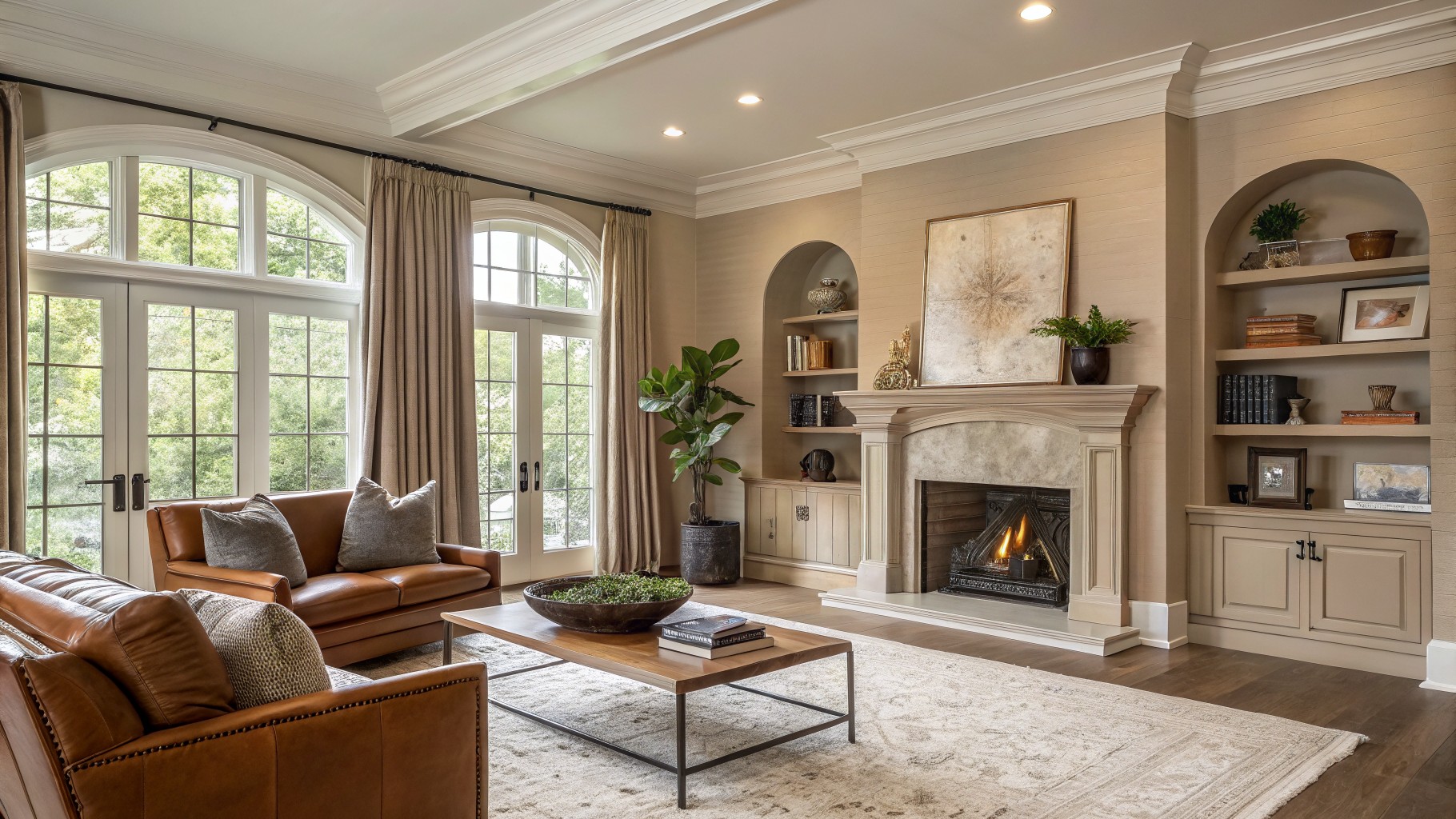
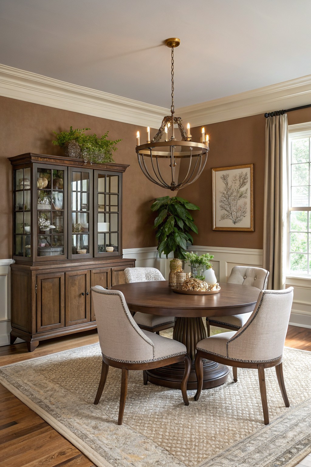
Soft Greige Walls
This room uses a soft warm greige on the walls. It is a light neutral that sits right between beige and gray, with a gentle warmth that keeps the space feeling comfortable rather than stark. Many people choose this kind of color because it works quietly in the background and lets wood tones and stone stand out without competing.
The undertone stays warm enough to pair well with leather seating and natural textures. It looks best with white trim and holds up nicely in rooms that get plenty of daylight. You can use it in living areas or open spaces where you want something flexible that does not feel dated after a few years.
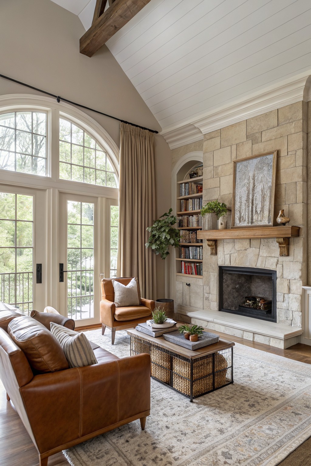
Warm greige walls

This bedroom uses a warm greige on the walls that sits somewhere between gray and beige. It gives a soft neutral that feels steady and easy to live with, without pulling too cool or too yellow on its own.
The color has a light taupe undertone that helps it blend with wood tones and white trim. It works best in rooms that get steady daylight, and it pairs well with both natural wood furniture and simple painted details.
Creamy Off-White Cabinets
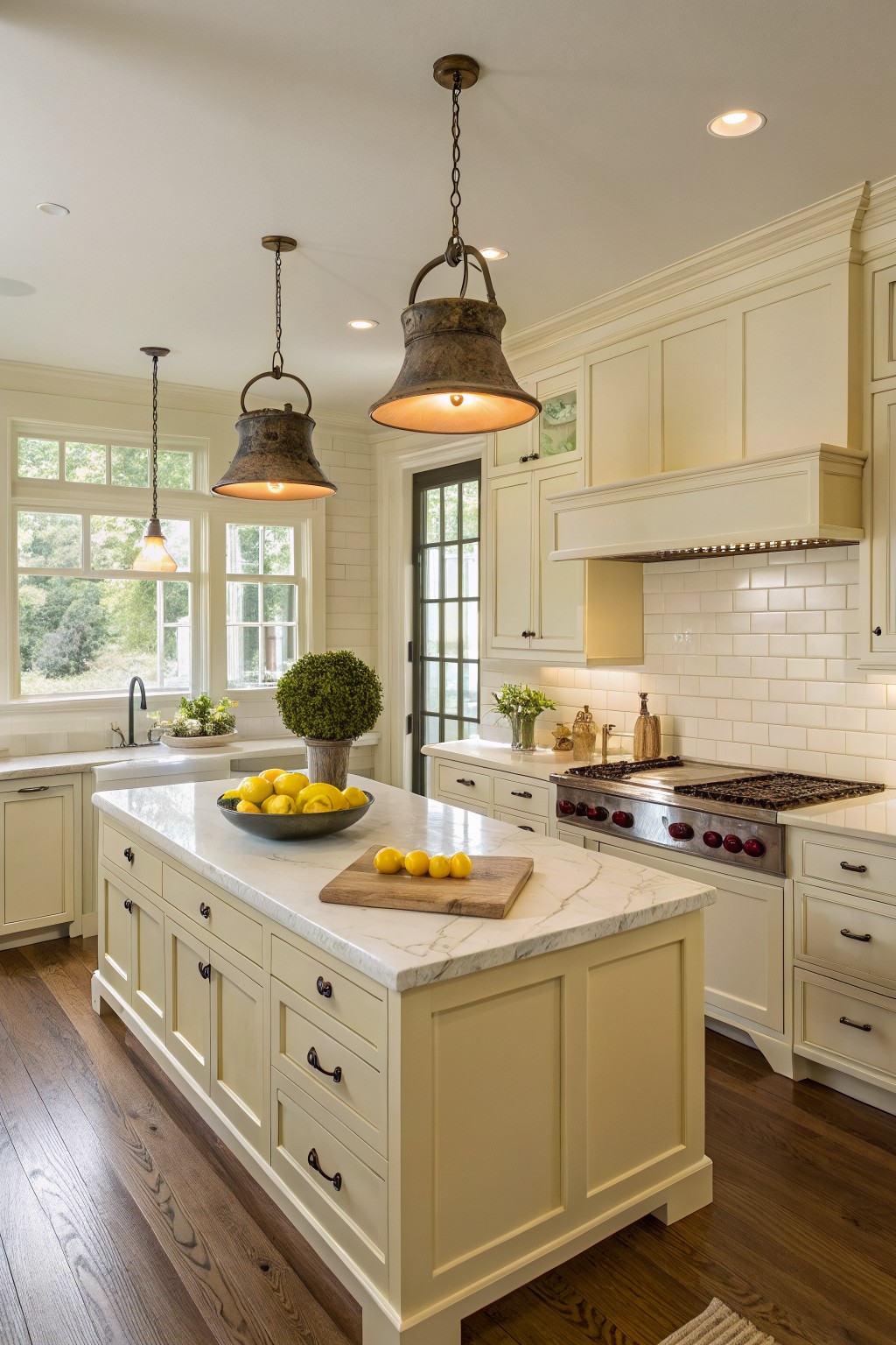
A warm off-white like this one gives kitchens a soft, settled look that still feels bright. It sits somewhere between a true white and a light cream, with just enough warmth to keep things from feeling cold. Colors like Benjamin Moore White Dove, Sherwin Williams Alabaster, or Behr Swiss Coffee tend to land in this same range.
The gentle warmth works especially well with wood floors and marble counters, since it keeps the contrast from looking too sharp. In rooms with lots of natural light it reads even softer, but it still holds up nicely in smaller kitchens too. Just watch that it does not pull too yellow next to very cool stone or bright white trim.
Soft Mint Green Walls
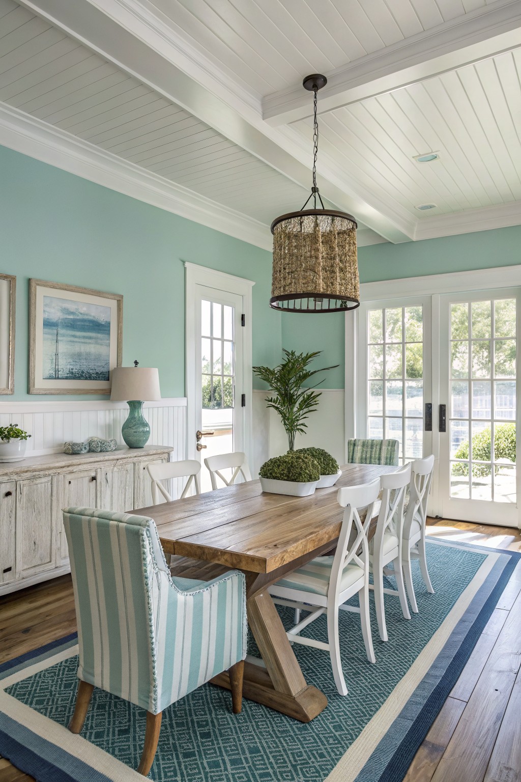
This soft mint green brings a quiet freshness to the room without making it feel cold or trendy. It sits right in that gentle space between green and blue, which is why it reads so comfortably on walls. You see versions of it in shades like Sherwin Williams Sea Salt, Benjamin Moore Palladian Blue, Behr Soft Aqua, or Farrow & Ball Borrowed Light.
The color stays light enough to work with white trim and wood tones without fighting them. It tends to look best in rooms that get steady daylight, and it pairs easily with simple fabrics or natural textures. Just test a sample first because the blue side can show up more once the lights come on at night.
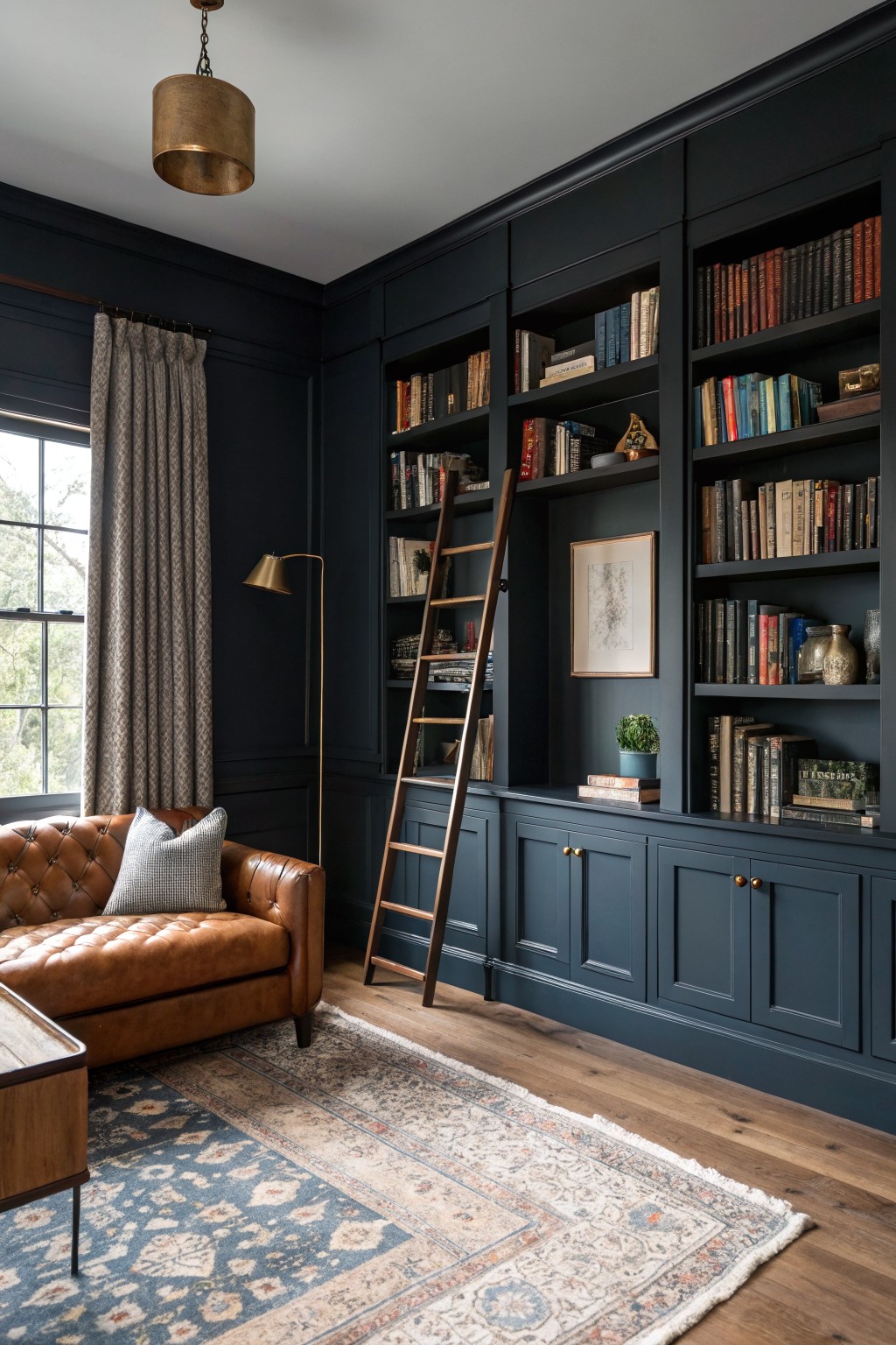
This deep navy brings a lot of weight to the walls and cabinetry without making the room feel closed in. It reads as a true saturated blue rather than a grayed-off black, which helps it hold its own next to warm wood floors and leather seating. Colors in this family tend to look richer when they wrap around built-ins instead of just covering flat walls.
It leans slightly cool, so it can pick up a touch of green in softer light. That works fine here because the brass accents and brown tones keep it grounded. It suits studies or living rooms where you want some depth but still need the space to feel usable during the day.
Warm Off-White Walls
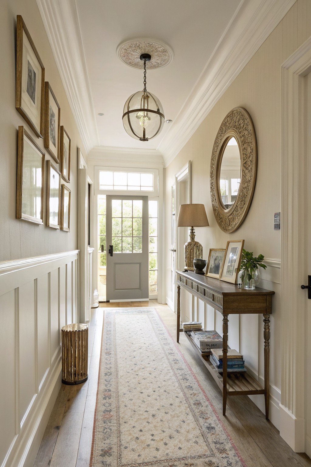
This warm off-white paint gives hallways a soft glow that feels calm and lived-in. It sits somewhere between white and very light beige, so it brightens the space while still looking grounded next to wood floors and trim.
The color works best when you keep the trim crisp and let natural wood bring in a bit of warmth. Good matches include Sherwin Williams Alabaster, Benjamin Moore White Dove, Behr Swiss Coffee, or Farrow & Ball Pointing.
Soft Sage Green Cabinets
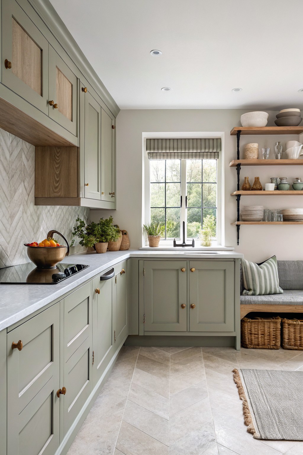
A muted sage green on the cabinets brings a quiet, steady feel to a kitchen without making the space look too styled. This kind of color sits in that middle ground between gray and green, so it feels soft rather than bold.
It tends to have cool undertones that work best with warm wood and light stone surfaces. The shade holds up well in rooms with steady daylight and pairs easily with brass or black hardware without needing much else to feel complete.
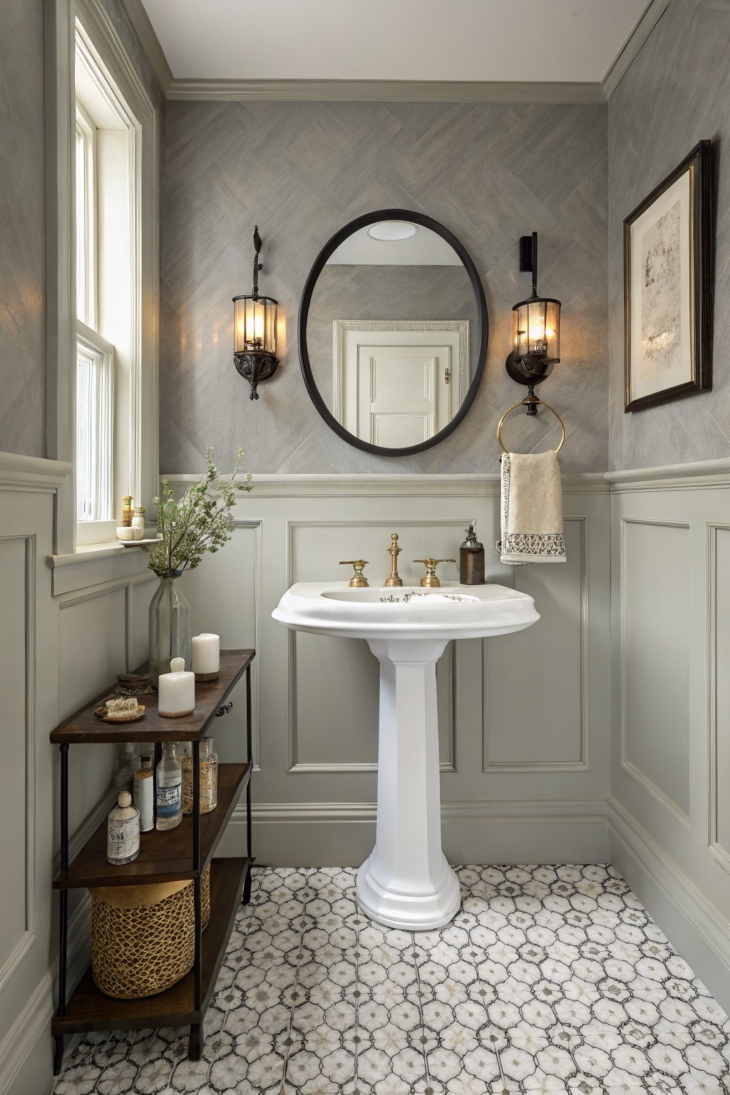
Soft Blue Gray Walls
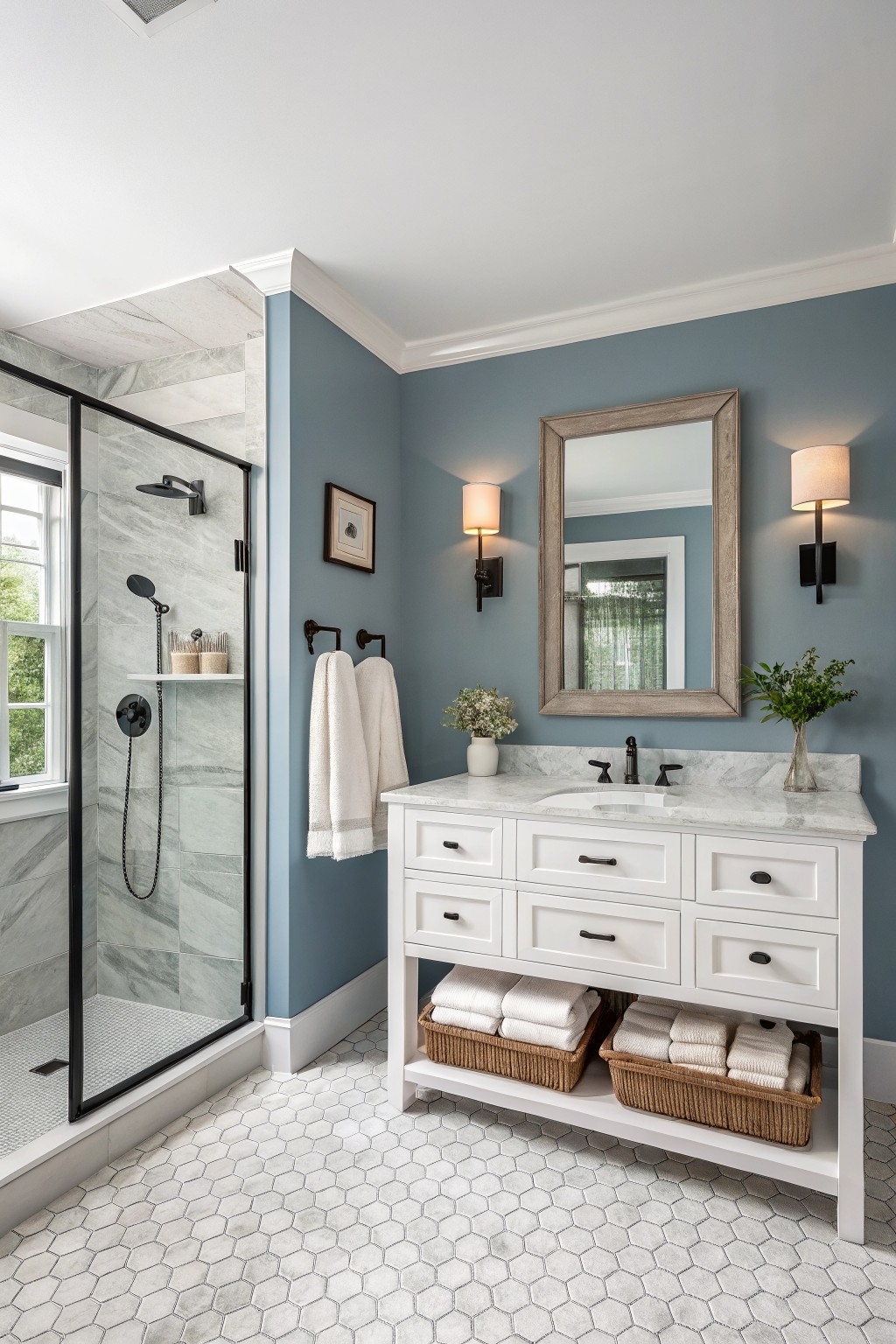
A soft blue gray works nicely in bathrooms because it feels calm and a little timeless. This one reads closest to Sherwin Williams Silver Strand or Benjamin Moore Wythe Blue, with Behr Silver Blue as another close option.
The color sits cool but not stark, so it pairs easily with white trim and marble. It can look a touch flat if the room gets little natural light, so test it in both morning and afternoon.
Warm Taupe Walls
This warm taupe brings a grounded feel to the room while still keeping things light enough. It has a soft brown base that sits nicely next to wood tones and avoids looking too gray or too yellow on the wall.
It works best with cream trim and medium to dark wood furniture. The color holds up well in both natural light and evening lighting, though it can start to feel heavy if the room gets very little daylight. Pair it with linen or cotton fabrics in soft neutrals and avoid anything too stark white on the trim.
Crisp White Built-Ins
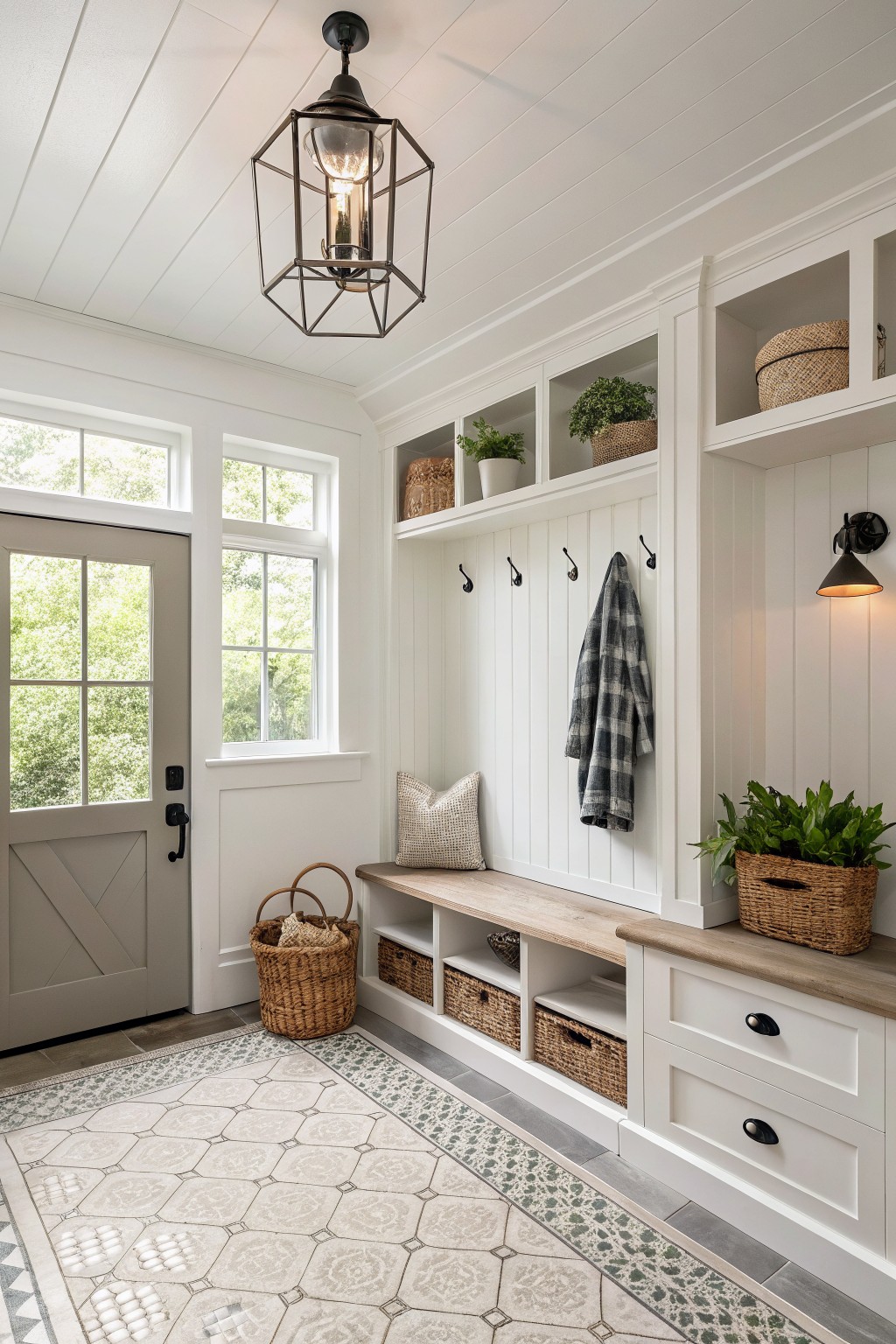
A crisp white on the walls and cabinetry keeps an entryway feeling open and easy to live with. This kind of bright white works well in spaces that get some natural light and need to stay practical without looking too stark next to wood tones or stone floors.
It has a clean base that pairs nicely with black hooks, woven baskets, and wood seating. The finish holds up to daily use while still looking fresh over time. Colors like Sherwin Williams Pure White or Benjamin Moore Simply White give a similar effect in rooms like this.
Deep Green Walls
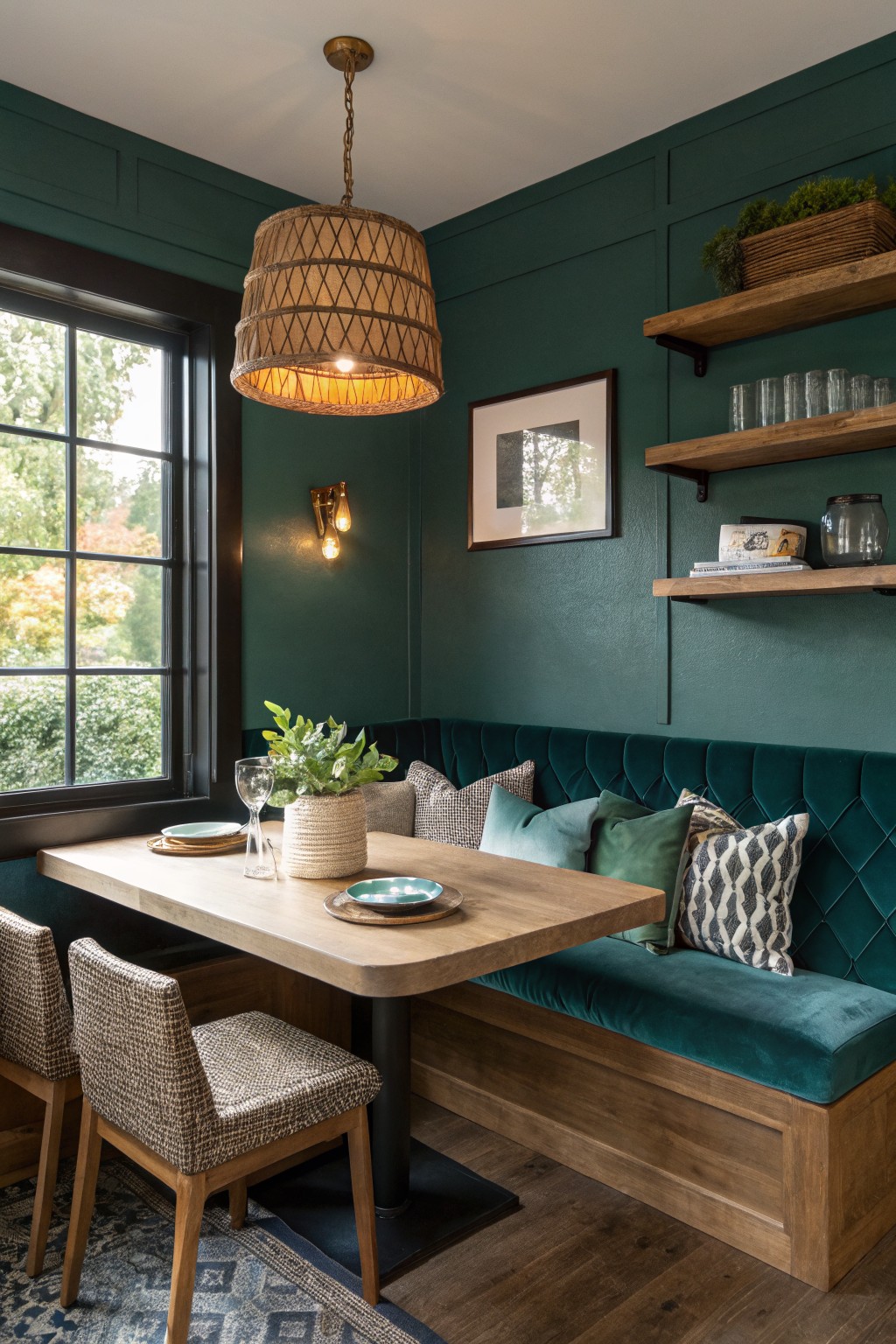
This deep green brings a grounded, steady feel to any room. It falls into the rich green family and looks closest to Sherwin Williams Rookwood Dark Green, Benjamin Moore Hunter Green, or Behr Forest Floor.
The color carries a hint of blue that keeps it from turning muddy under warm light. It works especially well with wood tones and simple fabrics, though it can feel heavy if the room lacks natural light.
Soft Blush Pink Walls
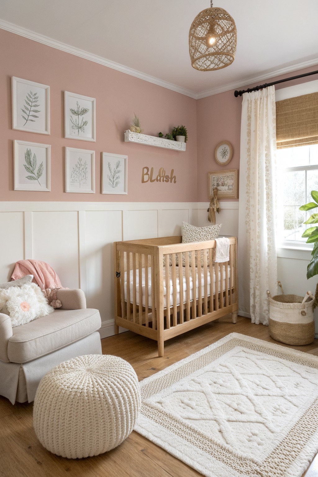
This warm blush pink brings a gentle feel to the room without trying too hard. It sits somewhere between a true pink and a soft neutral, which makes it easy to live with over time. The color looks closest to Benjamin Moore Cameo Rose, Sherwin Williams Romance, Behr Blushing Rose, or Farrow & Ball Pale Pink.
It has a light warm undertone that keeps the space feeling calm rather than sugary. White trim and natural wood floors help it stay soft instead of turning too sweet, and it works well in bedrooms or any room where you want a bit of color without making things busy.
Soft Gray Walls
This soft gray brings a quiet balance to the room without feeling cold or heavy. It sits nicely between warm and cool, making it easy to live with over time in a space like this.
The color has a gentle depth that works well with white trim and wood accents. It keeps things feeling clean and simple while leaving room for natural textures like tile or woven baskets to stand out.
Soft Sage Green Walls
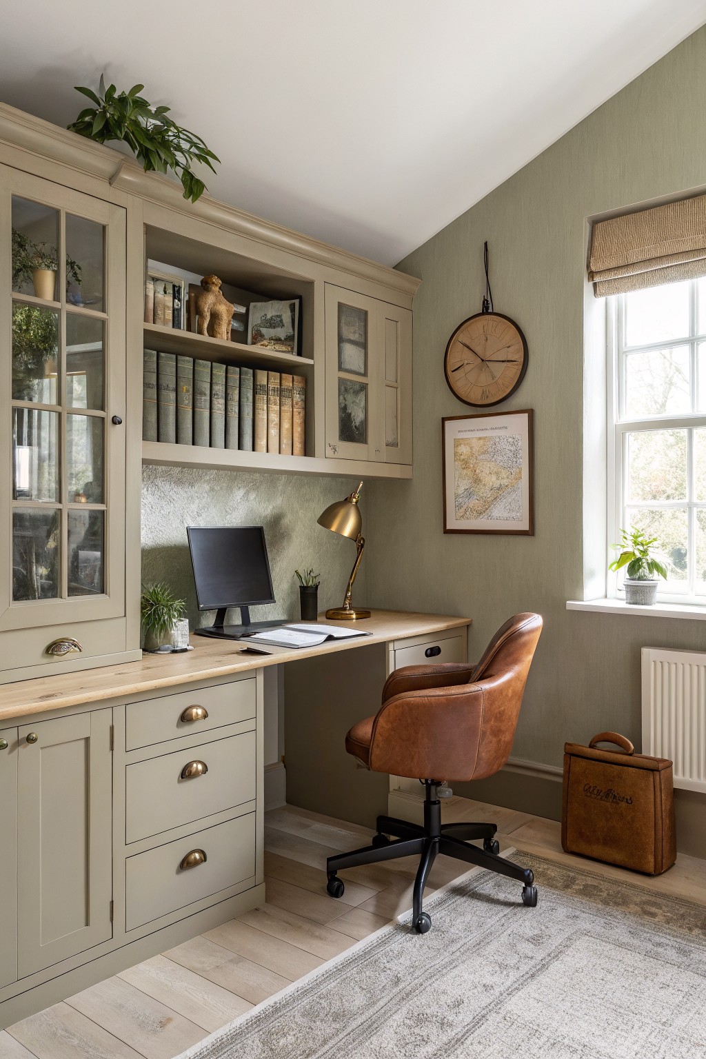
This is a soft sage green that sits right between gray and green. It feels calm without going flat and gives the room a quiet, settled look that still works with wood and leather. The color has a gentle warmth that keeps it from feeling too cool or stark in spaces with built-ins.
It pairs easily with natural wood tones and brown leather like the chair here. Try it in offices or living rooms where you want something a little different from plain gray but not as bold as a full green. Watch the light though, since it can lean more gray in low light or pick up extra green near big windows.
Soft Greige Walls

This soft greige sits right in that sweet spot between beige and gray. It has a gentle warmth that keeps the room from feeling too cool or flat, and it works nicely with wood floors and white trim without fighting them.
The color has a touch of taupe in it, so it shifts a little depending on the light. It pairs well with linen curtains, cream bedding, and any wood tones that already feel a bit aged. Just watch how it looks next to very cool whites, since that can pull out more gray than you might want.
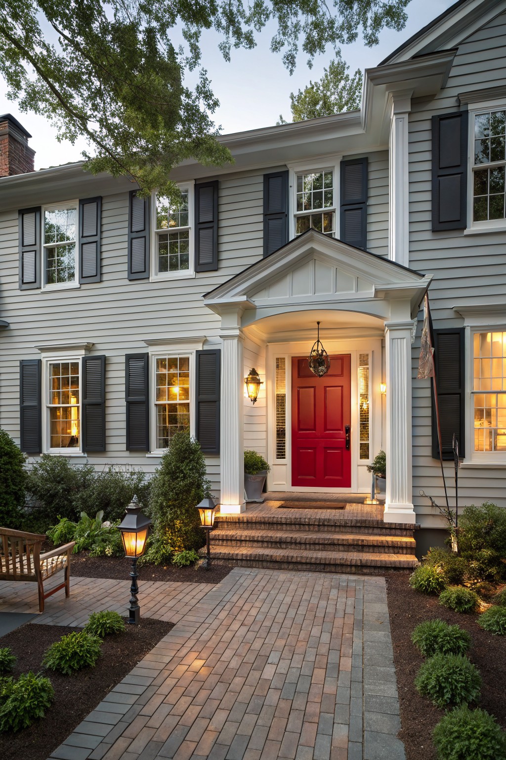
Crisp White Siding
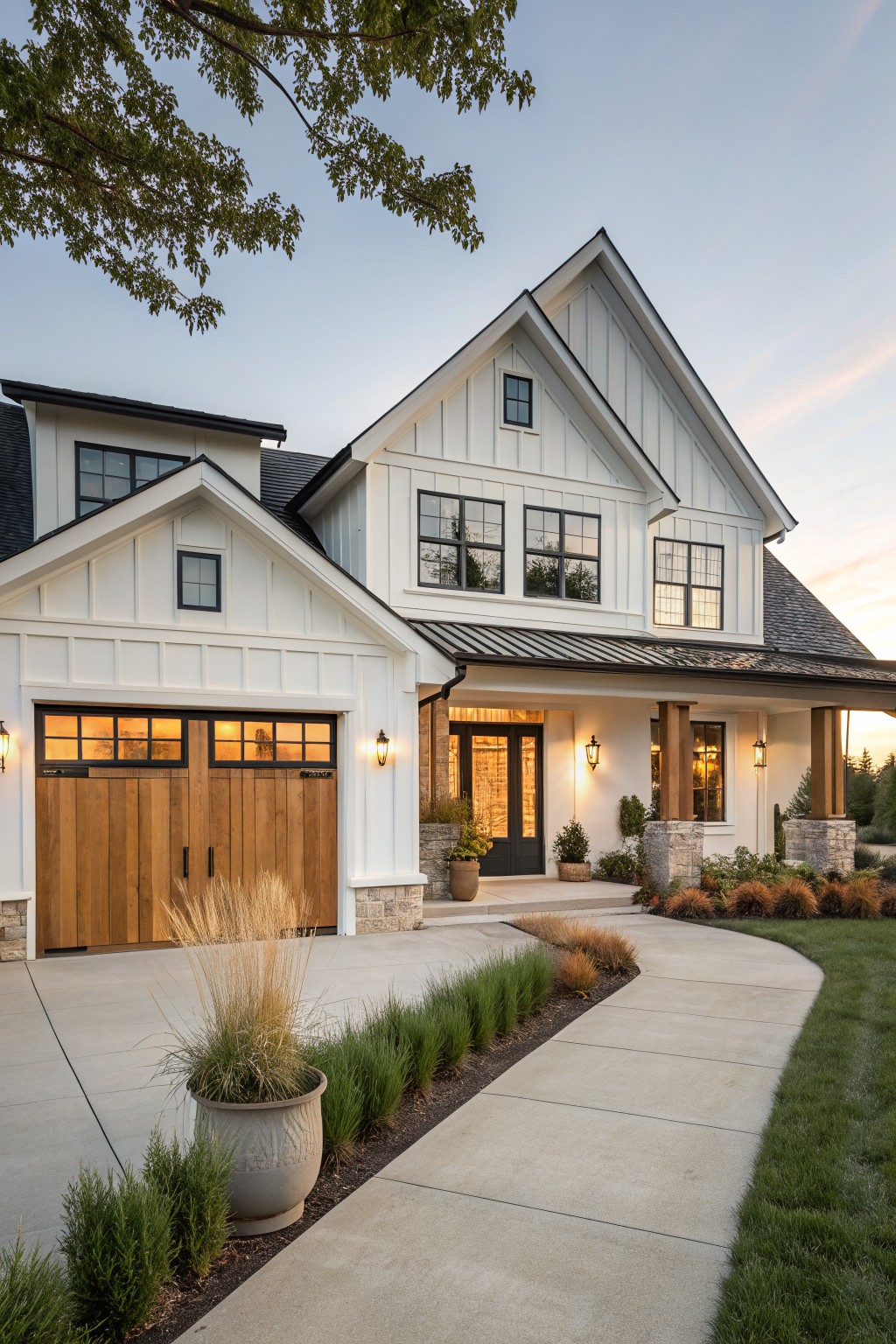
This house uses a crisp white on the siding that keeps the whole exterior feeling light and open. It is a bright neutral that does not fight with the wood tones or stone details and helps the dark window frames stand out.
A white like this usually has a clean base with very little warmth, which makes it work well on homes that get good natural light. It pairs easily with black accents or natural wood and holds up nicely without looking too stark against greenery or roof colors.
Soft Blue Gray Siding
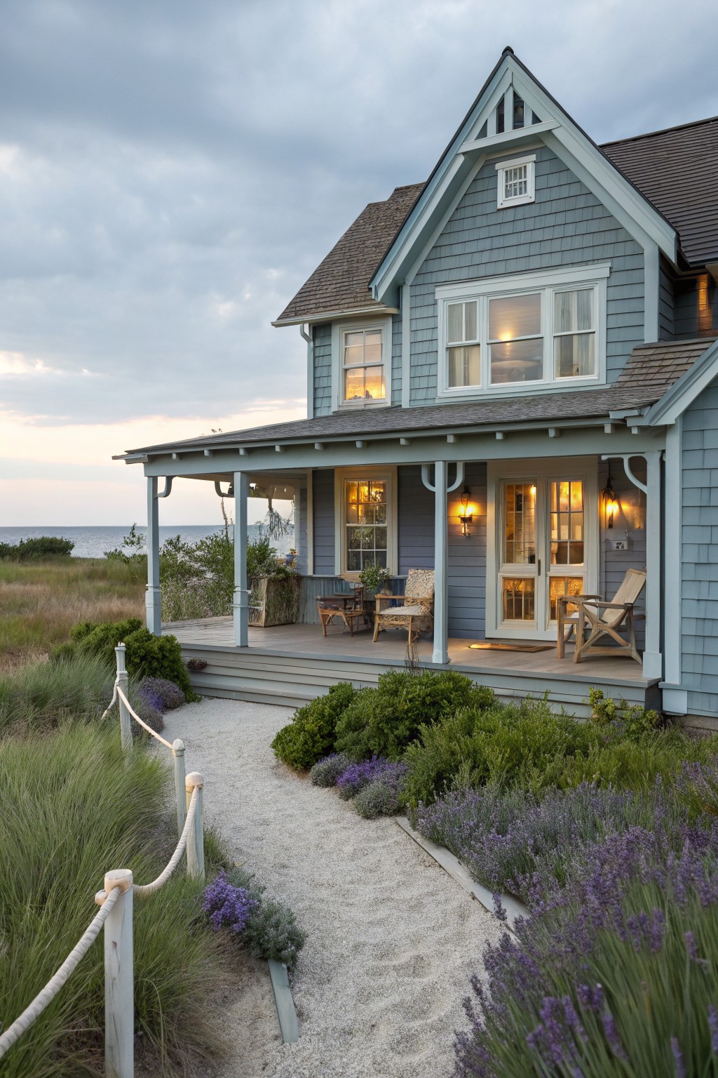
This soft blue gray gives the house a calm, settled look that holds up well over time. It sits between gray and blue without leaning too hard in either direction, which makes it easy to live with on an exterior.
The color has a slight cool undertone that reads softer in natural light. It pairs nicely with white trim and works best on homes near water or open fields where the light stays bright most of the day. Try it with cedar accents or simple black hardware if you want a bit more contrast.
A Deep Green Front Door
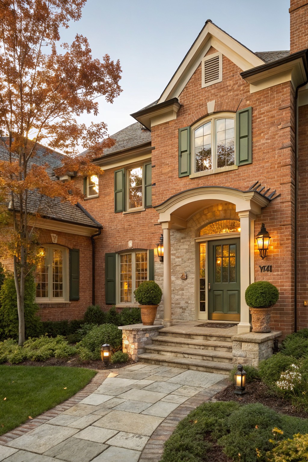
This deep green works well on exterior doors and shutters because it feels grounded without being too heavy. It has a slightly muted tone that sits nicely against red brick and warm stone, giving the entry a traditional look that still feels current. Many people like it because it adds just enough color while staying easy to live with year after year.
The color leans a bit warm rather than cool, which helps it blend with natural materials like brick and wood. It pairs best with creamy trim and soft lighting near the door. Colors like Sherwin Williams Forest Green, Benjamin Moore Hunter Green, or Behr Forest Floor often come close to this shade.
Dark Blue Siding
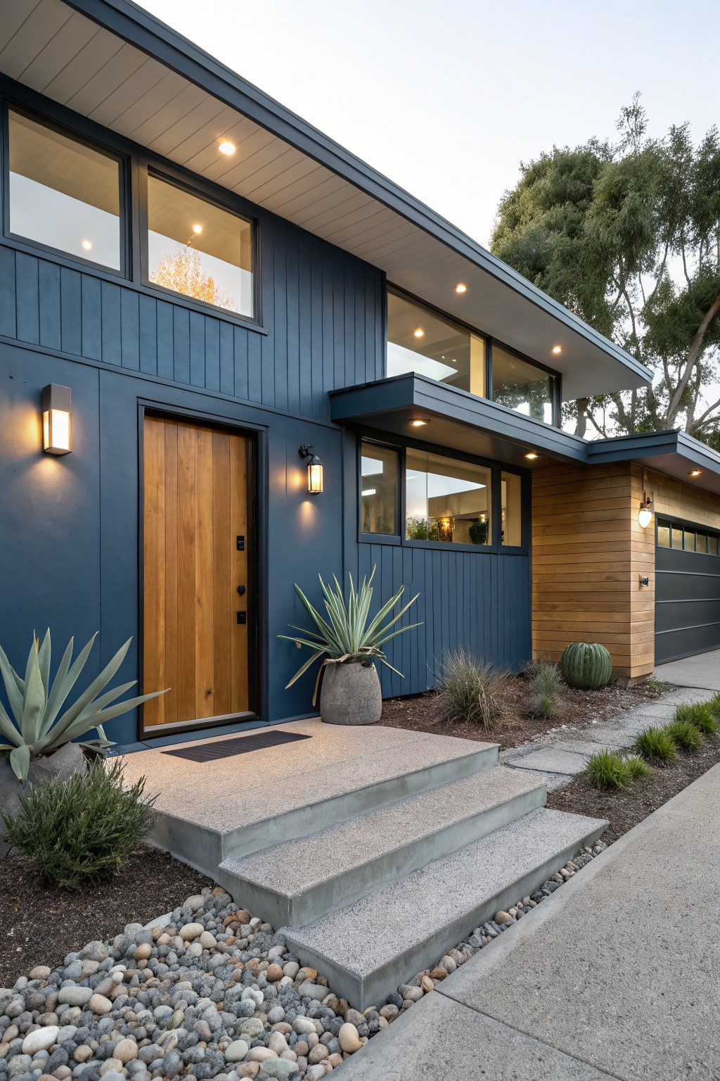
A deep navy blue like this makes a strong choice for exterior siding because it feels solid and steady without looking stark. It has a muted quality that keeps it from feeling too bright in daylight. Shades like Sherwin Williams Naval or Benjamin Moore Hale Navy sit close to this tone.
The color carries a soft gray undertone that helps it sit well next to wood and stone. It works best on homes with clean lines where you want something bold but still easy to live with over time. Pair it with warm wood accents or keep the trim simple so the blue stays the main focus.
Soft Gray Siding
A soft light gray like this one works well on house siding because it feels calm and blends in without disappearing. It reads as a gentle neutral with just enough warmth to keep the whole exterior from looking flat or too stark against white trim.
This shade has a mild warm undertone that helps it sit nicely with brick foundations and garden greens. It suits traditional homes best and pairs easily with black shutters or a bold front door if you want a bit more contrast.
Soft Green Front Doors

A soft sage green works nicely on exterior doors because it feels calm and a bit earthy without trying too hard. This kind of muted green sits comfortably against white brick and gives the entrance a gentle presence that still reads clearly from the street.
The color has some gray mixed in, so it tends to stay steady as the light changes throughout the day. It pairs well with stone steps, dark hardware, and simple landscaping, and it suits traditional homes that need a little color without looking busy.
Deep Sage Green Walls
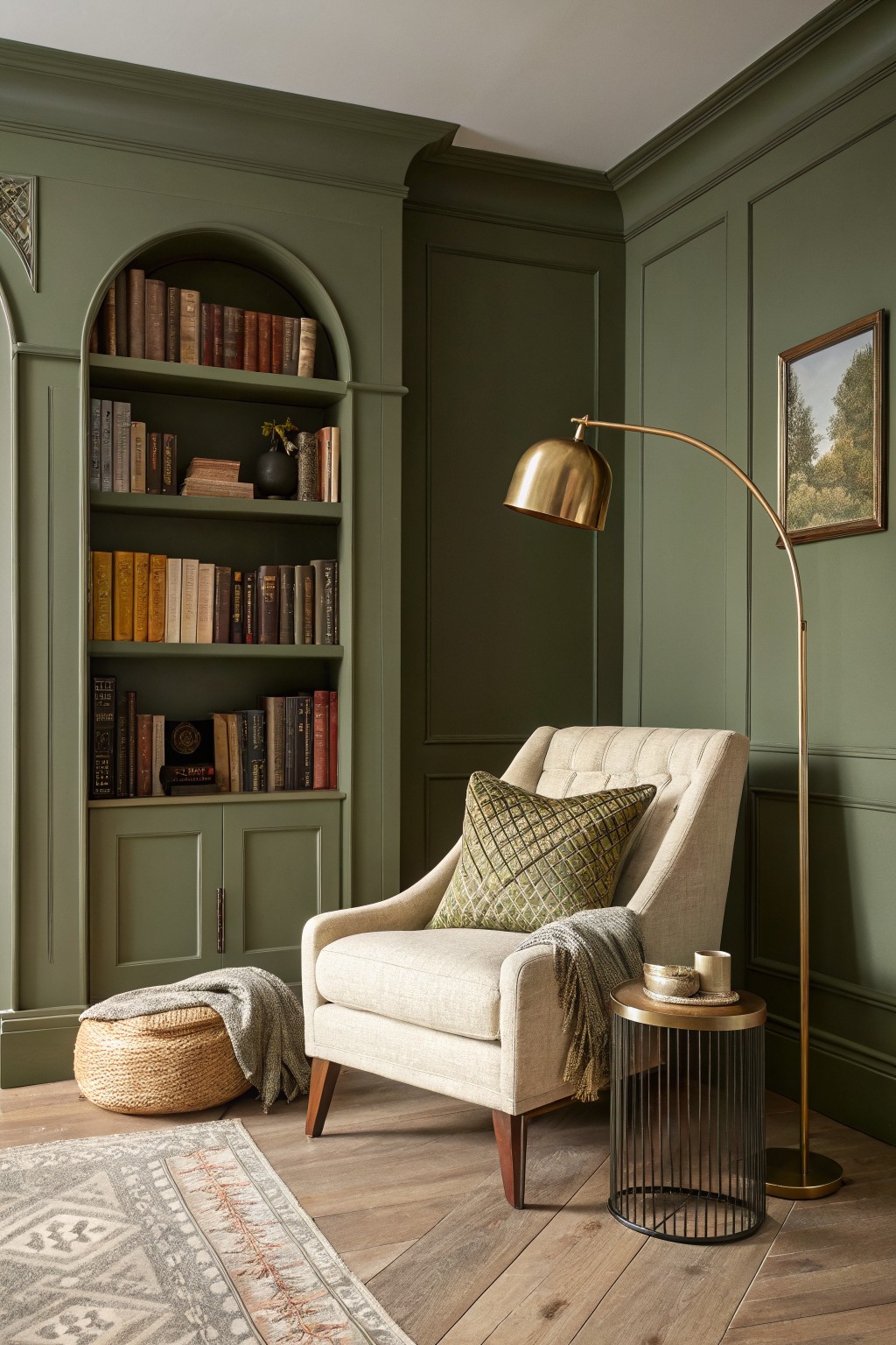
This deep sage green works well because it has a soft gray undertone that keeps it from feeling too bold or heavy. It sits nicely on both the walls and the built-in shelves, giving the room a calm, grounded look that still feels warm with the wood floor and natural textures around it.
The color holds up in different lighting and pairs easily with linen, brass, and wood tones without needing much else to feel complete. It suits older homes or any space where you want the walls to recede a bit while still adding depth.
Frequently Asked Questions
Q: How do I test one of these timeless shades without wasting paint on a whole wall?
A: Grab a large sample board and move it around the room at different times of day. Watch how the color shifts with morning sun versus evening shadows. This quick step shows whether the hue stays balanced or turns muddy in your specific light.
Q: Can I use these colors in a bathroom where steam and moisture hit the walls daily?
A: Pick a slightly deeper version from the list and finish it in satin or eggshell. The extra durability handles humidity without showing water spots as fast. Repaint the trim the same color for a clean look that still feels timeless.
Q: What if my wood floors have a strong orange tone and I want a neutral wall color?
A: Lean toward the cooler grays or soft taupes mentioned in the article. They pull the orange back instead of amplifying it. One coat of primer first keeps the wood warmth from bleeding through.