Over time I have learned that paint colors rarely stay exactly as they appear on a small chip once they cover an entire wall and interact with the room’s light and other surfaces.
Undertones can emerge in ways that either tie a scheme together or throw it off completely depending on the time of day.
Samples on the actual wall tell the real story.
The schemes that feel balanced usually account for those changes right from the start instead of fighting them later.
I often find myself reaching for colors that have held steady in my own spaces through morning sun and evening shadows alike.
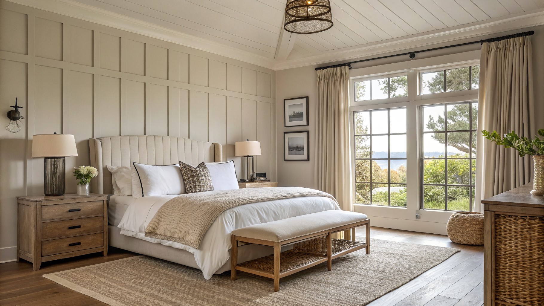
Soft Warm Beige Walls

This soft warm beige reads as a light greige that sits nicely between gray and tan. It feels calm without going flat, and the slight warmth keeps the room from looking too stark next to the wood tones.
It works best in spaces with decent natural light since the undertone can lean a bit cooler in shadow. Pair it with creamy whites on trim or simple wood furniture to let the color stay relaxed and easy.
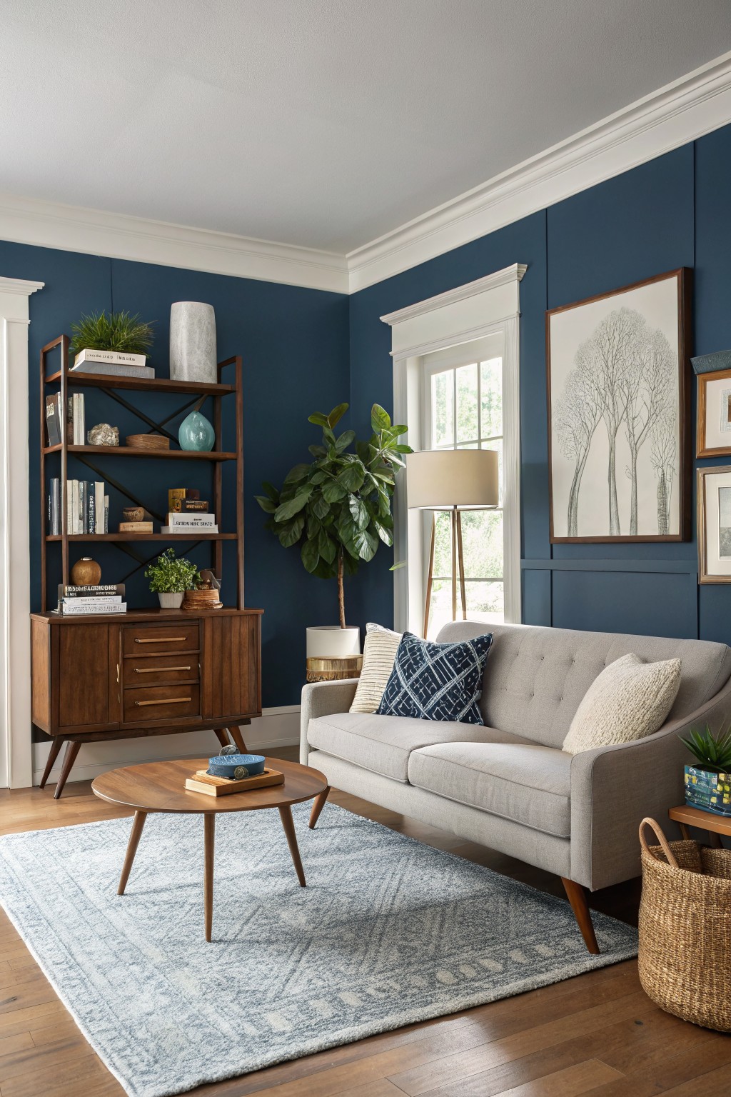
A deep navy blue like this one brings real presence to the walls without making the room feel heavy. It is a saturated shade with enough depth to ground the space while still reading as calm and steady. The color holds up well next to warm wood tones and white trim.
It tends to lean slightly cool so it shows best with plenty of natural light and pairs easily with linen fabrics or simple wood furniture. This navy works in living rooms or studies where you want something bolder than a neutral but not as stark as black. Test it in your own lighting first because it can shift a little darker once the walls are fully covered.
Soft Sage Green Cabinets
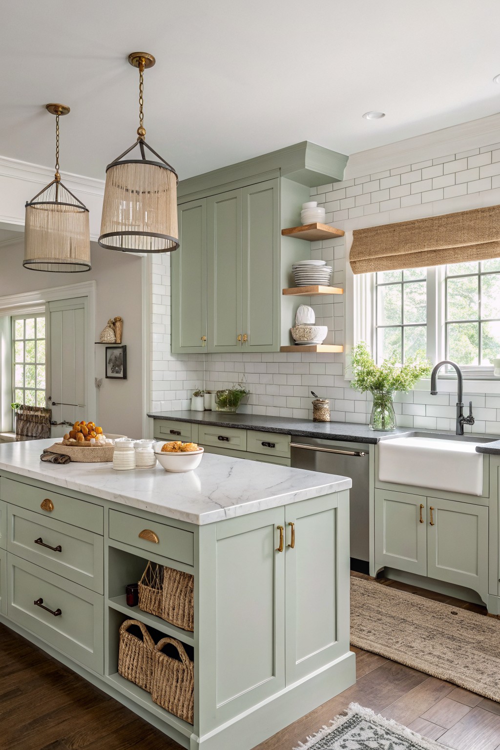
A soft sage green like this one brings a quiet balance to a kitchen without making it feel too themed. It sits right in that middle spot between gray and green so it reads calm and a little earthy at the same time.
The undertone stays fairly neutral which helps it work with white tile and marble tops. It looks best in spaces with steady daylight and pairs easily with warm wood floors or simple brass pulls. Avoid pairing it with anything too cool or it can start to feel flat.
Soft Greige Walls
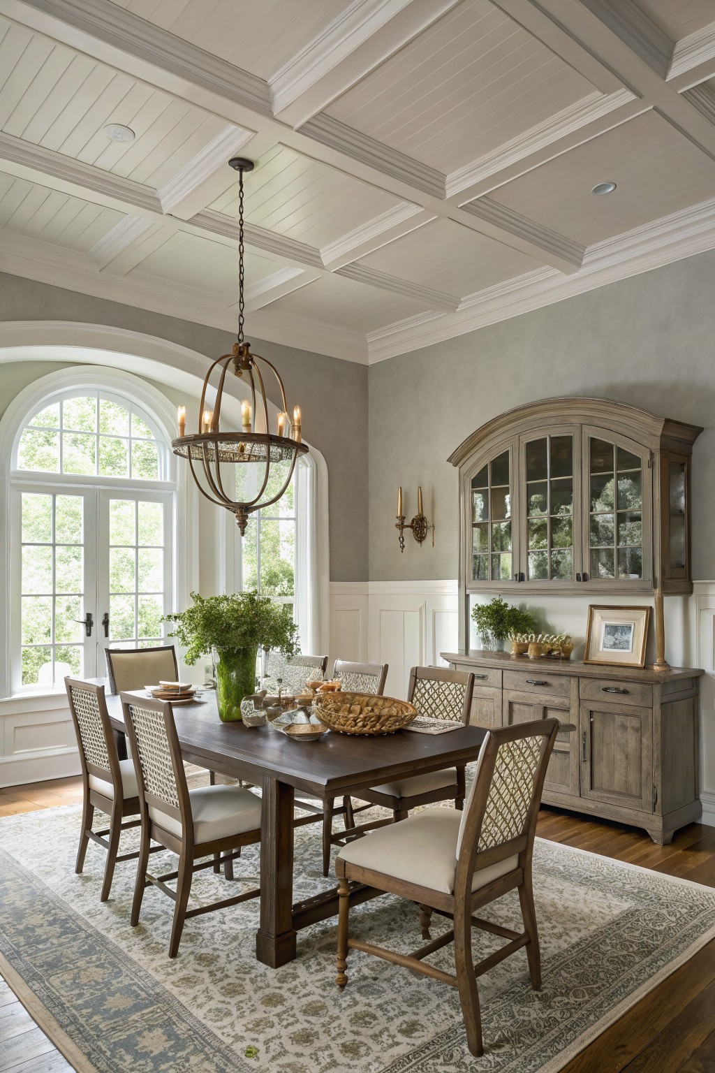
The walls in this dining room are painted a soft greige that sits right between gray and beige. It gives the space a calm, flexible feel that works with both the white trim and the darker wood furniture without making the room feel too cool or too dark.
This color has a slight warm undertone that helps the wood tones look richer. It pairs easily with most neutrals and would suit a lot of traditional or transitional homes, though it can start to look flat if the lighting is very dim.
Soft Teal Walls
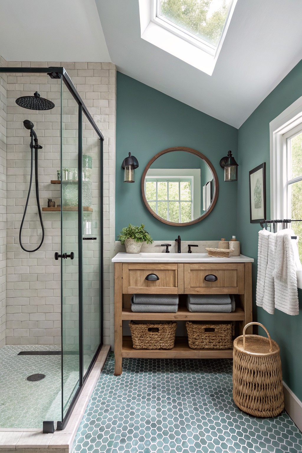
This muted teal brings a calm feel to the room without making it feel cold or flat. It sits in that nice middle ground between blue and green, which makes it easy to live with in smaller spaces like bathrooms.
The color has a bit of gray in the undertone so it reads softer next to wood and white surfaces. It works especially well with natural wood vanities, black fixtures, or simple tile, and it holds up nicely under both natural light and warmer bulbs.
Soft Yellow Walls
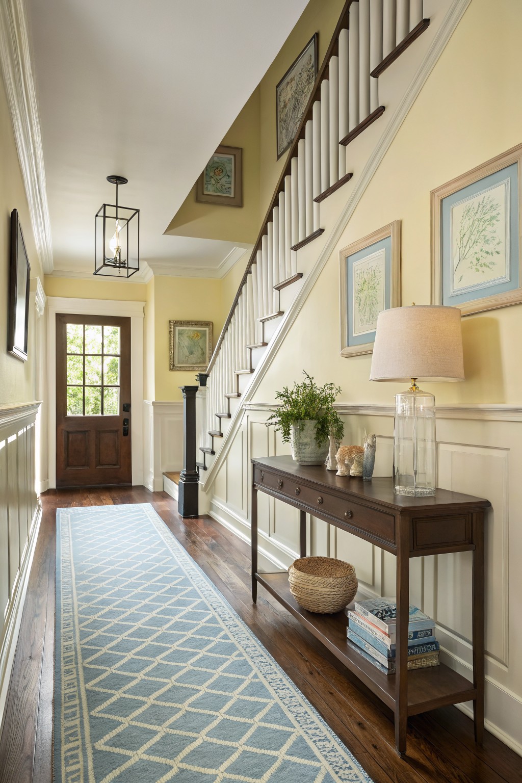
A soft yellow works well here because it brings a quiet warmth without turning the space too bright. The color sits nicely against the white wainscoting and dark wood floors, giving the hallway a calm, lived-in feeling that still feels fresh.
It carries a gentle warm undertone that picks up nicely in natural light but stays steady even on cloudier days. This kind of yellow pairs easily with wood tones and simple white trim, though it can start to feel flat if the room has very little natural light or too many cool grays nearby. Popular options in this range include Sherwin Williams Lemon Chiffon, Benjamin Moore Pale Yellow, Behr Sunflower Cream, and Farrow & Ball Yellow Ground.
Deep Green Walls
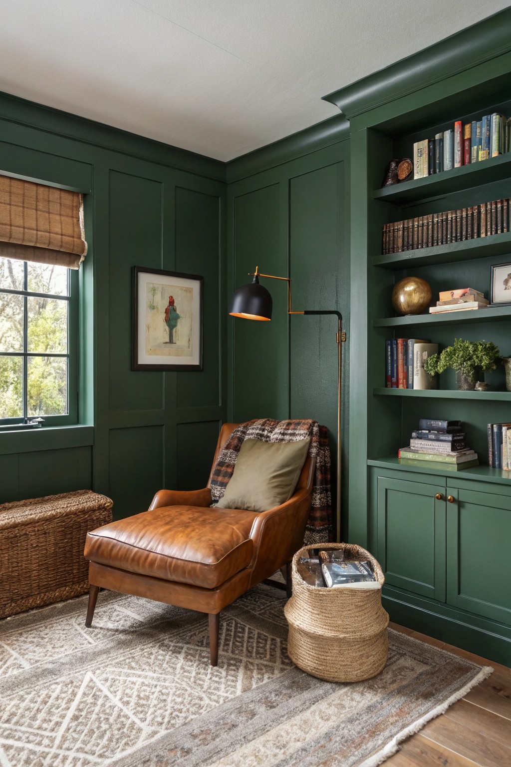
A deep green like this gives a room real presence while still feeling livable. It reads as a saturated forest green with just enough warmth to keep it from going cold, and it looks closest to Sherwin Williams Hunter Green or Benjamin Moore Forest Green.
The color holds up well next to wood floors and leather because it has a bit of depth without turning muddy. It works best in spaces that get some natural light during the day, and it can handle matching built-ins or trim in the same shade if you want everything to feel pulled together.
Soft Dusty Rose Walls
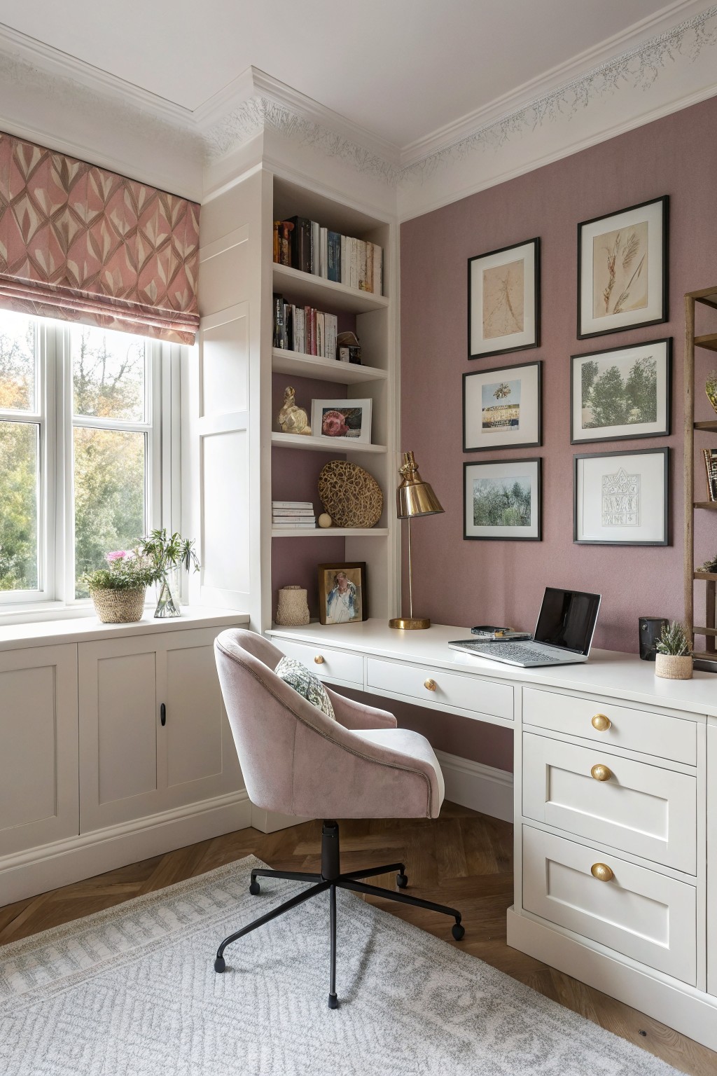
This soft dusty rose brings a gentle pink tone to the walls that feels warm but stays quiet. It sits between pink and mauve with enough gray in the mix to keep the room feeling calm rather than sweet.
The color holds up nicely against white trim and wood floors. It works best in rooms with steady daylight, and it pairs easily with soft textiles or simple wood furniture without needing extra layers to feel complete.
Warm Terracotta Walls
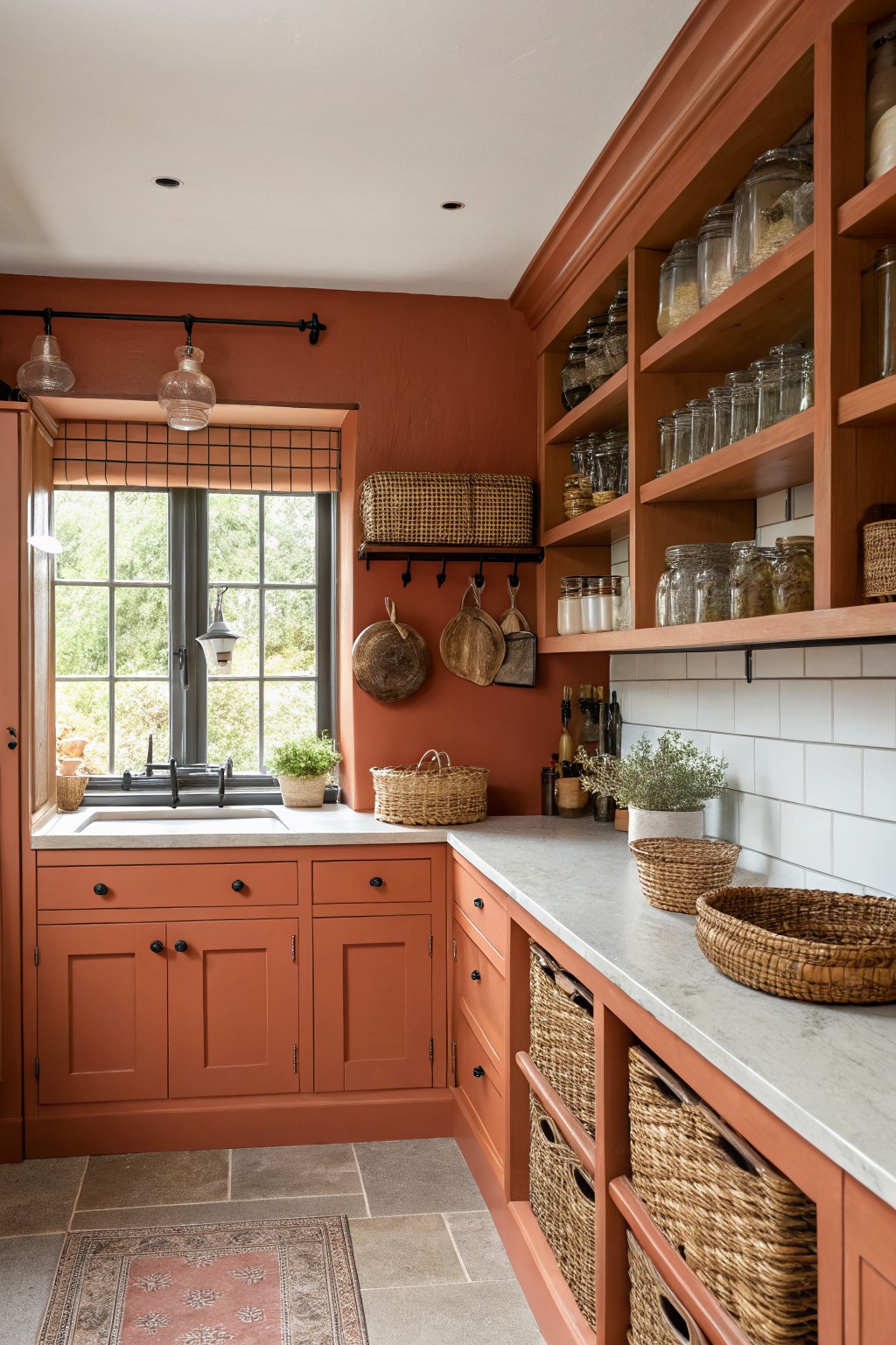
This warm terracotta color brings a grounded feel to the whole room without making it feel heavy. It sits somewhere between orange and red, with enough depth to hold its own against wood tones and stone surfaces. Many people like it because it feels natural and a little earthy while still working in a regular kitchen.
It has a slight red undertone that shows up more in daylight, so it pairs nicely with white tile and lighter countertops. Try it in spaces that get steady light, and keep the trim simple so the color stays the main focus. Good matches include Sherwin Williams Red Cent, Benjamin Moore Cinnamon Stick, Behr Baked Terracotta, and Farrow & Ball Red Earth.
Deep Charcoal Gray Walls
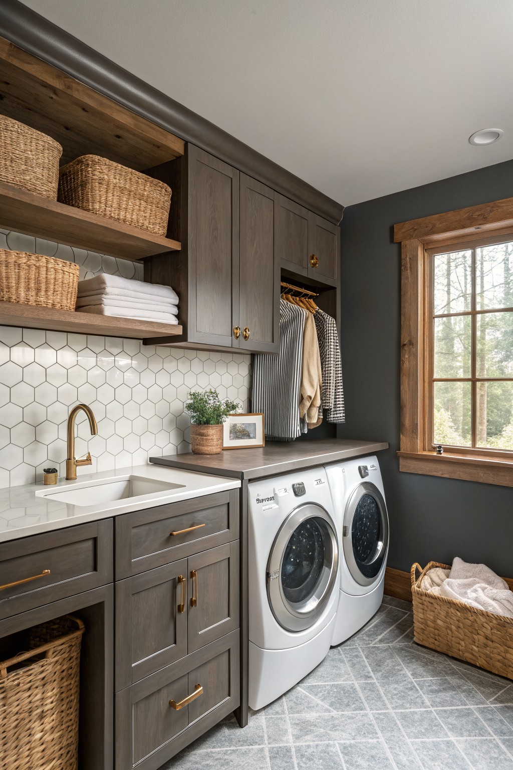
This dark charcoal gray on the walls brings a steady, grounded look to a laundry room. It is a cool gray with enough depth to feel solid rather than flat, and it sits comfortably next to the wood cabinetry and open shelving.
The color works best in rooms that get decent natural light so it does not go too heavy. It pairs easily with white counters, gray tile, and warm wood tones, though it can feel a bit stark if the space has no natural wood or soft textiles to balance it.
Soft Sage Green Walls
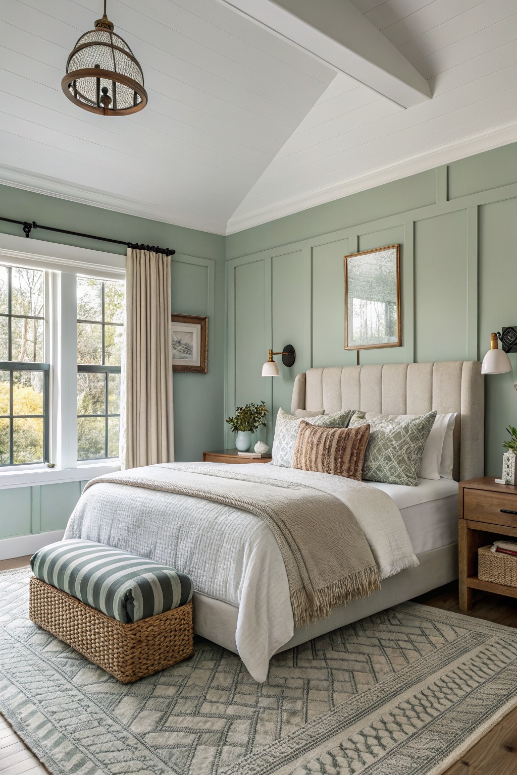
This soft sage green on the walls feels like a gentle middle ground between gray and green. It gives the room a calm look without turning it too cool or too earthy. The color family shows up often in shades like Sherwin Williams Rainwashed, Benjamin Moore October Mist, Behr Quietude, or Farrow & Ball Light Blue.
The slight gray undertone keeps the green from feeling too fresh or outdoorsy, so it works well with warm wood furniture and simple cream textiles. It suits bedrooms or other spaces where you want something restful but still a little interesting.
Soft Blue Gray Cabinets
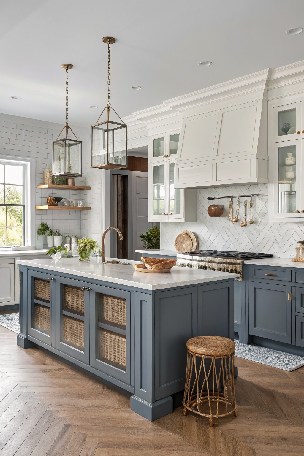
A soft blue gray works nicely on kitchen cabinets because it stays calm without turning cold or dull. This color family sits somewhere between gray and blue and feels easy to live with in most homes. It looks closest to Sherwin Williams Silver Strand or Benjamin Moore Harbor Gray.
The tone has a quiet coolness that still plays well with warm wood floors and white trim. It can look a little flat in rooms with very little natural light, so it helps to test a sample on the actual cabinets first.
A muted blue gray vanity
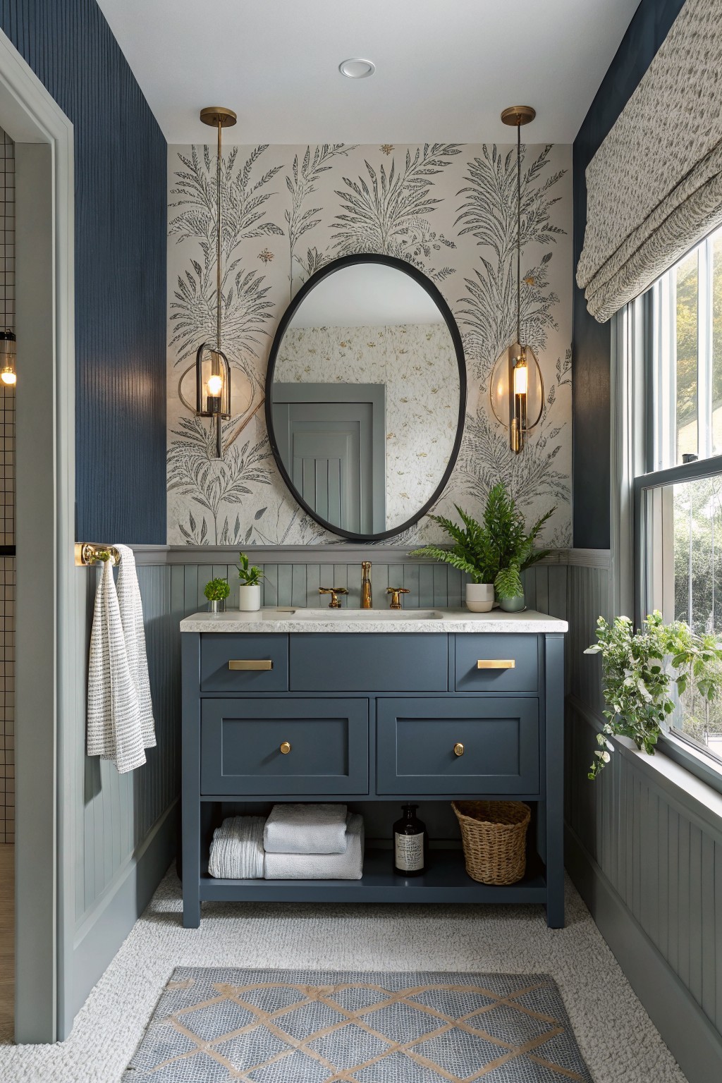
This muted blue gray on the vanity and lower walls brings a calm, steady feel to the room without making it feel heavy. It sits nicely between gray and blue, so it reads as a color but still stays quiet enough to let the wallpaper and brass details stand out.
It has cool undertones that show up more in brighter light, which helps the space feel fresh rather than stark. This kind of blue gray works well in bathrooms or small spaces where you want some depth but still need it to pair with white ceilings, light tile, or natural wood tones.
Warm Off-White Walls
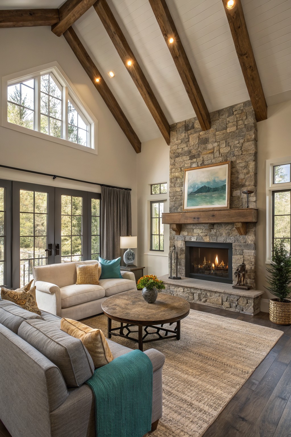
This living room uses a soft warm off-white on the walls. It has a gentle creamy tone that brightens the space without turning cold, and it sits comfortably next to the heavy wood beams and stone fireplace.
The color carries just enough warmth to feel cozy while still keeping the room feeling open. It works best with natural wood tones and stone, though it can start to look flat if the lighting is too dim or if you add too many cool grays.
Soft Greige Walls
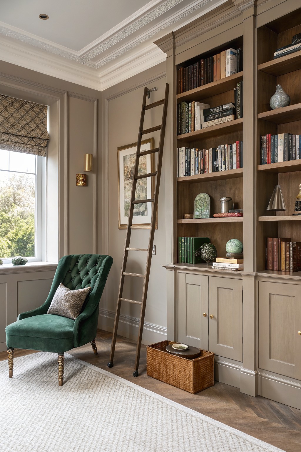
A soft greige works well on the walls here. It is a warm neutral that sits between gray and beige, giving the room a calm but grounded feel without pulling too cool or too yellow.
This color holds up nicely next to wood built-ins and trim. It suits studies or living rooms that already have some texture from furniture and flooring, though it can look a bit flat if the room gets very little natural light.
Warm Terracotta Walls
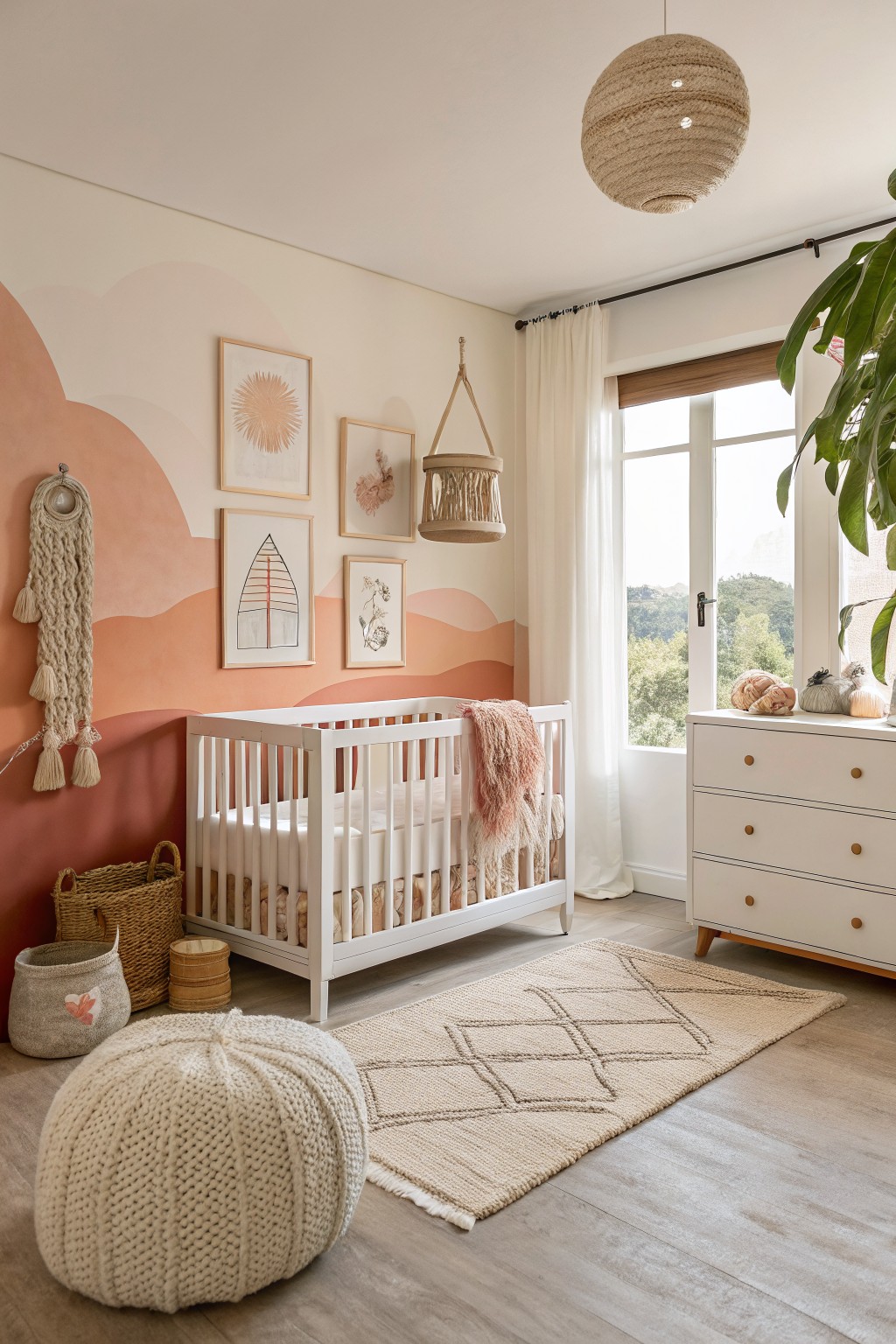
This room uses a soft warm terracotta on the walls. It is a muted clay shade that brings in some color without feeling bold or overpowering. The tone sits nicely between peach and orange and gives the space a gentle, lived-in feel that works well in smaller rooms.
It has a light pink undertone that shows more in daylight and pairs easily with white trim and pale wood floors. Try it in a bedroom or play area if you want something warmer than beige but still calm enough for everyday use. Similar shades show up as Sherwin Williams Canyon Clay, Benjamin Moore Coral Clay, Behr Baked Clay, and Farrow & Ball Red Earth.
Teal Blue Doors
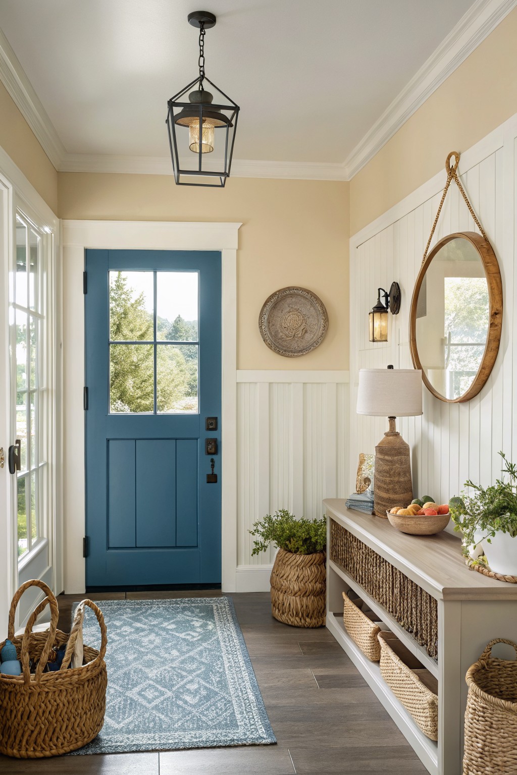
A teal blue door gives an entry a bit of color without making the space feel busy. This shade sits right between blue and green, so it feels fresh but still calm enough to work in most homes.
It has a soft gray undertone that keeps it from looking too bright in natural light. White trim makes it stand out nicely, and it looks good with warm wood floors or simple woven baskets nearby.
Warm terracotta cabinets

This warm terracotta red on the cabinets gives the kitchen a grounded, earthy feel. It sits somewhere between red and clay, which makes it feel cozy without turning too dark or overpowering.
The color has a soft orange undertone that reads nicely next to stone and wood. It works best in rooms with steady daylight and pairs easily with warm whites on the walls or simple gray counters.
Frequently Asked Questions
Q: How do I choose colors when my furniture already has strong tones?
A: Pull the main shade from your biggest piece like a couch or chair. Match it to one of the balanced schemes and add two softer tones for walls and small accents. This keeps the room feeling pulled together without starting over.
Q: What works best for a room that feels dark most of the day?
A: Pick the lightest option in any scheme you like and use it on the walls. Add a warm mid-tone for furniture and keep trim crisp and light. Light colors bounce what little daylight you get and open the space up fast.
Q: Can I carry one color scheme through the whole house without it getting boring?
A: Use the same base color on most walls and change only the accent shades from room to room. A soft gray might stay steady while one space gets warm wood tones and another picks up muted greens. But test a small patch first so you see how the light shifts it.