I often find that two colors only reveal their true depth once they sit next to my existing trim and furniture in real daylight.
The undertones can surprise you when the sun moves from one side of the room to the other.
I always bring home samples and live with them for a few days before deciding.
Pairs that add drama usually succeed because they balance warm and cool tones without clashing against the other surfaces in the space.
That practical step saves me from picking combinations that look striking in theory but never quite land in the finished room.
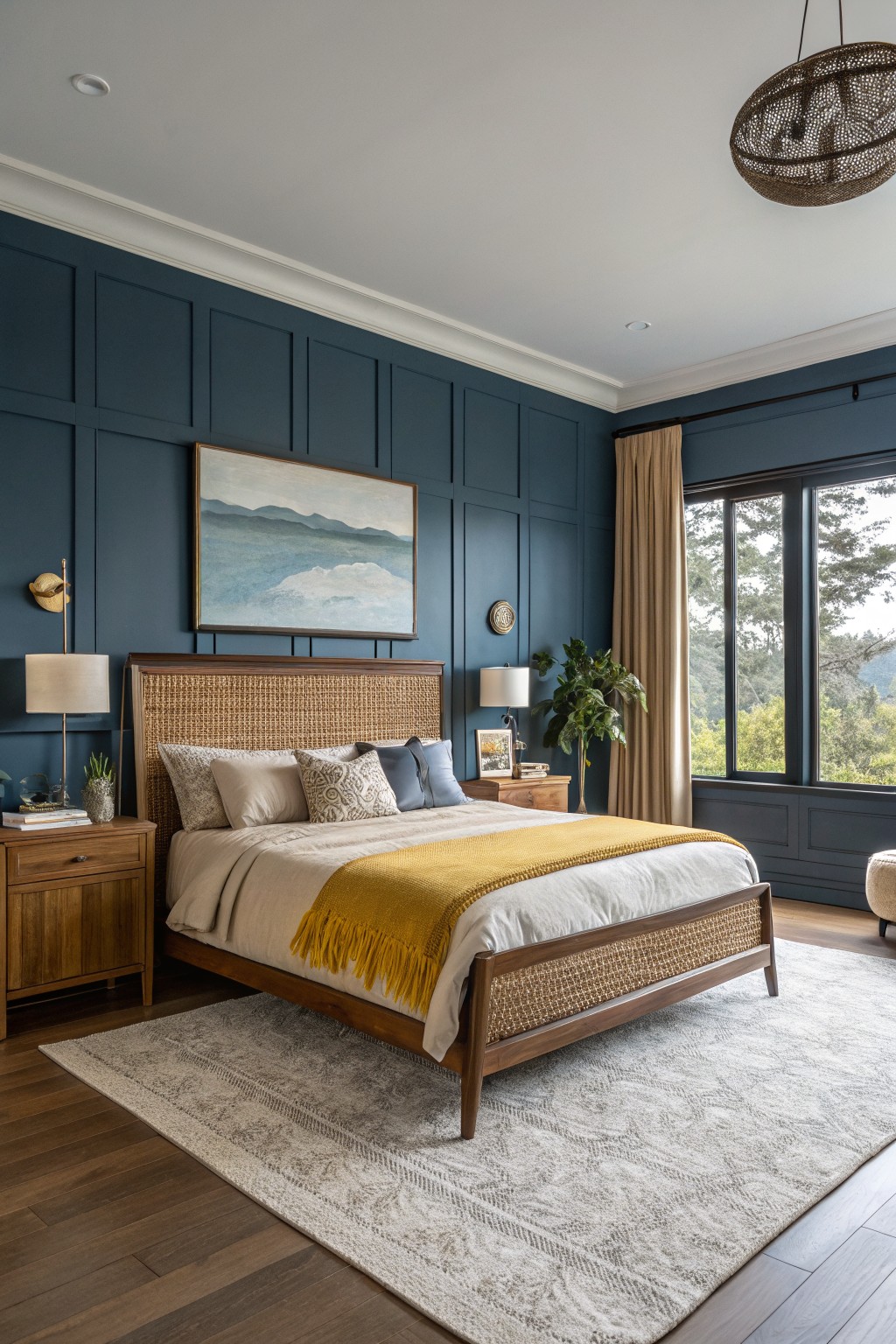
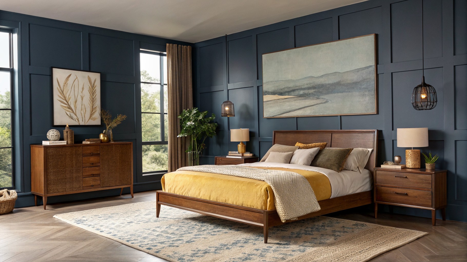
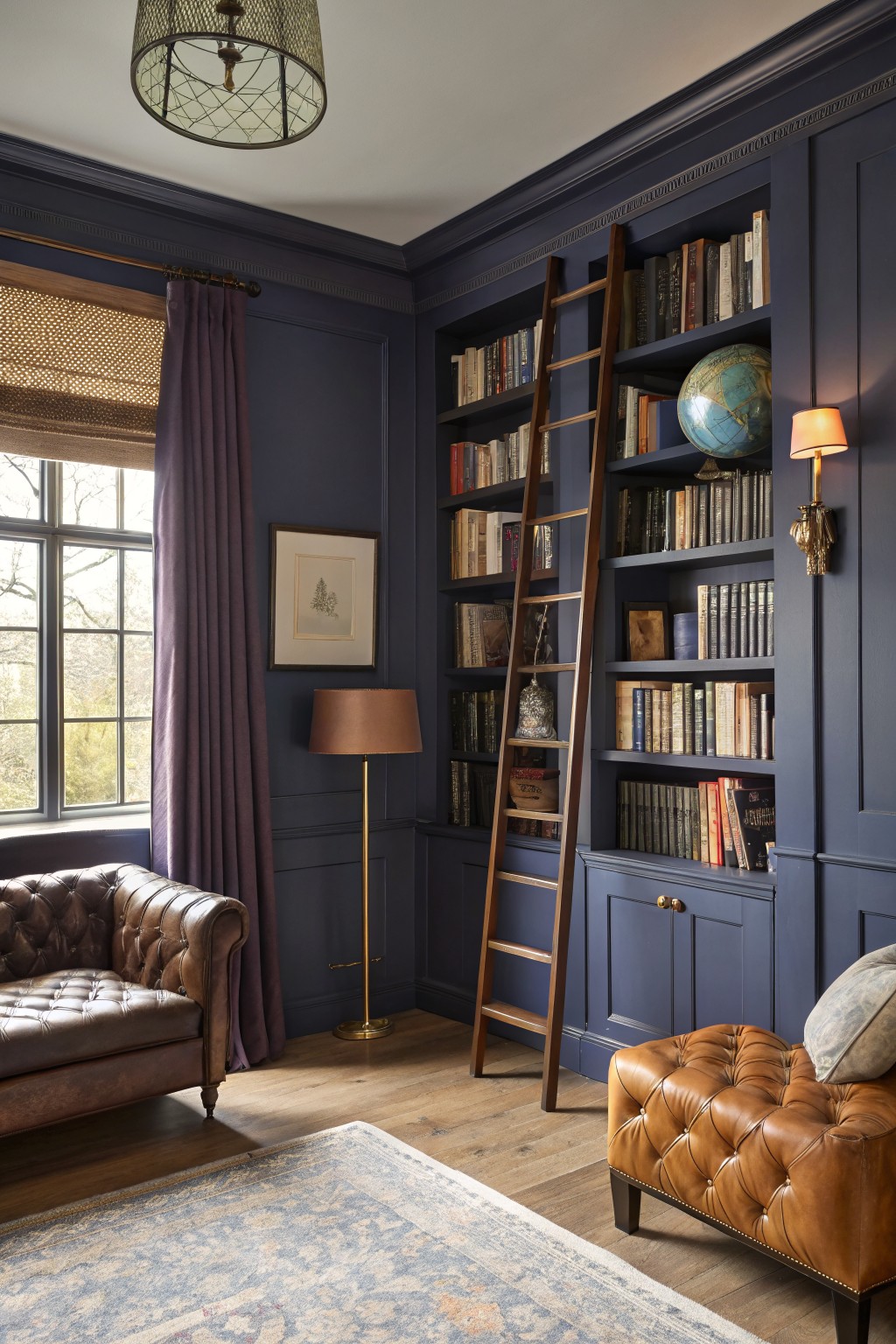
This deep navy has a saturated, slightly cool feel that still reads warm enough to feel inviting. It works well on paneled walls because the depth adds quiet drama without overpowering the room. You see similar tones in shades like Sherwin Williams Naval, Benjamin Moore Hale Navy, or Behr Midnight in Manhattan.
The color sits nicely next to the warm wood tones in the furniture and floor. It looks best when the room gets decent daylight, and it pairs easily with linen, cream textiles, or brass accents to keep the space from feeling heavy.
Soft Mint Green Walls
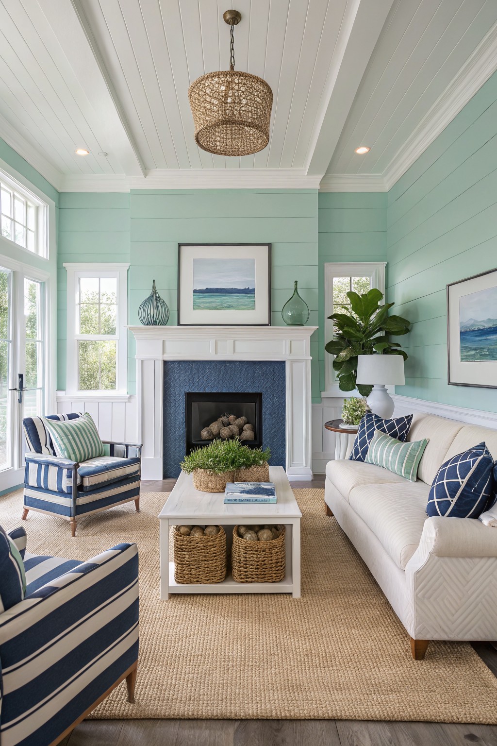
A soft mint green like this one gives a room a light and airy feel without going too cool or stark. It leans slightly blue in the undertone, which keeps it from reading too yellow or muddy in different lights. Shades such as Benjamin Moore Palladian Blue, Sherwin Williams Sea Salt, or Behr Coastal Mist sit close to this color.
The pale tone works best in spaces that get steady daylight, where it can stay fresh next to white trim and simple wood floors. It pairs nicely with deeper blues or soft neutrals so the green stays calm rather than sweet.
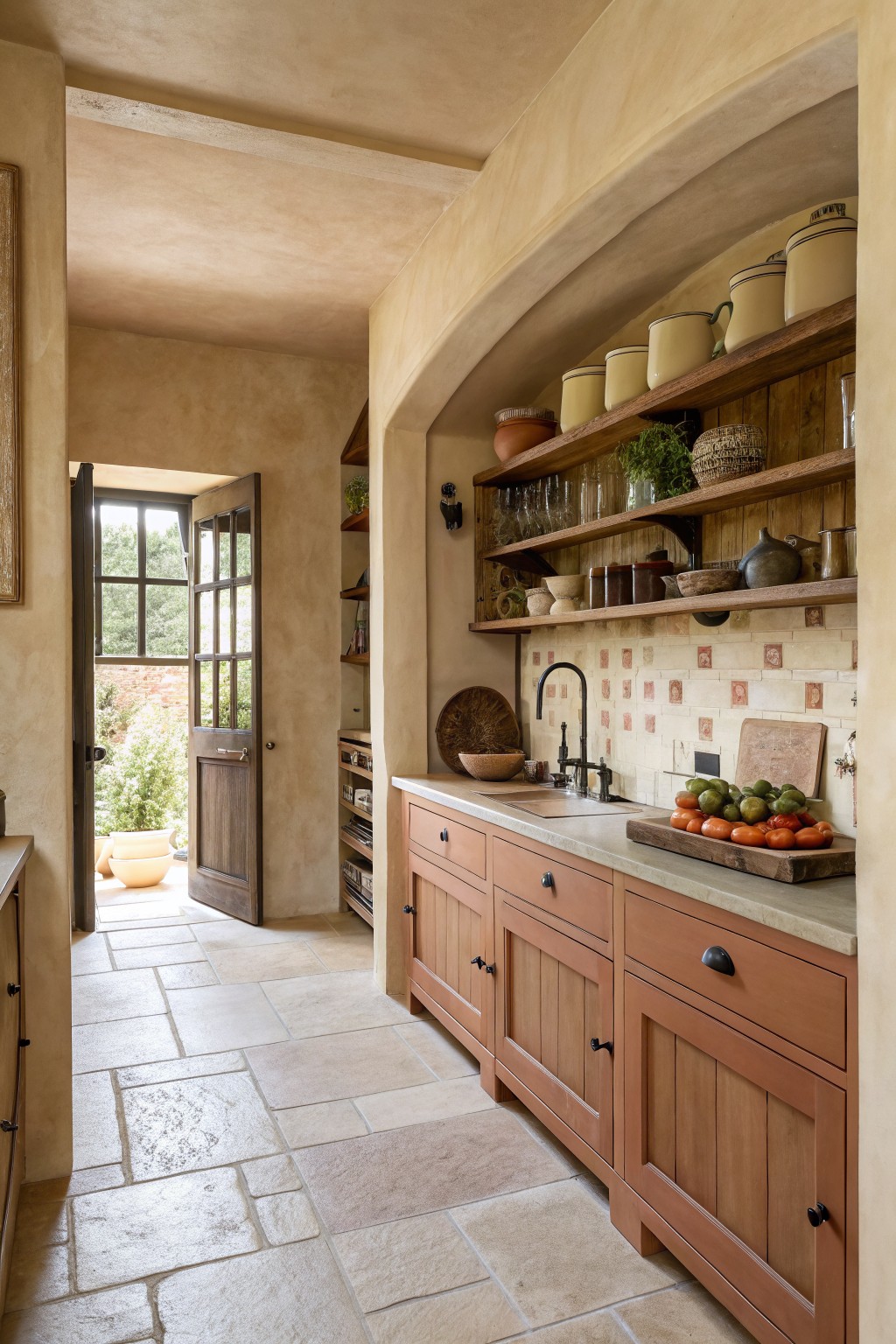
Sage Green Cabinetry
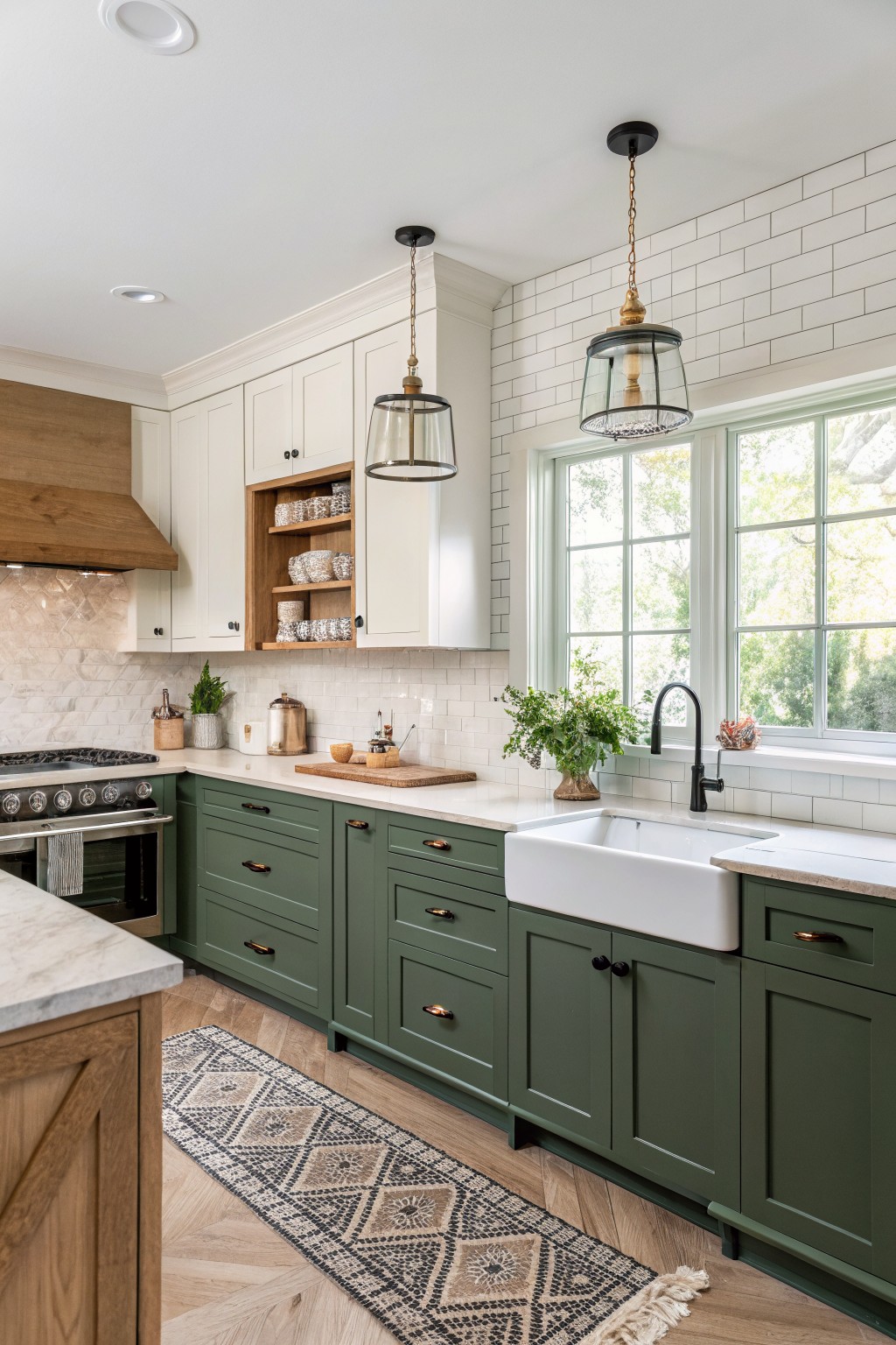
This muted sage green on the lower cabinets gives the kitchen a calm, steady feel without going too dark or too bright. It has that soft earthy quality that sits between gray and green. You see similar shades in Sherwin Williams Evergreen Fog, Benjamin Moore Saybrook Sage, or Behr Eucalyptus.
The gray undertone helps it sit nicely next to the white tile and wood tones. It works best in kitchens with decent natural light and pairs easily with warm wood floors or simple black hardware.
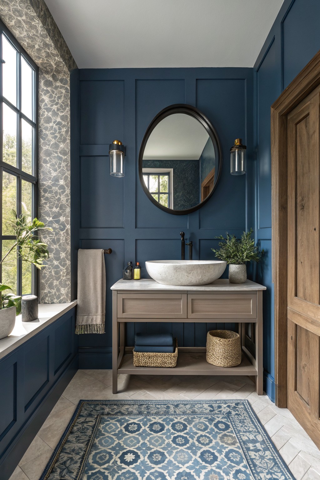
This deep navy blue on the walls brings a steady, enclosed feel to a bathroom. It is a cool, saturated color that holds its depth without turning flat, and it works well when you want the room to feel a little more private.
The color sits close to Benjamin Moore Hale Navy or Sherwin Williams Naval. It pairs nicely with warm wood vanities and stone counters, though it can feel heavy if the room has very little natural light.
Deep Plum Walls
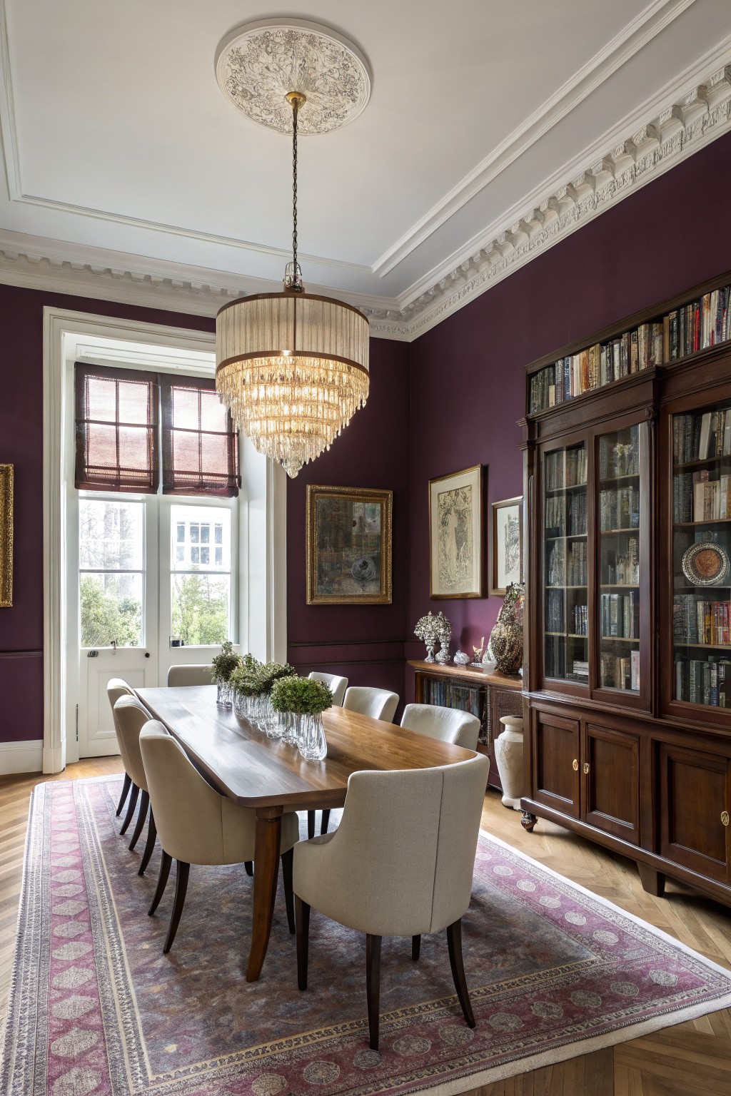
This deep plum works well when you want walls that feel rich without going full black. It is a saturated purple with a slight red undertone that keeps the room from feeling cold even in lower light.
The color sits nicely against white trim and brings out the warmth in wood furniture and cabinetry. It works best in dining rooms or studies where you already have some darker wood pieces, though it can feel heavy if the room gets very little natural light.
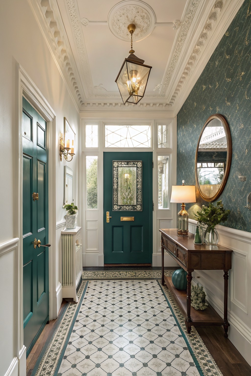
Soft Greige Walls

This soft greige is a warm light neutral that sits right between gray and beige. It gives walls a calm base without feeling flat or too stark next to white trim.
The color works best in hallways and entry areas where light changes during the day. Pair it with wood tones and simple white details so the space stays relaxed and easy to live with.
Deep Teal Walls
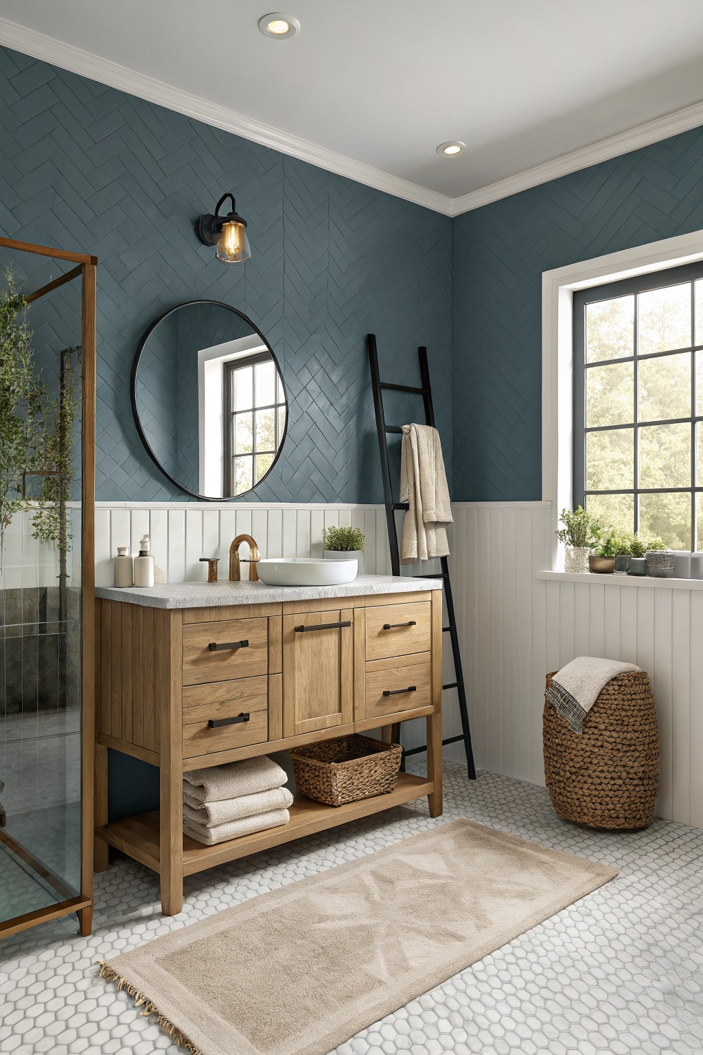
This deep teal brings a cool, steady feel to the room. It sits somewhere between blue and green without leaning too far either way. The color looks close to Sherwin Williams Rainstorm, Benjamin Moore Aegean Teal, Behr Deep Sea Dive, or Farrow & Ball Inchyra Blue. People often reach for shades like this when they want something bolder than gray but still calm enough for daily use.
It pairs well with white wainscoting and warm wood tones like the vanity here. The depth helps the space feel grounded, though it can read darker in low light so test a sample first. Keep the trim crisp and add simple black or brass hardware to let the teal stay the main focus.
Deep Teal Walls
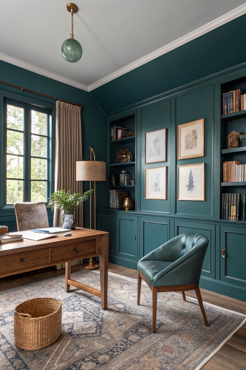
A deep teal brings a lot of presence to a room without feeling overwhelming. This color sits right between green and blue, giving it a rich look that works especially well on walls with built-ins or paneling. It pairs easily with wood furniture and keeps the space feeling cozy rather than dark.
The undertone leans slightly green, which shows more in natural light. It suits home offices or libraries where you want some depth but still need the room to feel usable. Pair it with warm wood tones and avoid anything too cool or stark for the trim.
Warm Terracotta Walls
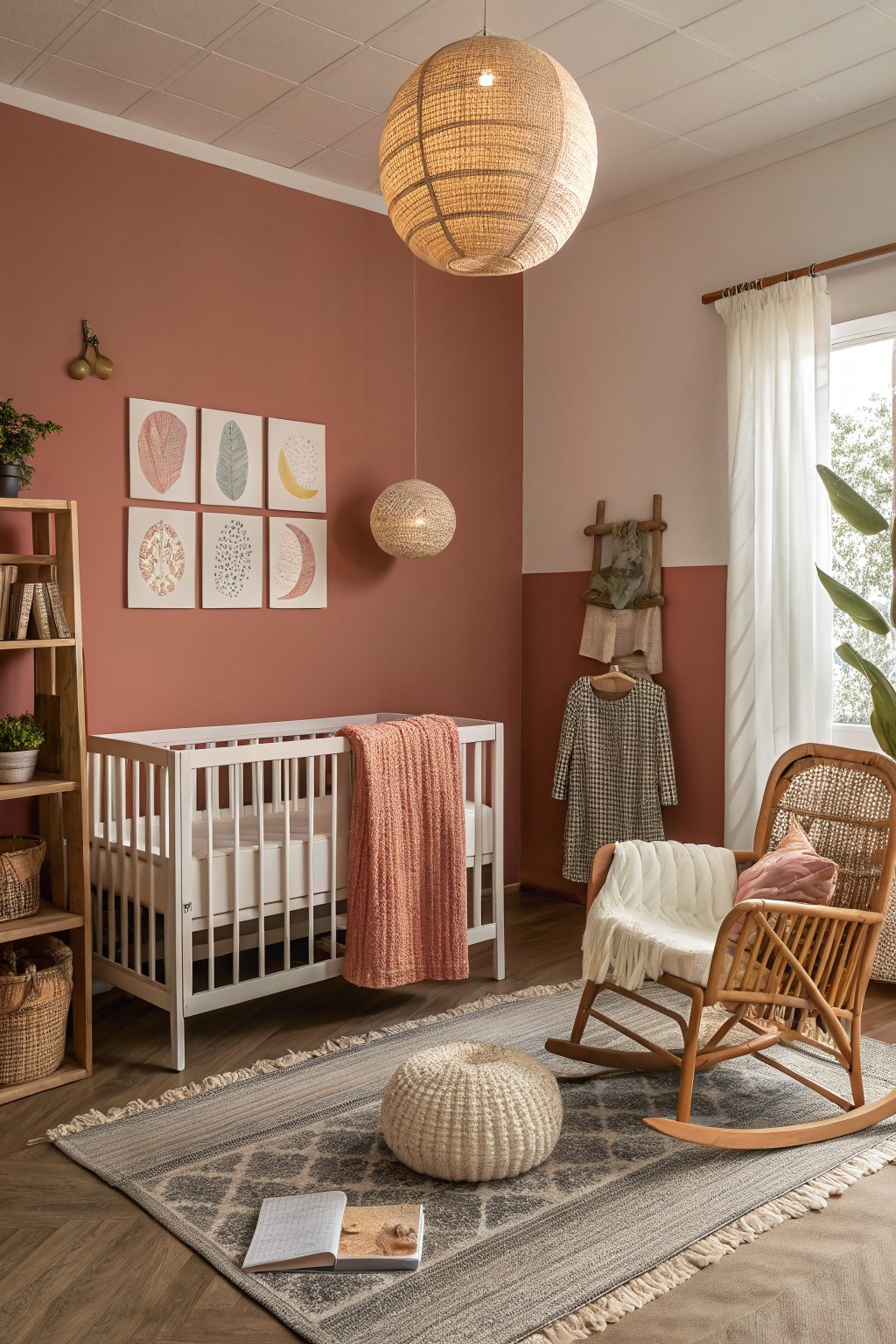
This warm terracotta is a soft clay color that brings a grounded feel to the room without making it feel heavy. It works because it has enough warmth to pair easily with wood floors and natural textures while still adding some depth to the space.
It sits on the warmer side with gentle orange undertones that show up more in the afternoon light. It looks good with white trim and simple wood furniture, though it can feel a bit flat if the room gets very little natural light.
Cool Gray Walls
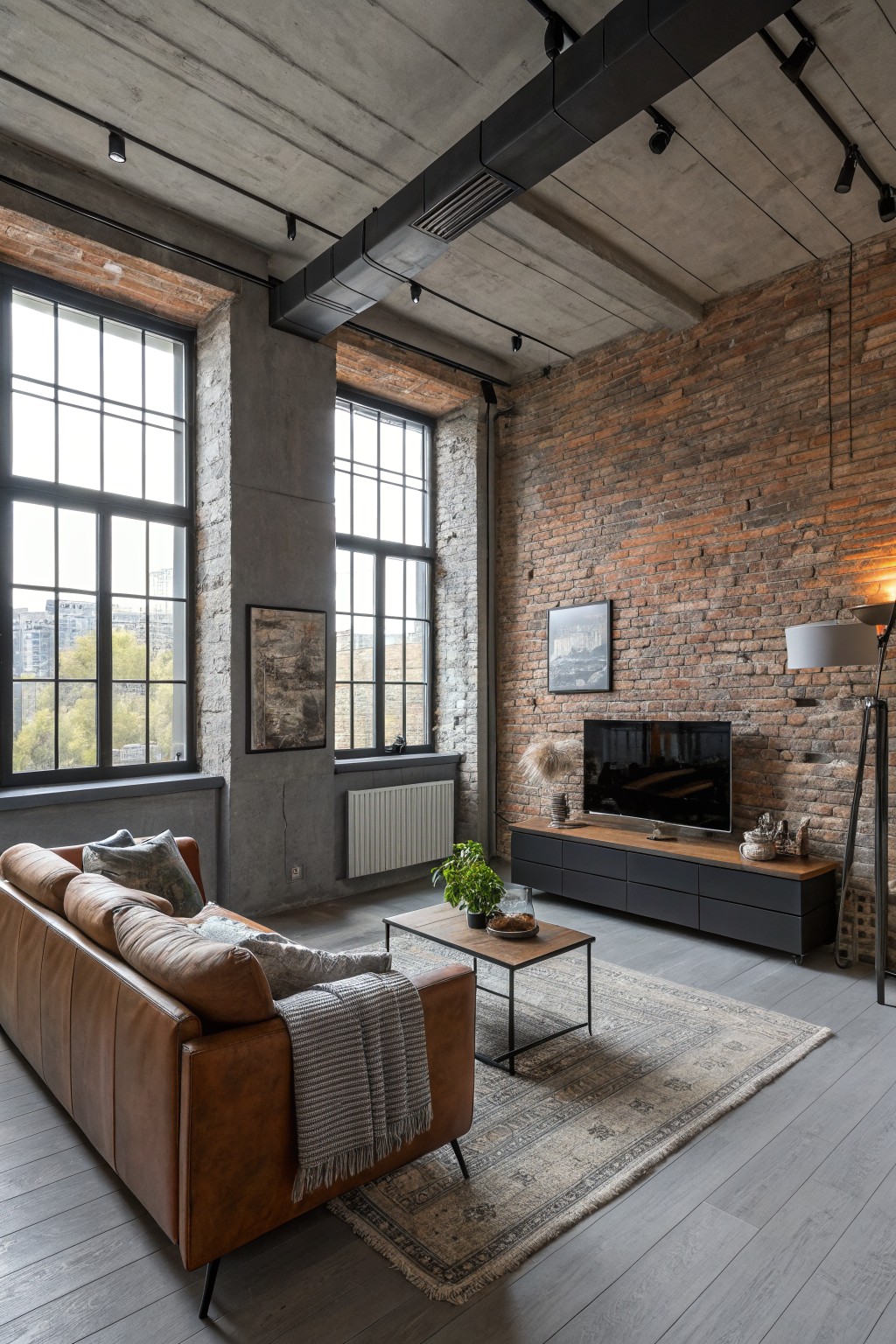
This living room uses a cool gray on the main concrete walls. It is a medium-toned gray with a slight blue cast that feels steady and modern next to the brick.
The color stays calm in bright light and works best with warm wood or leather pieces. It suits open spaces that already have texture from brick or metal, and it can start to feel flat if the room lacks any warm accents.
Olive Green Walls
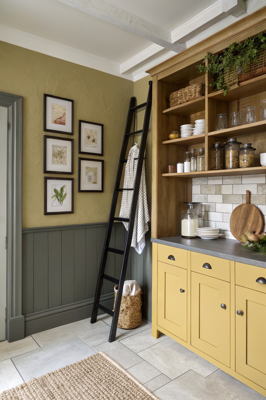
This muted olive green feels earthy and calm at the same time. It sits in that soft green family that leans a little warm, which helps it feel cozy rather than stark in a space with wood and stone around.
The color has a gentle yellow undertone that plays well with gray trim and natural wood tones. It works best in rooms that get decent daylight, and it pairs nicely with both painted cabinetry and open wood shelving without competing too much.
Soft Blue-Gray Walls
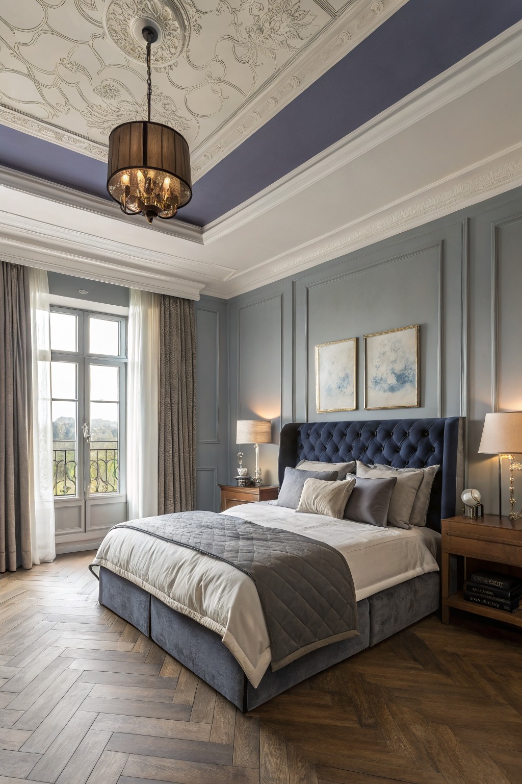
A soft blue-gray on the walls brings a calm but steady presence to a bedroom. It sits right between gray and blue, so it adds some color without turning the room cold or too bright.
This shade works best with warm wood floors and deeper navy pieces like a tufted headboard. It reads closest to Sherwin Williams Silver Strand, Benjamin Moore Wythe Blue, or Farrow & Ball Blue Gray. Watch the lighting though, since the cool undertone can lean a little more gray in low light.
Sage Green and Pale Yellow Walls
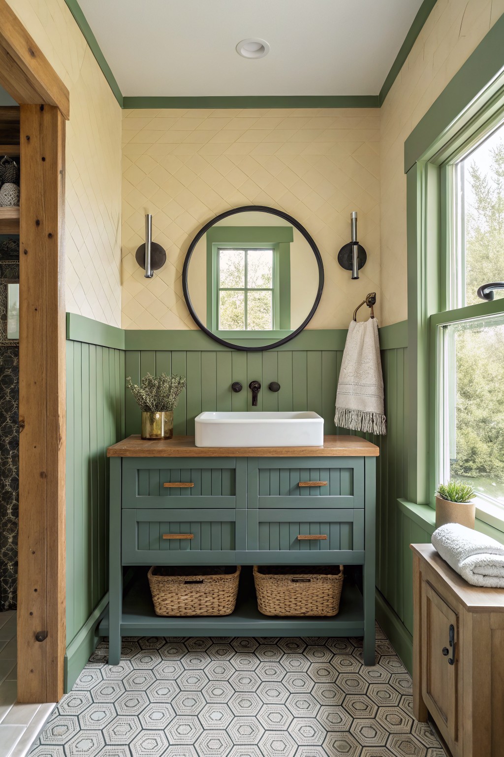
A soft sage green on the lower walls paired with a warm pale yellow above makes for a simple but effective two-tone look in a bathroom. This kind of muted green feels calm and a little earthy without turning heavy, and the yellow keeps the space from feeling closed in. It works especially well with wood tones and natural light.
The green carries a slight blue undertone that helps it sit nicely next to the wood vanity and patterned floor. Try it in smaller rooms where you want some color but still need the space to feel open. Good matches for the green would be something like Sherwin Williams Evergreen Fog or Benjamin Moore Saybrook Sage, while the yellow sits close to Farrow & Ball Hay or Behr Pale Sunshine.
Warm Mustard Yellow Walls
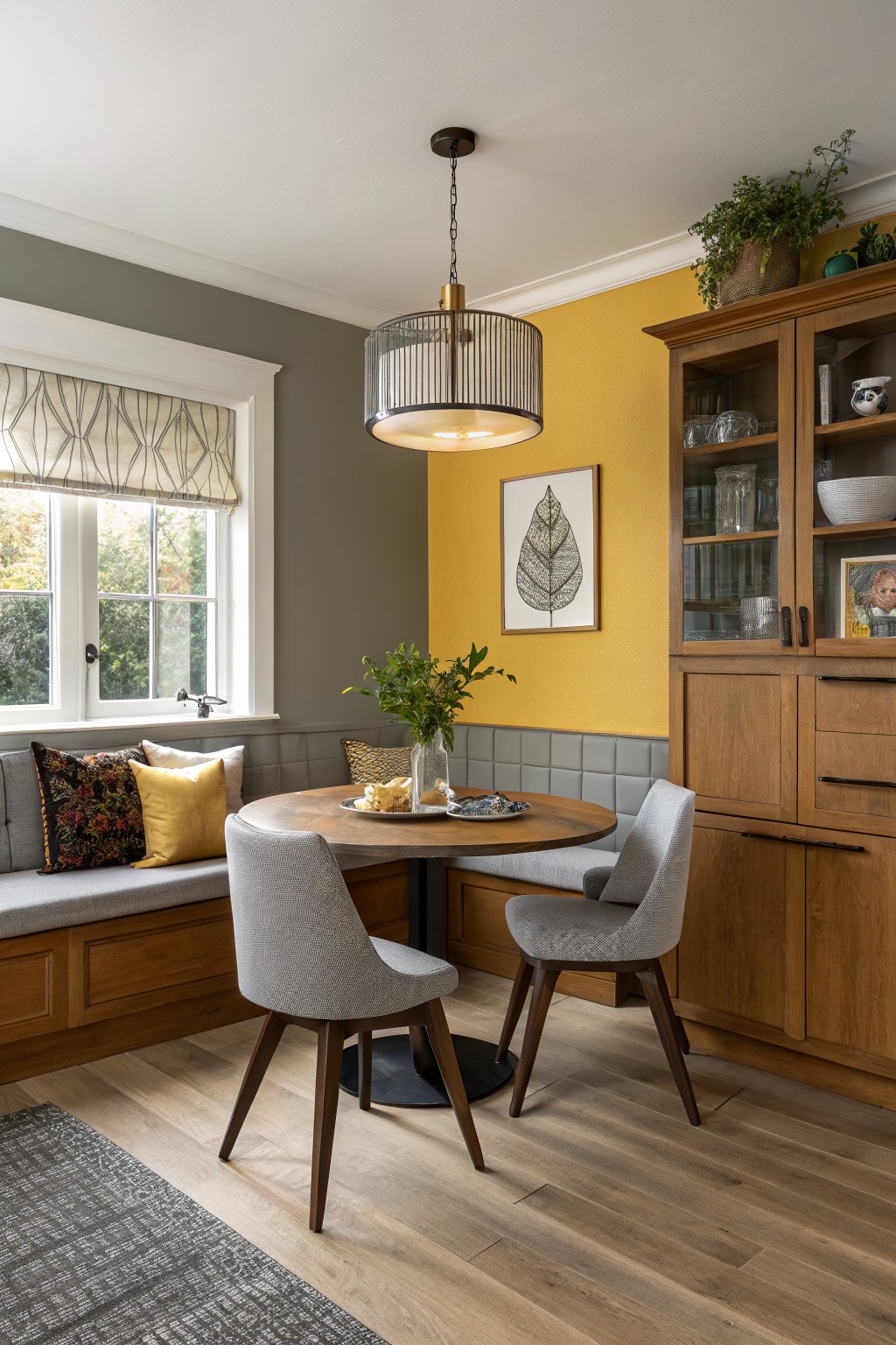
A warm mustard yellow brings a lively but grounded feel to an accent wall. This shade sits nicely between bold and cozy, which is why it works well in dining areas or breakfast nooks where you want a bit of energy without going too bright.
The color has a soft golden undertone that plays nicely with wood cabinetry and gray paneling. It holds up well in rooms with mixed lighting and pairs best with natural wood tones or muted neutrals so the yellow stays the main focus.
Deep Blue Gray Built-Ins
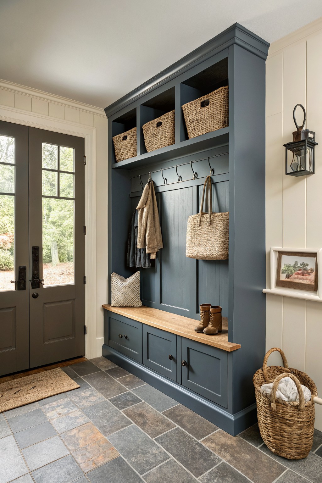
A deep blue gray on built-in storage gives an entry or mudroom a solid, grounded look. This color sits right between navy and charcoal, and it holds its own next to lighter walls and warm wood without feeling heavy.
It has cool undertones that work best with natural wood tones and soft neutrals. Try it on cabinetry or lockers in high-traffic spots, and pair it with white trim or a light ceiling so the room stays balanced.
Deep teal walls
A deep teal brings real presence to an entry or hallway without turning it heavy. This color family sits between green and blue, giving the space a grounded feel that still reads fresh next to white trim and warm wood tones. Closest matches include Farrow & Ball Inchyra Blue, Benjamin Moore Dark Teal, Sherwin Williams Cascade Green, and Behr Deep Sea.
The undertone leans slightly cool, so it can shift toward blue or green depending on the light in the room. It pairs easily with brass hardware and natural wood pieces, but it helps to test a sample first because the finish can look richer once the walls are fully covered.
Soft teal green cabinetry
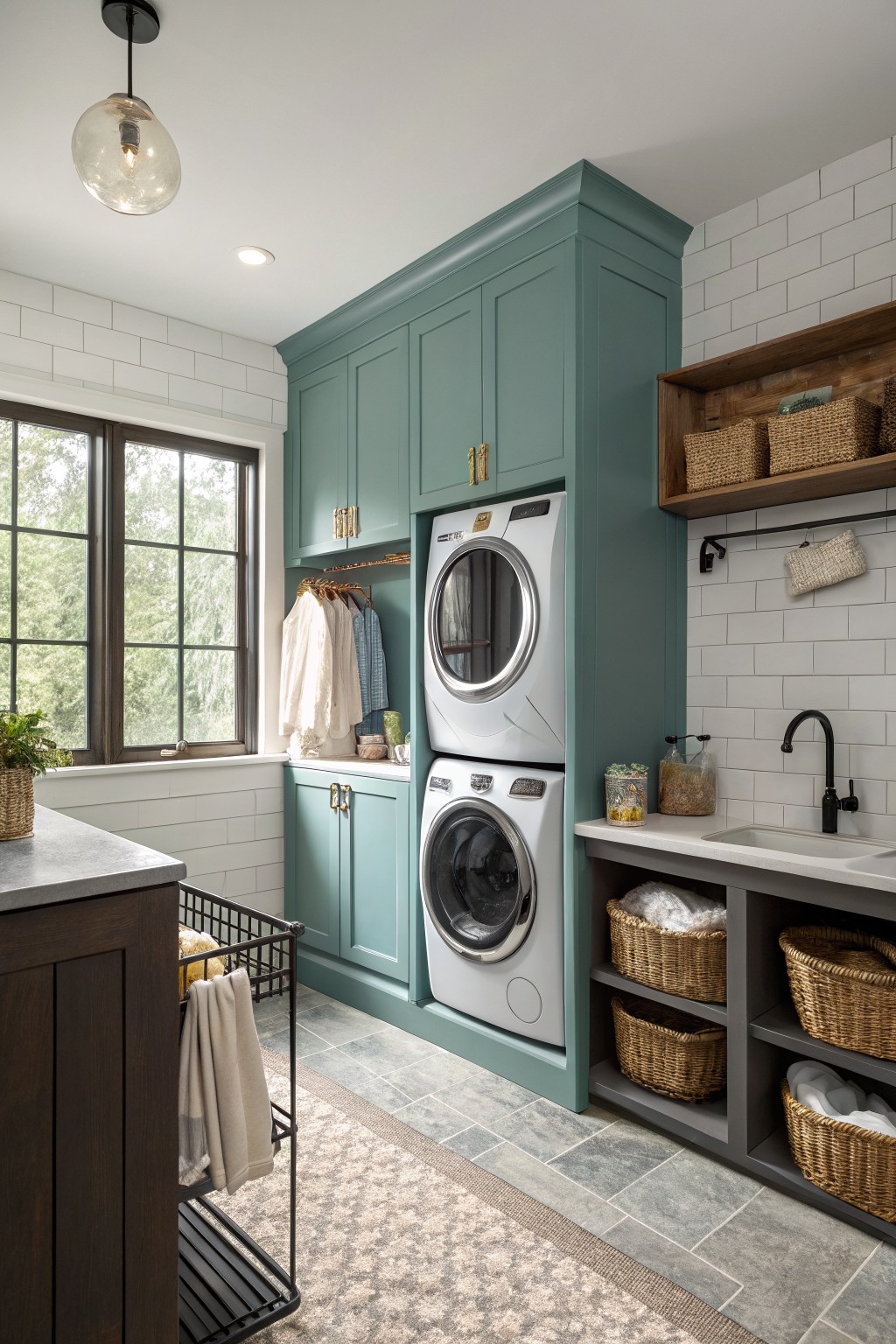
A soft teal green on cabinetry brings a calm note into utility spaces without making them feel busy. This shade sits right between blue and green so it reads fresh but still grounded next to white tile and wood tones.
It works best in rooms with decent natural light where the subtle gray undertone can show through. Pair it with simple white trim and natural wood accents and it stays easy to live with over time.
A deep navy blue works really well on walls when you want something bold that still feels grounded. This shade has a rich, saturated tone that gives the room weight without turning it too dark. It reads closest to Sherwin Williams Naval, Benjamin Moore Hale Navy, or Farrow & Ball Hague Blue.
The color sits nicely against warm wood tones and leather, so it suits libraries or studies where you already have natural materials. It can feel a little cool in low light, so most people pair it with brass accents or plenty of wood to keep the space from going flat.
Soft Sage Green Walls
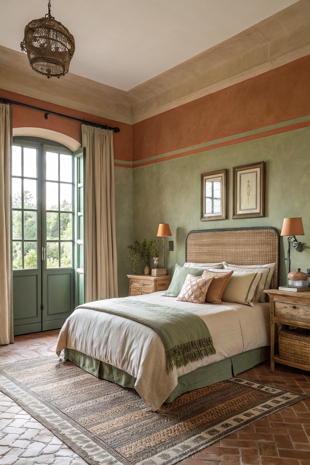
This muted sage green on the walls has a warm, earthy feel that works well in bedrooms. It sits somewhere between green and gray, so it feels calm without turning dull. The color pairs nicely with the terracotta band running above it and brings out the wood tones in the floor and furniture.
It tends to look a little different depending on the light, so test it in both morning and afternoon if you can. Stick with natural textures like linen and simple wood pieces to keep the room from feeling too heavy.
Teal Paneling Along The Stairs
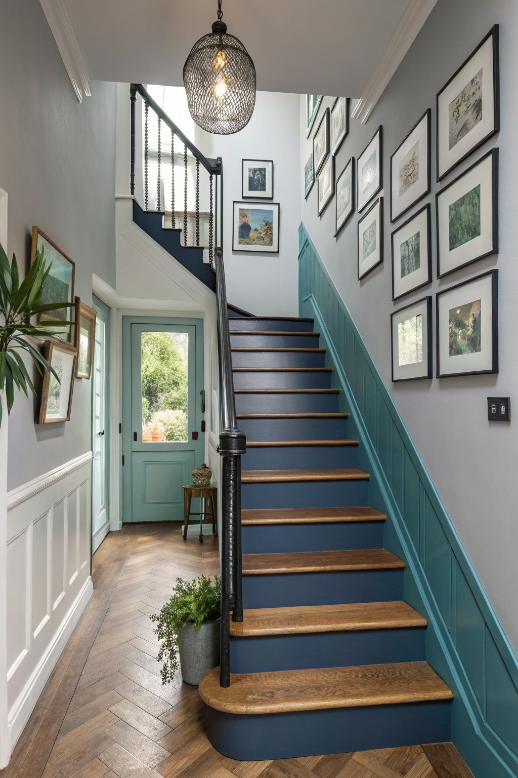
A teal like this works well in a stairwell because it adds color without making the space feel closed in. It sits right between blue and green, which helps it blend with wood tones and lighter walls above.
This shade has a soft blue undertone that shows up more when light hits it from the side. It looks good with natural wood stairs and floors, and it suits older homes or any spot where you want a bit of color but still need it to feel calm.
Warm Beige Kitchen Walls
A warm beige like this gives the room a soft, grounded feel without making the space look flat. It works well with wood tones and stone because the color has a gentle yellow undertone that keeps everything feeling natural and lived in. Colors in this family read closest to Sherwin Williams Biscuit, Benjamin Moore Manchester Tan, or Behr Toasted Barley.
It pairs easily with terracotta cabinets and tile because the beige stays neutral enough not to compete. Watch how the light hits it though, since the undertone can shift a bit warmer in the afternoon.
Deep Teal Blue Walls
This deep teal blue works well because it brings some color without making the room feel closed in. It sits nicely against white trim and light floors, giving the space a fresh but still grounded look. The color has a slight green undertone that keeps it from reading too cold.
It pairs easily with natural textures like wicker and light woods. In rooms with lots of windows it holds up nicely in daylight, though it can lean a little darker in the evening. Try it in sunrooms or spaces where you want a bit of color that still feels calm.
Deep charcoal accent walls
A deep charcoal gray on the back wall gives this bathroom real contrast while the side walls stay in a soft warm neutral. The color feels closest to Sherwin Williams Iron Ore or Benjamin Moore Kendall Charcoal, and it works because it stays dark without turning completely black.
The slight cool undertone shows up more under the overhead lights but still pairs cleanly with the wood shelf and stone floor. It suits small bathrooms or powder rooms where you want one strong wall without making the whole space feel closed in.
Soft Greige Walls
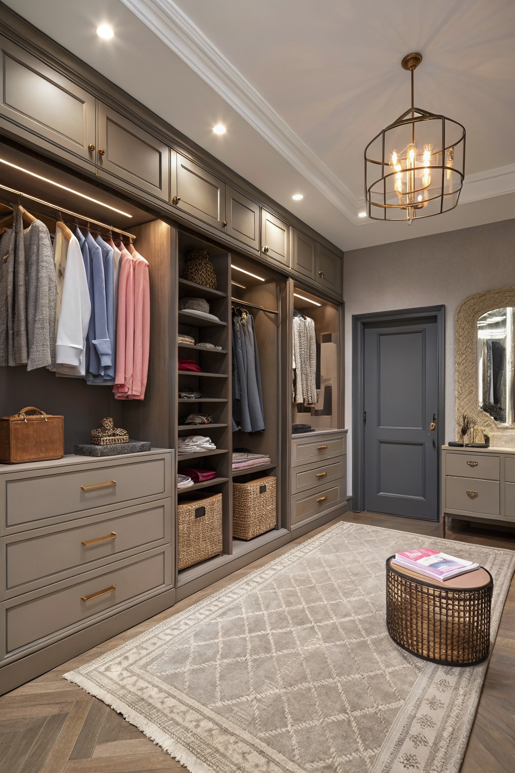
Greige is the color family here. It reads as a soft warm gray with a hint of beige, and it gives the room a calm neutral base that still feels a little grounded. This kind of shade works well when you want something that sits back and lets wood tones and built-ins stand out without competing.
It has a gentle warmth that keeps the space from feeling too stark next to the cabinetry and flooring. Greige like this pairs easily with brass accents or simple white trim, and it tends to look good in dressing rooms or bedrooms where the light stays fairly steady. Look for something close to Sherwin Williams Repose Gray, Benjamin Moore Edgecomb Gray, or Behr Agreeable Gray if you want to test the same feel.
Frequently Asked Questions
Q: How do I pick combos that add drama without shrinking my space?
A: Pick a deep base color for one wall and balance it with a lighter shade on the rest to keep things open. Try the pairing on a small section first so you see the real effect before you commit to the whole room.
Q: What works if I want bold colors but hate repainting every few years?
A: Go with richer tones on an accent wall only and save the lighter shades for bigger surfaces. This setup gives you the depth you want while making touch ups easier later.
Q: How do I handle tricky lighting that changes how the colors look?
A: Check your samples at morning and evening light to spot shifts early. Adjust by swapping in a slightly warmer or cooler shade until the pair feels right in your actual space.