I have noticed over the years that even a simple white or gray can shift once it meets the actual lighting in a room and sits next to existing trim or flooring.
When I bring home samples I always tape them up in a few different spots so I can watch how the color changes from morning sun to the warmer tones that appear after dinner.
Undertones matter more than the name on the can.
I tend to rule out anything that leans too pink or yellow in real conditions because those shifts become obvious the moment the furniture and rugs are back in place.
Testing a couple of the stronger options on larger patches has saved me from repainting after the fact.
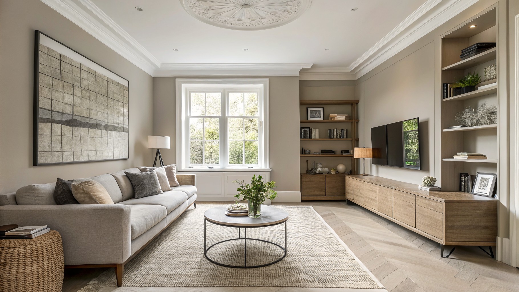
Warm Greige Walls
This warm greige sits right between gray and beige, with enough softness to feel calm but not washed out. It works well in rooms that already have wood floors and natural textures because it lets those elements stand out without fighting them.
The color has a light beige undertone that keeps it from turning cool or flat under daylight. It pairs easily with white trim and wood cabinetry, though it can look a little dull if the room gets very little natural light.
Soft Sage Green Walls
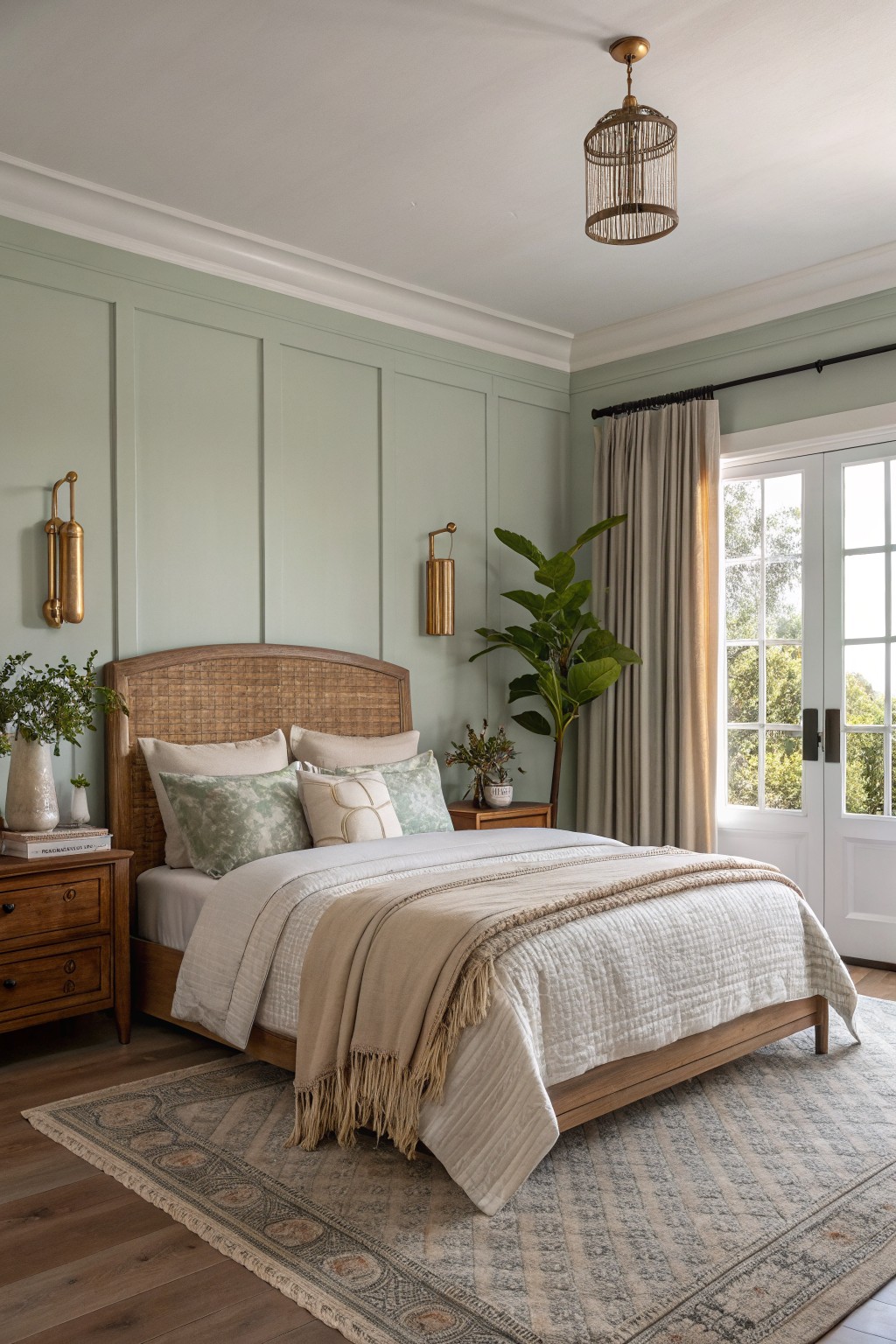
Soft sage green is the kind of color that brings a calm, natural feel into a bedroom without making the space feel dark. It sits somewhere between gray and green with just enough warmth to keep the room from looking cold. This shade works especially well when you want something a little different from plain white or beige but still easy to live with every day.
It pairs nicely with warm wood tones and white trim, which helps the green read a bit lighter during the day. If you try this color, look at options like Sherwin Williams Clary Sage, Benjamin Moore Soft Fern, or Behr Dried Thyme to find the right depth for your light.
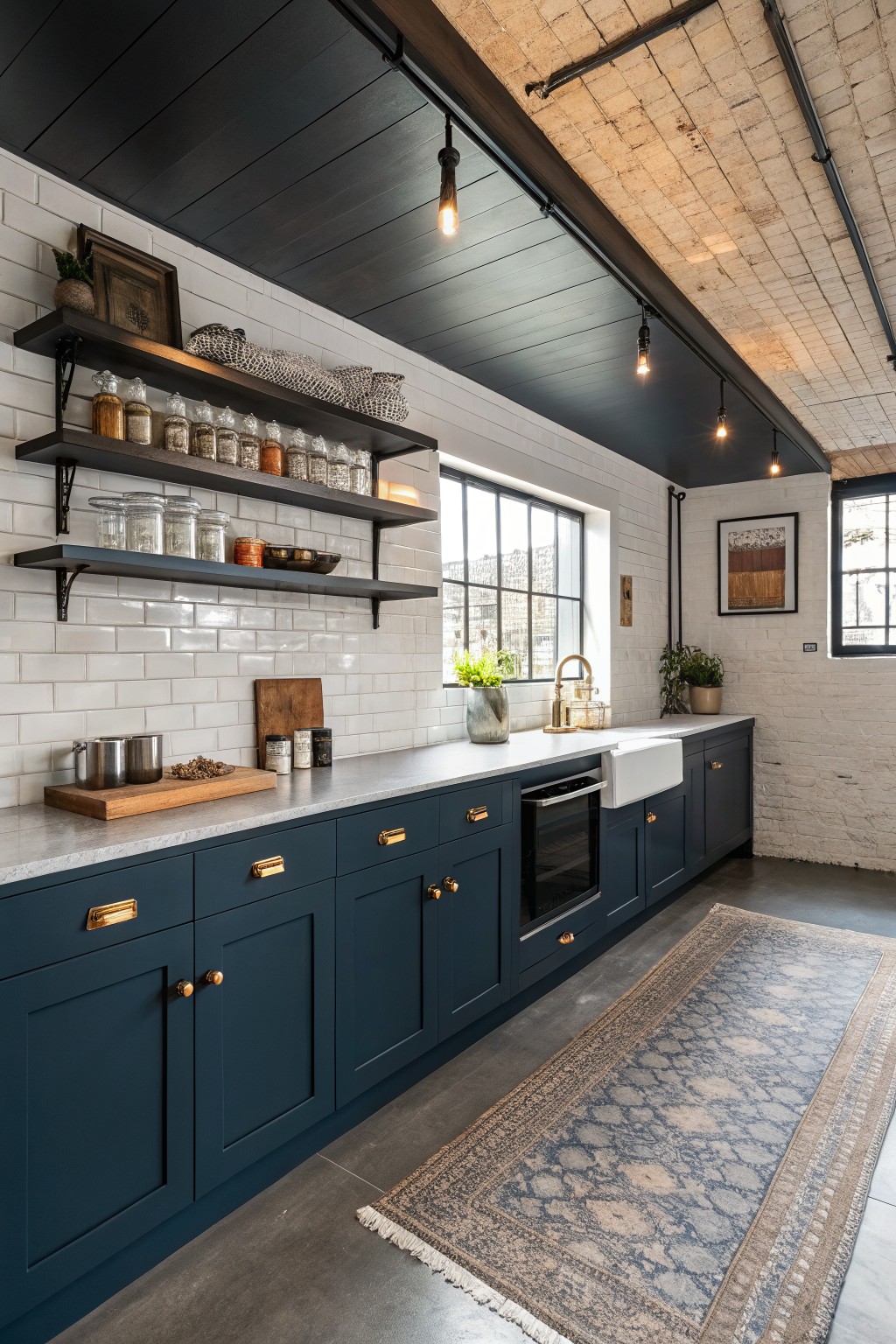
Warm Greige Cabinets
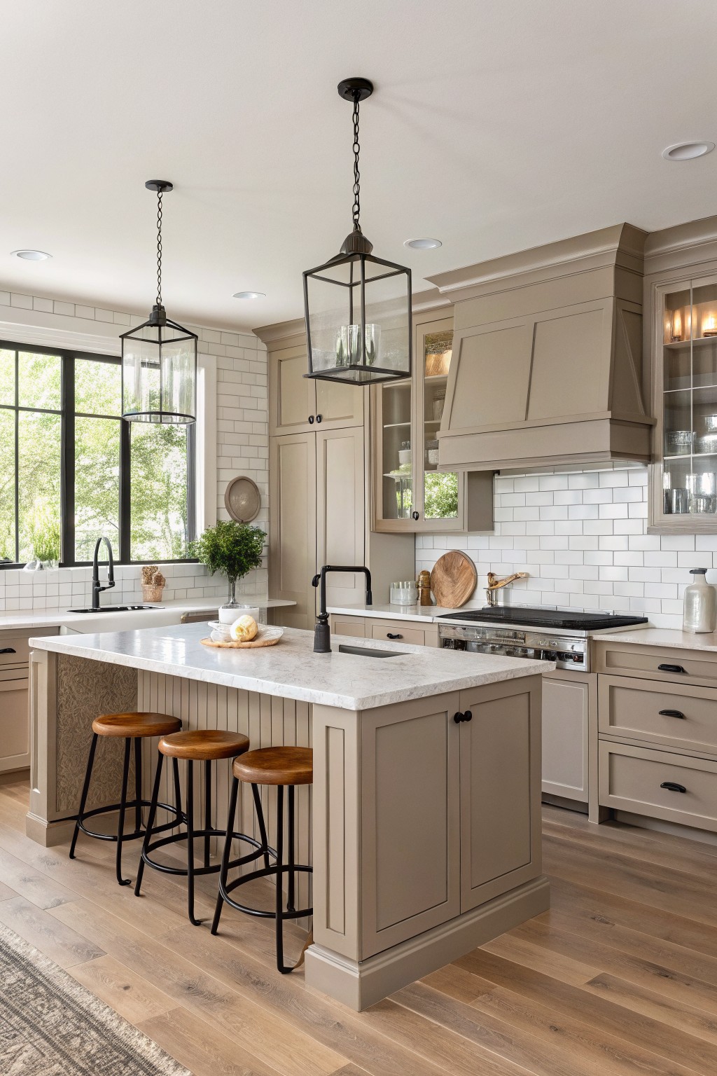
A warm greige on cabinets gives a kitchen that clean, settled look without going too gray or too beige. This one sits comfortably between the two and seems closest to Sherwin Williams Accessible Beige, Benjamin Moore Revere Pewter, or Behr Toasted Almond.
The soft undertone helps it stay calm next to white tile and wood floors. It works best in rooms with decent natural light and pairs nicely with black fixtures or simple wood tones.
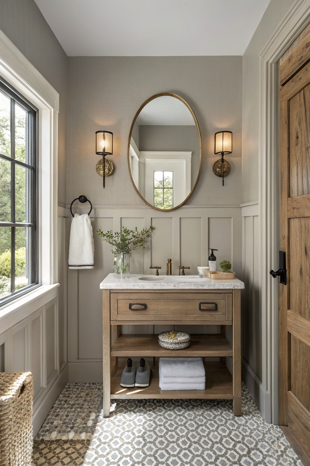
Warm Golden Beige Walls

This bathroom uses a warm golden beige on the walls. It has a soft yellow cast that keeps the space feeling light but still grounded, rather than stark or cold.
The color reads best with natural light and pairs easily with wood tones and stone. It works well with black fixtures too, though you want to watch the undertones if your lighting leans cool, since that can shift it toward a muddier look.
Soft Blue Gray Walls
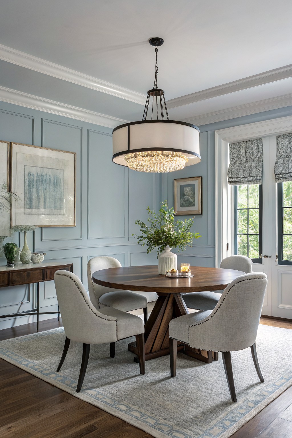
A soft blue gray like this one brings a calm feel to the room without making it feel cold or flat. It sits somewhere between blue and gray, so it reads gentle and a bit quiet. Colors in this range work well when you want something a little different from plain gray or white.
It has cool undertones that show up more in bright light, which is why it pairs nicely with warm wood tones and white trim. This kind of blue gray looks good in dining rooms or living spaces that get steady daylight. Try it with Benjamin Moore Palladian Blue, Sherwin Williams Rainwashed, Farrow & Ball Light Blue, or Behr Soft Cloud if you want a close match.
Soft Sage Green Walls
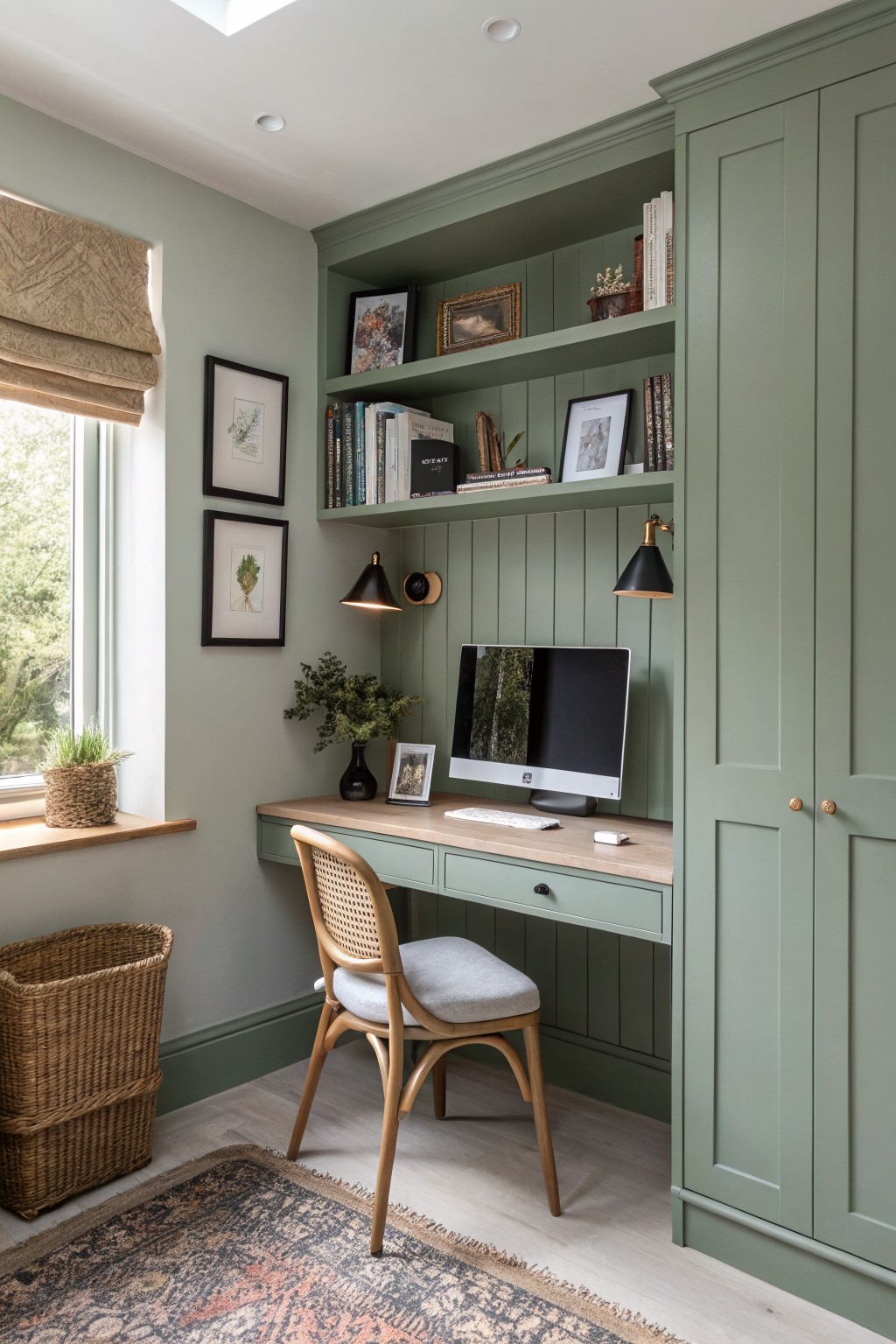
This soft sage green brings a calm feel to the room without making it feel flat. The color has a gentle gray undertone that keeps it from looking too bright or too earthy. It sits nicely next to warm wood tones and lighter flooring. Matches like Sherwin Williams Evergreen Fog or Benjamin Moore Saybrook Sage give a similar effect.
The green works best in spaces that get steady daylight since it can lean a bit cooler in low light. Pair it with natural wood furniture and simple textiles to keep the look relaxed and balanced. It suits small offices or built-in areas where you want something fresh but not stark.
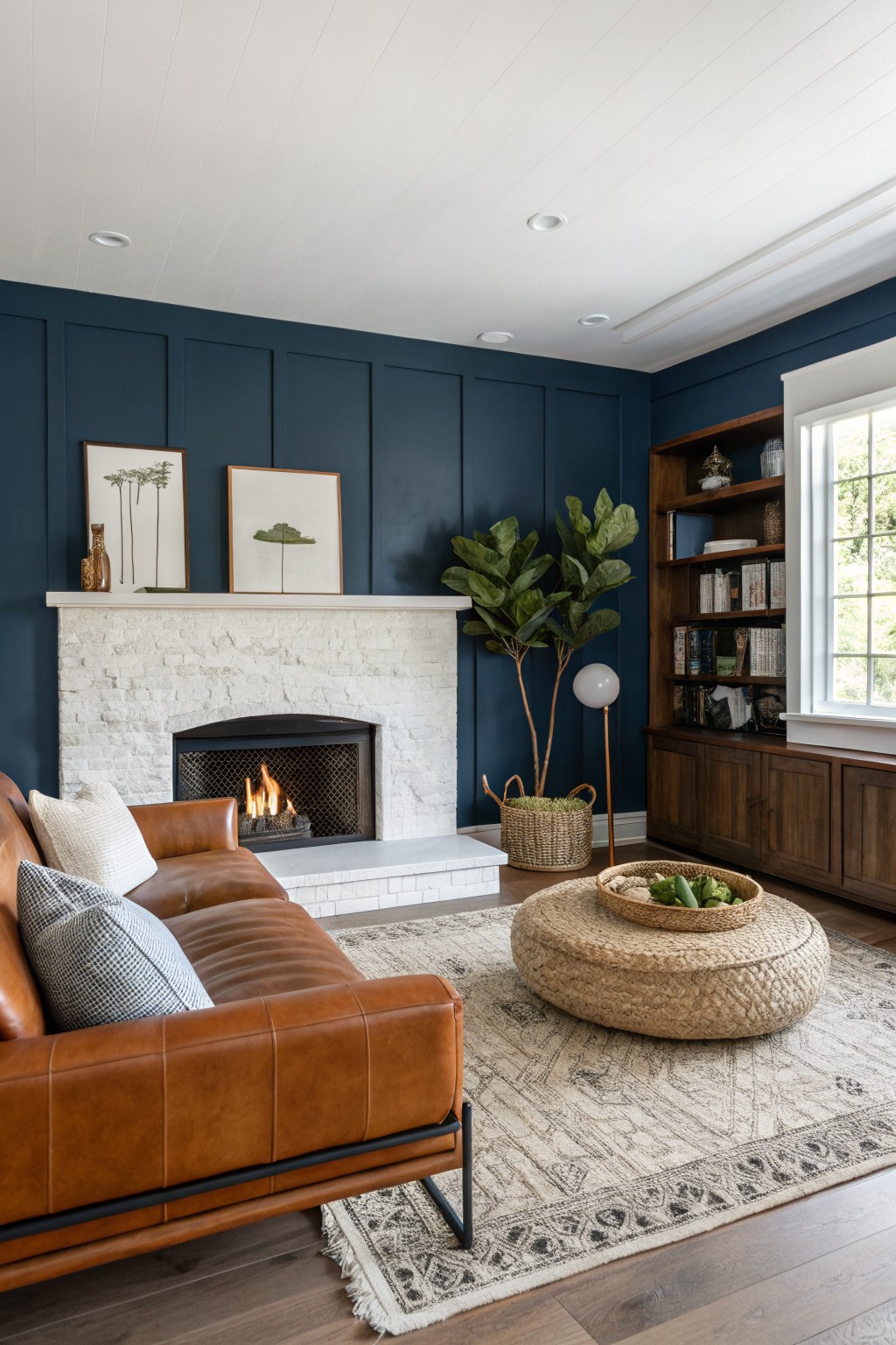
This deep navy blue is the kind of color that gives a room weight without making it feel heavy. It works well in living spaces because it reads as both modern and grounded, especially when paired with white trim and natural wood tones. Colors like this often sit close to Sherwin Williams Naval, Benjamin Moore Hale Navy, Behr Midnight Blue, or Farrow & Ball Hague Blue.
The tone has a slight cool lean that keeps the space feeling crisp rather than cozy. It pairs nicely with white ceilings and built-in wood shelving, though it can look flat if the lighting is too dim. Most people use it in rooms that already have some natural light and simple furnishings.
Soft Sage Green Built-Ins
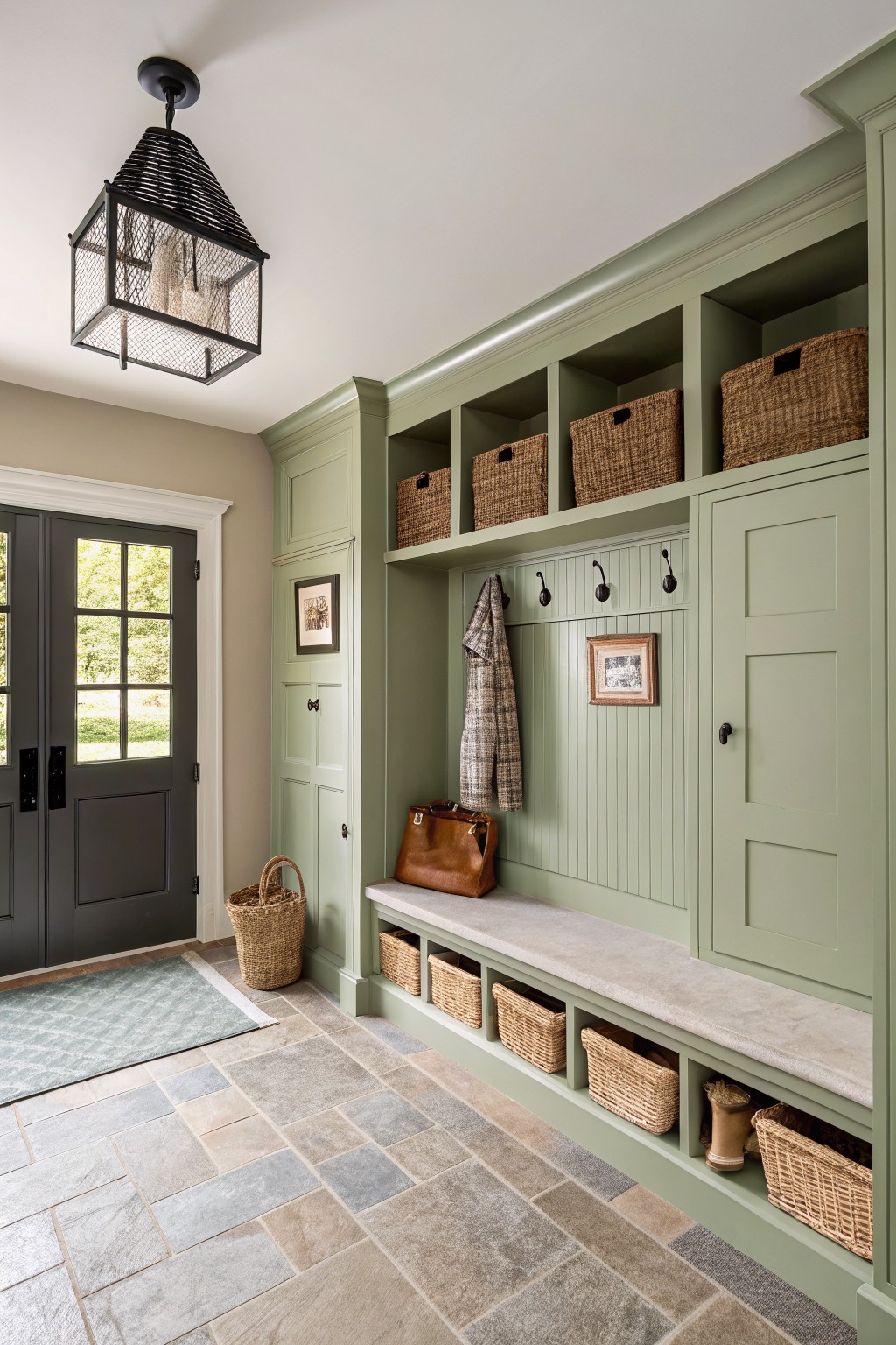
A soft sage green like this one brings a calm, natural tone to built-in storage without making the space feel heavy. It sits somewhere between gray and green, which helps it stay quiet and modern while still adding a bit of color to an entry or mudroom.
This shade works best with stone floors and wood tones nearby, and it pairs easily with black hooks or hardware. It can look a little cooler in low light, so it tends to do well in rooms that get steady daylight. Good matches from major lines include Sherwin Williams Clary Sage, Benjamin Moore Saybrook Sage, Behr Green Tea, and Farrow & Ball Lichen.
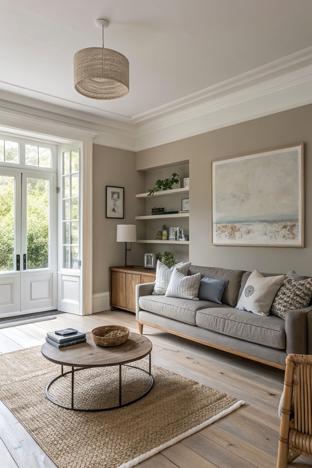
Soft Greige Walls
This soft greige gives the walls a quiet warmth that feels more inviting than a plain gray. It sits right between gray and beige, which helps the room feel calm and a little bit grounded without looking flat.
The color has a gentle warm undertone that plays nicely with wood tones and stone. It works best in bathrooms or small spaces where you want something neutral that still feels soft. Pair it with white trim and simple wood pieces to keep the look clean. Good matches include Sherwin Williams Agreeable Gray, Benjamin Moore Edgecomb Gray, and Behr’s Modern Gray.
Soft Blue Green Cabinets
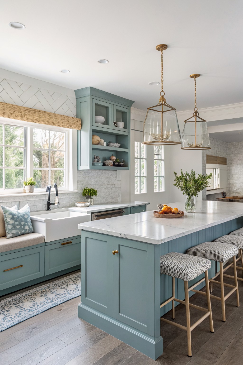
A soft blue green works nicely on kitchen cabinets. It gives the room a fresh look that still feels calm and livable. This shade sits somewhere between green and blue, which makes it flexible for lots of different styles. Colors like Sherwin Williams Rainwashed, Benjamin Moore Wythe Blue, or Farrow & Ball Pigeon all land close to it.
The cool undertone helps it blend with white counters and wood floors without looking stark. It works best in rooms with good natural light so the color stays soft instead of turning flat or gray.
Soft Blue Ceiling
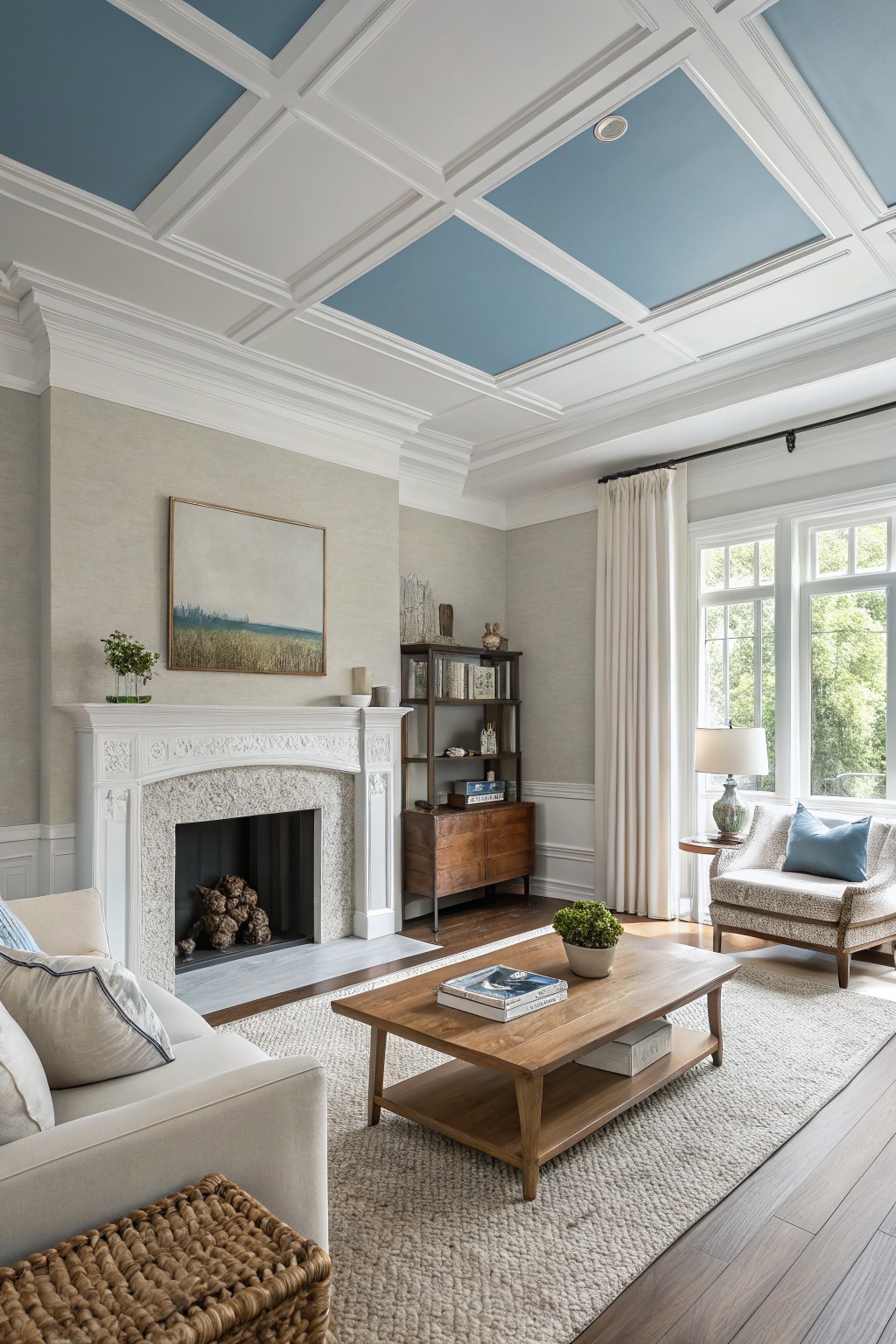
This ceiling is painted in a soft blue with cool undertones that keeps the room feeling open and calm. It is a muted shade that adds a touch of color without overpowering the space or clashing with the warm neutral walls below.
The blue reads best in rooms with steady natural light and pairs easily with white trim and wood tones. It seems closest to Sherwin Williams Rainwashed or Benjamin Moore Wythe Blue, and it works nicely in living rooms where you want something a little fresher than plain white overhead.
Soft Yellow Cabinetry
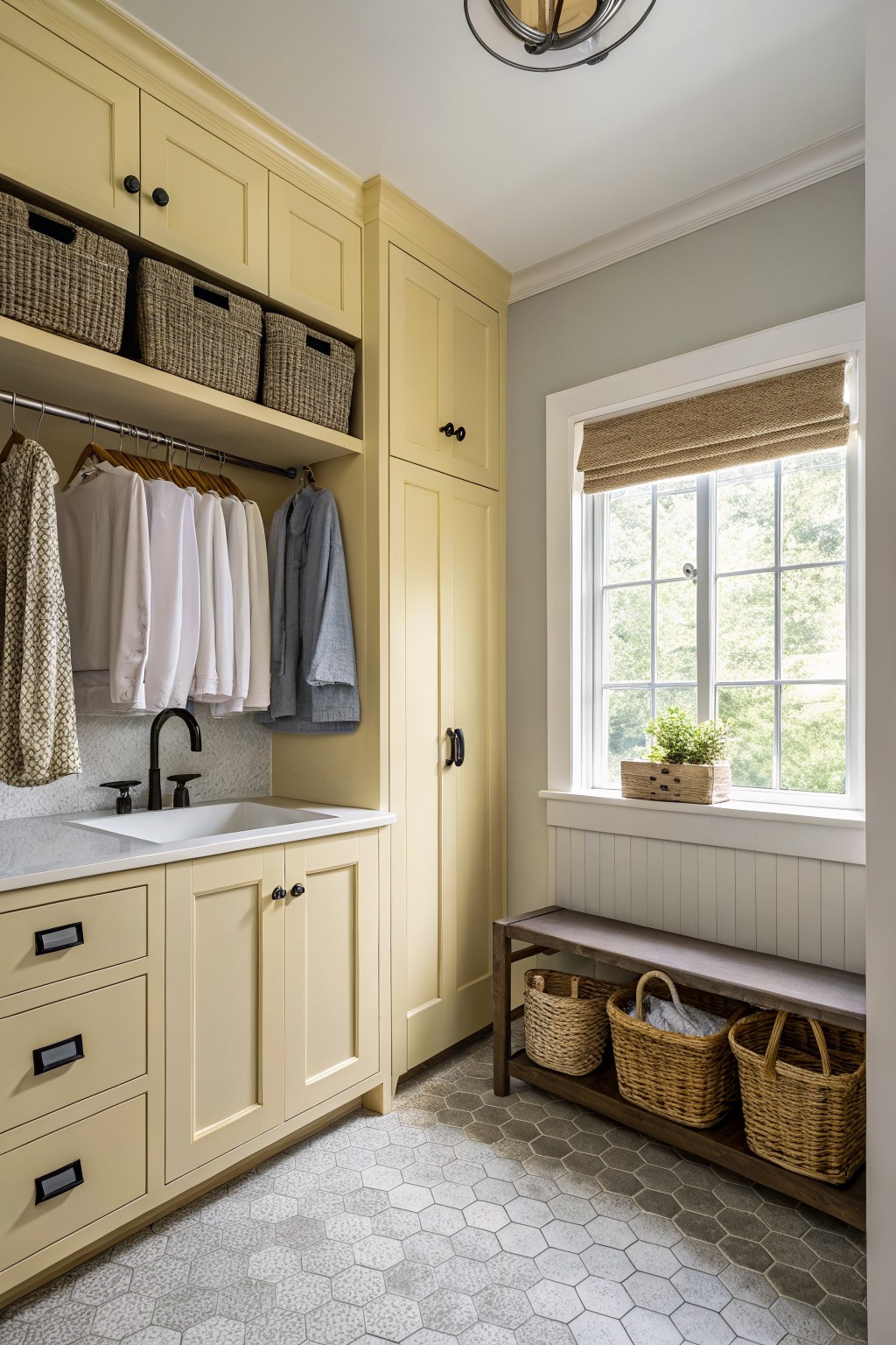
This soft butter yellow on the cabinetry gives the room a gentle warmth without feeling bold or overpowering. It is a pale, creamy shade that brightens the space while still reading as calm and clean.
The color has a light warm undertone that works well next to the cooler gray walls and the natural wood bench. It suits utility rooms or smaller spaces where you want a bit of cheer but still need the overall look to stay quiet and easy to live with. Pair it with simple white counters or soft gray tones to keep it balanced.
Soft Blue Gray Cabinetry

A soft blue gray on cabinetry gives a bedroom that clean and slightly elevated feel without trying too hard. This color sits somewhere between gray and blue, with cool undertones that keep it from feeling too heavy or too bright in a room with natural light.
It pairs nicely with warm wood tones like the exposed beam here and works well against softer textiles or pale flooring. Watch the lighting though, since it can lean more gray in low light and more blue when the sun hits it directly. Good options in this range include Sherwin Williams Rainwashed, Benjamin Moore Wythe Blue, or Farrow & Ball Blue Gray.
A deep navy works really well on cabinets when you want something stronger than gray but still clean and modern. This one sits somewhere between a true navy and a soft black, which helps it feel grounded next to the white tile and lighter counters without making the whole room feel heavy.
It has a cool undertone that reads crisp in good light, so it pairs nicely with warm wood tones or brass hardware. Just watch how it shifts in low light. It can look almost black in some rooms, so test a sample on the actual cabinet door before committing.
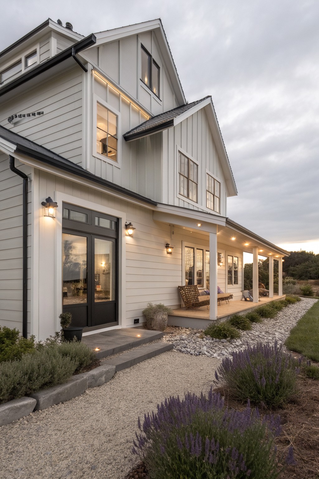
Soft White Siding
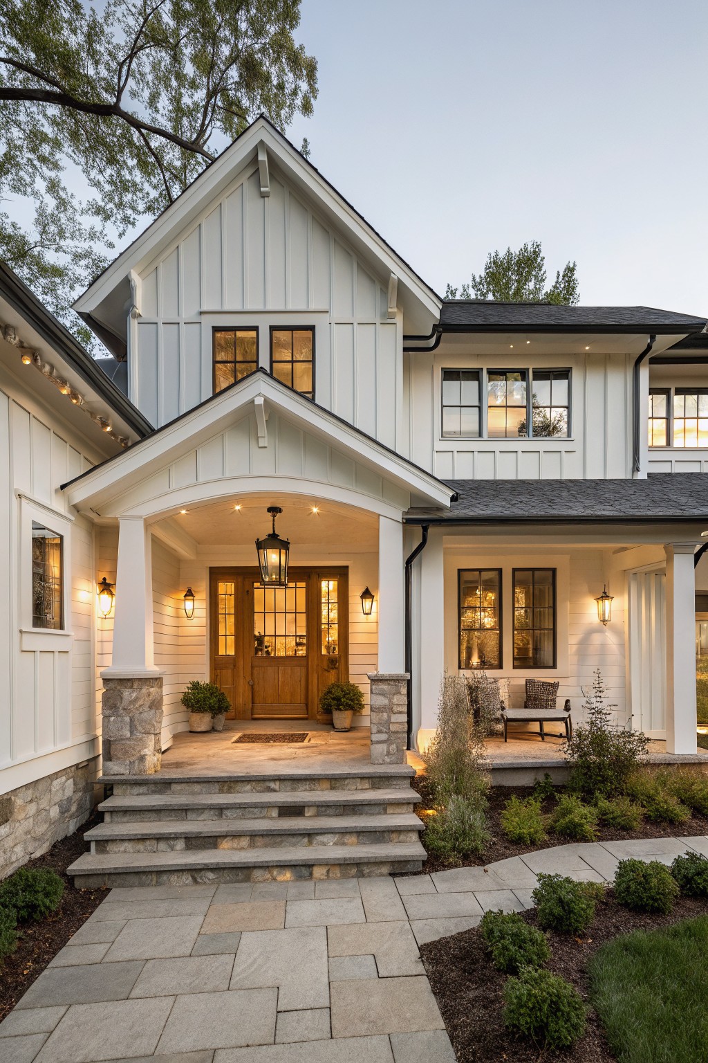
This soft white on the house siding gives a clean look that still feels warm and livable. It is a bright neutral with just enough depth to keep the exterior from feeling too stark or cold.
The color sits nicely next to wood tones and stone without fighting them. It works best on homes with dark roofs or natural accents and holds up well in full sun or shade.
Soft Sage Green Siding
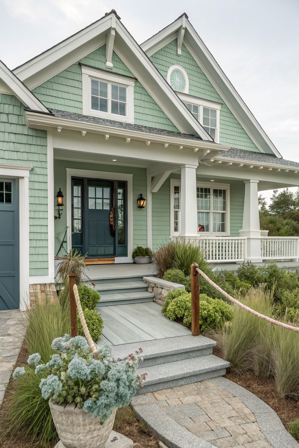
This soft sage green works well on exteriors because it feels calm and a little coastal without going too bright. The color family is a muted green with gray undertones, and it reads closest to Sherwin Williams Rainwashed, Benjamin Moore Saybrook Sage, Behr Aloe Vera, or Farrow & Ball Lichen.
It pairs nicely with white trim and stone details since the cool lean keeps the whole house looking clean. Watch how it shifts in different light though, since the gray side can look a bit flat if the house sits in deep shade all day.
Muted Blue Gray Siding
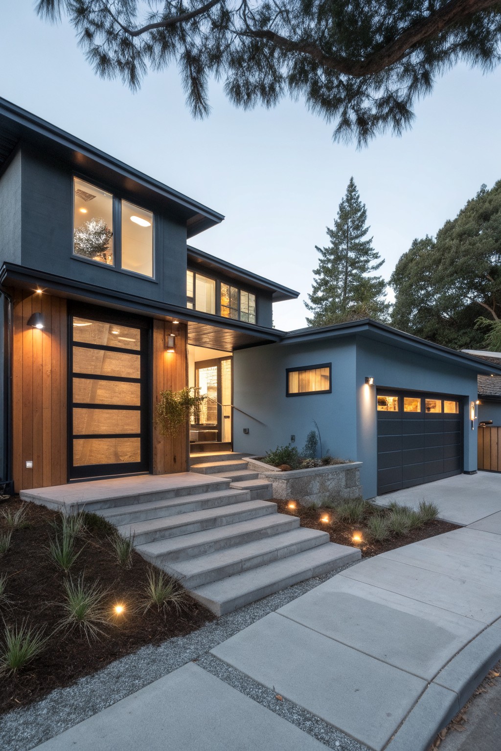
This muted blue gray on the house siding gives a clean, modern feel without looking too cold or stark. It reads as a soft blue gray that sits nicely between gray and blue, which helps the whole exterior look elevated but still approachable. Colors like this often work well on homes with simple shapes.
It has cool undertones that pair nicely with wood accents and darker doors or garage panels. This kind of blue gray tends to look best on homes with some natural texture nearby, like stone or wood, and it holds up well in different lighting. Watch that it does not pull too green in strong afternoon sun.
Soft Green Exterior Doors
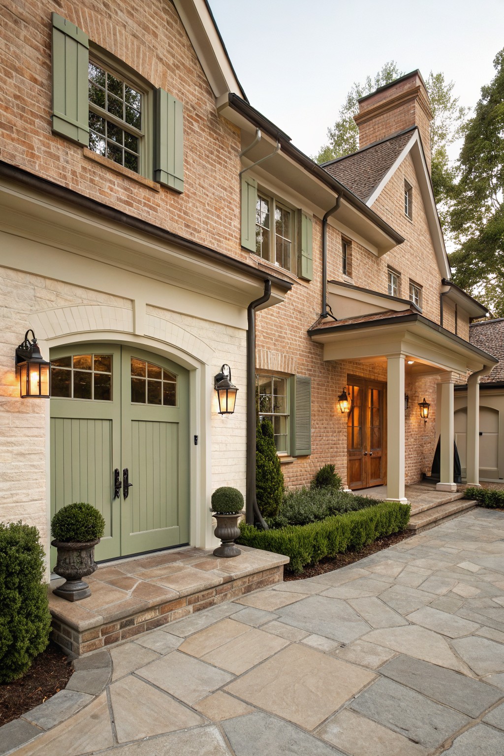
This muted sage green gives the doors a clean look that still feels grounded next to the brick. It sits in that middle range where it reads soft but not too pale, and it keeps the whole front from feeling too heavy or too stark.
The color has a slight gray undertone that helps it stay calm in bright light. It pairs easily with warm white trim and natural brick, though it can look a bit flat if the surrounding stone gets too cool or gray. Many people like it on doors or shutters because it adds just enough color without fighting the architecture.
Soft Greige Siding
This house uses a warm greige paint on the main siding that sits right between gray and beige. It keeps the look clean and modern while still feeling a little soft instead of stark. Many people like this kind of neutral because it works with both wood accents and darker windows without fighting them.
The color has a gentle warm undertone that shows up more in daylight. It pairs easily with natural wood doors and simple landscaping. Good matches would be Sherwin Williams Accessible Beige, Benjamin Moore Edgecomb Gray, or Behr Toasted Wheat.
Warm Cream Siding
This warm cream siding brings a soft yellow undertone to the whole house. It feels clean and lifted without looking stark, and it sits nicely against the brick steps and stone details.
The color works best with white trim and dark shutters. It can shift warmer in afternoon light, so test a sample on the wall first if your home gets strong sun.
Soft Greige Siding
This soft greige gives the whole exterior a calm, clean feel without looking stark. It sits right between gray and beige, so it reads warm in most lights and keeps the house from feeling too cool or flat next to the dark windows and roof.
The color works best on homes with simple lines and pairs easily with white trim or natural wood accents. Just watch how it shifts in full sun, since the undertone can lean a little greener or warmer depending on the time of day.
Frequently Asked Questions
Q: Will these colors hide imperfections on my walls or show every flaw?
A: Most of these modern shades have a bit of depth that helps. Still prep your surfaces well before you paint. A smooth base keeps the elevated feel.
Q: Can I mix two colors from the list in one room?
A: Yes pick one main and one for trim. It adds interest without losing the clean look.
Q: What if the paint dries darker than the sample I liked?
A: This happens often with deeper hues. Always buy a tester pot and paint a large board to check. Move it around the room to see it in all lights.