I have learned that even a bold color can shift dramatically once it is up on the walls and the afternoon light hits it from different angles throughout the day.
When choosing shades for my own rooms I always test them against the trim and the furniture already in place because undertones show up in ways you do not expect from the swatch.
Larger samples make all the difference.
Trying out these bolder options in different times of day helps me see which ones actually hold their depth without turning muddy.
Some of the trends worth considering are those that play well with existing surfaces rather than fighting them.
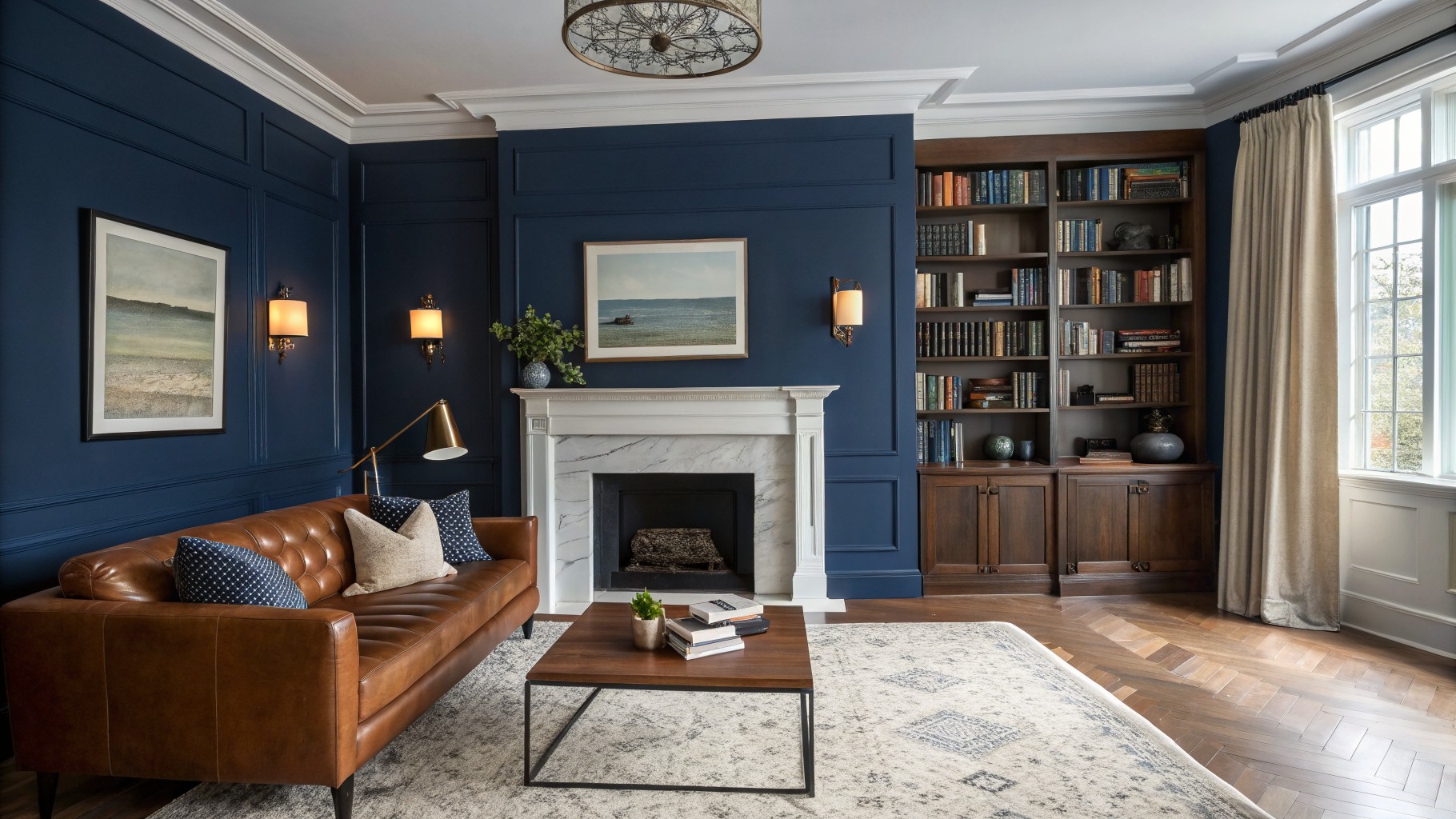
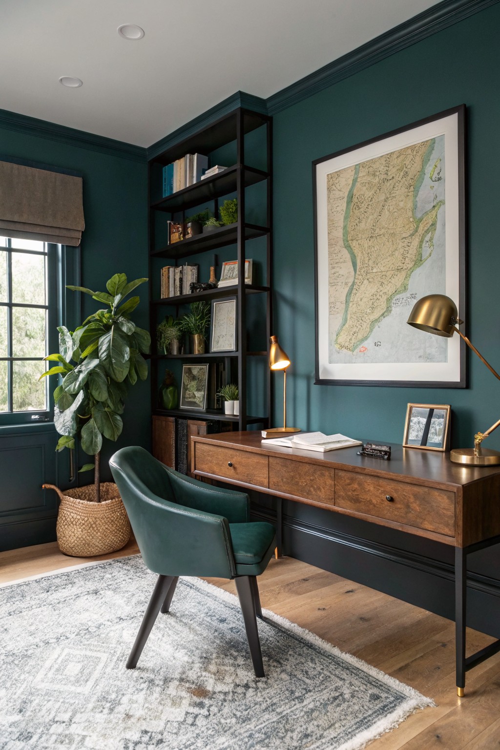
This deep navy blue brings a bold but classic feel to a living room. It is a cool saturated color that reads rich and grounded next to wood floors and leather seating. The tone works because it makes lighter fabrics and warm wood look even softer by comparison.
It has a slight gray undertone that keeps it from feeling too bright or coastal. Use it on all the walls or just on built-ins and trim around the fireplace. White or cream accents help it stay balanced so the room does not feel too dark during the day.
Deep Teal Cabinets
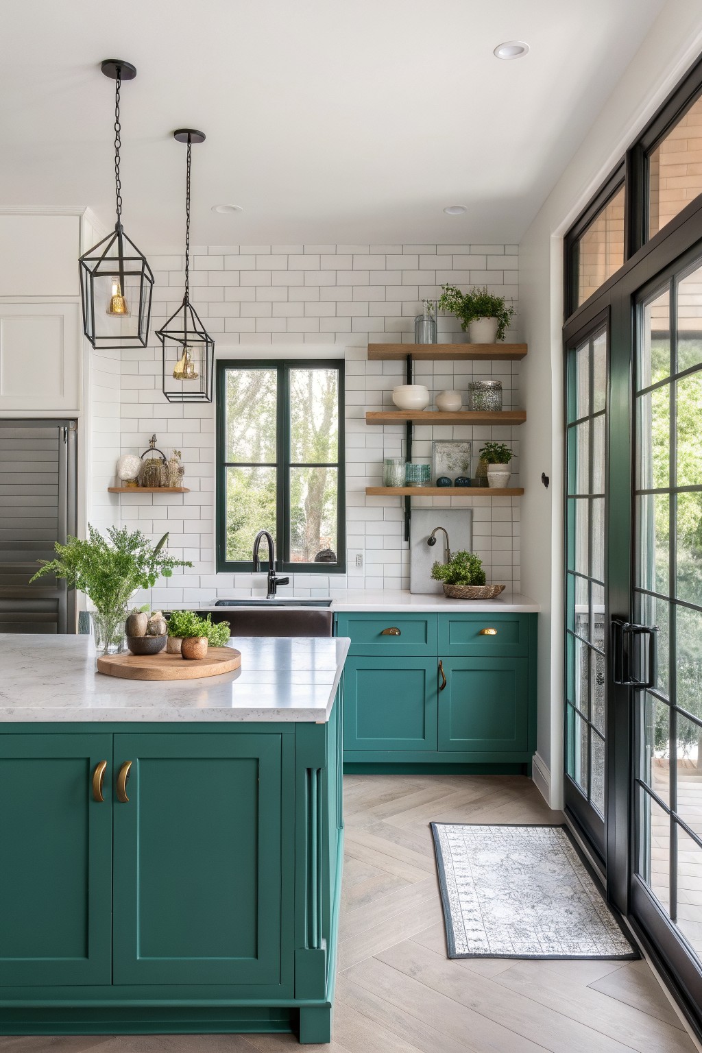
Deep teal is one of those colors that feels bold without trying too hard. It sits right between green and blue and gives cabinets a strong presence while still working with lighter walls and floors. This shade reads closest to Sherwin Williams Jade Dragon, Benjamin Moore 2050-10, Farrow & Ball Vardo, or Behr Tropical Teal.
It has a cool undertone that shows up more in bright light, so it works best in kitchens with plenty of natural light. Pair it with warm wood tones or simple brass hardware to keep the look balanced. Too much black around it can make the color feel heavier than it needs to be.
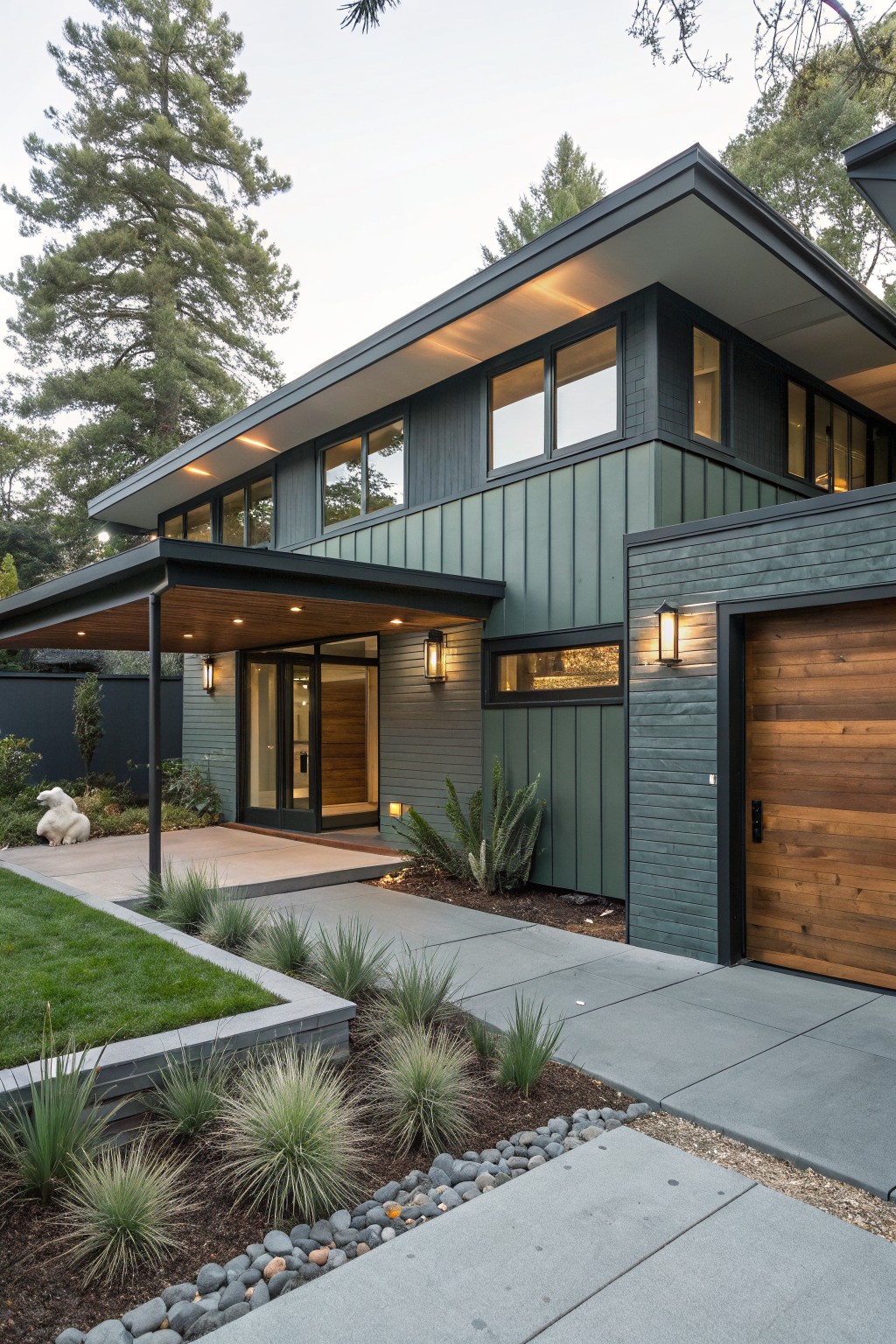
Dark Charcoal Siding

This deep charcoal gray on the siding gives the house a solid, grounded look without feeling too heavy. It lands right between black and a softer gray, which is why it works so well on larger exterior areas. Colors like Sherwin Williams Iron Ore or Benjamin Moore Kendall Charcoal come very close to this shade.
The cool undertone helps it sit nicely against stone and lighter trim. It holds up in changing light and suits homes that want something simple but current. Just check how it looks with your roof color and any masonry before committing.
Warm Terracotta Walls
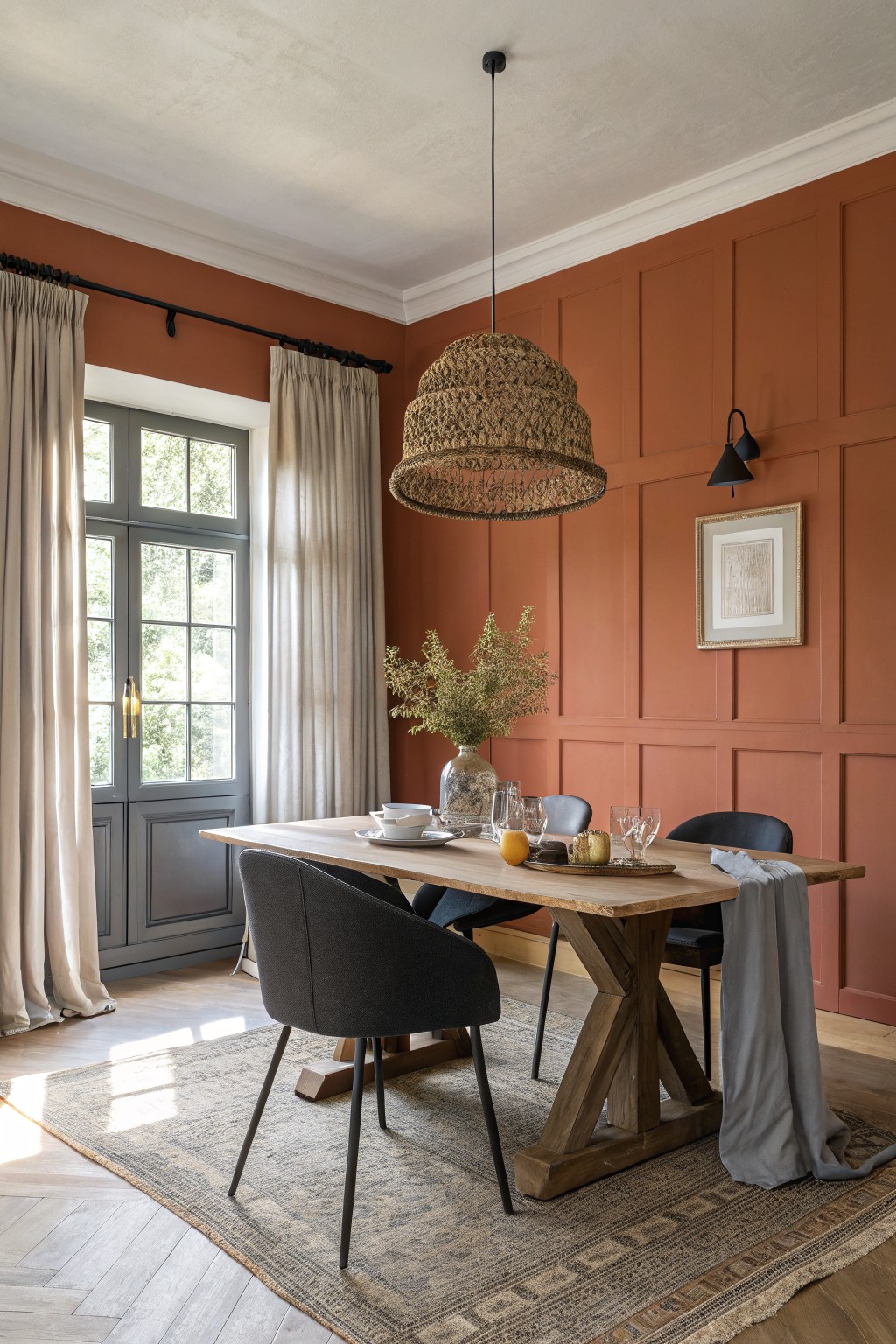
A deep terracotta brings a lot of warmth to a room without feeling heavy. This color sits right in that earthy orange red range and gives the walls a grounded look that still feels fresh. It works especially well when you want something bolder than beige but not as stark as a true red.
The tone has a soft warmth that plays nicely with wood and keeps the space from feeling too cool. It looks good in rooms with decent natural light and pairs easily with natural wood furniture or simple neutral textiles. In lower light it can read a little deeper, so a test patch helps before committing to the whole room.
Muted Sage Green Walls
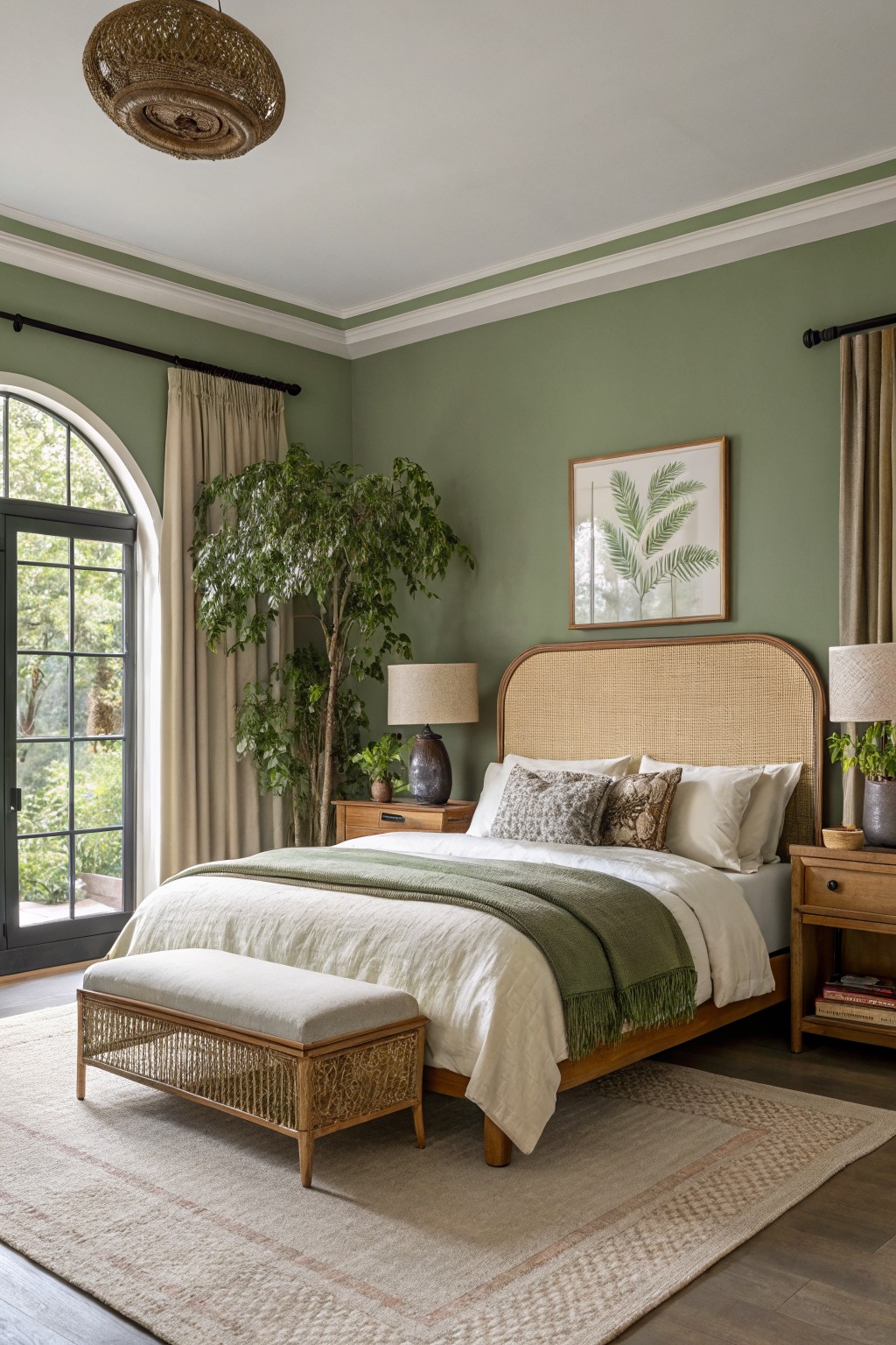
This muted sage green sits right in that soft middle ground between gray and green. It gives the walls a calm, grounded look without making the room feel dark or heavy.
The color has a gentle warm undertone that works well with wood furniture and natural textures. It suits bedrooms best, where the light stays soft most of the day, and it pairs easily with white trim or linen fabrics. Just watch that it does not lean too cool if your room gets mostly north light.
Soft Gray Siding
This light gray siding gives the house a calm, clean look that feels easy to live with. It reads as a soft gray with just enough warmth to keep it from looking cold next to the white trim.
The color works best on homes that have some natural greenery around them. It pairs well with dark doors and simple landscaping, though it can start to feel flat if the trim is painted the same shade.
Deep Charcoal Walls

A deep charcoal gray gives a bathroom that grounded, modern feel without going full black. It reads close to Sherwin Williams Tricorn Black or Benjamin Moore Wrought Iron, and it works especially well when the room has wood tones and some natural light to keep it from feeling too heavy.
This color has cool undertones that sit nicely next to warm wood vanities and brass fixtures. It suits smaller bathrooms that need a bit more weight, though it can feel closed in if the lighting stays dim or there is not enough contrast with the floor and trim.
Warm Mustard Yellow Walls
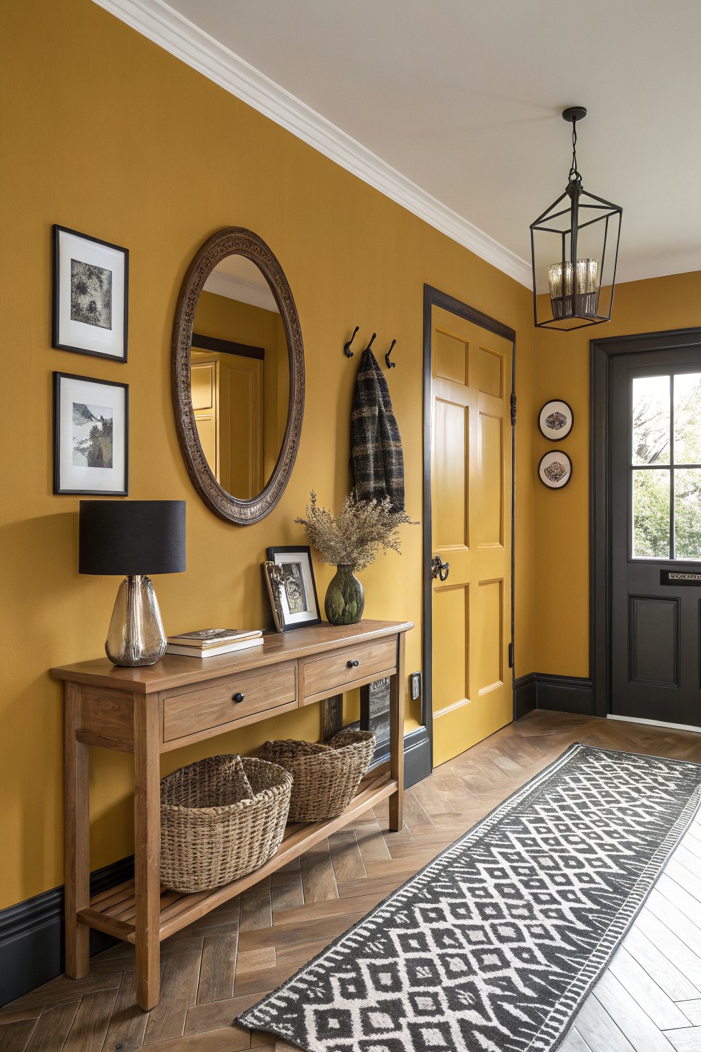
A warm mustard yellow like this gives an entry or hallway a cheerful lift that still feels grounded. It sits between golden and earthy, so it brings some life to the walls without turning the space too bright or childish.
This shade has a soft warmth that plays nicely with wood tones and dark trim. It tends to look best in rooms with decent natural light, and pairing it with black accents or natural baskets helps keep the whole look balanced rather than overwhelming.
Soft Sage Green Siding
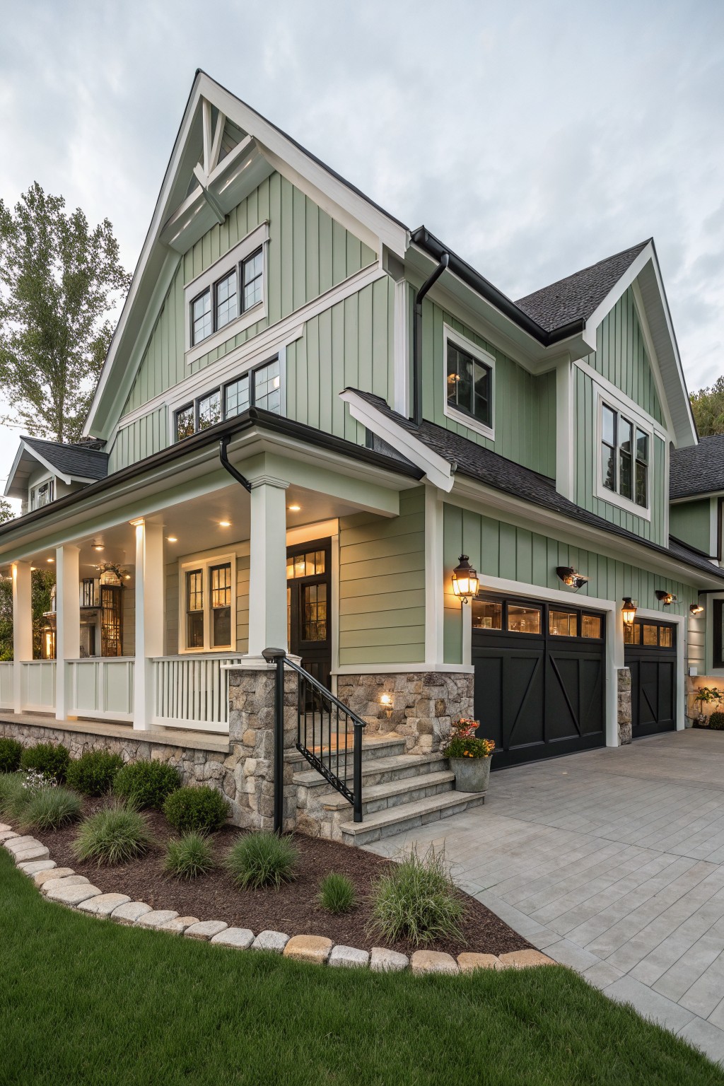
This soft sage green on the siding gives a house a calm but updated look. It sits somewhere between green and gray so it feels natural without being too bold. You see this kind of color often on homes that want a bit of personality while still blending with their surroundings. It reads closest to Benjamin Moore Saybrook Sage or Sherwin Williams Clary Sage, with Behr Soft Sage and Farrow & Ball Mizzle as other close options.
The color has a slight gray undertone that keeps it from looking too bright in full sun. It works best on homes with white trim and darker windows or doors. Stone at the base helps ground it even more. Just test a large sample first since the shade can shift depending on the light and nearby roof color.
Soft Terracotta Pink Walls
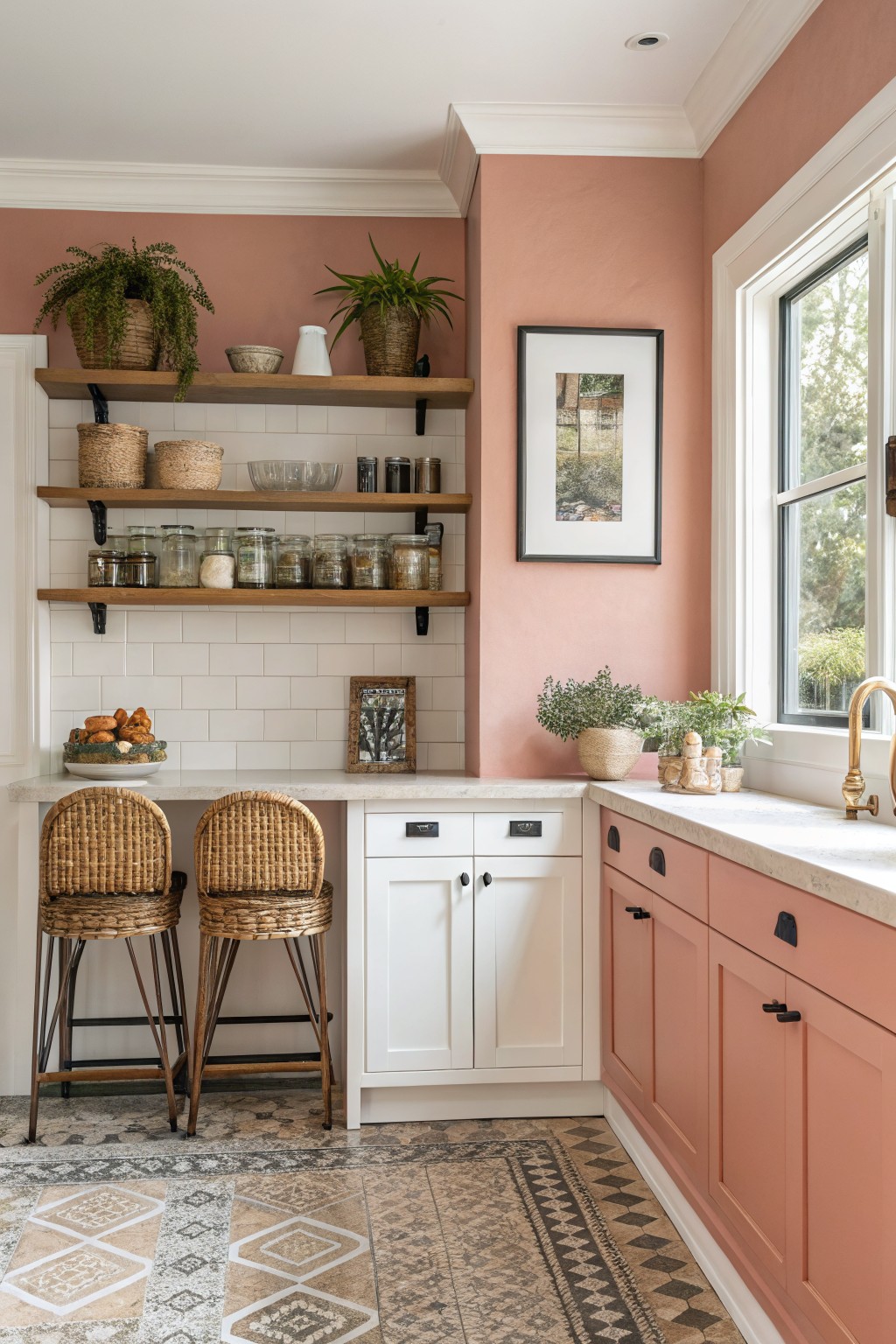
This warm terracotta pink brings a gentle earthiness to the kitchen. It sits somewhere between a dusty rose and a clay tone, which helps it feel grounded rather than overly sweet.
The color has a slight orange undertone that plays nicely with wood and white cabinetry. It suits rooms that get decent daylight and works best when paired with natural textures like woven stools or open shelving.
Deep Teal Walls
This deep teal color brings a strong but steady presence to the room. It sits right between green and blue and gives the walls a saturated look that still feels livable rather than overwhelming.
The tone has a slight cool lean, which is why it pairs so well with warm wood furniture and brass lamps. It works best in spaces that get steady daylight, since the color can turn a bit darker in low light.
A Teal Front Door

This teal shade on the front door brings a nice pop without feeling too loud. It sits somewhere between green and blue, which helps it work with the warm red brick around it and keeps the whole entry from looking too plain.
The color has a slight gray undertone that makes it look a little softer outside. It pairs best with light trim and natural brick, though it can start to feel heavy if the surrounding colors are already dark.
Soft Pink Walls
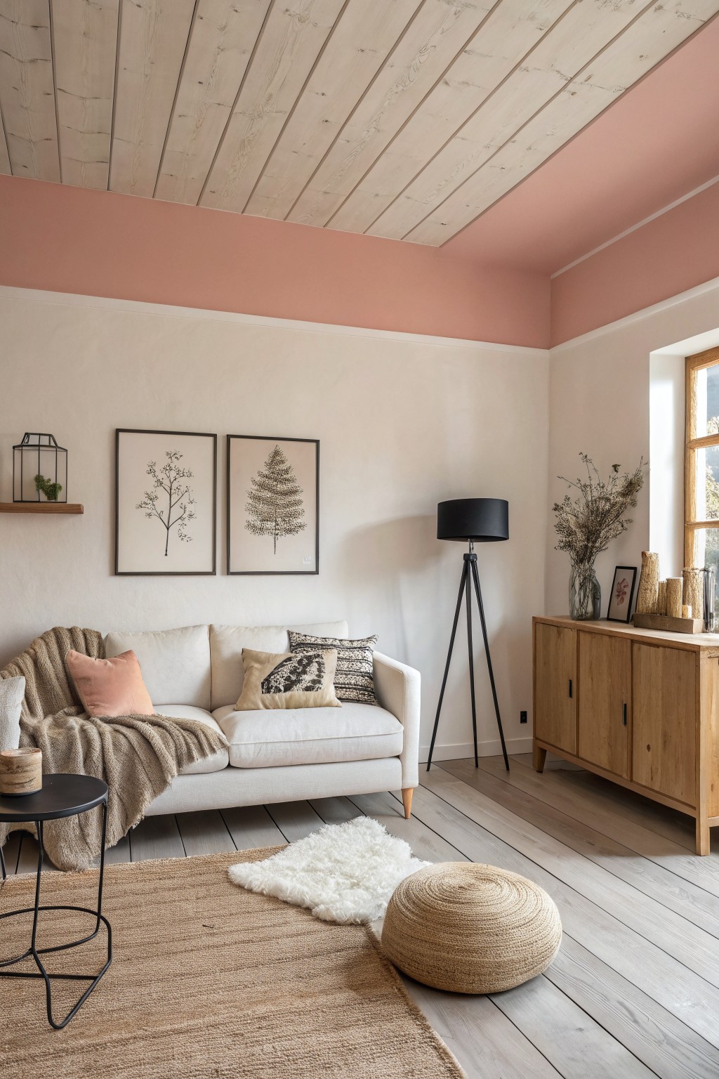
A soft warm pink like this gives the walls a gentle lift that feels fresh without trying too hard. It sits somewhere between peach and blush, so the color stays calm and easy to live with in a living room or bedroom.
The undertone leans a little peachy, which helps it play nicely with wood floors and light trim. It works best in spaces with decent natural light, and it pairs well with simple neutrals so the pink does not feel overwhelming.
Deep Burgundy Walls
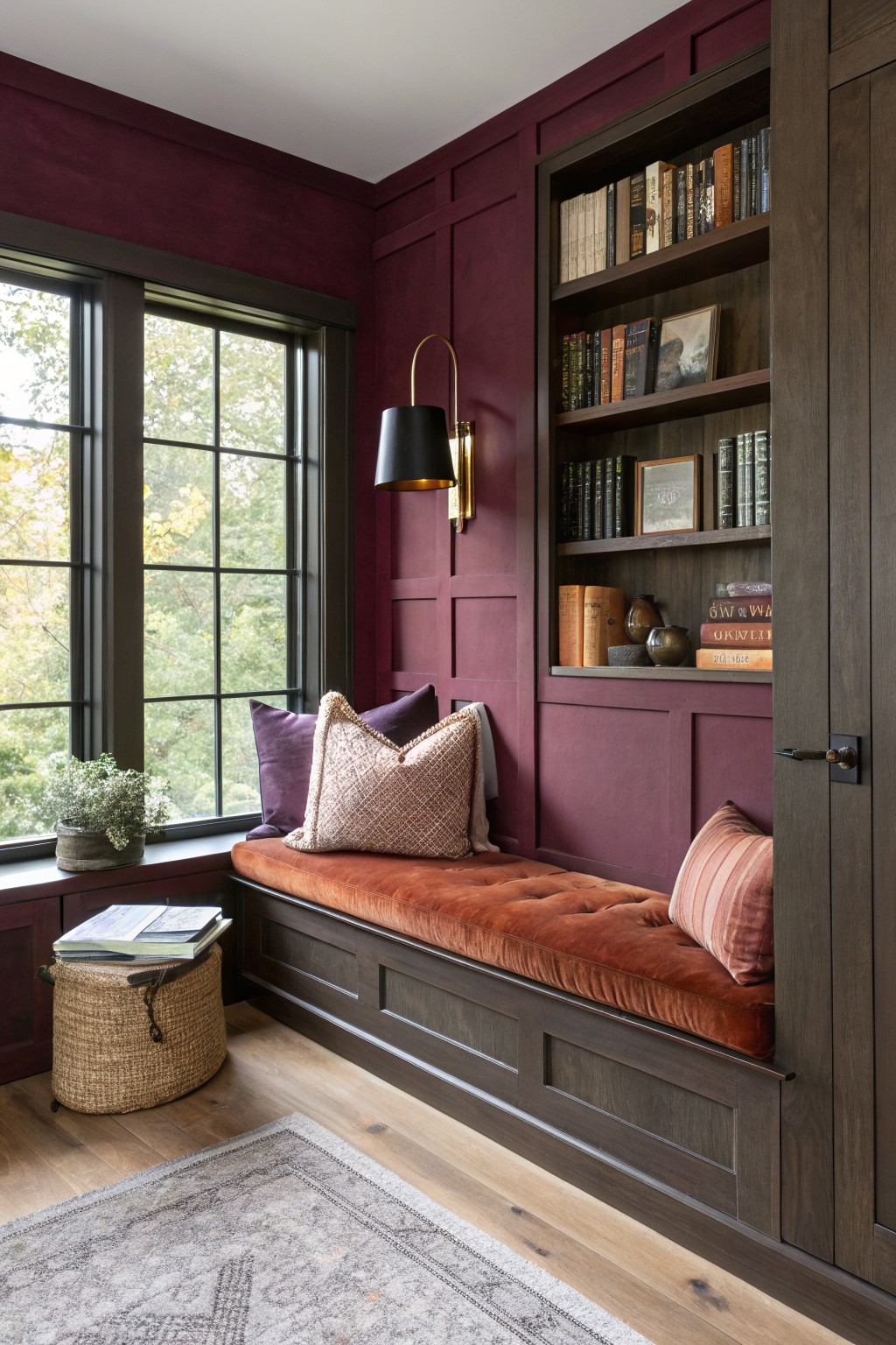
This deep burgundy paint gives a room that warm, enclosed feeling without going full dark. It leans slightly brown in its undertone, which keeps it from looking too bright or candy-like. Colors like Benjamin Moore Caliente, Sherwin Williams Red Barn, Farrow & Ball Eating Room Red, and Behr Red Theatre all sit close to this shade.
It works best in spaces that already have some wood and texture because the color sits nicely next to those materials. In lower light it can read a little moodier, so it suits rooms where you want a cozy, grounded feel rather than something airy.
Sage Green Siding
This muted sage green gives the house a quiet, grounded look that feels natural rather than bold. It sits between gray and green, so it reads softer outdoors and does not fight with the wood accents or the darker trim around the windows.
The color has a cool undertone that shows up more in bright light but stays steady next to cedar and stone. It works best on homes with clean lines where you want something a little different from plain gray without going full forest green. Keep the trim dark or use a warm off-white to help it settle in.
Soft Yellow Cabinetry
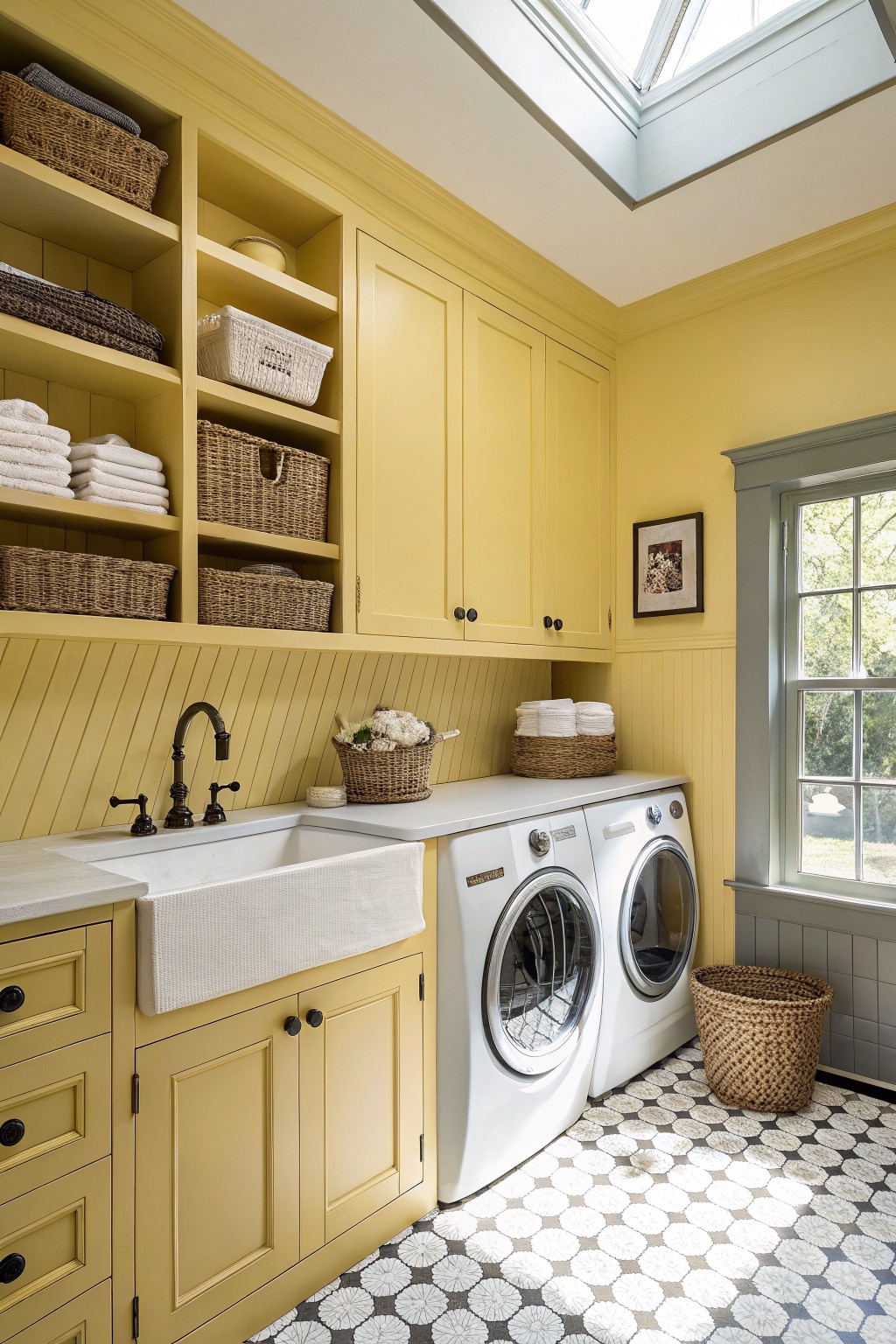
A soft sunny yellow works well in laundry rooms and other utility spaces because it feels clean and upbeat without being harsh. This color sits between a pale butter and a light lemon, which gives it a fresh look that still feels grounded. It reads very close to Sherwin Williams Daffodil, Benjamin Moore Yellow Iris, Behr Sunny Disposition, or Farrow & Ball Babouche in a lighter application.
The yellow has a gentle warm undertone that pairs nicely with white counters and gray tile. It shows up best in rooms that get steady daylight, since it can lean cooler in dim light. Use it on cabinetry or walls if you want the space to feel open but still practical.
Warm Greige Walls
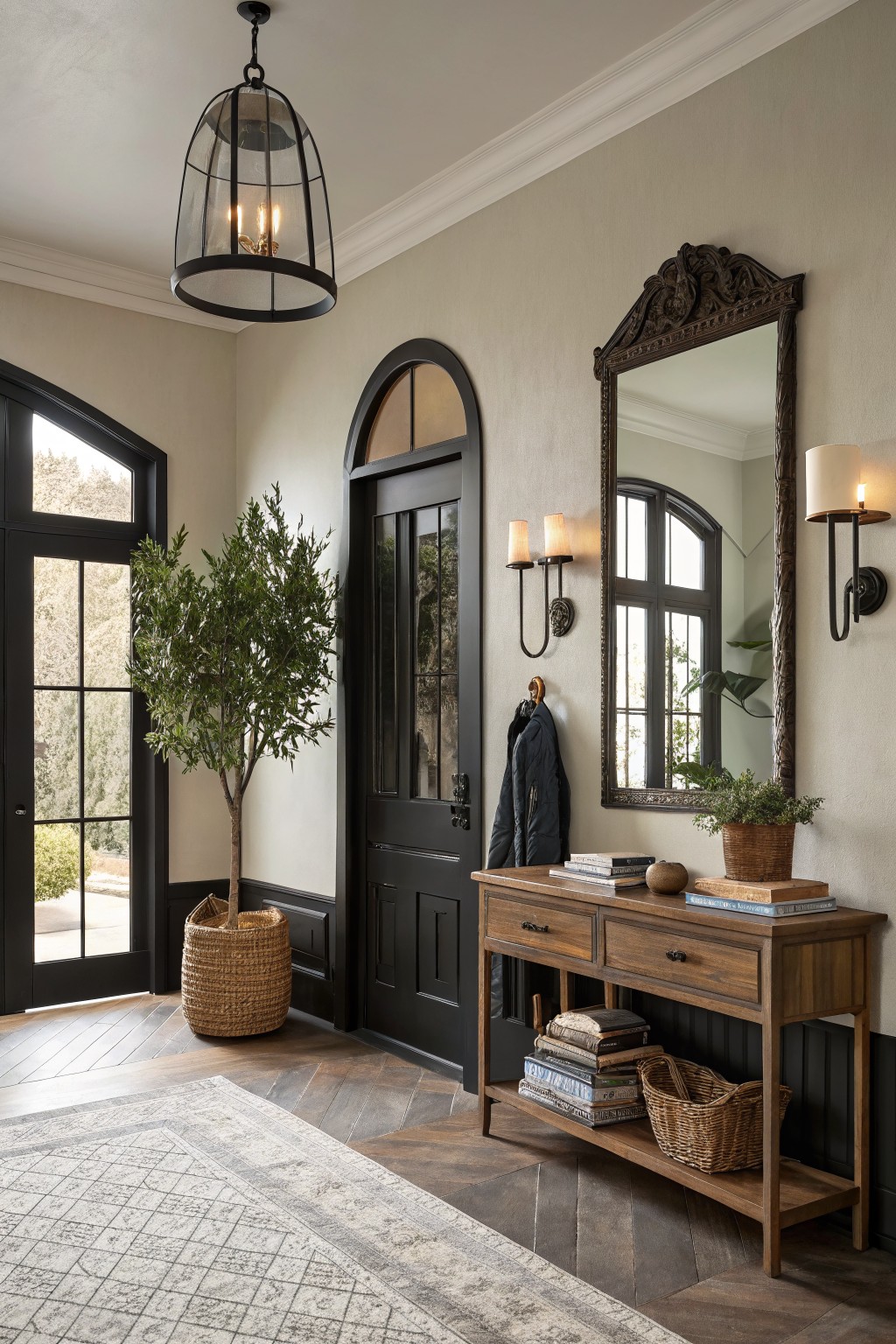
This warm greige sits right between gray and beige, giving the walls a soft, grounded look without feeling too cool or too yellow. It has enough depth to hold its own next to dark trim and wood tones, which is why it works so nicely in entryways and hallways where light can shift during the day.
It pairs best with black or deep charcoal accents and natural wood pieces, though it can start to feel flat if there is not enough contrast in the room. Colors like Sherwin Williams Accessible Beige, Benjamin Moore Edgecomb Gray, or Behr Almond Wisp all land close to this same range.
Soft Yellow Siding
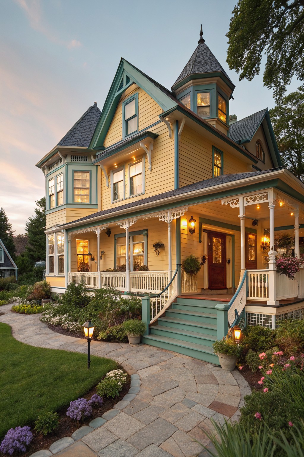
A soft yellow gives house siding a gentle brightness that feels welcoming without being loud. This color family brings just enough warmth to lift the look of the whole exterior while still blending in with older homes and natural surroundings.
It reads very close to Sherwin Williams Friendly Yellow or Benjamin Moore Pale Yellow. The slight warmth helps it work with dark roofs and teal or green trim, though it can start to feel washed out if the light is very strong all day.
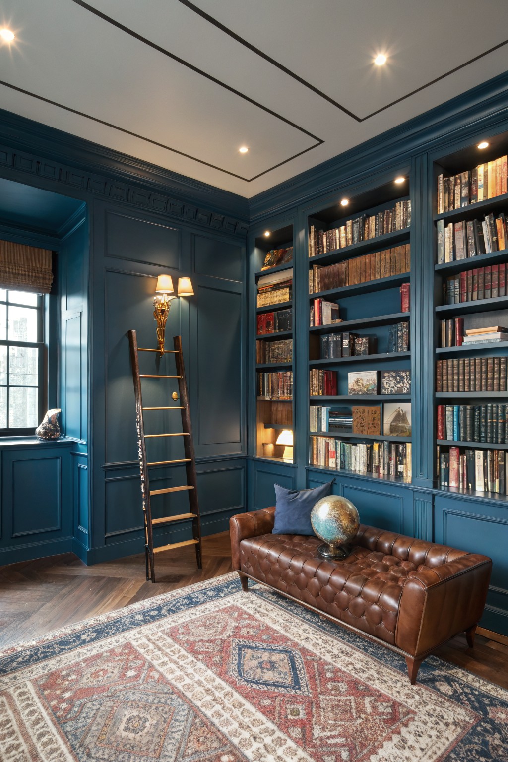
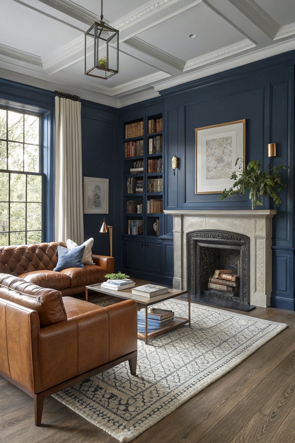
A deep navy blue like this brings a lot of weight to a room without feeling heavy. It works especially well on walls and built-ins together, creating a single solid background that lets books, wood tones, and leather stand out. This shade sits somewhere between navy and a soft teal, giving it enough depth to feel bold while still reading as classic.
It pairs best with warm wood, brown leather, and brass accents, which keep the space from turning too cold. In rooms with decent natural light it stays rich rather than flat, though it can feel a bit dark in small spaces with little window light. Try it in a study, library, or dining room where you want the walls to recede and the furnishings to do the talking.
Coral Pink Siding
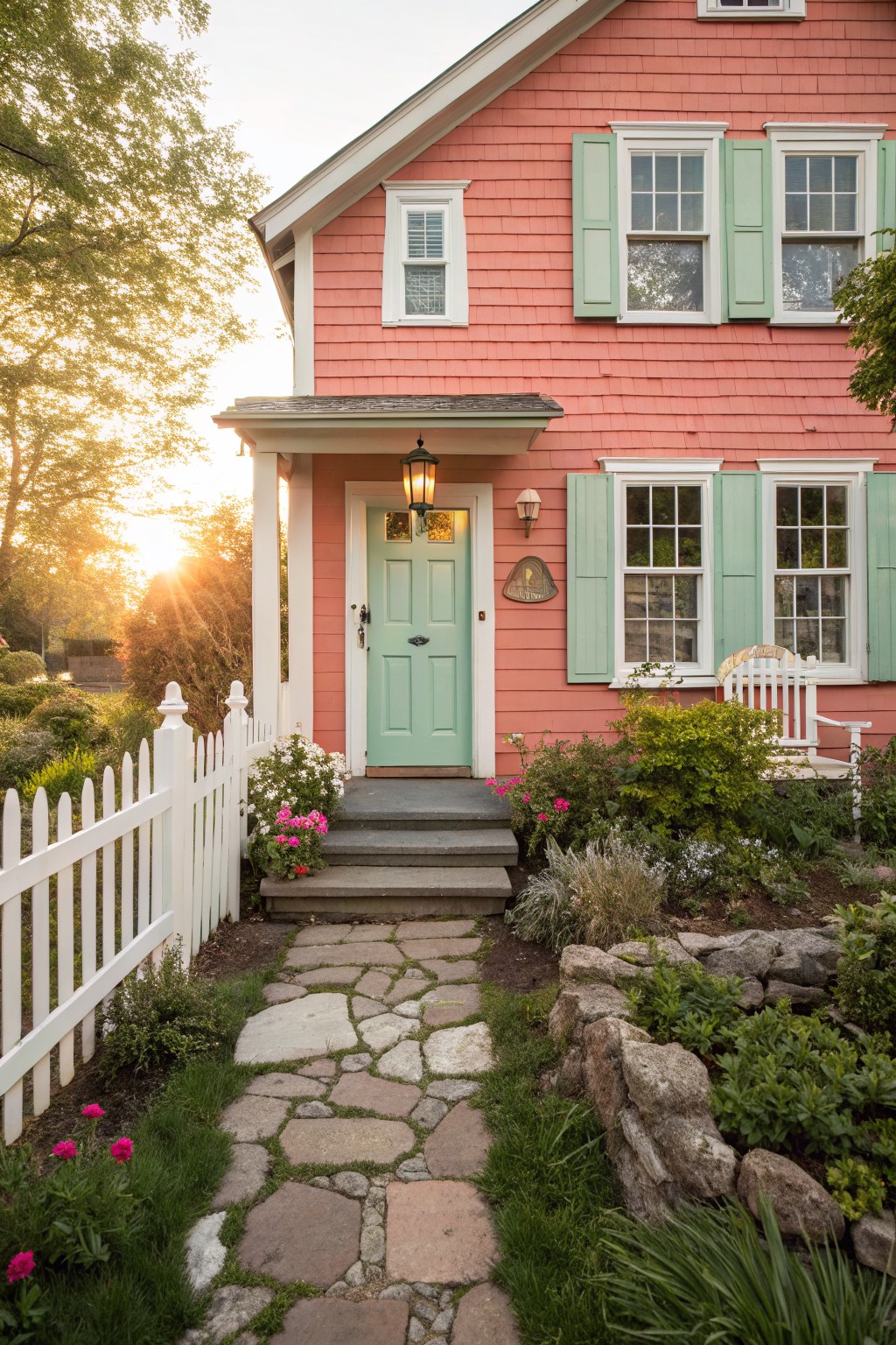
This coral pink siding gives a home a warm and cheerful look that still feels grounded. It has a soft peachy tone rather than a cool or bright pink. Shades like Sherwin Williams Coral Reef, Benjamin Moore Calypso Coral, or Behr Desert Coral sit close to this color.
The warm undertone helps it blend with stone paths and garden greens without clashing. It works best on homes with white trim and simple landscaping. Too much direct sun can make the color look a little stronger than expected.
Soft mauve walls
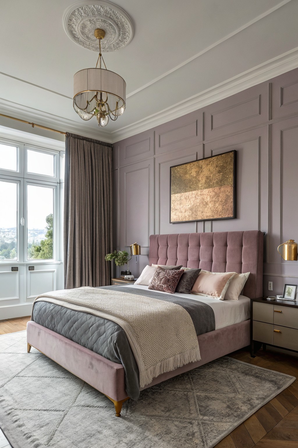
This soft mauve gray gives walls a gentle color that feels different from basic neutrals. It sits between gray and a hint of purple, which keeps the room calm but still interesting.
The undertone runs warm, so it pairs nicely with wood floors and light fabrics. It works best in bedrooms with decent natural light. In cooler rooms it can shift more toward gray, so test a sample first.
Frequently Asked Questions
Q: How do I test a bold color before painting the whole room?
A: Grab a sample pot and brush a large patch right on the wall. Check how it shifts from morning light to evening shadows. Live with it for a couple days before you commit.
Q: My furniture is mostly neutral. How do I add one of these trendy shades without clashing?
A: Pick a color that picks up a tiny accent already in the space like a throw or artwork. Paint just one wall to start. The rest of the room stays calm and the bold hit feels balanced.
Q: Will a deep bold color make my small bedroom feel even tighter?
A: Use it on a single wall behind the bed and keep the other three light. The contrast adds depth instead of closing things in.