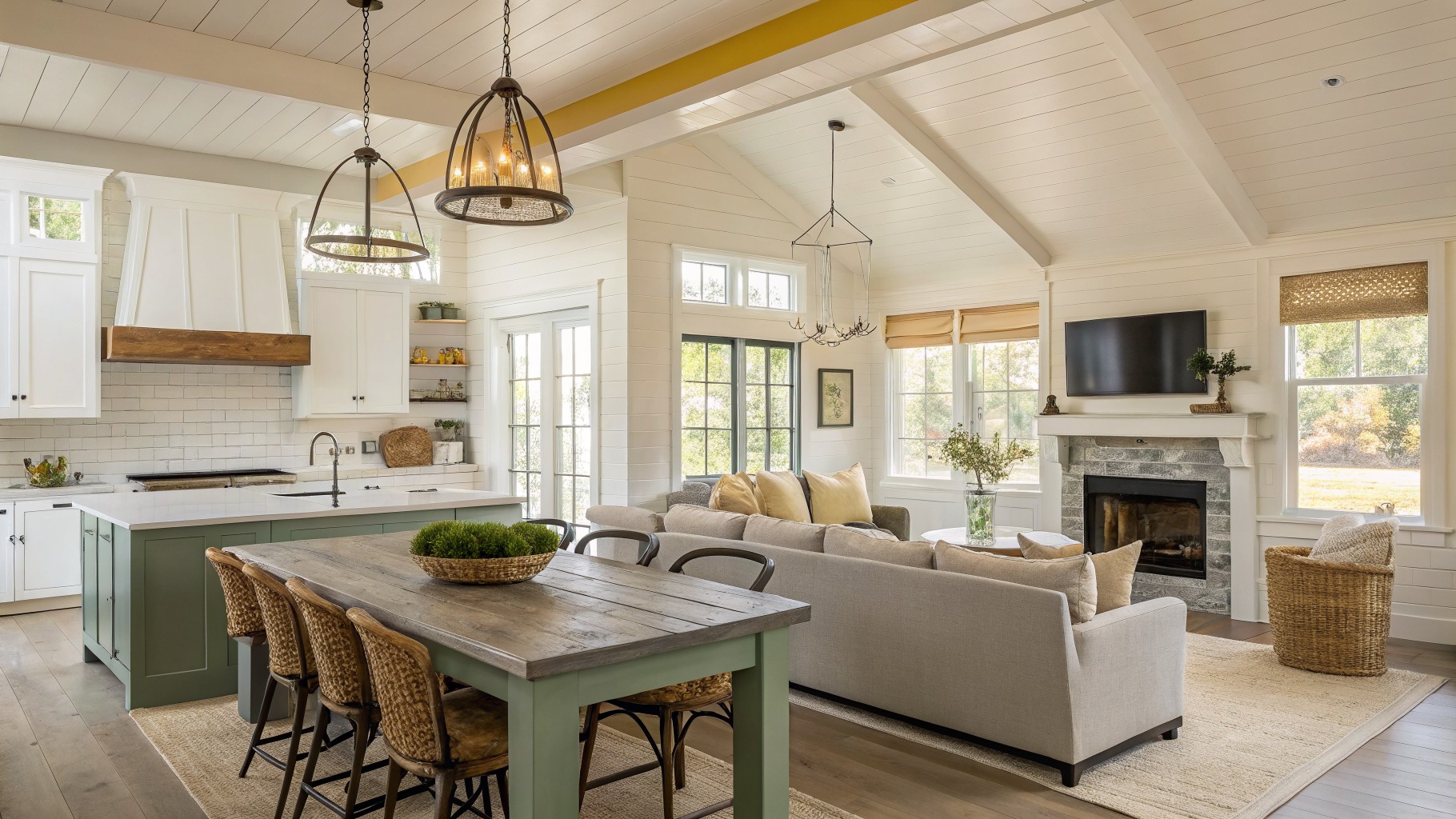
I have learned that choosing paint for an open floor plan means thinking about how colors move from one area into the next without clashing.
Light changes throughout the day and can pull out undertones I did not notice at the store.
I test every color in place now.
A soft gray might look warm in the morning but turn cool by afternoon near the kitchen cabinets.
That small step has saved me from colors that looked fine in isolation but felt off once the whole space came together.
Soft sage green cabinetry
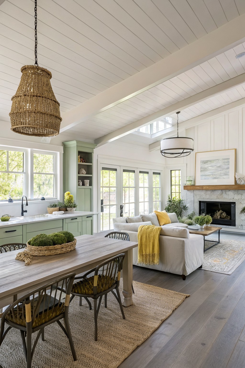
This soft sage green on the built-in cabinetry brings a gentle color into an open floor plan without taking over. It sits in that middle ground between gray and green, so it feels calm next to white walls and warm wood tones. Many people like it because it gives the kitchen area a bit of definition while still letting the rest of the space stay light.
The color has a slight gray undertone that keeps it from feeling too bright or country. It works well with white trim and natural wood floors, though it can look a little flat if the room gets very little natural light. Good matches include Benjamin Moore Saybrook Sage, Sherwin Williams Evergreen Fog, and Farrow & Ball Lichen.
Soft Blue Gray Walls

A soft blue gray works nicely in open floor plans because it feels calm and connected from one area to the next. This kind of color sits between gray and blue, giving just enough depth without making the space feel heavy or closed in.
It has cool undertones that show up more in bright light, so it pairs best with white trim and warm wood floors. Watch how it looks next to your cabinets or larger furniture pieces, since those can shift whether the blue gray reads cooler or a bit softer overall.
Soft Mint Green Walls
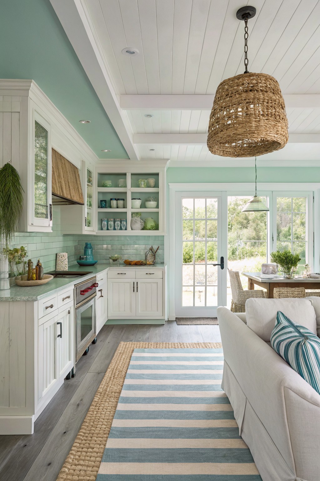
A pale mint green like this one gives open floor plans a quiet freshness that feels easy to live with. It reads as a soft green with light blue undertones and works especially well when white cabinets and wood floors are already in place. Colors that come close include Sherwin Williams Sea Salt, Benjamin Moore Saybrook Sage, Behr Soft Aqua, and Farrow & Ball Teresa’s Green.
The color stays gentle in both morning and afternoon light, so it does not fight the white trim or the natural wood tones. It suits kitchens that open into living areas, though it can start to feel chilly if the room gets very little natural light.
Warm Greige Walls
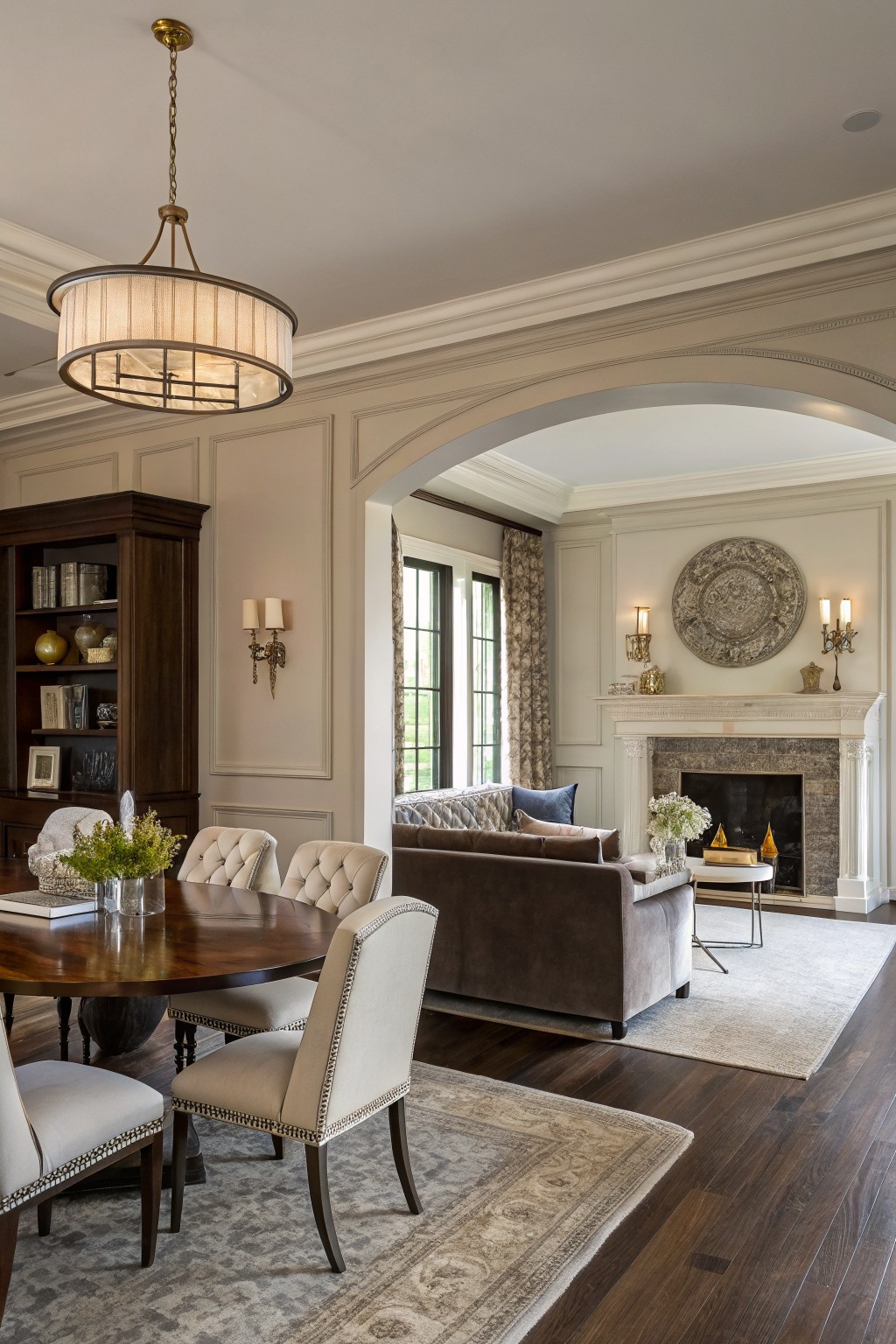
This room uses a soft warm greige on the walls. It sits right between beige and gray, giving just enough warmth to feel comfortable while staying neutral enough to connect the dining area with the living space beyond the arch.
The color has a light depth that keeps the wood floors from feeling too heavy. It works best with white trim and natural wood tones, and it helps the whole open layout feel pulled together without any one area standing out too much. Good matches include Sherwin Williams Accessible Beige, Benjamin Moore Revere Pewter, Behr Almond Wisp, or Farrow & Ball Elephant’s Breath.
Warm Gray Walls

A warm gray on the walls works well in open floor plans because it stays neutral without turning cold. This color has a soft brown undertone that helps the space feel connected even when the kitchen, living area, and dining zone all sit in one big room.
It pairs easily with wood tones, white ceilings, and dark cabinetry without fighting them. Watch how it shifts in different light though. In bright daylight it can read a touch lighter, while evening light brings out more of the warmth underneath.
Soft Sage Green Kitchen Cabinets

This soft sage green works well on the cabinets because it brings a gentle color into the kitchen without overpowering the space. It sits between gray and green, so it feels calm next to the wood floors and the white trim.
The color has a slight blue undertone that shows up more in brighter light. It pairs easily with wood tones and simple white walls, though it can look a bit cool if the room gets little natural light. Try it in open kitchens where you want a hint of color that still feels connected to the rest of the house.
Deep Teal Walls

This deep teal brings a bold but livable color to open floor plans. It sits between blue and green and gives the space a grounded feel that still feels fresh. The color reads closest to Benjamin Moore Blue Note, Sherwin Williams Jasper Stone, Farrow & Ball Inchyra Blue, or Behr Deep Sea Dive.
The cool undertone works nicely with warm wood tones like the cabinets here and helps tie the living area to the kitchen without needing lots of extra color. It can look a little heavy in low light, so it suits rooms that get steady daylight.
Deep Blue Gray Kitchen Islands
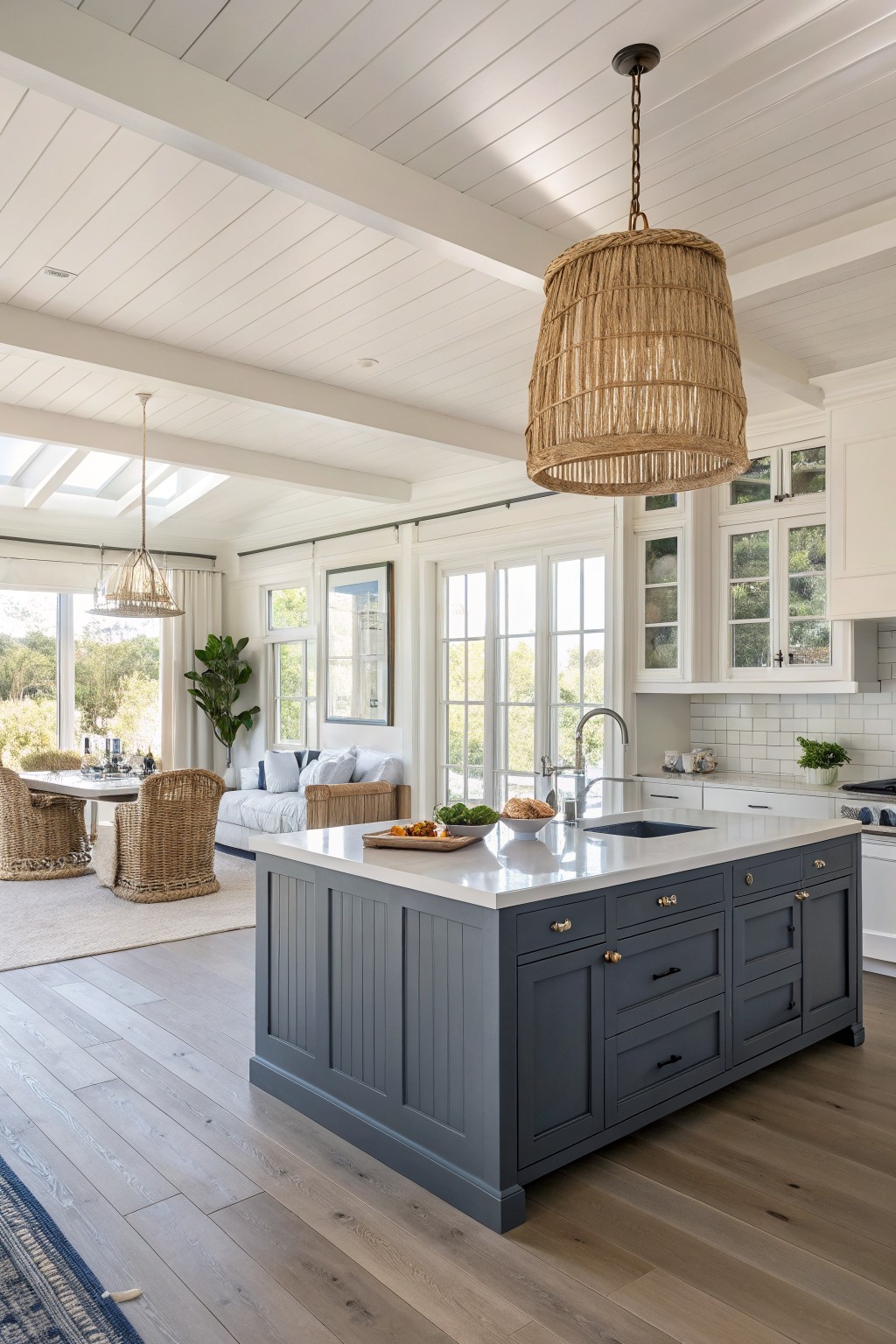
A deep blue gray on the island gives an open floor plan a solid anchor without closing things in. This shade sits between navy and charcoal, with a cool undertone that reads calm next to white walls and trim.
It works best when the surrounding surfaces stay light, like white quartz counters and pale wood floors. Watch the lighting though. In rooms with lots of natural light it stays crisp, but in dimmer spots it can lean heavier than expected. Good matches include Sherwin Williams Naval, Benjamin Moore Hale Navy, and Behr Dark Navy.
Deep Teal Green Walls

This deep teal green brings a strong but calm color to open living spaces. It sits between green and blue, giving the room a grounded feel without making it too dark or heavy. The color works especially well when the floors are dark wood and the trim stays light.
It has a cool undertone that can lean a bit blue in certain lights, so it pairs best with warm wood tones and simple white trim. Try it in larger rooms where you want the walls to connect different areas without needing lots of extra color elsewhere.
Soft Sage Green Kitchen Cabinet Color
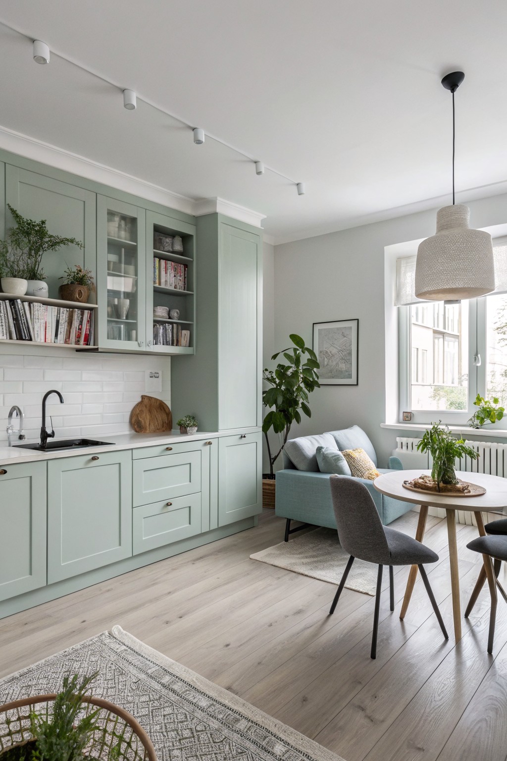
A soft sage green like this one gives an open kitchen a quiet, steady look without taking over the space. It lands between gray and green, so it feels calm rather than bold. Similar shades include Benjamin Moore Saybrook Sage, Sherwin Williams Sea Salt, Behr Aloe Vera, and Farrow & Ball Pigeon.
The color has a light cool undertone that sits well next to pale wood floors and simple white tile. It works best in rooms with decent daylight and pairs easily with other soft neutrals across an open layout.
Warm terracotta walls

This warm terracotta orange works well in open floor plans because it pulls the kitchen, dining, and living areas together without needing extra color. It has enough depth to feel cozy next to wood beams and stone while still keeping the room bright enough for daily use.
The color leans slightly earthy rather than bright, so it pairs best with natural wood tones and lighter cabinetry. Watch how it shifts in different lights, since it can read a bit deeper in shaded corners. Good matches include Sherwin Williams Cayenne, Benjamin Moore Moroccan Spice, Behr Baked Terracotta, and Farrow & Ball Red Earth.
Muted Blue Gray Walls

A muted blue gray like this one works nicely in open floor plans because it stays calm and neutral without disappearing. It sits between gray and blue, which helps different areas feel connected even when the space is large and open.
It has a soft cool undertone that can lean a bit green in daylight, so it pairs best with warm wood floors and simple trim. Avoid pairing it with too many other cool tones or it can start to feel chilly.
Classic Warm Greige Walls
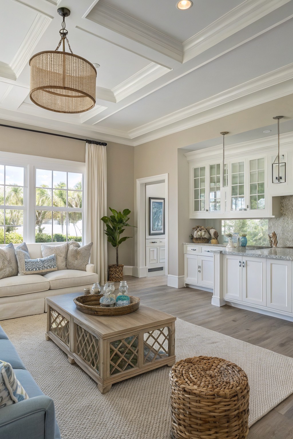
A warm greige like the one on these walls gives an open floor plan a soft, steady background. It sits between beige and gray without leaning too far in either direction. Colors such as Sherwin Williams Accessible Beige, Benjamin Moore Edgecomb Gray, Behr Almond Wisp, or Farrow & Ball Elephant’s Breath sit close to this tone.
The slight warmth helps the color stay friendly next to white trim and wood floors. It keeps the living area and kitchen feeling tied together. Just test it in both morning and afternoon light, since greige can shift more gray in cooler rooms.
Neutral Warm Greige for Open Spaces
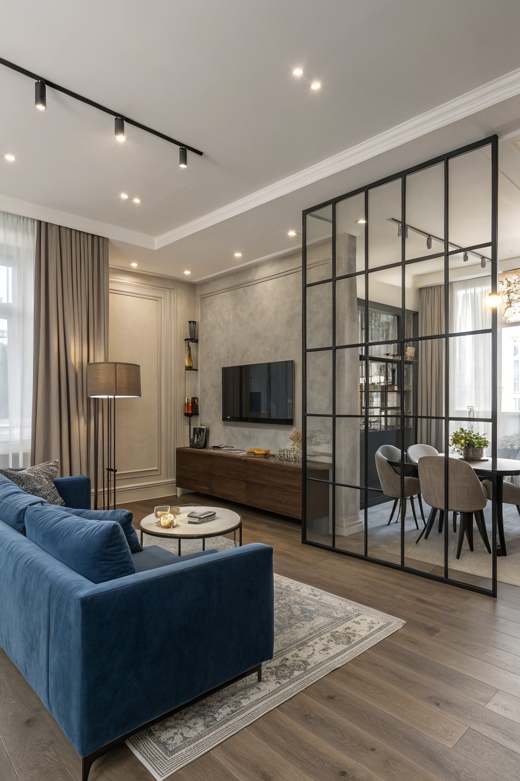
This room uses a soft warm greige on the walls. It is a muted neutral that sits between gray and beige, giving just enough color to feel calm while still letting wood tones and other finishes stand out.
The slight warmth helps it connect different zones in an open plan without looking too cool or stark. It pairs easily with medium wood floors and works best when you keep trim and larger pieces in similar neutrals rather than stark white.
Soft Sage Green Kitchen Island

A soft sage green works well on kitchen islands in open floor plans. The color has a muted tone that feels calm and blends easily with white walls and wood floors.
It carries a touch of gray that keeps it from turning too bright in daylight. Pair it with white trim and natural wood tones, or try shades like Sherwin Williams Clary Sage, Benjamin Moore Quietude, or Behr Aged Olive for a close match.
Deep Teal Walls with Dark Wood Accents
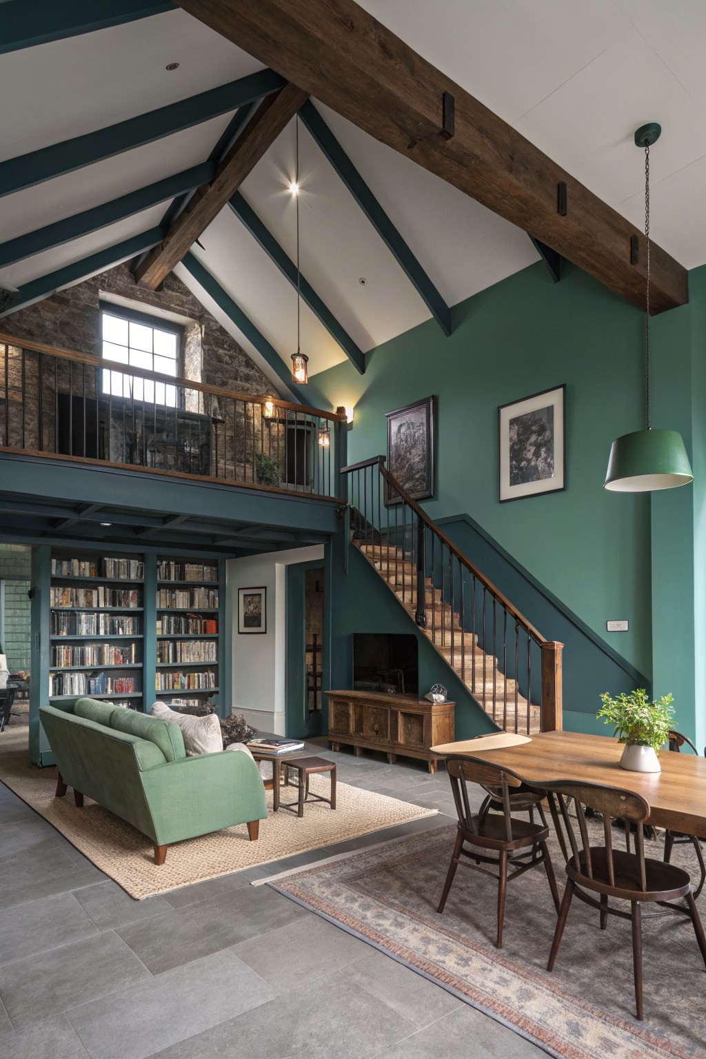
This deep teal green brings a steady presence to the room without overwhelming it. The color sits between blue and green, giving it a cool lean that still feels grounded next to the dark wood beams and stone floor.
It holds up well in rooms with tall ceilings and mixed materials. Pair it with warm wood tones or keep the trim dark so the green stays the main focus. Colors like this can look a bit flat in low light, so test a sample on the wall first.
Soft Aqua Green Walls
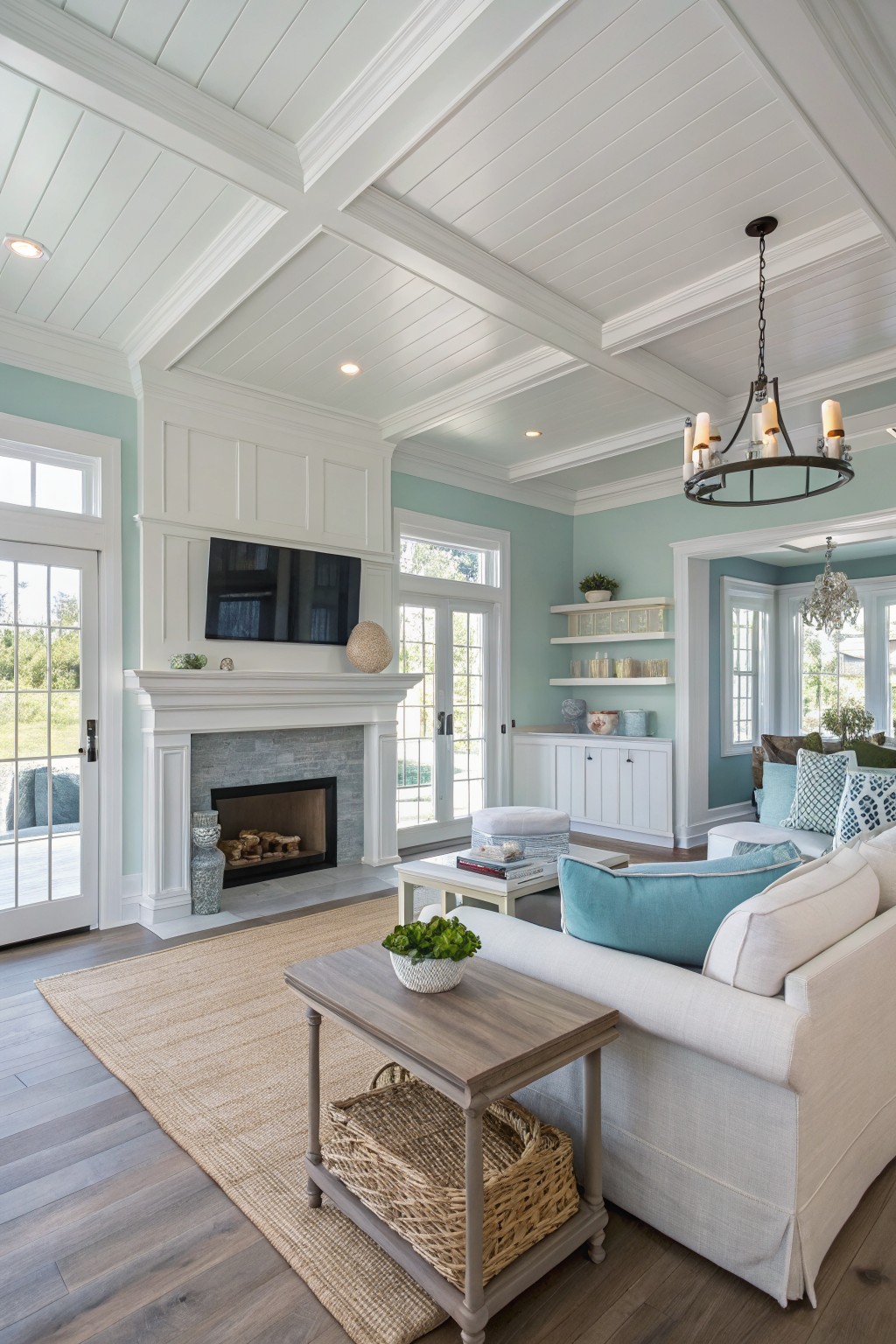
This soft aqua green gives an open floor plan a calm, airy feel without making the space look cold. It sits somewhere between green and blue, which helps it blend with both wood tones and white trim. Colors like Sherwin Williams Rainwashed, Benjamin Moore Palladian Blue, Behr Soft Aqua, or Farrow & Ball Pale Powder all land close to this shade.
The cool undertone works best in rooms with plenty of natural light and pairs nicely with warm wood floors or cream upholstery. It can start to feel chilly if the room gets little sun, so test a sample on the wall first before committing.
Warm Gray with Wood Beam Accents
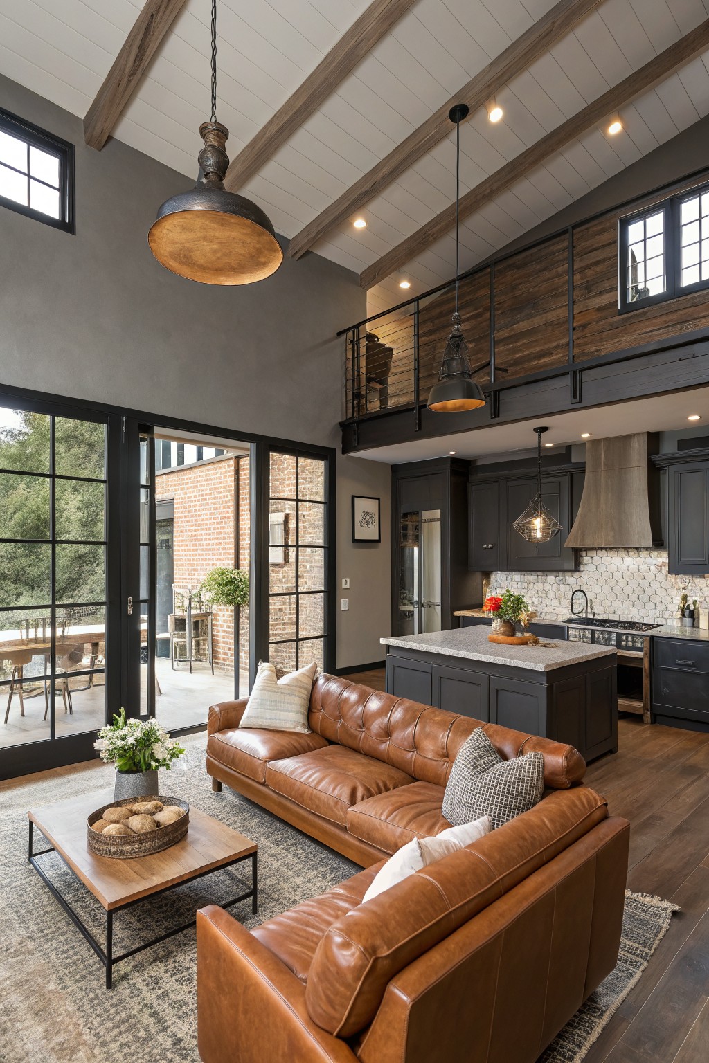
A warm gray like this sits nicely in open floor plans because it stays neutral while still feeling grounded. It has enough depth to hold its own next to wood beams and dark cabinetry without turning cold or flat. Colors that read close to this include Sherwin Williams Repose Gray, Benjamin Moore Stonington Gray, Behr Silver Strand, and Farrow & Ball Pavilion Gray.
The slight warmth helps it blend with both the wood tones and the leather seating while keeping the space from feeling too stark. It works best in rooms with good natural light and pairs easily with black window frames or darker built-ins. Watch the undertone though, since cooler lighting can pull it more toward blue-gray.
Sage Green Cabinetry

Sage green works nicely on kitchen cabinets when you want something calm that still feels connected to the rest of an open space. This version has a soft, slightly grayed tone that sits well next to wood floors and warm yellow walls without fighting them.
It tends to read a bit cooler in lower light but stays balanced overall. Try it with natural stone counters or simple black hardware if you want the cabinets to feel like a quiet anchor rather than the main focus.
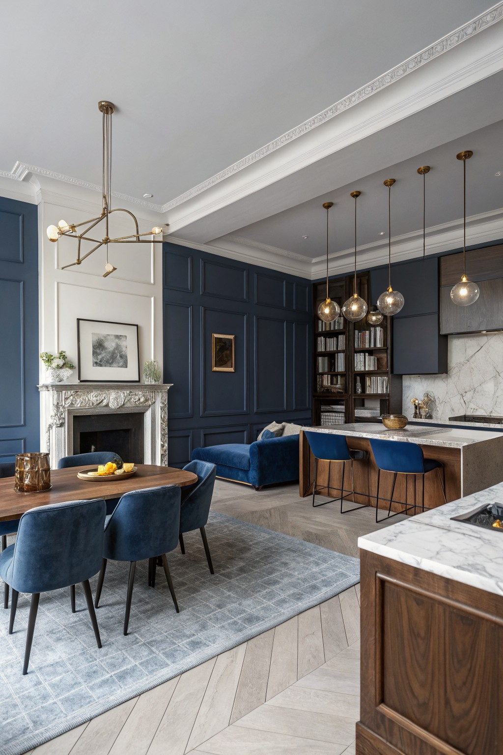
A deep navy blue like this works well in open floor plans because it gives the walls a strong presence without breaking the space into separate zones. The color family is a saturated navy, and it reads very close to Sherwin Williams Naval or Benjamin Moore Hale Navy.
It has a cool undertone that holds up next to wood cabinetry and stone surfaces. This shade works best in rooms with decent natural light, and it pairs easily with white trim or lighter wood floors.
Warm Greige Throughout Open Living Areas

This room uses a warm greige on the walls. It sits in that middle ground between beige and gray and feels easy to live with in an open layout.
The tone has a slight warmth that keeps the wood floors from looking too cool. It pairs well with the cabinetry and works across both the living area and the kitchen without creating any sharp breaks.
soft gray walls

The walls are painted a soft gray that pulls the whole open space together without trying too hard. This color family sits right in the middle, neither too warm nor too cool, so it blends easily with wood floors, stone, and bolder accents like the purple cabinets.
It has a gentle warmth that keeps the room from feeling flat or chilly once the light changes. Use it with crisp white trim and it stays light, though in very sunny rooms it can lean a touch cooler than expected.
Soft Sage Green Cabinets with Gray Undertones
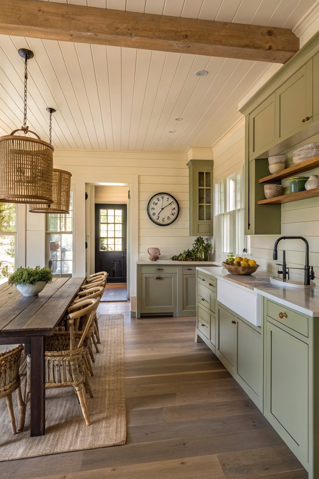
This soft sage green on the cabinets brings a quiet, steady look to an open kitchen. It sits between gray and green, so it feels calm rather than busy and helps the space stay cohesive with the rest of the home.
The color has a light gray undertone that reads softer in natural light and works well with warm wood floors and white trim. It suits both older homes and newer builds, and it pairs easily with black hardware or natural woven pieces without needing much else to feel finished.
Clean White Walls

This open floor plan uses a clean white on the walls to tie the kitchen and living areas together. The color is bright enough to bounce light around but soft enough that it does not feel stark next to the wood floors and blue island.
It has a cool undertone that reads crisp against the white trim and cabinetry. The same white works best in rooms with good natural light, and it pairs easily with wood tones or soft blues without needing extra layers of color.
Frequently Asked Questions
Q: How do I keep the color flow natural when my kitchen cabinets are a totally different tone from the living room sofa? A: Pick one soft neutral for the main walls and let the cabinets stand out as their own accent. Then repeat a muted version of that cabinet tone on an accent wall in the living area. This creates a quiet link without forcing everything to match.
Q: What happens if the paint looks great in one zone but flat in the next because of the windows? A: Walk through the space at different times of day with your sample boards. Shift the same color family one shade lighter or darker where the light changes most. Small adjustments like this keep the whole plan feeling connected.
Q: Can I skip the big samples and just go with the colors that look good on my phone? A: Grab real paint chips and tape them up for a few days instead. Phone screens shift the hues too much to trust for an open layout.









