I have watched plenty of promising colors turn flat or gray once daylight starts to slip away in a north facing room.
Undertones that look clean on the chip often shift against existing trim and flooring in ways that are hard to predict without samples on the wall.
Light matters more than the color name.
Furniture and rugs change the balance too, so a shade that feels open in the morning can close in by evening if it does not play well with the other surfaces already in place.
I always tape up large patches and check them at different hours before committing to anything.
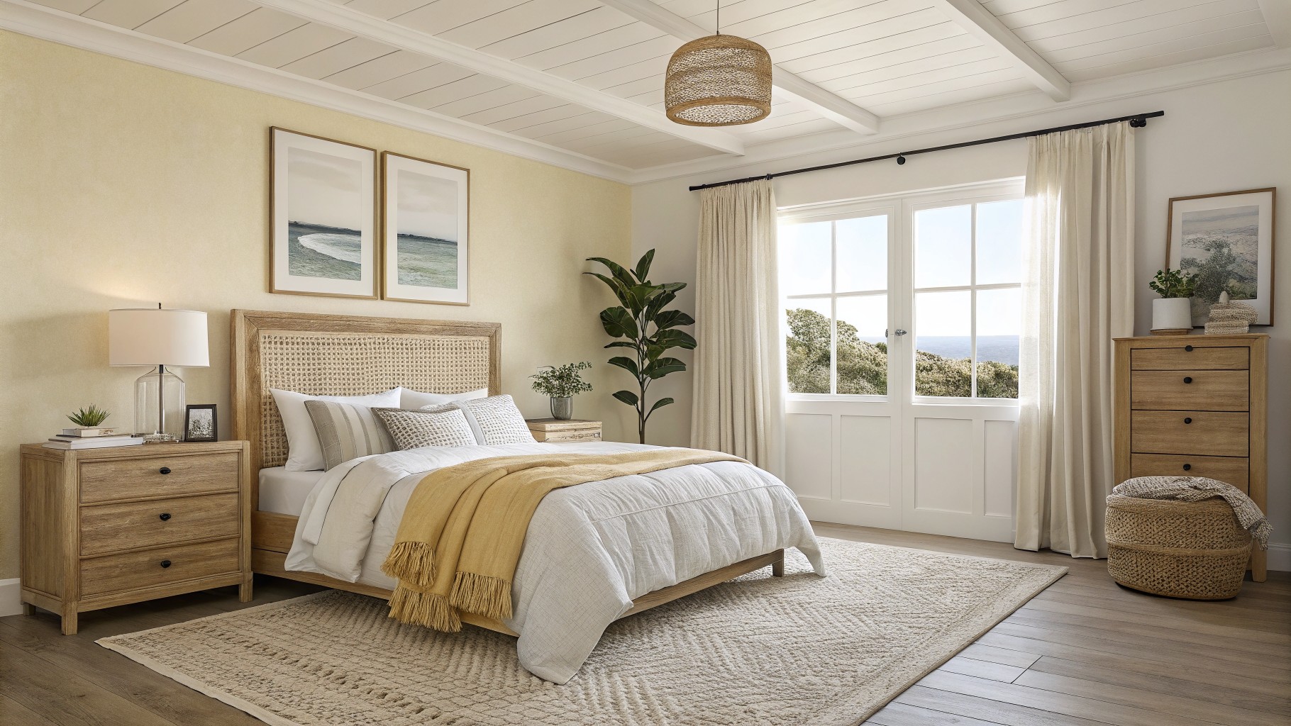
Soft yellow walls

This pale warm yellow brings a gentle brightness to rooms that do not get much direct light. It sits between cream and butter, with enough warmth to keep the space from feeling flat while still staying soft and quiet. Many people reach for colors like this when they want the room to feel open without going all the way to white.
The undertone leans slightly golden rather than green or gray, so it pairs easily with light wood floors and simple white or linen bedding. It can look a little flat under very cool lighting, so test it in the actual room before committing. Good matches in this range include Sherwin Williams Friendly Yellow, Benjamin Moore Hawthorne Yellow, Behr Lemon Meringue, and Farrow & Ball Dayroom Yellow.
Soft Blue Gray Built Ins
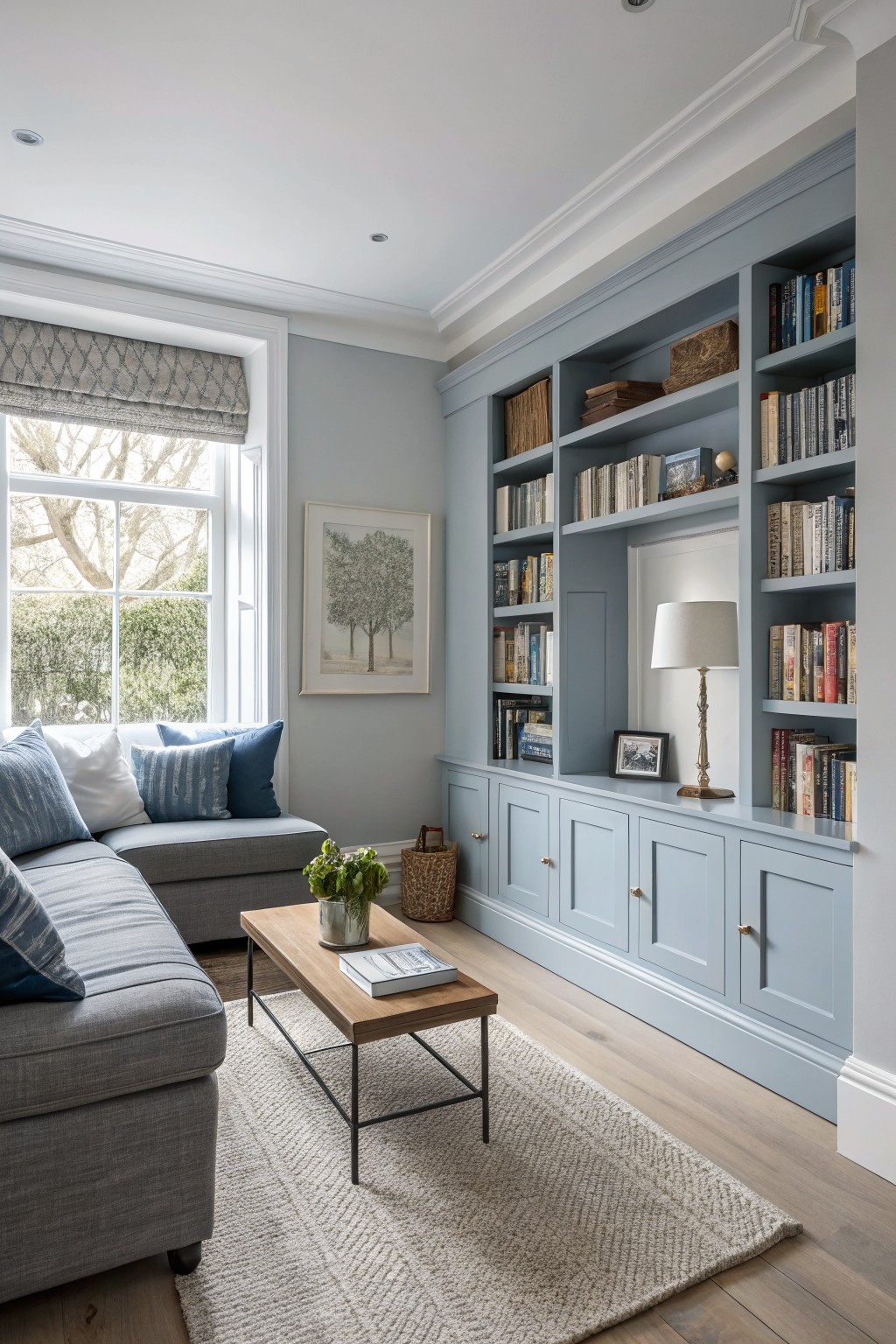
This soft blue gray brings a quiet coolness to rooms that do not get much light. It feels light enough to keep the space open but has enough color to avoid looking flat or washed out.
The tone works well with warm wood floors and white trim. It can suit living rooms or studies where you want something a little different from plain gray without going too bold. Try Sherwin Williams Silver Strand, Benjamin Moore Palladian Blue, Behr Silver Drop, or Farrow & Ball Skylight.
Soft Greige Cabinets

This warm greige sits right between beige and gray. It reads closest to Benjamin Moore Revere Pewter or Sherwin Williams Accessible Beige, with a touch of the same feel as Farrow & Ball Elephant’s Breath. The color stays soft enough to reflect what little light comes in, which helps a narrow kitchen feel less closed in.
It has gentle warm undertones that sit nicely next to wood tones and stone. Pair it with white trim and simple black hardware if you want it to stay bright. Avoid anything too cool or dark in the same space, since that can pull the greige toward muddy.
Soft Mint Green Walls

A soft mint green works well on walls in rooms that need more light. This shade sits between green and blue, giving a clean look that feels open without turning cold or stark.
It has a light cool undertone that reads brighter next to white trim and wood tones. The color suits small baths or any low-light space where you want something fresh but still calm, and it holds up fine with natural wood vanities or simple tile.
Warm beige walls

This warm beige works well in low light because it has a soft, creamy tone that reflects what little light is available without turning cold or flat. It sits right in the middle of the neutral range, so the space feels calm rather than stark. Popular matches in this family include Sherwin Williams Accessible Beige, Benjamin Moore Pale Oak, Behr Almond Wisp, and Farrow & Ball Slipper Satin.
The color has a gentle yellow undertone that keeps it from feeling gray, which helps it stay bright next to white trim and wood floors. It works best in hallways or narrow rooms where you want warmth without darkening the space. Pair it with crisp white woodwork and avoid anything too pink or orange in the undertone if your lighting is already warm.
Soft Butter Yellow Walls

A pale yellow works nicely in low light rooms because it bounces what light is available and keeps the space from feeling dim. This one has a gentle warmth that feels fresh rather than sharp, which makes it easy to live with day after day.
It sits close to Sherwin Williams Lemon Chiffon, Benjamin Moore Pale Honey, Behr Mellow Yellow, and Farrow & Ball Hay. The color pairs best with white trim and simple wood furniture, and it can look a bit flat if the room has no natural light at all.
Soft Sage Green Cabinetry

This muted sage green works well in rooms that do not get much natural light. It has a soft gray undertone that keeps the color from feeling too bright or flat, and it sits nicely against wood tones and stone. Colors like this often read calm without turning dull when the light changes through the day. Good matches include Farrow & Ball Pigeon, Benjamin Moore Saybrook Sage, Sherwin Williams Evergreen Fog, and Behr Dried Thyme.
It pairs best with warm wood trim or a simple mantel rather than crisp white. The finish matters here too, since a satin or eggshell sheen helps reflect what little light is available. Avoid anything too dark or blue in the same space, or the green can start to feel heavy.
Soft blush beige walls

This soft blush beige is a warm neutral with gentle pink undertones that helps low-light rooms feel a little brighter without going full white. It sits nicely against wood floors and furniture, giving the space a quiet lift instead of feeling heavy.
The color works best in bedrooms or sitting rooms where you want something soft but still grounded. Pair it with warm wood tones and avoid cool grays nearby, since the pink can pick up more strongly when the light drops.
Soft Blue Gray Walls

A soft blue gray works nicely in rooms that get limited natural light. This color family stays light enough to keep the space feeling open while adding just enough depth to avoid looking flat.
It has a cool undertone that reads clean next to white trim and light wood floors. Use it in living rooms or hallways where you want a calm background that still feels fresh rather than stark.
Soft Sage Green Walls
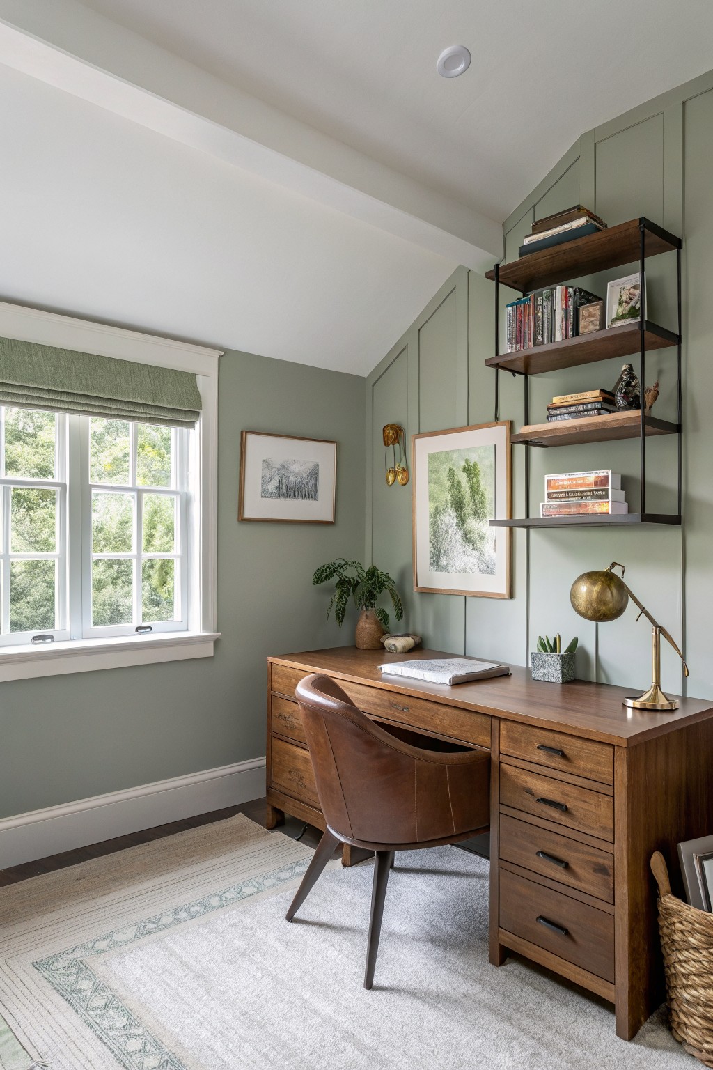
This muted sage green sits in that gentle middle ground between gray and green. It has enough depth to feel cozy in low light but stays light enough not to close the room in. The color reads closest to Sherwin Williams Evergreen Fog, Benjamin Moore October Mist, Behr Aged Sage, and Farrow & Ball Mizzle.
The gray undertone helps it stay calm next to warm wood furniture. It works best in offices or living rooms with medium to low natural light, though it can start to feel a little cool if the room gets almost no sun. Pair it with natural wood tones and simple white or cream trim.
Soft Blue Gray Vanities
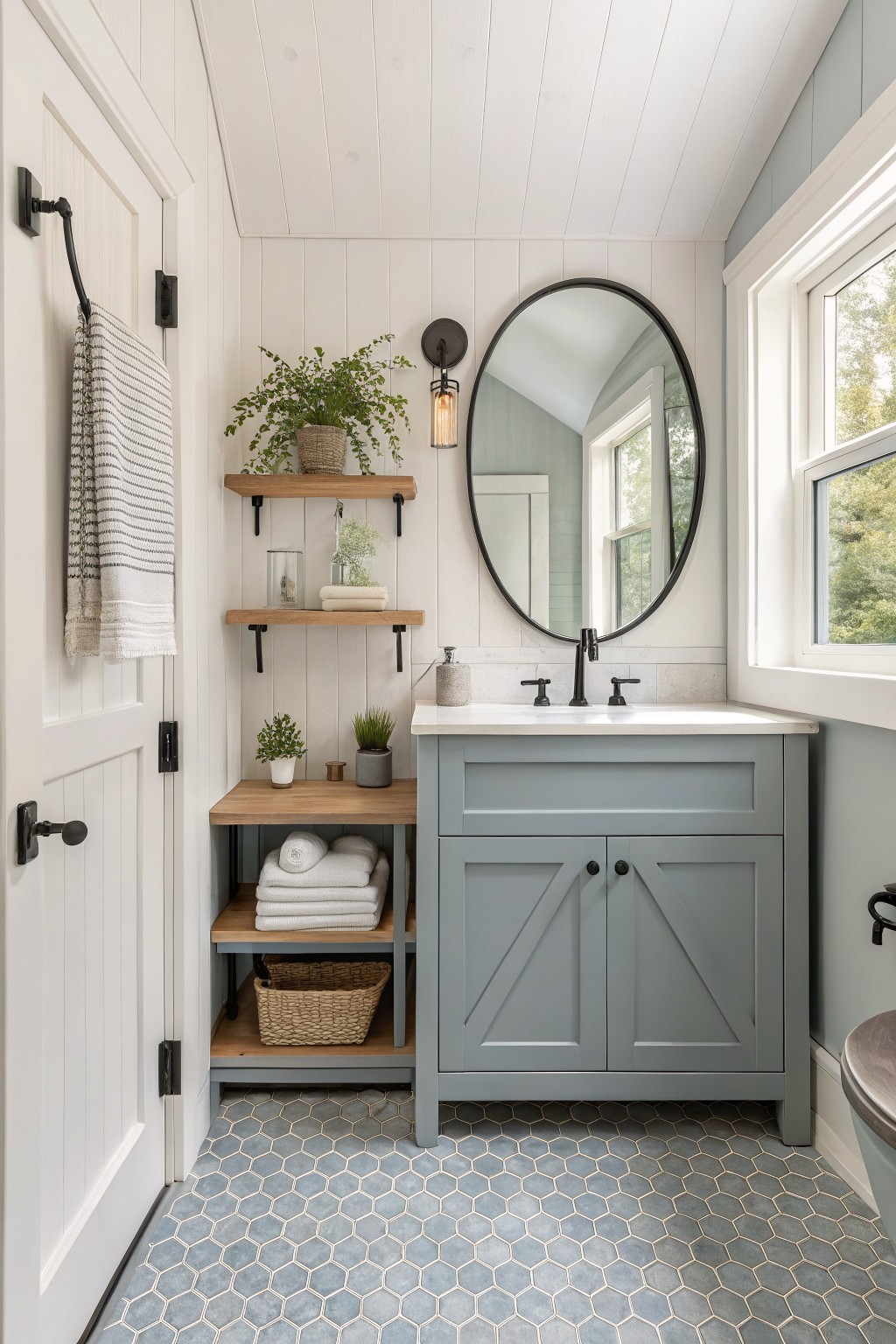
This soft blue gray on the vanity brings a cool, quiet tone that still keeps a small room feeling open. It sits between gray and blue without leaning too hard either way, which makes it easy to live with in low light. Colors like this work well when you want something a little different from plain white or beige but still light enough to bounce what light you have.
It has a gentle cool undertone that pairs nicely with white walls and wood tones. Try it in bathrooms or tight spaces where a true gray might feel flat. Sherwin Williams Silver Strand, Benjamin Moore Wythe Blue, and Behr Silver Drop all sit close to this look.
Soft Sage Green Cabinets

This soft sage green on the cabinets brings a gentle color into a kitchen without making the space feel heavy or dark. It sits in that middle ground between gray and green, so it stays calm even when natural light is limited. Colors like this often read best in older homes where you want something a little warmer than a true gray but not as bold as a full green.
It carries a quiet gray undertone that helps it stay steady next to white tile and wood counters. Try it with brass hardware or a pale yellow wall like the one here, and it still feels bright without looking washed out. It pairs well in kitchens that get some light but need a bit of help feeling open.
Soft Lavender Walls
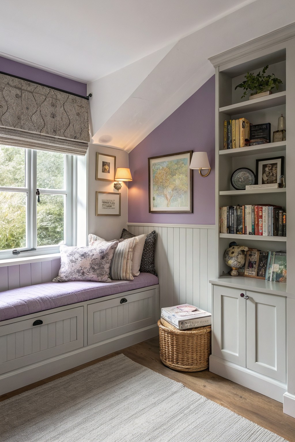
A soft lavender brings just enough color to low-light rooms without closing them in. This pale purple-gray tone feels light on the walls and helps the space stay open even when natural light is limited.
It has cool undertones that sit nicely next to white trim and wood floors. The shade works best in small nooks or bedrooms where you want a gentle color but still need the room to feel bright. Good matches include Benjamin Moore Lavender Ice, Sherwin Williams Hint of Lilac, Farrow & Ball Calluna, and Behr Lilac Chiffon.
Warm Beige Entry Walls

This warm beige on the walls gives a low light room a gentle lift without feeling stark. It has a soft neutral tone with just enough warmth to keep the space feeling open and calm rather than dim.
The color sits well next to white trim and wood floors, and it handles both natural light and lamps without shifting too cool. It works best in entries or small rooms where you want something simple that still feels bright enough to live with every day.
Soft Yellow Bedroom Walls

A soft yellow like the one on these walls brings a gentle brightness to rooms that stay dim. It has that warm, buttery feel without turning too bold. The color reads closest to Benjamin Moore Hawthorne Yellow or Sherwin Williams Daffodil.
It sits nicely against white trim and keeps the space feeling open even when light is limited. This shade works best in bedrooms or small rooms where you want a little cheer without making the walls feel heavy.
Soft Blue Gray Living Room Walls

A soft blue gray like the one on these walls helps low light rooms feel a little more open. It sits between blue and gray so it stays calm and does not go flat when the light is low.
The color has cool undertones that work best with white trim and wood floors. Try Sherwin Williams Worldly Gray, Benjamin Moore Wythe Blue, or Farrow & Ball Light Blue if you want something close.
Soft Sage Green Built Ins

This soft sage green brings a calm feel to rooms that need more light. It sits in the muted green family with gray undertones that keep it from turning heavy. The color reads closest to Sherwin Williams Clary Sage, Benjamin Moore Saybrook Sage, or Farrow & Ball French Gray.
It works especially well on built ins because the tone stays steady next to wood floors and trim. The gray in the mix helps the space feel open even when natural light is low. Stick with simple wood tones and avoid anything too cool or stark beside it.
Soft blue walls and ceiling
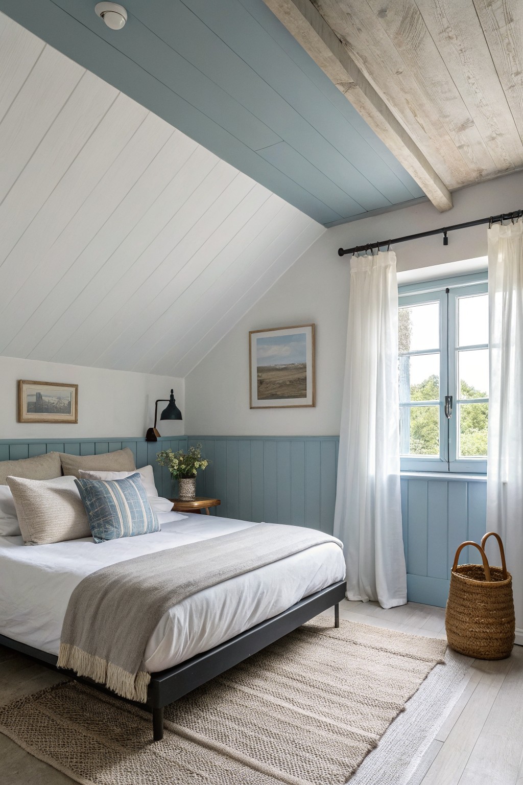
A soft blue gray works nicely in rooms that do not get much light. It looks closest to Sherwin Williams Silver Strand, Benjamin Moore Wythe Blue, or Farrow & Ball Pale Blue. The color stays gentle on both the paneling and the ceiling, which helps the space feel a little taller and less closed in.
The cool undertone keeps it from turning flat, but it still needs white trim or pale upper walls to stay bright. It pairs well with light wood floors and simple linen curtains. Too many dark textiles can make it feel heavier than it needs to.
Soft Sage Green Walls With Matching Cabinets
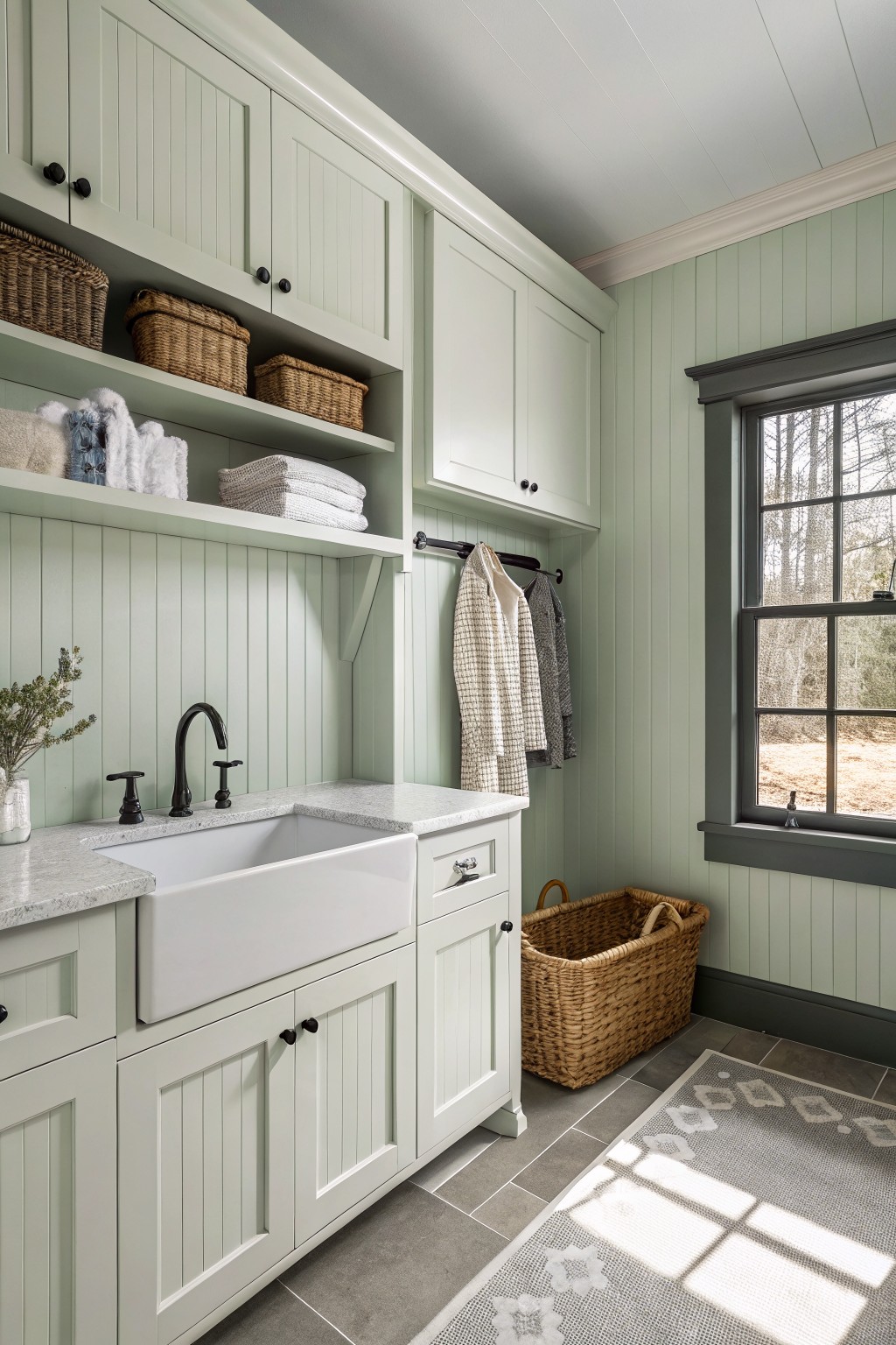
A soft sage green like the one on these walls and cabinets gives a room a gentle lift without feeling cold. The color sits in that middle ground between gray and green, so it keeps things calm while still adding enough life to make the space feel open.
It works especially well with white or off-white trim and stone or tile surfaces, since those keep the green from tipping too cool. In low light this shade stays steady instead of going flat, and it pairs easily with natural baskets or wood tones if you want a simple, unfussy look.
Soft Peach Walls

A soft peach works well in rooms that do not get much direct light. This warm, muted shade sits between pink and orange and helps the space feel a little brighter without turning stark or cool.
It has a gentle yellow undertone that keeps the color from feeling too sugary. White trim and light wood floors make it read even softer, and it suits small dining spots or window nooks where you want warmth without darkening the room.
Frequently Asked Questions
Q: How do I pick a color from the list when my room gets almost no direct sun? A: Warm off-whites and light taupes with yellow undertones work well because they catch and spread whatever light enters. Cool grays often fall flat in those conditions. Brush a sample on the wall and check it at midday and evening.
Q: Can dark furniture still fit with these bright schemes? A: Yes. The light walls create enough contrast to keep the space open even next to a dark sofa or table. Place one or two reflective pieces like a glass lamp nearby to bounce light around.
Q: What if the color looks too flat after the first coat? A: Add a second coat right away since low light hides thin spots. A soft sheen finish helps more than flat paint does in dim rooms.









