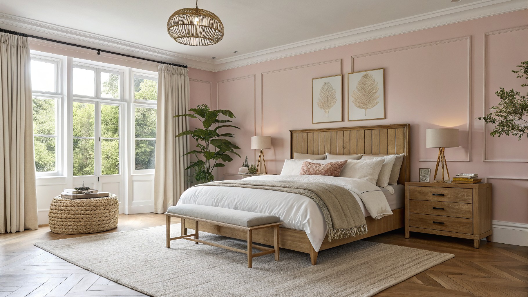
I have noticed that soft pink shades often shift depending on the direction of the windows in a room.
It is easy to choose a shade that looks perfect on a fan deck only to find it turns too peachy or gray once it covers the walls.
Samples on the actual surface tell the real story.
I like to place them near the trim and any upholstered pieces to see how everything works together in the space.
That step usually shows which colors will stay elegant without feeling too sweet or flat in the finished room.
Soft blush pink walls
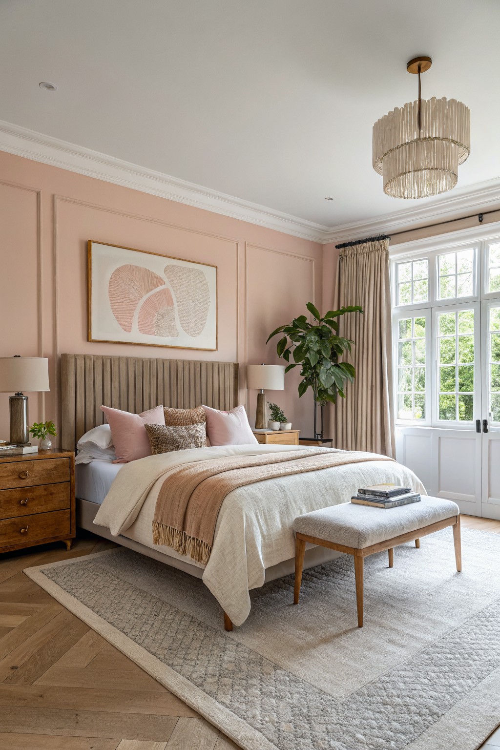
This bedroom uses a soft warm pink on the walls that feels calm without turning sweet. The color sits in a light blush family with a gentle peach undertone that keeps it from looking too cool or flat next to wood.
It works best in rooms with plenty of natural light and pairs easily with warm wood furniture, linen bedding, and neutral rugs. Watch how it shifts slightly warmer in the evening. Good matches in this range include Benjamin Moore Pale Petal, Sherwin Williams Romance, Behr Soft Blush, and Farrow & Ball Pink Ground.
Soft Dusty Pink Living Room Walls
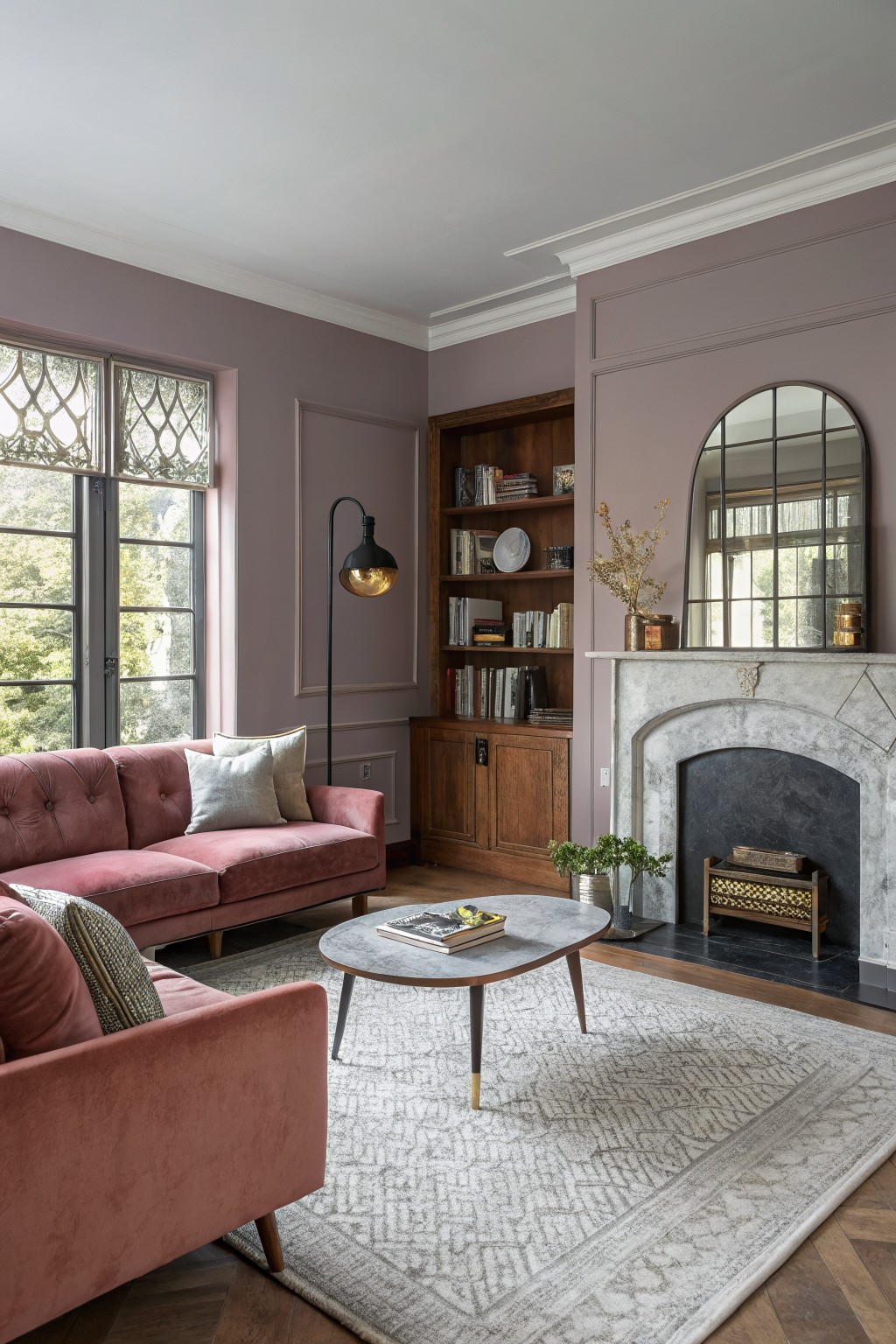
This muted dusty pink has a grayish tone that keeps the color calm rather than sweet. It reads as a soft rose-mauve that works well on larger wall areas. Similar shades include Farrow & Ball Cinder Rose, Sherwin Williams Roseate, Benjamin Moore Mauve Mist, and Behr Mauve Whisper.
The cool undertone helps it sit nicely next to wood cabinetry and stone. It stays balanced in rooms with mixed natural light but can shift grayer in low light, so testing a sample on the actual wall is useful before committing.
Soft pink kitchen island
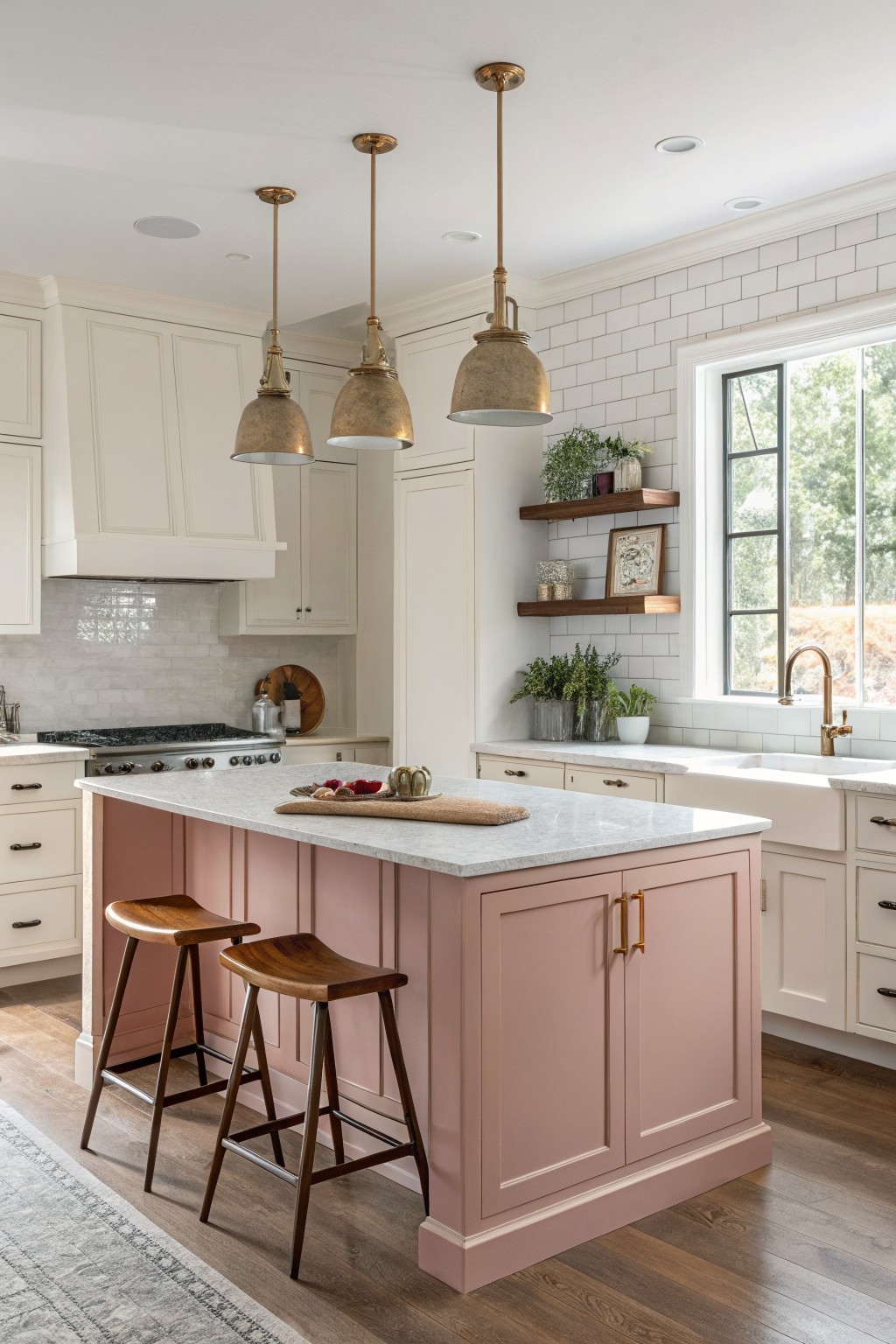
This soft pink on the island has a warm, slightly muted tone that feels more like a dusty rose than a bright blush. It sits nicely between pink and beige, which keeps the color calm and easy to live with. Shades like Sherwin Williams Romance, Benjamin Moore Palladian Pink, or Farrow & Ball Pink Ground all carry a similar quiet warmth.
The color works well against white walls and wood floors because the warmth prevents the pink from looking too cool or flat. It also holds up next to brass hardware without competing. In a kitchen with good daylight it stays soft, but in lower light it can read a touch deeper, so testing a sample on the actual cabinet is worth doing.
Soft Pink Bathroom Walls

This soft pink has a gentle gray undertone that keeps the color from feeling too sweet or childish. It belongs to the dusty pink family and looks closest to Sherwin Williams Blush, Benjamin Moore Pink Harmony, or Farrow & Ball Calamine.
The color sits nicely against marble and brass, and it works best in bathrooms that get steady daylight. It can start to look flat in very low light, so test it first if your space is darker.
Soft Pink Dining Room Walls

This warm dusty pink brings a gentle color to dining rooms and living spaces without feeling too sweet. It reads very close to Farrow & Ball Pink Ground, Sherwin Williams Rosy Outlook, Benjamin Moore Pale Petal, and Behr Rose Petal.
The color has a light peachy undertone that sits nicely next to wood furniture and woven rugs. It works best with plenty of natural light and pairs well with deeper wood tones or soft neutrals on the floor.
Soft Pink Ceilings
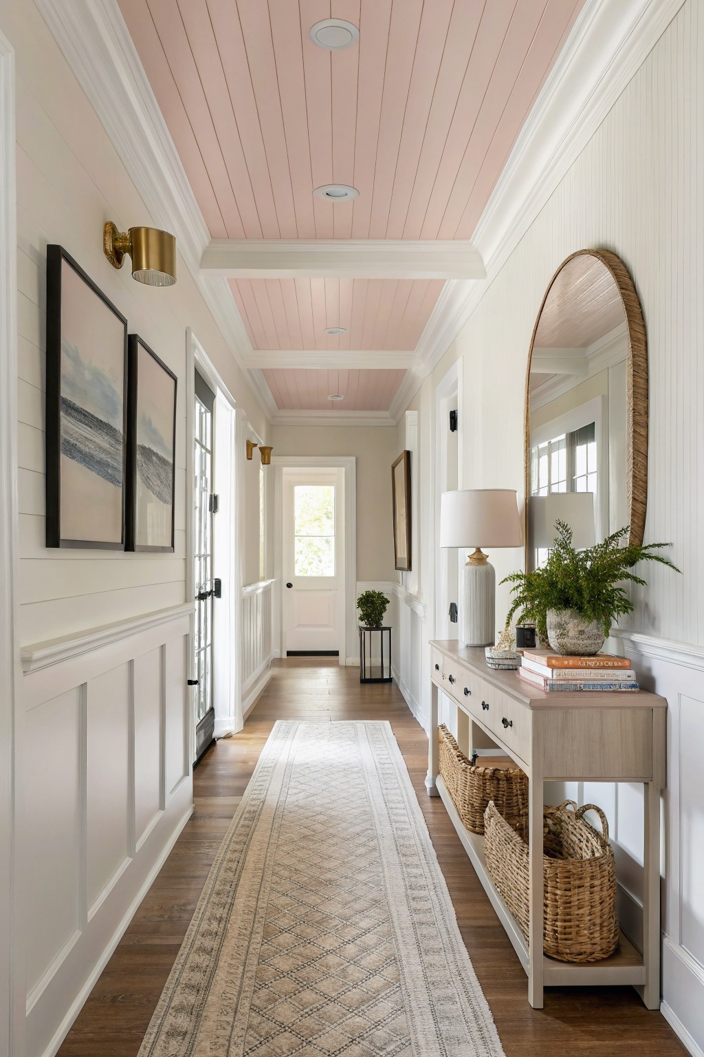
A soft pink ceiling adds a quiet warmth that feels calm rather than bold. This shade stays very light with just enough warmth to keep the hallway from feeling stark, and it sits well against the white walls and wood floor.
It has a slight creamy undertone that helps it read gently in natural light. Pair it with white trim and simple wood tones so the pink stays the focus without turning sugary. Colors like this often match things such as Benjamin Moore Pink Ground, Sherwin Williams Rosebud, or Behr Blush Pink.
Soft Pink Nursery Walls
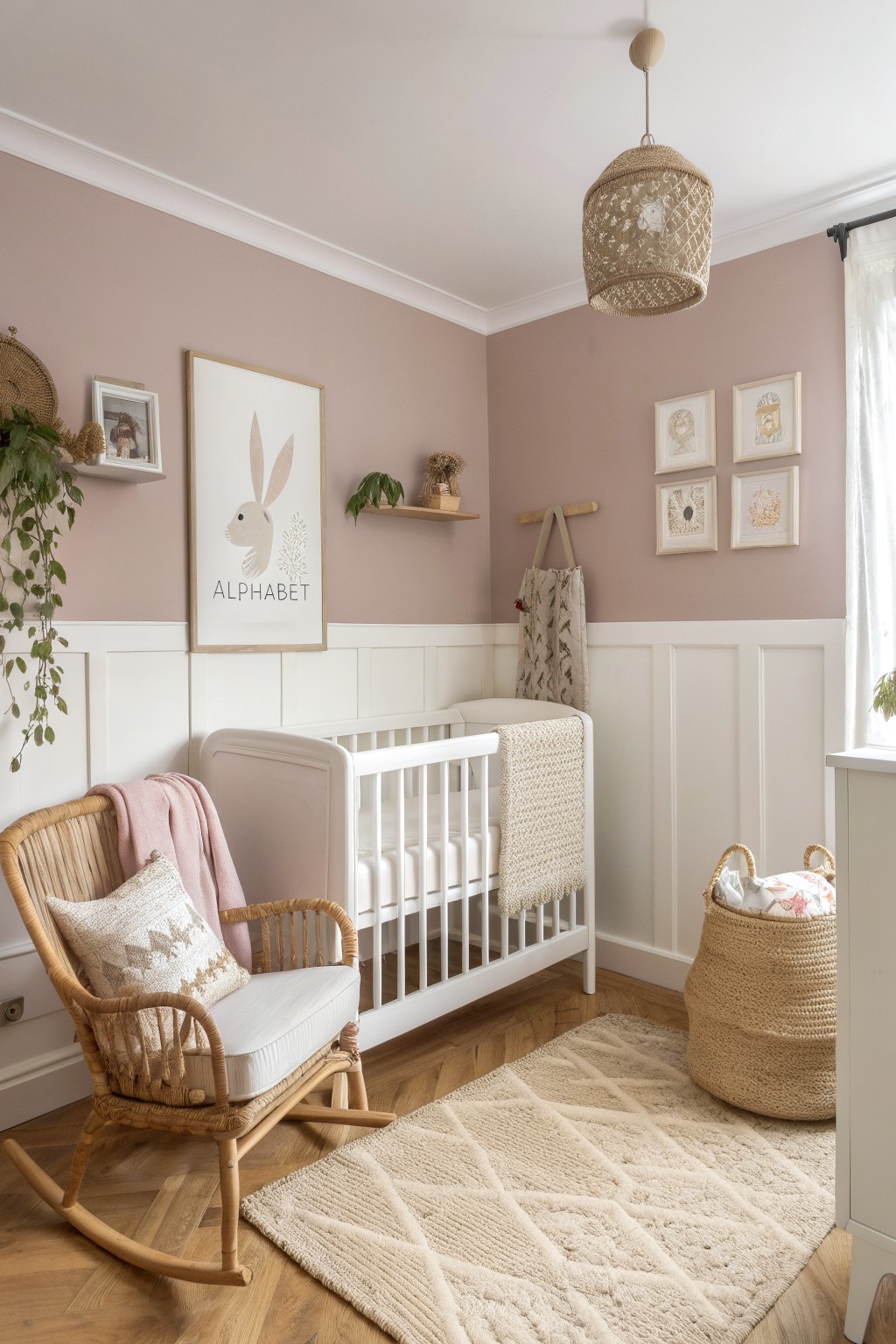
This soft pink has a warm, dusty tone that feels calm without turning too sweet. It sits nicely between beige and rose, which keeps the room feeling light and a bit grown up even in a nursery setting. Many people reach for this kind of color when they want pink but still need it to work with wood floors and simple furniture.
The undertone leans slightly warm, so it pairs well with white trim and natural wood. It can look a little flat in very cool light, so test it on a south or west wall if you can. Good matches include Benjamin Moore Mauve Mist, Sherwin Williams Ballet Slipper, Behr Rose Quartz, and Farrow & Ball Setting Plaster.
Soft Pink Office Walls

This soft dusty pink works well on both the walls and the built-in cabinetry. It has a muted tone with a hint of gray that keeps it from feeling too sweet or overly feminine. The color sits nicely against warm wood floors and brass hardware without competing with them.
It tends to read a bit warmer in natural light and pairs easily with brown leather and simple textiles. Watch the depth though, because in very bright rooms it can start to feel chalky if the finish is too flat.
Soft Pink Bathroom Walls with Beadboard
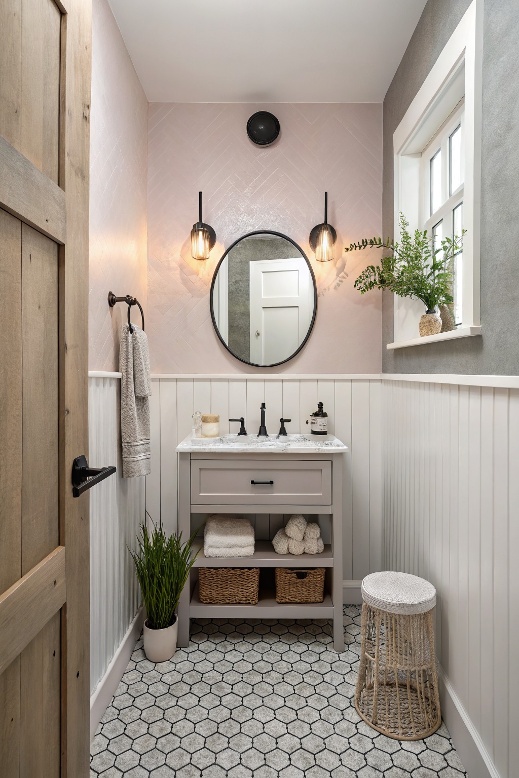
This soft pink has a light dusty tone that feels calm and a bit muted. It gives the room a gentle warmth without turning sugary, which makes it easy to live with in a small space like a bathroom.
The color sits nicely next to white beadboard and gray tile. It works well with black hardware or light wood tones, though it can look cooler under bright overhead lights so testing a sample on the wall helps. Good matches in this range include Farrow & Ball Pink Ground, Sherwin Williams Romance, Benjamin Moore First Light, and Behr Blush Pink.
Warm Blush Pink Bedroom Walls
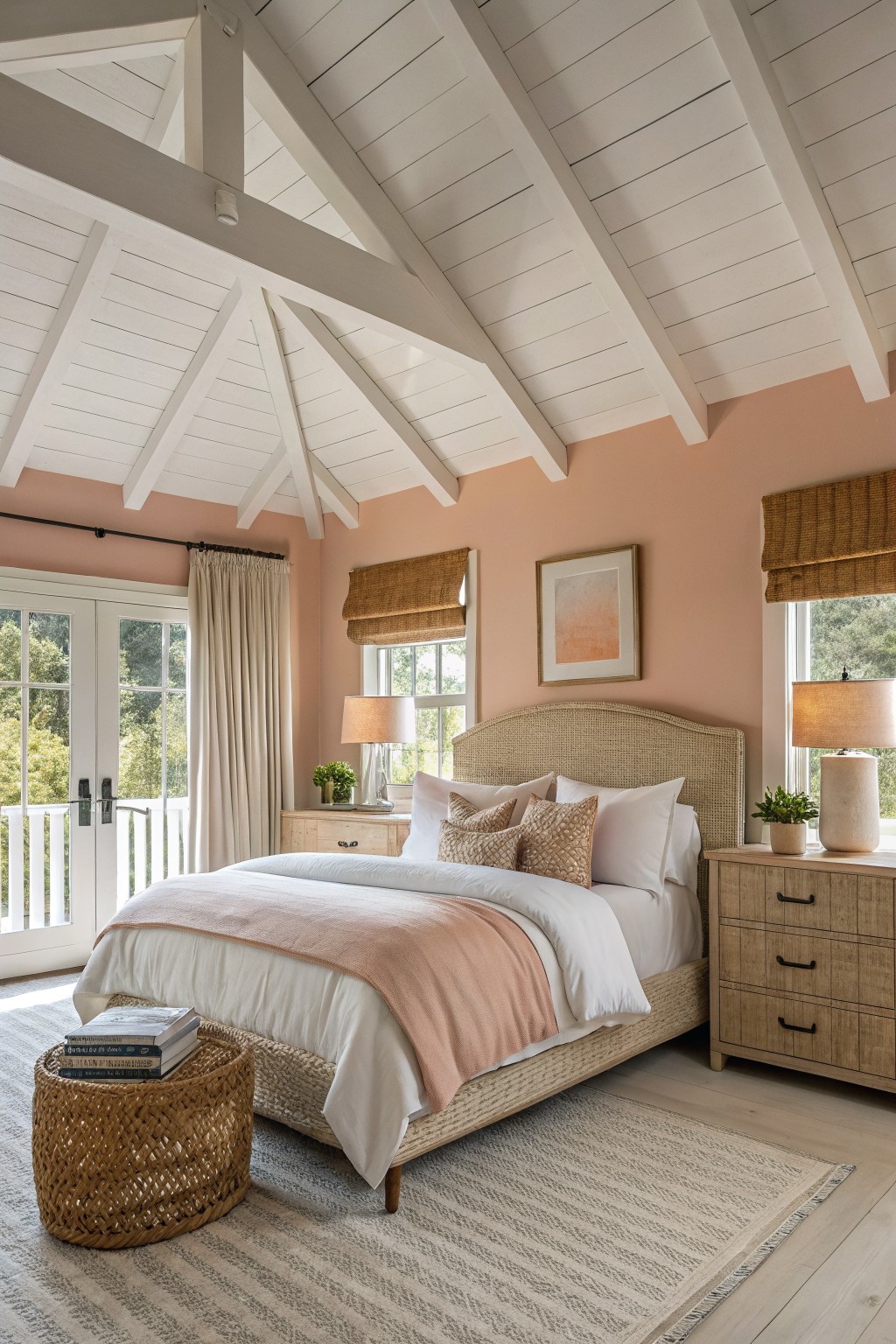
This room uses a soft pink that leans warm and peachy. It reads as a light blush pink with gentle orange undertones, and colors like Benjamin Moore Pale Pink, Sherwin Williams Rose Petal, Behr Blush Pink, or Farrow & Ball Setting Plaster come close.
The warmth keeps the color from feeling too cool against wood floors and white trim. It suits bedrooms or sitting rooms that get steady daylight, though it can look a bit flat in very dark spaces.
Soft Pink Entryway Walls

This soft pink is a muted dusty rose that sits nicely between gray and warm tones. It reads close to Farrow & Ball Cinder Rose, Benjamin Moore Blush, Sherwin-Williams Romance, and Behr Rose Petal. The color stays calm next to white trim and wood floors without turning too sweet or babyish.
It works best in entryways or hallways where you want a gentle shift from cooler rooms. Watch the lighting though, since the gray undertone can pull cooler in north light and warmer in afternoon sun. Pair it with simple white woodwork and natural wood tones to keep the look balanced.
Soft Pink Kitchen Cabinets
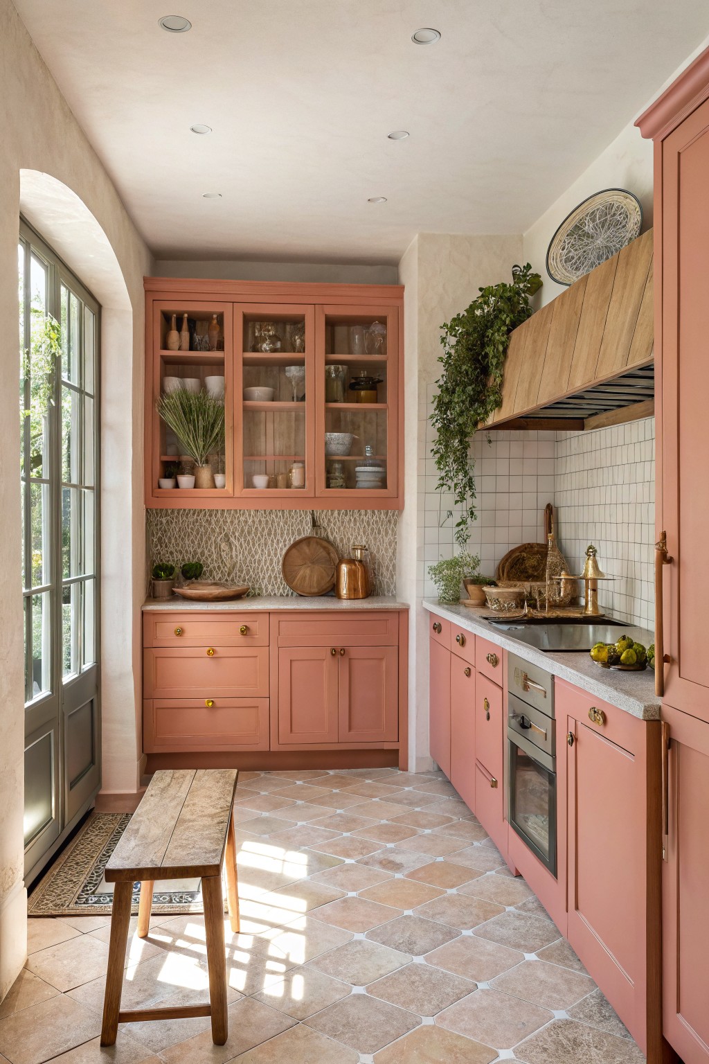
This soft pink has a warm dusty tone that feels gentle rather than sweet. It sits somewhere between rose and terracotta, which makes it easy to live with on larger surfaces like cabinets. The color adds a quiet warmth without overpowering the room.
It carries a light peachy undertone that shows up more in natural light. Pair it with warm wood tones and simple stone or tile to keep the look grounded. It suits kitchens that already have some natural texture.
Soft Pink Built-Ins
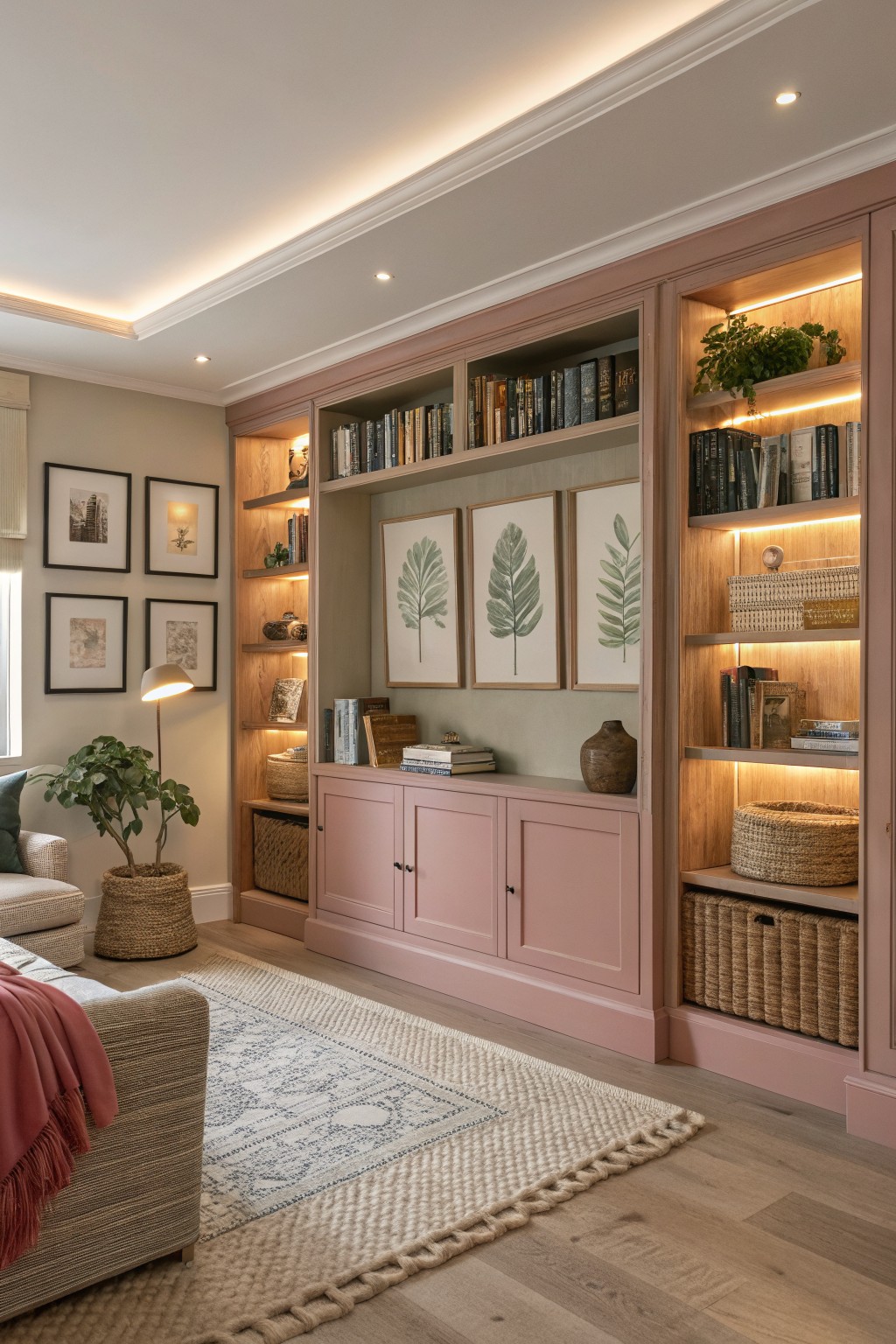
This soft pink on the built-ins has a warm, slightly dusty tone that feels calm rather than sweet. It falls into the blush family and reads close to Farrow & Ball Pink Ground, Benjamin Moore’s Pale Pink, Sherwin Williams Roseate, or Behr’s Soft Cameo.
The warmth helps it sit comfortably next to the wood tones and light flooring without fighting them. It works well in living rooms or studies where you want a bit of color that still feels relaxed, and it pairs easily with woven textures and neutral fabrics.
Soft Pink Laundry Room Walls

A soft warm pink like this one brings a gentle color to the walls without feeling too sweet. It sits somewhere between blush and a light terracotta, and shades such as Benjamin Moore Pink Ground, Sherwin Williams Rosy Outlook, Farrow & Ball Setting Plaster, or Behr Blush Pink all come close.
The color has a faint peachy undertone that keeps the room feeling bright next to white tile and blue upper cabinets. It works best in small utility spaces where you want a bit of warmth but still need the room to stay light and practical.
Dusty rose walls

This dusty rose pink sits in a nice middle ground between pink and mauve. It has a muted quality that feels soft but still holds some weight. The color reads closest to Farrow & Ball Cinder Rose, with similar versions showing up in Sherwin Williams Rosebud and Benjamin Moore Pink Harmony.
It pairs well with dark wood and black fixtures because the pink has enough depth to balance them. The grayish undertone keeps the space from feeling overly sweet, which makes it a good choice for smaller rooms like powder rooms. Just watch how it shifts in different light, since the gray can pull stronger in cooler rooms.
Soft Pink Stairs
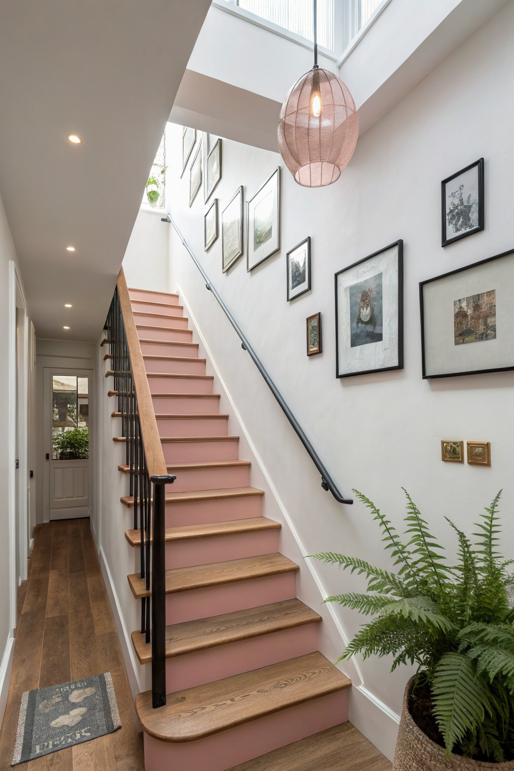
A soft pink on stair risers gives a quiet lift without taking over the space. This version sits in a gentle, slightly dusty range that feels warm next to wood but stays calm overall. It reads closest to Farrow & Ball Calamine, Benjamin Moore Pink Harmony, Sherwin Williams Rose Petal, or Behr Blush Pink.
The color holds up well in mixed light and works best with white walls and natural wood tones. It can look a touch flat if the lighting is very cool, so testing a sample on the actual surface helps.
Soft Blush Pink Cabinetry
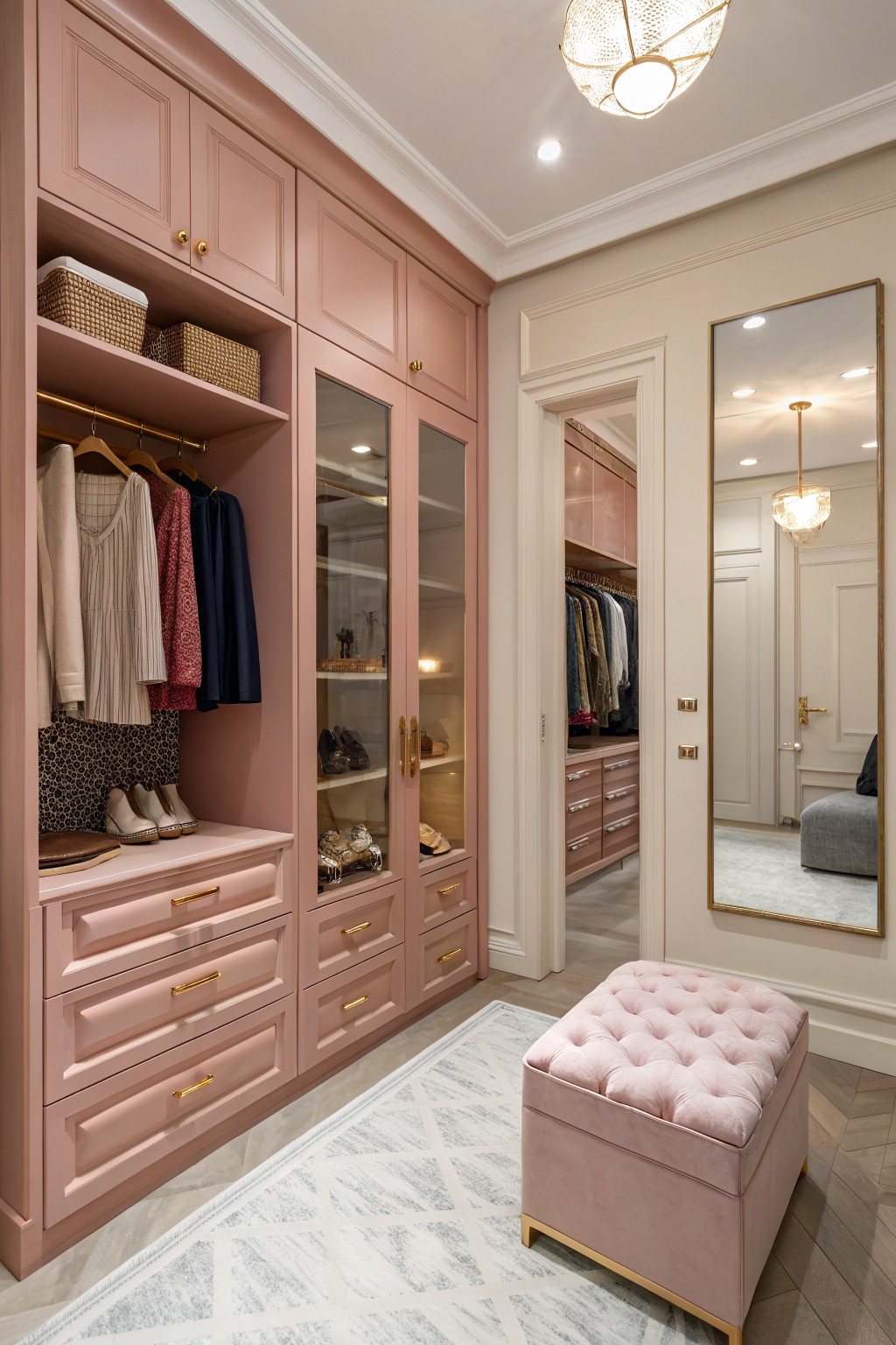
This soft blush pink gives cabinetry a gentle, lived-in feel without looking too sweet. It sits in that warm rose family and looks closest to Benjamin Moore’s Baby Pink, Sherwin Williams’ Blush, Farrow & Ball’s Pink Ground, or Behr’s Rose Petal.
The color has a light dusty undertone that keeps it from feeling flat next to wood tones or cream trim. It works best in spaces with good natural light and pairs easily with brass hardware or a simple white ceiling.
Soft Pink Bedroom Built-Ins
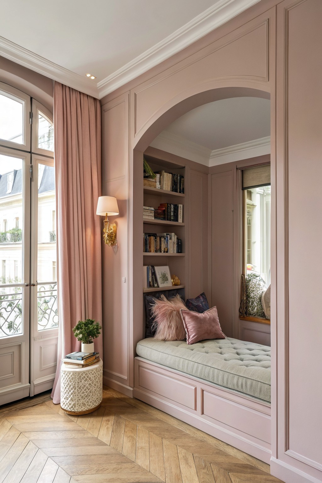
This soft blush pink works nicely on walls and built-ins because it feels warm without being too sweet. The color has a gentle dusty quality that makes the whole space feel calm and a bit lived-in. It sits well next to the wood floor and keeps the room from looking too stark.
The undertone leans slightly warm, which helps it look good with both natural light and the brass accents nearby. It works best in bedrooms or small reading spots where you want something soft but still grown-up. Pair it with pale wood or simple white textiles if you want to keep the look easy.
Frequently Asked Questions
Q: How do I pick the right soft pink if my room gets mostly afternoon sun?
A: Go for a pink with cool undertones so the light does not push it too warm by late day. Paint a large sample board and move it around the room for a few days to watch how it shifts.
Q: Can soft pink work with my dark wood floors?
A: Yes it balances the weight nicely. Choose a pink that leans slightly gray so the floors stay the main feature instead of fighting the walls.
Q: What if I want to repaint in a few years?
A: These shades layer well under new colors so you will not need heavy primer coats later. Stick with matte or eggshell finishes to make future changes even easier.









