I have spent years watching how certain Benjamin Moore shades settle into a room once the furniture is in place and the light shifts through the day.
Undertones that look neutral on a chip can suddenly pull warm or cool against the trim and flooring.
I test them in place first.
Some colors hold their balance better than others when evening light comes in.
I still reach for those steady ones when I want a space that feels right for years.
Soft Greige Bedroom Walls

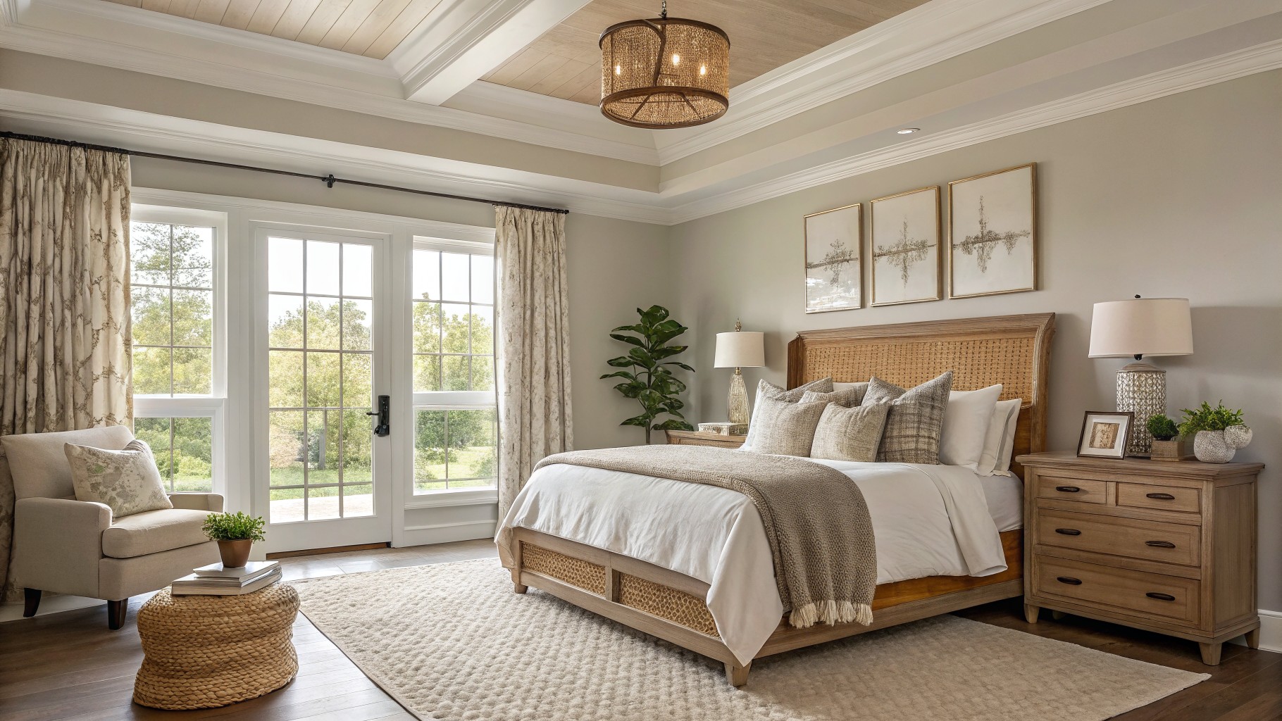
This room uses a light greige that feels warm without turning yellow. Benjamin Moore Revere Pewter captures that same soft gray-beige tone and sits nicely against the wood trim and ceiling.
It works because the color stays quiet while the wood tones and white bedding do the rest. Pair it with natural oak floors or simple linen curtains if you want the same relaxed look. Just test it in the actual light first since greiges shift fast once the sun moves.
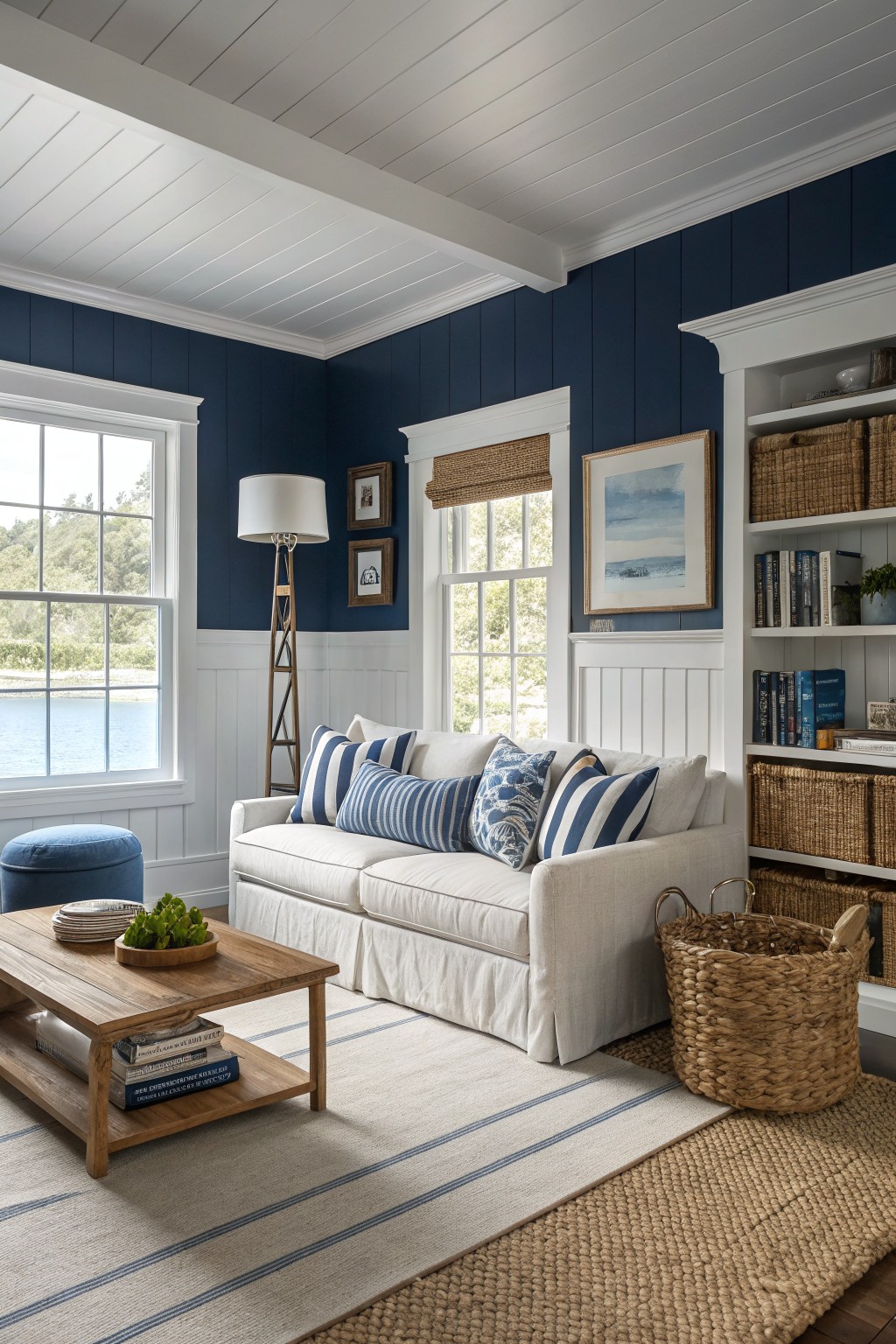
Benjamin Moore Hale Navy is the color that gives these walls their rich depth. It is a true navy that feels grounded without turning too dark, and it works especially well when the room has plenty of white trim and natural light.
The color has a slight cool undertone that keeps it crisp next to the white wainscoting and ceiling. It pairs nicely with wood tones and simple fabrics, though it can feel heavy in smaller rooms that get little sunlight.
Sage Green Cabinets

This kitchen shows a soft sage green on the cabinets that reads closest to Benjamin Moore October Mist. The color sits in that middle ground between green and gray, which keeps it from feeling too bright or too dull in a space with a lot of wood and white.
It pairs easily with the warm wood on the island and the white trim around the windows. The shade can look a little cooler in lower light, so it helps to test a sample on the actual cabinet door before committing.
Dark Charcoal Gray Walls
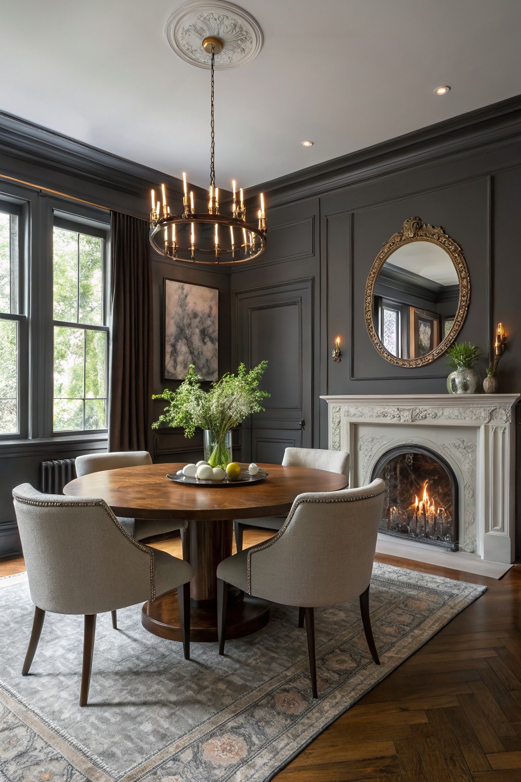
This deep charcoal gray reads very close to Benjamin Moore Kendall Charcoal. It gives the room a solid, settled look that feels comfortable rather than heavy.
The color has a touch of warmth that keeps it from feeling flat next to wood floors and white trim. It works best in rooms with classic details where you want the walls to stay in the background without disappearing.
Soft Sage Green Walls
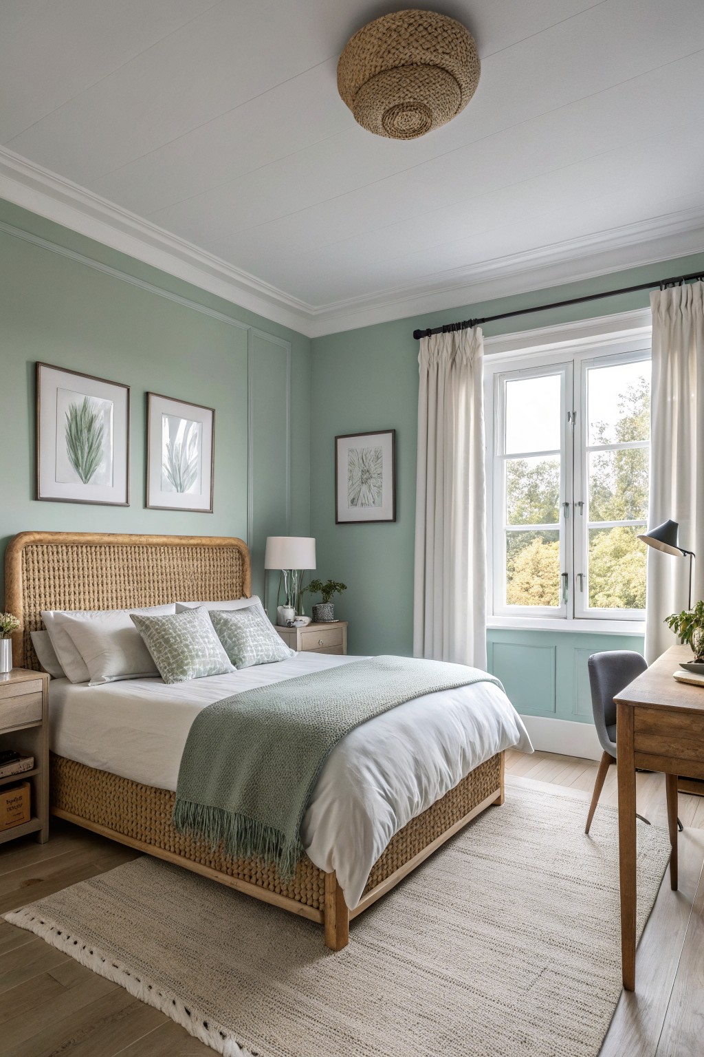
This soft sage green on the walls looks closest to Benjamin Moore Saybrook Sage. It is a muted green with a bit of gray that feels calm and easy to live with.
The color sits nicely next to warm wood and white bedding because the cool undertones keep it from feeling too yellow or too blue. It works best in bedrooms or sitting rooms where you want something gentle that still gives the space a bit of character.
Soft Sage Green Bathroom Walls
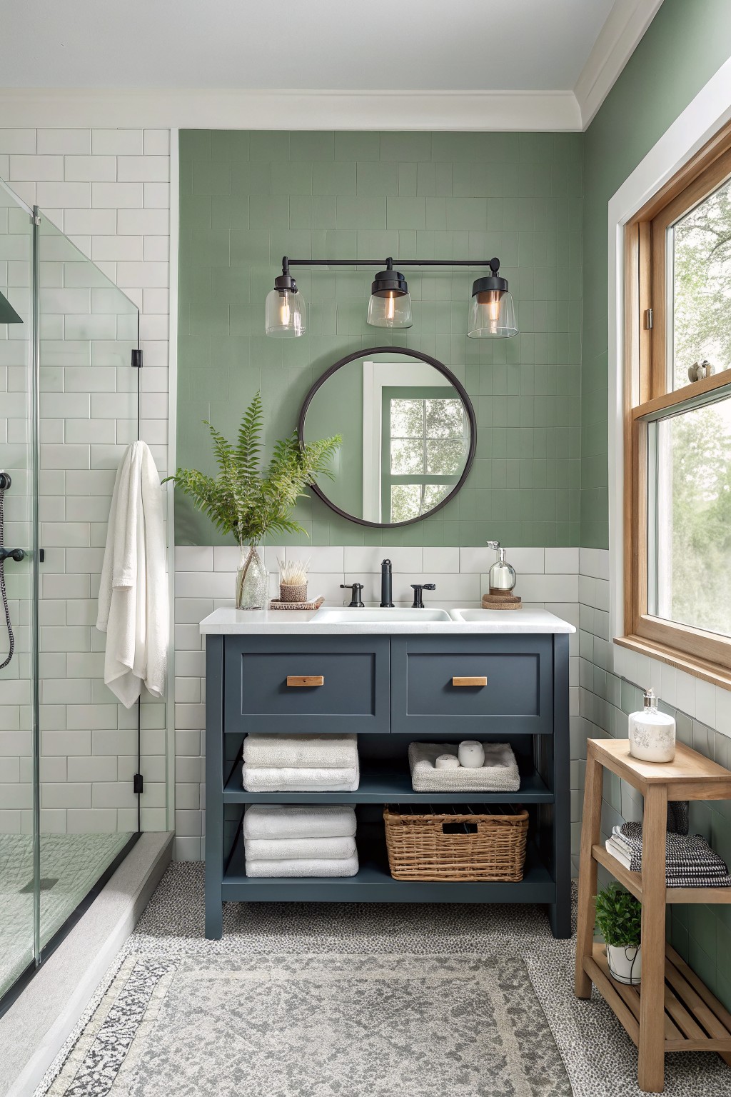
This soft sage green reads closest to Benjamin Moore October Mist. It is a muted green with gray undertones that feels calm and easy to live with. The color sits nicely next to white tile and keeps the room from feeling stark.
It works best in spaces with good natural light and pairs cleanly with dark cabinets or black fixtures. Watch the undertones if your lighting leans warm, since they can shift the green slightly toward gray.
Warm Greige Walls

This hallway shows a soft greige that looks closest to Benjamin Moore Revere Pewter. It sits right in the middle of gray and beige, which keeps the color feeling warm and steady instead of cool or flat.
The shade pairs easily with white trim and dark wood floors. It holds up well in spaces with mixed lighting and gives the walls enough depth to feel finished without pulling attention away from the woodwork.
Deep green walls
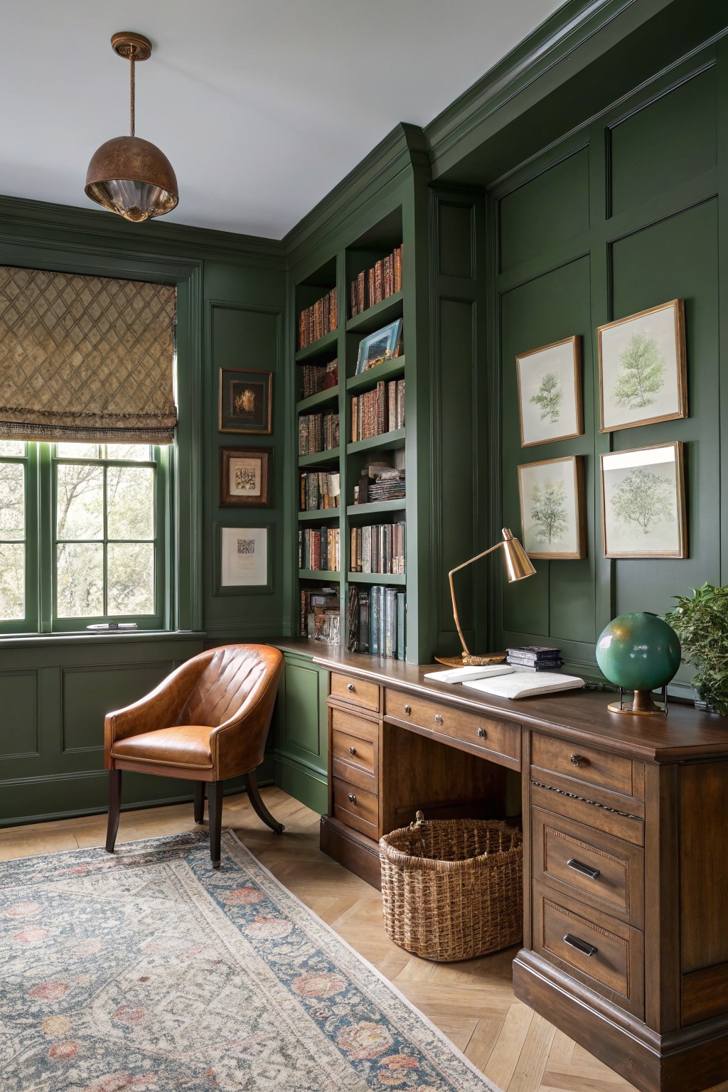
This deep green reads very close to Benjamin Moore Forest Green. It gives the room a solid, grounded look that feels classic rather than trendy.
The color has a slight blue undertone that sits nicely next to warm wood tones and brass accents. It works best in rooms with built-ins or lots of woodwork where you want the walls to feel substantial but still calm.
Soft Greige Kitchen Cabinets
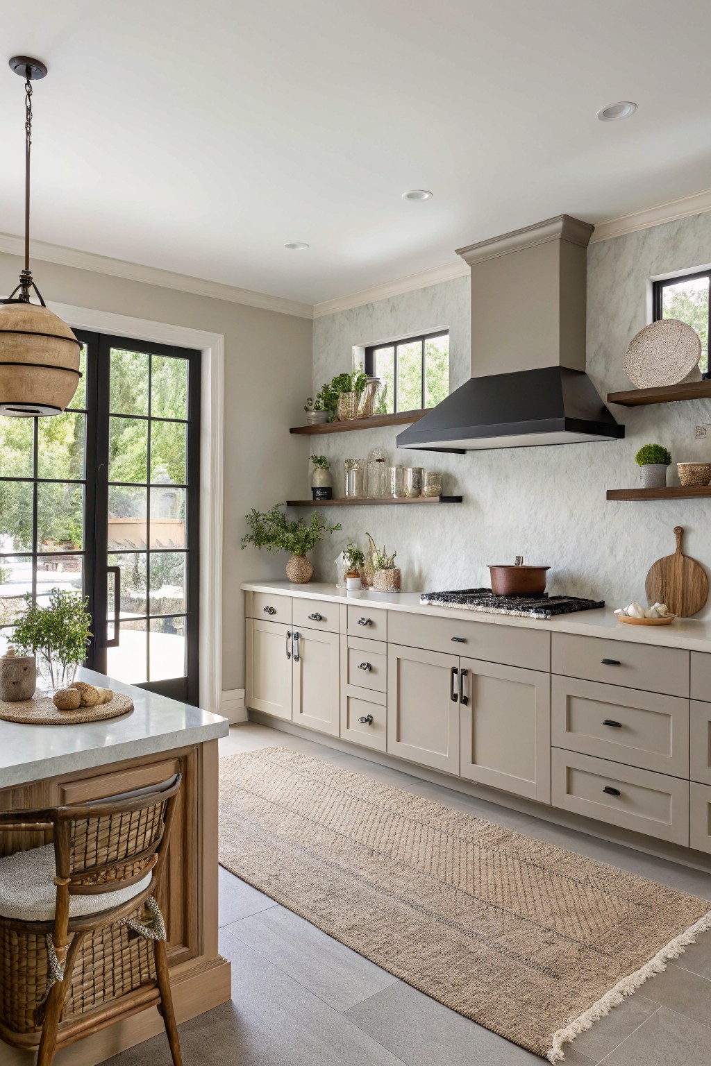
This kitchen uses a warm greige that reads closest to Benjamin Moore Revere Pewter. The color sits nicely between gray and beige, giving the cabinets a soft, lived-in look without feeling flat or too cool. It pairs well with wood tones and keeps the whole space feeling calm and steady.
Revere Pewter has a slight warm undertone that shows up more in natural light, so it works best in rooms with decent daylight. It looks good against both light stone and darker hardware, though it can start to feel dull if the lighting stays too dim all day.
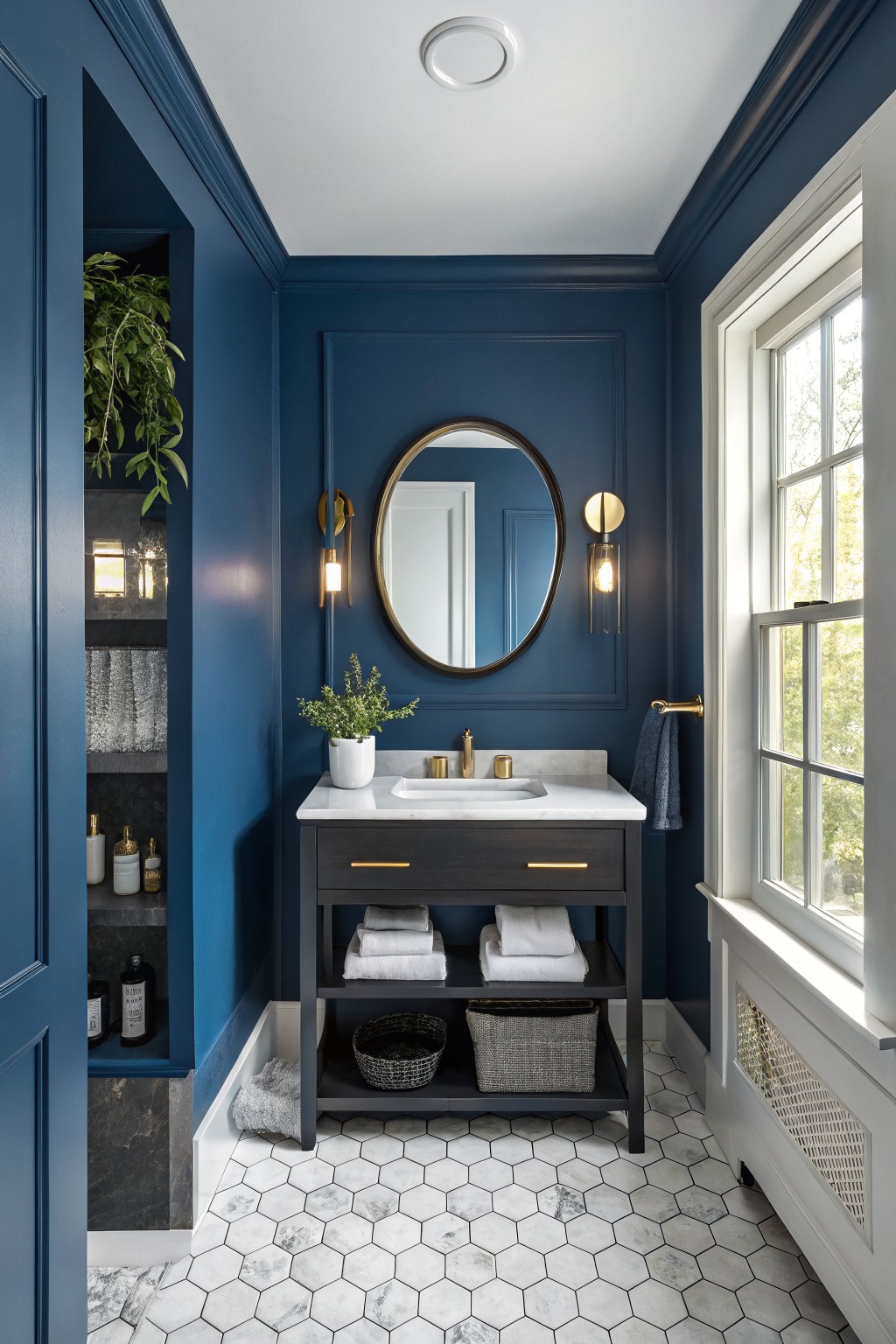
This bathroom uses a deep navy that looks closest to Benjamin Moore Hale Navy. The color brings a steady, grounded feel to the room while still keeping it bright enough thanks to the white trim and marble.
It has a cool undertone that sits nicely next to dark wood and brass details. This shade works best in smaller rooms that get decent daylight and pairs cleanly with white fixtures or light stone.
Soft Peach Walls

This soft peach color looks closest to Benjamin Moore Peach Melba. It is a warm, gentle shade with a light pink undertone that feels calm without turning too sweet or pastel. The color sits nicely against white trim and wood floors, which helps keep the room from feeling heavy.
It works best in spaces with plenty of natural light and pairs well with simple neutrals or light wood furniture. Watch the undertone if your room gets cooler light, since it can lean a bit more pink in those conditions.
Soft Blue Green Walls
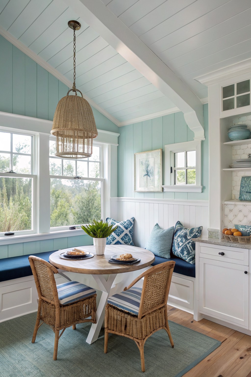
This light blue green on the walls looks closest to Benjamin Moore Palladian Blue. It has a cool, fresh tone that feels calm and open without turning icy.
The color works best with crisp white trim and warmer wood tones. It suits smaller spaces or rooms with steady daylight and pairs easily with navy accents or simple woven pieces.
Blue Gray Built-Ins
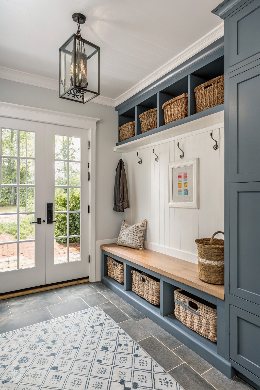
This blue gray on the built-in bench and cubbies looks closest to Benjamin Moore Boothbay Gray. It is a muted shade that sits nicely between gray and blue, giving the space a calm and slightly tailored look without feeling heavy. Many people like it because it works well with wood tones and keeps the room from looking too stark or plain.
The color has a soft cool undertone that shows up more in brighter light, but it still reads fairly neutral overall. It pairs easily with white walls and trim, plus natural wood like the bench top here. It suits entryways or mudrooms best when you want storage that blends in rather than stands out.
Soft Greige Walls
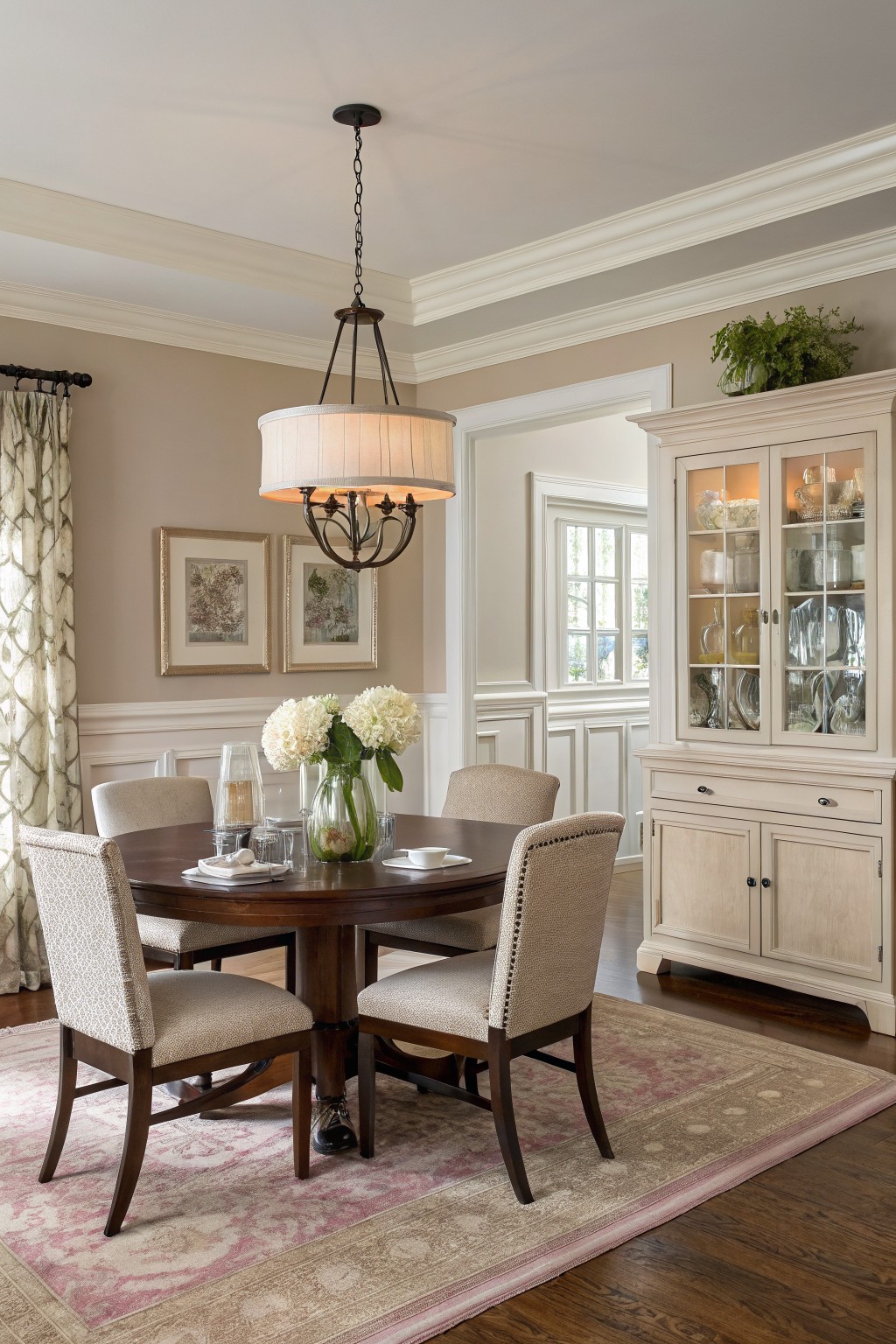
This wall color looks closest to Benjamin Moore Revere Pewter. It is a light greige that sits between gray and warm beige, giving the room a calm, steady feel without pulling too cool or too yellow.
The slight warmth helps it sit nicely next to dark wood floors and furniture. It works best in spaces with decent natural light, and it pairs easily with both white trim and softer neutral textiles.
Deep Green Bathroom Walls
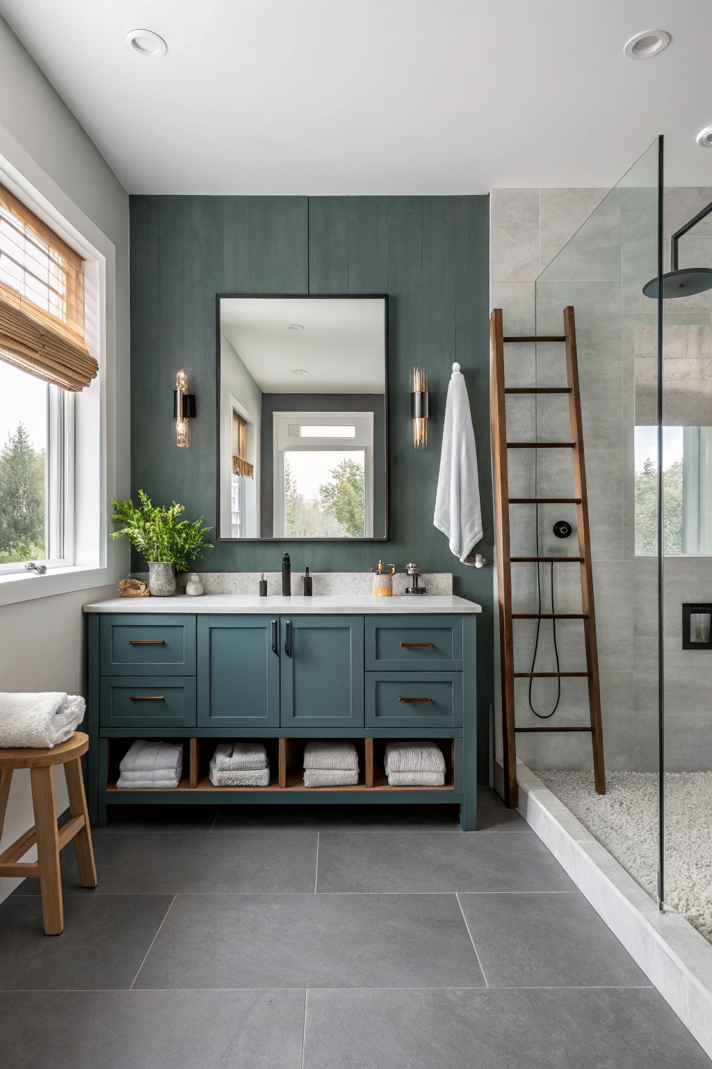
This deep green reads very close to Benjamin Moore Hunter Green. It is a cool, slightly blue-leaning green that feels grounded without turning too dark or heavy in a smaller room. The color works well on both the walls and the vanity because it gives the space a steady, calm base that still pairs with lighter stone and wood tones.
It sits nicely next to gray tile and warm wood accents, though it can look cooler under bright overhead lights. In a bathroom this shade gives a bit of weight without closing the room in, and it holds up well next to white towels or simple black hardware.
Soft Greige Living Room Walls

This room uses a soft greige that looks closest to Benjamin Moore Revere Pewter. The color sits between gray and beige, giving the walls a gentle warmth that feels steady rather than cool or stark.
It pairs easily with wood floors and furniture because the undertone stays neutral enough not to fight the grain. White trim helps keep it light, though it can start to feel flat if the lighting is very dim or the wood tones are too dark.
Soft Sage Green Cabinets
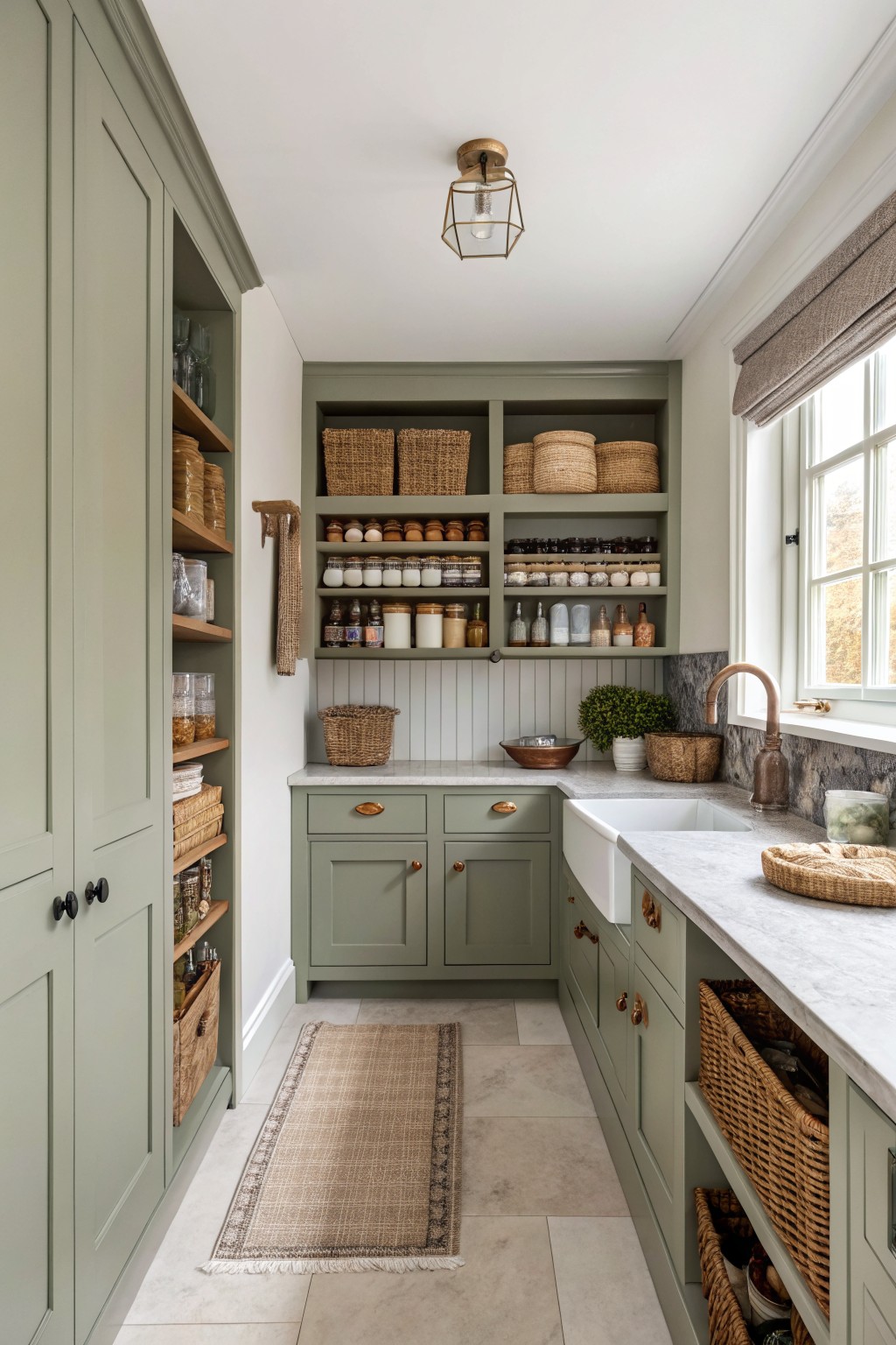
This soft sage green on the cabinets reads closest to Benjamin Moore Saybrook Sage. It sits in that middle ground between gray and green, which makes it feel calm rather than bold in a space like this.
The color holds up well next to the wood tones and stone counters without fighting them. It works best in rooms that get steady light and pairs easily with both warm woods and simple white surfaces.
Soft Blue Ceilings
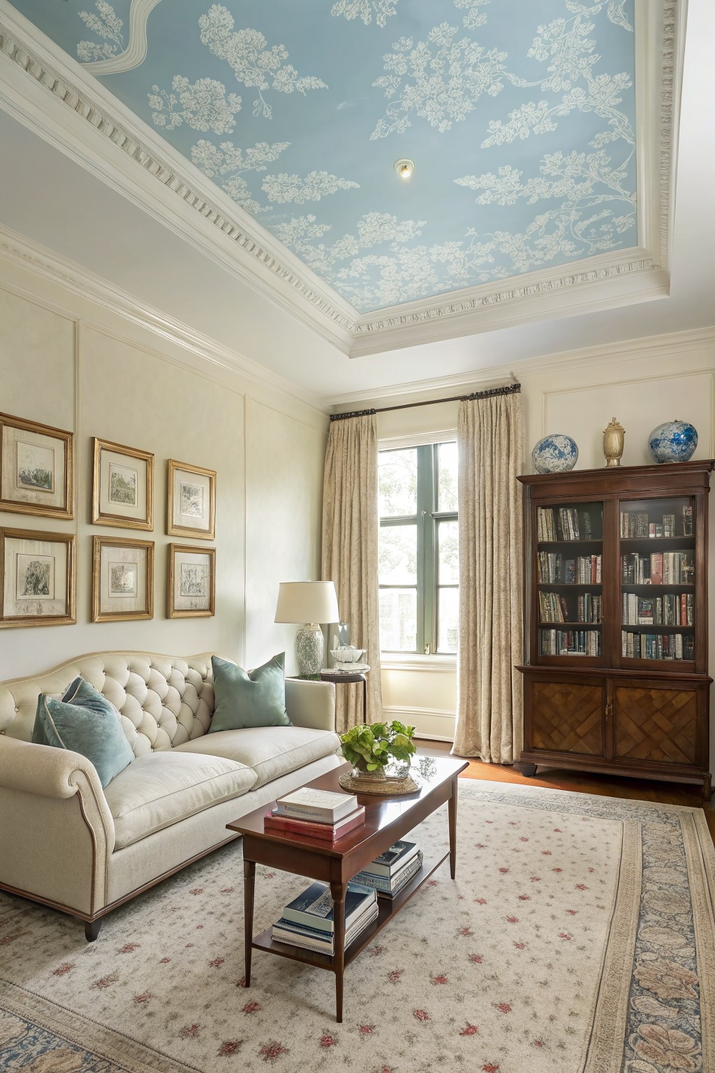
This ceiling color looks closest to Benjamin Moore Palladian Blue. It is a soft, cool blue that stays light and calm without turning icy, which makes the room feel open and a little unexpected in a traditional setting.
The blue sits nicely against warm off-white walls and wood trim. It works best in rooms with good natural light and pairs well with wood furniture or cream upholstery. Just keep the pattern or finish simple so the color stays the main focus.
Warm off-white walls

This entryway shows a soft warm off-white that feels calm and easy to live with. Benjamin Moore White Dove comes closest to the color on the walls here.
It has a light creamy undertone that keeps the space bright while still feeling a bit warmer than a pure white. The color sits nicely against wood floors and painted trim without making the room feel cold or too stark.
Frequently Asked Questions
Q: What if my furniture is mostly modern? A: Pair it with the calmer schemes that lean neutral. These hold the space together without clashing. Stick to two or three colors max from the list.
Q: How often do people repaint with these timeless options? A: Most wait eight to ten years before changing. The key is choosing colors that age gracefully with your stuff. Lighten or darken one wall if you want a quick refresh.
Q: Can I mix two different schemes in one house? A: Keep the main wall color consistent across rooms. This creates flow from one space to the next.









