I often find that a color looks completely different once it is up on the walls and the light moves through the space.
Undertones can turn a promising gray into something almost blue or green depending on the time of day.
That is why I always test samples in the actual room before committing.
Behr seems to build their schemes around colors that work well together even when those shifts happen.
The result is a selection process that feels less like guesswork and more like seeing how things will actually look in a finished home.
Warm Greige Walls
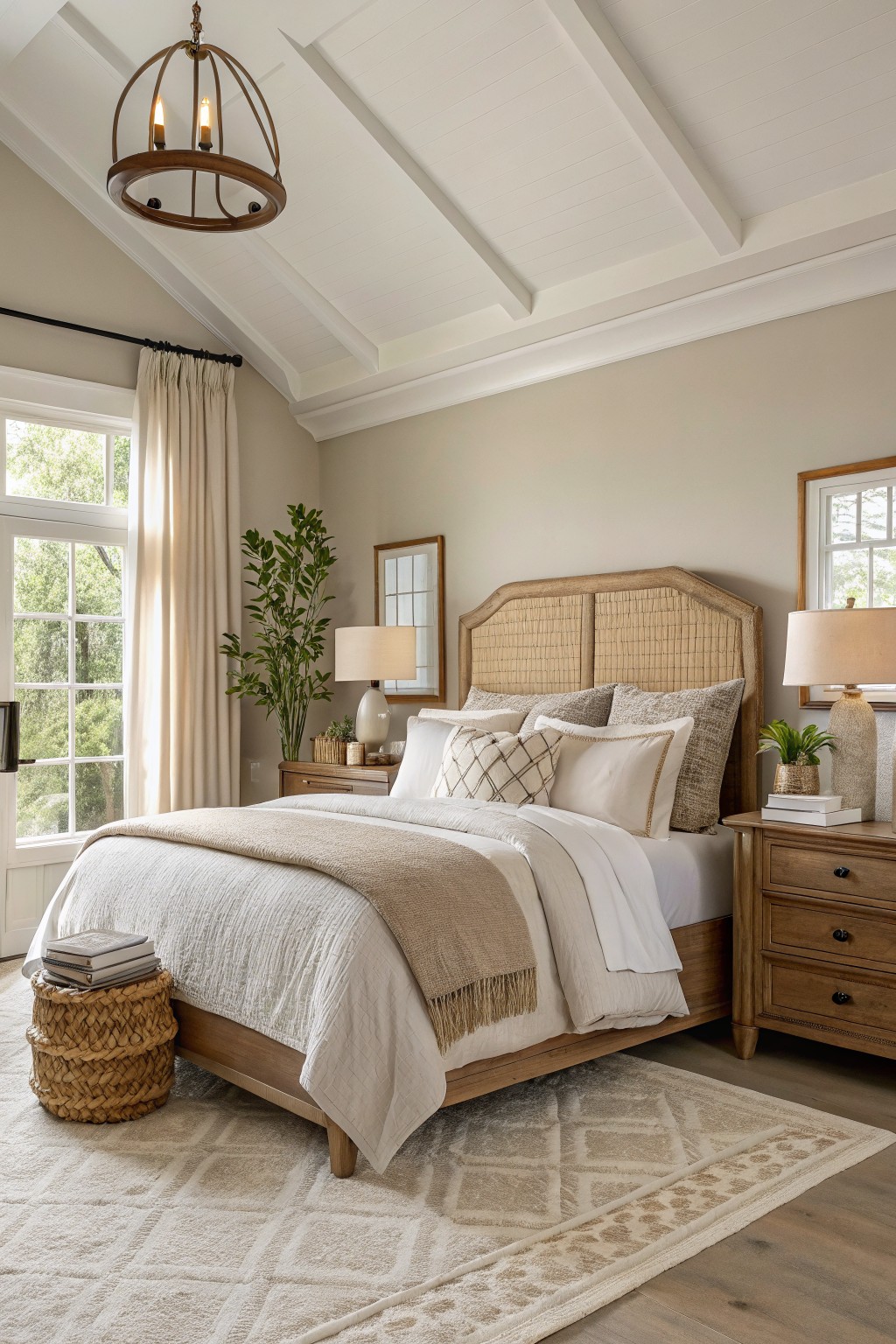
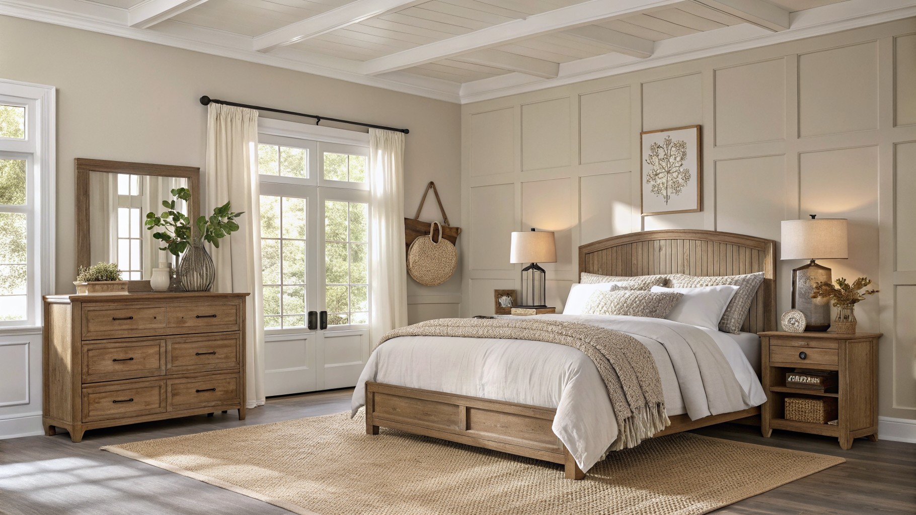
This bedroom uses a soft warm greige that looks closest to Behr Bungalow Beige. It sits nicely between beige and gray so the room feels calm without looking flat or cold.
The color has a light beige undertone that pairs well with the wood bed frame and keeps the space from feeling too stark. It works best in rooms with decent natural light and pairs easily with white trim or other light neutrals.
Soft Blue Gray Cabinets
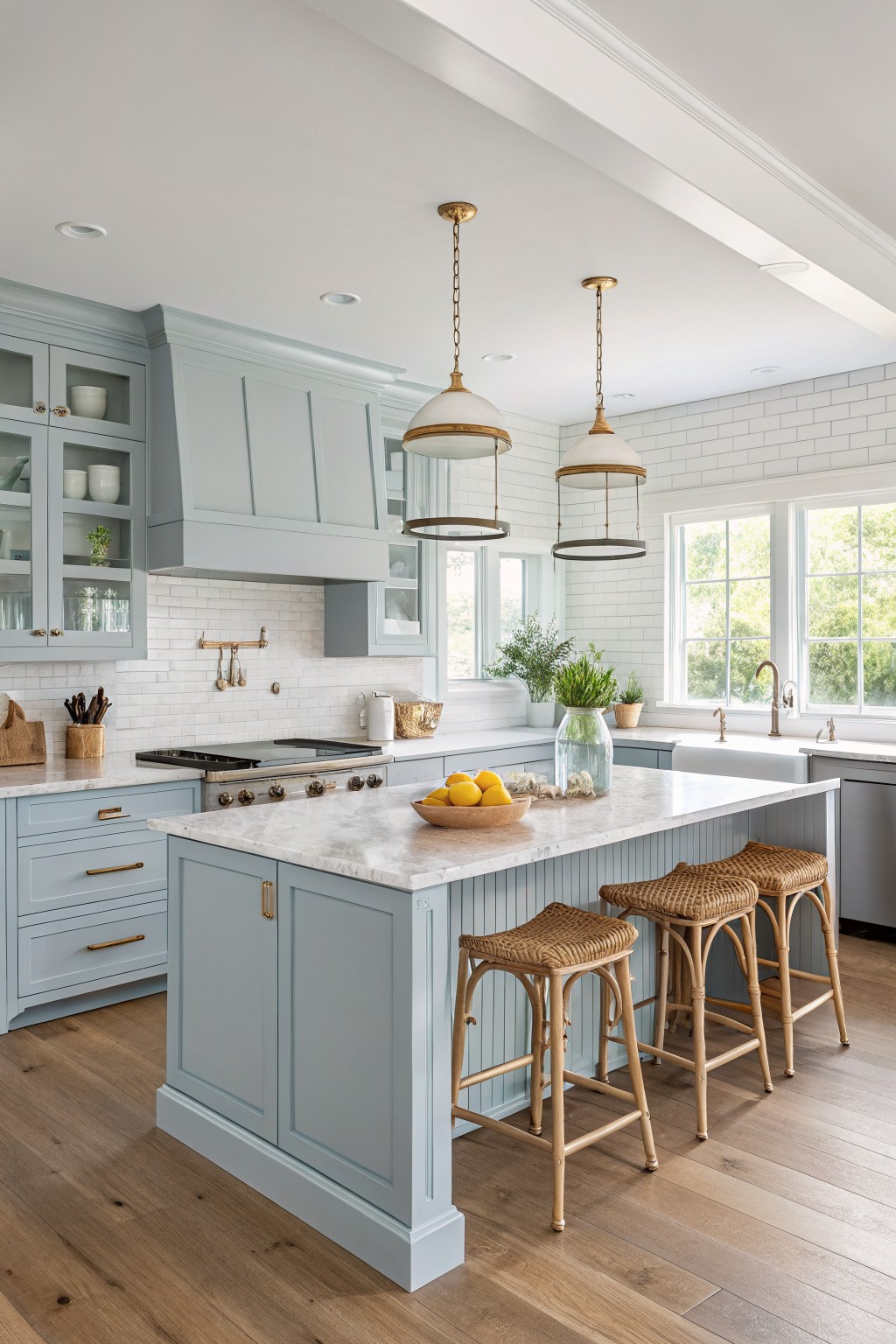
This kitchen shows a soft blue gray on the cabinets that feels calm without turning cold. Behr Silver Strand sits right in that range and gives the same gentle look.
It carries a slight cool undertone that stays steady next to white marble and warm wood floors. It works best in spaces with good natural light and pairs easily with simple hardware and light stone surfaces.
Deep Charcoal Walls

The walls here read as a deep charcoal gray that feels solid without turning the room heavy. Behr Dark Shadow comes close and gives that same rich tone that still lets wood tones stand out.
It has a cool lean that pairs well with the dark wood floor and cabinet. Try it in dining rooms or libraries where you want the space to feel grounded. Keep trim light if you want to avoid a cave-like feel.
Soft Sage Green Walls

This bathroom uses a muted sage green on the main wall. It looks closest to Behr Aloe and brings in a gentle color that feels easy to live with day to day.
The tone stays cool but soft, so it works well next to white cabinetry and warm wood. It suits bathrooms with decent daylight and pairs best with simple black hardware or natural textures.

This deep navy blue on the walls looks closest to Behr Midnight Blue. It gives the room a solid, grounded feel without turning the space too dark or heavy. The color works well in rooms with good natural light and pairs nicely with wood tones and built-in shelving.
It has a cool undertone that stays steady next to both light and dark furnishings. Try it in living rooms or studies where you want something a little more serious than gray but still easy to live with. Just watch the lighting, since it can read a touch cooler in low light.
Soft Green Siding
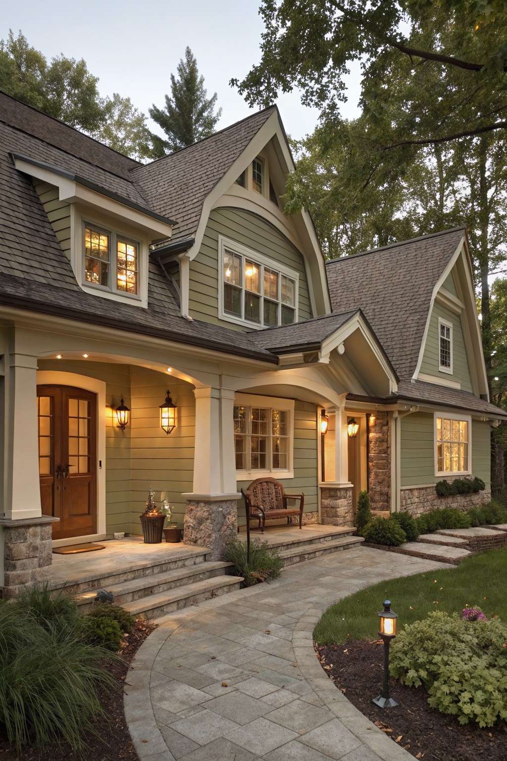
This house uses a soft sage green that looks closest to Behr Aged Sage. The color sits in a nice middle spot, not too bright and not too gray, which helps it blend with the stone and roof without fighting them.
It has a light cool undertone that stays steady in shade or sun. Pair it with warm white trim and natural wood doors if you want the green to feel calm rather than stark. Watch the depth though, because a touch darker can make the same house read heavier.
Soft Yellow Walls
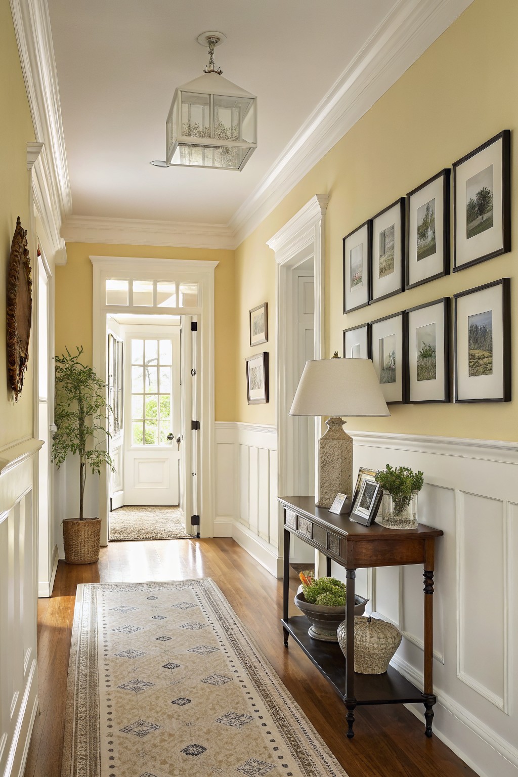
This soft yellow on the walls looks closest to Behr Buttercup. It is a light, warm color that feels sunny without being too bright, and it works nicely with the white trim and wood floors in a hallway like this.
The color has a gentle creamy undertone that stays calm even in changing light. It pairs well with natural wood tones and keeps the space feeling open and welcoming in older homes.
Soft Greige Built-Ins

This entry uses a soft greige that reads closest to Behr Accessible Beige. It sits nicely between gray and warm beige, which keeps the space feeling calm without turning too cool or too yellow.
The color works well with the wood door and stone floor because it has enough warmth to tie them together. It also gives the cabinetry and bench a clean look that still feels grounded. Pair it with black hardware and natural baskets if you want the same easy balance.
Soft Sage Green Siding
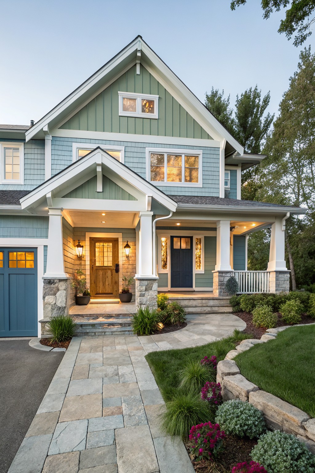
This house uses Behr Soft Sage on the main siding. It is a light, muted green that feels calm and natural rather than bold or bright.
The color has a touch of gray in it, which helps it sit nicely next to white trim and stone details. It works best on homes with simple lines and pairs well with wood doors or darker accents without looking too cool or washed out.
Deep Blue Walls

This deep blue on the walls looks closest to Behr Blue Note. It is a cool, slightly grayed blue that feels grounded without turning too dark in a small room.
The color sits nicely next to the gray tile and dark wood vanity, and it keeps the space feeling calm rather than heavy. It works best with warm brass accents and light stone to stop it from feeling flat.
Soft White Siding
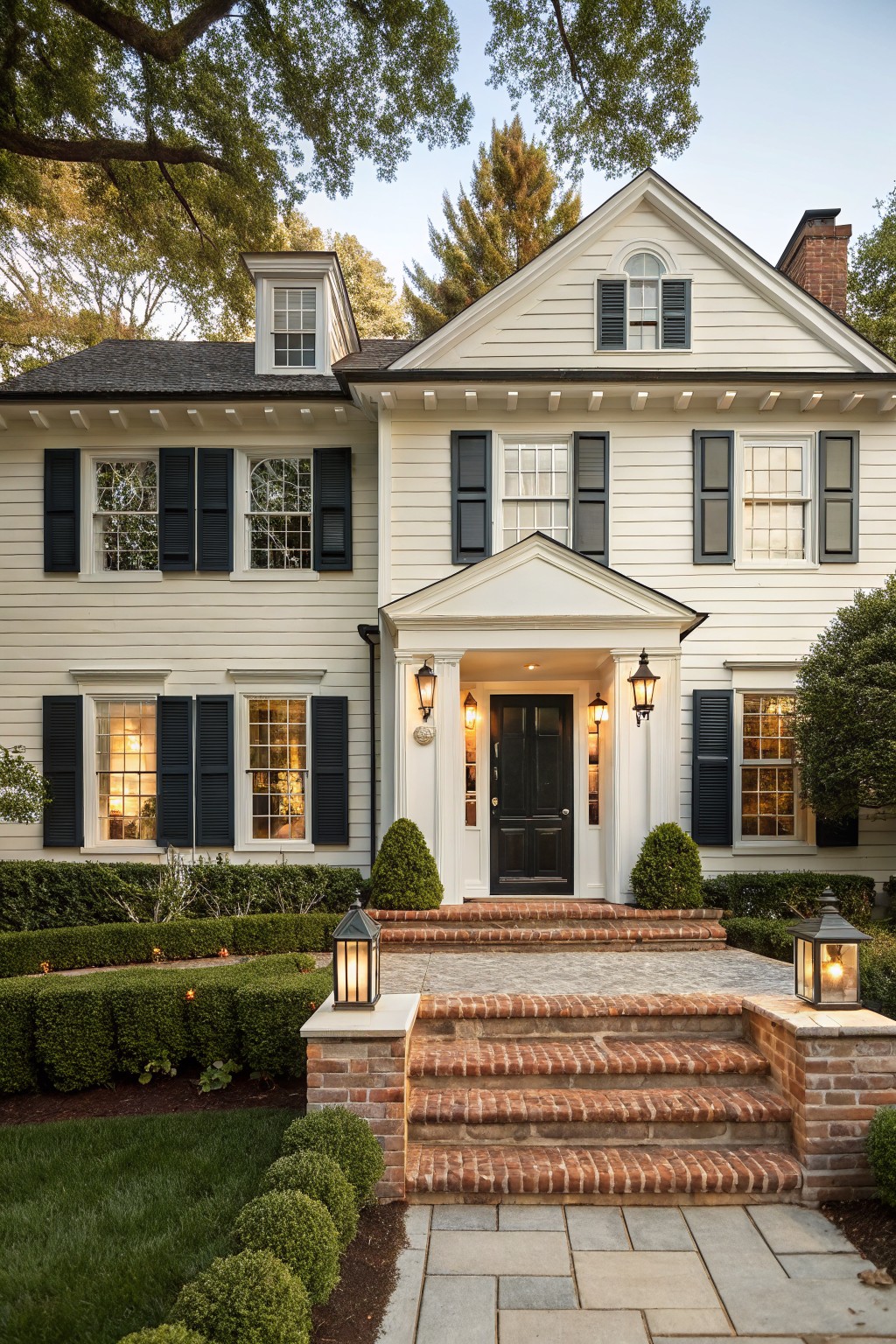
This house uses a soft white on the siding that looks closest to Behr Simply White. It is a clean white with just enough warmth to keep the whole exterior from feeling stark or flat.
The slight warmth helps it sit nicely next to the brick steps and dark shutters. It works well on traditional homes and tends to look good even when the light changes throughout the day.
Soft Greige Walls
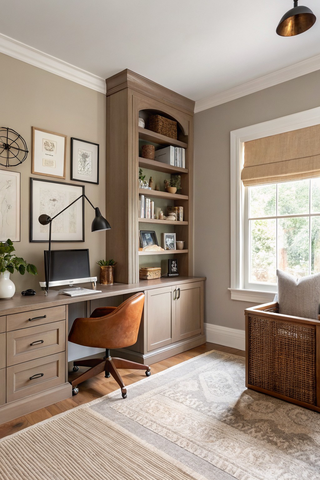
The walls here read very close to Behr’s Accessible Beige. It is a warm greige that sits nicely between gray and beige without pulling too cool or too brown.
This color has a gentle warmth that keeps the wood tones in the built ins and desk looking rich rather than washed out. It works well in rooms with lots of cabinetry and helps the space feel calm and put together without much effort.
Soft Peach Walls
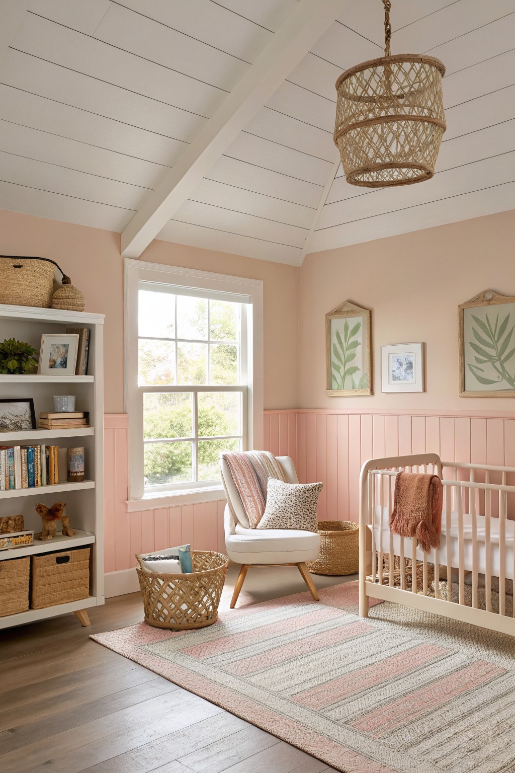
This soft peach on the walls gives the room a gentle warmth without feeling sugary. Behr Soft Peach sits right in that range and works especially well when you want color that stays calm rather than bold.
It has a light warm undertone that sits nicely against white trim and wood floors. The shade feels best in spaces that get steady daylight, since it can read a touch cooler in very shaded rooms.
Soft Greige Siding

This house uses a soft greige on the siding that reads closest to Behr Simply Greige. It is a warm neutral that sits between gray and beige, giving the exterior a calm, settled look without feeling flat or too cool.
The color has a light touch of brown in its undertone, which helps it blend nicely with stone and dark trim. It works well on homes with mixed materials and holds up in changing light, though it can lean a bit more green in deep shade. Pair it with warm white trim or charcoal accents to keep the balance.
Soft Blue Gray Walls

This bathroom shows a soft blue gray on the walls that looks closest to Behr Rainstorm. It is a muted color with cool gray undertones that feels calm without turning too dark or cold. The shade works nicely behind the wood vanity and white tile because it lets the natural wood tones stand out.
It pairs well with black fixtures and simple white trim. In a bathroom with decent natural light the color stays even and does not shift too much. It suits smaller spaces where you want something a little different from plain gray but still easy to live with.
Soft Eucalyptus Green Siding
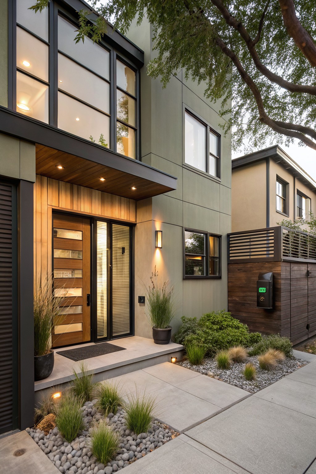
This house uses a soft sage green on the main exterior walls. It reads closest to Behr Aged Eucalyptus, a muted green-gray that stays calm and blends easily with wood and stone.
The color has a slight gray undertone that keeps it from turning too yellow in bright light. It pairs well with dark trim and natural wood doors, and it works on both modern and simpler homes without needing much contrast.
Warm Beige Walls

Behr Bungalow Beige gives these walls a soft, warm tone that feels easy to live with. It sits nicely between cream and light brown, so it does not read too yellow or too gray in most light.
The color works well with white trim and wood floors because it keeps the space from feeling stark. It suits casual rooms like kitchens or small eating areas where you want something simple that still has a bit of warmth.
Soft Sage Green Cabinets
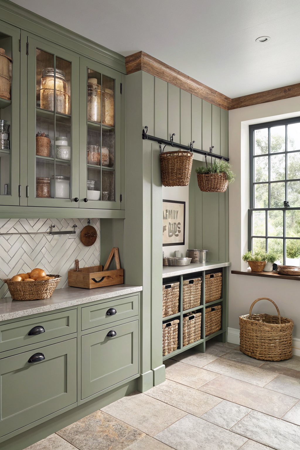
This muted sage green reads closest to Behr Aged Eucalyptus. It has a soft gray undertone that keeps the color from feeling too bright or bold, which makes it easy to live with in a kitchen or pantry space.
The color sits nicely against warm wood tones and light counters. It works best in rooms with decent natural light, and it pairs well with simple black hardware or woven textures if you want a bit more interest without adding more color.
Slate Blue Stair Railings

This staircase shows a deep blue gray that looks closest to Behr Blue Note. It is a cool, slightly muted color that gives the railings and newel posts a solid presence while still letting the white walls stay bright.
The gray undertone helps it sit nicely next to the warm wood treads and keeps the look from turning too stark. It works best in homes with simple trim and natural wood floors, though it can feel heavy if the room gets little natural light.
Soft Aqua Green Siding

This house uses Behr Aqua Tint on the siding. It is a light green with a cool, slightly blue feel that stays soft instead of looking too bright or minty.
The color works well with white trim and a warm roof. It suits older homes that need something gentle on the outside but still distinct from plain white or gray. Watch the undertone in strong sun, since it can lean a bit more blue than expected.
Terracotta Cabinets
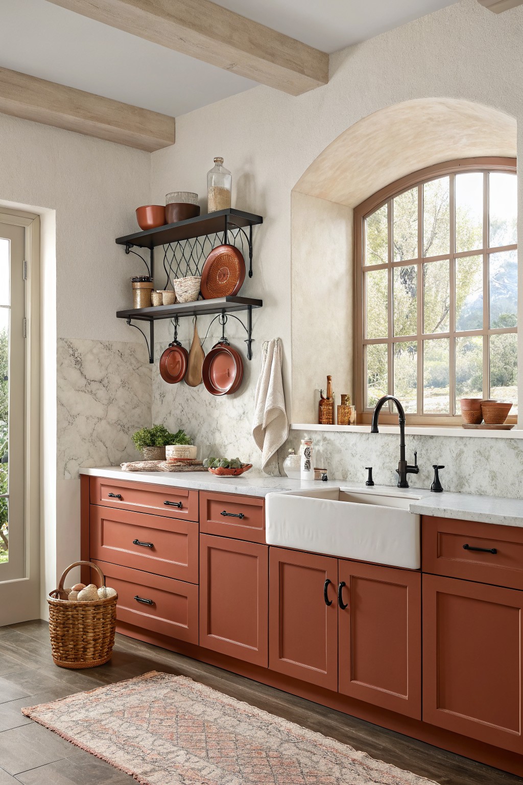
The cabinets in this kitchen are painted in a color that reads closest to Behr Baked Clay. It is a warm terracotta with soft orange undertones that feels earthy and steady next to the white counters.
This shade holds up well in rooms with mixed materials like stone and wood because the warmth keeps everything from looking too stark. It works best with black or dark hardware and simple trim so the color stays the focus.
Frequently Asked Questions
Q: Which colors from the scheme go on the walls versus the accents?
A: Pick the lightest or most neutral for your main walls. Save the bolder shades for pillows, art, or one accent wall. This approach gives you room to change things later without much work.
Q: What if my current furniture clashes with most of the schemes?
A: Match your biggest piece to a similar tone in one of the palettes. Then build around that with the other colors suggested. Small swaps like new throw blankets can tie everything together.
Q: Should I stick to one scheme throughout my whole house?
A: But you can shift slightly from room to room if the palettes share a few common tones. This keeps the flow natural without making every space identical.









