I often notice that a color I liked in the store ends up looking entirely different once it is on the walls and the afternoon sun hits it.
That shift usually comes down to how the undertones play against my trim and the fabric on the sofa.
Testing a patch in the actual room helps more than anything else.
Many cozy shades only reveal their true character after a few days of living with them in changing light.
I tend to favor those that stay warm and steady rather than turning flat or cool by evening.
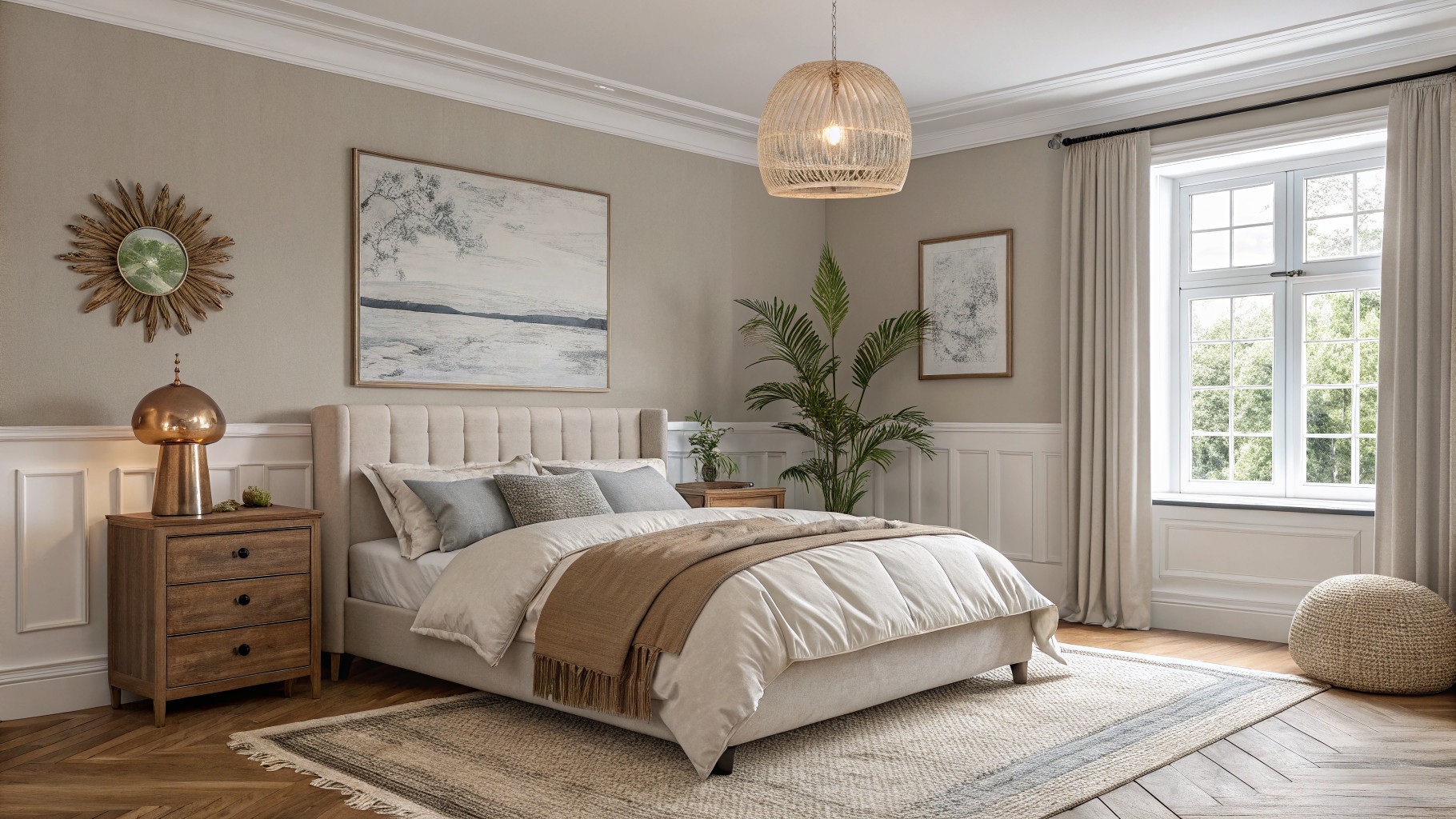
Warm Beige Bedroom Walls

This warm beige has a soft earthy tone that feels steady without looking flat. It sits nicely against the wood floor and white trim, giving the room a calm background that still feels lived in. Colors like this work because they pick up warmth from the light and keep the space from feeling too stark.
It leans slightly toward greige in some lighting but stays mostly warm overall. Try pairing it with white trim and simple wood pieces. Sherwin Williams Accessible Beige, Benjamin Moore Edgecomb Gray, Behr Toasted Almond, and Farrow & Ball Stony Ground all read close to this.
Warm Terracotta Walls
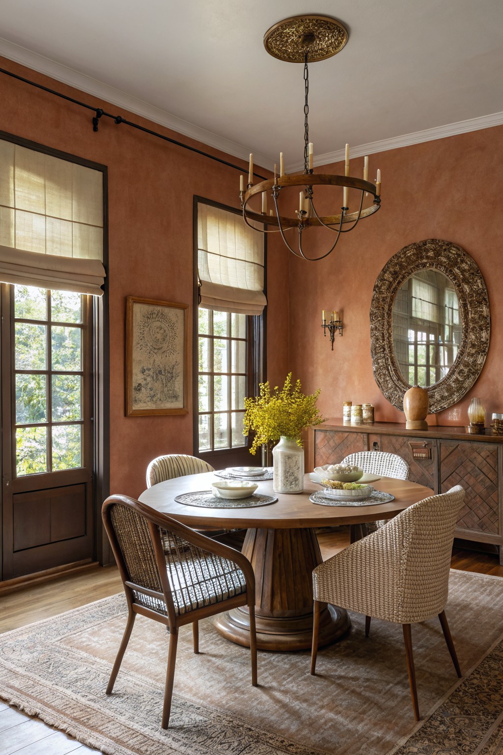
This dining room uses a soft terracotta on the walls. It is a warm earthy color that sits between orange and red, giving the space a grounded feel without turning heavy.
The color has gentle red undertones that look good next to wood and woven textures. It works best in rooms with natural light and pairs easily with creams, beiges, or deeper wood tones. Try something close to Sherwin Williams Baked Clay, Benjamin Moore Russet, Behr Adobe Dust, or Farrow & Ball Red Earth.
Soft Sage Green Bathroom Walls
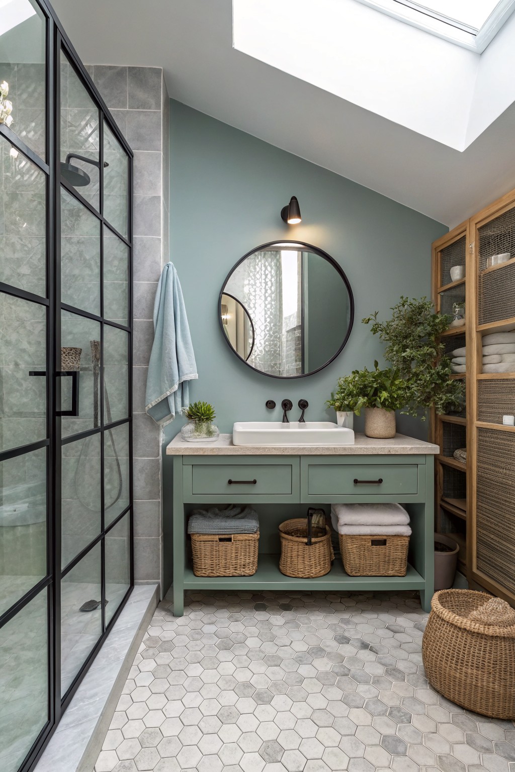
This soft sage green gives the bathroom a calm, grounded feel without trying too hard. It sits between green and blue, which keeps the space feeling fresh but still cozy enough for everyday use.
The color has a slight cool undertone that works nicely with wood cabinetry and light stone floors. It tends to look best in rooms with steady daylight, though it can shift a touch more blue when the light is dimmer.
Soft Greige Walls
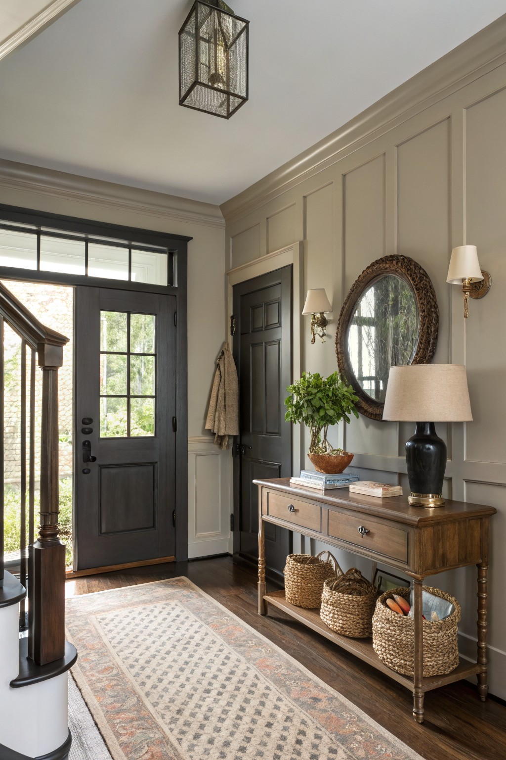
A soft greige covers the walls here and gives the space a quiet, settled look. It sits between gray and beige without leaning too far in either direction, which makes it easy to live with in an entry or hallway.
The color has a light warm undertone that works with dark wood trim and natural flooring. It stays comfortable in both morning and evening light and pairs simply with wood furniture or woven textures. Good matches include Sherwin Williams Accessible Beige, Benjamin Moore Revere Pewter, Behr Greige, and Farrow & Ball Elephant’s Breath.
Soft Blue Gray Walls
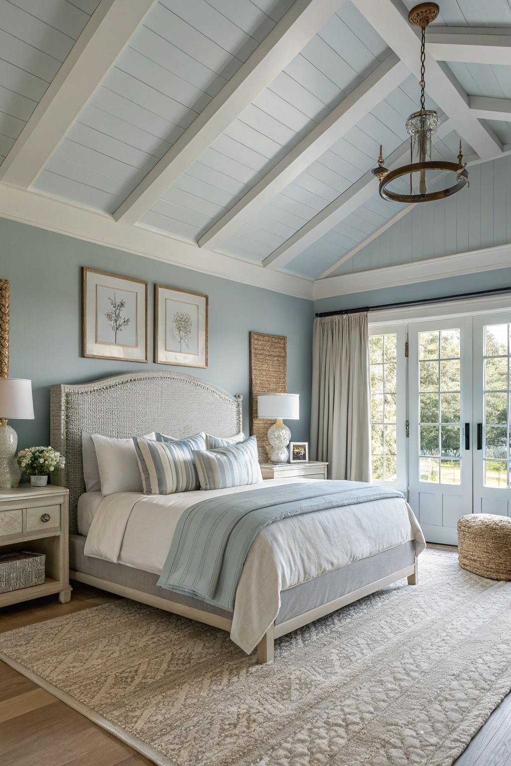
This soft blue gray on the walls gives a bedroom a quiet, comfortable feel that still reads fresh. It sits in the light blue gray family and works especially well when you want color without making the room feel heavy or dark.
It has a cool gray base that keeps the blue from turning too bright in strong light, and it pairs easily with white trim and light wood floors. Colors like this suit spaces where you want calm without going all the way to gray or white.
Muted sage walls

This color is a muted sage green that covers the walls and built-in cabinetry. It feels calm and a bit earthy, which makes the room feel settled without going dark or heavy.
The shade carries some gray in the undertone, so it sits well with warm wood tones and cream fabrics. It works best in living rooms that get decent daylight, and it pairs easily with natural wood furniture or stone around a fireplace. Best matches would be Sherwin Williams Evergreen Fog, Benjamin Moore Saybrook Sage, or Behr Jojoba.
Warm Yellow Kitchen Island
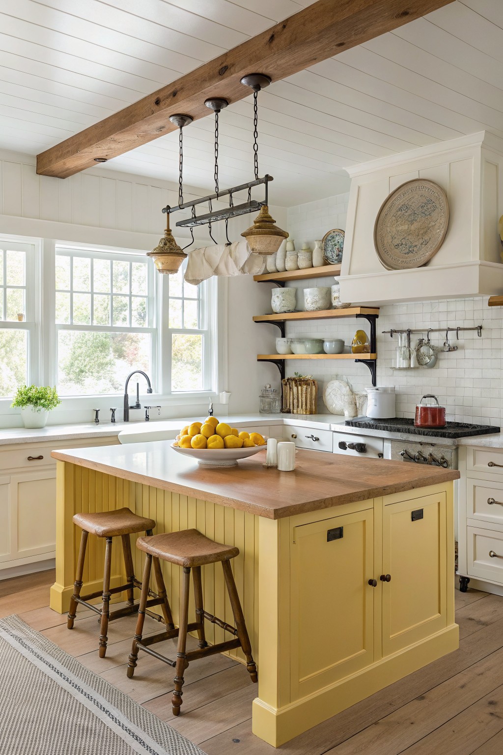
This warm yellow on the kitchen island is a soft, buttery shade that feels cheerful without being overwhelming. It sits nicely between pale cream and bolder gold, and it gives the whole space a friendly, lived-in look that works especially well in older homes.
The color has a slight warm undertone that plays nicely against white walls and wood tones. It looks closest to Sherwin Williams Optimistic Yellow, Benjamin Moore Sunflower, Behr Daffodil, or Farrow & Ball Yellow Ground. Use it on islands or cabinetry where you want a bit of color but still need the room to feel calm.

This deep navy blue gives a room a grounded, cozy feel right away. It works especially well in smaller spaces where you want some depth without going too dark. The color family reads closest to Sherwin Williams Naval, Benjamin Moore Hale Navy, or Behr Midnight Blue.
The blue sits nicely next to white trim and warm wood tones, which keeps it from feeling heavy. It suits breakfast nooks or casual dining areas that get decent daylight, though it can lean cooler in very bright rooms. Stick with light upholstery and natural textures to balance it out.
Deep Teal Walls

A deep teal makes a good choice when you want a small room to feel cozy and pulled together. This shade leans slightly blue but stays rich and grounded, and it gives the walls enough depth without turning the space dark. Colors like Farrow & Ball Vardo, Benjamin Moore 2051-10, and Sherwin Williams Raging Sea all sit in the same range.
The teal works especially well with warm wood and white stone because the contrast keeps the room from feeling flat. It holds up in both daylight and warmer lamp light, so it suits baths or powder rooms that get mixed lighting throughout the day.
Warm Terracotta Living Room Walls
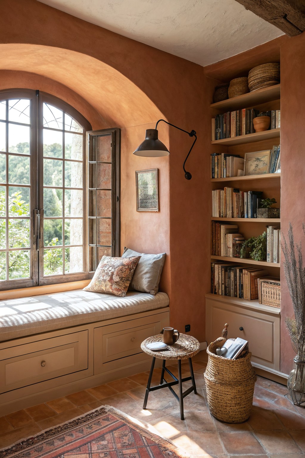
This wall color is a warm terracotta that sits between orange and brown. It gives the room a grounded feel without making the space feel heavy, and it works especially well with wood trim and built-in shelving.
The tone has a soft red undertone that reads richer in natural light. It pairs nicely with lighter fabrics and woven textures, though it can feel too dark in very small rooms if the trim is not kept light.
Muted Lavender Gray Walls
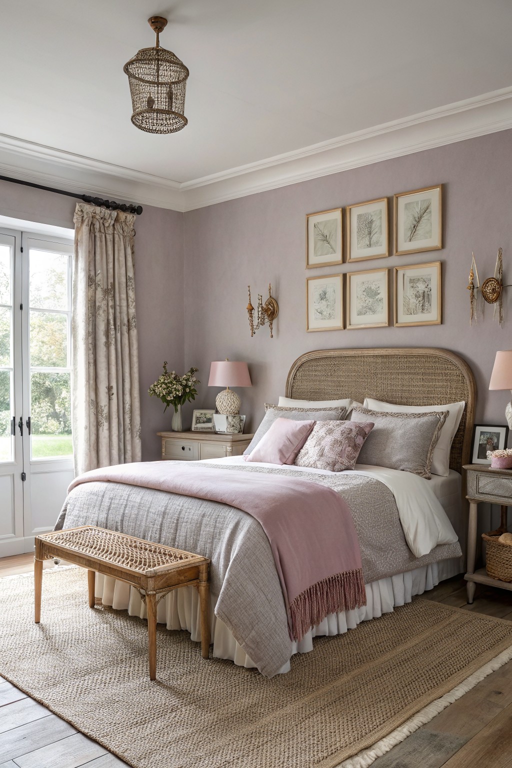
This bedroom shows a soft lavender gray on the walls. It is a quiet color that feels calm and a little warm at the same time.
The gray keeps the lavender from turning too sweet, so the room still reads as restful rather than fussy. It pairs easily with light wood and simple textiles, and it holds up well in both morning and evening light.
Deep Charcoal Gray Cabinets

A deep charcoal gray like this one gives cabinets and doors a solid, grounded look that still feels cozy in a small kitchen. It sits between black and gray without tipping too cool, and it holds up well next to warm wood counters and white tile.
The color works best in rooms with decent natural light so it does not go flat. Pair it with brass or wood tones to keep the space from feeling too stark, and test a large sample first since the depth changes fast under different bulbs.
Warm Beige Walls
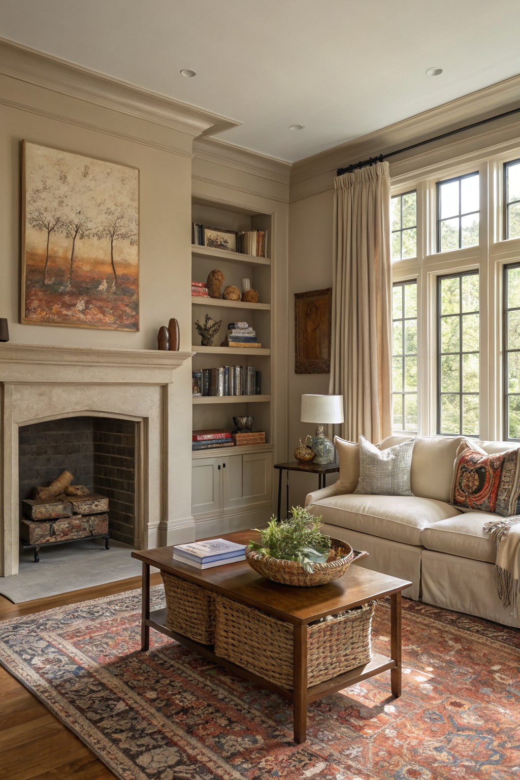
This room uses a warm beige that sits right between cream and light taupe. The color keeps the space feeling calm and settled while still letting the wood and stone show up nicely.
It has a soft undertone that reads warmer in daylight and stays steady under lamps. It works best in living rooms or family areas where you want something easy to live with, and it pairs well with painted trim and natural wood tones.
Soft Sage Green Built-Ins
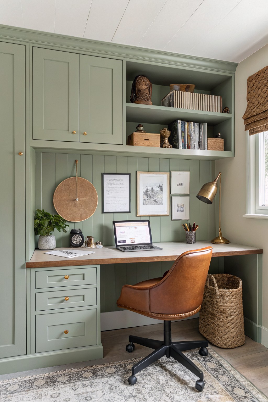
This sage green is a quiet color that works well on built-ins and walls together. It sits somewhere between green and gray, with a soft tone that feels steady rather than bold. Colors like Sherwin Williams Evergreen Fog, Benjamin Moore Soft Fern, or Behr Aged Eucalyptus all land close to what shows up here.
The green sits nicely next to the wood desk and floor without fighting them. It works best in rooms that get decent light, since the gray lean can turn a little cool in low light. Keep the trim the same color or go with a warm white if you want the cabinetry to stand out more.
Soft Blue Green Walls
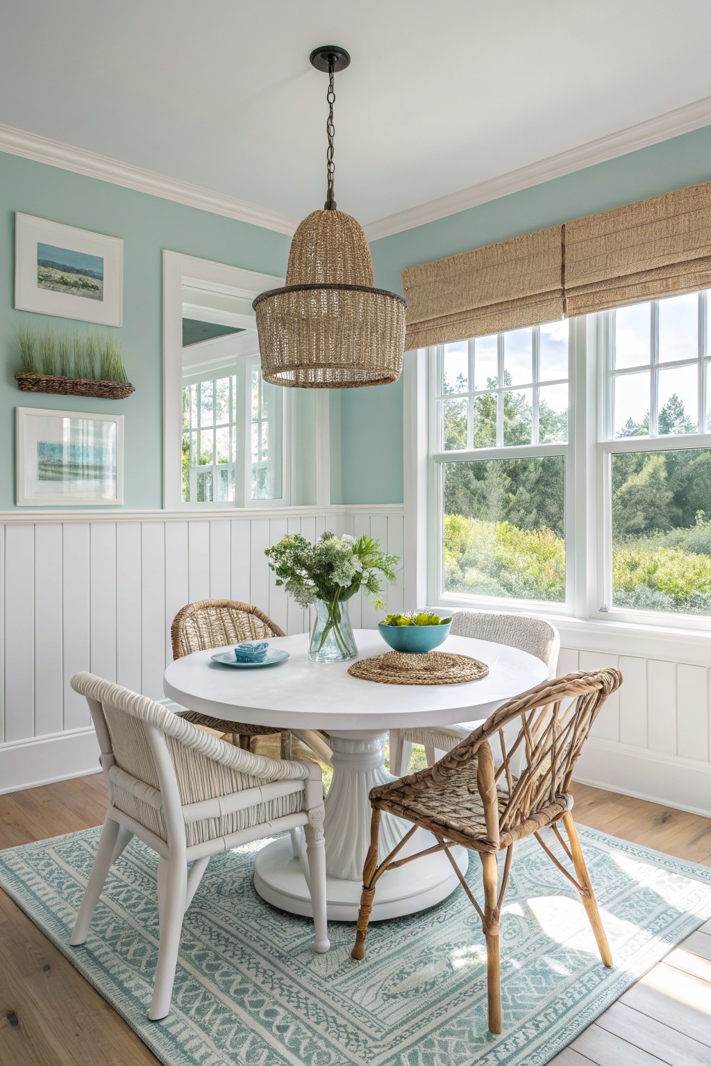
This soft blue green paint sits in that gentle middle ground between blue and green. It gives walls a calm, easy feeling without making the room feel cold or too bold.
The color has a light cool cast that reads best with plenty of natural light and white trim. It works nicely with wood floors and simple textures like woven chairs, and it suits dining spaces or kitchens where you want something fresh but still cozy.
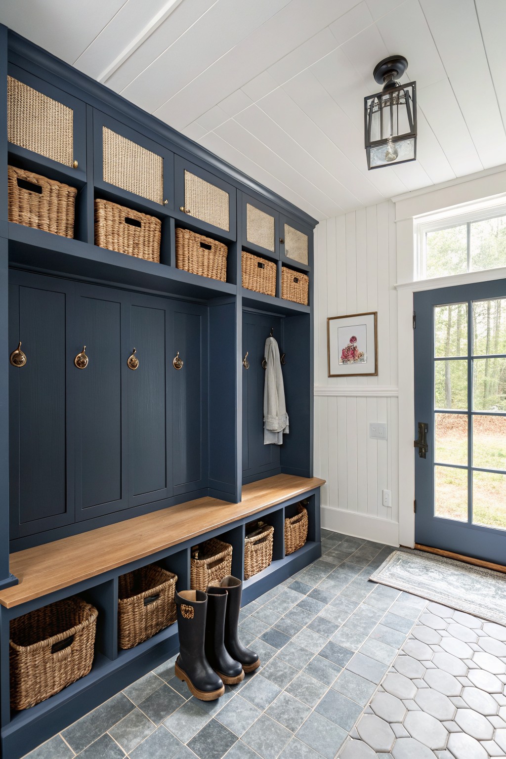
A deep navy blue on cabinetry gives a room a solid, settled look. This shade feels substantial next to the wood bench and floor, and it helps the storage blend into the background instead of standing out too much.
It has a cool undertone that stays steady even in brighter light. Try it in a mudroom or entry where you want the walls to feel calm, and pair it with white trim or light tile so the navy does not take over the space. Colors like Sherwin Williams Naval, Benjamin Moore Hale Navy, or Behr Midnight Blue come close.
Warm Greige Dining Room Walls

This dining room uses a warm greige on the walls that sits right between gray and beige. The color has enough depth to feel grounded but stays light enough to keep the space from closing in. It pairs easily with dark wood cabinetry and white trim without fighting either one.
The undertone leans slightly taupe, which helps it read cozy next to wood floors and furniture. It works well in rooms that get a mix of natural light and works best when you keep the trim crisp and the wood tones warm. Sherwin Williams Repose Gray, Benjamin Moore Edgecomb Gray, and Behr Silver Satin all land close to this look.
Warm peach walls
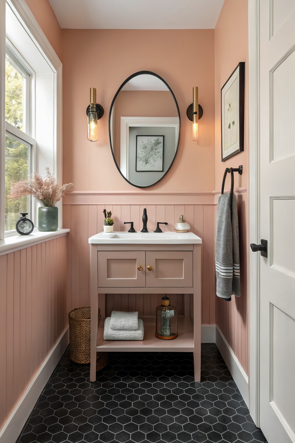
A soft peach paint color brings a gentle warmth to small spaces like bathrooms. It sits between pink and orange without leaning too far into either, which keeps the room feeling calm and a bit cozy. Shades like Benjamin Moore’s Peach Melba, Sherwin Williams’ Warm Apricot, or Behr’s Soft Peach give that same quiet tone.
The color has a light coral undertone that plays nicely against darker floors and black fixtures. It works best with white trim and natural light so it stays fresh instead of turning sugary. Avoid pairing it with too many cool grays or it can start to look muddy.
Soft Sage Green Study Walls

This space uses a muted sage green on the walls and trim. The color sits in a soft gray-green family that feels steady and easy to live with.
It has a slight cool lean that keeps the room from feeling heavy even with all the wood around. Pair it with warm brown accents or simple woven pieces if you want the same relaxed look. It works best in smaller rooms where you want color without making things feel closed in.
Frequently Asked Questions
Q: What if my space is tiny? Do cozy colors make it feel smaller? A: Choose lighter versions of the schemes, like pale sages or soft whites with warmth. They reflect light and open things up. Darker cozy tones work better as accents in small rooms.
Q: How do I blend a new paint color with my existing rugs and curtains? A: Pull a shade directly from your textiles for the walls. This ties everything together naturally. Start by matching the dominant hue in your fabrics.
Q: My walls have texture. Will these colors still look cozy? A: Textured walls add depth on their own. Pick matte finishes from the schemes to keep the feel soft. Glossy paints can highlight bumps you might not want to emphasize.
Q: Should I paint the trim the same color? A: Leave trim white or a shade lighter for contrast. It frames the cozy wall color without overpowering the space. This keeps the room feeling balanced and inviting.









