When I pick moody blues for farmhouse interiors, I pay close attention to how the color settles against existing trim and cabinetry in different times of day.
Some shades that seem rich on the sample board pick up unexpected green notes once they meet natural light from a nearby window.
Samples on the actual wall reveal the truth faster than any chart.
I have learned to place test patches near the furniture and flooring that will stay in the room so the final effect does not come as a surprise later.
That step saves time when you want the blue to feel grounded rather than floating against the other surfaces.
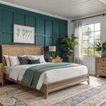
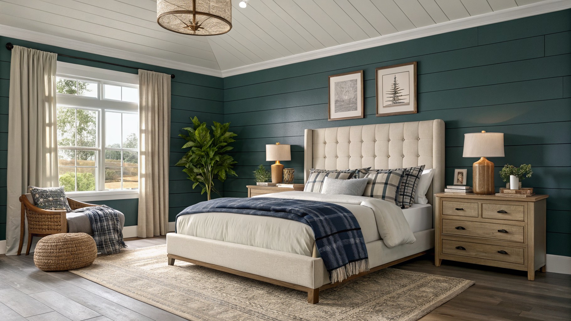
Deep teal walls

This deep teal reads as a moody blue-green that works nicely in farmhouse bedrooms. It sits between navy and green, giving the walls enough depth without turning the space too dark or cold.
The color has cool undertones that show up more in low light, so it pairs best with warm wood floors and white or cream textiles to keep the room from feeling heavy. Try it on an accent wall first if you want to test how it changes through the day.

This deep navy blue on the built-in cabinet and fireplace gives the room a solid, grounded feel. It is a true navy with a slight cool undertone that still reads warm enough next to wood beams and white brick.
The color works best in rooms with plenty of natural light so it does not go flat. It pairs easily with white trim, woven baskets, and brown leather without needing extra contrast.
Deep Teal Cabinets
This deep teal brings a moody feel to farmhouse kitchens without going too dark. It sits between blue and green, with enough depth to feel grounded next to wood tones and white tile. Colors like Sherwin Williams Riverway, Benjamin Moore Aegean Teal, Behr Deep Sea Dive, or Farrow & Ball Inchyra Blue all land close to this shade.
It works best with warm wood countertops and simple black hardware, since the teal already carries some green in its undertone. In brighter light it can lean a little more blue, so test a sample on the actual cabinets first. Pair it with cream or white walls to keep the room from feeling closed in.
Muted Blue Gray Walls

This muted blue gray gives walls a calm and slightly cool feel without going too dark. The gray in it keeps the color from feeling too bright or primary, which makes it easy to live with in smaller spaces or corners that get steady daylight.
It sits nicely against white wainscoting and pairs well with warm wood floors or natural textures. Watch how it shifts in different light, since the gray undertone can lean a bit cooler in the evening.
Deep Blue Gray Cabinets
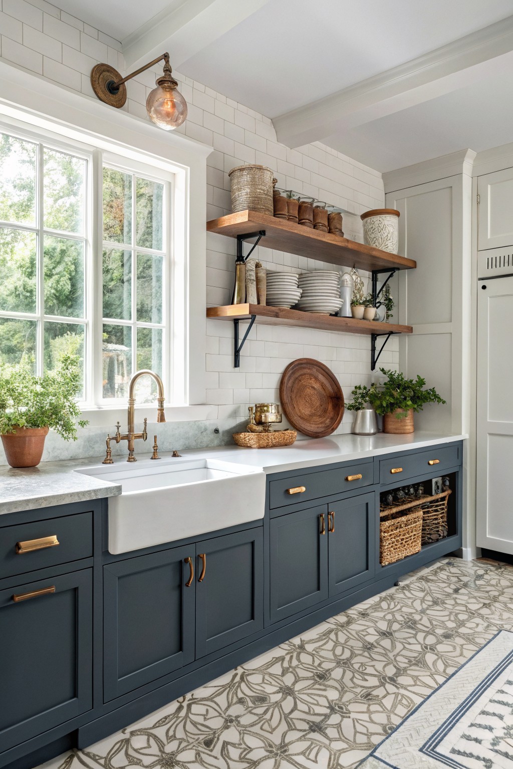
This deep blue gray brings a steady, slightly moody look to kitchen cabinets. It sits between navy and charcoal and gives the room a farmhouse feel without making the space feel closed in.
The color has a cool undertone that holds up well next to warm wood tones and white tile. It works best in rooms with plenty of light and pairs easily with brass hardware or simple white walls.
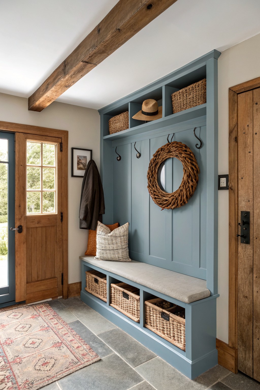
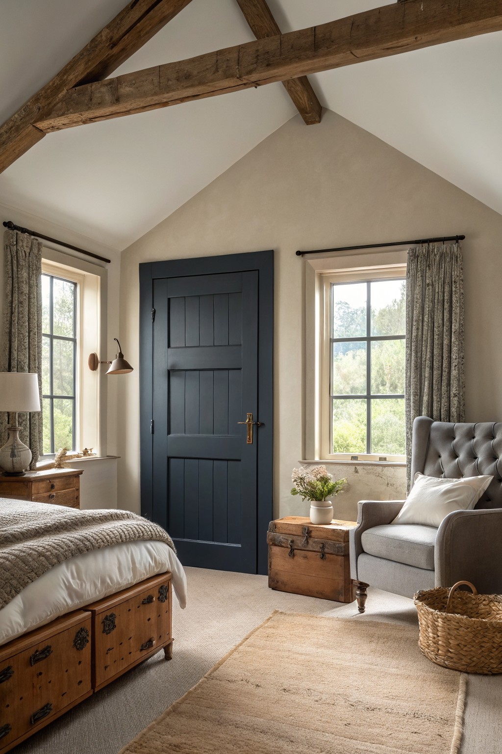
Teal Blue Doors And Built Ins
This teal blue brings a moody farmhouse feel without going too dark. It has a slight green undertone that keeps it from looking flat next to the white trim and wood tones.
It works best on doors and storage pieces where you want some depth. Pair it with warm woods and simple rugs so the color feels grounded rather than cold.
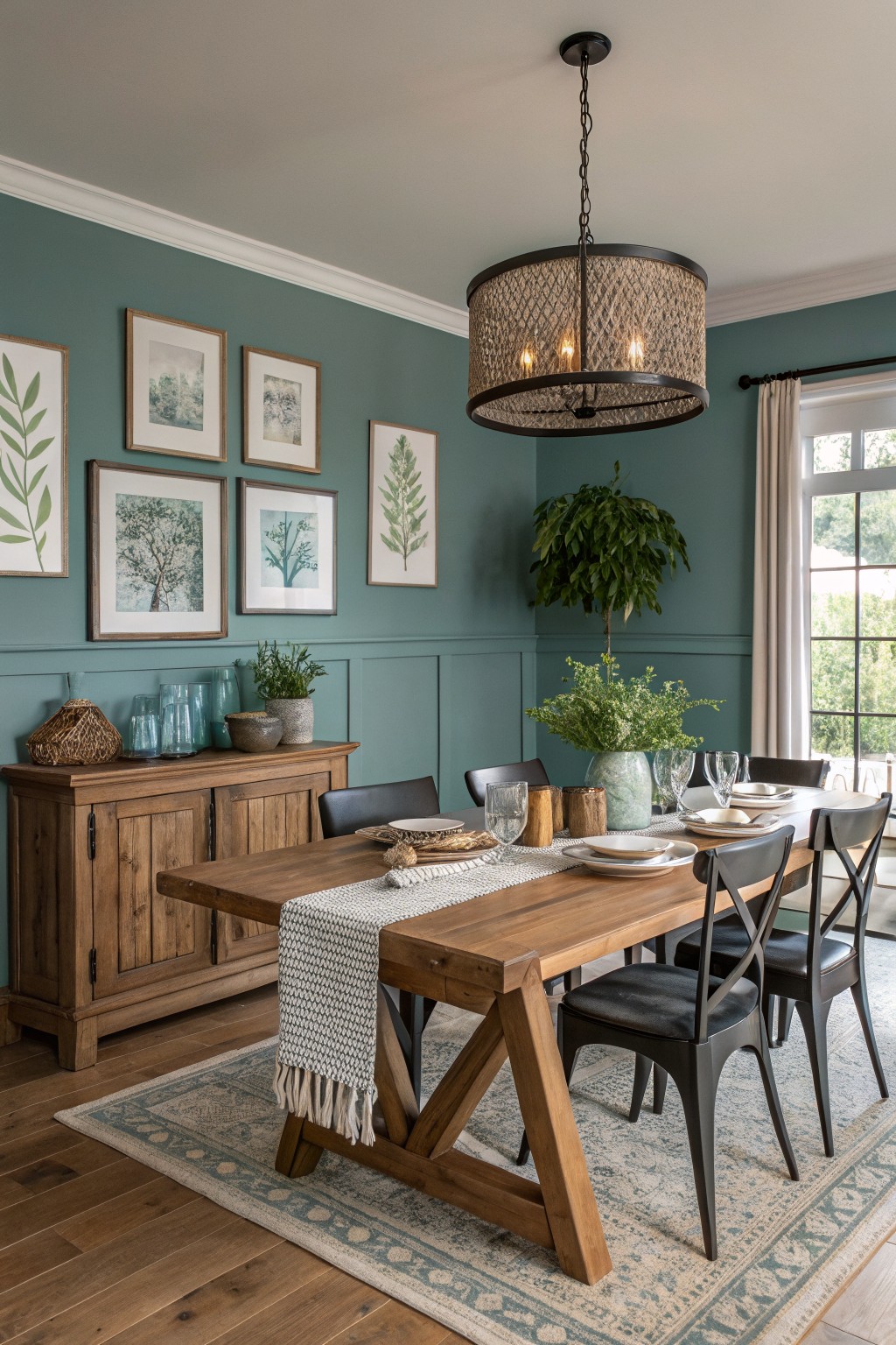
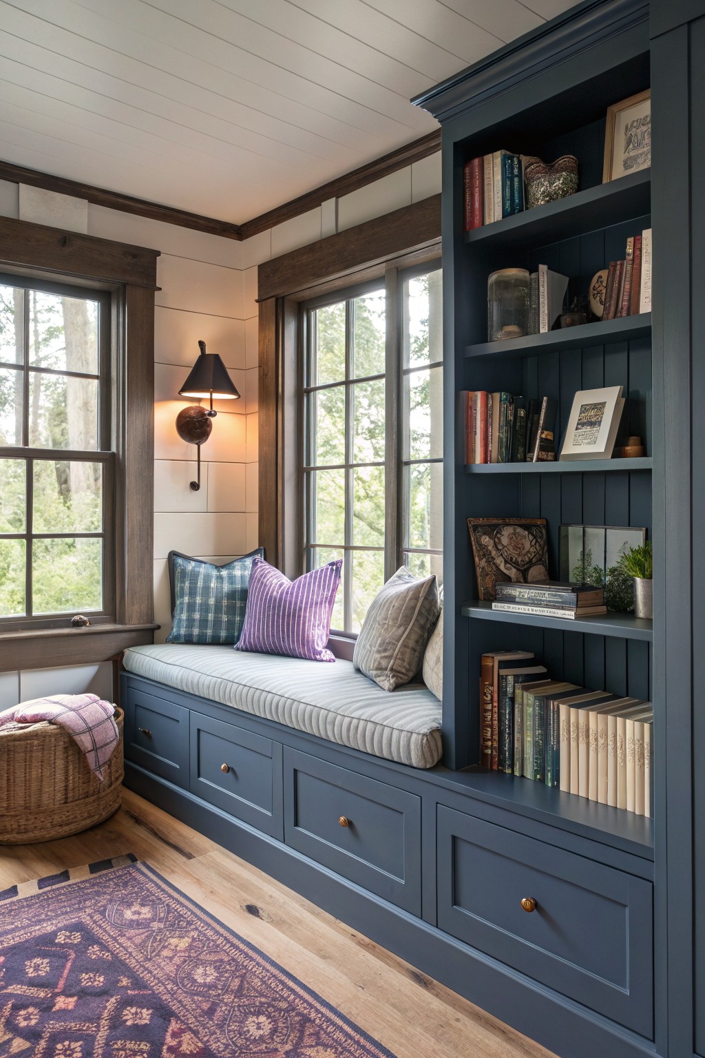
Moody Blue Walls And Cabinets

This moody blue brings a solid, grounded look to the whole space. It sits between navy and slate, with just enough gray in it to feel calm rather than heavy. The color works well on both the walls and the vanity because it keeps the room from feeling busy.
It has cool undertones that show up more in bright light, so it pairs best with warm wood tones, white tile, and simple black fixtures. In a farmhouse bath it feels fresh without trying too hard, though it can read a little stark if the room has no wood or texture to soften it. Likely matches include Sherwin Williams Naval, Benjamin Moore Hale Navy, Behr Dark Denim, and Farrow & Ball Hague Blue.
Muted Teal Walls
This muted teal gives the room a calm farmhouse look without feeling heavy. It lands in that blue-green range and reads very close to Sherwin Williams Rainwashed or Benjamin Moore Wythe Blue.
The color carries a soft gray undertone that helps it sit nicely next to warm wood tones. It works well in dining rooms or living spaces that get steady daylight and pairs easily with simple wood furniture and neutral textiles.
This deep navy reads as a cool, slightly gray blue that feels steady without turning too dark. It works well on built-ins because the color sits nicely against warm wood tones and keeps the whole corner from looking heavy.
It pairs best with light walls and natural wood floors. Watch the lighting though, since it can pull more gray in rooms with cool light.
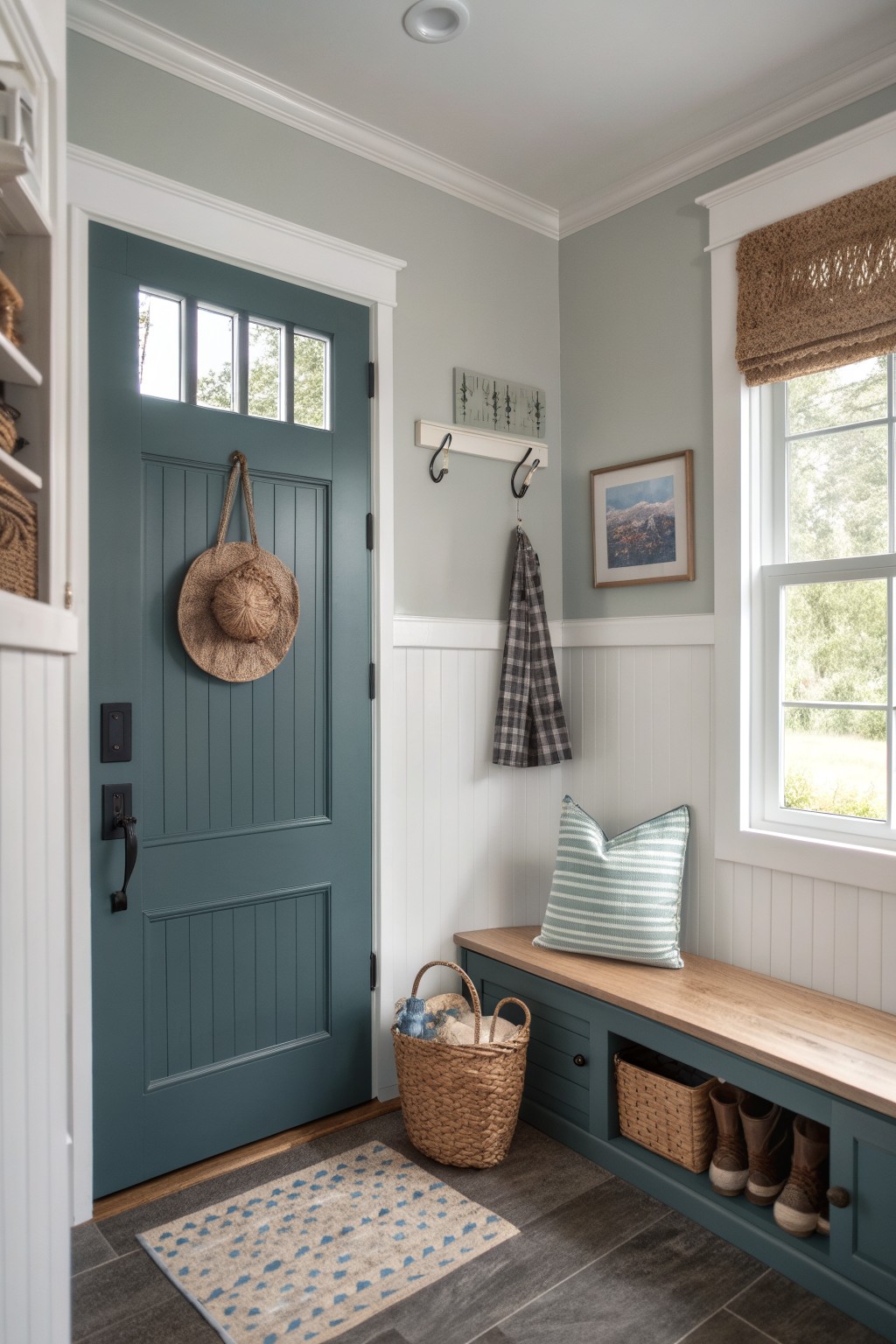
Teal Blue Doors

This teal blue has a cool tone with a bit of green in it that gives the door real presence without going too dark. It works well in a farmhouse entry because it stands out against white walls and trim while still feeling grounded next to the wood floor.
The color sits somewhere between a true blue and a teal, so it can shift depending on the light. It pairs easily with natural wood tones and simple neutrals, though it can look a little harsh if the room gets very little natural light.
Moody Blue Walls In The Bath
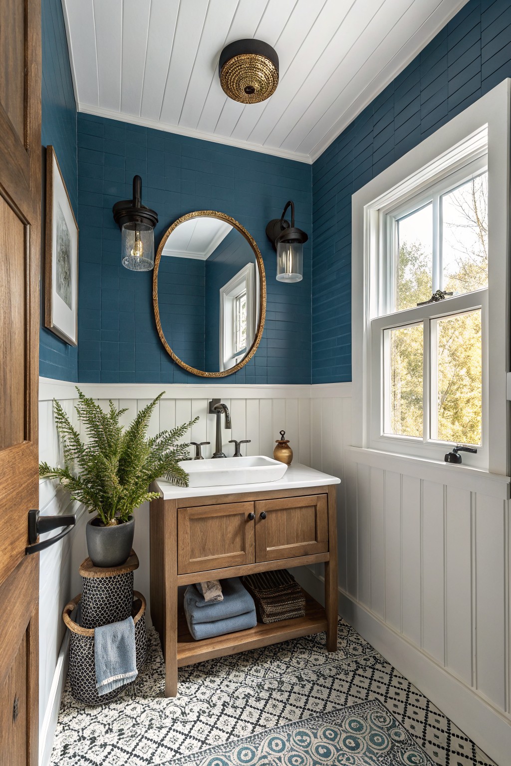
This deep moody blue on the walls comes across as a rich navy with a subtle teal undertone. It creates a cozy enclosed feeling that suits smaller rooms like bathrooms. It reads very close to Sherwin Williams Naval or Benjamin Moore Hale Navy, with Behr Midnight showing up similar in some lights.
The white wainscoting below keeps the color grounded and prevents it from feeling too dark. It works well with warm wood vanities and simple black fixtures. Watch how it shifts in different lighting before committing to the full room.
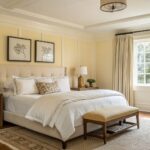
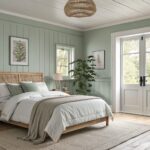
Moody Blue Bedroom Walls

This moody blue on the walls brings a calm, grounded feel to the room. It sits between navy and a soft teal, giving it enough depth to feel cozy without turning the space too dark. Colors like this work well in farmhouse bedrooms because they pair easily with wood tones and simple textiles.
It has a slight green undertone that shows up more in natural light, so it can read a touch cooler or warmer depending on the time of day. Try it with white trim and medium wood furniture to keep the look balanced. Good matches include Sherwin Williams Naval, Benjamin Moore Hale Navy, Behr Midnight, or Farrow & Ball Hague Blue.
Deep Teal Cabinets
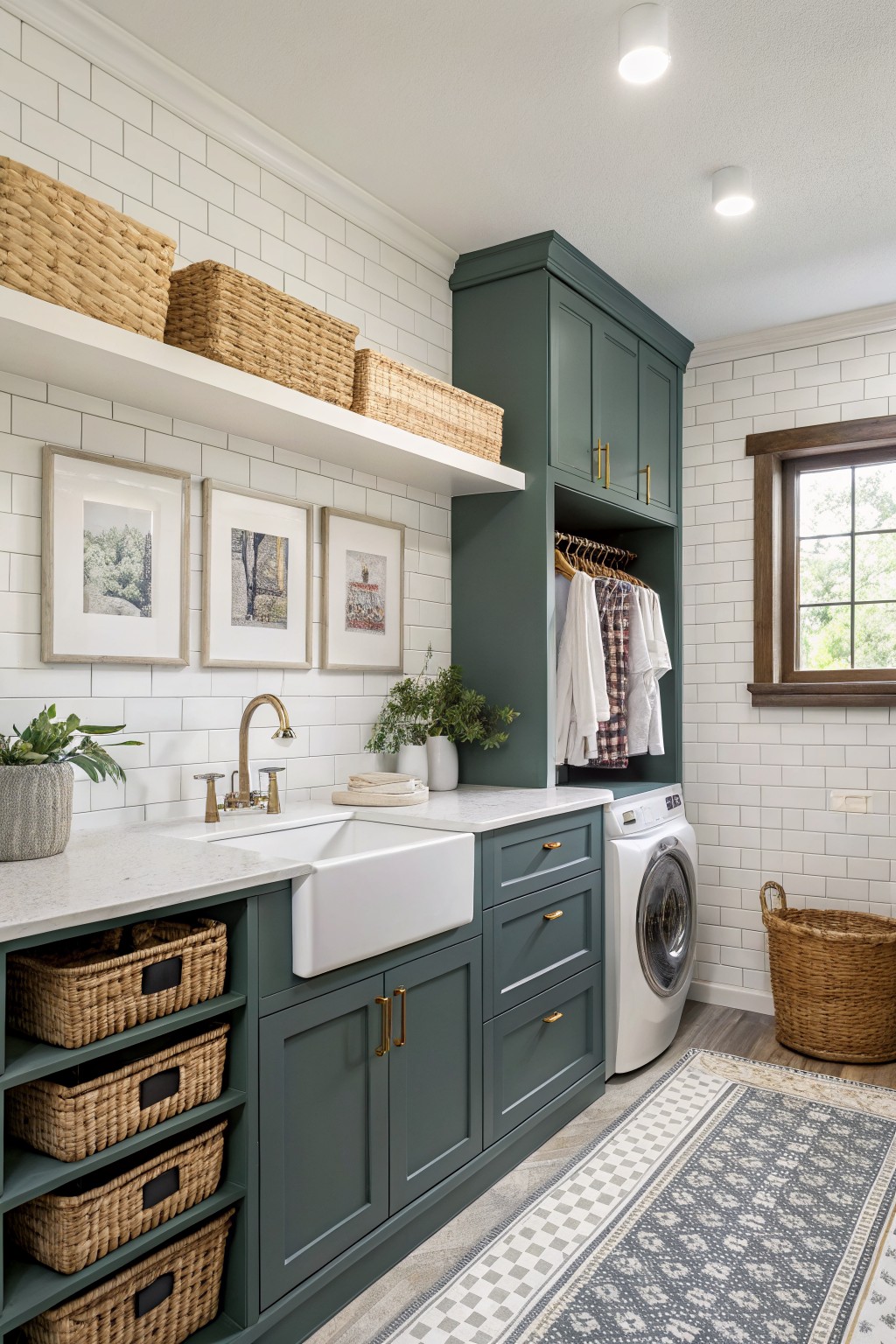
This deep teal reads as a moody blue green that works well on cabinetry. It has enough depth to feel grounded without turning the space too dark, and it pairs nicely with white tile and marble counters in a utility room like this.
The color sits somewhere between green and blue, so it can shift a bit depending on the light. It looks good with brass hardware and woven baskets, but it can feel heavy if the room lacks enough white or light tones around it.
Blue Gray Cabinets
This blue gray cabinet color sits right in that moody farmhouse range. It reads as a soft, slightly cool gray blue that feels calm without going flat against the wood tones around it.
The finish keeps the color from feeling too heavy, so it works nicely in a kitchen or pantry where you still want some warmth from baskets and shelves. Pair it with natural wood or simple brass hardware to keep the look balanced.
Blue Gray Built Ins
This blue gray on the built in cabinetry has a calm, slightly moody quality that fits right into a farmhouse entry. It reads as a soft medium depth color that keeps the space feeling collected without turning heavy.
The tone has cool undertones that sit nicely next to warm wood and stone. It works well in rooms with steady daylight and pairs easily with natural baskets, linen cushions, or simple black hooks. Likely matches include Sherwin Williams Rainwashed, Benjamin Moore Wythe Blue, Behr Silver Blue, and Farrow & Ball Blue Gray.
Deep Teal Cabinetry
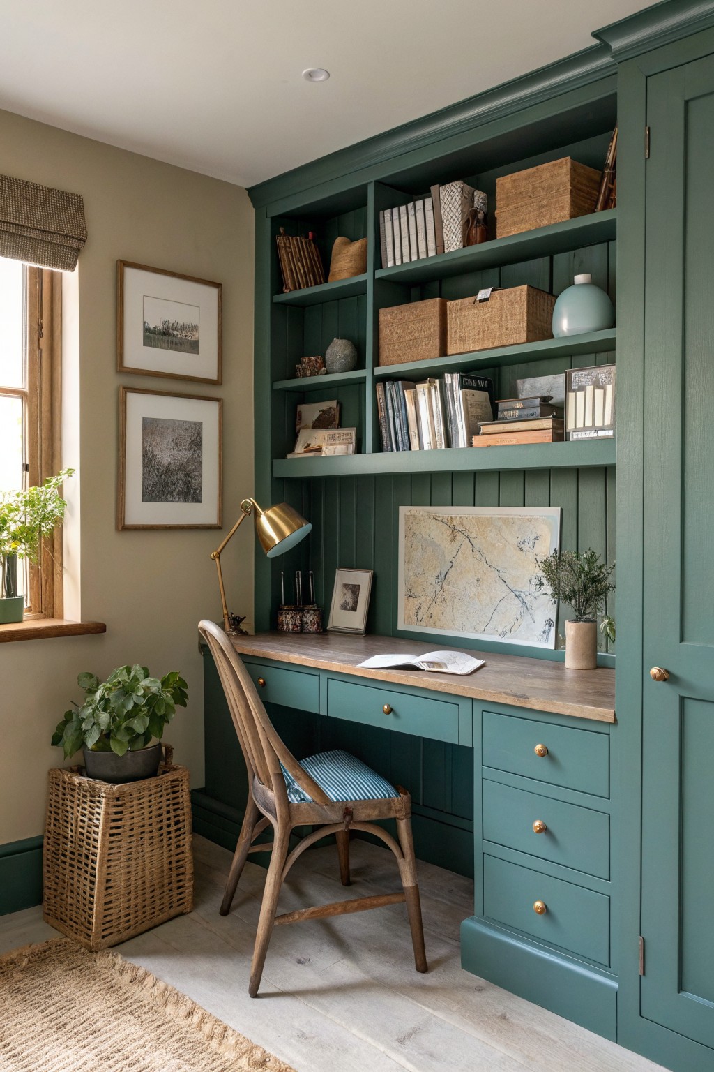
This deep teal reads as a moody blue-green with enough depth to feel grounded. It works especially well on built-ins because the color gives the whole unit a solid, collected look without needing extra trim details. Many people like this shade in smaller rooms where they want some weight on the walls.
It sits nicely next to warm wood tones and light floors. In brighter light it leans more blue, while in softer light it picks up more green. Pair it with natural wood furniture and simple brass hardware if you want the same calm effect.
Moody blue green cabinets
This moody blue green reads as a deep, slightly grayed shade that sits between navy and teal. It gives the vanity a solid, grounded look that still feels farmhouse rather than heavy or formal.
The color works well against white tile and light walls because the gray undertone keeps it from turning too cool. It pairs easily with black fixtures and woven baskets, though it can start to feel dark if the room gets little natural light.
Deep Blue Walls
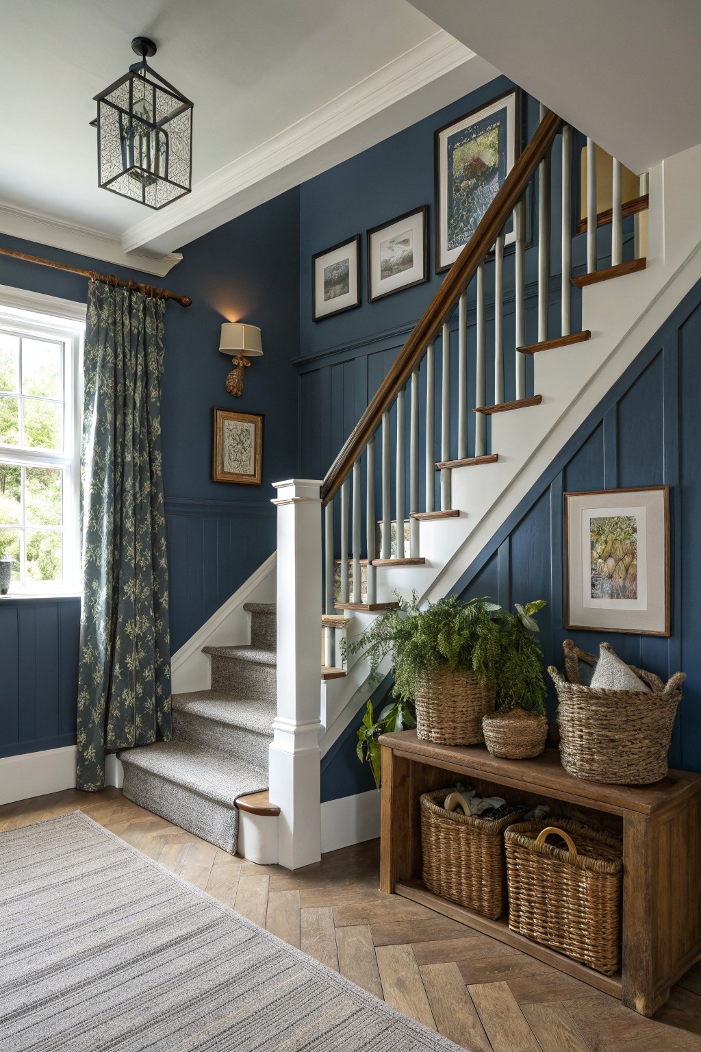
This deep navy blue on the walls creates a moody farmhouse look that feels solid and welcoming. It reads as a true navy with enough depth to make the space feel enclosed in a good way, especially against the white trim and wood tones nearby.
The color has cool undertones that sit nicely next to natural wood flooring and stairs. It works well in stairwells or hallways where you want some weight without making the area feel closed in. Try it with crisp white trim or lighter wood accents to keep the balance right.
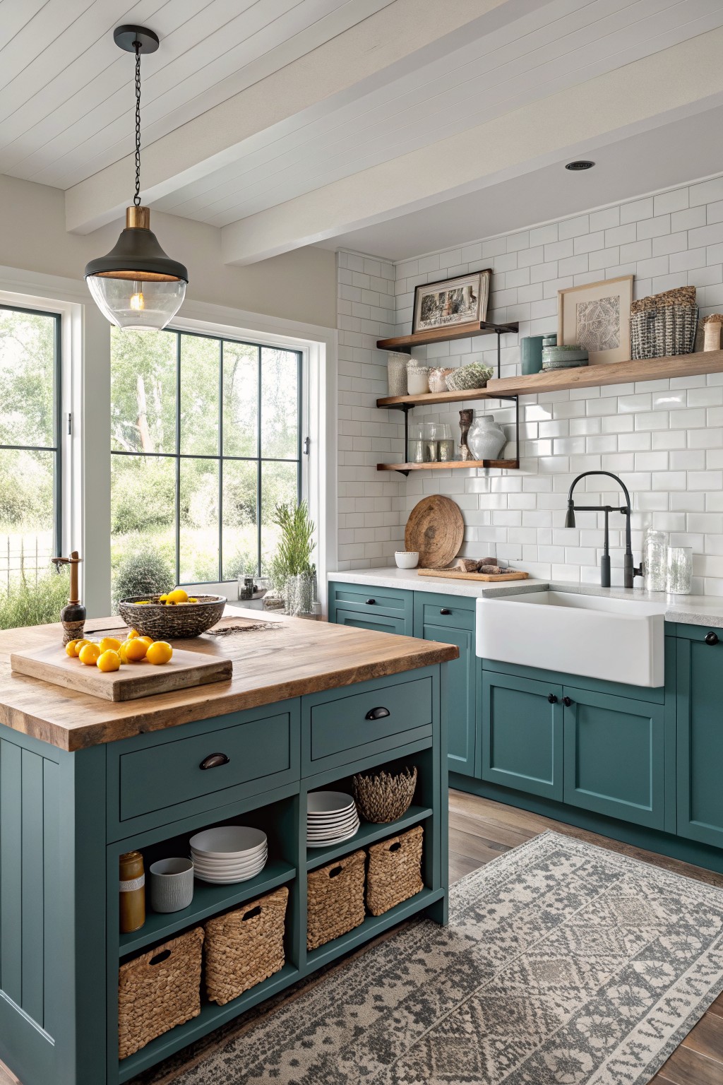
Deep Teal On Kitchen Cabinets
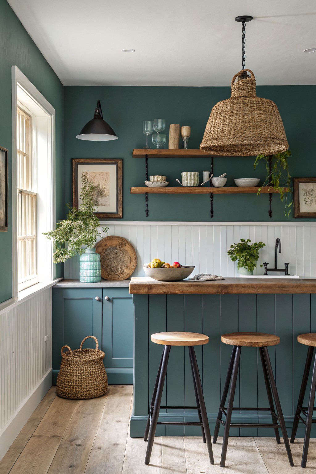
This deep teal blue on the lower cabinets and island gives the kitchen a solid, grounded feel. It sits between blue and green without leaning too hard either way, which keeps it from feeling too cold or too earthy.
The color holds up well against the wood counter and floor, and it works nicely with the lighter beadboard and the darker green on the walls above. It suits older homes or farmhouse kitchens that need a bit of weight on the cabinetry without going full navy.
A deep navy blue like this reads as a solid moody choice for interior doors in farmhouse spaces. It has enough depth to stand out without feeling too stark, and it sits nicely against warm wood tones and soft neutral walls. Colors in this range often lean toward options like Sherwin Williams Naval, Benjamin Moore Hale Navy, or Farrow & Ball Hague Blue.
The cool undertone keeps it from warming up too much in natural light, so it works best in rooms with plenty of wood or cream elements nearby. Pair it with white trim if you want more contrast, or let it blend into a darker scheme if the goal is a cozier feel.
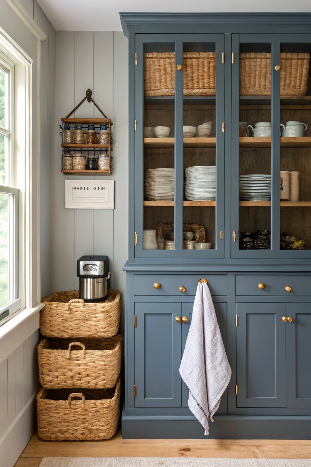
Moody blue cabinetry
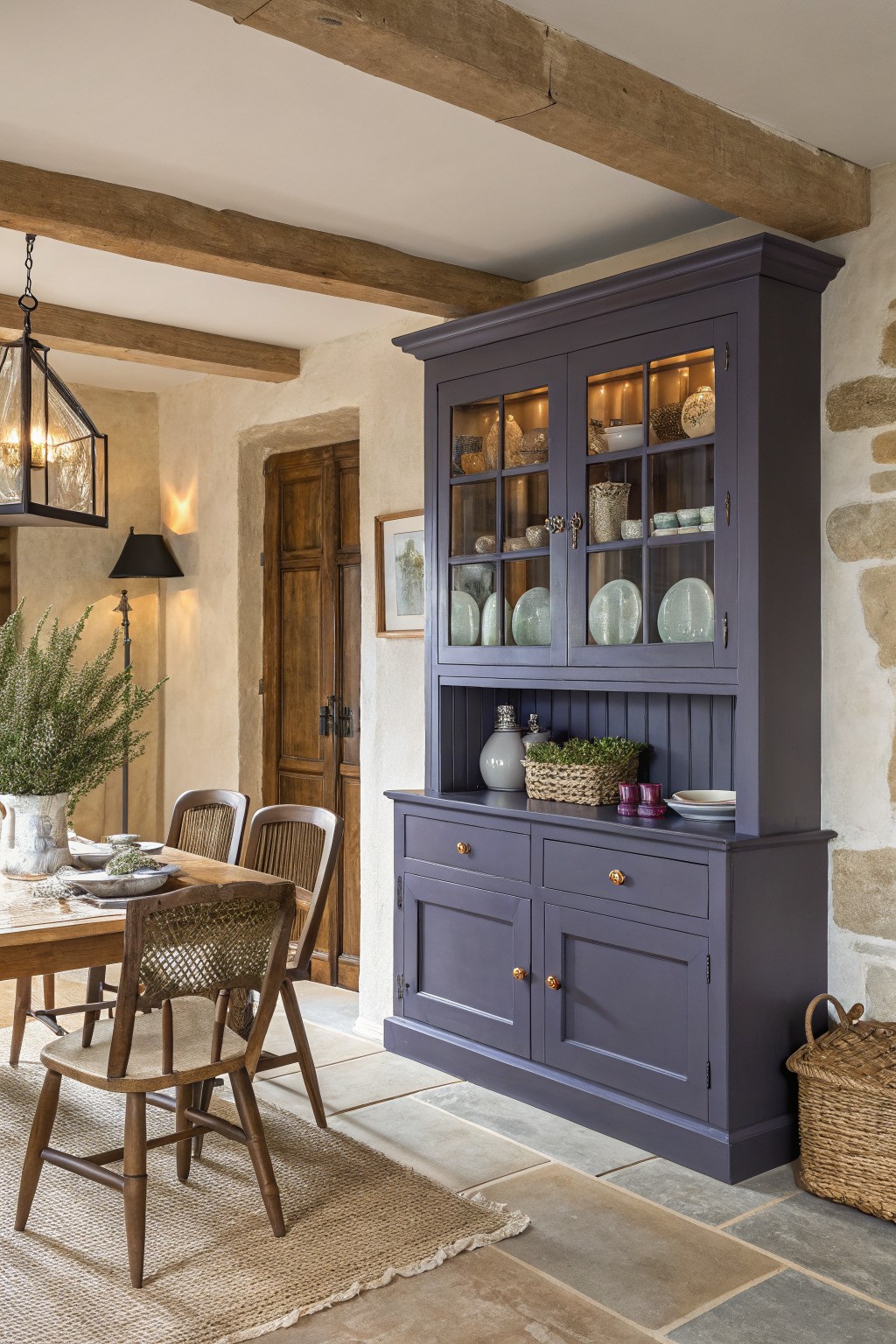
This deep moody blue on the cabinet has a slightly gray cast that keeps it from looking too bright or flat. It sits somewhere between navy and slate, which makes it feel solid and a little quiet at the same time. The color works especially well on larger pieces like hutches or built-ins because it adds weight without making the room feel closed in.
It has cool undertones, so it reads best next to warm wood tones and stone rather than crisp white trim. Try it on kitchen or dining storage if you want something that still feels farmhouse but a touch more dressed up. Colors like Sherwin Williams Naval, Benjamin Moore Hale Navy, or Farrow & Ball Hague Blue give a similar depth.
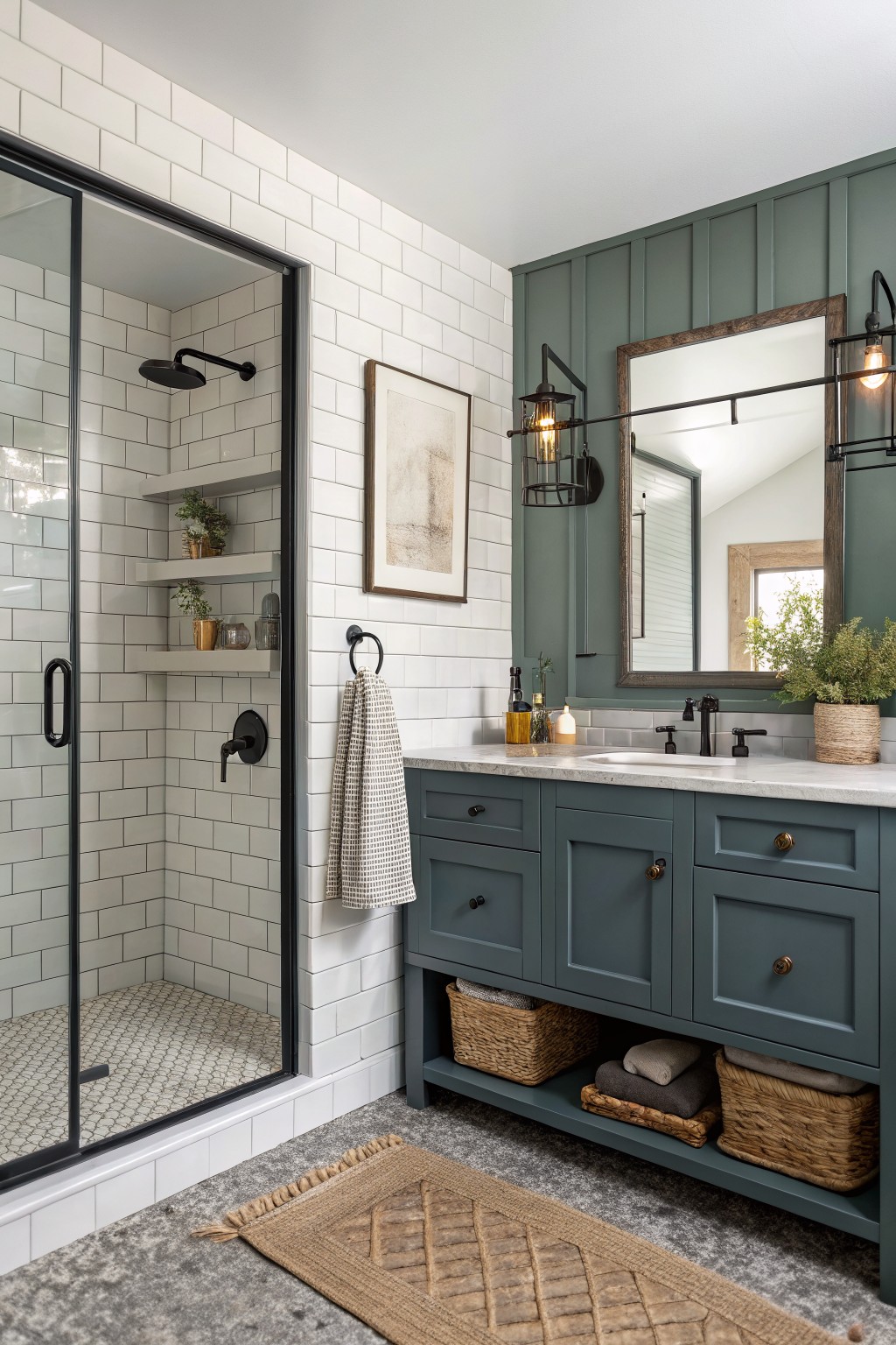
Deep Teal Vanity Cabinets
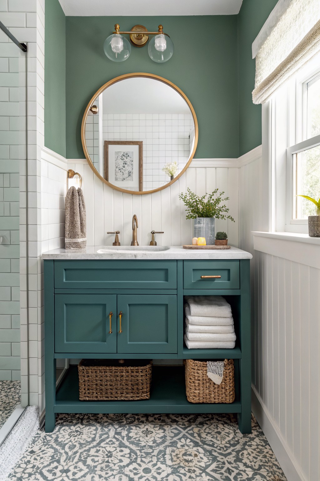
This deep teal on the bathroom vanity gives a moody blue feel that still works in a farmhouse setting. It brings some depth to the room without making it feel closed in.
The color has a slight green undertone that pairs nicely with white trim and wood tones. It suits small spaces like bathrooms or powder rooms where you want something richer than a plain gray or navy.
Deep teal walls
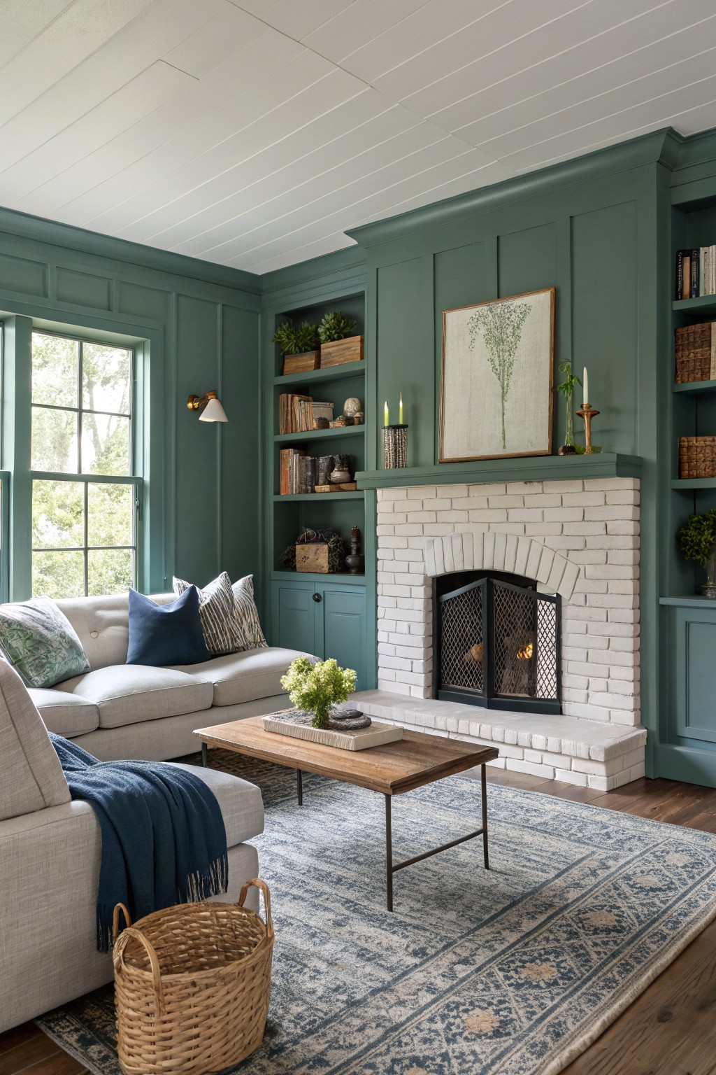
This deep teal brings a moody blue-green tone to the room. It sits between blue and green with enough depth to feel grounded without turning too dark. The color works well on large wall areas and built-in cabinetry because it holds its own next to white brick and natural wood.
It has a slight gray undertone that keeps it from looking too bright in natural light. Pair it with warm wood tones and simple white trim if you want the same calm farmhouse feel. Avoid pairing it with cool grays or stark whites or the teal can start to feel flat.
Muted Blue Green Cabinets

This color is a soft blue green that sits somewhere between teal and gray. It gives the cabinets a calm, grounded look without feeling too dark or heavy. Many people like it because it pairs well with wood tones and keeps the room feeling warm even though the paint itself is cool.
It has a slight gray undertone that helps it stay steady in different lights. This shade works best in kitchens or utility spaces where you want the cabinets to blend with natural wood and simple finishes. Try it with warm brass hardware or white walls if you want the blue green to read a little softer.
Frequently Asked Questions
Q: How do I pick one of these blues for my kitchen cabinets without it clashing with the wood floors? A: Start by holding paint samples against both the cabinets and the floor in different spots. A mid-tone blue often balances the warmth of wood better than a super dark shade. Test it on a small door panel first to see how it settles.
Q: Will a moody blue make my small reading nook feel even tighter? A: Pick a blue with some gray in it to keep the space from closing in. Paint just the back wall of the nook instead of all four sides. This draws the eye without shrinking the whole area.
Q: What happens if my living room gets strong afternoon sun? A: The blue can shift warmer and lose some depth in bright light. Try a slightly deeper shade than you first think to hold that moody feel. Check the color at different times of day before committing.