
I have learned that deep accent colors in bedrooms shift more than you think once they cover a full wall and meet the existing trim and bedding.
The same shade can feel grounding in the morning but heavier by evening depending on how much natural light reaches it.
I test every time.
Paying attention to undertones against your flooring and curtains usually shows whether a bold choice will stay balanced or start to dominate the space.
Seeing the color next to your actual furniture helps decide if it adds depth without making the room feel smaller than it is.
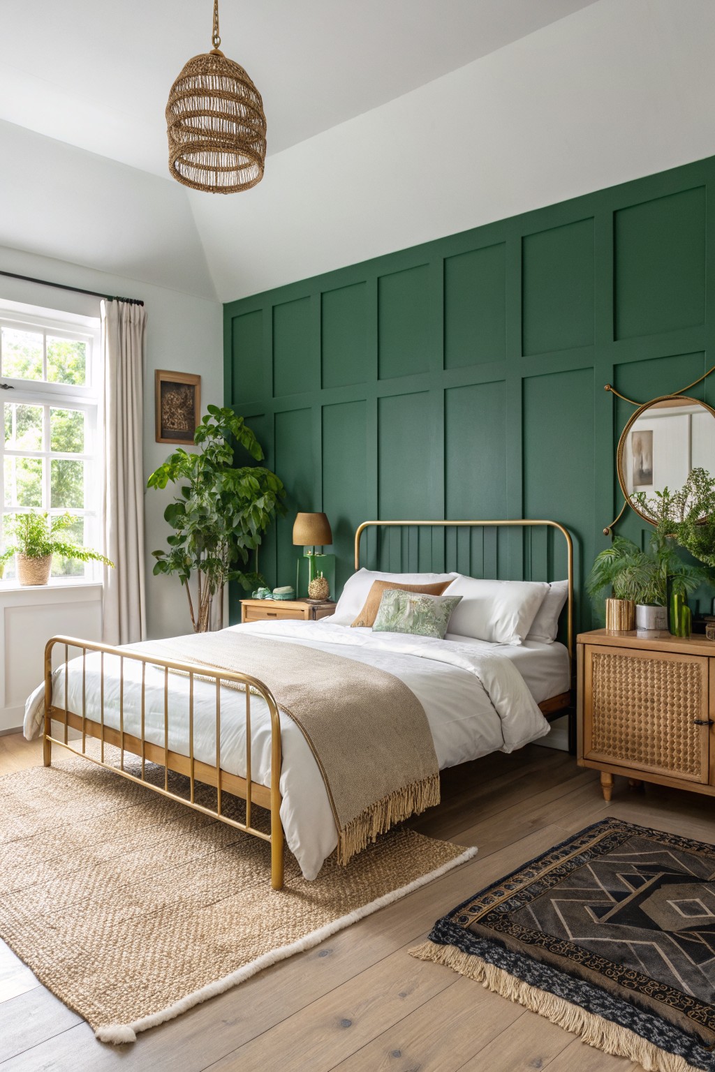
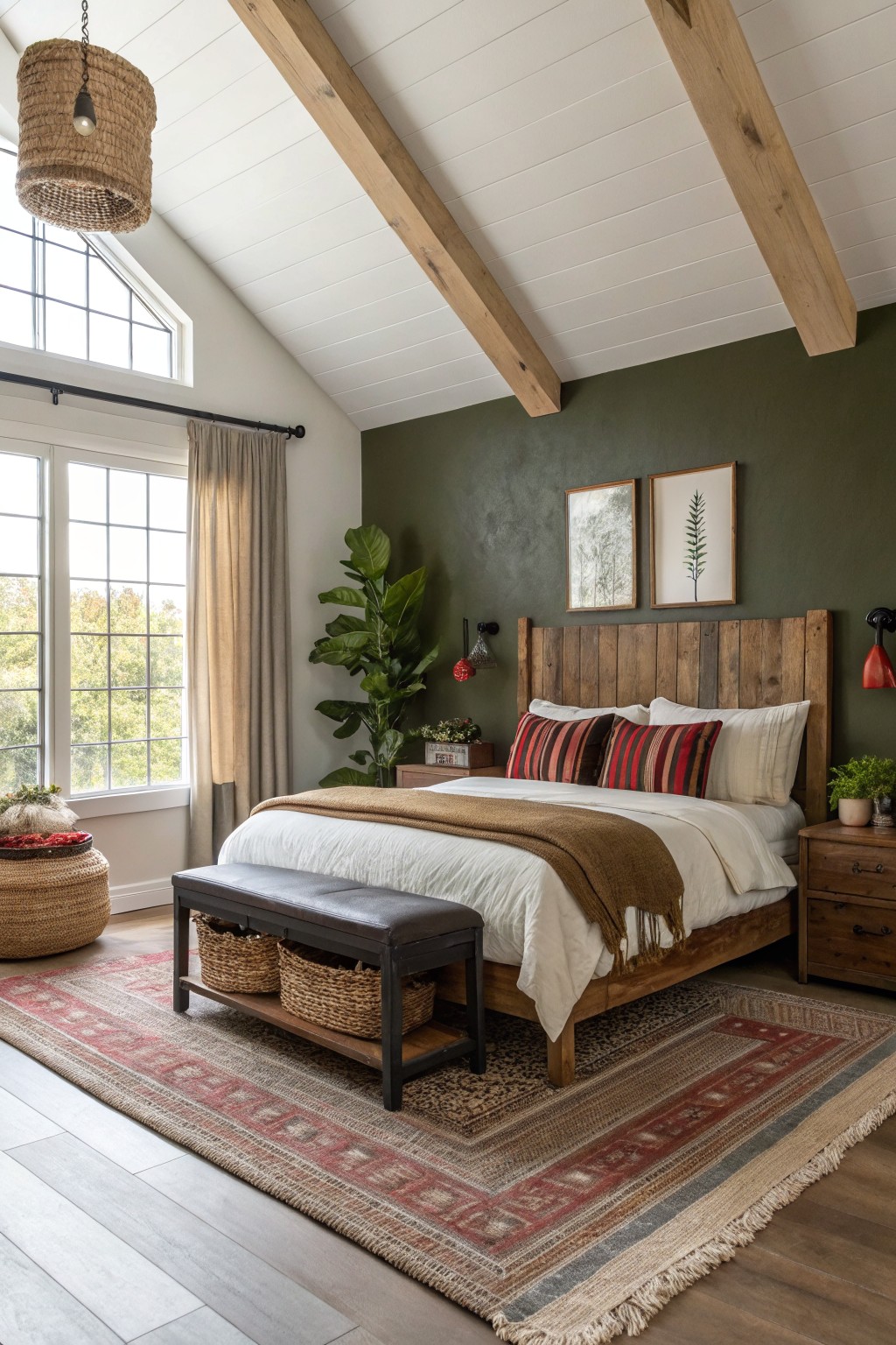
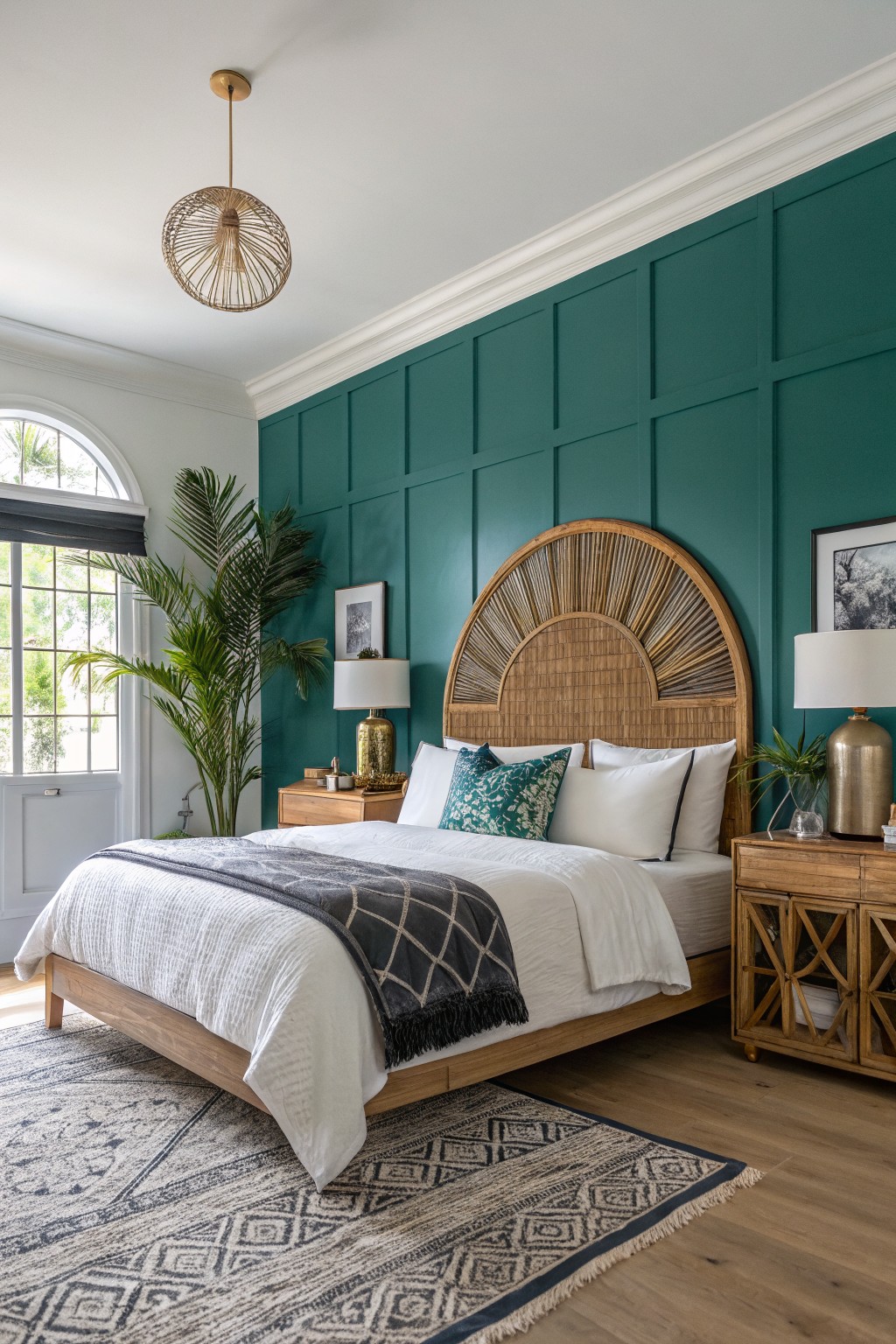
Deep green accent walls
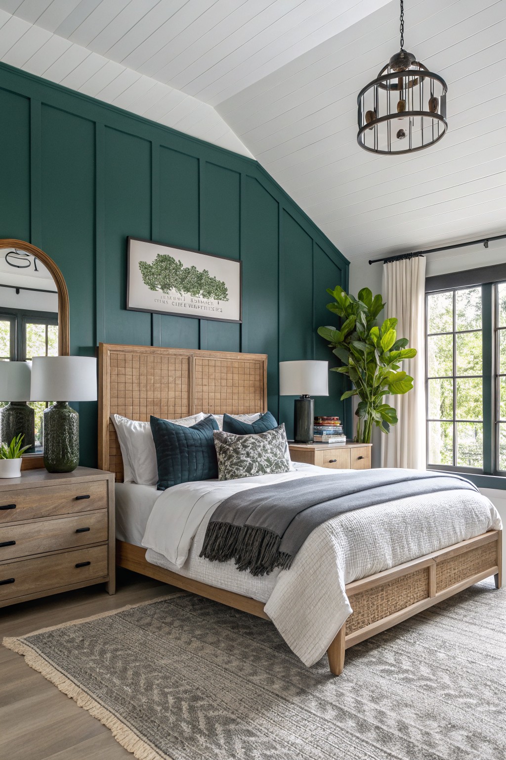
A deep green like this works well for bold bedroom walls because it brings in color without turning the space dark or closed in. It reads as a rich forest green with a hint of teal, and it sits nicely against the warm wood tones in the room. This kind of shade often matches closest to Benjamin Moore Hunter Green, Sherwin Williams Rookwood Dark Green, Behr Forest Floor, or Farrow & Ball Green Smoke.
It handles natural light well and stays grounded when paired with light bedding and wood furniture. The color feels best in rooms with decent window light and some white or cream trim to keep it from feeling too heavy. Watch the undertone though, since it can lean cooler in north facing rooms.
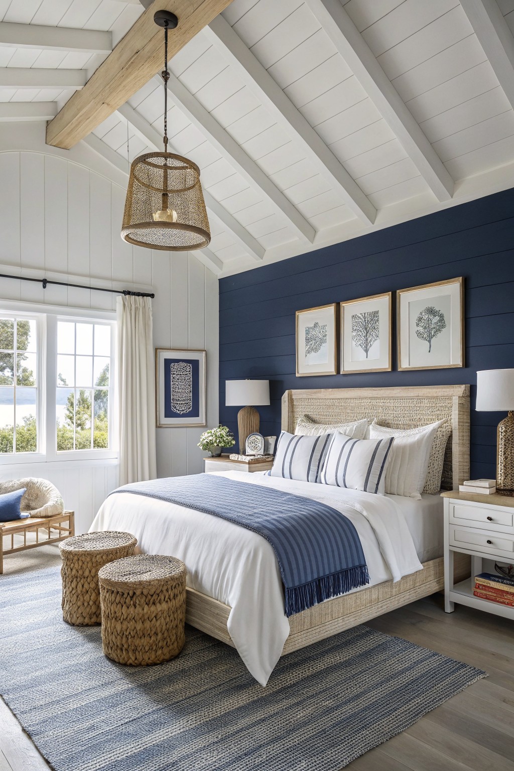
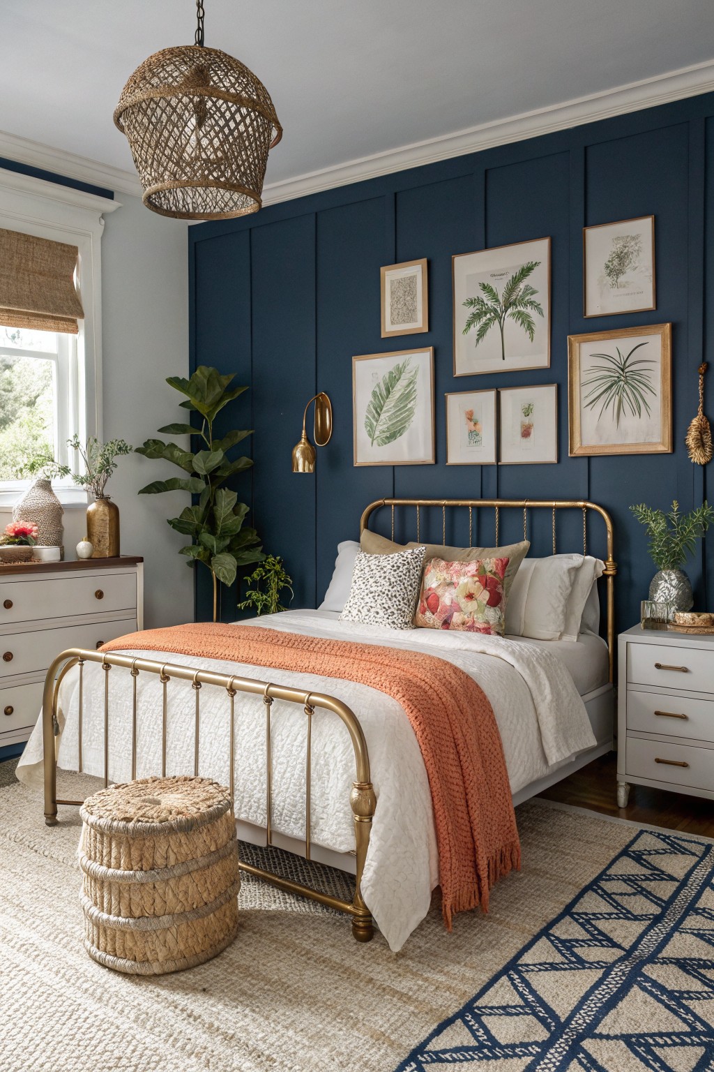
A deep navy blue works well on bedroom accent walls when you want something bold but still restful. This color family sits in that middle ground between black and true blue. It looks closest to Sherwin Williams Naval or Benjamin Moore Hale Navy.
The cool undertone keeps the wall from feeling heavy next to white trim and light wood furniture. It works best in rooms with decent natural light so the color stays clear rather than muddy.
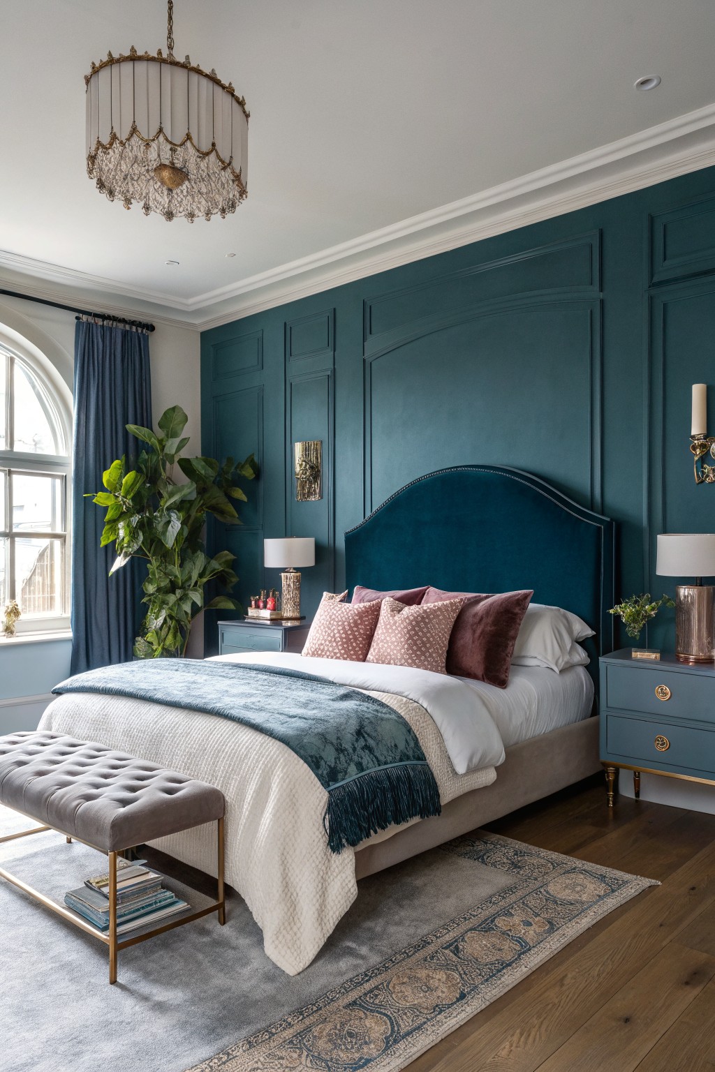
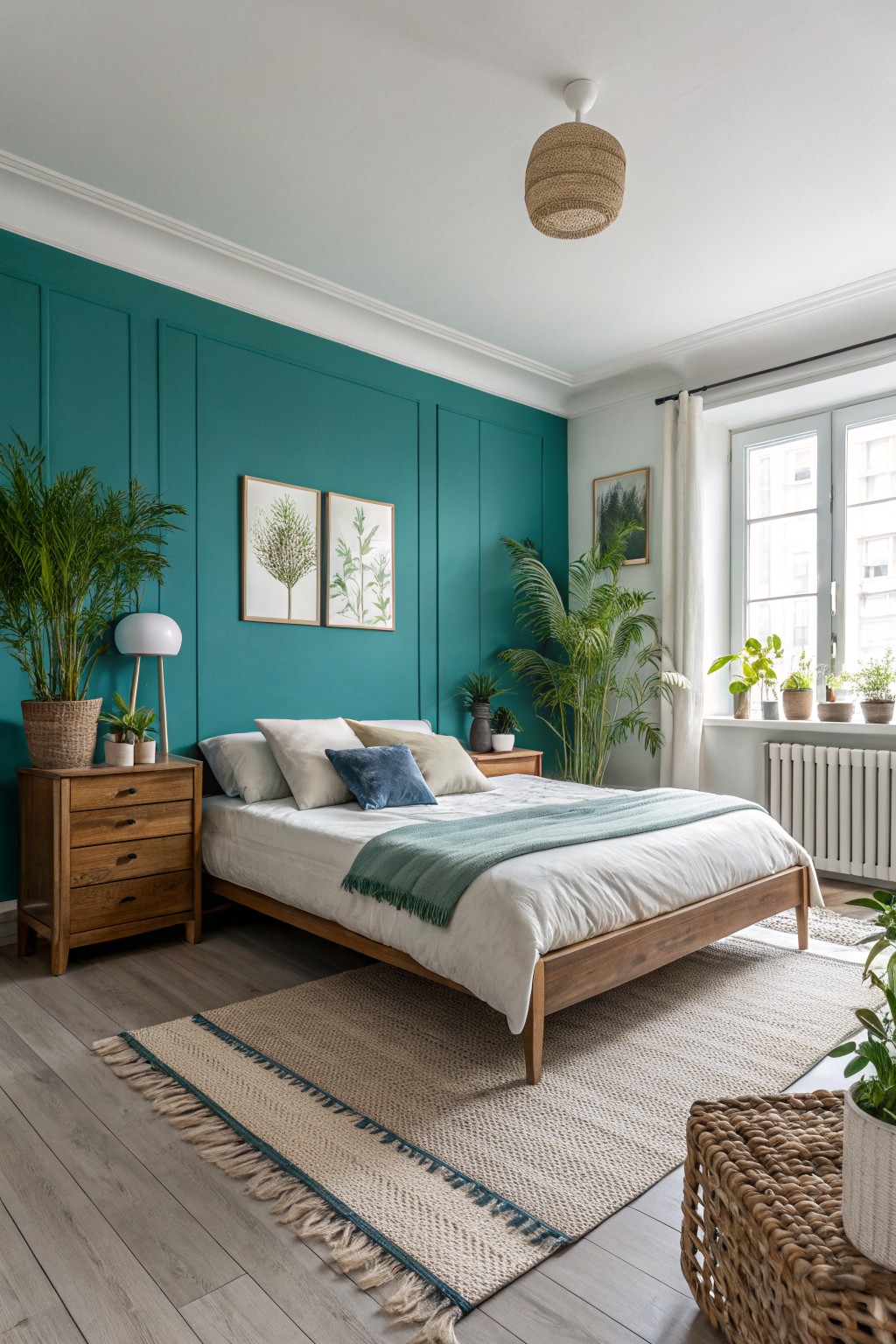
Deep teal accent walls
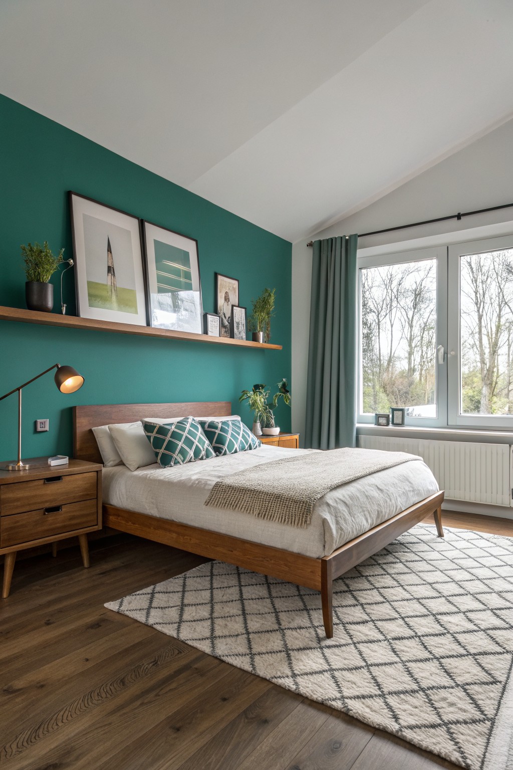
A deep teal green works well for an accent wall when you want something bold that still feels grounded. This shade sits between blue and green with enough depth to add interest without making the room feel closed in. It pairs nicely with warm wood tones and natural textures like the bed frame and flooring here.
It has a slight blue undertone that shows up more in cooler light, so it can read a little moodier at night. Try it in bedrooms with wood furniture or cream textiles to keep the balance. Benjamin Moore Aegean Teal, Sherwin Williams SW 6759 Dark Teal, Behr Deep Sea Diver, and Farrow & Ball Vardo all sit close to this color.
A deep navy makes a strong choice for a bedroom accent wall when you want color without the room closing in. This one sits in the true navy family with a cool lean, and it looks closest to Benjamin Moore Hale Navy, Sherwin Williams Naval, Behr Midnight Blue, or Farrow & Ball Hague Blue.
The white trim and light bedding keep the color grounded so it feels balanced rather than heavy. It works best in rooms with decent daylight and pairs easily with wood floors and soft neutrals.
Deep Green Bedroom Walls
A deep green like this gives an accent wall real presence while still feeling grounded. It sits somewhere between forest and emerald, with enough depth to make the room feel intentional. Colors that read close to it include Benjamin Moore Forest Green, Sherwin Williams Dark Green, Behr Forest Floor, and Farrow & Ball Studio Green.
The tone works best with warm wood floors and simple trim. In brighter light it can lean slightly blue, so test a large sample first if your room gets mostly indirect sun. It pairs easily with brass, linen, or natural textures without needing much else.
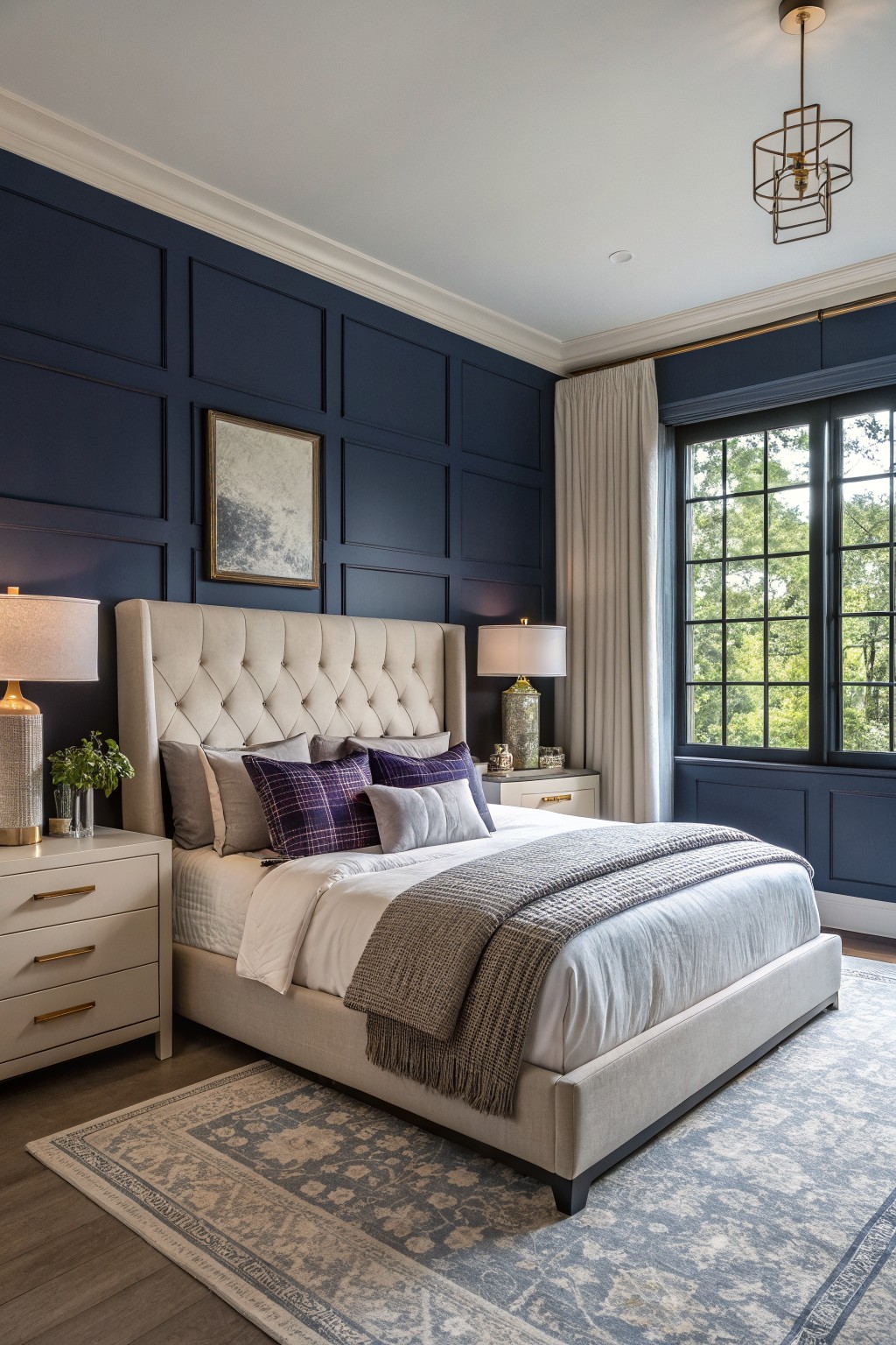
Deep Purple Accent Walls
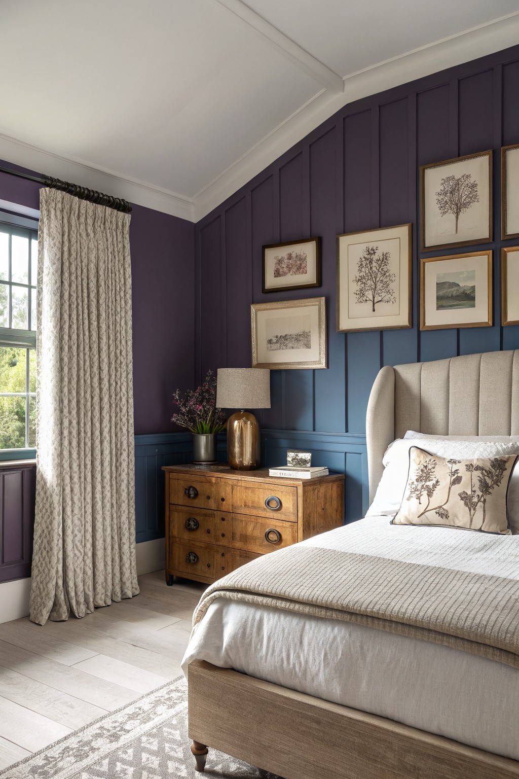
A deep purple like the one on these walls brings real depth to a bedroom without turning it dark or closed in. This shade sits in the indigo-purple family and reads closest to Benjamin Moore’s Hale Navy or Indigo, Sherwin Williams Naval, and Farrow & Ball’s Hague Blue. The color holds its own against the wood furniture and lighter bedding while still feeling calm.
It has a cool blue undertone that keeps the purple from going too red or muddy. The shade works best in rooms with decent natural light and pairs well with warm wood tones or soft neutrals on the bed and curtains. Watch the lower half of the wall if you try it, since a slightly different blue below the chair rail can help balance the overall weight.
Warm Terracotta Walls
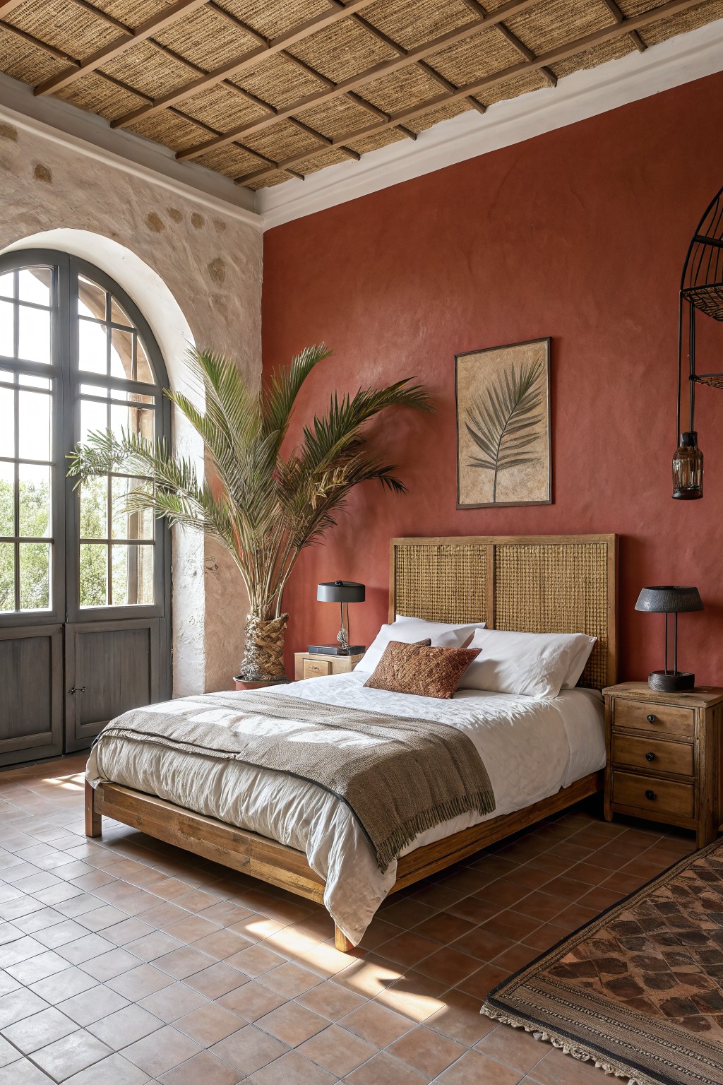
A warm terracotta gives a bedroom accent wall real presence while still feeling livable. This color sits in the deep clay red family and brings an earthy tone that pairs naturally with wood and stone.
It carries soft brown undertones that keep the wall from looking flat or too bold. Light bedding and wood furniture help it stay grounded, and colors like Sherwin Williams Red Cent, Benjamin Moore Terra Cotta, or Behr Adobe Dust sit close to this shade.
Warm Ochre Yellow Walls

This bedroom uses a warm ochre yellow on the walls. It is a deep earthy shade that brings color without making the space feel closed in or dark.
The color has golden undertones that sit nicely against wood floors and black metal. It works well in bedrooms with good natural light and pairs easily with neutral bedding and simple wood furniture.
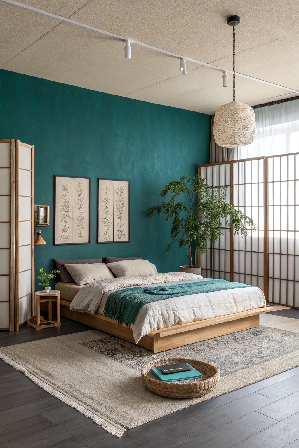
Deep teal bedroom walls

This deep teal gives a bedroom real color without making the walls feel heavy. It sits in that blue-green range and works because the tone stays soft enough to keep the room open even on all four walls.
The color has a slight gray undertone that keeps it from going too bright or too dark. It pairs easily with white trim, light wood floors, and simple bedding, and it tends to look best in rooms that get decent daylight.
A deep navy like this works well on an accent wall because it adds richness without closing the room in. It reads closest to Benjamin Moore Hale Navy or Sherwin Williams Naval, with Behr Midnight Blue as another close option if you want something slightly softer.
The color sits nicely against warm wood tones and brass, and it stays balanced when paired with lighter bedding and trim. Watch the lighting though. In low light it can lean a bit cooler, so test a large sample first to make sure it feels right in your space.
Deep Olive Green Accent Walls
This deep olive green gives a bedroom wall real presence without turning the space heavy. It sits in that in-between spot where green meets gray, which helps it feel grounded next to warm wood and natural textures.
The color holds up well in both soft daylight and warmer evening light. It pairs easily with white trim, linen bedding, and wood furniture, though it can start to feel flat if the room lacks any natural light or warm tones nearby.
Deep teal accent walls
A deep teal green on an accent wall gives a bedroom that bold look the article mentions without making the space feel closed in. It has a cool blue undertone that keeps the color from turning too heavy even when used in larger areas. This shade reads closest to Sherwin Williams Cascade Green, Benjamin Moore Aegean Teal, and Farrow & Ball Inchyra Blue.
It works best with white or off-white trim and simple light bedding so the wall stays the main focus. In rooms with good natural light the color stays balanced, but it can shift greener in dimmer spaces, so testing a sample on the actual wall is worth doing.
Deep Teal Bedroom Walls
A deep teal like this gives an accent wall real presence while still feeling livable. It sits between blue and green without tipping too far either way, which helps it work in bedrooms where you want color but not too much weight. Colors that come close include Farrow & Ball Hague Blue, Benjamin Moore Hudson Bay, Sherwin Williams Raging Sea, and Behr Deep Sea.
The finish here looks slightly matte, which keeps the color from feeling too slick against the wood floor. It pairs easily with warm wood tones and soft neutrals, though it can read cooler in low light so testing a sample on the actual wall is worth doing.
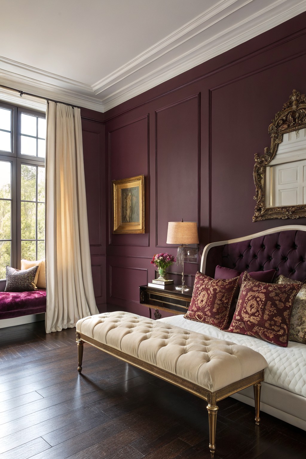
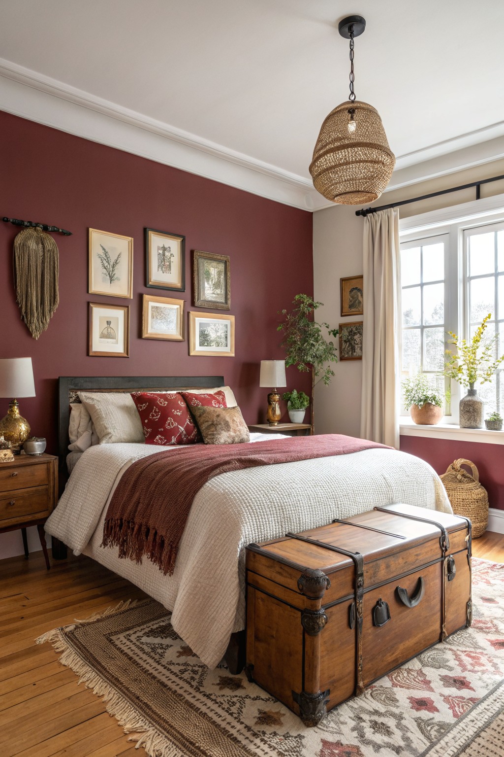
Deep Burgundy Walls
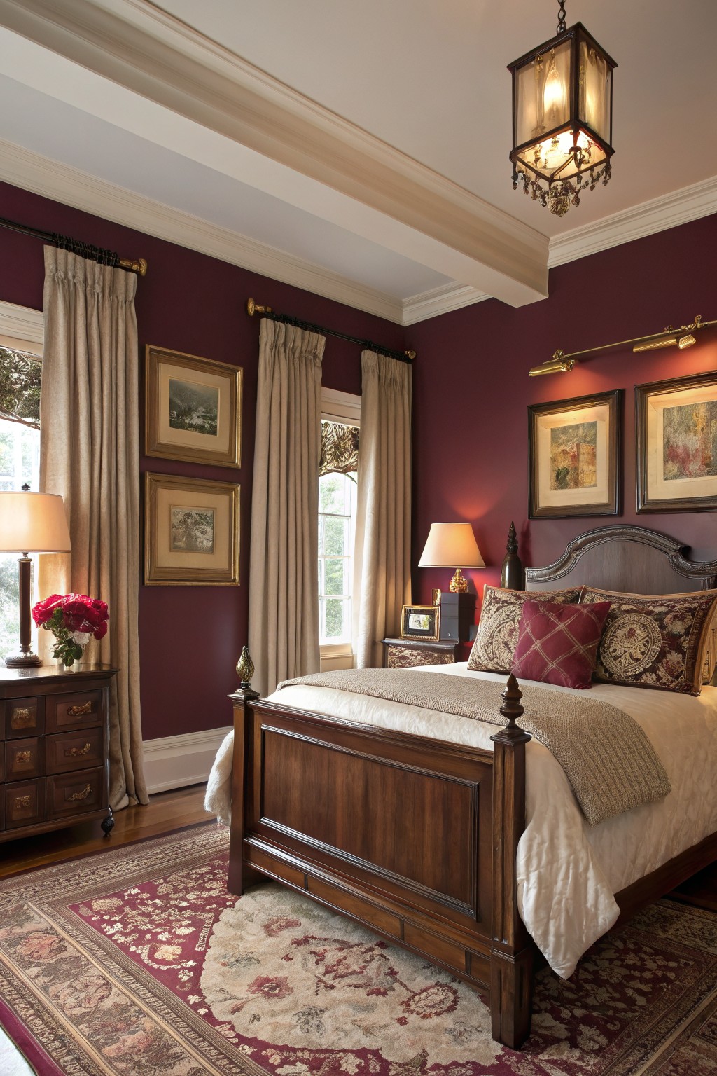
A deep burgundy on the walls gives a bedroom that rich, grounded look without turning heavy. This color sits in the warm red family and feels like a softened version of true maroon.
It works best with wood furniture and trim because the brown undertones keep everything connected. In lower light it can read a little deeper, so pairing it with lighter linens and a few cream pieces helps the room stay balanced.
Terracotta brick accent wall
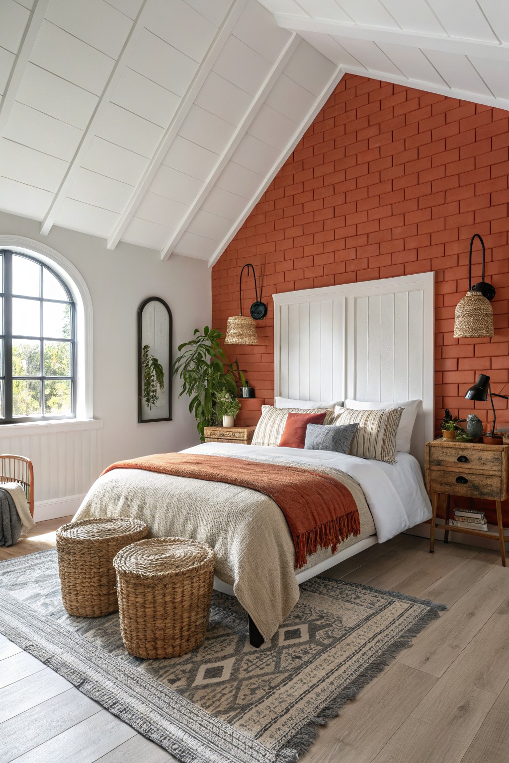
This terracotta brick color gives a bedroom a bold accent without making it feel closed in. It falls into the warm red family and has enough earthiness to keep the room balanced even on a full wall.
The slight orange undertone helps it sit well next to white trim and light wood floors. It works best in spaces with decent daylight so the color stays lively rather than heavy in the evening. Pair it with simple bedding and natural textures to let the wall stand out on its own.
Deep Brown Accent Walls
A deep warm brown makes a strong choice for an accent wall when you want weight without the room turning cave-like. This shade sits somewhere between espresso and dark chocolate, and it reads closest to Sherwin Williams Java, Benjamin Moore Raccoon Brown, Behr Coffee Bean, or Farrow & Ball Tanner’s Brown.
The color has a soft red undertone that keeps it from going flat or cold next to wood floors and stone. It works best in rooms with decent natural light and pairs easily with lighter bedding, pale trim, or natural textures so the wall adds depth instead of closing the space in.
Deep teal bedroom walls
A deep teal works nicely for an accent wall when you want color that feels bold but still livable. This shade sits right between blue and green and gives the room presence without making it feel closed in.
It has a cool undertone that sits comfortably next to warm wood and light flooring. Pair it with white trim and simple textiles so the color stays the main focus rather than turning heavy.
Deep Burgundy Walls
A deep burgundy paint color gives bedroom walls a rich look that still feels balanced. This shade falls between red and purple, and it reads closest to Benjamin Moore Burgundy, Sherwin Williams Raisin, Farrow & Ball Brinjal, or Behr Velvet Wine.
The color has a warm base that sits well against dark wood floors and white trim. It works best in rooms with decent natural light and pairs easily with cream upholstery or simple brass details.
Deep Teal Accent Wall
A deep teal works well here because it brings in enough color to feel bold while still reading as grounded. This shade sits in the green-blue range and pairs easily with warm wood tones and white trim, which keeps the room from feeling closed in.
It has a slight blue undertone that shows up more in natural light, so it suits spaces with decent windows. Try it with light bedding and simple wood furniture if you want the wall to stand out without dominating everything else. Best matches would be something like Sherwin Williams Cascade Green, Benjamin Moore Gulf Stream, or Farrow & Ball Vardo.
Deep Burgundy Accent Walls
A deep warm burgundy gives an accent wall real presence without feeling heavy. The color has a rich tone that reads grounded next to wood furniture and lighter textiles.
It carries a slight earthy undertone that helps it stay cozy rather than stark. This works best in rooms with good natural light and pairs well with cream bedding or oak floors to keep the overall feel balanced. Closest matches include Benjamin Moore Caliente, Sherwin Williams Bolero, Behr Red Theatre, and Farrow & Ball Eating Room Red.
Deep Teal Bedroom Walls
A deep teal like this gives a bedroom wall real presence while still feeling livable. It sits between green and blue, so it reads rich but not too dark or heavy. The color works especially well when the rest of the room stays light and simple.
It has a slight cool lean, which means it needs decent daylight to stay balanced. Warm wood furniture and cream or beige textiles help soften it and keep the space from feeling closed in.
Frequently Asked Questions
Q: Will a dark color on the accent wall make my bedroom too dark overall?
A: Balance it with plenty of white or light tones on the other walls. Add some reflective surfaces like a big mirror or metallic lamps. Your space keeps its airiness.
Q: How do I test these bold shades before committing?
A: Paint a large sample board and move it around the room. Check it in morning light and at night. This shows exactly how it feels in your space.
Q: What about using these colors with wood floors?
A: They work well. The wood warms up the deep tone nicely.


