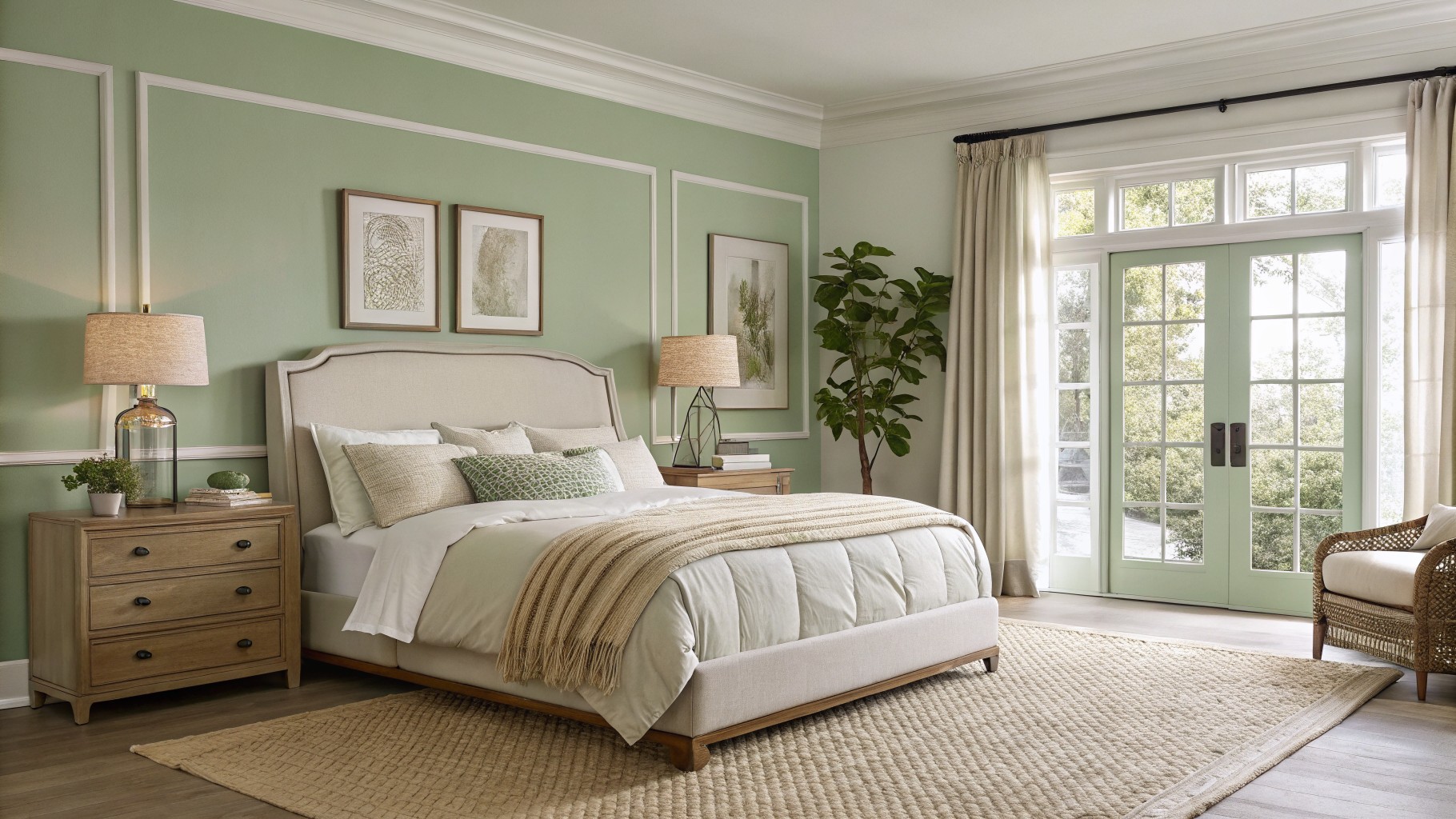
I often start by considering how a color will interact with the existing trim and flooring in a contemporary space because those surfaces can pull out unexpected tones once everything is together.
Natural daylight moves across the room throughout the day and can make a paint color appear warmer or cooler depending on the time.
I always put up a few test patches before deciding because the way it settles next to furniture matters more than the chip suggested.
Some shades end up feeling too stark once the full room comes together.
Testing in place avoids that mismatch entirely.
Soft Sage Green Walls
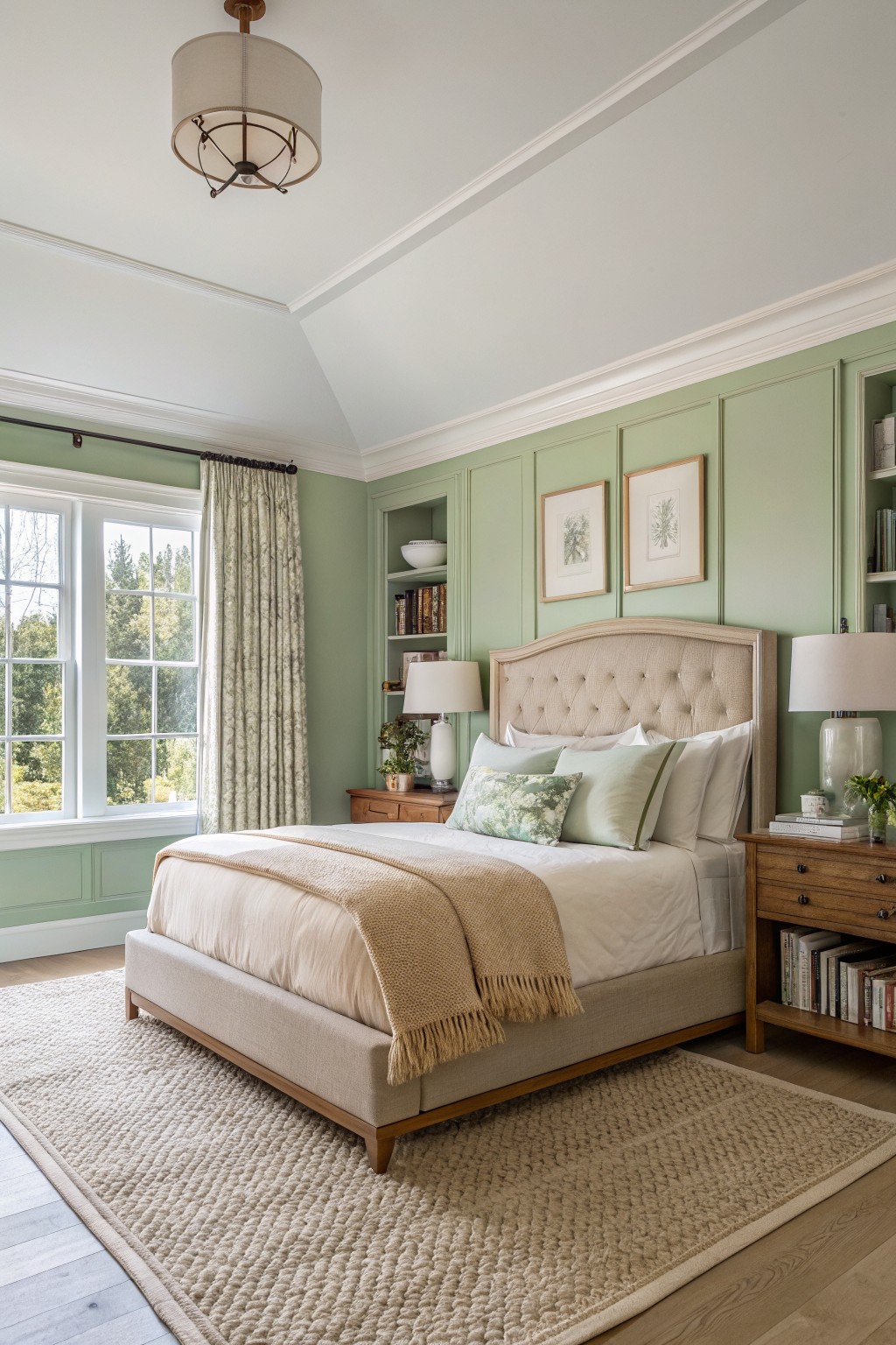
A soft sage green like this gives a bedroom a calm feel that still feels current. It sits close to Sherwin Williams Clary Sage, Benjamin Moore Soft Fern, or Behr Aloe Vera, with just enough warmth to keep the tone from going too cool.
The color works especially well with wood furniture and cream bedding, and it holds up nicely in rooms that get plenty of daylight. It can look a bit flat if the light is very dim, so most people use it where natural light is steady.
Soft Blue Gray Walls
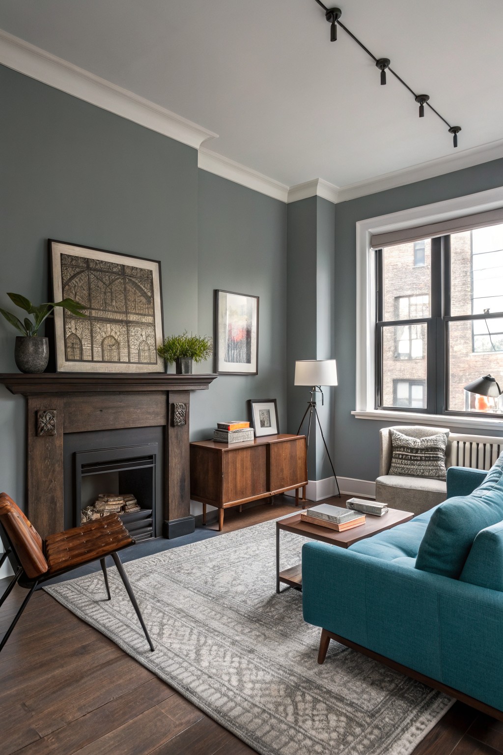
This muted blue gray gives living rooms a calm, steady background that still feels modern. It sits in that middle ground between gray and blue, and colors like Sherwin Williams Worldly Gray, Benjamin Moore Stonington Gray, Behr Silver Drop, or Farrow & Ball Pigeon all land close to it.
The cool undertone shows up more against warm wood floors and dark trim, so it needs decent natural light to stay balanced. It works best in spaces with wood furniture or built-ins, but it can feel flat if the room gets very little sun.
Warm Greige Cabinets
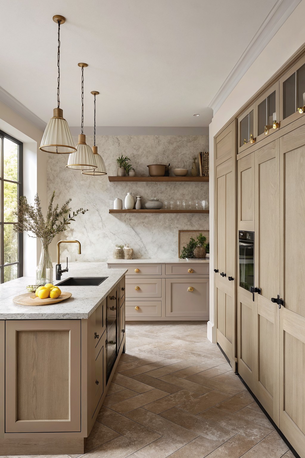
A warm greige is a good choice for cabinets when you want something softer than a straight gray. This one has a light beige base with a bit of gray mixed in, so it feels calm and blends easily with wood and stone. It keeps the kitchen from looking too stark while still reading as modern.
The undertone stays fairly warm, which helps it look good next to oak floors and marble. It works best in spaces with decent natural light and pairs well with black hardware or brass accents. Similar shades include Sherwin Williams Accessible Beige, Benjamin Moore Edgecomb Gray, Behr Greige, and Farrow & Ball Elephant’s Breath.
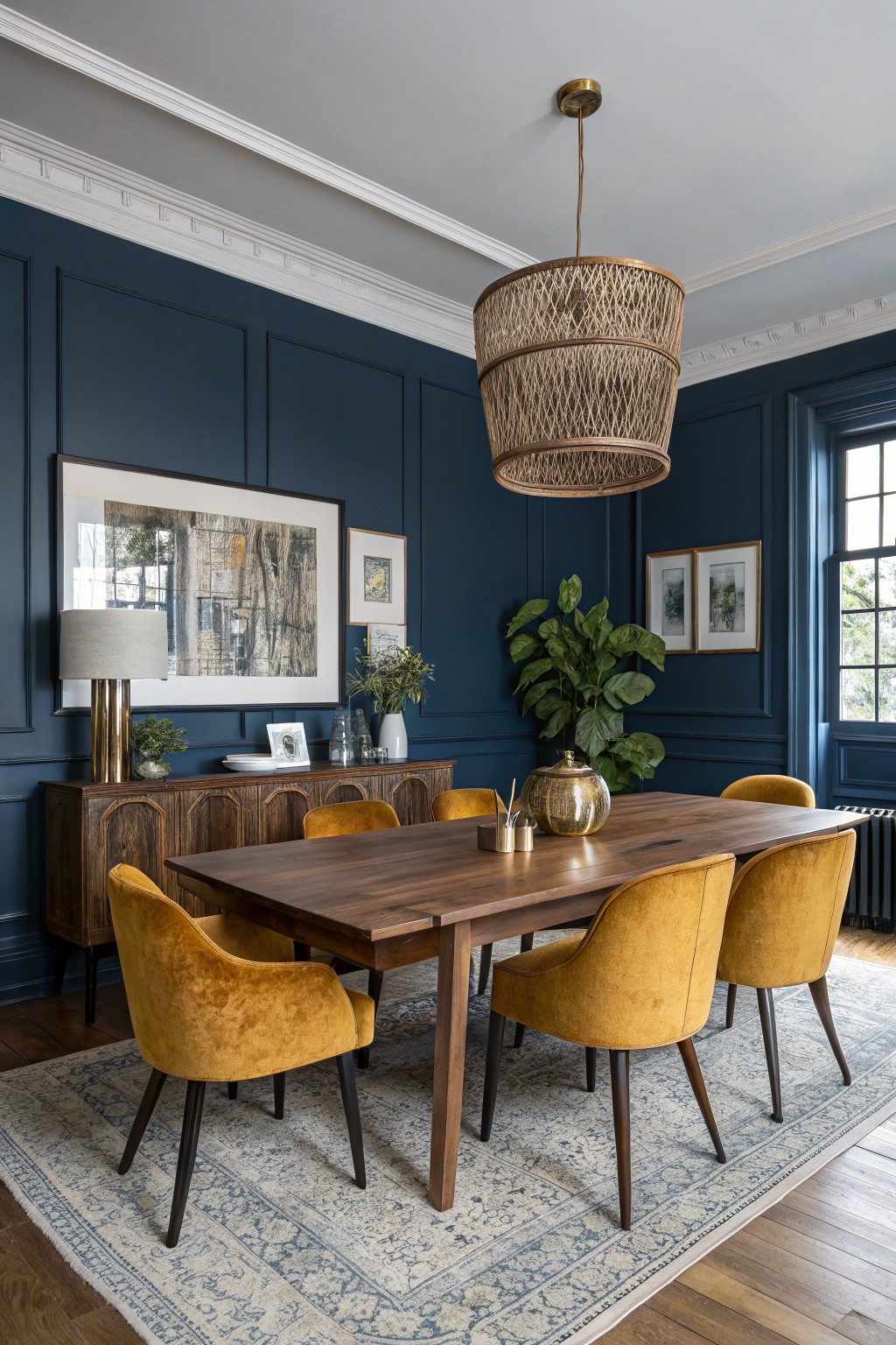
A deep navy blue like this one gives a room real weight while still feeling current. It reads as a saturated, slightly cool blue that holds its own against wood tones and white trim.
This color works best in spaces with decent light so it does not go flat. It pairs easily with warm wood furniture and richer textiles, but watch the undertone in very dim rooms where it can lean almost black.
Soft Sage Green Bedroom Walls

This soft sage green on the walls gives the room a calm, airy feel without going too bold. It is a light cool green that sits nicely between blue and green, making it easy to live with in a bedroom or similar space.
The color has gentle blue undertones that come out more with lots of natural light. It works well with white trim and warm wood tones, though it can feel a bit chilly if the room gets little sun.
Soft Sage Green Bathroom Walls
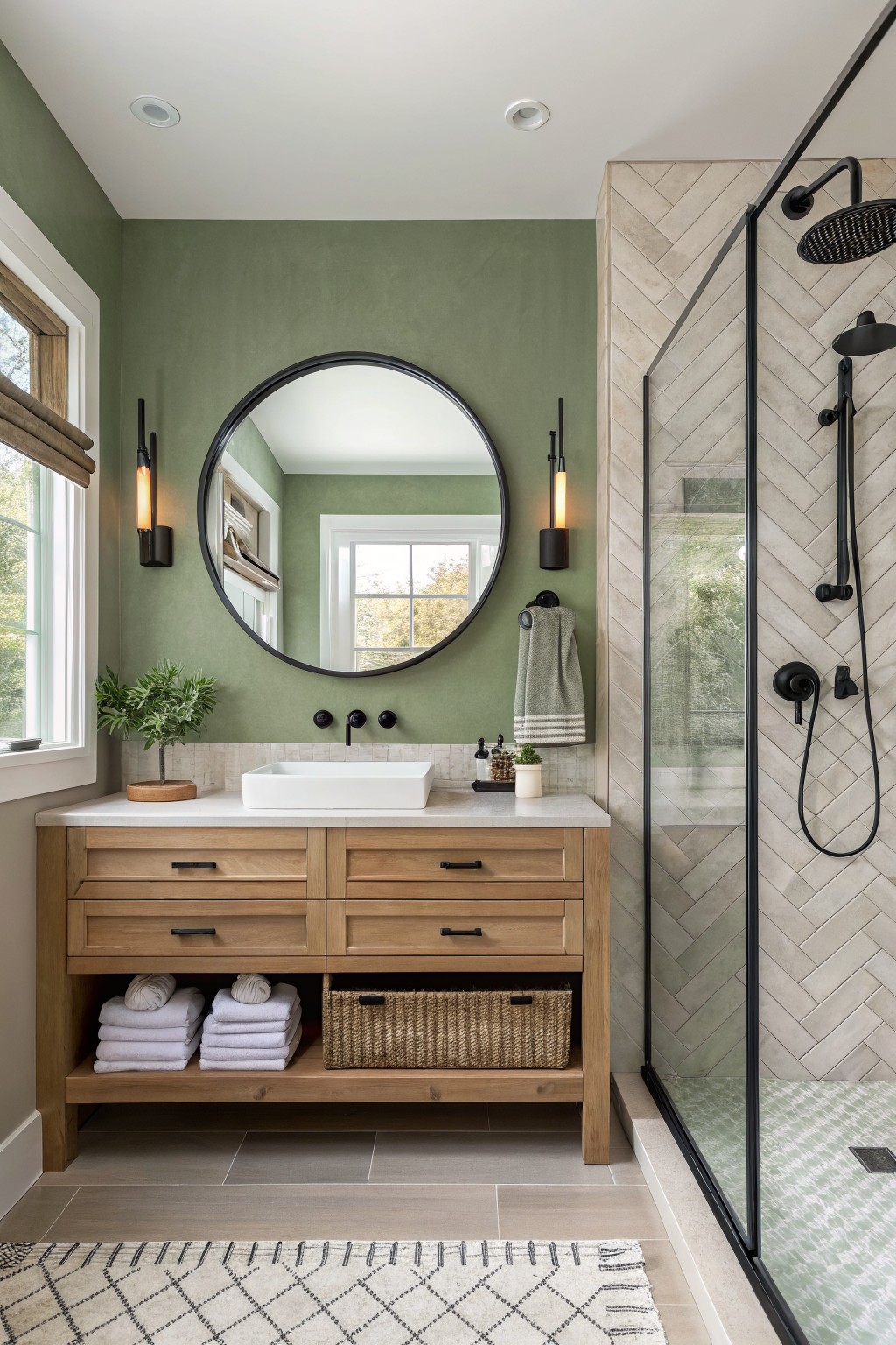
This soft sage green on the bathroom walls sits right in the middle of gray and green. It feels calm without going flat and gives the room a bit of natural color that still reads modern.
The tone has a touch of warmth so it works well next to light wood cabinetry and white tile. Try it in bathrooms or powder rooms where you want something a little softer than a true gray but not as bold as a full green.
Deep Teal Walls
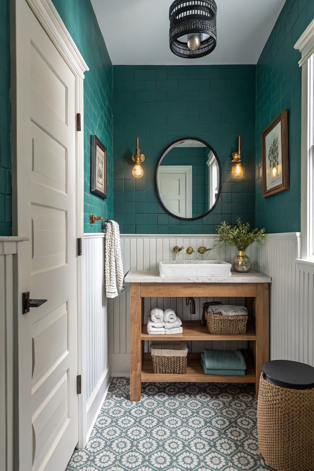
This deep teal brings a lot of color to the room without feeling overwhelming. It sits in that teal-green family and gives the space a solid, finished look that works especially well on the upper half of the wall.
The color has a cool lean that plays nicely against white trim and wood tones. It holds up in both natural light and at night, so it suits bathrooms or small rooms where you want something more interesting than a plain neutral. Pair it with simple white or light wood details and avoid anything too bright that might clash with the depth.
Soft Peach Walls

A soft warm peach brings a gentle touch to this room without turning it overly sweet. The color sits in that light peach family and reads closest to Benjamin Moore First Light, Sherwin Williams Rosy Outlook, Behr Peach Blush, or Farrow & Ball Setting Plaster.
It carries a mild warm undertone that feels easy next to wood and white trim. This kind of shade works well in bedrooms or smaller spaces where you want something soft but still grounded.
Soft Greige Walls
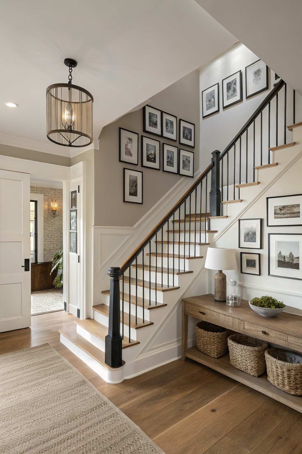
This wall color is a soft greige that sits right between warm beige and cool gray. It reads as a gentle neutral that still feels a little grounded, which makes it easy to live with in busy areas like stairs and hallways. Colors like Sherwin Williams Repose Gray, Benjamin Moore Edgecomb Gray, or Behr Silver Satin come close.
The undertone stays warm enough to play nicely with wood floors and trim, but it does not turn pink or yellow under most lights. It works best in homes that already have natural wood and white trim, and it can handle black accents without looking too stark. Just test it on a larger patch first since the gray can shift depending on the light in the room.
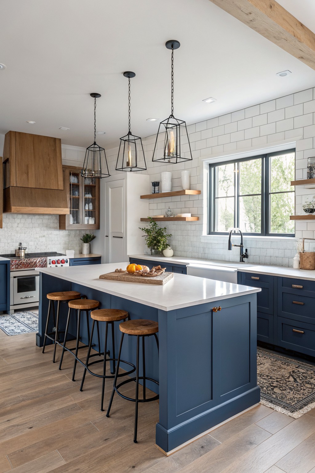
This kitchen uses a deep navy blue on the island and cabinets. It is a saturated color that still reads modern and balanced instead of dark or heavy. The shade falls between a true blue and black, which helps it sit well with white surfaces and wood tones.
It shows a cool undertone that becomes clearer in bright light. This color works best with white countertops and black accents. It also holds up nicely against natural wood like the range hood. In smaller kitchens it can feel a bit closed in, so test it on a large sample first.
Deep Teal Living Room Walls

A deep teal like this brings a calm, grounded feel to a room without making it feel closed in. The color sits somewhere between blue and green and has enough depth to hold its own next to wood tones and darker furniture.
It works best in spaces that get decent daylight because the shade can turn quite dark once the sun goes down. Pair it with warm wood, black accents, or natural leather to keep the room from feeling too heavy.
Soft Yellow Walls

A soft yellow on the upper walls gives this space a warm, easy feel that still reads modern. The color has a gentle creamy quality that keeps it from looking too bold, and it works especially well above white wainscoting.
It pairs cleanly with wood tones and blue accents while staying light enough for smaller rooms. Try something close to Benjamin Moore Pale Yellow, Sherwin Williams Lemon Chiffon, Behr Mellow Morning, or Farrow & Ball Yellow Ground if you want a similar effect.
Soft Blue Gray Bedroom Walls
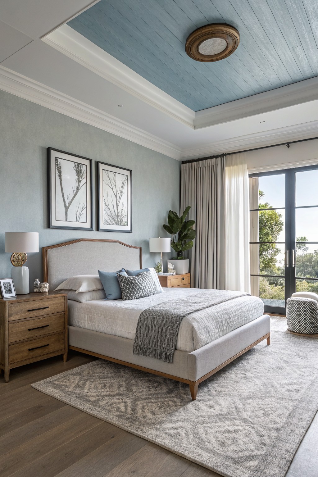
A soft blue gray on the walls gives a bedroom this calm, slightly cool feel. It sits between gray and blue with just a hint of green underneath, which keeps it from looking flat next to wood.
This shade works best in rooms with plenty of natural light and pairs easily with warm wood floors or white trim. It can look a little chilly if the lighting stays dim, so most people use it in spaces that get good daylight. You can find close matches in Sherwin Williams Rainwashed, Benjamin Moore Palladian Blue, Behr Silver Drop, or Farrow & Ball Pigeon.
Warm Taupe Walls

This warm taupe on the walls gives the space a grounded feel without looking heavy. It sits between beige and gray with a soft brown undertone that works well next to the wood floor and white trim.
The color holds up nicely in mixed lighting and pairs easily with both wood furniture and painted accents. It suits entryways or hallways where you want something simple that still feels lived in.
Deep Green Built-Ins
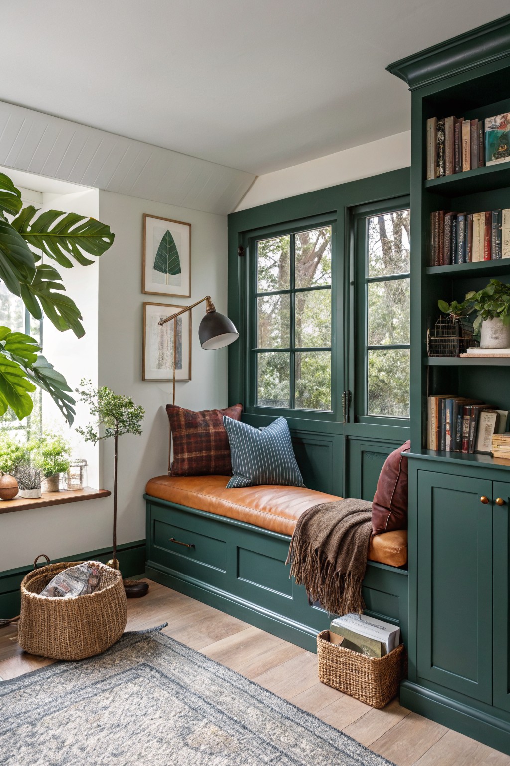
A deep green like this works well when you want color on cabinetry and trim without making the whole room feel dark. It has a cool, slightly blue undertone that keeps it from turning muddy next to warm wood tones or leather.
It shows up best in rooms with decent natural light and pairs easily with brown leather, oak floors, and simple textiles. Too little light and it can feel heavier than expected, so test it on a sample board first.
Soft Greige Bathroom Walls
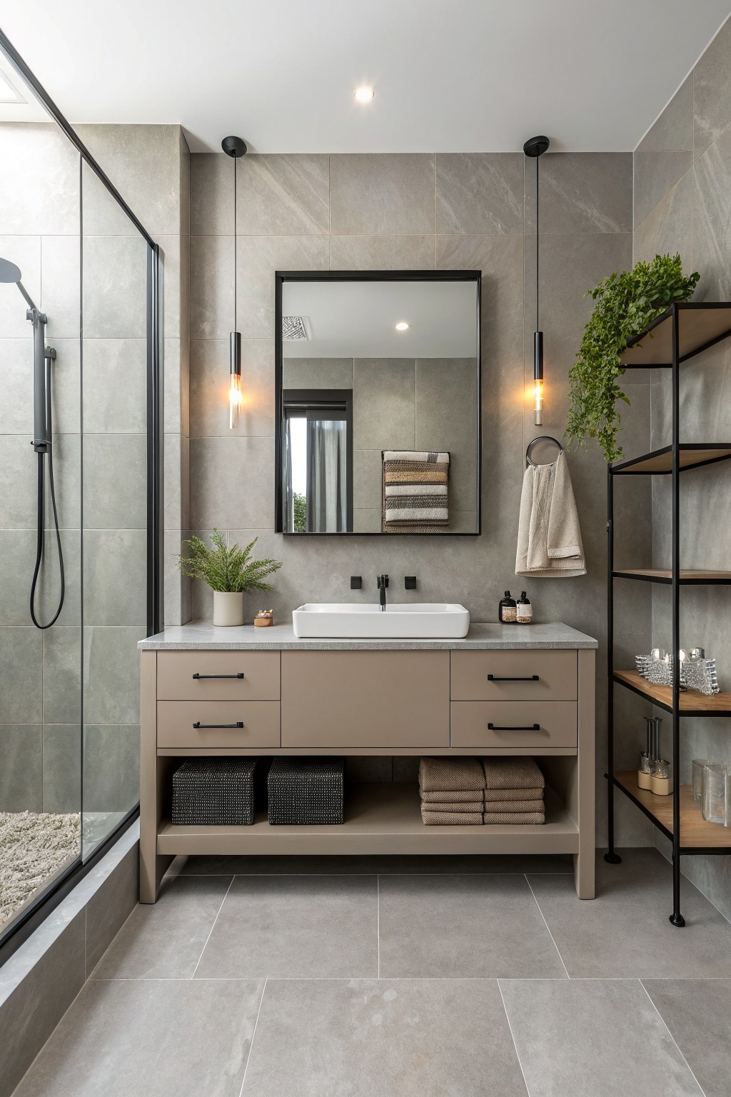
This bathroom shows a soft greige on the walls that sits between gray and warm beige. It has enough warmth to feel cozy but stays neutral enough for a clean modern look. The color works well with the gray tile floor and the slightly warmer tone on the vanity. It reads close to Sherwin Williams Repose Gray, Benjamin Moore Edgecomb Gray, or Behr Silver Fox.
The undertone stays fairly steady in both natural and artificial light. It pairs easily with black fixtures and wood accents without looking too cool or flat. Many people like this shade in bathrooms because it feels calm and holds up well next to stone or tile. Just test a sample first since the beige side can shift a bit depending on the lighting in your space.
Warm Terracotta Lower Walls

A warm terracotta red covers the lower half of the walls here. It gives the space a grounded feel without making the room feel dark or heavy, and it works especially well against the white upper walls and wood flooring.
This shade has soft orange undertones that keep it from looking too harsh. It pairs best with natural textures like wood and woven seating, and it holds up nicely in rooms with plenty of daylight. Try something close to Farrow & Ball Red Earth, Benjamin Moore Hearthstone, or Behr Terracotta.
Soft Greige Bedroom Walls

The walls are painted in a soft greige. This color sits between gray and beige, giving a warm neutral that feels calm and works well in modern rooms without looking too stark.
It has a gentle warm undertone that pairs nicely with wood floors and white trim. It suits bedrooms and living areas where you want something flexible that still feels inviting. Colors like Sherwin Williams Agreeable Gray, Benjamin Moore Revere Pewter, or Behr Silver Satin come close.
Soft Sage Green Cabinets
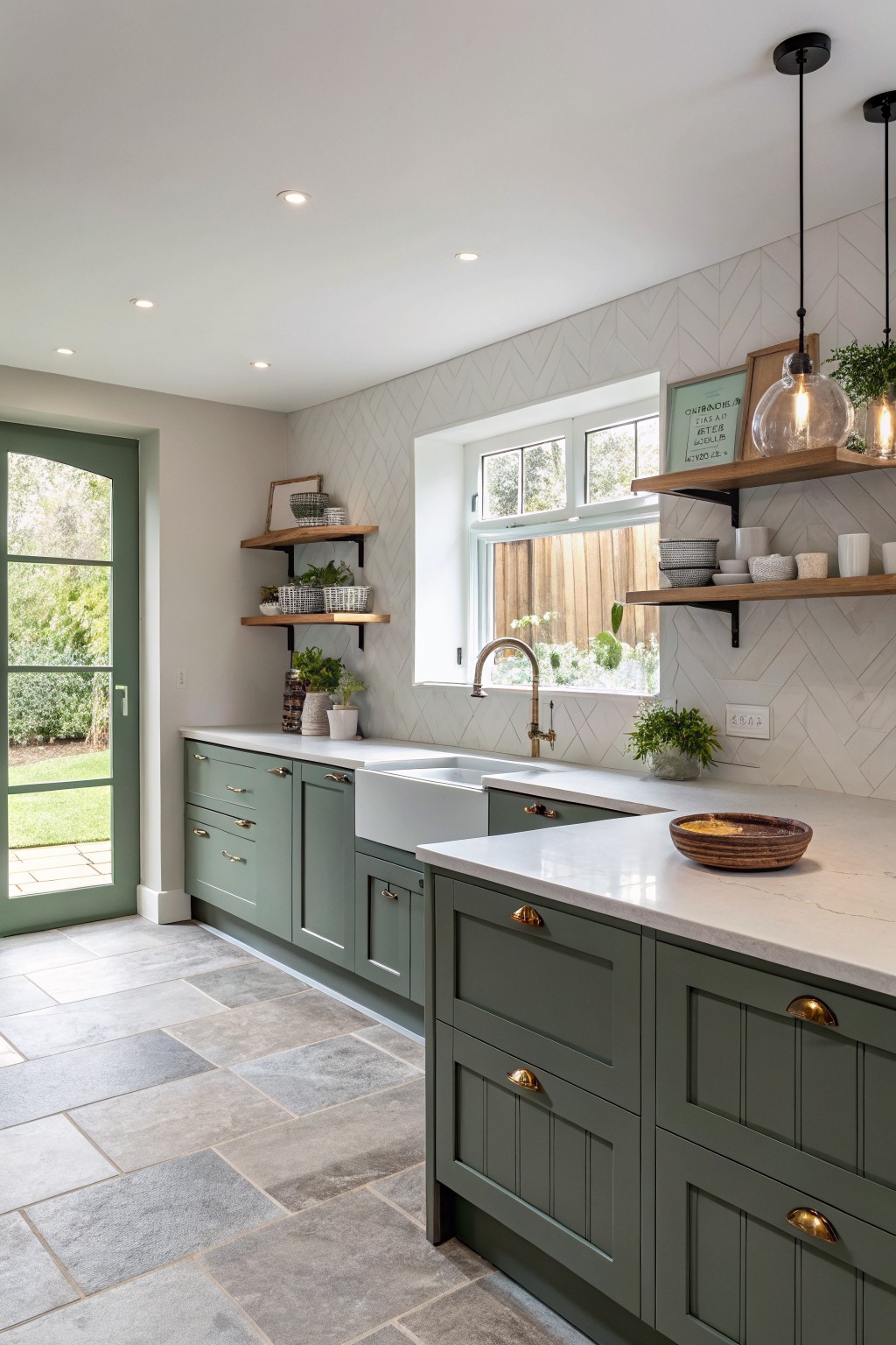
Sage green on cabinets gives a kitchen a quiet, steady look without feeling trendy. This version sits between gray and green with a soft, slightly cool undertone that keeps it from turning too bright or muddy. It reads closest to Sherwin Williams Evergreen Fog, Benjamin Moore October Mist, or Behr Aloe Vera.
The color pairs easily with white counters and wood tones, which help it stay grounded. It holds up well in rooms with mixed lighting, though it can lean more gray if the light stays cool all day. Try it in kitchens that already have some natural wood or stone nearby.
Warm Greige Walls
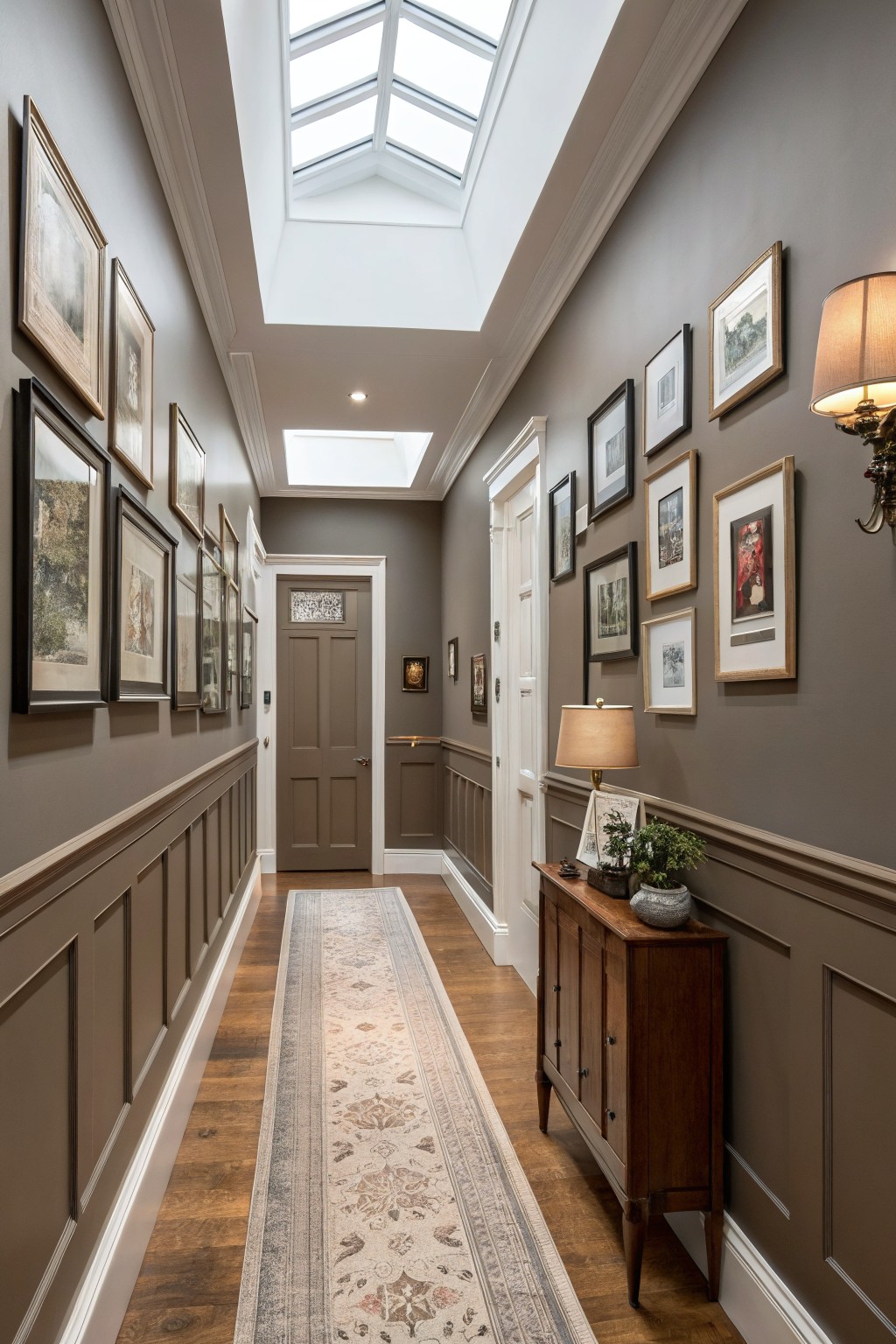
This hallway shows a warm greige on the walls. It sits right between gray and taupe, giving a soft neutral that feels current but still easy to live with.
The color carries a light brown undertone that keeps it from looking flat next to wood floors and white trim. It suits hallways and transitional spaces well, and it works with both light and darker furnishings without needing much else to hold the room together.
Soft Sage Green Built-Ins

A muted sage green on the cabinetry and open shelving gives this living room a calm, grounded feel. It sits somewhere between gray and green, which keeps it from looking too bold or too earthy. Colors like Sherwin Williams Evergreen Fog, Benjamin Moore Soft Fern, Behr Aged Eucalyptus, or Farrow & Ball Pigeon all read close to this shade.
The color has a soft gray undertone that helps it blend with warm wood tones on the floor and shelves. It works best in rooms with steady daylight and pairs easily with cream upholstery or black window frames. One thing to watch is that it can shift cooler in low light, so test a sample on the actual wall before committing.
Soft Blue Green Walls
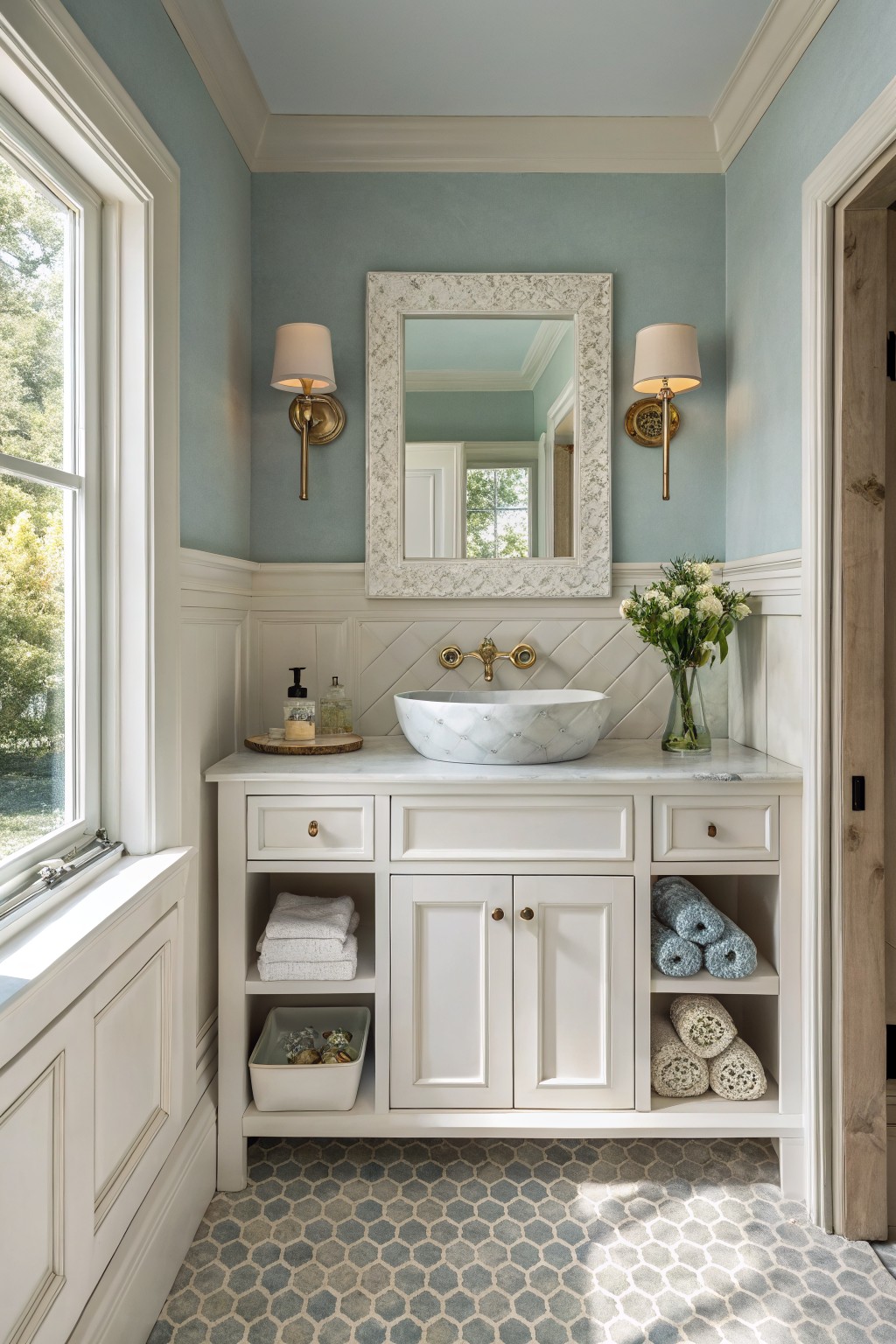
This soft blue green paint brings a calm, slightly cool tone to the bathroom walls. It has a light gray undertone that keeps the color from feeling too bright or watery.
The shade works best with white trim and simple wood or stone surfaces. Look for colors like Sherwin Williams Silver Strand, Benjamin Moore Palladian Blue, or Behr Whispering Blue if you want something similar.
Deep Green Bedroom Walls
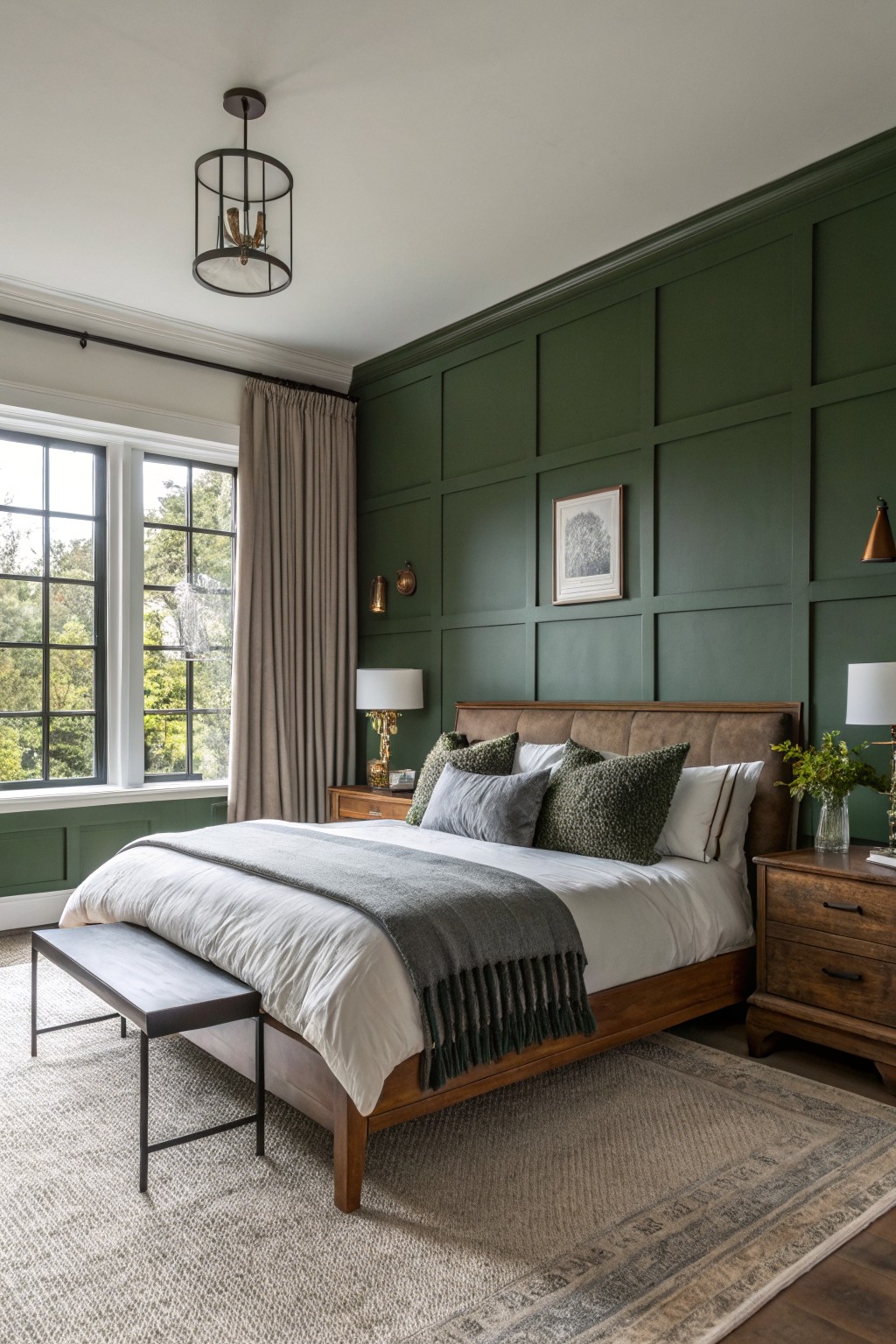
This deep green makes a solid pick for bedroom walls. It lands in that forest green family with a bit of olive depth, and it feels steady rather than trendy. It reads closest to Benjamin Moore Hunter Green, Sherwin Williams Forestwood, Behr Deep Forest, and Farrow & Ball Inchyra Blue.
The color sits nicely against warm wood tones and keeps the room from feeling cold. It works best with plenty of natural light and pairs easily with white bedding or simple linen. Watch the finish though, since a flat or eggshell helps it stay soft instead of shiny.
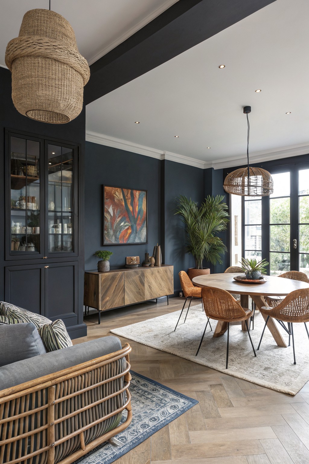
A deep navy blue works well on walls when you want something bold but still calm. This color reads as a true navy with a slight green undertone that keeps it from going flat or too cold next to wood tones.
It pairs nicely with light wood floors and natural textures like rattan or linen. The shade holds up in both natural daylight and evening light, though it can feel heavier in very small rooms with little sun. Try it in living areas or dining spaces where you already have warm wood furniture to balance the depth.
Frequently Asked Questions
Q: What colors from the schemes brighten up a north-facing room? A: Lean on the lighter neutrals and soft grays the article lists. They bounce what little light you get and keep the space from feeling flat. One wall in a warm off-white can shift the mood without extra lamps.
Q: How do I blend two different color schemes if I like parts of both? A: Pull the main wall color from one scheme and use the accent from the other on trim or a single wall. Test the pair on big boards first so you see how they sit together in your light. Keep the rest of the room simple so the mix stays calm.
Q: Do bold colors work on just one wall without overpowering the room? A: Yes, pick a deeper tone from the modern schemes and limit it to the wall behind the sofa or bed. The other walls stay light so the bold choice feels like a focal point instead of a whole new room.









