
When I choose paint for my own house I pay close attention to how the color shifts as sunlight moves from morning to afternoon.
The undertones often surprise me once the walls are fully covered and I see them next to my wood floors and trim.
I have repainted more than once after a shade that looked rich on the swatch turned dull under real room lighting.
Large test patches help me judge whether a color will stay welcoming once the lamps are on in the evening.
Real light changes everything.
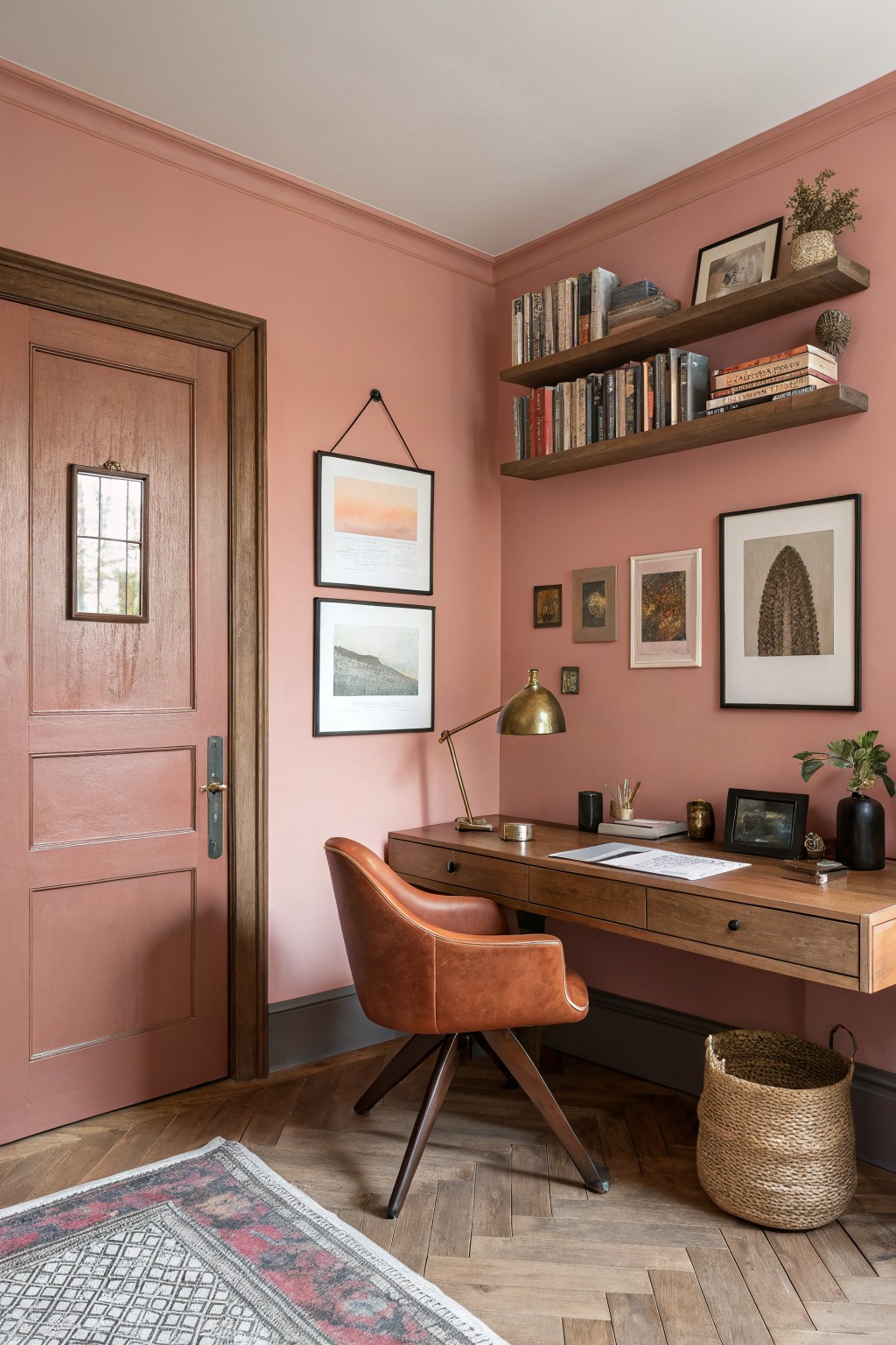
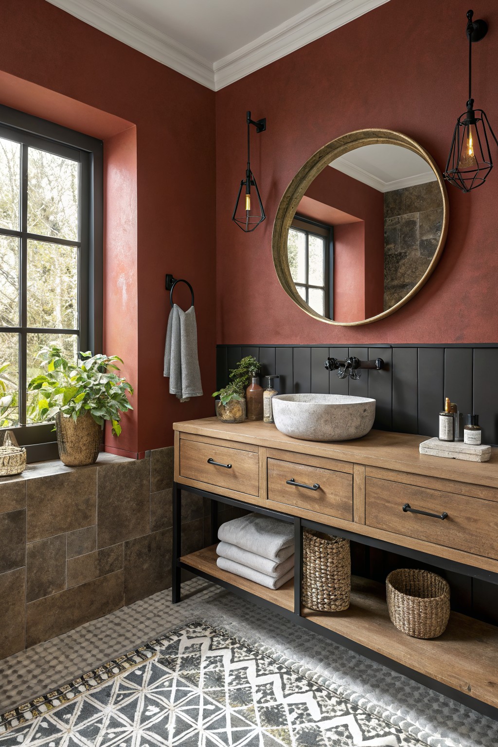
Warm Terracotta Walls

This room uses a warm terracotta on the walls. It is a soft clay color with a gentle orange undertone that feels cozy next to wood and leather. Shades like this add richness without making the space feel dark or heavy.
It reads very close to Sherwin Williams Baked Clay or Benjamin Moore Terra Cotta. The color sits nicely with warm wood tones and helps older rooms feel grounded. It works best in living areas with natural light, though it can look a bit stronger in cooler north-facing rooms.
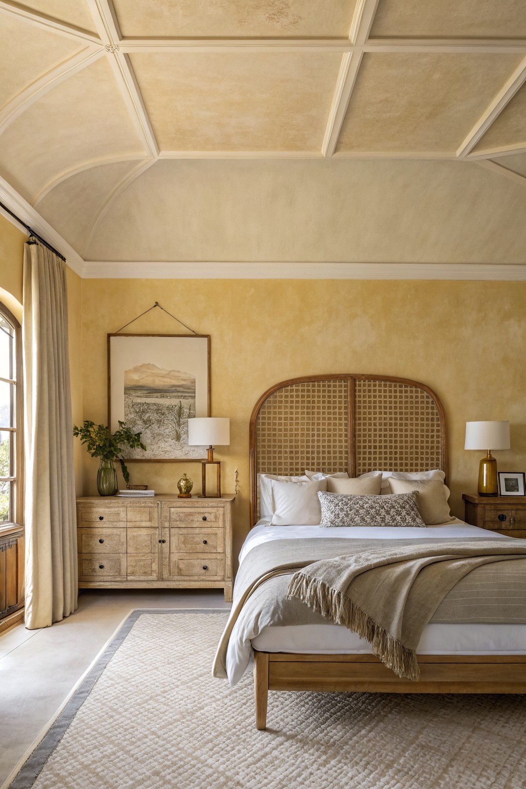
Warm Greige Walls
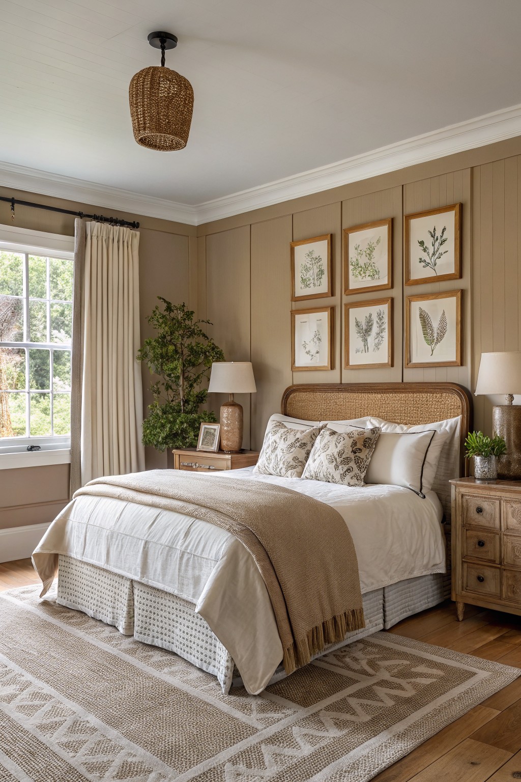
This warm greige is the kind of color that sits right between beige and gray. It has enough brown in it to feel cozy and grounded while still staying light enough for smaller rooms. Many people like it because it makes wood furniture and trim look richer without fighting them.
The undertone leans slightly golden, so it stays inviting even in lower light. It works especially well with oak floors and natural wood headboards. Try it in bedrooms or living rooms where you want a calm backdrop that still feels warm. Popular matches include Sherwin Williams Accessible Beige, Benjamin Moore Revere Pewter, and Behr Toasted Almond.
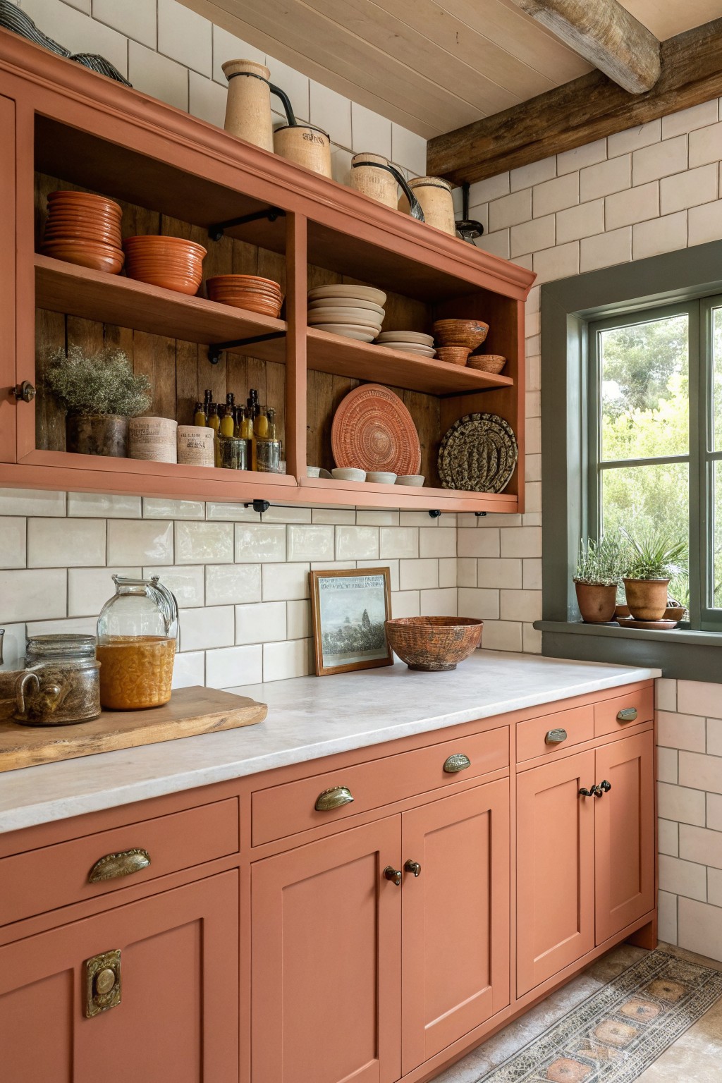
Warm Terracotta Cabinets

This kitchen shows a warm terracotta paint on the cabinets and island. It brings in a soft earthy tone that feels rich but still relaxed, which is why it works so well in spaces meant for daily use.
The color has gentle orange undertones that come through more in natural light. It pairs easily with white counters and dark metal stools, though it can look a bit flat if the room gets little sunlight. Sherwin Williams Baked Clay or Benjamin Moore Russet give a similar feel.
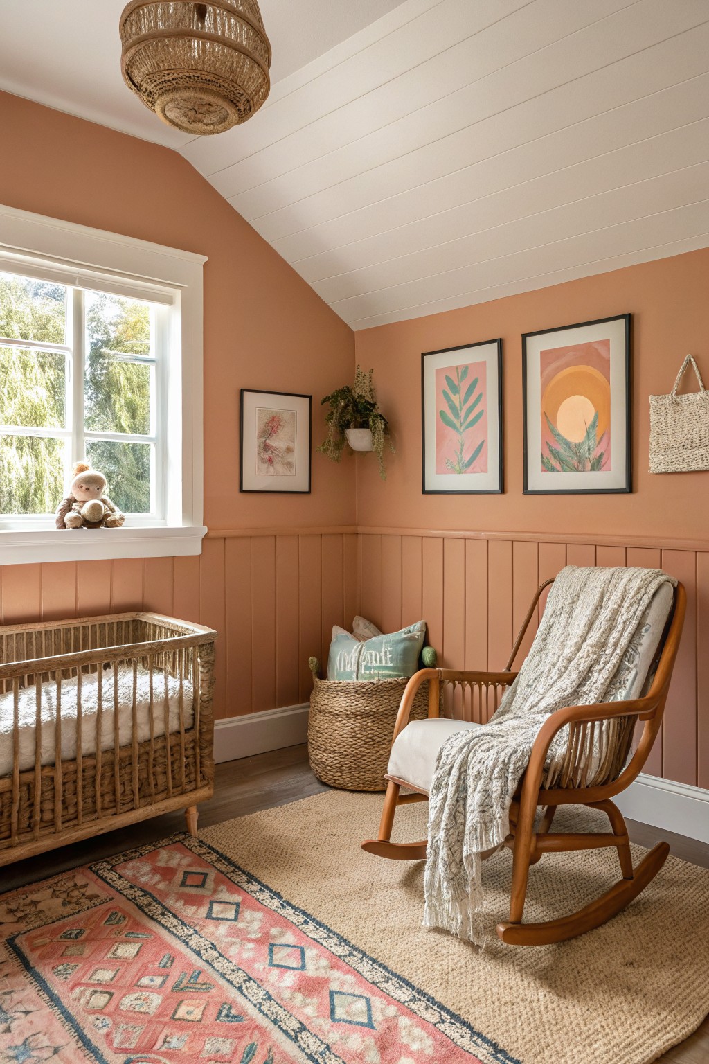
Warm terracotta walls
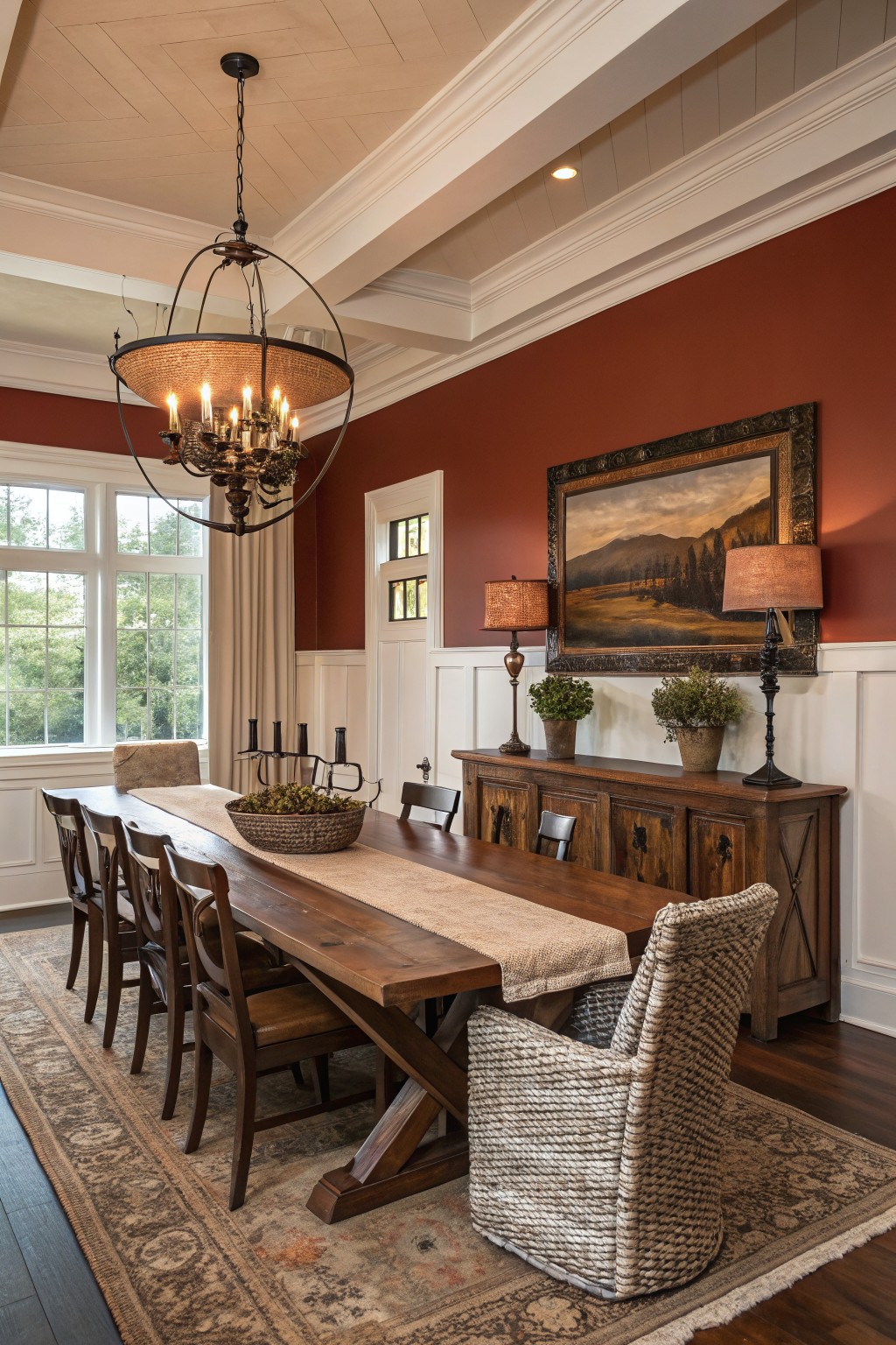
This deep warm red gives a room real presence without trying too hard. It sits in the terracotta family and brings a grounded feeling that works especially well with wood furniture and white trim.
The color holds up nicely in both daylight and evening light. It looks best in rooms where you want some weight on the walls, and it pairs cleanly with dark wood and simple furnishings. Try Sherwin Williams Rustic Adobe, Benjamin Moore Terra Cotta, Behr Warm Terracotta, or Farrow & Ball Red Earth if you want something close.
Warm Terracotta Walls

This terracotta red brings a lot of warmth to the room without feeling too heavy. It sits in that nice middle ground between orange and brown, with earthy undertones that make the space feel grounded and lived in. The color works especially well with wood trim and darker furniture because it keeps everything looking balanced rather than stark.
It holds up nicely in both natural light and evening lamps, though it can read a little deeper in low light. Pair it with cream or white trim if you want it to feel softer, or lean into the richness with natural wood tones and textured fabrics. It suits older homes or rooms that already have some wood detail.
Warm Beige Walls
This warm beige sits right in that soft neutral range that feels calm and lived in. It has a gentle earthy tone that keeps the room from feeling stark, and it works especially well in bathrooms where you want something easy to live with day after day. Colors like Sherwin Williams Accessible Beige, Benjamin Moore Edgecomb Gray, Behr Toasted Almond, or Farrow & Ball String all land close to this look.
It holds up nicely next to wood tones and stone, though it can shift a bit cooler under very bright light. Pair it with deeper greens or soft grays for contrast, and test a sample on the wall first so you see how it reads in your own space.
Warm Terracotta Walls
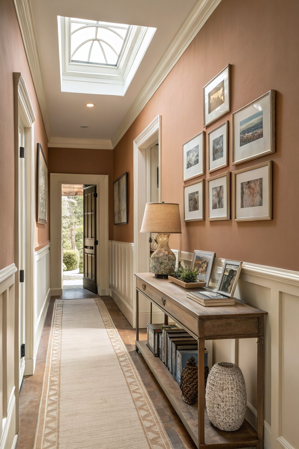
A warm terracotta brings a soft earthy feel to this hallway. The color sits somewhere between peach and clay, and it gives the space a grounded look that works with the wood trim and flooring.
It carries gentle brown undertones that help it feel richer in natural light. This kind of shade pairs best with creamy whites and warm woods, though it can start to feel heavy if the room gets very little daylight.
Warm Dusty Rose Walls
A warm dusty rose brings a soft richness to walls without feeling too sweet or bold. This color has a gentle warmth that makes wood furniture and leather seating feel grounded and inviting in a room.
It carries a light peachy undertone that shifts slightly with the light, so it works best in spaces that get steady daylight. Pair it with dark wood floors or brown leather pieces to keep the overall look balanced and cozy.
Warm Terracotta Cabinets
This warm terracotta shade on the cabinets gives the kitchen a grounded, lived-in feel. It is a soft clay red that leans earthy rather than bright, which helps the space feel welcoming even with all the wood and tile around it.
The color has a gentle warmth that plays well with lighter backsplashes and natural wood tones. It works nicely in kitchens that get good daylight, and it pairs easily with brass or dark hardware without looking too bold. Similar shades show up in paints like Benjamin Moore Terra Cotta, Sherwin Williams Copper Pot, Farrow & Ball Red Earth, and Behr Desert Clay.
Soft Yellow Walls

A soft warm yellow like this one gives walls a gentle brightness that still feels cozy and lived in. It has a light creamy base that makes the room feel open while pairing easily with white trim and darker wood tones.
This color works best in spaces that get good natural light, where the warmth shows up without turning too pale. It stays friendly next to stone floors or woven textures and avoids feeling stark even on cooler days.
Warm Terracotta Walls
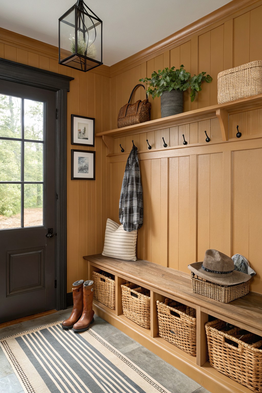
This warm terracotta color gives an entry a grounded and welcoming feel right away. It sits in that earthy orange-brown range that feels rich but still easy to live with. Shades like this read very close to Sherwin Williams Baked Clay, Benjamin Moore Canyon Clay, or Behr Warm Adobe.
The slight golden undertone keeps the space from feeling heavy even with all the wood around. It pairs nicely with natural baskets, black hooks, and lighter textiles on the bench. Try it in a mudroom or hallway where you want some depth without going too dark.
Rich Terracotta Walls
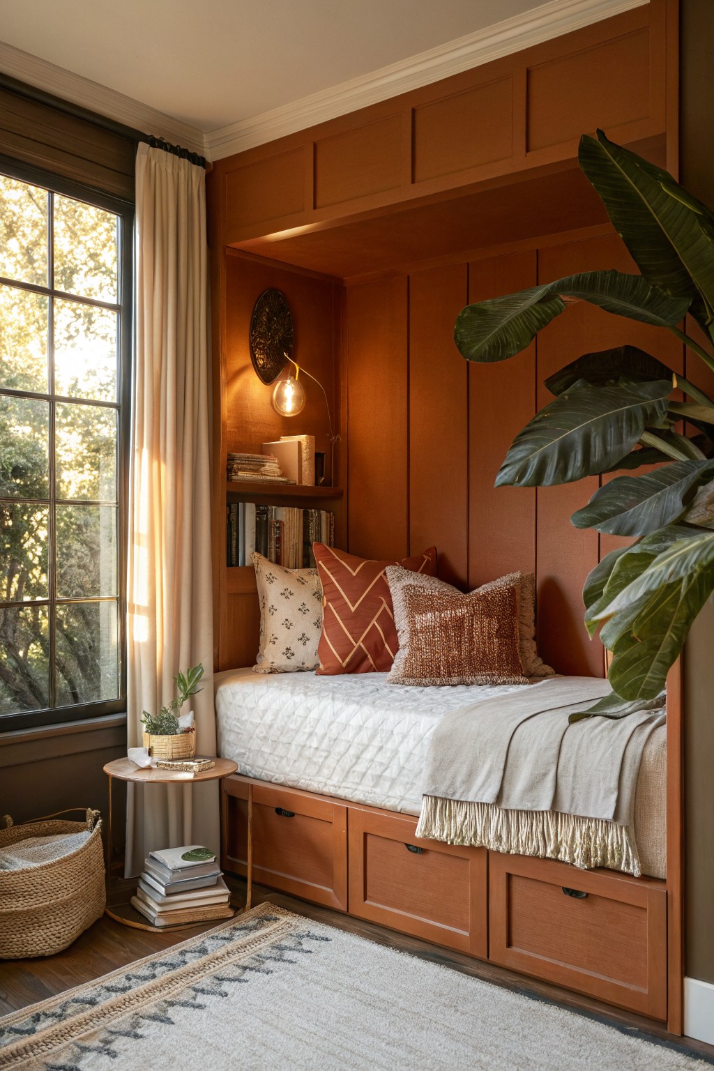
This deep terracotta brings a warm, earthy tone to the room that feels both grounded and inviting. It works especially well in smaller spaces or built-in areas where you want the walls to add depth without making everything feel heavy. The color has a soft orange undertone that keeps it from looking too brown or flat in different lights.
It pairs nicely with natural wood tones and simple fabrics, and it suits bedrooms or reading spots where you want some warmth. Just watch how it shifts with your lighting since the red notes can come forward under warmer bulbs. Best matches would be Sherwin Williams Baked Clay, Benjamin Moore Russet, Behr Warm Terracotta, or Farrow & Ball Red Earth.
Warm Terracotta Walls
This warm terracotta red covers the walls and gives the room a cozy, grounded feel. It sits in that nice middle ground between brown and red, so it feels rich but still welcoming instead of heavy.
The color has a soft orange undertone that shows up more when the light is warm. It works best with wood tones and darker accents like black trim or fixtures, though it can look a bit dull if the lighting stays too cool all day.
Warm Golden Beige Walls
This warm golden beige brings a soft yellow undertone that keeps the room feeling sunny and grounded at the same time. It sits right in that sweet spot between beige and light ochre, which is why it feels rich without looking heavy. You see similar tones in older homes where the goal is warmth that still lets wood and natural textures stand out. Colors like this often read closest to Benjamin Moore Lenox Tan, Sherwin Williams Bungalow Beige, or Farrow & Ball Biscuit.
The yellow lean shows up more in morning light and softens a bit as the day goes on, so it works best in rooms that get decent daylight. It pairs easily with oak furniture and linen textiles, though it can feel a little flat if you pair it with too much gray or cool white trim.
Warm Terracotta Kitchen Cabinets

This kitchen shows a warm terracotta red on the island and base cabinets. It is a rich earthy shade with a soft orange undertone that feels grounded and welcoming next to the wood floors. The color brings depth while still letting the white tile and marble countertop stay bright.
It works especially well with natural wood tones and simple black hardware. In rooms with plenty of daylight the red stays lively, but it can lean deeper in lower light. Test a large sample on the actual cabinet before committing since the finish changes how the tone reads.
Warm Terracotta Walls
A warm terracotta color like this one gives a room a cozy, grounded feeling right away. It sits between peach and clay, so it feels rich without turning too bold or heavy in a smaller space.
The shade carries a soft orange undertone that shows up more in daylight. It pairs easily with wood furniture and natural textures, though it can look a bit flat next to anything too cool or gray.
Warm Off-White Walls
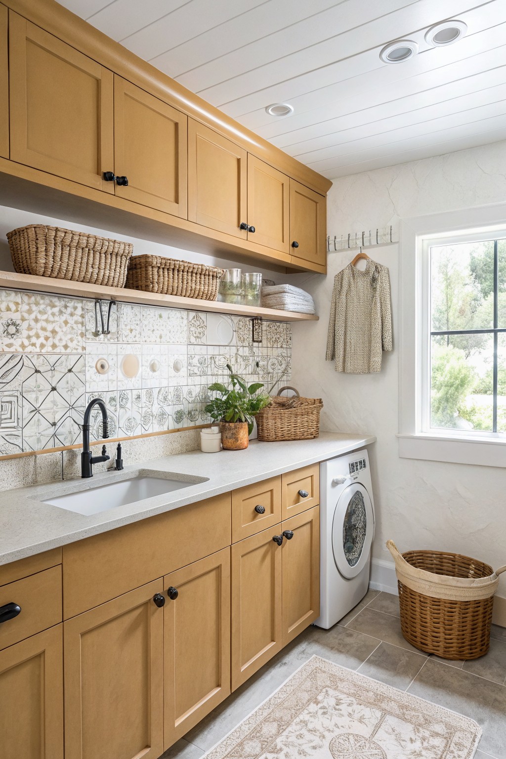
This laundry space uses a warm off-white on the walls that feels soft and lived-in rather than bright or stark. The color has a gentle creamy quality that keeps the room feeling calm while it sits nicely against the wood cabinets and stone counter.
It works well in practical rooms like this because the subtle warmth prevents the space from feeling cold under artificial light. Try it with natural wood tones and simple black hardware if you want something easy that still feels welcoming.

Rich Burgundy Walls
A deep burgundy red works well when you want a room to feel grounded and a little enclosed. This color family brings warmth without going too bright, and it sits nicely against wood tones like the light oak dresser in the space. It reads as rich and steady rather than loud.
The undertone here leans slightly brown, which keeps the red from feeling too cool or harsh under regular daylight. It pairs best with natural wood furniture, soft neutrals on the bed, and a bit of brass or gold for contrast. Just watch the lighting in the room, since the depth can make smaller spaces feel tighter if there is not enough natural light coming in.
Frequently Asked Questions
Q: How do I test these warm shades in my space without wasting paint? A: Paint big sample boards and move them around the room at different times of day. Watch how morning light versus evening lamps shift the tone. This shows you exactly which one feels rich and welcoming in your actual setup.
Q: My sofa and rugs lean cool. Will a warm wall color clash? A: Warm paint can soften those cooler pieces and make the room feel more balanced. Choose a muted golden tone that echoes any wood tones you already have. The contrast often brings out the best in both.
Q: Can I use one of these deeper colors in a tiny bedroom? A: Yes, but keep the ceiling and trim crisp white to hold the space open. A rich warm hue wraps the room in comfort instead of closing it in. Test it first on one wall to be sure.


