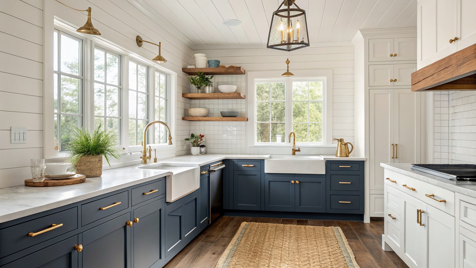
When choosing two-tone kitchen cabinets I pay close attention to how the paint will look once it is surrounded by my countertops and the way light moves through the room during the day.
Undertones often reveal themselves next to flooring or backsplash materials in ways that are hard to predict from a small swatch alone.
I always paint test pieces and check them in the morning and again in the afternoon to see the real shifts.
That step prevents most mistakes.
It also helps me decide which combination adds the contrast I am after without making the kitchen feel choppy.
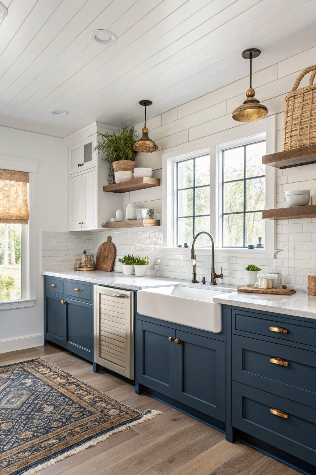
A deep navy blue works well on the lower cabinets here. It gives the kitchen a solid, grounded look without feeling heavy, especially when paired with crisp white uppers that keep the space from closing in. This kind of blue reads cool with a slight gray undertone that sits nicely against white tile and wood floors.
It pairs best with warm wood tones and simple brass hardware. In rooms with good natural light it stays fresh, but it can feel a bit somber in darker kitchens, so test a sample on the actual cabinet first. Good matches include Sherwin Williams Naval, Benjamin Moore Hale Navy, Behr Midnight Blue, and Farrow & Ball Hague Blue.
Soft Sage Green Lower Cabinets
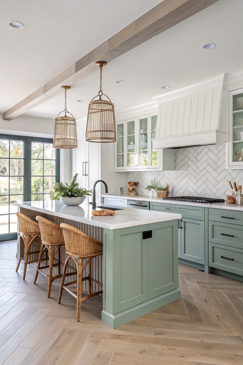
The lower cabinets here use a soft sage green that sits between gray and green. It feels calm and slightly cool, which helps the white uppers stand out without looking stark. Colors like Sherwin Williams Clary Sage, Benjamin Moore Saybrook Sage, or Behr Aloe Vera read very close to this tone.
It pairs well with marble counters and warm wood floors because the green stays quiet rather than competing. This shade works best in kitchens with steady daylight. In dimmer rooms it can lean more gray, so test it on a sample board first.
Earthy Sage Green Cabinet Paint
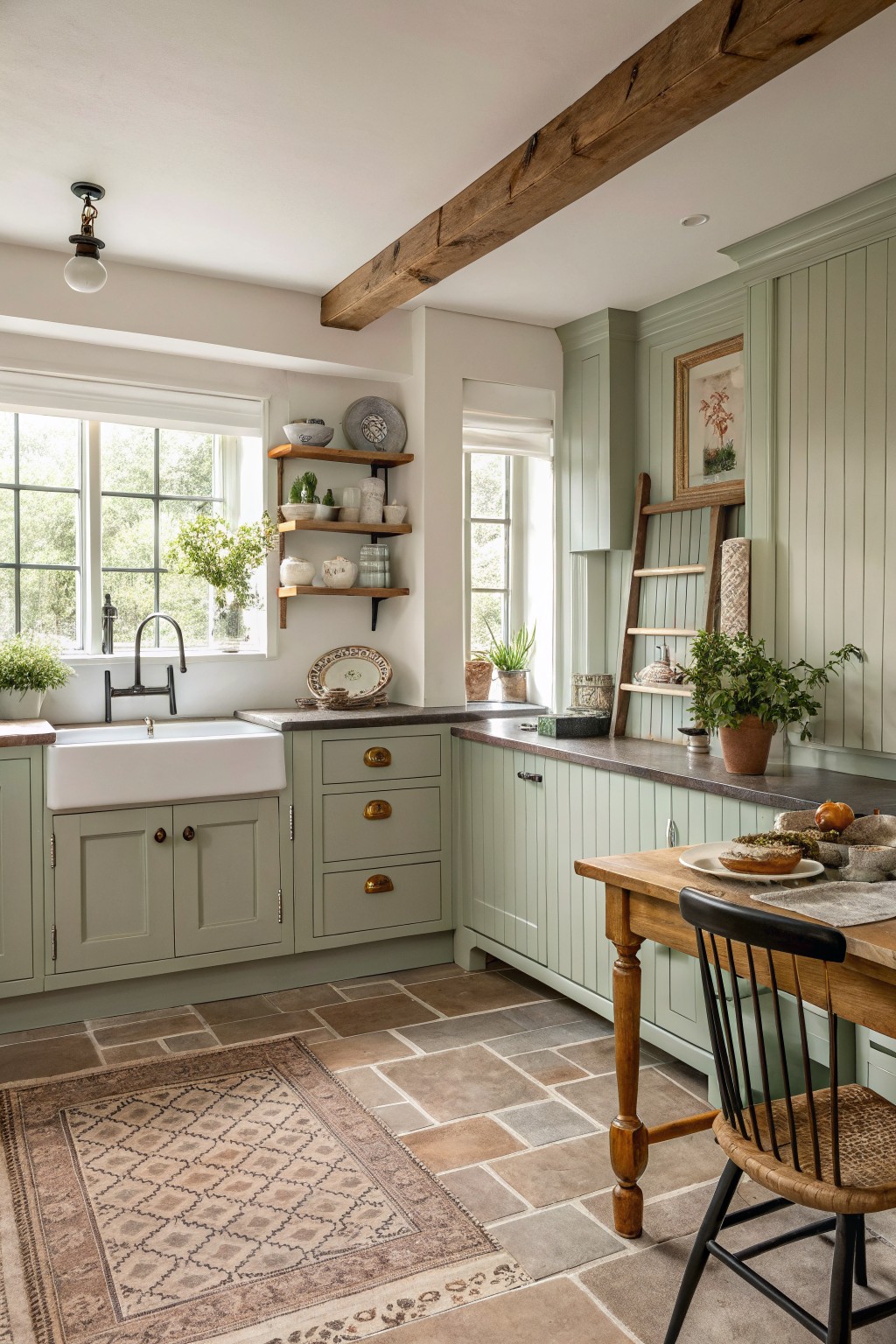
This soft sage green on the cabinets sits right in the middle of gray and green. It feels calm and a little earthy, which helps the kitchen feel welcoming without looking too styled.
The color has a cool undertone that shows up more in bright light, so it pairs best with warm wood and stone. Try something like Benjamin Moore October Mist, Sherwin Williams Evergreen Fog, or Farrow & Ball French Gray if you want a close match.
Soft Blue Gray Lower Cabinets
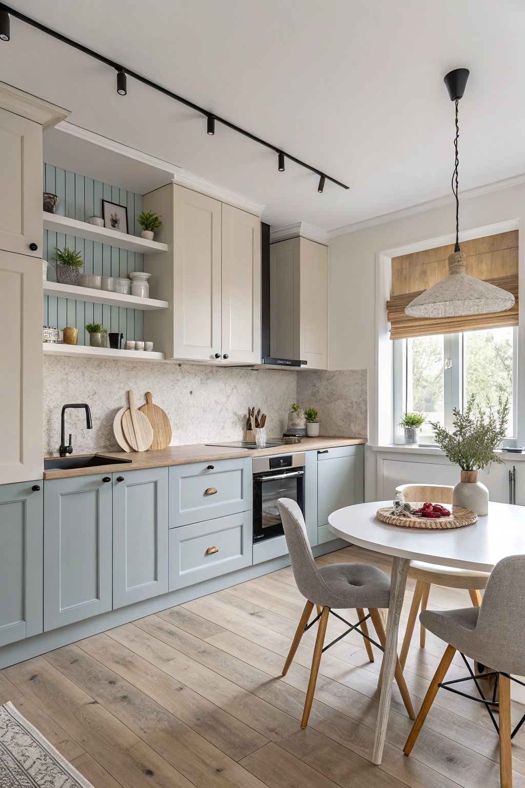
A soft blue gray on the lower cabinets gives a kitchen a quiet, steady look. This color sits between gray and blue with just enough depth to stand out next to lighter wood counters and cream uppers. It feels fresh without turning cold.
The shade has a faint green undertone that shows up more in natural light. It pairs easily with warm off white on the upper cabinets and wood tones on the floor. Try something close to Sherwin Williams Rainwashed, Benjamin Moore Wythe Blue, or Farrow & Ball Blue Gray.
Deep Green Kitchen Cabinets

A deep green works well on kitchen cabinets because it gives the space weight without feeling heavy. This color reads as a true forest green with a slight blue undertone that keeps it from going too warm or muddy. It pairs nicely with white counters and natural wood tones, which is why it shows up often in two-tone setups.
It holds up best in rooms with decent natural light. Pair it with brass or black hardware and keep the surrounding walls light so the cabinets stay the focus. Too much dark wood nearby can make the green feel flat.
Black And Warm Greige Cabinets
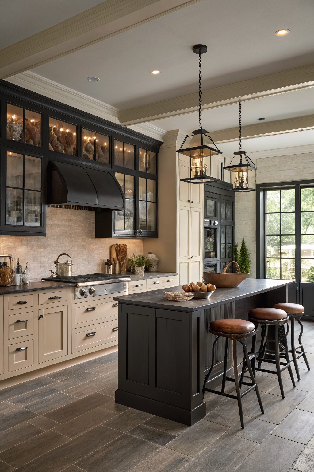
A warm greige on the lower cabinets and island gives this kitchen a soft neutral base. It sits right between beige and gray, which helps it balance the black upper cabinets without looking too stark or too plain.
This shade has a light warm undertone that works well with wood floors and stainless steel. It tends to read a little softer in natural light and pairs best with simple black hardware and dark countertops.
Soft Teal Upper Cabinets With Warm Yellow Base Cabinets
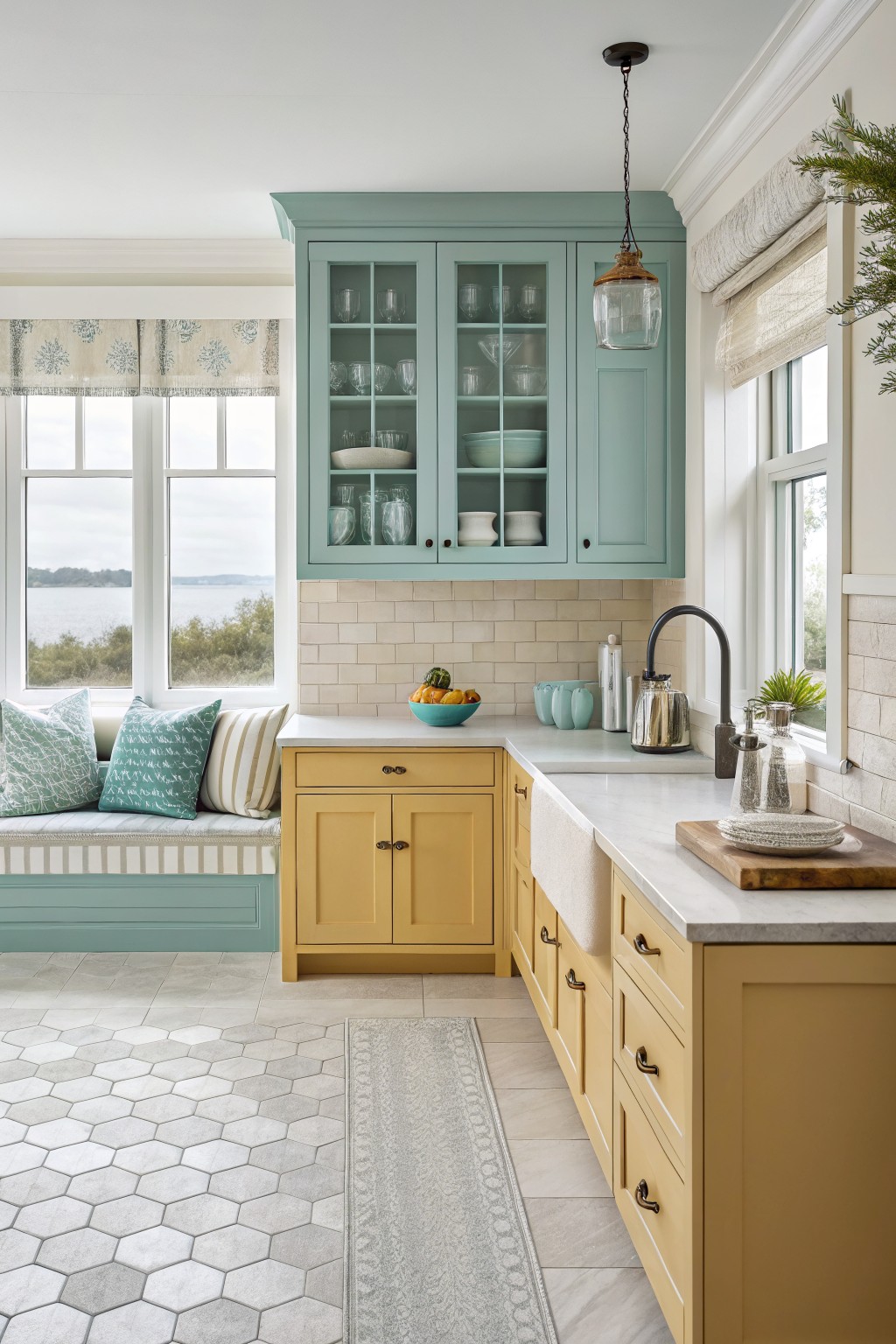
The upper cabinets are painted a soft teal that leans slightly blue green. It feels calm and fresh without being too bright or coastal, which makes it easy to live with in a kitchen that gets steady daylight.
This shade has a gentle gray undertone that keeps it from clashing with the stone backsplash or the warmer yellow on the lower cabinets. It pairs best with simple white or cream trim and works in rooms that already have some wood or natural texture nearby.
Soft Butter Yellow Cabinets

This soft butter yellow gives the cabinets a warm, gentle look that feels sunny without being too bold. It sits nicely between cream and yellow, which helps it blend with the wood counters and stone floor in a kitchen like this.
The color has a light warm undertone that keeps the space feeling open even with all the wood beams overhead. It pairs well with black hardware and natural stone, though it can look a bit flat if the lighting is too cool.
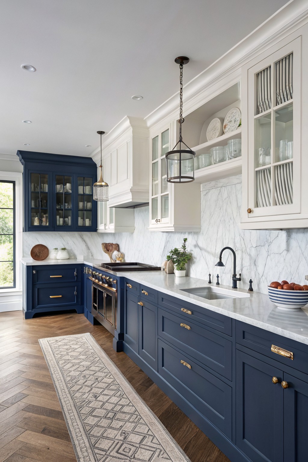
Navy blue works well for lower cabinets when you want contrast without going too dark everywhere. This shade sits right between a true blue and a soft black, so it still feels warm next to wood floors and marble counters. It pairs easily with white uppers to keep the whole kitchen from feeling heavy.
The color has a slight green undertone that shows up more in daylight, which helps it sit nicely against white trim and brass hardware. It works best in kitchens with some natural light, and it looks especially good next to light stone or warm wood tones. If your room runs cool, test it first because the depth can shift fast under different bulbs.
Blue Gray Cabinets With Wood Accents

This muted blue gray on the lower cabinets gives a kitchen a calm, grounded look without feeling heavy. It works especially well in two-tone setups because the color sits back a bit and lets the wood cabinets and white brick take some attention. The tone has a cool lean that keeps the space feeling clean rather than stark.
It pairs easily with natural wood, black hardware, and concrete floors. Watch the lighting though. In bright daylight it can read a touch greener, so test it on a sample board before committing. Good matches in this range include Sherwin Williams Rainwashed, Benjamin Moore Wythe Blue, Behr Silver Strand, and Farrow & Ball Pigeon.
Soft Blue Gray With Yellow Cabinets

A soft blue gray on the lower cabinets gives the kitchen a calm base that still feels fresh. This kind of color sits between gray and blue, so it reads cool without turning stark, and it works especially well next to warm wood floors and white stone counters.
It looks closest to Sherwin Williams Rainwashed, Benjamin Moore Wythe Blue, or Behr Silver Drop. The yellow cabinets add just enough warmth to keep the blue gray from feeling cold, which makes the whole two-tone setup feel balanced in a room with lots of light.
Muted Teal Lower Cabinets

This muted teal green on the lower cabinets is what gives the kitchen its quiet contrast. It leans more green than blue and has a soft gray undertone that keeps it from feeling too bright or coastal.
It works especially well next to the warmer beige on the upper cabinets and holds up nicely against white tile. The color feels calm in most kitchens but can look a little flat in very low light, so test it on a sample board first.
Soft Greige On The Island
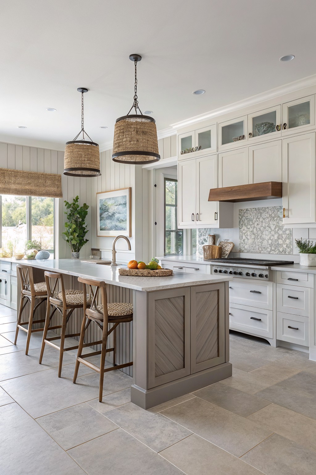
This kitchen uses a soft greige on the island cabinets. It sits right between gray and beige, which gives it a warm but still neutral feel that works well with the white perimeter cabinets. Colors like Sherwin Williams Repose Gray, Benjamin Moore Edgecomb Gray, Behr Perfect Greige, or Farrow & Ball Elephant’s Breath all land in this same range.
The undertone stays warm enough to keep the wood stools and flooring from looking cold. It pairs best with white uppers and natural wood tones. Just watch how it shifts in different light, since the gray can pull a bit more beige in bright rooms.
Muted Rose Base Cabinets
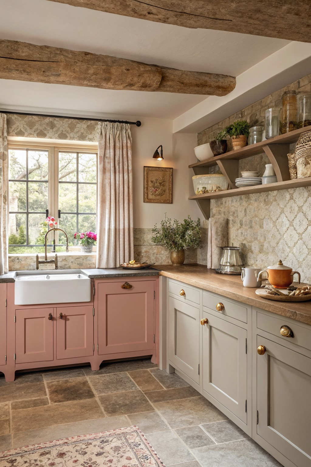
This muted rose on the base cabinets brings a gentle warmth that feels grounded rather than sweet. It sits close to tones like Farrow & Ball Dead Salmon, Sherwin Williams Smoky Salmon, Benjamin Moore Dusty Rose, or Behr Soft Blush.
It works best next to the lighter gray cabinets and stone surfaces because the color stays soft and does not compete. Watch how it shifts in different light since the undertone can lean warmer or cooler depending on the room.
Soft Green Kitchen Cabinets
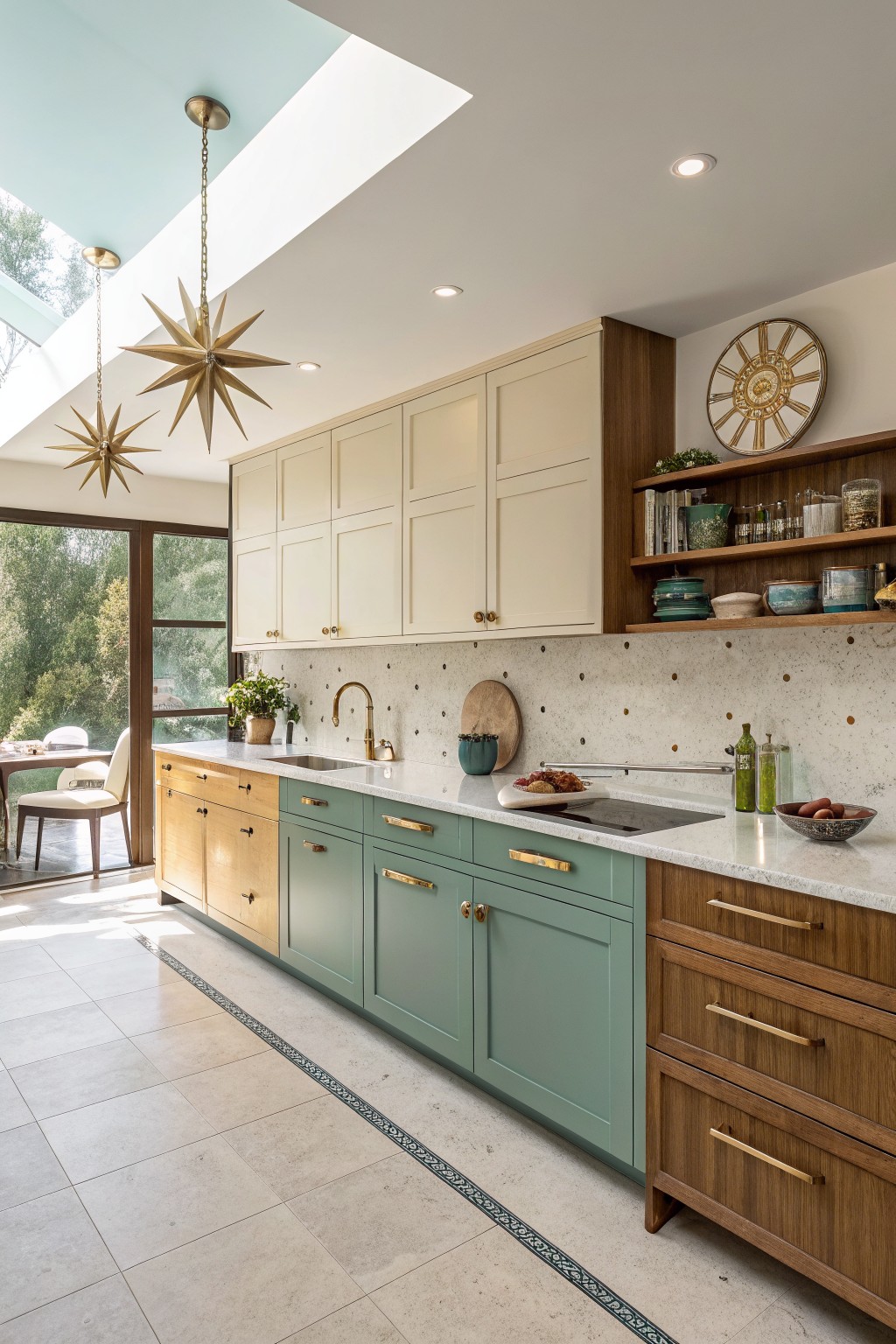
A soft sage green on the lower cabinets gives this kitchen a calm, grounded feel without making the space feel heavy. It works well as the deeper tone in a two-tone setup because it sits nicely against the lighter cream cabinets above and the warm wood accents on the sides.
This shade has a gentle gray undertone that keeps it from reading too bright or too blue in most lighting. It pairs easily with white countertops, brass hardware, and natural wood, but it can start to feel flat if the room has no warm elements nearby to balance it out.
Blue Gray Island Cabinets
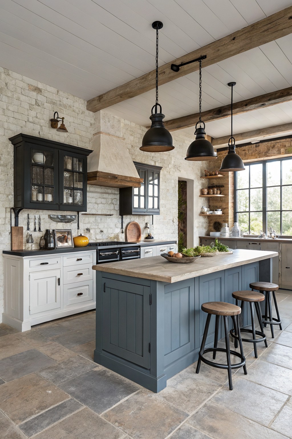
A muted blue gray gives the kitchen island a solid but quiet presence. It sits right in the middle of gray and blue without pushing too far either way.
This shade has a cool undertone that sits nicely next to the white perimeter cabinets and the wood tones on the floor and beams. It works best in kitchens that already have some natural wood or stone, and it pairs cleanly with black hardware or dark open shelving.
Classic Soft Sage Kitchen Cabinets
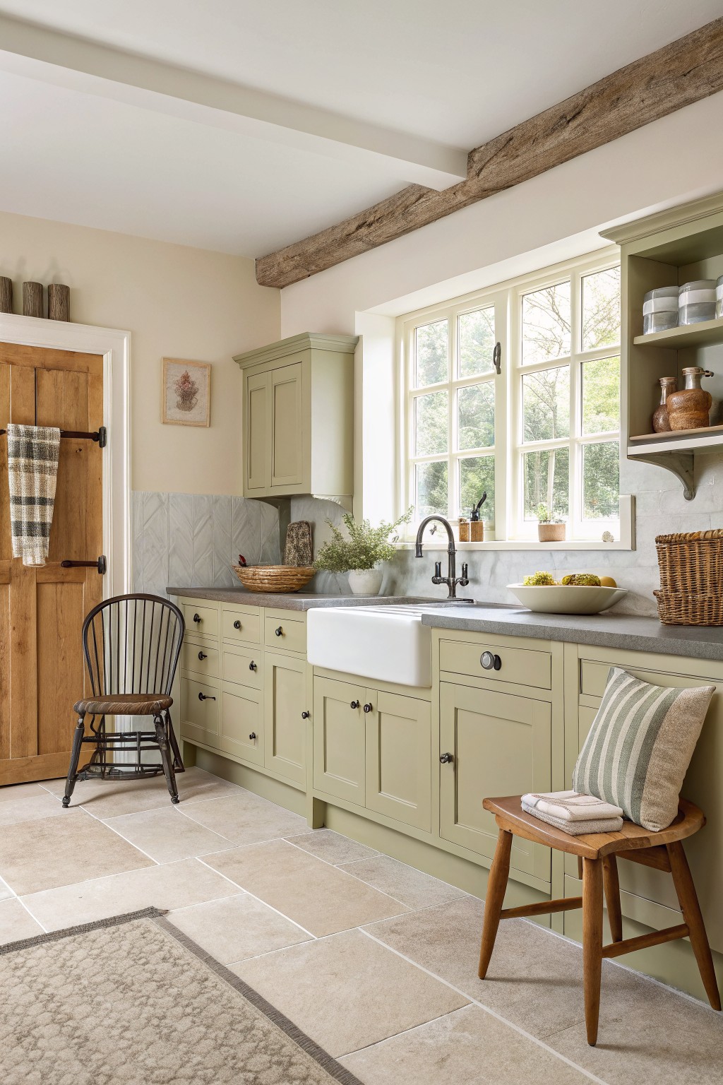
A soft sage green on kitchen cabinets gives a quiet, grounded look that feels easy to live with. This muted shade sits between gray and green, so it reads calm rather than bold. It works well in older homes where you want color but still need the space to feel light.
The color has a gentle gray undertone that helps it stay steady next to stone counters and wood tones. It pairs best with warm wood floors and simple white trim. Try Sherwin Williams Clary Sage, Benjamin Moore Saybrook Sage, or Farrow & Ball Pigeon if you want something close.
Creamy White Kitchen Cabinets

A creamy white on the upper cabinets gives this kitchen a soft, warm feel. It sits somewhere between pure white and light beige, which helps it blend with the wood island without looking too bright or cold.
This kind of shade works best in rooms with natural light and pairs easily with wood tones or stone surfaces. Watch how it shifts in different lighting though, since some versions can lean more yellow than others.
Sage Green With Yellow Cabinets
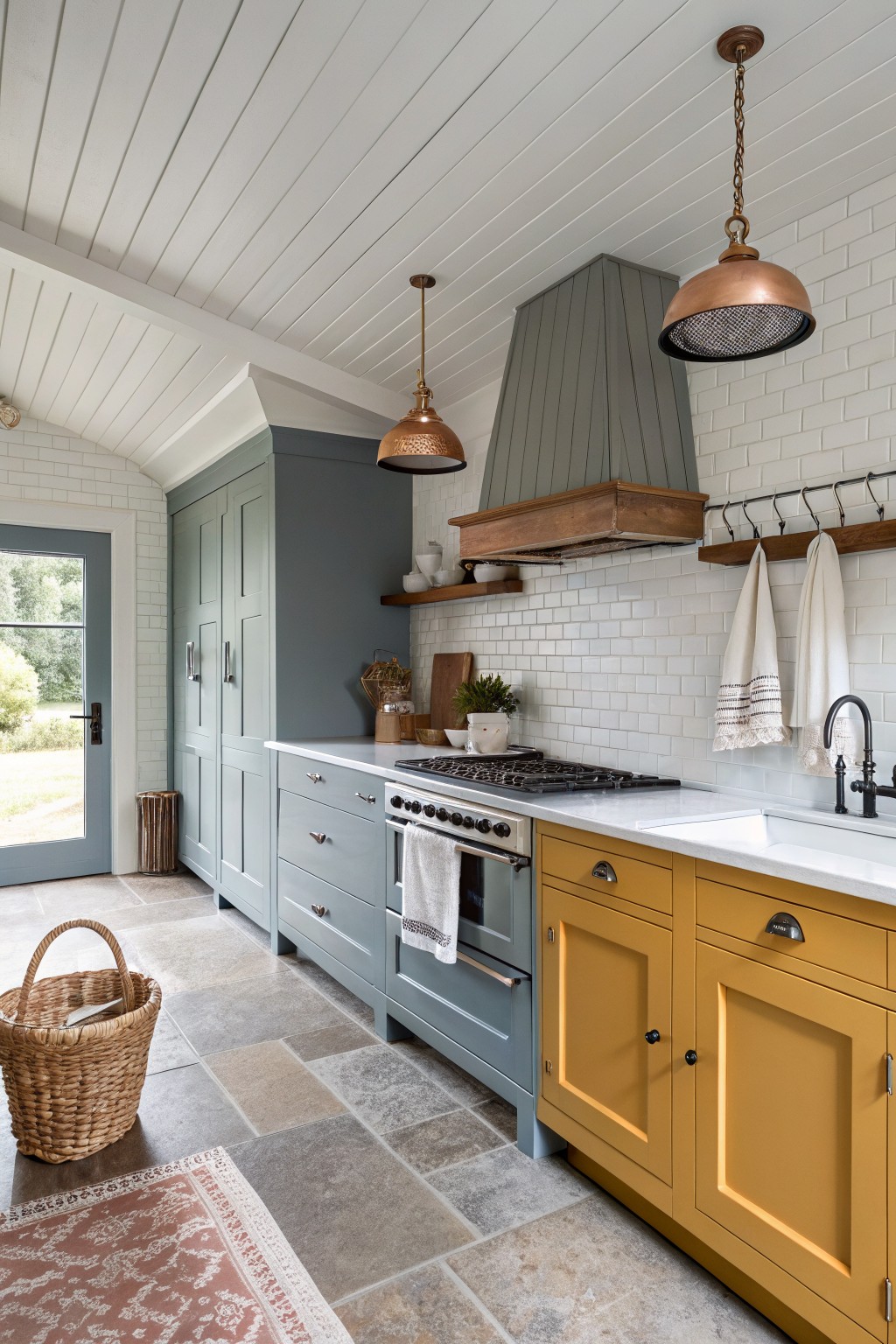
A soft sage green on the tall cabinets and a warm golden yellow on the base cabinets is what stands out here. This green has a touch of gray that keeps it from feeling too bright, and it works well in kitchens that need some calm without going flat or cold.
The yellow adds just enough warmth to balance things out, especially next to white counters and wood tones. It suits older homes or any space that already has mixed materials. In cooler light the green can shift a little more blue, so test it on a sample board first.
Fresh Soft Sage Kitchen Cabinets
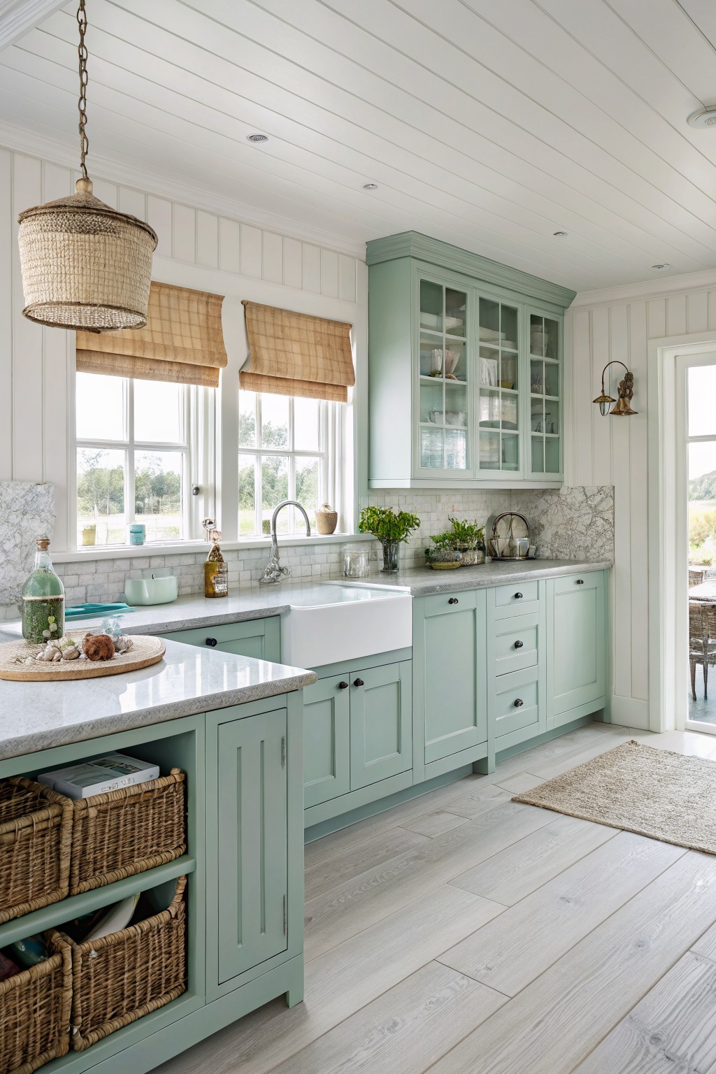
This soft sage green on the cabinets gives a kitchen a calm, fresh look without feeling too bold. It sits somewhere between green and gray, which makes it easy to live with and works well with white walls and light stone counters. The color stays gentle even in bright light.
It has cool undertones that keep the space feeling airy rather than heavy. Pair it with warm wood floors or natural baskets if you want a bit of contrast, but skip anything too dark or it can start to feel chilly.
Warm Terracotta Cabinets
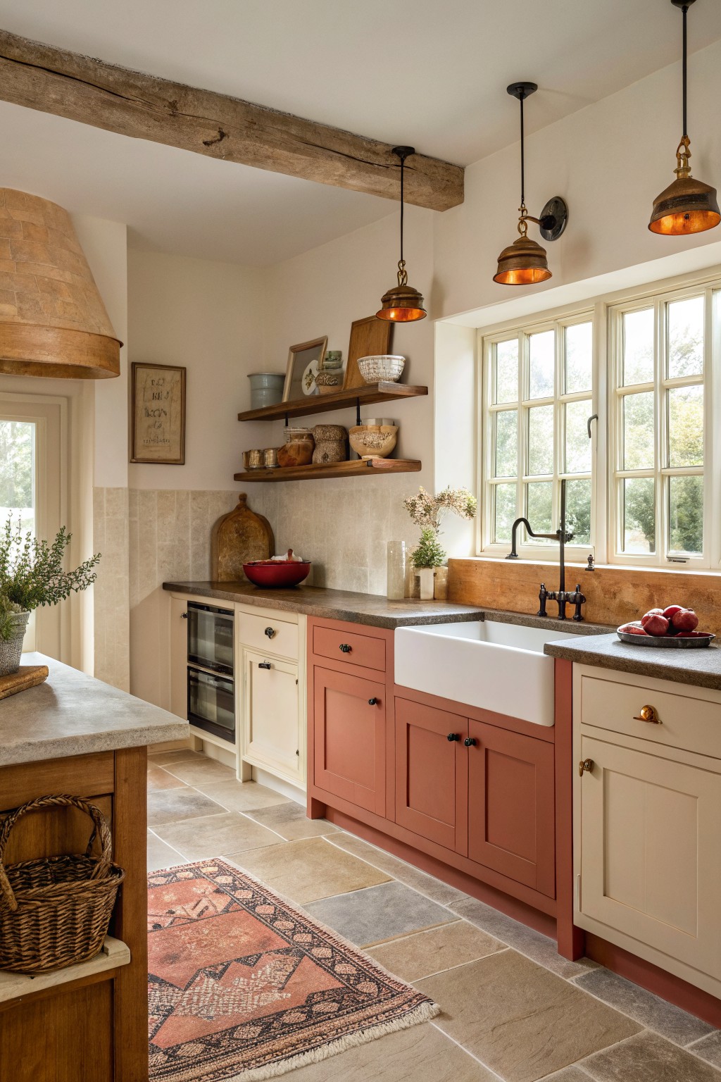
This kitchen uses a warm terracotta on the lower cabinets that brings a soft earthy tone to the space. It sits nicely next to the cream sections for a simple two-tone effect that feels grounded without looking heavy. The color has a gentle clay quality that keeps the room from feeling too stark.
It works best with natural wood tones and stone surfaces nearby. The slight orange undertone shows up more in daylight, so it suits kitchens that get steady light. Pair it with warm whites or soft beiges on the other cabinets if you want the contrast to stay balanced.
Muted Teal Lower Cabinets With White Uppers
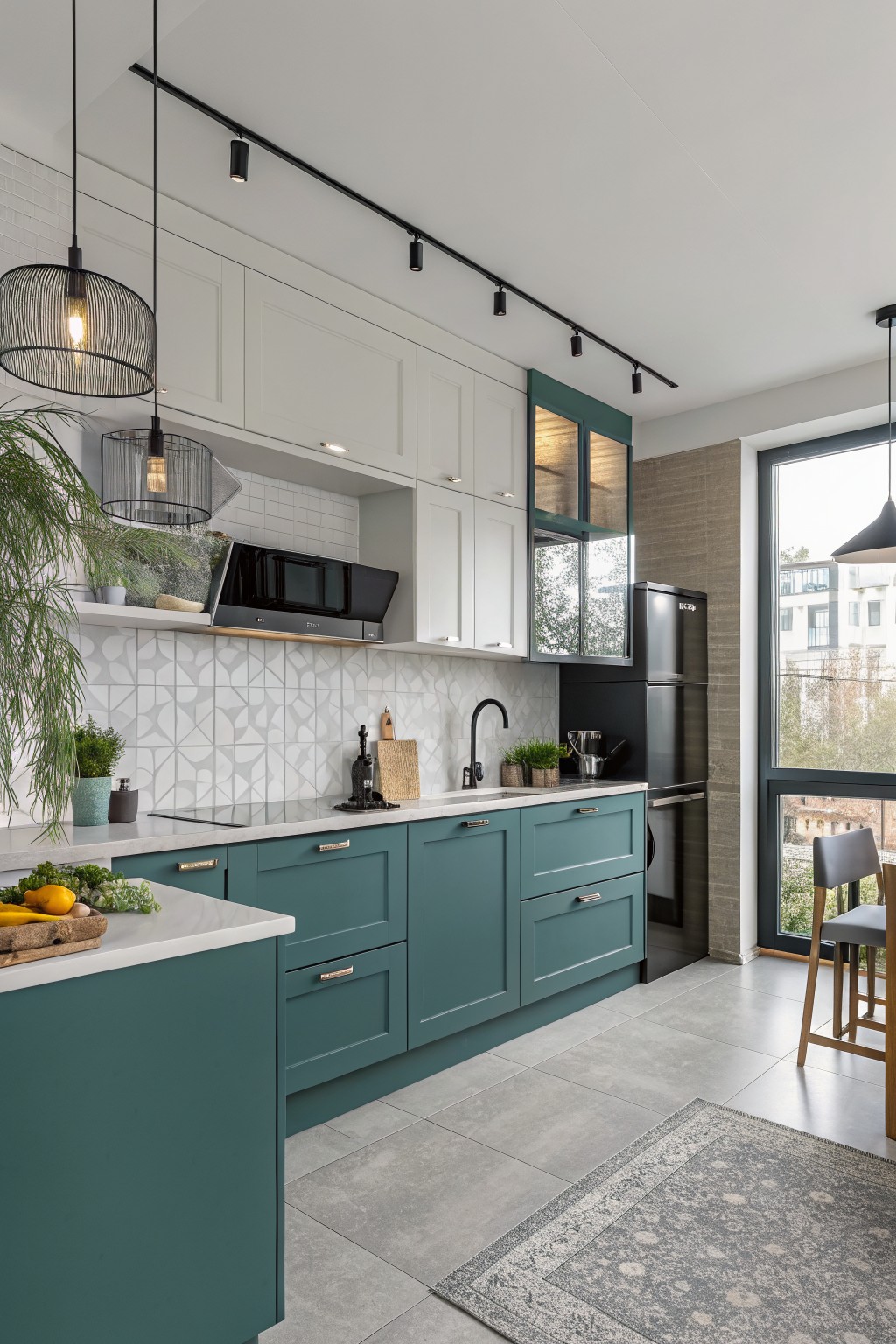
A muted teal on the lower cabinets gives this kitchen a nice bit of contrast without feeling too bold. It sits somewhere between blue and green and works especially well next to the white uppers and light gray tile. Colors like this often read a little deeper in person than they do in photos.
Sherwin Williams Rainwashed or Benjamin Moore Wythe Blue come close, as do Behr Cascade Green and Farrow & Ball Inchyra Blue. The teal pairs cleanly with white walls and simple hardware, though it can look flat if the lighting is very cool or if there is no wood tone nearby to warm it up.
Frequently Asked Questions
Q: Which color should go on the lower cabinets for the best contrast? A: Put the darker shade on the lowers. It anchors the kitchen and keeps the space from feeling top-heavy.
Q: Will two similar tones still create enough depth? A: Yes. A warm white paired with a muted taupe gives subtle layers without shouting. They play off each other nicely in most lighting.
Q: How do I keep the look from feeling busy in a small kitchen? A: Stick to one light color on the uppers and save the bolder one for the island only. This draws the eye to a single focal point and leaves the rest feeling open.









