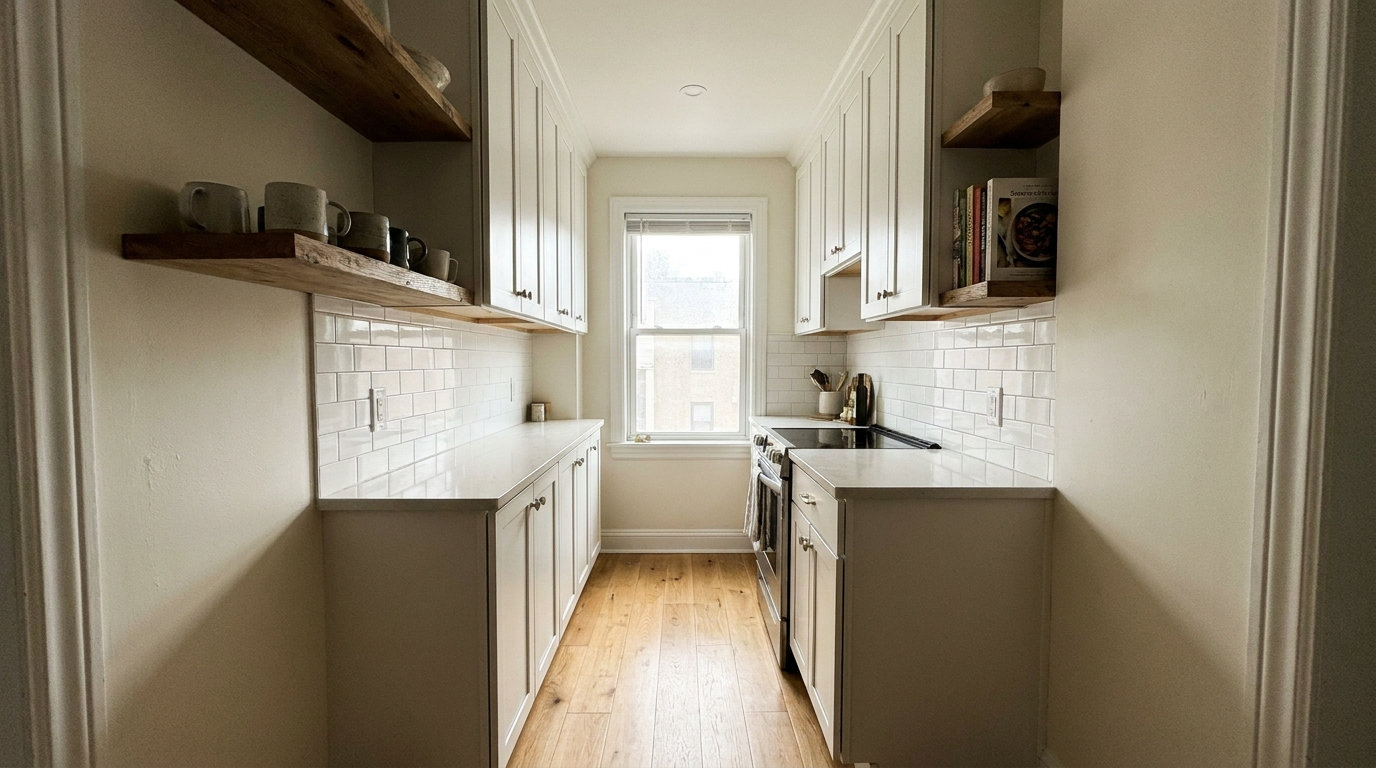
I have noticed over time that kitchen paint colors rarely behave the way they do on a paint chip once they cover an entire wall.
The way morning light hits one side of the room can make a color look warmer than it does in the afternoon when the sun moves.
Undertones show up more clearly next to countertops and trim than they ever do in the store aisle.
Testing remains the only reliable step.
A few colors end up working better than others for making the space feel less closed in once everything else in the kitchen is in place.
Pale Blue Walls
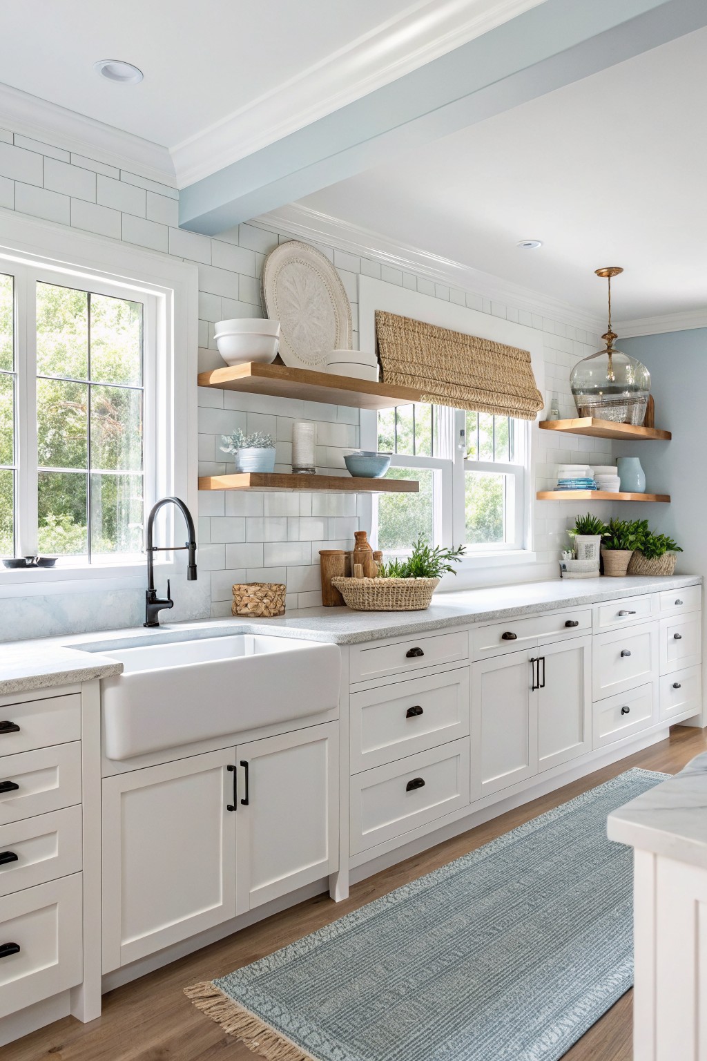
A pale blue works well in kitchens when you want the space to feel open and airy. This color sits in the cool blue-gray family and reads light enough to bounce light around without looking stark.
It pairs nicely with white cabinets and wood tones because the blue keeps things feeling fresh rather than cold. Watch the undertone though, since some versions lean slightly green in certain lights and can look off next to warm woods. Likely matches include Benjamin Moore Palladian Blue, Sherwin Williams Silver Strand, Behr Watery, and Farrow & Ball Skylight.
Soft Yellow Kitchen Cabinets
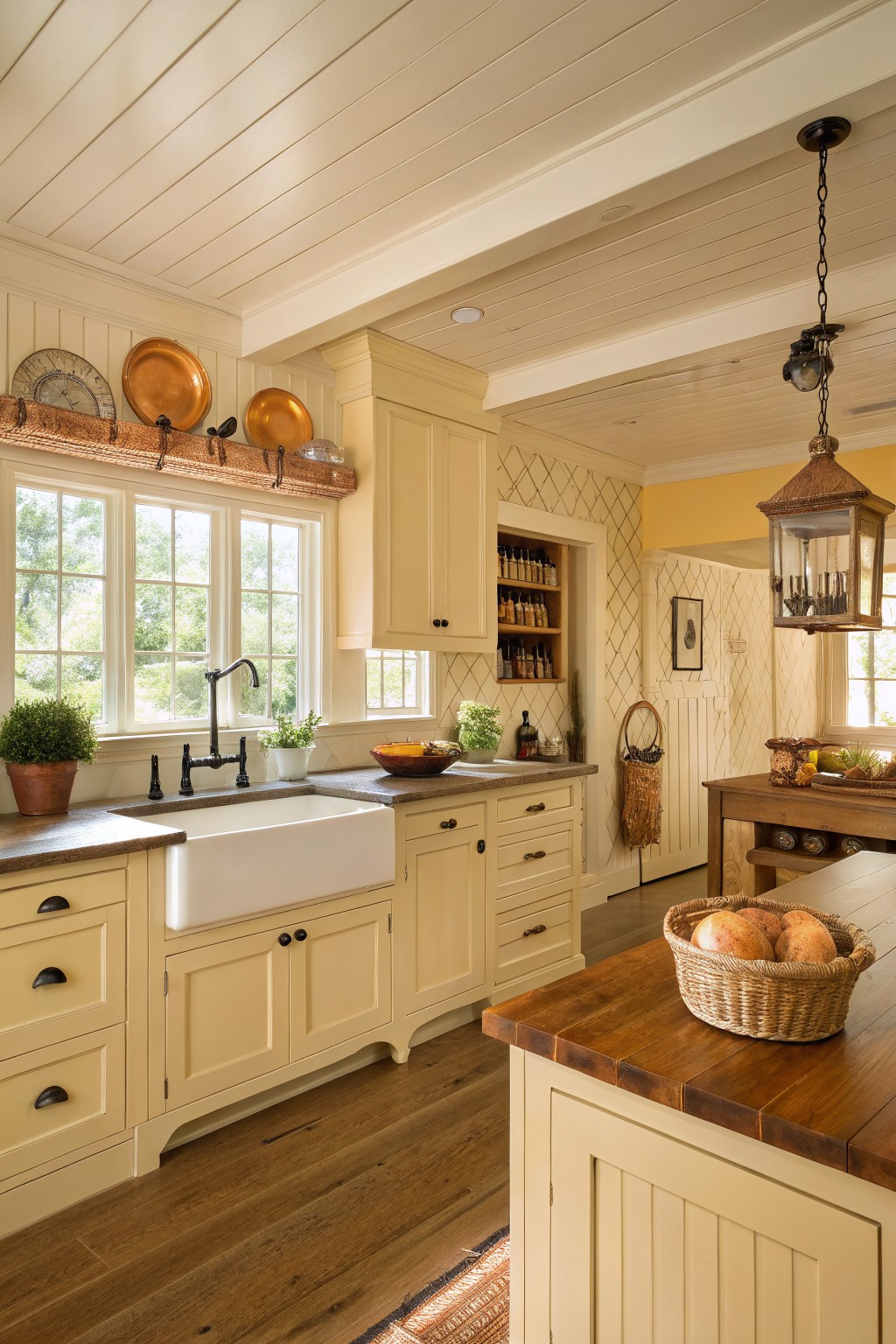
A soft pale yellow keeps a kitchen feeling open and light without going too bright. This color family has a warm tone that still reflects plenty of daylight, which helps the room look larger overall. It reads close to Benjamin Moore’s Hawthorne Yellow, Sherwin Williams Lemon Chiffon, and Farrow & Ball Hay.
The yellow undertone sits nicely against wood floors and dark hardware. It works best in spaces with decent natural light and pairs easily with cream trim or stone counters. Avoid using it in very dark kitchens where it can start to feel flat.
Soft Blue-Green Cabinets
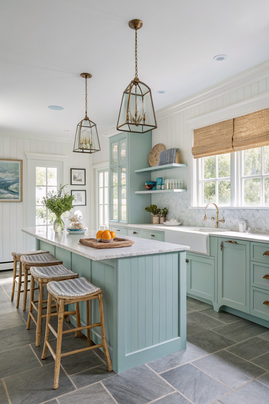
A soft blue-green works well in kitchens when you want the space to feel open and calm. This shade sits between blue and green without leaning too hard in either direction, and it keeps the room from feeling boxed in even when cabinets take up a lot of wall space. It pairs easily with white trim and light stone surfaces.
The color has a slight cool undertone that shows up more under bright light, so it helps the room feel airy rather than heavy. It looks good next to wood tones and marble, but it can go a little flat if the lighting is very dim or if everything else in the room is also cool toned. Try it on cabinets first if you want to test how it expands the feel of the space.
A Soft Greige Kitchen
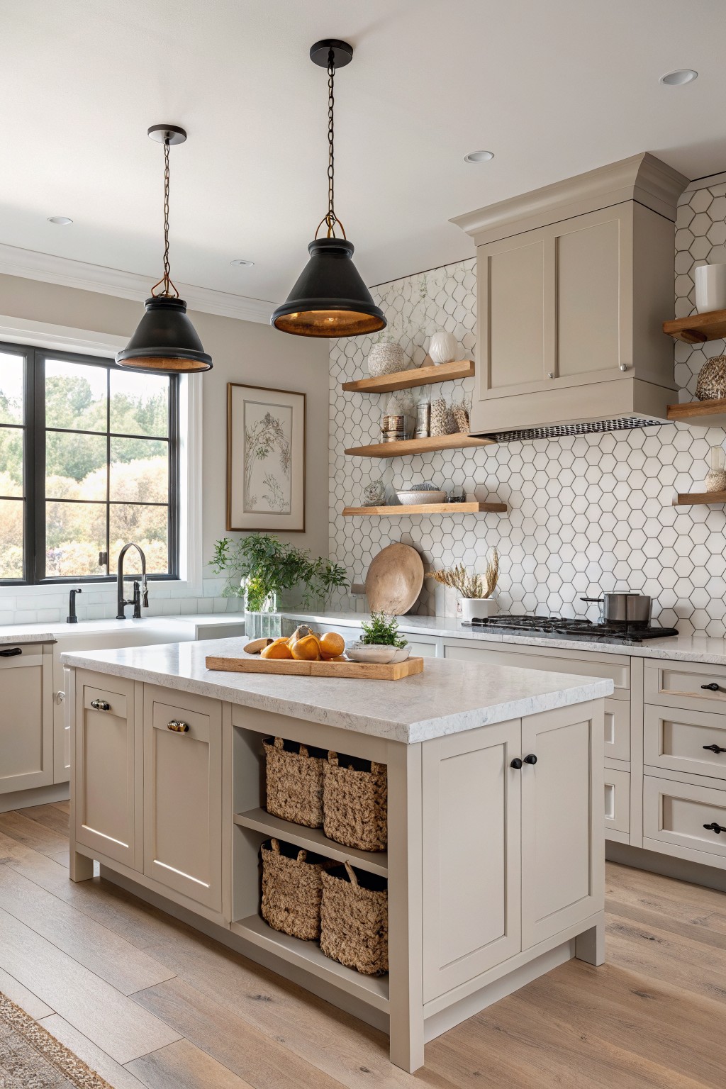
This color is a light greige with warm undertones that keeps the whole space feeling open. It sits between beige and gray without leaning too far either way, which helps the room look bigger even when the cabinets cover a lot of wall space. Many people reach for this kind of neutral because it works with both cool and warm finishes without fighting them.
It pairs easily with white tile, light wood floors, and black hardware. Watch the lighting though. In dimmer kitchens it can read a little muddy, so test it on a sample board first. Closest matches include Sherwin Williams Accessible Beige, Benjamin Moore Revere Pewter, Behr Greige, and Farrow & Ball Elephant’s Breath.
Soft greige cabinet color
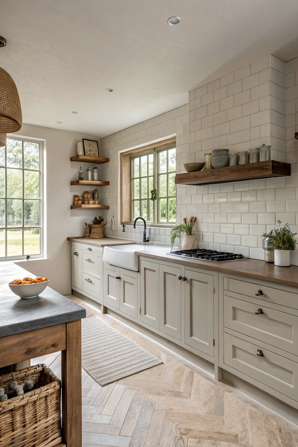
A light greige works well in kitchens because it keeps the space bright and open without feeling stark. The color has a gentle warmth that makes the room feel larger and calmer at the same time.
It pairs easily with wood counters and white tile. This shade reads close to Sherwin Williams Agreeable Gray or Benjamin Moore Edgecomb Gray, though it can shift a bit depending on the light.
Soft Blush Kitchen Walls
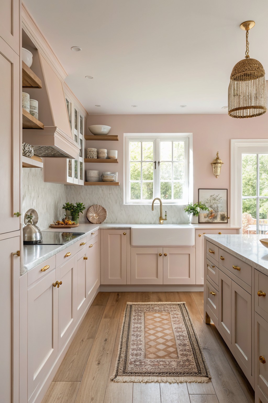
This soft blush pink is a light warm neutral that helps a kitchen feel more open. It carries a gentle pink-beige tone that reflects light without turning stark or cold.
The color works best with warm wood floors and simple white trim. It can look a bit stronger in low evening light, so test it on a large sample first if your kitchen gets mostly indirect sun.
Soft Sage Green Cabinets

A soft sage green works well when you want a kitchen to feel open without going all white. This muted shade sits between gray and green, so it stays calm and does not close the room in.
It has a slight gray undertone that keeps it cool under bright light. Try it with white counters and simple black hardware, but watch how it shifts if your floors are very warm.
Soft Blue Gray Cabinets
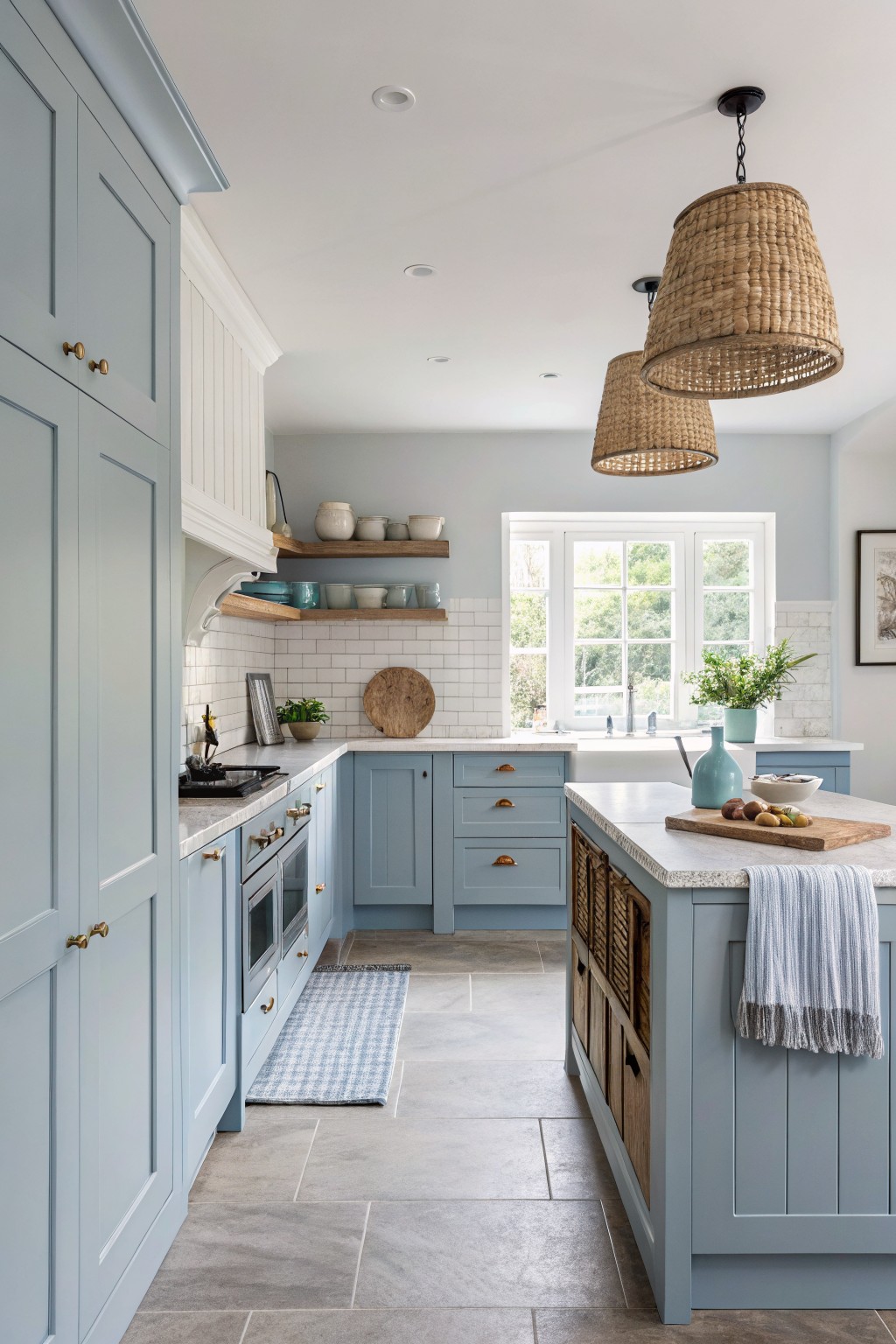
A soft blue gray works well in kitchens that need to feel bigger and brighter. This color has a cool, muted tone that bounces light around without looking too cold or flat.
It pairs nicely with white tile and wood floors. The shade can shift a bit depending on the light, so test it on a sample board first before committing to the whole room.
Soft Sage Green
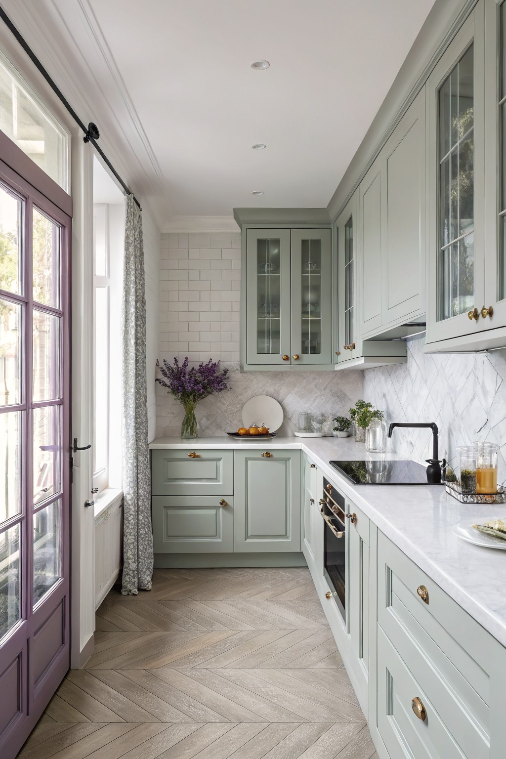
This soft sage green has a muted tone that keeps a kitchen feeling open and calm. It sits between gray and green, with just enough coolness to reflect light without looking stark.
The color works especially well against white tile and marble, and it pairs easily with brass hardware or dark accents. It suits smaller kitchens or those with limited natural light, though it can read a bit grayer in very low light. Popular matches include Sherwin Williams Rainwashed, Benjamin Moore Saybrook Sage, Behr Eucalyptus, and Farrow & Ball French Gray.
Pale Sage Green
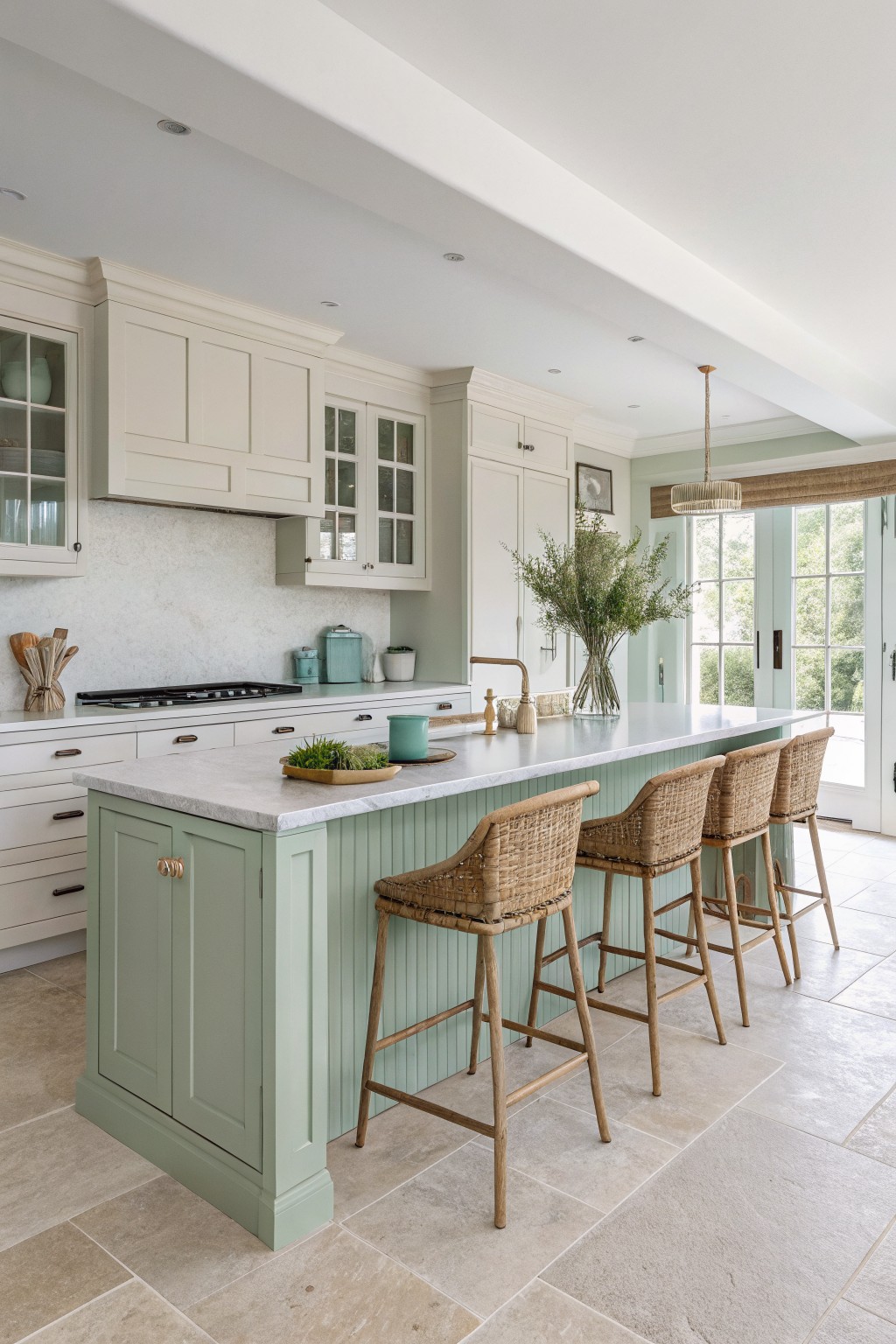
A pale sage green gives kitchens a quiet, open feel without making the space look cold. This muted green sits somewhere between gray and green, so it stays soft even when the light changes during the day.
It works best with white or cream trim and light wood floors. The color can look a little blue in cooler light, so test a sample on the wall before committing. Good matches include Sherwin Williams Rainwashed, Benjamin Moore Saybrook Sage, Behr Soft Sage, and Farrow & Ball French Gray.
Warm Greige Kitchen Walls
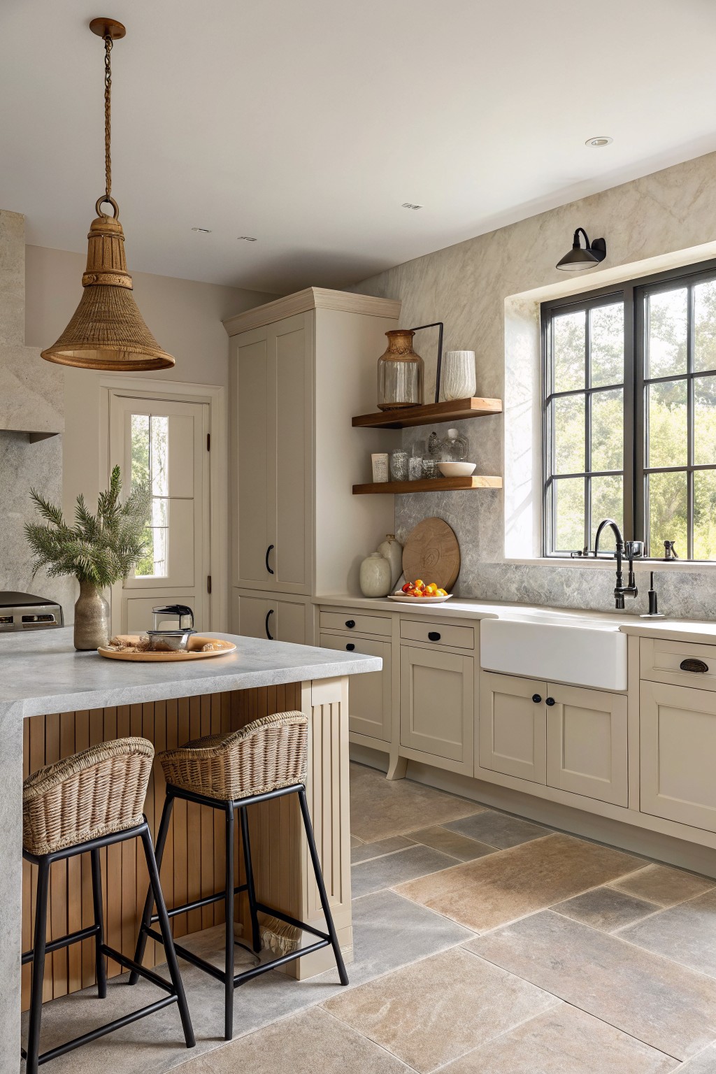
A warm greige is a good choice when you want walls and cabinets to feel light but not stark. This color sits in that soft middle ground between gray and beige, which helps the room feel open and calm without looking washed out.
It carries a gentle warm undertone that works with wood and stone without fighting them. Colors like Sherwin Williams Accessible Beige, Benjamin Moore Edgecomb Gray, or Behr Creamy Mushroom give a similar soft effect in kitchens that get plenty of daylight.
Pale Sage Kitchen Walls
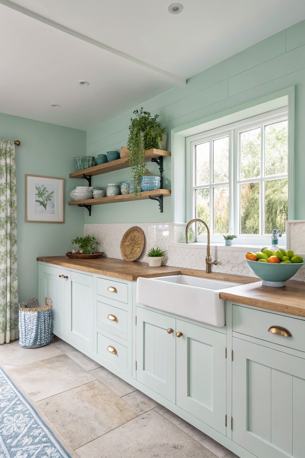
This pale mint green on the walls and cabinets gives a kitchen a light, open feel without looking stark. It sits in the soft green family and reads as a cool, airy shade that reflects light well. Colors like this help make smaller kitchens feel bigger because they keep the space from feeling closed in.
It has subtle blue undertones that work best with warm wood counters and white trim. Sherwin Williams Sea Salt, Benjamin Moore Palladian Blue, Farrow & Ball Teresa’s Green, and Behr Misted Fog all land close to this look. It suits kitchens with good natural light and pairs cleanly with simple hardware.
Warm Blush Walls
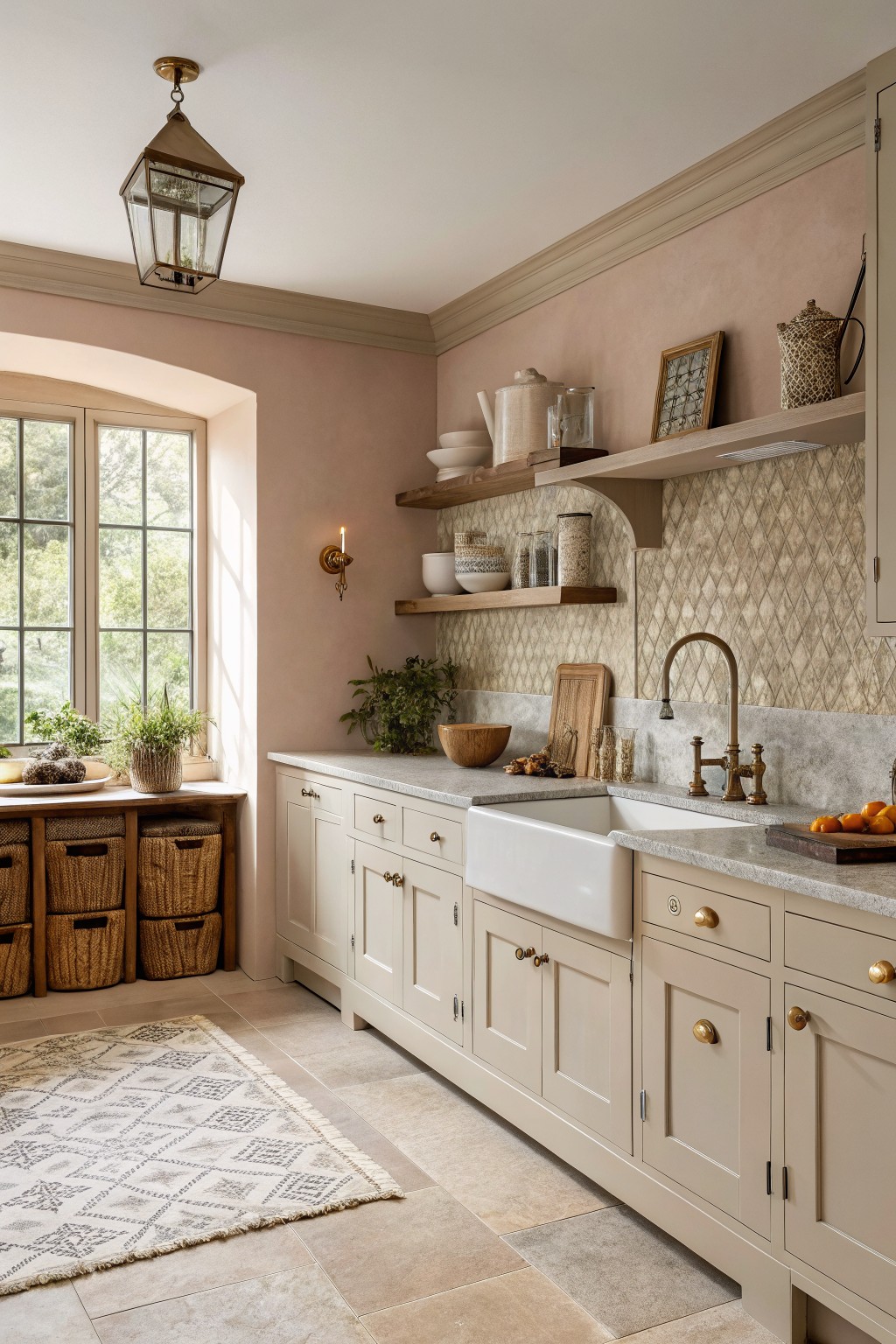
This soft blush beige keeps the kitchen feeling light and open. The color sits in that gentle middle ground between warm neutral and pale pink, so it adds just enough warmth without closing the space in.
It has a slight rosy undertone that reads soft against cream cabinets and gray stone. The look works best in rooms with decent natural light, and it pairs easily with wood tones or simple tile without needing extra contrast.
Muted Sage Green Kitchen Cabinets

A soft sage green makes a kitchen feel bigger because it stays light while still adding some color. This muted shade sits between gray and green, which helps it blend with white surfaces and wood tones instead of closing the space in.
It has cool undertones that work best with bright natural light and white trim. Pair it with marble or quartz counters and keep the ceiling and walls pale so the green on the cabinets stays the main feature without turning the room too dark.
Soft Blue Green Walls
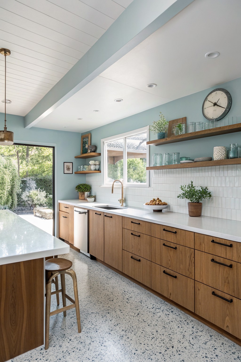
This soft blue green keeps a kitchen feeling open and calm. It sits in that light range where the walls recede a little, which helps the room look bigger without turning stark or chilly.
The color has a quiet cool tone that pairs nicely with wood cabinets and white tile. It can shift slightly toward green or blue depending on the light, so test a few samples on the wall before committing. Good matches include Benjamin Moore Palladian Blue, Sherwin Williams Rainwashed, Behr Soft Aqua, or Farrow & Ball Pale Powder.
Creamy White Kitchen Walls
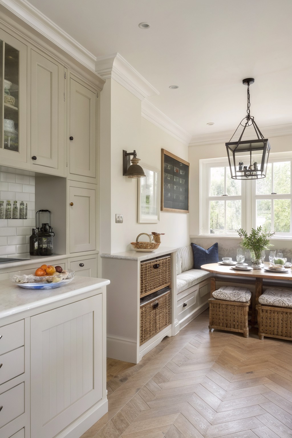
A warm off-white is one of the easiest ways to make a kitchen feel larger without going full bright white. This color has a soft creamy base that bounces light around while still feeling a little grounded next to wood and stone.
It works best with warm wood floors and simple trim, though it can read slightly yellower in north-facing light. Try it on both walls and cabinets if you want the whole space to open up. Benjamin Moore Cloud White, Sherwin Williams Alabaster, and Behr Swiss Coffee all sit in this same range.
Warm Peach Kitchen Walls
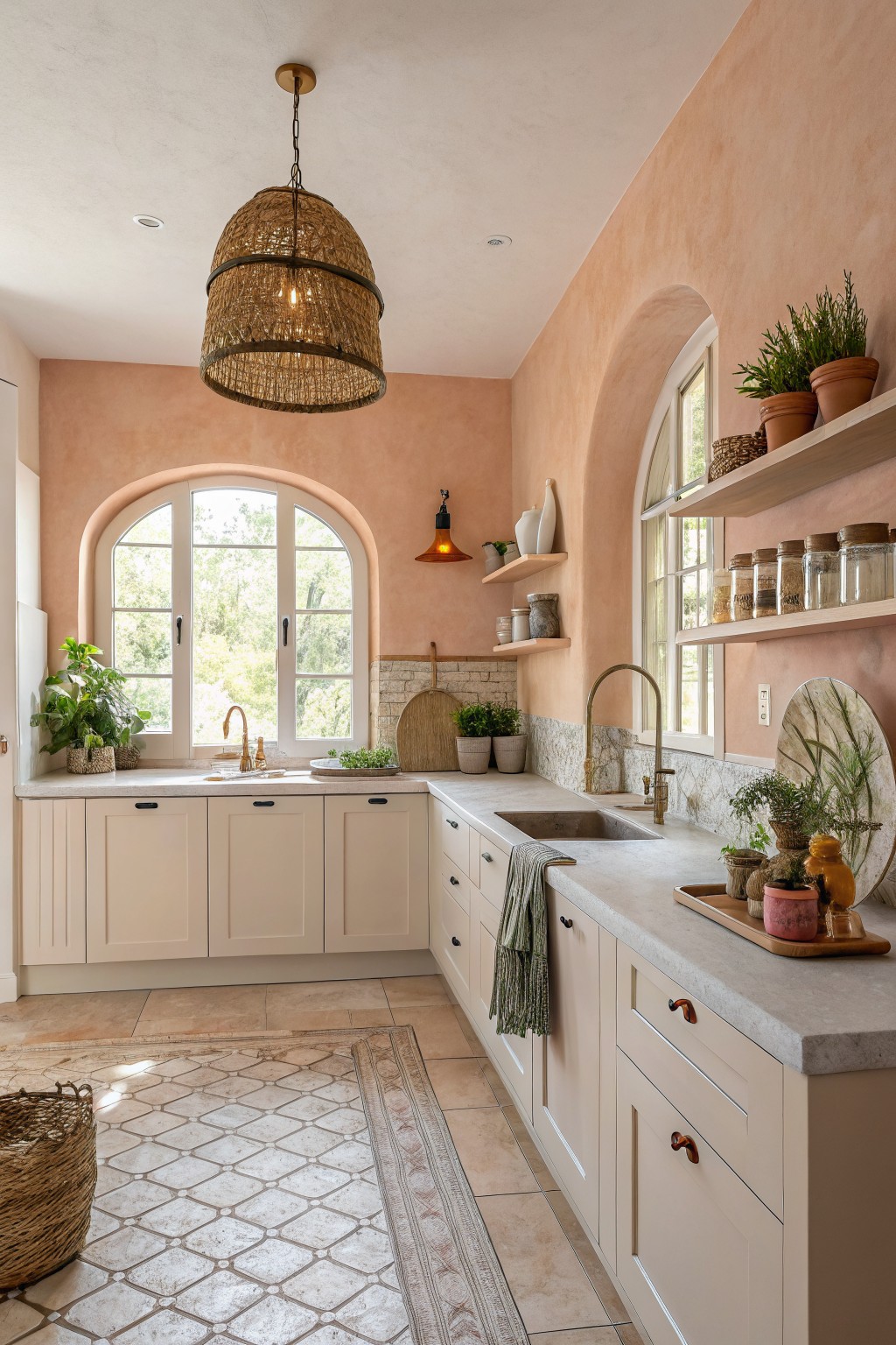
A warm peach on the walls gives a kitchen that soft, open feeling without turning it stark white. This color sits in a light neutral family with gentle pink undertones that bounce light around and keep the space from feeling closed in.
It works best with cream cabinets and pale stone counters. Try Benjamin Moore Peach Parfait, Sherwin Williams Rosy Outlook, Behr Soft Peach, or Farrow & Ball Setting Plaster if you want something close.
Frequently Asked Questions
Q: My kitchen gets almost no sunlight. Which colors will still open it up? A: Go for soft off-whites or the palest warm greiges. They catch and spread every bit of artificial light so the walls feel like they recede.
Q: Should the ceiling match the walls or stay white? A: Match the ceiling to the walls. The single color removes any hard line that stops the eye and makes the whole room feel taller right away.
Q: How do I test a color without wasting paint on the whole room? A: Brush two full coats onto a large piece of foam board and lean it against different walls for a few days. Check it morning and night so you see how it shifts with your lighting.









