When I choose bedroom paint, I think first about how it holds up to the light shifting through the day.
Sunlight warms colors in the morning but can make them feel stark or dull by evening if the base isn’t right.
Shades that balance their undertones create steady calm instead of those jarring surprises.
A soft sage I tested recently looked washed out on the chip but settled into a peaceful hush once the afternoon light hit my walls.
Always sample in your room’s light.
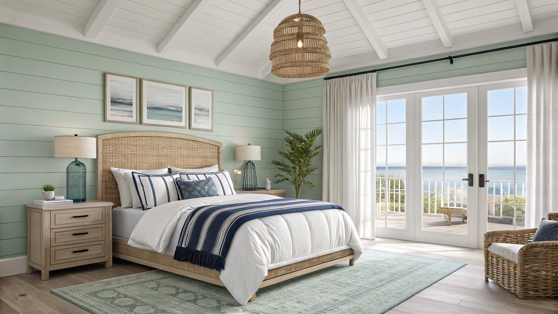
Soft Seafoam Walls

This bedroom shows off a pale seafoam green on the shiplap walls. It looks closest to Sherwin-Williams Sea Salt, or maybe Benjamin Moore Quiet Moments and Behr Breezeway. That gentle cool green keeps the room feeling open and restful, especially overhead with white ceilings.
Cool undertones give it a fresh coastal vibe next to wood tones and navy bedding. It shines in bright natural light. Pair with rattan or white trim to stay light, but watch it can read grayer in dim rooms.
Soft Gray Walls
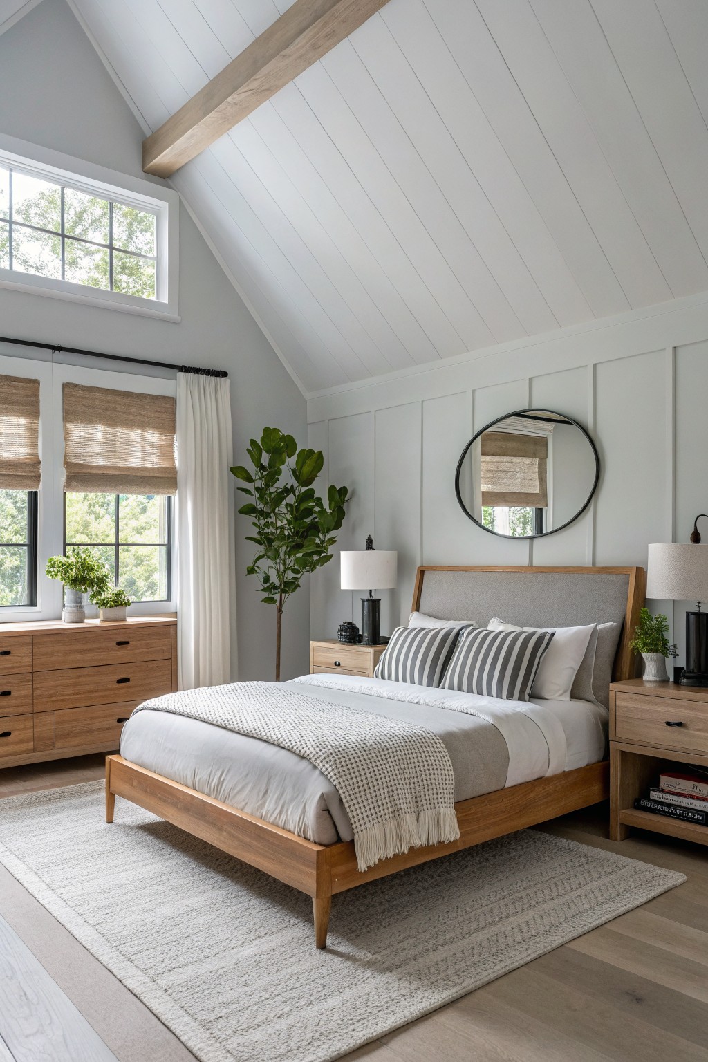
The walls in this bedroom are a soft light gray, closest to Benjamin Moore Gray Owl or Sherwin-Williams Repose Gray. It’s that cool gray family that feels calm without going too dark. Folks like it because it lets the wood furniture and plants stand out nice and easy.
That subtle cool undertone picks up daylight well, especially near windows like these. Pair it with warm oak pieces and a bit of greenery to keep the room balanced. Just watch it doesn’t look too stark in low light.
Soft Pink Walls
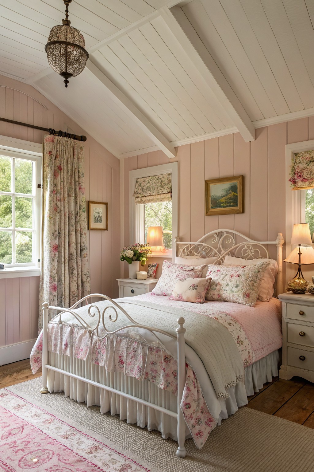
This bedroom’s walls show off a soft pink that’s got that gentle blush feel, reading closest to Benjamin Moore First Light or Sherwin-Williams Pussy Willow, maybe Farrow & Ball Calamine too. It’s pale but warm, the kind that makes a space feel restful right away. Not too bold, just enough color to cozy up the room without overwhelming.
The warm undertones keep it from going cold in softer light, and it sits pretty against the white trim and wood floors. Pair it with florals or whites on the bed, like here. Works best in bedrooms with decent windows. One thing, test it first if your light’s dim.
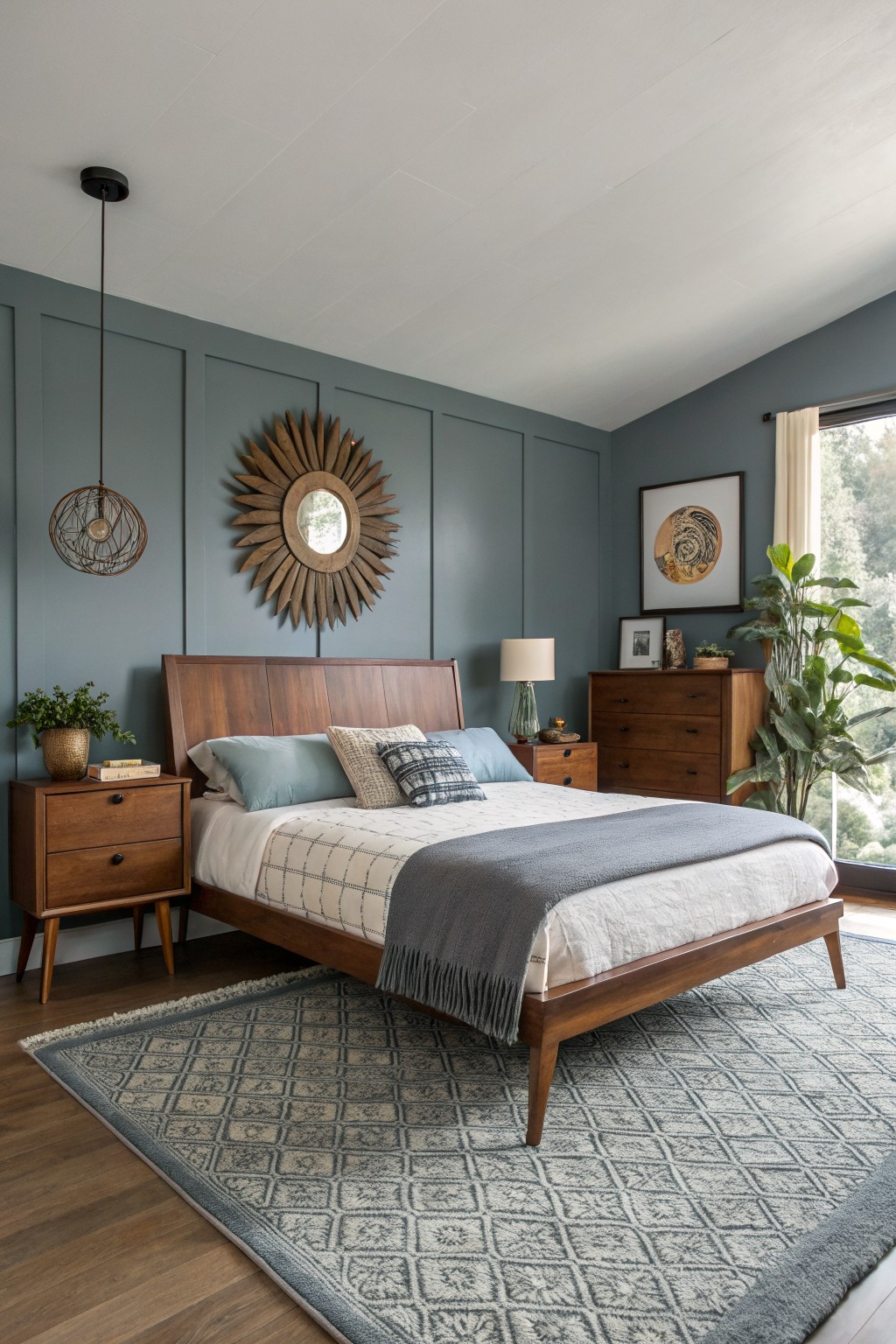
Soft Blue-Gray Walls
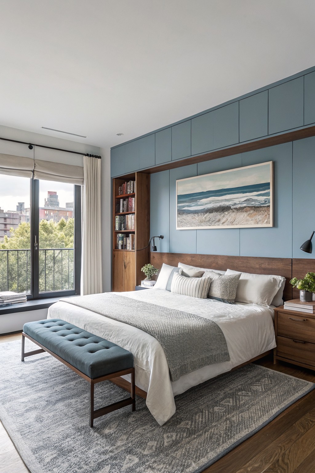
Those walls are painted in a soft blue-gray that seems closest to Sherwin-Williams Sea Salt or Benjamin Moore Palladian Blue. It’s a gentle cool-toned shade, not too blue or gray, just right for a bedroom that stays calm all day. You notice how it sits back nicely against the wood headboard and shelves.
Cool undertones like that work best in spaces with decent natural light. It picks up warmth from nearby trees or furniture without shifting too much. Pair it with white linens and oak pieces, and skip anything too yellow to keep the feel steady.
Soft Sage Green Walls
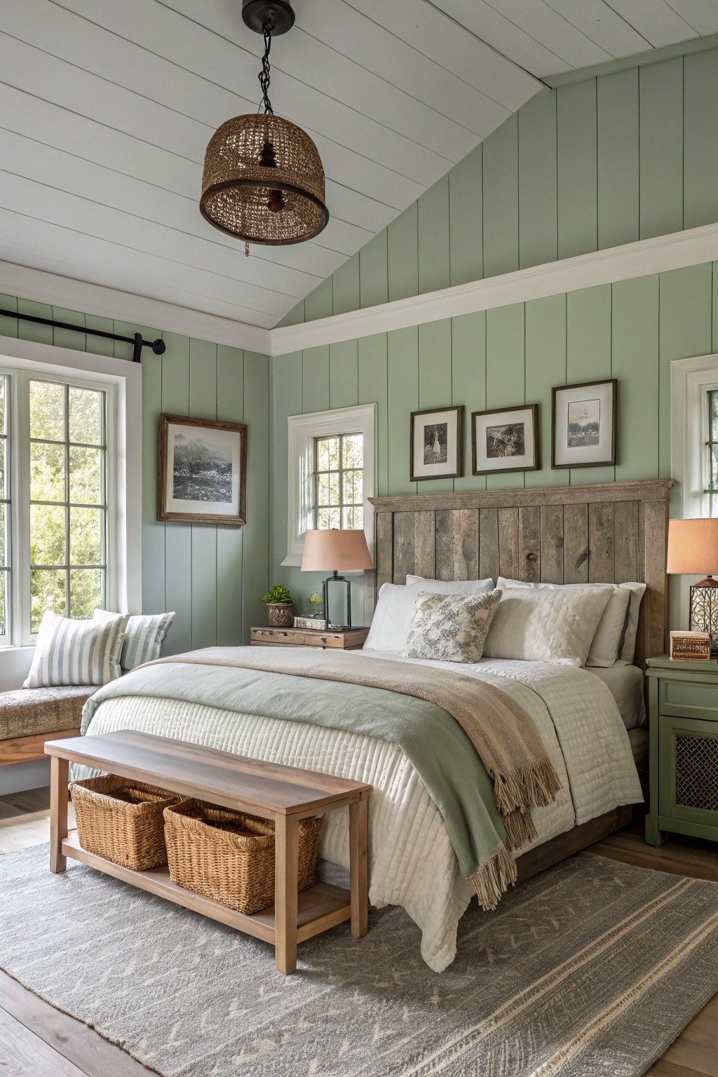
This bedroom’s walls show off a pale sage green that seems closest to Sherwin-Williams Clary Sage SW 6178, Benjamin Moore Saybrook Sage HC-114, or Behr Silver Sage N480-3. It’s a gentle green from the sage family, light enough to feel airy but with enough color to cozy up the space. Folks like it because it plays so well with wood tones, like that reclaimed headboard here.
The undertone leans a bit gray, which keeps it cool and serene instead of brassy. It shines in north-facing rooms or ones with plenty of window light. Stick to white ceilings, natural fibers, and tan bedding to let the green breathe.
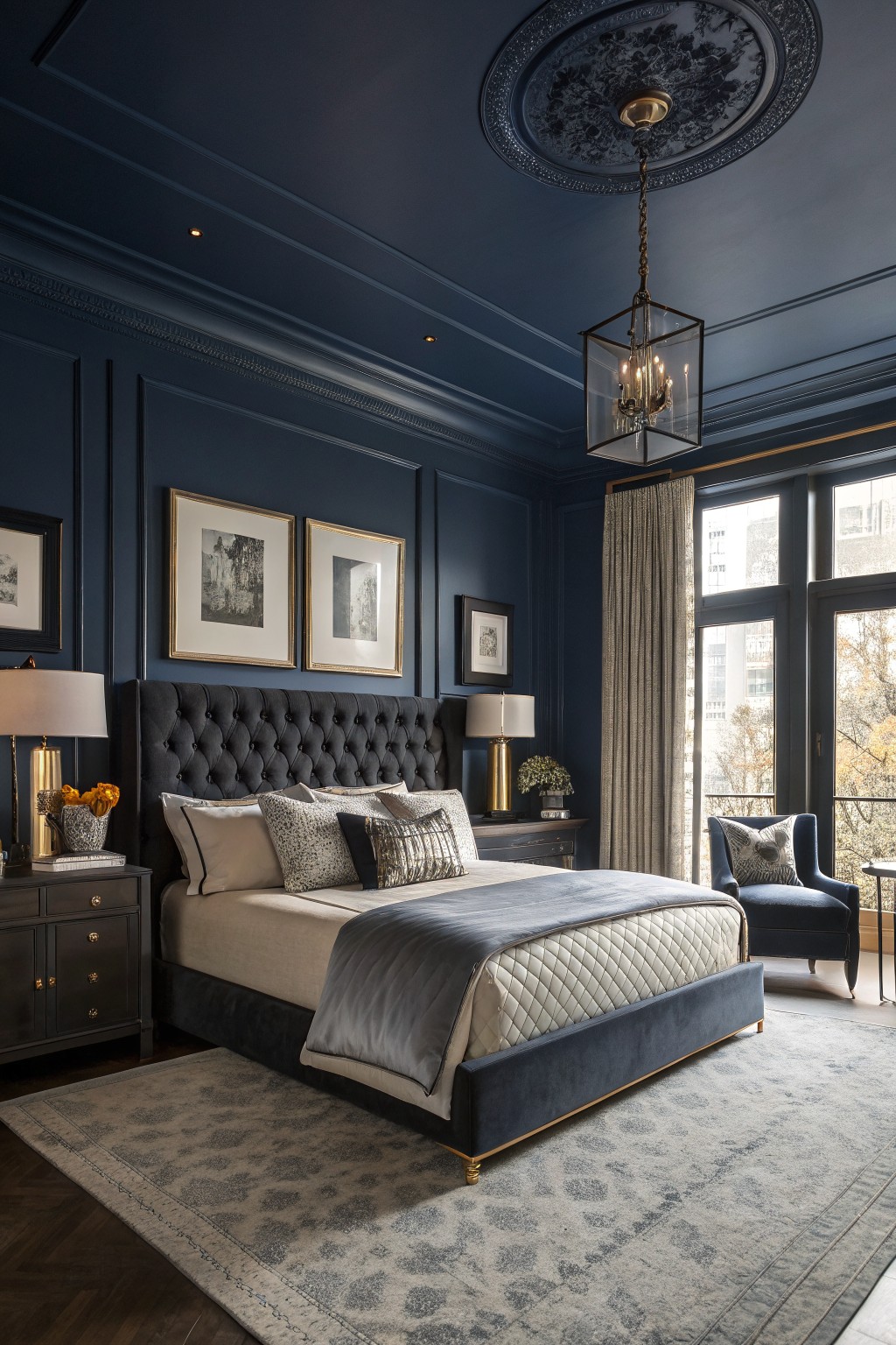
This bedroom goes all in on deep navy paint for the walls and ceiling. It looks closest to Sherwin-Williams Naval, or maybe Benjamin Moore Hale Navy and Farrow & Ball Hague Blue. Navy like this makes a real cozy spot for sleeping. It’s rich but not overpowering.
Cool gray undertones help it stay calm in softer light. Gold accents and pale bedding keep things balanced. Works best where you get some daylight through the windows.
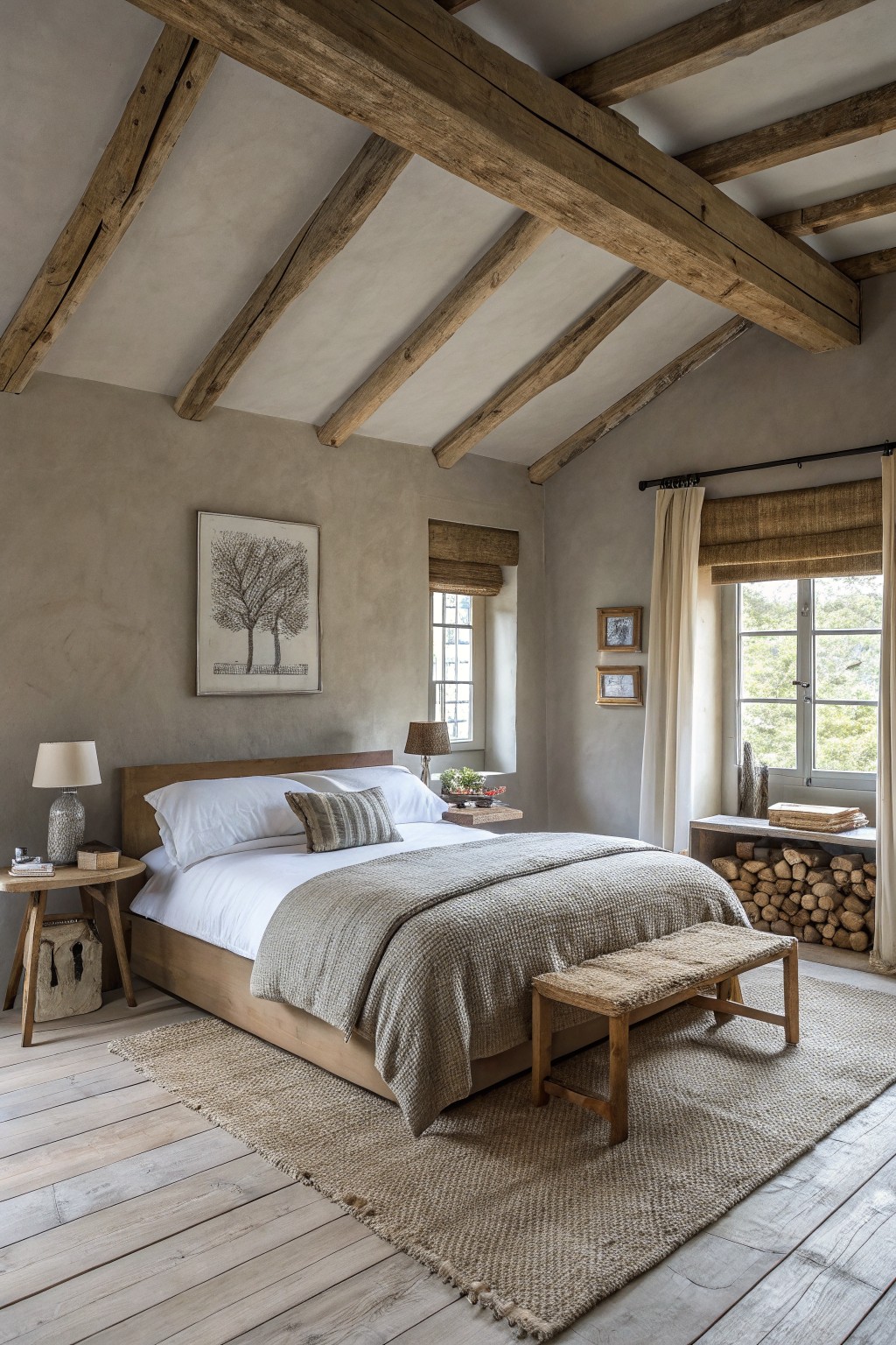
Warm Greige Walls
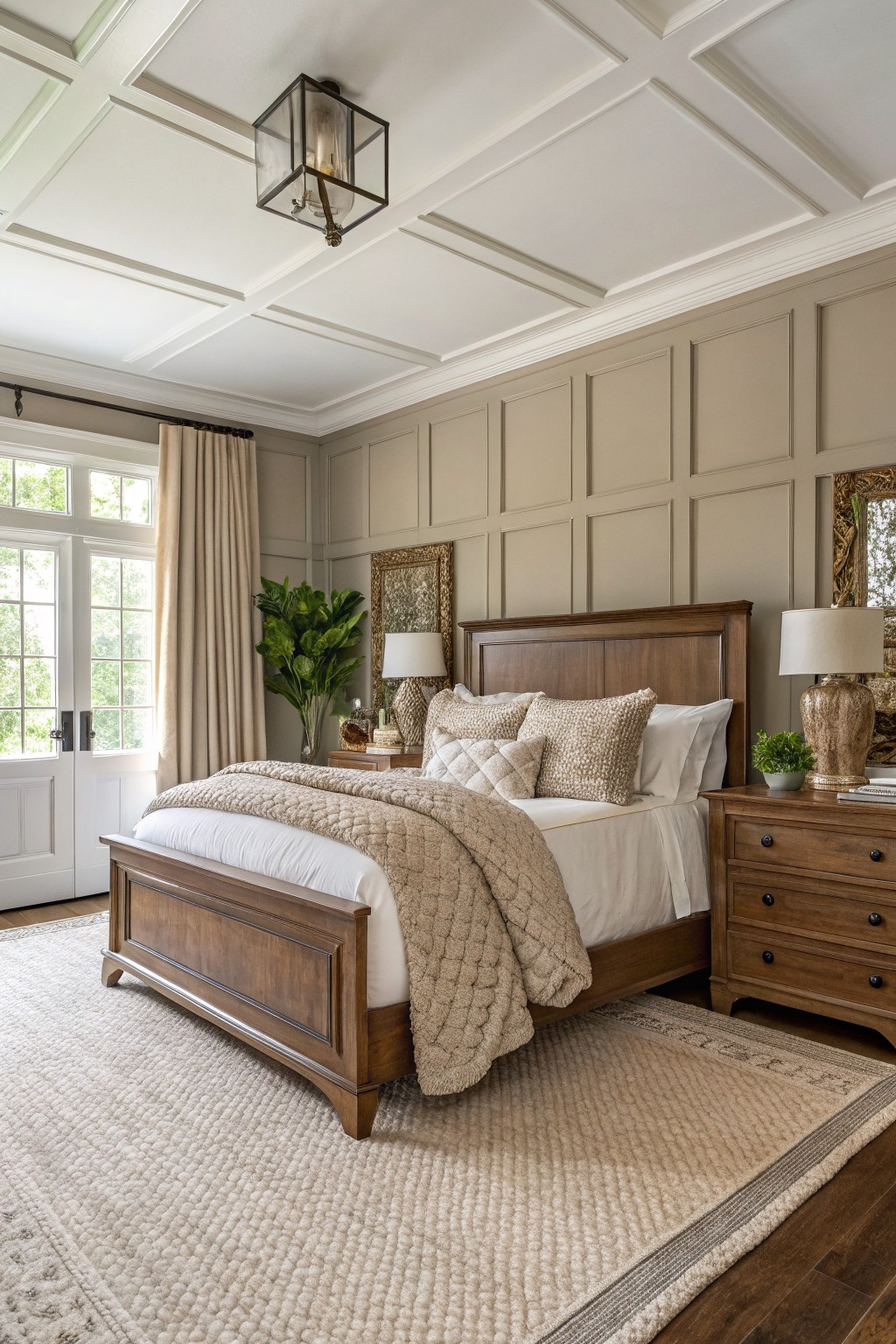
Those paneled walls show off a warm greige that’s easy on the eyes. It looks closest to Sherwin Williams Agreeable Gray or Benjamin Moore Revere Pewter, maybe even Behr’s Silver Drop. This neutral sits right between beige and gray. Folks like it because it makes wood furniture pop without overpowering the room.
The beige undertone keeps things cozy, especially with good window light. It works best in bedrooms where you want calm. Go with cream bedding and brass lamps like here. Just test it in your space first… lighting can shift it a bit.
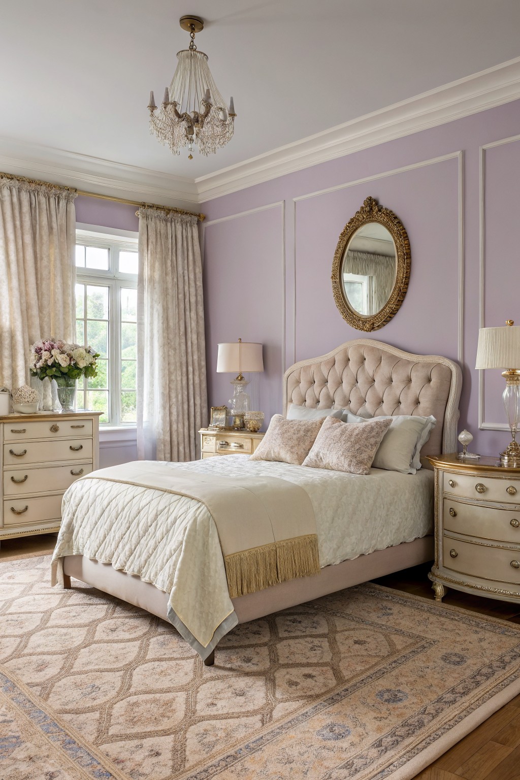
Soft Mauve Walls
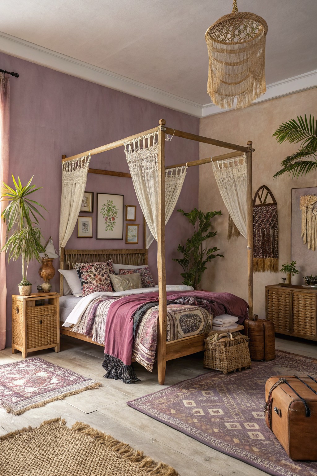
This bedroom uses a soft mauve on the walls. It looks closest to Sherwin-Williams Wilder or Benjamin Moore’s Gray Wisp. Or maybe Behr’s Dreamy Mauve. That gentle purple family has just enough warmth to feel cozy without overwhelming the space. It’s why the room stays so restful.
The undertone leans pinkish warm, which plays nice next to wood tones like the bed frame here. It works best in rooms with some natural light. Pair it with plants and woven pieces. In dimmer spots it might read grayer though.
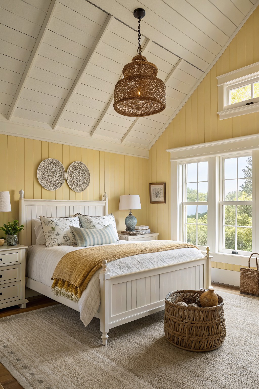
Pale Yellow Walls
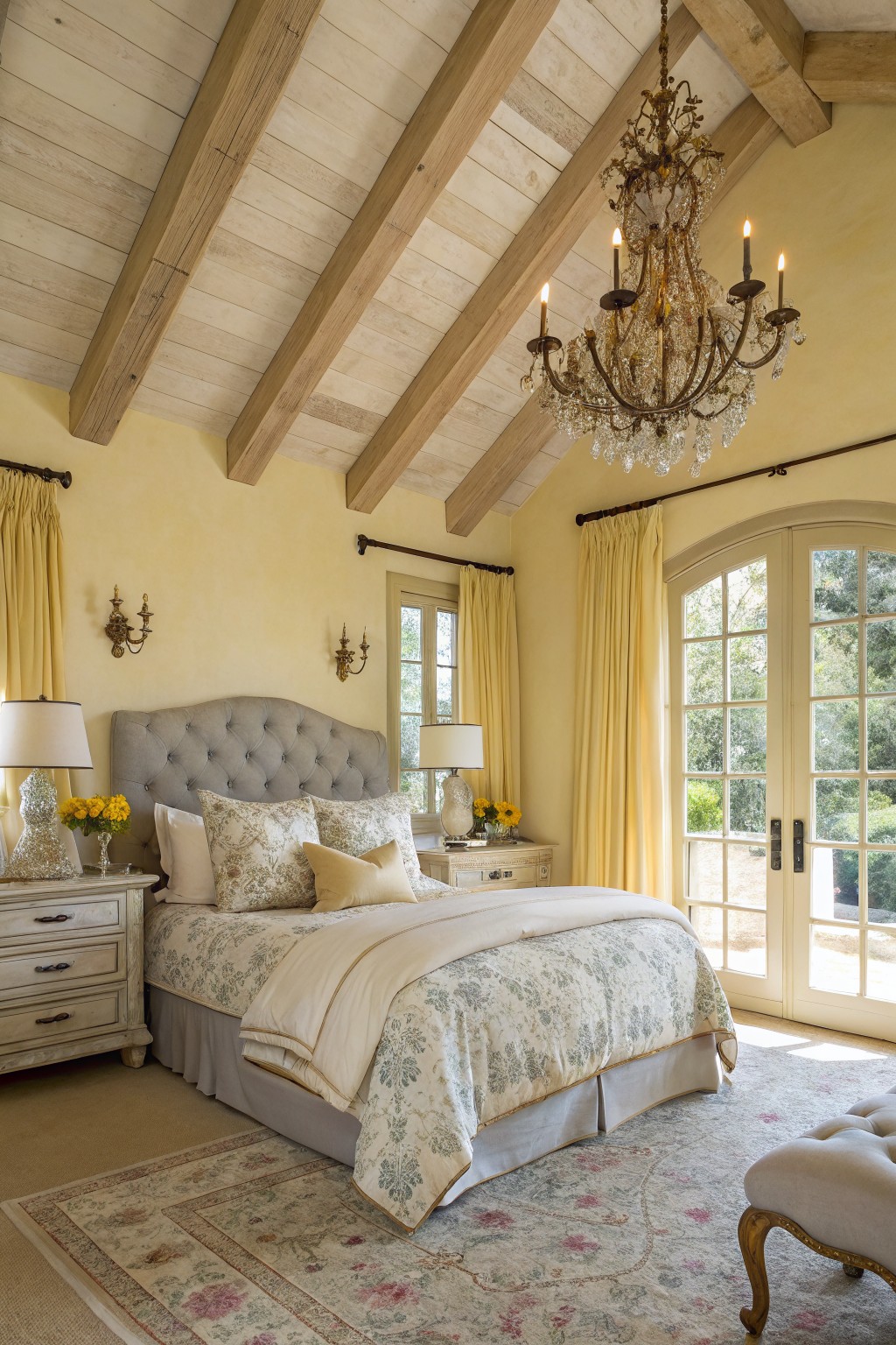
This bedroom shows off a soft pale yellow on the walls that keeps things light and restful. It has that warm, sunny feel without going too bright. I’d say it comes closest to Sherwin-Williams Greek Villa or Benjamin Moore Pale Yellow 202, maybe Behr’s Rice Porridge too.
The color picks up golden undertones from the wood beams up top, and it works great with natural light pouring in from the French doors. Pair it with cream bedding or muted yellow drapes like these. Just watch it in north-facing rooms, where it might read a touch cooler.
Coastal Seafoam Green Walls
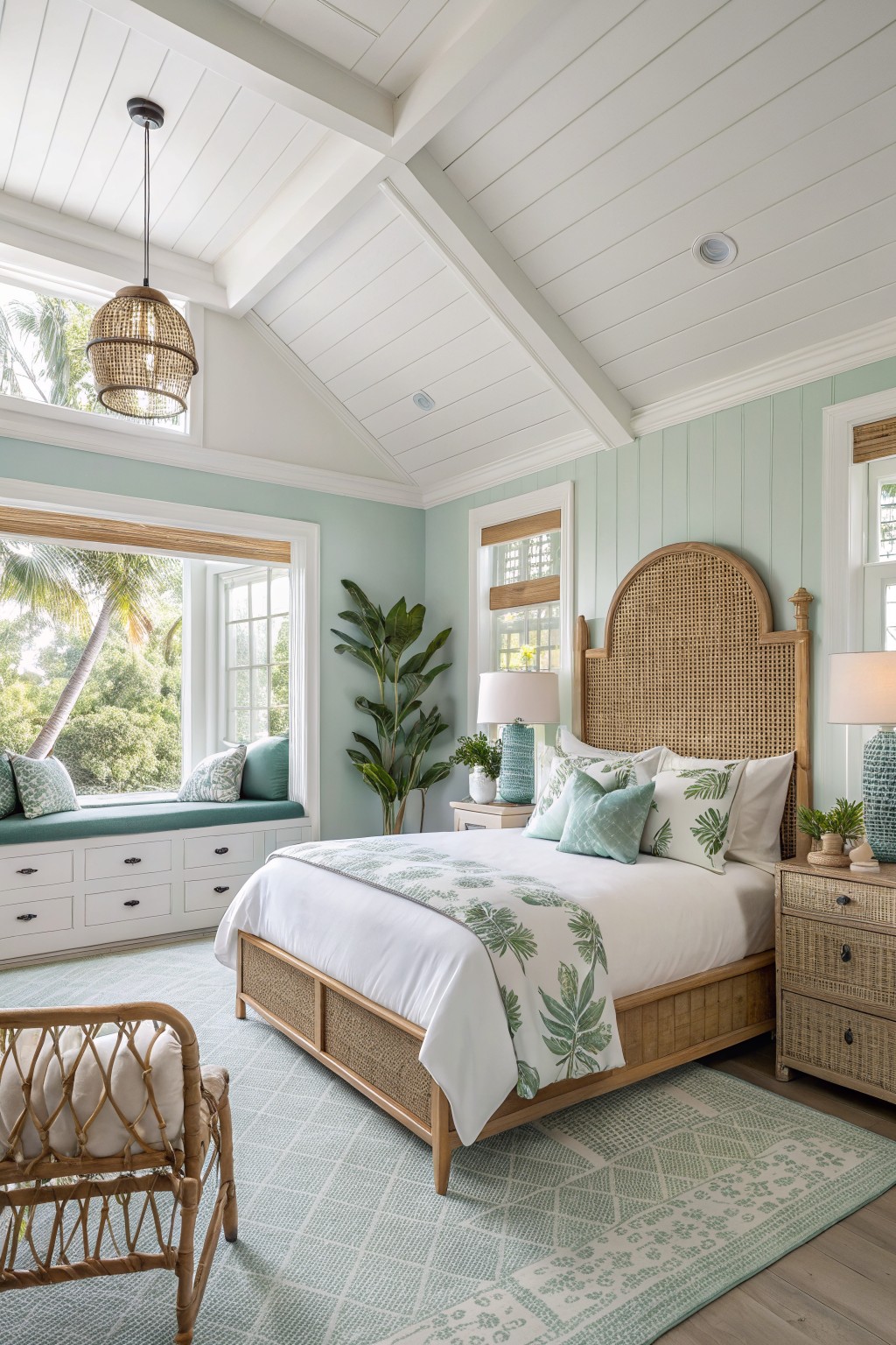
This pale seafoam green on the walls looks closest to Sherwin-Williams Sea Salt, or maybe Benjamin Moore October Mist or Behr’s Breezeway. It’s a gentle pastel green with cool blue undertones that keeps a bedroom feeling fresh and restful. Folks like it because it brightens the space without being too bold, especially next to white ceilings and trim.
That cool edge shows up more in natural light from big windows. It pairs nicely with rattan beds and wood tones here, adding a coastal touch. In north-facing rooms it might lean grayer, so test a sample first.
Warm Terracotta Walls
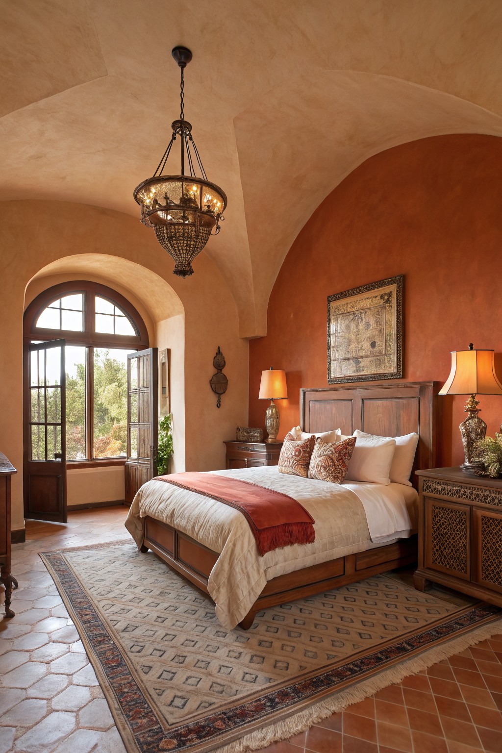
This bedroom pulls off a warm terracotta paint that reads very close to Sherwin-Williams Terracotta Tile SW 2154-30, or Benjamin Moore’s Potters Clay HC-99 and Behr’s Terracotta Flower P240-7. It’s an earthy orange-brown with real depth, the kind that feels grounded and easy on the eyes. That textured plaster finish just makes the color hug the room nicely, especially around the wood bed and cabinets.
The undertone leans red-warm, so it picks up golden light from windows like this one overlooking trees. It works best in sunny spots or rooms with natural wood trim… pairs well with cream bedding and those saltillo tiles on the floor. Watch for north-facing light though. It might pull a bit muddier there.
Concrete Gray Walls
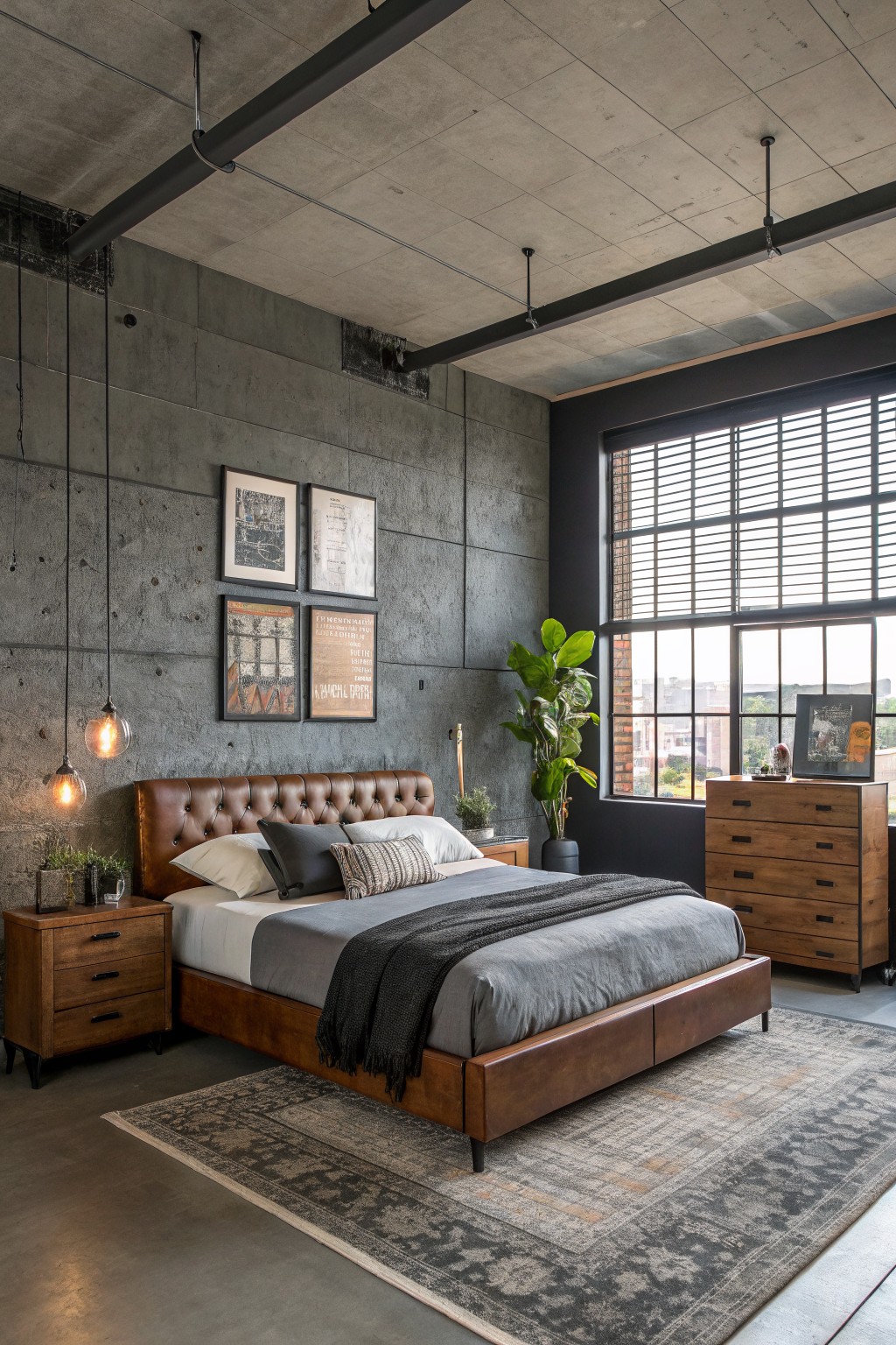
This bedroom pulls off a cool concrete gray on the walls for that modern loft vibe. It seems closest to Sherwin-Williams Repose Gray or Benjamin Moore Stonington Gray, maybe even Behr’s Cracked Pepper if you want a touch deeper. That kind of neutral gray keeps things serene without going flat. It lets the warm leather bed and wood drawers stand out nice.
The cool undertones here play well with lots of window light. I’d use it in urban spaces or bigger rooms where it won’t close in. Pair with brass lamps or plants for balance… just watch it doesn’t overwhelm if your lighting’s dim.
Soft Lavender Walls
Those walls show a pale lavender that’s soft and easy on the eyes. It’s from the purple family but stays light and gentle, almost like a hint of lilac. I’d say it reads closest to Sherwin-Williams Lullaby or Benjamin Moore Lavender Mist, maybe Behr’s Dreamy Lilac too. Folks like it for bedrooms because it calms things down quick, especially next to all the cream and gold pieces.
The warm undertone keeps it from feeling cold. Bright light from the window makes it glow just right… pairs well with wood floors and beige bedding. Try it in a sunny spot, but test against your trim first to see how the purple sits.
Sage Green Shiplap Walls
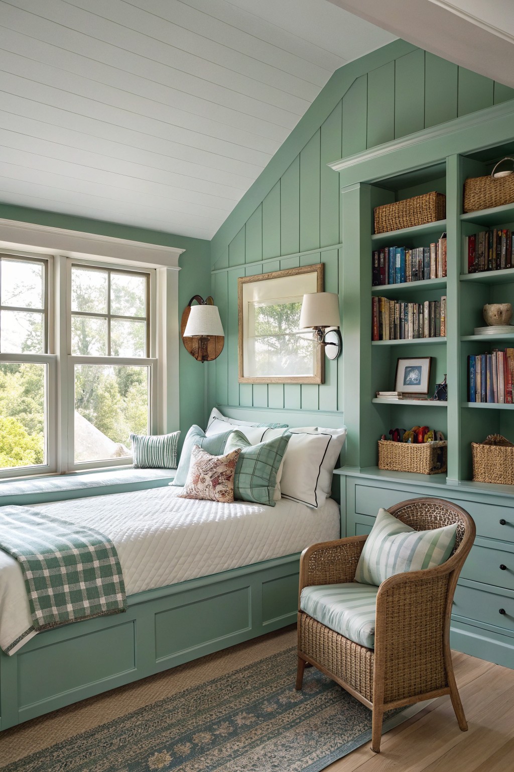
This bedroom uses a soft sage green on the shiplap walls and built-ins that looks closest to Sherwin-Williams Sea Salt or Benjamin Moore Saybrook Sage. Behr’s Silver Sage comes pretty near too. It’s a pale green with cool gray undertones. That mix keeps things calm and easy on the eyes, especially in a retreat like this.
Daylight from the windows keeps the color feeling light and airy. It works best in rooms with good natural light. Pair it with white linens and wood accents to let the green shine without overwhelming. Avoid pairing with bold reds… they’ll fight it.
Blue-Gray Retreat Walls
This bedroom paint pulls off a soft blue-gray that looks closest to Sherwin-Williams Sea Salt or Benjamin Moore Palladian Blue. Behr’s Blueprint reads close too. It’s the sort of easygoing color that settles a room down without trying too hard, especially next to all that warm wood.
That cool gray undertone keeps it from going full blue. Natural light makes it glow just right, like here with the big windows letting trees show through. Stick to wood pieces and a few greens, and it feels lived-in, not stark.
Pale Yellow Nursery Walls
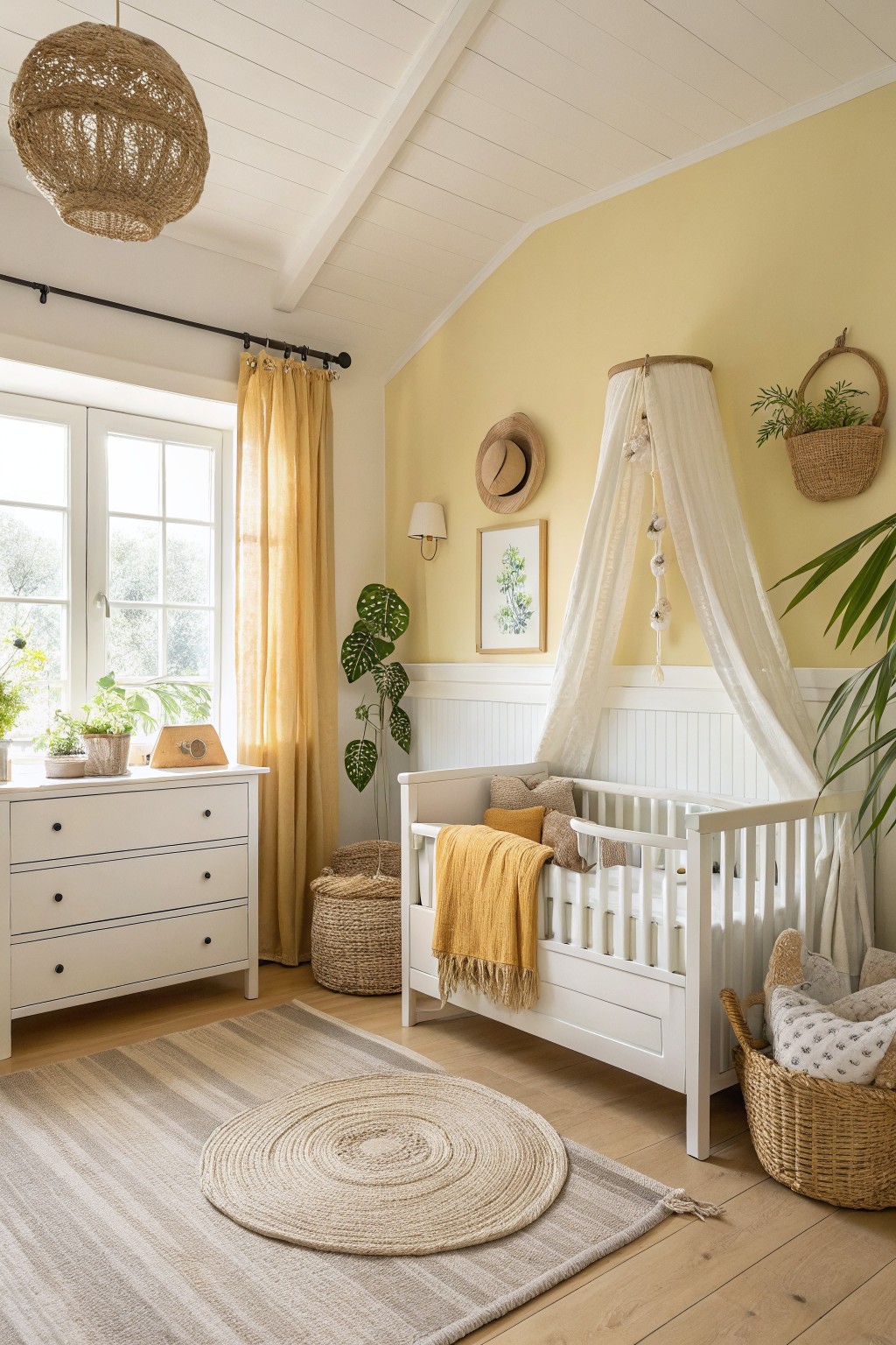
This pale yellow on the walls reads very close to Benjamin Moore’s Pale Yellow HC-3 or Sherwin-Williams’ Butter Up. Behr’s Lemon Glow has that same soft feel too. It’s the kind of light wash that brightens a bedroom without shouting, and it makes spaces feel open and restful right away.
Warm undertones keep it from looking stark next to wood trim or cribs. It works best in rooms with good natural light, like this nursery setup with plants nearby. Watch for pairing with true whites so everything stays cozy.
Warm Greige Bedroom Walls
This bedroom uses a soft warm greige on the walls that reads closest to Sherwin-Williams Agreeable Gray or Benjamin Moore Revere Pewter. Maybe Farrow & Ball Skimming Stone too. It’s one of those easy neutrals that sits just right between gray and beige. Folks like it because it keeps things calm and pairs well with wood without fighting it.
The warm undertones come through especially next to the oak beams overhead. It works best in rooms with good light or wood floors like this one. Stick to textured fabrics and simple wood furniture. Watch that it doesn’t go too pink in south-facing spots.
Warm Sage Walls
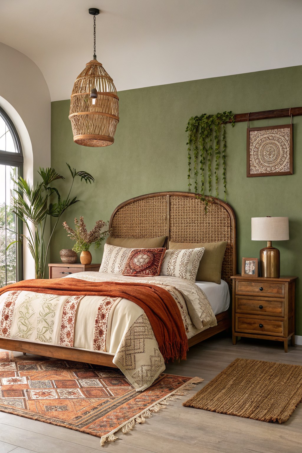
This warm sage green on the bedroom wall seems closest to Sherwin-Williams Clary Sage or Benjamin Moore October Mist, with Behr Silver Sage reading very close too. It’s a muted green that’s earthy and restful, the kind that settles right in without overpowering the space. What makes it stand out is how it hugs wood tones and baskets, like the rattan headboard here.
That yellow-green undertone keeps things cozy, especially next to plants and brass. It shines in brighter rooms but holds up okay in softer light too. Pair it with rust throws or woven rugs, and skip anything too pink or blue. Just right for a quiet spot.
Soft Creamy Walls
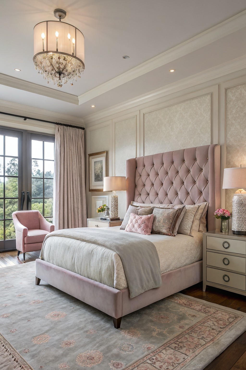
The walls in this bedroom are a soft creamy white, the kind that feels warm without going yellow. It looks closest to Benjamin Moore’s White Dove or Sherwin-Williams Alabaster, maybe even Behr’s Swiss Coffee. What I like about it is how it lets the pink velvet headboard and wood floors stand out, but still keeps everything calm and pulled together.
That warm undertone works best in rooms with good natural light, like through those French doors here. Pair it with dusty pinks or grays, and watch how the trim stays crisp against it. Just test a sample first. North-facing rooms might need something a touch warmer.
Pale Yellow Shiplap Walls
This bedroom uses a pale yellow on the shiplap walls that looks closest to Sherwin-Williams Corn Silk SW 1653 or Benjamin Moore Pale Yellow 202. Behr’s Whipped Cream reads pretty similar too. It’s a soft, warm yellow that stays light without going brassy. Folks like it for bedrooms because it brings in a bit of sunshine, especially next to crisp white trim like on that four-poster bed.
The golden undertone picks up nicely in morning light from big windows. It works best in spaces with wood floors or natural baskets and throws. Pair it with creamy whites or soft blues on bedding, but skip anything too cool-toned… it can make the yellow feel off. Rooms like this stay cozy year round.
Deep Green Walls
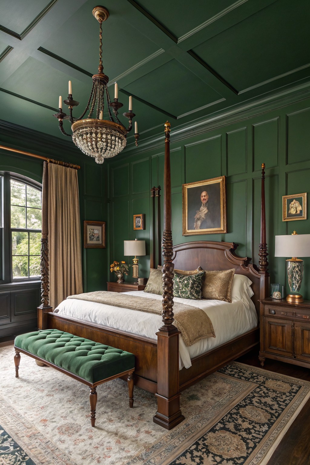
Those walls are painted a deep green that seems closest to Sherwin-Williams Pewter Green or Benjamin Moore Guilford Green, with maybe a nod to Farrow & Ball Green Smoke. It’s a moody color in the emerald family, rich enough to feel elegant but not overpowering. Folks go for it because it wraps the room in coziness, especially when the wood bed and trim stand out against it.
The undertone leans a touch blue but warms up with the paneling and brass accents. It works best in bedrooms that catch some natural light from windows overlooking trees. Pair with soft creams on the bed and gold details. Skip it if your space is super dim… might close in too much.
Soft Pale Blue Walls
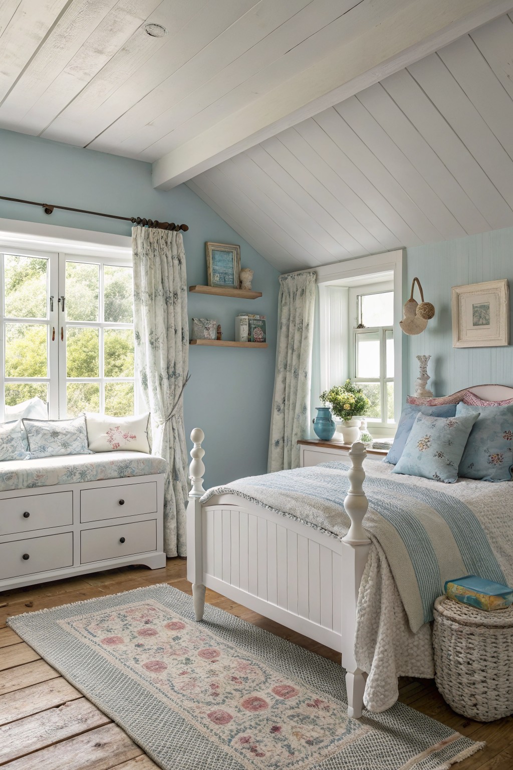
This bedroom uses a gentle pale blue on the walls, the kind that feels close to Benjamin Moore’s Palladian Blue or Sherwin-Williams Sea Salt. Sometimes it pulls a bit greener, like Farrow & Ball’s French Gray. It’s not a bright blue. More of a quiet, washed-out shade that keeps things restful without going flat.
That cool undertone works nice next to the whitewashed wood beams and trim here. It brightens up in good light but stays cozy with warm bedding or a wooden floor. Pair it with creamy whites and soft florals. Just watch it doesn’t read too gray in dim rooms.
Soft Blue Walls
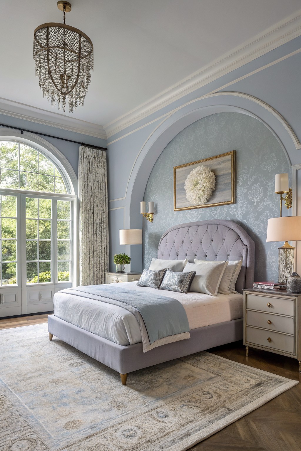
This soft blue on the walls reads very close to Benjamin Moore’s Palladian Blue or Sherwin-Williams Composure. Sometimes Farrow & Ball’s Skylight feels just like it too. It’s that pale blue family with a gentle gray undertone that keeps things calm and easy on the eyes. You notice how it lets the natural light from those big windows fill the room without overwhelming anything.
The cool side makes it perfect for bedrooms facing east or with lots of daylight. Pair it with creamy whites on the trim and wood floors like these oak ones to keep it grounded. Just watch if your space has warm incandescent lights. It can pull a bit greener then.
Warm Wood Panel Walls
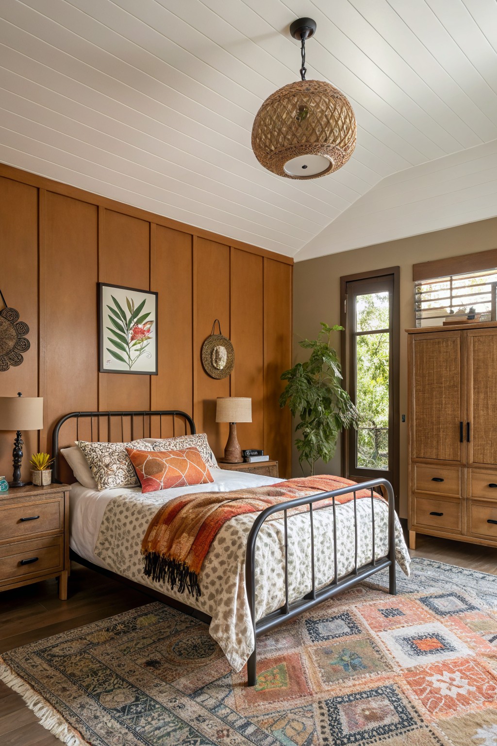
This bedroom uses a warm brown on the paneling behind the bed. It sits somewhere between terracotta and walnut, looking closest to Sherwin-Williams Killarney or Benjamin Moore Spiced Brandy. That orange undertone keeps it from feeling flat. It’s a good pick if you like wood tones but want something paintable and not too dark.
The color picks up light from the window nicely, warming up the white ceiling overhead. Pair it with orange throws or rattan accents like they did here. Stick to rooms with some natural light so it doesn’t turn muddy.
Frequently Asked Questions
Q: How do I test these colors in my actual bedroom before committing to a full can?
A: Snag a few sample sizes and slap large patches right on your walls next to your bed. Walk by them morning, noon, and night to catch how light changes them. That way you avoid any surprises once the room’s all done.
Q: My room faces north and stays dim. Which shades from the list still feel bright?
A: Lean toward warm neutrals like soft beiges or creamy off-whites. They bounce what little light you get and keep things cozy. Skip the cool blues, though—they can turn shadowy.
Q: Will these light, dreamy colors work in my tiny bedroom without closing it in?
A: They open up small spaces beautifully. Pick ones with a hint of sheen to reflect light around.
Q: How do I mix in dark furniture with these serene walls?
And: Layer in textured bedding to bridge the two. The contrast warms everything up just right.