I often find that earthy paint colors look different once they cover an entire wall and sit next to my existing furniture.
The undertones can shift in morning light versus evening, which changes how the room feels throughout the day.
Natural textures like linen curtains or jute rugs pull out certain hues that samples alone never reveal.
I always test a patch near the trim before deciding.
Some shades hold their warmth better than others when paired with wood tones, and those are the ones I return to again and again.
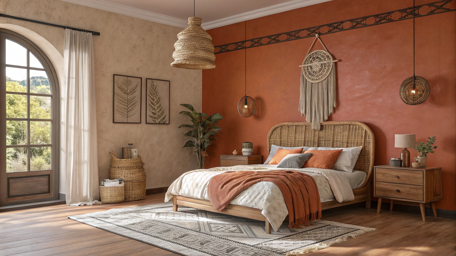
Warm Terracotta Walls

This wall color is a deep terracotta with warm orange undertones. It gives the room a grounded feel that works especially well in boho spaces because it plays off natural wood and woven textures without looking too heavy.
The color sits nicely next to lighter linens and beige floors. It tends to read a bit richer in lower light, so it suits bedrooms or living rooms where you want some warmth but still need the space to feel open. Good matches include Benjamin Moore’s Cayenne, Sherwin Williams Baked Clay, Behr Terracotta Tile, and Farrow & Ball Red Earth.
Soft Sage Green Walls
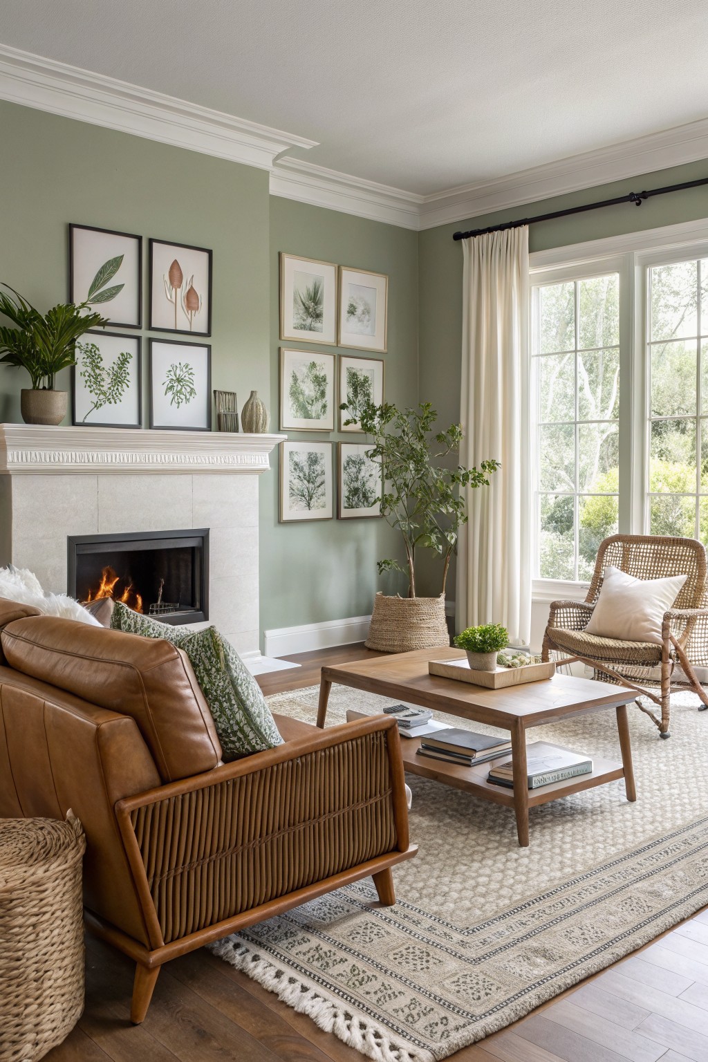
This muted sage green gives the walls a soft earthy tone that feels calm and grounded. It sits nicely in living rooms because it works with wood tones and white trim without fighting them.
The color has a gentle warm undertone that keeps it from turning too cool in lower light. It pairs best with natural textures and simple furniture so the space stays relaxed rather than busy.
Warm Greige Cabinets
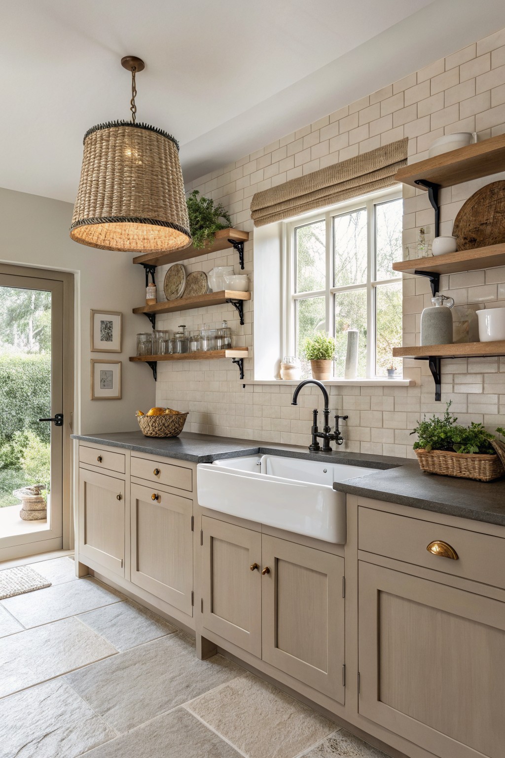
This kitchen uses a soft warm greige on the cabinets. It sits between gray and beige with a gentle tan undertone that keeps the space feeling calm and grounded. The color works well with natural wood tones and stone counters without making the room feel too heavy or too washed out.
It pairs nicely with black hardware and open wood shelves. The shade stays flexible in different lights and suits older homes or newer builds that lean toward simple, earthy finishes. Try it on lower cabinets first if you want to test how it reads next to your flooring.
Warm Terracotta Bathroom Walls
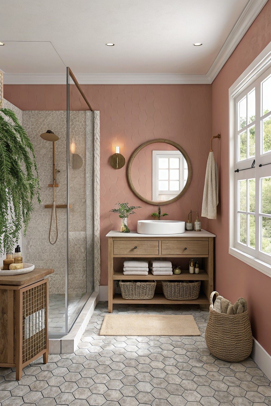
A warm terracotta reads as the main color here. It sits in that soft space between pink and clay, giving the walls an earthy tone that feels natural rather than bold.
The color has a gentle warmth that sits well with wood vanities and stone floors. It stays calm in bathrooms but can shift a bit deeper in low light, so it helps to test a sample on the actual wall first.
Warm Yellow Walls
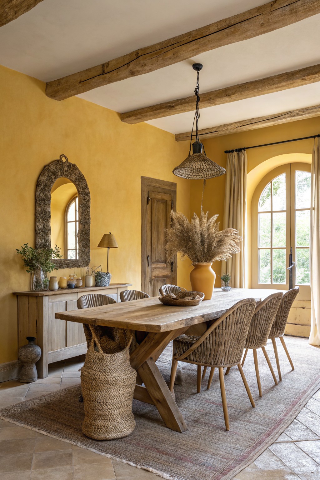
This warm yellow paint color gives the room an earthy, grounded feel. It sits in the ochre family and reads closest to Sherwin Williams Goldenrod, Benjamin Moore Yellow Marigold, Behr Sunflower, or Farrow & Ball India Yellow. The depth keeps it from looking too bright while still bringing life to the space.
The color carries a soft orange undertone that sits nicely next to wood tones and natural textures. It works best in dining rooms or living areas with plenty of natural light. Pair it with warm wood furniture and avoid cool grays that can make the yellow feel muddy.
Soft terracotta beige walls

This wall color is a soft terracotta beige that brings a gentle warmth without feeling heavy. It has a light peachy undertone that sits nicely against wood tones and white trim, which is why it works so well in entryways and hallways where people want something calm but still inviting.
The color holds up best in spaces with decent natural light and pairs easily with woven baskets, raw wood furniture, and simple linen pieces. It can start to feel a bit flat if the room has too much gray elsewhere, so keeping the other elements warm helps it stay balanced.
Warm Golden Yellow Walls

This warm golden yellow on the walls sits in the earthy ochre family and brings a soft, grounded feel to the room. It keeps the space from feeling stark while still letting the wood built-ins and desk stand out naturally.
The color has a slight mustard undertone that shows up more in daylight. It works best in rooms with warm wood tones and simple textures, and it pairs well with natural rugs and woven seating. Sherwin Williams Biltmore Gold or Benjamin Moore Hawthorne Yellow come close, as does Behr Honey Bee.
Warm Taupe Siding

This house uses a warm taupe on the main siding. It is a soft earthy neutral that blends gray and brown without leaning too far in either direction. The color feels steady on an exterior and works well when you want something low key but still interesting.
It carries a light warm undertone that shows up more in afternoon light. The shade sits comfortably next to stone and wood trim. Look for something close to Sherwin Williams Accessible Beige, Benjamin Moore Edgecomb Gray, or Behr Toasted Almond if you want a similar tone.
Soft Sage Green Walls
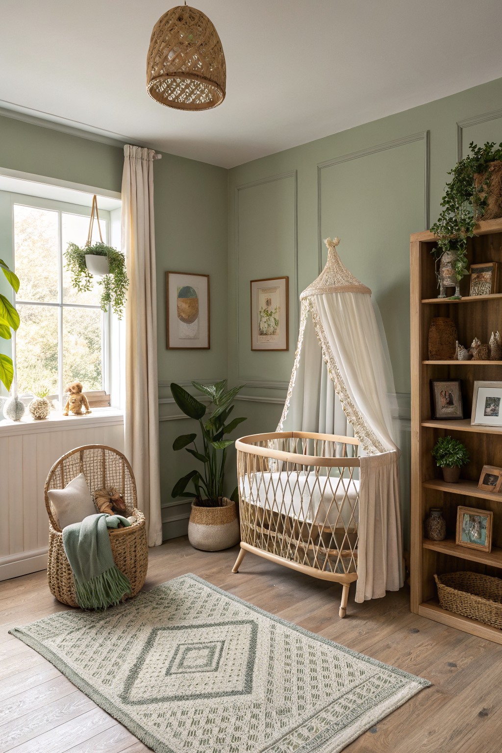
This muted sage green has a gentle earthy tone that feels calm and natural in a room. It sits between gray and green with just enough depth to ground the space without closing it in.
The color works especially well with warm wood floors and natural textures. Try Sherwin Williams Clary Sage, Benjamin Moore October Mist, or Behr Eucalyptus Leaf if you want a close match.
Soft Sage Green Living Room Walls
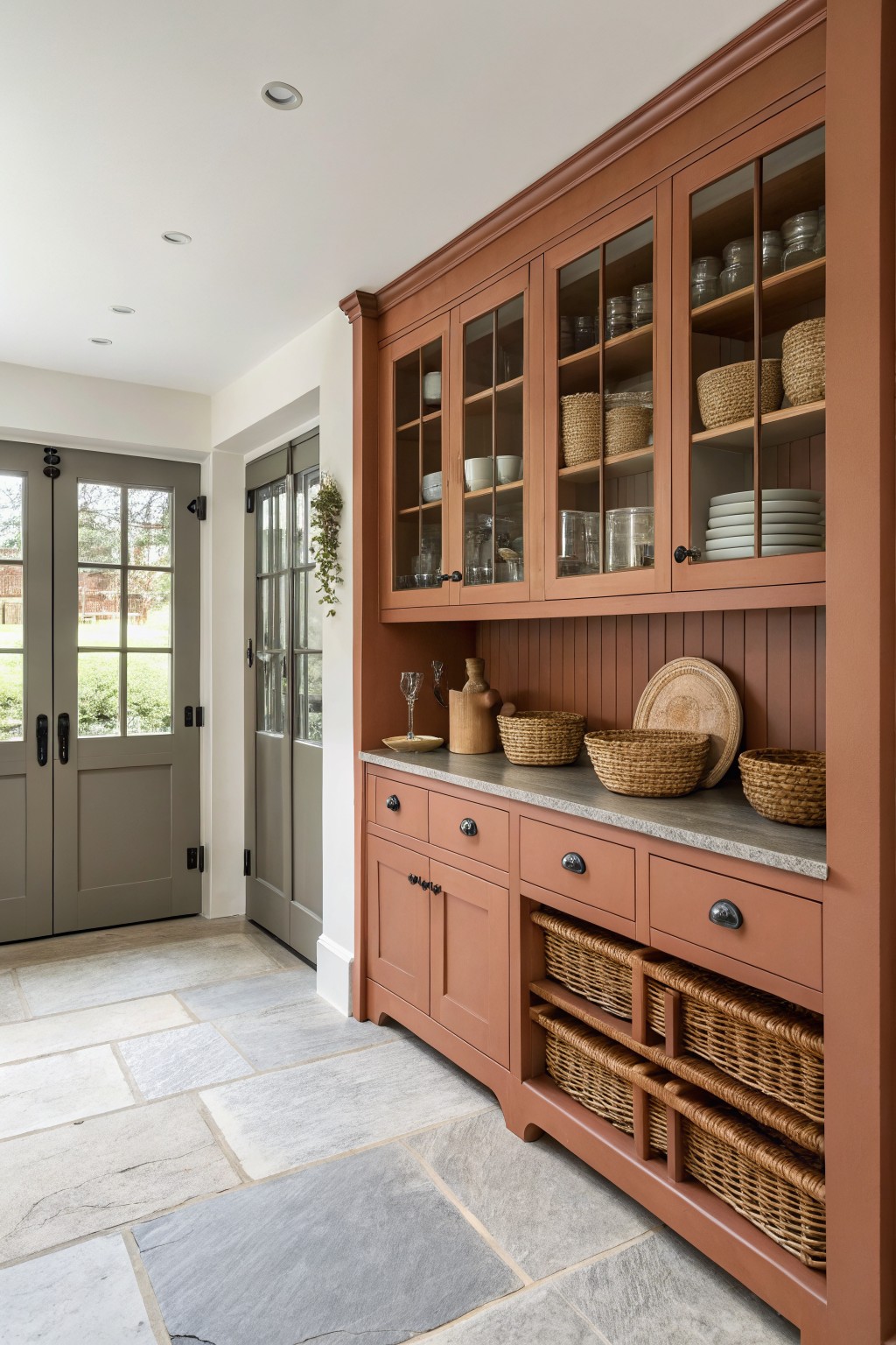
This warm terracotta on the built-in cabinets brings a soft earthy tone into the room. It sits in a nice middle ground between orange and brown, which helps it feel grounded without looking heavy next to the stone floor and counters. The color works especially well in spaces that already have natural textures like wood or woven pieces.
It carries a slight red undertone that shows up more in brighter light. This makes it a good choice for rooms with plenty of daylight, but it can look a bit deeper in shaded areas. Pair it with gray stone or light wood to keep the balance.
Warm Beige Siding
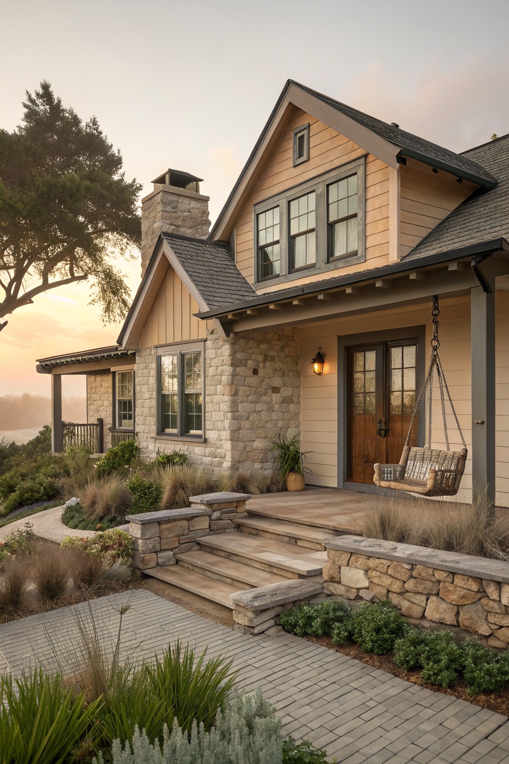
This house uses a warm beige on the siding that sits right between tan and soft gray. It feels natural next to stone and keeps the whole exterior from looking too stark or too dark.
The color has a slight golden undertone that shows up best in late light. It works well with darker roofs and simple trim, though it can look flat if the surrounding landscaping stays too sparse.
Warm Terracotta Living Room Walls

This warm terracotta color on the walls has a soft clay feel that grounds the space without making it heavy. It reads as a muted reddish brown with enough depth to feel cozy next to wood and stone.
The color has a gentle orange undertone that keeps it from looking flat in natural light. It pairs well with white trim and built-ins, though it can feel too dark in smaller rooms with little daylight.
Deep Terracotta Bathroom Walls
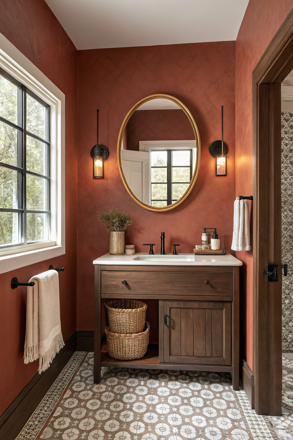
This bathroom shows a deep terracotta paint on the walls. It is a warm clay red that feels grounded and works well in smaller rooms where you want some color but still keep things natural.
The shade has soft orange undertones that sit nicely next to dark wood and patterned floors. It pairs best with warm woods and simple black fixtures, though it can look flat if the lighting is too cool.
Sage Green Siding
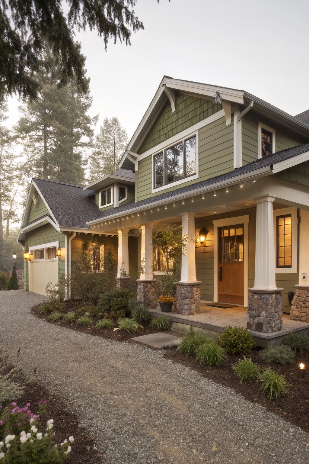
This house uses a soft sage green on the siding. It is a muted earthy tone that sits nicely between gray and green. The color feels calm and blends well with natural surroundings without standing out too much.
It has a slight gray undertone that helps it look steady next to stone and white trim. Sage green works best on homes with wood or stone accents and pairs easily with dark roofs or simple landscaping. Avoid using it in very shady spots where it can start to read flat.
Warm terracotta island cabinets
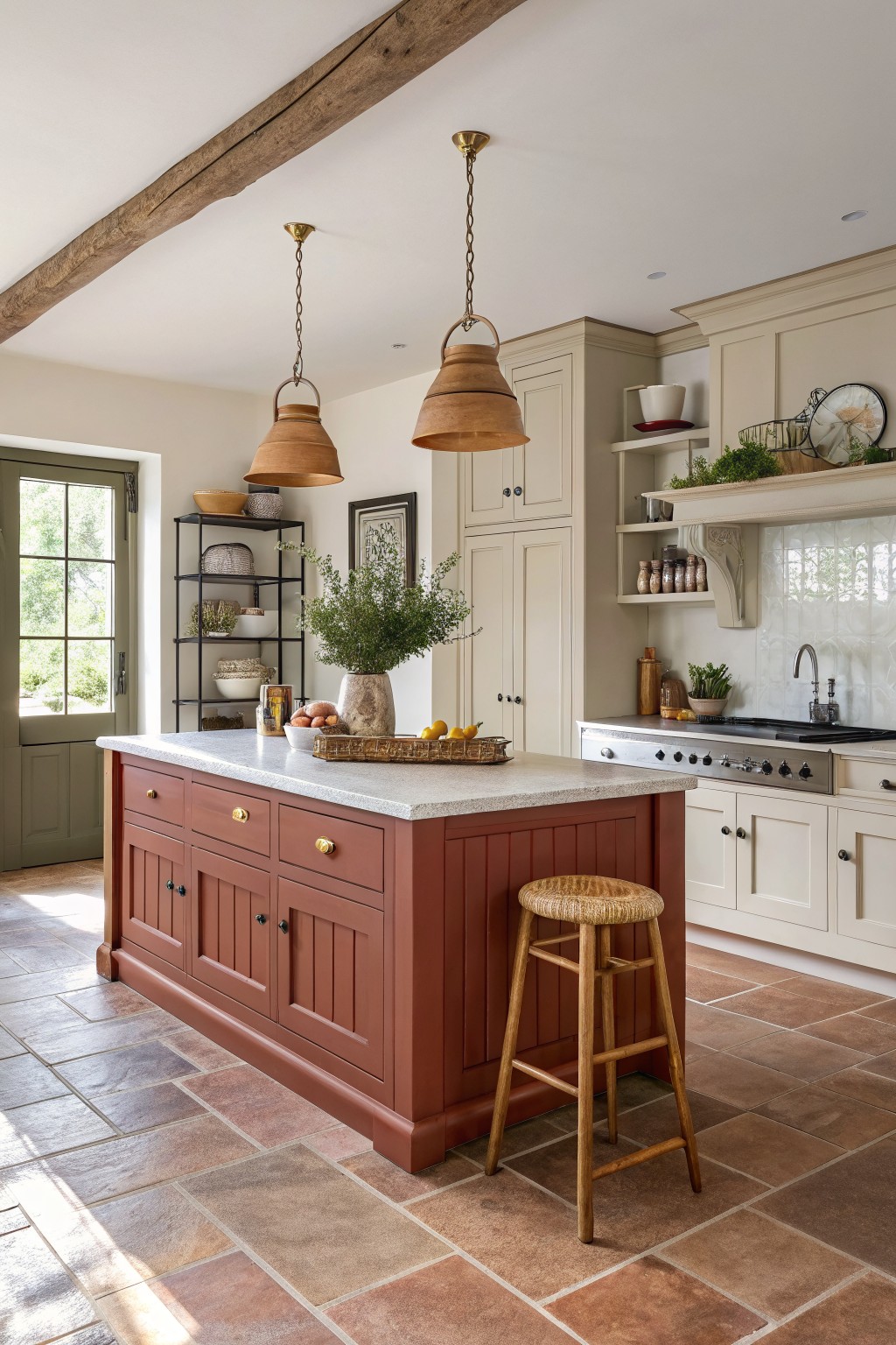
This earthy terracotta shade on the kitchen island gives the room a steady, grounded look. It sits in a warm clay red family and looks closest to Farrow & Ball Red Earth or Benjamin Moore Cayenne, with Sherwin Williams Fired Brick as another close option.
The color holds a soft orange undertone that keeps it from turning too pink or purple in most light. It works best when paired with cream cabinets, stone counters, and wood floors, and it stays balanced as long as the surrounding finishes stay light and natural.
Warm Terracotta Boho Walls
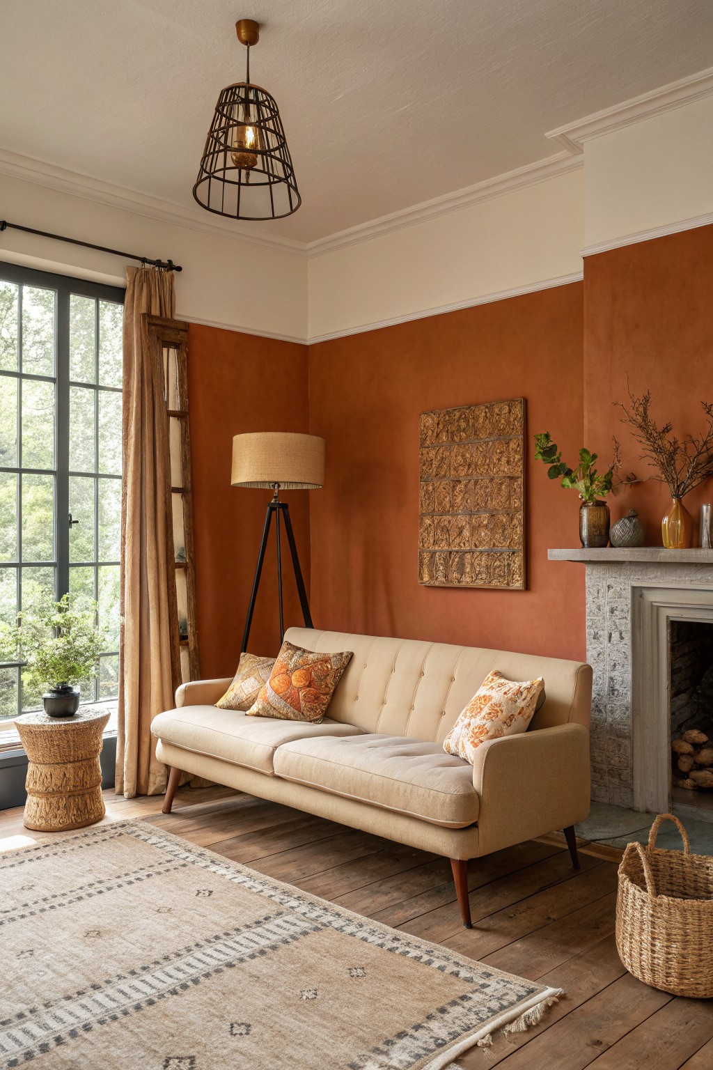
This terracotta color is a warm, earthy orange that sits somewhere between rust and clay. It gives the room a grounded feeling without making the space feel heavy or dark.
The shade has a slight red undertone that reads nicely next to wood floors and stone. It works best in rooms with plenty of natural light and pairs easily with woven textures or simple wood furniture.
Warm Greige House Siding

This warm greige on the stucco siding sits in that easy middle ground between beige and gray. It feels earthy without going too dark and pairs naturally with stone and wood details on the house. Many people like it because it stays calm next to different roofing colors and garden plantings.
It has a soft yellow undertone that shows up more in direct sun but stays quiet in shade. The color works best on homes with natural textures like stone paths or cedar accents. It can look a little flat if the trim is too bright white, so most people lean toward a warmer off-white or light taupe instead. Closest matches include Sherwin Williams Accessible Beige, Benjamin Moore Edgecomb Gray, Behr Toasted Almond, and Farrow & Ball Elephant’s Breath.
Soft Blue Gray Walls
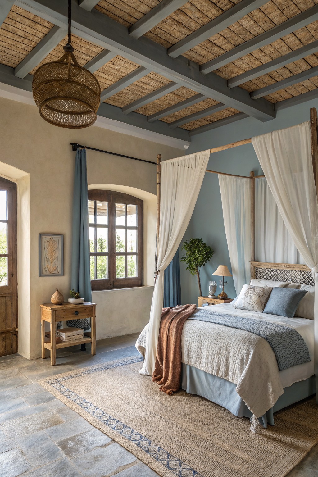
This soft blue gray brings a calm feel to boho rooms without turning cold. It sits somewhere between gray and blue, which helps it blend with wood beams, stone floors, and linen fabrics that show up in these spaces.
It works best in rooms with decent natural light since the gray side can come forward when the light drops. Pair it with warm wood tones or off-white trim to keep the look balanced and avoid a flat result.
Sage Green Cabinets
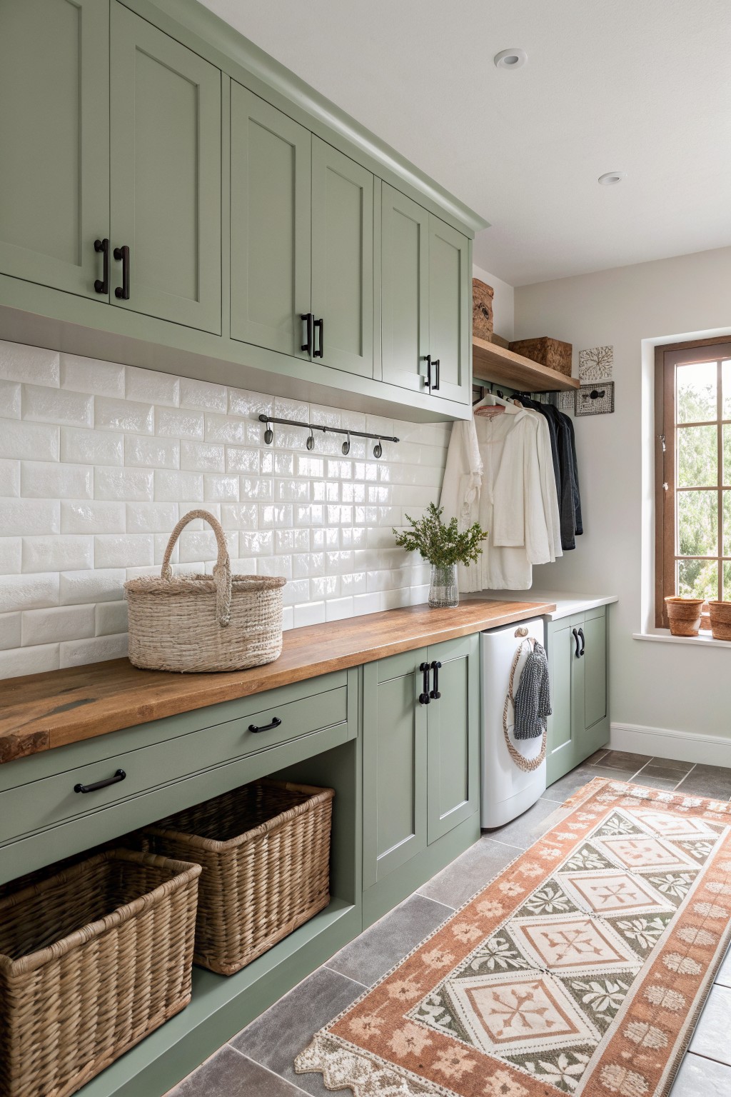
This muted sage green on the cabinets gives a calm earthy tone that feels grounded without being heavy. It sits somewhere between gray and green, which helps it blend with wood tones and natural textures. The color reads closest to Sherwin Williams Clary Sage, Benjamin Moore Saybrook Sage, Behr Aged Eucalyptus, or Farrow & Ball French Gray.
It works best in spaces that already have wood and stone, since the slight cool undertone keeps the green from turning too yellow in warmer light. Pair it with white tile or simple black hardware if you want the color to stay soft rather than bold.
Warm Terracotta Siding
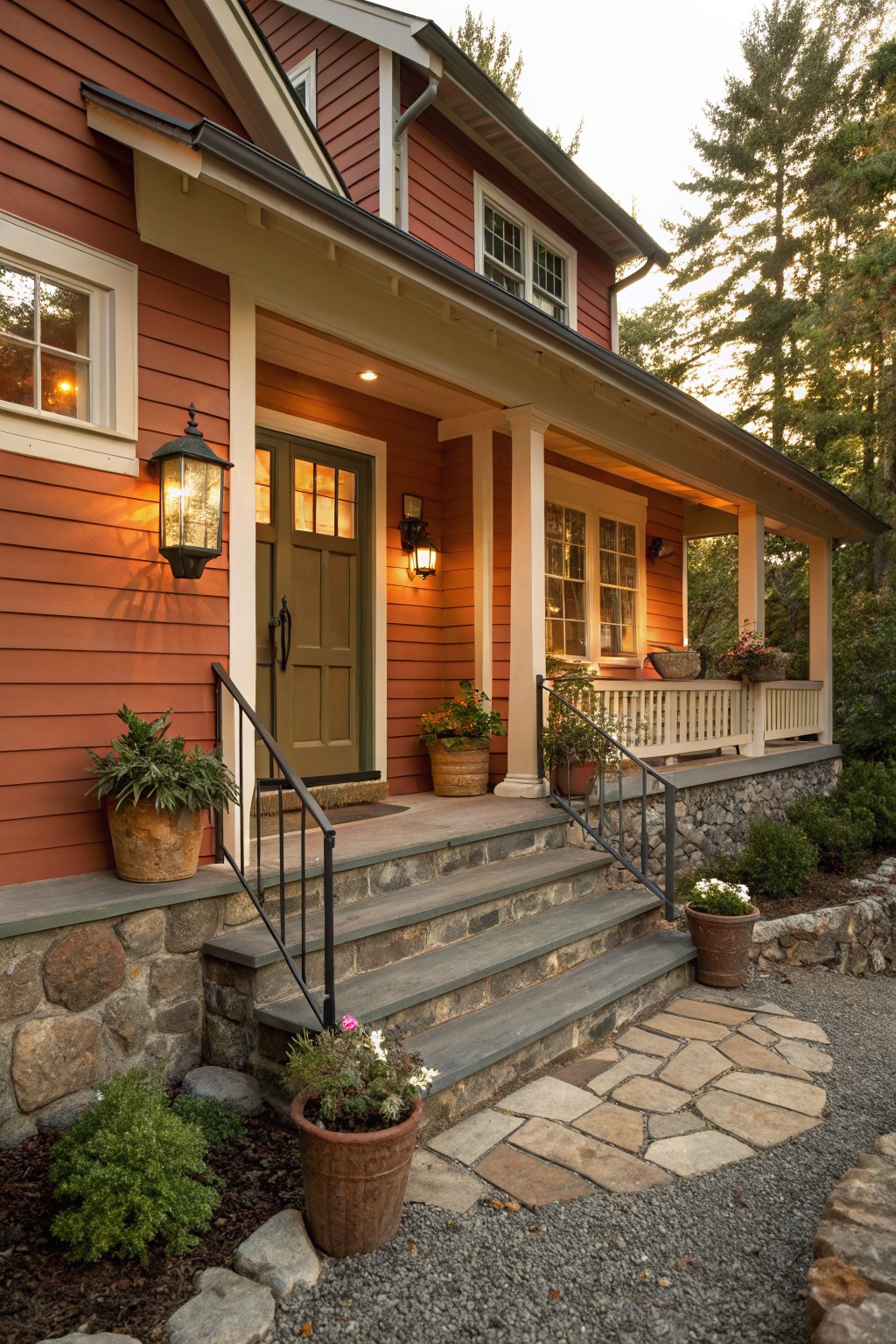
This siding uses a warm terracotta color that feels grounded and simple. It is a muted red orange with soft clay undertones that sit comfortably next to stone and wood without fighting them.
It works best on homes that already have natural textures nearby. Pair it with warm white trim and avoid cool grays that can make the color look flat or harsh in daylight.
Frequently Asked Questions
Q: Should I paint a whole wall to test these colors or just a small patch?
A: Paint a large poster board instead and move it around the room at different times of day. This shows you how the light hits the color without committing right away. You will spot any surprises fast.
Q: How do I add natural texture if I cannot afford new furniture?
A: Layer in woven baskets and linen curtains that pick up the paint hues. These pieces bring in that boho feel without much cost.
Q: Will these boho colors clash with my existing wood floors?
A: Earthy tones usually blend right in with wood because they mimic natural shades. Pick one color that has a hint of the floor’s undertone to tie everything together.









