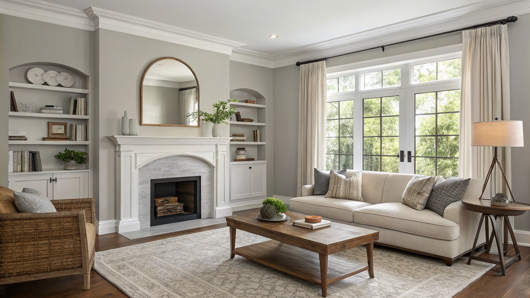
I have spent years watching how paint colors shift once they cover an entire wall and the light moves through the day.
The way light hits different walls can pull out undertones that were not obvious in the store sample.
I always place large swatches near the trim and next to the furniture to see how everything settles together.
A few schemes in the mix surprised me by staying steady from morning to evening without clashing.
Real rooms tell the truth.
Soft Greige Walls
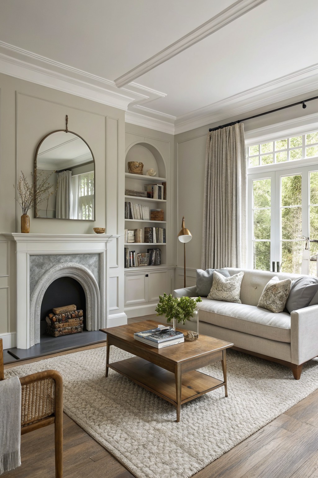
A soft greige with warm undertones works well here. It sits between gray and beige without leaning too far in either direction, which makes it easy to live with in a room that mixes older trim details with simpler furniture.
The warmth in the color keeps it from feeling flat next to the wood floor and stone around the fireplace. It pairs nicely with white trim and built-ins, and it holds up fine in both natural light and evening lamps.
Soft Sage Green Walls
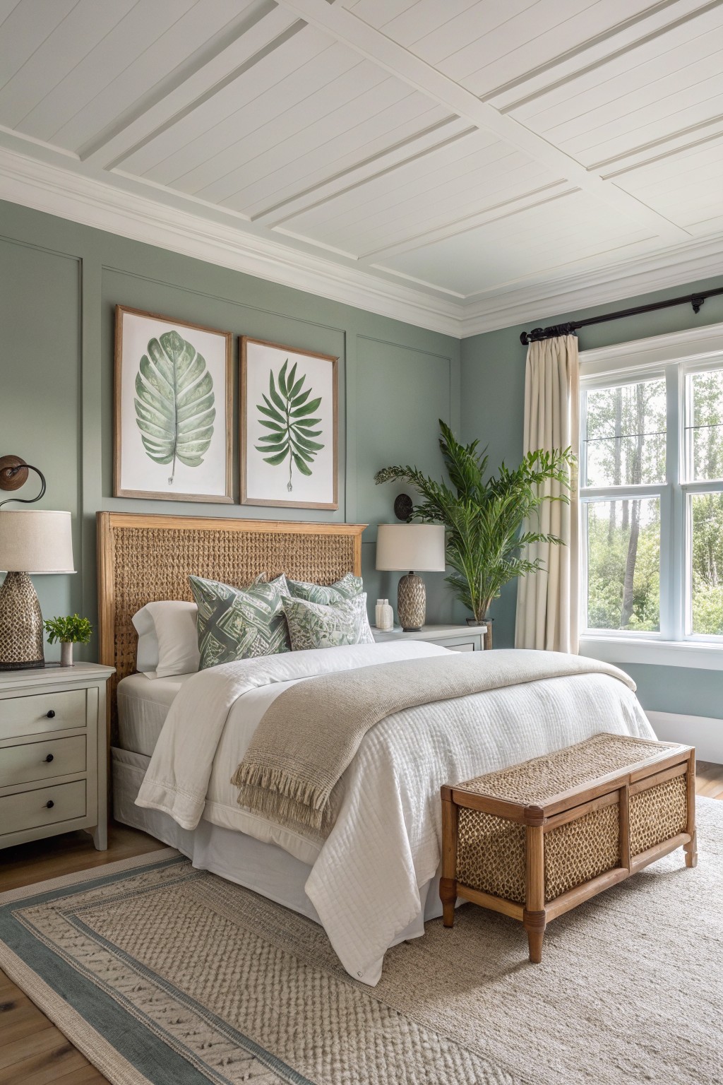
This soft sage green sits somewhere between gray and green. It has enough depth to feel grounded but stays light enough to keep the room open. Colors like Sherwin Williams Evergreen Fog, Benjamin Moore Saybrook Sage, or Behr Aloe Vera read very close to it. The result is a calm wall color that works with both older wood pieces and simpler modern furniture.
The undertone leans cool, which helps it sit well next to white trim and natural wood tones. It shows up best with plenty of daylight. In low light it can start to feel a little dull, so test it first if your room gets less sun.
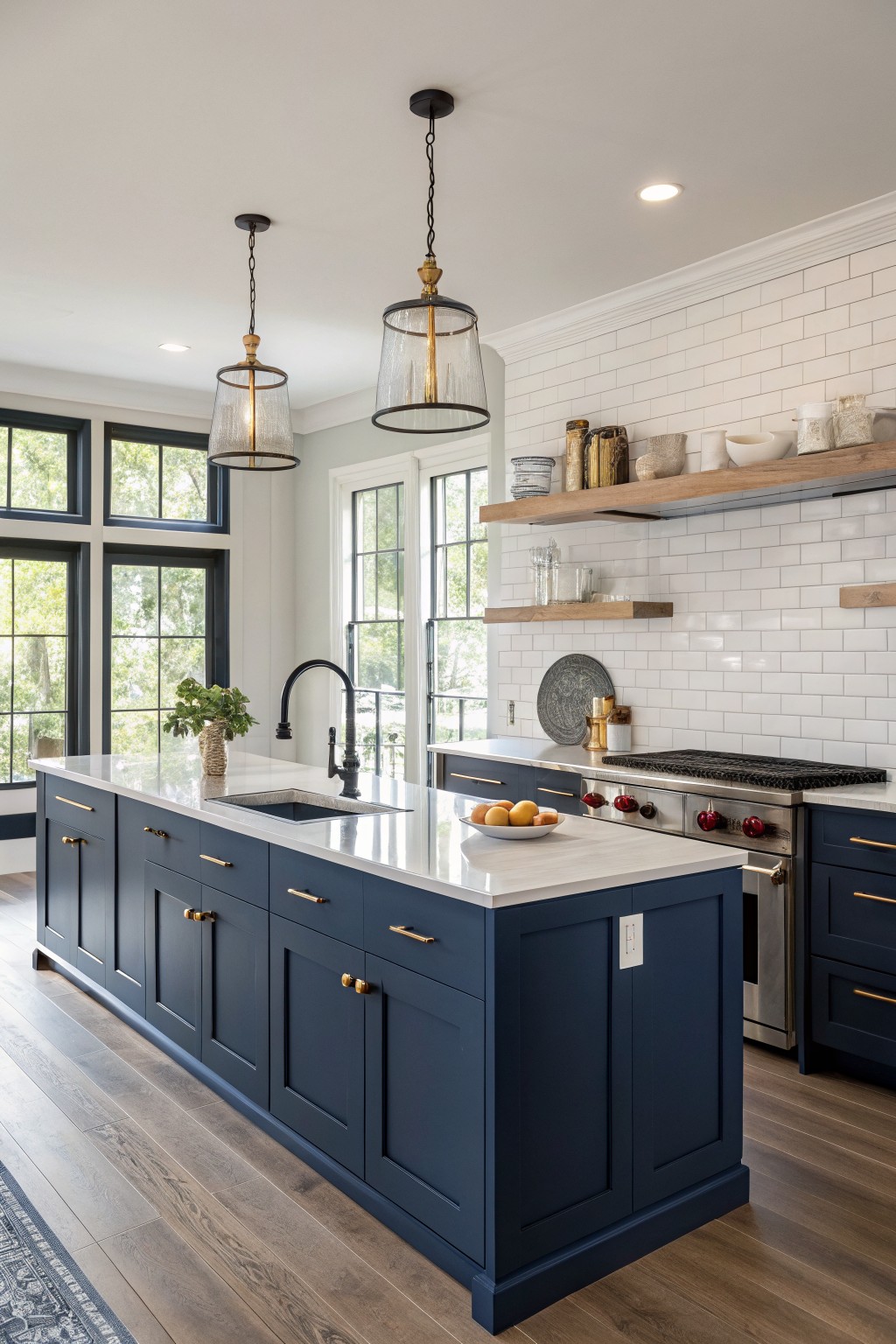
This deep navy blue works well on the cabinets because it brings a solid, grounded feel without making the kitchen feel closed in. It sits between classic and modern, so the room still reads fresh rather than heavy. The color has a cool base that stays steady next to white counters and wood floors.
It pairs best with warm wood tones and simple gold or brass hardware. In brighter light the blue can lean a touch greener, so test it on a sample board first if your kitchen gets strong afternoon sun. Similar shades show up as Sherwin Williams Naval, Benjamin Moore Hale Navy, and Farrow & Ball Hague Blue.
Soft Blue Gray Walls
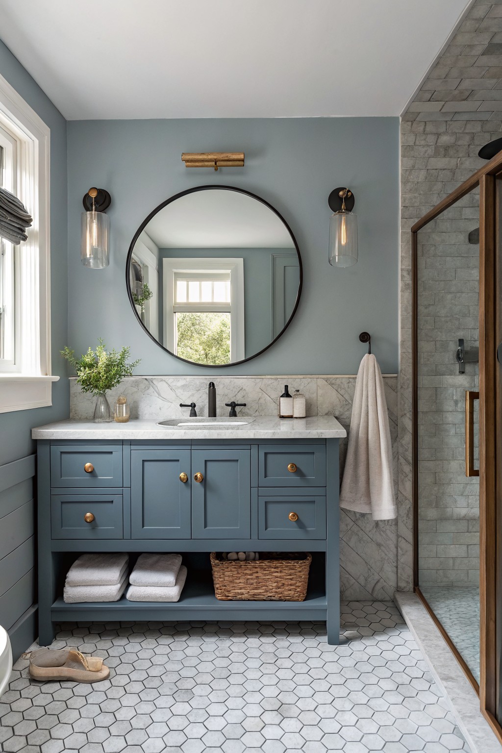
This soft blue gray reads as a gentle mix of blue and gray with cool undertones. It shows up on both the walls and the vanity here, which keeps the space feeling calm and pulled together. The color family works well in transitional homes because it sits between classic and modern without leaning too far either way. Likely matches include Benjamin Moore Wythe Blue, Sherwin Williams Rainwashed, Behr Silver Strand, and Farrow & Ball Pigeon.
It holds up nicely next to marble and wood tones, though it can look a bit flat in low light. Pair it with warm brass or black hardware to add contrast, and test a large sample first since the gray side shows more in some rooms than others.
Soft Yellow Walls
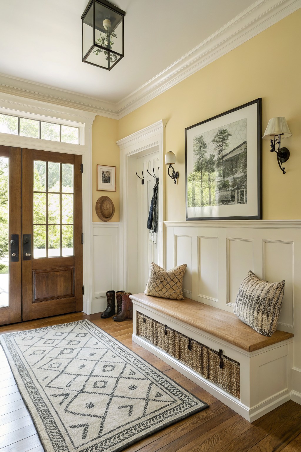
A soft yellow like this brings a gentle warmth to an entry without feeling too bold or dated. It reads as a pale, buttery shade that keeps the space feeling open and easy to live with.
The color has a light warm undertone that works best with white trim and natural wood floors. It pairs well in homes that mix older details with simpler furniture, though it can look washed out in very low light.
Warm Greige Walls

This room uses a warm greige on the walls. The color sits right between gray and beige with a soft, slightly brown cast that feels calm and easy to live with.
It has a light warm undertone that keeps the space from feeling too cool next to wood floors and cabinetry. The shade works well in dining areas or living rooms and pairs nicely with both painted trim and natural wood tones.
Soft Green Siding
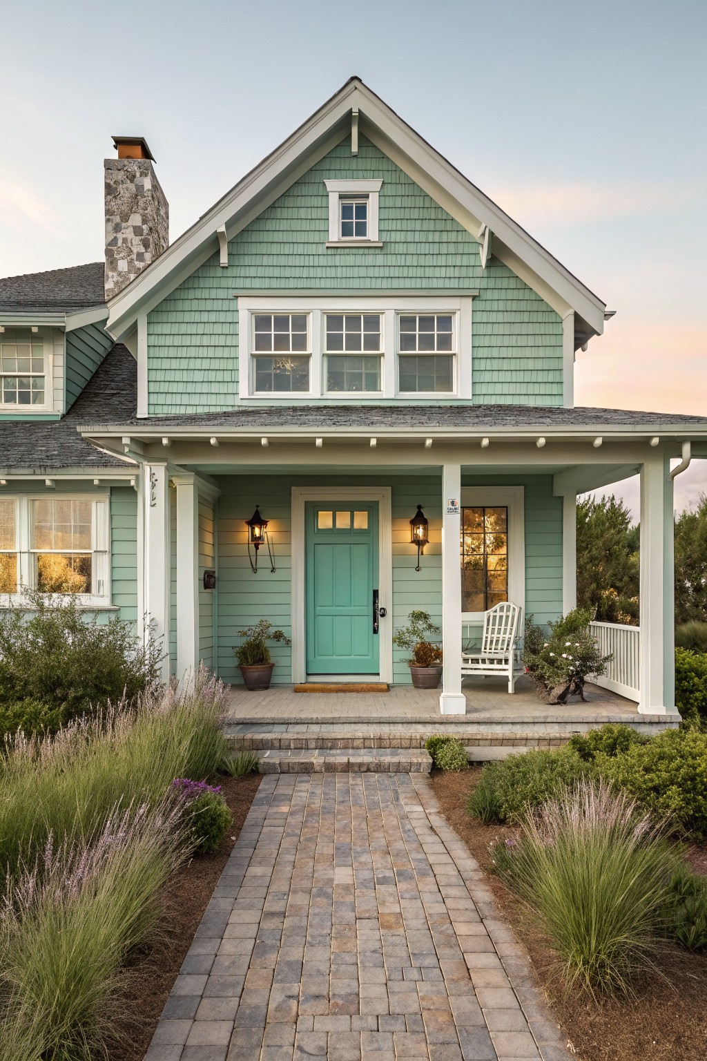
This soft sage green siding gives a house a quiet transitional feel without trying too hard. It sits between gray and green, so it works on both traditional and simpler homes. Similar shades include Sherwin Williams Sea Salt, Benjamin Moore Saybrook Sage, Behr Soft Sage, and Farrow & Ball Lichen.
The color has cool undertones that show up more in shade, which is why it pairs best with white trim and a darker roof. It can look a little flat on very sunny lots, so test it on a few boards first.
Muted Sage Green Paneling
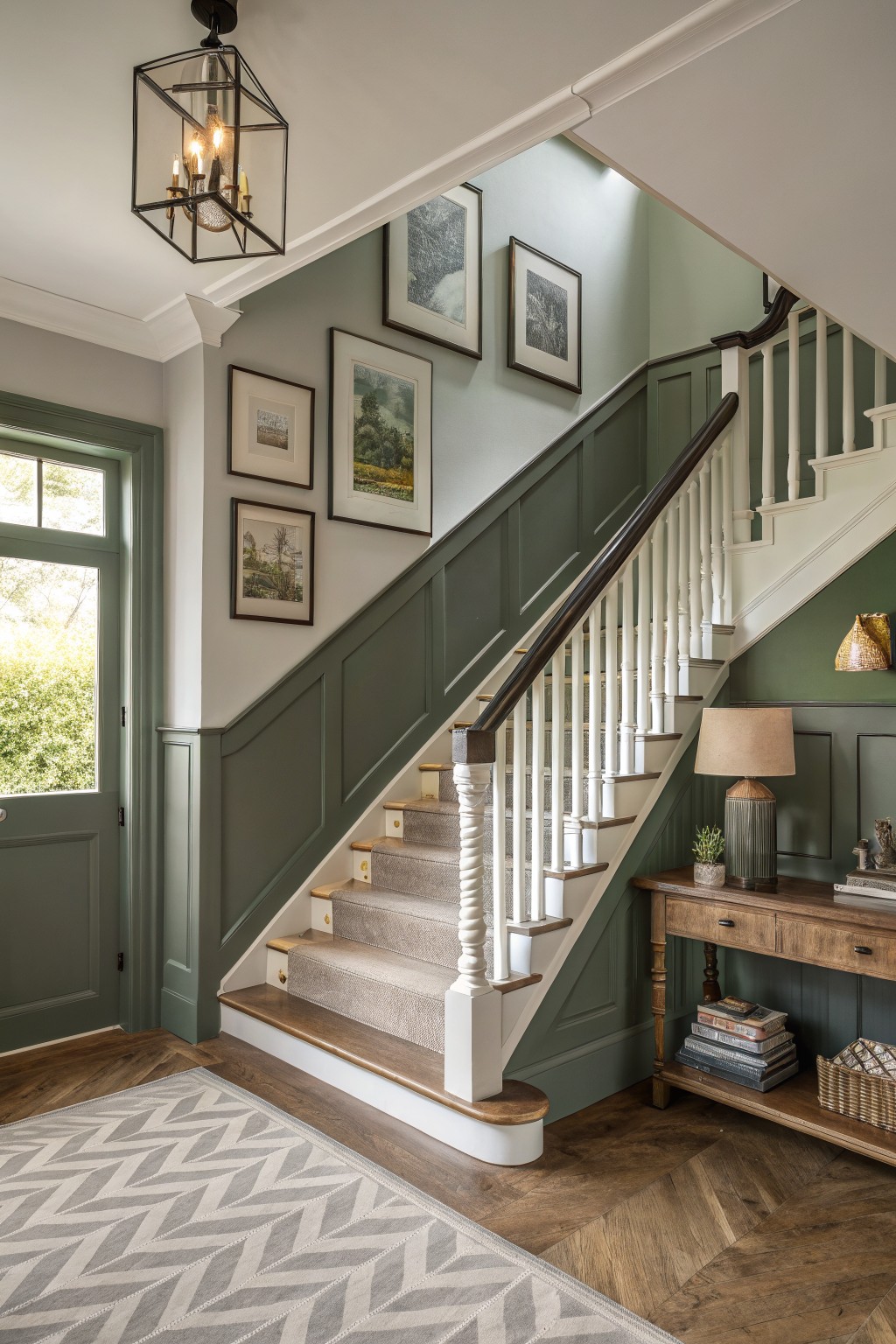
This muted sage green works well on the lower walls and stair paneling because it sits between gray and green without leaning too far either way. It feels calm next to the warm wood floor and white trim, and it keeps the space from looking too stark or too dark. Colors like this often read softer in real rooms than they do on a swatch.
It has a light gray undertone that helps it stay neutral in changing light, so it pairs easily with both white balusters and darker wood tones. Try it in hallways or stair areas where you want some color but still need the space to feel open. Benjamin Moore Saybrook Sage, Sherwin Williams Evergreen Fog, or Behr Aged Eucalyptus all sit close to this look.
Bright White Siding
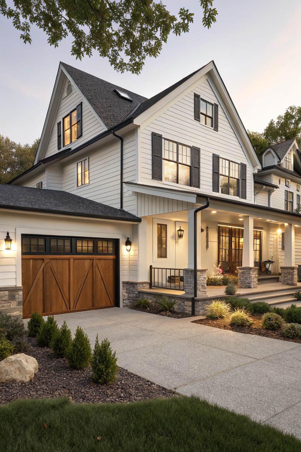
This house uses a bright white on the siding. It reads as a clean, slightly warm white that works for transitional homes because it feels classic without looking dated or too stark.
It sits well next to the dark roof and wood garage door. Try something like Benjamin Moore Chantilly Lace, Sherwin Williams Pure White, or Behr Ultra Pure White if you want a similar fresh look on an exterior.
Deep green walls
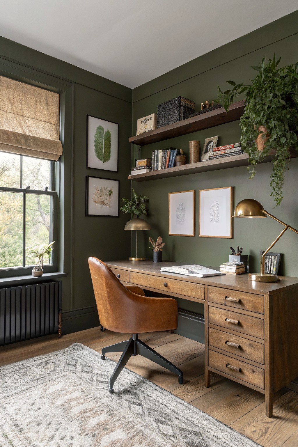
This deep green reads as a warm olive tone that sits nicely between classic and modern. It gives a room weight without feeling heavy, and it works especially well in spaces that already have wood tones and natural light. Colors like this often come across as grounded and flexible at the same time.
It has a slight earthy undertone that keeps it from looking too cool next to brown wood floors or leather. Try it in an office or library where you want some depth but still need the room to feel usable during the day. Pair it with warm wood furniture and simple black or brass accents so the green stays the main focus.
Warm Terracotta Walls

This wall color is a warm terracotta that sits between red and orange without going too bright. It gives the space a grounded feel that still works with lighter cabinetry and wood tones around it. The color holds up well next to the stone floor and the open storage below the bench.
It has a slight earthy undertone that keeps it from feeling too sweet or pink in natural light. This shade pairs nicely with warm woods and black hardware, though it can look flat if the room gets very little daylight. It suits entry areas or mudrooms where you want something a little different from plain beige.
Soft greige siding

This house uses a soft greige on the siding. It sits right between gray and beige, giving the exterior a quiet, updated look that still feels grounded.
The color has a light warmth that helps it blend with stone and dark shutters without turning cool or flat. It works well on homes that want a simple update while keeping some traditional feel. Try it with white trim or natural wood doors to keep the balance right.
Deep Blue Gray Walls

This deep blue gray on the walls brings a transitional look that feels both familiar and updated. It sits somewhere between navy and charcoal, which keeps the space from feeling too stark or too dark.
The color has a cool undertone that works well with gray cabinetry and white marble. It suits bathrooms or small rooms that get decent light, though it can start to feel heavy in spaces with little natural light.
Warm Greige Exterior Siding
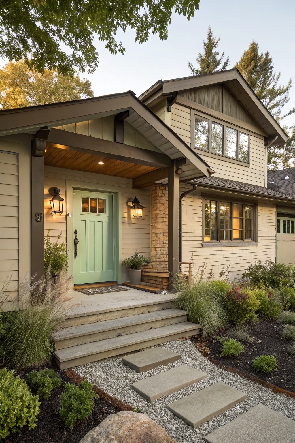
This house uses a soft greige on the siding. It sits right between gray and beige, giving a warm neutral that still feels current without looking too stark against the roof and trim.
The color has a slight warm undertone that helps it blend with wood accents and brick details. It works well on homes that mix traditional shapes with simpler modern lines, and it pairs nicely with both dark and light trim depending on the overall look you want.
Muted Sage Green Bedroom Walls
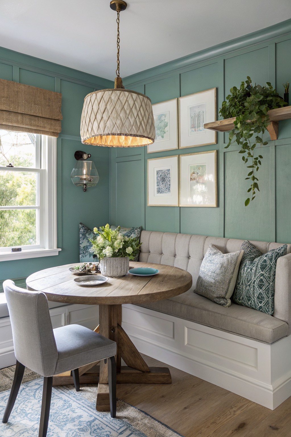
A muted sage green on the walls gives a room that calm transitional feel without going too traditional or too modern. This shade sits between green and soft teal, and it works because it feels quiet next to warm wood and white trim. Colors like Sherwin Williams Clary Sage, Benjamin Moore Saybrook Sage, or Farrow and Ball Pigeon come close to the look.
The color has cool undertones that show up more in bright light, so it suits rooms with good natural light. It pairs well with white trim and wood furniture, but it can feel a little chilly if the space gets mostly warm artificial light.
Soft Sage Green Siding
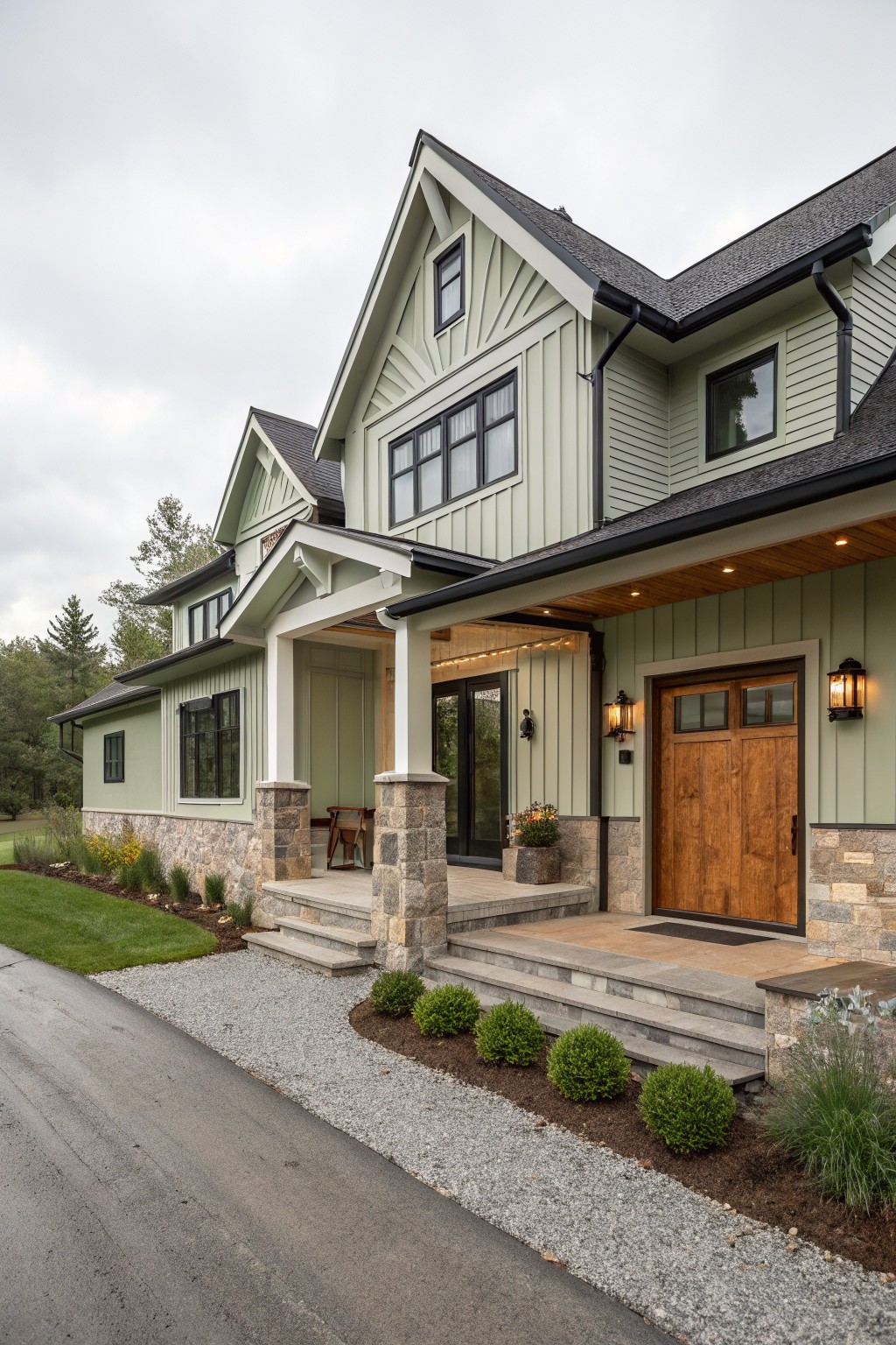
This house uses a soft sage green on the siding. It is a muted green with gray undertones that feels balanced and easy to live with. The color reads closest to Benjamin Moore Saybrook Sage or Sherwin Williams Clary Sage. Behr Soft Fern gives a similar quiet tone as well.
It works well with stone at the base and wood details nearby. The shade stays calm in changing light and suits homes that want something fresh without going too bright or too cool outside.
Soft Peach Walls
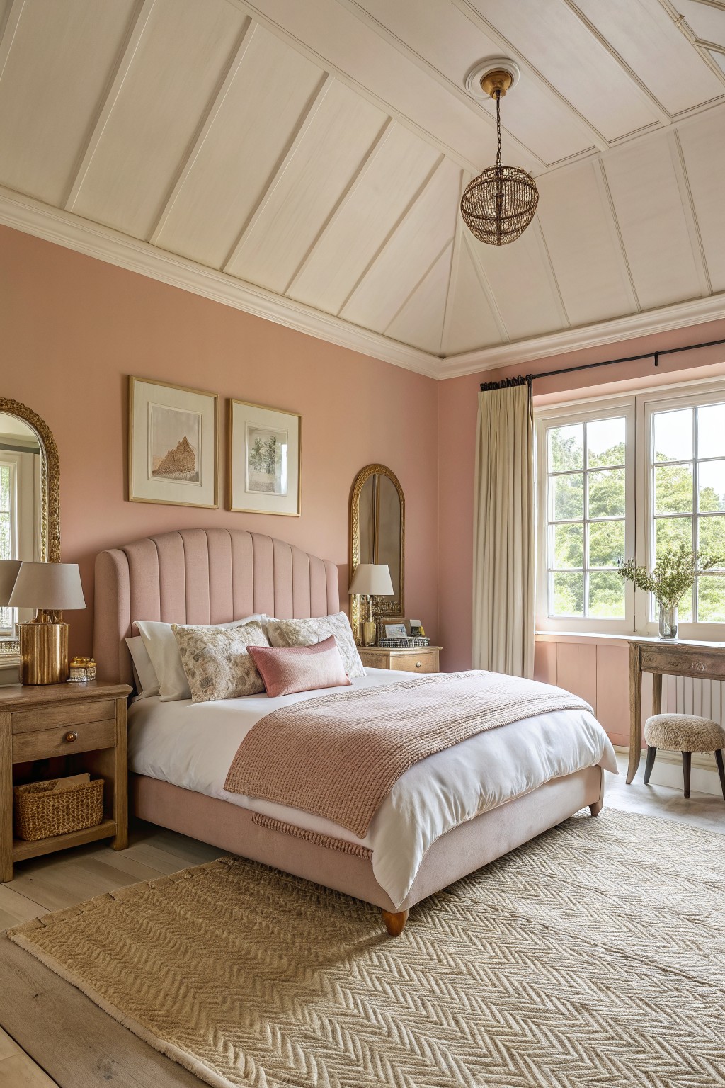
This muted peach color on the walls gives a warm, gentle feel that works well in a bedroom. It sits in that soft peach-pink family and reads closest to Farrow & Ball Setting Plaster, Benjamin Moore Pale Apricot, Sherwin Williams Warm Blush, or Behr Soft Coral.
The undertone stays warm without turning too orange, so it pairs nicely with wood floors and white bedding. It suits spaces that need a bit of color but still feel calm and easy to live with.
A Soft Teal Front Door

This soft teal door color sits in the blue green family and gives the house a quiet but noticeable lift. It feels calm against the white siding and keeps the overall look simple rather than busy.
The color has some gray in it, so it stays easy to live with next to wood accents and dark trim. It works best on homes that blend classic shapes with cleaner lines, and it pairs well with natural materials without fighting them.
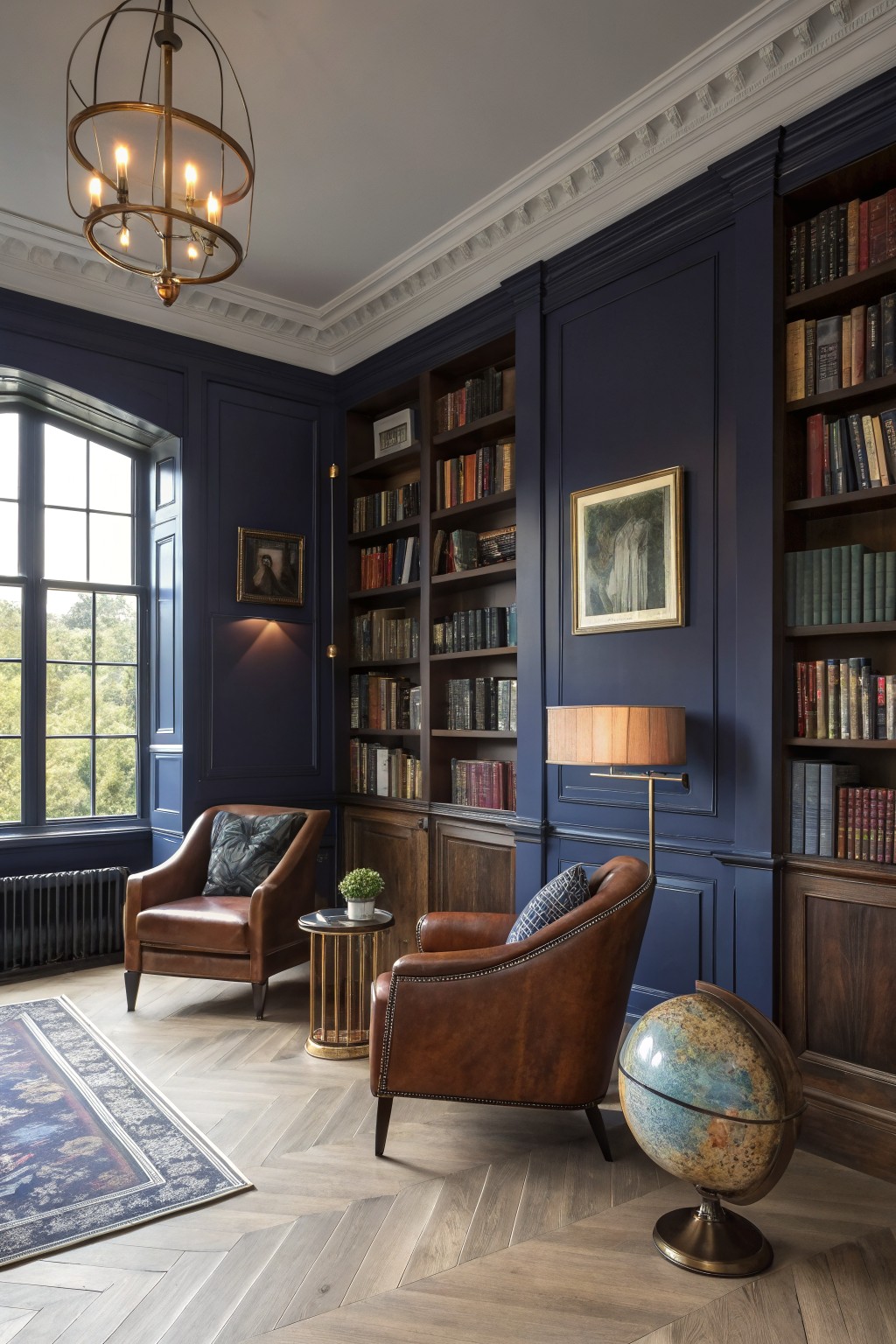
This deep navy blue gives the walls a solid, grounded feel that works especially well with wood built-ins. It reads as a true navy rather than a black or charcoal, and it sits comfortably next to the warm wood tones in the room. Colors like this often show up in transitional spaces because they add depth without making the room feel closed in.
It has a cool undertone that can lean slightly purple in certain lights, so it helps to test it on a larger swatch. The color works best with natural wood floors or leather furniture, and it pairs cleanly with white or off-white trim. Sherwin Williams Naval, Benjamin Moore Hale Navy, and Farrow & Ball Hague Blue all land close to this shade.
Frequently Asked Questions
Q: How do I test these transitional colors on my walls without wasting time? A: Paint a few large patches right on the wall and live with them for a few days. Watch how morning and evening light shifts the hue so you know what you are really getting.
Q: My wood floors lean warm. Which shades from the list will still feel balanced? A: Choose cooler grays or muted blues that pull the warmth down a notch. They keep the classic floor from feeling too heavy while the room stays current.
Q: Can I carry one color into the hallway and still make it work? A: Yes, repeat the same wall color but switch to a slightly lighter trim shade. The repeat ties the spaces together without making everything match exactly.









