I often find that a color I liked on the store wall ends up looking quite different once it covers all four walls in my living room and the furniture is arranged again.
The way light moves across the space during the day can pull out undertones that were not obvious at first, especially when they meet the existing flooring and window trim.
I test a few options on the actual walls before committing.
Furniture and trim colors also play a bigger role than most people realize when they narrow down their choices.
Testing in real conditions shows which shades hold up through everyday use without feeling off.
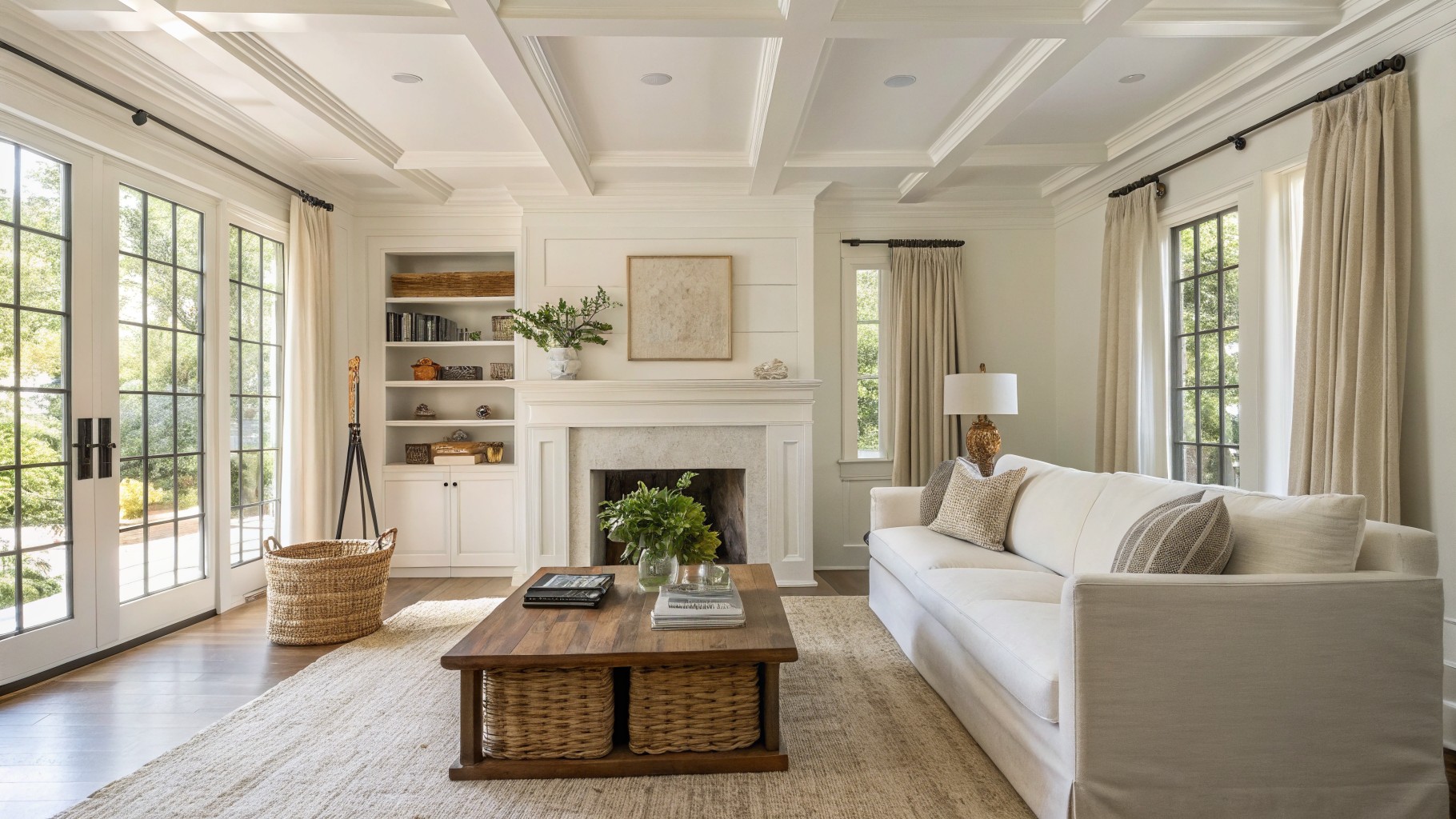
Bright White Living Room Walls

A bright white covers the walls and trim here. It keeps the room feeling open and simple, which works well for everyday use. Colors like Sherwin Williams Pure White, Benjamin Moore Chantilly Lace, or Behr Ultra Pure White give off that same clean effect.
This white has a slight cool lean that sits nicely next to the wood tones in the floor and coffee table. It works best in spaces with plenty of light and pairs easily with soft fabrics or natural textures.
Warm Beige Walls

This warm beige paint color gives the living room a quiet, settled look that feels easy to live with every day. It sits in that soft middle ground between beige and light taupe, with just enough warmth to keep the space from feeling flat or cold.
The color reads especially well against wood tones and brown leather. It pairs nicely with both painted trim and natural wood finishes without competing. Try something close to Sherwin Williams Accessible Beige, Benjamin Moore Edgecomb Gray, or Behr Creamy Mushroom if you want a similar effect.
Soft Sage Green Walls

This sage green gives the living room a calm, settled look that still feels fresh during the day. It sits in that gray-green range with a cool but soft undertone, so it never reads too blue or too yellow. Sherwin Williams Evergreen Fog, Benjamin Moore Saybrook Sage, and Farrow & Ball Mizzle all land close to this tone.
The color works well on the paneled walls and built-ins because it lets the wood floor and blue sofa stay the main focus. White trim keeps everything light, and the green holds up fine even when the light shifts through the day. It suits rooms that get steady use without needing constant updates.
Warm Terracotta Walls
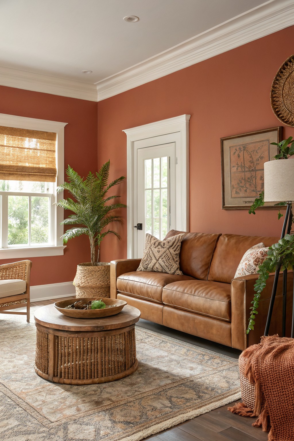
This warm terracotta brings a soft earthy orange to the walls that feels steady and lived-in. It has enough red to read cozy but stays muted so it does not overwhelm a room with regular daylight.
The color sits comfortably next to white trim and wood floors. It works best in spaces that already have warm wood tones or leather furniture, and it can look a little flat if the room gets only cool north light. Likely matches include Sherwin Williams Red Clay, Benjamin Moore Coral Clay, Behr Baked Terracotta, and Farrow & Ball Red Earth.
Deep Teal Living Room Walls
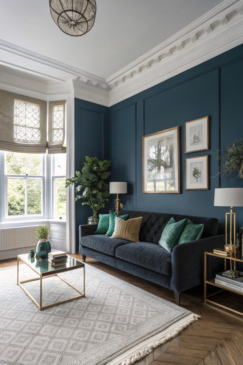
This deep teal blue gives a living room a calm, settled look that still feels everyday. It has enough depth to make the space feel enclosed without turning it dark, and the slight green undertone keeps it from reading flat next to wood floors and white trim.
It works best in rooms with decent natural light, since the color can shift cooler in the evening. Pair it with warm neutrals, brass, or cream upholstery to balance the tone, and avoid too many cool grays that might make the walls feel chilly.
Soft Greige Walls
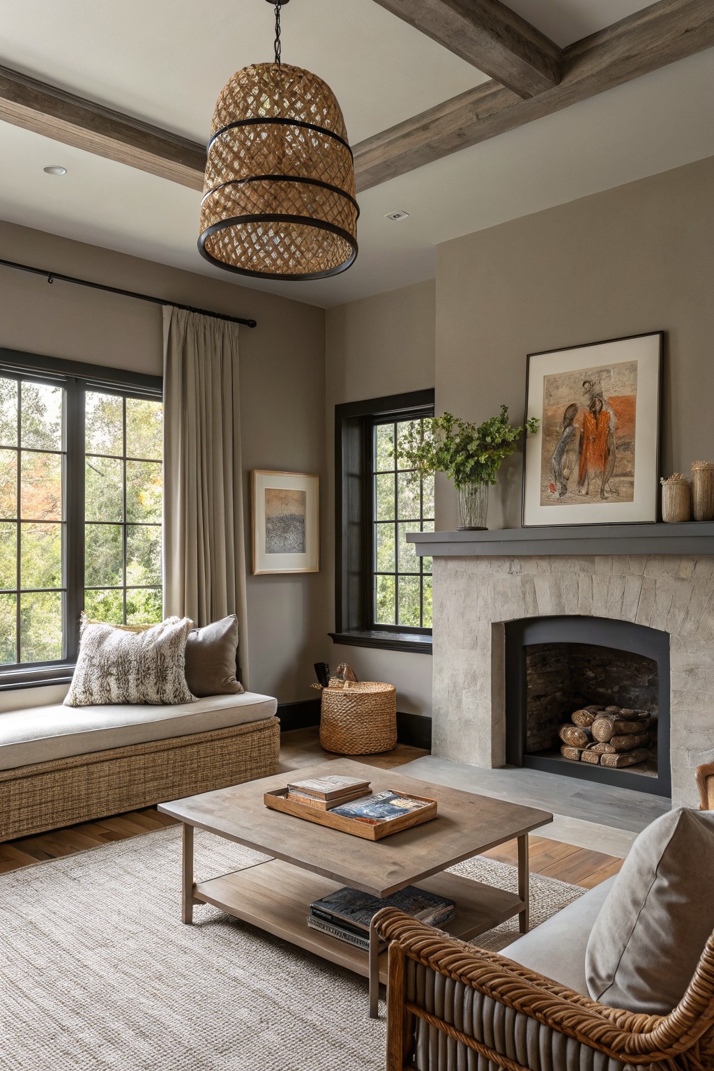
A soft greige covers the walls here. It is a warm neutral that blends gray and beige, giving the room a calm, settled look that works for daily use.
The color carries a slight warmth that sits comfortably next to wood beams and stone. It handles mixed lighting well and pairs easily with linen, leather, or darker wood tones. Try Sherwin Williams Repose Gray, Benjamin Moore Revere Pewter, Behr Greige, or Farrow & Ball Elephant’s Breath for a close match.
Soft Blue Gray Walls
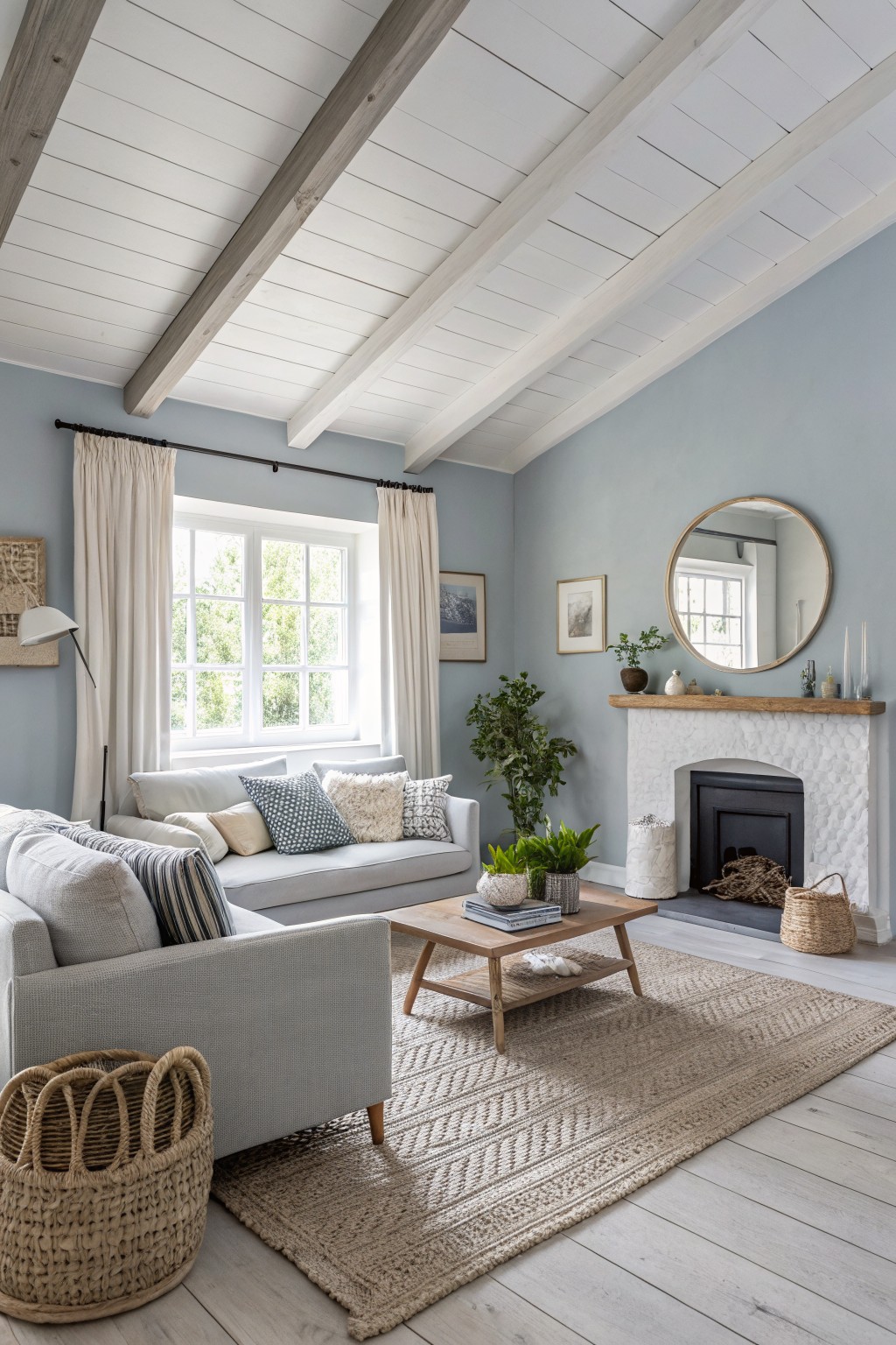
This soft blue gray gives living rooms a calm, relaxed feel that still has enough color to keep things interesting. It lands in that middle ground between gray and blue, so it reads as gentle rather than bold and works for daily living without feeling stark.
The color carries cool undertones that sit nicely against white trim and wood beams. It performs best with plenty of natural light and pairs easily with linen, soft textiles, or simple wood furniture. Test a sample first because the blue can look a touch greener or grayer depending on the light.
Soft Warm Sage Green Walls
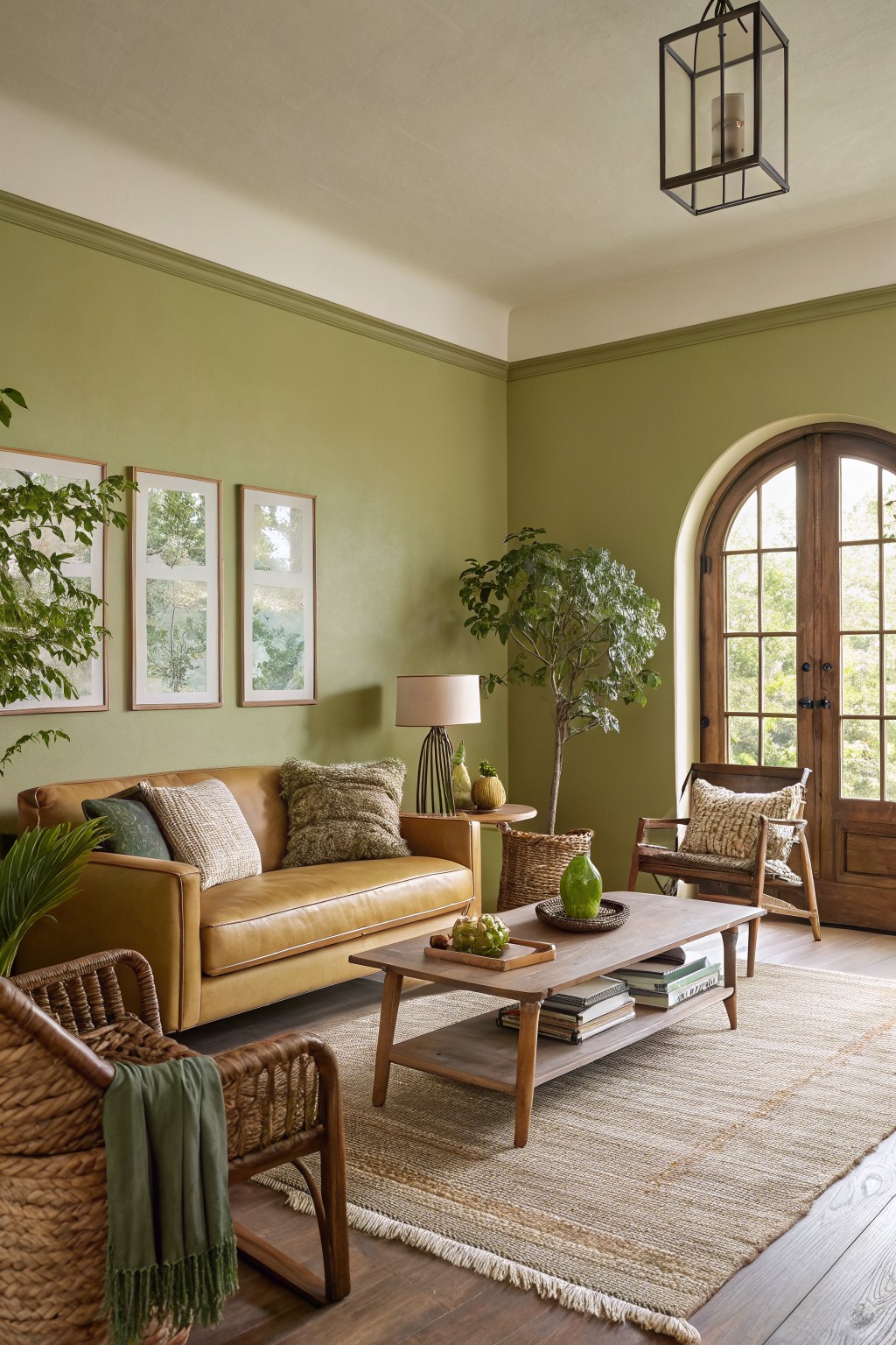
This living room uses a soft sage green on the walls. It is a muted green with warm undertones that feels calm without going too cool or gray.
The color reads nicely against wood floors and leather seating. It works best in rooms with steady daylight and pairs easily with natural textures like jute or rattan.
Soft Blue Walls
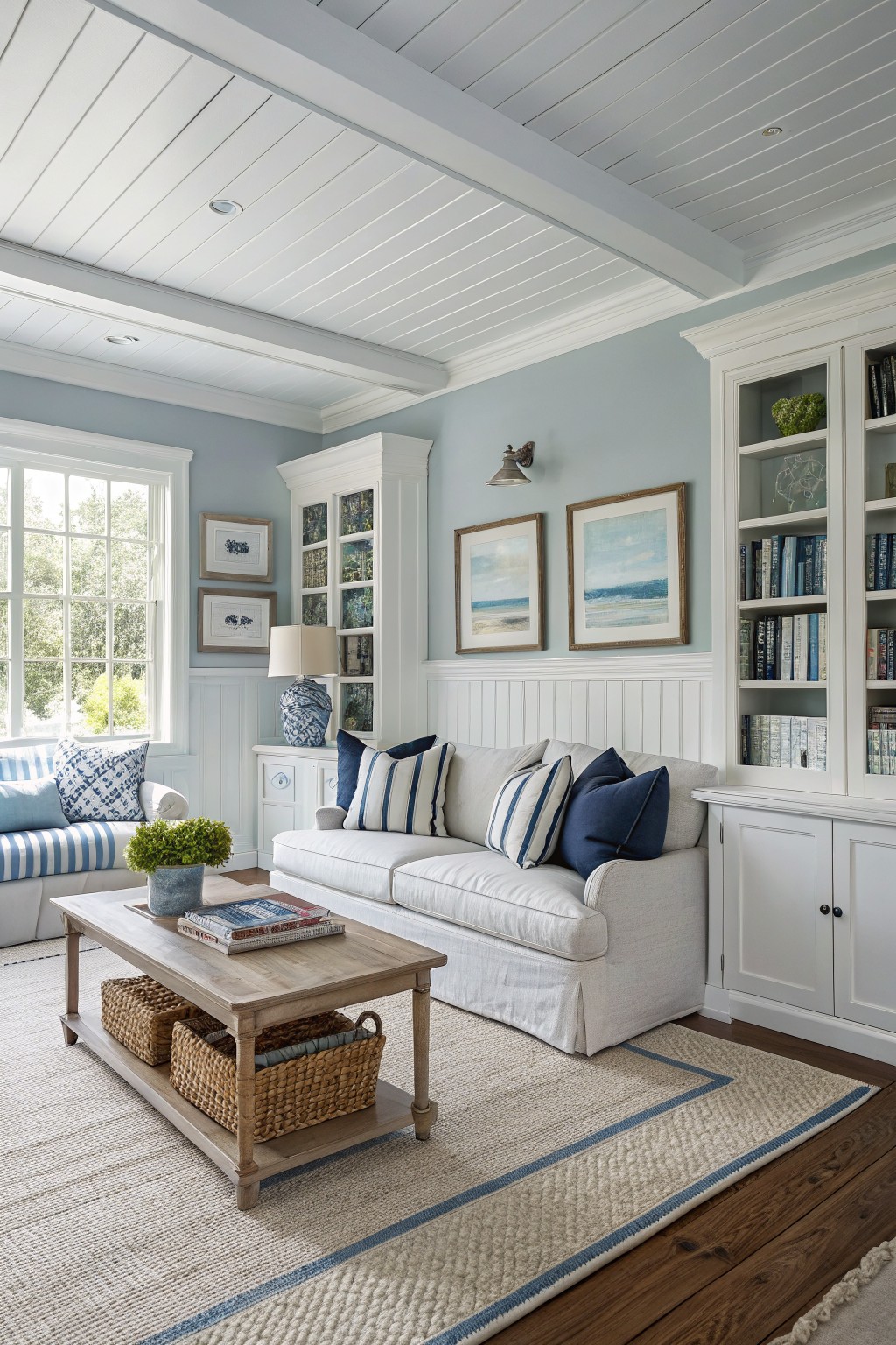
This light blue-gray gives a living room a calm, easy feel that works for everyday use. It sits in the cool family of blues but stays pale enough to feel airy rather than heavy, and the slight gray undertone helps it read as quiet instead of bright.
The color looks best with crisp white trim and warm wood floors, which keep it from turning too chilly. It suits homes that get steady daylight, and it pairs well with simple fabrics and neutral upholstery so the walls stay in the background.
Deep Terracotta Living Room Walls
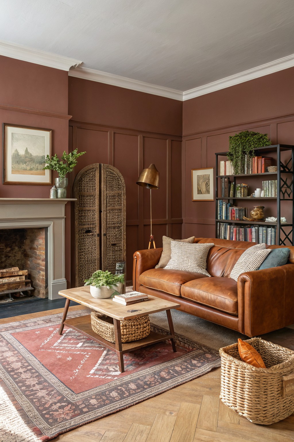
This deep terracotta color on the walls brings a steady, earthy feel to the room. It sits between brown and red with enough warmth to feel inviting rather than heavy.
The tone has a soft clay undertone that pairs easily with wood trim and leather. It works best in rooms with decent natural light, where it can read a little richer without turning flat.
Soft Yellow Walls
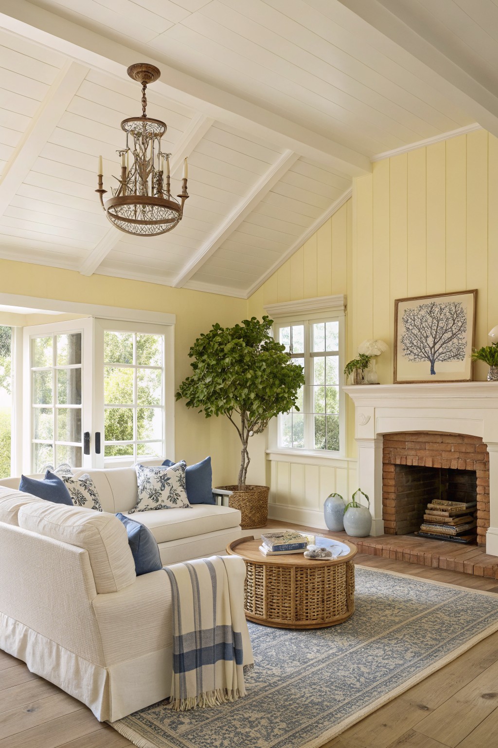
This living room uses a soft pale yellow on the walls. It is a light warm color that sits between cream and true yellow. The tone feels easy and calm for everyday living without pushing too hard.
The yellow has a gentle creamy undertone that reads nicely against white trim and wood floors. It works best in rooms with steady daylight and pairs simply with blue textiles or neutral seating. Similar shades include Benjamin Moore Lemon Ice, Sherwin Williams Happiness, Behr Sunbeam, and Farrow & Ball Pale Hound.
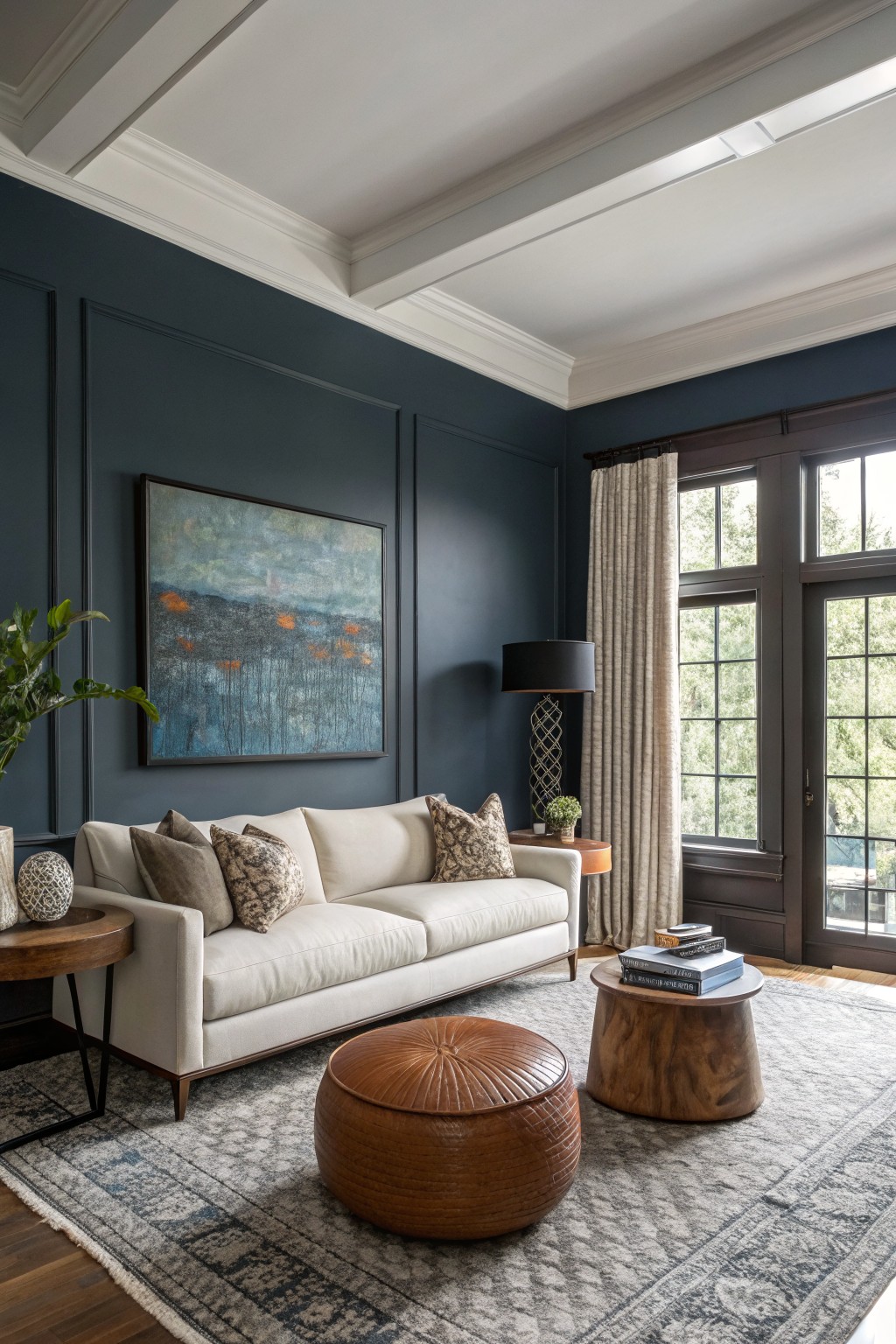
This deep navy blue on the walls creates a calm, settled feeling in a living room without making the space feel closed in. It sits in that cool navy range with enough depth to feel substantial but not heavy, and it reads evenly across larger wall areas.
The color has a slight gray undertone that helps it stay steady next to white trim and wood floors. It works best in rooms with decent natural light and pairs easily with cream upholstery or warm wood furniture. Dark navy can start to feel flat if the room gets very little daylight, so test it on a large sample first.
Muted Sage Green Living Room Walls

This soft sage green has a muted, slightly gray tone that feels calm and easy in a living room. It sits between green and gray without leaning too far either way. Colors like Sherwin Williams Sea Salt, Benjamin Moore Saybrook Sage, or Behr Quietude give a similar look.
The color works well with white trim and light wood floors, and it stays relaxed next to simple fabrics and natural textures. It needs decent daylight to keep from feeling flat or cool in the evening.
Earthy Terracotta Living Room Walls
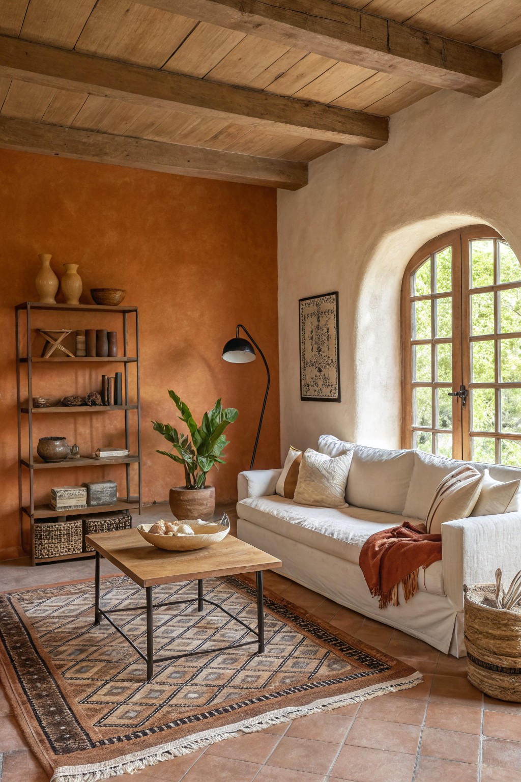
A warm terracotta works well when you want a living room that feels grounded without looking heavy. This color sits between orange and brown, with enough red in it to read cozy next to wood tones and clay tile. It gives the space a simple, lived-in look that does not need a lot of extra color to feel finished.
It has a soft earthy undertone that stays steady in both morning and afternoon light. Pair it with natural wood furniture, linen upholstery, and a few woven textures so the walls do not overpower the room. Too much white trim can make it feel stark, so a softer off-white or stained wood trim usually sits better with it. Best matches would be Sherwin Williams Rustic Adobe, Benjamin Moore Cinnamon Stick, Behr Baked Terracotta, or Farrow & Ball Red Earth.
Light Blue Gray Living Room Walls
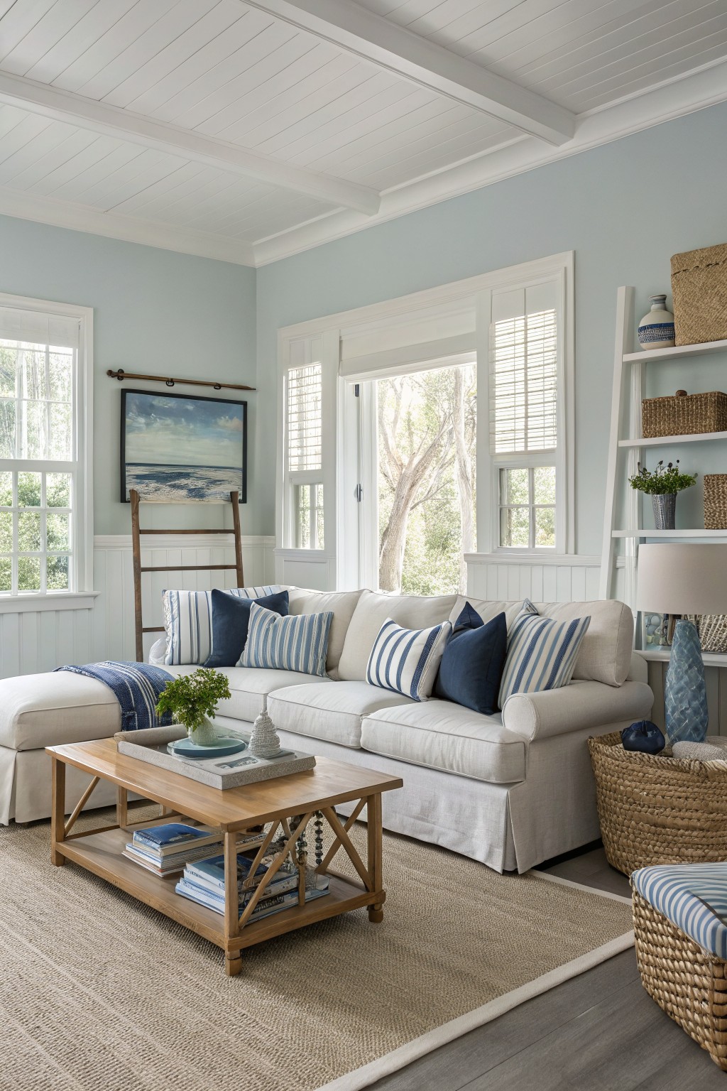
A soft blue gray works nicely in living rooms because it feels calm and light without turning cold. This color family sits between gray and blue, so it gives a relaxed backdrop that still has some life to it. It reads closest to Sherwin Williams Rainwashed, Benjamin Moore Wythe Blue, Behr Silver Drop, or Farrow & Ball Pale Powder.
The slight green undertone helps it stay balanced next to white trim and wood floors. It works best with natural textures like linen or woven rugs, and it can handle a bit of sun without shifting too much. Watch the lighting though, since low light can make it lean more gray than blue.
Warm Greige Living Room Walls
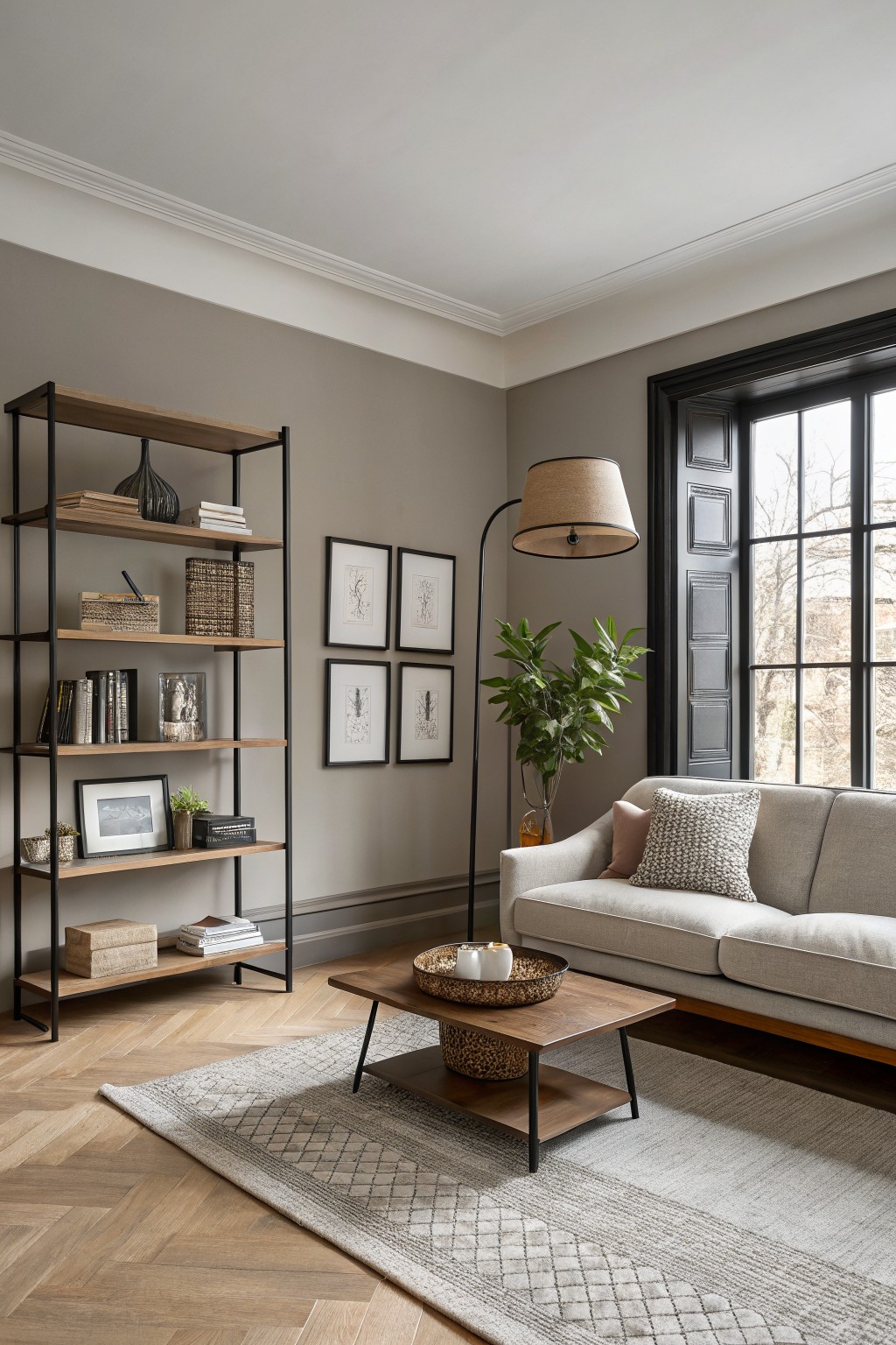
This living room uses a soft greige on the walls. It is a warm neutral that blends gray and beige without leaning too far in either direction.
It has a gentle warmth that shows up next to wood floors and keeps the space feeling calm rather than stark. Pair it with cream upholstery or light wood tones, and test it first in good natural light since it can shift slightly cooler in shaded areas.
Soft lavender walls

This living room uses a soft lavender on the walls. It is a cool, muted color that feels calm and a little airy. It has enough gray in it to stay relaxed rather than sweet.
The color sits nicely next to white trim and wood floors. It works best in rooms with steady daylight and pairs easily with blues or soft neutrals. It looks similar to Sherwin Williams Hint of Lilac, Benjamin Moore Lavender Ice, Behr Quiet Lilac, and Farrow & Ball Pale Amethyst.
Classic Terracotta Living Room Walls
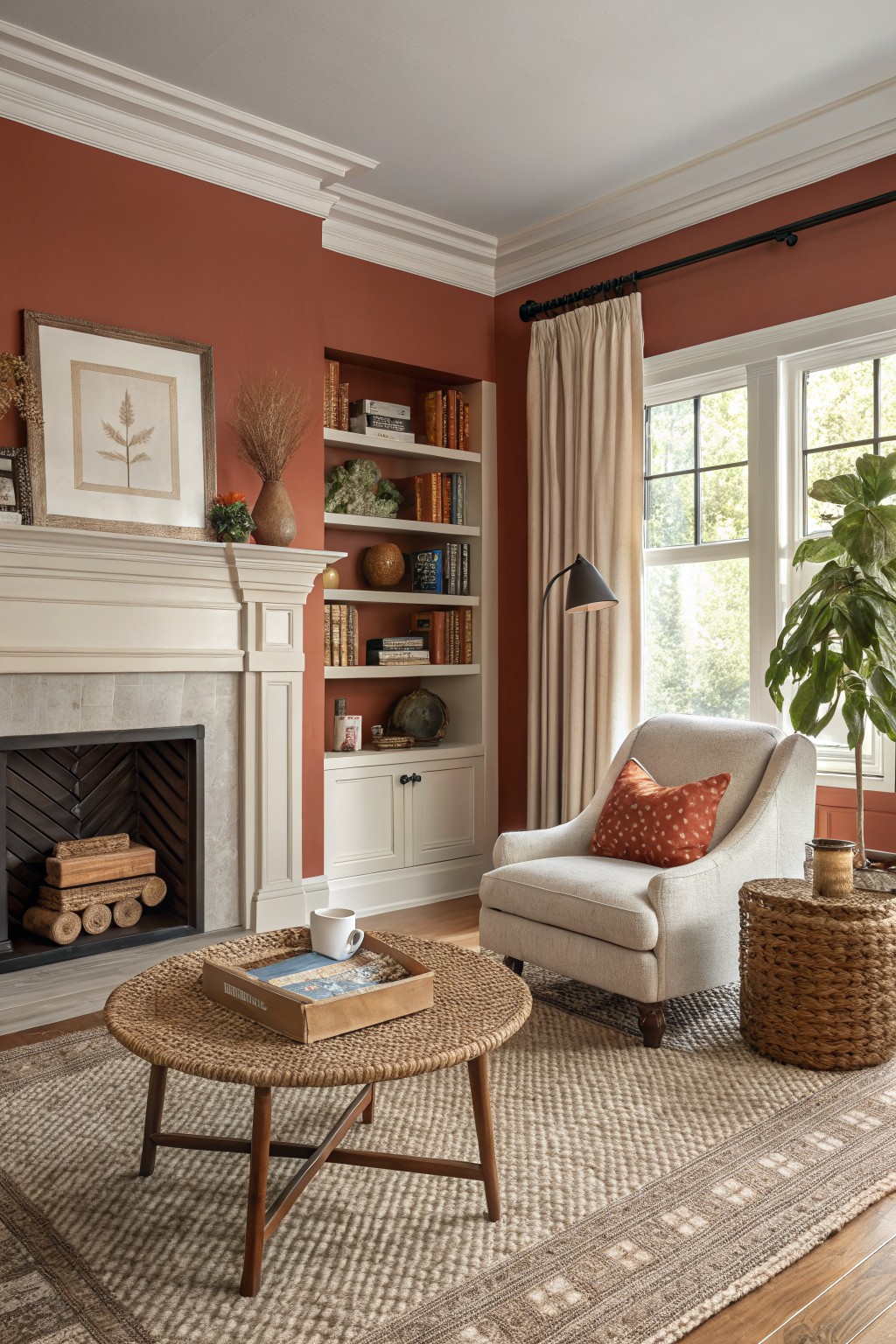
A warm terracotta color like the one on these walls brings an earthy tone into a living room without making it feel heavy. It sits somewhere between red and orange, with enough depth to feel cozy while still working in everyday spaces. This shade reads closest to Sherwin Williams Rookwood Terra Cotta, Benjamin Moore Terra Cotta, Behr Clay Pot, or Farrow & Ball Red Earth.
It pairs nicely with white trim and wood tones, which help keep the color from looking too bold. The warmth shows up more in natural light, so it suits rooms that get steady daylight. Avoid using it in small spaces with cool lighting, where the red undertone can start to feel stronger than expected.
Soft Pink Living Room Walls
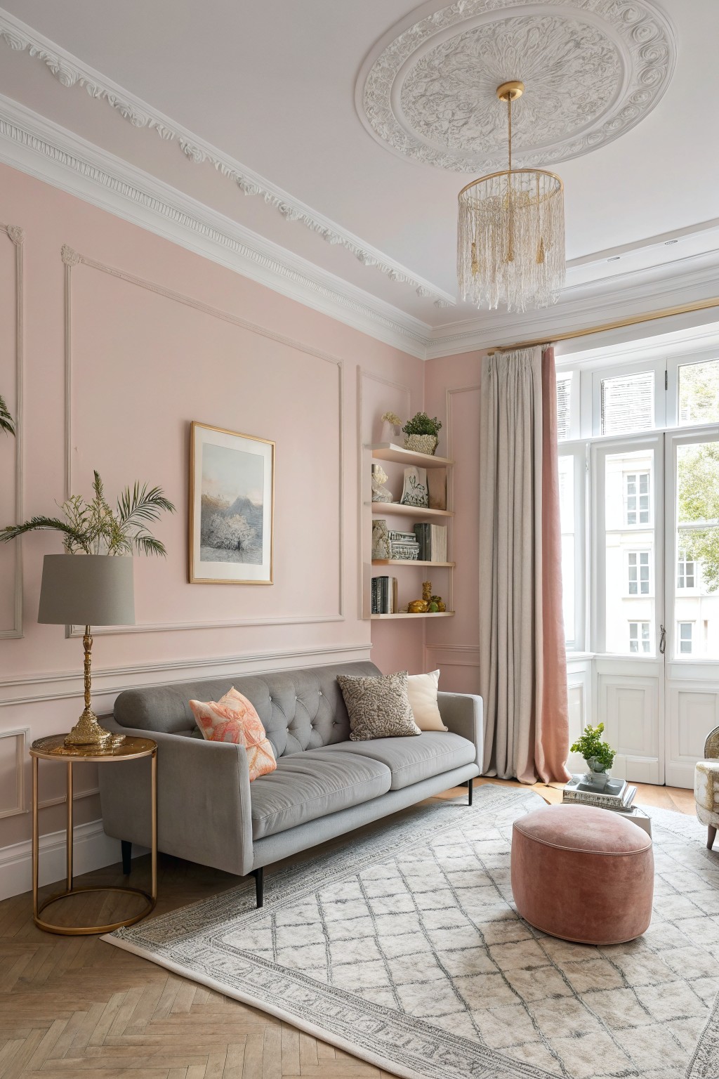
This soft pink on the walls gives a gentle, relaxed feel without turning the room sugary. It reads as a muted blush with a touch of warmth. The color looks closest to Benjamin Moore Pink Peony, Sherwin Williams Blushing, and Behr Rosewater.
It works well with white trim and wood floors because the pink stays soft instead of competing. The tone holds up in both bright and softer light, though it can lean a little cooler if the room gets mostly north light. Pair it with simple neutrals and avoid strong grays that might make the pink feel flat.
Deep Teal Green Living Room Walls
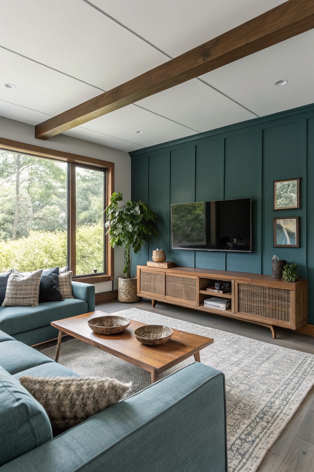
This deep teal green gives the living room a solid, grounded feel without making it feel closed in. It has enough depth to stand out next to the wood tones on the floor and furniture. The color family works well in spaces that get decent daylight, and it reads closest to Benjamin Moore Blue Green, Sherwin Williams Jasper, Behr Peacock Green, or Farrow & Ball Hague Blue.
The undertone leans slightly green rather than pure blue, which helps it sit comfortably with warm wood and woven textures. It holds up fine with lighter seating and a pale rug, though it can look heavier in rooms with very little natural light.
Warm Butter Yellow Walls

The walls here are painted a soft warm yellow that feels gentle and easy on the eyes. It is a light buttery shade with a touch of warmth that keeps the room from feeling stark. This kind of color works well in living rooms that get steady daylight and pairs nicely with white trim and natural wood tones. Benjamin Moore’s Moonlight or Sherwin Williams Creamy give a similar look, as do Behr’s Soft Sunlight and Farrow & Ball’s Hay.
The yellow sits quietly behind the white built-ins and does not fight with the blue cushions or woven textures. It stays calm even when the light shifts through the windows. This shade suits relaxed homes where you want a bit of color without it taking over the space. Watch the undertone if your light leans cooler, since it can read a touch greener in some rooms.
Gray Green Living Room Walls
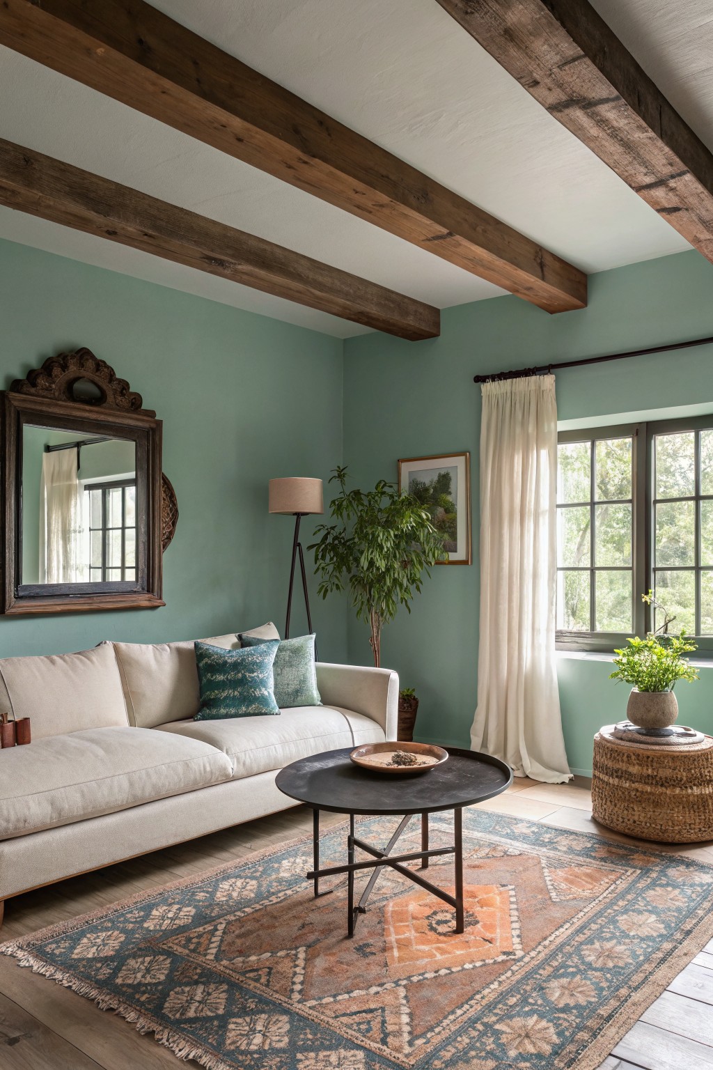
A soft sage green like this brings a calm feel to living rooms without making them feel cold. It sits somewhere between green and blue, so it reads gentle and a little earthy. Colors in this family work nicely with wood tones and simple fabrics. Good matches include Sherwin Williams Sea Salt, Benjamin Moore Saybrook Sage, Behr Breezeway, and Farrow & Ball Light Blue.
It has a slight gray undertone that keeps it from looking too bright in daylight. This shade pairs well with warm wood floors and cream upholstery. It can look a bit flat if the room has no natural light, so test it on a larger patch first.
Frequently Asked Questions
Q: What colors suit a living room with dark wood floors? A: Lighter paint colors balance out the dark tones nicely. Soft greiges or muted greens keep the space feeling open and relaxed. Pick one and test it first on a small section.
Q: My furniture is already colorful. How do I choose paint? A: Stick to neutral walls so the furniture pops. Warm whites or light taupes create a calm backdrop.
Q: Does the time of day affect how the color looks? A: Check your samples in morning and evening light before committing. This step shows whether the shade stays soothing or shifts too much during regular hours.









