When I repaint a house I always notice how the same color can shift from one room to the next depending on the windows and the time of day.
Undertones that seem neutral in the store often turn warm or cool once they sit next to wood floors and white trim.
I test every shade on the actual wall first.
Colors that work well together across an open space usually share a similar depth rather than just matching on paper.
Paying attention to how each room receives light helps the whole house feel connected instead of chopped up.
Soft Greige Walls
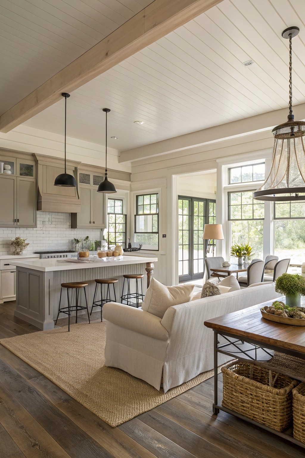
This warm greige reads as a soft gray-beige that sits nicely between cool and warm tones. It keeps the kitchen and living area feeling connected without making either space look too stark next to the wood floors.
The color has a gentle warmth that works with both painted cabinetry and natural wood. It suits homes that want a calm background rather than a strong statement, and it pairs well with white trim or similar neutrals on built-ins. Good matches to consider are Sherwin Williams Accessible Beige, Benjamin Moore Revere Pewter, Behr Greige, or Farrow & Ball Elephant’s Breath.
soft sage gray walls
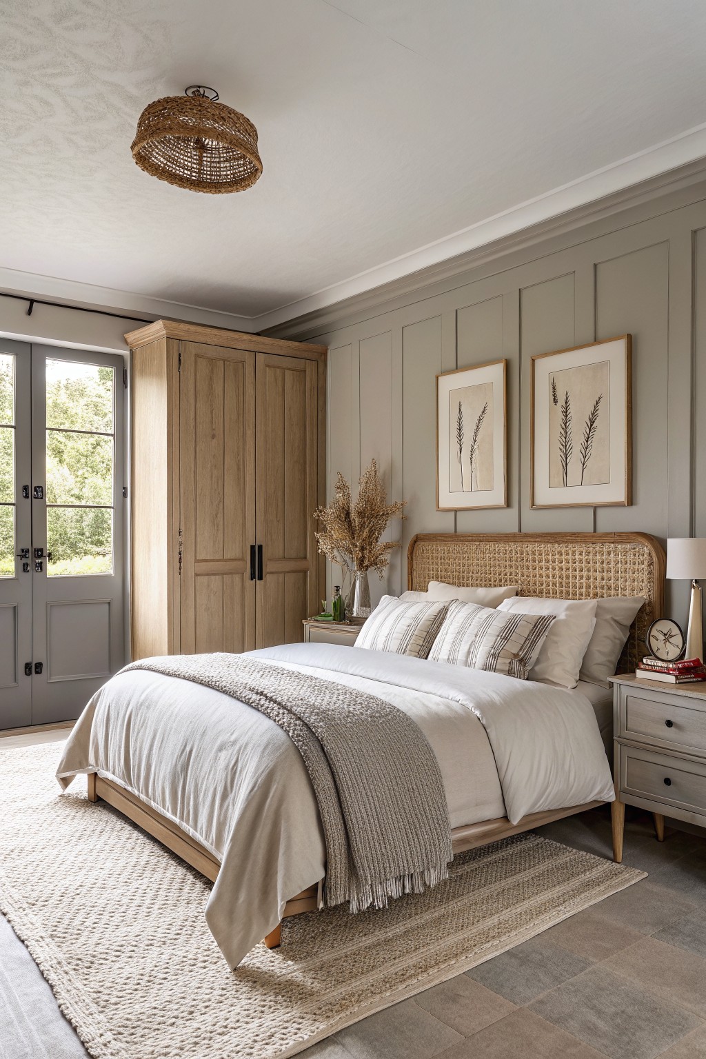
This soft sage gray sits right in the middle of gray and green. It gives a calm background that moves easily from room to room without feeling cold or flat.
The color has a slight warm undertone that keeps wood tones looking natural. It works best with light oak floors and simple white trim. Too much cool lighting can make it read more gray than intended, so test it in both morning and afternoon light first.
Soft Sage Green Walls
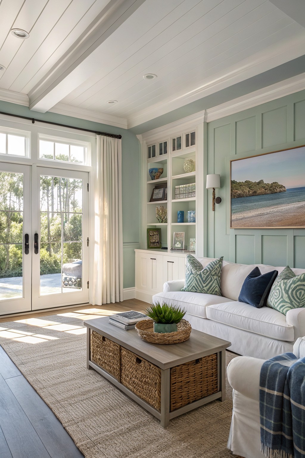
This soft sage green reads as a quiet, gray-tinged green that feels easy to use across multiple rooms. It sits in that middle ground between cool and neutral, so it does not fight with wood tones or white trim and still gives the space some color.
The shade has a light, slightly cool cast that works best with lots of natural light and pairs cleanly with painted cabinetry or built-ins. It stays flexible enough to carry into hallways or adjacent rooms without looking too strong or too washed out.

This deep navy blue gives a room a grounded, steady feel that carries easily from one space to another. It sits in the true navy family rather than teal or gray, and it holds its own next to wood furniture without looking heavy.
The color has a slight green undertone that shows up more in natural light, so it pairs best with warm wood tones and soft neutrals on the ceiling or trim. Benjamin Moore Hale Navy, Sherwin Williams Naval, and Farrow & Ball Hague Blue all land close to this shade.
Sage Green Kitchen Cabinets
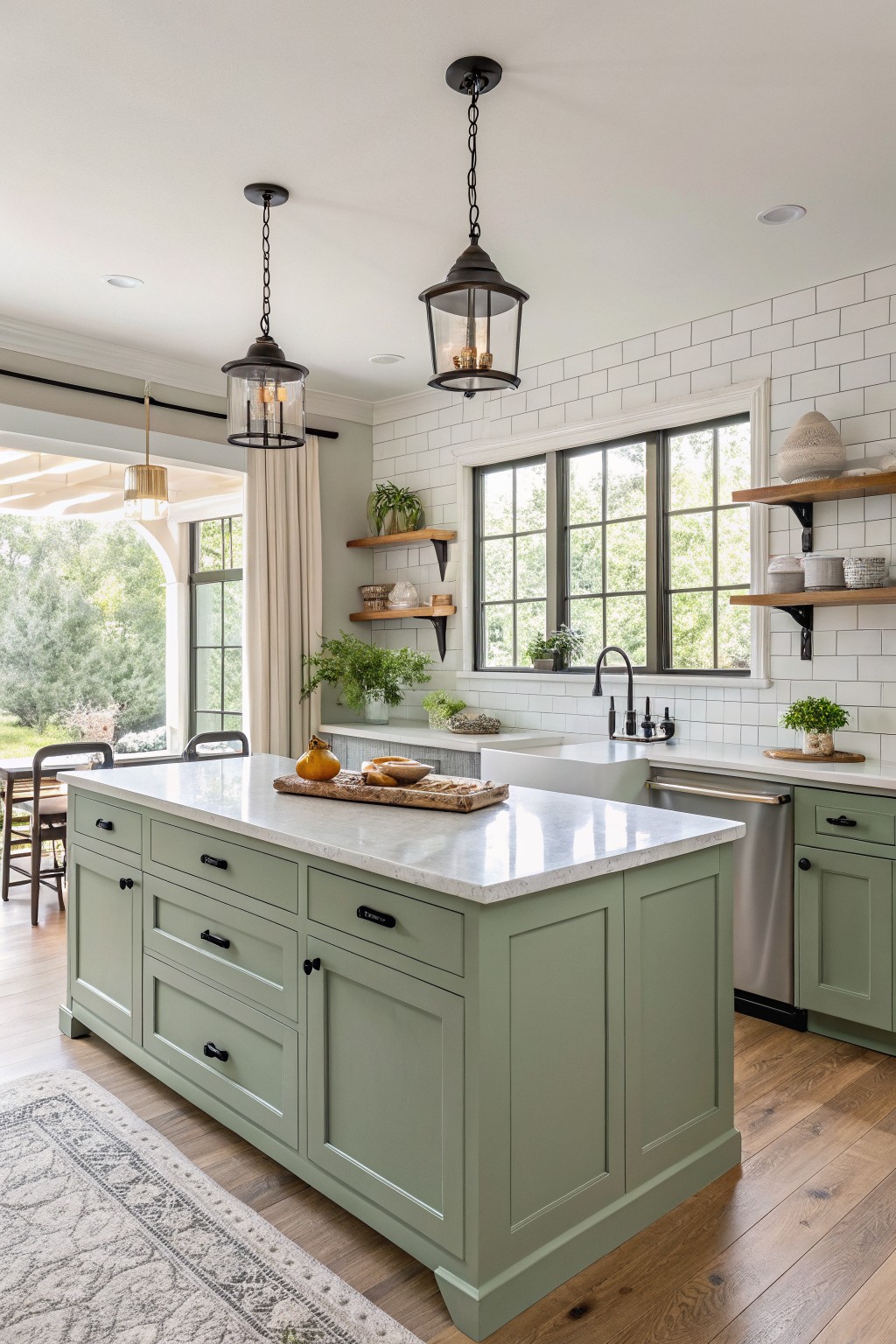
A soft sage green covers the kitchen island and cabinets. This color family sits between gray and green, giving a calm earthy tone that feels natural with warm wood floors and white stone counters.
It carries a light gray undertone that helps it stay quiet in bright rooms. It works best with black hardware and simple white walls. Good matches include Sherwin Williams Clary Sage, Benjamin Moore Saybrook Sage, Behr Quietude, and Farrow & Ball French Gray.
Soft Sage Green Bathroom Walls
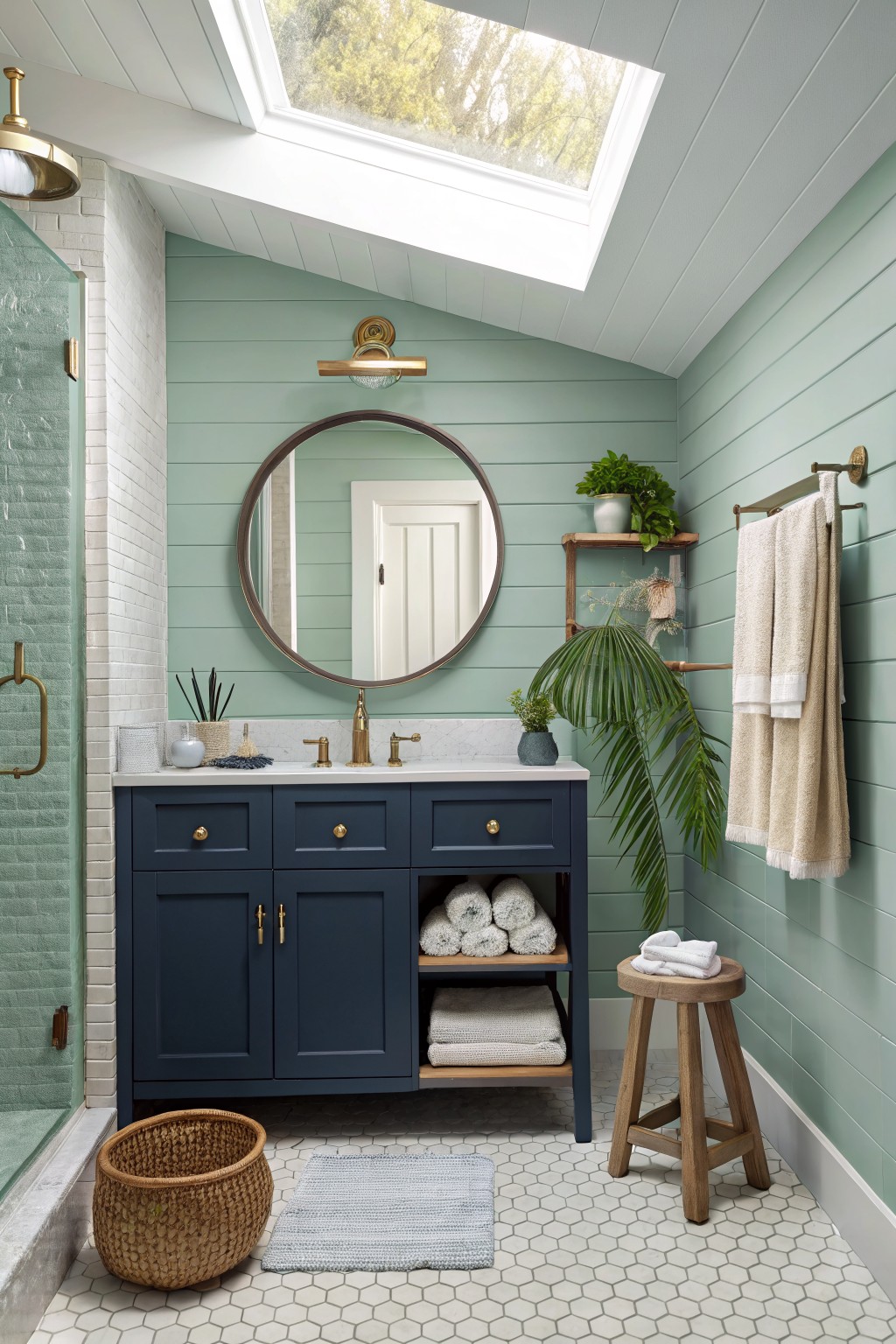
This soft sage green on the walls gives a calm, quiet feel that works well in a bathroom. It sits between gray and green with a light cool tone that keeps the room from feeling heavy.
The color reads best with warm wood tones and navy cabinetry. It suits homes that want a gentle color without going too bright, and it holds up fine next to white tile and brass fixtures.
Soft Yellow Walls
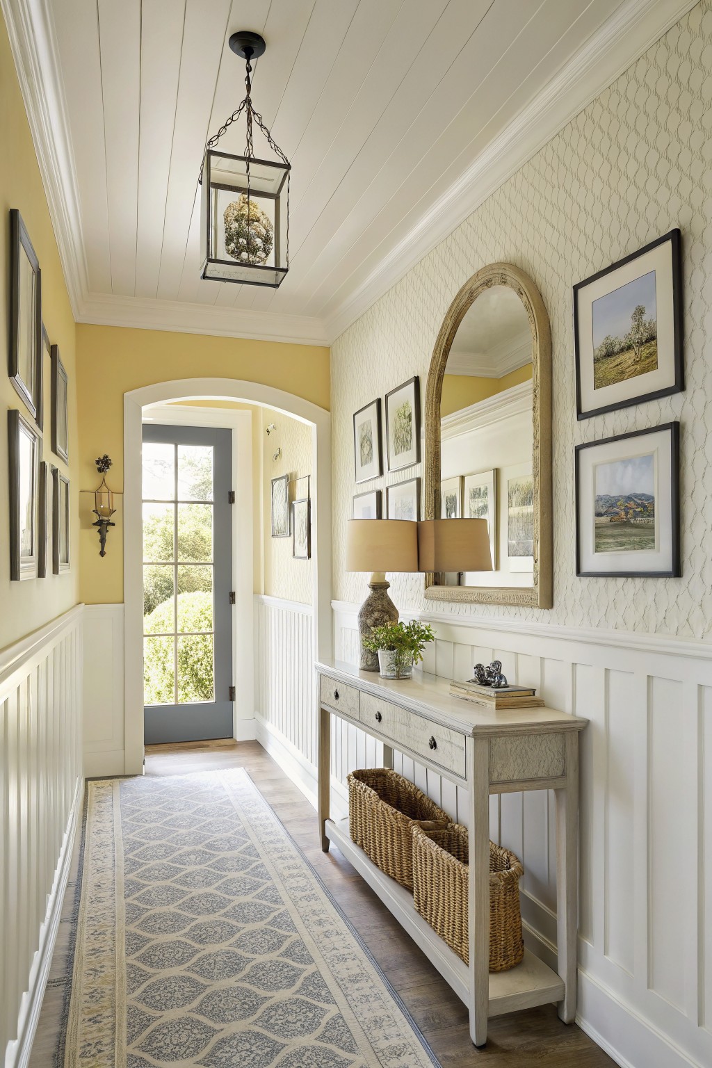
This soft yellow is a warm, pale shade that feels light and welcoming in a hallway. It sits in the yellow family with gentle golden undertones that keep the color from looking too bright or childish. Benjamin Moore’s Hawthorne Yellow, Sherwin Williams Butterfield, Behr Mellow Yellow, and Farrow & Ball Babouche all read very close to it.
The color works well with white trim and wood floors because the warmth keeps the space from feeling stark. It suits older homes or any layout where you want rooms to connect without a big shift in mood. Just test it in different lights first since yellow can shift more than you expect once the walls are covered.
Soft Blush Pink Walls
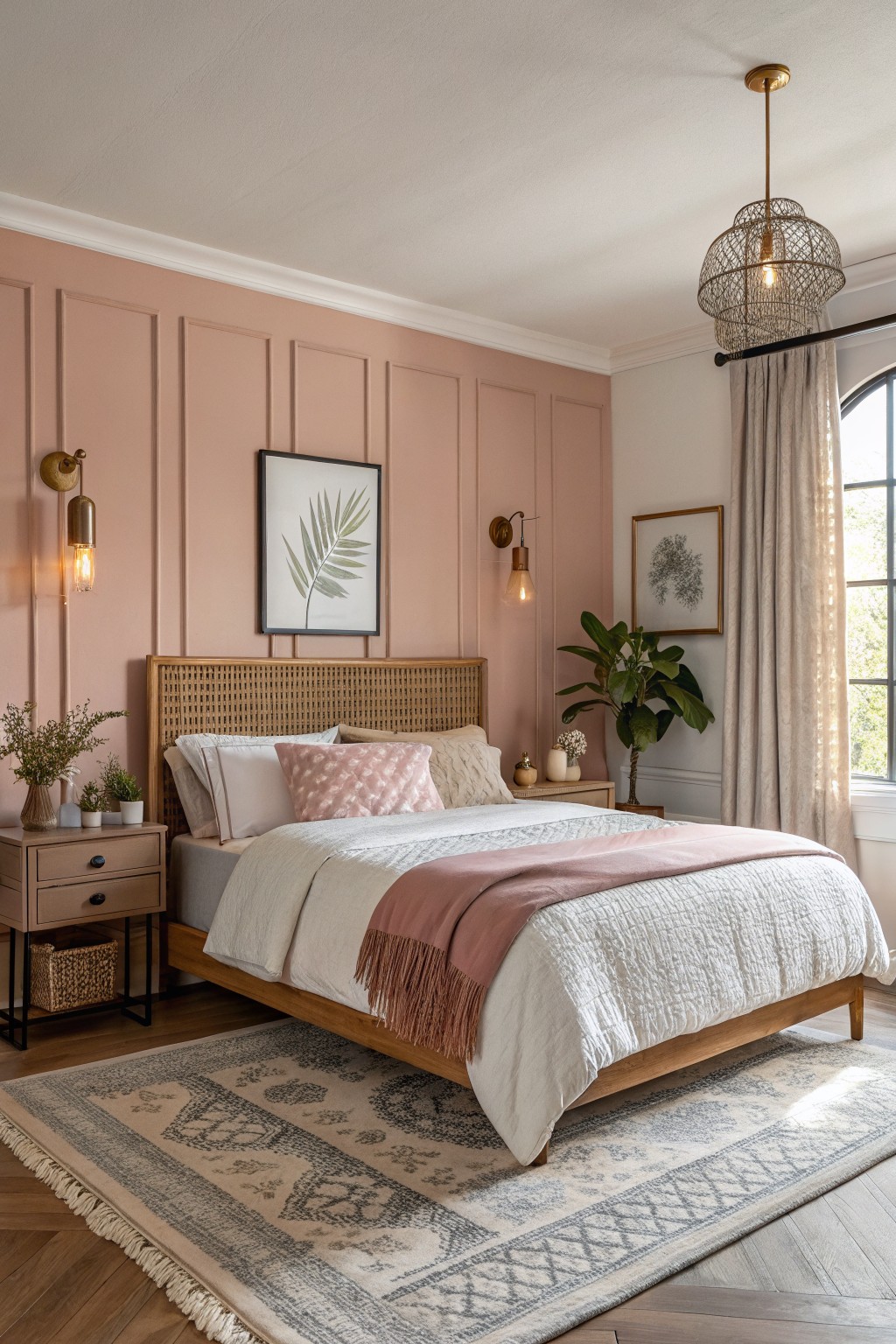
This warm blush pink sits right in that soft dusty rose range with a light peachy undertone. It gives the room a gentle warmth that feels calm rather than sugary. Colors like this work well when you want something a step away from plain beige or gray. It reads closest to Sherwin Williams Blushing, Benjamin Moore Pink Damask, Behr Dusty Rose, or Farrow & Ball Pink Ground.
The tone stays warm enough to sit nicely next to wood and natural textures. It looks best with white or off-white trim so the pink stays soft instead of turning muddy. In brighter rooms it feels light and open. Darker spaces can make it look heavier, so test it in your own light first.
Deep Green Walls
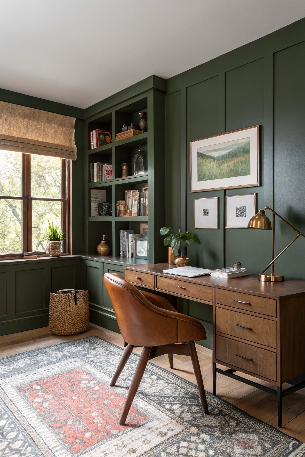
This deep green makes a strong choice for whole-home flow because it feels grounded without being too heavy. It sits in the forest green family and reads closest to Sherwin Williams Forest Green, Benjamin Moore Hunter Green, or Farrow & Ball Studio Green.
The color has a slight warmth that keeps it from going cold next to wood floors and trim. It works well in rooms with built-ins or lots of furniture since the depth helps tie everything together without needing extra layers of pattern.
Warm Greige Walls
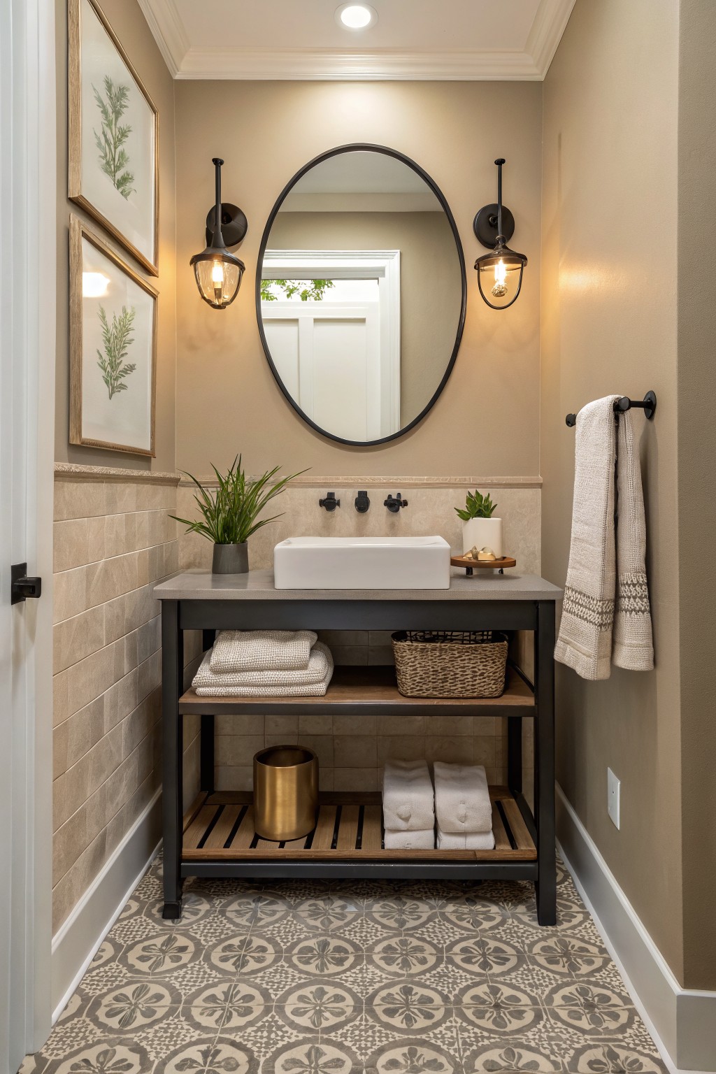
This bathroom shows a warm greige on the walls. It is a soft neutral that sits between beige and gray, giving just enough warmth to keep the space from feeling cold while still reading clean and calm.
The color works well with stone tile and wood tones. It stays flexible in smaller rooms and pairs easily with both dark metal fixtures and lighter textiles without shifting too much in different light.
Soft Greige Living Room Walls
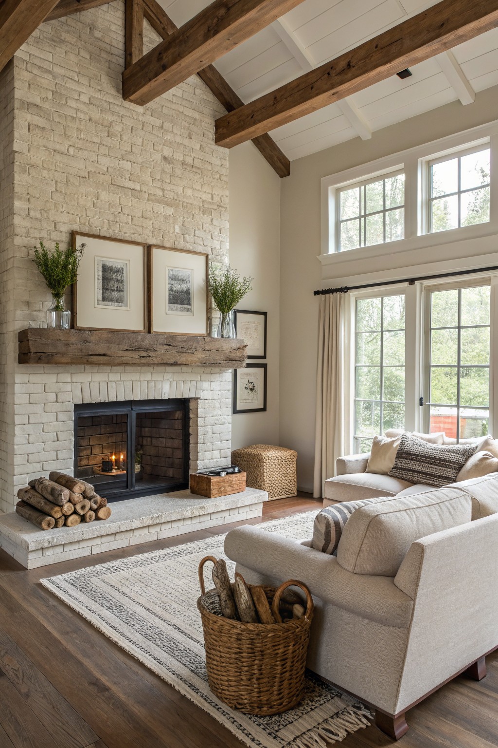
This soft greige is the kind of color that helps rooms flow together without much effort. It sits right between warm beige and light gray, so it feels calm next to wood tones and white trim.
The slight warmth keeps it from turning cool under different lights, and it pairs easily with stone or natural wood. It works well in living areas or open plans where you want a steady background color from one room to the next.
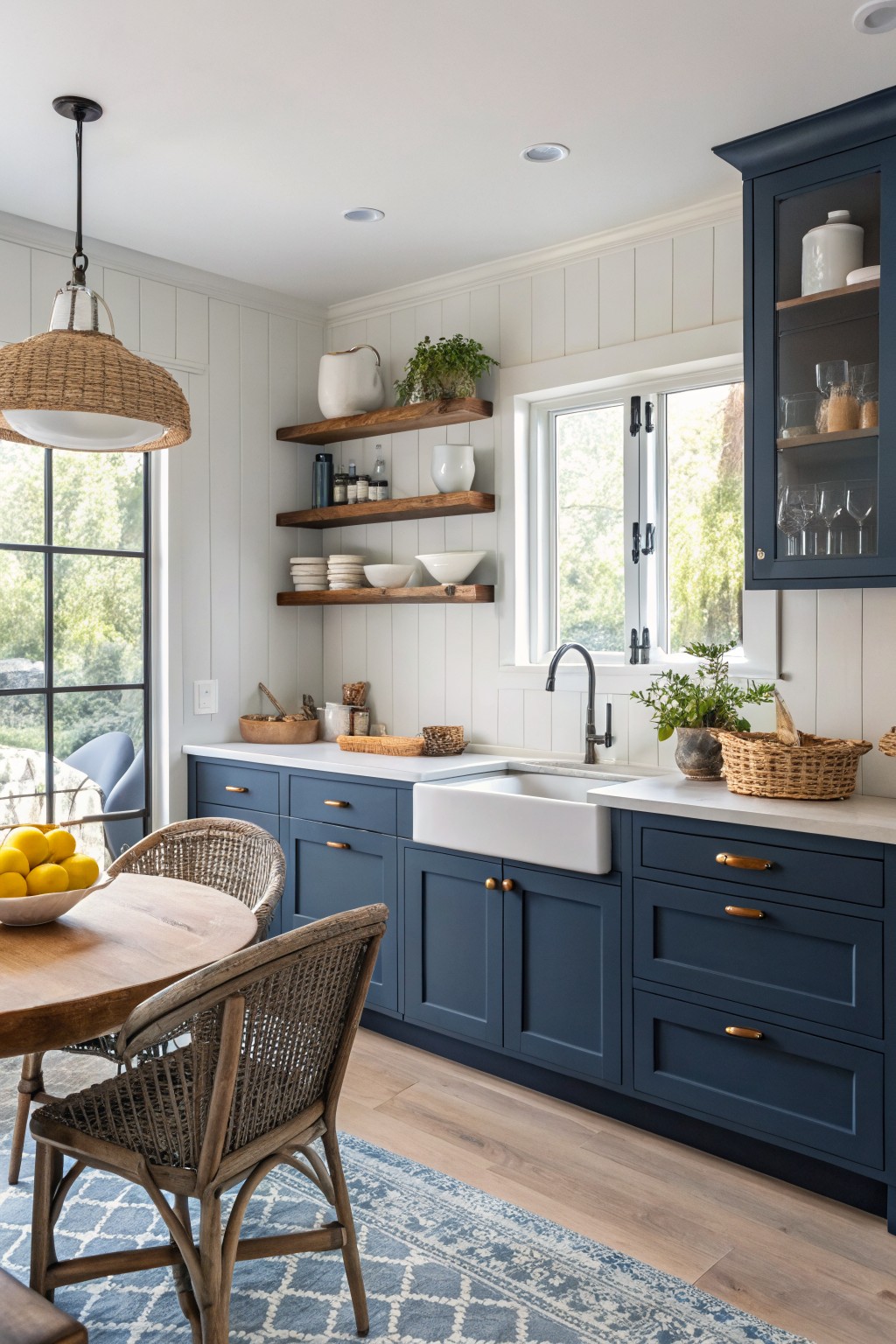
This kitchen uses a deep navy blue on the cabinets. It is a solid color that gives the room some weight while still keeping things light overall.
The blue sits somewhere between cool and neutral, which helps it work with white walls and light wood floors. It looks best in spaces with plenty of natural light and pairs cleanly with white counters and simple hardware.
Soft Sage Green Kitchen Walls
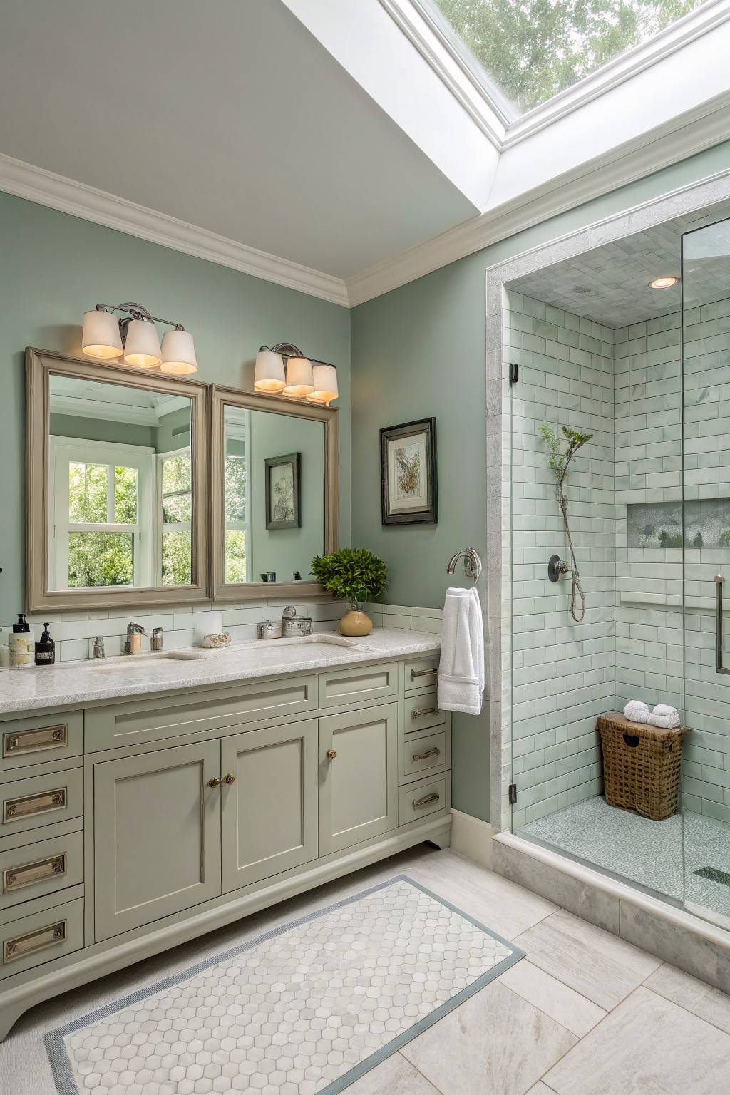
A soft sage green like this brings a calm, steady feel that works across many rooms without standing out too much. It sits between gray and green with a light, slightly cool tone that feels fresh next to white trim and stone counters.
This shade looks good in spaces with decent daylight and pairs easily with wood tones or simple marble. Try Sherwin Williams Evergreen Fog, Benjamin Moore Saybrook Sage, or Behr Soft Sage if you want a close match.
Warm beige walls

A warm beige like this one gives rooms a soft base that helps colors move easily from one space to the next. It sits in that light neutral range with a gentle yellow undertone that keeps things feeling bright without going flat.
It works well with wood beams and tile floors, though it can read a little warmer in low light so testing a sample is worth it. Good matches include Sherwin Williams Accessible Beige, Benjamin Moore Edgecomb Gray, Behr Canvas, or Farrow & Ball Shaded White.
Soft Blue-Green Walls
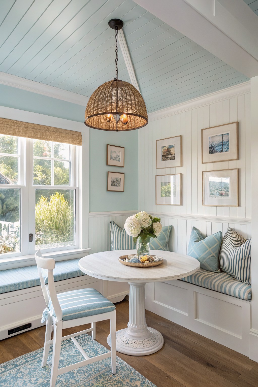
A soft blue-green like this one brings a cool, light feel to a room without turning it icy. It has a gentle aqua tone that works especially well with white trim and wood floors, keeping the space feeling open and calm.
Benjamin Moore Palladian Blue sits very close, along with Sherwin Williams Rainwashed and Behr Soft Aqua. It shows best in rooms with steady natural light, and it pairs cleanly with simple textiles or natural wood tones. Too little light can make the cool side read a bit flat.
Soft Yellow Cabinetry

This buttery yellow on the cabinets brings a gentle warmth that feels cheerful but still calm. It reads as a soft, slightly muted tone that sits nicely between cream and a true yellow, which helps it work without looking too bold.
The color holds up well against white tile and gray stone, and it suits kitchens or utility spaces that get steady daylight. It can shift a bit greener or more golden depending on the light, so test a sample on the actual cabinet doors before committing.
Deep Teal Walls
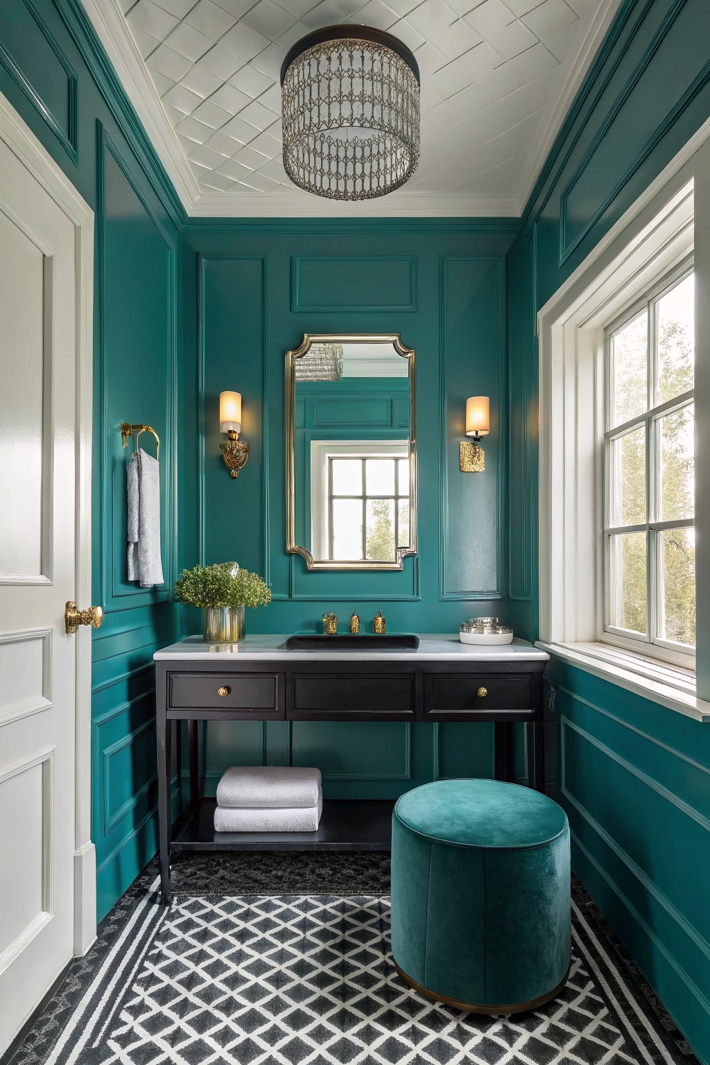
A deep teal like this brings real presence to a small room without feeling heavy. It sits between green and blue with enough depth to hold its own next to dark wood and white trim. Many people reach for this kind of color when they want something bolder than a neutral but still easy to live with day to day.
It tends to read a little greener in natural light and works best with warm wood tones or black hardware to keep it grounded. In a bathroom or powder room it creates a cozy feel rather than a stark one, especially when the ceiling stays light.
Soft Blush Walls
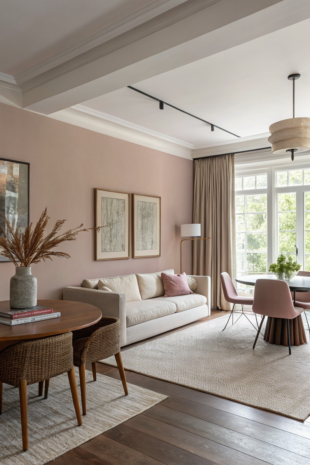
This muted blush beige reads as a warm neutral with just enough pink in it to feel soft and lived-in. It works nicely for whole-home flow because it stays gentle next to wood floors and cream furniture without pulling too sweet or too gray.
The color has a light terracotta undertone that shows up more in afternoon light, so it pairs best with natural wood tones and avoids looking flat when used across multiple rooms. It can feel a bit cool if the space gets only north light, so test it in your own conditions first.
Muted Sage Green Walls
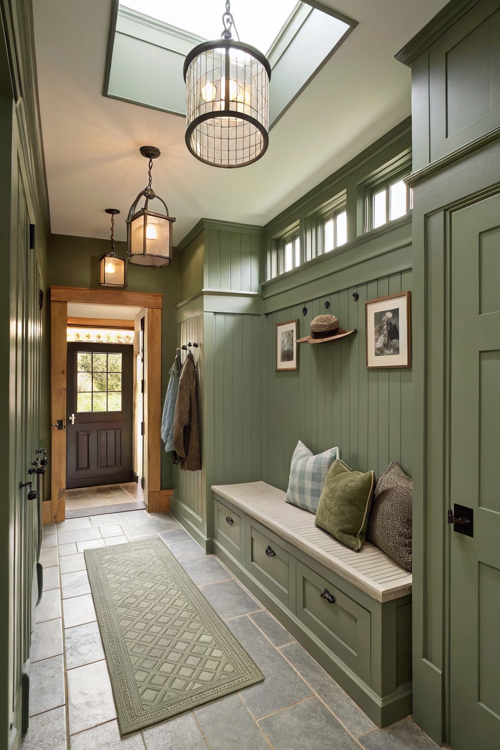
This muted sage green reads as a calm, slightly grayed color that feels steady in an entry or mudroom. It sits between Sherwin Williams Evergreen Fog, Benjamin Moore Saybrook Sage, Behr Aged Sage, and Farrow and Ball Pigeon.
The gray undertone keeps it from turning too blue or too yellow, so it holds up next to wood trim and stone floors. It works best in spaces with steady daylight, and it pairs cleanly with both light wood and darker cabinetry without fighting for attention.
Soft Gray Cabinets

This soft gray on the cabinets lands in the greige family. It has a quiet warmth that keeps the space feeling calm without going flat, and it moves easily into other rooms.
It reads best with white trim and light stone surfaces. Colors like Sherwin Williams Repose Gray, Benjamin Moore Light Gray, or Behr Silver Drop all sit close to it and hold up well in kitchens or storage areas where you want something steady but not too cool.
Charcoal gray walls
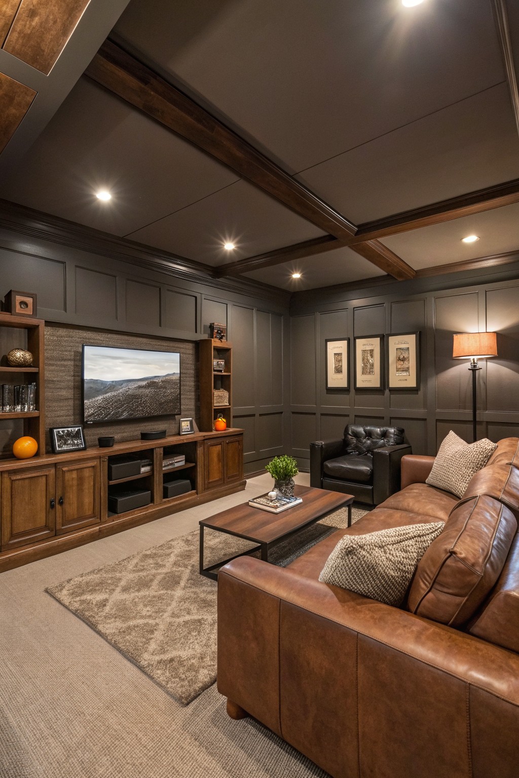
A deep charcoal gray like this brings a grounded, steady feel to a whole home without making rooms feel closed in. It sits right in that useful middle ground between black and a standard gray. Colors such as Sherwin Williams Iron Ore, Benjamin Moore Kendall Charcoal, Behr Blackened, or Farrow & Ball Railings all read very close to the tone shown here.
The color has a quiet warmth that keeps wood cabinetry and trim from looking too stark. It works especially well in rooms with mixed lighting and helps tie together different wood tones across open spaces. Watch the finish though, since a flat or eggshell version stays softer while anything glossier can start to feel heavy.
Frequently Asked Questions
Q: How do I pick shades that move easily from one room into the next? A: Start with a single color family and shift the depth slightly as you cross doorways. This keeps the eye moving without any jarring stops. Paint a small board in each shade and prop them side by side in the hallway to see how they actually meet.
Q: My living room gets morning light but the dining room stays shady. Which colors hold up? A: Lean toward warmer neutrals in the darker room so it does not feel dingy. Cooler versions of the same base work fine where the sun hits hard. Check the samples on the actual walls at both 8 a.m. and 4 p.m. before you buy gallons.
Q: Can I just use one color on every wall? A: One color works if you vary the finish instead. Eggshell on walls and satin on trim keeps things from feeling flat while the hue stays consistent. Most people still add at least a second color on an accent wall or ceiling to stop the house from looking like a rental.
Q: What if I want one bold color somewhere? A: Use the bold shade in a contained space like a powder room or reading nook. Keep the surrounding rooms in the calmer tones from your main scheme. The contrast feels intentional instead of random.









