I have found that living room colors often shift more than I expect once the furniture is in place and the light changes throughout the day.
Undertones can turn a soft gray into something cooler than it looked on the swatch especially when paired with white trim and wood floors.
Samples on the wall tell the real story.
Some shades hold their warmth better in north-facing rooms while others need a bit of evening light to reveal their depth.
In my own space I always check how a color looks next to the sofa and curtains before committing to the full walls.
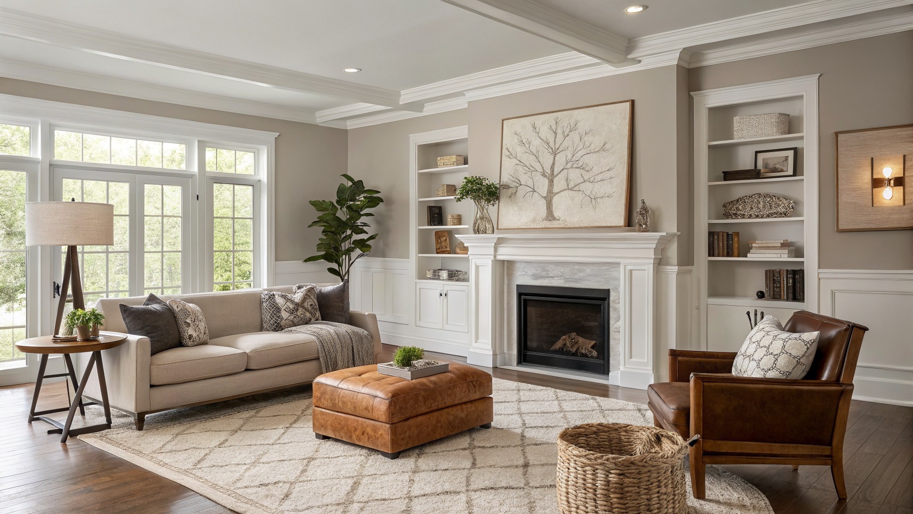
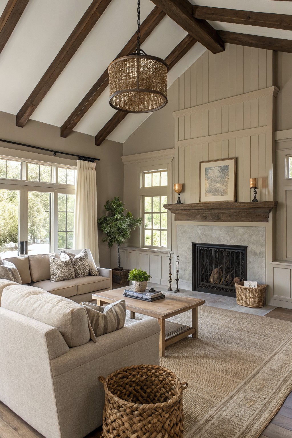
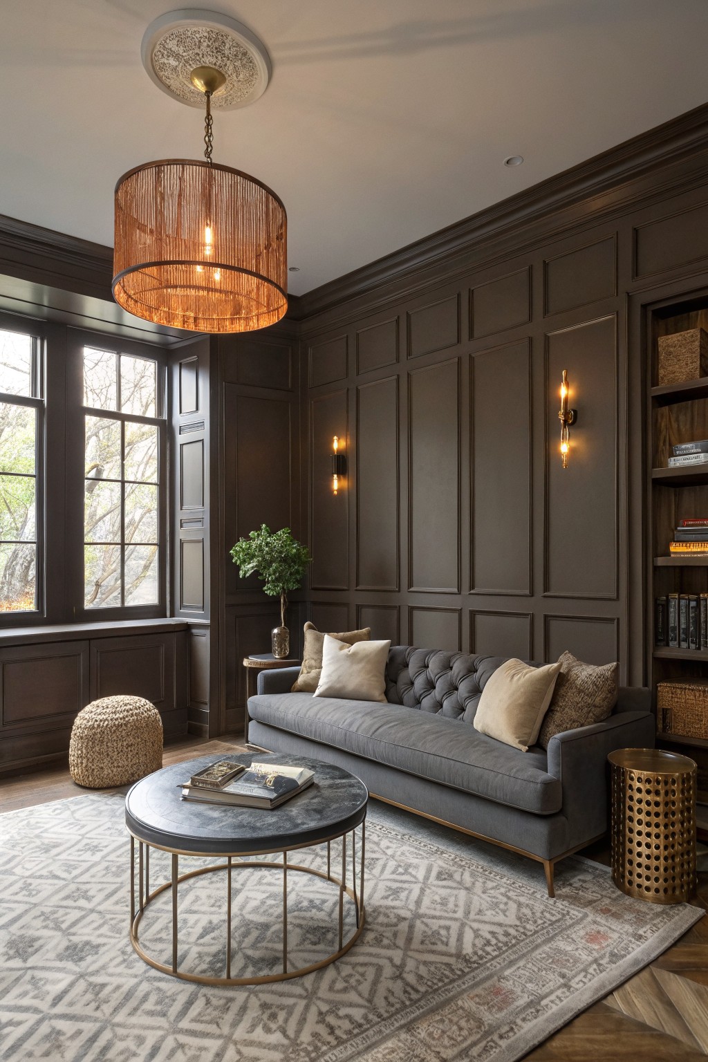
A Soft Greige For Living Room Walls

The walls in this room are painted a soft greige that sits right between gray and beige. It feels warm without turning yellow and gives the space a quiet, settled look that still reads fresh.
This shade works especially well with crisp white trim and built-ins because the contrast keeps everything feeling clean. It also sits nicely next to wood floors and stone, and it holds up in both morning and afternoon light without shifting too much.
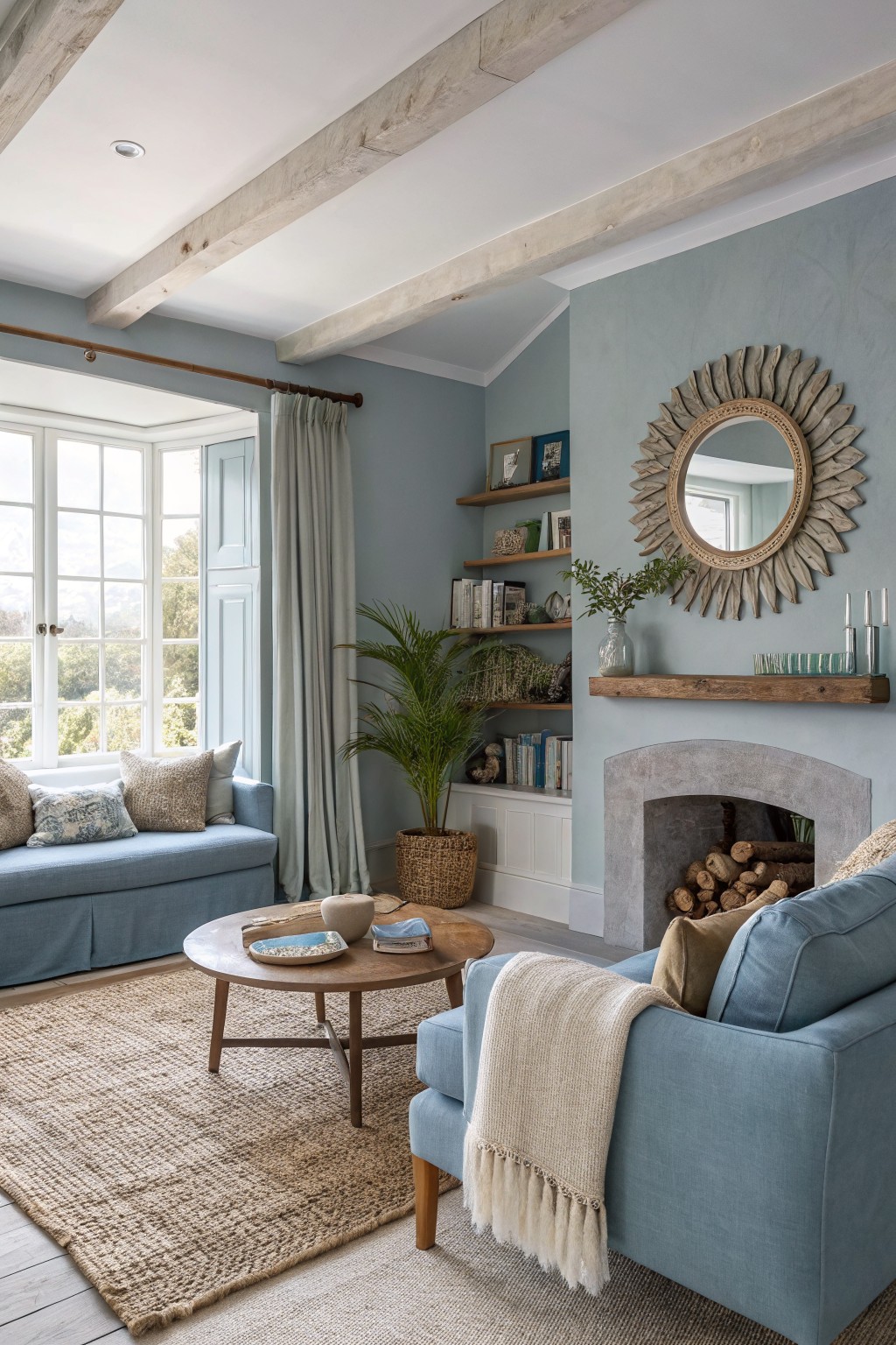
Soft Blue Walls
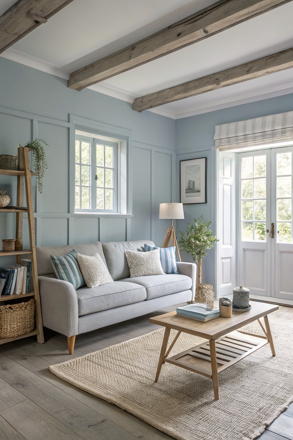
This soft blue on the walls gives a living room a calm and easy feel without making it look too cool or stark. It sits somewhere between gray and blue, which helps it work well with wood tones like the ceiling beams here. Colors like this often read closest to Sherwin Williams Rainwashed, Benjamin Moore Palladian Blue, or Behr Quietude.
The blue stays light enough to keep the space bright even on cloudy days. It pairs nicely with warm wood floors and simple neutral furniture, though it can start to feel chilly if the room gets very little natural light.
Soft White Living Room Walls

This room uses a warm soft white on the walls and ceiling. It feels clean and bright but still has enough warmth to keep the space comfortable rather than cold or stark.
The color sits nicely against white trim and wood floors, and it works especially well in rooms with plenty of natural light. A few good matches would be Benjamin Moore Cloud White, Sherwin Williams Alabaster, Behr Simply White, or Farrow & Ball Wimborne White.
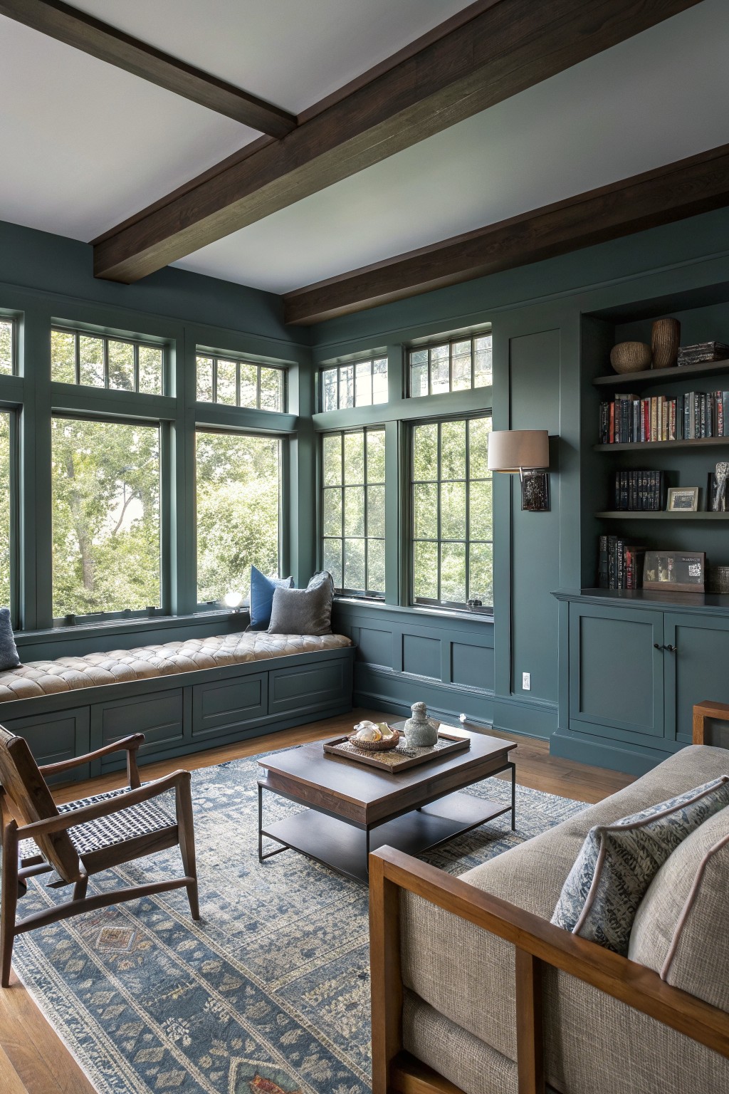
Deep Teal Walls
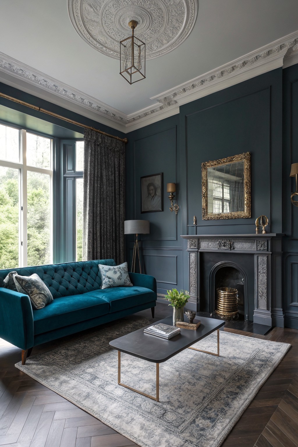
Deep teal brings a nice balance to living rooms when you want color that feels present but still comfortable. This shade sits between blue and green, so it adds depth without making the space feel heavy or overly dark.
It has a subtle green undertone that shows up more in natural light. The color works especially well with dark wood floors and painted trim, and it holds its own next to gold or brass accents without competing.
Soft Sage Green Walls
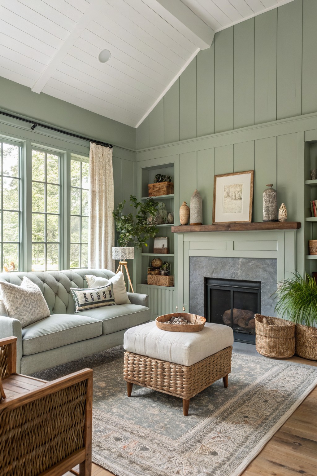
This soft sage green works well in living rooms because it feels calm without going flat. The color sits somewhere between green and gray, which gives it a gentle tone that pairs nicely with wood tones and lighter fabrics. It keeps the space from feeling too cool while still looking fresh.
The green has a bit of gray in it, so it stays steady even when the light changes through the day. It looks good with warm wood trim or a stone fireplace, and it holds up nicely next to natural textures like linen or woven pieces. Just watch that it does not pull too blue in a room with very little natural light.
Soft Blue Gray Living Room Walls
This living room uses a soft blue gray on the walls. It is a cool toned color that feels calm and a little airy without turning the space cold or flat.
The color has a touch of gray in it that helps it sit nicely with wood beams and stone details. It works best in rooms with decent natural light and pairs easily with blue upholstery or simple wood furniture.
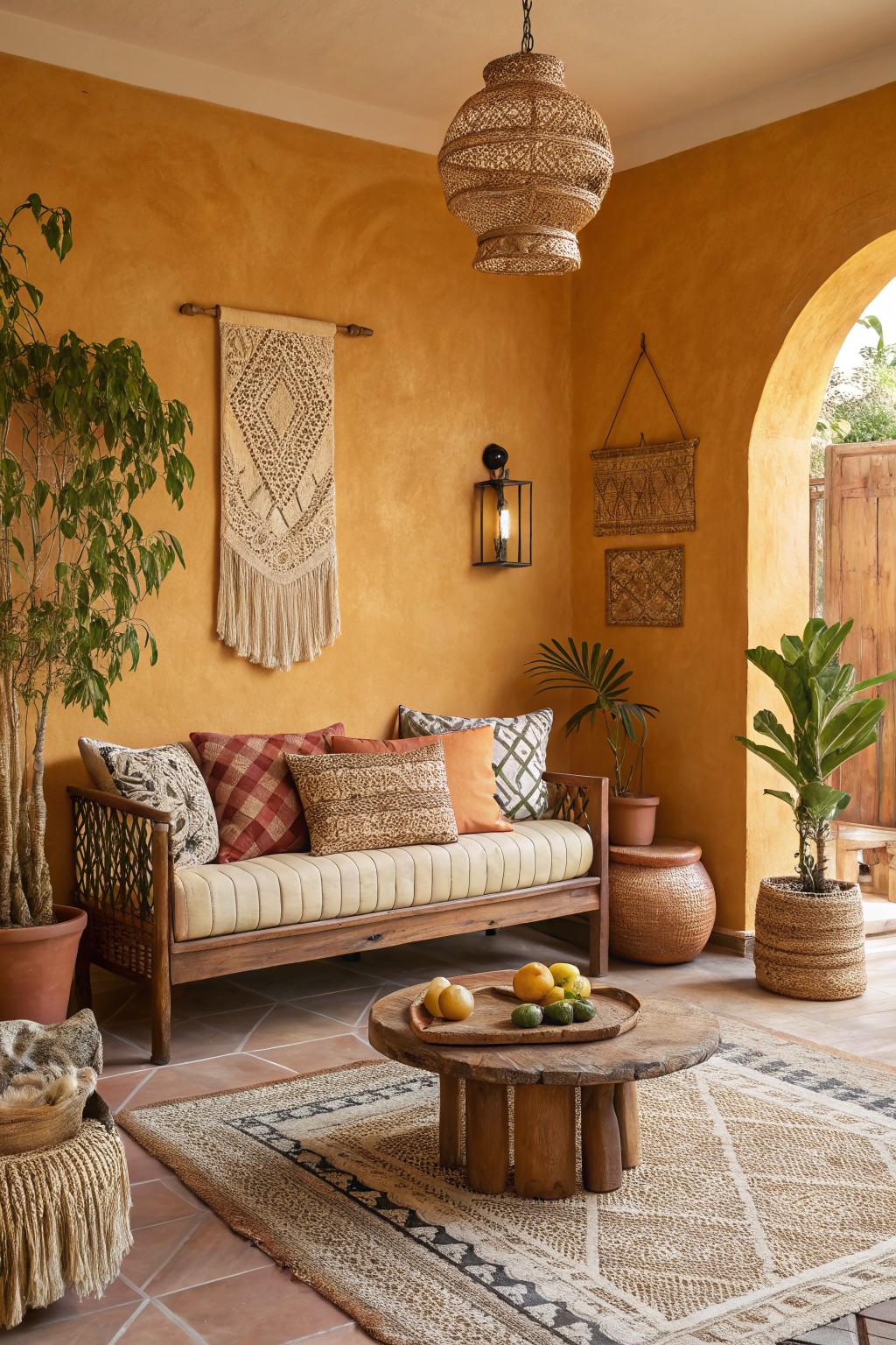
Warm Terracotta Walls

A warm terracotta color like this brings a soft earthy feel that makes a living room feel settled without trying too hard. It sits somewhere between orange and red and gives the space a grounded look that still feels bright enough for everyday use. This shade reads very close to Benjamin Moore Caliente, Sherwin-Williams Red Cent, Behr Canyon Dusk, and Farrow & Ball Red Earth.
The color has a gentle red undertone that keeps it from feeling too yellow or flat once the light shifts during the day. It works especially well with warm wood tones and simple tile floors, though it can start to feel heavy if the room gets very little natural light.
Soft Blush Pink Walls

This soft blush pink on the walls gives a living room a gentle and welcoming feel. It is a warm pink with a touch of peach that keeps the color from going too cool or too sweet. You could try Sherwin Williams Rose Quartz, Benjamin Moore First Light, or Farrow & Ball Calamine if you want something close.
The color works well with white trim and light upholstery. It shows up best in rooms that get steady daylight and pairs easily with wood tones and soft neutrals.
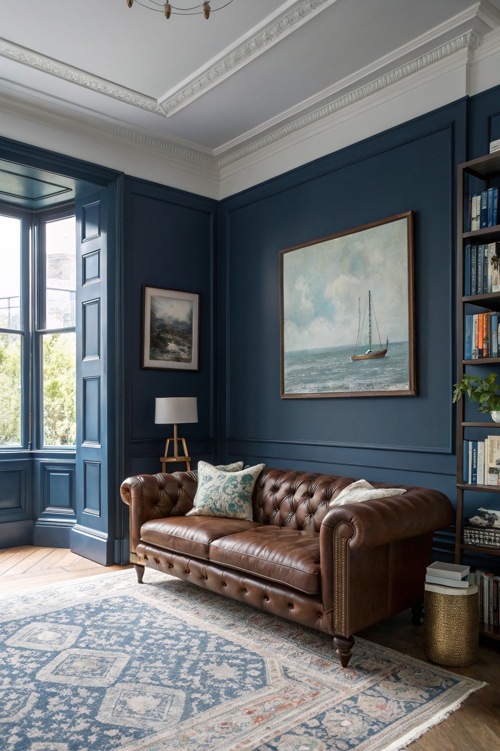
A deep navy blue gives a living room that solid, grounded feel without making the space feel closed in. This shade sits right between a true blue and a hint of black, which helps it hold up nicely next to wood floors and white trim.
It works best in rooms that get decent daylight, since the color can lean a bit cooler in low light. Pair it with warm wood tones, cream fabrics, or soft neutrals so the blue stays comfortable rather than stark.
Soft Greige Walls
A soft greige works really well in living rooms because it feels warm and settled without looking too heavy. This one leans slightly toward beige with a hint of gray, which keeps the space feeling comfortable and easy to live with.
It has enough warmth to sit nicely next to wood beams and trim, but it still feels current. Pair it with cream upholstery or natural textiles if you want the room to stay relaxed.
Warm terracotta walls
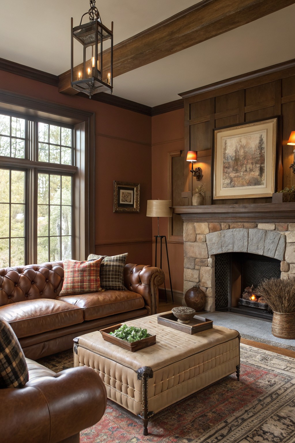
This living room uses a warm terracotta paint on the walls that sits right between brown and red. It gives the space a grounded feel without making the room feel dark or heavy, and it works especially well with wood beams and trim.
The color has a soft red undertone that shows up more in daylight. It pairs nicely with stone and leather, but it can start to feel too strong if you add too many other warm tones around it.
Soft Yellow Living Room Walls

This living room uses a soft yellow on the walls that feels warm and welcoming without going too bright. It reads like a pale buttery shade with gentle warmth that keeps the space feeling open and comfortable.
The color has a light undertone that works best with white trim and natural wood tones. It pairs nicely with blues and soft neutrals, but it can start to feel a bit cool if the room does not get enough sunlight. Popular matches include Sherwin Williams Lemon Twist, Benjamin Moore Pale Yellow, Behr Sunny Disposition, and Farrow & Ball Hay.
Deep Teal Green Walls
This deep teal green on the walls gives the whole room a calm, enclosed feeling that still feels fresh. It is a saturated shade with blue undertones that sits nicely against the dark wood trim and ceiling beams.
The color works best in spaces that get good natural light, where it stays balanced rather than turning too dark. It pairs easily with warm wood furniture and soft neutral fabrics, though it can feel heavy if the room has little daylight or too many dark pieces.
Soft Mint Green Walls
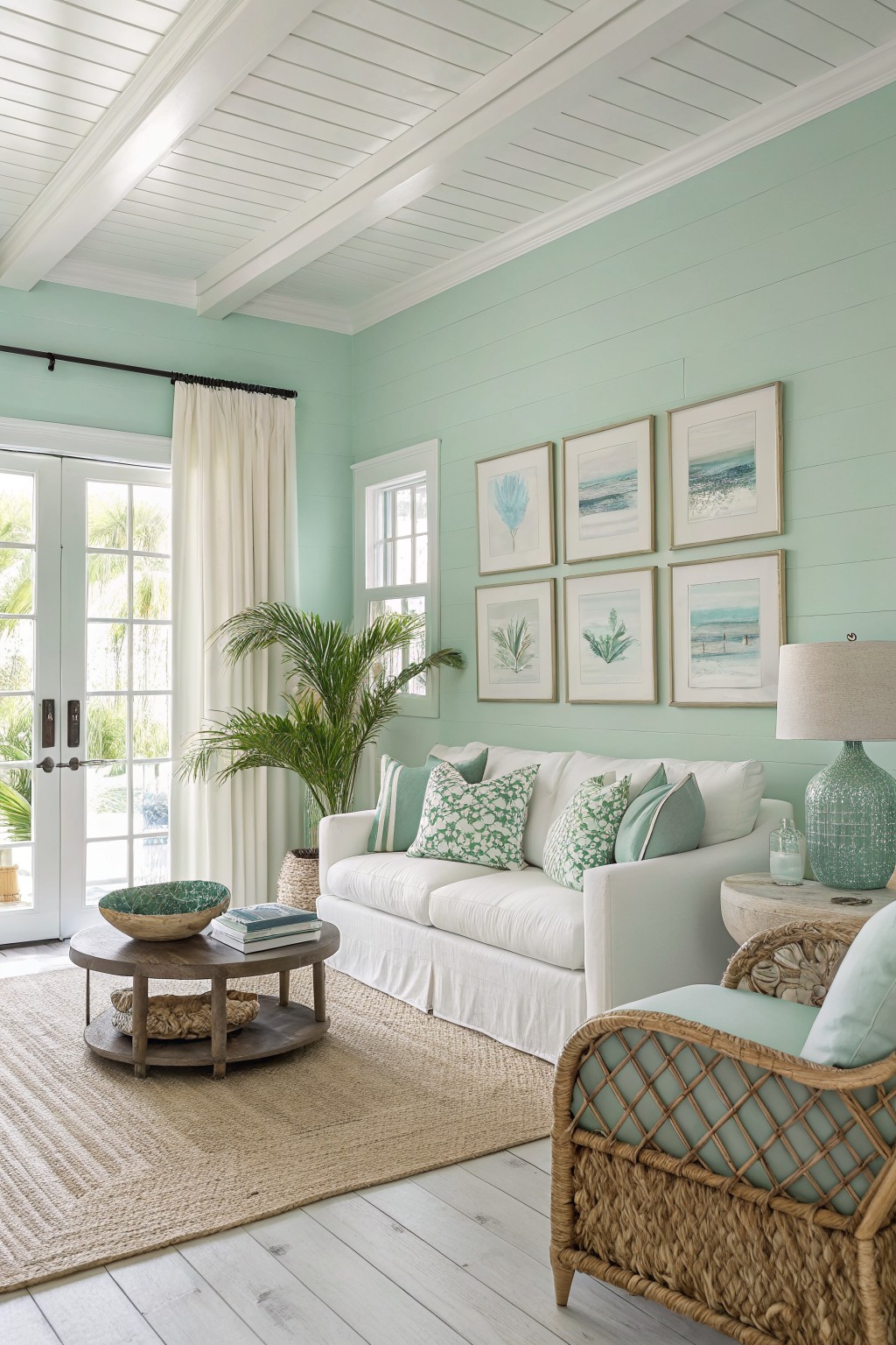
This soft mint green is a light, slightly blue-green that feels fresh without being too bold. It gives the walls a calm, airy quality that works well in living rooms where you want color but still need the space to feel open and easy to live in.
The color has a gentle cool undertone that stays soft next to white trim and light wood floors. It pairs nicely with linen or cotton fabrics and simple wood pieces, though it can look a little gray if the room gets mostly indirect light.
Soft Lavender Gray Walls

A soft lavender gray covers the walls in this living room and keeps the space feeling calm without going flat. The color sits right between a true gray and a very light purple, which gives it just enough character to stand out while still working as a background.
It has cool undertones that read nicely against the warm wood floors and deeper purple furniture. This shade suits rooms with steady daylight and pairs easily with natural wood, cream textiles, or simple black accents.
Deep Green Living Room Walls
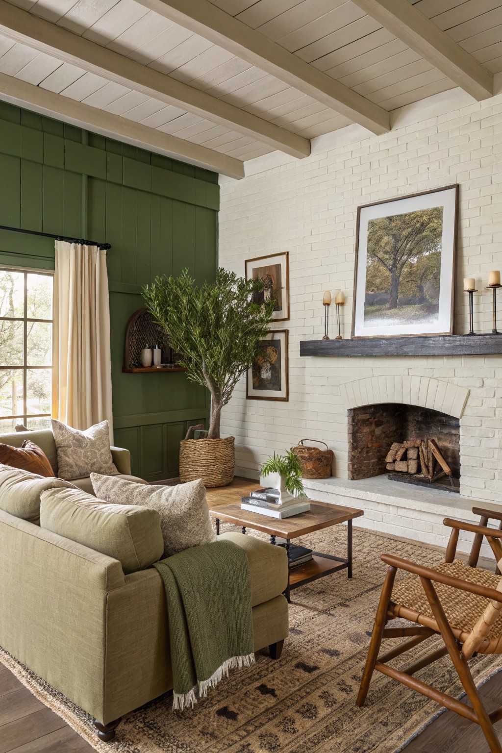
This deep green wall color brings a calm and grounded feeling to the living room. It sits in the forest green family and reads as a rich, slightly muted shade that feels cozy rather than bold. It looks closest to Benjamin Moore Hunter Green, Sherwin Williams Forest Green, Behr Forest Floor, or Farrow & Ball Bancha.
The color has a cool undertone that plays nicely against white brick and warm wood tones. It works best in rooms with decent natural light and pairs easily with neutral textiles and simple wood furniture. Watch the depth if your space is small, since it can feel heavier without enough light.
Warm Ochre Walls
This warm ochre color gives living rooms a sunny yet grounded feel. It sits somewhere between golden yellow and soft terracotta, which makes it feel cheerful without being too bright. It works especially well when there is plenty of wood and natural texture in the room to balance it out.
The undertone leans warm and earthy, so it pairs nicely with cream fabrics, dark wood, or simple woven pieces. It can look a little flat in very low light, so most people use it in rooms that get good daylight. Sherwin Williams Baked Clay sits close, as does Benjamin Moore Hawthorne Yellow and Farrow & Ball India Yellow.
Deep brown walls
This living room uses a deep brown on the walls that feels grounded and comfortable. The color has warm undertones that keep the space from feeling cold, and it works especially well in rooms with wood trim and natural light.
It pairs nicely with lighter upholstery and brass accents without competing for attention. Try it in living rooms where you want some depth but still need the space to feel usable every day.
Frequently Asked Questions
Q: I have a small living room. Which colors from the list would keep it from feeling cramped?
A: Go for soft neutrals or light grays that bounce light around. They open up the space without making it feel bare. Add a warm wood tone through furniture to keep things cozy.
Q: My sofa is already a neutral tone. How do I add one of these chic shades without clashing?
A: Pick a color that has similar undertones to your sofa. Layer in a muted green or terracotta through pillows and throws first. This lets you test the vibe before committing to paint.
Q: What about painting just one wall instead of the whole room?
A: That works great for bolder ideas. Choose the wall behind the sofa or TV to create a focal point. But keep the other walls light so the room still feels balanced and inviting.