I have found that wall colors rarely stay exactly as they look on a small swatch once they cover an entire room and meet the light that actually comes through the windows.
Undertones show up differently depending on the time of day and how they sit next to trim or the flooring already in place.
Testing a sample first saves the most regret later.
A color that feels calm in one corner can shift warmer or cooler by the opposite wall, and I usually check both spots before deciding.
Living with the paint for a day or two also shows whether it will hold up once furniture and everyday items are back in the space.
Warm Yellow Walls
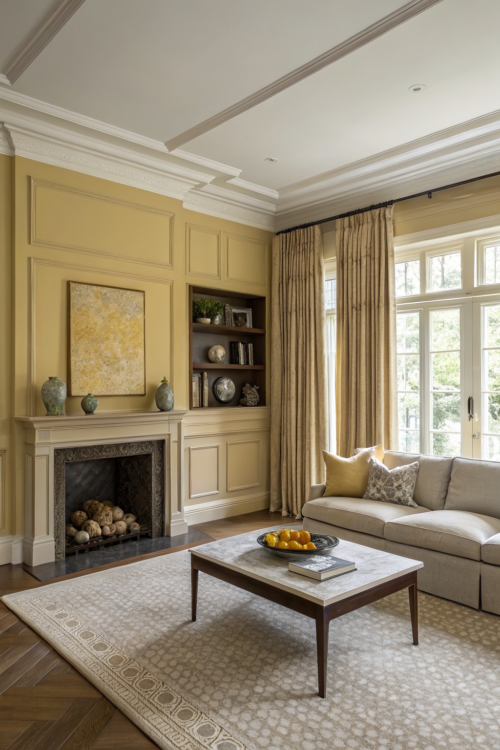
A soft golden yellow like this one gives the room a gentle warmth that feels both calm and inviting. It sits right in that middle ground between pale and rich, so it adds color without making the space feel busy or overwhelming. Many people reach for shades in this family when they want something a little sunnier than beige but not as bold as true yellow.
It works especially well with cream trim and wood floors, though it can shift a bit depending on the light. Good matches to try are Sherwin Williams Rattan, Benjamin Moore Hawthorne Yellow, or Farrow & Ball Yellow Ground.
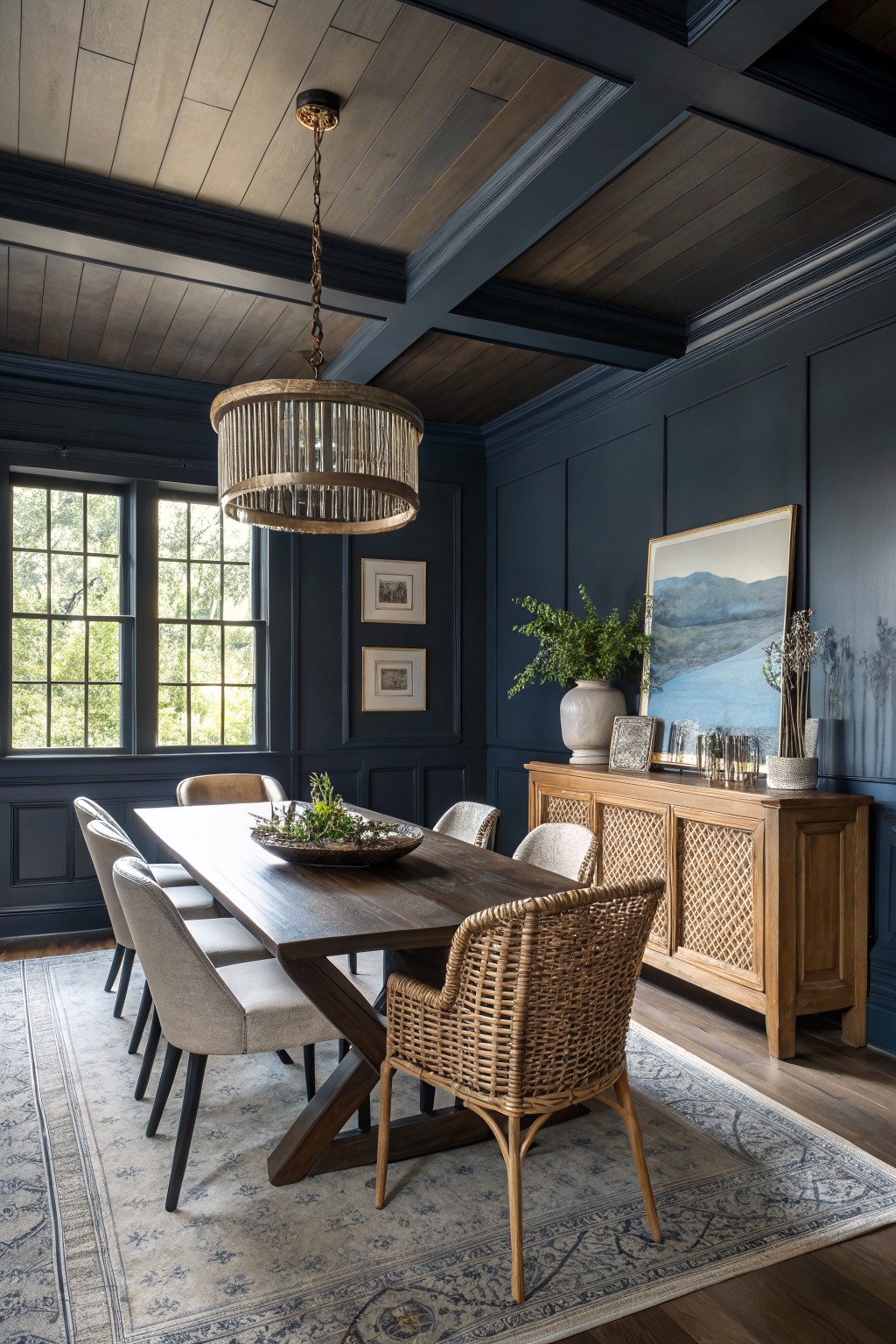
This deep navy blue gives the walls a strong but quiet presence. It sits on the cooler side with a touch of gray that keeps it from feeling too heavy, and it works especially well in rooms with plenty of wood tones and natural light.
The color looks closest to Sherwin Williams Naval, Benjamin Moore Hale Navy, or Farrow & Ball Hague Blue. It pairs nicely with warm wood furniture and lighter upholstery, though it can feel a little stark if the lighting stays dim all day.
Deep Teal Cabinets
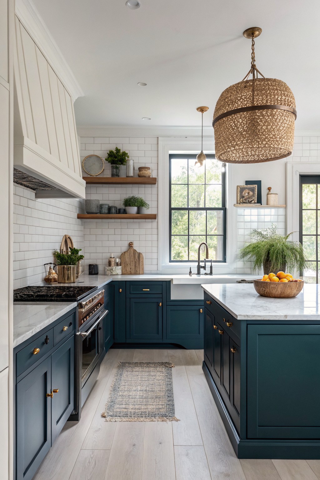
A deep teal works well in kitchens because it adds richness without feeling heavy. This color sits between navy and green, giving the space a calm but grounded feel that still reads elegant next to white tile and light wood tones.
It tends to have a slight blue undertone that shows up more in cooler light, so it pairs nicely with warm brass hardware and marble surfaces. Try it on cabinets if your kitchen gets good natural light, and keep the surrounding walls and trim crisp to let the teal stand out.
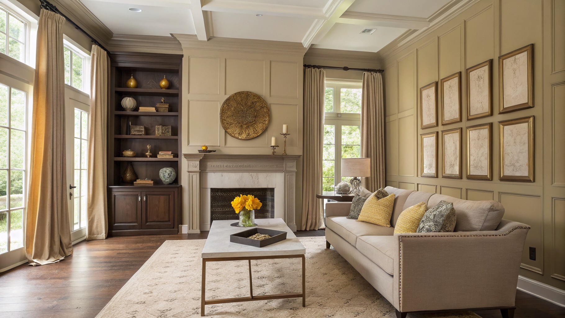
Warm Greige Walls
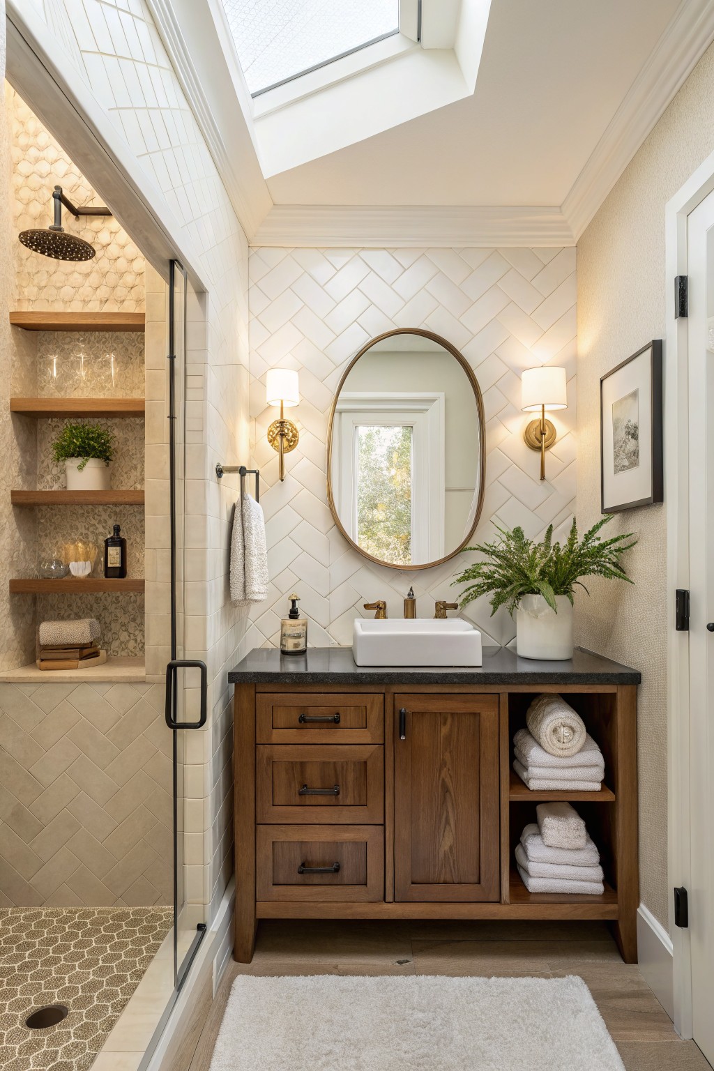
This warm greige brings a soft beige tone to the walls that feels calm without looking too cool or flat. It sits nicely next to wood tones and keeps the room from feeling stark even when the light changes through the day.
The color has a gentle warmth that works well with tile and natural wood cabinetry. It suits bathrooms or smaller spaces where you want something quiet that still feels finished and easy to live with.
Soft Greige Walls
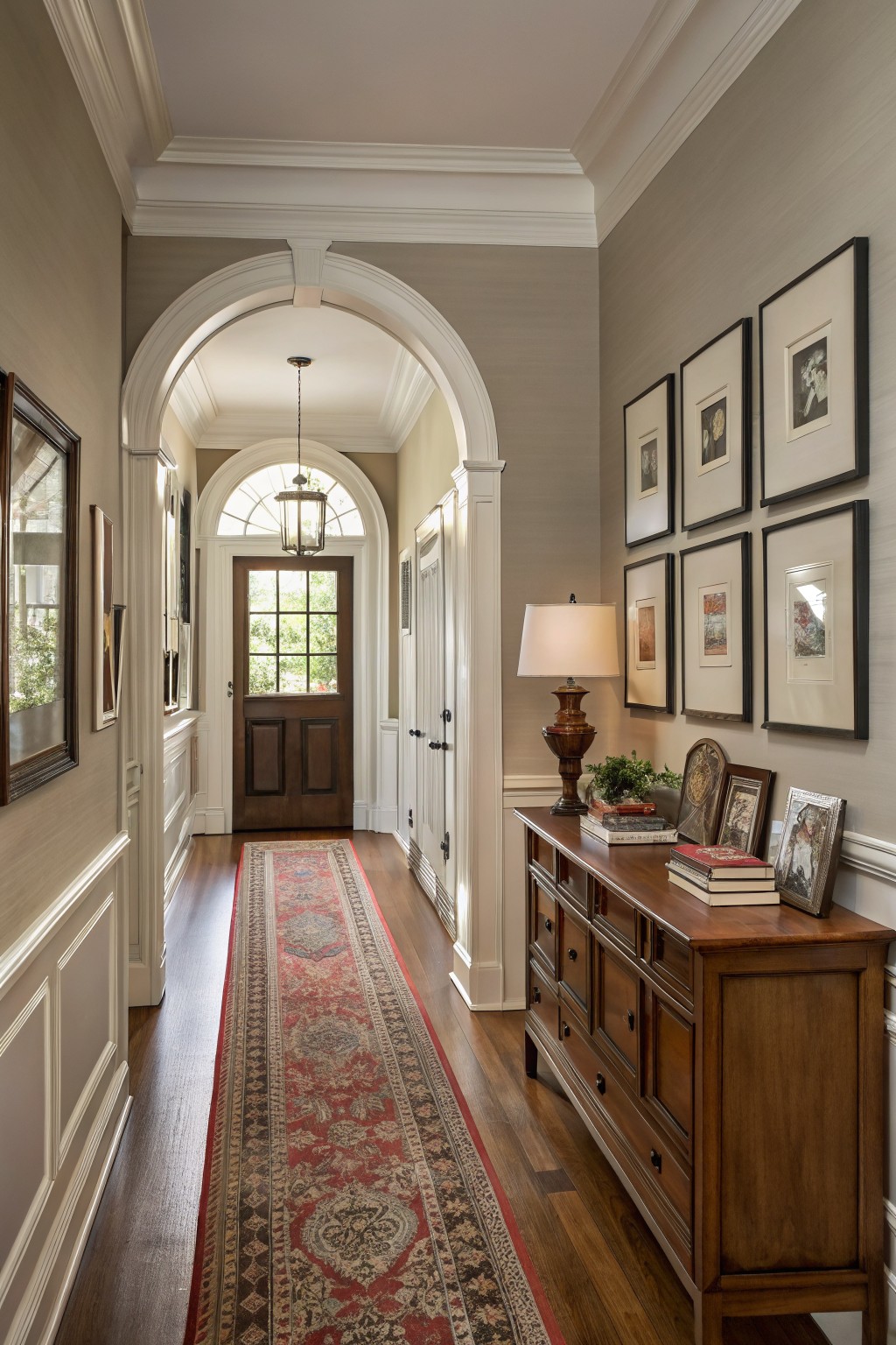
This soft greige sits right between gray and beige, giving the walls a quiet warmth that still feels neutral. It reads as calm and steady in the hallway without pulling too cool or too brown, which makes it easy to live with over time.
The color has a light warm undertone that plays nicely with dark wood floors and crisp white trim. It works best in homes that already have wood tones or classic details, and it holds up well in both natural daylight and evening light. Pair it with simple wood furniture or layered rugs if you want the space to feel balanced.
Soft Blue Gray Walls
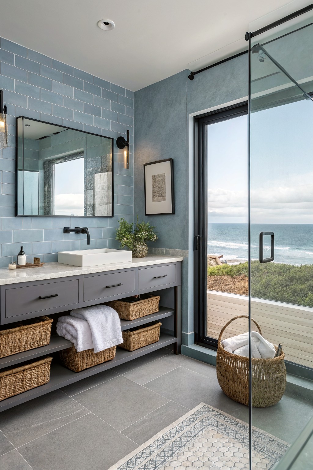
A soft blue gray like this gives a bathroom a calm, steady feel without making it feel cold. It sits right in the middle of blue and gray so it works with both warm and cool tones in the room. Colors like Sherwin Williams Silver Strand or Benjamin Moore Harbor Gray come close to this shade.
It has a slight cool undertone that shows up more in bright light from a window. Gray cabinetry and white marble keep it grounded, while the blue tile on the back wall helps it feel connected rather than flat. Avoid pairing it with too many yellow or orange accents or it can start to look washed out.
Muted Olive Green Walls
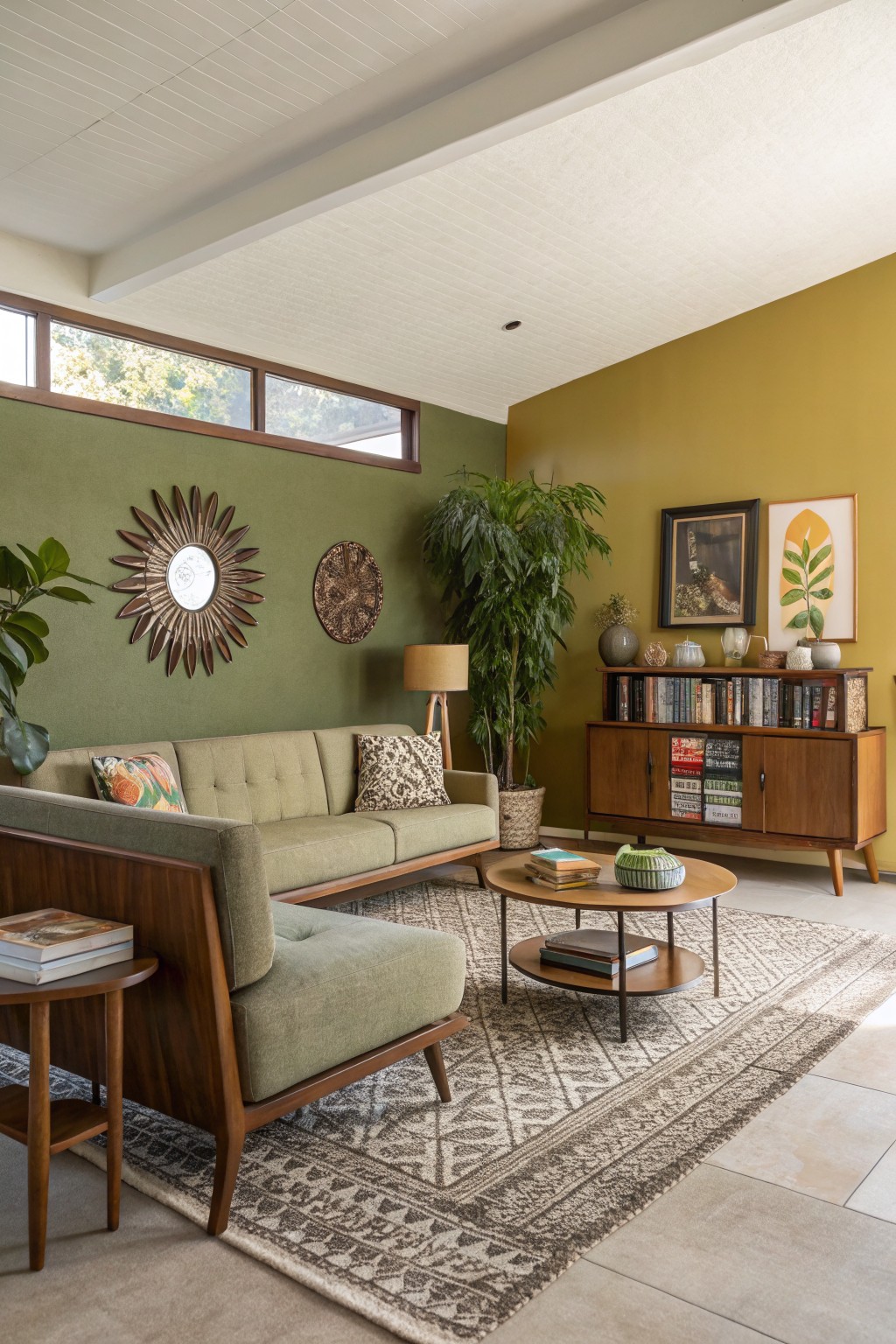
This muted olive green brings a grounded feel to a living room without making it feel heavy. It sits somewhere between sage and olive, with a soft warmth that keeps the space from looking too stark next to wood tones and natural textures. Colors like Sherwin Williams Dried Thyme, Benjamin Moore Soft Fern, or Behr Aged Olive give a similar effect.
The color has a slight yellow undertone that shows up more in daylight, so it works best in rooms with decent natural light. It pairs easily with medium wood furniture and simple textiles, though it can start to feel dull if the room already has a lot of cool grays.
Soft Pink Beige Walls
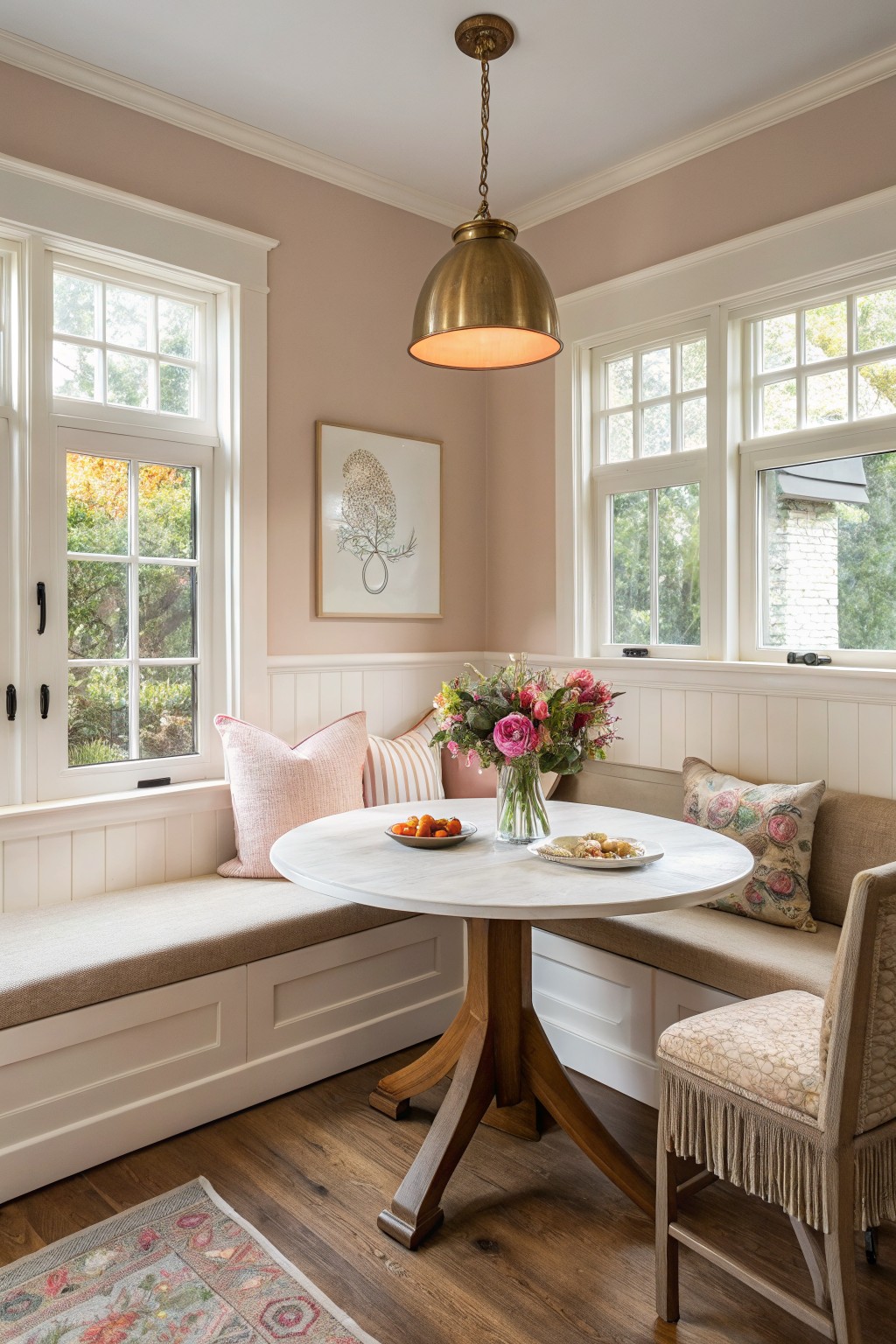
This soft pink beige brings a gentle warmth to walls without feeling too sweet or too plain. It sits in that middle ground between beige and blush, so it feels calm and a little bit soft at the same time. The color works especially well in rooms that get steady daylight, where the pink undertone stays quiet instead of turning strong.
White trim and natural wood floors keep it from feeling heavy, and it pairs nicely with linen, brass, or simple upholstery. Just watch the lighting. In cooler north light it can lean a touch more gray, while strong afternoon sun brings out the pink side more clearly. Benjamin Moore Pale Pink, Sherwin Williams Romance, and Farrow & Ball Setting Plaster all sit close to this look.
Soft Pink Walls
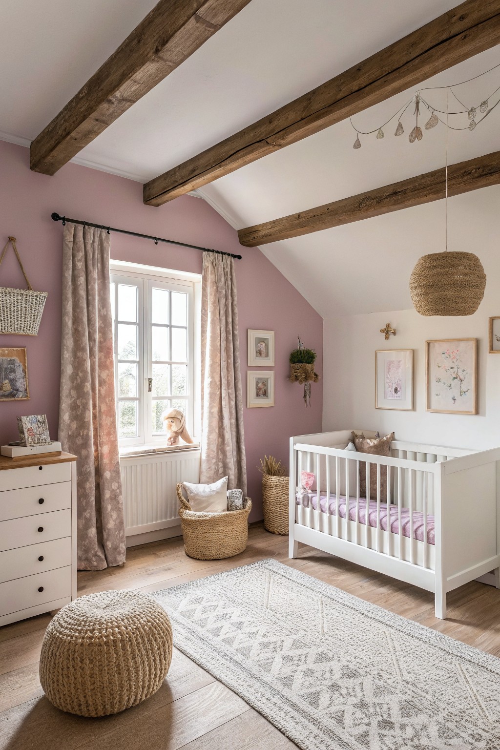
A soft warm pink like this one gives a room a gentle, refined feel without turning it too sweet or childish. The color has a dusty quality with just enough beige in the undertone to keep it calm and easy to live with. It pairs naturally with white trim and wood tones that show up in older homes.
This shade works well in bedrooms or sitting rooms that get steady daylight. It can shift slightly cooler in north light so testing a sample on the wall helps. Keep the trim bright white and add simple woven textures or light wood furniture to let the pink stay the main focus.
Soft Blue-Gray Walls
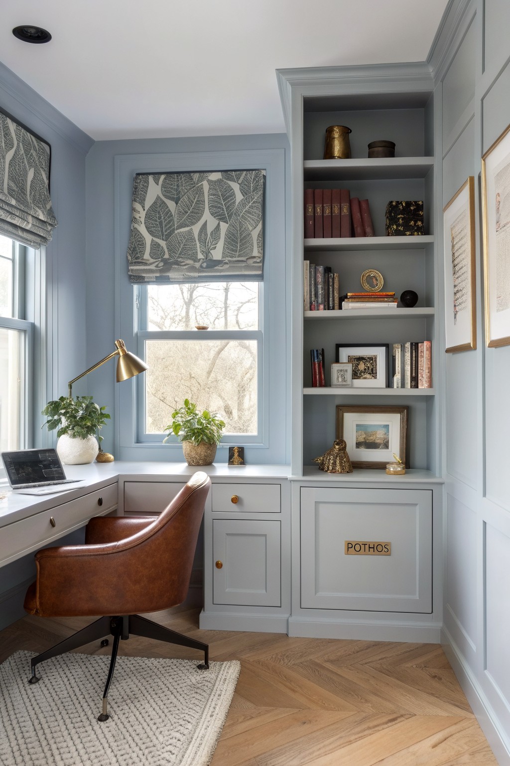
This room shows a soft blue-gray on the walls and built-in shelves. It is a cool, muted shade that feels calm and a little quiet. The color sits well next to the warm wood floor and keeps the space from feeling too plain or cold.
It has a touch of gray in the undertone, so it stays steady even when the light changes. This kind of blue-gray works best in smaller rooms like a study or office. Use it with simple wood furniture and white trim to keep the look clean and easy to live with.
Soft yellow walls
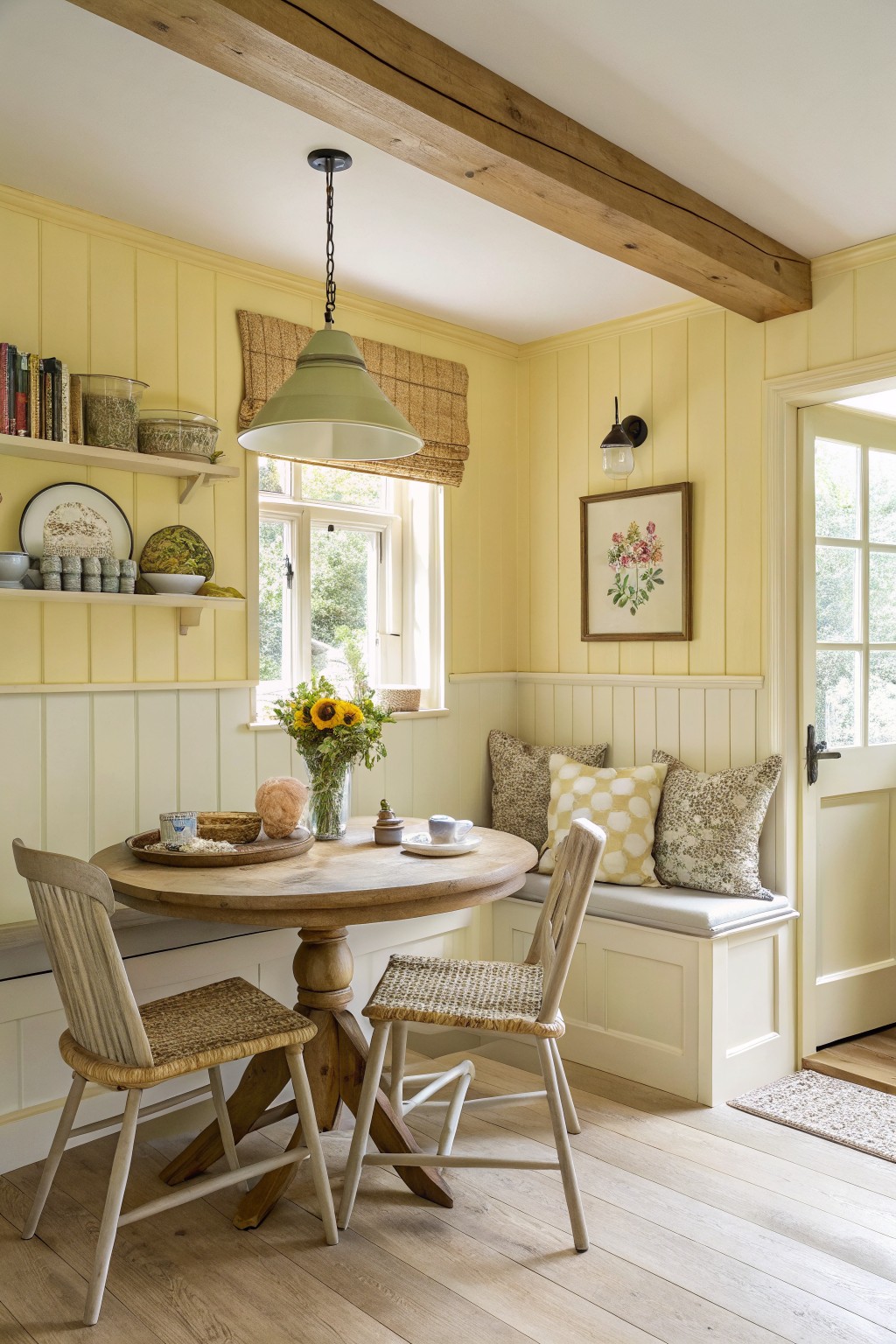
This soft yellow brings a quiet brightness to a room without feeling loud or overpowering. It sits in that gentle buttery range that warms up wood tones and white trim while still keeping the space feeling open and calm. People often reach for it in kitchens or small dining spots where they want a little cheer but nothing too bold.
It can pick up a faint green undertone depending on the light, so test it on a big sample first. It pairs easily with natural wood furniture, woven textures, and simple white details. Good matches in this family include Sherwin Williams Buttercup, Benjamin Moore Pale Yellow, Behr Lemon Verbena, and Farrow & Ball Yellow Ground.
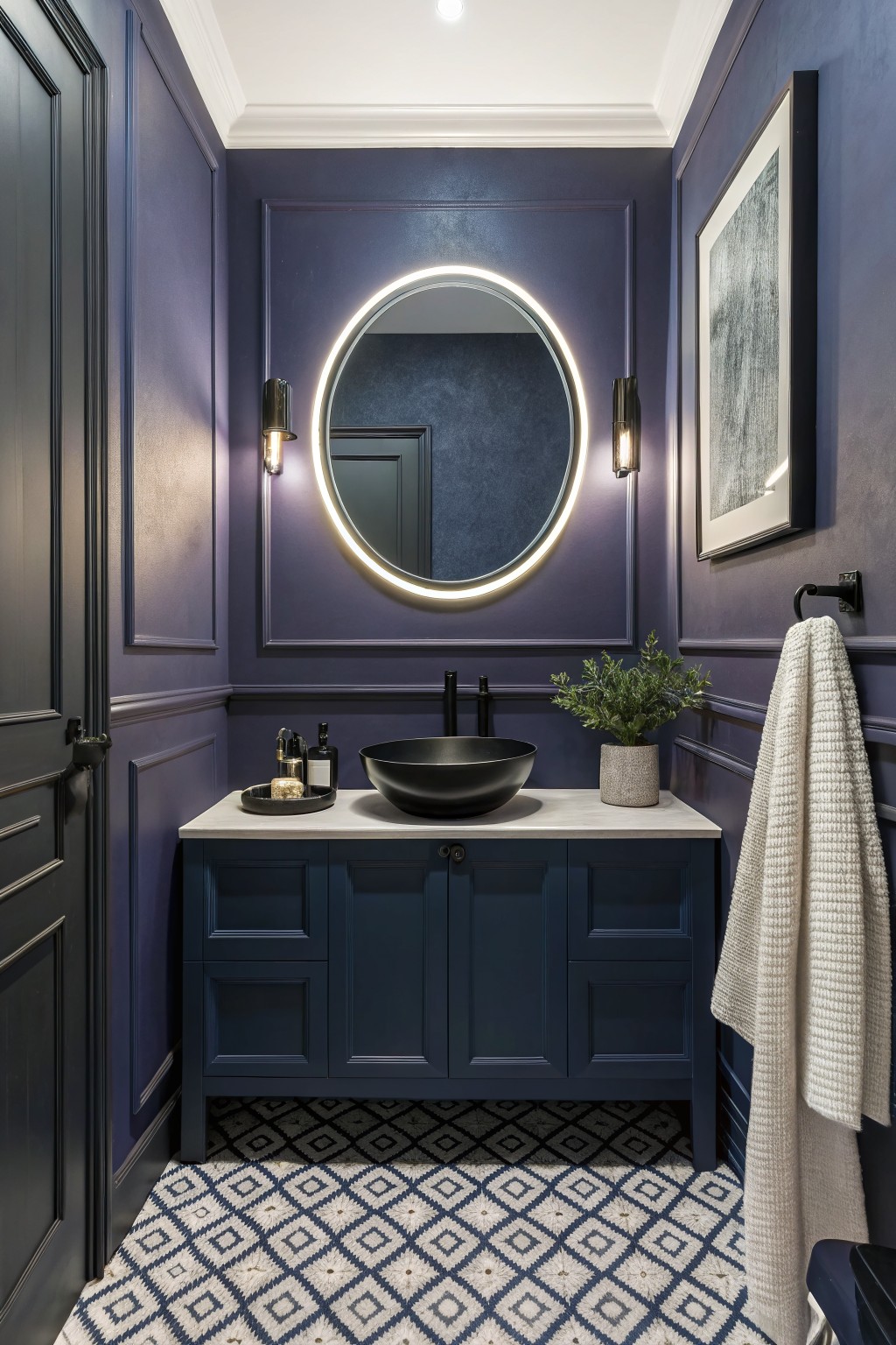
A deep navy blue like this gives a room real presence without feeling heavy. It reads as a rich, slightly cool navy that adds quiet elegance to smaller spaces like a powder room or guest bath.
The color has a soft matte finish that works nicely with white ceilings and dark wood cabinetry. It pairs well with light stone counters and simple black fixtures, though it can look flat if the lighting stays too dim.
Deep Teal Bedroom Walls
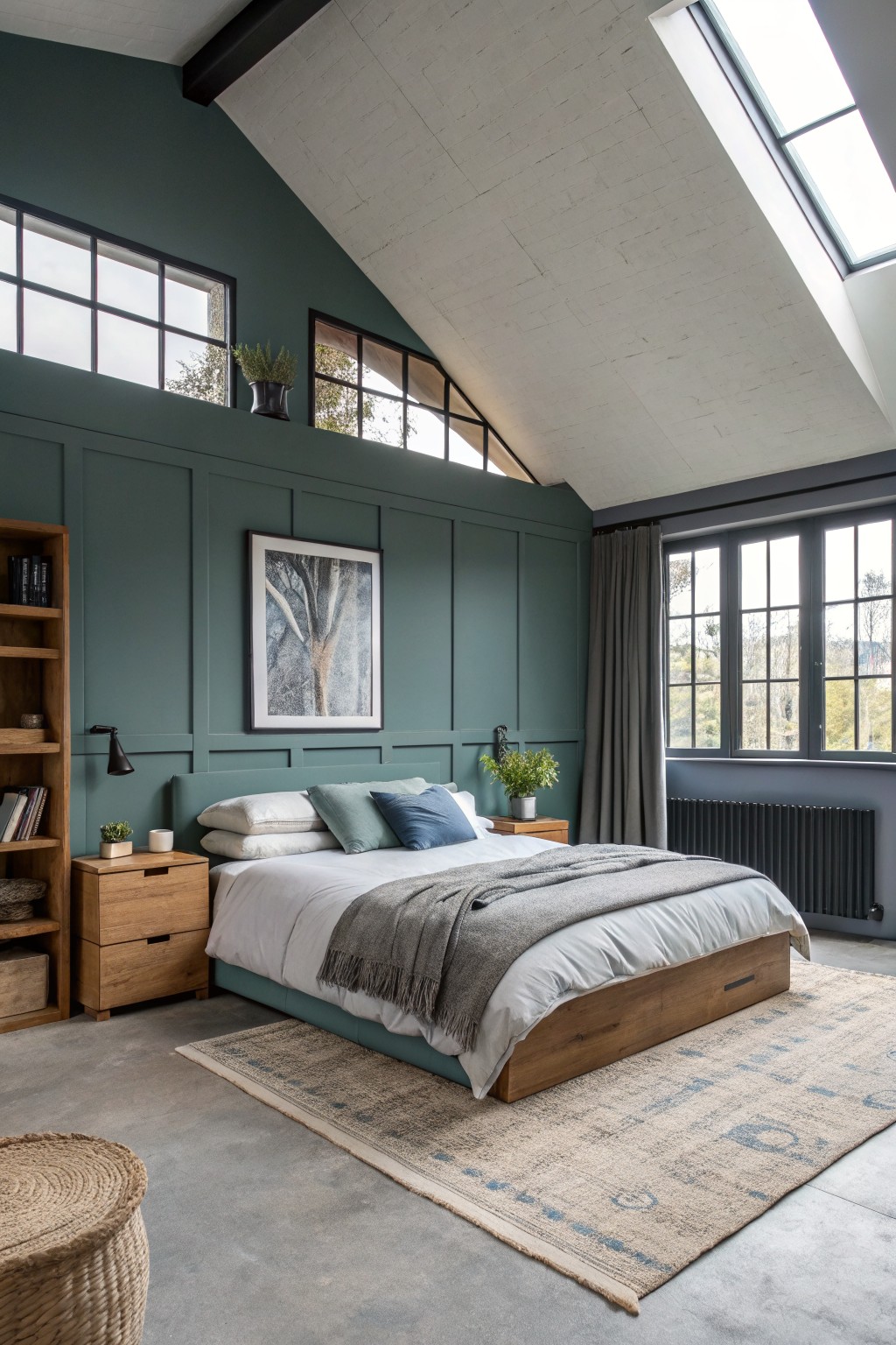
A deep teal like this gives the walls a solid, quiet presence without feeling heavy. It sits somewhere between green and blue and works especially well in rooms with lots of natural light and wood tones. The color reads very close to Farrow & Ball Inchyra Blue, Benjamin Moore Aegean Teal, or Sherwin Williams Riverway.
It holds up nicely next to warm wood furniture and white bedding, and the depth keeps the space from looking too stark. In a bedroom this size it feels settled rather than bold, though it can look cooler under artificial light so testing a sample on the actual wall is worth it.
Soft Teal Walls
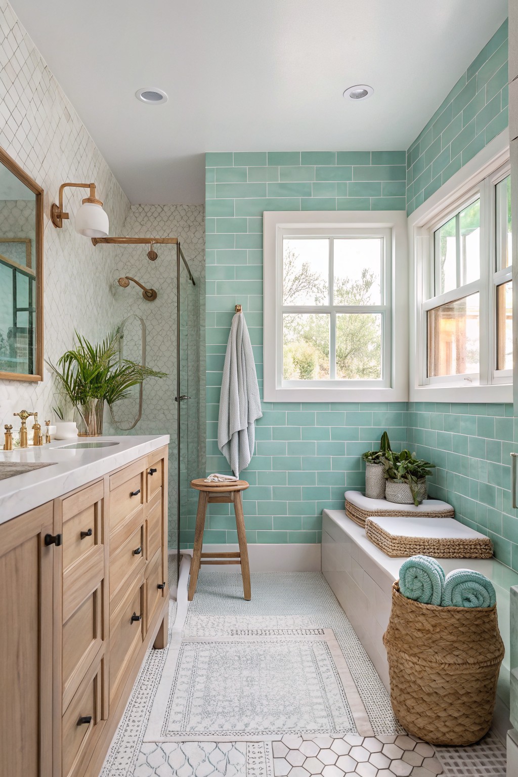
This soft teal brings a cool, clean feel that works nicely in a bathroom. It reads as a gentle green-blue rather than a bright turquoise, and it sits comfortably next to white trim and warm wood tones. Colors like this often feel fresh without making the space feel cold.
It has a slight gray undertone that helps it stay calm in different lighting. Try it in rooms that get steady natural light, and pair it with simple whites or natural wood to keep the look balanced. Too many cool metals can push it toward feeling chilly.
Warm Terracotta Walls
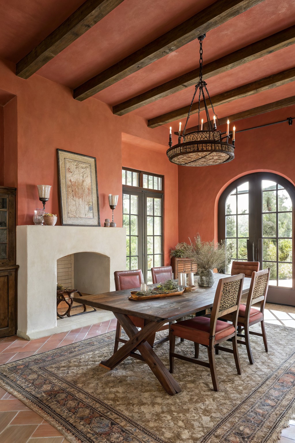
This warm terracotta color gives the room a grounded, earthy feel without being too heavy. It sits somewhere between orange and red, with enough depth to make the space feel welcoming and a little bit rustic. The shade works especially well in rooms that get plenty of natural light, since it keeps the walls from looking flat or dull.
It has soft orange undertones that pair nicely with dark wood and leather. Try it in dining rooms or living areas where you want something a bit richer than beige but still neutral enough to live with every day. Just watch how it shifts in different lighting before committing to the whole room.
Soft Blue Walls
A soft blue-gray like this one brings a gentle calm to a room without making it feel cold. It sits somewhere between blue and gray, so the color stays light and easy on the eyes even when the sun is bright. People often reach for shades like Benjamin Moore Palladian Blue, Sherwin Williams Rainwashed, Behr Silver Strand, or Farrow & Ball Borrowed Light when they want this same quiet look.
The cool undertone pairs nicely with white trim and light wood floors, which keeps the space feeling open. It works well in bedrooms or small sitting areas where you want a little color but still need the room to feel restful. Just watch how it shifts with different lights, since it can lean more gray in the evening.
Soft Sage Green Walls
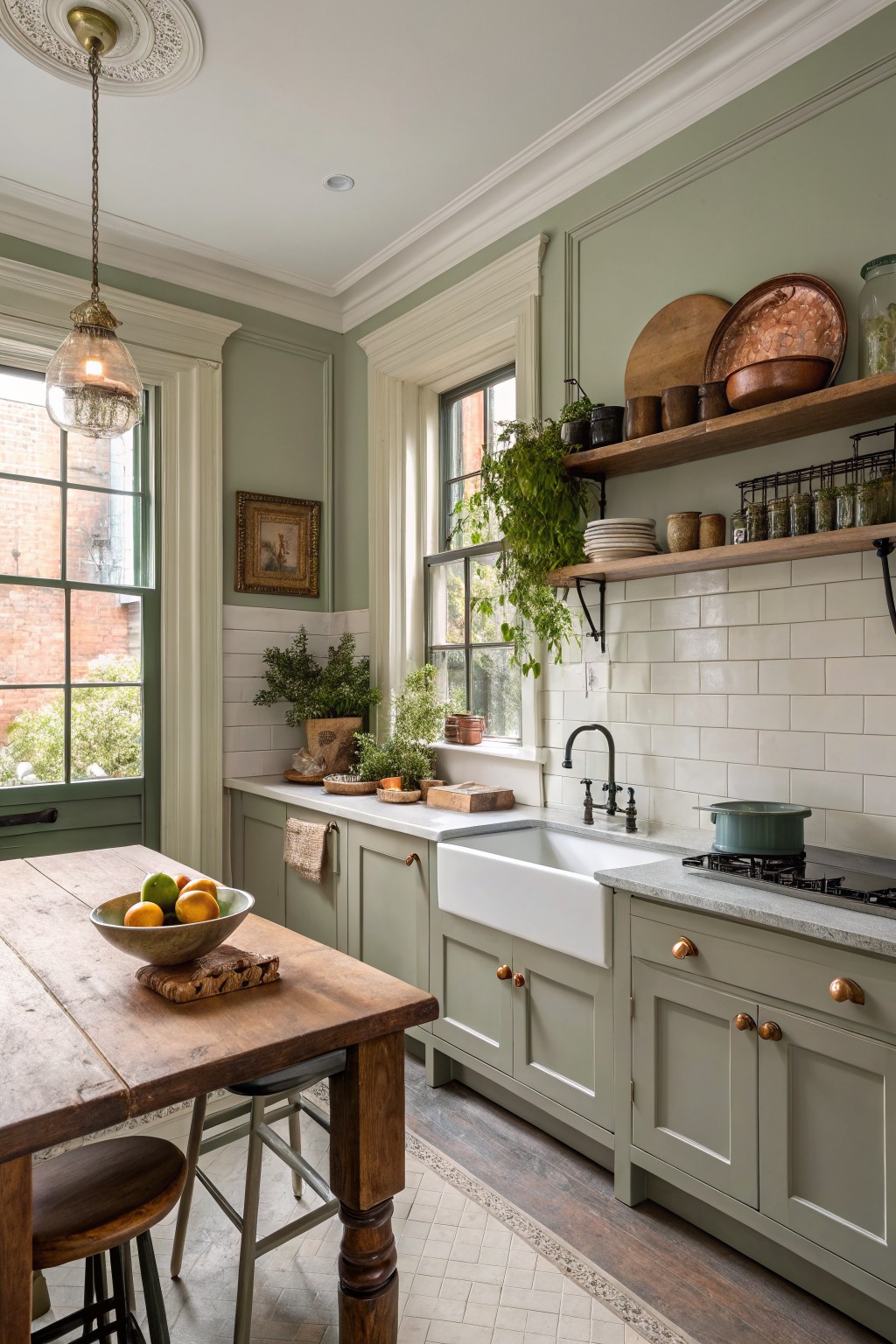
A soft sage green like the one here brings a calm, natural feel to a kitchen without making the space feel heavy. It has a gentle gray undertone that keeps it from looking too bright or too yellow, and it pairs easily with white cabinetry and wood tones.
This color works best in rooms with good natural light where the green can stay soft rather than turning dull. It looks especially nice next to warm wood counters or simple white tile, though it can feel a bit cool in very shaded spaces. Good matches include Farrow & Ball Lichen, Sherwin Williams Rainwashed, Benjamin Moore October Mist, and Behr Aloe Vera.
Soft Greige Built-ins
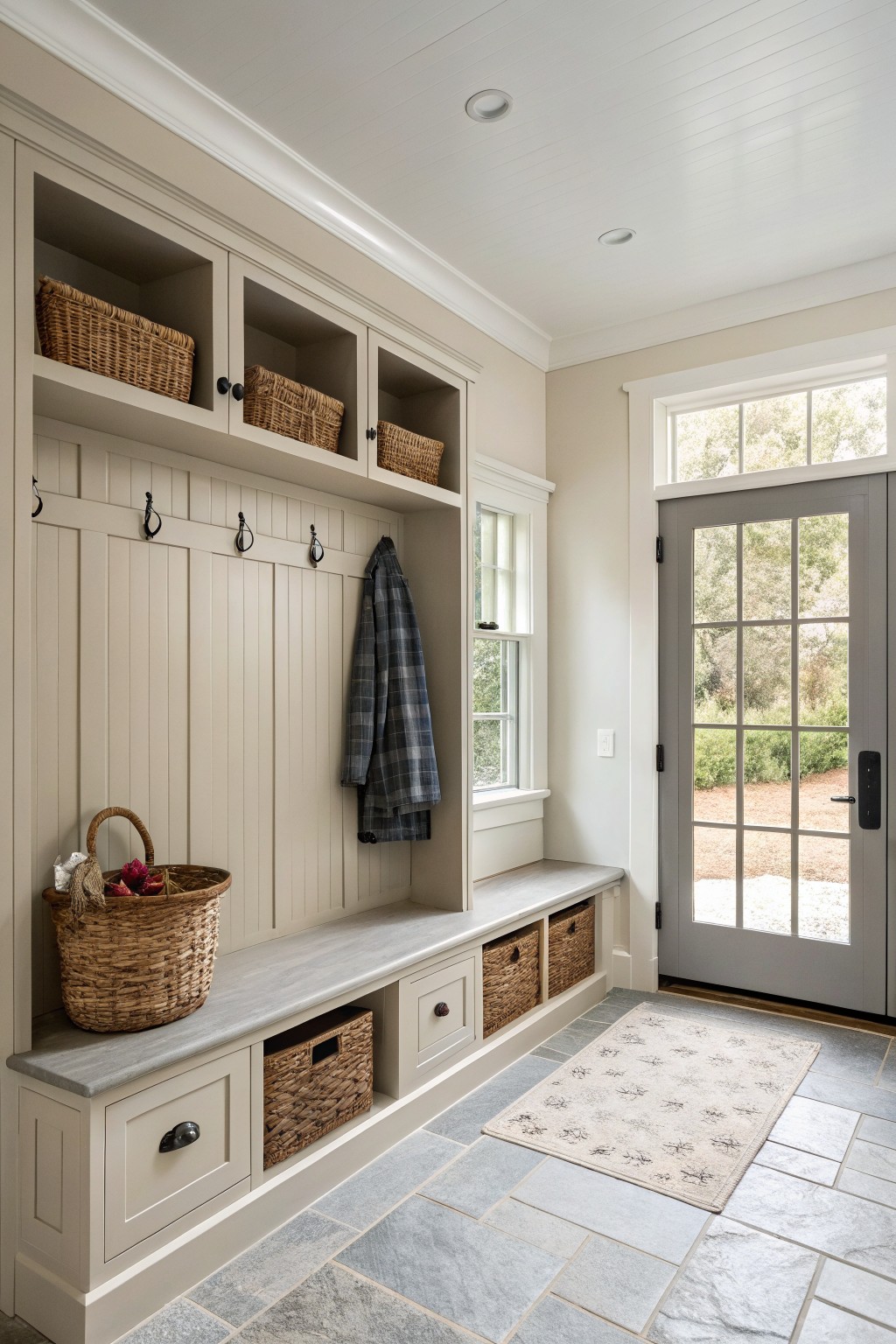
This soft greige is the kind of neutral that feels steady and calm in a busy entry space. It has just enough warmth to keep the room from feeling stark, especially with all the cabinetry and hooks taking up so much wall area.
It pairs easily with the gray floor tile and wood baskets without competing for attention. Something close to Sherwin Williams Accessible Beige or Benjamin Moore Edgecomb Gray would give you that same balanced look in a similar room.
Frequently Asked Questions
Q: Does lighting affect how these elegant paint colors turn out?
A: Check the light in your room at different hours before choosing. A color that looks soft in the store might feel too dark once the sun hits it.
Q: How do I match a new wall color with my existing rugs and curtains?
A: Pull out the undertones from your fabrics. A neutral beige often blends well if your textiles have warm hints.
Q: Is it worth repainting if I only have one accent wall in mind?
A: Yes it can refresh the whole room. Focus on a color that complements your main furniture pieces for the best impact.