I’ve painted enough rooms to know that neutrals aren’t as straightforward as they seem on swatches.
They shift with the light pouring through your windows, sometimes warming up unexpectedly or cooling a space right down.
I once picked what looked like a perfect taupe for my bedroom, only to watch it flatten out under afternoon sun.
The timeless ones in here balance those quirks with undertones that support wood tones and fabrics without overwhelming them.
A few really reward you when you tape up samples and watch them through a full day.
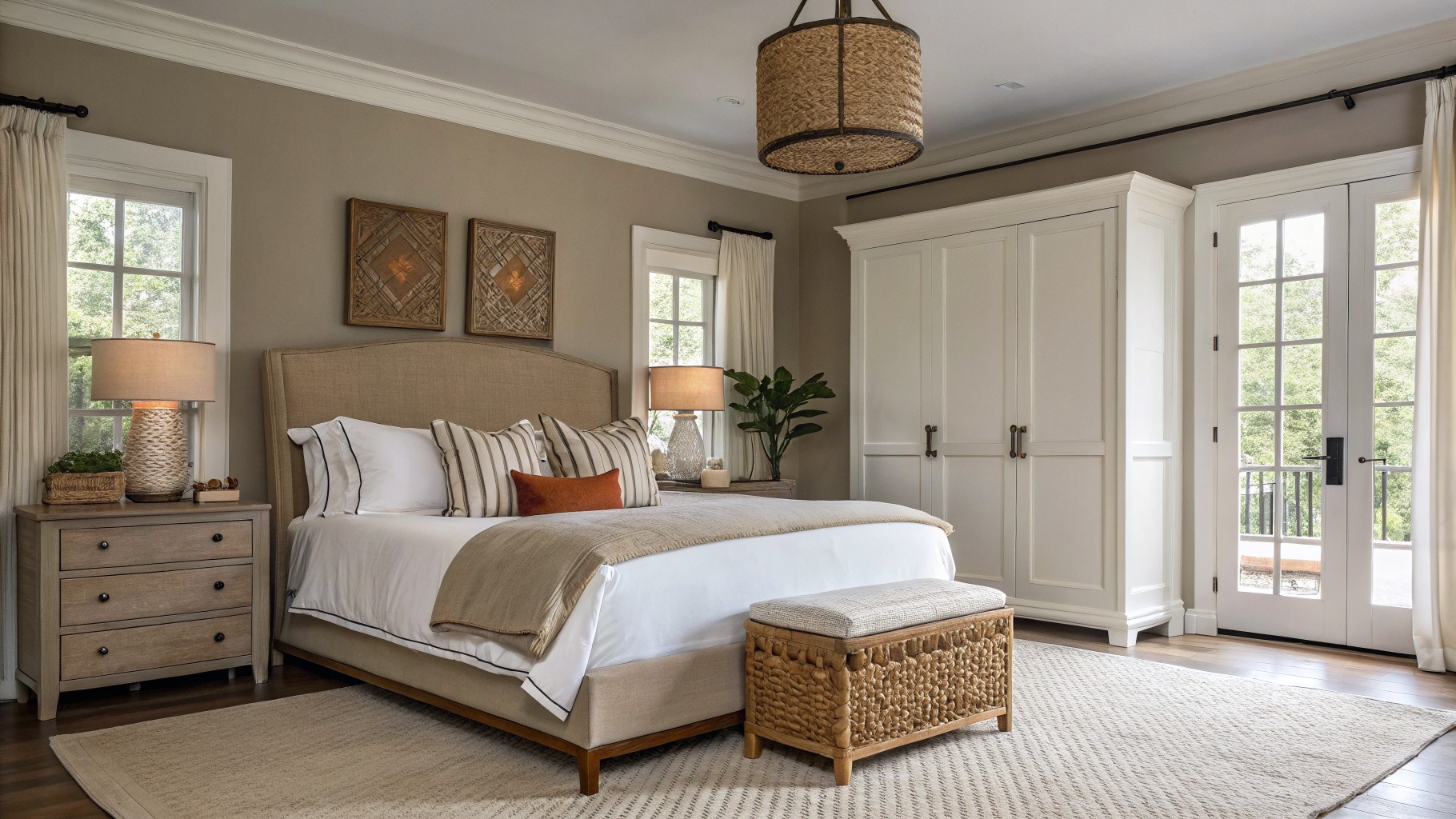
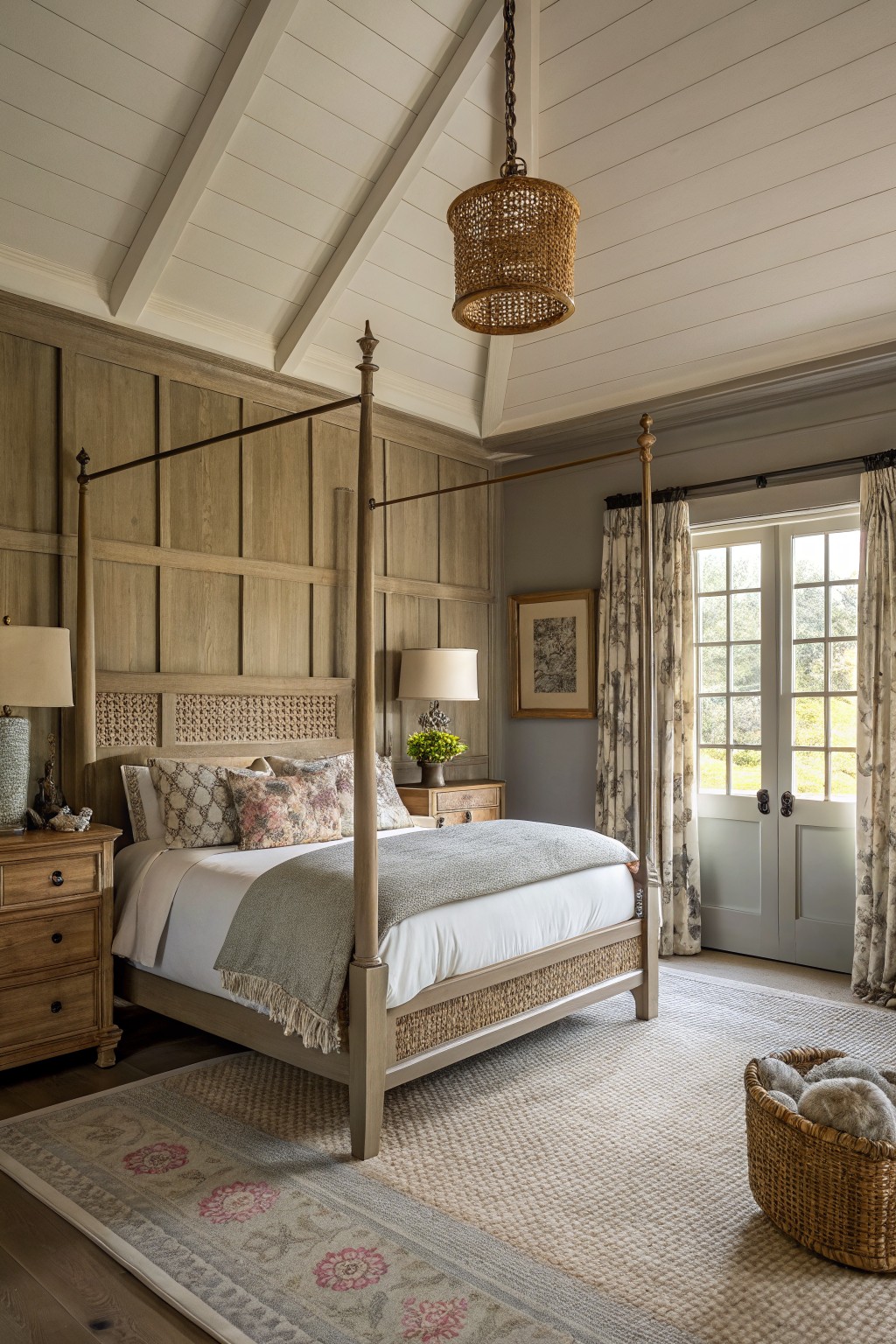
Soft Greige Walls
This bedroom uses a gentle greige on the walls. It looks closest to Sherwin Williams Agreeable Gray or Benjamin Moore Edgecomb Gray, maybe Behr’s Silky White too. That warm neutral family sits just right, light enough for bigger rooms but with enough depth to hold its own.
Warm beige undertones make it forgiving in most light. It works great around wood nightstands and white bedding like here. Pair with textured rugs or plants… just test samples if your space gets dim light.
Soft Blue-Gray Walls
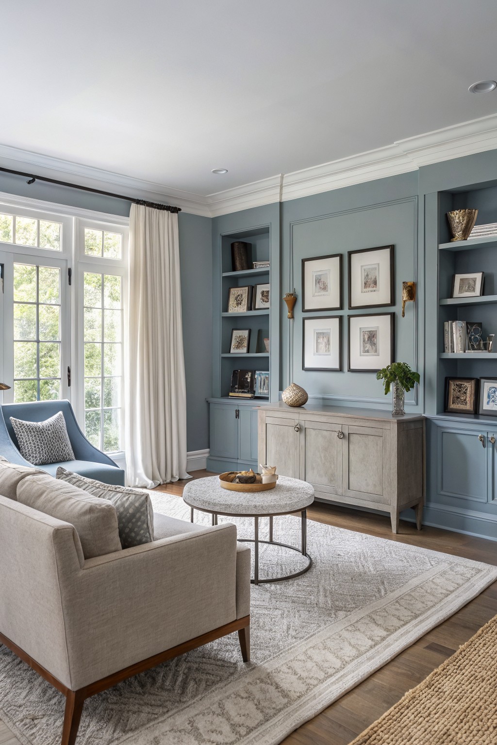
This living room uses a soft blue-gray on the walls and built-ins that seems closest to Benjamin Moore Palladian Blue or Sherwin-Williams Sea Salt. Maybe a touch of Farrow & Ball’s Borrowed Light too. It’s one of those cool neutrals that stays quiet but makes everything else pop a little. People like it because it feels fresh without shouting color.
The undertone leans gray-blue, cool enough for sunny spaces like this one with its big windows. It sits right next to wood floors and beige furniture. Watch for north-facing rooms though, it might read a bit flat there. Stick to creamy whites on trim to keep it balanced.
Warm Beige Walls
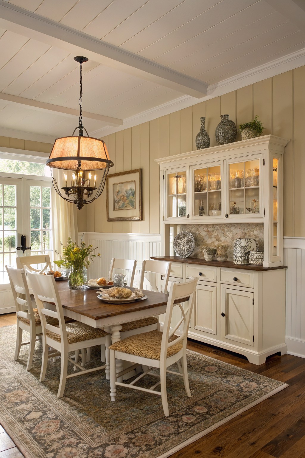
Those walls catch your eye right away with their warm beige tone. It looks closest to Sherwin-Williams Accessible Beige or Benjamin Moore Edgecomb Gray, maybe even Farrow & Ball Skimming Stone. What I like about this shade is how it feels cozy without going too yellow or brown. It just sits easy in a room like this dining space.
The warmth comes from subtle peach undertones that play well off wood floors and furniture. It works best in spaces with good natural light, like near windows, and pairs nicely with crisp white trim. Skip it if your room stays dim all day… it might read flat then.
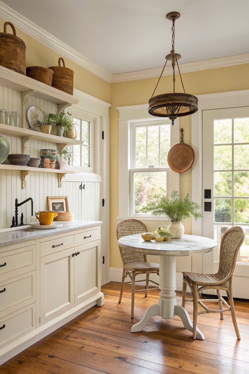
Creamy White Kitchen Cabinets
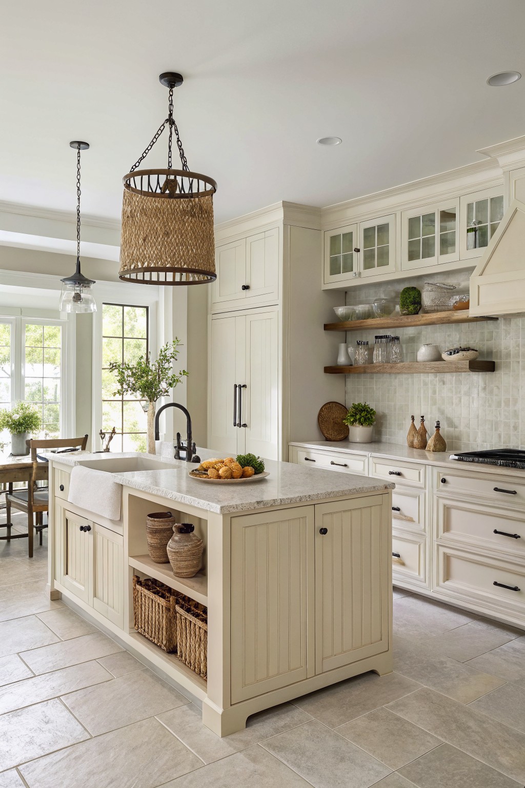
This creamy white covers the cabinets and island in a way that feels just right for everyday use. It looks closest to Sherwin-Williams Alabaster or Benjamin Moore White Dove, maybe even Behr’s Swiss Coffee. That soft warmth keeps it from looking cold next to the wood shelves and natural light coming in.
The beige undertone shows up nicely against the quartz counters and tile floor. It works best in kitchens with good daylight, where it picks up hints of peach or yellow without overpowering. Stick to matte finishes to avoid glare, and it pairs easy with brass hardware or greenery.
Warm Greige Walls
These walls pull off a warm greige that’s easy on the eyes. It reads very close to Sherwin-Williams Accessible Beige or Benjamin Moore Edgecomb Gray, maybe even Behr’s Mocha Foam. Folks go for this kind of neutral because it blends right in with wood tones like the chevron paneling here, keeping everything feeling connected and calm.
That warmth comes from subtle beige undertones, which show up best in rooms with good window light. Pair it with black fixtures and natural baskets for a grounded look. Just watch it doesn’t go too yellow under certain bulbs.
Pale Sage Walls
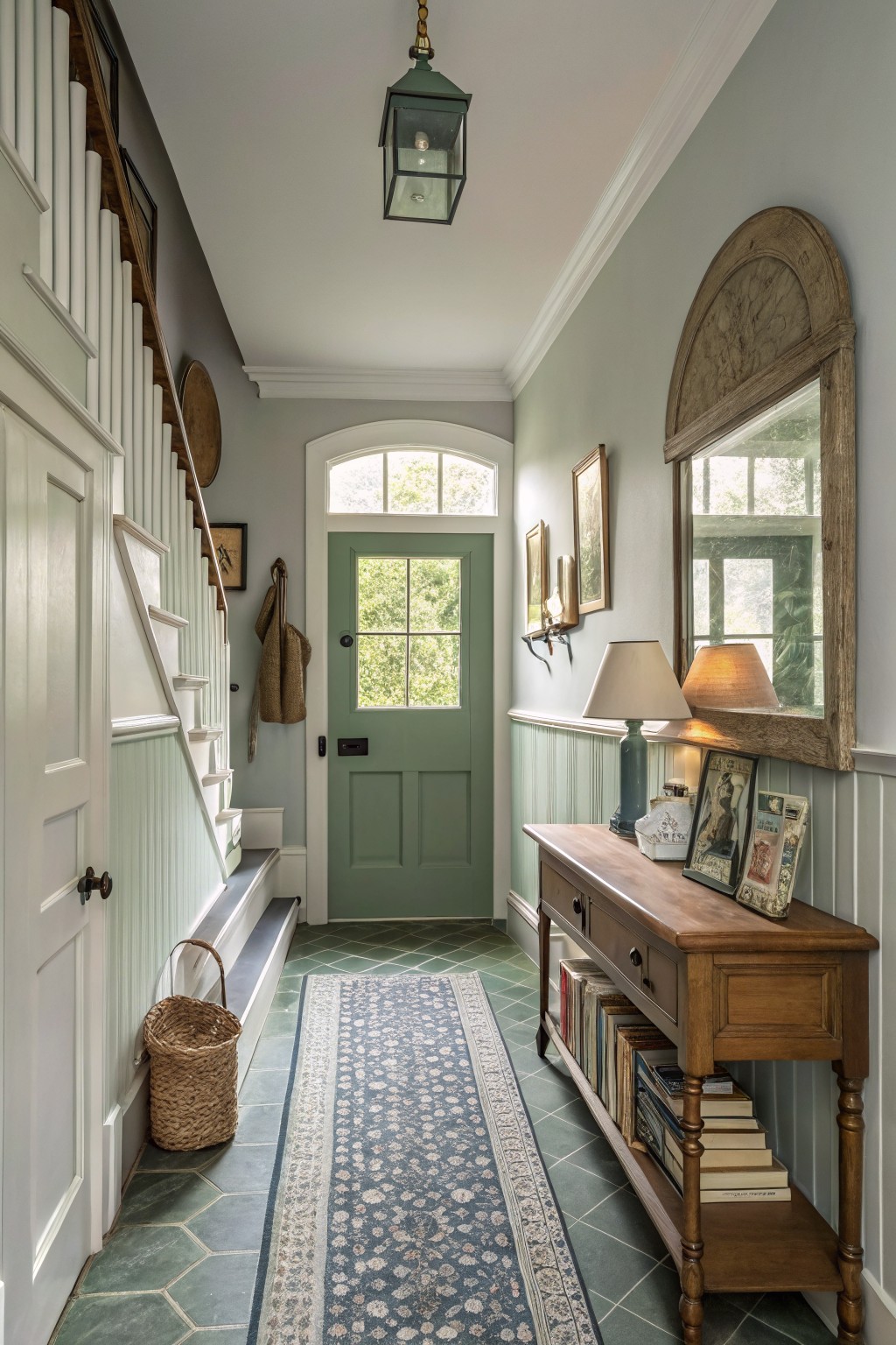
The walls in this entryway pull off a pale sage green that feels like the perfect neutral with just a touch of green. It comes across closest to Sherwin-Williams Sea Salt or Benjamin Moore October Mist, maybe Farrow & Ball French Gray too. What stands out is how calm it keeps the space while nodding to nature, without going full-on bold.
That gray-green undertone plays nice in morning light coming through the windows. It sits well against white woodwork and warm furniture like the hall table here. Stick to natural pairings, and watch it doesn’t fade too much in dim spots.
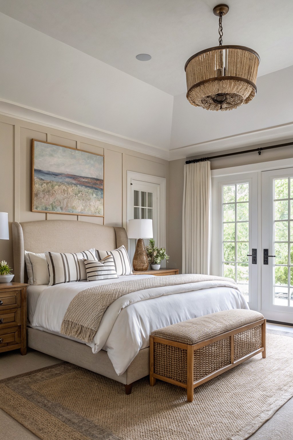
Warm Beige Bedroom Walls
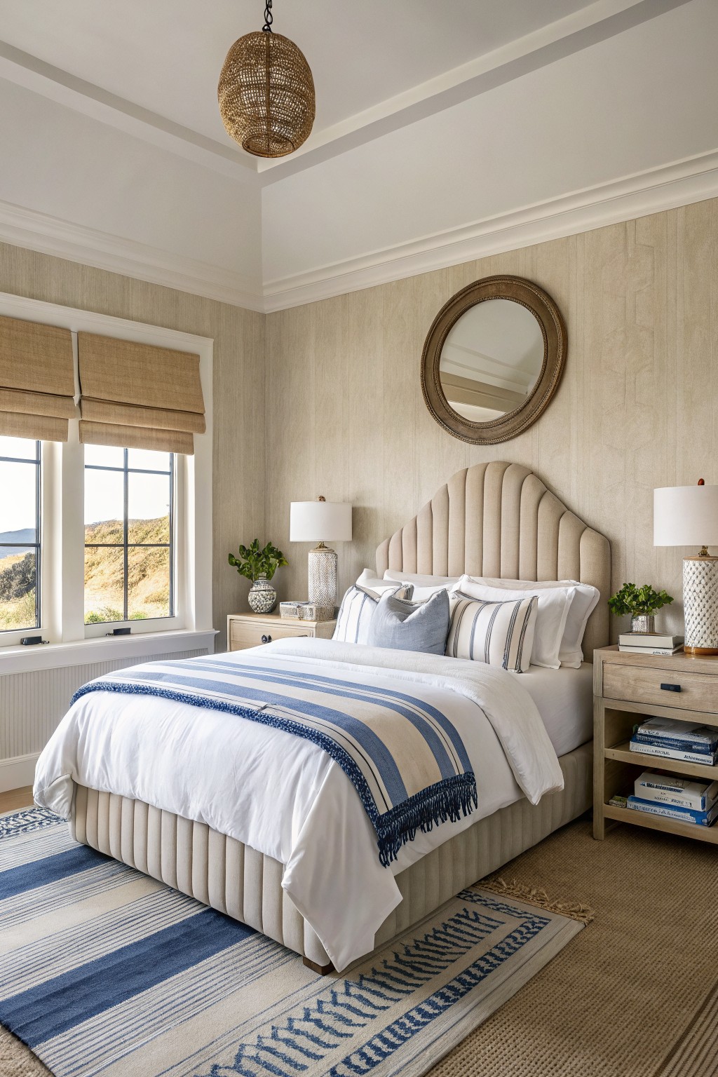
This warm beige on the walls pulls together the whole room without trying too hard. It sits close to Sherwin Williams Accessible Beige or Benjamin Moore Edgecomb Gray, maybe even Behr’s Toasted Almond. That kind of soft neutral keeps things light and easy, especially with the textured finish showing up just right.
The warm undertones pick up the wood tones on the nightstands and let the blue bedding pop without clashing. It works best in rooms with good natural light, like this one facing the water. Pair it with crisp whites on trim to keep it fresh.
Soft Blue-Gray Home Office Walls
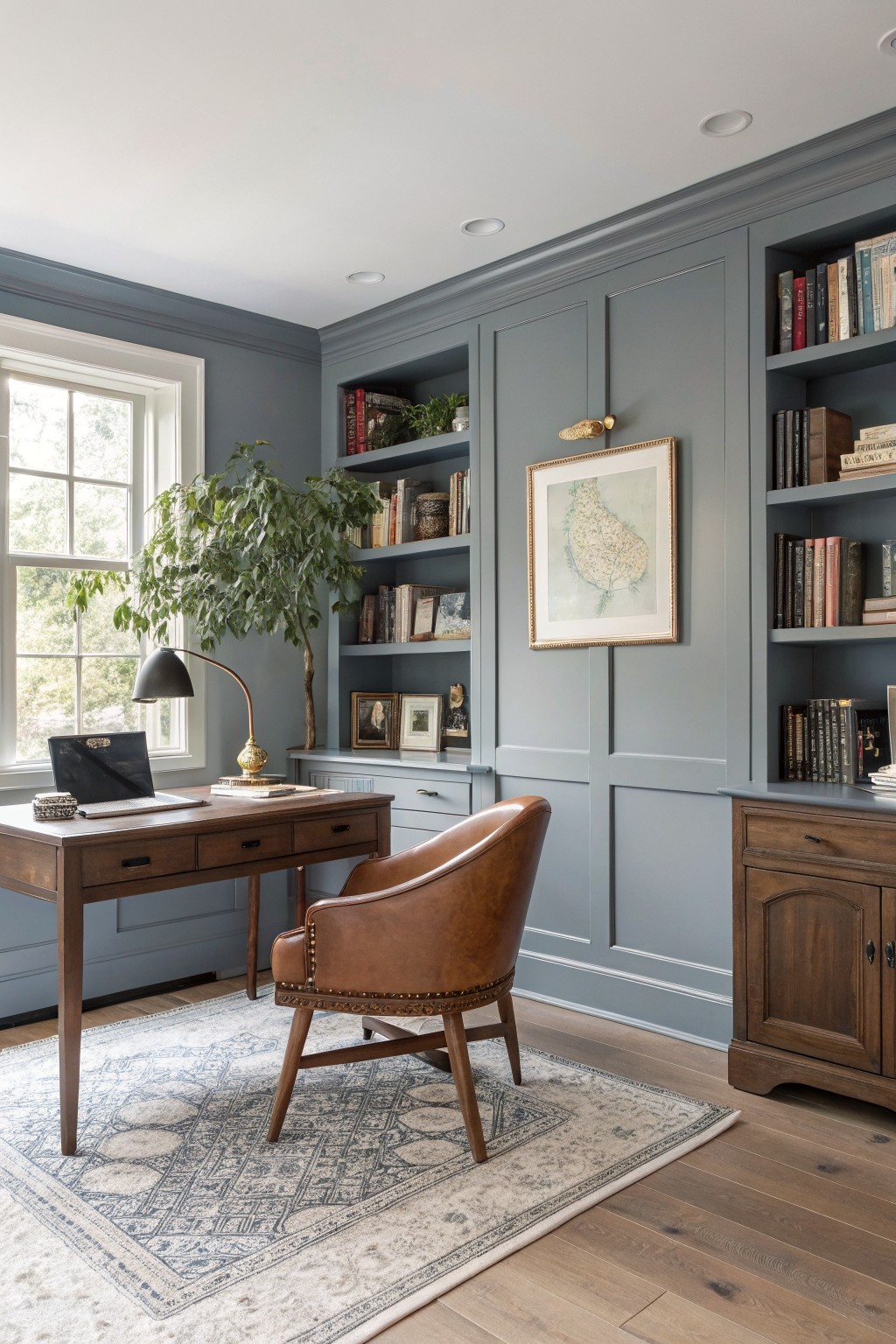
This home office pulls off a soft blue-gray on the walls and cabinetry that reads very close to Benjamin Moore’s Stonington Gray or Sherwin-Williams Sea Salt. Or maybe something like Farrow & Ball’s Pavilion Gray. It’s a cool neutral with just enough blue to feel fresh but still timeless. Folks go for it when they want walls that don’t fight the furniture.
That subtle blue undertone shows up best against warm oak floors and wood pieces like the desk here. Stick it in a study or library with decent window light. Watch it with super warm bulbs though… might pull greener. Brass lamps play right into it.
Soft Blush Walls
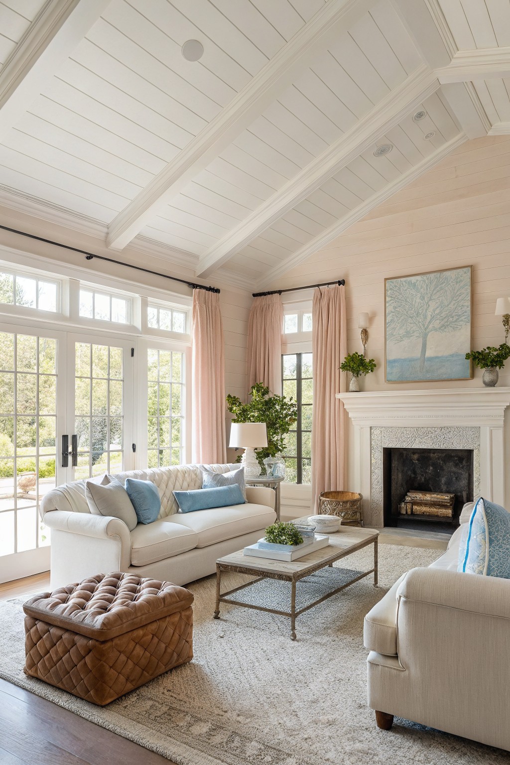
This living room pulls off a soft blush on the shiplap walls that sits in the pale pink neutral family. It comes closest to Benjamin Moore First Light or Farrow & Ball Setting Plaster, with Sherwin-Williams Shoji White reading pretty similar too. Folks go for shades like these because they add a hint of warmth that keeps things from feeling stark, all while staying easy on the eyes.
The subtle pink undertone shows up best in rooms with good natural light, like from big windows. It works alongside wood floors and white trim without clashing, and throws in nicely with cream furniture. Just watch it doesn’t pull too peachy in south-facing spots.
Pale Sage Dining Room Walls
This dining room shows off a pale sage green on the walls, the kind of neutral that feels fresh without shouting. It looks closest to Sherwin-Williams Sea Salt or Benjamin Moore Saybrook Sage, maybe even Farrow & Ball French Gray. What I like about it is how it sits quietly next to the wood furniture and lets those pieces stand out.
That cool gray undertone keeps it from going too yellow or minty. It works best in spaces with good light, like a dining area, paired with warm browns and off-whites on trim. Just watch it doesn’t read flat in dim rooms.
Creamy Off-White Kitchen Cabinets
This kitchen pulls off a creamy off-white paint on the cabinets and lower walls that feels just right. It sits closest to Sherwin Williams Alabaster or Benjamin Moore White Dove, maybe even Behr Swiss Coffee. That kind of warm neutral keeps the space bright without going too cool or clinical. Folks like it because it lets wood tones and greenery pop naturally.
The subtle yellow undertone warms up under natural light from those big windows. Pair it with oak floors like here, or brass hardware. It works best in kitchens or breakfast nooks. Just test samples, since it can shift a bit on paneling.
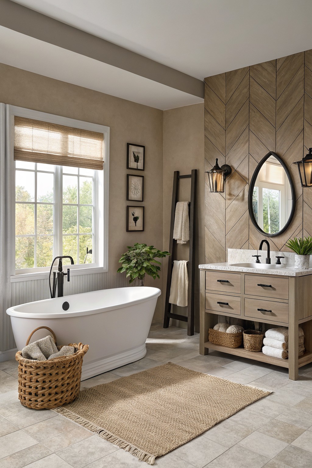
Pale Sage Bathroom Walls

This pale sage green on the walls seems closest to Sherwin Williams Sea Salt or Benjamin Moore Saybrook Sage. It’s a soft, muted green in the neutral family that adds just a hint of color without overwhelming a space. People go for shades like this in bathrooms because they feel calm and fresh, especially next to white tile.
The cool gray undertone makes it read lighter in bright light, and it works well with deeper green cabinets like you see here. Pair it with natural wood tones or crisp whites to keep things balanced. In smaller rooms, it opens things up nicely.
Soft Greige Trim
The trim around the French doors in this bedroom reads very close to a soft greige. That’s the neutral family sitting right between warm gray and beige. Folks keep coming back to it because it plays so well with wood tones like the paneling here, without stealing the show.
With subtle warm undertones, it shifts gently in natural light from the windows. I’d match it to Sherwin-Williams Repose Gray or Benjamin Moore Edgecomb Gray, maybe Farrow & Ball Skimming Stone. Works best in bedrooms or spaces with lots of wood. Just pair with crisp whites on ceilings and you’re set.
Warm Greige Study Walls
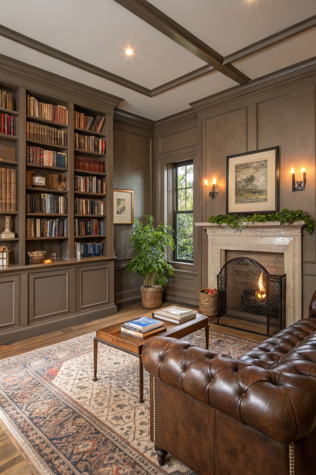
This warm greige covering the walls and built-ins looks closest to Benjamin Moore Revere Pewter or Sherwin-Williams Agreeable Gray, maybe even Farrow & Ball Skimming Stone. It’s a go-to neutral that sits right between gray and beige. What makes it stand out is how it lets the wood floors and leather furniture shine, without stealing the show.
Those subtle brown undertones keep things cozy, especially by the fireplace. It shines in rooms with some natural light, like a study. Go easy on cooler metals though…stick to brass or wood pairings.
Soft Greige Living Room Walls
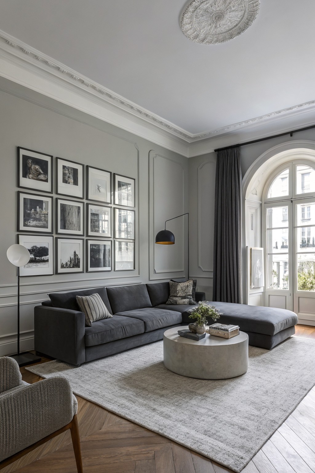
This soft greige on the walls reads very close to a warm neutral like Sherwin-Williams Agreeable Gray or Benjamin Moore Edgecomb Gray. Sometimes it pulls toward Farrow & Ball Skimming Stone too. It’s that easy in-between shade, not too gray or beigey, which keeps rooms feeling calm without going flat.
The warm undertone plays nice with wood floors like the herringbone here, and it holds up in natural light from big windows. Pair it with charcoal sofas or black frames for contrast. Just test samples, since it can shift cooler in low light.
Warm Beige Entryway Walls

This warm beige on the walls looks closest to Sherwin-Williams Alabaster or Benjamin Moore Edgecomb Gray, maybe even Behr’s Toasted Almond. It’s that easy neutral family with just enough cream to stay cozy. People go for it in open spots like this because it lets wood tones pop without stealing the show.
Warm undertones keep it from feeling stark, especially next to oak stairs and white trim. It works best in sunny entries or halls where daylight warms it up more. Pair with natural baskets or rugs, but test samples first. North light can nudge it cooler.
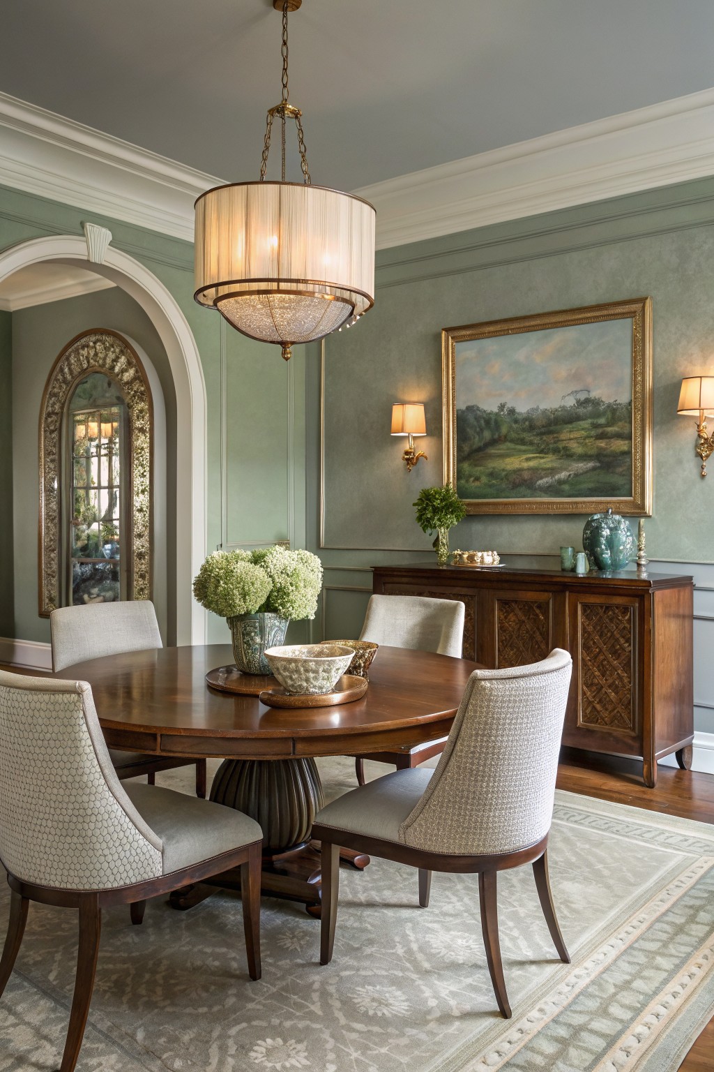
Warm Greige Dining Room Walls

The walls in this dining room pull off a warm greige that seems closest to Sherwin Williams Accessible Beige or Benjamin Moore Edgecomb Gray. Maybe even Behr’s Toasted Almond. It’s a soft neutral with just enough warmth to feel inviting without going full beige. What stands out is how it lets the wood tones on the table and sideboard really shine.
That subtle warmth comes through best in rooms with windows bringing in natural light. It pairs nicely with cream ceilings and gilded details. Stick to matte finishes to keep it understated, and it works great around antique furniture like this setup.
Warm White Cabinetry
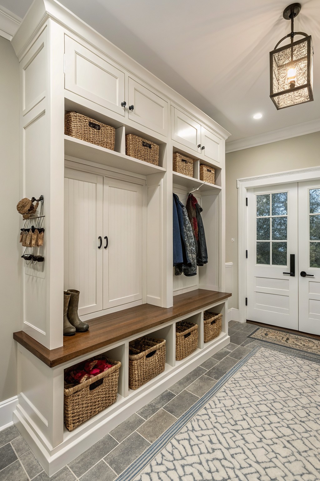
This cabinetry uses a warm white paint that looks closest to Sherwin Williams Alabaster or Benjamin Moore White Dove. It’s the kind of neutral that feels fresh and livable, keeping a mudroom looking organized without overpowering the space. People like it because it bounces light around nicely and lets wood details stand out.
The subtle creamy undertone keeps it from going too stark, especially next to the walnut benchtop you see here. It works best in entry areas or laundry spaces with good natural light. Pair it with woven baskets or brass hardware for that everyday warmth, but test samples first since lighting can shift the feel a bit.
Frequently Asked Questions
Q: How do I test these neutral colors in my actual room? A: Snag sample pots and brush big swatches right onto the wall in a corner you can repaint later.
Paint them side by side so you compare easily. Walk through the space at different times of day—your lights will reveal the true shades.
Q: Will light neutrals make my small bedroom feel bigger? A: Pick soft, warm-leaning ones that reflect light without overwhelming the eye.
They open up tight spots naturally. Skip heavy patterns on bedding to let the walls breathe.
Q: My floors are dark wood. How do I choose a neutral that works with them?
And here’s the trick: Go for a shade a touch lighter than your wood tones. It grounds the room without clashing. Test it next to the floor to confirm the balance.
Q: Can I mix bold furniture with these sophisticated neutrals? A: Layer in your colorful pieces—they pop beautifully against the calm backdrop…
Just balance with a few textured neutrals elsewhere. The contrast keeps things fresh and lived-in.