I’ve painted enough rooms to know that light dictates everything about a color’s true personality. A shade that glows warmly in morning sun might flatten out by afternoon in a north-facing space.
I once dismissed a muted terracotta because it looked dull on the sample card, but it held steady and rich once up on the walls. Colors with subtle undertones tend to adapt best without pulling gray or pink when conditions change. Sample them first.
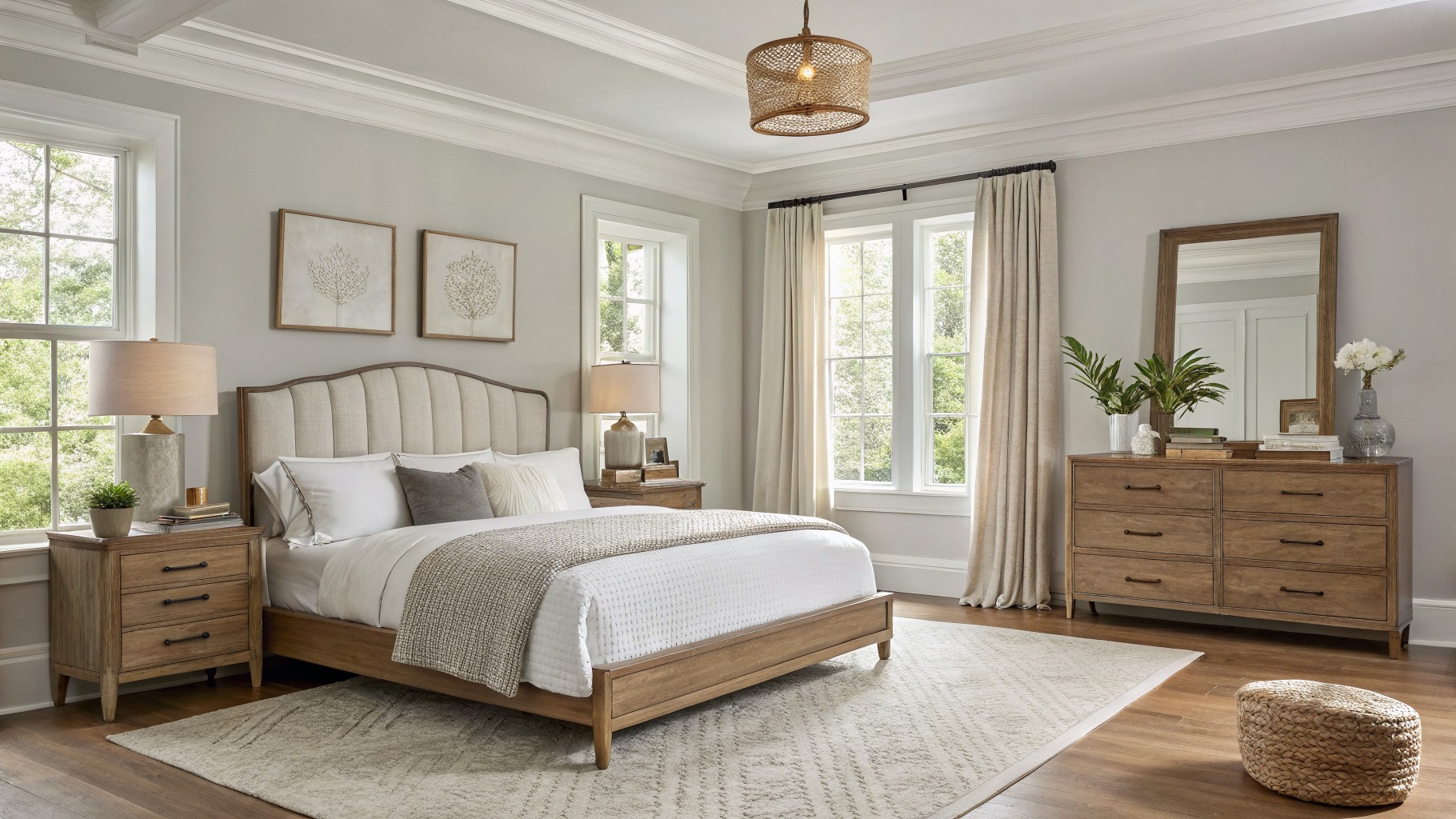
Soft Greige Walls
This bedroom pulls off a nice light greige on the walls. It sits closest to Sherwin-Williams Agreeable Gray or Benjamin Moore Edgecomb Gray. Those are solid picks for a color that’s mostly neutral but with enough warmth to feel cozy. Folks go for it because it keeps things calm without washing out, especially next to wood pieces like the bed and dresser here.
The undertone leans warm, almost beige on brighter days. It works best in spaces with decent natural light coming through windows. Stick to off-whites for trim and pair with oak tones or textured linens. One thing… if your bulbs are cool-toned, test a sample first so it doesn’t gray out too much.
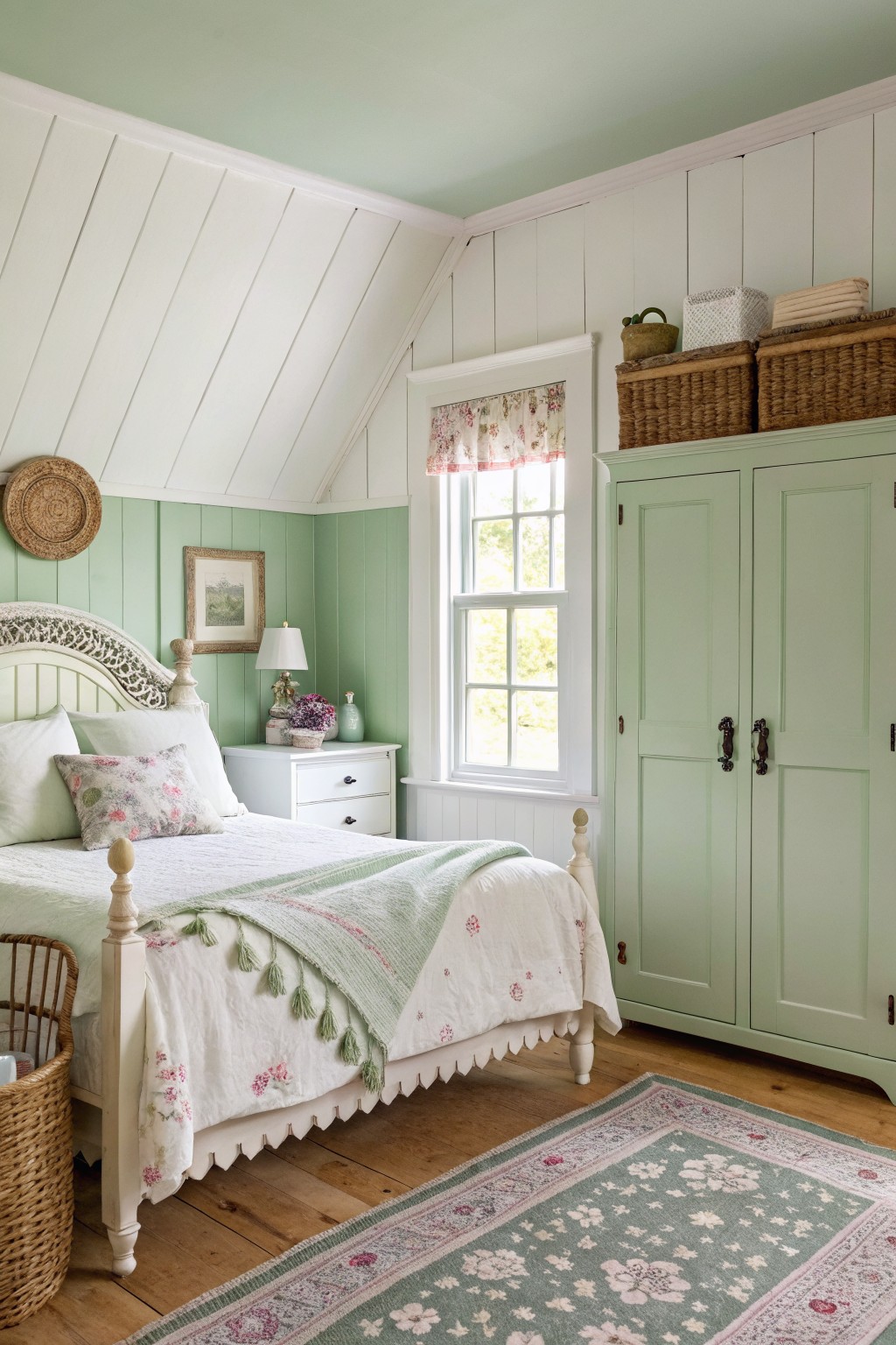
Pale Sage Walls
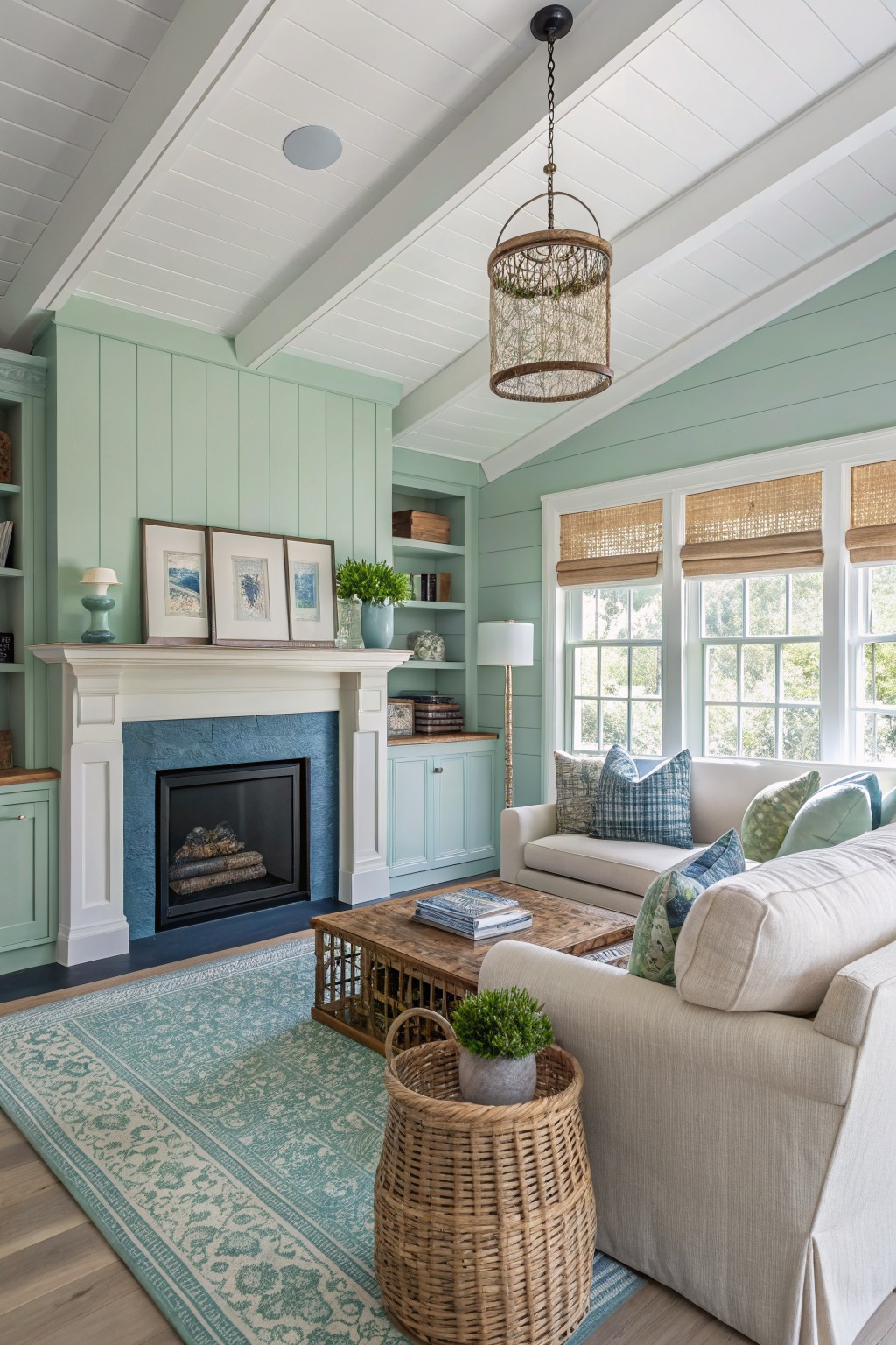
This pale sage green on the walls comes across closest to Sherwin-Williams Sea Salt or Benjamin Moore Saybrook Sage. It’s a soft, cool green that keeps things calm and coastal. You see it here wrapping around the built-ins and fireplace cabinets, making the whole room feel bigger and breezier.
That blue-green undertone picks up nicely with natural light through the windows. It works great in living rooms or family spaces where you want wood furniture and cream fabrics to stand out. In dimmer spots, though, add warm lamps to balance it.
Deep Purple Cabinets
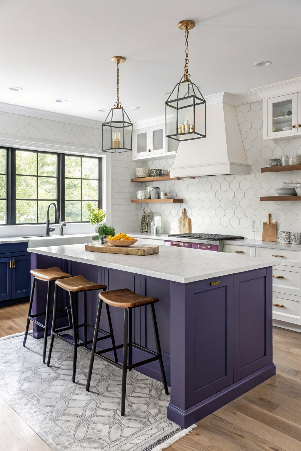
This deep purple shows up strong on the kitchen island cabinets. It reads very close to Benjamin Moore Eggplant or Farrow & Ball Brinjal, and I’d put Sherwin-Williams Rookwood Dark Ruby right in the mix too. What makes it work is how saturated it is without going too dark, giving the room a punch of color that pulls everything together.
That blue-violet undertone keeps it from feeling heavy, especially under good window light like here. It pairs easy with white uppers and wood stools. Just test it in your space first, since it shifts a bit with the floors or counters nearby.
Deep Charcoal Gray Walls
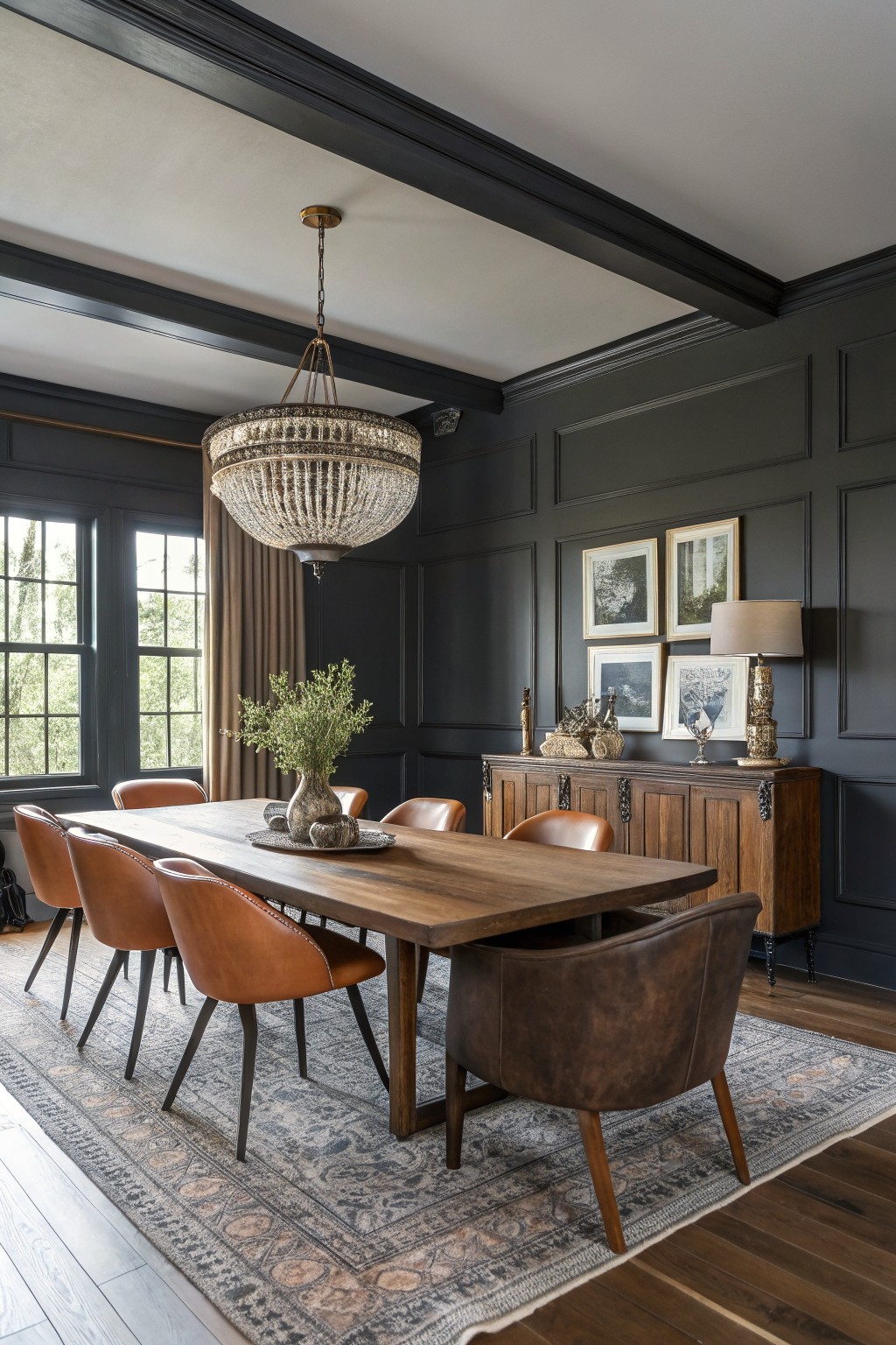
Those paneled walls in deep charcoal gray look closest to Sherwin-Williams Iron Ore or Benjamin Moore’s Kendall Charcoal. It’s a cool, nearly black gray that adds real presence to a room. People like it because it makes wood furniture pop and keeps things feeling pulled together.
The cool undertones play well with warm leather chairs and brass lights. It suits dining rooms or studies with decent window light. Just pair it with textured rugs to avoid any chill.
Soft Pale Sage Walls
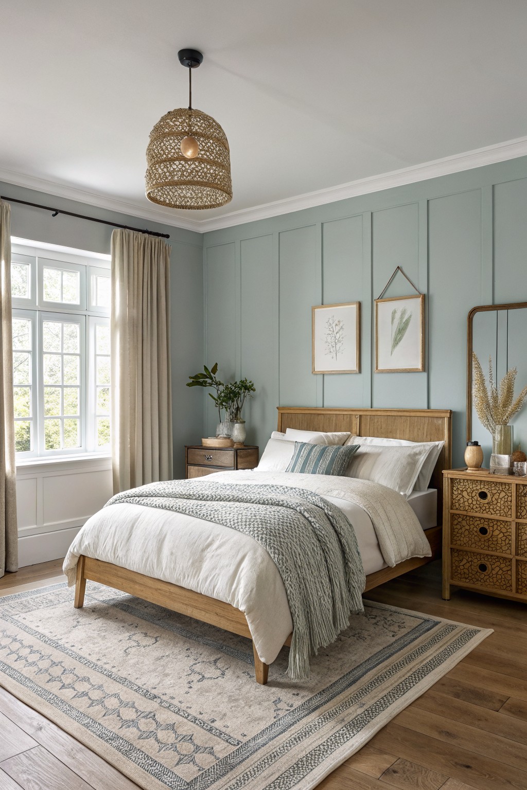
This pale sage green on the walls looks closest to Sherwin-Williams Sea Salt or Benjamin Moore’s Saybrook Sage. Or maybe Behr’s Breezeway. It’s a light, easy color with just enough blue to feel fresh. What stands out is how it lets the wood furniture breathe without competing.
The cool undertone keeps it from going yellow in most lights. It works best in sunny rooms like this bedroom, paired with oak tones and cream bedding. Watch for north-facing spaces though, where it might read a touch grayer.
Pale Mint Shiplap Walls
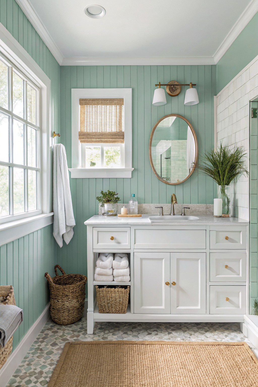
This pale mint green on the shiplap walls seems closest to Sherwin-Williams Sea Salt or Benjamin Moore Palladian Blue, with Behr’s Secret Aqua reading pretty similar too. It’s a soft cool green that stays light and fresh, the kind that opens up a small bathroom without overpowering it. You notice how it plays nice with the white vanity and gold faucet right away.
That blue undertone helps it stay crisp next to natural light from the window. It works best in baths or coastal spots, paired with white trim and rattan accents. Just watch it in low light, where it might lean a touch gray.
Warm Greige Walls
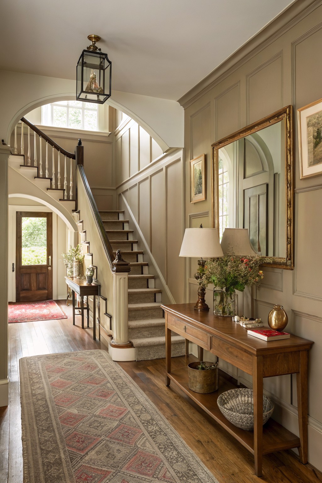
This warm greige covers the paneled walls here, giving the entry a cozy settled feel. It looks closest to Sherwin-Williams Agreeable Gray or Benjamin Moore Edgecomb Gray, maybe even Farrow & Ball Skimming Stone. Folks like it because it stays neutral enough for busy spots but has just enough warmth to keep from feeling cold.
Those beige undertones come through best next to wood floors and trim like this. Pair it with brass lamps or soft rugs, and it fits hallways or living rooms without overwhelming. Watch the light though. In dimmer spaces it might lean grayer.
Warm Yellow Ceiling
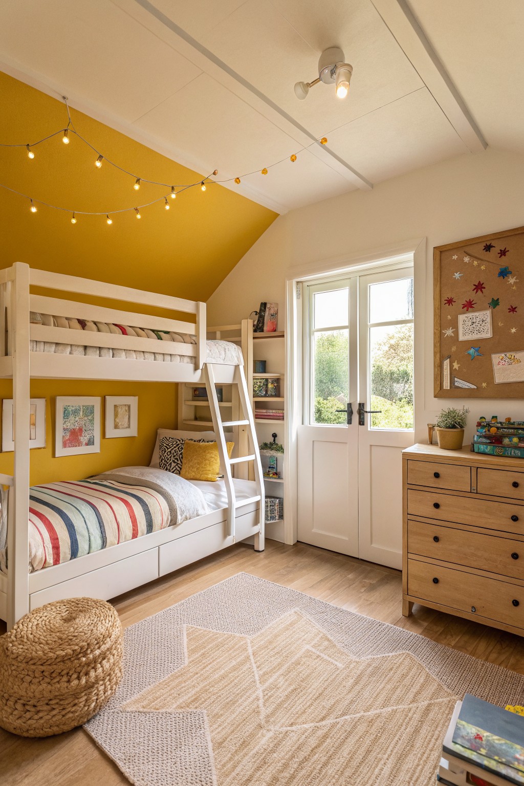
This warm golden yellow on the vaulted ceiling grabs your eye right away. It’s got that sunny, cheerful feel without going too bright or babyish. Looks closest to Farrow & Ball Babouche, or maybe Sherwin-Williams Corn Silk SW 1652 and Benjamin Moore Hawthorne Yellow HC-85. Folks like it because it adds playfulness to a simple room setup.
The golden undertones keep it cozy next to white walls and oak floors. It shines in north-facing spaces with some natural light coming through the windows. Pair it with crisp whites below and wood accents. Just watch it doesn’t overwhelm small rooms… stick to ceilings or accents there.
Deep Green Walls
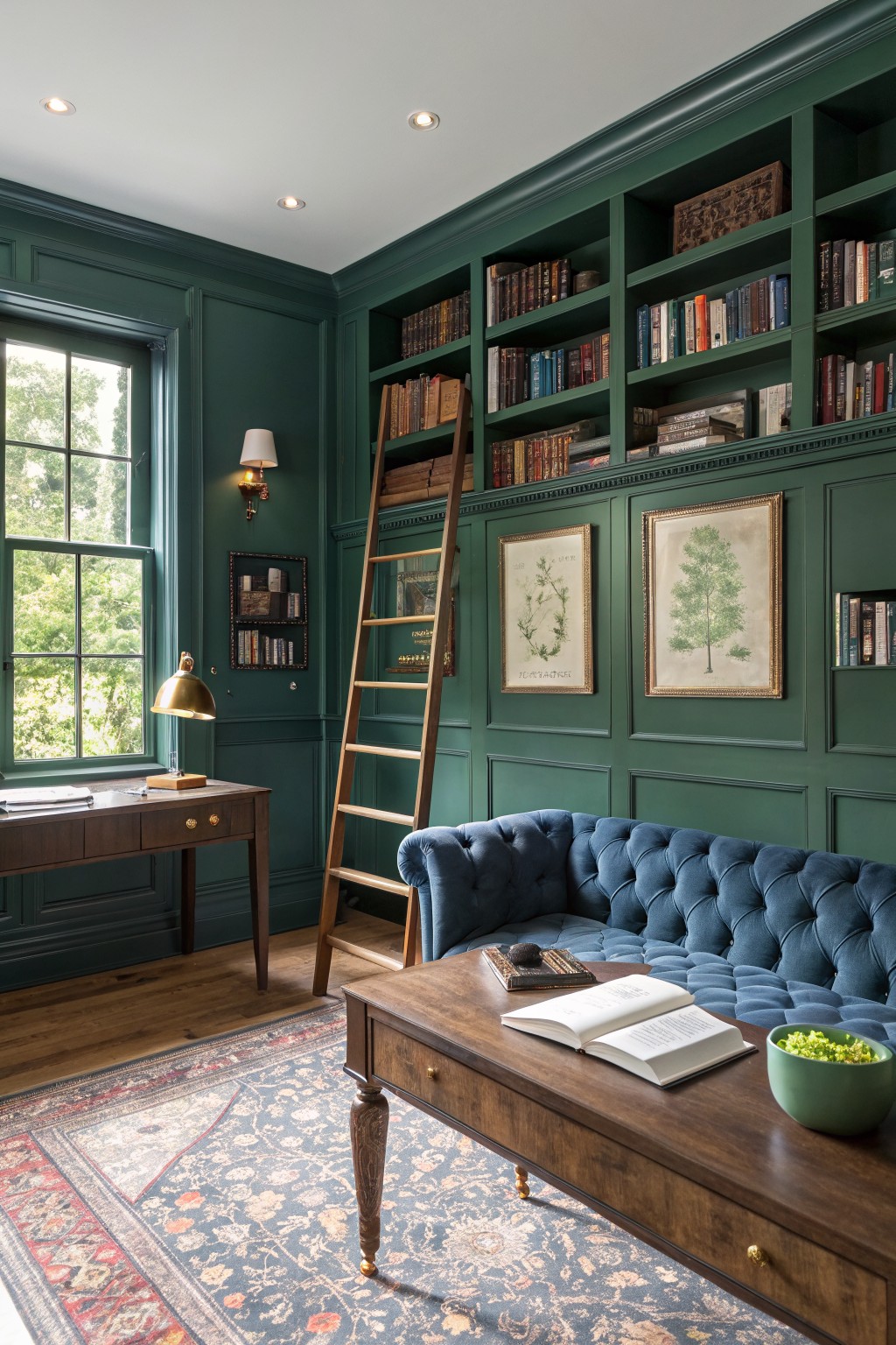
This deep green paint covers the walls and built-ins in a way that feels just right for a home library or study. It looks closest to Farrow & Ball’s Studio Green, or maybe Sherwin-Williams Pewter Green and Benjamin Moore’s Guilford Green HC-116. That rich tone brings a cozy, timeless vibe without overwhelming the space, especially with all the wood bookshelves around it.
The color picks up warm undertones from nearby brass lamps and oak pieces, staying lively in good window light. It works best in furnished rooms like this one, where you can add blue upholstery or leather details. Just make sure you’ve got enough natural light, or it might read a touch darker.
Sage Green Kitchen Cabinets
This soft sage green on the cabinets pulls together the whole kitchen without trying too hard. It sits closest to Sherwin Williams Evergreen Fog or Benjamin Moore Saybrook Sage, maybe even Behr’s Silver Sage. What I like about this shade is how it feels fresh but grounded, especially next to the white herringbone backsplash and marble counters.
The gray undertones keep it from turning yellow in different lights. It works great in sunny rooms like this one, and pairs easy with warm woods or rattan furniture. Just test a sample first, since sage can shift a bit on cabinets.
Deep Green Bathroom Walls
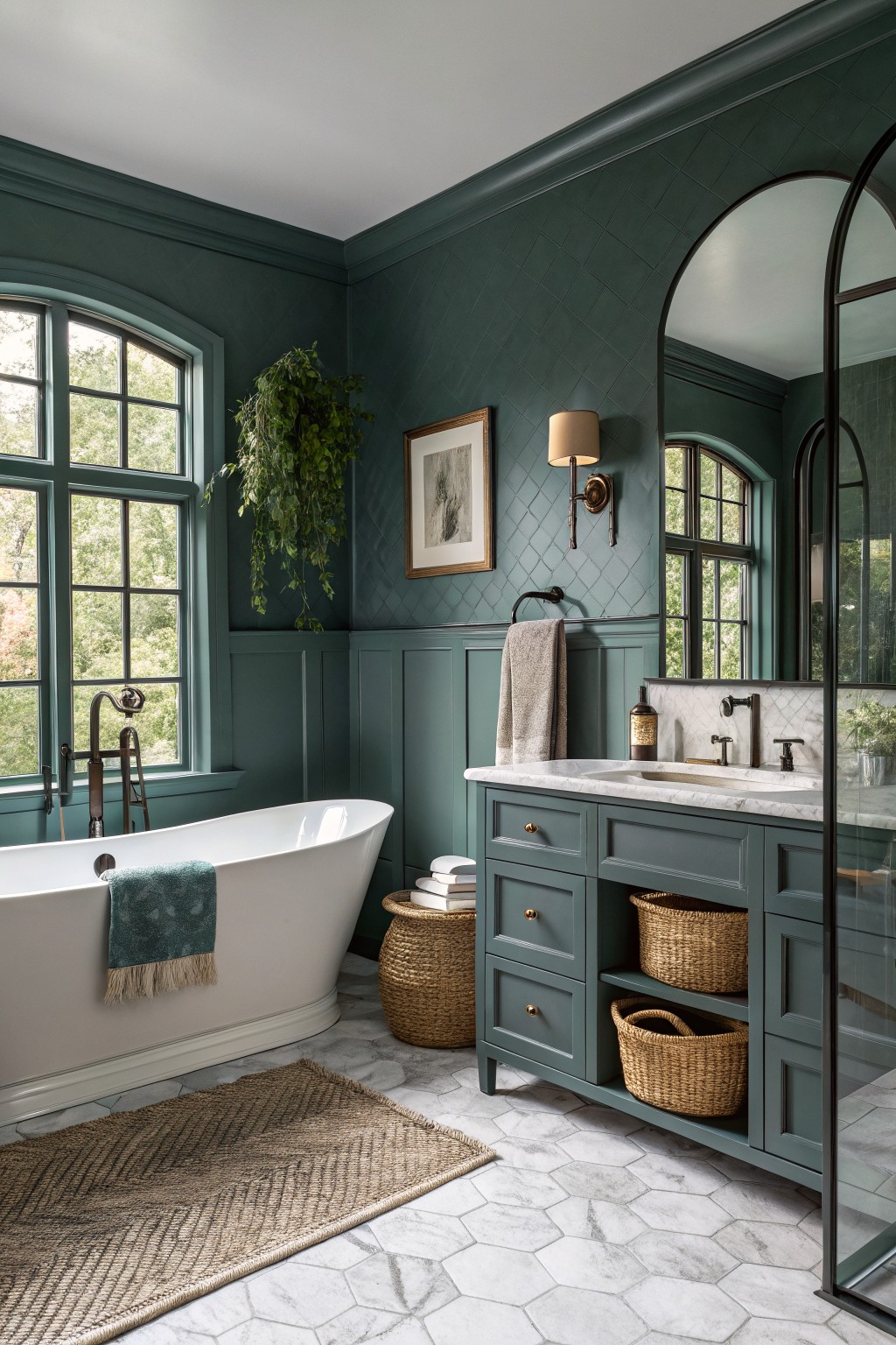
This deep green on the walls looks closest to Sherwin-Williams Pewter Green (SW 6208) or Benjamin Moore Saybrook Sage (HC-114), with Farrow & Ball Green Smoke not far off. It’s a moody take on green that adds real depth to a bathroom. What stands out is how it wraps the room nicely, making even a simple setup with a tub and vanity feel put-together.
That subtle teal undertone keeps it from going too forest-like. It shines in spaces with big windows for light, paired against white marble and brass. Skip it in super dim rooms, though… might close things in.
Warm Terracotta Walls
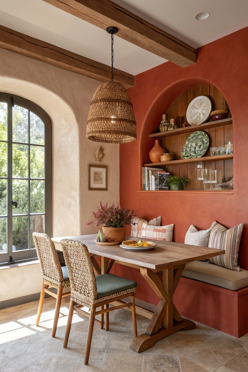
This terracotta shade on the alcove wall reads very close to Sherwin-Williams Reddened Earth or Benjamin Moore Potter’s Clay. Maybe even Behr’s Canyon Clay. It’s a warm, rusty red that’s earthy without being too bold. Folks like it because it brings in that Southwest vibe, making rooms feel lived-in and sunny.
The orange undertones warm up wood tones like the table here. It works best in spaces with good natural light, say a breakfast nook. Pair it with soft beiges or greens on other walls. Just test samples, since it can shift a bit in low light.
Pale Mint Green Walls
This pale mint green on the walls gives the room a fresh, easy feel. It looks closest to Sherwin-Williams Sea Salt or Benjamin Moore Saybrook Sage, maybe Behr’s Silver Screen too. Light like that keeps things airy without washing out, and it picks up nicely on wood tones nearby.
The cool blue undertone shines in natural light from those big windows. Works best in living areas with white trim and neutral furniture. Just watch it can read greener in warmer bulbs… pair with beiges or soft blues to keep it balanced.
Soft Pale Green Walls
That soft pale green on the walls looks closest to Sherwin-Williams Sea Salt or Benjamin Moore Saybrook Sage. Maybe Behr’s Willow Green too. It’s a gentle minty shade, not too bright, that just freshens up the space nicely.
The cool undertones keep it from going yellow in most lights, and it sits so well next to white trim and warm wood floors. Try it in a bedroom attic or guest room. Pairs easy with creamy linens or pinks, but watch it doesn’t look flat in north-facing spots.
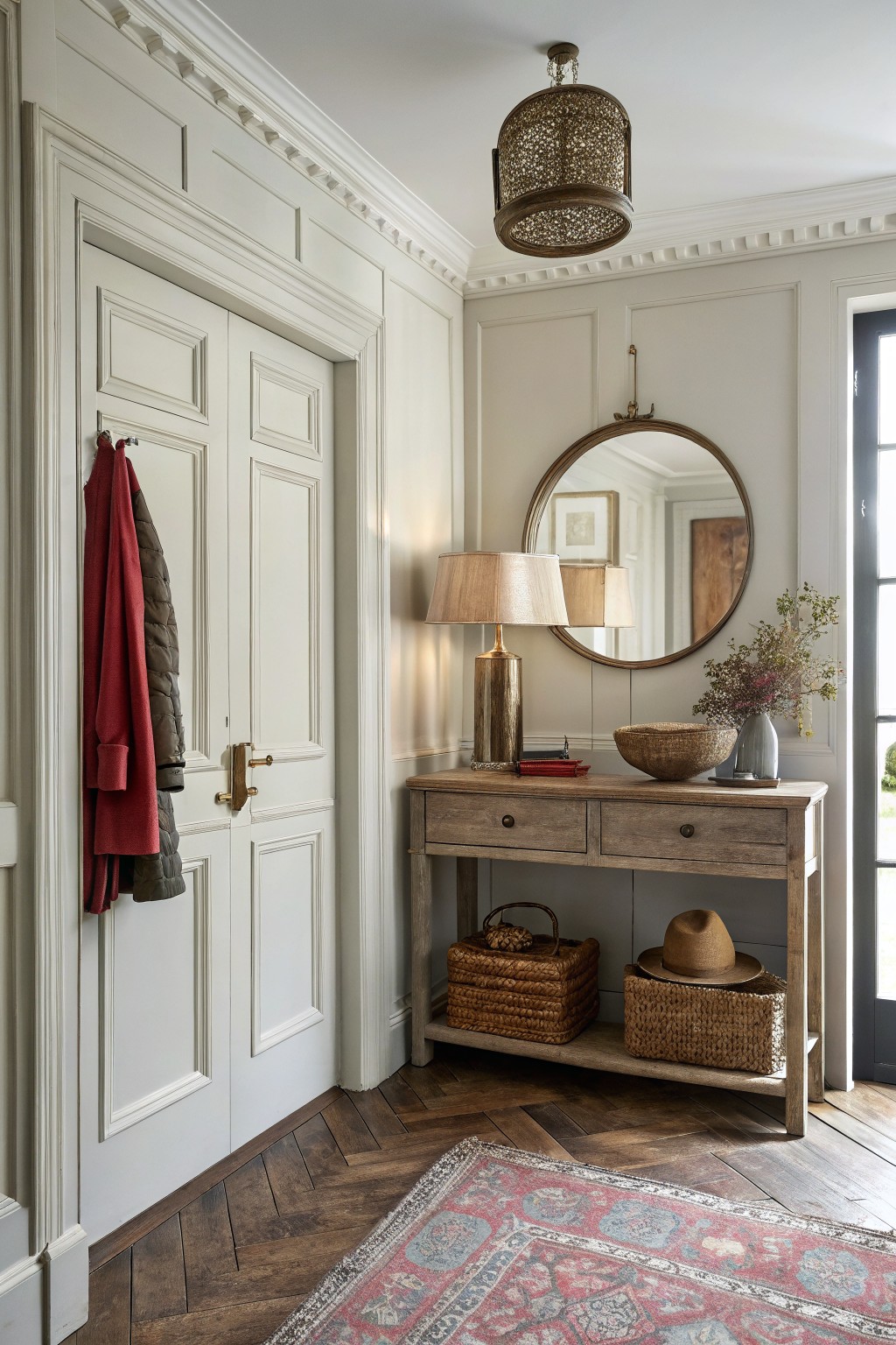
Soft Warm Gray Walls
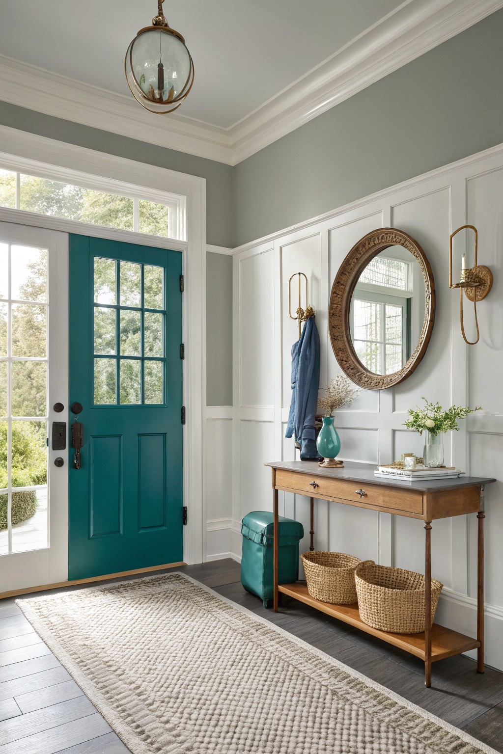
This entryway paint job leans into a soft warm gray that seems closest to Sherwin-Williams Repose Gray or Benjamin Moore Edgecomb Gray. Sometimes Behr’s Silky White hits a similar note too. It’s your basic greige. Folks go for it because it brightens things up without washing out.
Warm undertones keep wood pieces like that console table looking good. Brightens entry spaces nicely. Just watch it next to super cool whites. The teal door here gives it some life.
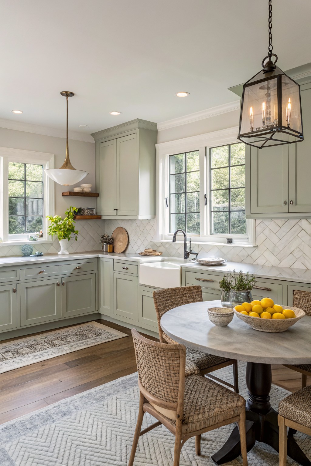
Sage Green Country Kitchen Cabinets
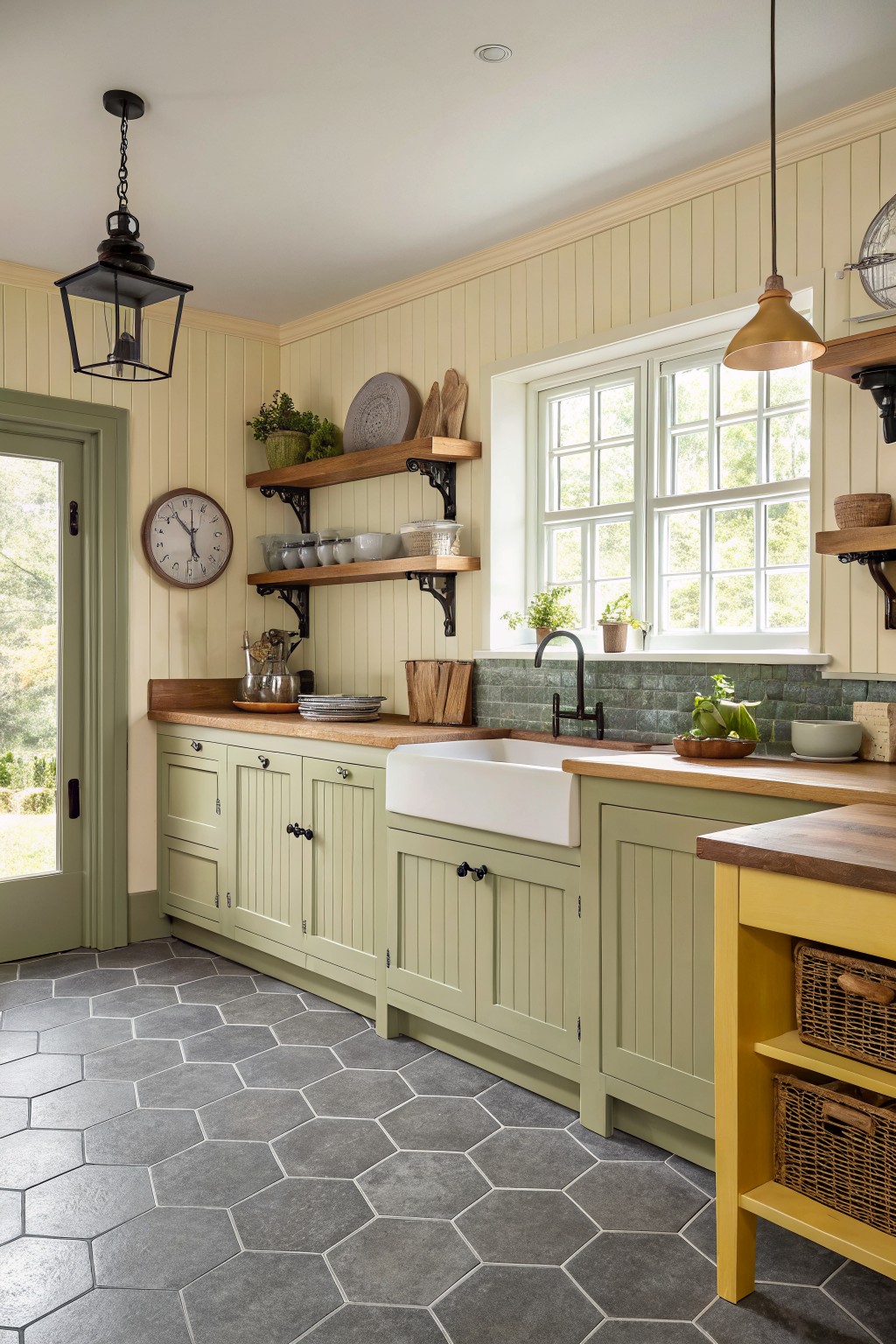
This muted sage green on the cabinets looks closest to Sherwin-Williams Clary Sage or Benjamin Moore Saybrook Sage. It’s a soft green with just enough gray to keep things calm, not overpowering. Folks like it because it brings a fresh feel to kitchens without clashing with wood counters or brass hardware.
The undertone leans warm, especially next to oak tops and those gray hex tiles. It works best in rooms with good window light, like this one overlooking the yard. Pair it with creamy walls and black taps for that cozy country look. Just test samples first, lighting can shift it cooler indoors.
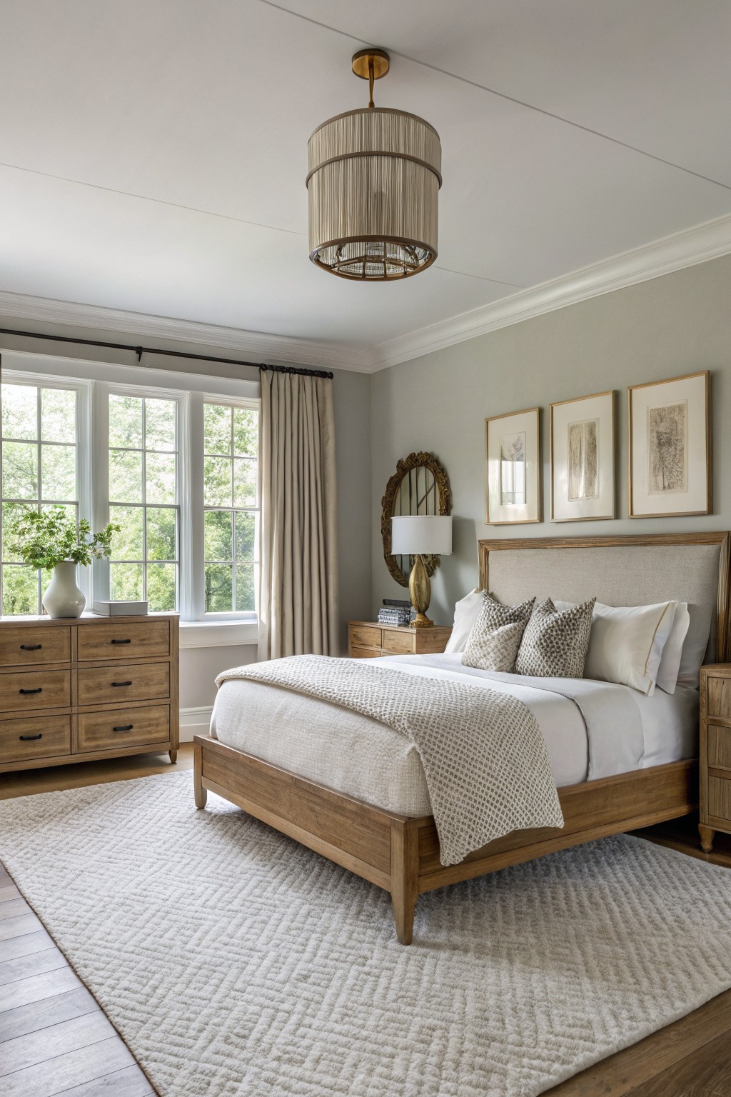
Soft Blush Pink Walls
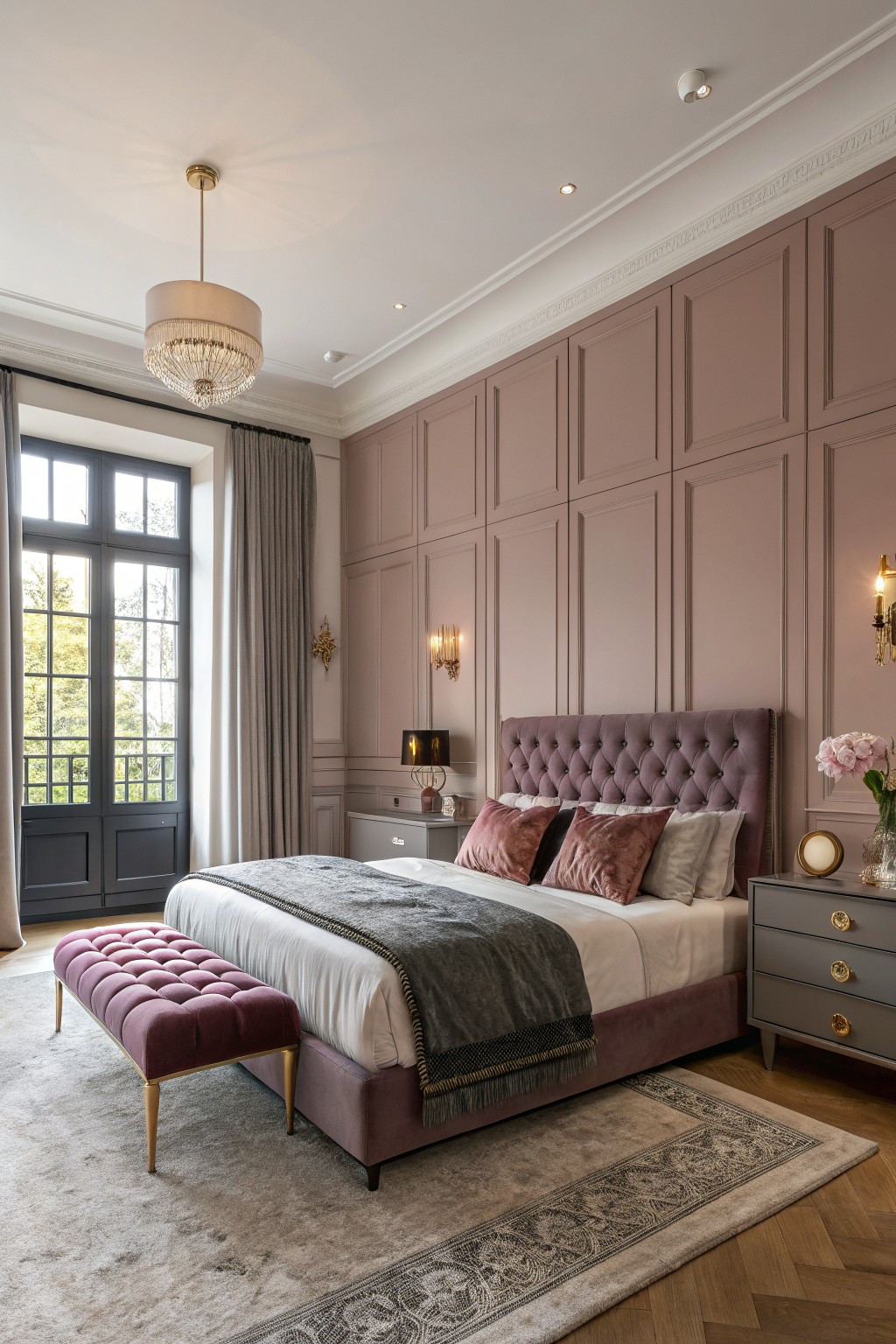
This soft blush pink shows up nicely on the paneled walls here. It’s that gentle pink family with a dusty edge, and it reads closest to Sherwin-Williams Rosé or Benjamin Moore Head Over Heels. Farrow & Ball Pink Ground has the same feel too. What I like about it is how it keeps a bedroom looking calm without going too pale or girlie. It just warms things up a bit.
The undertone leans warm and mauve, so it plays well next to oak floors and dark wood doors like you see. Natural light from big windows makes it glow without washing out. Pair it with grays or golds on furniture, but watch it can feel flat in low light.
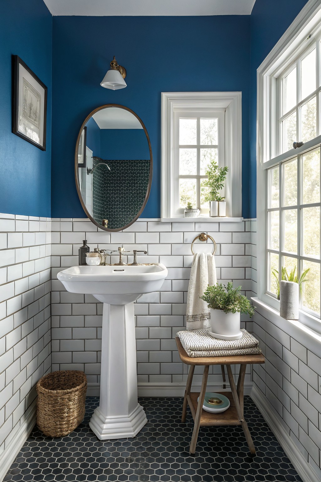
This deep navy blue on the upper walls looks closest to Sherwin Williams Naval or Benjamin Moore Hale Navy, maybe Behr’s Blueprint too. It’s the kind of rich blue that turns a tiny powder room into something special. Cozy but not cave-like.
That cool undertone plays well against white subway tile and black floors. Stick it in spaces with some window light, and add wood stools or plants to warm it up a bit.
Warm Peach Walls
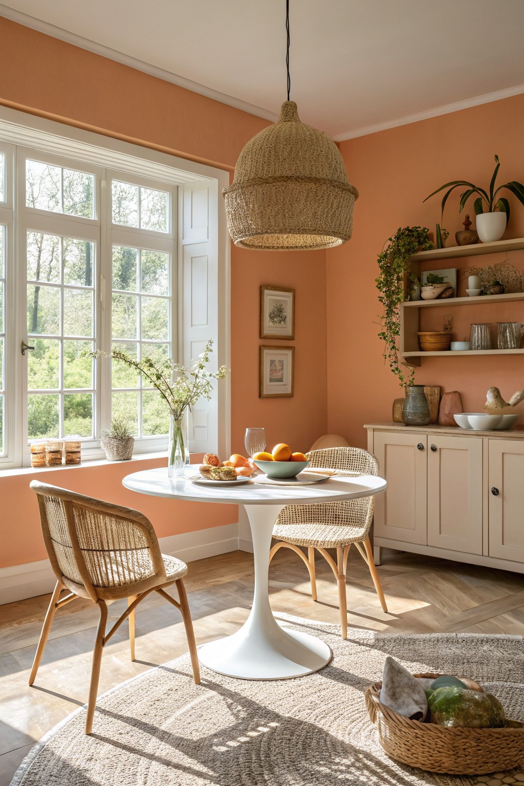
This warm peach on the walls feels like a soft terracotta shade. It reads close to Sherwin-Williams Spiced Cider, Benjamin Moore Potters Clay, or Farrow & Ball Red Earth. People like it because it’s cheerful but not loud. Makes the room feel sunny even on regular days.
Those golden undertones play well with wood furniture and white trim. Best in spaces with good light, like a breakfast corner. Pair it with rattan or plants… keeps everything looking fresh and lived-in.
Soft Blue Cabinets
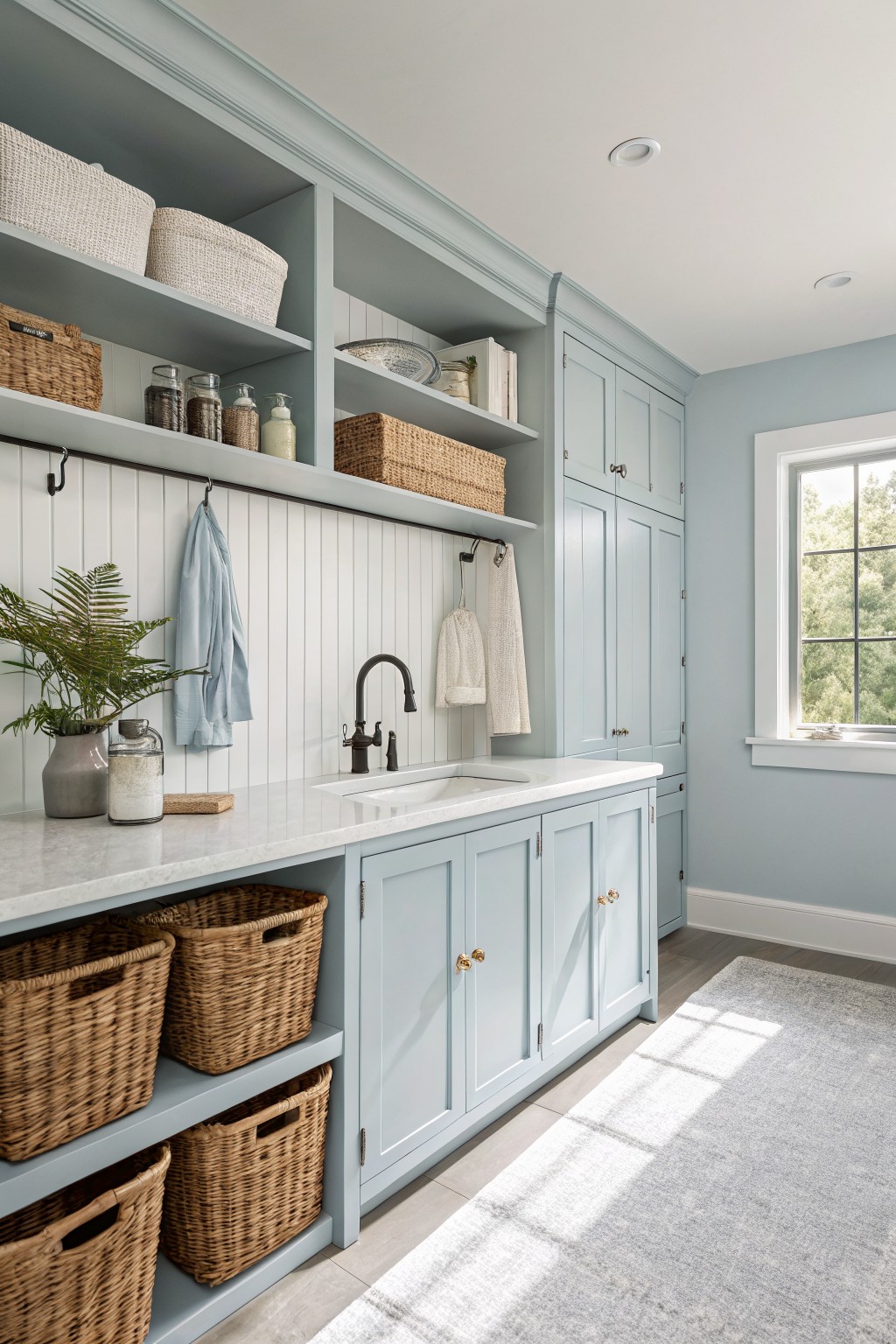
This pale blue on the cabinets comes across closest to Sherwin-Williams Sea Salt or Benjamin Moore Palladian Blue. It’s a relaxed cool blue, not too bright, that makes a laundry room feel bigger and calmer right away. Folks like it because it mixes easy with everyday stuff without stealing the show.
That gray undertone keeps it from feeling stark, especially next to white shiplap like you see here. It works best in spots with decent window light, paired with wood floors or baskets. In low light though, test a sample first… it can read a touch greener.
Warm Off-White Walls
Those walls show a warm off-white that reads very close to Sherwin Williams Alabaster or Benjamin Moore White Dove. Sometimes Farrow & Ball Skimming Stone hits the same note. It’s a light neutral with just enough warmth to feel cozy without turning yellow. Folks like it because it brightens small corners like this entry and lets wood details stand out.
Warm greige undertones make it forgiving in mixed light. Works best in hallways or living rooms with oak floors or antique furniture. Stick to brass lamps and woven baskets for contrast. Avoid cool grays nearby, or it might look flat.
Sage Green Cabinetry
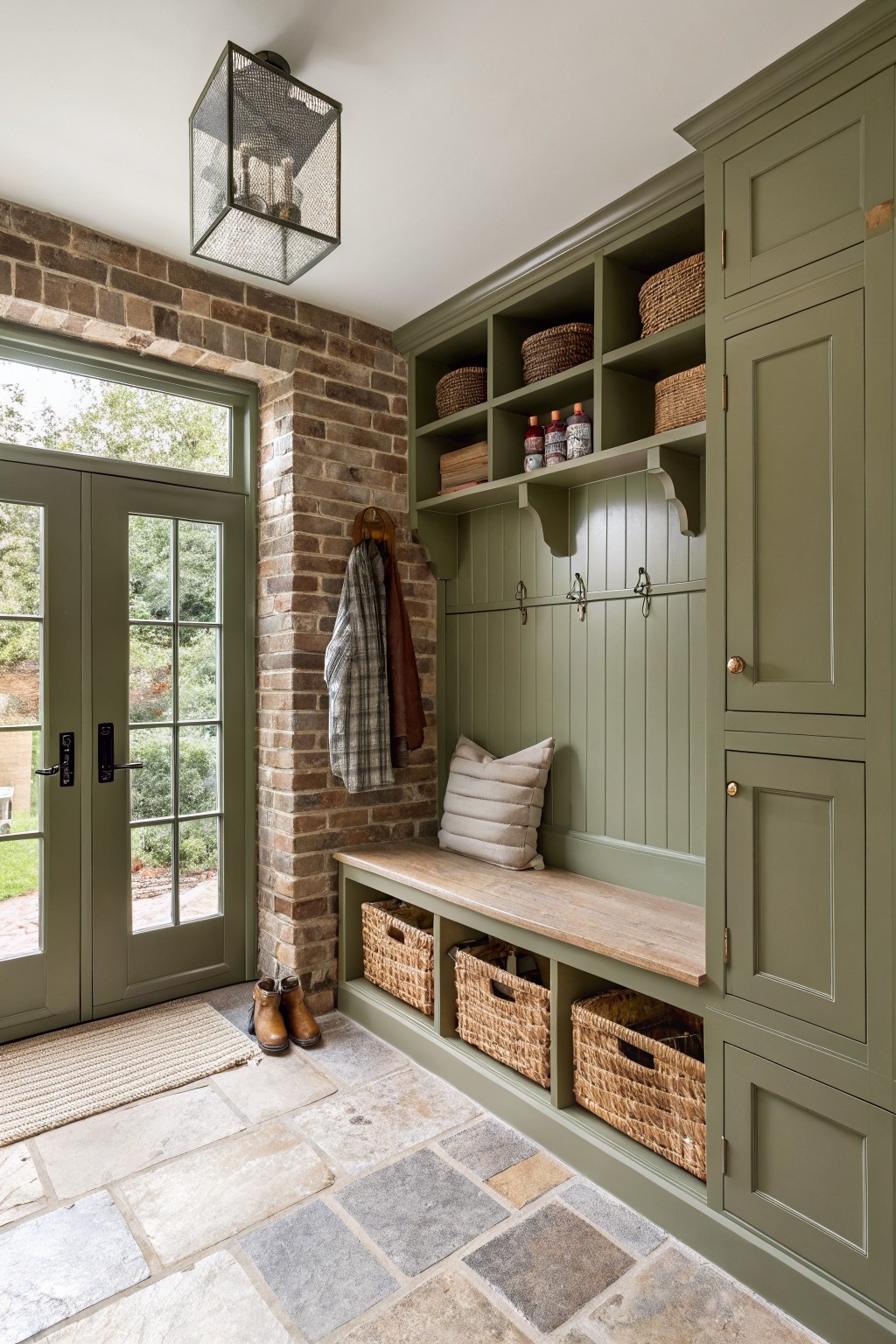
This sage green on the cabinets and beadboard paneling looks closest to Sherwin-Williams Clary Sage or Benjamin Moore Saybrook Sage. It’s a soft, muted green with warm gray undertones that sits just right next to brick and wood. People like it because it feels grounded without being too bold. Perfect for mudrooms or entryways where you want calm.
The warmth really shows up in natural light, like through those big doors here. Pair it with wood tones and baskets for that lived-in feel. In dimmer spots it might lean grayer… so test samples there first.
Frequently Asked Questions
Q: How do I test these colors in my actual room lighting?
A: Paint big swatches right on the wall with sample sizes. Walk around at different times of day to see how light hits them. That way you avoid surprises.
Q: Will a bold color like Sunset Glow overwhelm a small living room?
A: Balance it with crisp white trim and light floors. It draws the eye up and makes the space feel taller. Keep furniture simple to let the color shine.
Q: Can I use these shades on cabinets or just walls?
A: They work great on cabinets too. Just prime first for smooth coverage.
Q: How do I pair one of these with my wood furniture?
A: Pick a color that echoes a tone in the wood, like a warm terracotta with oak. Test it next to your pieces. And layer in textiles for harmony.