I’ve noticed that two tone exteriors shift in ways that photos rarely capture once the light changes from morning to late afternoon.
The main color often looks bolder against brick or siding while the accent holds up only if it plays well with the roof and surrounding greenery.
Samples on the actual walls help spot those shifts before any final choice.
Some combinations stay crisp even in overcast weather while others lose their edge once the landscaping fills in around the base.
I tend to focus first on how the trim reads next to both the main body and the stone details.

This deep navy blue works well on the main siding because it feels solid without being too harsh. It gives the house a steady look that stands out against lighter trim and natural stone details. Many people like this kind of color when they want something classic that still feels current on older homes or newer builds with traditional shapes.
The color has a slight cool undertone that shows up more in bright light. It pairs nicely with warm white trim and wood doors. If your roof is dark or your landscaping has plenty of green, this navy tends to settle in without fighting everything else. Just watch how it shifts from morning to late afternoon before you commit.
Soft Sage Green Siding
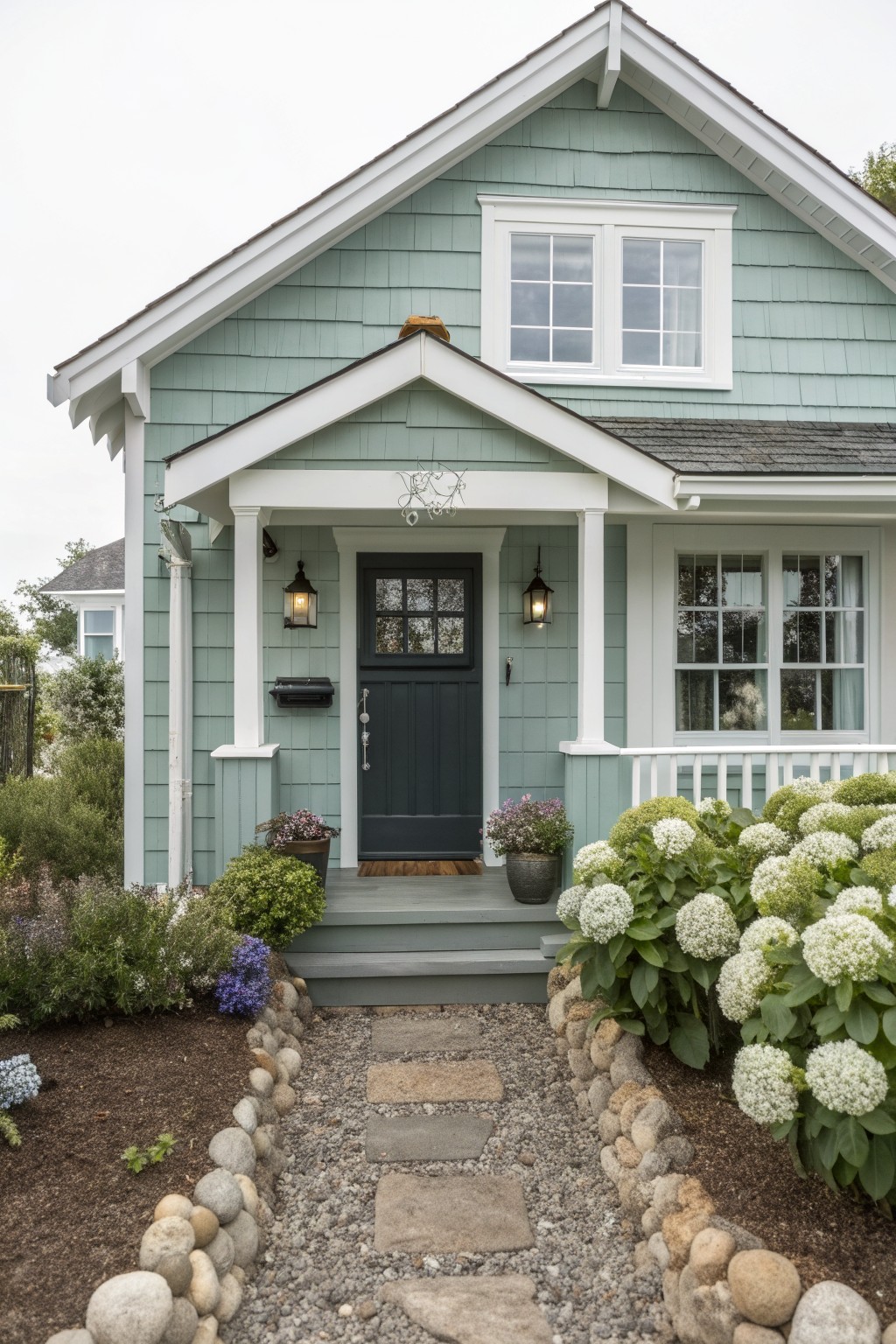
A soft sage green like this one often looks closest to Sherwin Williams Evergreen Fog or Benjamin Moore Saybrook Sage. It gives the house a calm, slightly coastal feel that stays gentle even in bright light.
The color has a quiet blue undertone that keeps it from looking too yellow outdoors. It works well with white trim and a dark door, and it suits older homes or simple cottages where you want something a little different from plain gray or beige.
Charcoal Black Siding

This deep charcoal black works well on modern homes because it gives a strong clean look without feeling too heavy. It sits close to Sherwin Williams Tricorn Black, Benjamin Moore Black Beauty, or Behr Midnight Black, and the flat finish helps it stay calm next to wood and stone.
The color has a cool undertone that shows up more in daylight, so it pairs best with warm wood tones or light masonry to keep the house from feeling cold. It works on newer builds or updated homes where you want simple contrast without lots of trim details.
Warm Neutral Brick

This warm neutral brick color gives the house a soft, settled look without feeling too heavy. It sits somewhere between beige and light taupe, which helps it blend nicely with most roof tones and surrounding greenery. Many people like this shade because it feels classic but still fresh on older homes or new builds alike.
The color has a slight warm undertone that shows up best in morning or late afternoon light. It pairs easily with white trim and a bold front door, though it can start to look flat if the trim is too bright or the landscaping is very dark. Popular matches include Benjamin Moore Revere Pewter, Sherwin Williams Worldly Gray, Behr Silver Strand, and Farrow & Ball Elephant’s Breath.
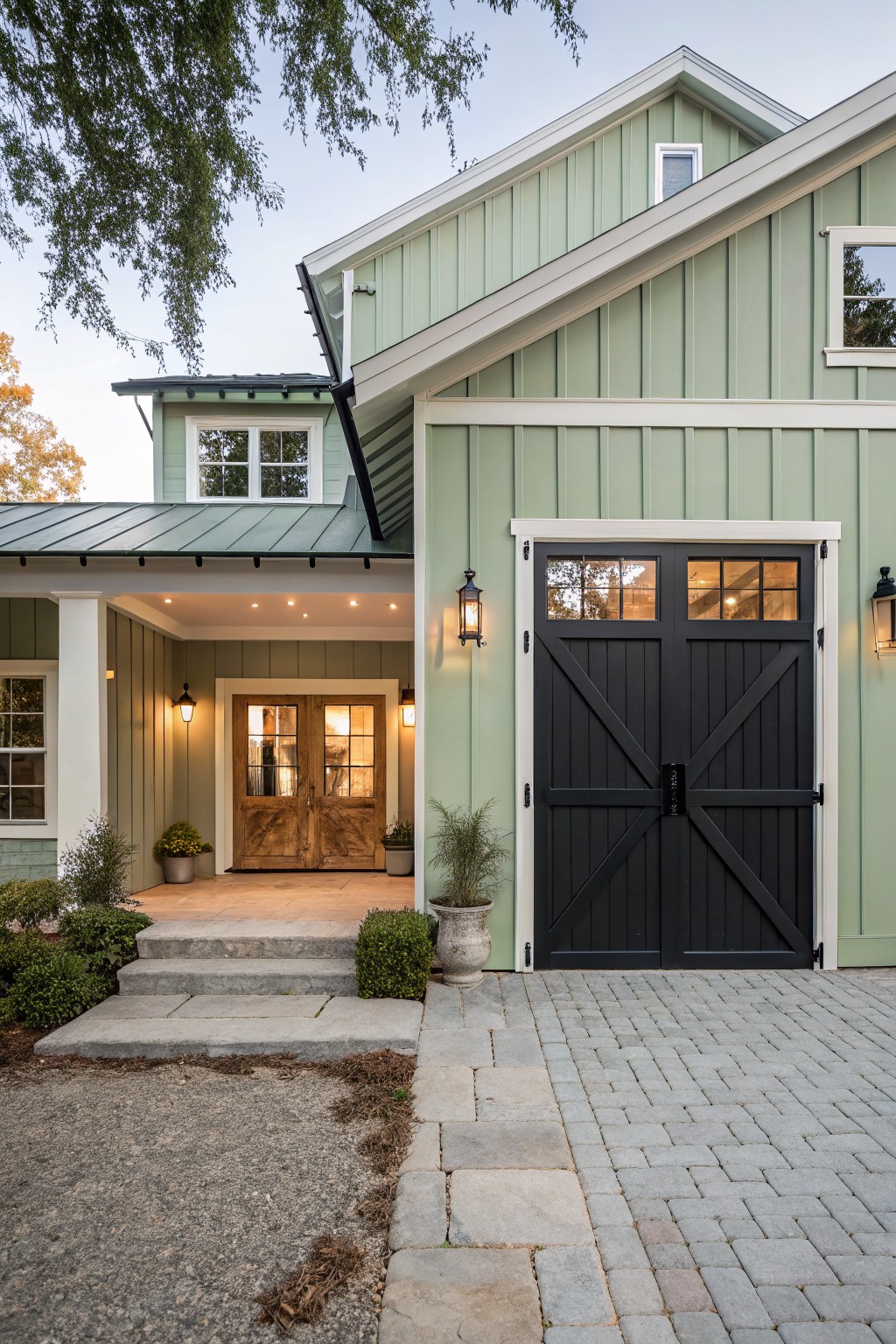
Soft Sage Green Siding

This muted sage green on the siding gives the house a calm look without feeling too bold. It leans more gray than bright green, which helps it blend with stone and wood rather than stand out on its own.
The color holds up well outside because the gray undertone keeps it from shifting too much in sun or shade. It works best with warm trim and darker accents like the garage doors here. Similar shades to consider are Sherwin Williams Clary Sage, Benjamin Moore Saybrook Sage, or Behr Dried Thyme.
Warm Brown Siding
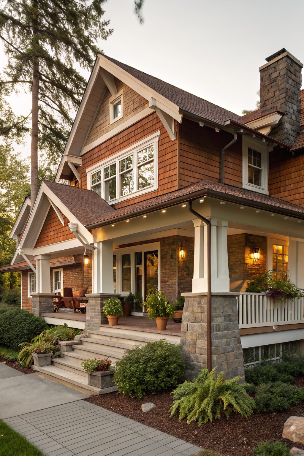
This warm brown siding gives the house a natural and settled look. It falls into that reddish brown family that feels like stained cedar, and it holds up well next to stone and white trim.
The color has a soft red undertone that shows more in daylight. It works best on homes with some texture like shingles or shakes, and it pairs cleanly with gray stone bases or dark roofing without fighting for attention.
Soft Blue Siding

This light blue paint on the siding is what gives the house its fresh look. It sits in a cool blue family with a touch of green undertone that keeps it from feeling too stark or cold. Colors like Sherwin Williams Rainwashed, Benjamin Moore Palladian Blue, Behr Clear Skies, or Farrow & Ball Dix Blue all have that same soft feel.
It works best on homes with white trim and some architectural detail because the contrast stays clean. The color holds up well next to brick paths and garden greens, though it can shift a little greener in deep shade so testing a sample on the wall first is worth doing.
Light Gray Siding

This light gray siding is a solid pick for two tone exteriors that need some contrast without going too bold. It sits in a soft neutral range that feels clean and modern while still working with the darker sections on the house. It reads very close to Sherwin Williams Repose Gray or Benjamin Moore Stonington Gray.
The color has a mild warm undertone that keeps it from looking too cold next to wood and brick. It suits homes with simple lines and works best when paired with a dark gray or black on the accents. Just watch how it shifts in full sun since the tone can look a bit lighter outside.
Soft Green Trim On Brick

This soft sage green works well as an accent color on the trim, windows, and door of a red brick house. It sits in a gentle middle ground between gray and green, which keeps it from feeling too bright or too dull against the warm brick tones. Many people like it because the color stays calm while still creating a clear contrast that makes the whole exterior feel put together.
The green has a slight gray undertone that helps it blend with natural surroundings and older brickwork. It pairs nicely with simple white or off-white trim if you want more contrast, or with darker roofing to keep the look grounded. Just watch how it shifts in different light, since the gray notes can come forward more in shade.
Crisp White Siding

This crisp white exterior paint keeps the whole house looking fresh and simple. It reads very close to Benjamin Moore Simply White or Sherwin Williams Pure White, with a touch of warmth that prevents it from feeling cold.
The color sits well next to the black trim and wood accents without competing. It works best on modern homes that already have strong dark details, and it holds up nicely outdoors as long as you add a few warm wood or stone elements nearby.
Warm Off White Tudor Panels
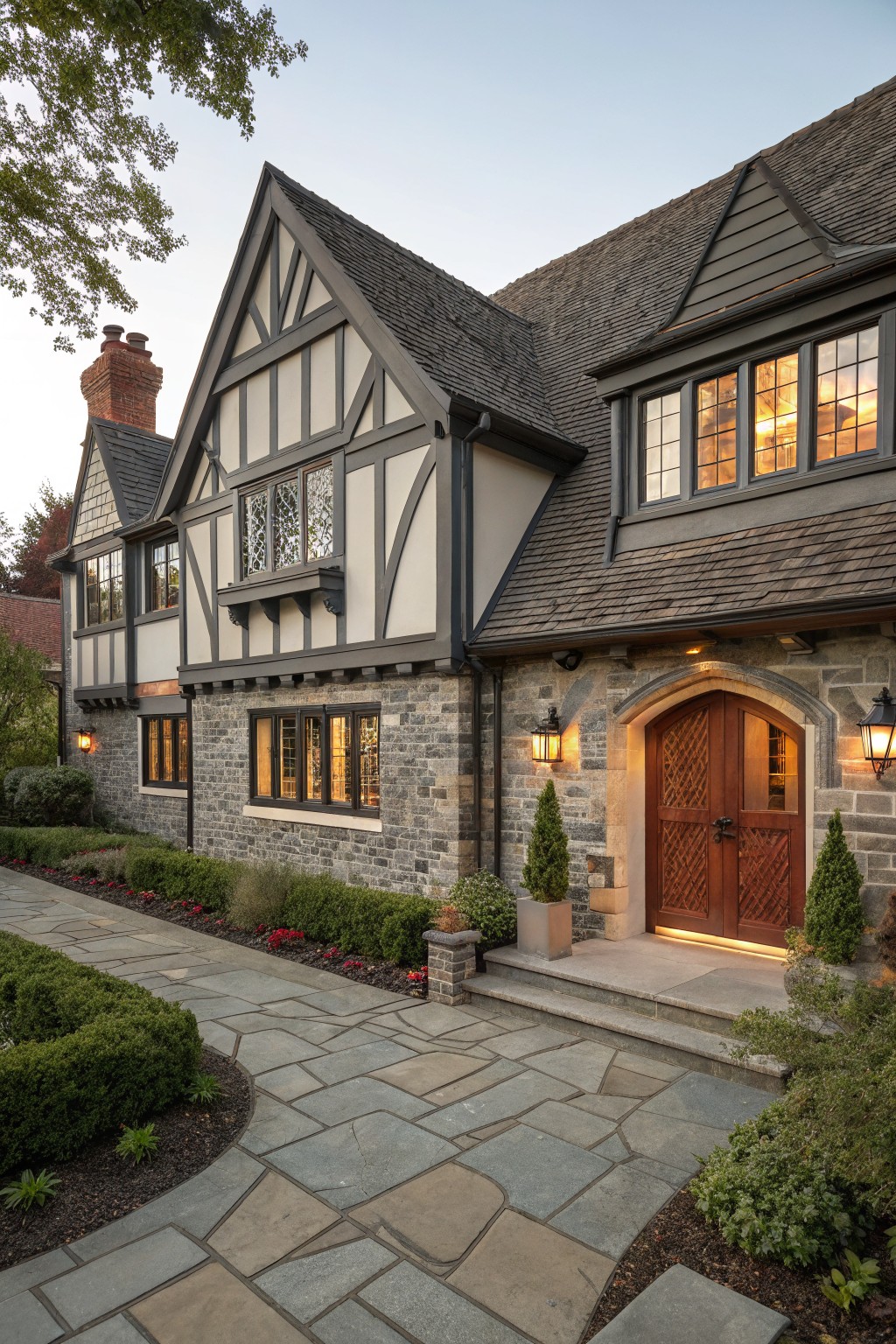
This house uses a soft warm off white on the panels set between the dark timber framing. The color sits right in that light neutral range and creates a gentle contrast against the charcoal beams without looking too bright or cold. It feels calm and a bit creamy, which helps the whole front stay balanced.
The same tone works especially well with stone bases and dark roofs because it keeps the look traditional but still fresh. Pair it with similar warm whites on trim if you want to soften the contrast further, or let the dark beams stay bold. Just test it on a sample board first since the undertone can shift depending on the light.
Light Beige Siding

This light warm beige on the siding is the main color that stands out here. It has a soft neutral tone that feels calm and blends easily with sand and grass. Many people like it because it keeps the house looking bright without needing a stark white.
It sits somewhere between a pale tan and a light greige, with a touch of warmth that shows up more in afternoon light. This color works well on homes near the coast or in open areas. It pairs nicely with dark window frames and simple wood accents, though it can look a bit flat if the trim is too light.
Soft Warm Beige Siding
This house uses a soft warm beige as the main exterior color. It is a light neutral with gentle warmth that keeps the whole look calm and classic instead of stark.
The beige sits nicely against the darker green shutters and white trim. It works well on traditional homes and holds up in changing light without feeling too cool or flat.
Bright Coral Doors

This warm coral shade brings a lively contrast to the white siding without overpowering the whole house. It is a mid-tone coral with a touch of orange that feels cheerful and current. The color reads closest to Benjamin Moore Coral Reef, Sherwin Williams Coral Pink, Behr Coral Gables, or Farrow & Ball Coral.
It sits well against clean white walls and black window frames, which keeps the look crisp rather than sugary. Try it on doors or small accent areas first, and test the sample on site since coral can shift a little in strong sunlight.
Soft Blue Gray Doors
This blue gray color family brings a calm, slightly cool tone to exterior doors and shutters. It reads as a muted slate blue that sits nicely against the warm stone without fighting it. The finish looks matte enough to feel relaxed rather than crisp.
It works best on homes with natural masonry or wood tones nearby. Pair it with warm white trim or leave the stone exposed so the blue gray stays grounded. Watch the light though, since this shade can shift cooler in full sun.
Soft Sage Green Siding
This soft sage green gives the house a calm, lived-in look without feeling washed out. It sits in that middle range between gray and green, so it reads as natural rather than overly sweet or bold.
The color holds up well next to white trim and darker doors because the undertone stays quiet. It works best on homes with simple lines and some greenery around them. Just check a few samples on the actual siding first since the shade can shift depending on the light.
Soft Gray Siding

A muted gray like the one on this shingle siding brings a calm and steady look to the whole house. It has a cool undertone that keeps the color from feeling too flat or heavy, and it works nicely with lighter trim. This kind of gray often reads closest to Benjamin Moore Stonington Gray or Sherwin Williams Worldly Gray, though a few people might also like Behr Silver Drop for a similar effect.
The cool base helps it sit well next to stone and white details without clashing. It suits older homes or traditional styles best, especially when the roof is a darker shade. Just check the color in natural light first, since grays can shift more than you expect once they are on a large surface.
Deep Charcoal Gray Siding

This deep charcoal gray on the upper level of the house creates a bold but simple contrast against the lighter siding below. It is a cool dark neutral that feels solid and modern without trying too hard. Colors like Sherwin Williams Iron Ore, Benjamin Moore Kendall Charcoal, or Behr Black Fox would all be close matches.
The gray sits flat against the wood accents and concrete steps, so it does not compete with them. It works especially well on homes with strong horizontal lines and clean edges. Just keep an eye on how it looks next to any very warm wood tones, since those can make the gray pull cooler than expected.
Soft Pink Siding

A warm salmon pink like this one gives an exterior a friendly, lived-in look. It reads as a soft pink with gentle orange undertones rather than a cool rose. The color works well on older homes where you want something a bit different from plain neutrals. It seems closest to Benjamin Moore Peach Blossom, Sherwin Williams Coming Up Roses, Behr Coral Rose, and Farrow & Ball Pink Ground.
The pink holds its own next to stone and wood without feeling too sweet. It suits cottages and traditional houses especially well and pairs nicely with creamy trim or dark roofs. Just test it on site first since pink can shift a little in bright sun.
Soft Gray Siding

A light gray like this gives the house a quiet, clean look that still feels grounded. It sits somewhere between warm and cool, which helps it blend with the wood deck and darker accents without competing. Matches that come close include Sherwin Williams Repose Gray, Benjamin Moore Gray Owl, or Behr Silver Satin.
This shade works best on modern or coastal homes where you want contrast without going full white. It pairs easily with black windows and natural wood tones, though it can look flat if the lighting is too harsh or if there is no darker trim to balance it.

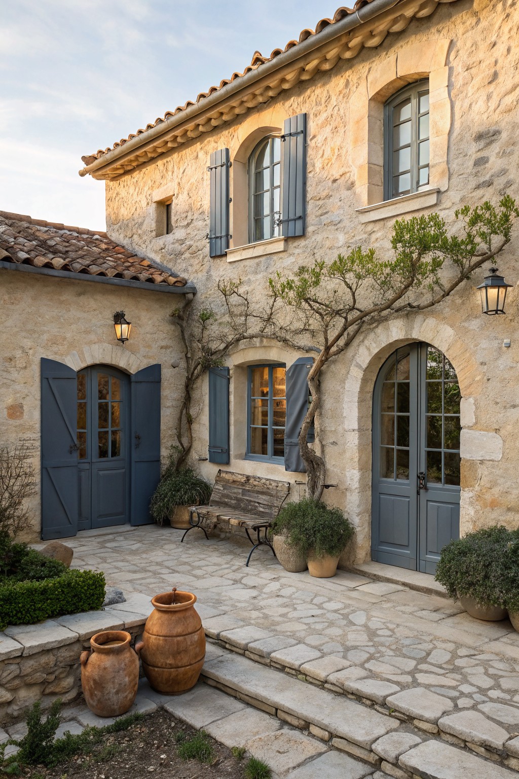
This deep navy blue siding gives the house a bold but simple presence. It reads closest to Sherwin Williams Naval or Benjamin Moore Hale Navy, with a cool undertone that holds up well next to stone and wood.
The color works best on homes with some texture around the base, like the stone shown here. It pairs easily with warm wood accents and keeps the overall look clean without feeling stark.
Frequently Asked Questions
Q: How do I choose two tones that suit a ranch house without making it feel flat?
A: Go with a warm neutral on the main walls and a deeper shade on the trim and eaves. This draws the eye along the horizontal lines and adds depth. Test both colors on a small patch first to see how they shift in morning light versus afternoon shade.
Q: Can I use two tone colors if my house has a lot of brick already?
A: Pick one tone that pulls from the brick and use the second for the wood or siding sections. Keep the contrast high but limited to those clear breaks so the brick stays the main feature. A single coat on the trim is often enough to tie everything together.
Q: What if the high contrast starts to look dated after a few seasons?
A: Swap just the darker accent color for a softer version of the same hue. Most people find this refreshes the whole look without a full repaint. Focus on the front facade first since that is what you notice every day.