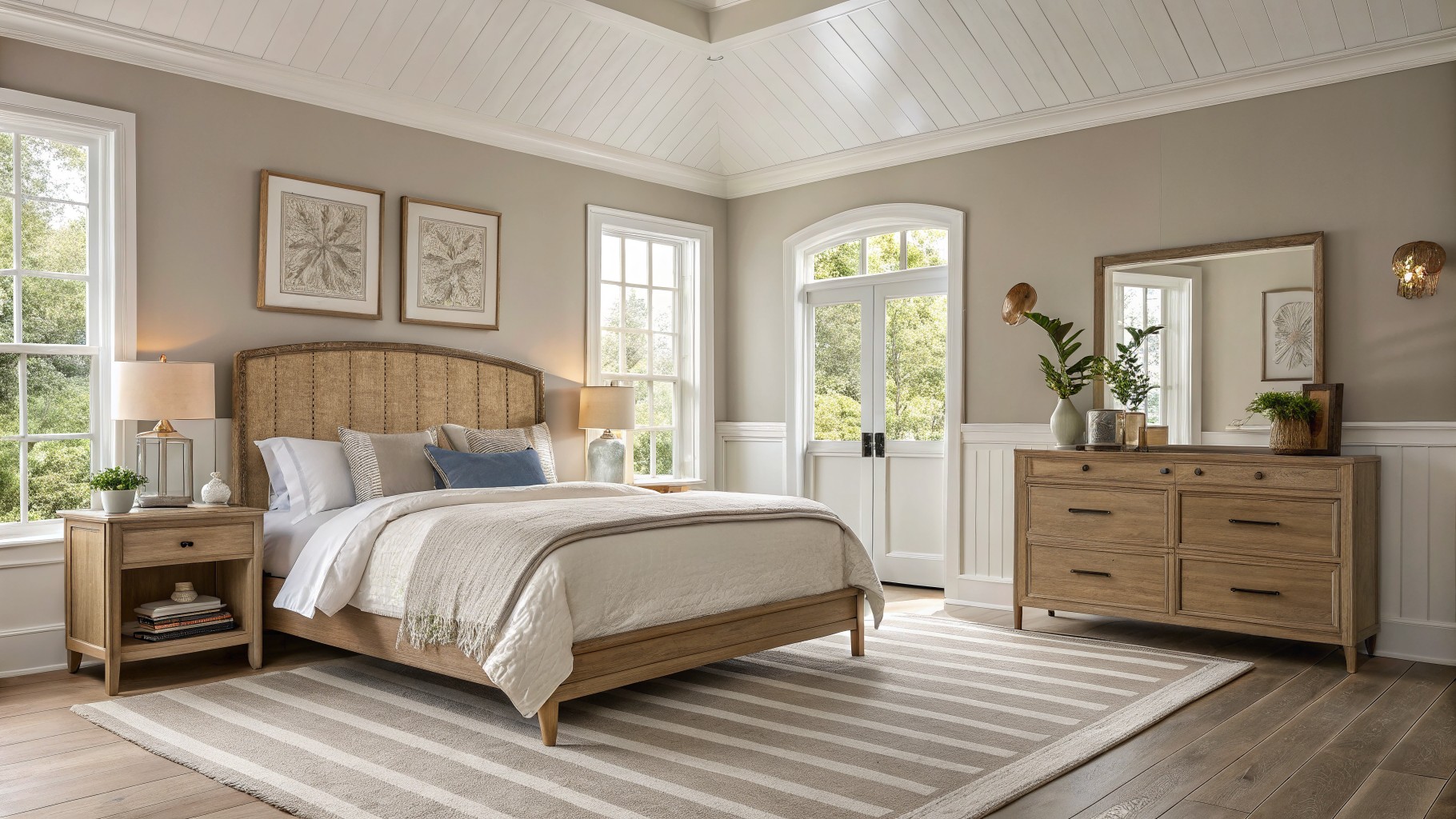
I have found that neutral paints shift more than expected once they cover a full wall and the light moves from morning to evening.
Undertones show up clearly against trim and flooring, and that interaction often decides whether a color feels right in the room.
In my own house I always run samples across a few surfaces first because the same shade can lean warmer or cooler depending on what sits beside it.
Colors that work well tend to stay calm next to furniture and rugs instead of fighting them for attention.
Testing first avoids most regrets.
Soft Greige Walls
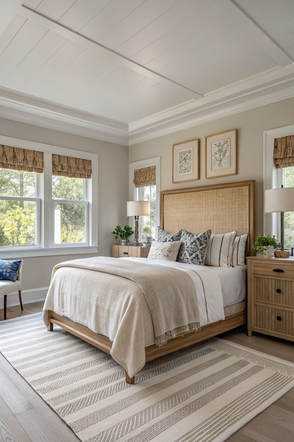
This warm greige on the walls sits between gray and beige in a way that feels soft and livable. It has enough warmth to keep the room from feeling cold but stays neutral enough to work in many different spaces.
The color reads a little lighter in natural light and pairs easily with wood tones and white trim. It suits bedrooms especially well, though the same shade can move into living rooms or hallways without much trouble. Best matches would be something like Sherwin Williams Agreeable Gray, Benjamin Moore Revere Pewter, or Behr Accessible Beige.
Soft Yellow Ceilings
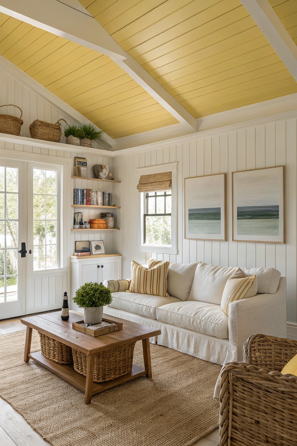
A soft yellow ceiling brings a gentle warmth into an otherwise neutral room. It reads as a light buttery shade that feels sunny without turning bright or overpowering the white walls and trim.
This color has warm undertones that sit nicely with wood tones and natural textures. It works best in rooms that get steady daylight and pairs well with other soft neutrals used elsewhere in the house.
Soft Sage Green Walls
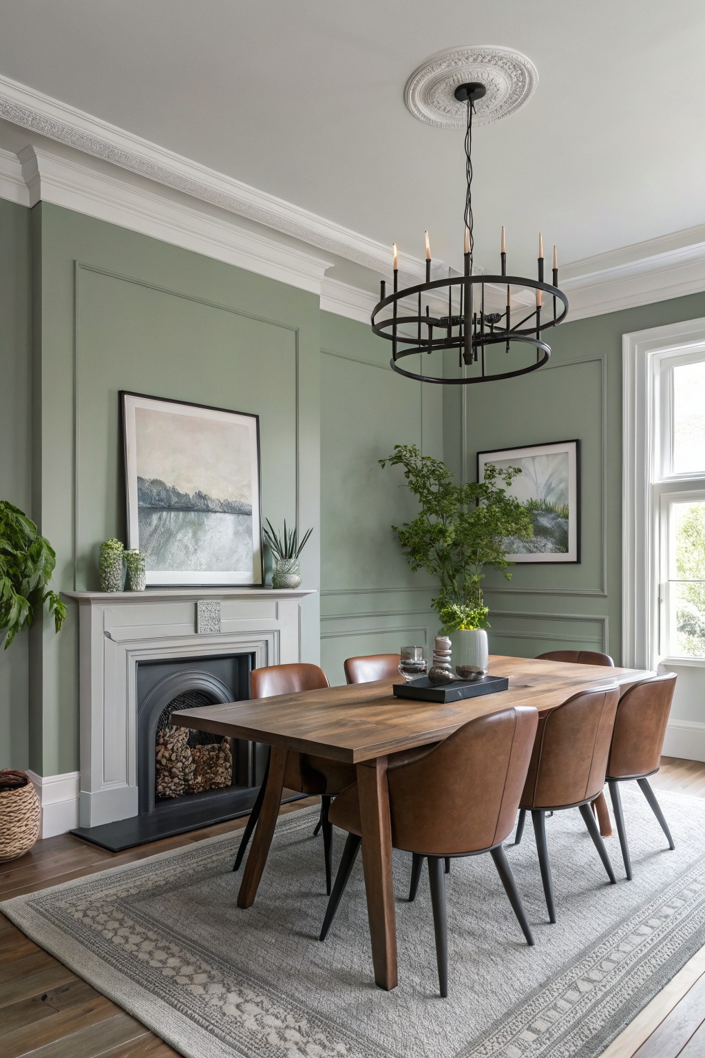
A soft sage green like this makes a calm neutral choice that works in many rooms. It sits somewhere between gray and green with a muted tone that feels easy to live with and pairs well with wood floors and furniture.
The color holds up nicely next to white trim and darker seating. It suits dining areas or living spaces where you want something a little different from beige but still quiet. Good matches include Sherwin Williams Evergreen Fog, Benjamin Moore Saybrook Sage, Behr Bonsai, and Farrow & Ball French Gray.
Soft greige kitchen cabinets
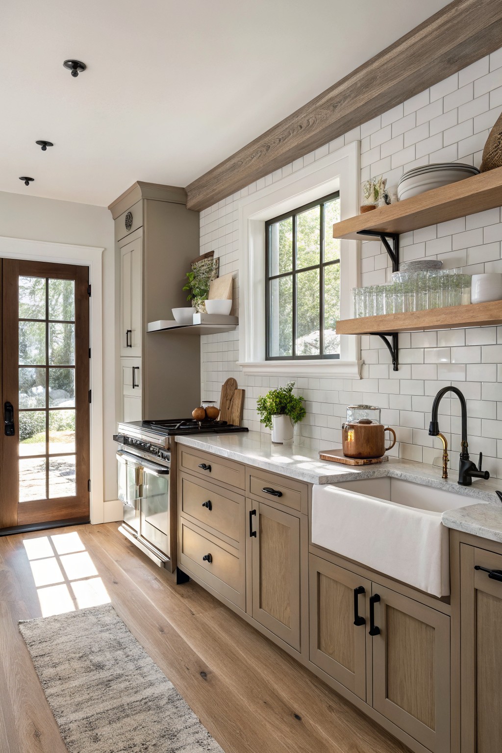
This kitchen uses a soft greige on the cabinets. It is a neutral that blends gray and beige with a touch of warmth that keeps the space from feeling too cool or stark.
The color sits nicely against the white tile and light wood floors. It works well in rooms with both natural light and wood tones. Try Sherwin Williams Accessible Beige, Benjamin Moore Edgecomb Gray, or Behr Creamy Mushroom for a close match. It pairs easily with black hardware and simple white trim.
Soft Blue Gray Walls
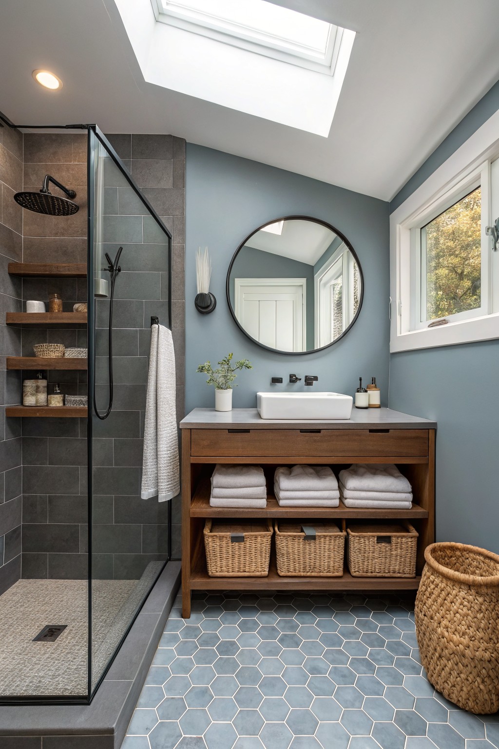
This bathroom uses a soft blue gray on the walls that sits between gray and blue without leaning hard either way. It belongs to the blue gray family and looks closest to Sherwin Williams Passive or Benjamin Moore Gray Owl.
The color stays calm next to wood tones and keeps the room from feeling cold. It works best in baths or smaller spaces where you want something quiet that still reads as a color instead of plain gray.
Warm Beige Walls
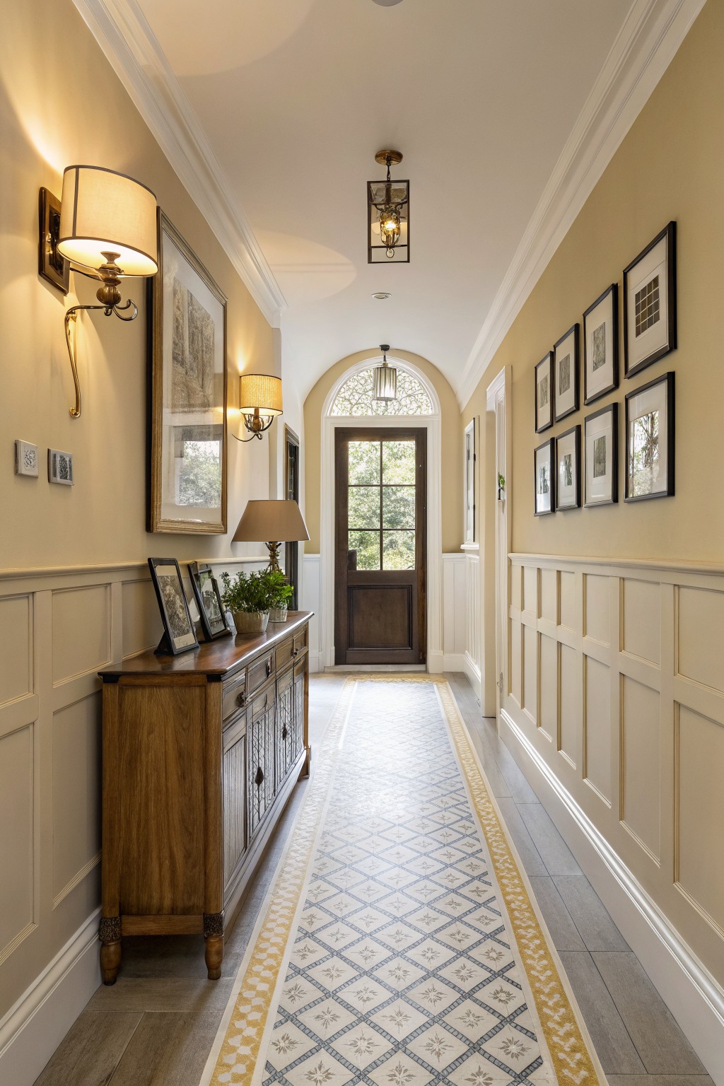
This color is a soft warm beige with a light taupe undertone. It sits nicely between gray and brown, which helps it feel calm and steady in a space that gets both natural light and darker corners. It works well in hallways or open areas where you want something neutral that still feels a little lived in. Matches that come close include Sherwin Williams Accessible Beige, Benjamin Moore Edgecomb Gray, and Behr Almond Wisp.
The beige pairs easily with white trim and wood tones, which keeps the whole look grounded. It can lean a touch cooler in low light, so test it on a bigger patch first if your hallway gets less sun. This shade suits most traditional homes and works across multiple rooms without needing constant changes.
Soft Greige Living Room Walls
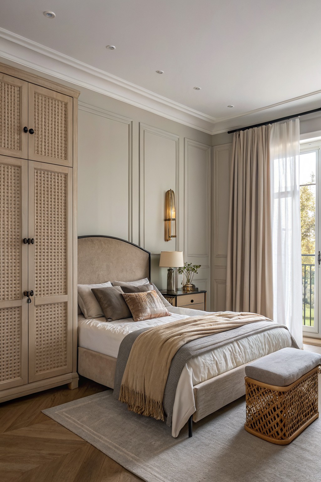
This soft greige works well because it sits right between gray and beige without leaning too far either way. The walls here read warm and quiet, which makes the room feel settled even with the wood tones around it.
It has a light beige undertone that keeps it from going cool or flat, so it pairs nicely with natural wood floors and cabinetry. In lower light it can look a touch more gray, so test it on a bigger patch before committing.
Warm Greige Walls
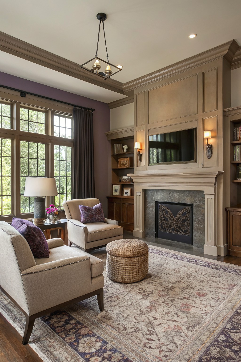
This room uses a warm greige on the walls. It sits between beige and gray and feels soft without turning cool or flat.
The color has a light brown undertone that helps the wood cabinetry and stone fireplace read richer. It works in living rooms with mixed textures and pairs best with creamy trim or medium wood tones. Sherwin Williams Accessible Beige and Benjamin Moore Edgecomb Gray sit close to this shade.
Light Gray Cabinets
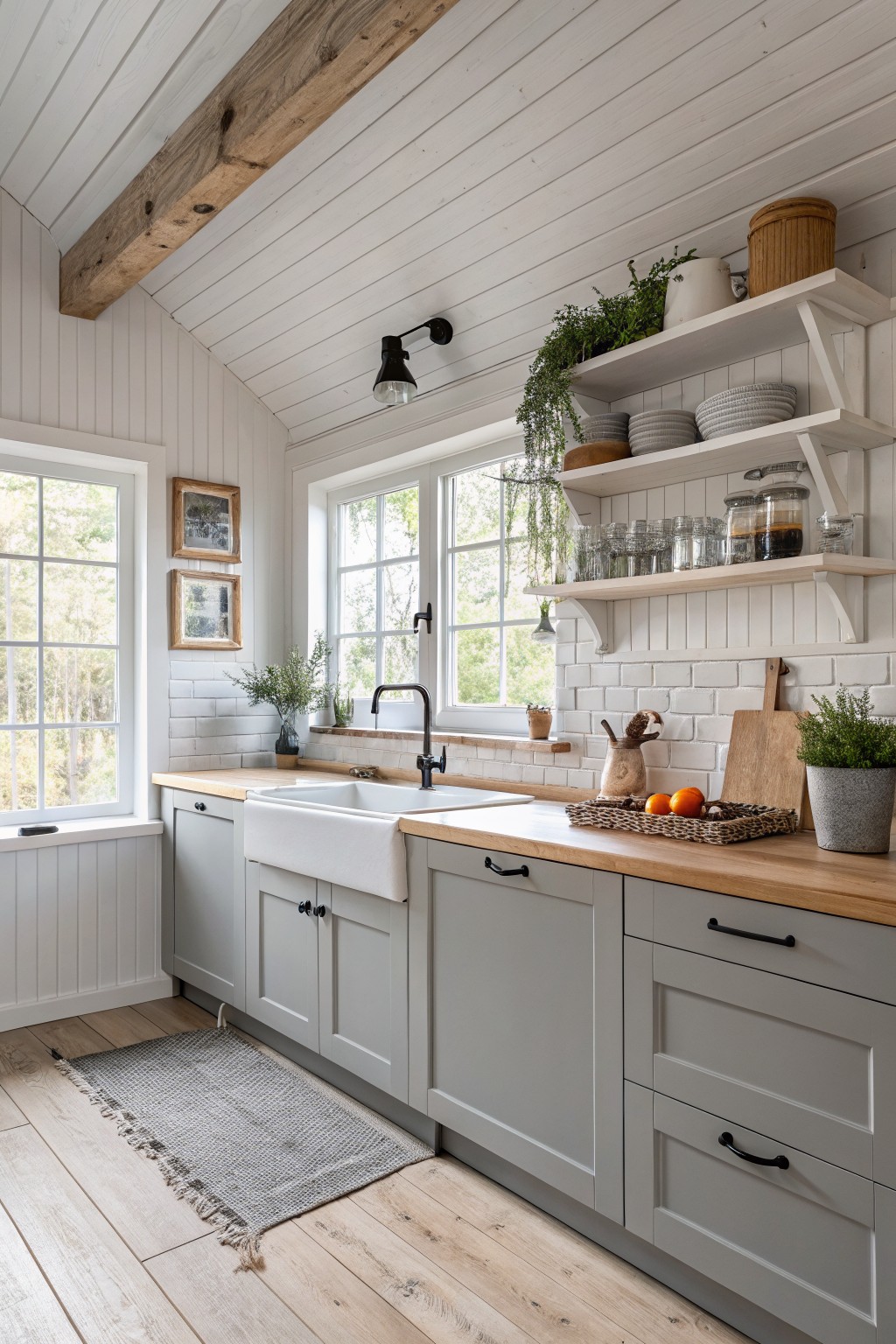
A soft gray works well on cabinets when you want something neutral that still feels calm and current. This one sits between warm and cool, so it pairs easily with wood tones and white tile without looking too stark or too muddy.
It has a slight blue-gray undertone that shows up more in bright light but stays quiet next to the natural wood counters. Try it in kitchens or bathrooms where you want built-ins to blend rather than stand out, and keep the trim crisp white so the gray stays looking fresh.
Deep Charcoal Gray Walls
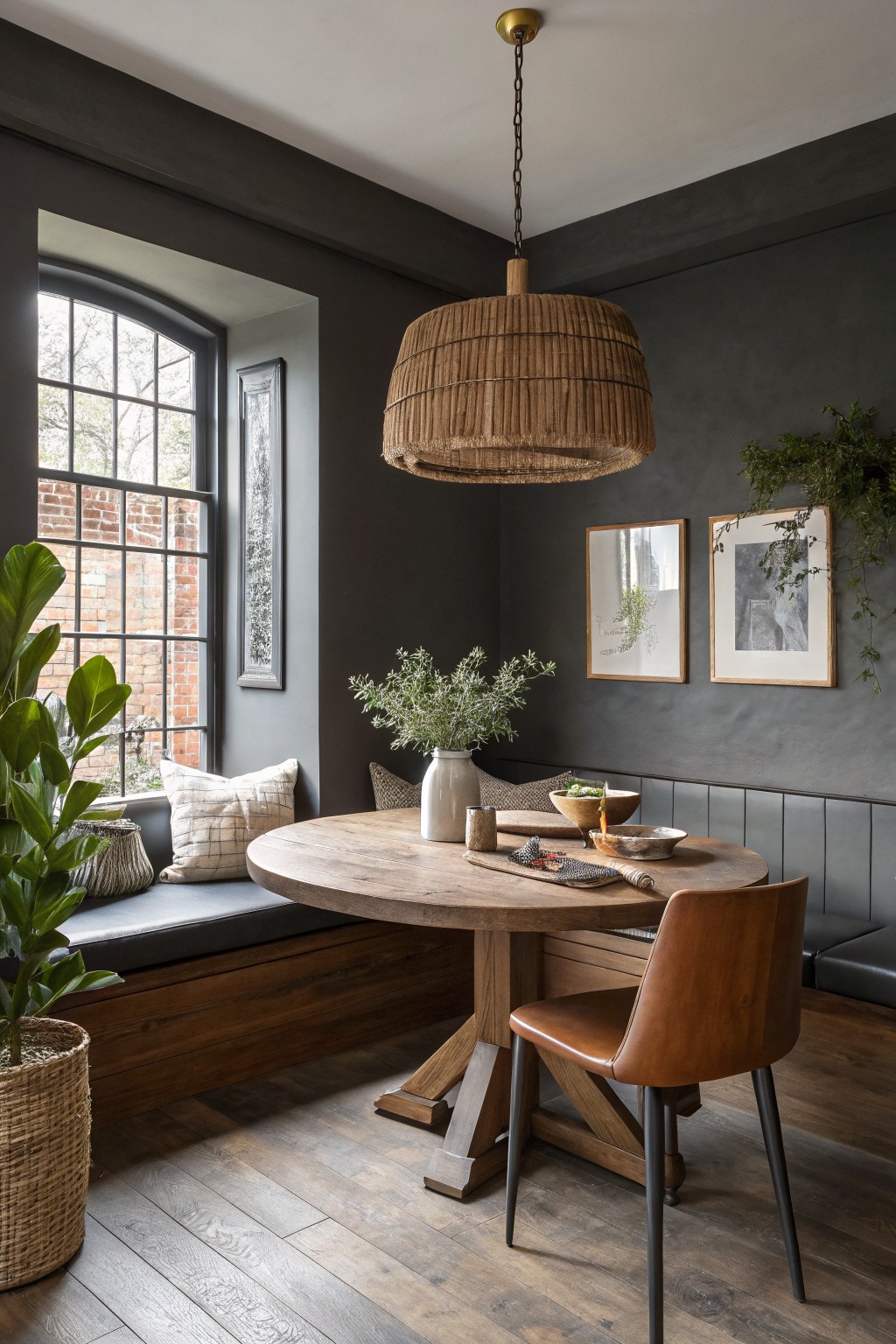
A deep charcoal gray like this one gives a room weight and calm at the same time. It reads as a true neutral but with enough depth to hold its own next to wood tones and darker floors.
This shade has a soft, slightly cool undertone that works best in rooms with steady daylight. It pairs cleanly with warm woods and simple built-ins, though it can feel flat in spaces that get very little natural light. Best matches would be Sherwin Williams Iron Ore, Benjamin Moore Kendall Charcoal, or Farrow & Ball Railings.
Soft greige on walls and cabinetry
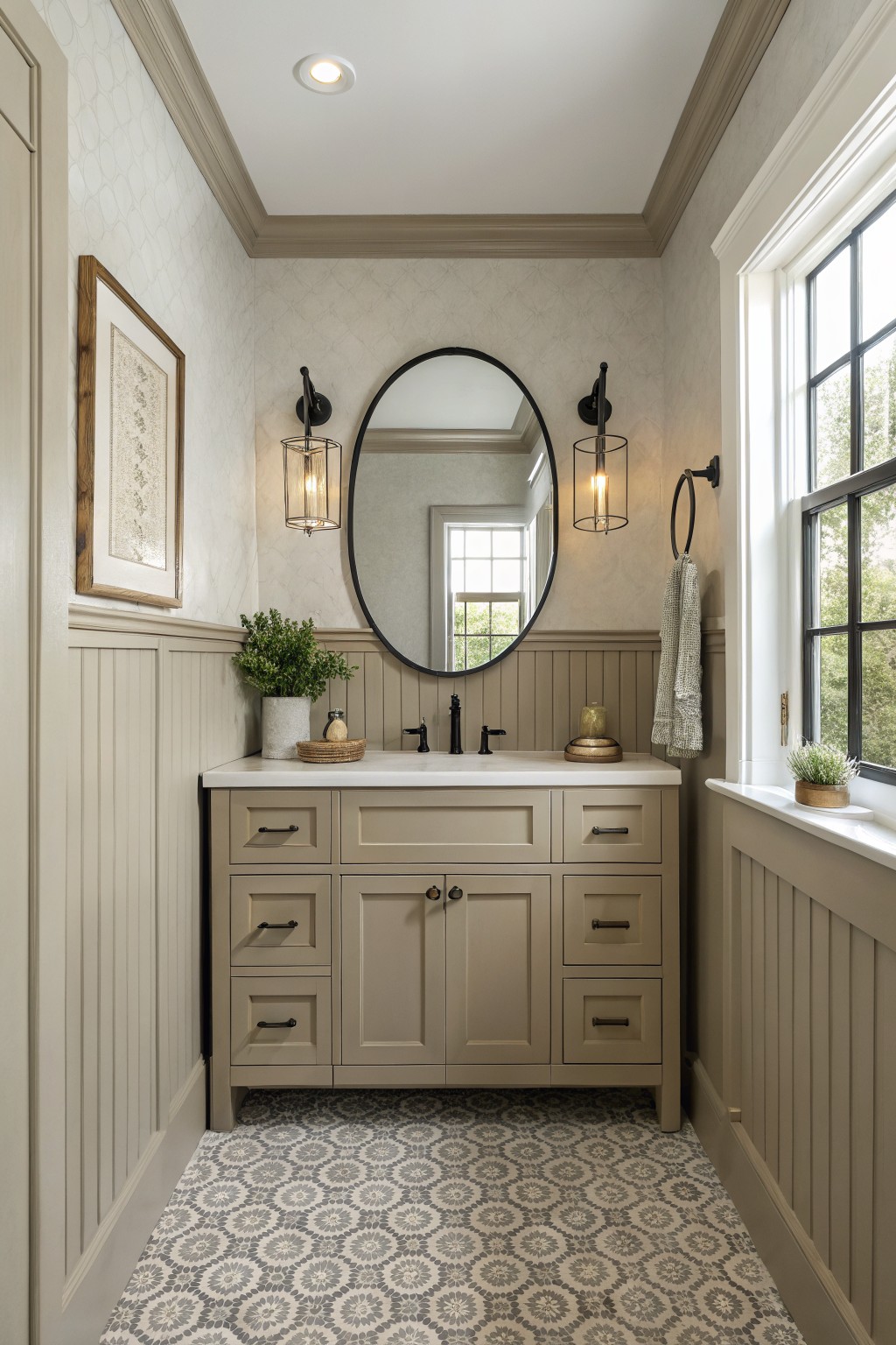
This soft greige sits right in the middle of gray and beige. It gives the room a steady, quiet background that still feels warm enough to work with wood tones and tile.
The color has a light warm undertone that keeps the space from feeling cool or flat. It looks good with black hardware and white counters. Sherwin Williams Accessible Beige, Benjamin Moore Edgecomb Gray, or Behr Greige would all be close matches.
Soft Sage Green Walls and Built In Cabinetry
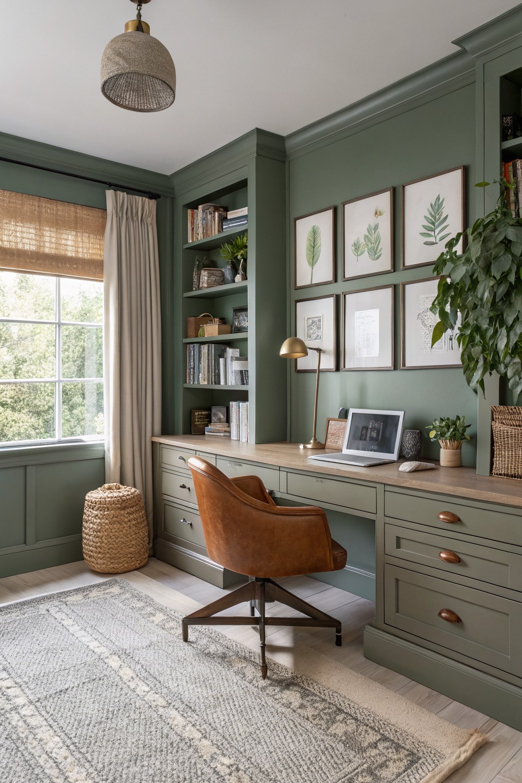
This muted sage green is a nice neutral choice for walls and built-in cabinetry. It sits between gray and green without leaning too hard in either direction. The color feels calm and works well in rooms that get steady daylight. It reads closest to Sherwin Williams Evergreen Fog, Benjamin Moore October Mist, or Farrow & Ball Lichen.
The green has a soft gray undertone that keeps it from feeling too earthy. It pairs easily with warm wood tones and simple painted trim. In a home office or living space it stays flexible without needing a lot of contrast.
Pale Blue Walls
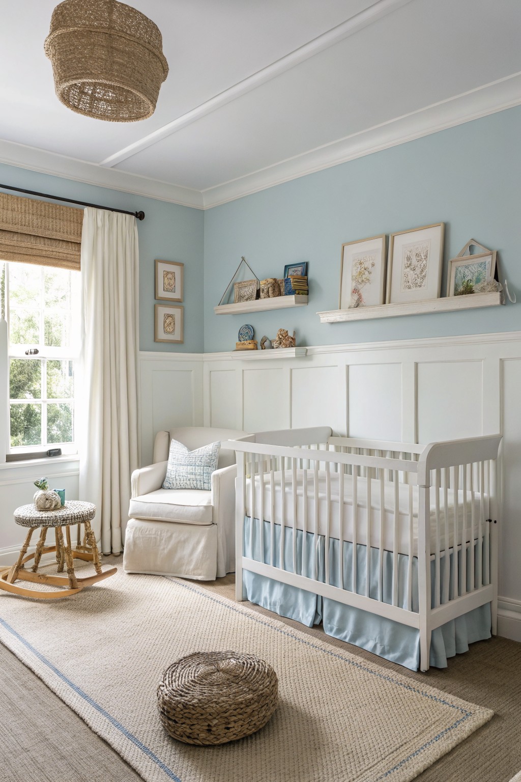
This pale blue is a soft, muted shade that feels calm and slightly cool without turning stark. It sits in that gentle area between blue and gray, which makes it easy to live with in everyday rooms.
The color pairs best with white trim and natural textures like wood or woven pieces. It works well in bedrooms or similar spaces where you want something restful but still flexible enough to change accents later.
Soft Greige Cabinets
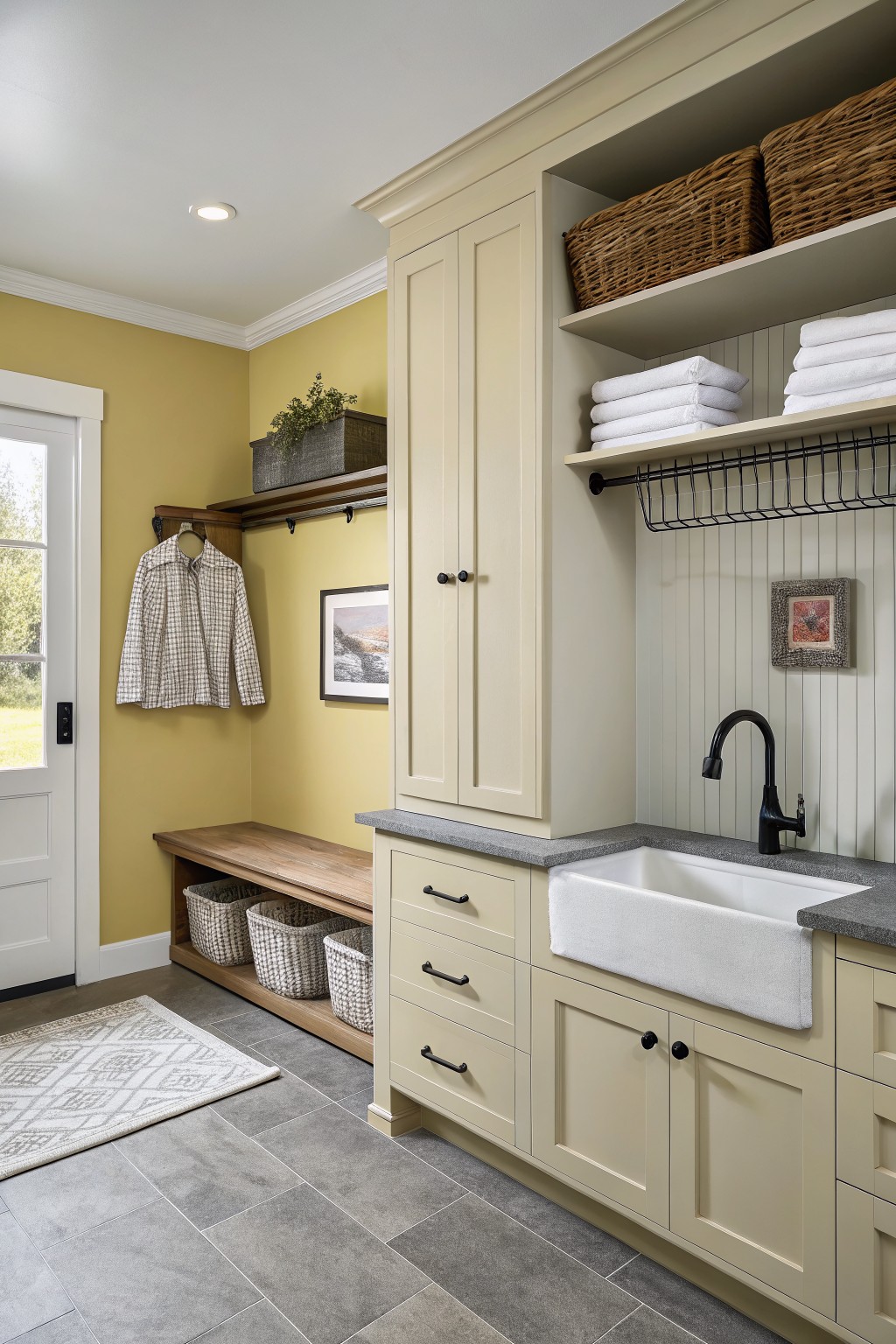
This soft greige on the cabinets gives a warm neutral that sits between beige and gray. It reads clean next to wood and stone without feeling stark. Colors like Sherwin Williams Accessible Beige or Benjamin Moore Collingwood come close to the shade shown here.
The undertone stays gentle in different lights and works well with black hardware or gray counters. It suits rooms that need a flexible base color that still feels a little soft.
Warm Greige Walls with Natural Wood
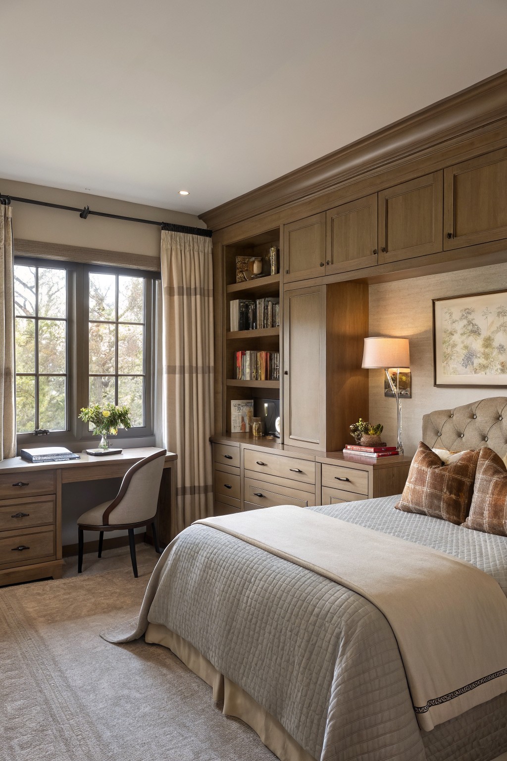
This warm greige is the kind of neutral that feels soft and lived-in right away. It sits nicely next to wood tones without competing with them, which makes it easy to use in rooms with built-ins or cabinetry.
The color has a gentle warmth that keeps the space from feeling flat or cool under indoor light. It works well with natural wood finishes and simple neutral textiles, though it can look a bit flat if the room gets very little daylight.
Soft beige siding
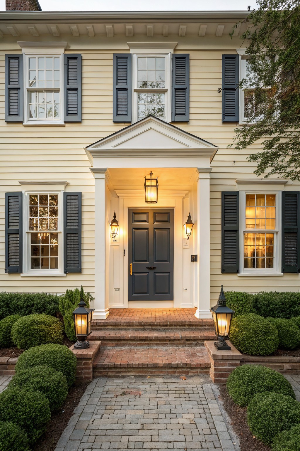
This light beige siding has a warm neutral tone that feels soft rather than stark. It sits somewhere between a pale greige and a creamy beige, which helps it blend with brick and natural surroundings without looking too yellow or too gray. Many people like it because it gives the house a gentle, lived-in look that still reads clean.
The color has a mild yellow undertone that shows up more in morning light and pairs well with white trim or red brick. It works on traditional homes or simpler exteriors where you want something calm that does not fight with other materials. Watch how it shifts if your roof or landscaping leans very cool.
Soft Gray Siding
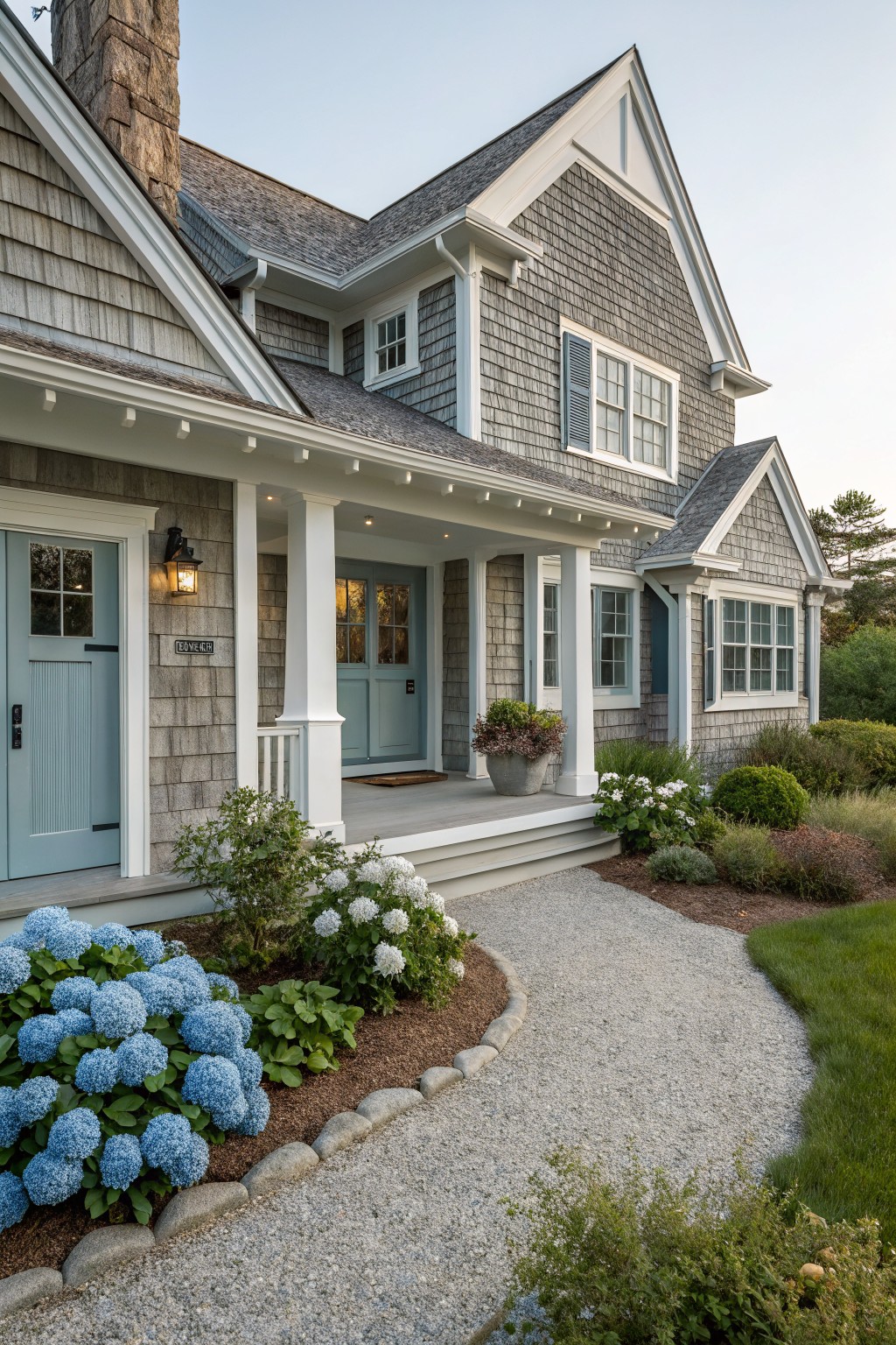
A soft gray like this works nicely on shingle siding because it feels calm and blends with most surroundings without standing out too much. It sits somewhere between a true gray and a light taupe, which helps it look natural next to stone and wood details on the house.
This kind of gray often has a slight cool undertone that shows up more in bright light, so it pairs best with crisp white trim and a darker roof. It suits older homes or coastal styles where you want something low key that still feels put together. Good matches include Sherwin Williams Agreeable Gray, Benjamin Moore Coventry Gray, Behr Silver Strand, or Farrow & Ball Light Gray.
Soft Green Siding
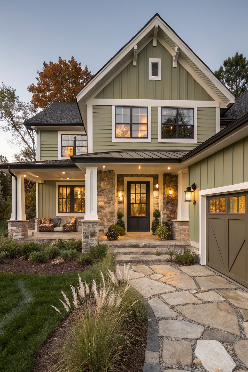
This muted sage green siding sits right in the middle between gray and green. It reads soft and steady on the house without pulling too cool or too warm.
The color holds up well against white trim and stone. It works best on homes that already have some natural texture around them. Try it with dark window frames or a darker roof if you want a bit more contrast.
Warm Greige Siding
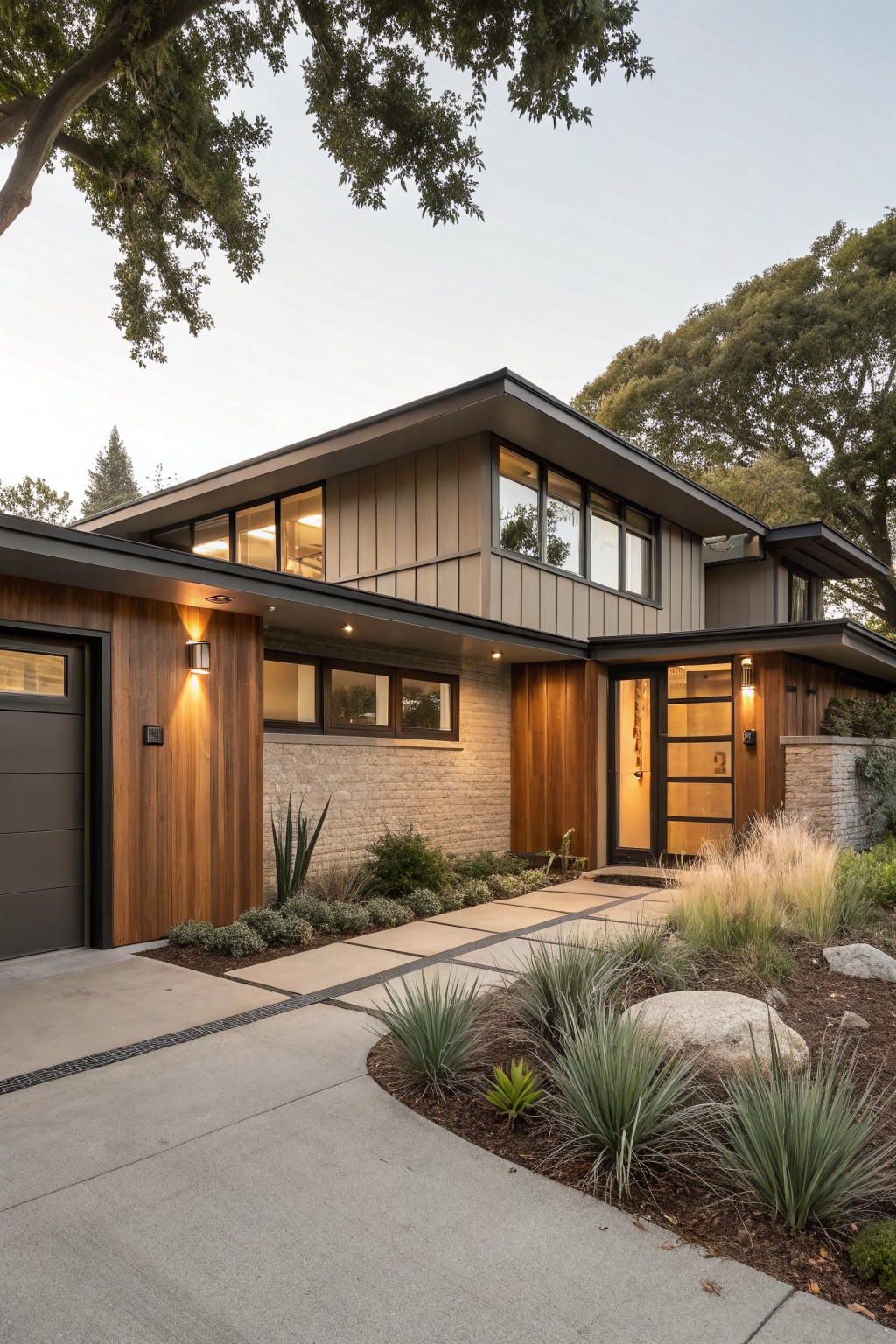
This house uses a warm greige on the main siding. It sits between gray and beige with a soft, slightly earthy feel that looks good in natural light. Colors like this work well because they stay calm next to wood and brick without fighting them.
It has a light warm undertone that keeps the house from looking too cool or flat outside. Sherwin Williams Repose Gray or Benjamin Moore Edgecomb Gray come close, as do Behr Silver Satin and Farrow & Ball Elephant’s Breath. Pair it with natural wood doors or simple trim and it holds up well on most homes.
Warm white painted brick
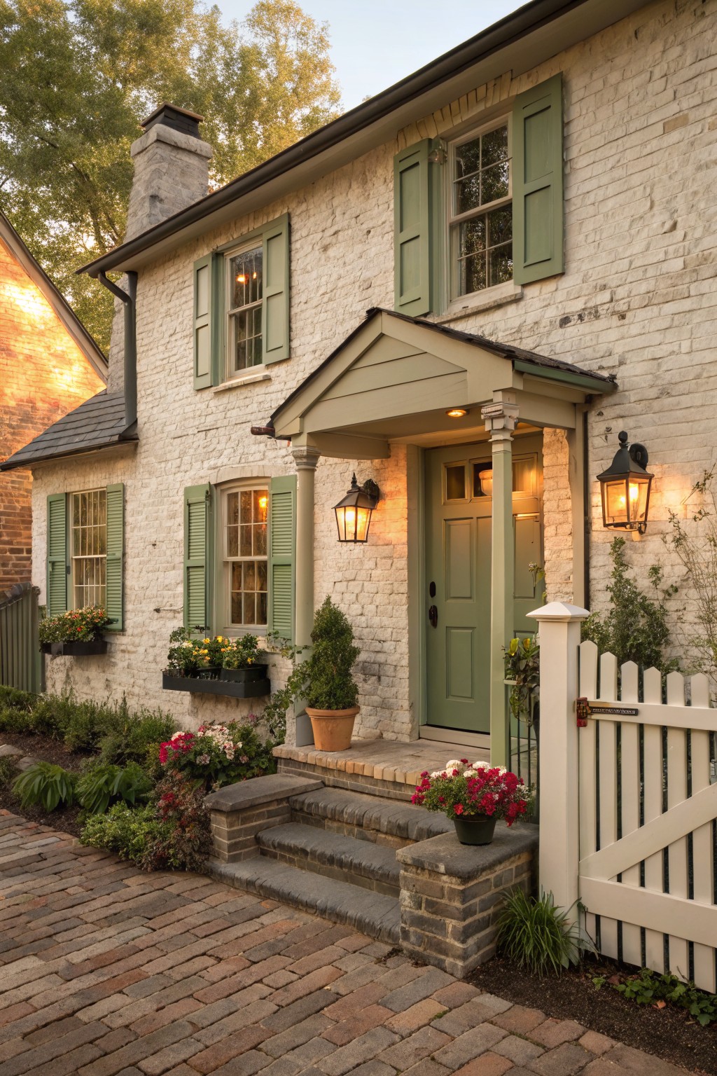
A warm white on brick gives the outside of a house a clean but soft look. This color sits right between bright white and light cream, so it feels natural against stone and older masonry without turning harsh in daylight.
It carries a gentle beige undertone that helps it sit well with both dark trim and softer greens. It works on many traditional homes and pairs easily with black hardware or natural wood doors.
Warm Beige Exterior Walls
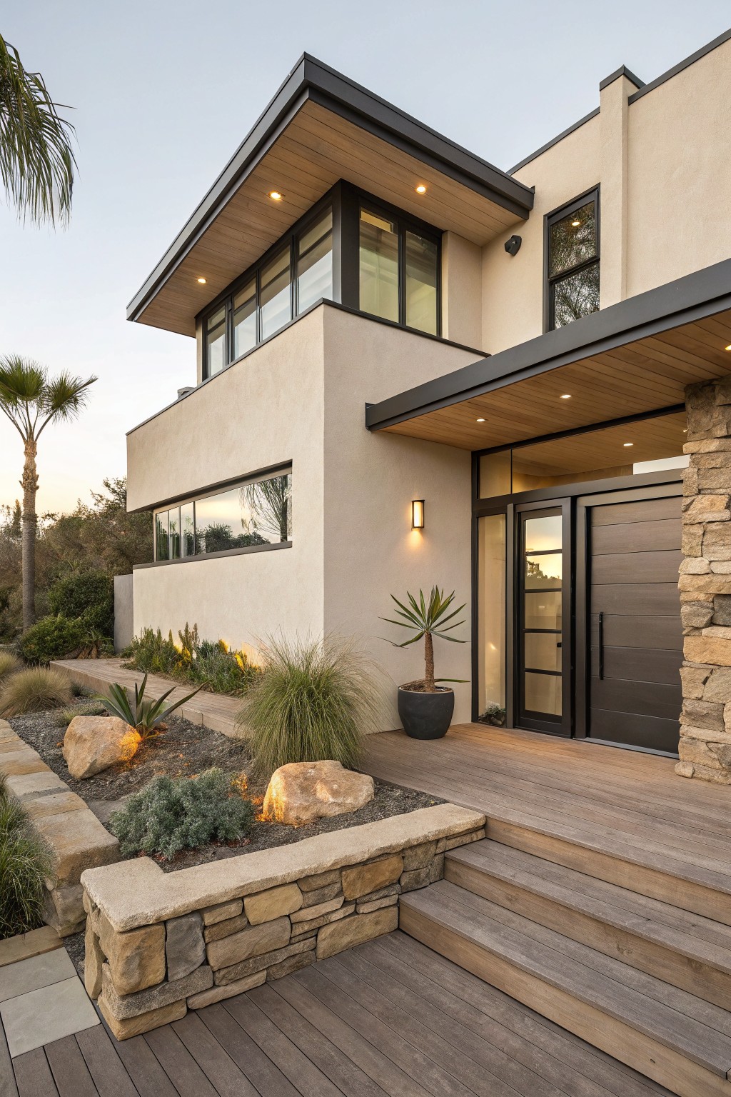
A warm beige like this works well on stucco because it feels soft but still has enough depth to hold its own outside. The tone sits somewhere between a true beige and a light greige, which helps it blend with natural materials rather than fighting them.
It reads closest to Sherwin Williams Accessible Beige or Benjamin Moore Edgecomb Gray, with Behr Silver Satin as another close option. The color stays steady next to wood and stone, though it can look a bit flat if the light gets very harsh.
Soft Sage Green Siding
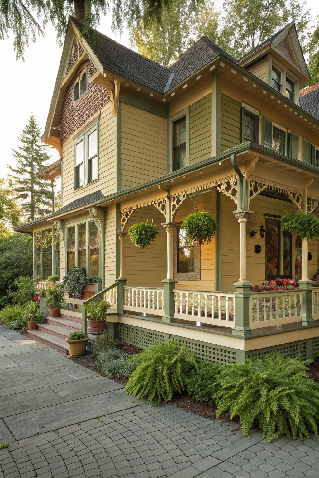
This soft sage green brings a quiet warmth to the whole exterior without feeling bold. It sits in that middle ground between green and neutral, so the house still reads calm even with all the trim and architectural details around it.
The color has a slight yellow undertone that helps it look good next to the cream porch and darker green accents. It works best on older homes where you want something a little softer than a straight gray or beige, and it holds up fine in both sun and shade.
Soft Blue Gray Siding
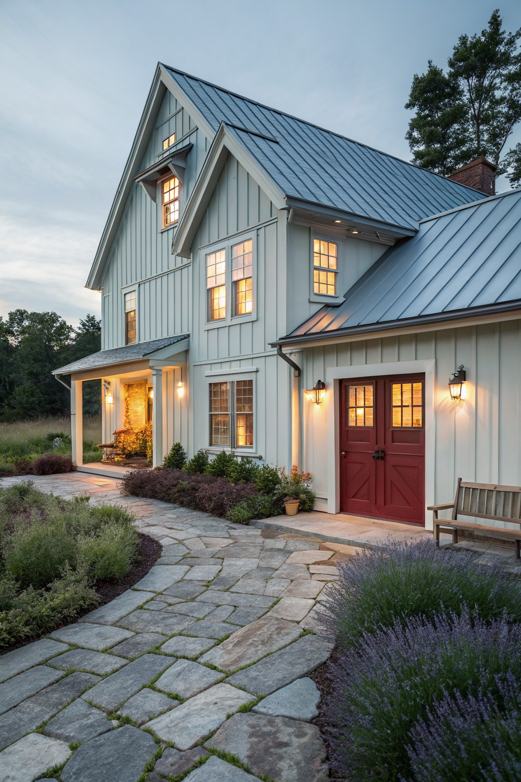
This soft blue gray on the house siding feels calm and easy to live with outside. It sits in a cool neutral family that leans slightly blue with a hint of green. Good matches include Benjamin Moore Palladian Blue, Sherwin Williams Silver Strand, Behr Silver Bullet, and Farrow & Ball Light Blue.
The color holds up well next to metal roofing and stone paths. It can read a touch cooler in strong sun, so testing a large sample on site helps avoid surprises. Pair it with warm white trim or natural wood accents to keep the whole look balanced.
Frequently Asked Questions
Q: How do I pick a neutral that still shows some life next to my wood floors? A: Hold sample boards against the floorboards in morning and evening light. Notice which shade picks up the warm grain instead of fighting it. Stick with that one on the main walls.
Q: What if I want the same neutral scheme to stretch from the kitchen into the living room? A: Choose one base color for the bigger surfaces in both areas. Shift only the trim or an island to a half-shade darker version. The eye keeps moving without any hard stops.
Q: Will these colors still work once I add my colorful throw pillows and art? A: Let the neutrals sit back so the pillows and art stay the focus. Test one pillow against the painted sample first. If it pops without clashing, you are set.









