When I look at open living spaces the way colors shift from one area to the next often decides whether the whole room feels connected or just patched together.
I have seen colors that looked perfect in the store turn too cool or too warm once the sunlight hit them at different angles.
Testing on the actual walls saves a lot of regret later.
Furniture and other surfaces also change how a color reads so it helps to consider those pieces when picking the main shades.
The schemes here show ways to link the spaces while keeping each area distinct enough to feel purposeful.
Warm greige walls

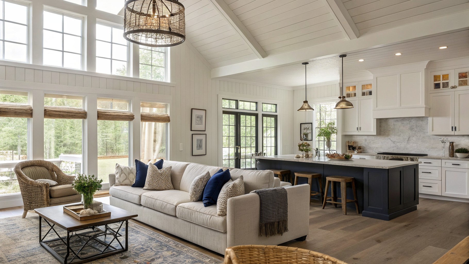
This wall color is a soft greige with a light touch of warmth. It sits between gray and beige, which makes it easy to connect the living area and kitchen without the space feeling chopped up or too cool.
The slight warmth helps it work with the wood tones and white trim. It stays calm under different lighting and pairs well with both light fabrics and darker cabinetry. Try Sherwin Williams Agreeable Gray, Benjamin Moore Edgecomb Gray, or Behr Accessible Beige if you want something close.
Blue Gray Walls In Open Living Spaces
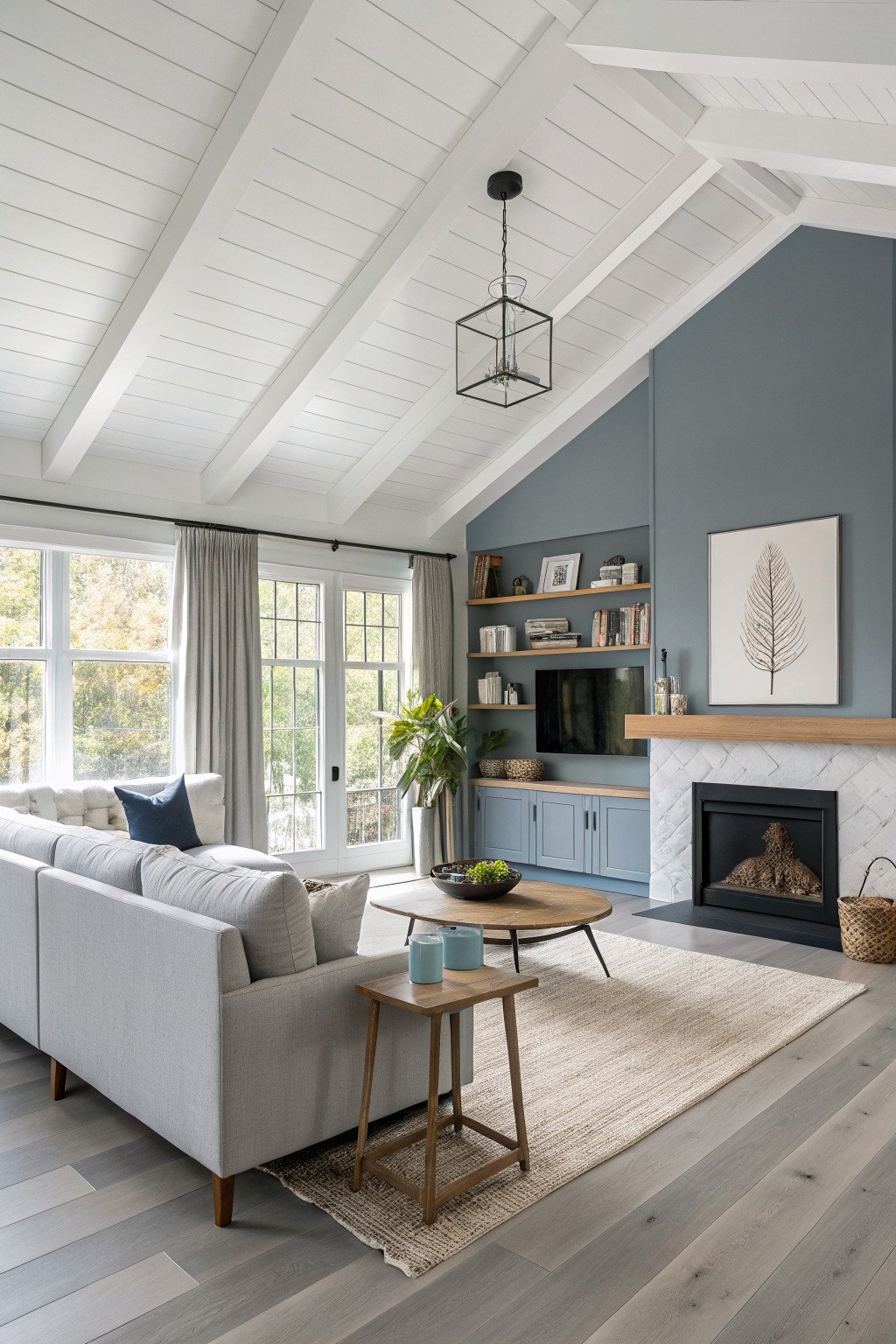
This great room uses a soft blue gray on the main wall around the fireplace. It is a cool toned color that sits nicely against white ceilings and brings a steady feel to the whole open area.
The color has a light gray base with a hint of blue that stays calm next to wood floors and cabinetry. It works best in rooms with plenty of natural light and pairs easily with white trim or pale wood tones.
Soft Mint Green Walls

This soft mint green gives an open great room a light, easy feel without making it feel too cool or stark. It leans slightly toward aqua but stays gentle, which helps different areas of the space read as one connected room.
The color has a cool undertone that sits nicely against white trim and wood floors. It works well in rooms with steady daylight, and similar shades show up in options like Sherwin Williams Sea Salt, Benjamin Moore Palladian Blue, Behr Aqua Foam, or Farrow & Ball Pale Powder.

This deep navy brings a calm, grounded feel to an open great room. It has a cool undertone that keeps the color from turning too purple or muddy, and it reads especially well against wood tones and stone.
The shade works best in rooms with good natural light and pairs easily with lighter upholstery or warm wood cabinetry. Sherwin Williams Naval or Benjamin Moore Hale Navy are close matches, though the exact depth can shift a bit depending on the lighting.
Warm beige that keeps wood looking rich
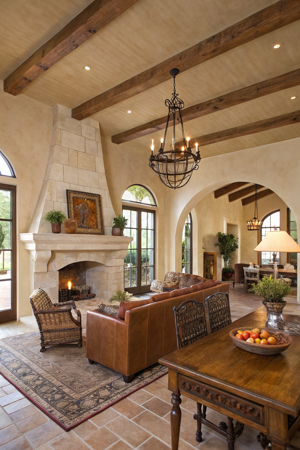
This warm beige has a soft sandy tone that works well in open rooms. It sits comfortably next to dark wood beams and keeps the space from feeling too heavy or stark.
The color carries a light yellow undertone that shows up more in natural light and blends nicely with stone. It suits homes that already have wood and masonry, and it works best when paired with similar warm neutrals rather than crisp white trim.
Soft Warm Neutrals In Open Rooms
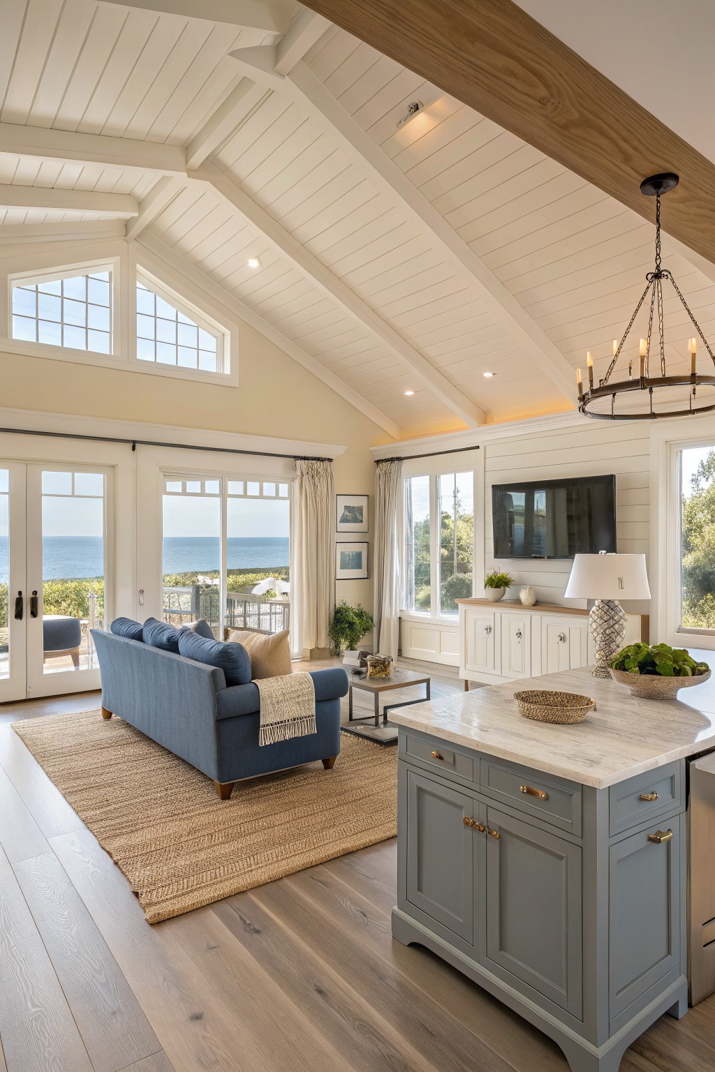
This great room uses a soft warm neutral on the walls. It is a light greige that feels calm and easy to live with, sitting nicely between the wood ceiling beams and the darker floor.
The color has a gentle warmth that keeps the space from feeling stark while still letting the natural light move through. It pairs well with white trim and wood tones, though it can shift slightly depending on the time of day and what you place against it.
Sage Green Walls

A muted sage green works really well in open living spaces because it feels calm without going flat. This one has a soft olive tone that sits nicely next to warm wood cabinetry and keeps the room feeling connected rather than chopped up.
It leans slightly gray, which helps it stay steady in changing light and pairs easily with natural textures like linen or stone. Try it in kitchens or great rooms where you want some color but still need the space to feel open and livable.
Soft Gray Walls
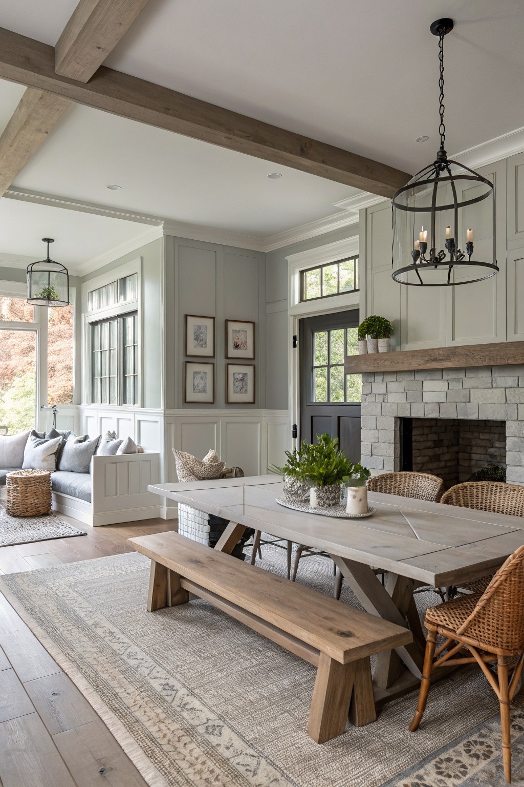
This soft gray on the walls gives the room a calm, steady look that helps tie the open space together. It sits nicely between the wood beams and the stone fireplace without pulling too much attention.
The color has a light, slightly cool feel that keeps the room from feeling heavy. It works best with white trim and natural wood, and it holds up well in spaces that get both morning and afternoon light.
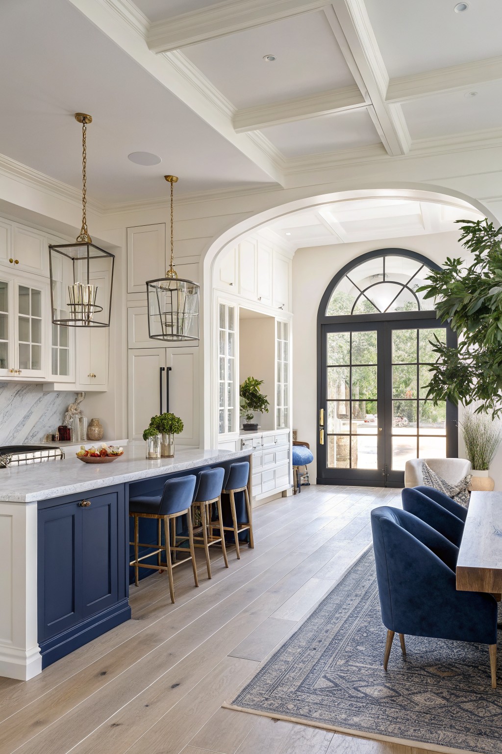
A deep navy blue works well on kitchen cabinets in an open layout. It gives the island and base cabinets a solid presence that still feels grounded next to white walls and light wood floors.
The color sits on the cooler side and holds up nicely under bright light. It pairs best with warm wood tones and simple white trim, though it can feel heavy if the room lacks enough natural light or contrast from lighter surfaces.
A pale sage green
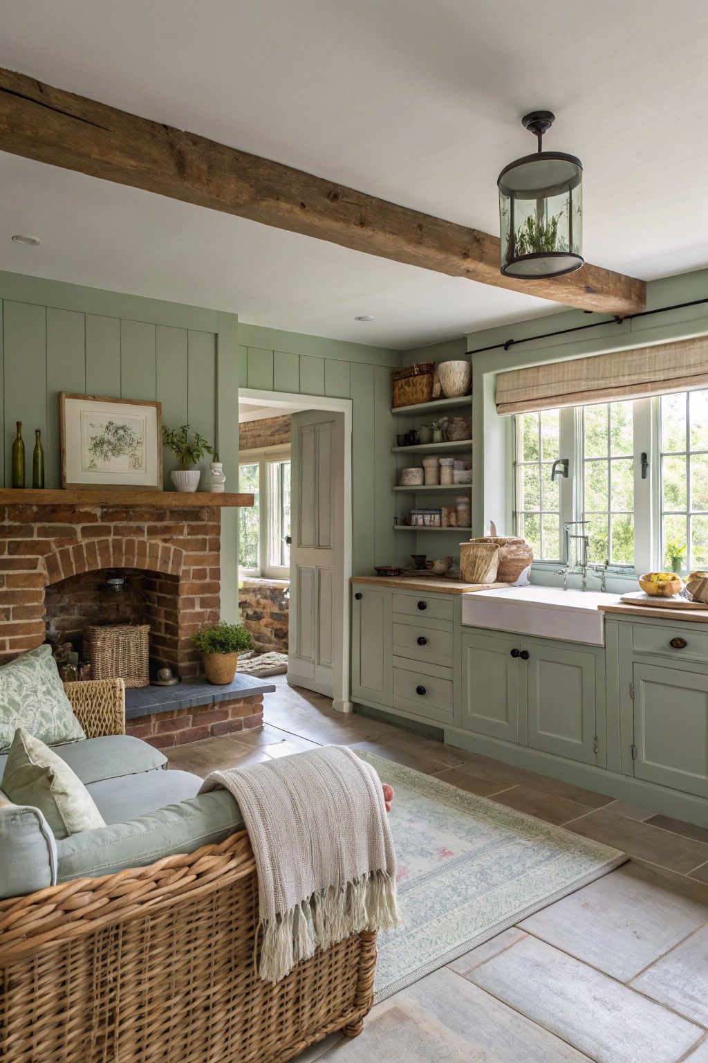
This pale sage green brings a quiet, steady feel to open living areas. It sits between gray and green, so it reads soft rather than bright and helps tie the kitchen cabinets to the main walls without breaking the space into separate zones.
The color has a light gray undertone that keeps it from feeling too earthy next to warm wood beams and brick. It works best in rooms with decent natural light and pairs easily with stone floors, simple white trim, and natural textures like linen or wicker.
Soft Sage Green Walls
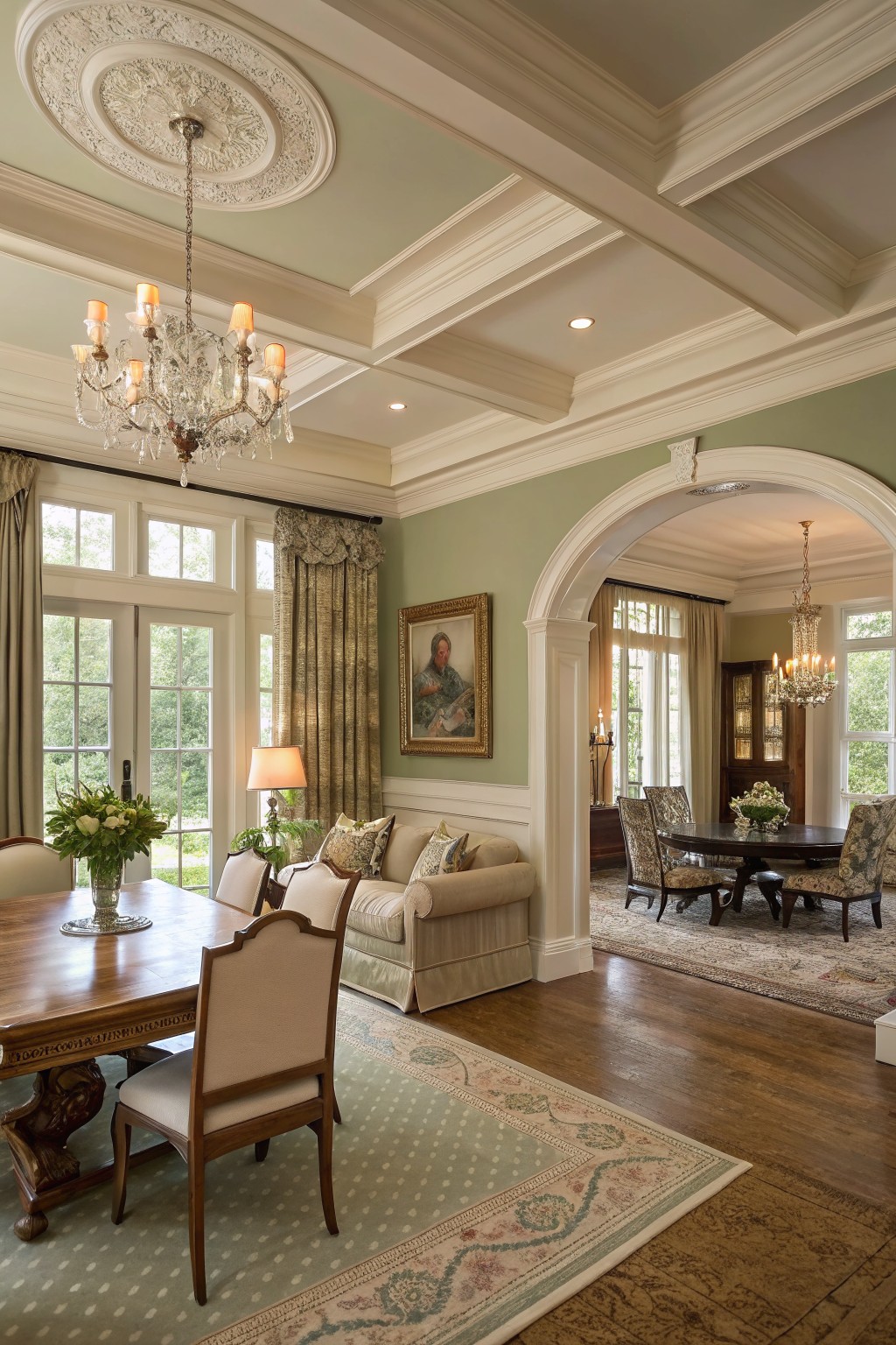
A soft sage green covers the walls in this open space and helps pull the living and dining areas together. It is a muted, light green that feels calm without fading into the background.
This color reads very close to Sherwin Williams Rainwashed or Benjamin Moore Saybrook Sage. It also sits near Behr Aloe Vera. The slight gray undertone keeps it from turning too yellow in daylight, and it works well with warm wood floors and off-white trim.

This deep navy blue on the cabinets gives the kitchen a clear spot in the open layout. It is a cool, saturated color that still feels grounded next to the wood floor and concrete ceiling. Many people like it because it adds weight without making the whole room feel dark.
The color sits somewhere between true navy and a hint of teal. It pairs easily with light walls, black window frames, and gray seating. In brighter light it stays rich, but it can look almost black in low light, so test a sample first.
Soft blush neutrals

This color is a soft blush beige with warm undertones that keeps the space feeling light but still grounded. It works especially well in open layouts because it shifts gently from one area to the next without creating hard stops. The tone sits nicely against the wood cabinetry and marble counters, giving everything a quiet warmth rather than a stark contrast.
It has a faint rosy cast that shows up more in natural light and can lean a little cooler under artificial bulbs, so testing a sample on the wall is worth doing. Pair it with deeper wood tones or soft textiles to keep the room from feeling too delicate. Good matches include Benjamin Moore Pale Pink, Sherwin Williams Rosy Outlook, Behr Blush Beige, and Farrow & Ball Setting Plaster.
Warm Off White Walls
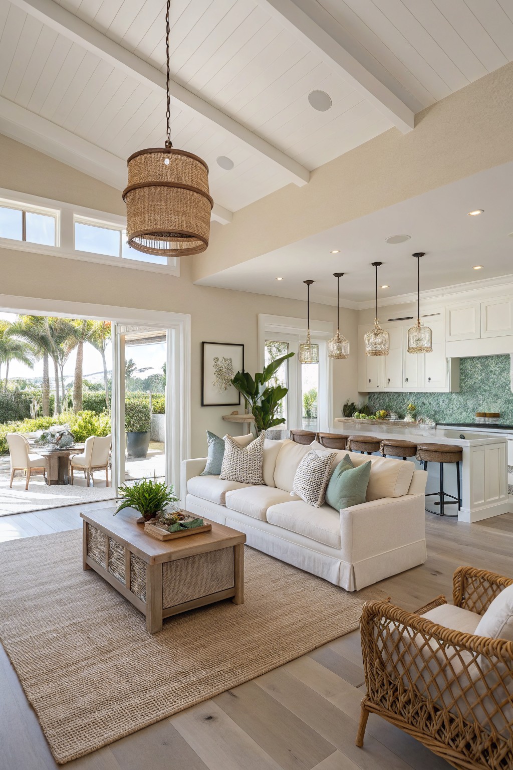
This room uses a warm off-white on the walls that feels soft but still grounded. It has enough warmth to keep the space from looking stark next to the wood floors and woven textures.
The color sits nicely with white trim and cabinetry without competing. It works best in open living areas where you want the walls to connect everything without pulling too much attention. Good matches include Sherwin Williams Alabaster, Benjamin Moore White Dove, Behr Almond White, or Farrow & Ball Pointing.
Warm Beige Walls
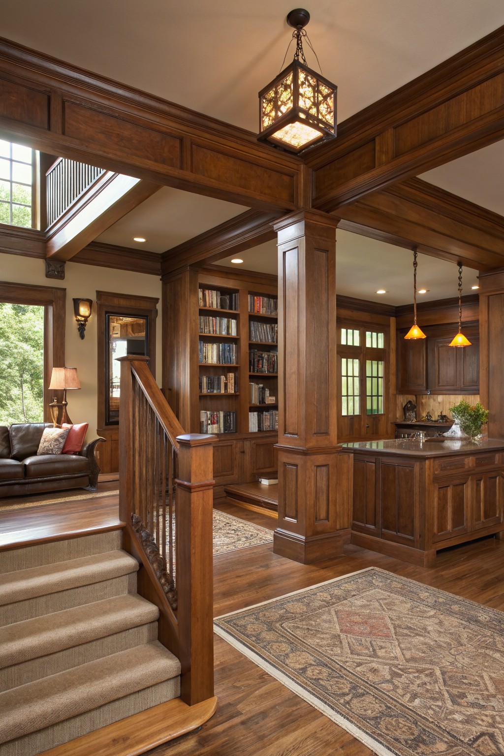
The walls in this room are painted a soft warm beige. It sits right between too light and too dark, which helps the space feel connected even with all the wood paneling and built-ins around it.
This color has a gentle yellow undertone that keeps the dark wood from looking heavy. It works best in rooms with lots of natural wood and built-ins, and it pairs easily with leather, stone, and both light and dark floors.
Bright White In Open Rooms
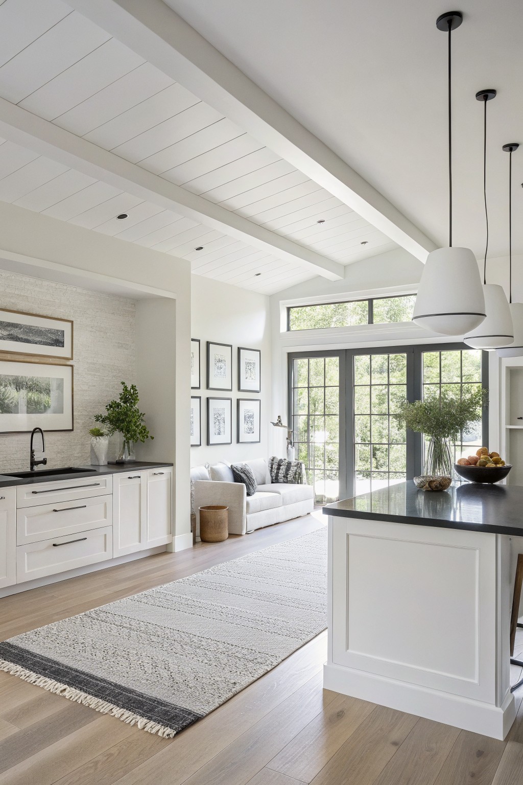
A bright white is the main paint color here. It keeps the whole open area feeling light and connected without any heavy contrast between the walls, ceiling, and cabinetry.
This white sits fairly cool with little warmth, so it works best when paired with natural wood floors and a few dark accents like the island top. It can look stark in low light, so test it in the actual space first.
Warm ochre walls
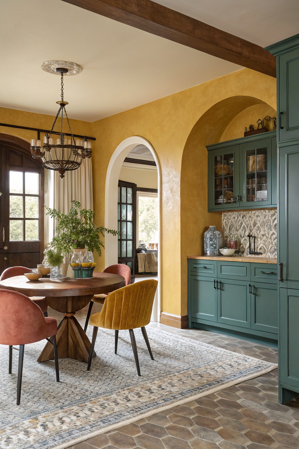
This warm ochre yellow on the walls brings a soft sunlit feel to an open great room. It sits in that earthy yellow range that feels natural rather than bright, and it helps tie the kitchen and dining areas together without making the space feel divided.
The color has a gentle orange undertone that plays nicely with wood tones and deeper greens like the cabinets shown here. It works best in rooms with decent natural light, and it pairs well with stone floors or simple wood trim. Avoid using it in very dark spaces where it can start to feel heavy.
Soft Sage Green That Blends Living And Kitchen Areas

This soft sage green works well in open living areas because it feels calm without going flat. It sits somewhere between green and gray, which helps it blend with both wood tones and white trim. The color stays light enough to keep the space feeling open while still giving the walls some presence.
It has a slight cool undertone that reads a bit warmer in rooms with lots of natural light. It pairs nicely with white cabinetry, dark fireplaces, and wood beams without competing with them. In a great room this shade can tie the kitchen and living areas together without needing strong contrasts.
Frequently Asked Questions
Q: How do I pick colors that work across my kitchen and living room without making everything feel the same?
A: Start with your biggest room and choose a neutral that feels right there. Then pull a softer shade from that for the connecting space. Test samples on the walls at different times of day to see how they shift together.
Q: What if my open space gets lots of natural light in one area but not the other?
A: Light changes everything so grab samples and paint big swatches where the light hits differently. A color that looks warm in the sunny spot might turn flat in the shade. Adjust by going a bit lighter or warmer in the dimmer area.
Q: Should I use the same color on all walls or switch it up between zones?
A: You can switch colors but keep them in the same family. Pick one main hue and vary the tones slightly for each zone. This keeps the flow without boring repetition.









