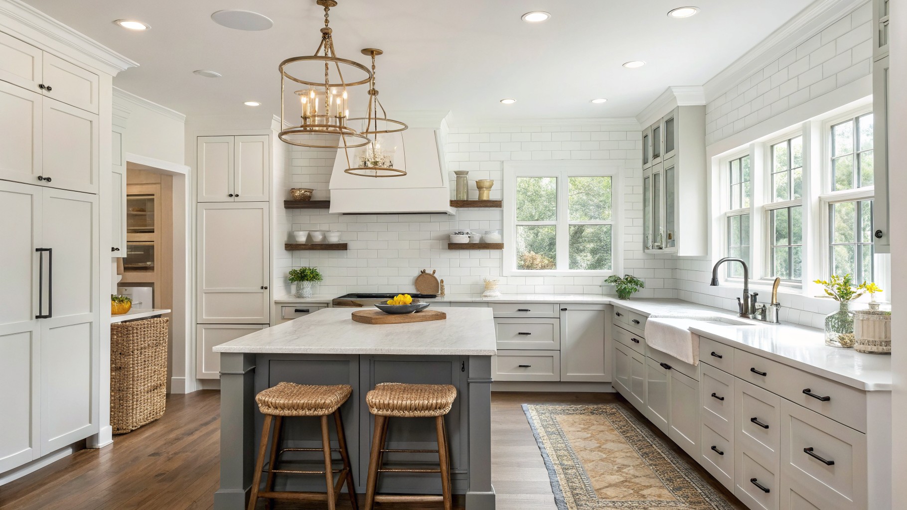
I have learned that kitchen paint colors often shift once the cabinets and countertops are in place.
Natural light moves across the room throughout the day and can make certain undertones appear stronger at different times.
I usually put up several large samples and live with them for a week so I can see the shifts before committing.
Timeless options usually avoid strong shifts and instead settle into the space without fighting the other finishes.
Swatches on the wall reveal what a chip never shows.
Soft Green Kitchen Cabinets
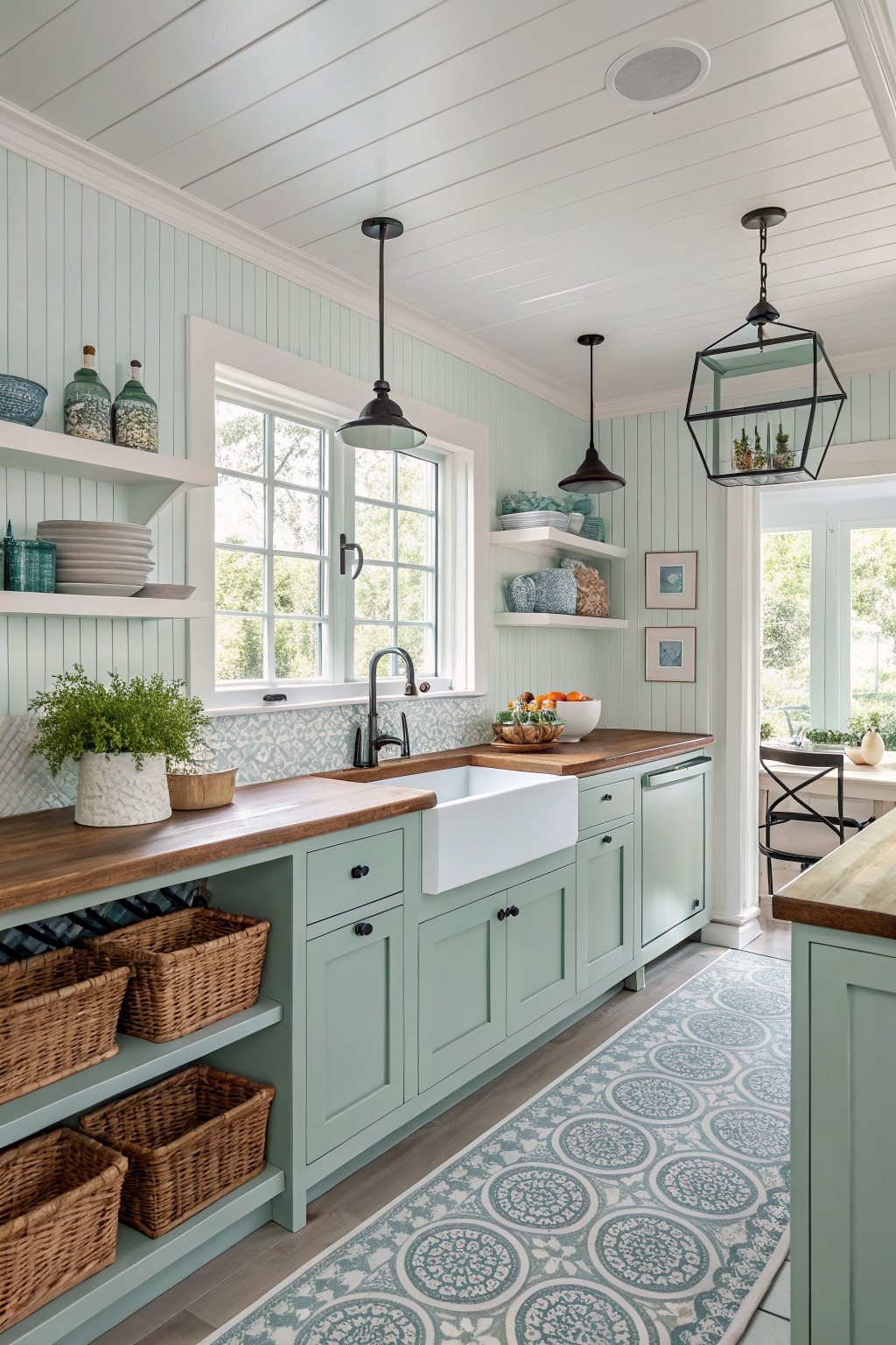
This soft green on the cabinets looks closest to Sherwin-Williams Sea Salt. It is a light muted green with a cool undertone that feels calm and easy to live with. Many people like it because it adds a bit of color without making the space feel busy or trendy.
The color sits nicely next to warm wood counters and white fixtures. It works best in kitchens with decent natural light, since the undertone can lean a little blue in dimmer rooms. Pair it with simple hardware and wood tones to keep the look balanced.
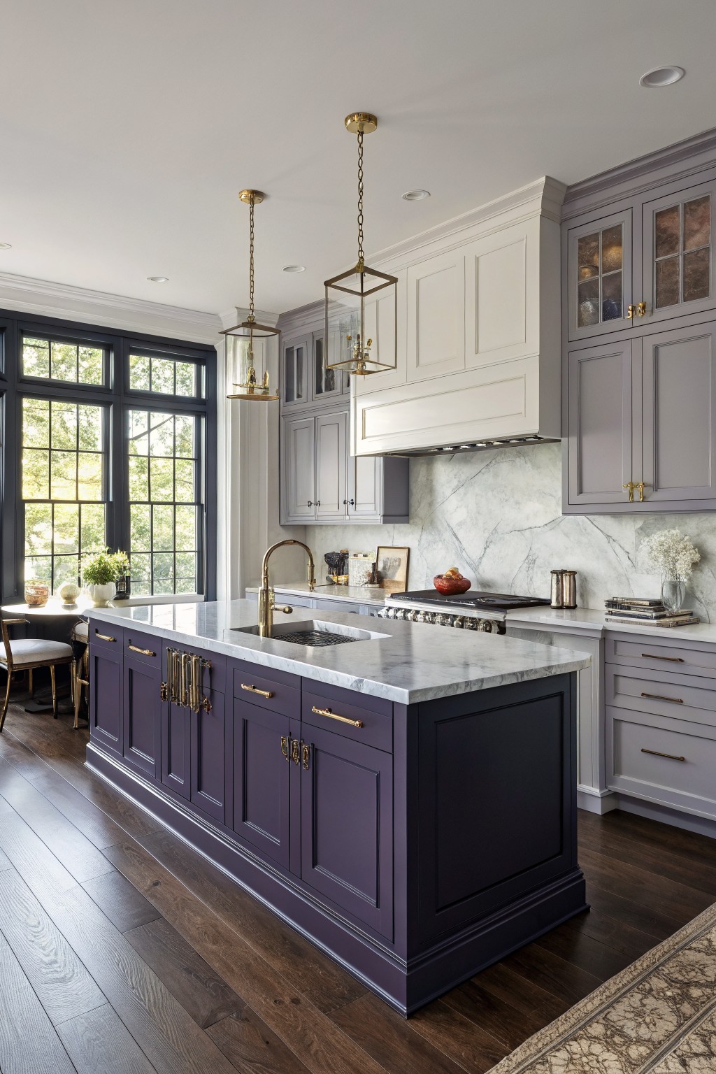
The deep navy on the island looks closest to Sherwin-Williams Naval. It is a cool, saturated navy that feels grounded without turning the whole kitchen dark, and it holds its own next to the white marble and brass hardware.
This color works best when the rest of the room stays light. It pairs cleanly with warm wood floors and off-white perimeter cabinets, but it can feel heavy if the room lacks enough natural light or if the trim and ceiling are also painted dark.
Soft Greige Kitchen Walls
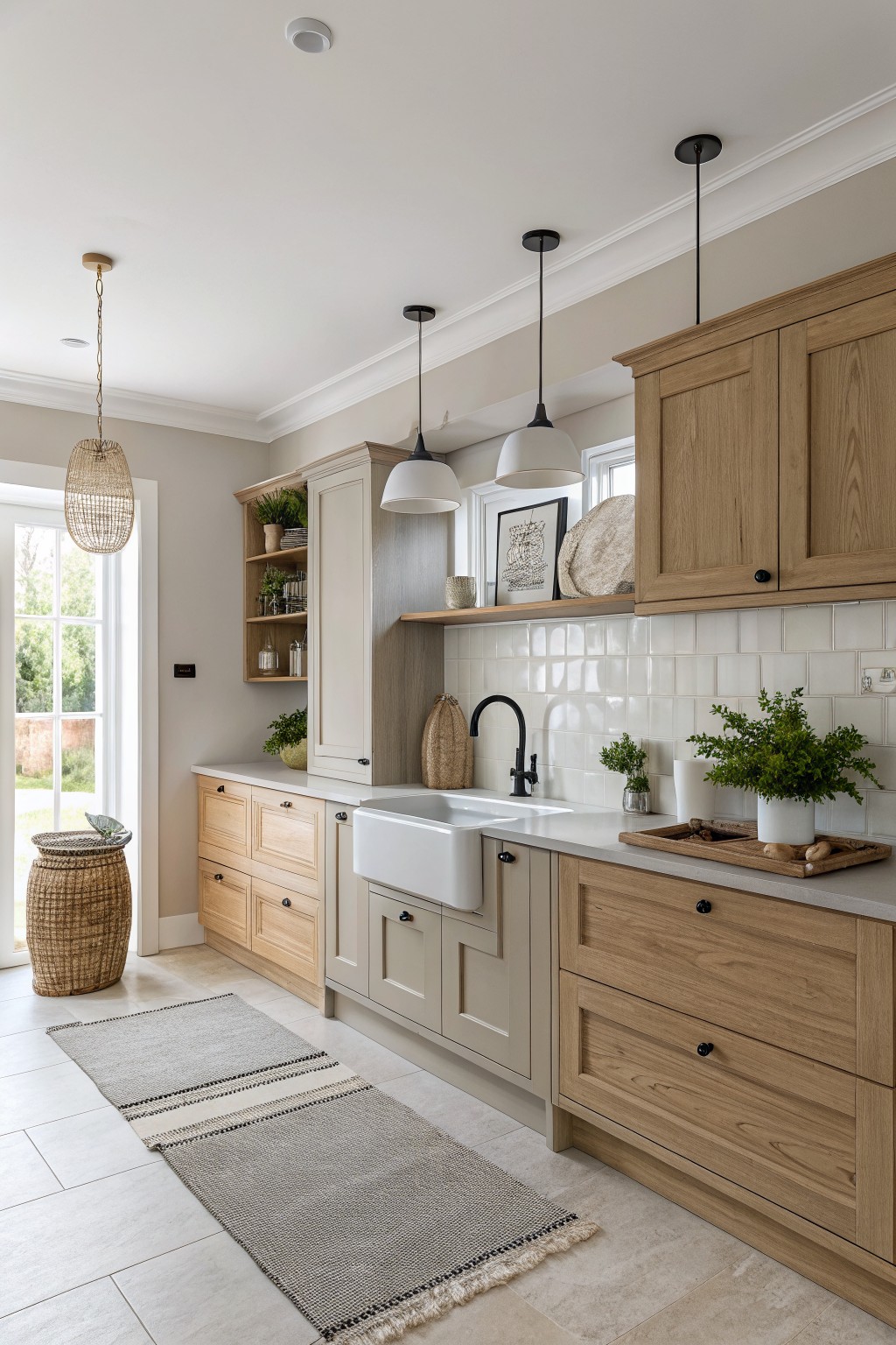
This kitchen uses a warm greige that looks closest to Sherwin-Williams Accessible Beige. The color sits right between gray and beige, giving the space a quiet, lived-in feel without pulling too cool or too brown.
It has a gentle warmth that helps the wood cabinets look richer next to it. The same tone on the painted cabinets keeps everything calm and connected, though it can start to feel flat if there is not enough contrast from tile or hardware.
Soft Sage Green Cabinets
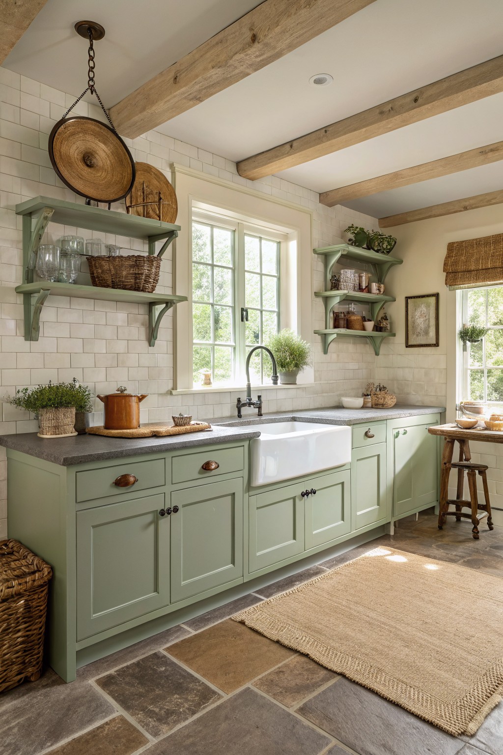
This kitchen uses a soft sage green that reads closest to Sherwin-Williams Evergreen Fog. It is a muted gray-green that feels calm and steady without going too cool or too earthy. The color works well on cabinets because it stays quiet while still giving the room some personality.
Evergreen Fog has a slight gray undertone that helps it sit nicely next to white tile and wood tones. It looks best in spaces with decent natural light and pairs easily with stone counters or simple wood shelves. Darker greens can feel heavy in a kitchen, but this one keeps things light and livable.
Muted Sage Green Cabinets
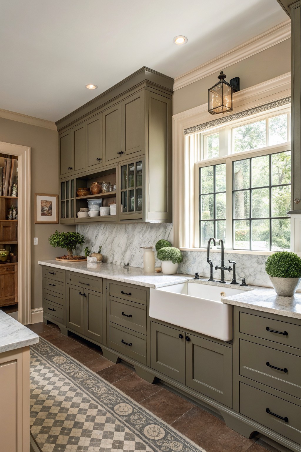
This kitchen shows a soft sage green on the cabinets that reads closest to Sherwin-Williams Clary Sage. The color sits in a nice middle ground between green and gray, which keeps it from feeling too bold while still giving the room some depth.
It works especially well with marble counters and black hardware because the green stays quiet enough not to compete. The shade holds up nicely in natural light but can lean a little cooler in low light, so testing it on a sample board is worth the extra step.
Earthy Clary Sage Kitchen Cabinets

This kitchen uses a soft sage green on the cabinets. It looks closest to Sherwin-Williams Clary Sage. The color stays gentle and a little earthy, which helps the room feel settled without turning dull.
It carries a mild gray undertone that works nicely with the stone counters and wood floors. This shade suits kitchens that get good daylight and pairs best with white trim and simple black hardware.
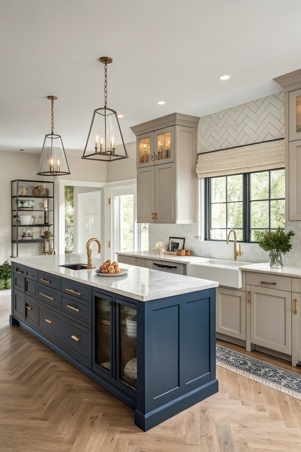
This kitchen island is painted in a deep navy that reads closest to Sherwin-Williams Naval. The color gives the whole space a solid base while still feeling fresh next to the lighter cabinets and white counters.
It has a slight cool lean but does not go flat under natural light. Navy like this pairs easily with wood floors and marble, though it can feel heavy if the room lacks enough light or white trim to balance it.
Soft Blue Gray Cabinets
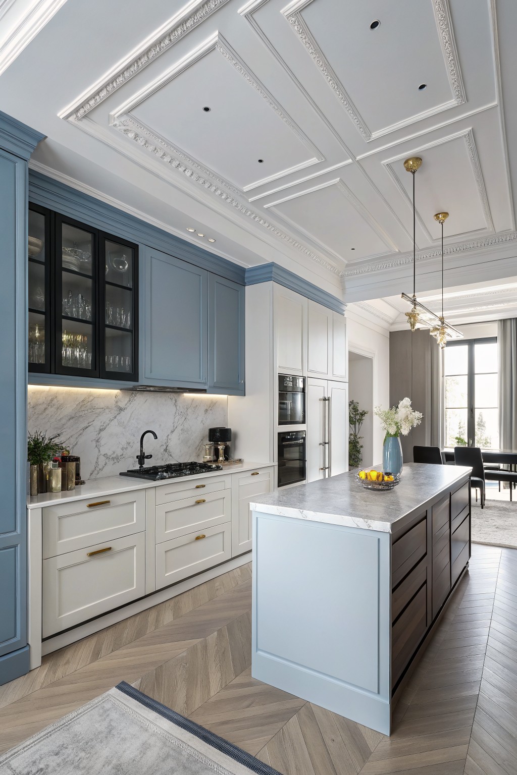
This kitchen uses a soft blue gray that reads closest to Sherwin-Williams Rainwashed. The color sits between blue and gray with a cool lean, which keeps the space feeling open and calm even with all the cabinetry.
It works well next to white lower cabinets and light wood floors because the gray undertone prevents the blue from turning too cold. Pair it with white counters and simple hardware if you want the same balanced look.
Evergreen Fog Kitchen Cabinets With Wood Island
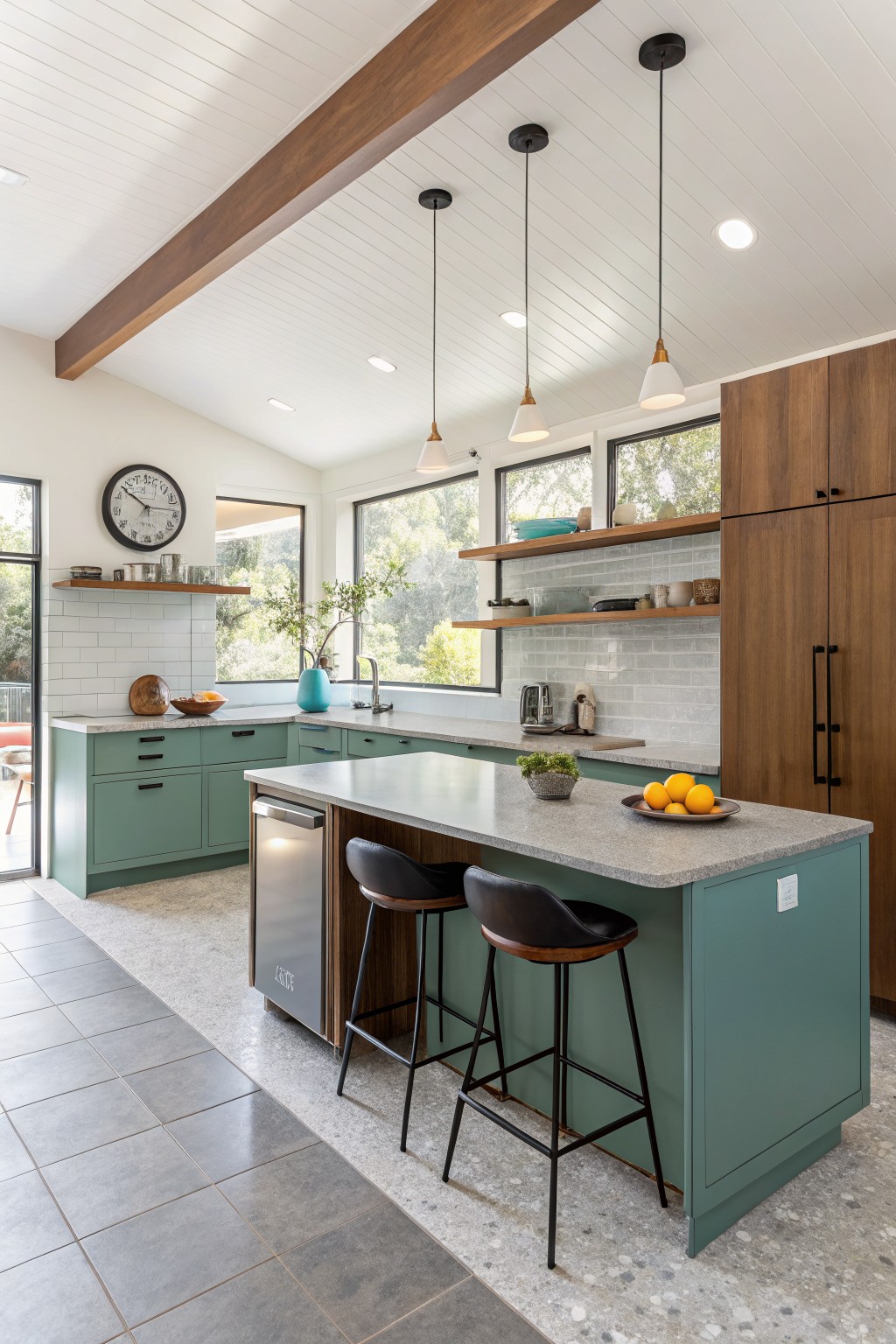
The cabinets in this kitchen are painted a soft sage green that feels calm and a little earthy. Sherwin-Williams Evergreen Fog comes closest to that muted tone with its gentle blue undertone.
It sits nicely next to the wood island and gray counters without competing with them. This color works best in kitchens that get steady daylight and pairs easily with black hardware or warm wood tones.
Creamy White Cabinets
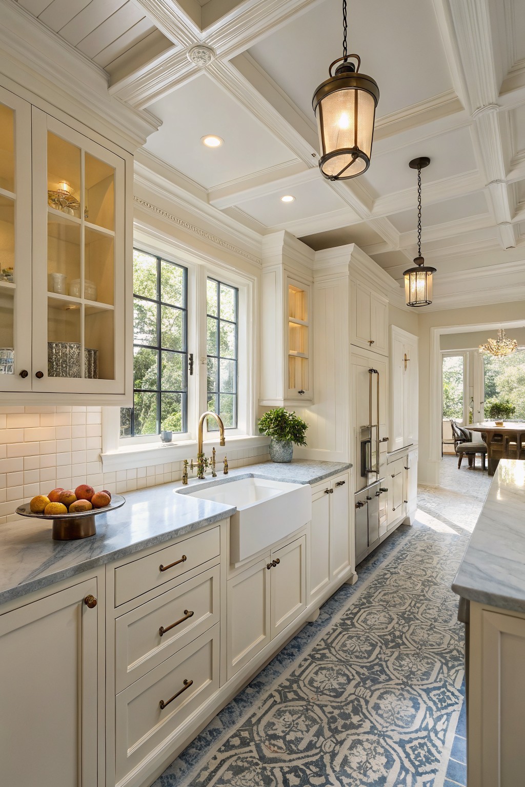
Sherwin-Williams Alabaster is the paint color on these cabinets. It is a soft warm white that feels clean without turning cold, which is why it stays popular in kitchens year after year.
The slight cream undertone helps it sit nicely next to marble counters and brass hardware. It works best in rooms with decent natural light, and it pairs well with both wood tones and stone.
Retreat Green Kitchen Cabinets
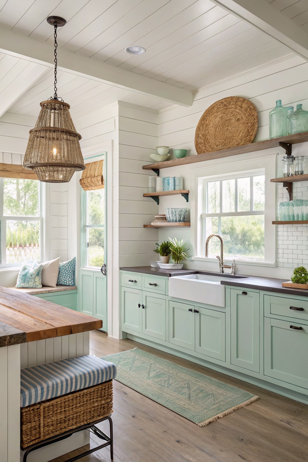
This soft green on the cabinets looks closest to Sherwin-Williams Retreat. It gives the room a calm feel without going too bright or too pale, and it works nicely next to white walls and wood tones.
The color has a slight blue undertone that shows up more in bright light. It pairs well with dark counters and natural wood floors, though it can look a little cool if the room gets mostly north light.
Charcoal Kitchen Cabinets
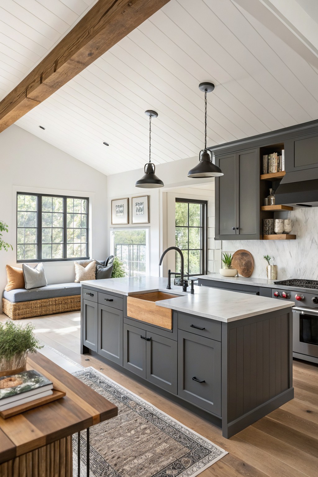
Sherwin-Williams Iron Ore gives these cabinets their deep gray tone. It is a cool, saturated color that still feels grounded rather than stark, which is why it works well in a kitchen with plenty of wood and natural light. The color holds its own next to the white countertops and ceiling without looking heavy.
It has a blue-gray undertone that shows more in bright light, so it reads a little softer than a true black. Pair it with warm wood tones on the island and floor to keep the room from feeling cold, and use it on the perimeter cabinets only if you want the island to stand out.
Evergreen Fog Lower Kitchen Cabinets
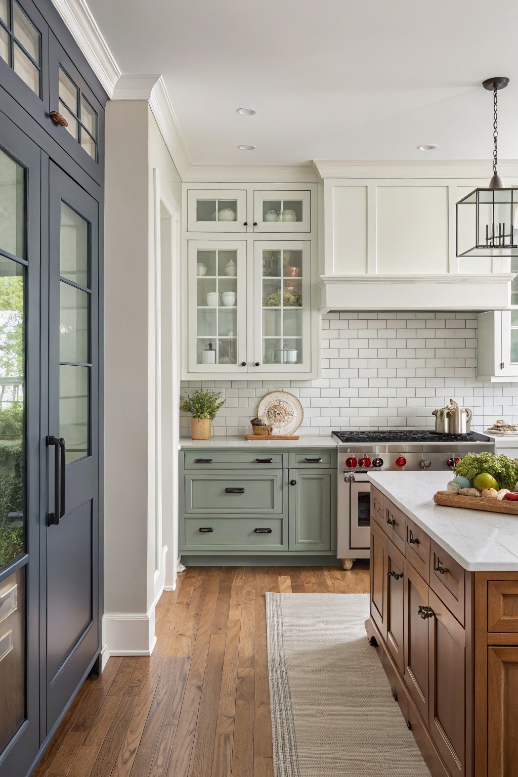
The lower cabinets are painted a soft sage green that reads closest to Sherwin-Williams Evergreen Fog. It gives the kitchen a quiet, settled look that feels comfortable rather than styled.
The color carries a bit of gray in the undertone, which helps it blend with the white tile and the warmer wood tones on the island and floor. It works best in kitchens with steady daylight and pairs well with both painted trim and natural wood.
Warm Peach Kitchen Walls
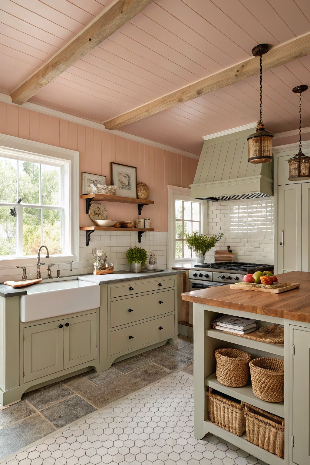
The walls are painted in a soft warm pink that looks closest to Sherwin-Williams Coral Bead. It gives the room a gentle peach tone that feels inviting next to the wood beams and stone floor without taking over the space.
This shade has a light orange undertone that helps it stay cozy under different lights. It pairs nicely with the sage green cabinets and keeps the whole kitchen feeling calm and lived-in.
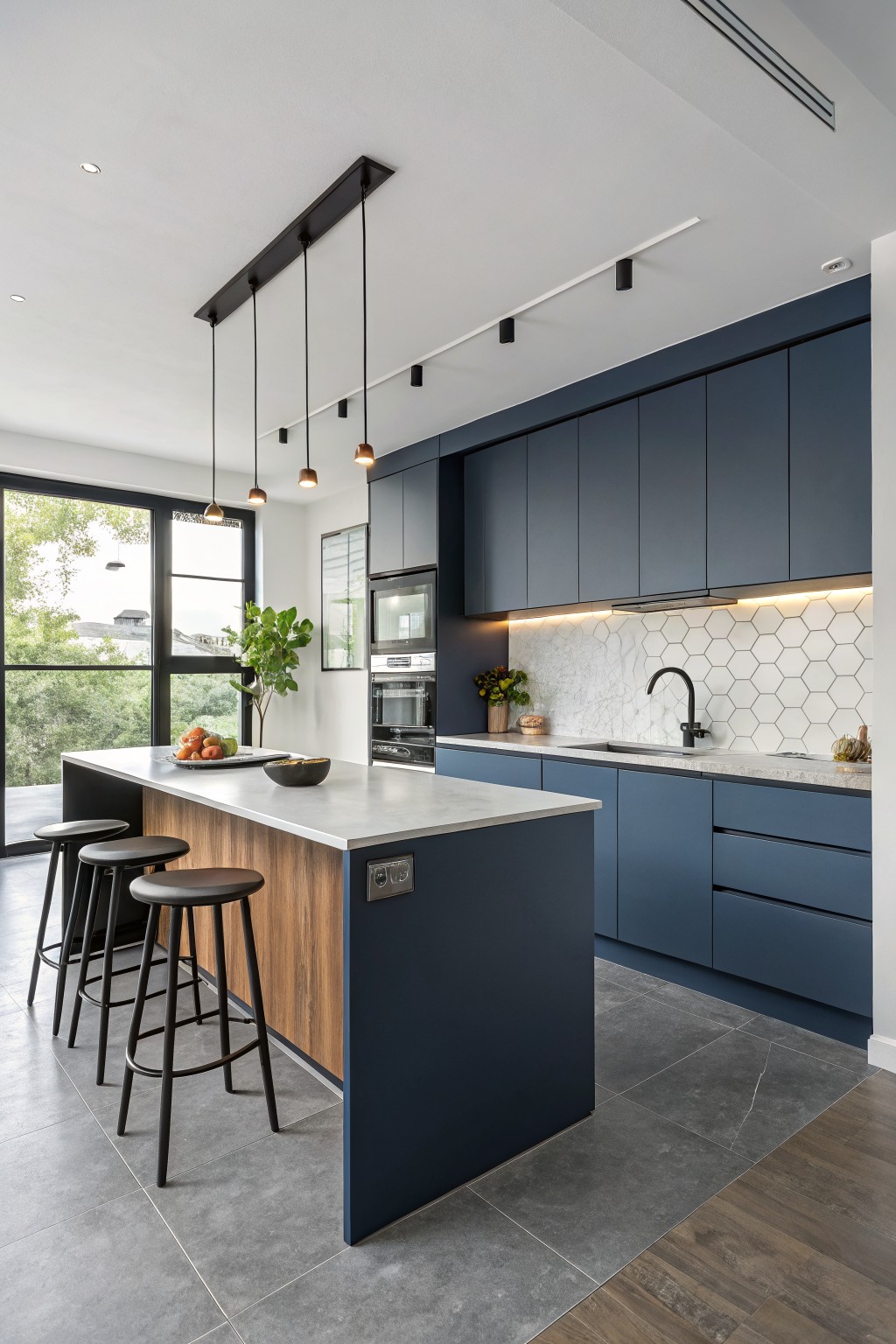
This kitchen uses a deep navy blue on the cabinets that looks closest to Sherwin-Williams Naval. The color gives a strong presence without feeling trendy, and it holds up well in a space that gets a lot of use.
The cool undertone works nicely with the wood tones on the island and the light counters. It suits kitchens that have decent natural light and pairs best with simple hardware and clean surfaces.
Frequently Asked Questions
Q: How do I know which color from the list will still feel right in a few years?
A: Stick with the soft neutrals and warm grays. They stay calm as your cabinets and counters age. Match the undertones to your flooring for a steady look.
Q: What if my kitchen gets strong afternoon sun?
A: Grab a sample of the color and paint it on a big board. Move the board around the room at different hours. The right timeless shade holds steady without shifting too yellow or pink.
Q: Should I worry about these colors showing every smudge and splash?
A: Pick a satin finish in one of the deeper options from the list. It wipes clean fast after cooking. (A flat finish hides marks better but needs more touch-ups over time.)
Q: Can I paint just the island a different shade?
A: Yes. Keep the main walls in a light neutral and use one bolder pick on the island. This adds interest without overpowering the whole space.









