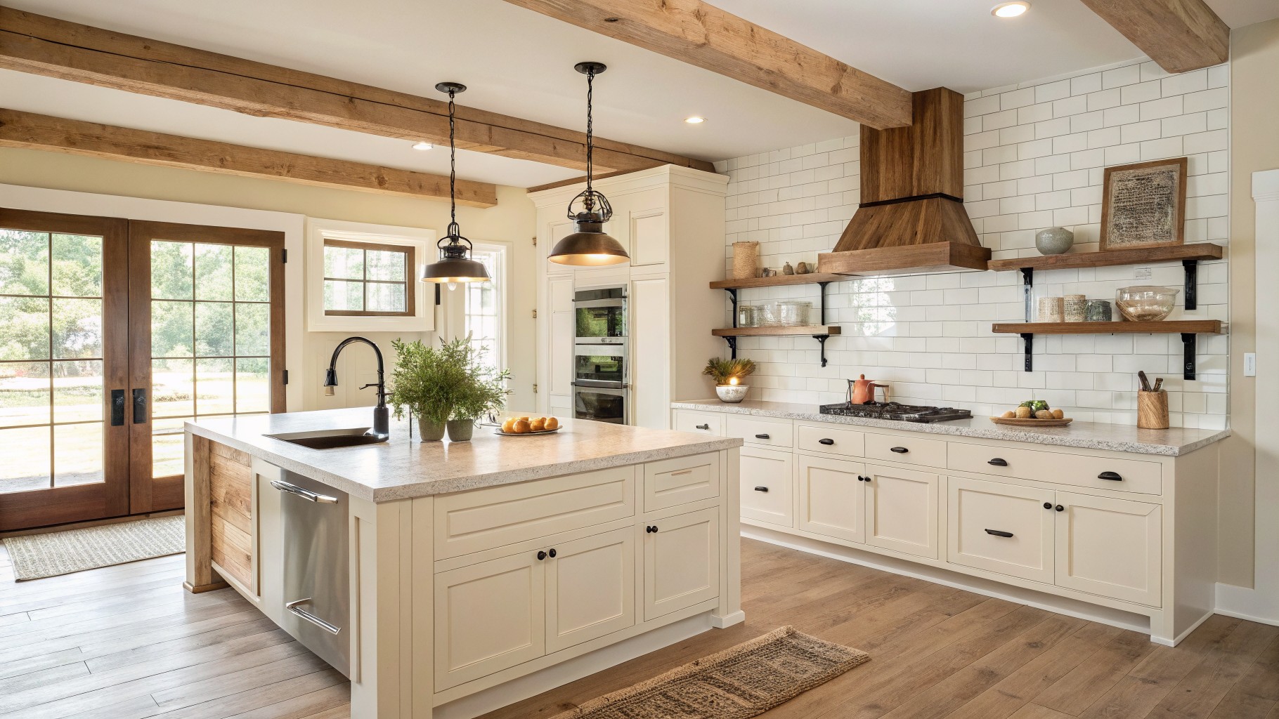
When I repaint my kitchen I always notice how the color changes depending on the time of day and where the windows sit.
Undertones that seem neutral on a chip can turn warm or cool once they sit next to cabinets and trim.
I test in place now.
Farmhouse kitchens need colors that balance the rustic wood and modern finishes without fighting them.
A few of these options surprised me when I imagined them in different lighting conditions around the room.
Soft Yellow Walls
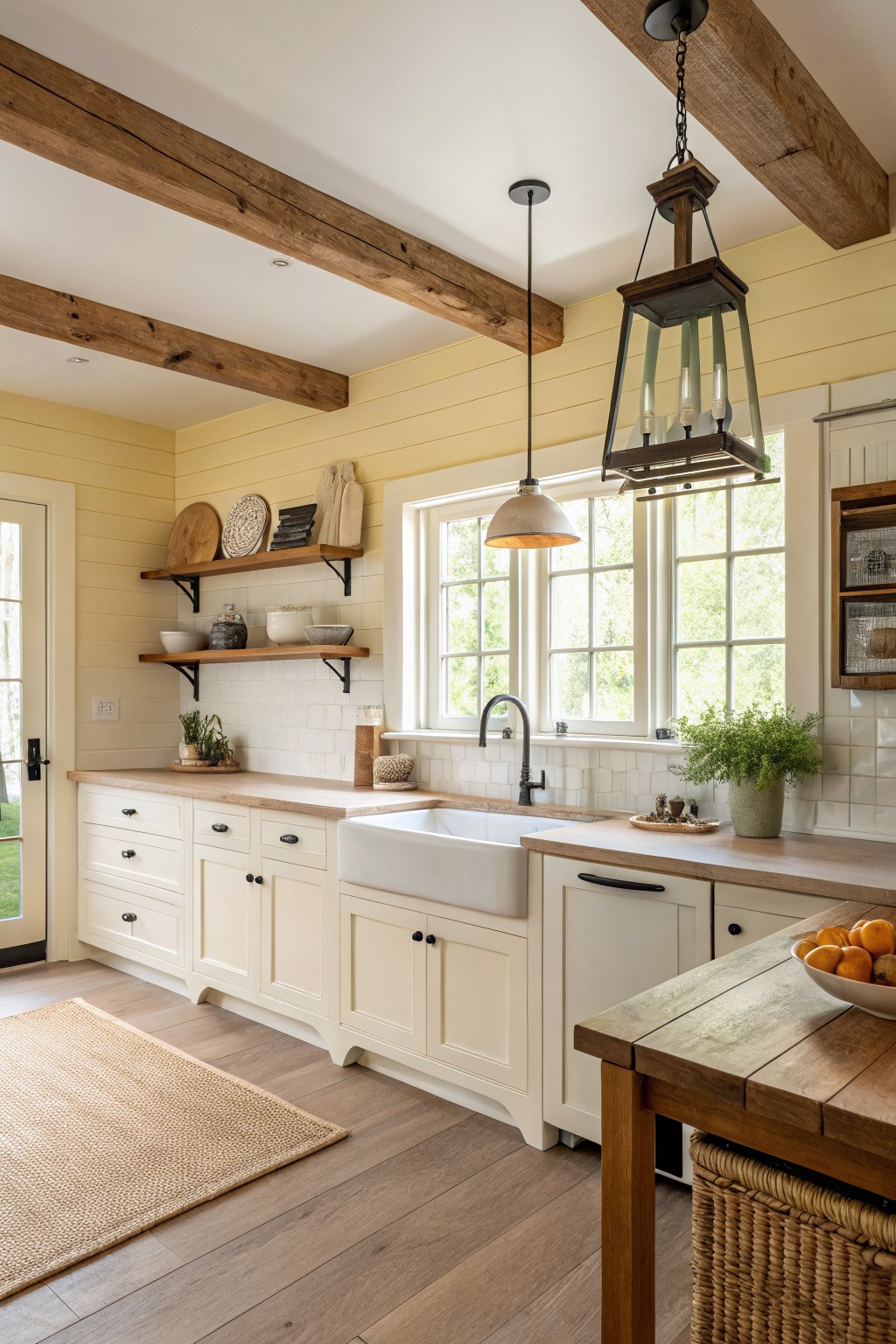
This soft yellow gives the kitchen a gentle warmth that feels right at home in a farmhouse setting. It sits between cream and true yellow, so it reads calm rather than bright. You see similar tones in Sherwin Williams Lemon Chiffon, Benjamin Moore Pale Yellow, Behr Flaxseed, and Farrow & Ball Hay.
The color has a light warm undertone that plays well with wood beams and white cabinets. It works best in rooms with decent natural light. Too little light can make it look flat, while strong sun brings out the soft buttery side.
Soft Greige Cabinets
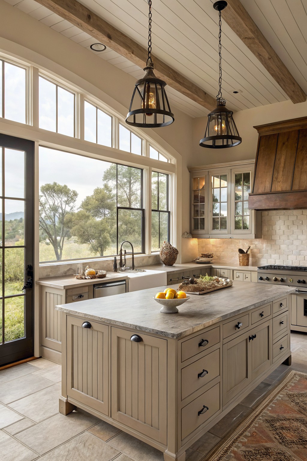
This kitchen shows a soft greige on the cabinets and island. It is a muted mix of gray and beige that feels warm and steady rather than stark.
The color has a light warmth that sits well next to wood and stone. It works in a farmhouse kitchen because it stays calm and lets the natural textures stand out without competing. Try Sherwin Williams Accessible Beige, Benjamin Moore Revere Pewter, or Behr Greige for a close match.
Muted Blue Gray Cabinets
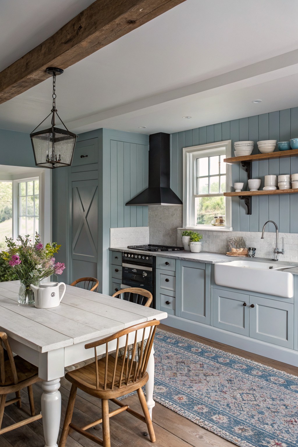
This muted blue gray reads as a cool, slightly green-tinged shade that feels calm without going flat. It works nicely in a farmhouse kitchen because it sits between gray and blue, giving the cabinets some presence while still letting wood tones and white surfaces stand out. Colors like this often come across as Sherwin Williams Rainwashed, Benjamin Moore Harbor Gray, or Farrow & Ball Pigeon.
The tone stays steady in both natural light and evening hours, though it can lean a touch greener next to warm wood floors. Pair it with white trim or a white sink to keep the look fresh, and avoid pairing it with too many cool metals if you want to prevent a chilly feel.
Soft Sage Green Cabinets
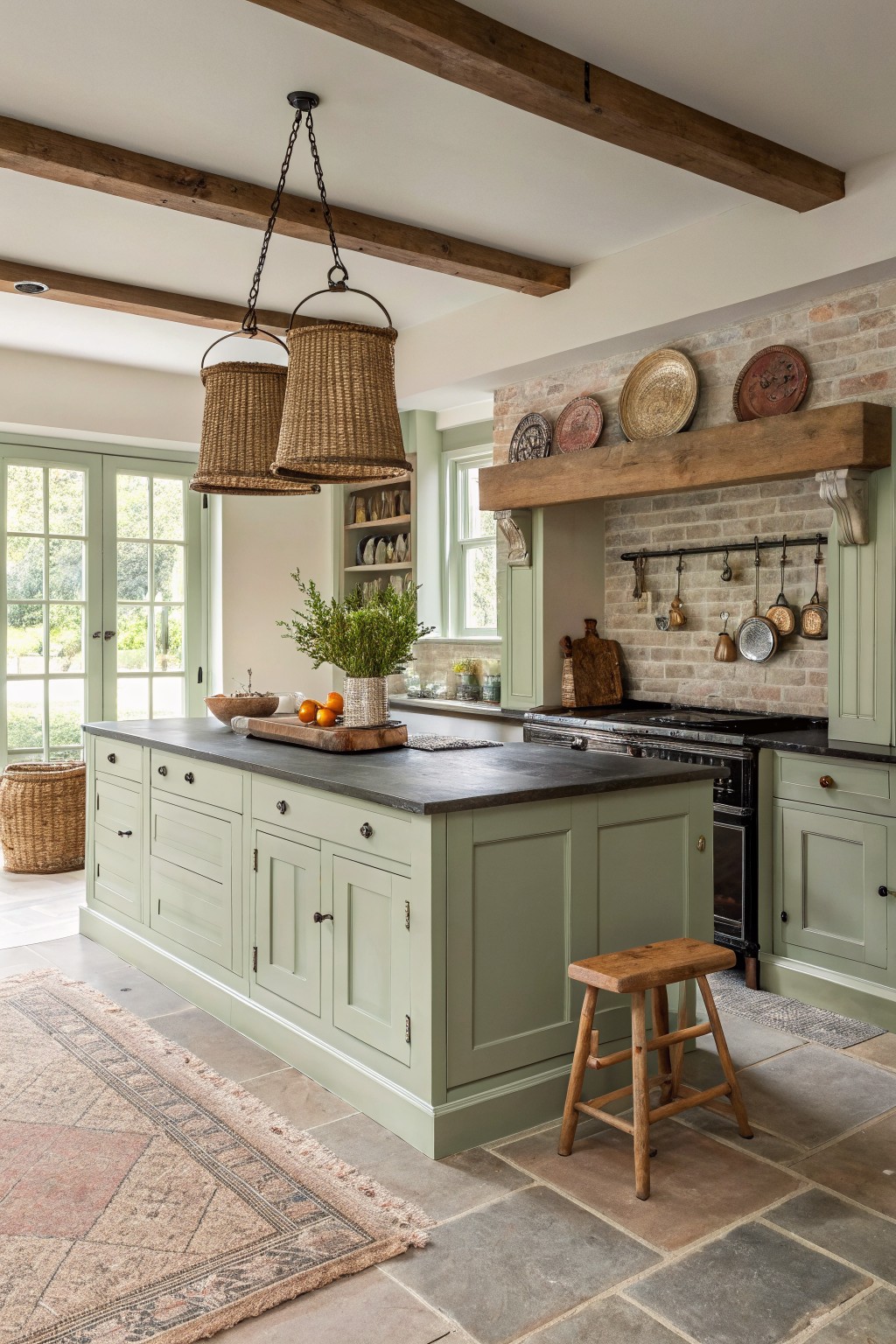
A soft sage green brings a quiet, steady feel to kitchen cabinets. This color family leans slightly warm with gray undertones, so it avoids looking too bright or cool against wood beams and stone.
It works especially well with dark countertops and brick details. Try Sherwin Williams Clary Sage, Benjamin Moore Saybrook Sage, Farrow & Ball Pigeon, or Behr Aged Sage if you want something close.
Dark Blue Gray Cabinets
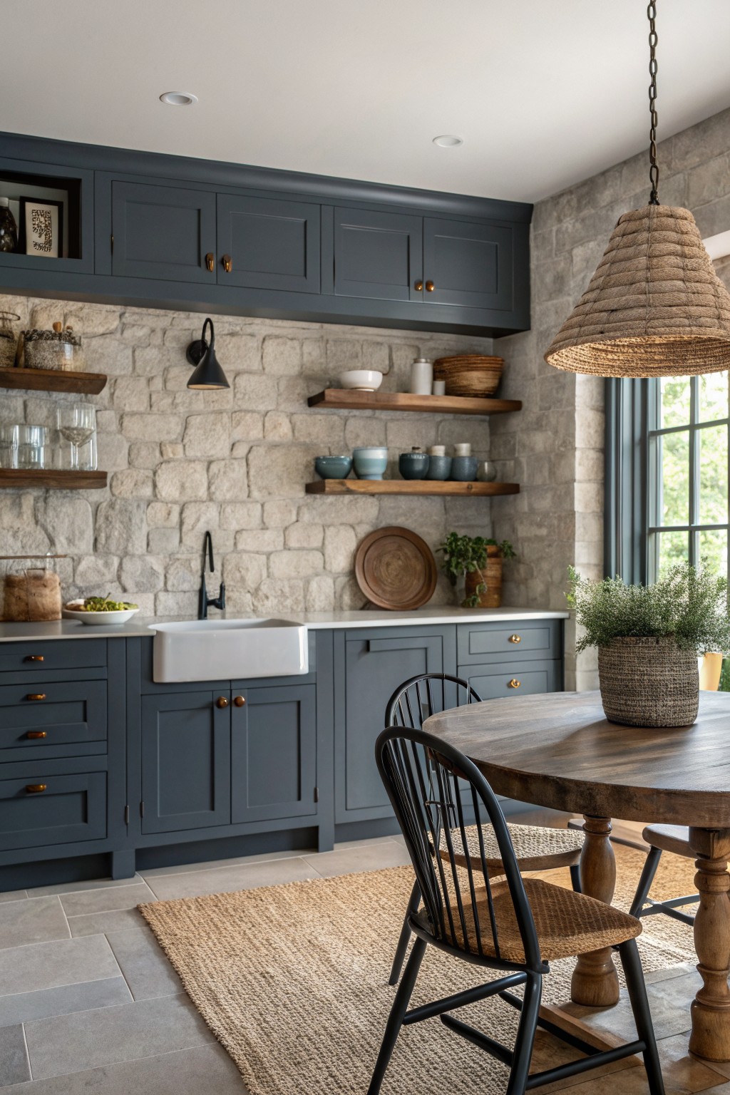
This dark blue gray on the cabinets gives a kitchen a solid, grounded feel without going full black. It sits in the cool blue gray family and works well for a rustic modern farmhouse look. Sherwin Williams Naval or Benjamin Moore Hale Navy read very close to it, with Farrow & Ball Railings as another option that has similar depth.
The color holds up nicely against stone and wood tones, which keeps the space from feeling too stark. It suits rooms with good natural light best, since it can lean heavier in dimmer areas. Pair it with warm wood counters or open shelves to balance the cool tone.
Soft Blue Gray Walls
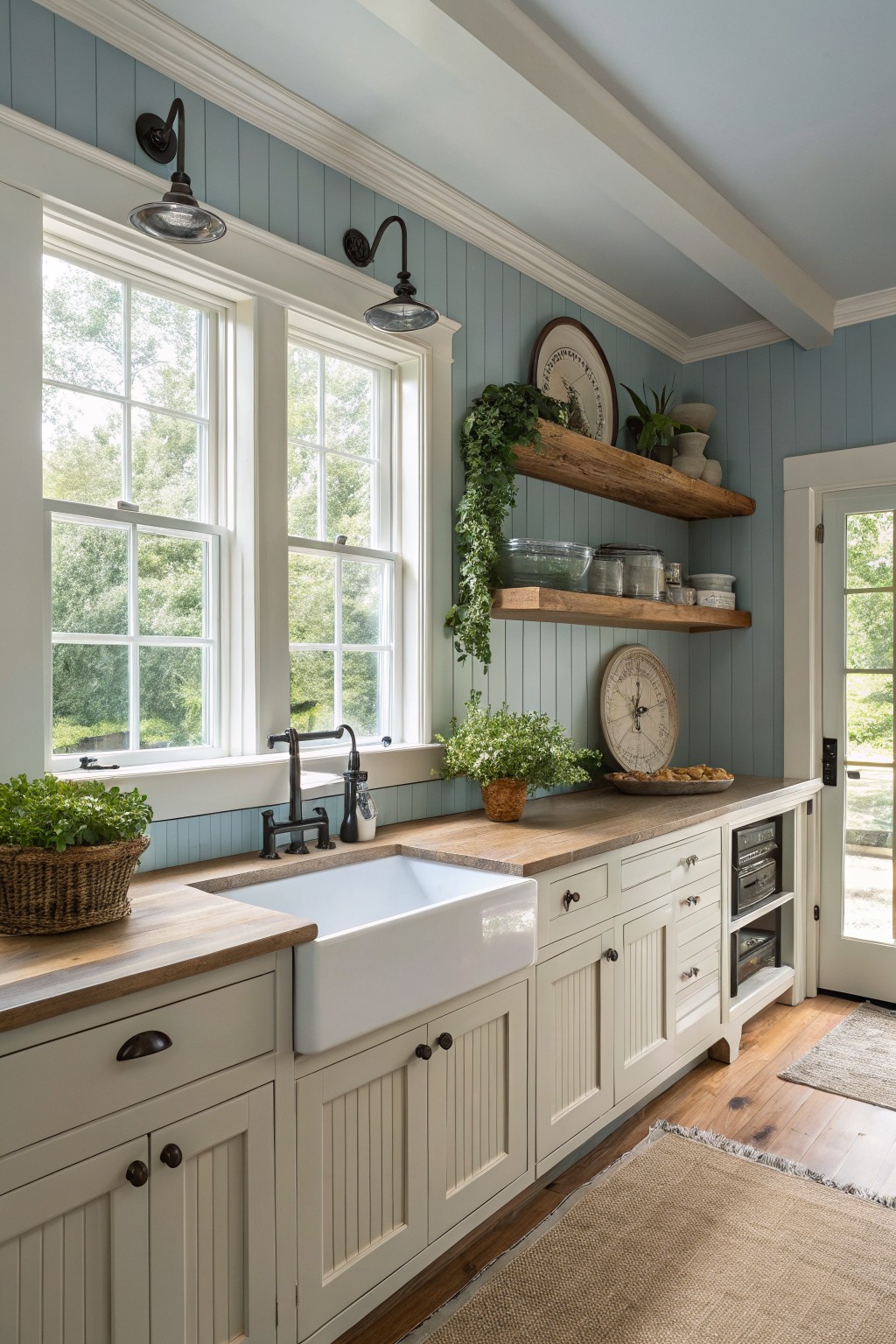
This soft blue gray paint brings a calm, slightly cool tone to a farmhouse kitchen without feeling stark. It reads as a muted blue with gray undertones that keeps the space feeling airy yet grounded.
The color sits comfortably next to white cabinets and warm wood counters. It works well in rooms with good natural light and pairs nicely with black hardware or simple wood shelving. Sherwin Williams Rainwashed, Benjamin Moore Palladian Blue, and Behr Silver Strand all capture this same feel.
Warm Greige Kitchen Cabinets
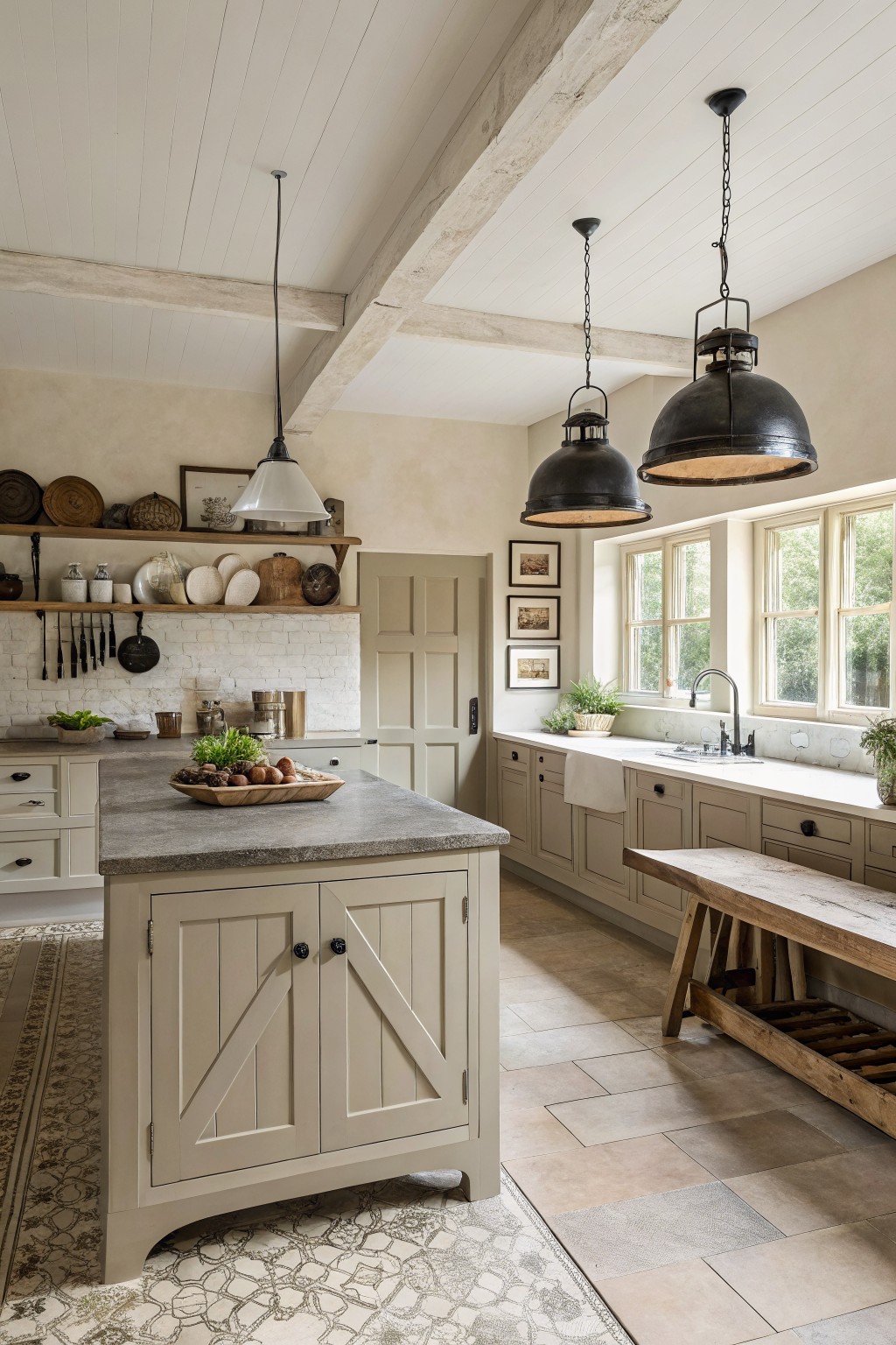
A soft greige brings just the right amount of warmth to kitchen cabinets without pulling too gray or too beige. This color family sits in that middle ground and tends to work well in farmhouse kitchens that mix wood, stone, and metal. Sherwin Williams Repose Gray reads very close, along with Benjamin Moore Revere Pewter and Behr Accessible Beige.
It usually shows a light warm undertone that keeps the room from feeling cold. Pair it with white trim or a darker countertop to hold the balance. It suits spaces that want a calm, slightly rustic look without going full neutral overload.
Soft Sage Kitchen Cabinets
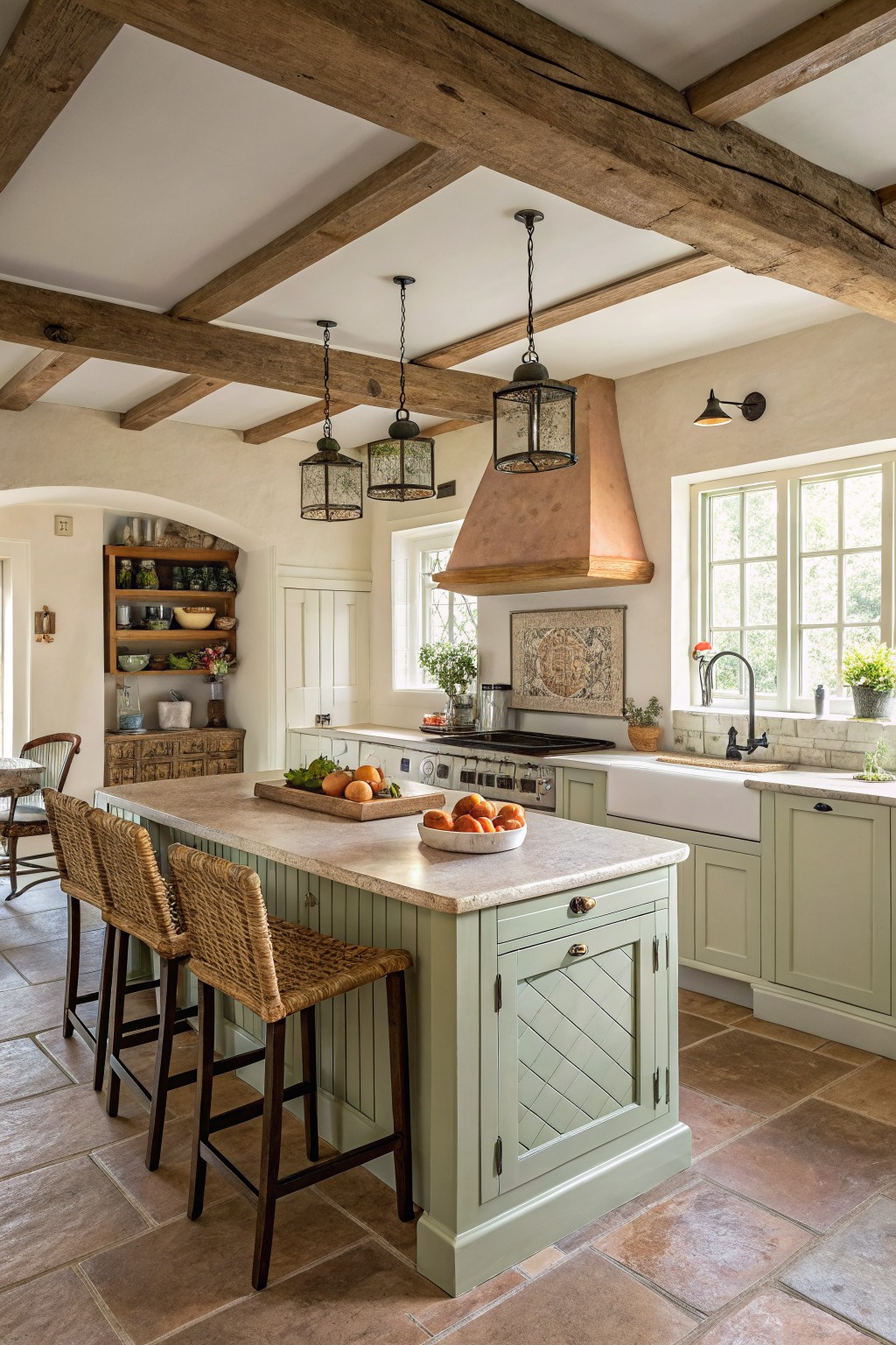
This soft sage green on the island cabinets gives a calm, lived-in feel that fits right into a farmhouse kitchen. It sits between gray and green without tipping too far either way, which helps it blend with wood tones and stone surfaces. The color reads closest to Sherwin Williams Clary Sage, Benjamin Moore Saybrook Sage, Behr Aloe, or Farrow & Ball Pigeon.
It works best with warm wood floors and simple white trim, and it holds up well under both natural light and warmer indoor bulbs. One thing to watch is keeping the undertone consistent across other painted pieces so the room stays balanced rather than patchy.
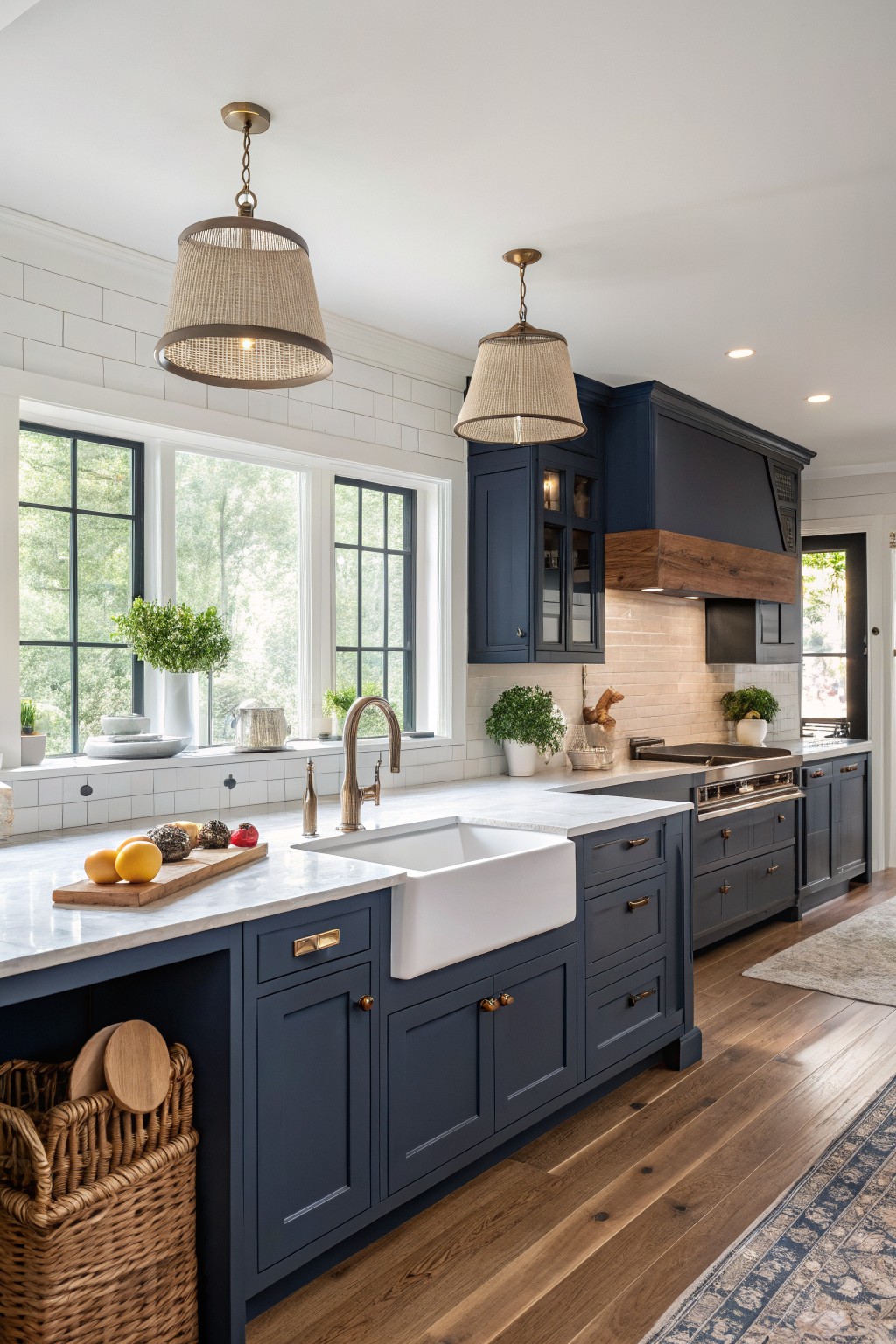
A deep navy blue brings a strong but simple look to kitchen cabinets. It feels solid and a bit moody without turning the whole room dark, especially when paired with white walls and light countertops.
This shade sits close to Sherwin Williams Naval, Benjamin Moore Hale Navy, or Behr Midnight Blue. It works best with warm wood tones underfoot and brass or gold hardware to keep the blue from feeling too cold.
Soft White Kitchen Walls
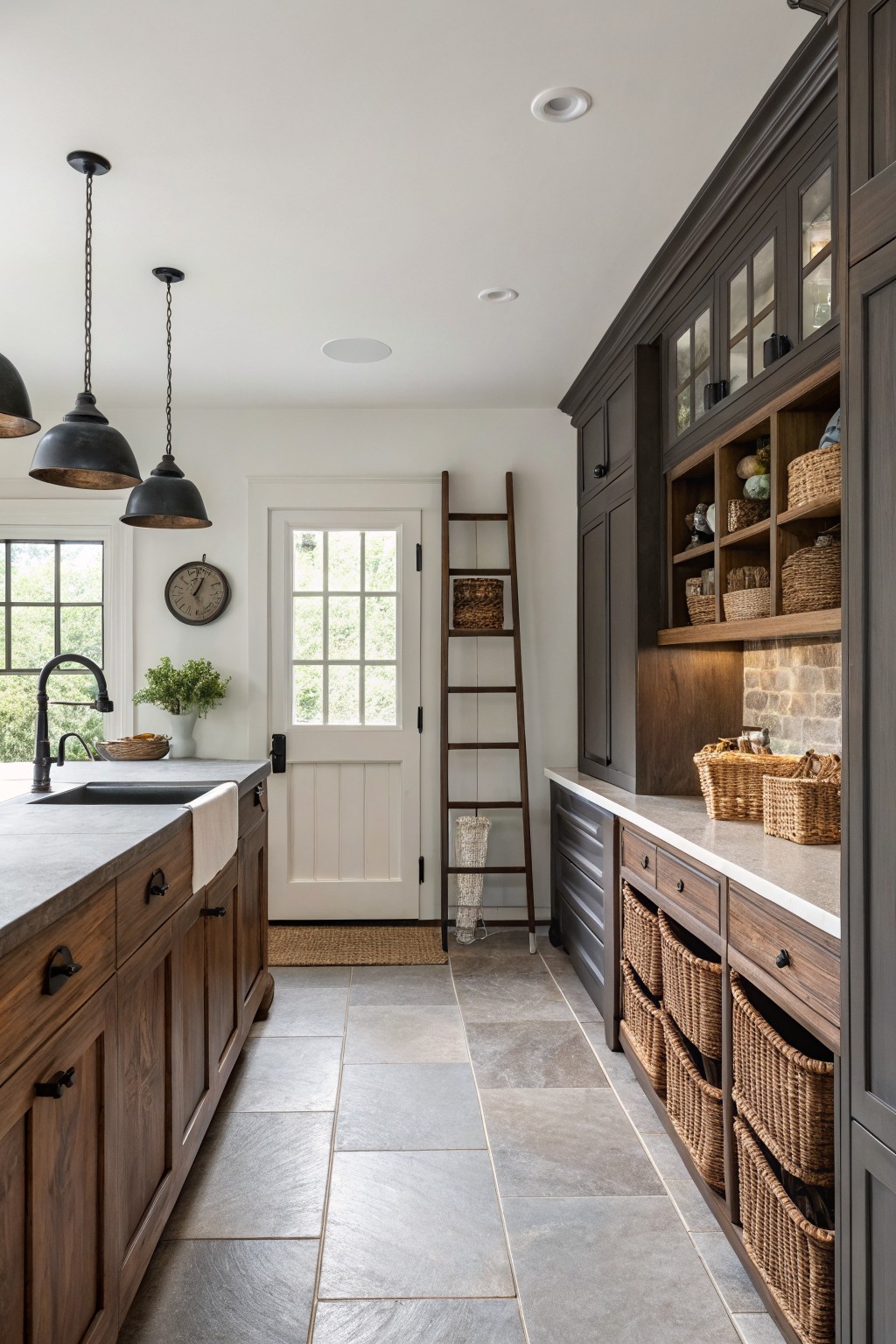
This kitchen uses a bright white on the walls that feels fresh without looking stark. It is a clean white with a touch of warmth that helps the dark wood cabinets and stone floor feel balanced.
It works best in rooms with decent natural light and pairs well with wood tones or black hardware. Keep an eye on the undertone if your trim or flooring leans cool so the whole space stays cohesive.
Creamy White Cabinets
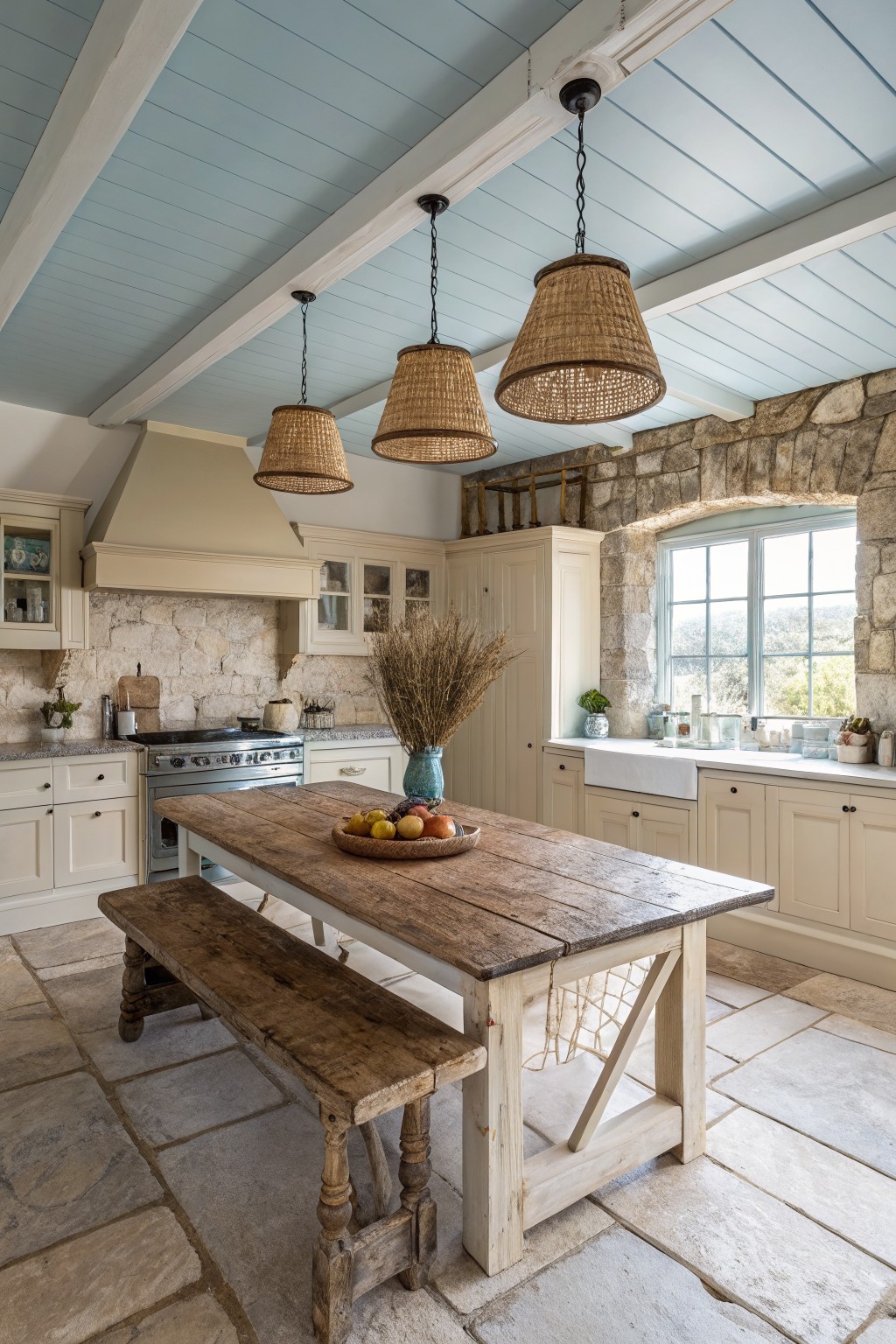
This kitchen uses a warm off white on the cabinets that feels soft against the stone walls. It is not a stark white but one with a gentle cream tone that keeps the whole space from looking too cold or bright.
That undertone pairs nicely with wood tones and natural textures. It works best in rooms with good light and older details where you want the cabinets to blend rather than stand out. Colors like Benjamin Moore Simply White, Sherwin Williams Alabaster, or Behr Swiss Coffee sit in this same range.
Earthy Sage Green Cabinets
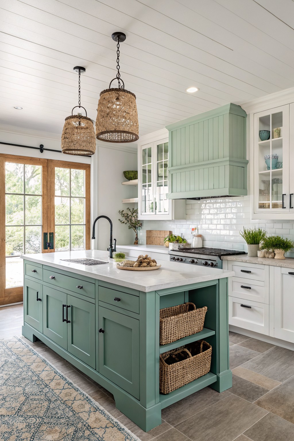
Sage green works well in farmhouse kitchens because it brings a calm, slightly earthy tone that feels both fresh and grounded. This particular shade sits somewhere between gray and green, with a soft muted quality that keeps the space from looking too bold or too pastel.
It reads best next to white trim and warm wood tones, and it holds up nicely under natural light without shifting too cool. Try it on an island or range hood first if you want to test the color without committing the whole room.
Buttery Yellow Kitchen Walls
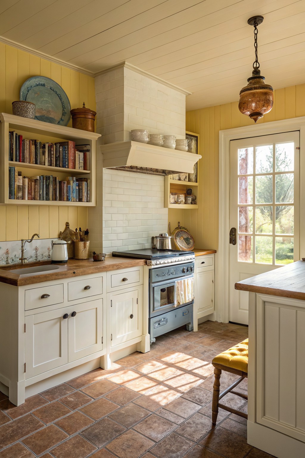
This kitchen uses a soft yellow on the walls that brings a gentle warmth without feeling too bright. It is a light, buttery shade that works well in farmhouse kitchens because it keeps the space feeling open and connected to the wood tones around it.
The color has a warm undertone that sits nicely next to white cabinets and natural wood countertops. It looks closest to Benjamin Moore’s Hawthorne Yellow or Sherwin Williams Buttercup, and it can also read similar to Behr’s Sunlit Yellow in rooms with good natural light.
Mushroom Beige Cabinets

Mushroom beige is a soft greige that leans slightly warm. It gives the cabinets a quiet, lived-in look that feels right at home in a farmhouse kitchen without turning too gray or too brown.
This color sits well next to wood countertops and black hardware. It works best in rooms with decent natural light, and it pairs easily with woven baskets or open shelving if you want to keep things simple.
Muted Sage Green Cabinet
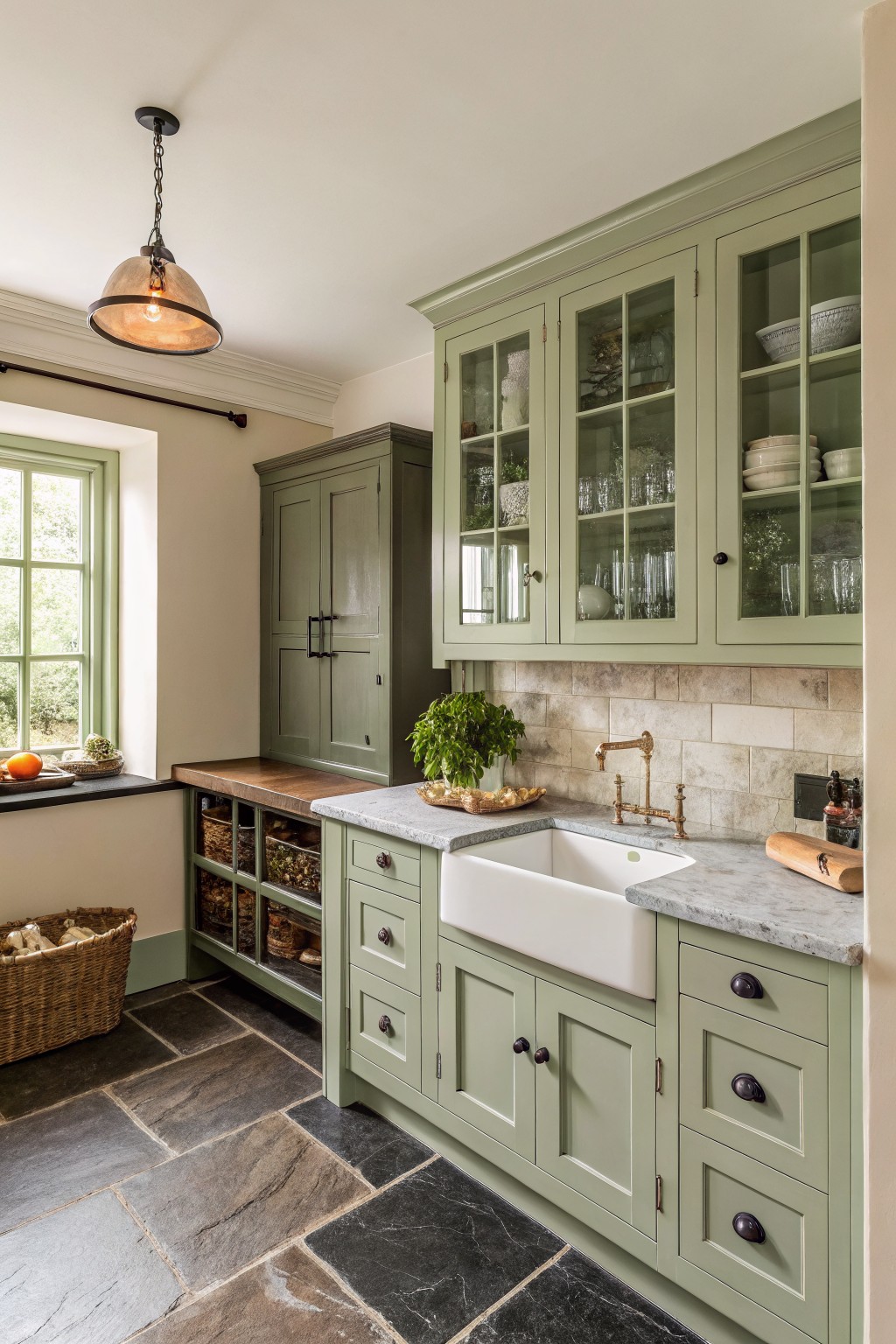
This muted sage green on the cabinets gives the kitchen a calm, slightly earthy feel. It is a gray-green that reads soft rather than bright, and it works nicely in farmhouse settings that mix modern and rustic elements.
The color has cool undertones that pair well with stone counters and wood tones. It stays steady in both natural and indoor light, though it can look a little cooler next to very white surfaces.
Soft Peach Cabinets
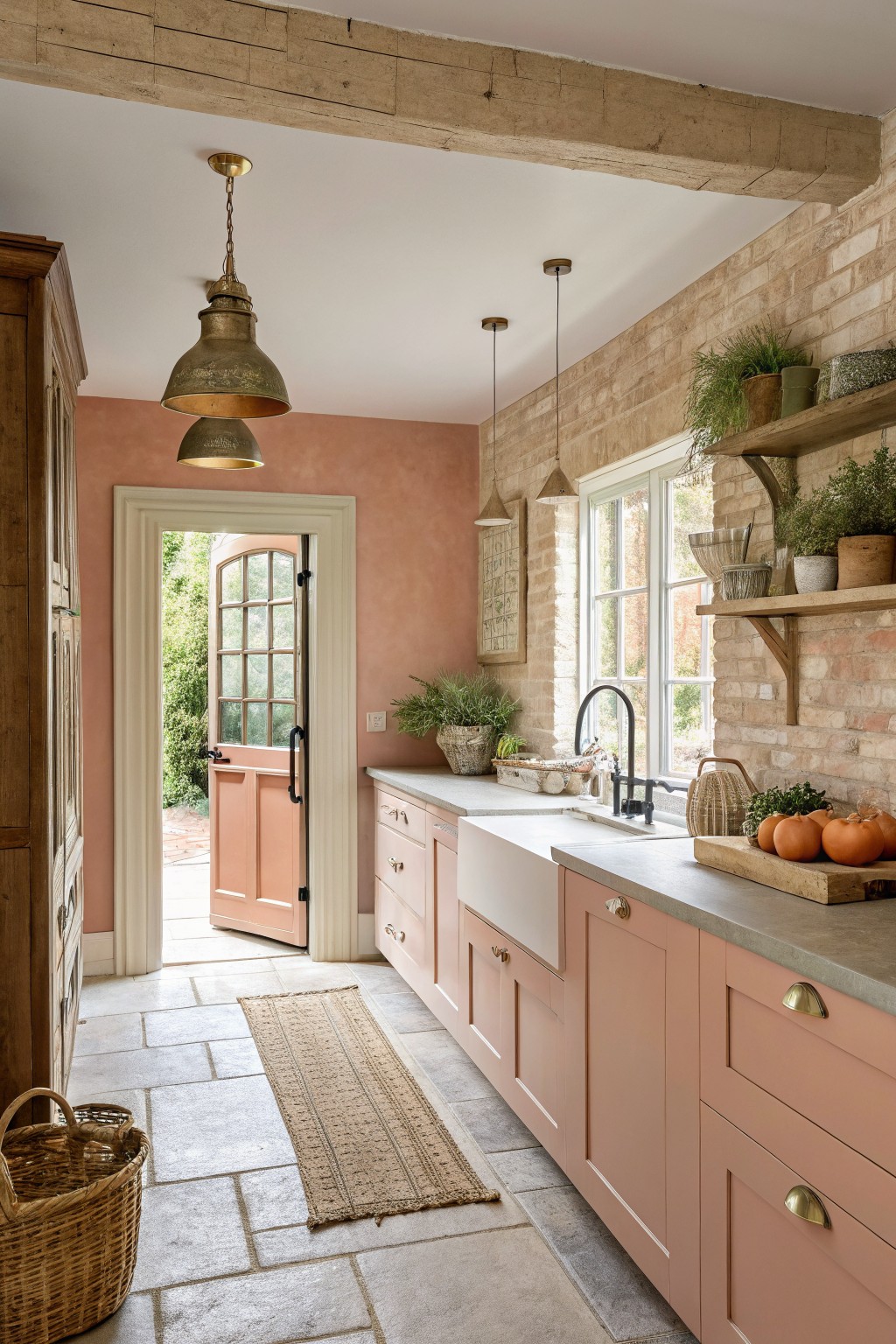
This soft peach on the cabinets brings a gentle warmth to the kitchen without feeling too sweet. It falls into the warm peach family and looks closest to Benjamin Moore Peach Melba, Sherwin Williams Coming Up Roses, or Behr Soft Peach.
The color has a light terracotta undertone that keeps it from turning too pink. It works best with white trim and natural stone or wood floors, though it can look flat if the room gets little daylight.
Soft Gray Cabinets
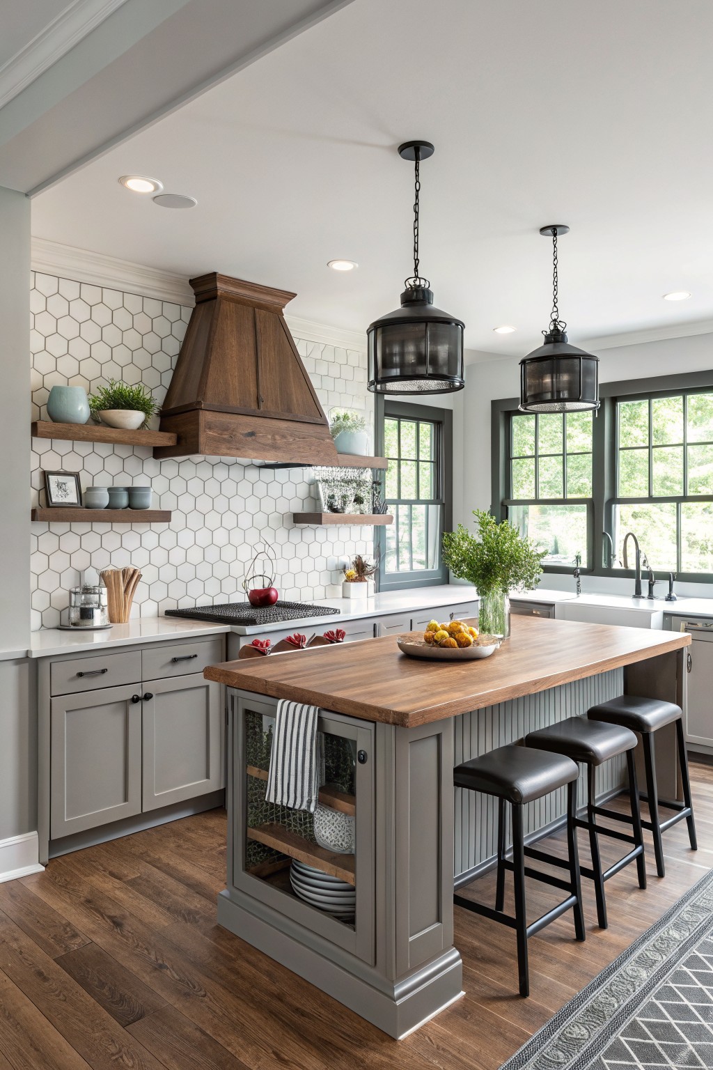
A soft warm gray on the cabinets gives this kitchen a calm, lived-in feel without making the space look cold. It sits nicely next to the wood tones on the island and floor, and it keeps the whole room feeling balanced rather than stark.
This kind of gray has a touch of beige in it, so it shifts a bit depending on the light. It works best with white walls or tile and natural wood, and it holds up well if you want to add black accents or open shelving later. Colors like Sherwin Williams Repose Gray, Benjamin Moore Edgecomb Gray, or Behr Agreeable Gray are usually close matches.
Soft rose walls
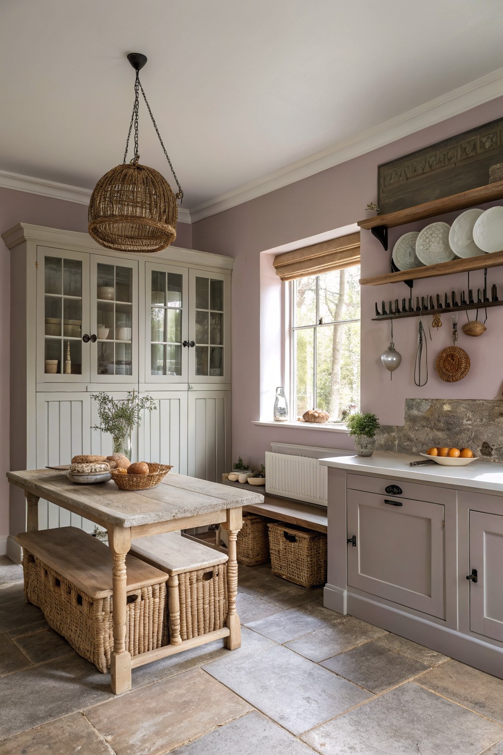
This kitchen uses a soft dusty rose on the walls. It is a muted color with gray undertones that feels calm without looking flat. The shade sits nicely next to the wood tones and stone floor. It reads very close to Farrow & Ball Cinder Rose or Sherwin Williams Mauve Mist, with Benjamin Moore Pale Mauve as another close option.
The color works best in rooms with steady daylight. It pairs easily with wood furniture and simple cabinetry but can look a little cool if the light is very gray. Keep the trim light to help it stay soft.
Soft Mint Green Kitchen Walls
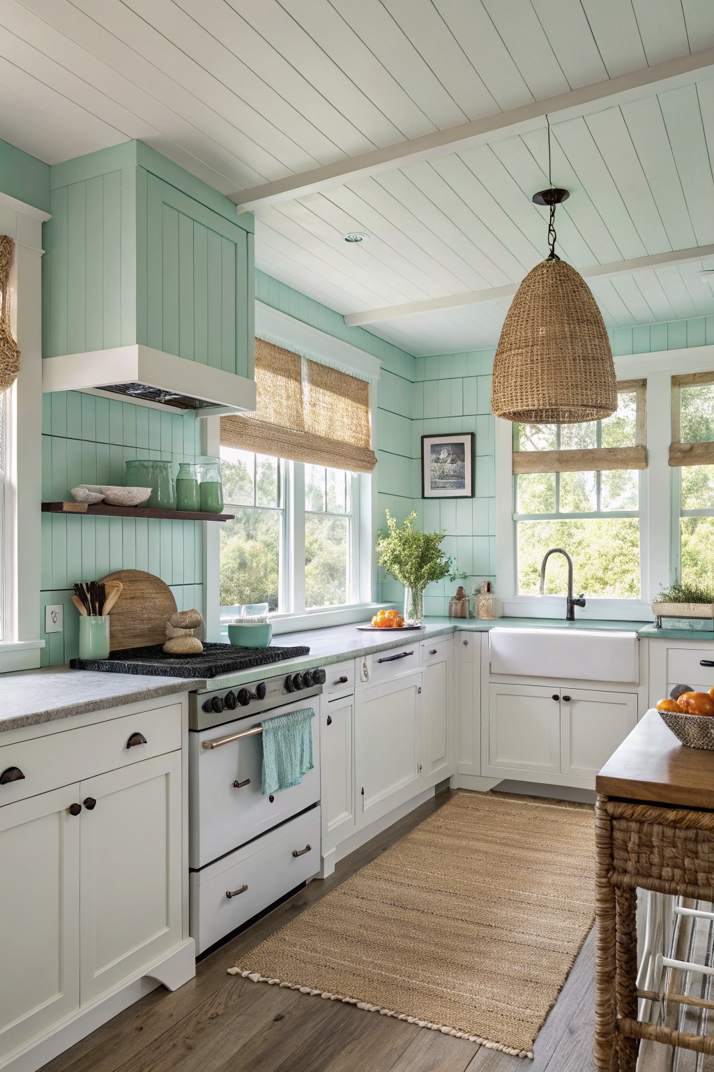
This soft mint green gives the kitchen a calm, fresh look without feeling too bold. It is a light cool green with a touch of blue in the undertone. The color reads closest to Sherwin Williams Breezeway, Benjamin Moore Spring Mist, Farrow & Ball Teresa’s Green, or Behr Seaglass.
It works especially well with white trim and natural wood tones on the floor and counter. The shade stays airy in bright rooms but can look a little flat in low light, so test a sample first if your kitchen gets mostly indirect sun.
Classic Greige Kitchen Cabinets
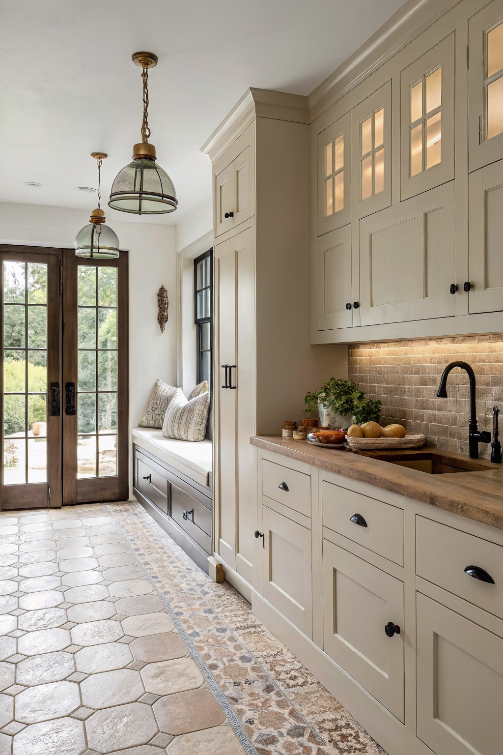
This soft greige on the cabinets sits right between gray and beige. It keeps the kitchen feeling warm and simple while still looking clean next to the wood counter and stone floor. Many people like it because it does not fight with other materials in the room.
It has a light warm undertone that shows up best with plenty of natural light. The color works well with black hardware and natural wood tones. It can lean a bit cooler under strong overhead lights, so test a sample on the actual cabinet door before committing.
Warm Terracotta Walls
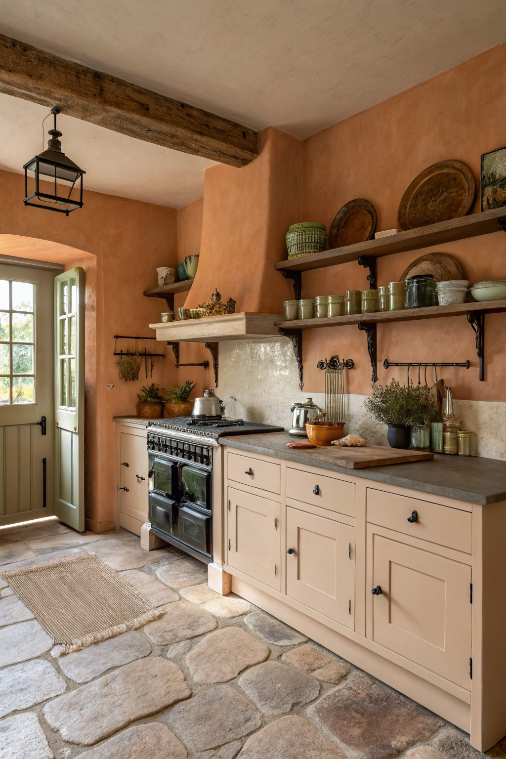
Warm terracotta brings a soft earthy tone to a kitchen without feeling heavy. This color sits in the orange-peach family and gives the room a grounded look that still feels light enough for everyday use. It works especially well in farmhouse settings where you want some warmth next to wood and stone.
The best matches tend to be Sherwin Williams Rustic Adobe, Benjamin Moore Georgia Clay, Farrow & Ball Red Earth, or Behr Desert Clay. It pairs nicely with creamy cabinets and gray counters, though it can look too strong if the room gets very little natural light.
Warm Gray Cabinets
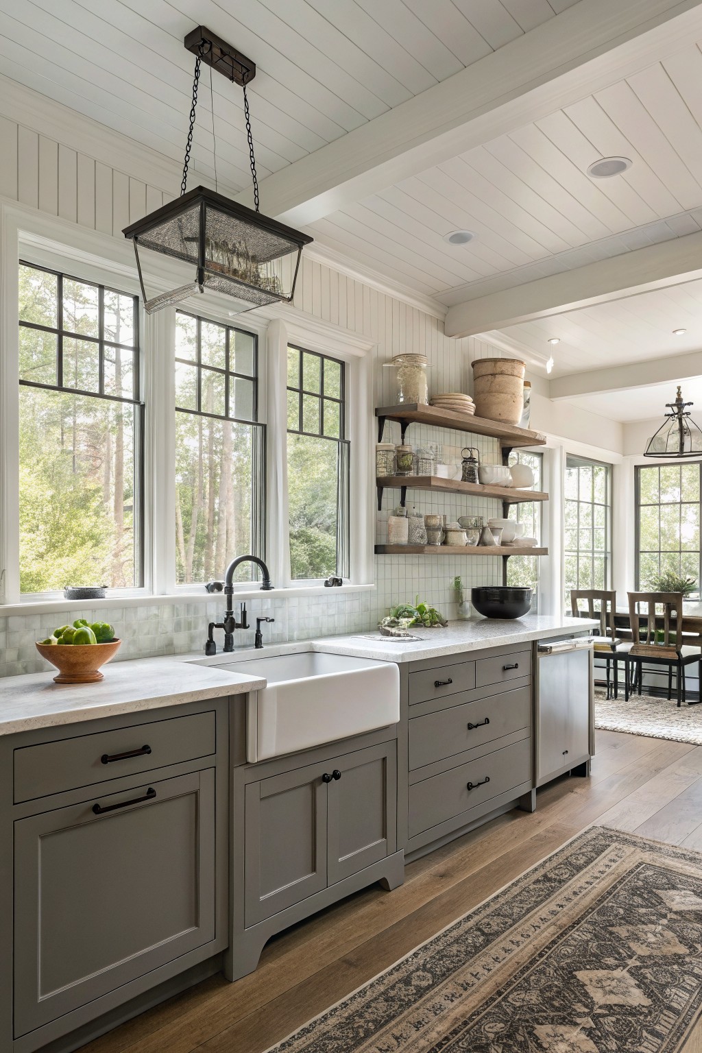
A warm gray on kitchen cabinets gives a simple way to add color without making the room feel dark. This shade sits right between cool gray and soft greige, so it feels calm next to white trim and wood tones.
It works best when you keep the rest of the room light. Pair it with white counters and black hardware to keep the look clean. Colors like Sherwin Williams Agreeable Gray or Benjamin Moore Edgecomb Gray come close to this tone.
Creamy White Kitchen Walls
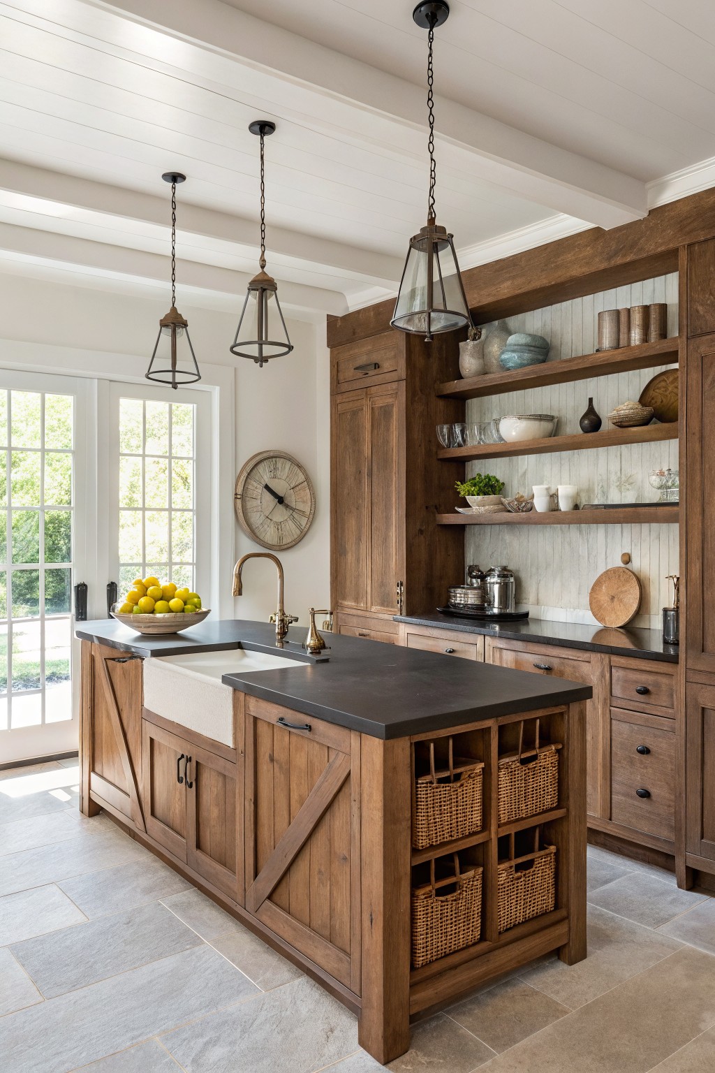
This kitchen uses a warm off-white on the walls that sits nicely against the wood cabinetry. It is a soft creamy neutral that avoids looking too bright or cold.
The slight warmth in the tone keeps the space feeling comfortable while still looking fresh. It works well with natural wood, dark counters, and simple hardware, and it suits kitchens that get steady daylight.
Cool Blue Gray Kitchen Cabinets
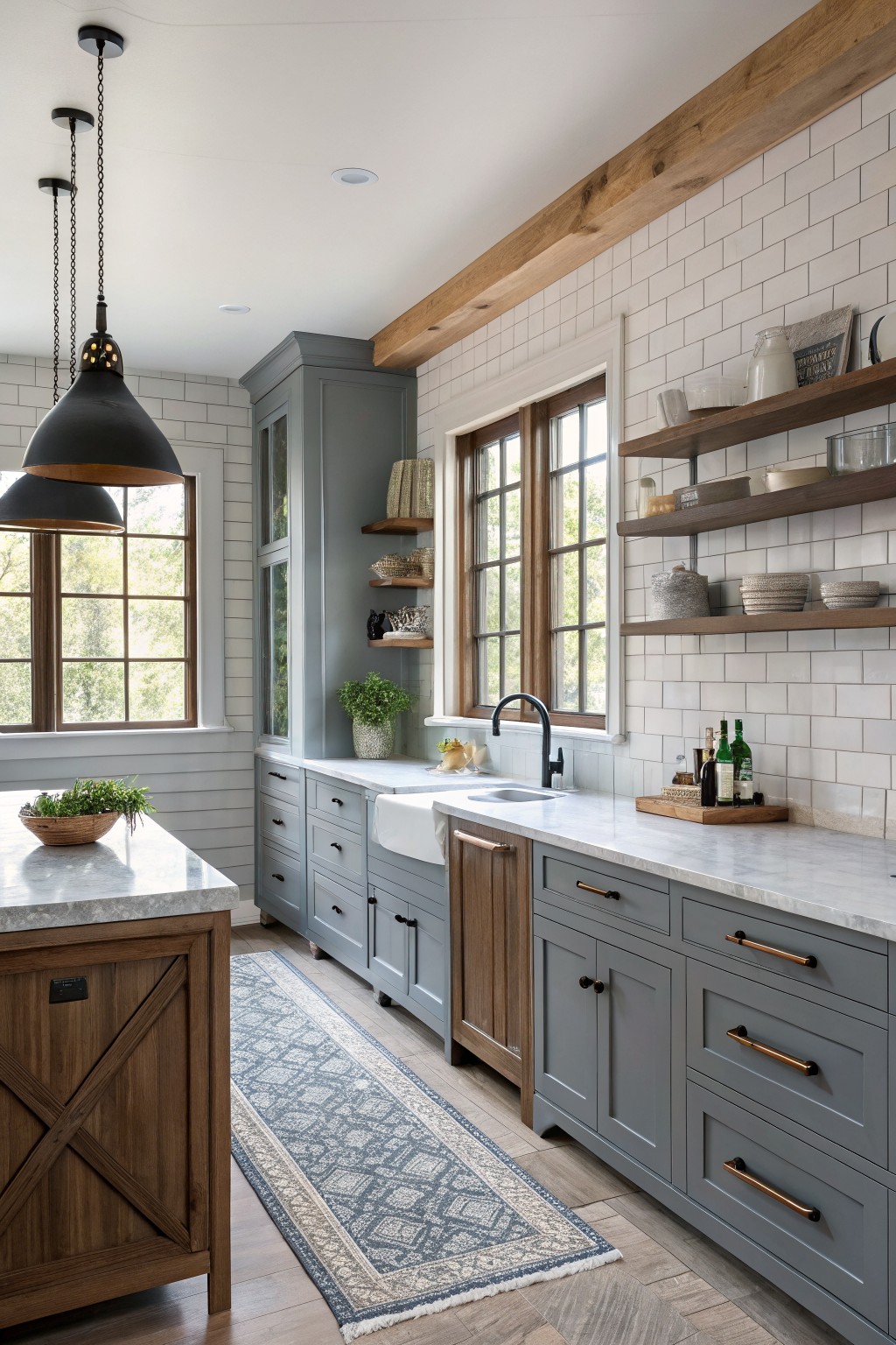
A muted blue gray on cabinets gives a kitchen a calm, steady feel without looking too stark. This color sits right in the middle of gray and blue, so it stays neutral while still adding a little depth next to wood and white tile.
It has cool undertones, so it reads best when paired with warm wood tones and creamy whites to keep the space balanced. Watch the lighting though, since it can shift cooler in north facing rooms.
Frequently Asked Questions
Q: Which color hides fingerprints best if I have kids around?
A: Go with a mid-tone gray from the options. It shows less wear than crisp whites or dark navies.
Q: My kitchen faces north so it stays cool. What color warms it up?
A: Choose a creamy white with yellow undertones. It bounces light around and makes the space feel cozier right away.
Q: Should I paint the ceiling the same color as the walls?
A: Skip that. A slightly lighter shade on the ceiling keeps the room from feeling closed in.









