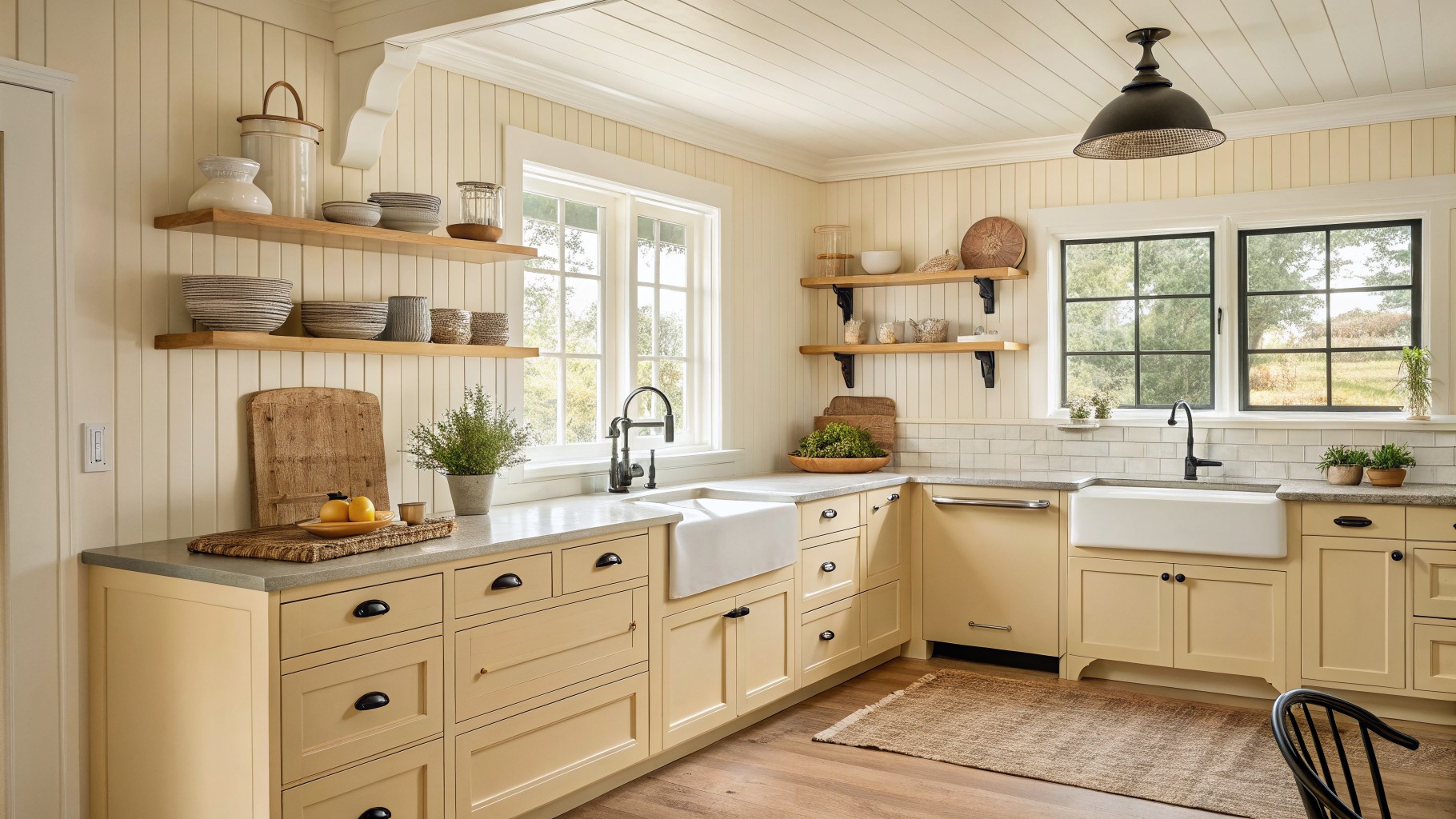
I have noticed that cream shades in a kitchen often pick up whatever light comes through the windows and can turn cooler than expected by midday.
That is why I always test a few samples on the actual wall before committing to a whole room.
The undertones matter more than people realize because they show up next to white trim or wooden cabinets in ways that change the whole feel.
Some creams hold their warmth better when the room has both natural light and overhead fixtures.
Yellow based ones rarely disappoint.
Warm Cream On Kitchen Cabinets
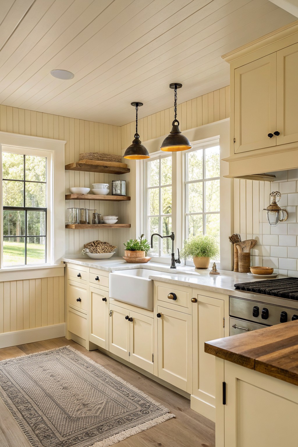
A warm cream works well on kitchen cabinets when you want something softer than white but still light. This shade sits right in that middle ground, with enough warmth to feel cozy next to wood tones and stone counters. It comes across as a true cream rather than a cool off-white. Colors like Sherwin Williams Creamy, Benjamin Moore Linen White, or Behr Creamery often land close to this look.
It has a gentle yellow undertone that shows up more in natural light, which helps it stay friendly even on cloudy days. Pair it with white trim and warm wood floors if you want it to feel balanced. Avoid anything too gray nearby or it can start to read muddy.
Warm Cream Cabinets With Wood Countertops
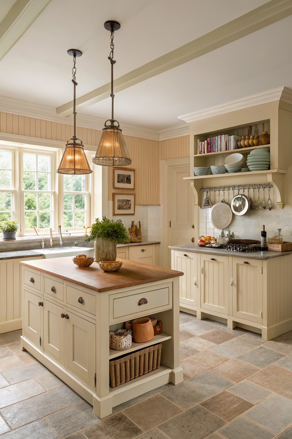
This warm cream cabinet color brings a soft, lived-in feel to the whole kitchen. It sits somewhere between white and beige, with enough warmth to keep the space from feeling stark while still looking clean next to the wood countertop and stone floor. Many people reach for colors like this because they work well with older homes and mix easily with both painted trim and natural wood.
The undertone leans slightly yellow rather than gray, which helps it read cozy even in lower light. It pairs nicely with wood tones and stone, but it can start to look dingy if the room gets very little natural light or if you pair it with cool metals. Try it on cabinets first if you want the color without committing the whole room.
Warm Cream Cabinets
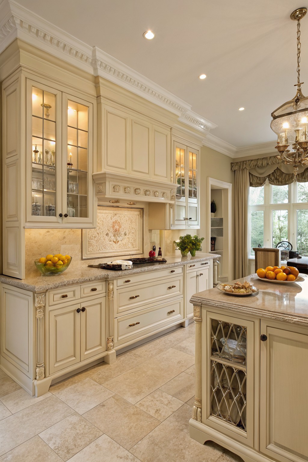
This kitchen uses a soft warm cream on the cabinets. It sits right in that cream family, with gentle yellow undertones that keep it from feeling stark. Good matches include Sherwin Williams Creamy, Benjamin Moore Linen White, Behr Almond Wisp, and Farrow & Ball Cream.
The color works nicely with the stone counters and wood floors because it stays light but still feels grounded. It pairs well with brass hardware or darker wood accents without competing. Watch the lighting though, since cream can shift a little warmer under yellow bulbs.
Warm Cream Kitchen Cabinets
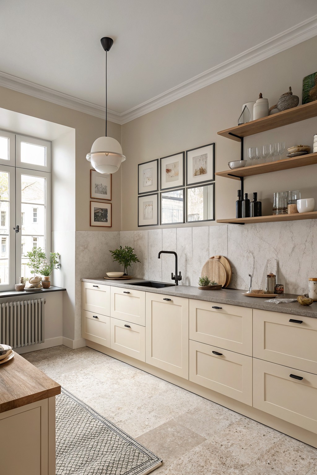
A warm cream is the main color on the cabinets here. This soft neutral sits between white and beige, which keeps the kitchen feeling calm and lived in. It reads closest to Sherwin Williams Creamy, Benjamin Moore White Dove, Behr Canvas, or Farrow & Ball Slipper Satin.
The gentle warmth helps the color sit nicely next to wood floors and stone counters. It works well with black hardware and open wood shelves, though it can start to feel flat if the lighting is very cool.
Warm Cream Cabinets With Dark Wood Beams
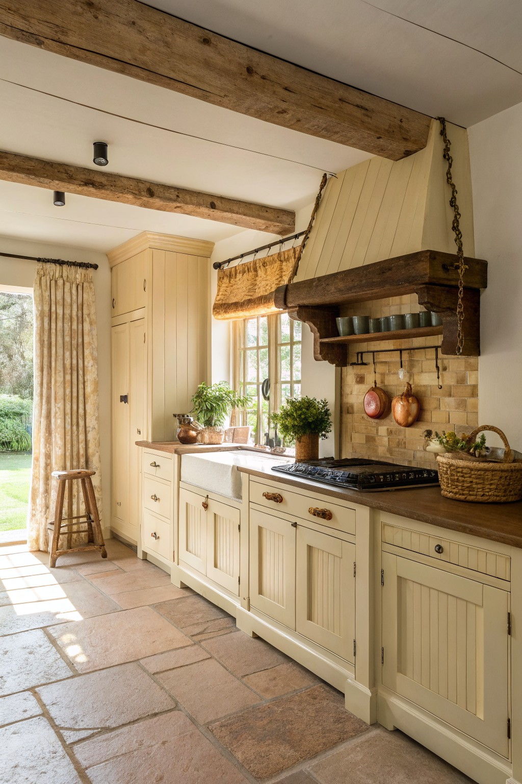
This kitchen shows a warm cream on the cabinets. It is a soft off-white with light yellow undertones that keeps the space feeling cozy and lived-in. Colors in this family avoid looking stark next to wood and stone.
It reads very close to Sherwin Williams Creamy or Benjamin Moore Linen White, with Behr Almond Cream as another close option. The shade works best with warm wood counters and dark beams, and it stays steady even when natural light shifts during the day.
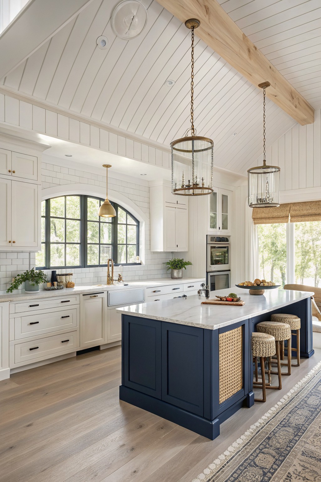
A warm cream covers the main cabinets here. It keeps the kitchen feeling soft and lived-in instead of stark, and it sits comfortably next to the wood floors and darker island.
This shade has a light yellow undertone that shows up best in daylight. It works well in kitchens that need a bit of warmth and pairs easily with wood tones, brass, or a deep navy. Good matches include Sherwin Williams Creamy, Benjamin Moore Cloud White, Behr Almond Wisp, and Farrow & Ball Pointing.
Warm Cream Cabinets With Green Island
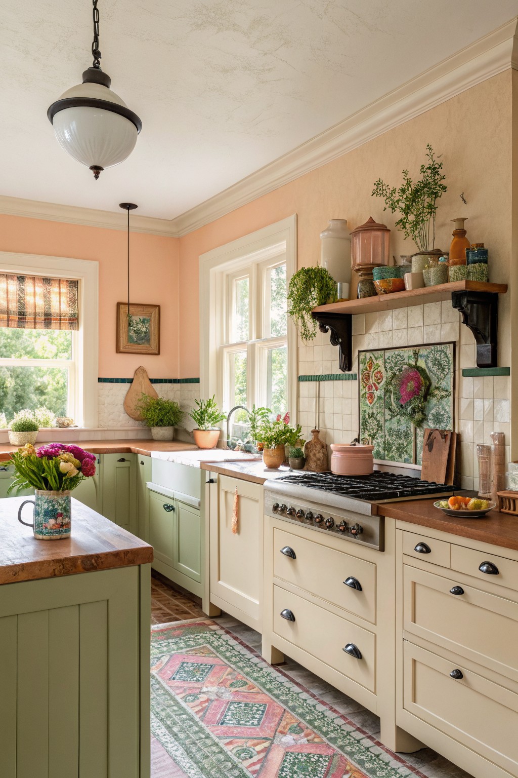
This warm cream on the cabinets gives the kitchen a soft, lived-in look that still feels clean. It sits somewhere between off-white and light beige, with just enough warmth to keep the space from feeling chilly next to all the wood.
The color has a gentle yellow undertone that reads nicely against the butcher block counters and the green island. It works best in kitchens with decent natural light and pairs well with wood tones or simple tile backsplashes.
Soft Cream Kitchen Cabinets
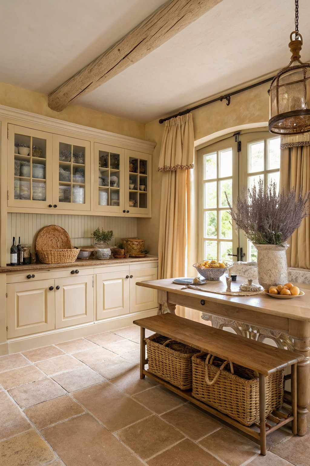
This warm cream paint color on the cabinets brings a gentle yellow undertone that keeps the kitchen feeling cozy rather than stark. It sits nicely between white and beige so the space still feels light but never cold.
The color works especially well with wood tones and stone floors because it does not fight the natural materials. It can shift a little warmer in morning light so test a sample on the actual cabinet door before committing.
Soft Cream Cabinets With Marble Counters
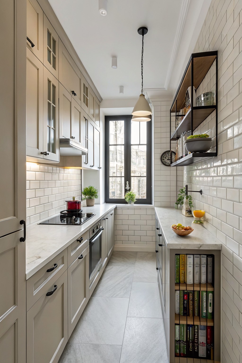
This kitchen uses a warm cream on the cabinets that sits somewhere between white and beige. It gives the space a gentle, lived-in feel without going too yellow or too gray. The color works well with the white tile and marble counters because it keeps everything from looking too stark.
It has a soft beige undertone that shows up more in warmer light. Pair it with black hardware or dark wood floors if you want a bit more contrast. Colors like Sherwin Williams Alabaster, Benjamin Moore White Dove, or Behr Creamy tend to land close to this look.
Warm Cream Upper Kitchen Cabinets
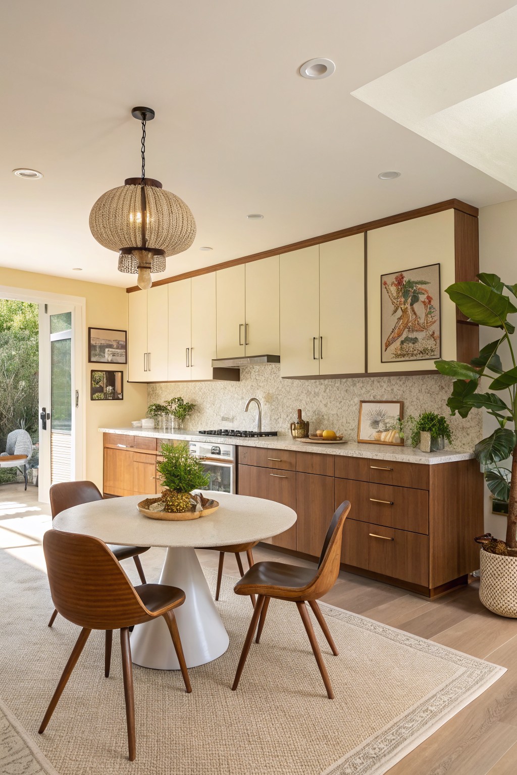
This kitchen uses a soft warm cream on the upper cabinets. The color sits right between white and a pale yellow, giving it that cozy feel without looking too heavy or stark against the wood below.
It has a gentle warmth that works especially well with natural wood tones and light stone. In rooms with decent daylight it stays bright, but it can pick up a slight yellow cast under cooler bulbs, so testing a sample on the actual cabinet door is worth doing.
Warm Cream Cabinets With Stone Counters

This kitchen shows a warm cream on the cabinets that feels soft without going too pale. It sits nicely between white and beige, giving the space a gentle glow that still reads clean. Colors like this work because they pick up warmth from wood tones and natural light rather than fighting against them.
It has a light yellow undertone that keeps the cabinets from looking stark next to stone counters or darker beams. Sherwin Williams Alabaster, Benjamin Moore White Dove, Behr Creamy, and Farrow & Ball Pointing all land close to this shade. It suits older homes or any kitchen that already has wood and stone.
Cream Cabinets in the Kitchen

This cream color on the cabinets is a warm off-white that sits nicely between beige and true white. It keeps the kitchen feeling bright but still grounded, especially next to the wood beams and stone counters.
It has a soft yellow undertone that reads warmer in daylight and pairs well with both the light blue island and natural wood tones. Try it on cabinetry in older homes where you want something softer than stark white without shifting too far into beige. Good matches include Sherwin Williams Creamy, Benjamin Moore White Dove, Behr Canvas, and Farrow & Ball Pointing.
Warm Cream Cabinets With Marble Counters

A warm cream works nicely on kitchen cabinets because it sits between white and beige without tipping too far either way. Colors that come close include Sherwin Williams Creamy, Benjamin Moore Cloud White, Behr Antique White, and Farrow & Ball Pointing.
It holds up well next to wood floors and marble counters. The soft undertone keeps the space from feeling cold, though it can look a little flat in very low light.
Soft Sage Green Cabinets
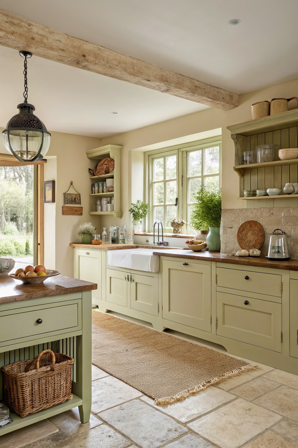
This kitchen uses a soft sage green on the cabinets. It is a gentle color that sits between green and a warm neutral.
It has a touch of warmth that keeps it from feeling cool under different lights. The shade works well with wood counters and stone floors, and it pairs nicely with cream walls or simple natural textures.
Warm Cream Kitchen Walls
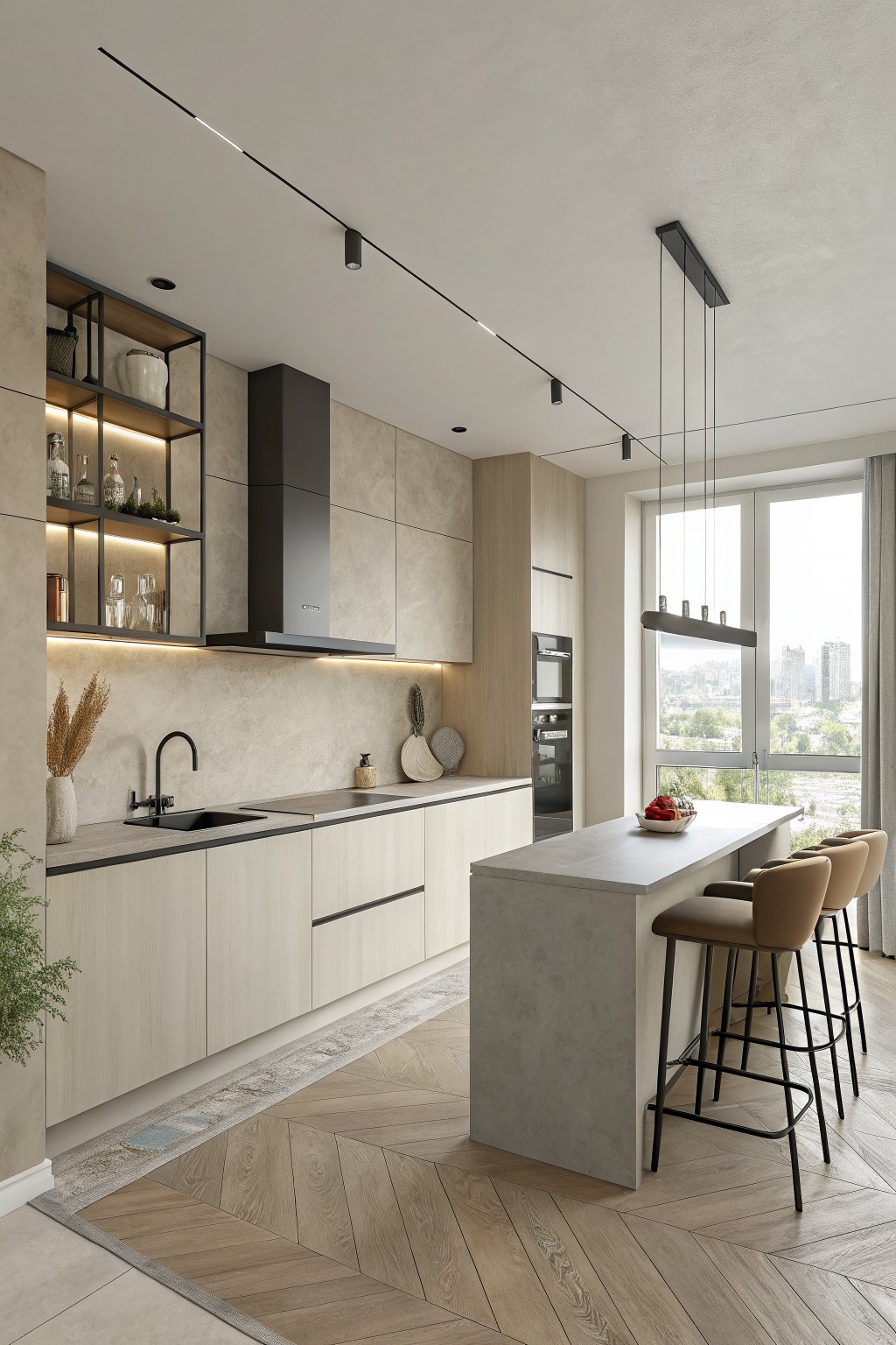
This warm cream paint color gives the kitchen a soft, settled feel that works well with light wood cabinetry. It sits in that middle ground between beige and off-white, picking up just enough warmth from the flooring and counters to keep things cozy.
The color has a light yellow undertone that shows up more in natural daylight and pairs cleanly with black fixtures or concrete surfaces. It tends to look best in kitchens with plenty of windows, though it can lean a touch cooler under artificial lights.
Warm Greige Cabinets
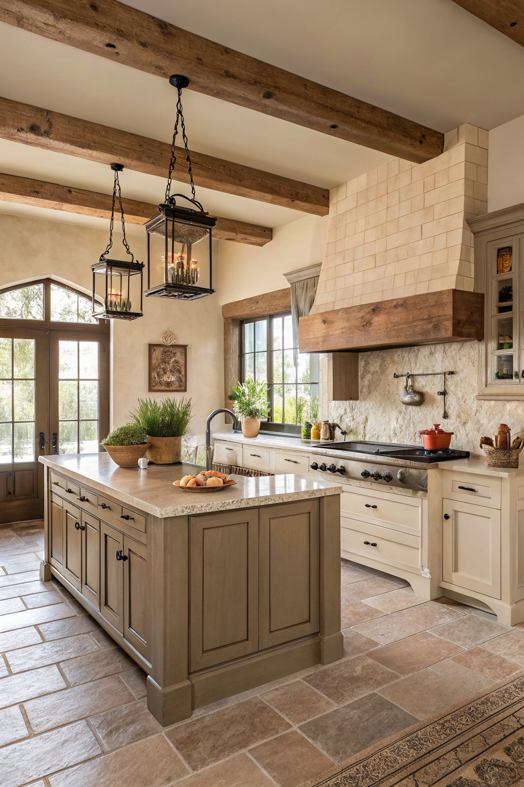
This kitchen uses a warm greige on the cabinets. It is a soft neutral that sits between beige and gray with a bit of warmth that keeps the space feeling inviting rather than stark.
The color has a light taupe undertone that works nicely with wood tones and stone. It suits traditional kitchens best and pairs well with both light and dark accents without needing much else to look finished.
Soft Cream Kitchen Walls
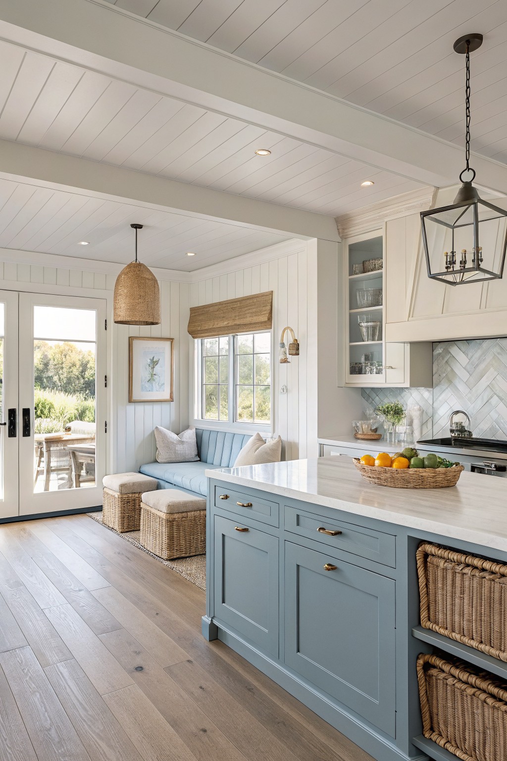
This kitchen uses a warm cream on the walls. It feels soft next to the blue island and helps the whole space stay light without going too cool or bright.
The color has a gentle warmth that pairs easily with wood floors and white trim. It works best in kitchens that get decent daylight and looks good with natural textures like baskets or woven shades.
Warm Cream Cabinets With Brick Accents

A warm cream is a good choice for kitchen cabinets when you want something soft but still practical. This shade has a light buttery tone that feels cozy next to brick and wood without turning too yellow.
It sits nicely with gray counters and metal hardware. The color works best in rooms with decent daylight and pairs easily with both natural wood tones and painted trim.
Frequently Asked Questions
Q: Which cream shade works best if my cabinets are already a light wood tone? A: Go for a cream with a bit more warmth to it. This keeps everything feeling connected instead of washed out. Test a few samples on the wall next to your cabinets during the day.
Q: Does cream paint hide everyday kitchen messes well? A: Most creams handle smudges fine. Go with a satin finish to wipe them away easily.
Q: How can I make sure the cream stays inviting at night under artificial lights? A: Choose a color that leans slightly yellow rather than gray. This prevents the walls from looking dull once the sun goes down. Try the paint under your actual kitchen lights before committing.
Q: What if the cream I like feels too yellow in person? A: Shift to a softer version with less pigment. Many people end up going one shade lighter than their first pick. It still gives that cozy vibe without overpowering the space.









