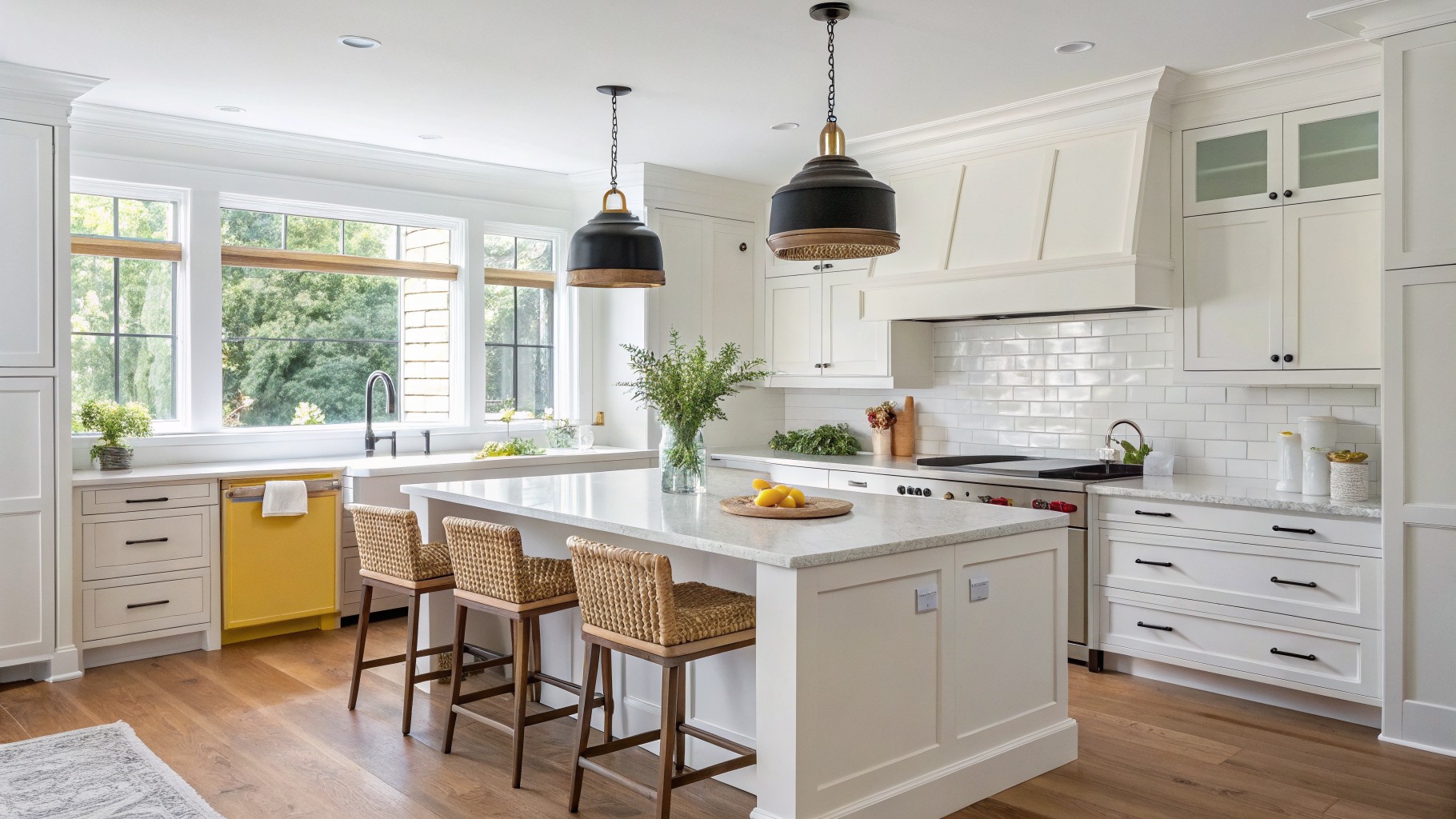
I’ve noticed that paint in a kitchen rarely looks the same at noon as it does in the evening when the lights are on.
The way a color interacts with cabinetry and countertops often determines whether it feels right over the long run.
Testing on the actual walls helps reveal any surprises with undertones.
Some shades that look promising in the store end up feeling too stark once applied.
I usually start with samples on multiple walls to see how the light moves across them throughout the day.
Creamy White Cabinets
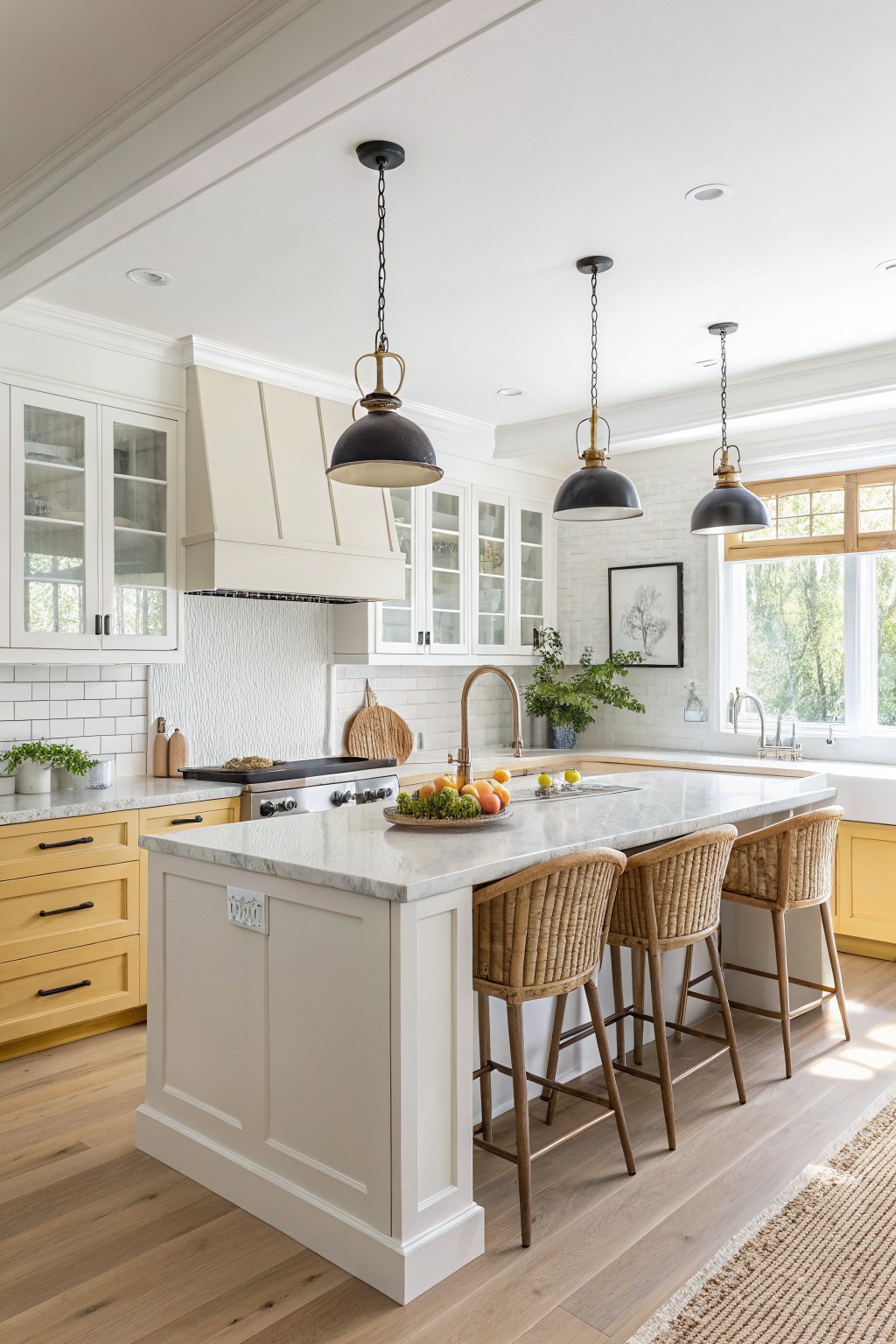
This kitchen uses a warm off-white on the cabinets that sits right between a true white and a soft cream. It gives the room a gentle brightness without feeling cold or flat, which is why the color stays useful over time.
The tone has a light warmth that plays well with wood floors and stone counters. It works in both older homes and newer ones, though it can look a bit dull if the lighting is very dim.
Soft Greige Cabinets
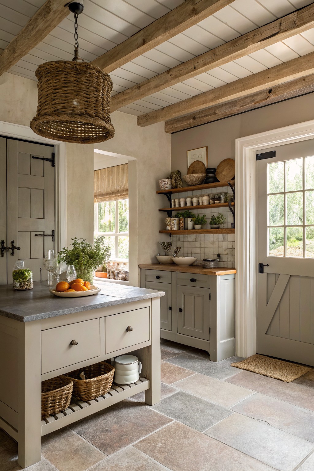
This kitchen uses a soft greige on the cabinets. It is a warm neutral that blends gray and beige without leaning too far in either direction. The color feels steady next to wood tones and stone, which is why it stays useful in kitchens year after year.
It has a light warm undertone that keeps the room from feeling cool or stark. The shade works well with natural wood beams and simple tile floors. Try it with white trim or a darker countertop if you want a bit more contrast.
Warm Greige Kitchen Walls
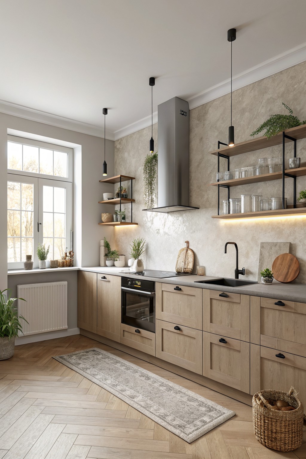
This kitchen uses a soft warm greige on the walls. It sits between beige and gray with a light taupe undertone that keeps the space feeling calm and steady. Colors like this work because they let wood cabinets and stone surfaces read clearly without competing.
The tone stays warm enough to feel cozy next to the light oak cabinetry. It pairs well with black hardware and simple wood shelves. Most kitchens suit this shade as long as you keep trim and ceilings light so the room stays open.
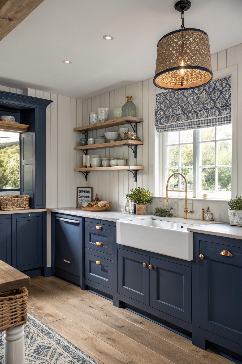
A deep navy blue works well on kitchen cabinets when you want something that feels solid and lasting. This shade sits between black and true blue, giving the room structure without making it feel heavy. It pairs easily with lighter counters and wood tones that keep the space from closing in.
The color has a cool undertone that reads clean next to white walls and brass hardware. It works best in kitchens with decent natural light, since darker navy can look flat in very dim rooms. Try it with warm wood floors or cream trim to soften the look.
Muted Blue Gray Cabinets

This muted blue gray on the cabinets is the kind of color that feels steady without being dull. It leans more gray than bright blue, which helps it stay calm next to wood and stone.
It has a cool undertone that works best with warm wood tones and white counters. Watch how it shifts in different light, since it can look a bit greener in some rooms.
Soft Sage Green Cabinets
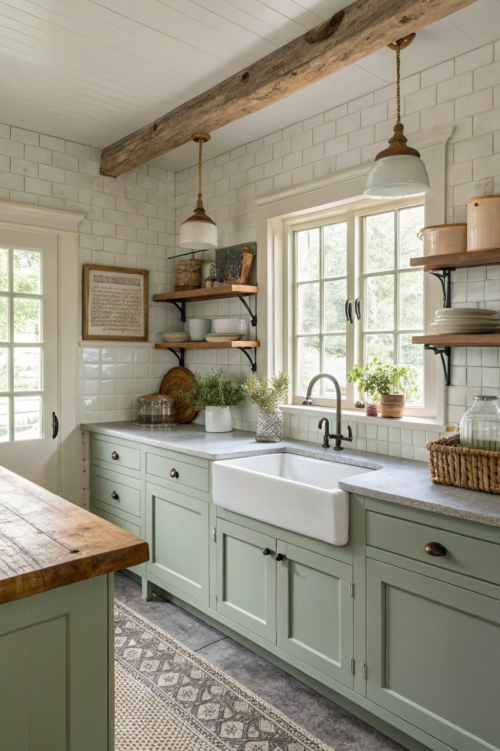
A soft sage green on kitchen cabinets gives a calm, lived-in feel that still looks fresh after years. This muted green sits somewhere between gray and earthy, so it works well with wood tones and stone without fighting them.
It has a slight warm undertone that keeps the room from feeling cold, especially next to white tile and gray counters. Pair it with natural wood shelves or open shelving if you want to soften the look even more. It suits older homes or any kitchen that gets steady daylight.
Earthy Sage Green Kitchen Cabinets
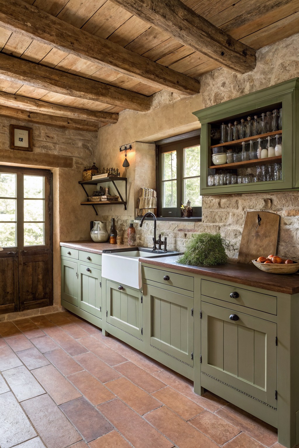
A soft sage green on cabinets gives a kitchen that steady, lived-in look without feeling trendy. This muted shade has a slight gray undertone that keeps it from turning too yellow or too blue in different lights.
It works especially well with warm wood counters and stone walls, and it holds up nicely next to terracotta floors or dark hardware. Benjamin Moore Quietude, Sherwin Williams Clary Sage, and Farrow & Ball French Gray all sit close to this tone.
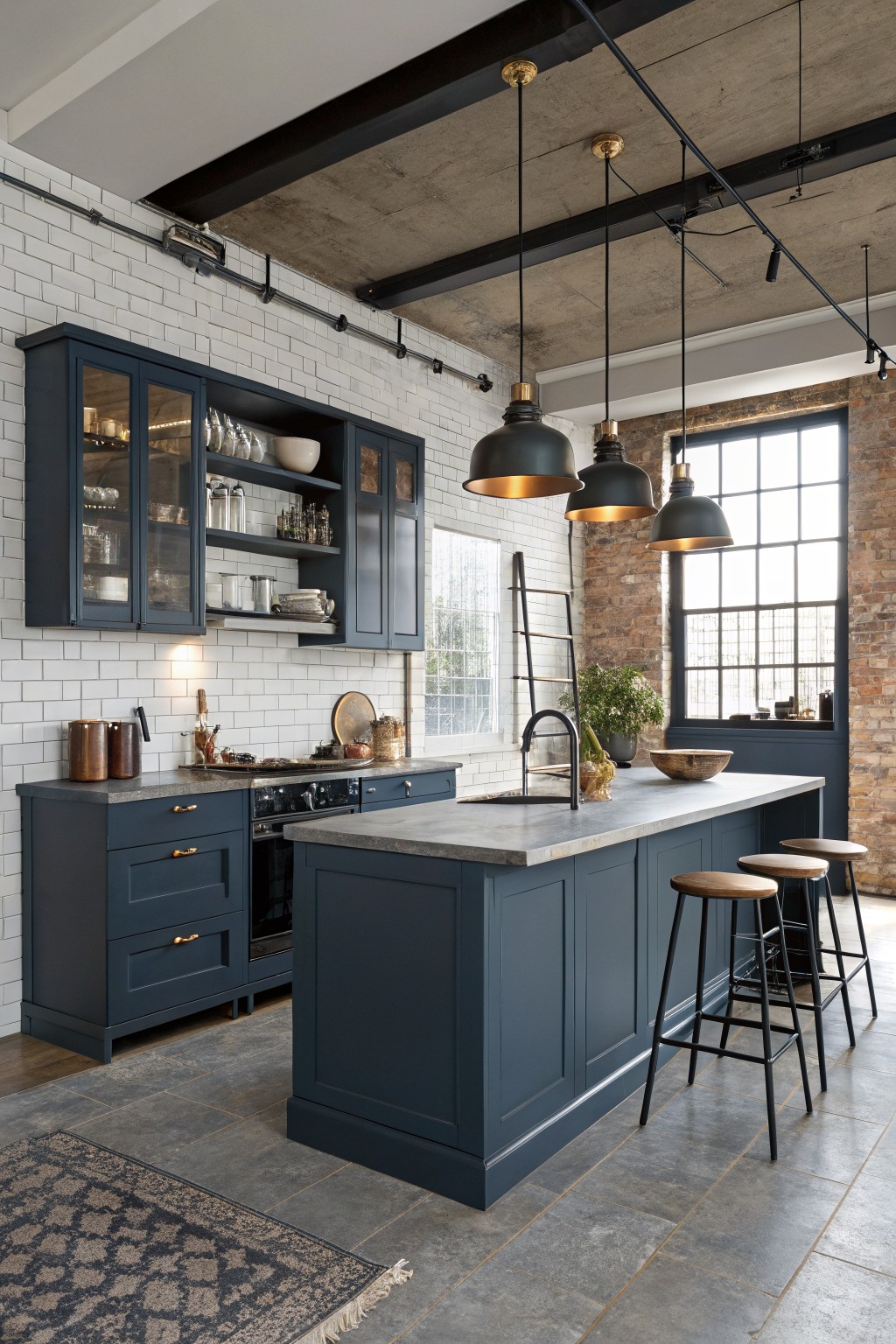
A deep navy blue works well in kitchens because it feels solid without turning too dark or moody. This shade sits between a true blue and a near-black, giving cabinetry a clean, lasting look that holds up over time.
It has cool undertones that sit nicely against gray stone counters and white tile. The color pairs best with warm wood floors or simple black hardware, though it can feel flat if the room lacks natural light.
Greige Kitchen Walls With Warm Undertones
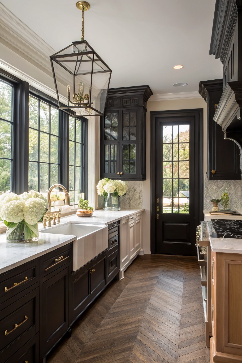
This warm greige keeps a kitchen feeling calm and steady over time. It sits right between gray and beige, so it avoids looking too stark or too yellow. The color looks closest to Sherwin Williams Accessible Beige, Benjamin Moore Edgecomb Gray, or Behr Silver Satin.
It works best with dark cabinetry and light stone counters because the soft tone keeps the space from feeling heavy. The undertone stays warm enough to blend with wood floors but light enough to reflect daylight well.
Soft Blue Gray Cabinets
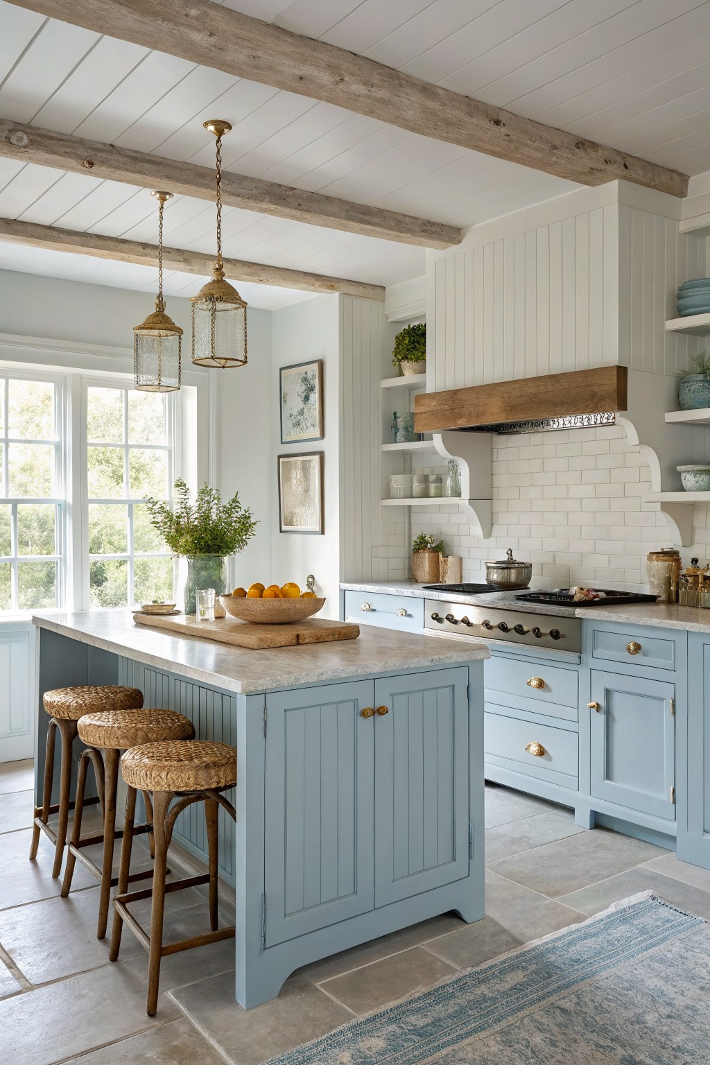
This soft blue gray on the cabinets gives the kitchen a calm, steady look that still feels fresh. It sits right between gray and blue without leaning too hard either way, which is why it stays easy to live with over time. The color works because it plays off the warm wood tones around it without fighting them.
It has a slight cool undertone that shows up more in bright light, so it helps keep the room from feeling too warm when there is lots of wood and stone nearby. Pair it with white walls and simple hardware if you want it to stay quiet. It suits older homes and newer ones alike as long as the trim stays light.
Soft Buttery Yellow
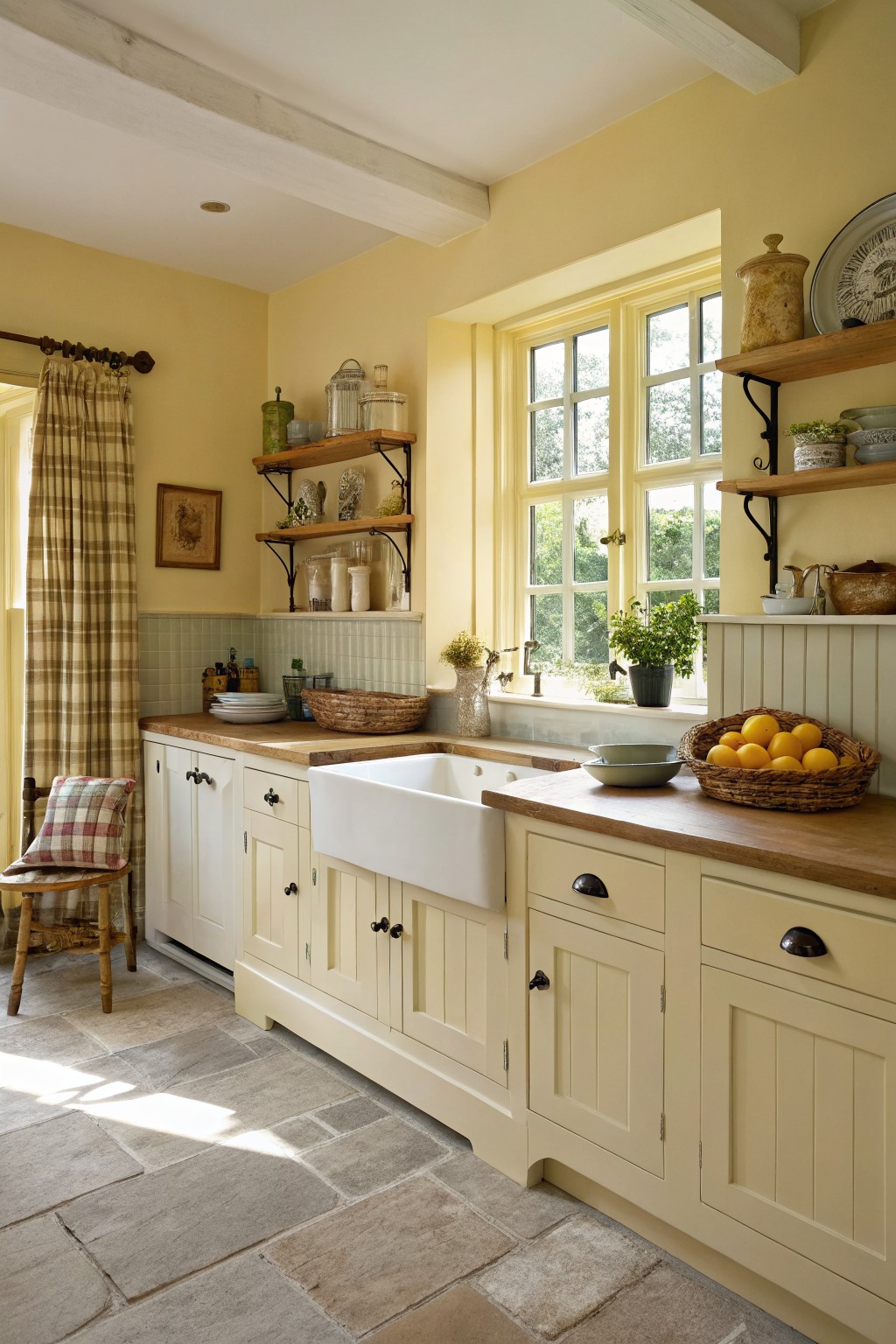
This soft buttery yellow brings a gentle warmth to a kitchen without feeling too bold. It has that quiet sunny feel that works well with wood counters and stone floors, and it stays friendly even as trends shift. The color family is a pale butter yellow. It reads close to Sherwin Williams Buttercup, Benjamin Moore Hawthorne Yellow, Farrow & Ball Yellow Ground, and Behr Sunflower Seed.
The warm undertone helps it sit nicely next to white trim and natural wood. It works best in spaces with decent daylight, since it can lean a bit flat in very dark rooms. Pair it with simple cabinet hardware and avoid heavy gray accents that might dull the yellow.
Warm Cream Kitchen Walls

A warm cream is one of those kitchen colors that just works without much fuss. It has a soft ivory base with a touch of beige that keeps the room feeling cozy rather than stark. This shade sits nicely next to wood tones and makes the space feel a little more lived in.
It pairs especially well with natural wood cabinets and stone or tile details. Watch the lighting though, since it can read a bit more yellow in low light. Good matches include Sherwin Williams Alabaster, Benjamin Moore Cloud White, Behr Swiss Coffee, or Farrow & Ball Pointing.
Soft Greige Kitchen Cabinets
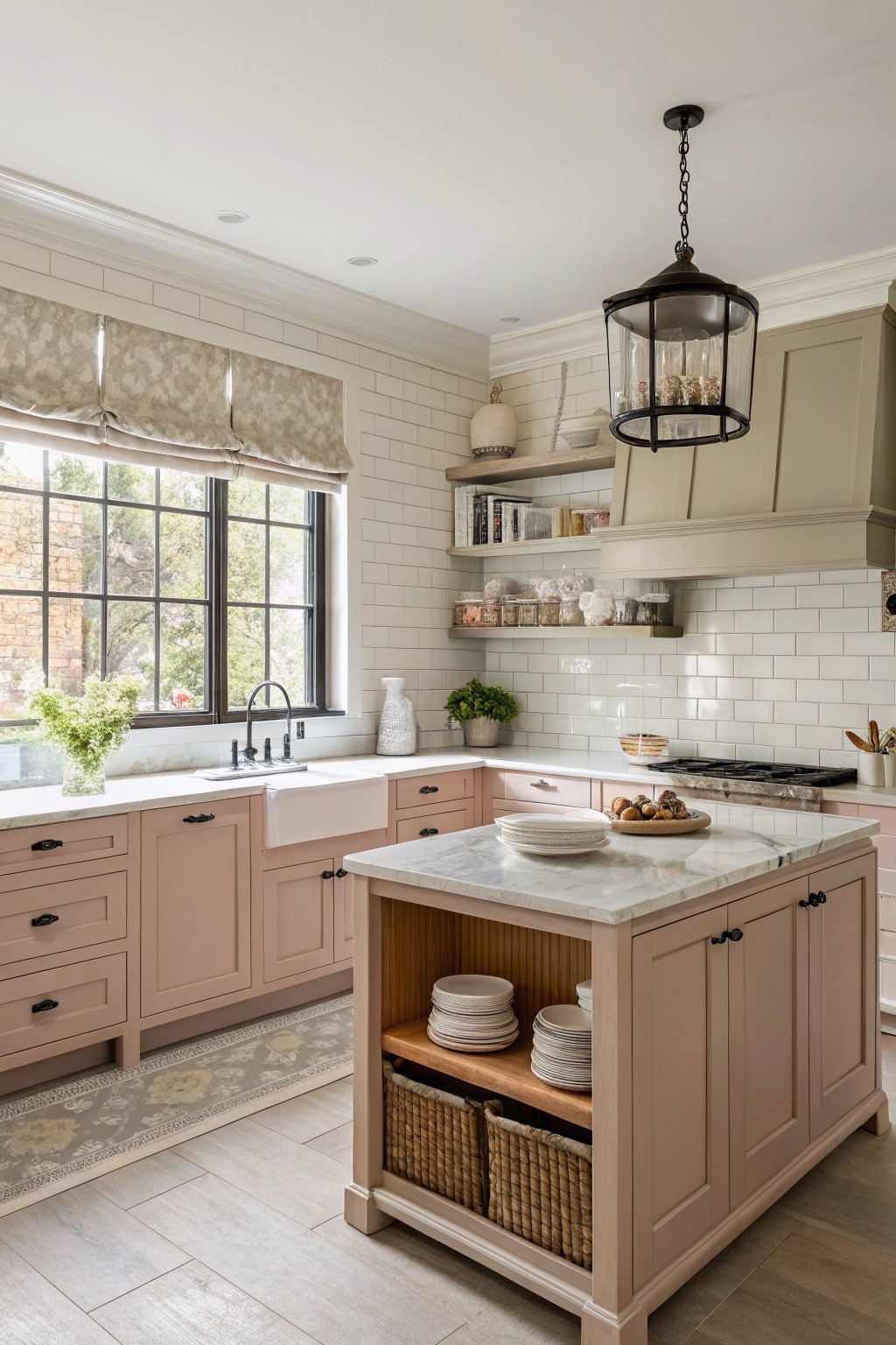
This kitchen shows a soft warm greige on the cabinets. It sits right in that middle ground between gray and beige, with enough warmth to feel inviting rather than stark.
The color has a faint pinkish undertone that helps it stay cozy next to white tile and marble. It works best in kitchens with wood floors or natural light, and it pairs easily with black hardware or light stone without looking dated.
Rich Red Kitchen Island
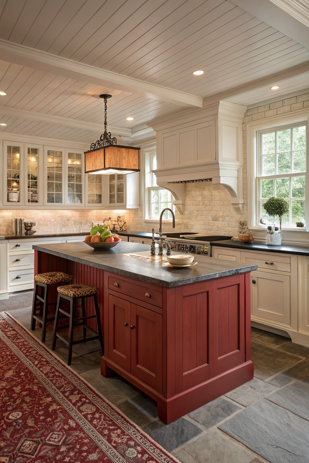
This kitchen uses a deep warm red on the island, a color family that brings depth without feeling heavy. It reads closest to Sherwin Williams Red Barn or Benjamin Moore Caliente, with similar options like Behr Moroccan Red showing up in older homes too.
The shade has a soft earthy undertone that sits nicely next to stone counters and white trim. It works best in kitchens with good natural light and pairs cleanly with wood tones or black hardware.
Soft teal cabinetry
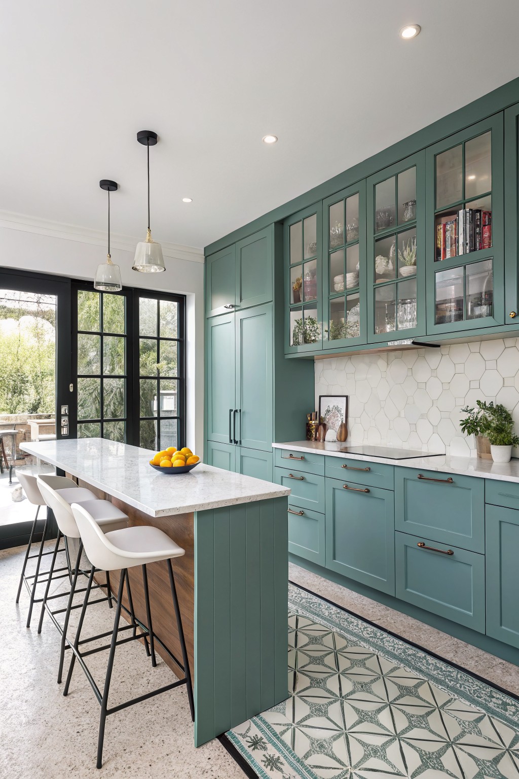
This muted teal green on kitchen cabinets brings a steady, quiet color that feels fresh without being loud. It sits right between blue and green, and it keeps the room from feeling too stark or too warm. Colors like Sherwin Williams Rainwashed, Benjamin Moore Wythe Blue, Farrow & Ball Green Blue, or Behr Breezeway sit in that same range.
The tone works best with white stone counters and wood tones nearby. It stays calm under both daylight and warmer bulbs, and it looks at home in both older homes and newer builds. Just watch how it shifts next to very cool whites, since that can pull out more blue than expected.
Warm Greige Cabinets With Stone Accents
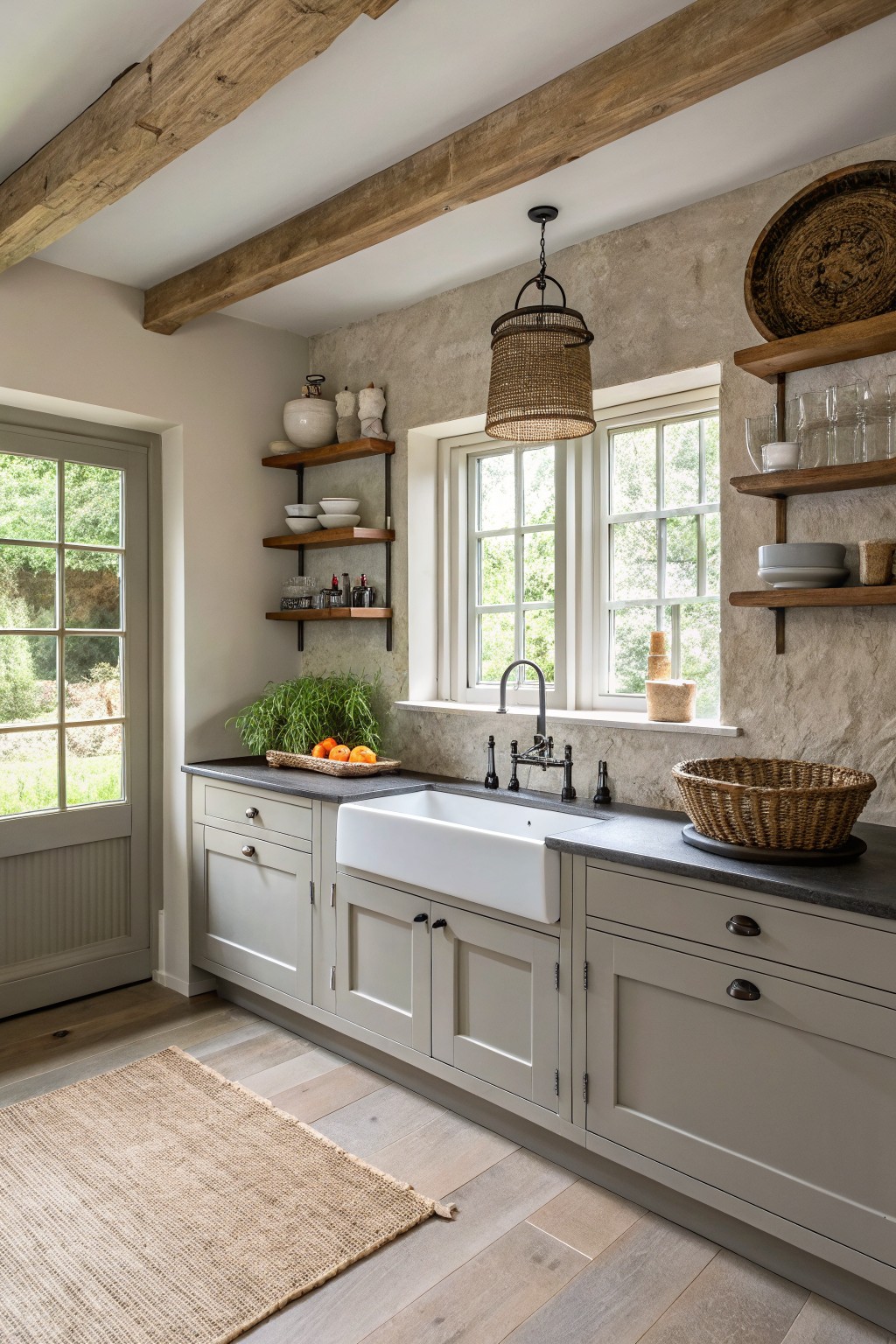
This kitchen uses a soft greige on the cabinets. It sits between gray and beige without leaning too far in either direction, which keeps the space feeling calm and easy to live with.
The color has a slight warm undertone that works nicely with wood floors and dark stone counters. It stays steady in both natural light and evening light, and it looks good with black hardware or brass. Good matches include Sherwin Williams Worldly Gray, Benjamin Moore Revere Pewter, Behr Silver Strand, and Farrow & Ball Elephant’s Breath.
Deep Green Cabinets
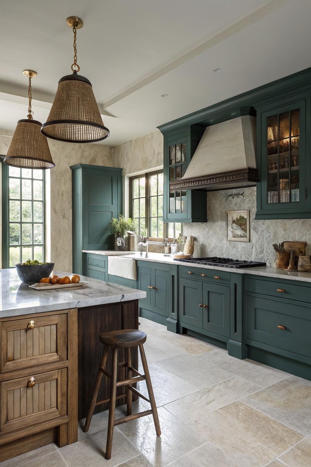
A deep green brings a solid, steady feel to kitchen cabinets that still feels current after many years. This shade sits in the forest green family with a hint of blue that keeps it from looking flat or heavy.
It works especially well against warm wood tones and light stone counters, and it can handle both brass and black hardware without fuss. Just watch how it shifts in low light, since it can read darker than expected in smaller or north-facing kitchens.
Soft Mint Green Cabinets
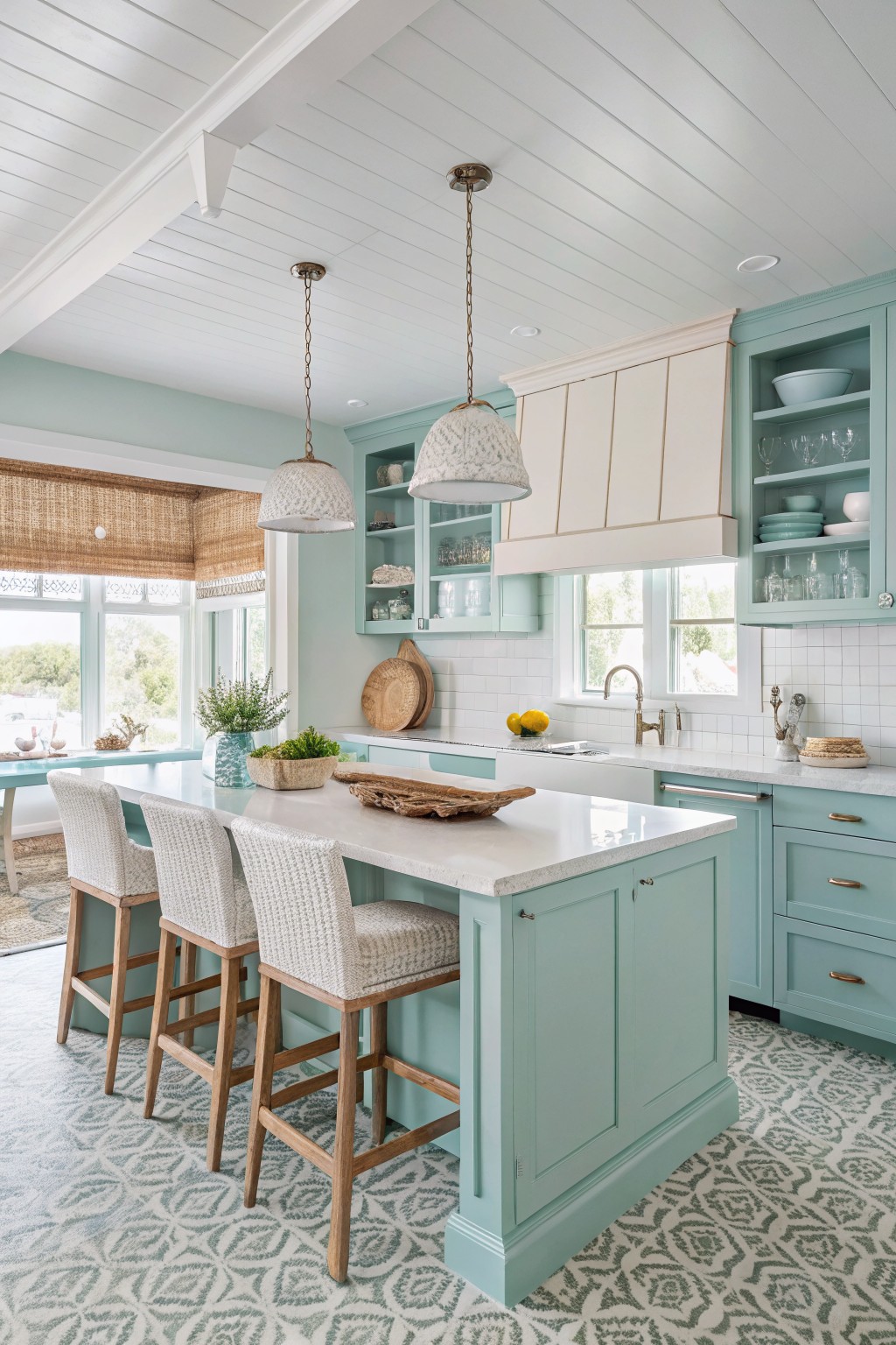
A soft mint green works well on kitchen cabinets because it brings in a gentle color without overpowering the room. This shade sits between blue and green and feels calm next to white counters and wood tones.
The undertone leans cool, so it can look a little bluer in low light. It suits kitchens with plenty of daylight and pairs easily with warm wood or painted trim. Closest matches include Sherwin Williams Sea Salt, Benjamin Moore Palladian Blue, Behr Breezeway, and Farrow & Ball Pale Powder.
Warm Off-White Walls
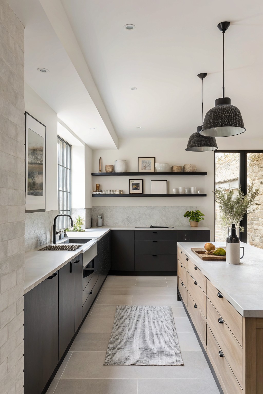
This kitchen shows a warm off-white on the walls. The color sits between white and a very light greige, which makes the space feel bright but still grounded next to the dark cabinets and wood island.
It has a soft creamy undertone that keeps things from looking too cool or stark. The shade works well with black hardware, light stone counters, and natural wood tones, and it holds up nicely in rooms with plenty of daylight.
Warm Off-White Cabinets
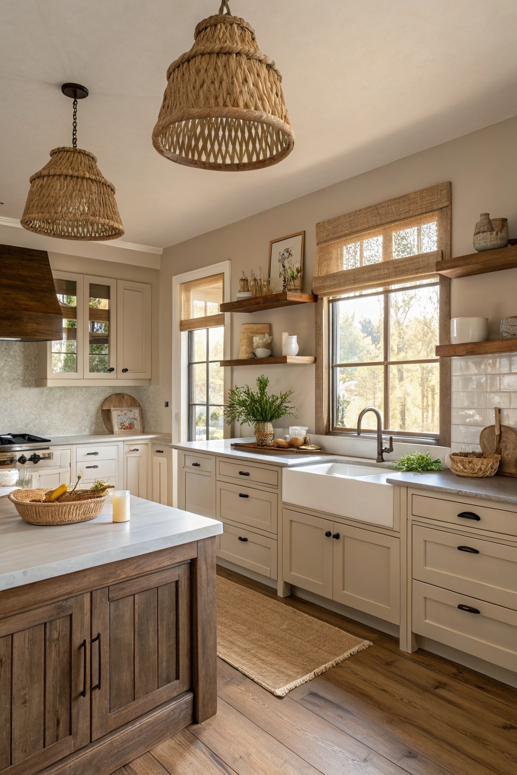
This kitchen uses a soft warm off-white on the cabinets that sits between white and beige. It gives a quiet, timeless look that feels clean but not stark, and it works especially well when you want the space to feel calm and lived in.
The color carries a light beige undertone that helps it blend with wood tones and stone surfaces. It looks good in both bright and softer light, and it pairs easily with dark hardware or natural wood accents without needing much else to feel finished.
Soft Blue Gray Kitchen Cabinets
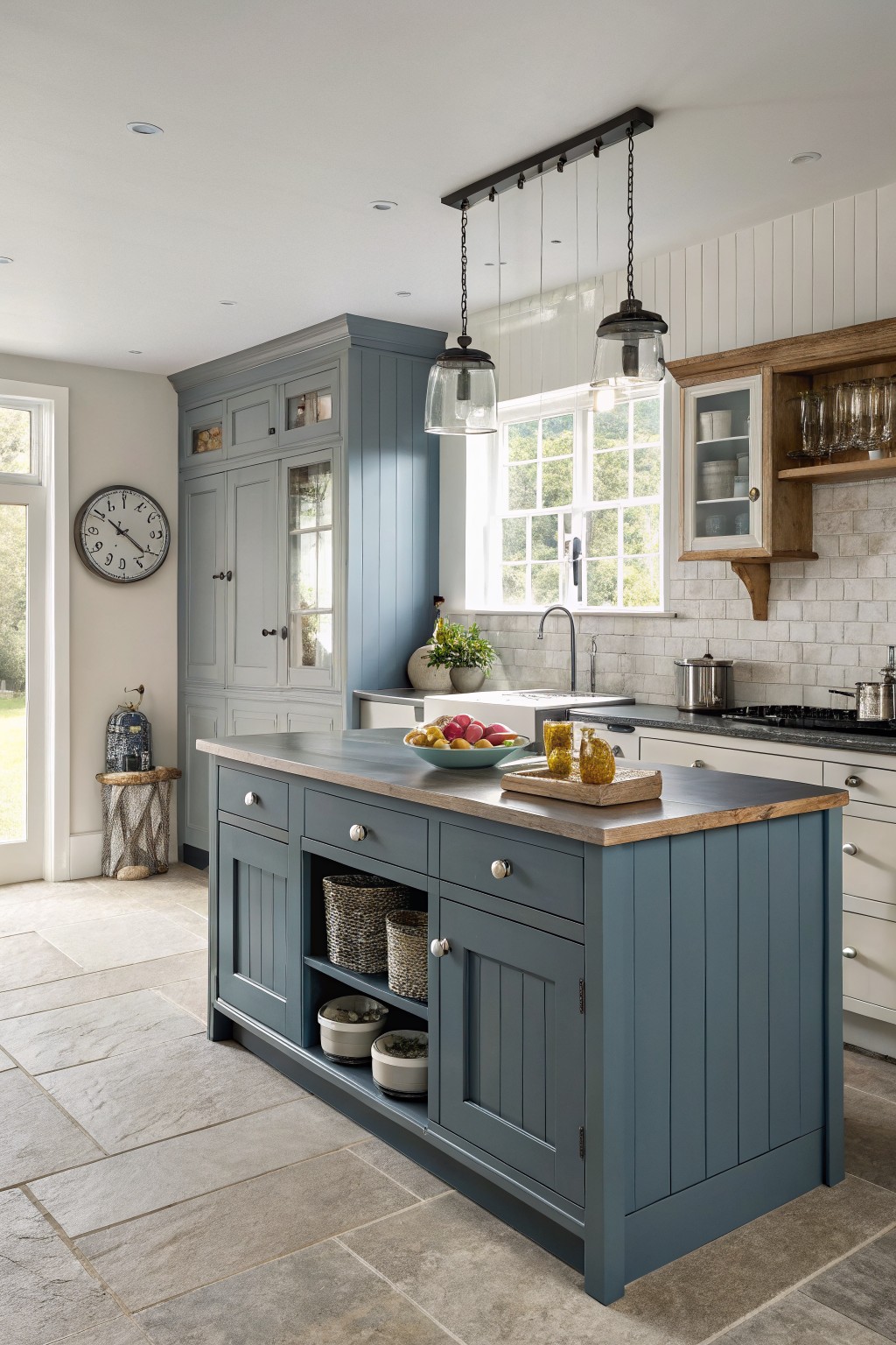
This kitchen uses a soft blue gray on the island and cabinets. It is a cool, muted shade that sits between gray and blue without going too dark or too bright.
It works best with warm wood tones and white walls. The color stays steady in different lights and pairs well with stone or tile backsplashes. Best matches would be Farrow & Ball Pigeon, Sherwin Williams Silver Strand, Benjamin Moore Wythe Blue, or Behr Silver Drop.
Frequently Asked Questions
Q: How do I know which of these colors will hold up once I see it on my own walls?
A: Grab a few sample pots and paint large patches in different spots around the room. Check them at different times of day since kitchen light changes fast. A color that feels right in the store might shift once it meets your cabinets and counters.
Q: What if my cabinets already have a strong wood tone and I want to use one of these timeless shades?
A: Pick a soft neutral from the list to keep the walls from fighting the wood. Warm whites or greiges tend to settle in without adding more contrast. This keeps the whole space feeling balanced instead of busy.
Q: Can these colors make a small kitchen look even tighter?
A: Lighter versions of the timeless neutrals bounce light around and open things up. Skip deep tones on every wall if the room lacks windows. One darker accent wall can still add depth without closing the space in.









