I’ve always believed the front door sets the tone for the whole house, and honestly, it’s one of my favorite places to play with color.
There’s something so satisfying about walking up to a home and seeing a door that feels just right. It can be bold, soft, classic, or a little unexpected.
I’ve put together some of my favorite Benjamin Moore front door colors that I keep coming back to again and again. These are the shades I would actually use on my own home.
If you’re thinking about giving your entry a fresh look, this is where I’d start. A simple paint change can make everything feel a little more put together.
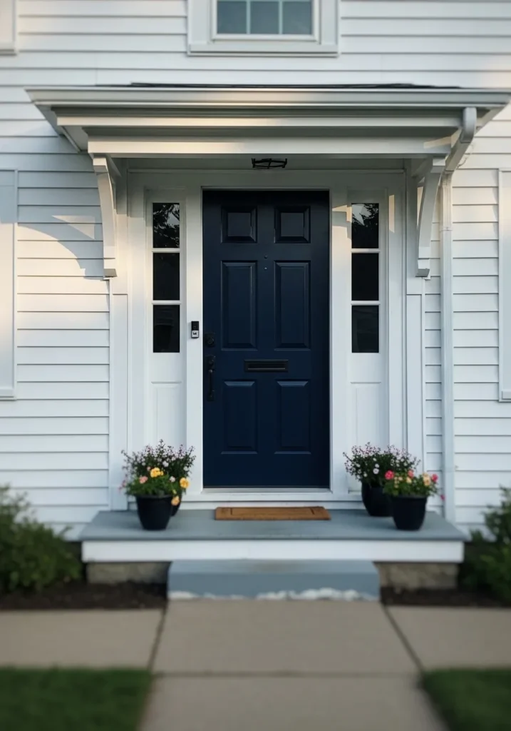
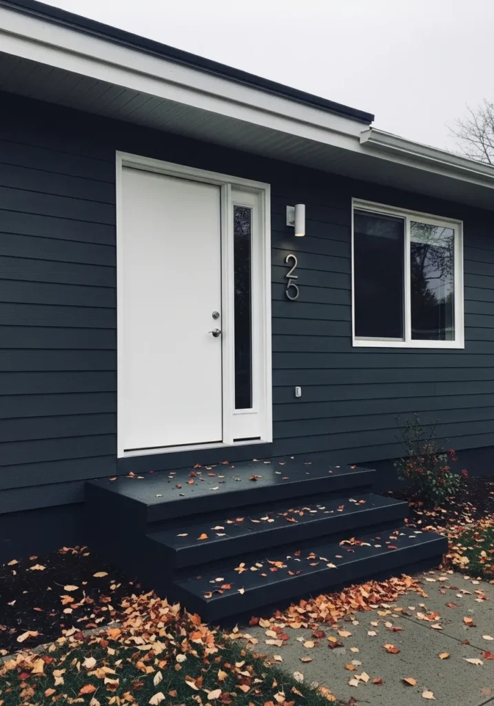
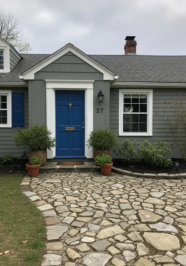
This front door reads as a deep navy blue, and it looks very close to Benjamin Moore Hale Navy. It’s a rich, cool-leaning blue that almost dips into charcoal in certain light. On a simple white exterior like this, it stands out without feeling loud, which is why so many people keep coming back to this shade.
The undertone leans slightly gray, so it doesn’t go overly bright or nautical. That helps it work well with crisp white trim and even black hardware like you see here. It holds its color in different lighting, though in low light it can look nearly black. I like it most for traditional homes or anything with clean lines where you want contrast but not something flashy.
Classic Red Front Door That Still Feels Fresh
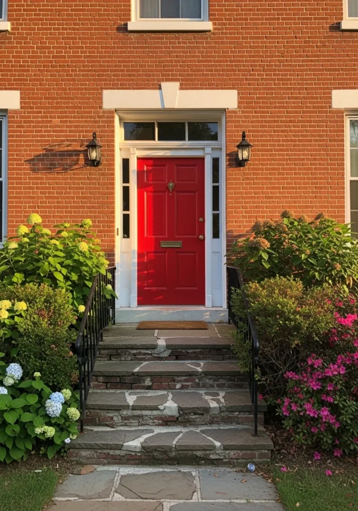
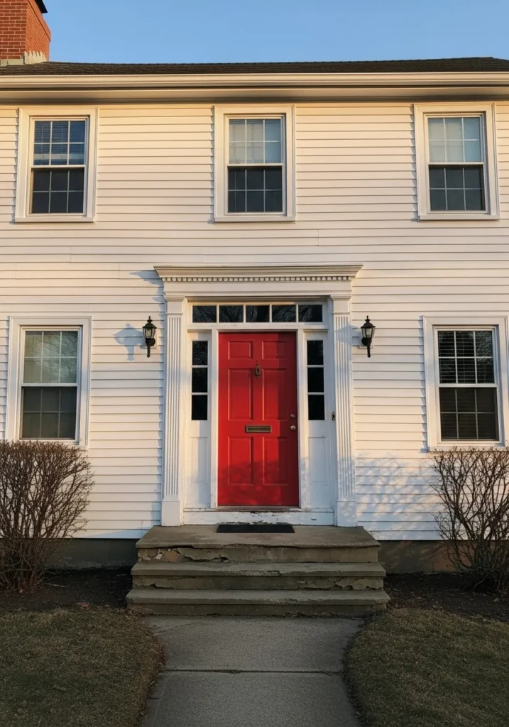
This front door reads as a strong, true red, and it comes very close to Benjamin Moore Caliente. It’s a clean, slightly warm red that feels traditional but not dated. Against a red brick exterior, it still stands out, which is not always easy to do, and that’s part of the appeal.
The warmth in the red leans just enough to keep it from looking too sharp or glossy. With white trim around the door, it feels balanced and easy to live with. This kind of red works well on older homes, especially brick ones, but it can feel a bit bold if the rest of the exterior is already busy.
Soft Yellow Front Door That Feels Cheerful
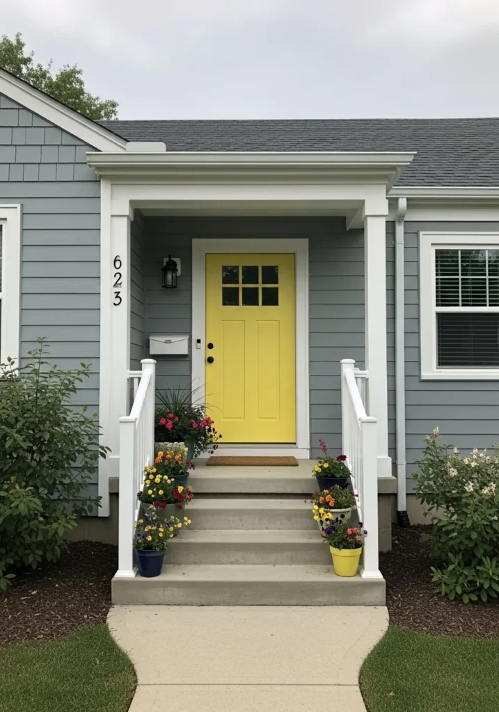
This front door reads as a soft, buttery yellow, and it looks closest to Benjamin Moore Hawthorne Yellow. It’s not a sharp lemon tone. It has a gentle warmth that feels easy and lived-in, which makes it a nice choice if you want color without going too bold.
The yellow leans slightly muted, so it doesn’t feel too bright against the cool gray siding and white trim. That balance helps it stay pleasant instead of overwhelming. I find this kind of yellow works best on smaller entries like this one, where it can stand out without taking over the whole exterior.
Deep Green Front Door With A Traditional Feel
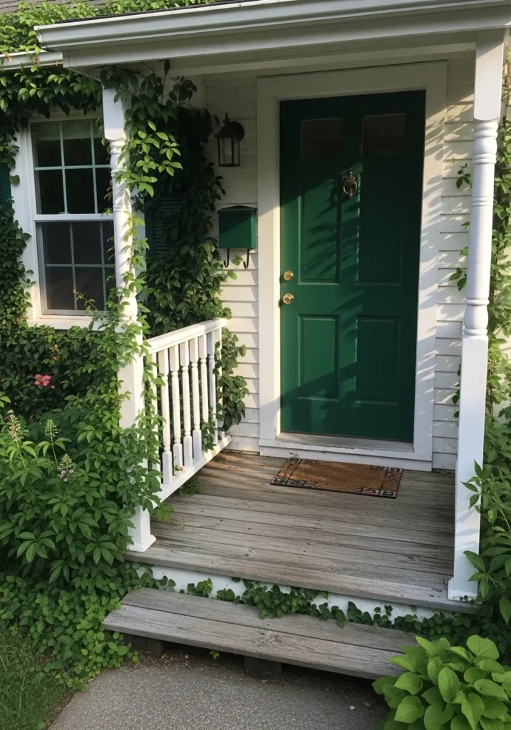
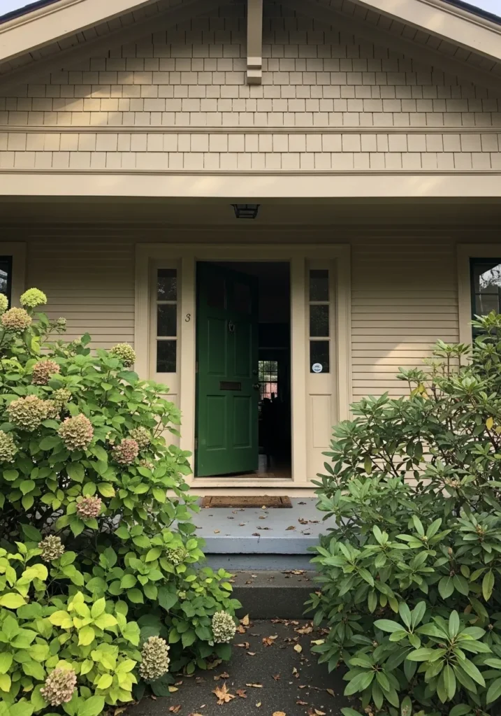
This front door reads as a deep, classic green, and it feels closest to Benjamin Moore Hunter Green. It’s a rich shade that leans slightly warm, which keeps it from looking too dark or cold. Colors like this have been used for years, and they still feel steady and familiar on a front entry.
The green sits nicely against the white siding and all the surrounding greenery, which helps it blend in without disappearing. It can shift a bit depending on light, sometimes reading darker and more serious. I think it works best on homes with a bit of age or character, especially when you have plants or climbing vines nearby.
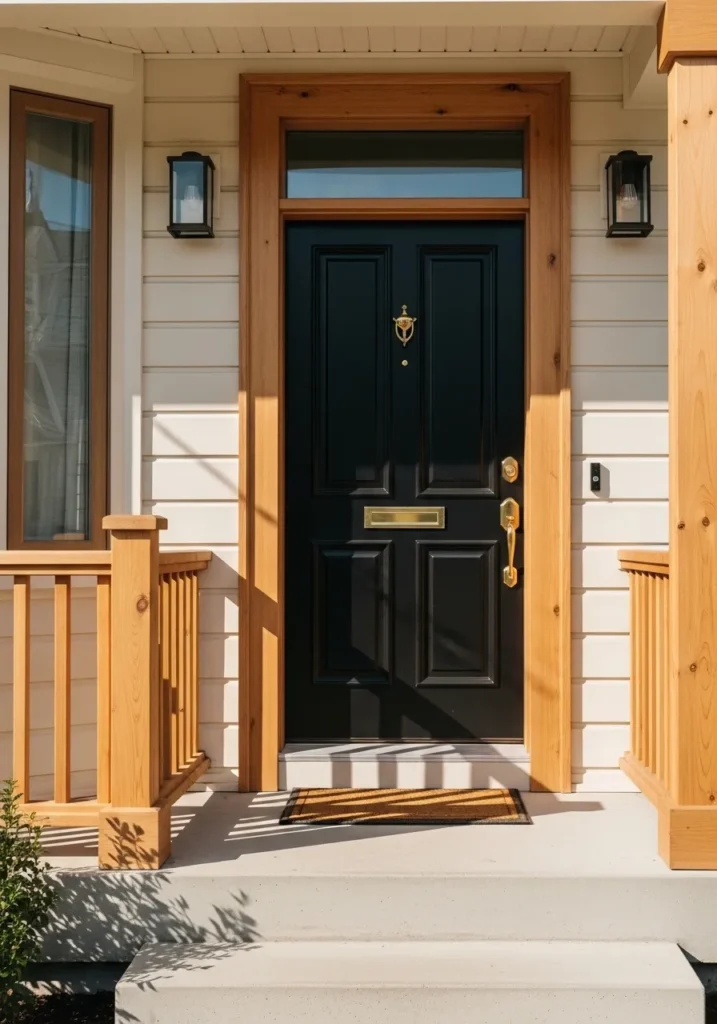
Soft Black Front Door That Feels Clean
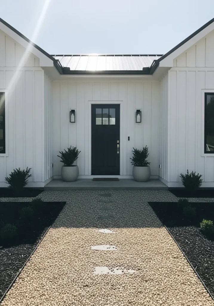
This front door reads as a soft black, and it looks closest to Benjamin Moore Black Beauty. It’s not a harsh, inky black. It has a slightly muted tone that makes it easier to use on a home exterior without feeling too heavy.
Against the white siding, the contrast feels crisp but still comfortable. The color can shift depending on light, sometimes reading more charcoal than true black. I like this kind of shade for modern or simple homes where you want contrast but still want everything to feel calm and pulled together.
Muted Blue Gray Front Door That Feels Easy
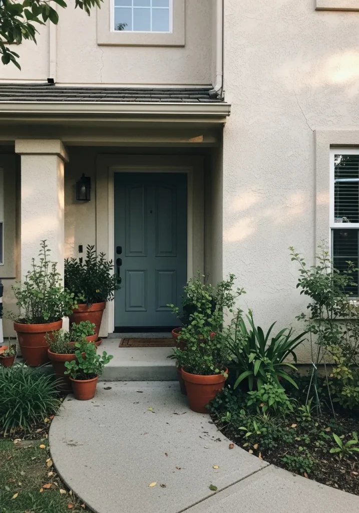
This front door reads as a muted blue gray, and it looks closest to Benjamin Moore Boothbay Gray. It sits right between blue and gray, with a soft, slightly cool tone that feels calm without going dull. It’s the kind of color that blends in at first, then you start to notice how steady and easy it is.
The undertone leans more blue than green, but it stays softened, especially next to the warm stucco and terracotta pots. That mix keeps it from feeling cold. This shade works well if you want something quieter than navy or black but still a bit more interesting than a plain gray.
Dark Green Front Door That Feels Traditional
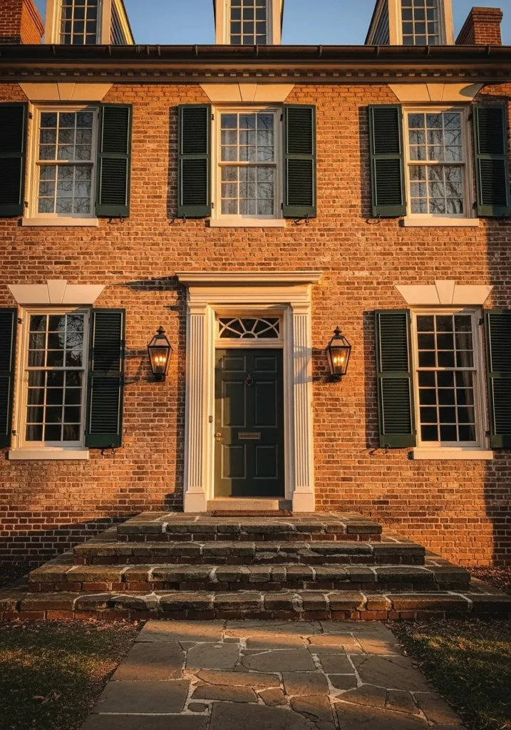
This front door reads as a deep, slightly muted green, and it looks closest to Benjamin Moore Essex Green. It’s a classic shade that sits between green and black, which gives it a steady, grounded look without feeling flat. On a brick exterior like this, it feels right at home.
The color leans cool, but the warmth of the brick and the cream trim keeps it from feeling too heavy. In lower light it can look almost black, which is part of its appeal. I like this kind of green for older homes where you want something traditional that still has a bit of depth to it.
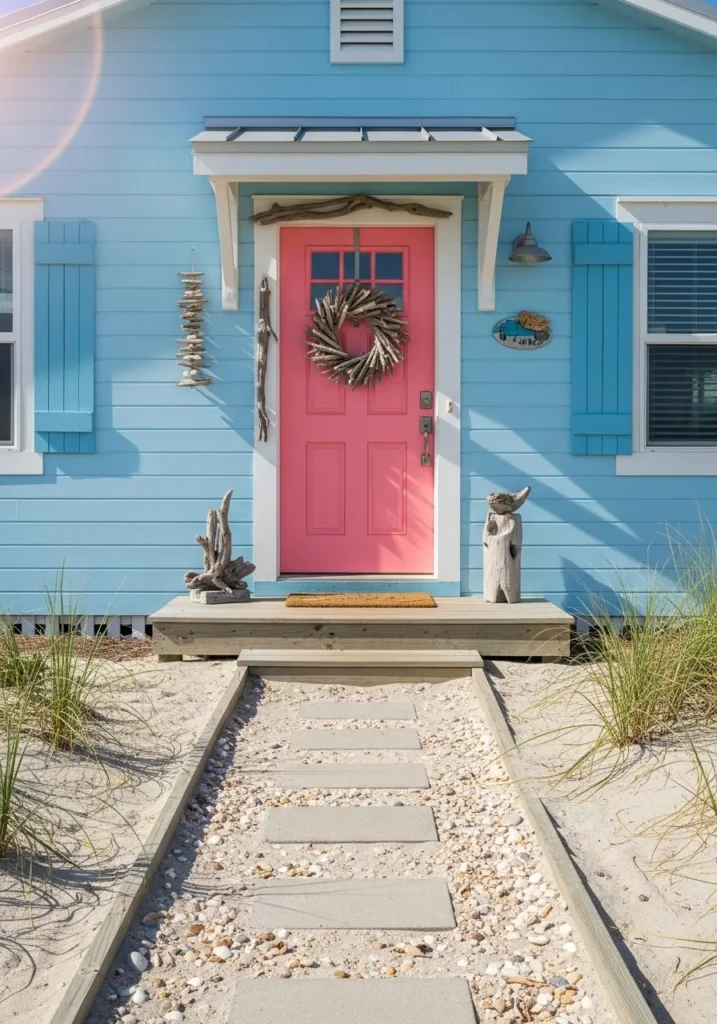
Soft Coral Front Door That Feels Lively
This front door reads as a soft coral, and it looks closest to Benjamin Moore Coral Gables. It sits between pink and orange, with a warm, slightly faded tone that feels cheerful without being too bright. On a simple white house like this, it really stands out in a relaxed way.
The color leans warm, but it has just enough softness to keep it from feeling sharp. Next to white siding, it feels clean and easy to pair with, especially with simple trim and minimal details. I find this kind of coral works best if you want something playful but still easy to live with day to day.
Soft Sage Green Front Door That Feels Relaxed
This front door reads as a soft sage green, and it looks closest to Benjamin Moore Saybrook Sage. It’s a light, muted green with a bit of gray in it, so it feels calm and easy rather than bright or crisp. It has that slightly weathered look that works well on simple exteriors.
The undertone leans a little warm, which helps it sit nicely next to the natural wood trim and the pale blue siding. It doesn’t shift too much, though in brighter light it can look a touch lighter than expected. I like this kind of green for coastal or casual homes where you want color, just not something too sharp.
Bold Red Front Door With A Strong Presence
This front door reads as a deep, bold red, and it looks closest to Benjamin Moore Heritage Red. It’s a richer red than the brighter versions, with a slightly darker base that keeps it from feeling too sharp. That depth makes it work well on homes with stone or wood like this.
The undertone leans warm, which helps it sit naturally next to the wood columns and stone base. In lower light it can look a bit deeper and more subdued. I tend to like this kind of red when you want color that feels solid and established, not overly bright or playful.
Soft Gray Green Front Door That Blends In
This front door reads as a soft gray green, and it feels closest to Benjamin Moore Saybrook Sage, just a touch deeper and more muted. It’s one of those in-between shades that doesn’t jump out right away, but it gives the whole entry a calm, settled look.
The green undertone is very gentle, almost leaning toward gray, which helps it sit easily against the beige siding and simple trim. It can shift a bit depending on light, sometimes reading more gray than green. I tend to like this kind of color when you want something quiet that still has a bit more character than a plain neutral.
Deep Green Front Door That Feels Modern
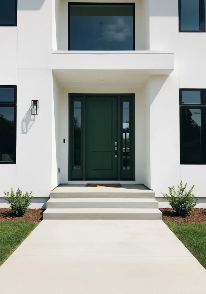
This front door reads as a deep, saturated green, and it looks closest to Benjamin Moore Salamander. It’s a dark green that almost leans black at first glance, but once you look closer, the green comes through clearly. That gives it a bit more interest than a standard dark neutral.
The undertone leans cool, which works well against the clean white exterior and black window trim. In brighter light, you can see more of the green, but it still stays quite deep. I tend to like this kind of shade on modern homes where you want contrast, but something softer than a flat black.
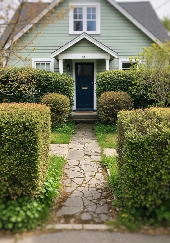
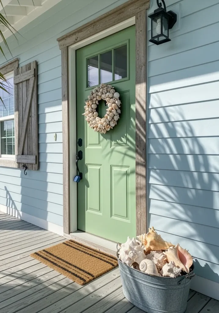
This front door reads as a deep navy blue, and it looks closest to Benjamin Moore Hale Navy. It’s a strong, classic blue that leans slightly muted, which keeps it from feeling too bright or overly crisp. That makes it easy to use on homes that already have some color, like the soft green siding here.
The undertone has a bit of gray in it, so it stays steady in different lighting and doesn’t shift too much. Next to the greenery and white trim, it feels balanced and familiar. I tend to like this shade when you want contrast, but nothing that feels too sharp or modern.
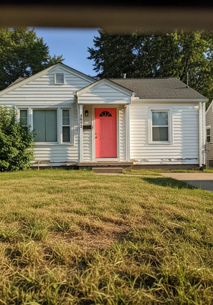
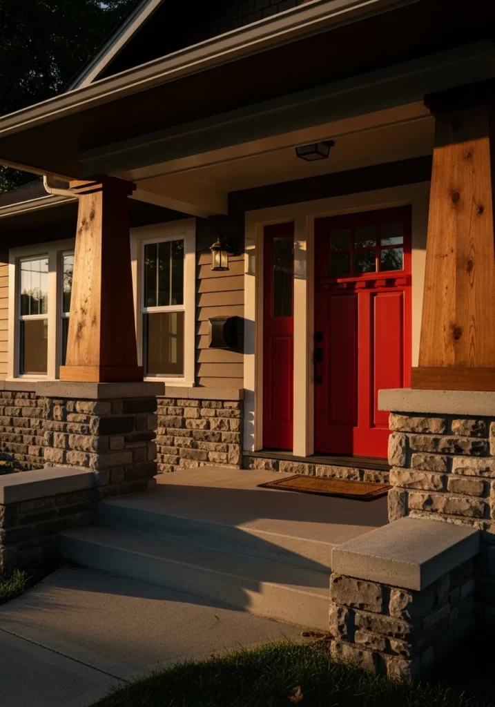
Bright Red Front Door That Feels Classic
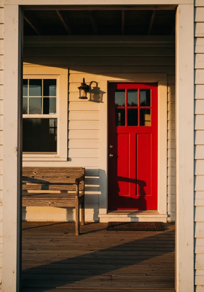
This front door reads as a bright, clean red, and it looks closest to Benjamin Moore Caliente. It’s a clear, warm red that feels lively but still familiar, which is why it shows up so often on simple homes like this. It stands out right away against the light siding, but it doesn’t feel out of place.
The undertone leans warm and slightly orange, which helps it work with natural wood like the bench and porch floor. In strong light it can look a bit brighter, while in shade it deepens slightly. I think this kind of red works best when the rest of the exterior is fairly simple, so the color has room to stand on its own.
Warm Yellow Front Door That Feels Modern
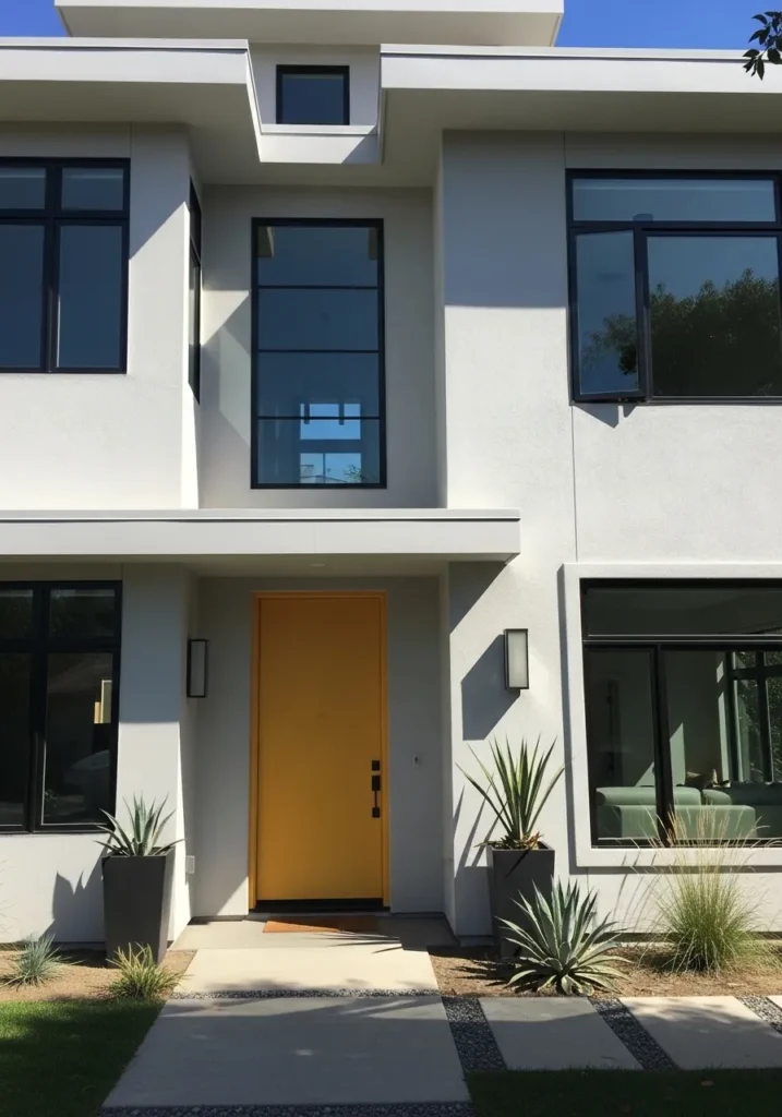
This front door reads as a warm, golden yellow, and it looks closest to Benjamin Moore Golden Honey. It’s deeper than a soft pastel yellow, with a bit of richness that keeps it from feeling too bright or playful. On a clean white exterior like this, it stands out in a simple, straightforward way.
The undertone leans warm and slightly earthy, which helps it sit well next to the neutral walls and black window frames. In strong light it can look a bit more golden, while in shade it softens slightly. I like this kind of yellow for modern homes where you want color, but still something that feels a bit grounded.
Soft Dusty Pink Front Door That Feels Gentle
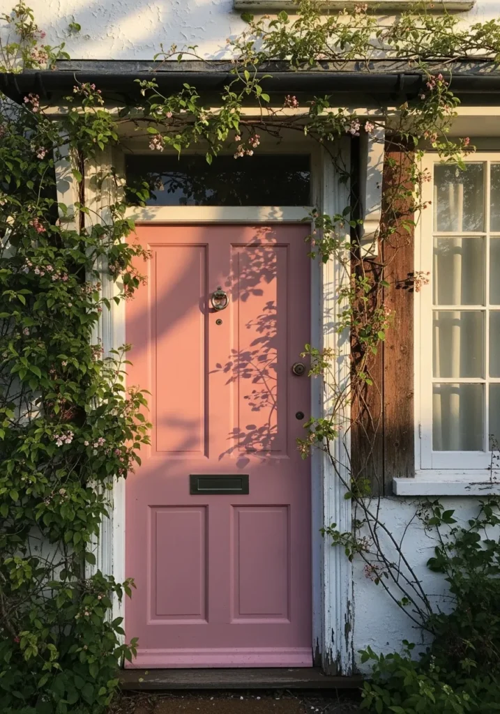
This front door reads as a soft dusty pink, and it looks closest to Benjamin Moore Pink Damask. It’s not a bright or sugary pink. It has a muted, slightly earthy tone that makes it feel more relaxed and easier to live with, especially on older homes.
The undertone leans warm with a hint of beige, which helps it sit naturally against the worn wood trim and climbing greenery. In softer light it can look a bit more subdued, almost like a faded rose. I tend to like this kind of pink when you want something different, but still calm and not too playful.
Crisp White Front Door That Feels Clean
This front door reads as a crisp white, and it looks closest to Benjamin Moore Chantilly Lace. It’s a bright, clean white without much warmth, which gives it a sharp and simple look. On a darker exterior like this deep blue siding, it stands out in a very clear, uncluttered way.
The undertone leans cool, so it can feel a bit stark if paired with warmer colors, but it works well with black trim and modern finishes. In softer light it may read slightly softer, but it still stays quite bright. I like this kind of white when you want a fresh, minimal look that feels straightforward and easy.
Soft Teal Front Door That Feels Welcoming
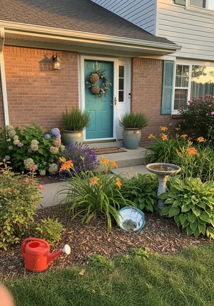
This front door reads as a soft teal, and it looks closest to Benjamin Moore Aegean Teal. It sits between blue and green, with a slightly muted quality that keeps it from feeling too bright. That balance makes it easy to use, especially on brick homes like this where you already have a lot of warmth.
The undertone leans a bit green, which helps it connect nicely with the plants and pots near the entry. In brighter light it can look a touch lighter and more blue, while in shade it deepens slightly. I tend to like this kind of teal when you want color that feels relaxed but still noticeable.
Soft Black Front Door With A Classic Look
This front door reads as a soft black, and it looks closest to Benjamin Moore Black Beauty. It’s not a flat or overly dark black. There’s a slight softness to it that makes it easier to use on a front entry without feeling too heavy.
The undertone leans just a bit warm, which works nicely with the natural wood trim and brass hardware around the door. In brighter light, it can read more charcoal than true black. I tend to like this kind of black when you want contrast that still feels comfortable and not too stark.
Soft Coral Pink Front Door
This front door reads as a soft coral pink, and it looks closest to Benjamin Moore Coral Gables. It sits between pink and orange, with a warm, sun-faded feel that makes it easy to live with. It’s colorful, yes, but not sharp or overly bright. On a simple entry like this, it feels relaxed and a little playful without trying too hard.
The undertone leans warm, which works nicely with natural wood and sandy tones around the entry. Next to the light blue siding, it looks even softer and slightly more pink. I find this kind of color works best when the rest of the house stays simple, so the door can carry the color without feeling busy.
Classic Red Front Door That Stands Out
This front door reads as a true, classic red, and it looks closest to Benjamin Moore Caliente. It’s a clean red with a bit of warmth, not too dark and not too bright, which makes it easy to use on traditional homes like this one with white siding and simple trim.
The undertone leans slightly warm, so it pairs well with neutral exteriors and even older materials like worn steps or aged wood. In different light, it can shift a little deeper but still holds that clear red look. I tend to like this kind of red when you want something familiar that still feels strong and noticeable.
Classic Blue Front Door That Feels Steady
This front door reads as a medium to deep blue, and it looks closest to Benjamin Moore Newburyport Blue. It’s a traditional blue with a slightly muted quality, not too bright and not too dark, which makes it easy to use on homes with neutral siding like this soft gray.
The undertone leans a bit cool with a hint of gray, so it stays balanced and doesn’t feel overly bold. Next to the stone walkway and simple trim, it feels settled and familiar. I like this kind of blue when you want color that stands out a bit but still feels grounded and easy to live with.
Deep Green Front Door That Feels Natural
This front door reads as a deep, earthy green, and it looks closest to Benjamin Moore Hunter Green. It’s a classic shade that sits right in that traditional green range, not too dark but still grounded. It feels familiar, the kind of color you see on older homes that still looks right today.
The undertone leans warm, which helps it blend in with all the surrounding greenery and soft beige siding. In lower light it can look a bit deeper, almost like a forest green. I tend to like this kind of green when there are plants close to the entry, since it ties everything together in a quiet way.