I have always loved how a simple wall color change can completely shift the feel of a room, and honestly, it is one of the easiest ways to make a space feel new again.
Sometimes all it takes is pairing two unexpected colors together to get that bold, slightly dramatic look without changing everything else.
I put this list together because I kept saving these kinds of combinations on my phone, and I figured I might as well share the ones that keep catching my eye.
If you are into spaces that feel a little more expressive but still livable, these color ideas are such a fun place to start.
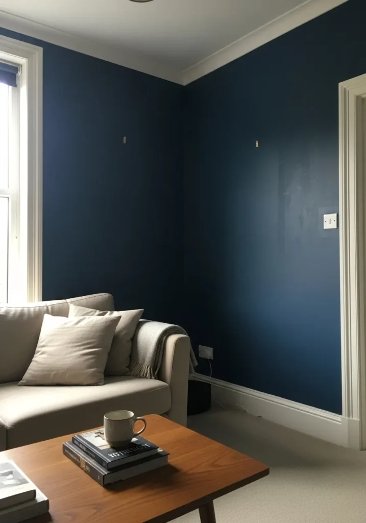
This reads as a deep navy blue, the kind that leans slightly cool without going flat. It looks very close to shades like Sherwin Williams Naval, Benjamin Moore Hale Navy, or Behr Midnight Blue. It has that inky depth that makes a simple room feel more settled, especially next to white trim and a light sofa.
Navy like this can shift depending on light. In brighter spaces it shows a cleaner blue, but in lower light it leans almost charcoal. It works well in living rooms or bedrooms where you want a bit of contrast without going full black. I tend to keep the rest of the room lighter, like soft beige or warm wood, just to keep it from feeling too enclosed.
Dusty Pink And Deep Blue Walls
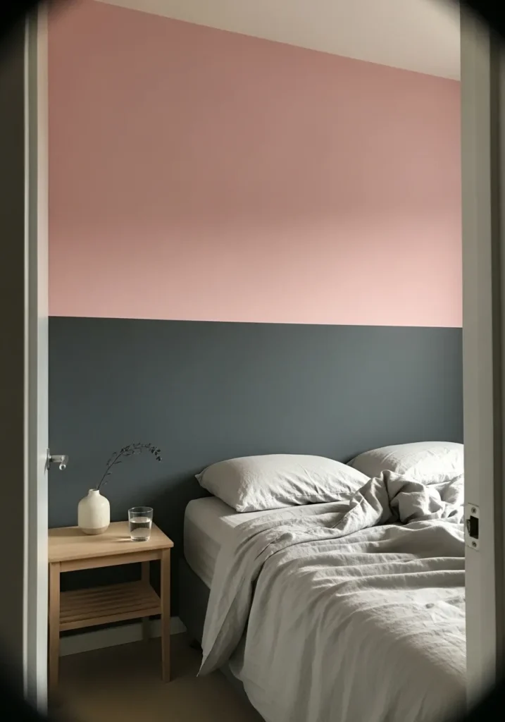
This leans into a soft dusty pink paired with a deep muted blue, a mix that feels calm but still a bit unexpected. The pink reads like a warm blush tone, close to shades such as Farrow & Ball Setting Plaster, Benjamin Moore First Light, or Behr Pink Quartz. The lower blue section feels like a toned-down navy or slate, something in the range of Sherwin Williams Smoky Blue or Benjamin Moore Van Deusen Blue.
The pink has a slightly earthy undertone, so it does not feel too sweet, especially next to that darker blue. It works nicely in a bedroom where you want a bit of contrast without going harsh. Keeping bedding and furniture simple, like light neutrals or pale wood, helps the colors settle in without feeling busy.
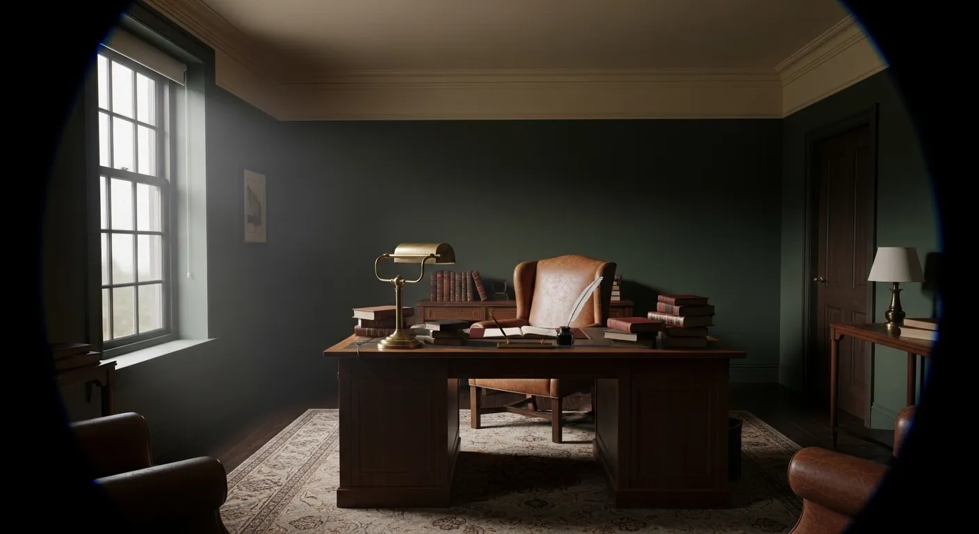
Deep Green Walls In A Dining Space
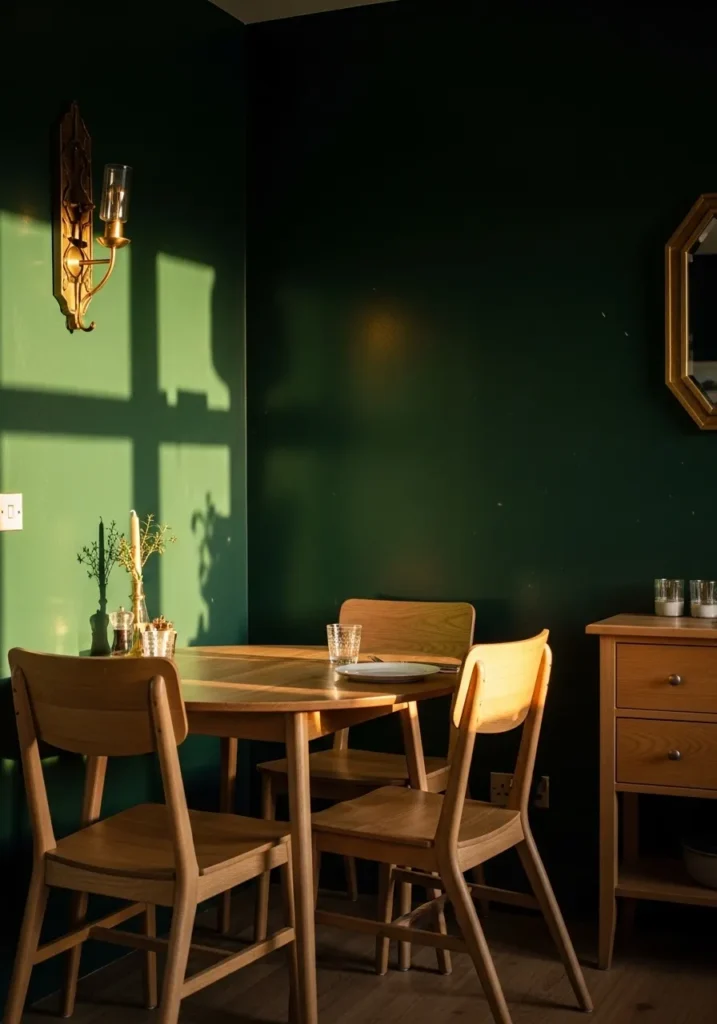
This looks like a deep green, the kind that sits between forest and emerald. It feels close to shades like Benjamin Moore Hunter Green, Sherwin Williams Pewter Green, or Farrow & Ball Studio Green. It has that rich, slightly moody tone that works well when you want a room to feel a bit more enclosed and settled.
The undertone leans warm, especially next to light wood furniture, which keeps it from feeling too cold. In a dining area like this, it pairs easily with simple wood tones and a bit of brass or warm metal. It can look quite dark in low light, so I would keep some lighter elements around it, even just a pale tabletop or soft neutral fabrics, to keep things from getting too heavy.
Classic Black And Cream Walls
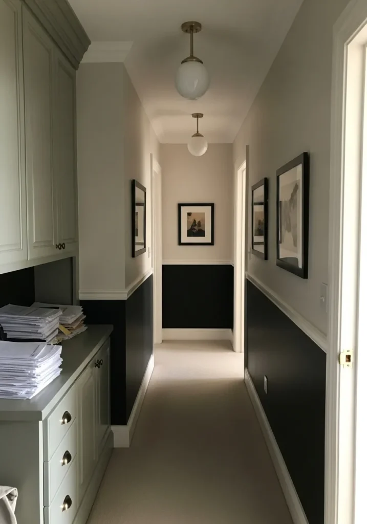
This is a black and cream combination, with a soft warm cream on the upper walls and a deep near-black below. The darker shade reads close to colors like Benjamin Moore Black HC-190 or Sherwin Williams Tricorn Black, while the upper portion feels similar to Benjamin Moore Swiss Coffee or Sherwin Williams Alabaster. It is a simple pairing, but it always works.
The cream keeps things light through the hallway, while the black adds weight at the lower half, especially with white trim separating the two. It helps hide wear in high traffic areas too, which is practical. I tend to like this in narrow spaces where you want a bit of structure without making everything feel closed in.
Warm Terracotta With Soft White
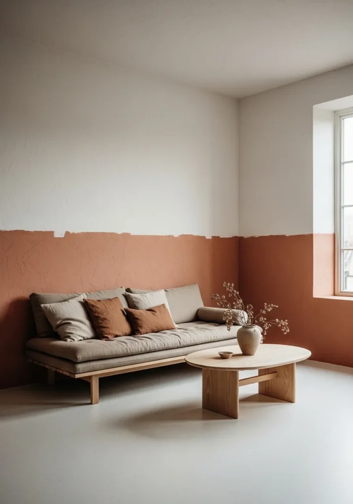
This is a warm terracotta paired with a soft off white, and it leans more earthy than orange. The lower wall color looks close to shades like Sherwin Williams Cavern Clay, Benjamin Moore Terra Cotta Tile, or Behr Canyon Dusk. It has that sunbaked tone that feels relaxed and a little rustic, especially against simple plaster walls and light upholstery.
The undertone is warm and slightly muted, which helps it sit comfortably with pale wood and neutral fabrics. It works well in living rooms where you want color without going too bright. I would keep the upper white slightly creamy rather than stark, so the transition feels natural and not too sharp.
Muted Sage And Dusty Rose Walls
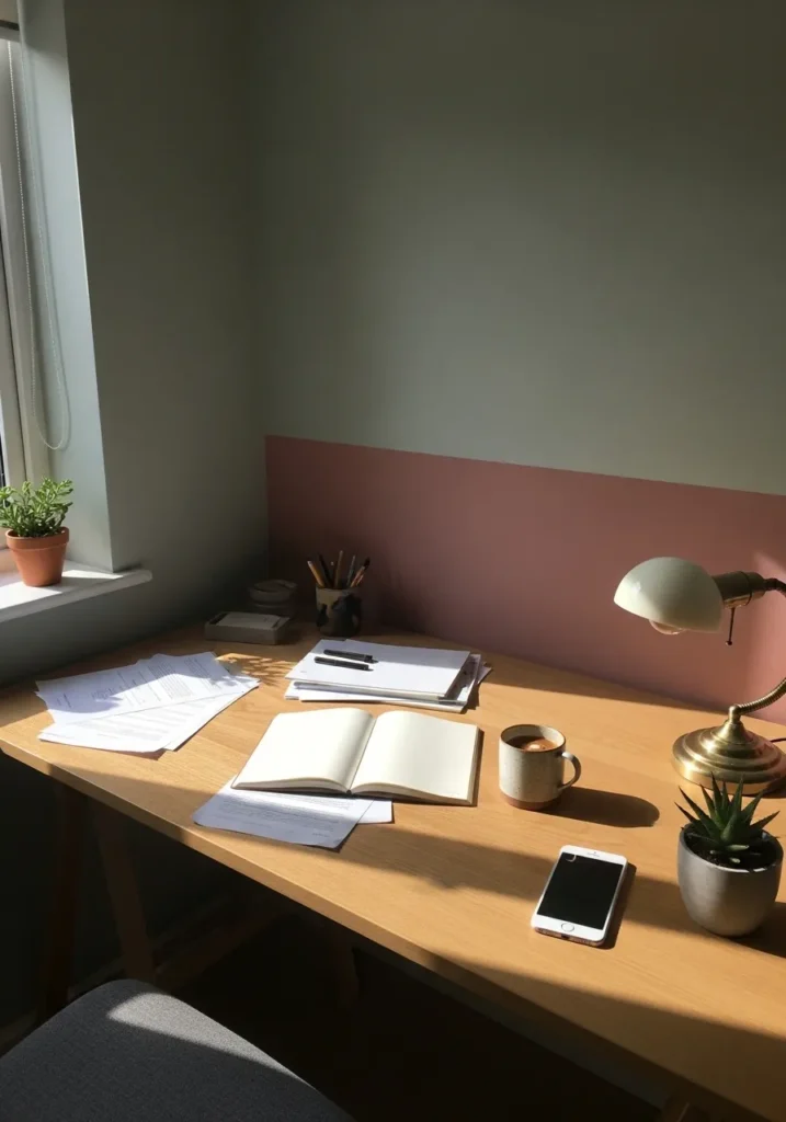
This looks like a muted sage green on the upper wall with a dusty rose along the lower half. The green sits in that soft gray-green range, close to colors like Benjamin Moore Saybrook Sage or Sherwin Williams Clary Sage. The lower section leans into a warm, slightly faded pink, something along the lines of Farrow & Ball Sulking Room Pink or Behr Rose Ash.
The sage has a quiet, slightly cool undertone, which keeps the space feeling calm, while the pink adds just enough warmth to balance it out. It works nicely in a small workspace, especially with light wood surfaces. I would keep the rest of the palette simple, otherwise the mix can start to feel a bit busy.
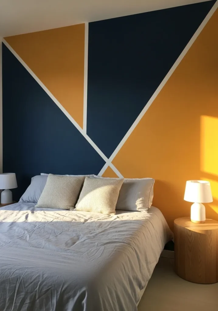
This is a mix of deep navy and warm mustard, set off with crisp white lines. The navy reads close to shades like Benjamin Moore Hale Navy or Sherwin Williams Naval, while the mustard leans toward something like Behr Turmeric or Sherwin Williams Butternut. It is a bold combination, but the colors themselves are quite familiar, which helps it feel usable.
The navy has a cool depth, while the mustard brings in warmth, so the balance comes naturally. In a bedroom like this, it works best when the rest of the space stays simple, like light bedding and pale wood. Too many extra colors can start to compete with it. I would keep everything else quiet and let the wall carry it.
Deep Forest Green With Warm Leather
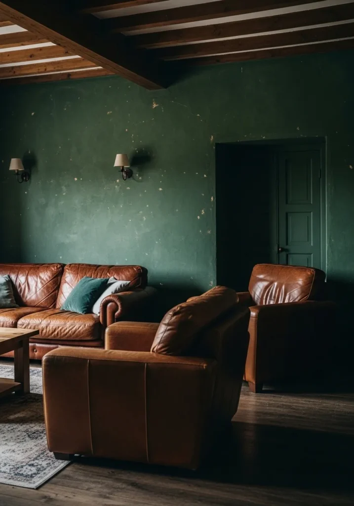
This is a deep forest green, the kind that sits right between green and black depending on the light. It feels close to shades like Farrow & Ball Studio Green, Benjamin Moore Hunter Green, or Sherwin Williams Rookwood Dark Green. It has a slightly aged look to it, especially against brown leather seating, which gives it a more relaxed and lived-in feel.
The undertone leans warm, so it pairs easily with wood beams and warm-toned furniture without feeling cold. It can read quite dark, especially in corners, so I would use it in rooms where you are fine with a bit of mood. A few lighter pieces nearby help, even just a pale rug or lighter wood, to keep it from feeling too closed in.
Soft Lavender And Cool Gray Walls
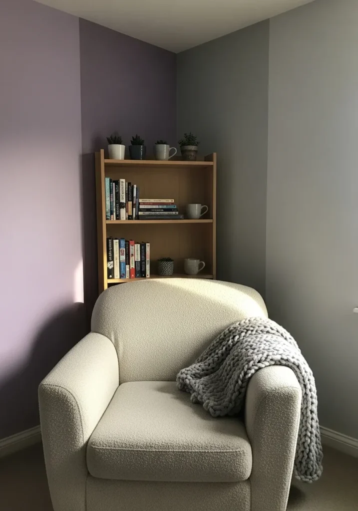
This is a soft lavender paired with a cool light gray, a combination that feels quiet but still a bit different from the usual neutrals. The lavender leans slightly muted, close to shades like Benjamin Moore Hint of Violet or Sherwin Williams Veiled Violet. The gray reads as a gentle, slightly cool tone, something in the range of Benjamin Moore Classic Gray or Sherwin Williams Passive.
The lavender has a subtle gray undertone, which keeps it from feeling too sweet, especially next to that cleaner gray wall. It works well in a reading corner or bedroom where you want something calm but not plain. I would keep fabrics and furniture simple, like soft creams or light wood, so the color pairing stays easy to live with.
Dusty Pink With Deep Teal Cabinets
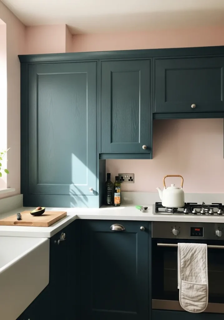
This looks like a soft dusty pink on the walls paired with a deep teal on the cabinetry. The pink sits in that muted blush family, close to shades like Benjamin Moore First Light or Farrow & Ball Setting Plaster. The cabinets lean toward a rich teal, something like Sherwin Williams Riverway or Benjamin Moore Aegean Teal.
The pink has a gentle warmth, which keeps the space from feeling too cool next to that darker teal. It works especially well in kitchens where you want color but not something loud. I would keep counters and surfaces light, like the pale worktop here, so the contrast stays clear and the room does not feel too heavy.
Black And Soft White Walls
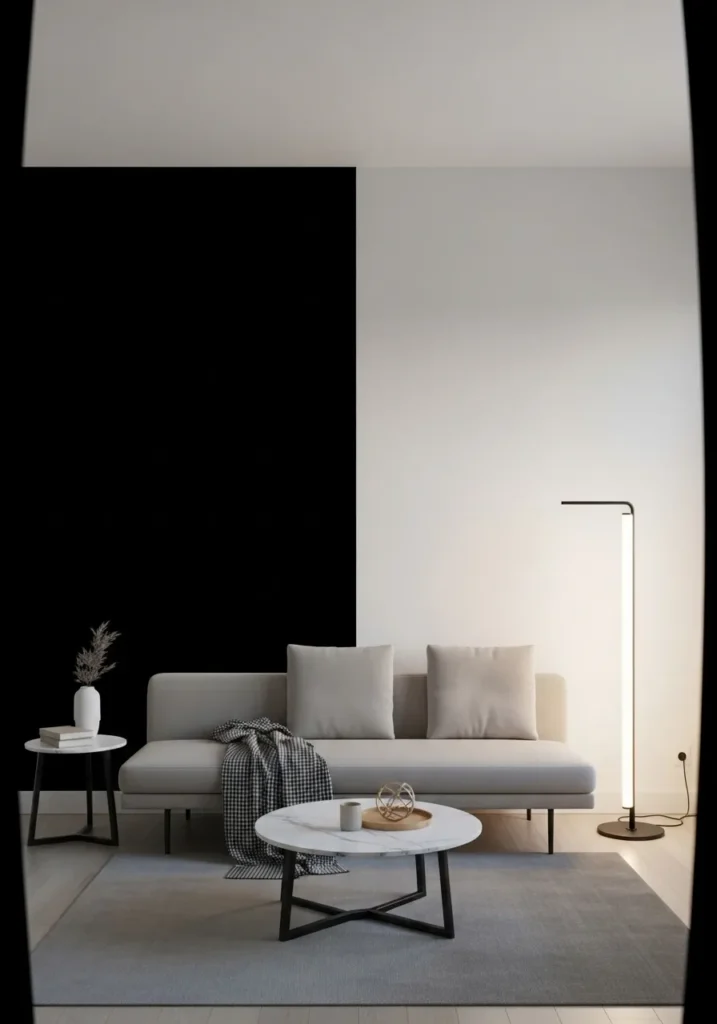
This is a black and soft white combination, and it leans more classic than stark. The black looks close to shades like Benjamin Moore Black HC-190 or Sherwin Williams Tricorn Black, while the white reads more like a gentle off white such as Benjamin Moore Simply White or Sherwin Williams Alabaster. It is a simple pairing, but it always feels clean and easy to understand.
The black has a deep, neutral base, which works well next to light furniture like the sofa here. The white keeps the room from feeling too closed in, especially when used across larger wall areas. I would keep the rest of the palette quiet, just a few soft grays or warm woods, so the contrast stays calm and not too sharp.
Soft Blue Walls With Warm Neutrals
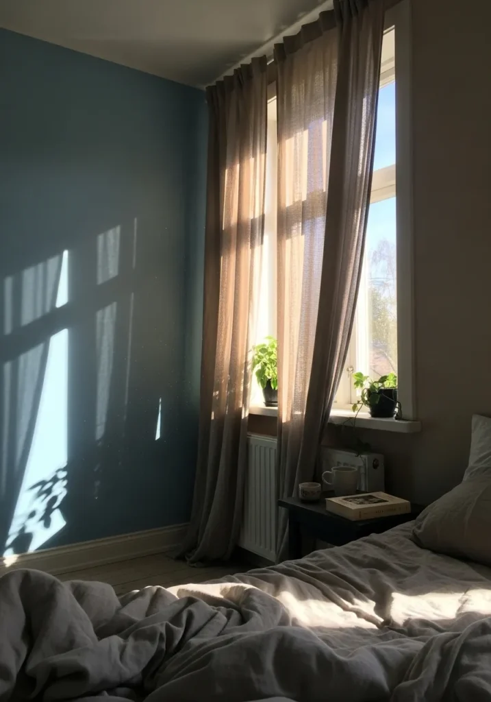
This reads as a soft muted blue, the kind that leans slightly gray rather than bright. It feels close to shades like Benjamin Moore Smoke, Sherwin Williams Misty, or Behr Light French Gray with a blue undertone. It has that quiet, washed look that works well in bedrooms, especially next to simple bedding and soft fabrics.
The undertone is cool, but not sharp, so it pairs easily with warmer elements like beige curtains or natural wood. It can shift a bit depending on light, sometimes looking more gray than blue. I would keep the rest of the palette relaxed and neutral so the wall color stays gentle and does not feel too cold.
Bold Orange And Deep Blue Walls
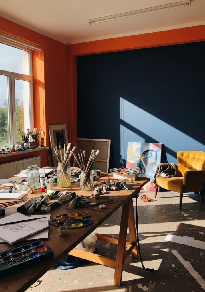
This is a strong orange paired with a deep navy blue, a combination that leans warm and cool at the same time. The orange looks close to shades like Sherwin Williams Cavern Clay or Behr Spiced Pumpkin, while the blue sits near Benjamin Moore Hale Navy or Sherwin Williams Naval. It is a high-contrast pairing, but both colors feel grounded rather than bright.
The orange has a warm, slightly earthy base, which keeps it from feeling too sharp next to the darker blue wall behind it. This kind of mix works well in creative spaces, where you do not mind a bit of energy in the room. I would keep furniture fairly simple so the color pairing stays the main focus.
Warm Rust With Soft Beige
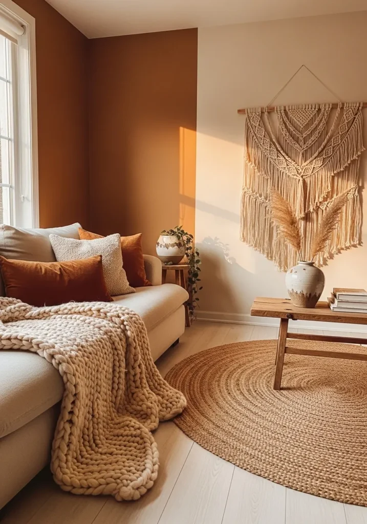
This is a warm rust tone paired with a soft beige, a combination that leans very earthy and relaxed. The rust wall looks close to shades like Sherwin Williams Cavern Clay or Benjamin Moore Potters Clay, while the beige reads similar to Benjamin Moore Muslin or Sherwin Williams Accessible Beige. It has that sun-warmed look that feels easy to live with.
The rust has a strong warm undertone, which works nicely next to natural textures like woven rugs and chunky knit throws. The beige keeps things from feeling too heavy and gives your eye a place to rest. I would keep the rest of the room in soft, natural materials so the colors stay calm and not overly styled.
Deep Plum And Soft Gray Walls
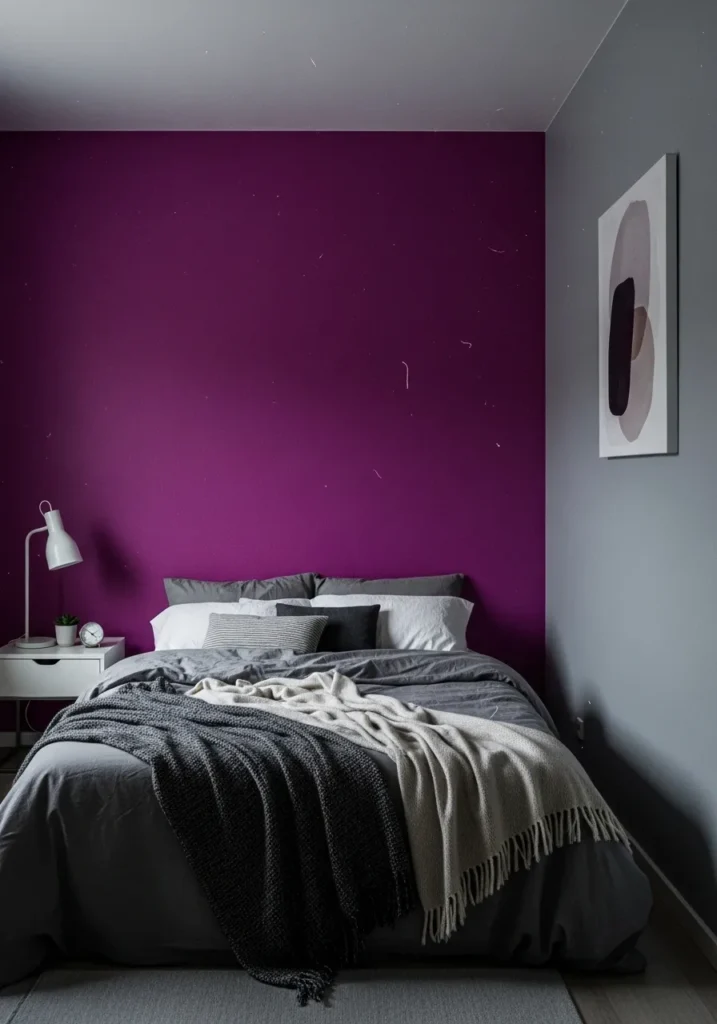
This looks like a deep plum or berry tone on the main wall, paired with a soft cool gray on the side. The plum reads close to shades like Benjamin Moore Shadow or Sherwin Williams Mature Grape, while the gray feels similar to Sherwin Williams Passive or Benjamin Moore Gray Owl. It is a richer color choice, but still feels usable in a bedroom setting.
The plum has a slightly cool undertone, which works well next to that clean gray and simple bedding. It can look darker in low light, almost like a muted wine color, so I would keep nearby textiles light to balance it out. A mix like this suits bedrooms where you want a bit of color without going too bright.
Pale Blue And Soft Gray Walls
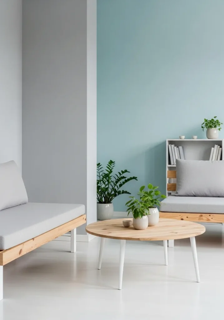
This is a pale blue paired with a soft light gray, a combination that feels easy and quiet. The blue sits in that airy, slightly cool range, close to shades like Benjamin Moore Palladian Blue or Sherwin Williams Rainwashed. The gray reads as a gentle neutral, something like Sherwin Williams Passive or Benjamin Moore Gray Owl.
The blue has a subtle green undertone, which keeps it from feeling too cold next to the gray. It works well in simple spaces with light wood and clean lines, like the low furniture here. I would keep everything else fairly minimal, otherwise the softness of the colors can get lost.
Deep Red Walls With Black Trim
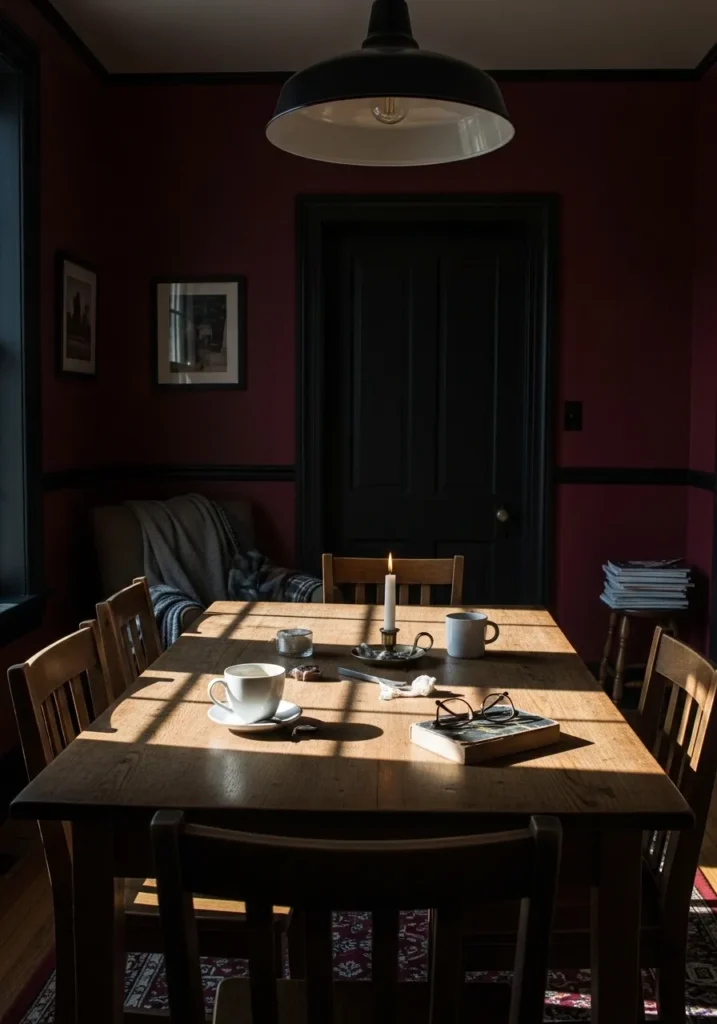
This is a deep red, almost a wine or oxblood tone, paired with black trim and detailing. The red looks close to shades like Benjamin Moore Caliente, Sherwin Williams Burgundy, or Farrow & Ball Preference Red. It is a strong color, but it leans slightly muted, which keeps it from feeling too bright.
The undertone sits on the warmer side, and it works well with darker elements like the black door and trim. That contrast gives the room some structure without needing much else. I would use this in a dining room or a smaller space where a darker color feels intentional. Lighter wood or simple textiles help keep it from feeling too enclosed.
Soft Mint And Pale Yellow Walls
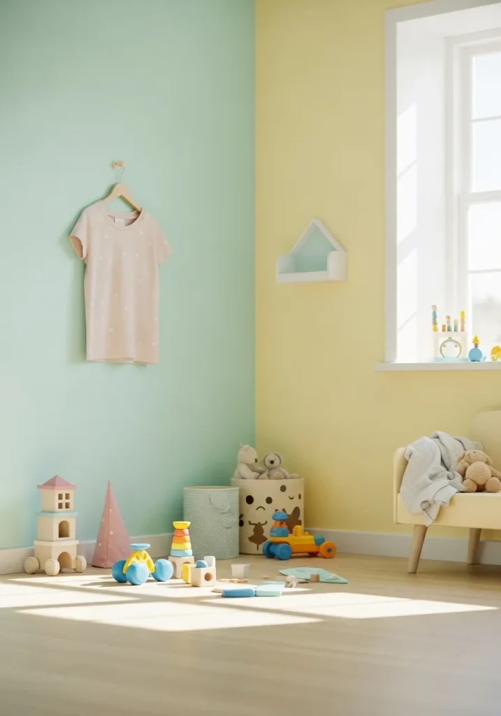
This is a soft mint green paired with a pale buttery yellow, both light and slightly muted. The mint reads close to shades like Benjamin Moore Spring Mint or Sherwin Williams Mint Condition, while the yellow feels similar to Sherwin Williams Butter Up or Behr Lemonade. It is a gentle combination that feels bright without being sharp.
The mint leans a bit cool, while the yellow brings in warmth, so the balance feels easy on the eyes. It works well in a kids room or any space that needs a lighter touch. I would keep furniture simple and mostly neutral so the colors stay soft and do not start to feel busy.