I have always believed that the color on your walls quietly shapes how you feel when you sit down to work, and my own office proved that pretty quickly.
When I finally swapped out a flat white for something with a bit more depth, I noticed I could focus longer and felt less restless.
That small change sent me down a bit of a paint color rabbit hole, and now I pay a lot more attention to how different shades behave throughout the day.
If you’re trying to make your workspace feel a little more put together and a lot more focused, the right color can honestly do more than you expect.
These Benjamin Moore picks are the ones I keep coming back to when I want a space that feels calm, steady, and actually easy to sit in for hours.
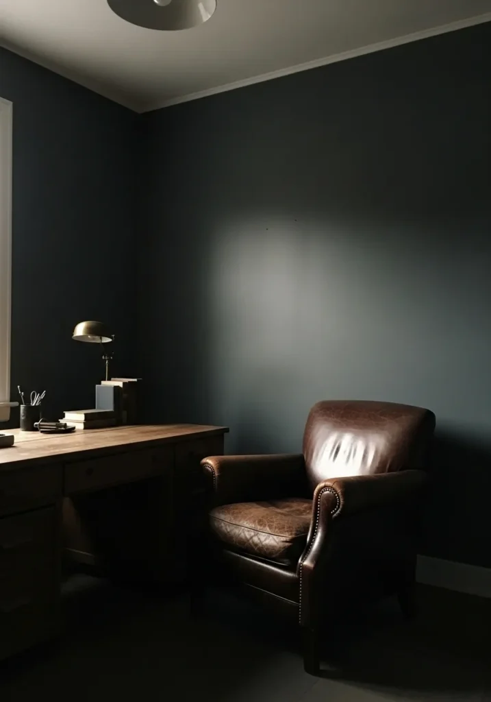
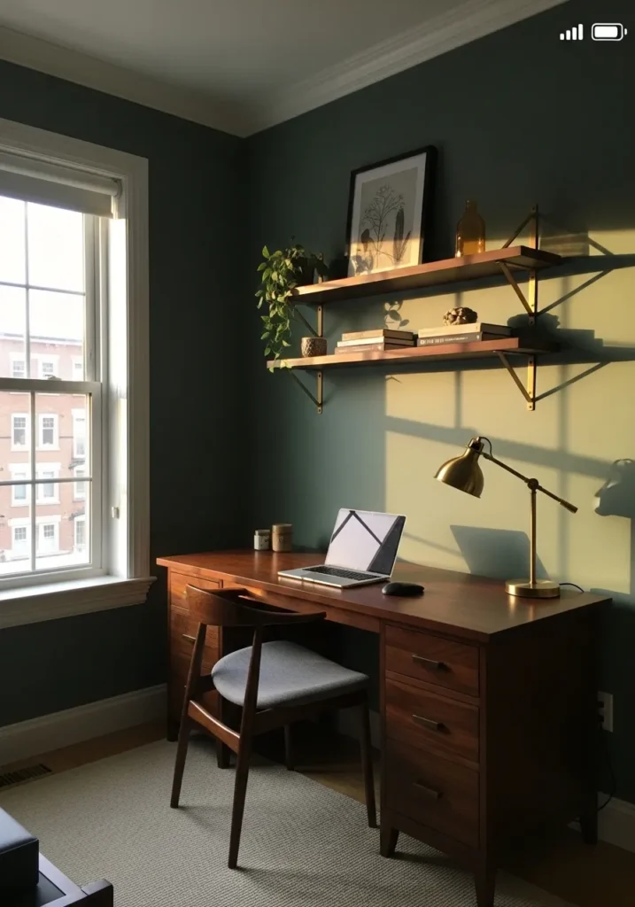
Deep Blue Walls For A Focused Office
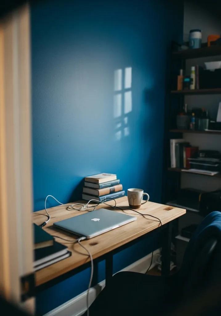
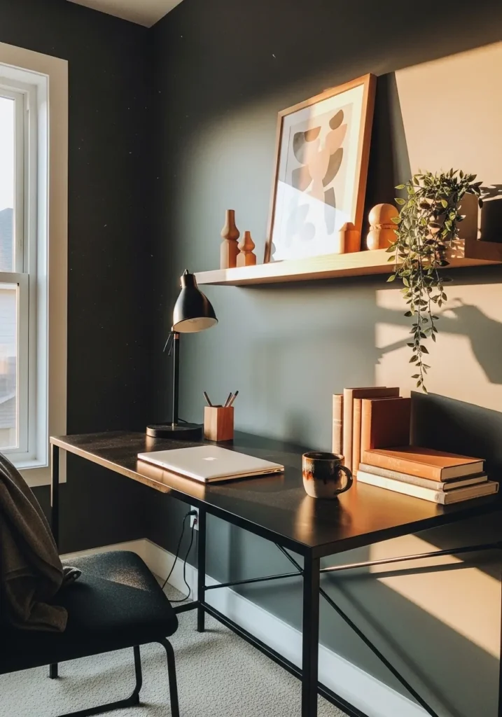
This looks closest to Benjamin Moore Hale Navy, a rich deep blue that sits right between classic navy and something a bit softer. It has that steady, grounded feel that works well in a work area, especially with a simple wood desk and a few stacked books nearby. It’s the kind of color that helps the room feel settled without being too dark.
Hale Navy leans slightly cool, but it’s not sharp or cold. In natural light, it can read a bit lighter and more relaxed, while in dimmer corners it deepens nicely. It pairs easily with warm wood, black accents, and even a bit of clutter on the desk. Just keep the lighting decent, otherwise it can start to feel a little heavy.
Light Gray Walls That Stay Out Of The Way
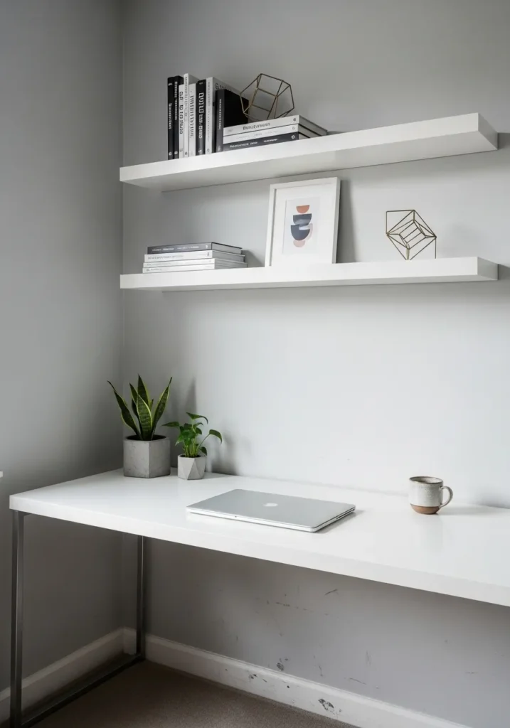
This reads very close to Benjamin Moore Classic Gray, a soft light gray that sits right between warm and cool. It’s a quiet color, and that’s really the point. With simple white shelves and a clean desk, it lets everything else stay easy on the eyes without pulling your focus away.
Classic Gray has a faint warmth to it, so it doesn’t feel cold or flat. In brighter spaces it can almost lean off-white, while in shaded corners it settles back into a gentle gray. It works well if you want something neutral but not stark, especially with white furniture and a few natural elements like a small plant.
Soft Green Gray For A Calm Work Corner
This looks closest to Benjamin Moore Saybrook Sage, a muted green gray that feels easy on the eyes. It sits in that middle range where it is not too dark and not too pale, which makes it a good choice for a quiet work area. Next to the warm wood desk and simple chair, the color reads calm without feeling dull.
Saybrook Sage leans slightly warm with a soft green undertone that shows more in natural light. In brighter spots near a window, it feels a bit fresher, while in the rest of the room it settles into a gentle gray-green. It pairs well with wood tones, soft fabrics, and simple decor. I would keep the rest of the palette light so the color does not start to feel heavy.
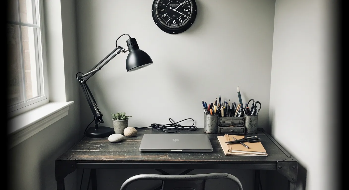
Deep Charcoal Walls For A Quiet Workspace
This looks closest to Benjamin Moore Kendall Charcoal, a deep gray that leans slightly cool without going fully black. It has that steady, grounded feel that works well in a small office corner, especially next to a dark desk and a few warm wood accents on the shelf.
Kendall Charcoal can shift a bit depending on light. In brighter spots it softens into a true charcoal gray, while in lower light it reads darker and more enveloping. It pairs nicely with warm wood tones and simple black pieces, but it does better when you keep some lighter elements nearby so the space does not feel too closed in.
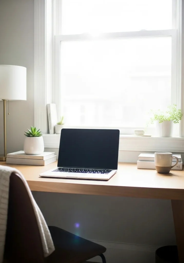
Soft Warm White For A Clear Headspace

This reads very close to Benjamin Moore White Dove, a soft warm white that feels gentle instead of stark. It has a bit of creaminess to it, which helps take the edge off a bright workspace filled with paper and a white desk. It’s the kind of color that keeps things calm without feeling empty.
White Dove leans warm, but only slightly, so it still looks clean in natural light. Near a window, it can brighten up quite a bit, while in quieter corners it settles into a soft off-white. It works well if you want a simple backdrop that does not compete with your work, especially when paired with light furniture and a few neutral tones.
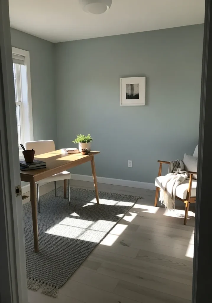
Soft Blue Gray For A Quiet Work Zone
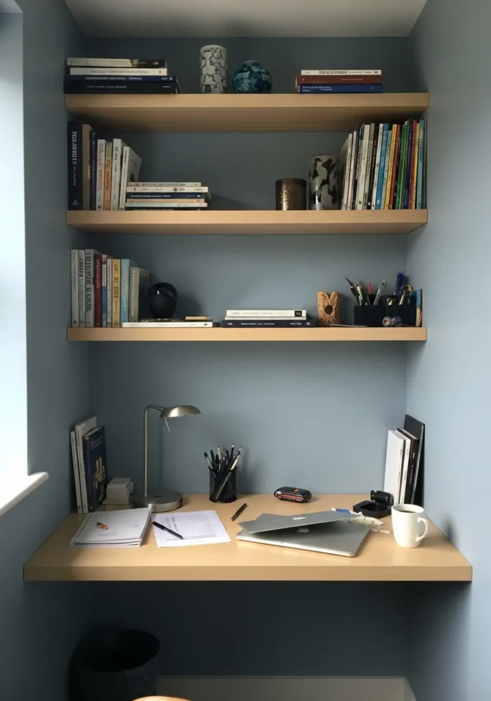
This reads very close to Benjamin Moore Smoke, a muted blue gray that sits right in that calm middle range. It’s not too cool and not too pale, which makes it easy to live with day to day. With the light wood shelves and simple desk, the color feels steady and a bit relaxed without getting dull.
Smoke has a soft blue undertone that comes through more near natural light, while the gray side keeps it from feeling too airy. It works well in smaller office setups like this, especially if you want a bit of color but still need a calm backdrop. I would keep the rest of the room simple so the tone stays clear and not muddy.
Muted Green Gray For Everyday Focus
This looks closest to Benjamin Moore October Mist, a soft green gray that feels calm without being flat. It sits in that gentle middle range where it brings a bit of color into the room but still keeps things easy to look at. Next to the light wood desk and simple chair, it comes across relaxed and steady.
October Mist has a light green undertone that can shift depending on the light. Near a window, it feels a bit fresher and more open, while in quieter areas it leans more gray. It works well if you want something softer than a true gray, especially with light woods and simple neutral pieces.
Light Cool Gray For A Narrow Workspace
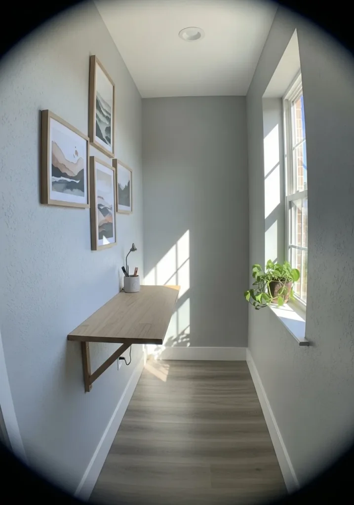
This looks closest to Benjamin Moore Gray Owl, a light gray that leans slightly cool without feeling stark. It has a clean, quiet look that works well in tighter areas like a narrow desk setup by a window. With the light wood surface and simple wall art, the color stays easy and not distracting.
Gray Owl can shift depending on the light. In brighter spots, it feels almost airy and soft, while in shaded areas it settles into a more noticeable gray. It pairs nicely with white trim and pale wood, but I would avoid going too dark with furniture since that can make the space feel a bit closed in.
Deep Blue Green Walls For A Focused Room
This looks closest to Benjamin Moore Newburg Green, a deep blue green that sits right on the edge between navy and forest tones. It has a strong, steady feel that works well in a quiet office corner, especially next to a wood desk and a leather chair. It’s a darker color, but it doesn’t feel flat.
Newburg Green leans cool, with that blue base showing more in lower light. In brighter spots it softens a bit and the green comes through. It pairs well with warm wood and darker furniture, but I would keep a few lighter accents around so the room does not feel too closed in.
Soft Dusty Blue For A Calm Desk Area
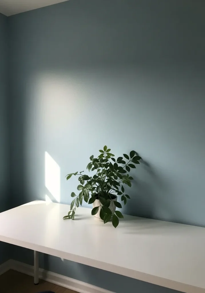
This looks closest to Benjamin Moore Boothbay Gray, a soft blue gray that sits right between muted blue and gentle gray. It has a quiet, steady feel that works well in a simple setup like this, especially next to a clean white desk and a small plant. The color brings in just enough tone without feeling busy.
Boothbay Gray leans cool, with a soft blue undertone that shows more in brighter light. In lower light, it settles into a more neutral gray. It pairs nicely with white furniture and natural greenery, but I would keep the rest of the palette simple so the color stays clear and not washed out.
Warm Beige Walls That Keep Things Simple
This looks closest to Benjamin Moore Muslin, a soft warm beige that sits somewhere between cream and light tan. It has a relaxed, easy feel that works well in a practical setup like this, especially next to a light wood desk and darker office equipment. It keeps the space from feeling too stark.
Muslin leans warm, with a gentle yellow undertone that shows more in brighter light. In lower light, it settles into a calm neutral that still feels soft. It pairs well with wood tones and black accents, but I would keep the rest of the palette fairly light so the color does not start to look dull.
Dusty Blue Gray For A Small Office Nook
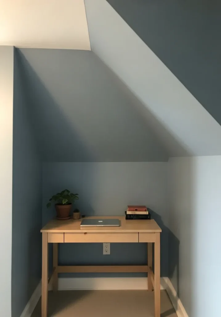
This looks closest to Benjamin Moore Boothbay Gray, a muted blue gray that feels soft and steady without being too pale. It sits in that middle range where it adds a bit of color but still works like a neutral. With the simple wood desk and a small plant, it comes across calm and easy to focus in.
Boothbay Gray leans cool, with a soft blue undertone that shifts depending on the light. In brighter spots it feels lighter and a bit airy, while in deeper corners it settles into a more grounded gray. It works well in smaller spaces like this, but I would keep the furniture light so the color does not start to feel heavy.
Deep Green Walls For A Steady Work Space
This looks closest to Benjamin Moore Salamander, a deep green that leans slightly toward black in lower light. It’s a bold color, but it has a calm, steady feel that works well in a focused work area. With the warm wood desk and simple shelving, it comes across rich without feeling too sharp.
Salamander has a cool base, but the green shows more when natural light hits the wall. In darker corners, it can read almost charcoal. It pairs well with wood tones and a few lighter accents, but I would not go too heavy with dark furniture or the space can start to feel a bit closed in.
Soft Cream Walls For A Simple Office Setup
This looks closest to Benjamin Moore Swiss Coffee, a warm off-white that leans slightly creamy without turning yellow. It’s the kind of color that feels easy to live with, especially in a setup with light wood furniture and a few simple pieces on the shelves. It keeps the space bright but not stark.
Swiss Coffee has a soft warmth that shows more in natural light, giving the walls a gentle glow. In lower light, it settles into a quiet neutral that still feels comfortable. It works well with wood tones and black accents, but I would avoid pairing it with anything too cool or it can start to look a bit off.
Soft Blue Walls For A Creative Work Area
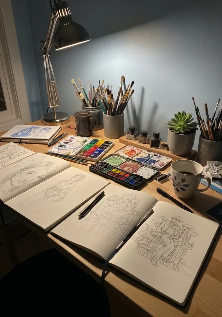
This looks closest to Benjamin Moore Smoke, a muted blue gray that feels calm but still has a bit of personality. It sits right in that middle zone where it adds color without becoming distracting, which works well in a more hands-on workspace like this with art supplies spread across the desk.
Smoke leans cool, with a soft blue undertone that becomes more noticeable under direct light. In dimmer areas, it settles into a quieter gray. It pairs nicely with natural wood and neutral pieces, and it helps keep a busy desk from feeling overwhelming… which is honestly helpful in a space like this.
Clean Light Gray For A Minimal Desk Space
This looks closest to Benjamin Moore Silver Satin, a very light gray that sits right on the edge of off-white. It has a clean, simple feel that works well with darker furniture like a black desk, letting the contrast stand out without making the wall feel stark.
Silver Satin leans slightly cool, but it stays soft rather than sharp. In brighter light, it can read almost white, while in shadow it shows more of its gray tone. It works best when paired with darker accents or simple pieces, but I would avoid mixing in too many competing tones so the look stays clear and not busy.
Soft Blue Gray For A Relaxed Office Room
This looks closest to Benjamin Moore Healing Aloe, a light blue gray that feels calm without going too cool. It has a soft, slightly airy quality that works well in a simple office with light wood furniture and minimal decor. The color adds just enough interest without getting in the way.
Healing Aloe leans gently toward blue, but the gray keeps it from feeling too bright. In natural light, it can look a bit fresher, while in lower light it settles into a quieter tone. It pairs nicely with pale woods and soft fabrics, and it works best when the rest of the room stays light and simple.
Deep Teal Walls For A Quiet Corner
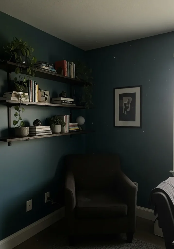
This looks closest to Benjamin Moore Blue Note, a deep blue-green that sits somewhere between navy and teal. It has a darker, more settled feel that works well in a quiet corner like this, especially with simple shelving and a darker chair. It brings in color, but in a way that still feels steady.
Blue Note leans cool, with the blue showing more in lower light and a hint of green coming through when the light hits it. It pairs well with black accents and natural elements like plants, but I would keep some lighter pieces around so the space does not feel too closed in.
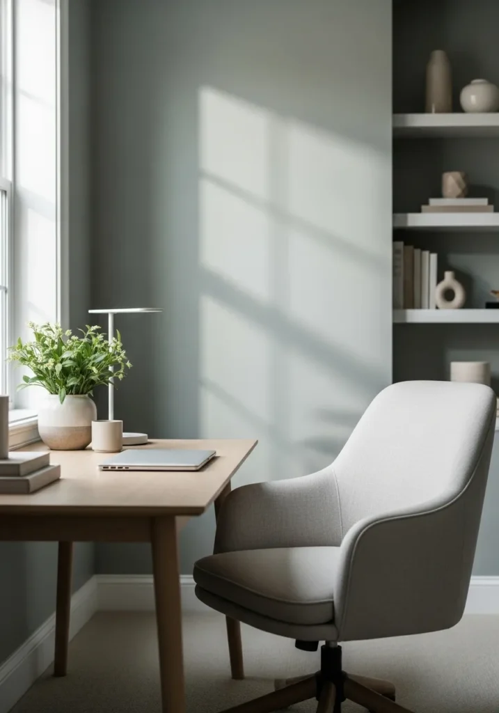
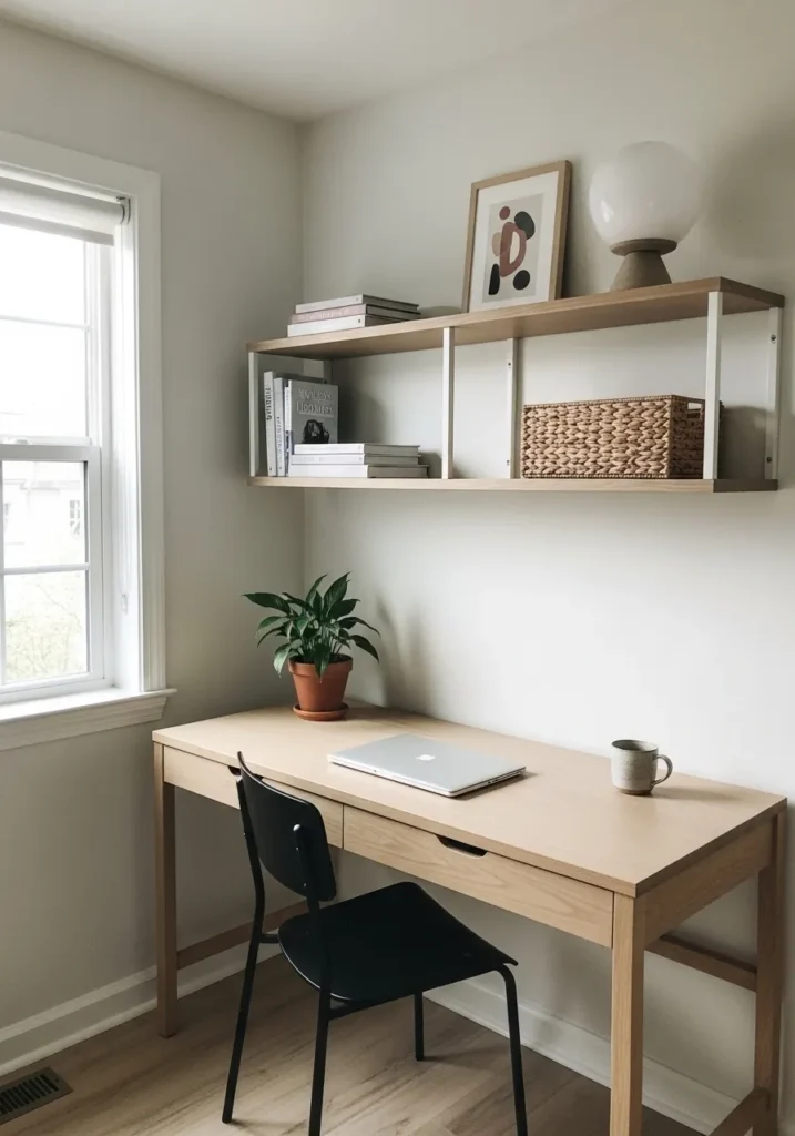
Soft Greige Walls For A Light Work Spot
This looks closest to Benjamin Moore Edgecomb Gray, a light greige that sits right between beige and gray. It has a soft, easy feel that works well in a bright spot like this, especially with a simple wood desk and a few small plants nearby. It keeps the space light without feeling too plain.
Edgecomb Gray leans slightly warm, but it still reads neutral in most lighting. Near a window, it can look a bit lighter and almost creamy, while in lower light it settles into a gentle gray-beige. It pairs well with wood tones and soft whites, and it works best when the rest of the space stays simple and uncluttered.