I have always believed a small bathroom can feel just as good as a big one, it just needs the right color on the walls.
After trying a few shades in my own space, I realized how much paint can change the way a room feels.
Some colors make everything look lighter and more open, while others add just enough warmth to keep it from feeling plain.
In this list, I am sharing Benjamin Moore paint colors I keep coming back to when I want a small bathroom to feel a little bigger and a lot more put together.
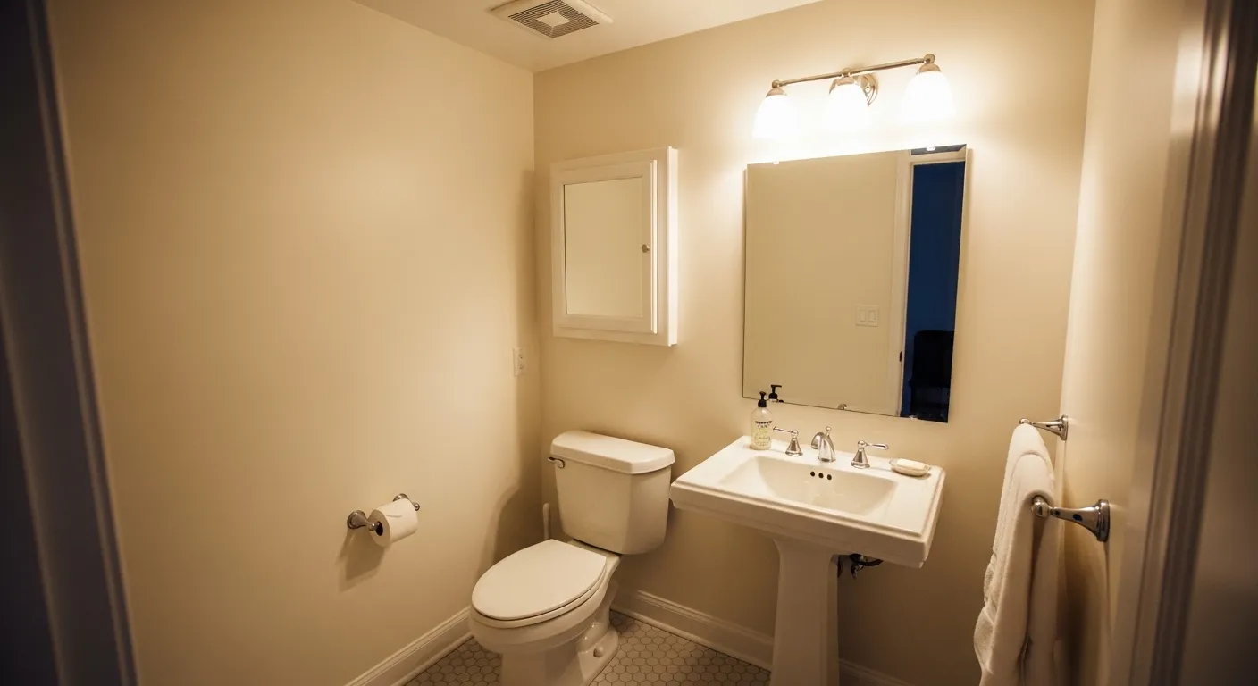
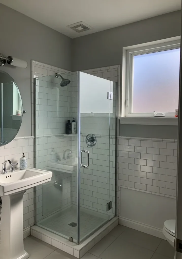
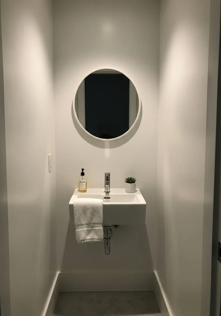
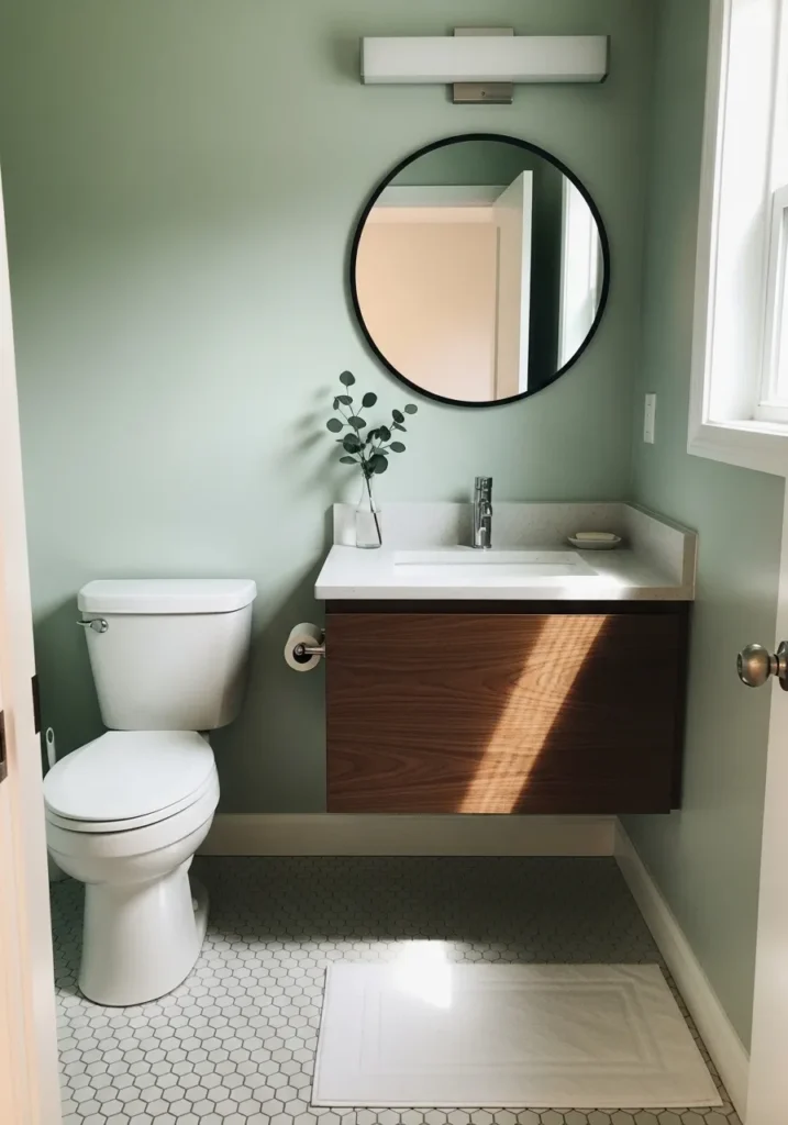
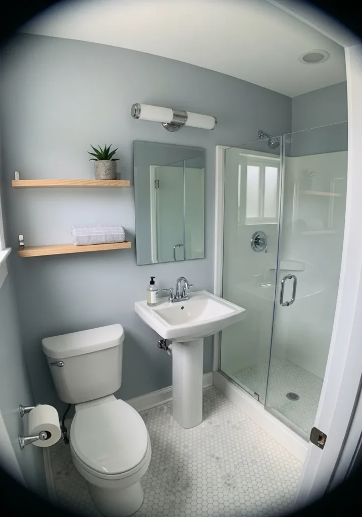
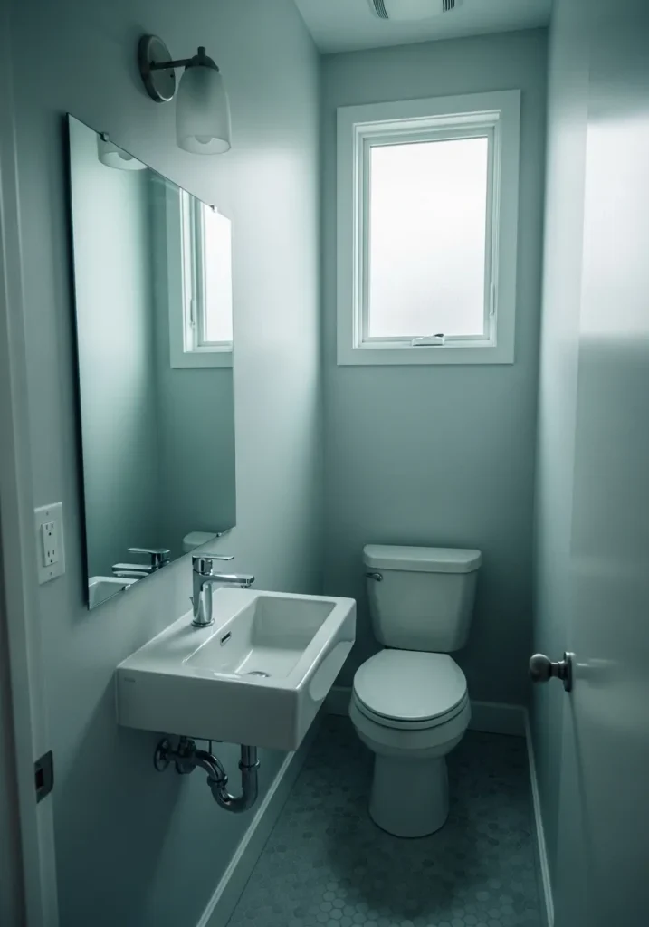
Soft Greige For Narrow Bathrooms
This wall color reads like a light greige, and it looks very close to Benjamin Moore Pale Oak. It sits right between warm beige and soft gray, which makes it easy to live with. In a tight bathroom like this, that kind of in-between color helps the walls feel less boxed in and a bit more open. It also works nicely with the white sink and simple trim without feeling too stark.
Pale Oak has a gentle warmth to it, so it does not turn cold in low light. You can see how it stays calm even next to the small wood shelf and framed art. It tends to look best with soft whites and light wood, especially in narrow layouts where darker tones would close things in. If anything, just watch the lighting. In very dim spaces it can lean a touch beige.
Pale Blue Gray For A Fresh Small Bath
This soft blue gray looks closest to Benjamin Moore Healing Aloe. It sits in that quiet space between blue and gray, which is why it feels light without going cold. In a small bathroom, this kind of color helps the walls feel open but still a little cozy. It also works well next to a simple wood vanity, where the color keeps things from looking too sharp.
Healing Aloe has a slight green undertone that shows up more in natural light. That is part of the charm, though it can shift a bit depending on the room. It tends to look best with clean whites and light finishes. If the space gets very little light, it may lean more gray than blue, so it is worth testing first.
Soft Cool Gray That Feels Clean
This wall color looks closest to Benjamin Moore Gray Owl. It is a light gray with a soft cool edge, but it never feels harsh. In a small bathroom, that kind of gray keeps things looking open without going flat or dull. It works especially well next to white tile and a simple wood vanity, where the contrast stays easy on the eyes.
Gray Owl has a slight green undertone, though it stays pretty subtle most of the time. In brighter light it leans a bit fresher, while in lower light it reads more like a quiet gray. It pairs well with clean whites and light to medium woods. If the room is very dim, it can feel a touch cooler than expected, so that is something to keep in mind.
Mid Tone Gray That Keeps Things Simple
This looks closest to Benjamin Moore Stonington Gray. It is a mid tone gray with a soft, slightly cool base, but it still feels easy to live with. In a small bathroom, this kind of gray gives a bit more presence than pale colors without making the space feel tight. Next to white tile, it comes across clean and steady, not too sharp.
Stonington Gray has a faint blue undertone that shows more in certain light, especially near cooler finishes like chrome or glass. It tends to work best when paired with crisp whites so it does not turn dull. In lower light, it can deepen a bit, so it is a good pick if you want some contrast without going dark.
Warm Beige That Feels Easy To Live With
This wall color looks very close to Benjamin Moore Edgecomb Gray. It sits in that soft beige-gray range, leaning a bit warm, which makes it feel comfortable right away. In a small bathroom, that kind of color helps the space feel less stark than plain white but still light enough to keep things open. It works nicely around a simple vanity and warm lighting without feeling heavy.
Edgecomb Gray has a gentle warmth that comes through more under indoor lighting. It can read a little more beige than gray at times, especially in tighter spaces. It pairs well with soft whites and brushed metal finishes, and it tends to stay calm even when the lighting changes. A good everyday neutral, honestly.
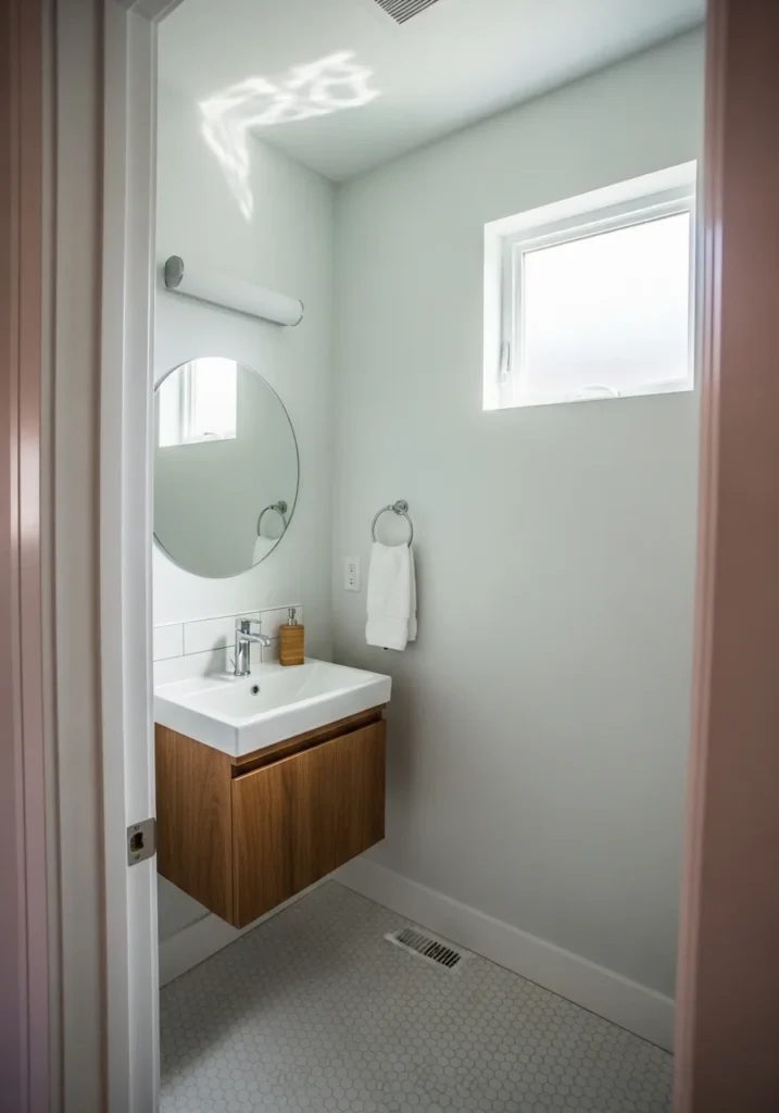
Crisp White That Opens Up The Room
This looks closest to Benjamin Moore Chantilly Lace. It is a clean, bright white with very little warmth, which is why it makes a small bathroom feel a bit bigger right away. When you have simple fixtures and light wood shelves like this, a clear white keeps everything looking fresh without competing for attention.
Chantilly Lace leans slightly cool, so it stays sharp next to chrome and bright whites. It works best in spaces that get some natural light, where it will not feel too stark. If the lighting is very warm, it can soften just a touch, but it still reads mostly true white. A solid choice when you just want things to feel light and uncluttered.
Warm Gray That Feels A Bit Deeper
This wall color looks closest to Benjamin Moore Chelsea Gray. It is a deeper warm gray that sits somewhere between gray and soft taupe, which gives it a bit more presence than lighter shades. In a small bathroom, using a color like this can make the space feel more defined without going too dark, especially when paired with lighter tile.
Chelsea Gray has a noticeable warm undertone, so it tends to lean slightly brown depending on the light. Next to white fixtures and simple tile, it stays balanced and does not feel heavy. It works best when there is at least some natural light in the room. Otherwise, it can read a bit darker than expected.
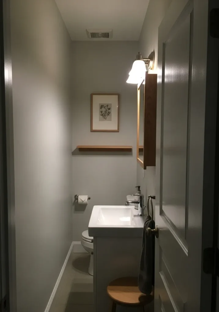
Soft Off White For A Narrow Space
This looks closest to Benjamin Moore White Dove. It is a soft off white with a gentle warmth, which makes it feel a bit more relaxed than a stark white. In a tight bathroom like this, that slight warmth keeps the walls from feeling too sharp while still keeping everything light and open. It works well around a simple sink and round mirror where you do not want the color to stand out too much.
White Dove has a creamy undertone that shows more under warm lighting. It stays fairly neutral, though it can lean a little beige in dim corners. It pairs easily with both cool metals and softer finishes, which makes it flexible in small spaces. If you want something clean but not too bright, this is usually a safe place to land.
Soft Gray That Stays Light
This wall color looks closest to Benjamin Moore Coventry Gray. It is a medium-light gray with a slightly cool base, but it still feels soft rather than sharp. In a small bathroom, this kind of gray gives a bit of contrast against white tile while still keeping the room feeling open. It works nicely next to chrome fixtures and simple white surfaces.
Coventry Gray has a gentle blue undertone that can show more in cooler light. It stays fairly even, though it can look a touch deeper in shaded corners. It pairs well with crisp whites and glass finishes, which helps everything feel clean without going too bright. If you want gray that has some presence but does not take over, this is a comfortable choice.
Creamy White That Warms Up The Space
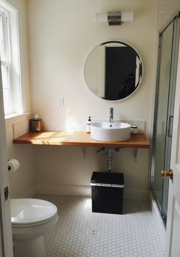
This wall color looks closest to Benjamin Moore Swiss Coffee. It is a warm creamy white that sits just off true white, which makes it feel softer right away. In a small bathroom, that slight warmth can make the space feel more comfortable while still keeping it bright. It works especially well next to a wood countertop, where the tones feel connected without trying too hard.
Swiss Coffee has a gentle yellow undertone that shows more in natural light. It can lean a bit warmer depending on the time of day, so it is not as crisp as cooler whites. It pairs nicely with warm woods and brushed metals, and it tends to stay easy to live with in smaller rooms. If you want white but not stark, this is usually a good direction.
Soft Blue Green That Feels Fresh
This wall color looks closest to Benjamin Moore Palladian Blue. It sits in that soft blue green range, which gives it a light and airy feel without going too pastel. In a small bathroom, this kind of color can make the space feel a bit more open while still adding some personality. It works nicely around a white pedestal sink where you want a little color but nothing too heavy.
Palladian Blue has a noticeable green undertone that can shift depending on the light. In brighter spaces it leans fresher and slightly more blue, while in dimmer light it can soften and feel a bit muted. It pairs well with crisp whites and brushed metals, and it tends to stay calm on the walls even in tight layouts.
Soft Sage Green That Feels Calm
This wall color looks closest to Benjamin Moore Saybrook Sage. It is a muted green with a soft gray base, which keeps it from feeling too bright. In a small bathroom, this kind of color adds just enough interest while still feeling easy on the eyes. It works especially well next to a wood vanity, where the green and warm wood tones feel naturally connected.
Saybrook Sage leans slightly earthy, so it can shift a bit depending on the light. In brighter light it looks fresher and more green, while in lower light it softens and reads a little more gray. It pairs well with white tile and simple finishes, and it tends to stay steady even in tight spaces.
Light Blue That Keeps It Airy
This wall color looks closest to Benjamin Moore Breath of Fresh Air. It is a pale blue with a soft gray base, which keeps it from feeling too bright or childish. In a small bathroom, this kind of light blue helps the walls feel open while still adding a bit of color. It works well around a simple pedestal sink where you want things to stay clean and uncluttered.
Breath of Fresh Air leans slightly cool, so it stays crisp next to white trim and chrome finishes. It can look a bit brighter under strong lighting and more muted in lower light. It pairs easily with whites and light neutrals, and it tends to keep the space feeling calm without going flat.
Soft Gray White That Feels Clean
This looks closest to Benjamin Moore Classic Gray. It is a very light gray that almost reads like an off white, which is why it works so well in small bathrooms. It keeps the space bright but gives just a little more depth than plain white. Next to white tile and simple fixtures, it feels calm and easy to live with.
Classic Gray has a warm undertone, so it leans slightly beige depending on the light. It stays soft even in brighter spaces and does not turn too cool. It pairs well with clean whites and chrome finishes, and it tends to keep everything looking simple without feeling flat.
Warm Tan That Feels Soft
This wall color looks closest to Benjamin Moore Manchester Tan. It is a warm tan that sits between beige and a very soft brown, which gives it a cozy feel without making the room look dark. In a small bathroom, this kind of shade can feel more relaxed than cooler grays, especially next to a wood vanity where the tones blend easily.
Manchester Tan has a gentle yellow undertone that shows more in natural light. It can shift a bit warmer as the light changes, but it usually stays soft and even. It pairs well with white fixtures and warm finishes, and it tends to keep the space feeling comfortable without closing it in.
Soft Blue Gray That Feels Calm
This wall color looks closest to Benjamin Moore Quiet Moments. It is a light blue gray with a soft green hint, which keeps it from feeling too cold. In a small bathroom, this kind of shade gives a bit of color while still feeling relaxed and open. It works nicely next to white fixtures and simple floating shelves where you want things to stay light.
Quiet Moments has a gentle mix of blue and green undertones that can shift depending on the light. In brighter spaces it leans a little fresher, while in lower light it softens and reads more muted. It pairs well with crisp whites and light wood, and it tends to stay easy on the eyes even in tight spaces.
Soft Blue Green That Feels Easy

This wall color looks closest to Benjamin Moore Palladian Blue. It is a light blue green with a gentle gray base, which keeps it soft and not too bright. In a small bathroom, this kind of color gives just enough personality while still feeling light and open. It works nicely with white cabinetry and simple chrome fixtures.
Palladian Blue has a balanced mix of blue and green undertones, so it can shift a bit depending on the light. In natural light it leans a little fresher, while in dimmer spaces it turns more muted and calm. It pairs well with crisp whites and soft neutrals, and it tends to stay comfortable to look at even in a tight layout.
Clean Soft White Walls
This wall color looks closest to Benjamin Moore Chantilly Lace. It is a clean, bright white without much undertone, which helps a small bathroom feel more open right away. It keeps everything looking simple and uncluttered, especially around a compact sink and minimal fixtures.
Chantilly Lace leans neutral to slightly cool, so it stays crisp next to chrome and white finishes. It reflects light easily, which helps in narrow spaces that need a boost. It works best when you want a fresh, straightforward look and do not want the wall color to compete with anything else.
Soft Greige That Feels Quiet
This wall color looks closest to Benjamin Moore Edgecomb Gray. It is a light greige that sits between warm beige and soft gray, which makes it easy to use in a small bathroom. It keeps the space feeling calm without going stark, especially around a simple white sink and clean lines.
Edgecomb Gray has a warm undertone, so it leans a bit beige in most lighting. Under softer light it can look a little deeper, while brighter light pulls out more of the gray. It pairs well with white fixtures and brushed metal finishes, and it tends to stay easy to live with over time.
Soft Creamy White That Feels Warm
This wall color looks closest to Benjamin Moore White Dove. It is a soft white with a gentle creamy base, which makes it feel warmer than a stark white. In a small bathroom, this kind of shade keeps things bright but a little more relaxed. It works nicely with light wood shelves and a simple vanity, where the warmth carries through.
White Dove has a subtle warm undertone that shows more in natural light. It does not turn yellow, but it avoids that cold, sharp look some whites have. It pairs well with natural wood, soft grays, and clean white fixtures, and it tends to hold a quiet, easy look throughout the day.
Pale Blue Gray That Feels Fresh
This wall color looks closest to Benjamin Moore Gray Cashmere. It is a soft blue gray with a slight green undertone, which keeps it from feeling too cool or flat. In a small bathroom, this kind of shade gives a light wash of color while still keeping the space feeling open. It works well around a simple sink and white trim where everything stays clean and uncluttered.
Gray Cashmere can shift a bit depending on the light. In brighter light it leans more blue, while in softer light it takes on a slightly muted, almost silvery look. It pairs easily with white fixtures and light flooring, and it tends to stay calm and easy to live with in a narrow room.