I have always believed that the right paint color can completely change how a living room feels, even before you add a single pillow or piece of decor.
Some shades make everything feel lighter and easier, while others give the room a bit more depth and mood in the best way.
In this list, I pulled together Benjamin Moore colors that I keep coming back to in my own projects because they just work.
If you are updating your space or starting fresh, these are the kinds of colors I would happily use again and again without overthinking it.
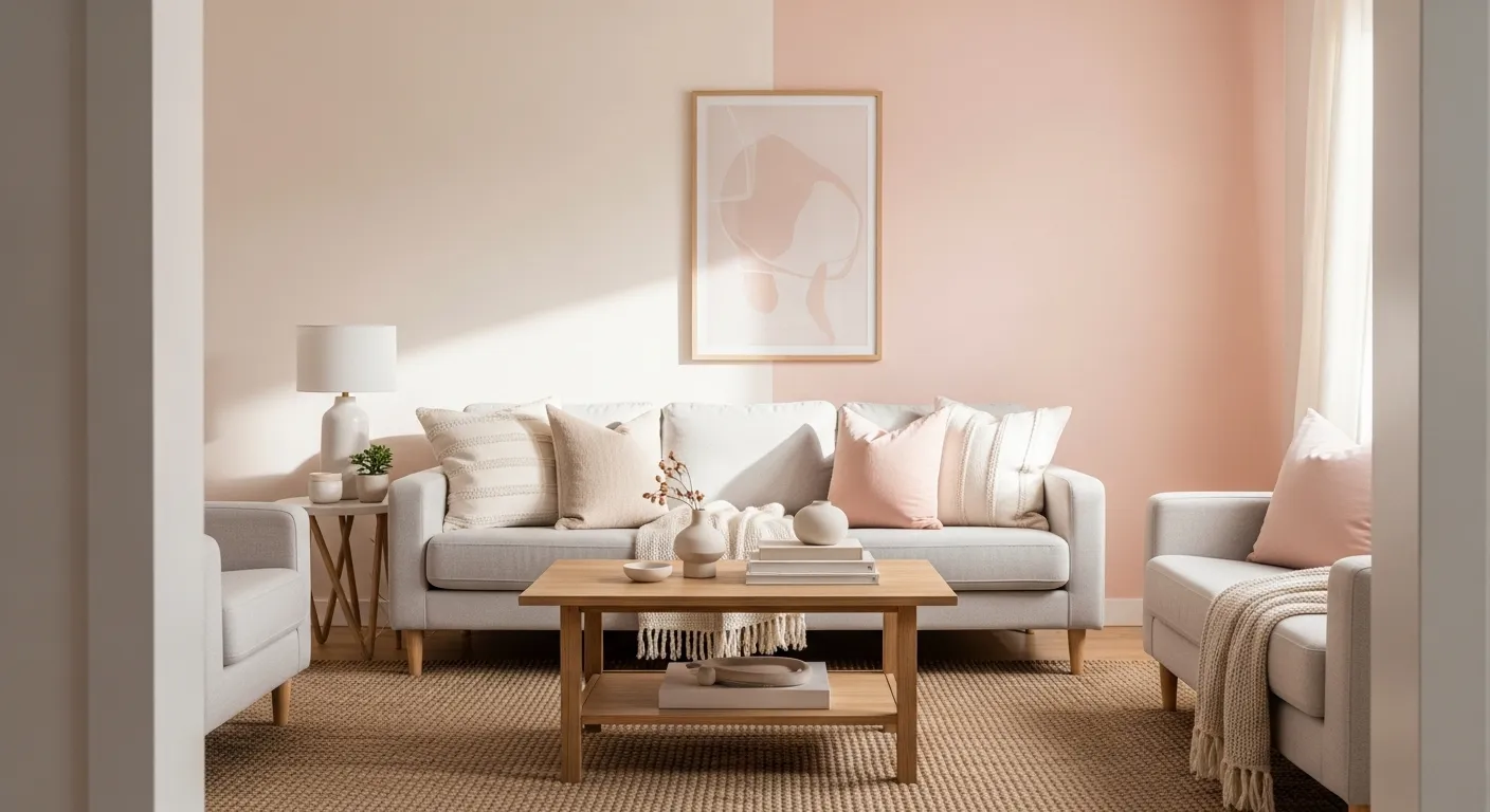
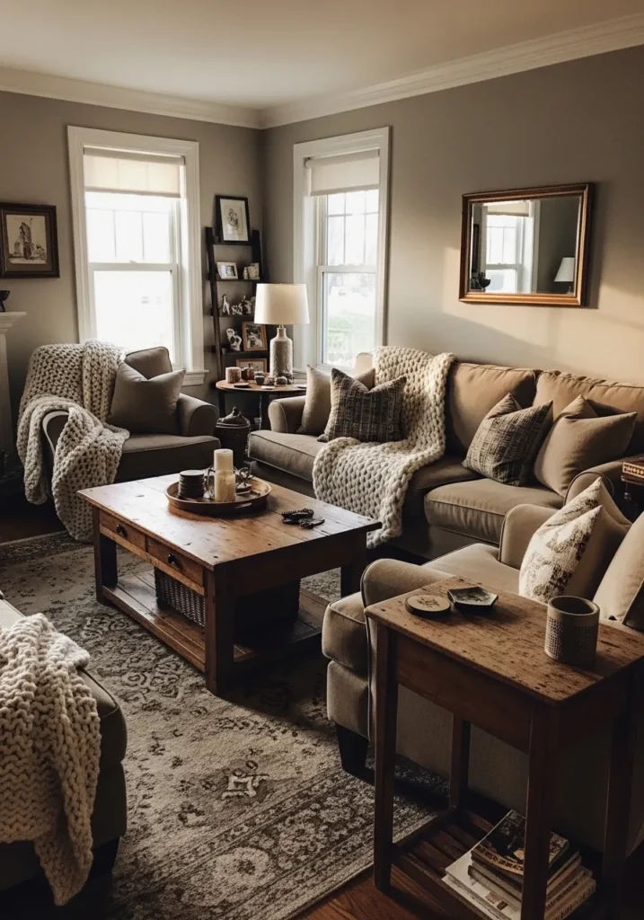
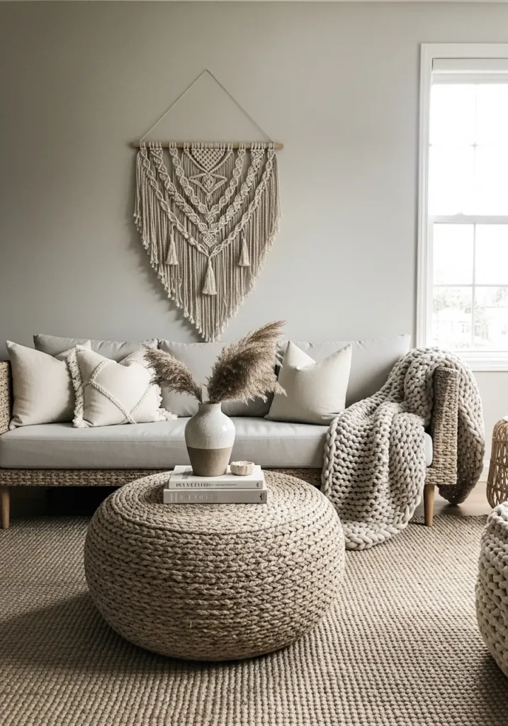
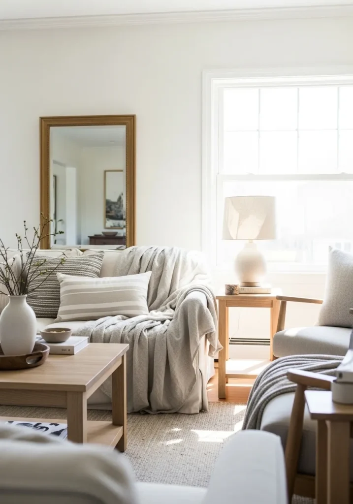
Soft Warm Greige Walls
This looks very close to Benjamin Moore Pale Oak. It sits right between beige and gray, with a gentle warmth that keeps it from feeling cold. It is the kind of color that quietly works in the background, especially with a neutral sofa and light wood like this.
Pale Oak has a soft pink-beige undertone that shows up more in certain light, but it usually stays calm and easy to live with. It does well in living rooms that get steady daylight and pairs naturally with cream fabrics, woven textures, and pale woods. Just be aware it can lean a touch warmer on larger walls, which some people love and some don’t.
Deep Blue Accent Wall
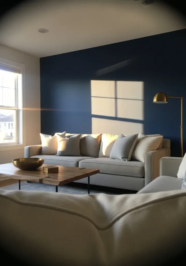
This looks closest to Benjamin Moore Hale Navy. It is a deep navy blue that feels steady and a little muted rather than bright. It works well as an accent wall, especially behind a light sofa like this, because it gives the room some contrast without feeling too sharp.
Hale Navy has a soft gray undertone, which keeps it from reading too bold or glossy. It tends to shift a bit depending on light, sometimes looking almost charcoal in lower light. It pairs nicely with warm woods and brass finishes, and it helps lighter fabrics stand out in a simple way.
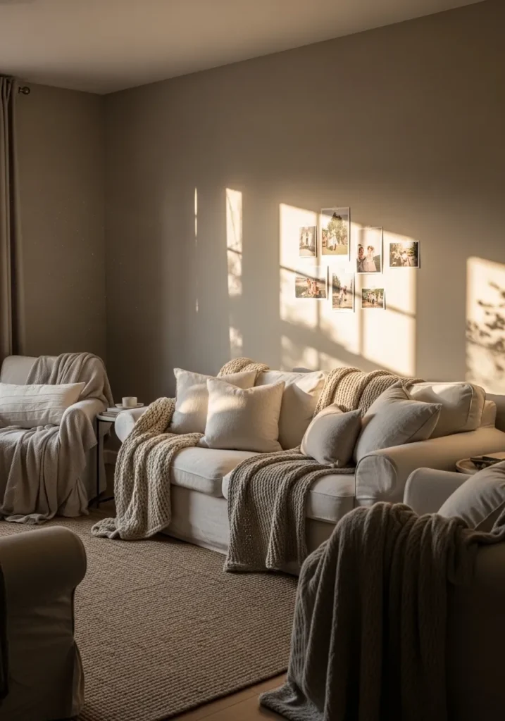
Soft Creamy White Walls
This reads very close to Benjamin Moore Swiss Coffee. It is a warm off white that leans creamy rather than stark, which makes it easy to live with. You can see how it works with the light sofa and simple wood table without anything feeling too sharp or cold.
Swiss Coffee has a gentle yellow undertone that shows up more in brighter rooms, but it usually stays soft and quiet. It works well in spaces with lots of natural light and pairs nicely with beige fabrics and light woods. If anything, it can look a bit too warm next to cooler grays, so that is something to keep in mind.
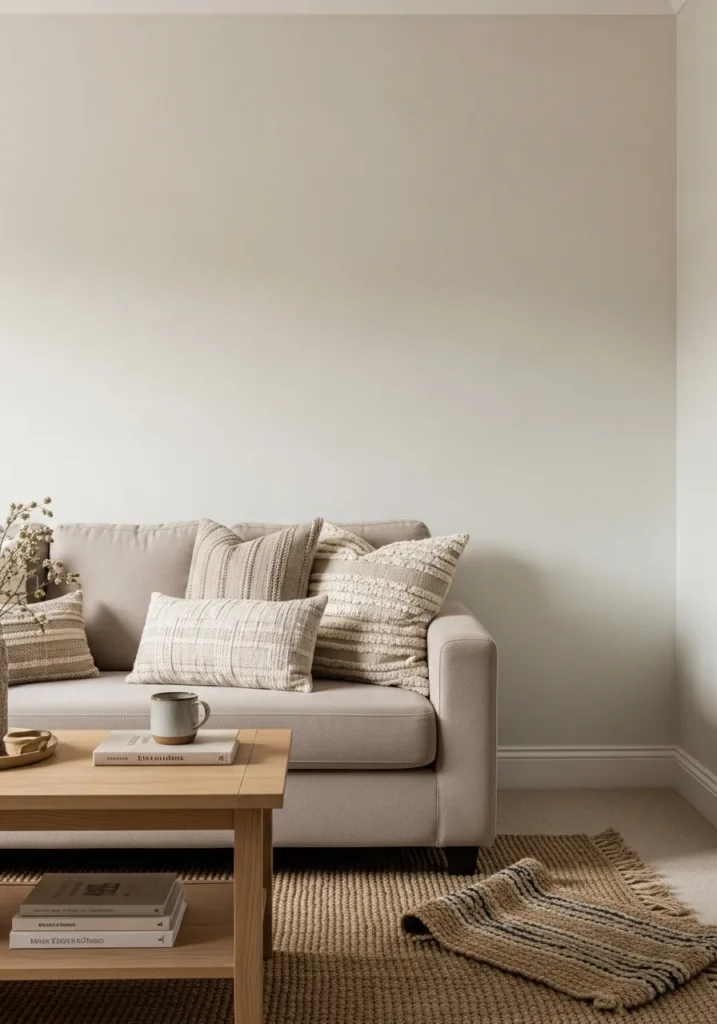
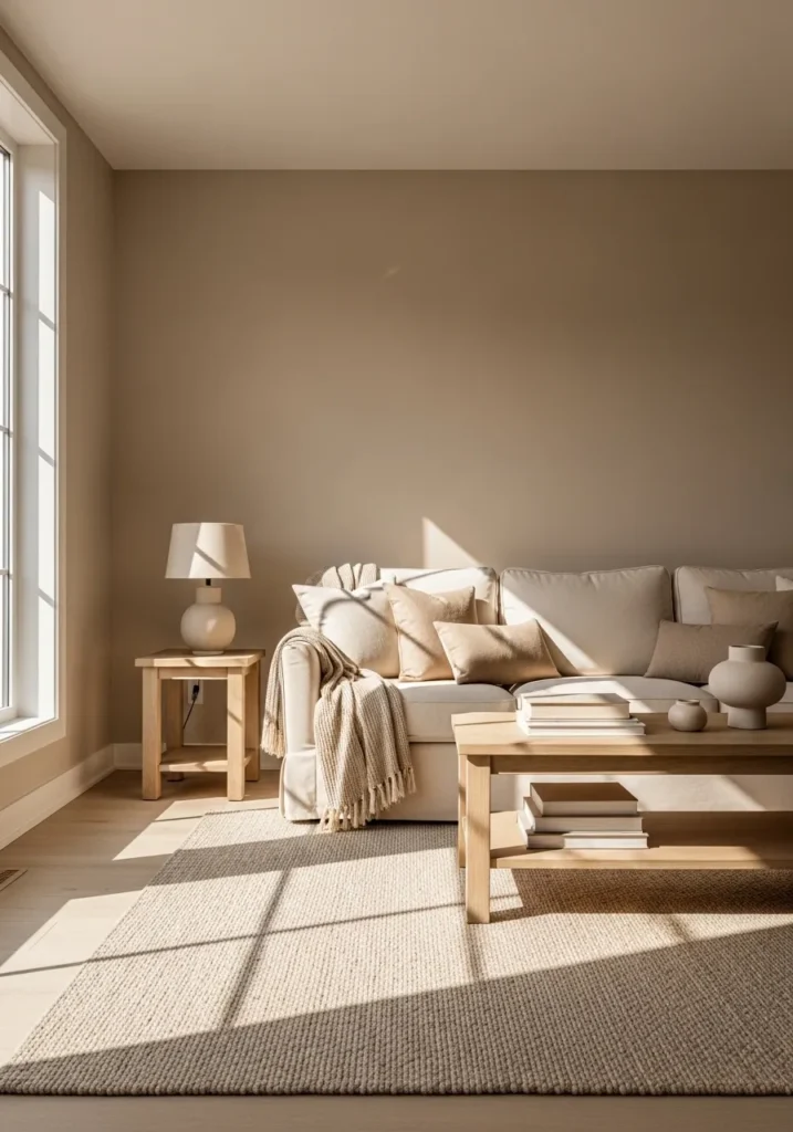
Warm Taupe Living Room Walls
This feels very close to Benjamin Moore Revere Pewter. It sits in that comfortable middle ground between beige and gray, but with a noticeable warmth that makes the room feel settled. It works especially well here with the wood tables and soft brown tones in the furniture.
Revere Pewter has a slightly earthy undertone, which helps it lean warmer in most spaces. It tends to look softer in natural light and a bit deeper in the evening. This is one of those colors that handles a mix of fabrics and finishes easily, though it can read a little muddy if paired with very cool grays.
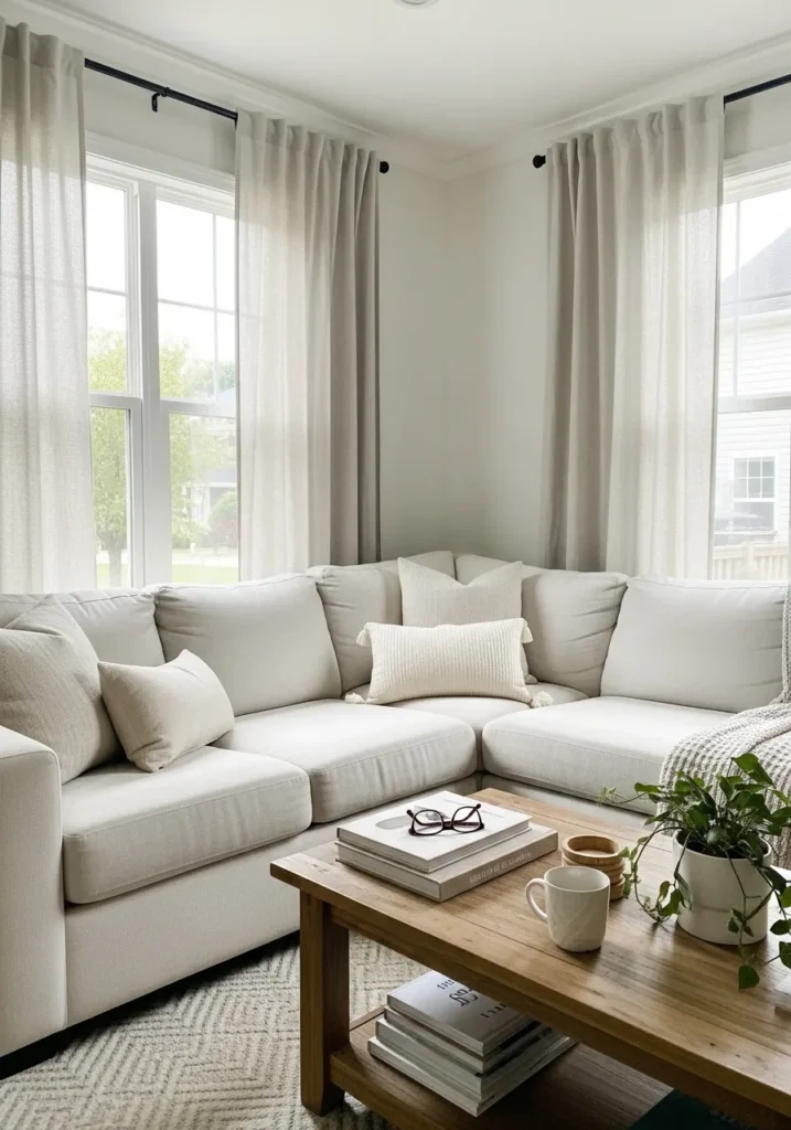
Clean Soft White Walls
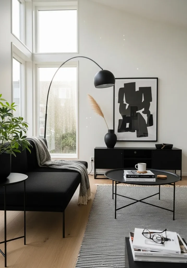
This looks closest to Benjamin Moore Chantilly Lace. It is a crisp white, but not harsh, with just enough softness to feel comfortable in a living room. You can see how it works with the black furniture and light wood floor without feeling too stark.
Chantilly Lace leans slightly cool, though it usually reads pretty neutral in bright spaces. It does best in rooms with good natural light, where it stays clean instead of flat. It pairs well with black accents and simple materials, but in dimmer spaces it can feel a bit sharp, so lighting really matters here.
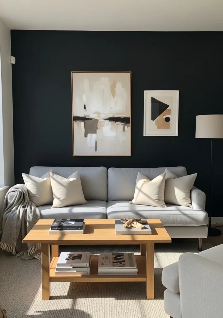
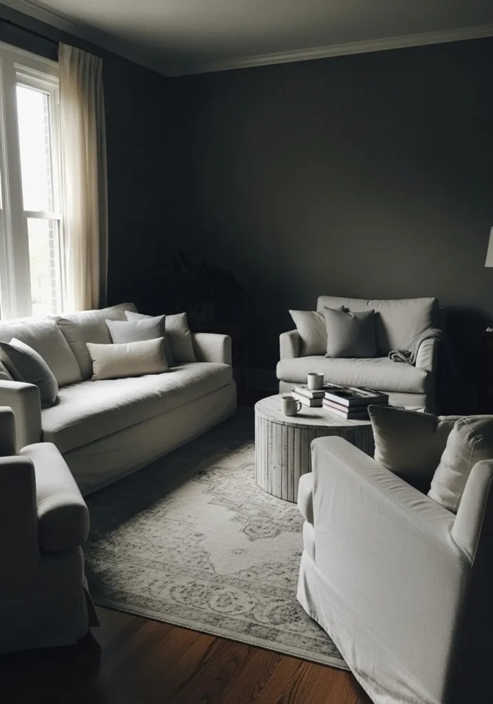
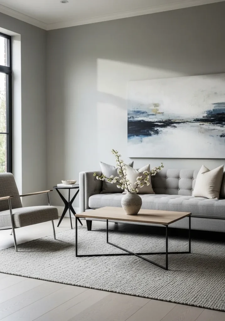
Deep Charcoal Walls
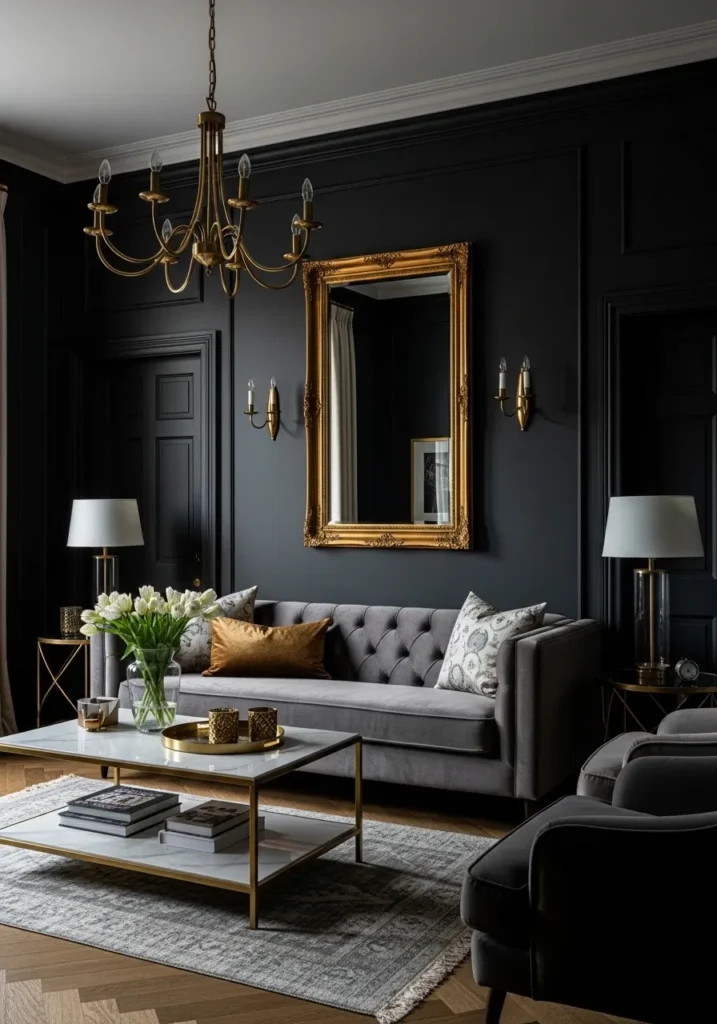
This reads very close to Benjamin Moore Kendall Charcoal. It is a rich, dark gray with a soft depth that leans slightly cool but not cold. It works well here because it lets the lighter sofa and the gold mirror stand out without feeling too heavy.
Kendall Charcoal has a balanced undertone that can shift depending on the light, sometimes looking a bit warmer, sometimes more slate-like. It tends to do best in rooms with good light or higher ceilings, since it can feel dense in smaller spaces. Paired with warm metals and soft fabrics, it comes across a little more relaxed and less formal.
Soft Light Greige Walls
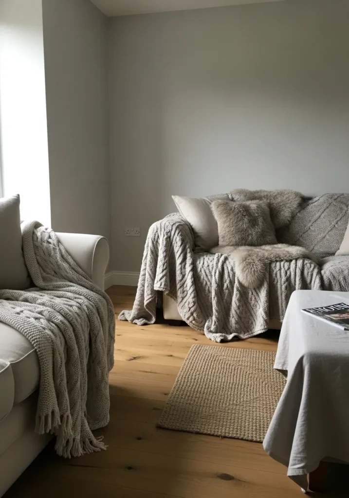
This looks closest to Benjamin Moore Classic Gray. It is a very light greige, sitting right between soft gray and a hint of beige, which makes it easy to use across a whole room. It keeps things calm without going too white, especially next to those layered neutral throws.
Classic Gray has a gentle warm undertone, though it can shift slightly depending on the light. In brighter rooms it reads almost like an off white, while in lower light it shows a bit more body. It works well with light wood floors and soft fabrics, but it can look a touch flat if the space does not get enough natural light.
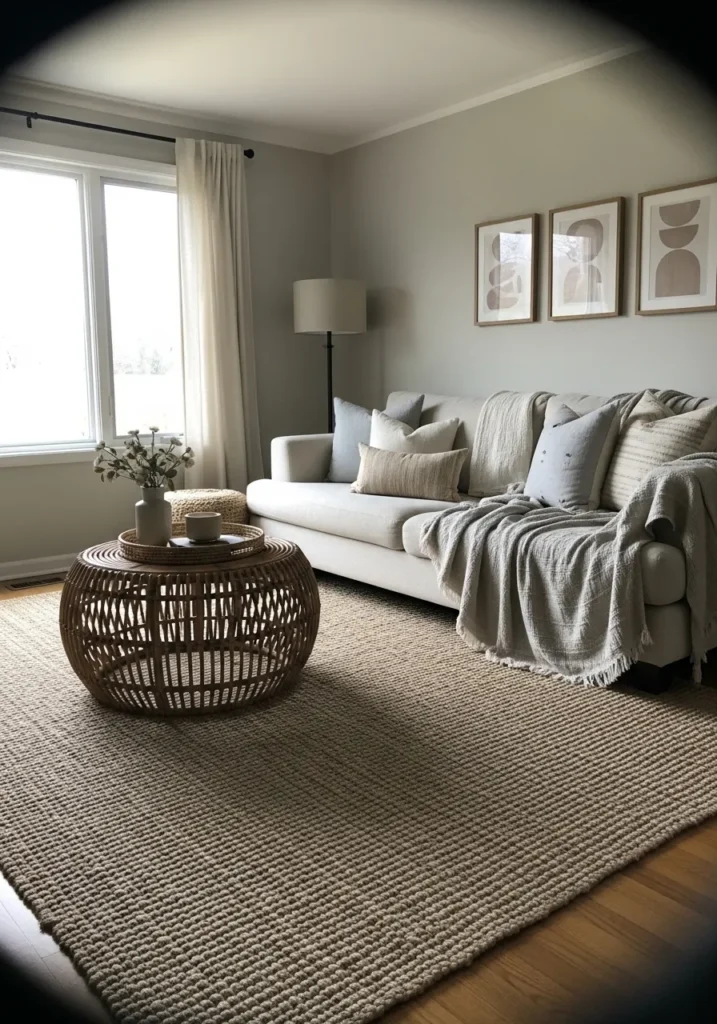
Warm Greige With A Soft Beige Lean
This looks closest to Benjamin Moore Edgecomb Gray. It sits in that in-between space where gray meets beige, but it leans a bit warmer overall. It works nicely with all the woven textures and soft fabrics, keeping everything feeling easy and pulled together without looking too pale.
Edgecomb Gray has a quiet warmth that shows up more when paired with natural materials like the jute rug and light wood. In brighter rooms it can read almost like a creamy neutral, while in softer light it settles into a true greige. It is a good choice if you want something neutral but not too cool or flat.
Warm Beige With A Soft Glow
This looks closest to Benjamin Moore Natural Cream. It is a warm beige that leans a little creamy, which makes the whole room feel relaxed without going too yellow. It works especially well with the layered neutral fabrics and soft tones on the sofa.
Natural Cream has a gentle warmth that becomes more noticeable in stronger light, sometimes picking up a slightly golden feel. It tends to look richer in the evening and softer during the day. It pairs easily with other warm neutrals and wood tones, though it can feel a bit heavy if you mix it with cooler gray finishes.
Deep Green Walls With A Classic Feel
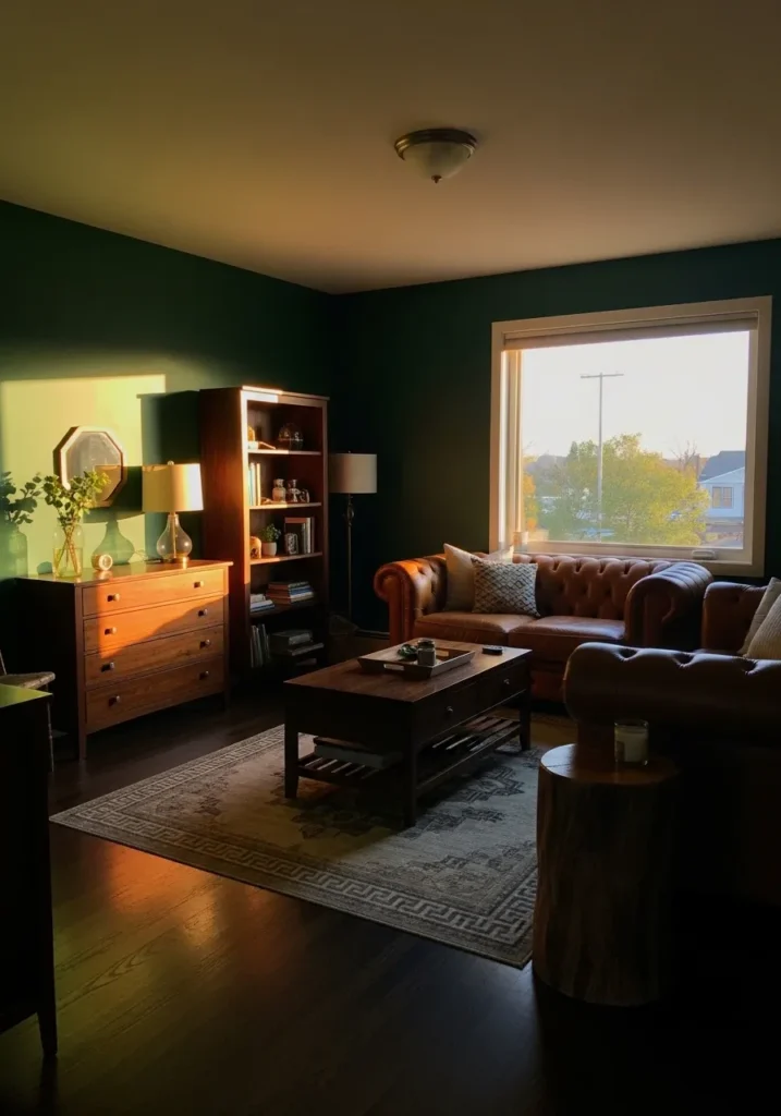
This looks closest to Benjamin Moore Hunter Green. It is a rich, deep green that leans slightly warm, which keeps it from feeling too sharp or overly dark. It works well with the brown leather sofa and wood furniture, giving the whole space a more settled, traditional feel.
Hunter Green has a strong presence, but it softens a bit in natural light and can read almost muted in certain corners. It pairs naturally with warm woods and brass finishes, and it tends to feel more comfortable in rooms that get some daylight. In very low light, it can go quite dark, so that is something to think about.
Dark Blue Green Accent Wall
This reads very close to Benjamin Moore Newburg Green. It is a deep blue green that leans slightly cool, but still feels rich rather than sharp. It works well as an accent wall behind a light sofa like this, giving the room some contrast without feeling too busy.
Newburg Green has a noticeable blue undertone, though it can shift toward green depending on the light. In brighter spaces it shows more color, while in lower light it deepens and feels almost moody. It pairs nicely with light woods and soft neutral fabrics, which helps keep the look from feeling too dark.
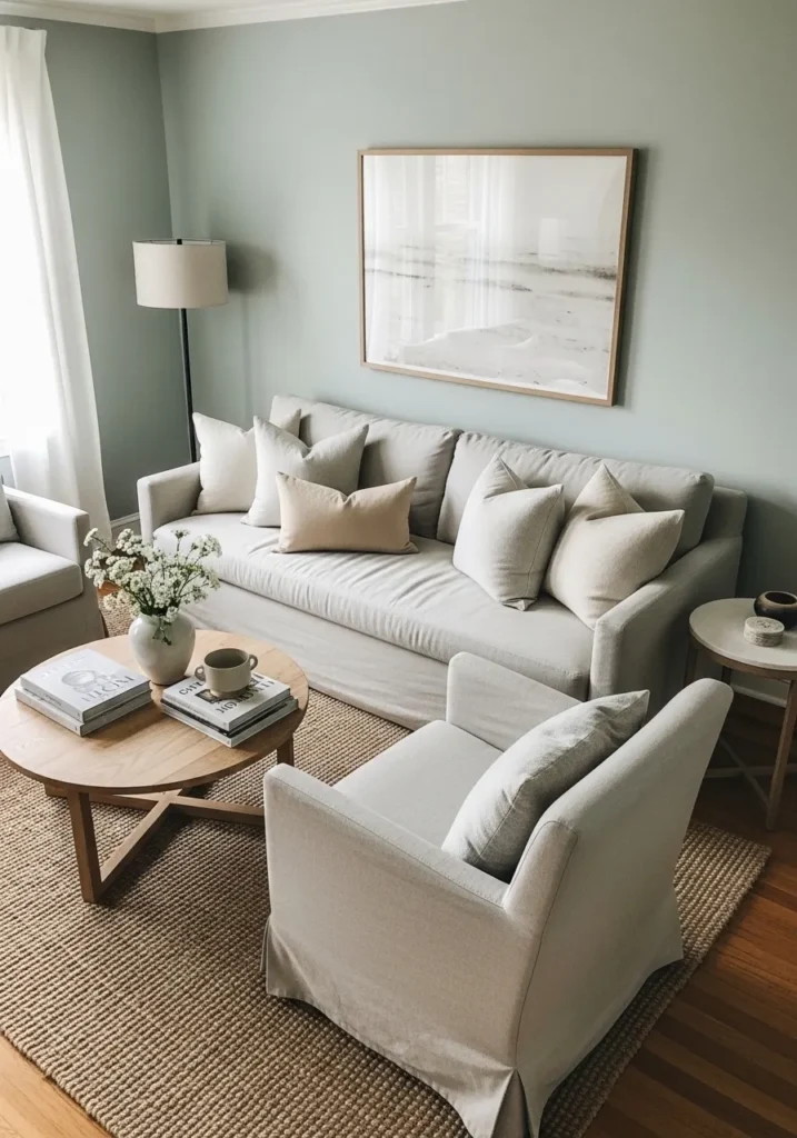
Soft Blue Gray Walls
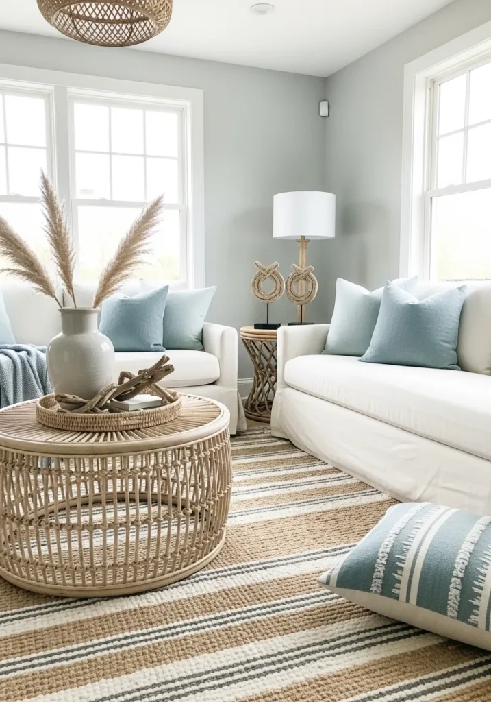
This looks closest to Benjamin Moore Healing Aloe. It is a light blue gray with a gentle softness that leans slightly green, which keeps it from feeling too cool. It works nicely with the pale blue pillows and natural textures, giving the room a relaxed, easy feel.
Healing Aloe has a subtle mix of blue and green undertones, and the balance can shift depending on the light. In brighter spaces it looks lighter and fresher, while in softer light it settles into a muted gray tone. It pairs well with white upholstery and woven materials, though it can look a bit washed out if the room lacks natural light.
Warm Neutral Beige Walls
This looks closest to Benjamin Moore Muslin. It is a soft beige with a clear warm undertone, but it stays light enough to feel easy and not too heavy. It works well with the pale wood furniture and layered neutral fabrics, keeping everything in the same relaxed range.
Muslin has a gentle golden undertone that becomes more noticeable in stronger light. In brighter rooms it feels lighter and a bit creamy, while in softer light it deepens slightly. It pairs best with other warm tones and natural materials, and it can feel a little off if mixed with cooler gray pieces.
Soft Muted Blue Gray Walls
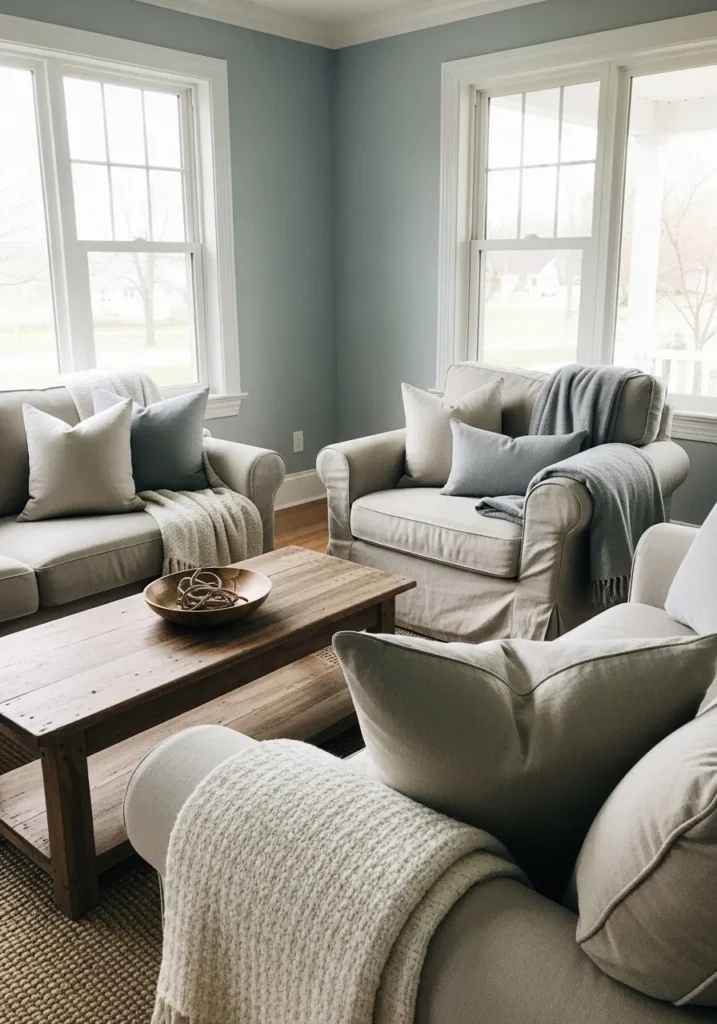
This looks closest to Benjamin Moore Smoke. It is a soft blue gray that leans slightly cool, but it has just enough softness to keep it from feeling cold. It works nicely with the light upholstery and wood table, giving the room a calm, easy look.
Smoke has a gentle blue undertone with a hint of gray that helps tone it down. In brighter light it feels lighter and a bit airy, while in softer light it can look more gray than blue. It pairs well with creams and warm woods, though it can feel a little flat if everything in the room stays too similar in tone.
Soft Neutral Gray Walls
This looks closest to Benjamin Moore Stonington Gray. It is a light gray with a slightly cool undertone, but it stays soft enough to work in a living room without feeling stark. It pairs nicely with the darker furniture and wood trim, giving a bit of contrast while still feeling calm.
Stonington Gray has a subtle blue undertone that can show up more in cooler light. In brighter rooms it feels lighter and cleaner, while in dimmer spaces it can look a bit deeper. It works well with both warm wood tones and soft textiles, though it can lean a little cool if everything around it is too gray.
Soft Muted Sage Green Walls
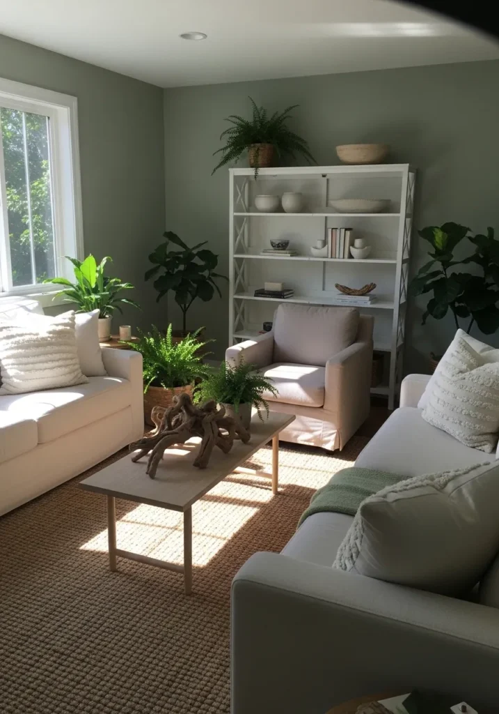
This looks closest to Benjamin Moore October Mist. It is a light sage green with a gray base, which keeps it soft and easy to use in a living room. It has that quiet, natural feel that works well with simple furniture and a few plants.
October Mist has a gentle green undertone, but the gray in it tones everything down so it never feels too bright. In stronger light it leans a bit fresher, while in lower light it reads more muted. It pairs nicely with warm woods and off whites, and it tends to feel most comfortable in rooms that get some natural light.
Deep Charcoal Gray Walls
This looks closest to Benjamin Moore Kendall Charcoal. It is a deep gray with a soft warmth to it, not too cold and not fully black. It gives the room a more settled feel, especially next to the light sofas and pale rug.
Kendall Charcoal has a balanced undertone that can shift a bit depending on the light. In brighter areas it reads more like a true gray, while in lower light it deepens and feels almost like a soft black. It works well with warm wood tones and lighter fabrics, though it does best in rooms that have at least some natural light.
Light Warm Greige Walls
This looks closest to Benjamin Moore Edgecomb Gray. It is a light greige that leans slightly warm, sitting right between beige and gray without going too far either way. It works well with the soft neutral sofa and woven textures, keeping everything easy and relaxed.
Edgecomb Gray has a subtle warm undertone that can shift depending on the light. In brighter rooms it feels lighter and a bit creamy, while in lower light it leans more gray. It pairs easily with both warm woods and cooler fabrics, which makes it a safe choice if you like to mix finishes a bit.
Soft Classic Greige Walls
This looks closest to Benjamin Moore Revere Pewter. It is a balanced greige that leans slightly warm, sitting comfortably between gray and beige. It works well with the traditional furniture and warm wood tones, keeping the room feeling steady and easy to live with.
Revere Pewter has a soft undertone that can shift a bit depending on the light. In brighter light it feels lighter and more neutral, while in dimmer areas it can lean a touch warmer. It pairs well with creams and darker woods, though it can look a bit dull if everything around it stays too similar in color.
Soft Creamy White Walls
This looks closest to Benjamin Moore White Dove. It is a warm white with a soft creamy base, not too stark and not too yellow. It works well in a room like this where the light is strong, keeping everything bright but still comfortable to look at.
White Dove has a gentle warmth that shows up more as the light changes. In bright daylight it feels clean and light, while in softer light it leans a bit warmer and cozier. It pairs easily with light woods and neutral fabrics, though it can look slightly creamy next to very crisp whites.
Warm Taupe Walls
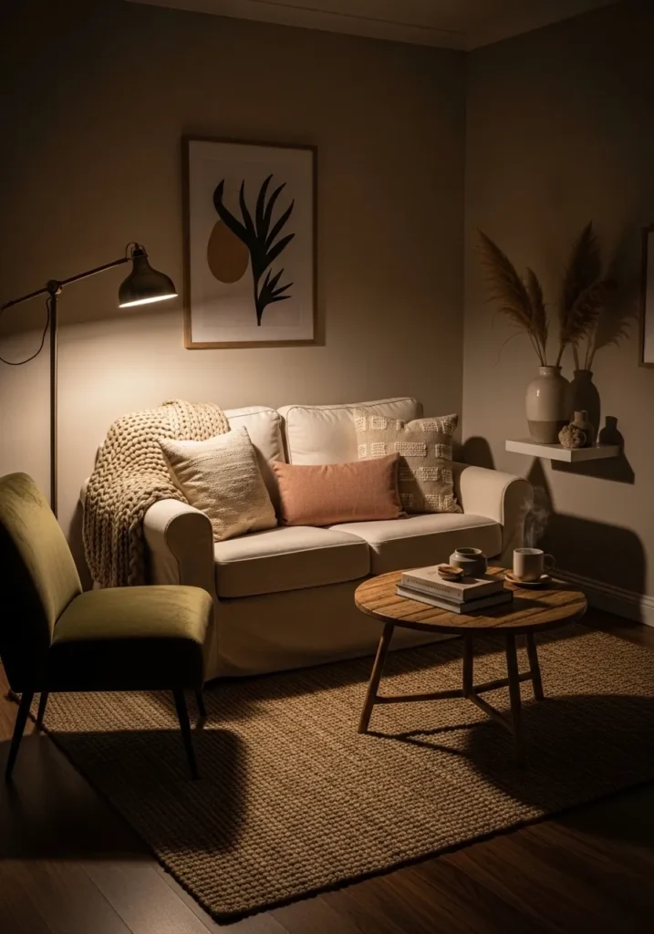
This looks closest to Benjamin Moore Smokey Taupe. It is a mid tone taupe with a clear warm base, sitting somewhere between beige and brown. It works nicely in a smaller, softly lit room like this, giving it a cozy and settled feel.
Smokey Taupe has a warm undertone that becomes more noticeable under artificial light, where it can read a bit richer and deeper. In brighter light it softens and shows more of its neutral side. It pairs well with creamy upholstery and natural wood, though it can feel a little heavy if the room does not have enough light.
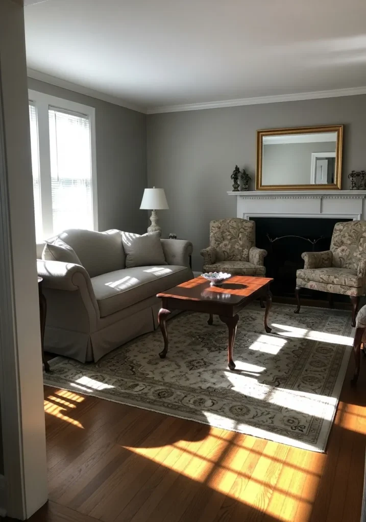
Soft Light Gray Walls
This looks closest to Benjamin Moore Classic Gray. It is a very light gray that leans just slightly warm, so it reads almost like an off white in some spaces. It works well in a clean, simple room like this where the focus stays on the furniture and artwork.
Classic Gray has a soft undertone that can shift depending on the light. In bright natural light it looks airy and pale, while in lower light it shows a bit more of its gray side. It pairs easily with both warm and cool tones, though it can look a little flat if everything in the room stays too similar in shade.
Soft Gray Green Walls
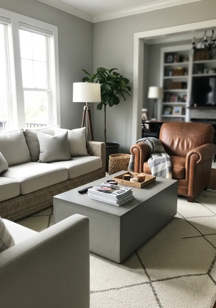
This looks closest to Benjamin Moore Saybrook Sage. It is a muted gray green that leans slightly warm, which keeps it from feeling too cool or sharp. It works nicely with the light sofa and that leather chair, giving a bit of color without taking over the room.
Saybrook Sage has a soft green undertone with a touch of gray that tones it down. In brighter light it reads a bit fresher, while in softer light it leans more neutral. It pairs well with warm woods and natural textures, and it tends to feel most comfortable in rooms that get steady daylight.
Soft Dusty Green Walls
This looks closest to Benjamin Moore Hollingsworth Green. It is a muted green with a gray base, which keeps it soft and easy to live with. It works well with the light upholstery and simple wood pieces, giving just enough color without feeling strong.
Hollingsworth Green has a gentle, slightly cool undertone that can shift depending on the light. In brighter spaces it reads a bit fresher, while in softer light it leans more neutral. It pairs nicely with warm woods and off whites, though it can look a touch dull if the room does not get enough natural light.