I have always had a soft spot for teal. It sits right between calm and playful, which makes it such a fun color to bring into a home.
Some days I want something light and airy, and other times I lean toward deeper shades that feel a little moodier, and teal somehow does both without trying too hard.
If you’re into colors that feel fresh but still easy to live with, teal is one of those shades that keeps surprising you in the best way.
I pulled together my favorite Benjamin Moore teal paint colors that I keep coming back to, the kind that give a room personality without making it feel overwhelming.
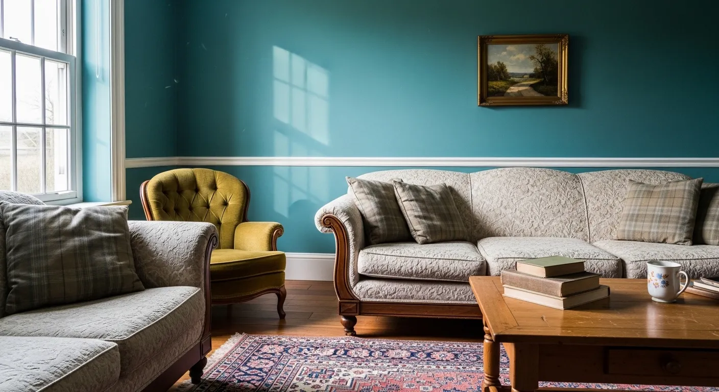
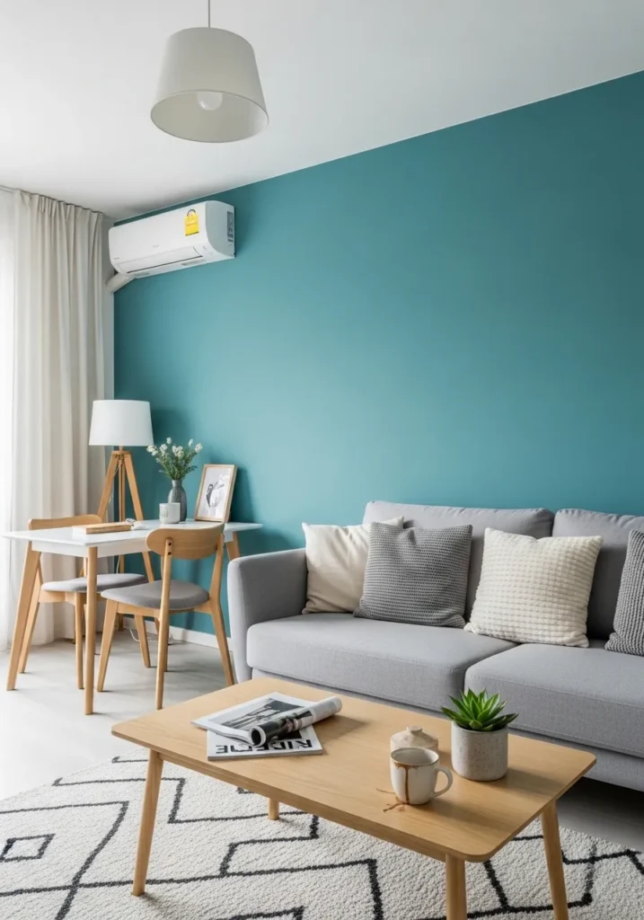
A Bright Teal Living Room
This wall color looks closest to Benjamin Moore Peacock Blue 2049-40, a clear, vibrant teal that sits right between blue and green. It has that fresh, lively feel without going too dark. You can see how it lifts a simple setup, even with neutral sofas and a basic wood coffee table. It is the kind of color that brings energy into the room but still feels easy to live with.
The undertone leans slightly green, which keeps it from feeling too sharp or cold. It works best with soft whites and natural textures like wood or woven rugs. In brighter rooms it can feel crisp, while in lower light it deepens a bit. I would keep the rest of the palette calm so the teal stays the focus… too many bold colors nearby can make it feel busy.
Teal Cabinets That Feel Fresh
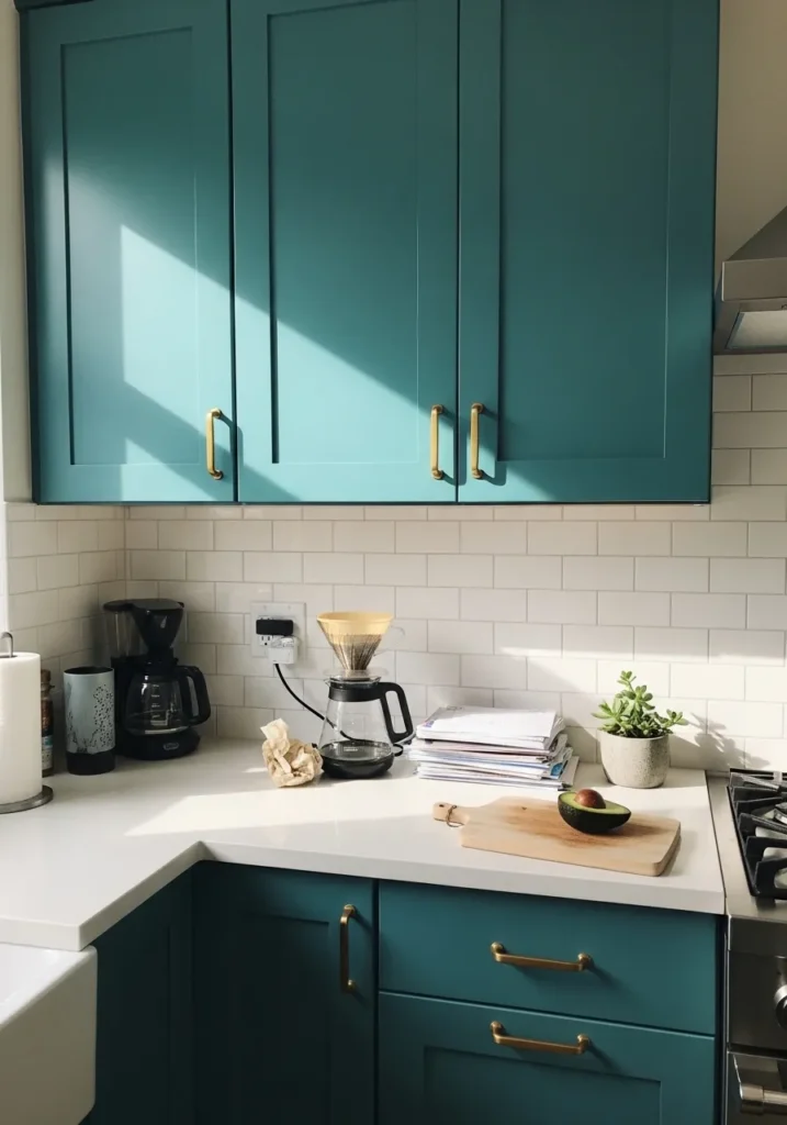
These cabinets read very close to Benjamin Moore Teal Ocean 2049-30, a mid-to-deep teal that leans slightly green. It has a clean, lively look without going too dark, which is why it works so well in a kitchen. Even next to simple white tile and a plain countertop, the color holds its own and keeps the space from feeling flat.
The green undertone helps it feel a bit softer than a blue-heavy teal, especially in natural light. It pairs easily with warm metals like the brass handles here and also works well with wood tones. In smaller kitchens, I would keep the surrounding walls light so the cabinets do not feel heavy. It is a bold choice, but still easy to live with day to day.
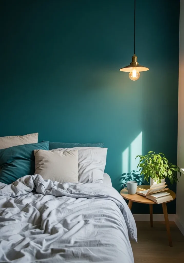
Deep Teal For A Calm Bedroom
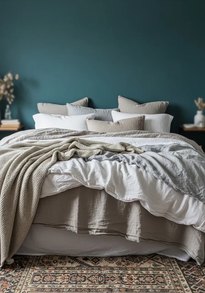
This wall color feels closest to Benjamin Moore Aegean Teal 2136-40, a slightly muted teal that leans more blue than green. It is not overly bright, which makes it easy to use in a bedroom. Even with simple neutral bedding, the color gives the space a bit more presence without feeling loud.
There is a soft gray undertone in it, so it reads calmer than a sharper teal. That helps when you pair it with light fabrics like white or beige, like the bedding here. In lower light it can look a bit deeper and moodier, so I would keep some lighter accents around to balance it. It is one of those teals that works when you want color, but still want the room to feel settled.
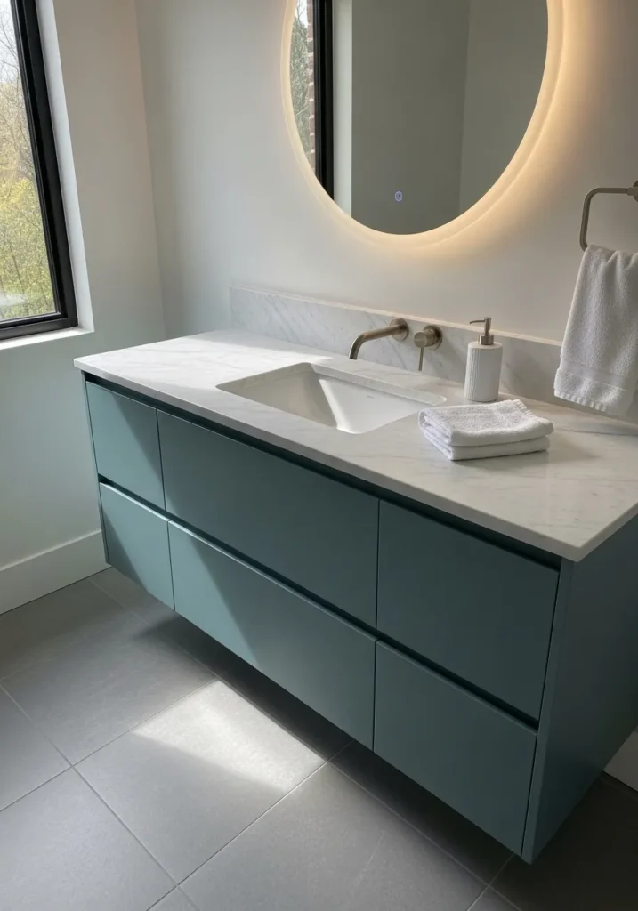
Rich Teal In A Small Bathroom
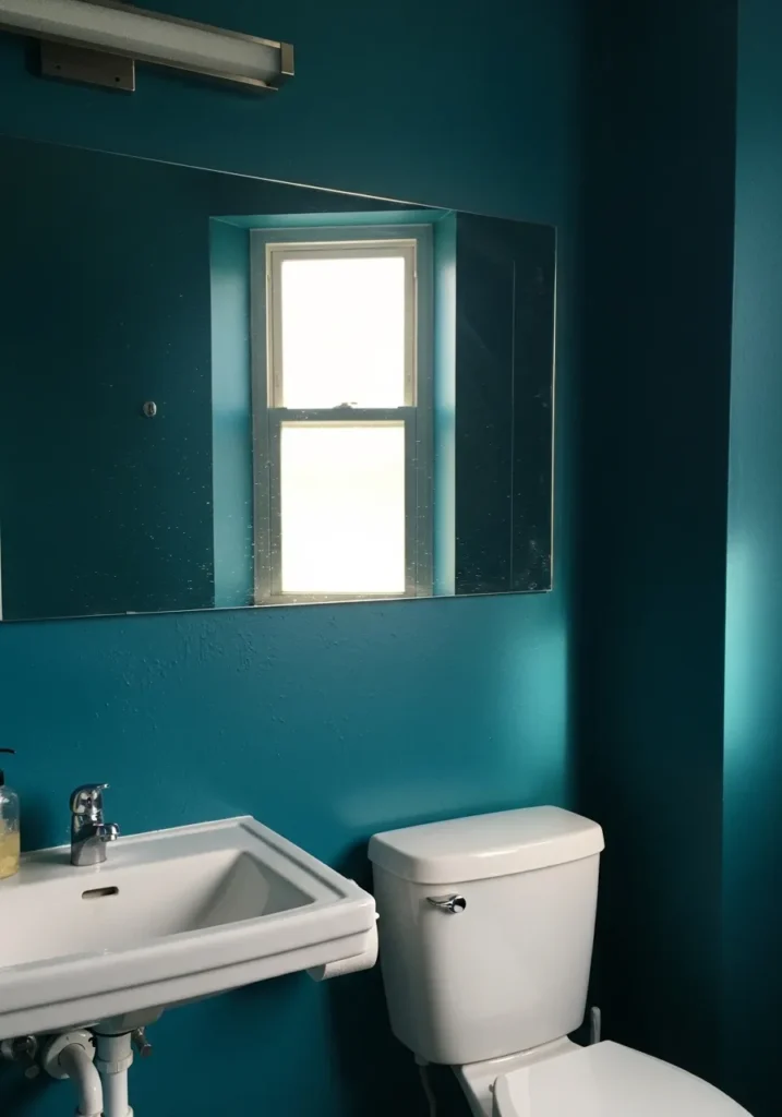
This shade looks closest to Benjamin Moore Teal 2055-10, a deeper and more saturated teal that leans slightly toward blue. It has a strong, clean look that works surprisingly well in a small bathroom. Even with simple white fixtures like the sink and toilet, the color gives the room more presence without needing much else.
The undertone stays on the cooler side, so it can feel a bit crisp depending on the light. In a space with limited natural light, it may read darker, almost inky at times. I would keep trim and fixtures bright white to break it up a bit… it helps the color feel more balanced and not too closed in.
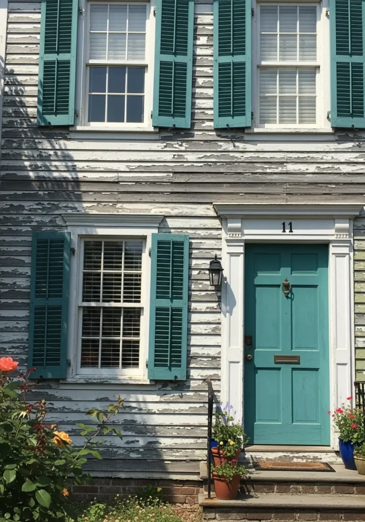
A Teal Front Door That Stands Out
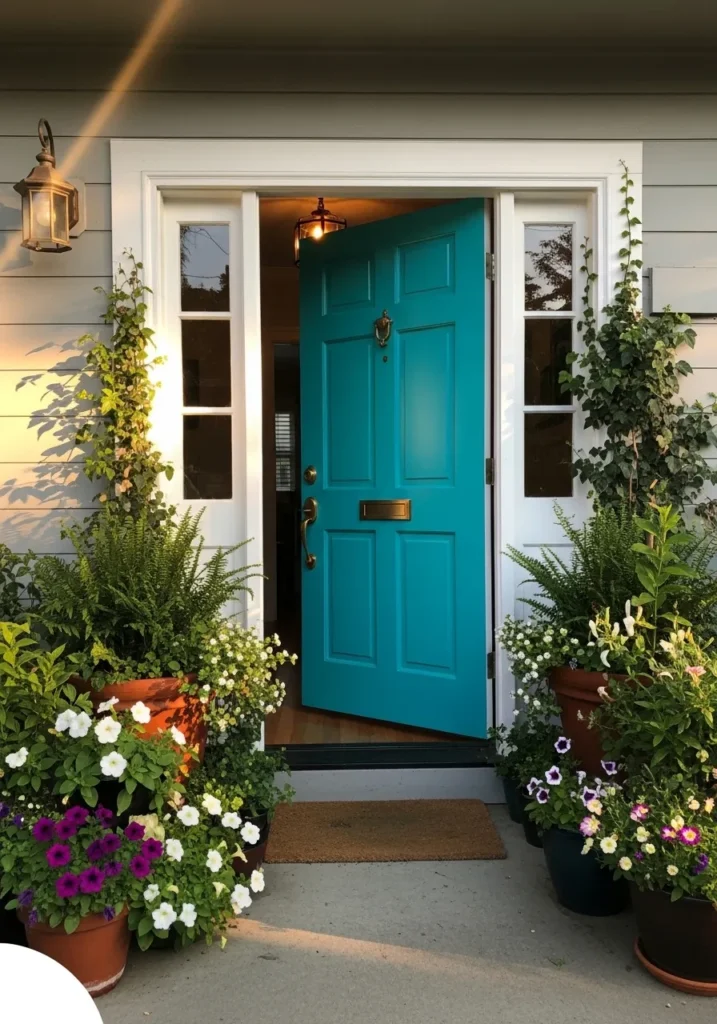
This door color looks closest to Benjamin Moore Peacock Blue 2049-40, a bright teal that leans slightly toward green. It has a clean, cheerful feel that works really well for an entry. Against simple white trim, the color feels fresh and noticeable without being too much.
The green undertone helps it sit nicely with plants and natural greenery around the entry. In strong light, it can look a bit brighter and more playful, while in shade it settles into a richer teal. I would keep the surrounding colors simple so the door stays the focus… it is a bold color, but it feels right at home on a front entrance.
Dark Teal Walls In A Dining Room
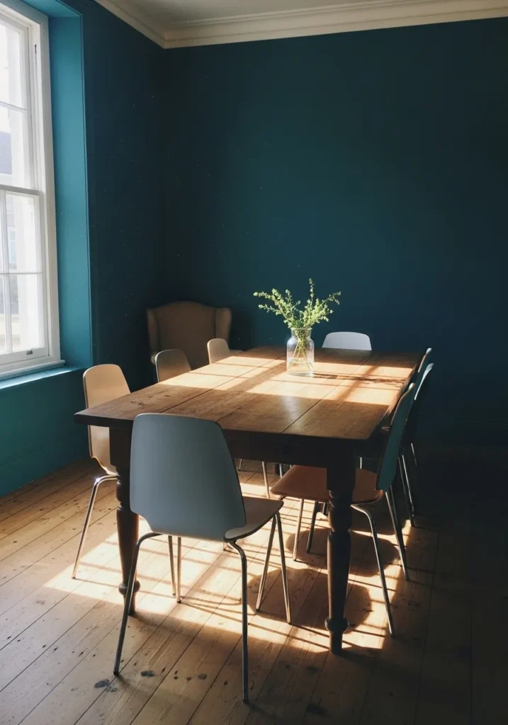
This wall color looks closest to Benjamin Moore Dark Teal 2053-20, a deep, saturated teal that leans more blue than green. It has a heavier feel compared to brighter teals, which works well in a dining space. Next to a warm wood table, the color feels richer and more settled, not sharp or flashy.
The blue undertone gives it a slightly cooler edge, especially in areas away from direct light. In a room with one window like this, it can shift between a soft teal and a much deeper tone. I would keep furniture lighter or natural so the walls do not feel too closed in… it is a strong color, but it works when you let it stand on its own.
Teal Walls In A Narrow Hallway
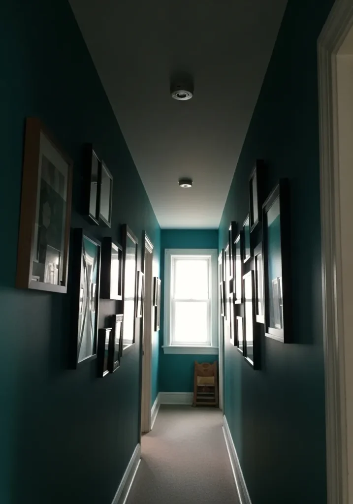
This wall color looks closest to Benjamin Moore Blue Danube 2062-30, a deep teal that leans strongly toward blue. It has a richer, slightly darker tone, which can work well in a narrow hallway like this. Instead of trying to brighten the space, it gives it a more defined, finished feel.
The cool undertone shows up more in lower light, so the color can shift depending on how much daylight reaches the space. In a long hallway with one window at the end, it will read deeper along the sides and a bit lighter near the light source. I would keep trim and ceiling white to break it up… otherwise it can start to feel a little closed in.
A Moody Teal For A Work Space
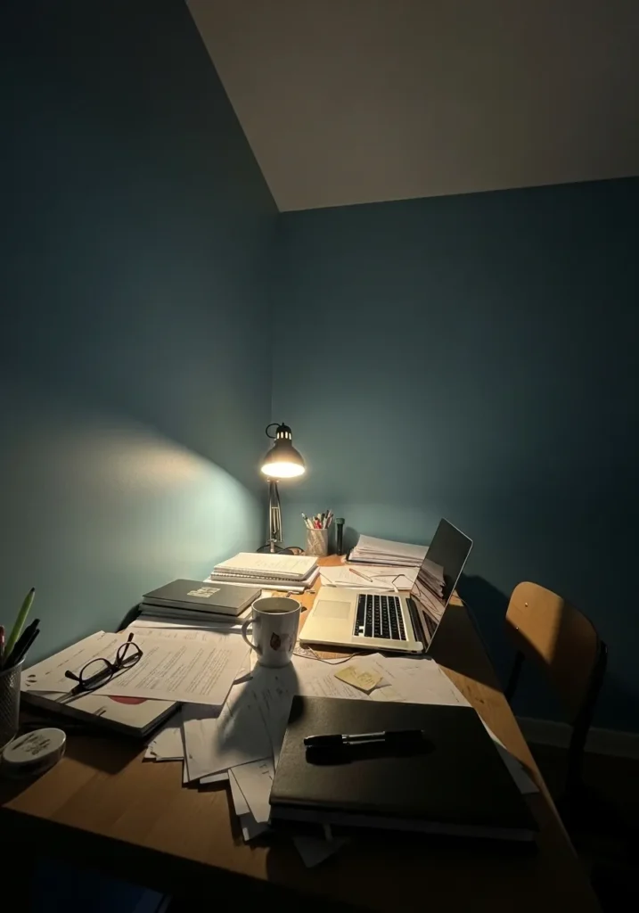
This wall color looks closest to Benjamin Moore Aegean Teal 2136-40, though it reads a bit deeper here under indoor lighting. It is a muted teal with a soft gray base, which makes it feel steady rather than bright. In a small work corner like this, it gives the space a bit of focus without feeling too busy.
The undertone leans blue with a slight gray cast, so it can shift depending on the light. Under a desk lamp, it looks darker and more contained, while in daylight it would open up a bit. I like it with simple wood furniture and neutral pieces… it keeps the room from feeling too heavy while still letting the color show.
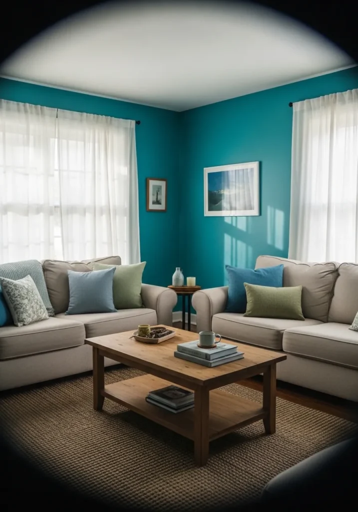
Light Teal For A Clean Living Space
This wall color reads very close to Benjamin Moore Jamaican Aqua 2048-60, a lighter teal with a clear blue-green balance. It has a softer, more open feel compared to deeper teals, which makes it a good fit for a smaller living area. Even next to a simple gray sofa and light wood furniture, the color keeps the room feeling fresh without taking over.
The undertone leans slightly blue, so it stays cool and crisp, especially in brighter light. In a space with white walls and light flooring, it feels easy and relaxed rather than bold. I would keep the rest of the palette simple and neutral… this kind of teal works best when it has a bit of breathing room around it.
Soft Teal For A Nursery
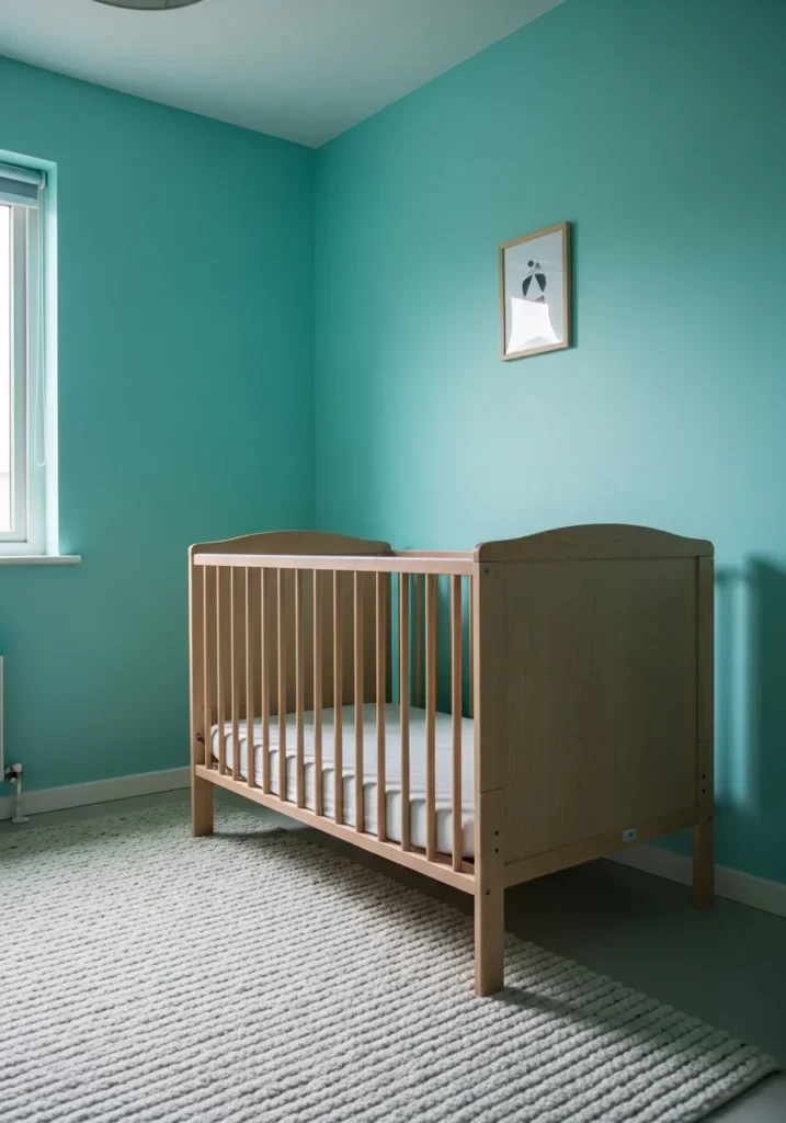
This wall color looks closest to Benjamin Moore Arctic Blue 2050-60, a light teal that leans a bit toward green. It has a gentle, easy feel, which works well in a nursery setting. Paired with a simple wood crib, the color feels calm without going dull.
The undertone is soft and slightly muted, so it does not come across as overly bright. In natural light, it reads fresh and clean, while in lower light it stays soft rather than turning dark. I would keep the rest of the room light and simple… this kind of teal works best when it stays easy on the eyes.
A Soft Teal For Exterior Details
This door color looks closest to Benjamin Moore Jamaican Aqua 2048-60, a lighter teal with a soft blue-green balance. It has a slightly weathered feel here, which makes it sit nicely on an older exterior. Against the worn siding and simple white trim, the color feels easy and not too bold.
The undertone leans a bit green, so it works well with plants and garden elements around the entry. In brighter light it can look a touch lighter and more washed, while in shade it shows more depth. I would keep the rest of the exterior fairly neutral… this kind of teal works best when it is not competing with too many other colors.
Teal Walls In A Reading Corner
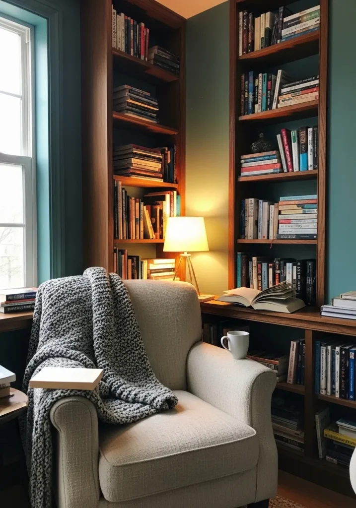
This wall color looks closest to Benjamin Moore Aegean Teal 2136-40, a muted teal with a soft blue-gray base. It is not overly bright, which makes it a good choice for a quiet reading area. Paired with warm wood shelves and a simple chair, the color feels settled and easy to spend time in.
The gray undertone helps tone it down so it does not feel sharp. Under a warm lamp, it leans a bit deeper and more relaxed, while in daylight it shows more of its teal side. I would keep textures soft and natural here… this kind of color works best when the space stays simple and comfortable.
Teal For A Small Balcony Wall
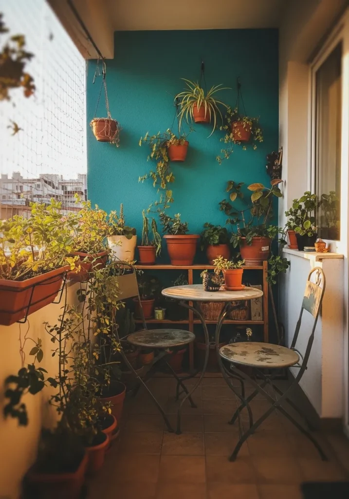
This wall color looks closest to Benjamin Moore Peacock Blue 2049-40, a brighter teal with a noticeable green side. It has a lively, outdoor-friendly feel that works well on a small balcony. Even with simple pots and a small table, the color gives the space a bit more life without needing much else.
The green undertone helps it sit naturally with plants, which makes it a good choice for garden corners or balconies. In direct light, it can look more vivid, while in shade it settles into a slightly deeper tone. I would keep surrounding surfaces light and simple… it lets the teal stand out without making the space feel crowded.
Muted Teal Cabinets In A Laundry Room
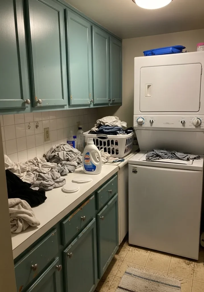
These cabinets look closest to Benjamin Moore Oil Cloth 2144-30, a softened teal that leans a bit green and slightly gray. It is not a bright teal, which makes it easier to use in a practical space like a laundry room. Even with everyday wear on the cabinet fronts, the color still holds up and does not feel too bold.
The green undertone helps it feel a little warmer than a blue-heavy teal, especially next to simple white appliances. In indoor lighting, it can look a bit more muted and calm. I would keep the walls light and simple… this kind of teal works best when it stays in the background and lets the space feel easy to use.
Deep Teal On A Kitchen Island
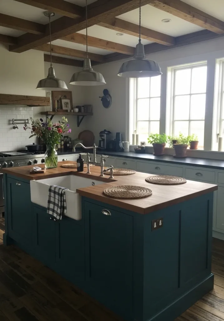
This island color looks closest to Benjamin Moore Dark Teal 2053-20, a rich teal that leans more toward blue. It has a heavier, more solid feel, which works well on a larger piece like a kitchen island. Next to the wood countertop, the color feels fuller and a bit more grounded without looking too dark.
The blue undertone keeps it on the cooler side, especially in shaded areas of the room. In brighter light, it shows more of its teal side and feels a little more open. I would keep surrounding cabinets lighter like these… it gives the eye a break and keeps the island from taking over the whole space.
Soft Teal On Bathroom Cabinets
This cabinet color looks closest to Benjamin Moore Smoke 2122-40, which sits right on the edge of teal and gray. It is a softer, more muted take on teal, with a noticeable blue-gray base. In a bathroom like this, paired with a white countertop, it feels clean without being plain.
The gray undertone keeps it from looking too bright, especially in natural light from a nearby window. It can shift slightly cooler or warmer depending on the light, which gives it some flexibility. I would keep finishes simple and light… this kind of teal works best when everything around it stays quiet and easy.
Rich Teal For A Bedroom Wall
This wall color looks closest to Benjamin Moore Teal Ocean 2049-30, a deeper teal that leans slightly blue but still carries some green. It has a fuller, more saturated feel, which works well behind a bed where you want a bit more presence without going too dark.
The tone shifts depending on the light. In brighter spots it reads clearer and more teal, while in softer light it deepens and feels a bit cozier. Paired with light bedding and simple wood, it stays balanced. I would keep the rest of the room fairly quiet… this kind of teal does best when it has space to breathe.
Teal Walls In A Stairway
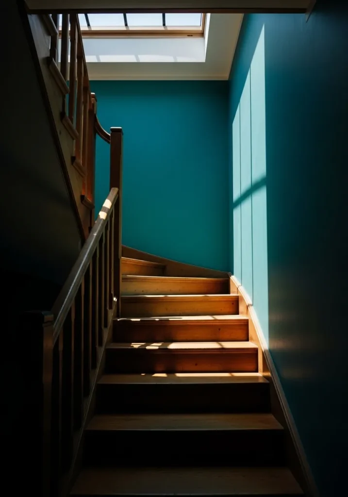
This wall color looks closest to Benjamin Moore Blue Lagoon 2054-40, a clear teal that leans slightly blue but still keeps a fresh, lively tone. It works well in a stairway where you want something a bit more noticeable, especially when it catches light from above.
The color shifts quite a bit depending on the light. In stronger daylight from a skylight, it reads brighter and more open, while in the lower part of the stairs it deepens and feels richer. Paired with warm wood steps, it has a nice contrast. I would keep trim and railings simple and classic… this shade already brings enough interest on its own.
Bright Teal Accent In A Small Room
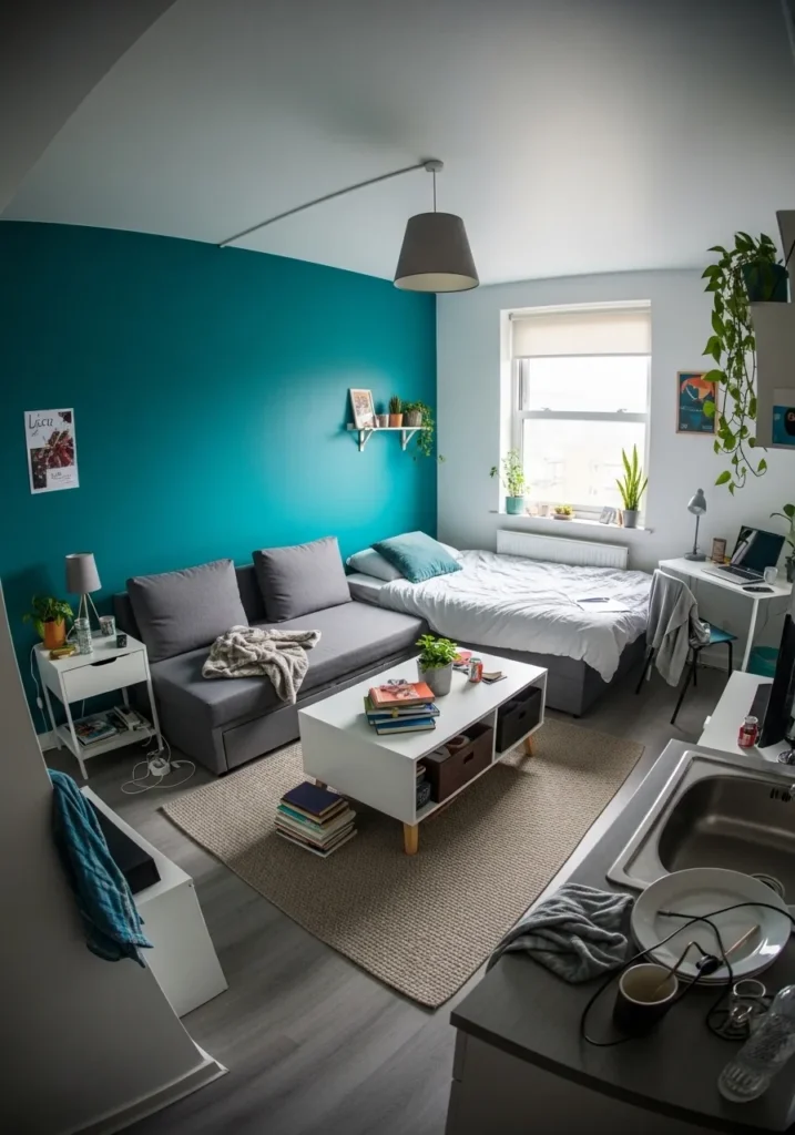
This wall color looks closest to Benjamin Moore Tropical Teal 2048-20, a brighter teal that leans slightly green and feels fresh right away. It works well as an accent wall, especially in a smaller room where you want a bit of color without covering every surface. Next to neutral furniture, it feels lively but still manageable.
The green side of the teal keeps it from feeling too cool, which helps when paired with simple whites and soft grays. In daylight from the window, it looks clearer and more vivid, while in lower light it settles down a bit. I would keep the rest of the palette light and simple… this shade already does enough on its own.
Teal For An Outdoor Wall
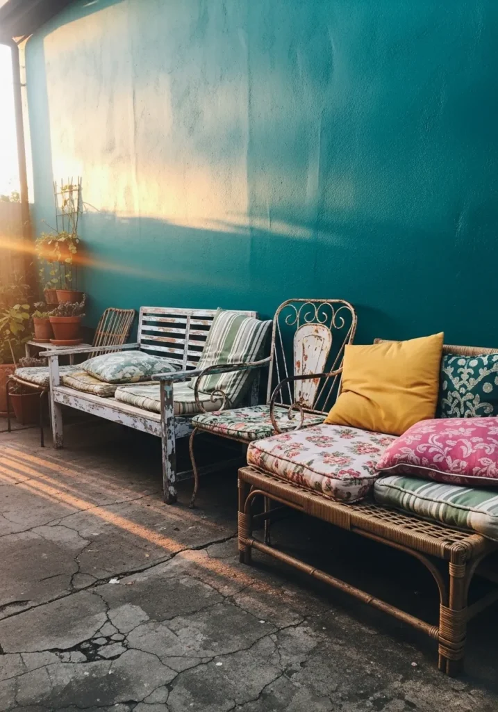
This wall color looks closest to Benjamin Moore Jamaica Aqua 2048-60, a brighter teal that leans more green and feels a bit sun-washed. It works well outside, where a stronger color can handle open light and still show up clearly. Even against worn wood seating, it keeps the space feeling fresh and a little relaxed.
The green undertone helps it sit naturally with plants and terracotta pots, which makes it a good fit for patios or garden corners. In direct sun, it can look lighter and more playful, while in shade it settles into a deeper teal. I would let the surrounding pieces stay a bit imperfect… this kind of color actually works better with a lived-in look.