Navy blue is one of those colors I keep coming back to whenever I want a room to feel a little more polished without trying too hard. My own love for it started with one navy accent wall, and somehow it turned into painted cabinets, doors, and even a hallway.
Benjamin Moore has some truly beautiful navy shades, and I had a lot of fun rounding up the ones that feel classic and easy to live with. Some are deep and moody while others lean a bit softer and calmer.
If you are thinking about using navy somewhere in your home, this list might give you a few ideas I wish I had seen sooner. I always find that the right blue can completely change how a room feels.
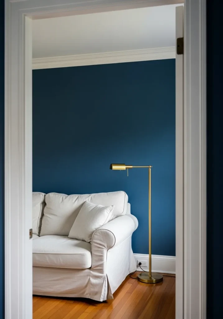
This wall color reads very close to Benjamin Moore Hale Navy (HC-154). It’s a deep navy blue that sits right in that classic, dependable range. Not too inky and not overly bright either. You see this kind of navy used a lot in traditional interiors because it feels steady and familiar. The white sofa against the wall shows it off well. The contrast makes the color look crisp without feeling heavy.
Hale Navy usually leans slightly cool, with a soft gray undertone that keeps the blue from looking overly bold. That undertone is why it works nicely with clean white trim and warm wood floors like the ones here. I tend to see this color work best in living rooms, offices, or small sitting areas where you want something darker but still comfortable to live with. Good natural light helps, though it still holds its color well in softer lighting too.
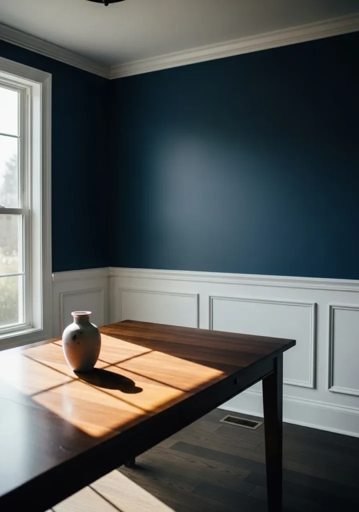
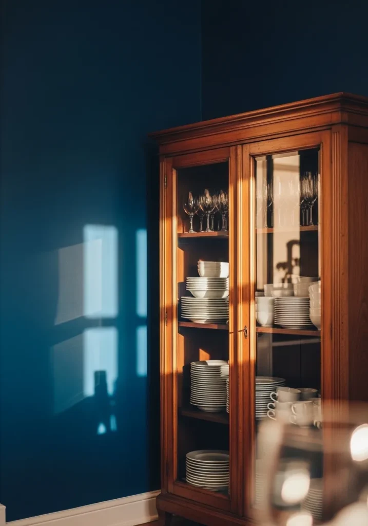
This shade looks very close to Benjamin Moore Newburyport Blue (HC-155). It sits right in that deep navy range but has a slightly softened feel compared to some darker blues. You still get the richness of navy, just without it feeling too sharp. The white wall paneling below it helps show that contrast nicely, which is often where colors like this really shine.
Newburyport Blue usually carries a subtle gray undertone, so it reads calm instead of overly bold. That undertone also makes it work well with warm wood furniture like the dining table here. I tend to like this color in dining rooms or studies where a darker wall can make the space feel a bit more settled. It also pairs well with clean white trim and traditional millwork, which keeps the whole look feeling balanced.
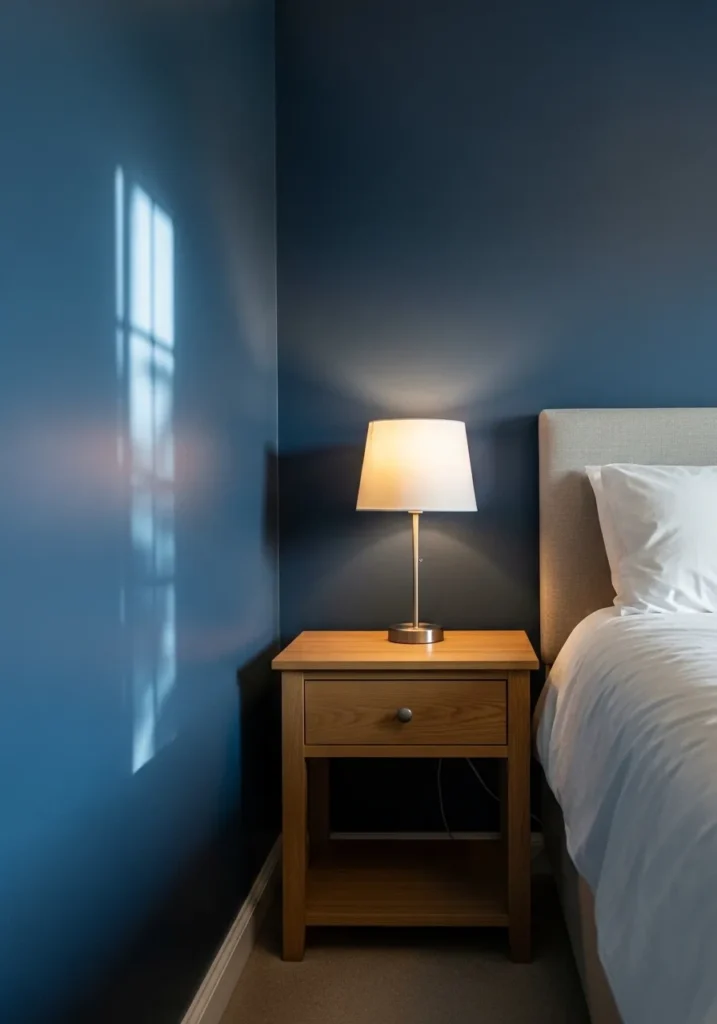
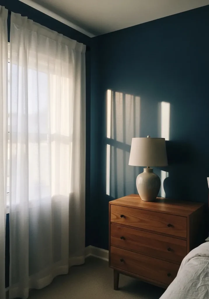
This color looks closest to Benjamin Moore Van Deusen Blue (HC-156). It sits right between navy and deep blue, so it feels rich without going almost black. That middle depth is part of why people like it. It still reads clearly blue. The color beside the light wood nightstand shows how steady and balanced it can feel on a full wall.
Van Deusen Blue usually carries a cool gray undertone, which helps it stay calm instead of overly bold. It tends to work well in bedrooms and smaller sitting rooms where a darker color can make the space feel settled. White bedding or trim keeps it looking crisp, while natural wood furniture helps the color feel a little warmer. A nice combination, honestly.
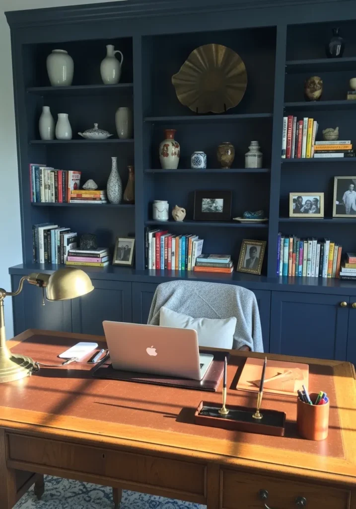
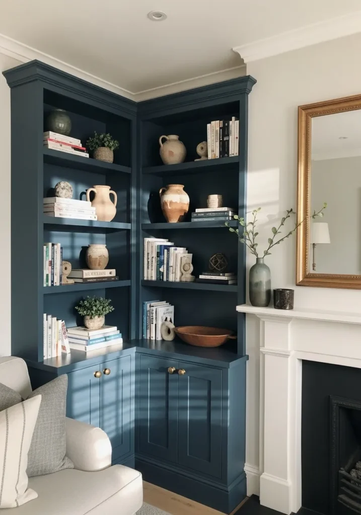
This painted shelving looks closest to Benjamin Moore Gentleman’s Gray (2062-20). Despite the name, it sits right in that deep navy range with a slightly richer tone than a typical flat navy. It feels strong but still comfortable to live with. Using a color like this on built ins is a good trick because it lets the shelves become part of the room instead of just storage.
Gentleman’s Gray has a blue base with a quiet green undertone, which gives it a bit of depth. You can see how well it works around books and small objects on the shelves. Lighter ceramics and paperbacks tend to stand out nicely against it. I often like this type of navy in studies, libraries, or home offices where darker cabinetry helps the room feel a little more settled.
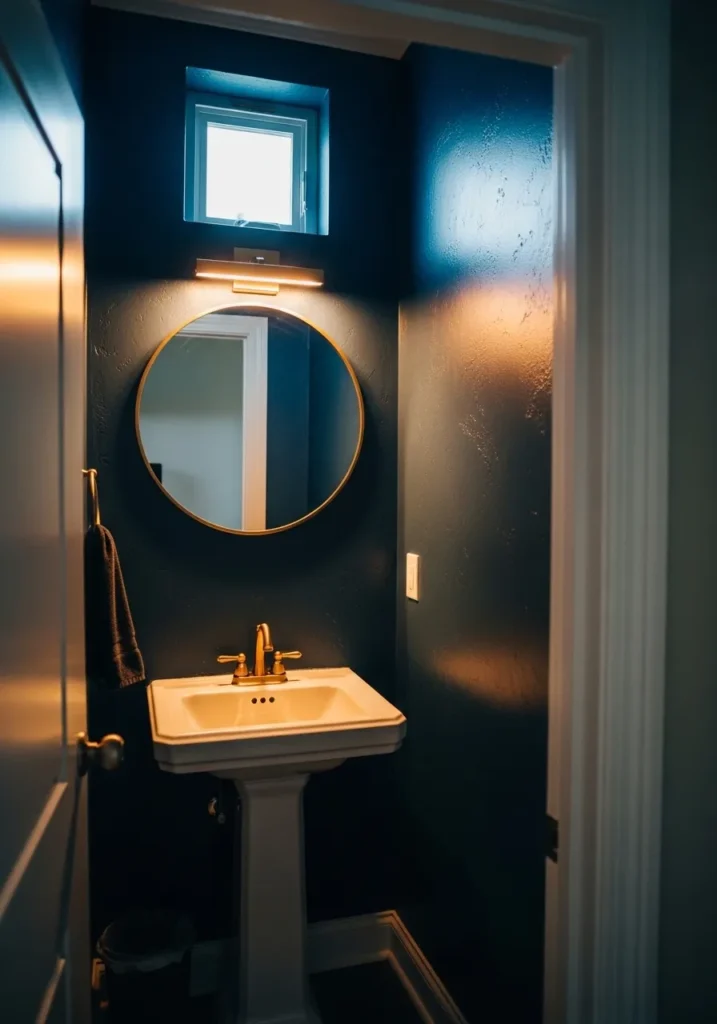
This wall color looks very close to Benjamin Moore Hale Navy (HC-154). It is one of those deep navy blues that reads strong but still familiar, which is probably why people keep coming back to it. In a small powder room like this, a color like Hale Navy can feel surprisingly comfortable instead of overwhelming. The white pedestal sink shows the contrast clearly, which helps the blue stand out in a clean way.
Hale Navy usually carries a cool gray undertone, so the color stays steady and not overly bright. That undertone also works well with brass fixtures and simple white trim, both of which you often see in smaller bathrooms. I tend to like this kind of navy in compact spaces where a darker wall actually makes the room feel a bit more intentional. It works best when the surrounding details stay fairly simple.
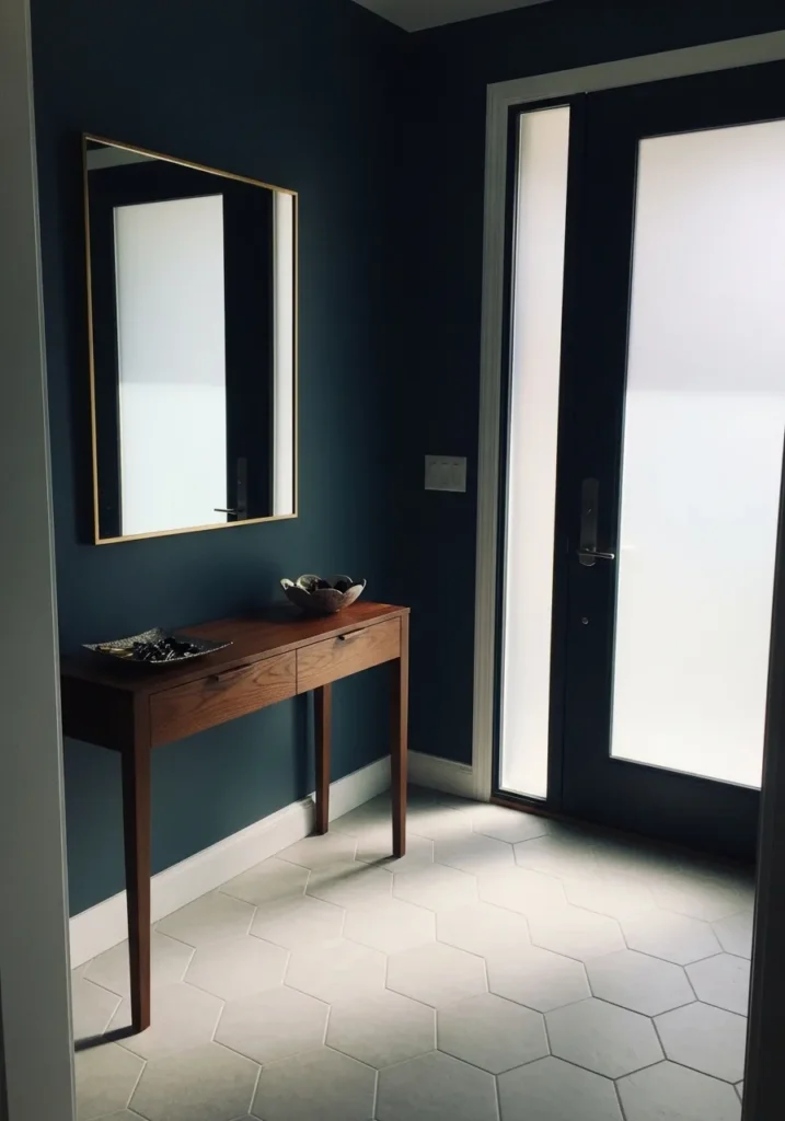
This wall color reads very close to Benjamin Moore Van Deusen Blue (HC-156). It is a strong navy that still shows its blue clearly instead of drifting toward black. That middle depth is part of the appeal. It feels bold but still very livable. In an entry area like this, the color sets the tone right away without needing much decoration.
Van Deusen Blue usually has a cool gray undertone that keeps the navy looking steady and classic. You can see how well it works beside white trim and a simple wood console table. Those lighter elements keep the wall color from feeling too heavy. I tend to like this kind of navy in entryways or hallways where you want a little presence but not something flashy. It just feels dependable.
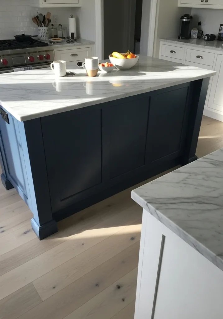
This island color reads very close to Benjamin Moore Hale Navy (HC-154). It is the kind of navy that feels steady and familiar, which is why it shows up so often in kitchens. The depth is dark but still clearly blue, not black. Against a light marble countertop like this, the color looks clean and intentional.
Hale Navy usually has a soft gray undertone that keeps the blue from feeling too sharp. That undertone also works well with white cabinetry and light wood floors. In kitchens, I tend to see this color used on islands rather than every cabinet. It gives the room a bit of contrast while the rest of the space stays bright.
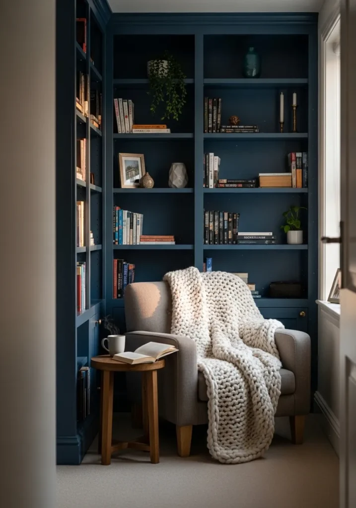
This shelving color reads very close to Benjamin Moore Van Deusen Blue (HC-156). It is a steady navy that still shows a clear blue tone instead of drifting too dark. That makes it a nice choice for built ins like these. The color gives the shelving a bit of presence while still letting books and small objects stand out.
Van Deusen Blue usually carries a cool gray undertone, which helps the color feel calm and balanced. You can see how well it works next to lighter pieces like the upholstered chair and the chunky knit throw. I tend to like this type of navy for libraries, reading nooks, or small sitting areas where darker shelving can make the room feel a little more settled.
This wall color looks very close to Benjamin Moore Hale Navy (HC-154). It is one of those deep navy blues that still feels very classic and easy to live with. The color reads clearly blue but stays dark enough to give the room some weight. Against white window trim and simple curtains, the navy looks crisp and well defined.
Hale Navy usually carries a soft gray undertone, which helps it feel balanced rather than overly bold. That undertone also works nicely with warm wood furniture like the dining table and chairs here. I tend to see this shade used in dining rooms and studies where a darker wall can make the space feel a little more settled. It works especially well when the trim stays bright white.
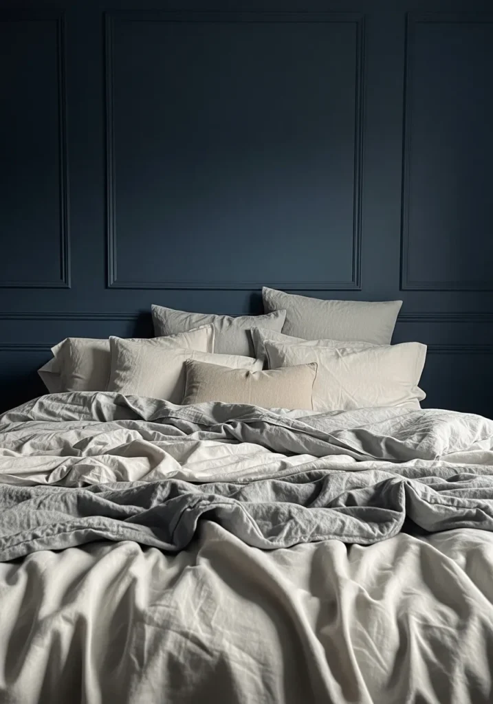
This wall color reads very close to Benjamin Moore Hale Navy (HC-154). It is a deep navy that still shows a clear blue tone instead of turning nearly black. That balance is part of why this shade is so widely used. On a full wall like this, the color gives the room a calm, steady backdrop behind the bed.
Hale Navy usually has a soft gray undertone, which keeps the color from feeling too sharp or overly bright. You can see how well it works with simple light bedding and neutral fabrics. In bedrooms, I tend to like this type of navy as a feature wall or behind the bed where it can give the space a bit of depth without making the whole room feel dark.
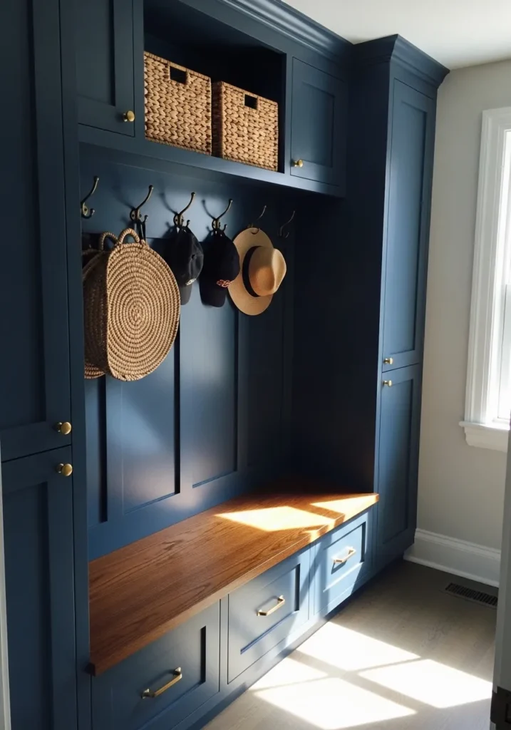
This cabinetry color reads very close to Benjamin Moore Newburyport Blue (HC-155). It sits in that deep navy range but carries a slightly softer tone than some darker blues. That little bit of softness makes it useful for built in storage like this. The color feels strong but still practical for everyday spaces.
Newburyport Blue usually has a gentle gray undertone, which keeps the navy from feeling too bold. It works nicely next to natural wood surfaces like the bench seat here. I tend to like this shade for mudrooms, laundry areas, or entry storage where darker cabinetry can hide wear a bit better. White trim nearby also helps keep the color looking crisp.
This cabinet color looks very close to Benjamin Moore Van Deusen Blue (HC-156). It is a deep navy that still reads clearly blue instead of drifting too dark. That balance makes it a nice choice for built in shelving. The color has enough depth to give the cabinetry some presence, but it still feels comfortable in a living room.
Van Deusen Blue usually carries a soft gray undertone, which keeps the navy from feeling overly bold. You can see how well it works next to the white fireplace mantel and lighter books on the shelves. I tend to like this shade on built ins because it gives storage areas a bit more character while the rest of the room stays fairly neutral.

This wall color looks very close to Benjamin Moore Newburyport Blue (HC-155). It sits in that darker navy range but still reads clearly blue when you see it across a full wall. That kind of depth works well in hallways. The color gives the space a little presence without needing much else.
Newburyport Blue usually has a soft gray undertone, which keeps the navy from feeling too sharp. It pairs nicely with black frames like the gallery wall here, since the darker trim and artwork blend easily against the blue. I tend to like this shade in hallways or stair areas where a deeper color can make the space feel a bit more finished.
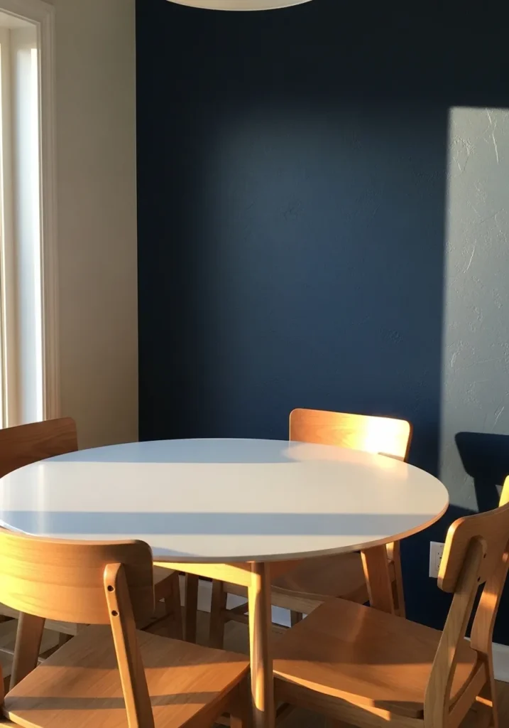
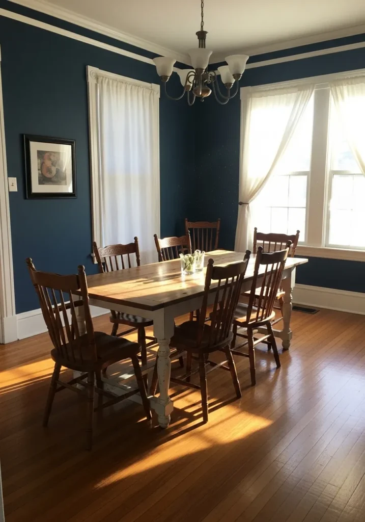
This wall color reads very close to Benjamin Moore Hale Navy (HC-154). It is a deep navy that still keeps a clear blue tone instead of turning nearly black. That balance is part of why it shows up so often in everyday interiors. As a single wall behind a dining table, the color gives the space a little weight without needing much decoration.
Hale Navy usually carries a quiet gray undertone, which helps the blue feel calm rather than sharp. You can see how well it sits next to light wood chairs and a simple white table. That mix of dark wall and lighter furniture tends to work well in dining areas or breakfast spaces where you want some contrast but still want the room to feel relaxed.
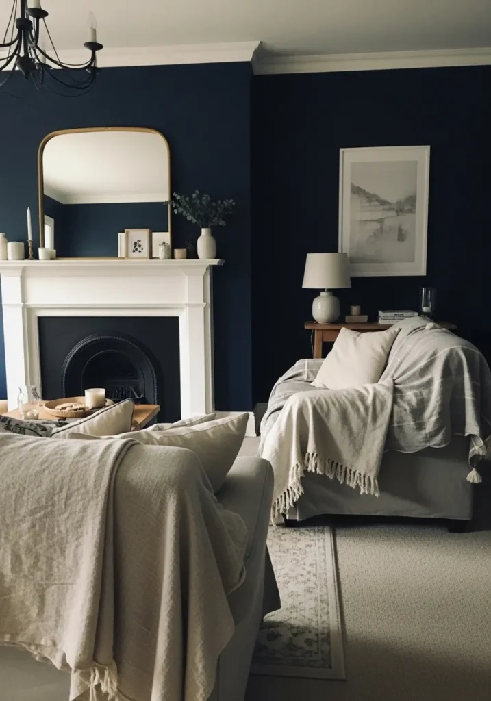
This wall color looks very close to Benjamin Moore Hale Navy (HC-154). It is a classic deep navy that stays clearly blue even at this darker depth. That is one reason it shows up so often in living rooms. The color gives the walls some weight while the white fireplace mantel keeps the space from feeling too dark.
Hale Navy usually carries a gentle gray undertone, which helps the color stay balanced and calm. It works nicely next to soft neutral furniture like the light sofa and chair here. I tend to like this type of navy in living rooms where it can frame architectural details such as a fireplace or built in mantel area without feeling overly bold.
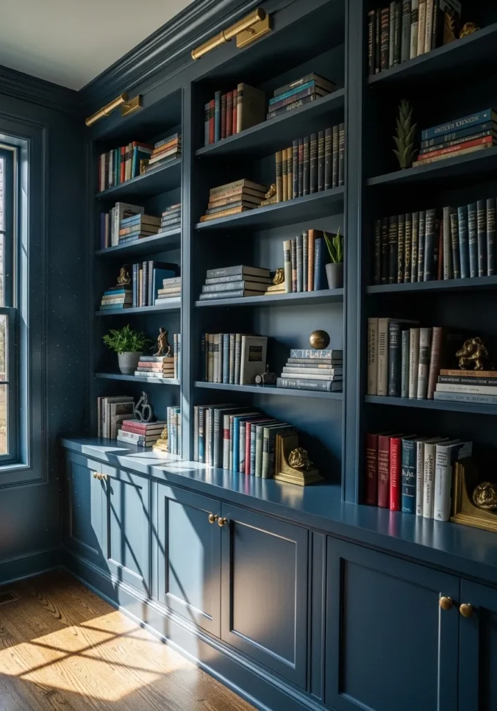
This cabinetry color looks closest to Benjamin Moore Van Deusen Blue (HC-156). It is a rich navy that still reads clearly blue even when used across large built in shelves. That kind of depth works well in a study or home library. The color helps the shelving feel substantial without making the room look overly dark.
Van Deusen Blue usually carries a soft gray undertone, which keeps the navy calm and steady. It pairs nicely with brass accents like the picture lights above the shelves and with natural wood flooring. I tend to like this shade in rooms with books or collections where a darker background lets objects stand out a bit more.
This wall color reads very close to Benjamin Moore Gentleman’s Gray (2062-20). It sits in that deeper navy range but carries a slightly softer blue tone that works well in bedrooms. The color feels steady and relaxed rather than overly bold. Paired with simple wood furniture like the dresser here, it gives the room a bit of richness without making it feel heavy.
Gentleman’s Gray often shows a subtle teal undertone, which becomes more noticeable in natural light. That undertone keeps the navy from looking flat and helps it work nicely with white curtains and light bedding. I tend to like this shade in bedrooms where the goal is a darker wall that still feels comfortable and easy to live with.
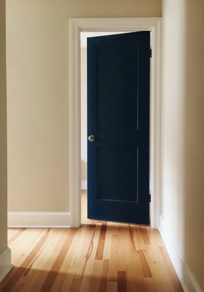
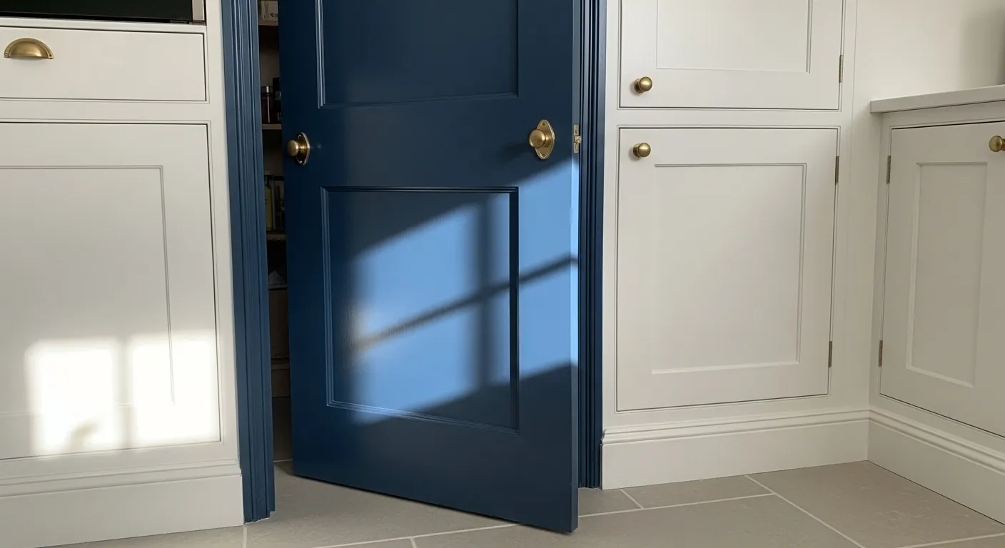
This door color looks very close to Benjamin Moore Hale Navy (HC-154). It is a deep navy that stays clearly blue even when used on a smaller surface like a door. That makes it a nice way to introduce a darker color without repainting an entire room. Against the light beige walls and white trim here, the navy stands out in a simple, clean way.
Hale Navy usually has a soft gray undertone, which helps it sit comfortably next to both warm wood flooring and neutral wall colors. I tend to like this shade on interior doors because it adds a little contrast in a hallway while the rest of the space can stay light and fairly simple.
This wall color looks very close to Benjamin Moore Newburyport Blue (HC-155). It is a deep navy that still carries a noticeable blue tone instead of leaning black. That kind of color works well in dining spaces where a darker wall can give the room a bit more character without needing much decoration.
Newburyport Blue usually has a soft gray undertone, which helps it sit comfortably next to warm wood pieces like the cabinet here. The contrast between the rich navy wall and natural wood furniture tends to feel balanced and easy on the eyes. I often like this type of navy in dining rooms because it gives the space a little formality while still feeling livable.
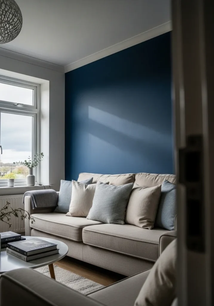
This wall color reads very close to Benjamin Moore Van Deusen Blue (HC-156). It is a deep navy that keeps a clear blue tone instead of turning almost black. That makes it a comfortable choice for living rooms where you want a darker wall but still want the space to feel relaxed. Behind a light sofa like this, the color gives the room a little contrast without needing much else.
Van Deusen Blue usually has a soft gray undertone, which helps the navy stay balanced in natural light. It works especially well next to pale upholstery and simple wood furniture. I tend to like this shade as a single accent wall because it brings in that rich navy look while the rest of the room can stay light and easy.