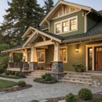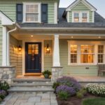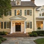
Dark green paint has always been one of my favorite ways to make a room feel a little richer and more interesting.
I started noticing it years ago when I saw a deep green wall in a friend’s dining room and it completely changed the mood of the space.
Since then I keep coming back to it whenever a room feels a little flat or too safe.
Benjamin Moore has some incredible dark greens that feel bold but still easy to live with.
In this list I’m sharing 21 dramatic dark green paint colors from Benjamin Moore that I keep seeing in beautiful homes and design ideas.
Some feel moody and classic while others lean a little softer.
If you love the idea of adding depth to a room, these greens might be exactly what you are looking for.
A Deep Forest Green Living Room Wall
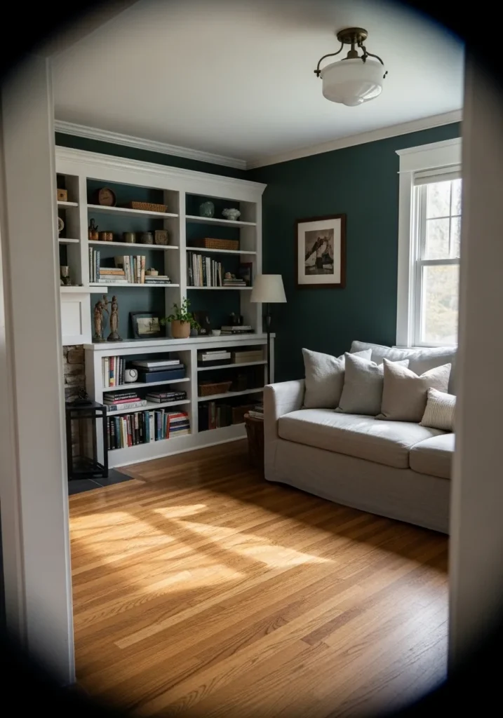
This wall color looks very close to Benjamin Moore Hunter Green (2041-10). It is a deep forest green that leans cool but still feels classic and steady. You see this kind of color often in older homes and built-ins because it has enough weight to stand beside white trim and still look intentional. The white shelving and trim here make the green feel even richer.
Hunter Green tends to read slightly cooler in natural light, with a hint of blue in the background. That cooler edge works well next to medium wood floors like the ones in this room. It is a color that suits libraries, living rooms, and study spaces where you want a darker wall but still something traditional and calm. White millwork, simple shelving, and neutral upholstery usually suit it best.
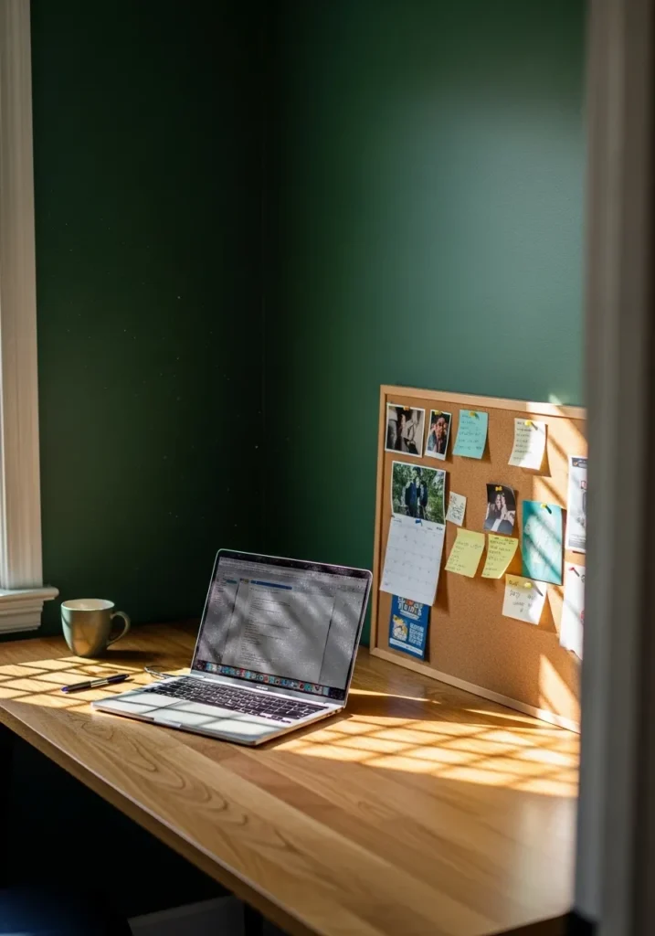
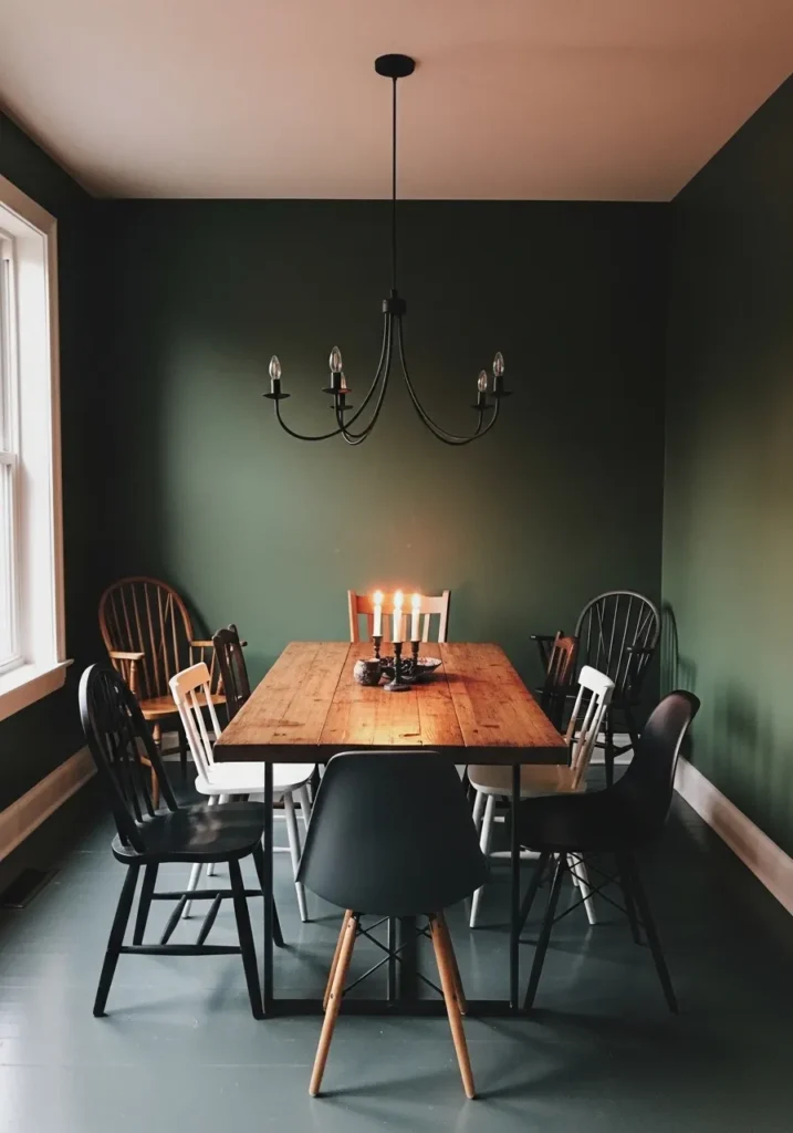
A Dark Green That Works In A Dining Room
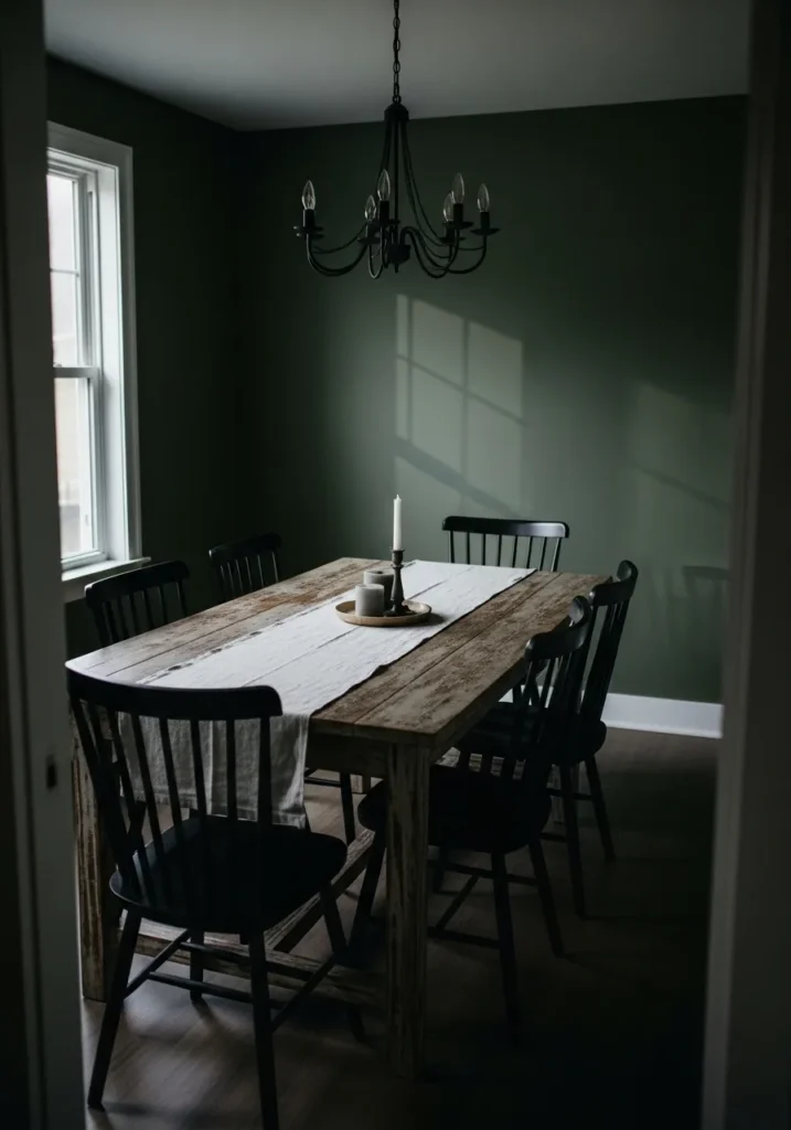
This wall color reads very close to Benjamin Moore Essex Green (HC-188). It is a deep traditional green that leans slightly cool, almost forest-like, but still feels classic rather than trendy. In a dining room it gives the space a quiet, grounded feeling. You can see how well it sits next to the rustic wood table and black chairs. Colors like this tend to make simple furniture look more settled and intentional.
Essex Green usually shows a subtle blue undertone, especially in rooms with natural light from one side. That cooler edge keeps the color from feeling muddy or brown. It works well in dining rooms, libraries, or small sitting rooms where darker walls make the space feel a bit cozier. White trim and natural wood are easy partners for it. Too many bright colors nearby can fight it, so I usually keep the rest of the room fairly calm.
A Dark Green That Suits Quiet Corners
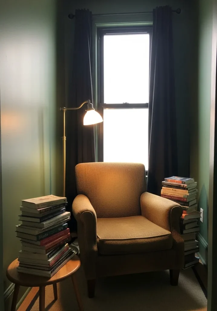
This wall color looks very close to Benjamin Moore Salamander (2050-10). It is a very deep green that sits right on the edge of green and black. Colors like this work well in small corners and reading spots because they feel calm and a little tucked away. Next to a simple chair and a small stack of books, the color almost turns the wall into a backdrop rather than something bright or busy.
Salamander usually carries a cool undertone with a hint of blue. In brighter light it reads green, but in dimmer areas it can lean darker and moodier. That is part of the appeal. It pairs easily with warm wood, brass lamps, and simple fabrics. I tend to like it in small rooms, reading nooks, or offices where darker walls feel comfortable instead of heavy.
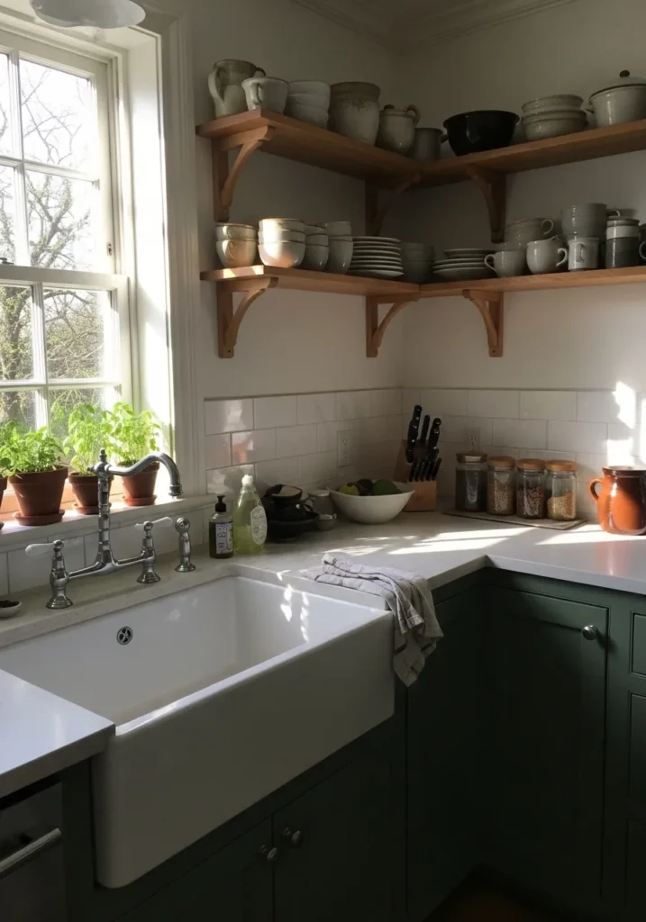
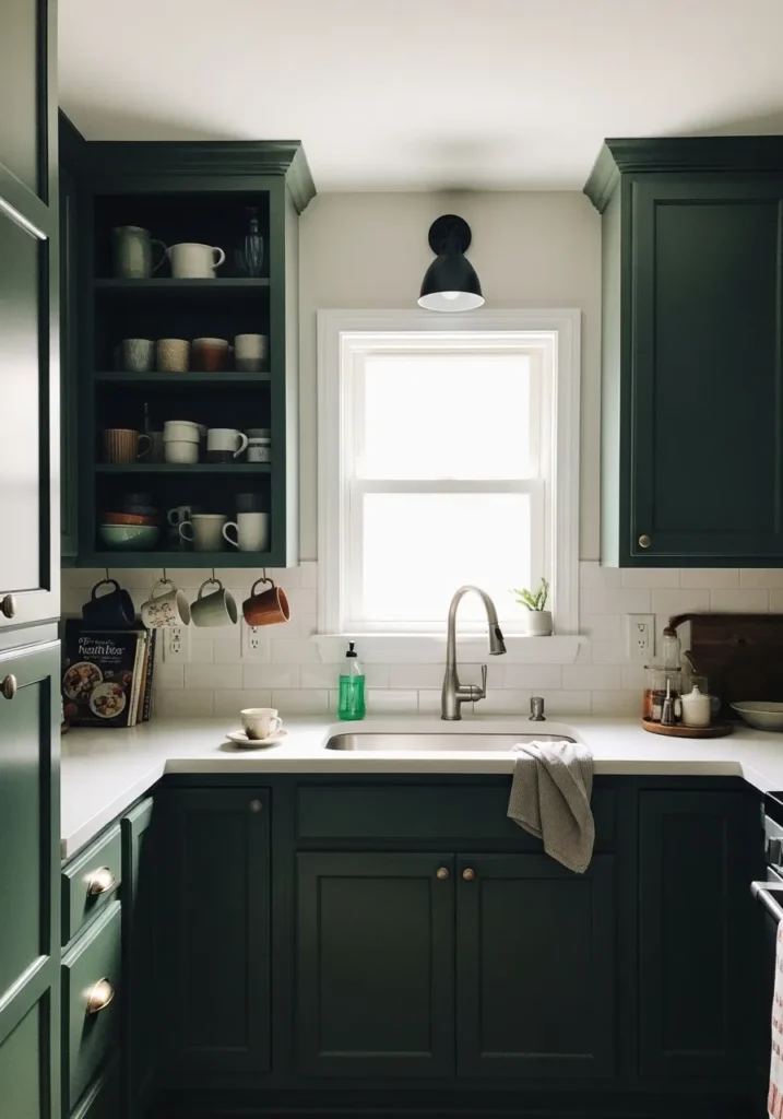
Dark Green Kitchen Cabinets
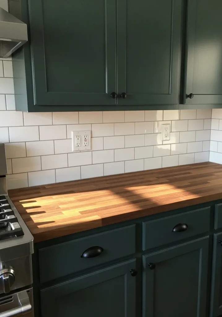
The cabinet color here reads very close to Benjamin Moore Hidden Falls (CSP-545). It is a deep green that leans slightly blue, which gives it that cooler, inky look many people like in kitchens. Dark greens like this feel steady and classic, especially when used on cabinetry instead of walls. Against the white tile backsplash, the color looks clean and defined rather than heavy.
Hidden Falls usually carries a cool undertone that becomes clearer in bright kitchens. The green can shift a little depending on light, sometimes reading deeper and sometimes showing more of its blue side. It pairs naturally with butcher block counters and simple black hardware like the ones here. If someone wants a dark cabinet color that still feels crisp next to white tile, this type of green is a good place to start.
A Deep Green Accent Wall Behind The Bed
This wall color looks very close to Benjamin Moore Narragansett Green (HC-157). It is a dark blue green that sits somewhere between forest green and deep teal. Colors like this are often used on a single bedroom wall because they give the bed a quiet backdrop without needing much decoration. Next to a simple wood bed frame, the color feels calm and steady.
Narragansett Green usually leans a little cool, with a soft gray tone underneath the green. That gray edge helps it feel relaxed instead of sharp. It works nicely with natural wood furniture and neutral bedding like the ones here. I tend to like this type of green in bedrooms where the rest of the room stays fairly simple. The darker wall makes the space feel a bit more settled.
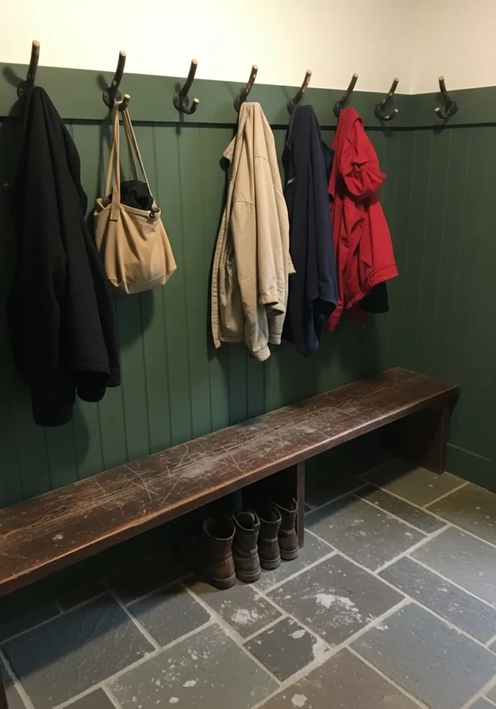
Dark Green Walls In A Mudroom
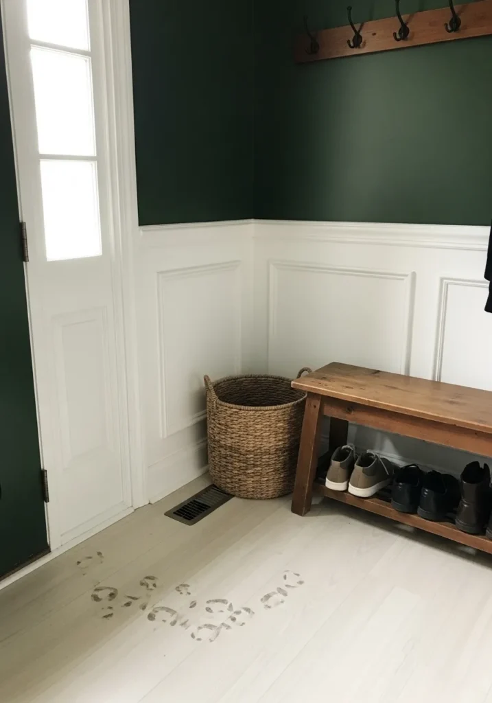
This wall color reads very close to Benjamin Moore Backwoods (469). It is a dark woodland green that leans slightly earthy without turning muddy. Colors like this are often used in entry spaces and mudrooms because they hide wear well and still feel classic. Against white wainscoting like the one here, the green looks even deeper and more defined.
Backwoods usually carries a subtle olive undertone, which keeps it feeling natural rather than sharp. That tone works nicely next to warm wood benches and woven baskets. It tends to look its best in practical spaces like mudrooms, back halls, or laundry areas where a darker wall makes the room feel a bit more settled. White trim is a good partner for it, especially in older style homes.
A Deep Green For Small Bedrooms
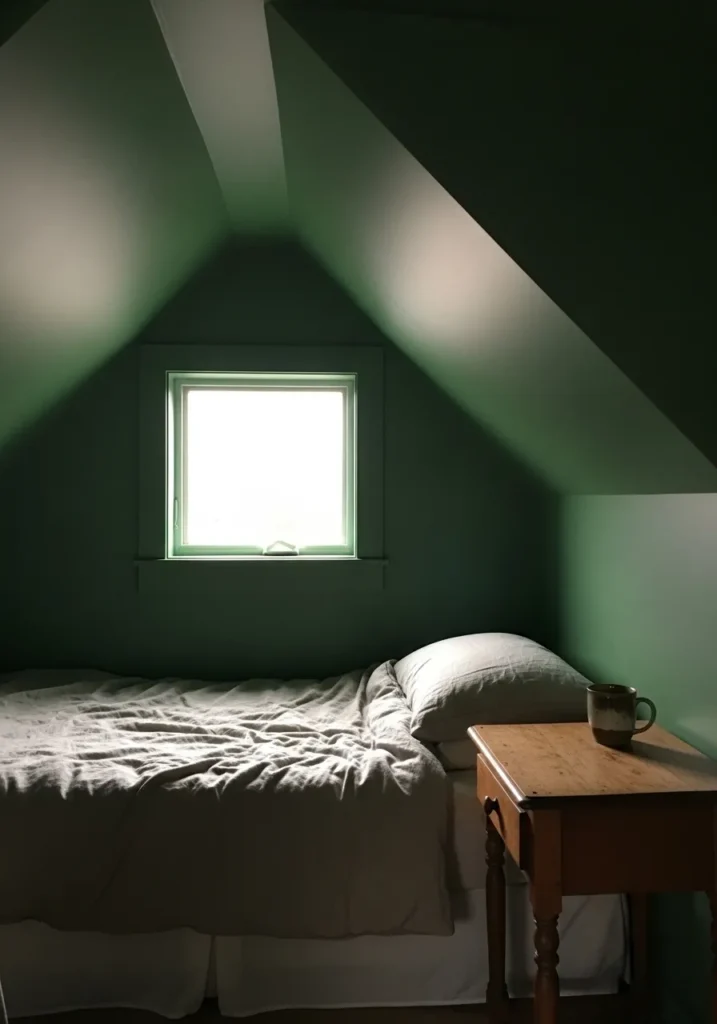
This wall color looks very close to Benjamin Moore Lafayette Green (HC-135). It is a dark traditional green that sits right in that classic forest range without turning too blue. Colors like this often work well in smaller bedrooms because they make the room feel a little quieter and more settled. Even with simple bedding and a small wood table nearby, the color still feels complete.
Lafayette Green tends to show a soft earthy undertone. It reads a bit warmer than some darker greens, which helps when it sits next to natural wood furniture. In small rooms with sloped ceilings or simple layouts, a deeper green like this can make the walls feel more unified instead of choppy. I usually see it paired with light bedding and wood tones, which keeps the room from feeling too heavy.
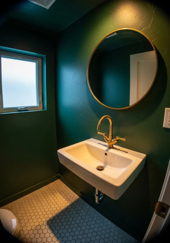
Dark Green Walls In A Small Bathroom
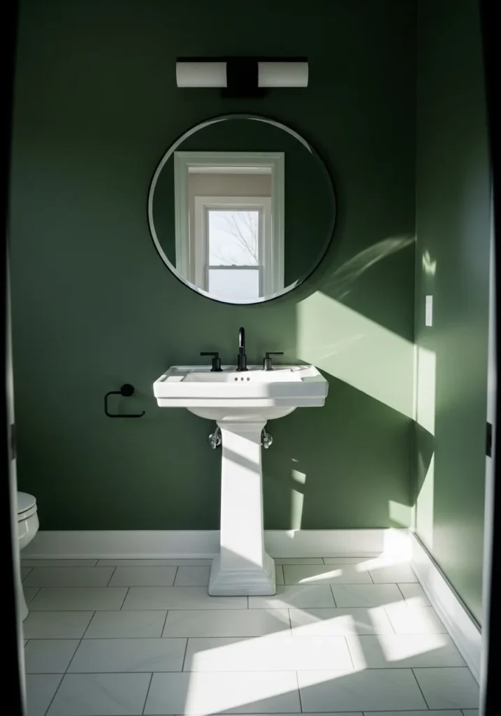
This wall color looks very close to Benjamin Moore Essex Green (HC-188). It is a deep, classic green that leans slightly cool and a little inky. In a small bathroom, a color like this can actually work better than something light. The strong contrast with a white pedestal sink makes the green feel crisp instead of heavy.
Essex Green tends to carry a subtle blue undertone. That cooler base helps it stay clean next to white tile and black fixtures like the ones here. It usually works well in powder rooms, half baths, and small spaces where you want the walls to feel rich without adding a lot of decoration. Simple trim and white fixtures keep the color looking sharp.
Dark Green Walls In A Home Office
This wall color looks very close to Benjamin Moore Calypso Green (2058-20). It is a deep green that leans slightly blue, which gives it a cooler and more modern feel than some forest greens. Colors like this often work well in home offices because they feel focused and steady without being dull. Next to a simple wood desk, the green reads rich but still clean.
Calypso Green usually carries a noticeable blue undertone, especially in brighter light. That cooler tone helps it pair easily with natural wood desks and simple black or white accents. It tends to work well in offices, study areas, or small work corners where you want the walls to feel a bit stronger than plain neutrals. Keeping the furniture simple usually lets the color look its best.
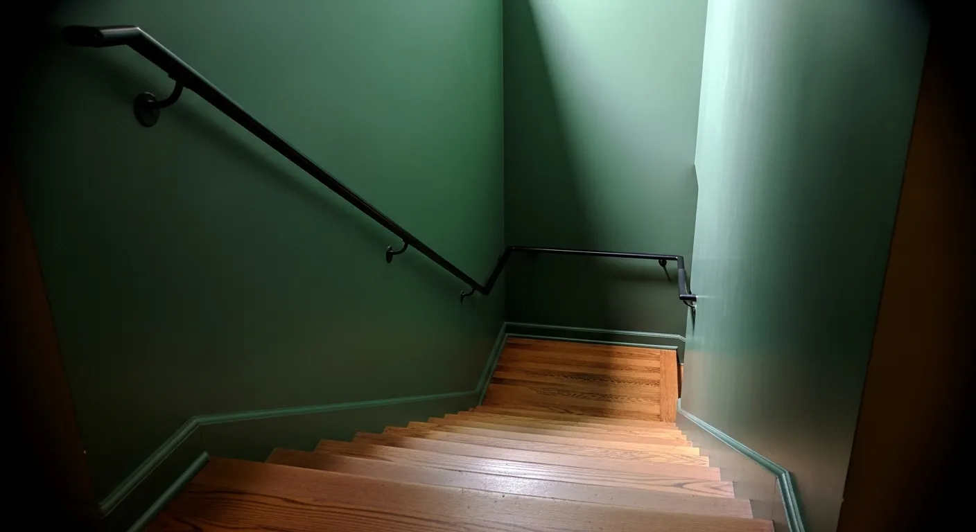
Dark Green Walls In A Long Hallway
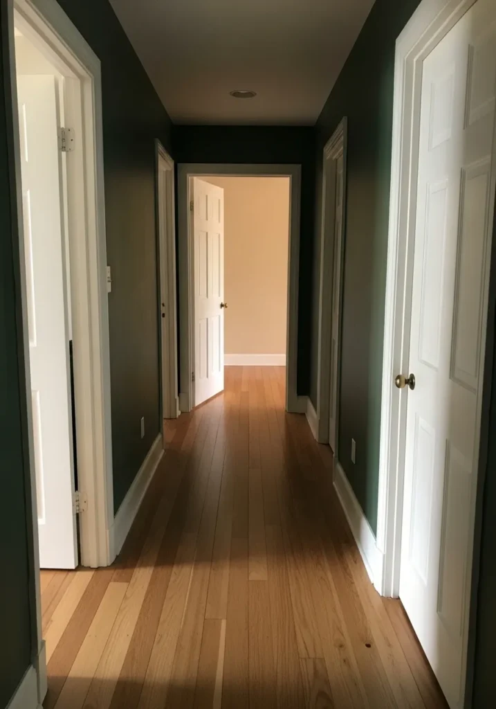
This wall color looks very close to Benjamin Moore Salamander (2050-10). It is a very deep green that almost reads black in certain areas, which is part of why it works so well in hallways. Narrow spaces can handle darker colors better than people expect. The white doors and trim here keep the green looking sharp and defined.
Salamander carries a cool undertone with a hint of blue, which helps it stay clean next to warm wood floors like these. In brighter areas it reads clearly green, but in deeper corners it can look nearly black. That shift gives hallways a little more character without adding extra decoration. I usually like this kind of color in corridors, entry halls, or stair landings where the architecture already does most of the talking.
Deep Green Kitchen Cabinets
The cabinet color here looks very close to Benjamin Moore Hunter Green (2041-10). It is a strong, traditional dark green that sits right in that classic forest range. This type of green works especially well on kitchen cabinets because it feels steady and familiar. With white countertops and a farmhouse sink nearby, the color looks crisp instead of heavy.
Hunter Green usually carries a cool undertone with a bit of depth that keeps it from looking flat. Natural wood shelves like the ones here tend to bring out the warmth in the room, which helps balance the darker cabinets. I often see this color used in kitchens where people want something darker than navy but still traditional. Keeping the walls light usually lets the green stand out in a good way.
Dark Green Walls For A Dining Room
This wall color reads very close to Benjamin Moore Essex Green (HC-188). It is a deep traditional green that sits right in that old-house forest range. Colors like this have been used in dining rooms for years because they give the room a steady, settled feeling. The warm wood table stands out clearly against the darker wall, which is often the goal with this kind of paint.
Essex Green usually carries a cool undertone with a slight blue cast. That keeps the color looking clean next to white trim and black lighting fixtures like the one here. It tends to work well in dining rooms, libraries, and other spaces where darker walls feel comfortable rather than overwhelming. Keeping the furniture simple lets the green do its quiet job in the background.
Deep Green Walls In A Small Powder Room
This wall color looks very close to Benjamin Moore Salamander (2050-10). It is one of those very dark greens that can read almost black at first glance. In a small powder room that kind of color often works surprisingly well. The white sink and light floor stand out clearly against it, which keeps the room from feeling dull.
Salamander carries a cool undertone with a hint of blue, so it usually looks sharp next to brass fixtures like the faucet here. In bright light it shows more green, while in dimmer corners it deepens quite a bit. That shifting tone is part of the appeal. I tend to see this color used in small bathrooms or powder rooms where a darker wall feels intentional rather than overwhelming.
A Deep Green Living Room Wall
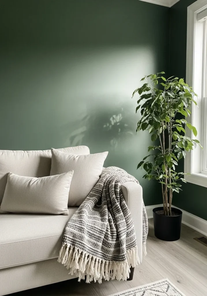
This wall color looks very close to Benjamin Moore Vintage Vogue (462). It is a dark green with a soft gray undertone that gives it a calm, slightly muted look. Colors like this are popular for living rooms because they feel rich without being too sharp. Next to a light sofa like the one here, the green reads deeper and more balanced.
Vintage Vogue tends to lean a little earthy. The gray in it keeps the color from looking too bright or too forest-like. That usually makes it easy to live with day to day. It pairs nicely with neutral fabrics, light wood floors, and a few plants around the room. In brighter spaces it can soften a bit, which helps the darker tone feel comfortable rather than heavy.
Dark Green Paneling In A Mudroom
This wall color looks very close to Benjamin Moore Backwoods (469). It is a deep earthy green that sits right between forest green and olive. Colors like this show up often in mudrooms and back entries because they hide scuffs well and still feel traditional. On vertical paneling like this, the color reads a little richer and more solid.
Backwoods usually carries a soft olive undertone. That slight warmth helps it sit comfortably next to dark wood benches and stone floors like the ones here. It tends to work best in hardworking spaces where a darker wall feels practical. I often see it paired with cream or off white above the paneling, which keeps the room from feeling too closed in.
A Deep Green Accent Wall In The Living Room
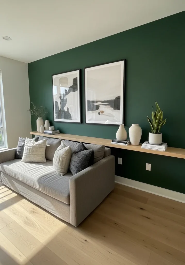
This wall color looks very close to Benjamin Moore Hunter Green (2041-10). It is a strong forest green that sits right in that classic dark green range. People often use a color like this on one living room wall to give the room a little more weight without painting the whole space. Next to a light sofa and pale wood floors, the green stands out in a nice steady way.
Hunter Green usually leans slightly cool with a subtle blue edge. That helps it stay clean next to white trim and light furniture. It also pairs easily with simple decor like framed prints or a long floating shelf on the wall. In brighter rooms it keeps its depth, which is part of why this color shows up so often in living rooms.
Dark Green Walls In A Home Library
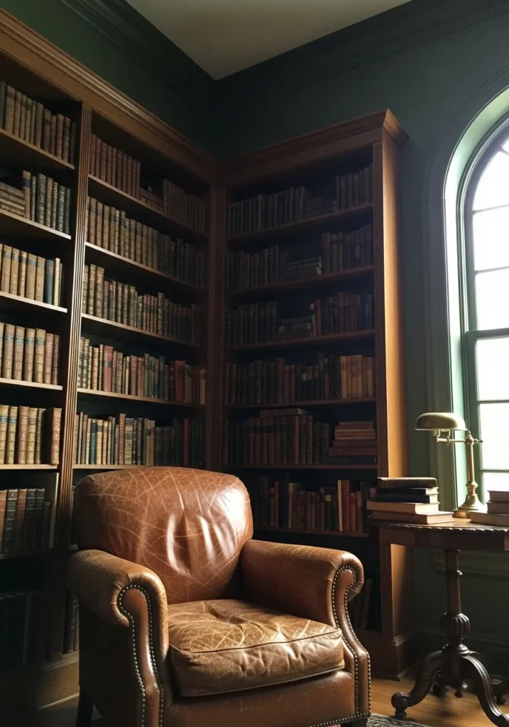
This wall color reads very close to Benjamin Moore Essex Green (HC-188). It is one of those deep historic greens that almost looks black until the light hits it. In a room lined with wood bookcases, that kind of green feels very natural. The color sits quietly behind the shelves and leather chair without competing with them.
Essex Green usually leans slightly cool and very deep. It tends to look especially good next to warm wood tones like the shelving and side table here. In daylight the green comes forward a little more, while in dim light it settles into a darker tone. That shift is part of why people use this color in studies, libraries, or reading rooms.
Deep Green Walls In A Laundry Room
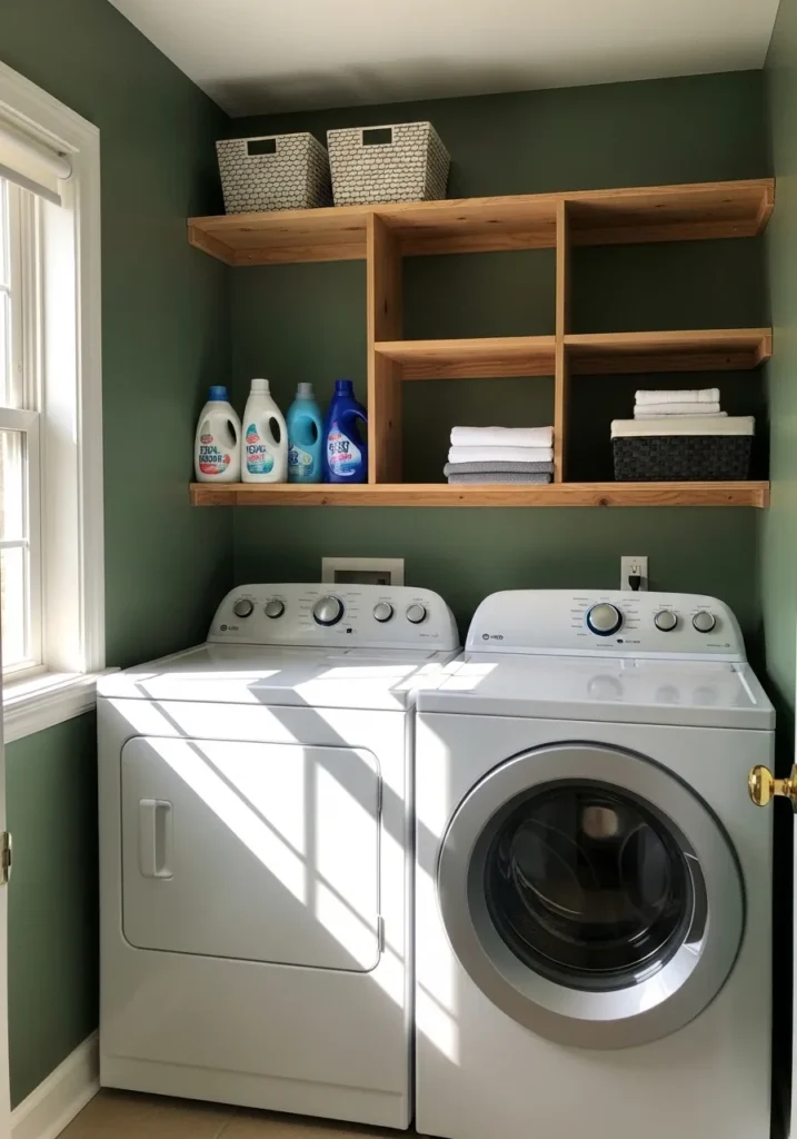
This wall color reads very close to Benjamin Moore Narragansett Green (HC-157). It is a dark green that carries a soft gray tone, which keeps it from looking too bright or too forest-like. In smaller utility rooms like a laundry space, that kind of green can feel calm and steady rather than busy. The white washer and dryer stand out clearly against it, which helps the room feel clean.
Narragansett Green usually leans a little cool. That gray note makes it easy to pair with light wood shelves and simple white trim. In brighter daylight it softens slightly, which is nice in practical spaces where you spend time folding or sorting clothes. Dark greens like this often work well in laundry rooms because they hide everyday scuffs better than lighter paint.
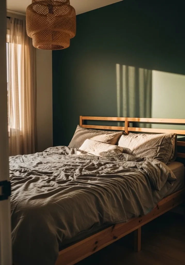
Dark Green Paneled Wall Behind The Bed
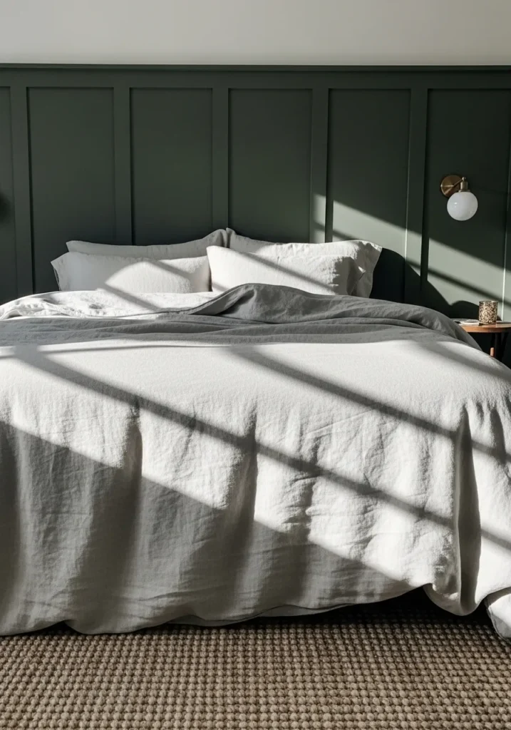
This wall color looks very close to Benjamin Moore Salamander (2050-10). It is one of those very deep greens that almost reads black until the light hits it. On a paneled headboard wall like this, the color gives the room a quiet, steady backdrop. The white bedding stands out against it, which keeps the space feeling fresh instead of heavy.
Salamander carries a cool undertone with a bit of blue in it. That helps it stay crisp next to white trim and simple linens. In brighter daylight the green becomes more visible, while in the evening it deepens quite a bit. I tend to see colors like this used behind the bed because the darker wall makes the sleeping area feel a little more settled.
A Deep Green Dining Room Wall
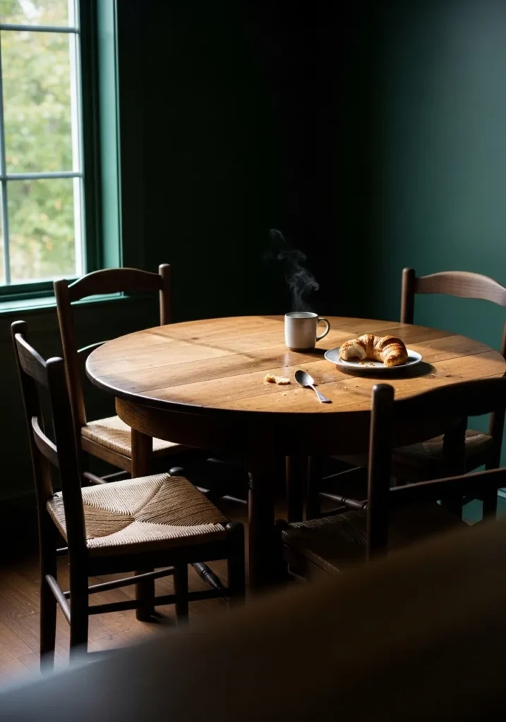
This wall color reads very close to Benjamin Moore Salamander (2050-10). It is a very dark green that can look nearly black until light from the window hits it. Colors like this often show up in dining rooms because they make the space feel a little quieter and more settled. Around a simple wood table and chairs, the green feels natural and grounded.
Salamander usually carries a cool undertone that leans slightly blue. That cooler tone pairs well with warm wood furniture like the round table here. In brighter daylight the green becomes easier to see, while in lower light it deepens quite a bit. That shift gives the room a calm, slightly moody look that many people like for dining spaces.
Deep Green Kitchen Cabinets
These cabinets look very close to Benjamin Moore Salamander (2050-10). It is a very dark green that almost reads black in some light, but still shows its green tone once the room brightens up. On kitchen cabinets, that depth can feel solid and classic. Against a white countertop and tile backsplash, the color stands out in a simple, balanced way.
Salamander leans slightly cool with a hint of blue in the mix. That cooler edge works well with brushed metal hardware and light walls around the cabinets. In daylight it shows a bit more green, while in dimmer light it settles into a darker tone. Many people like this color for cabinetry because it feels strong without looking overly trendy.