I have been obsessed with pink paint for a while, and I finally gave my own space a little splash of it.
Some people love bold statements, but I like my pinks to feel playful and fresh without being overwhelming.
I love how just one wall or a tiny accent can completely change the vibe of a room.
My favorite part is finding shades that feel chic but still cheerful enough to make me smile every time I walk in.
Over time, I have tried a bunch of soft blushes, warm corals, and even bright bubblegum tones.
Each one brings its own personality and energy, and I wanted to share my favorite picks that can give any space a pop of fun color.
This list is full of pinks that feel lively, sophisticated, and totally wearable in a real home.
I hope you find a shade that makes you as excited about your walls as I am about mine.
Sherwin Williams Rose Tan for a Warm Mid-Century Modern Glow
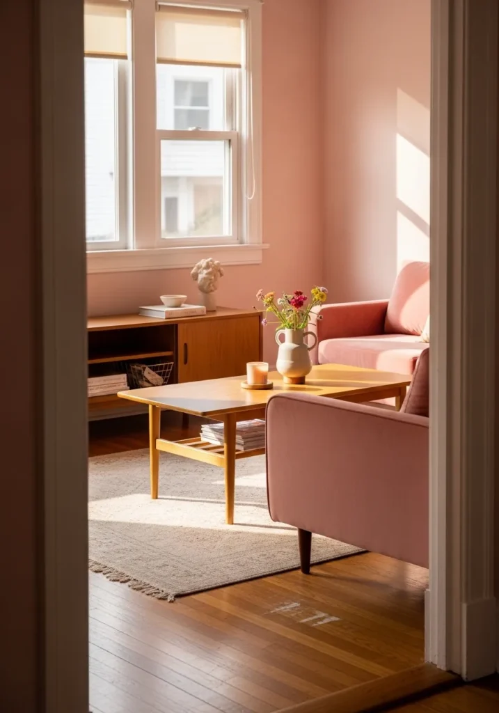
This living room layout masters the art of mixing vintage vibes with a soft and rosy backdrop. The walls feature a muted and earthy pink that feels sophisticated rather than sugary. Minimalist wooden furniture, like the sleek coffee table and side console, brings a grounded and organic feel to the space. Natural light pours in through the large windows and highlights the velvety texture of the dusty rose seating. A simple patterned rug and a few well-placed floral accents finish the look with a clean and breezy aesthetic.
The way the sunlight hits that specific shade of pink makes the entire room feel like a permanent golden hour. It is a brilliant example of how a monochromatic palette can feel layered and interesting without being overwhelming. I am totally here for the retro influence combined with such a fresh and airy color choice. Everything about this setup feels inviting and tranquil, which is exactly what a cozy home should be.
Sherwin Williams Reddened Rust for a Toasty Traditional Curb Appeal
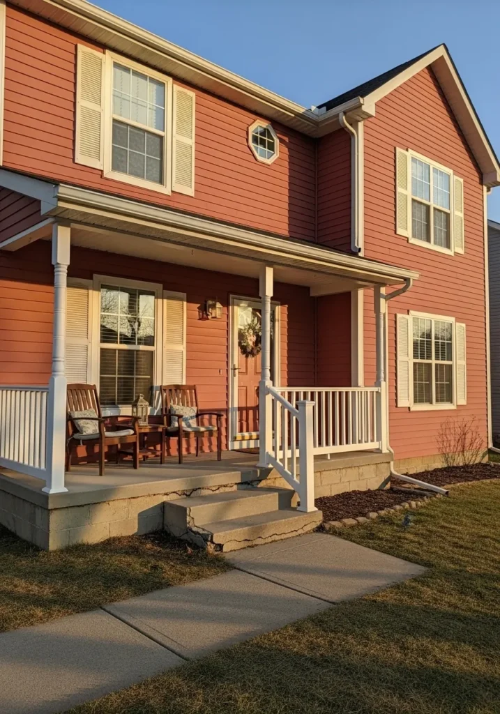
This two-story home showcases how a deeper and more saturated pink can completely transform a classic suburban exterior. The horizontal siding is drenched in a rich and sun-baked clay tone that perfectly bridges the gap between a playful mauve and a traditional brick red. Crisp white trim on the windows and porch railings provides a sharp and clean contrast that keeps the look architectural and tidy. A welcoming front porch with wooden rocking chairs creates a cozy and lived-in feel, while the golden hour sunlight brings out the hidden warmth in the paint.
The bold choice to go with such a spicy and earthy hue is exactly what makes this house stand out on the block. It feels incredibly grounded and mature while still maintaining that fun and unexpected pop of color we all love. Seeing how the white shutters pop against that deep rose background makes me want to grab a glass of lemonade and sit on that porch for hours. This design proves that pink can be totally timeless and upscale when you pick a shade with the right amount of depth.
Sherwin Williams Intimate White for a Delicate Rustic Dining Nook
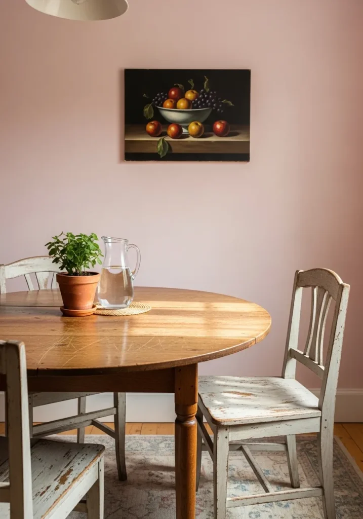
This charming dining area pairs a whisper-light pink wall with weathered, vintage-inspired furniture to create a serene breakfast corner. The round wooden table shows off its natural grain under the soft morning light, surrounded by distressed white chairs that add a touch of farmhouse soul. A moody still-life painting of fruit provides a sophisticated focal point, anchoring the airy wall color with deeper, traditional tones. The combination of the potted greenery and the simple glass pitcher makes the whole setup feel effortless and lived-in.
If you are into the cottagecore look, this specific palette is a total dream come true. I love how the pale pink acts as a neutral, giving the room a hint of warmth without screaming “nursery.” The contrast between the rugged wood textures and that smooth, velvety wall finish is simply stunning. It feels like the perfect spot to sip herbal tea while catching up on your favorite interior design blogs.
Sherwin Williams Shell Pink for a Peachy Modern Bedroom Retreat
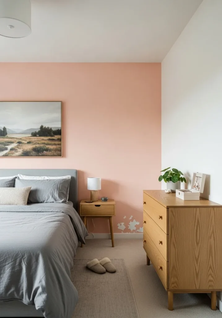
This serene bedroom setup features a stunning accent wall in a soft, peachy-pink that instantly warms up the entire space. The clean lines of the light wood dresser and matching nightstand bring a Scandinavian-inspired simplicity that keeps the room feeling fresh and organized. A plush grey upholstered bed provides a cool-toned anchor against the warm wall, while minimalist artwork and a single green plant add just the right amount of personality. The neutral carpet and white side walls help the main color pop without making the room feel too small or dark.
Some people love a bold statement, but I think there is something so magical about this subtle, sunset-inspired glow for a sleeping space. The way the wood tones play off that specific pink hue feels incredibly high-end and intentional. It creates such a calm and peaceful sanctuary that I would never want to leave my bed in the morning. This design really proves that you can use pink in a way that feels mature and totally chic.
Sherwin Williams Bella Pink for a Charming Storybook Cottage
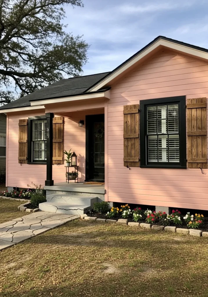
This adorable single-story home proves that a soft candy pink can look incredibly grounded when paired with the right rustic elements. The horizontal lap siding is painted in a cheerful bubblegum shade that feels bright and welcoming against the natural greenery. Heavy wooden shutters in a medium oak finish add a touch of old-world texture, while the black window frames and front door provide a sharp modern edge. A neatly manicured garden bed with colorful blooms lines the base of the house, tied together by a lovely flagstone walkway leading up to the concrete porch steps.
The contrast between those chunky wood shutters and the playful pink walls is just pure genius. It gives off such a cozy and whimsical vibe without feeling too precious or overwhelming for the neighborhood. I am absolutely loving how the black trim keeps everything looking sophisticated and intentional. This design is a masterclass in using “girly” colors to create a home that looks both adventurous and perfectly put together.
Sherwin Williams Midday for a Productive and Airy Home Office
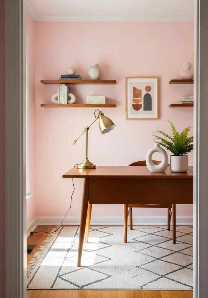
This workspace setup proves that a soft wash of pink can be the ultimate motivator for a creative mind. The room features clean white baseboards and trim that frame the gentle blush walls beautifully, making the space feel open and bright. A stunning mid-century modern desk in a warm acorn finish takes center stage, complemented by matching floating shelves that display a curated mix of sculptural ceramics and books. The geometric pattern of the ivory rug adds a subtle layer of visual interest without cluttering the floor, while the brass task lamp provides a metallic glint that ties the whole polished look together.
No matter your style, having a desk area that feels this serene is basically a cheat code for staying focused. The way the natural light dances across that peachy backdrop makes the whole office feel incredibly upbeat and welcoming. I find this specific combination of wood tones and pastel pink to be such a sophisticated take on the modern work-from-home vibe. It is exactly the kind of spot that makes you actually look forward to opening your laptop on a Monday morning.
Sherwin Williams Exuberant Pink for a Bold and Electric Townhome Statement
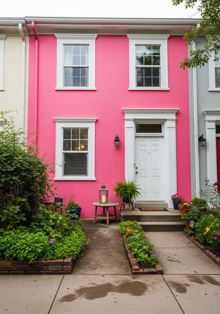
This vibrant two-story townhouse makes a fearless splash with a saturated fuchsia exterior that demands attention. The intense pink walls serve as a high-energy backdrop for the crisp white architectural details, including the classic fluted door surround and chunky window casings. Lush greenery and overflowing flower beds soften the concrete entryway, while a simple wooden side table with a lantern adds a touch of garden charm. The black light fixtures and dark window frames ground the look, providing a necessary visual break from the brilliant neon hue.
If you really want to be the talk of the neighborhood in the best way possible, this daring shade is your ticket to stardom. It feels incredibly adventurous and full of life, especially when nestled between more traditional neutral homes. I love how the white trim keeps the whole aesthetic feeling polished and intentional rather than just loud. This house is a total mood booster, and seeing it on my daily walk would definitely put a massive smile on my face.
Sherwin Williams Coral Reef for a Zesty and Energetic Kitchen Hub
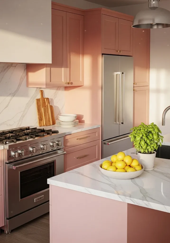
This vibrant kitchen layout takes a bold step away from the expected by drenching the shaker-style cabinetry in a lively and spirited coral pink. The rich pigment of the cupboards creates a stunning focal point against the bright white marble countertops that feature delicate grey veining. Stainless steel appliances and a professional-grade range add a touch of industrial sleekness, while golden hardware provides a hint of warmth and luxury. Large windows allow natural light to flood the room and bounce off the smooth painted surfaces, making the entire cooking area feel expansive and cheerful.
If you’re into a space that feels like a permanent tropical vacation, this juicy hue is exactly what you need in your life. I love how the punchy color makes the classic marble and steel elements feel so much more approachable and fun. It is such a clever way to inject a massive dose of personality into a functional room without losing that clean and organized aesthetic. Every time I look at this design, it makes me want to whip up a fresh batch of fruit smoothies and enjoy the bright and happy energy it radiates.
Sherwin Williams Romance for a Sweet and Minimalist Hallway Transition
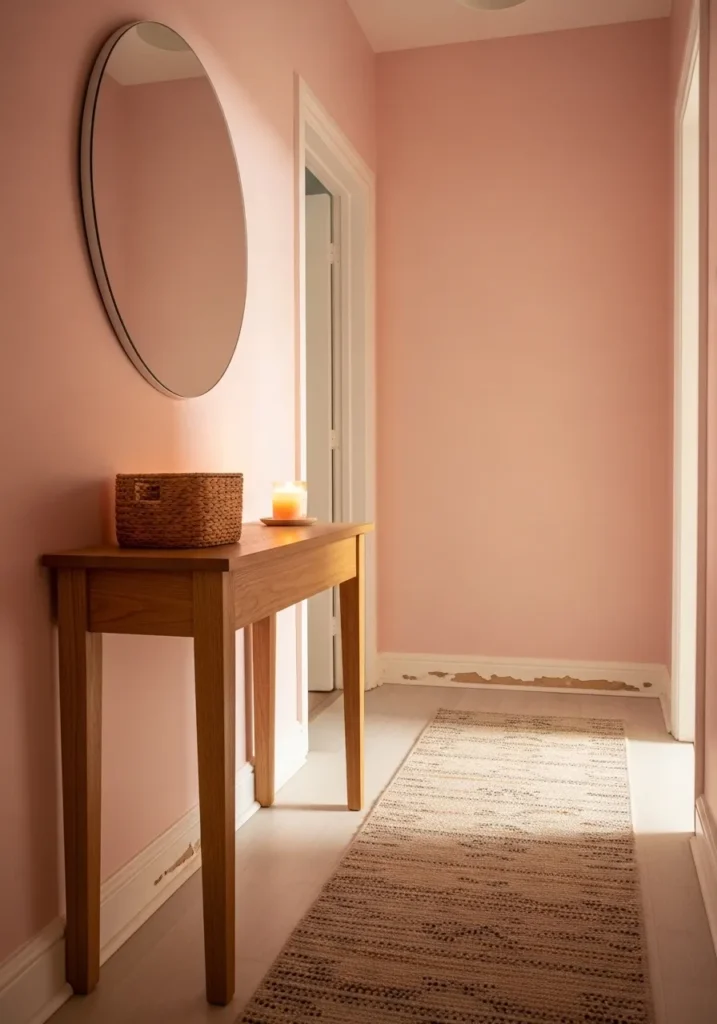
This narrow hallway proves that even the smallest transit areas can have a major personality with a quick coat of paint. The walls are dressed in a delicate and sugary pink that reflects the natural light beautifully, making the tight space feel much airier than it actually is. A simple wooden console table adds a touch of organic warmth, topped with a woven basket and a glowing candle for a welcoming touch. The large round mirror on the wall creates a sense of depth, while the textured runner rug adds a cozy layer to the light wooden floors.
If you have a hallway that feels a bit neglected, this soft glow is a fantastic way to breathe some life into it. I love how the creamy pink tone softens the architectural lines of the doorways and makes the whole transition feel intentional. It creates such a lovely and peaceful atmosphere for walking through the house. Seeing how that candlelight plays off the pale walls makes the entire setting feel like a cozy hug every time you step inside.
Sherwin Williams Pink Shadow for a Stately Colonial Face-Lift
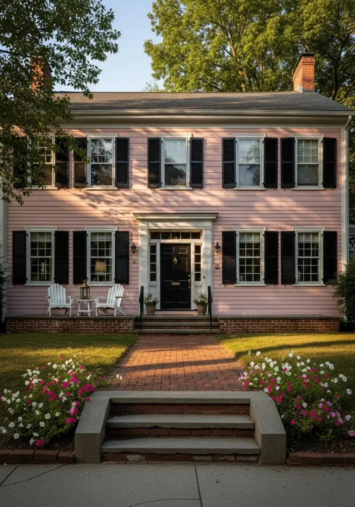
This grand two-story Colonial home breathes new life into traditional architecture with its soft and dusty rose siding. The horizontal lines of the house are punctuated by striking black shutters and a matching front door, which provide a sophisticated weight to the playful wall color. A classic white pediment above the entrance and crisp window trim keep the look tailored and clean, while the red brick foundation adds a touch of earthy permanence. The symmetrical front porch with its white Adirondack chairs and simple greenery creates an inviting spot for morning coffee or evening chats with neighbors.
If you are looking for a way to make a historic silhouette feel totally current and fresh, this palette is an absolute winner. The way the black accents ground the lighter pink tones makes the entire exterior feel upscale and established rather than just trendy. I am genuinely impressed by how much character this specific shade adds to the property without masking its beautiful architectural bones. It is a perfect example of how to embrace a feminine color while maintaining a sense of elegance and prestige.
Sherwin Williams Peppermint for a Joyful and Bright Nursery Haven
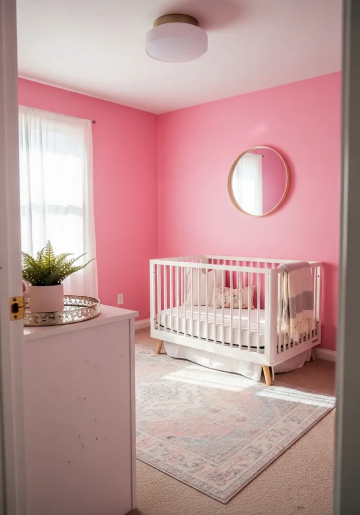
This delightful nursery space features a lively bubblegum pink that coats the walls with an unapologetic sense of fun and energy. A clean white crib with light wood legs sits at the center, anchored by a faded bohemian rug that pulls in soft grey and blush tones to balance the intensity of the paint. The round gold mirror and simple white dresser keep the room feeling modern and uncluttered, while sheer white curtains allow a gentle glow of natural light to soften the vibrant walls. A touch of greenery in a pink ceramic pot adds a fresh and organic element that completes this cheerful sanctuary.
No matter your personal style, it is hard not to smile when walking into a room that feels this genuinely happy. I love how the gold accents and white furniture prevent the bold pink from feeling too heavy or closed in. It creates such a spirited and whimsical environment that is just perfect for a little one to grow up in. This design really showcases how a daring color choice can turn a standard bedroom into a memorable and designer-level space.
Sherwin Williams Rosé for a Sun-Drenched European Apartment Vibe
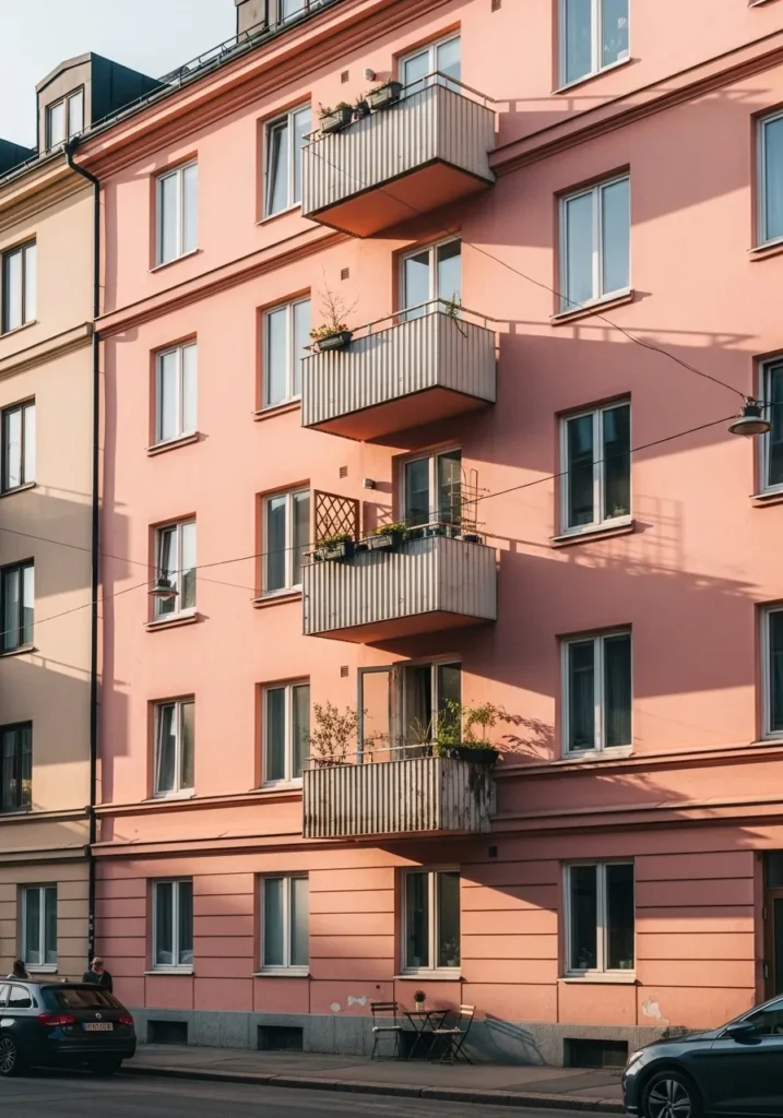
This multi-story apartment building captures the essence of a romantic city stroll with its warm and dusty pink facade. The architecture features clean horizontal lines and repetitive window patterns that give the building a sense of rhythm and order. Charming balconies with corrugated metal railings offer a perfect spot for tiny urban gardens, while the ground floor is accented with a simple bistro set for a touch of street-side flair. As the afternoon sun hits the stucco, the building takes on a glowing, almost coral-like quality that stands out beautifully against the neighboring neutral structures.
Some people love an all-white city block, but I think there is something so soulful and welcoming about a building that embraces a bit of color. It reminds me of the beautiful streets in Stockholm or Copenhagen, where every corner feels like a photo op. The way the shadows play across the different levels adds so much depth and character to the neighborhood. I would give anything to sip an espresso at that little table and just soak up the cheerful energy this design radiates.
Sherwin Williams Sashay Sand for a Luxe Art Deco Bathroom Retreat
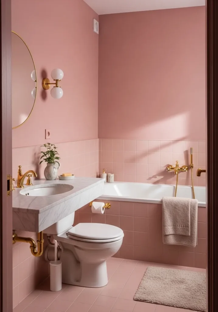
This stunning bathroom design uses a sophisticated and earthy mauve to create a high-end spa atmosphere. The upper walls are saturated in a deep, velvety pink that contrasts beautifully with the lighter square tiles covering the lower half of the room. A sleek white marble vanity with an undermount sink anchors the space, while glamorous gold fixtures and plumbing add a touch of vintage opulence. The round mirror and globe-style wall sconces lean into a modern Art Deco aesthetic, perfectly complemented by a plush neutral rug and a small potted plant for a breath of life.
Most go for white, but a full-on rose bathroom makes home relaxation feel way fancier. The way the warm gold hardware pops against that dusty lilac-pink backdrop feels incredibly polished and intentional. I think the decision to carry the color through the tiles and the paint creates such a cohesive and expensive feel. It is a brilliant example of how to do a “Pretty in Pink” theme in a way that feels mature, chic, and like a total sanctuary.
Sherwin Williams Pinkish for a Dreamy Tiny Cottage Escape
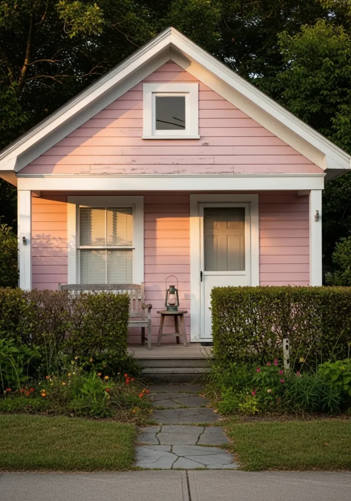
This pint-sized home is the absolute definition of curb appeal with its soft and weathered pink lap siding. The classic gabled roofline is highlighted by chunky white trim and a tidy front porch that feels tucked away from the rest of the world. A simple wooden bench and a rustic lantern on a stool create a minimal yet cozy outdoor seating area perfect for watching the sunset. Manicured hedges and a slate stone path add a touch of structure to the lush green lawn and wild garden blooms surrounding the base of the house.
If you are looking for a way to make a small footprint feel grand and inviting, this delicate, rosy hue is your best friend. The way the warm light of the late afternoon hits the texture of the wood makes the whole building look like it belongs in a fairytale. I find this design to be incredibly soothing because it balances the playful color with such grounded and natural elements. It is basically the ultimate inspiration for anyone wanting to turn a backyard shed or a tiny house into a boutique-style retreat.
Sherwin Williams Pinky Beige for a Cozy Literary Corner
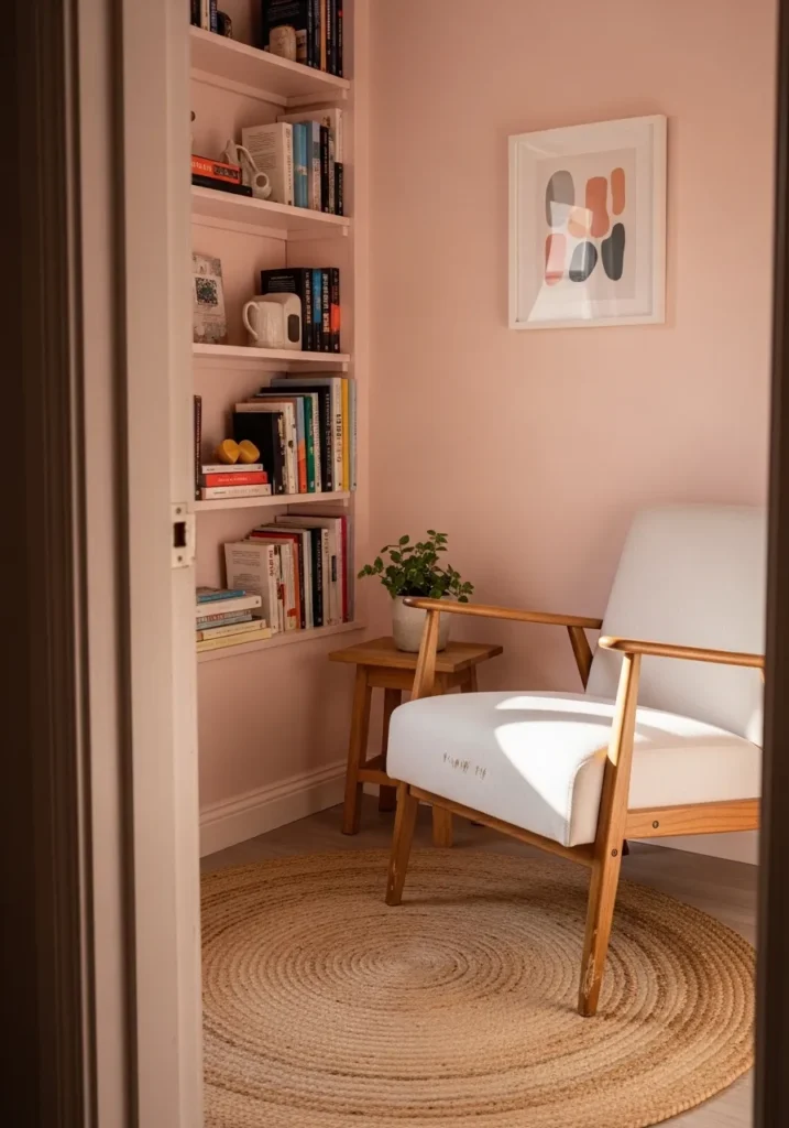
This tiny reading nook makes incredible use of a muted and sandy pink that serves as the ultimate backdrop for a home library. The built-in bookshelves are painted in the same soft hue as the walls, creating a seamless and custom look that keeps the small corner from feeling cluttered. A mid century modern armchair with crisp white upholstery and light wood arms provides a comfortable spot to relax, perfectly paired with a round jute rug that adds an earthy texture. Small touches like the minimalist abstract art and a dainty green plant on the wooden side table bring just enough life and color to the quiet space.
If you have a spare corner that needs some love, this monochromatic blush setup is such a clever way to build a personal sanctuary. The way the late afternoon sun hits those shelves creates the most peaceful and inviting glow imaginable. It feels like the kind of spot where you could lose track of time for hours with a good book and a warm cup of coffee. I am truly impressed by how sophisticated and calm this palette feels, proving that pink can be the most relaxing neutral in your design toolkit.
Sherwin Williams Breathless for a Breezy Mid-Century Patio
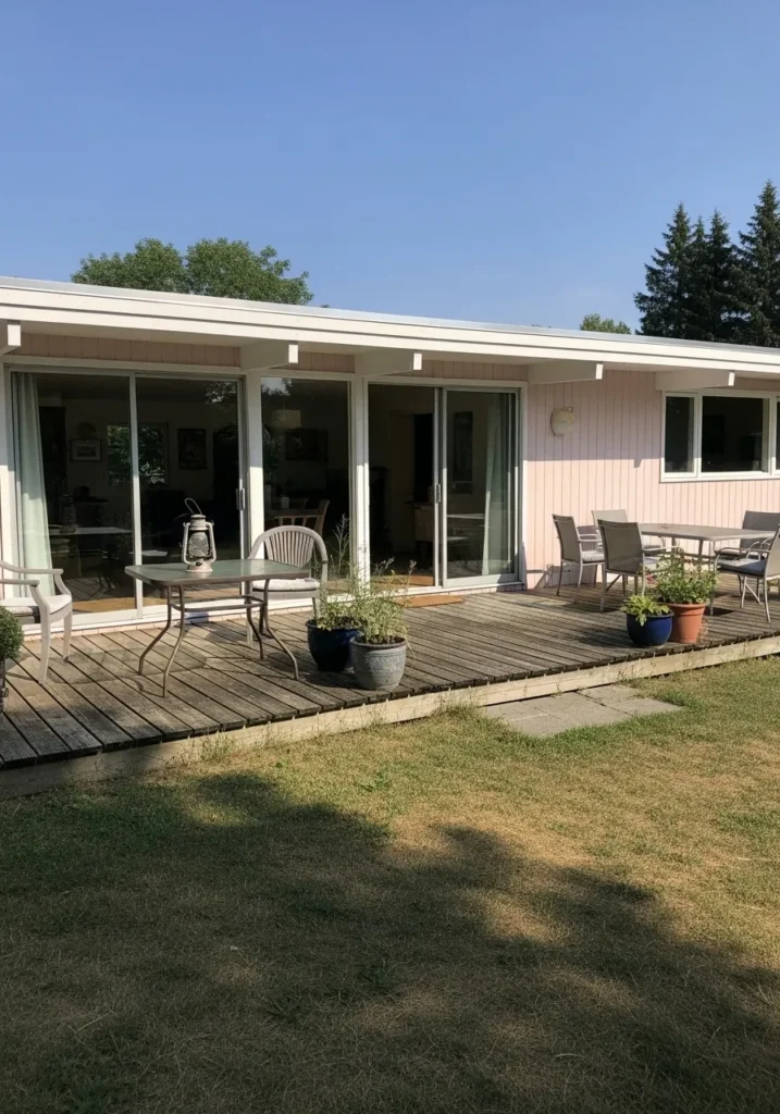
This single-story ranch home features vertical wood siding in a very pale and airy pink that almost acts as a cool-toned neutral. The architecture is defined by a flat roofline with exposed white beams that extend over a massive wooden deck, creating a seamless indoor-outdoor living flow. Floor-to-ceiling sliding glass doors reflect the clear blue sky while a variety of patio furniture sets the stage for effortless summer entertaining. Simple potted herbs and a vintage-style lantern on the glass table add a touch of lived-in charm to the minimalist backyard setup.
I find this design to be the ultimate inspiration for anyone wanting to give their outdoor space a modern yet soft touch. The way the whisper-light pink plays against the bright white trim and the natural weathering of the deck is just so chic and unexpected for a patio. It feels incredibly peaceful and high-end without trying too hard, like a private vacation spot right in your own backyard. This look is a total win for those who want a hint of color that still feels completely sophisticated and fresh.
Sherwin Williams Pink Shadow for a Sophisticated Scandi Dining Vibe
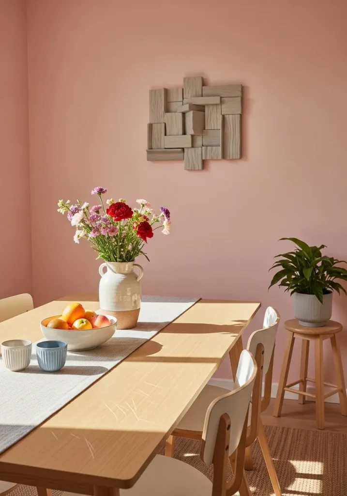
This airy dining room showcases how a dusty, medium-toned pink can create a backdrop that is both trendy and incredibly peaceful. The walls are bathed in a warm mauve-pink that feels perfectly balanced against the light oak wood of the dining table and matching stools. A 3D geometric wall sculpture in a similar wood tone adds a layer of modern architectural interest without needing a single drop of bold color. The table is simply dressed with a grey runner and a ceramic vase overflowing with fresh wildflowers, while a lush green plant on a side stool provides a natural pop of life that grounds the entire palette.
That sunlight on the smooth wood turns this space into the perfect slow Sunday brunch spot. I am genuinely impressed by how the earthy pink walls make the white chairs look so much more expensive and designer-focused. It is a fantastic example of a monochromatic look that avoids being boring by playing with different textures like woven rugs and raw wood. This space feels like a breath of fresh air and a total win for anyone who wants a “chic” home that still feels warm and lived-in.
Sherwin Williams Heather Pink for a Regal Victorian Dream
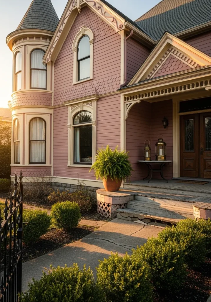
This stunning Victorian exterior embraces its historic roots while adding a whimsical twist with a dusty lilac-pink finish. The intricate architecture features classic fish-scale shingles and decorative gingerbread trim that pop against the deeper rose-toned lap siding. Creamy beige accents on the window frames and porch railings soften the overall look, while the dark wood double doors add a touch of grounded elegance to the entrance. A lush fern in a terracotta pot and golden lanterns on the porch complete this fairytale aesthetic, making the home feel both grand and incredibly lived-in.
If you have ever wanted to live in a modern-day castle, this specific color palette is the ultimate blueprint. I love how the evening sun catches the different textures of the siding and makes the whole house glow with a sense of history and charm. The combination of the rounded turret and that sophisticated pink hue creates such a unique and upscale street presence. It is a brilliant example of how to use a playful color to highlight beautiful architectural details without losing an ounce of sophistication.
Sherwin Williams Fleeting Flower for a Coastal Dream Bedroom
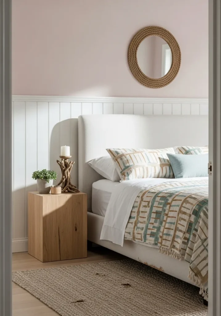
This airy bedroom setup combines a very pale, sandy pink upper wall with crisp white beadboard wainscoting for a touch of seaside texture. The high-contrast pairing creates a clean and architectural feel that highlights the beautiful natural wood of the blocky nightstand. A plush cream upholstered headboard serves as a soft backdrop for the patterned bedding, which features subtle teal and tan stripes that tie the whole organic palette together. The round rope mirror and driftwood-style candle holder add the final touches of coastal charm, making the space feel like a high-end boutique hotel room by the beach.
That hint of pink catching the sunlight makes the whole room feel fresh and airy. I love how the designer used the beadboard to keep the color from feeling too sweet, instead giving it a very grounded and sophisticated beachy vibe. It is such a clever way to use a warm pastel without committing to a full pink room. Seeing this tranquil corner makes me want to curl up with a good book and just listen to the waves in my imagination.
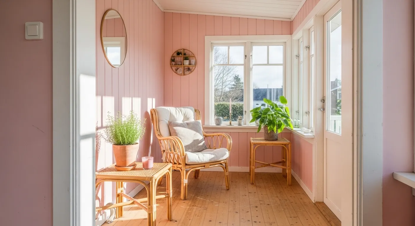
Sherwin Williams Bella Pink for a Sun-Drenched Relaxation Nook
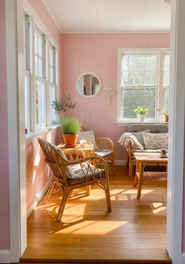
This charming sunroom or enclosed porch is a masterclass in how to use vertical wood paneling to create a cozy, cottage-inspired retreat. The walls are bathed in a warm, cheerful pink that glows beautifully as natural light streams through the large, white-trimmed windows. The space is anchored by natural honey-toned wood floors and furnished with light rattan chairs and a small matching table, adding a touch of bohemian texture. A plush grey sofa with decorative pillows provides a comfortable spot to lounge, while various potted plants and a small round mirror add a lived-in, organic feel to the room.
There is something so inherently peaceful about a space that leans into such a bright and happy color palette while keeping the furniture grounded and natural. I love how the vertical lines of the pink paneling make the ceilings feel higher, and the whole area feel more expansive. It’s the perfect setting for a morning cup of tea or a quiet afternoon of reading, surrounded by a hue that feels like a constant sunbeam. This design perfectly captures the essence of “playful yet chic,” turning a simple transition space into a high-value destination within the home.
Sherwin Williams Coral Candy for a High-Functioning Entryway
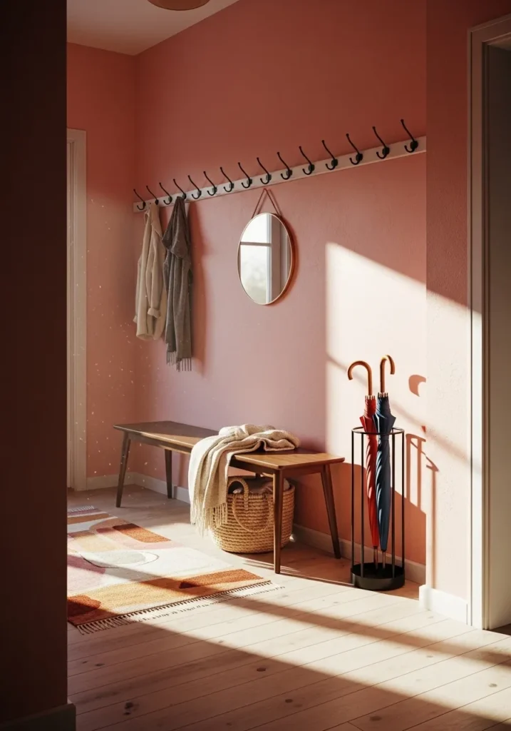
This mudroom or entryway makes a strong case for using a more saturated, sunset-toned pink to create an immediate sense of warmth upon entering the home. The walls are finished in a rich, coral-leaning pink that feels energized and welcoming, especially when caught in the long shadows of the afternoon sun. A long wooden bench in a mid-century silhouette provides a practical spot to kick off shoes, while a white peg rail stretching across the wall keeps coats and scarves organized. The space is tied together with a geometric runner rug that picks up various shades of terracotta and cream, and a sleek umbrella stand adds a touch of modern utility.
I love that this design doesn’t shy away from being functional while still embracing a very specific, bold aesthetic. The way the light hits the wall creates a beautiful gradient, making the color feel dynamic rather than flat. Using a round mirror above the bench is a classic trick to bounce more light around, but here it also adds a soft, curved element to contrast the sharp lines of the peg rail and bench. It’s an incredibly smart use of a “pop of color” that feels intentional, organized, and deeply inviting.
Sherwin Williams Exuberant Pink for a Bold Modern Duplex
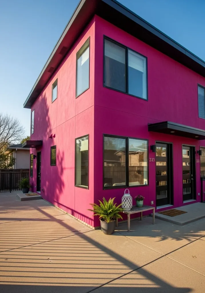
This striking two-story modern duplex breaks all the rules of traditional suburban design with its saturated, high-impact fuchsia exterior. The flat-roofed structure features clean, sharp angles that are emphasized by the intense pink stucco. To balance the vibrant walls, the design utilizes deep black for the window frames, sleek modern front doors, and minimalist overhangs. The concrete patio and walkways provide a neutral foundation, while a simple wooden bench accented with a white lantern and a lush fern adds a touch of organic softness to the entryway.
If you’re looking to make a massive architectural statement, this is exactly how you do it. The way the late afternoon sun casts long, dramatic shadows across the smooth pink surfaces gives the building an almost sculptural quality. It feels incredibly confident and avant-garde, turning a functional multi-family home into a piece of urban art. This look is perfect for those who want their home to be a vibrant landmark in the neighborhood.
Sherwin Williams Redend Point for a Grounded and Earthy Living Room
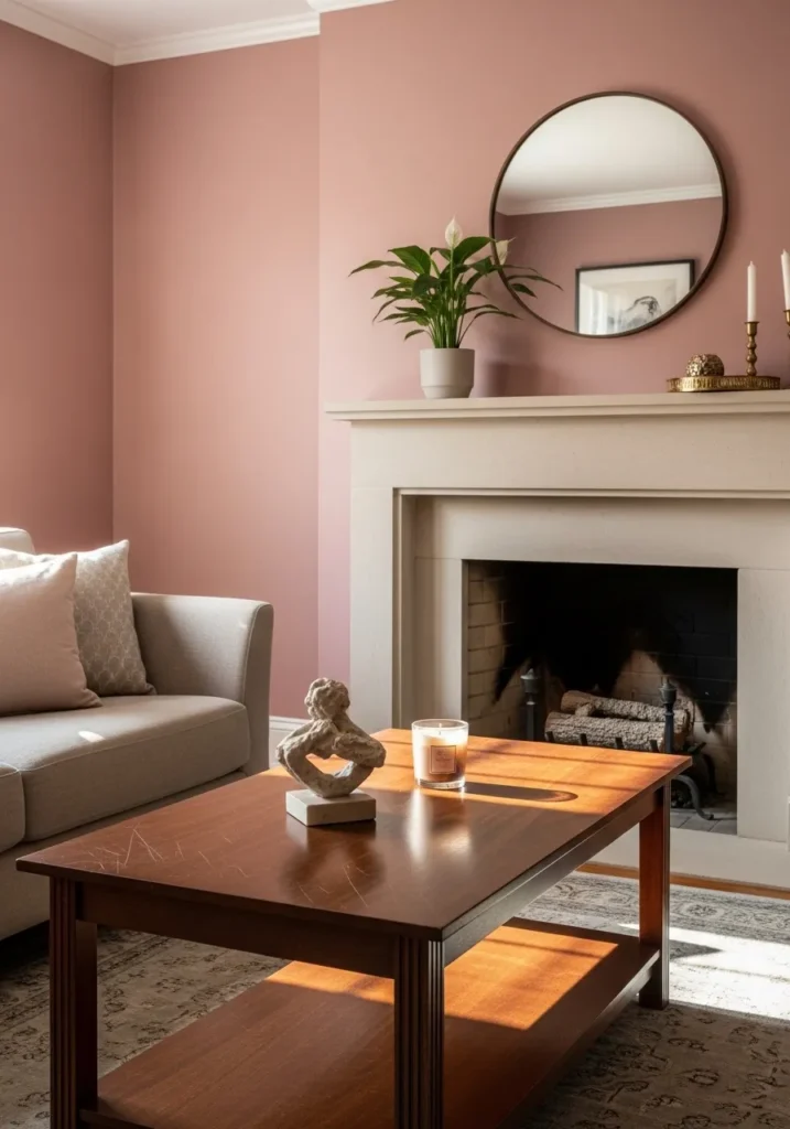
This living room setup demonstrates how a deep, clay-inspired pink can act as a warm and sophisticated neutral. The walls are painted in a muted terracotta-pink that creates a cozy, cocoon-like feel around the focal point: a classic, cream-colored fireplace mantel. A sleek grey sofa with plush pink accent pillows offers a soft place to land, while a rich mahogany coffee table adds a layer of traditional elegance. The space is accessorized with thoughtful details like a circular mirror, a minimalist stone sculpture, and a delicate peace lily, all of which thrive in the soft afternoon light.
I love how this specific shade of pink feels so mature and organic; it’s less about “bubblegum” and more about “earth and stone.” The way it pairs with the white crown molding and the cream fireplace gives the whole room a tailored, high-end look without feeling cold. It is a perfect example of using color to create a space that feels both grounded and incredibly stylish—a true sanctuary for relaxing after a long day.
Sherwin Williams Coral Reef for a Vibrant Urban Brownstone
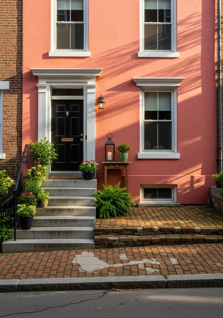
This narrow city exterior proves that a bold color choice can make even the most compact facade feel grand and full of life. The walls are dressed in a rich, sun-baked coral that catches the late afternoon light, creating a warm and energetic glow that stands out against the neighboring brick. The classic architectural details are highlighted by crisp white window frames and a stately pediment above the black front door, which features a traditional brass knocker.
I’m loving how the bright walls are balanced out by natural, calming details.The granite steps lead up to a small but lush landing filled with potted ferns and colorful blooms, while the weathered brick sidewalk adds a sense of history and texture. The long shadows stretching across the facade add so much depth, making the entire home feel like a cozy, hidden gem in the heart of the city. It is a fantastic example of how to use a spirited pink tone to create a sophisticated and memorable street presence.
Sherwin Williams Rose colored for a Chic and Moody Powder Room
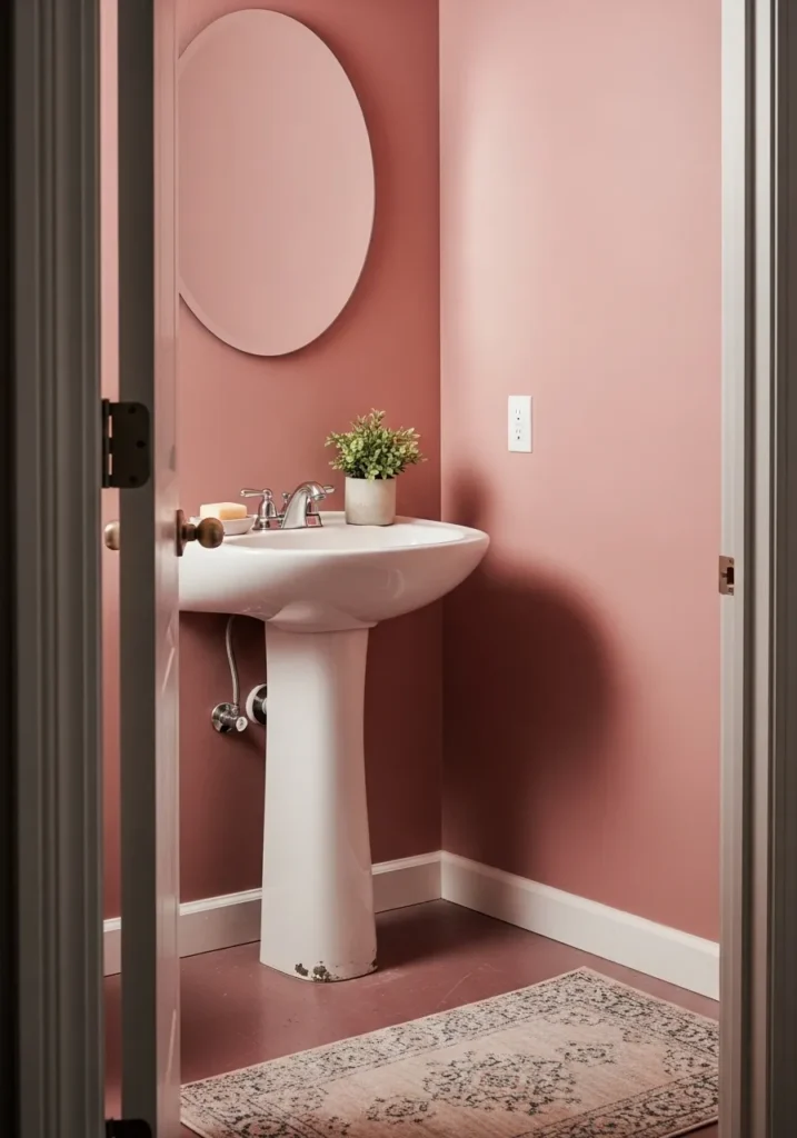
This final look features a sophisticated, deep dusty rose that transforms a small powder room into a high-style sanctuary. The rich wall color provides a dramatic contrast against the crisp white of the pedestal sink and the clean lines of the baseboards. A simple round mirror above the sink reflects the light and adds a sense of openness to the compact corner, while a tiny potted plant provides a refreshing touch of green. The space is anchored by a vintage-inspired patterned rug that brings in softer blush tones, perfectly complementing the saturated walls.
I love how this design proves that a darker, more “grown-up” pink can make a utilitarian space feel like a curated retreat. The way the shadows play in the corners gives the room an incredible depth and a slightly moody, artisanal vibe. It is the perfect choice for someone who wants to experiment with color in a way that feels timeless and deeply elegant. Using a monochromatic palette for the walls and floor (even the flooring has a rosy undertone!) makes the white fixtures absolutely pop, creating a look that is both bold and beautifully balanced.


