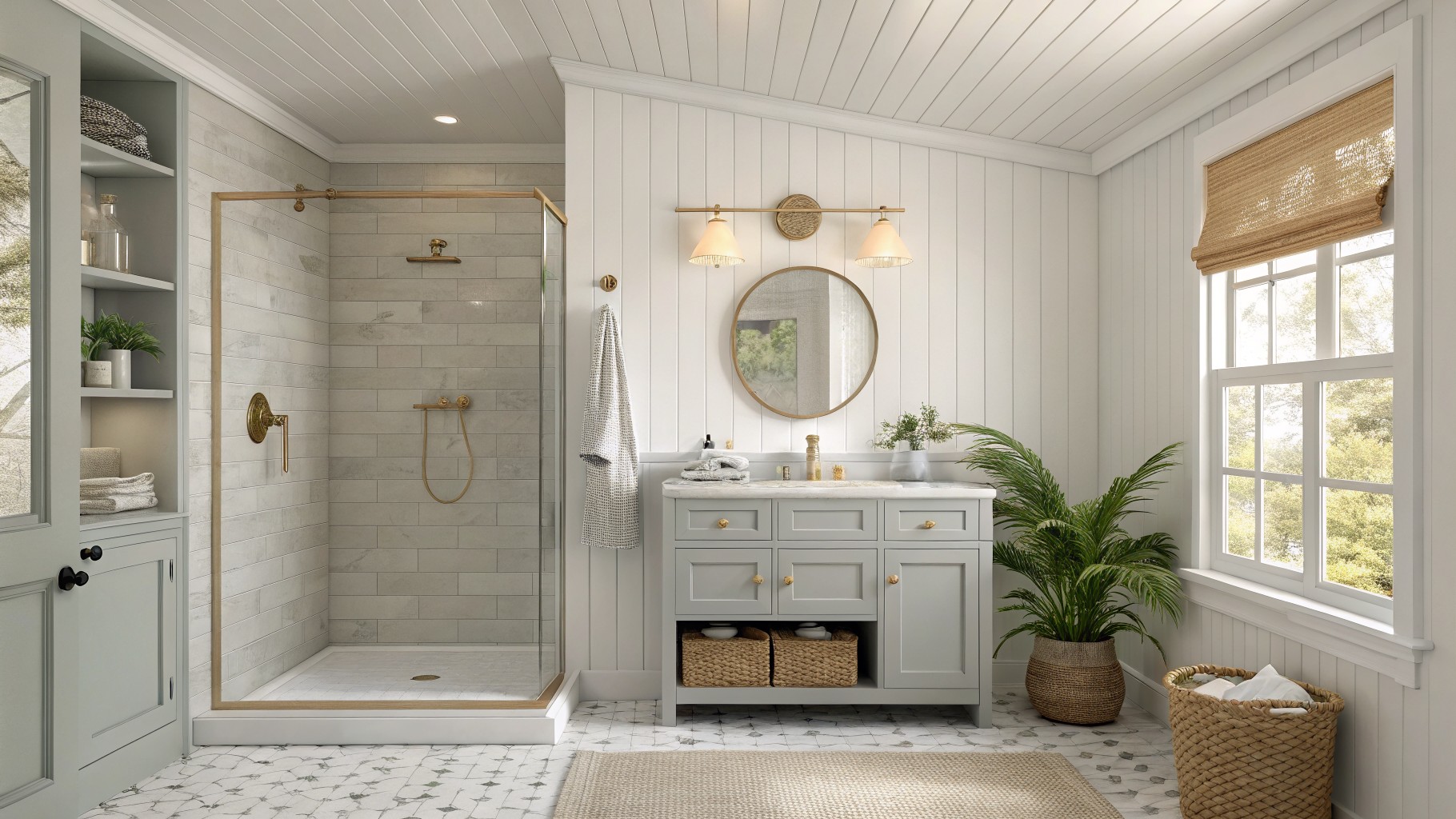
I have learned the hard way that bathroom paint colors often look different once the lights are on and steam fills the air.
A soft gray might seem perfect on the chip but then pulls too cool against the tile and the fixtures.
I always test samples on the actual wall before committing because the morning light changes everything in ways you cannot predict from a store display.
Some shades hold up better than others when you factor in the fixtures and cabinetry nearby.
Testing first is worth it.
Light gray bathroom cabinets
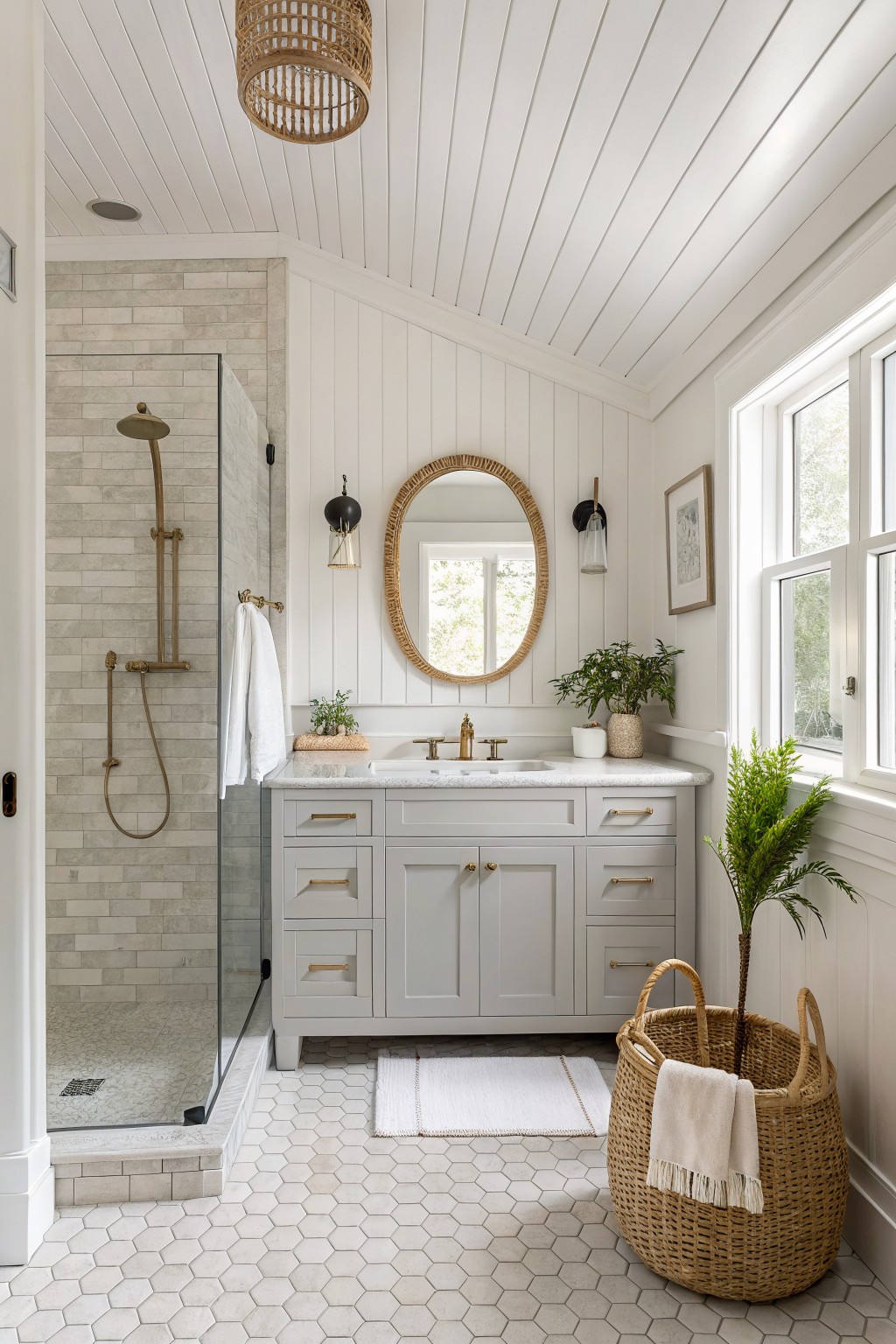
This light gray on the vanity is a soft neutral that keeps the bathroom feeling calm and open. It has enough depth to stand out against the white walls without making the space feel heavy or closed in.
The color sits somewhere between a pale gray and a warm off-white, which helps it blend with brass hardware and marble tops. It works best in bathrooms with plenty of natural light and pairs easily with white trim or light tile.
Soft Blue Gray Walls
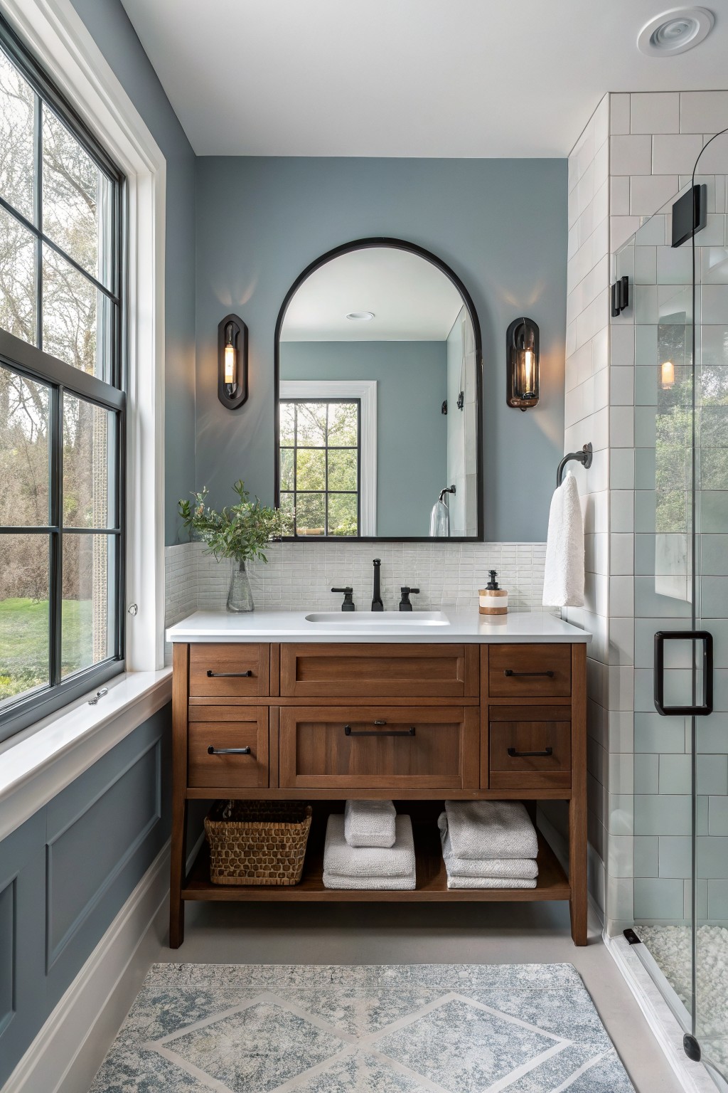
A soft blue gray gives a bathroom that calm, clean feeling without going too cold. This color family sits right between gray and blue and reads closest to Sherwin Williams Rainwashed, Benjamin Moore Wythe Blue, Behr Silver Bullet, or Farrow & Ball Blue Gray.
It has cool undertones that show up more in low light, so it pairs best with warm wood and white tile to keep the room from feeling stark. Stick with natural wood vanities or simple white trim if you want the color to feel balanced.
Soft Sage Green Walls
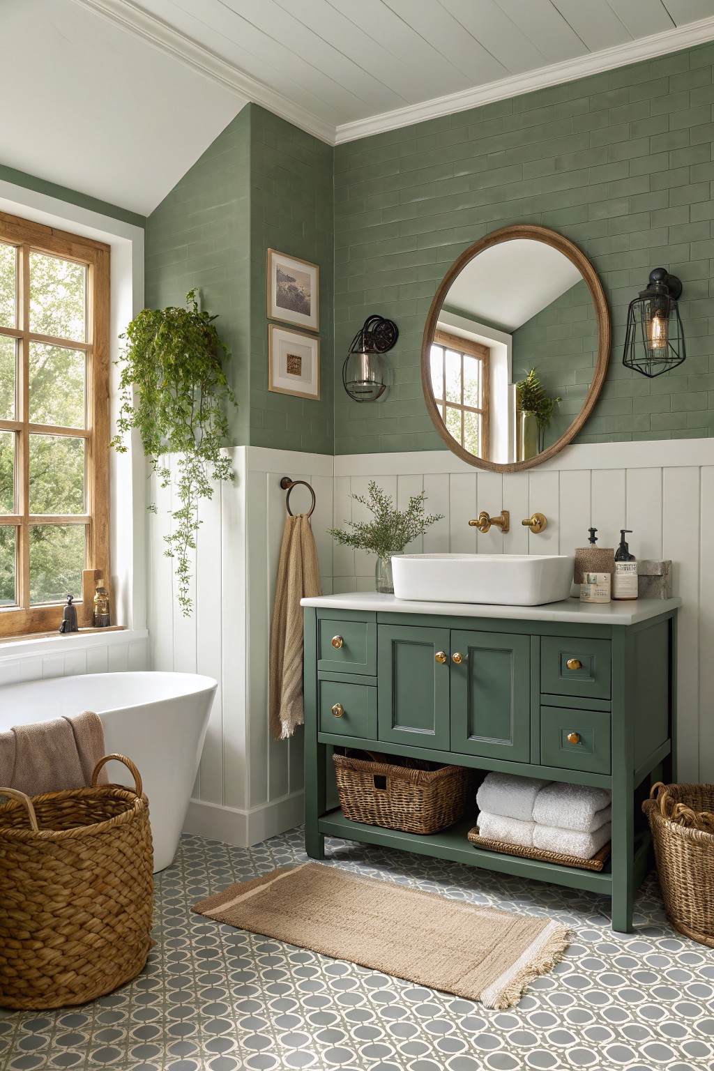
This muted sage green on the upper walls feels like a calm, earthy choice for a bathroom. It sits somewhere between gray and green with a soft finish that keeps the space from looking too bold.
The color works best with crisp white trim and wood cabinetry. It handles both natural light and artificial lighting without shifting too much, though it can look cooler in low light. Good matches include Sherwin Williams Clary Sage, Benjamin Moore Saybrook Sage, Behr Aged Olive, and Farrow & Ball Calke Green.
Light Sage Green Walls
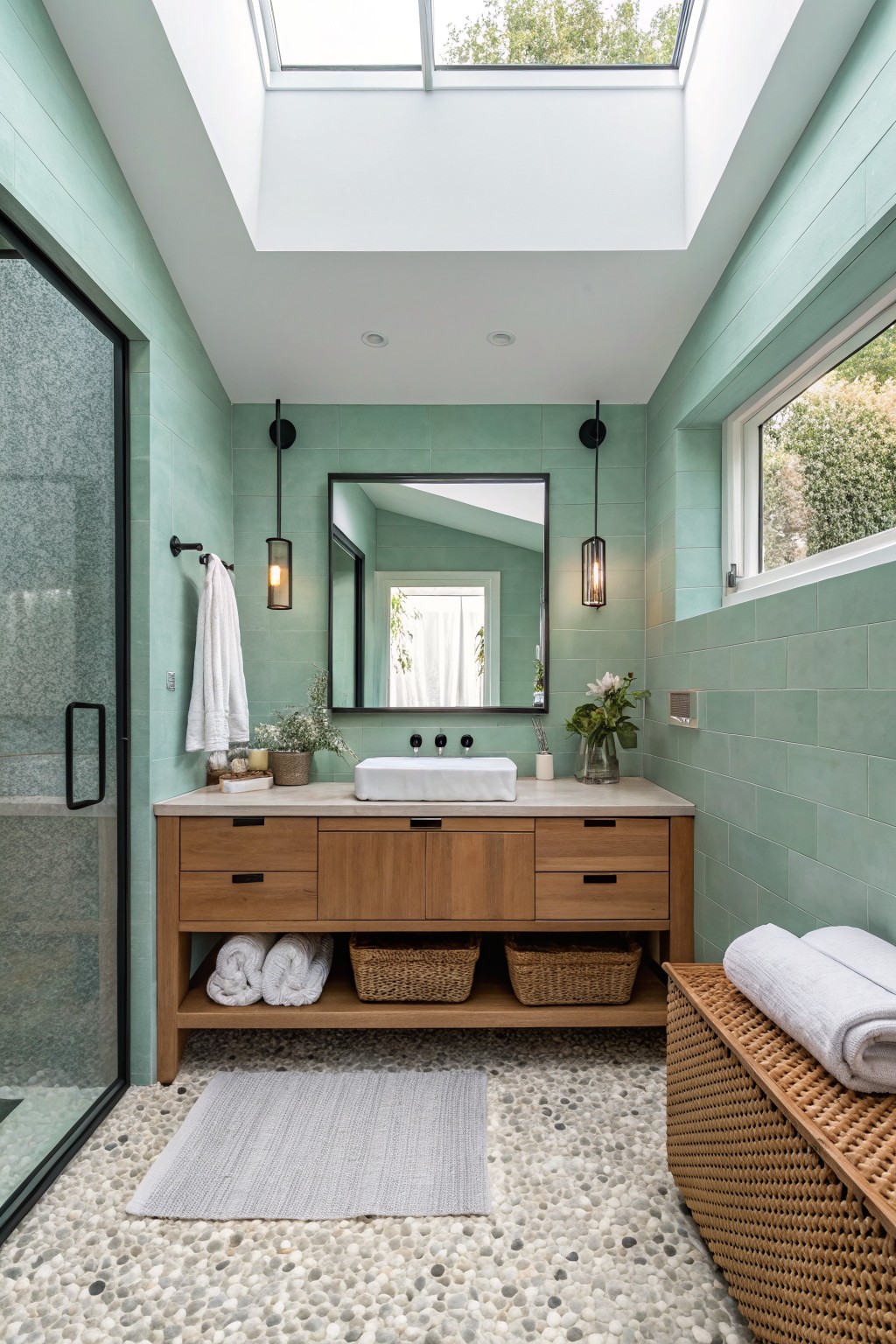
This bathroom uses a soft sage green on the walls that feels fresh and calm at the same time. It is a light cool green with a hint of blue that keeps the room from feeling heavy while still adding some color.
The shade pairs well with wood tones and stone floors because it stays quiet enough not to fight them. It works best in bathrooms with decent natural light, since it can lean a little cool in very dim spaces. Good matches include Sherwin Williams Rainwashed, Benjamin Moore Saybrook Sage, Behr Aqua Foam, and Farrow & Ball Vert de Terre.
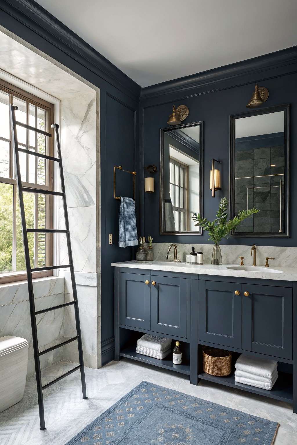
A deep navy blue on the walls gives a bathroom real presence. It feels grounded and a little moody, which works especially well in spaces that already have white marble or light stone to keep things from getting too heavy.
This color sits on the cool side with just a hint of gray in it. It looks best with warm brass or gold accents and dark cabinetry, though it can read flat if the room gets very little natural light.
Soft Greige Walls In A Bathroom
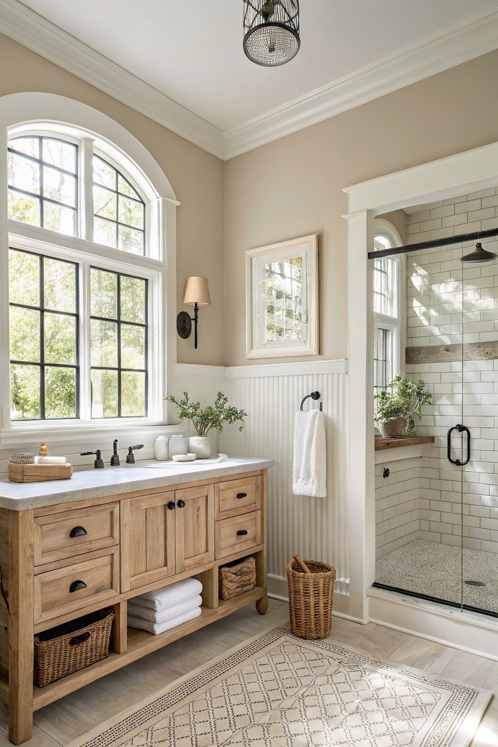
This bathroom uses a soft warm greige on the upper walls. It sits between beige and gray and keeps the room feeling calm and a little grounded.
The color has a gentle warmth that works well with wood tones and white trim. It suits bathrooms that get decent daylight and pairs easily with both cool tile and natural textures.
Soft Mint Green Walls
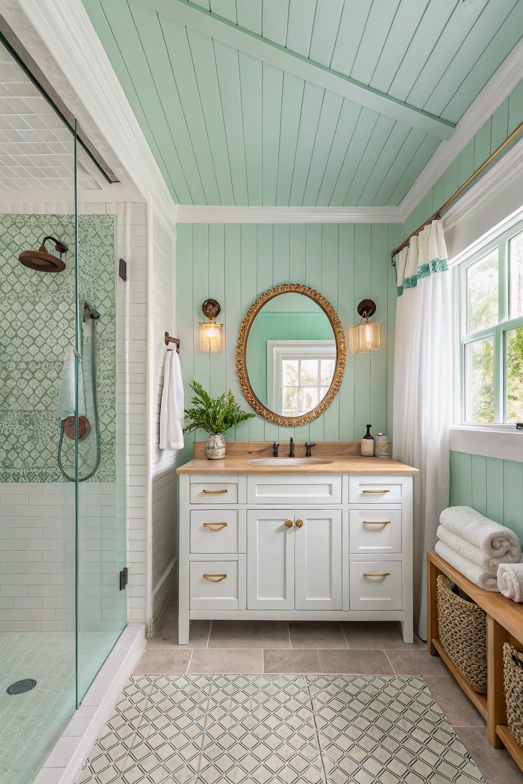
This soft mint green brings a light, fresh feeling to a bathroom without making it feel cold. The color family sits between green and blue, and it reads very close to Sherwin Williams Sea Salt or Benjamin Moore Water’s Edge.
It has a gentle blue undertone that keeps the space feeling open and works well with white trim and wood tones. The shade suits smaller rooms with decent natural light, though it can look a bit flat in very dark bathrooms.
Warm Greige Bathroom Walls
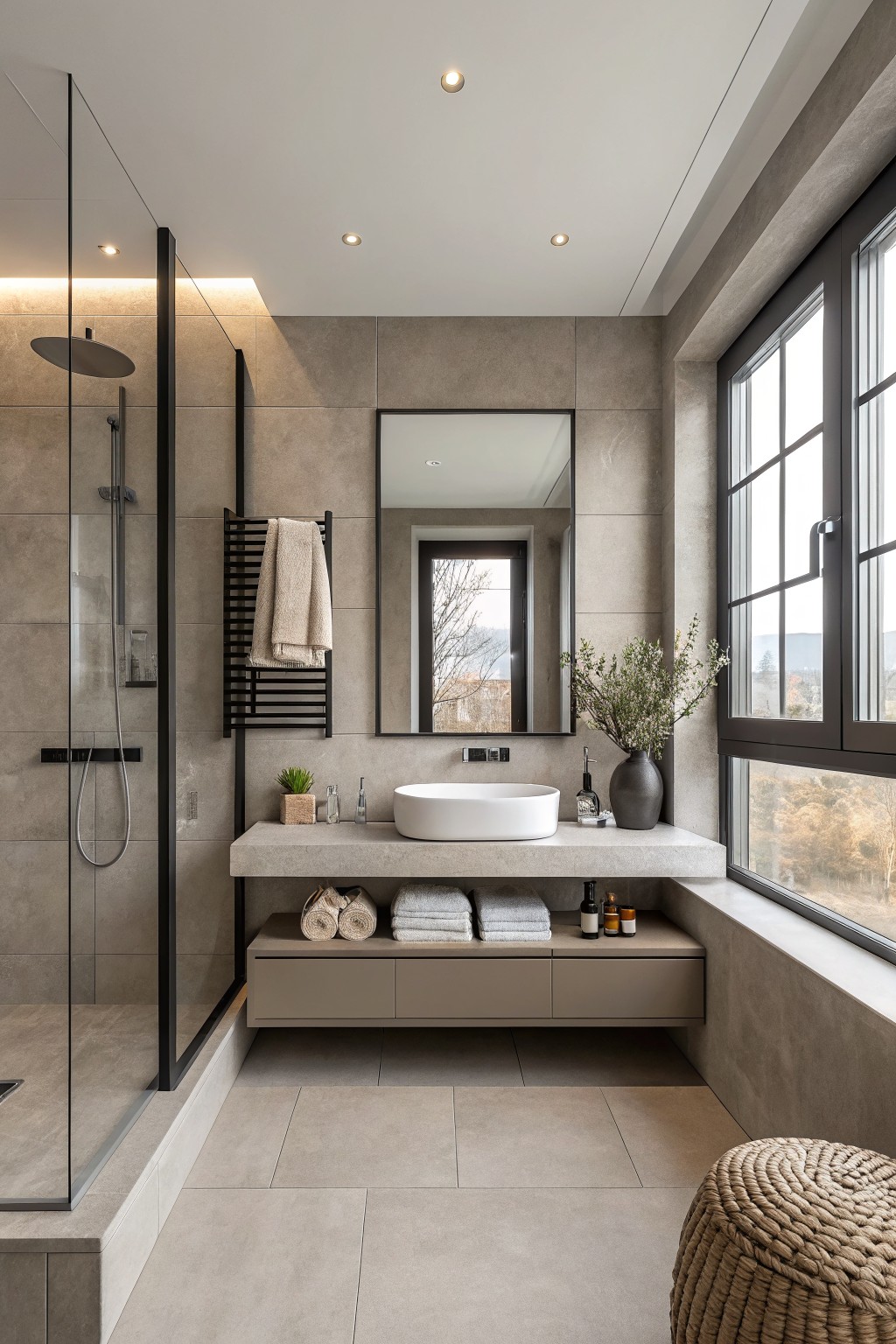
This bathroom uses a warm greige on the walls that sits between gray and beige. The color feels soft and steady, which helps the room look calm without turning too cool or flat.
It has a light brown undertone that works with stone and wood surfaces. Try it in bathrooms with decent natural light, and pair it with simple white or off-white trim so the walls stay the main focus.
Soft Blush Pink On The Walls
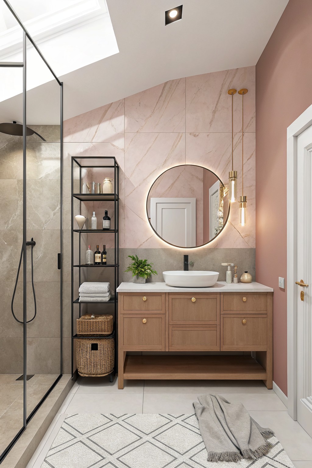
This bathroom uses a soft blush pink on the main wall. It is a warm dusty rose that feels calm and easy to live with rather than overly sweet or bold.
The color has a light gray undertone that helps it sit nicely next to wood cabinets and stone. It works best in bathrooms with decent natural light and pairs well with simple wood tones or white fixtures.
Calming Sage Green Bathroom Walls
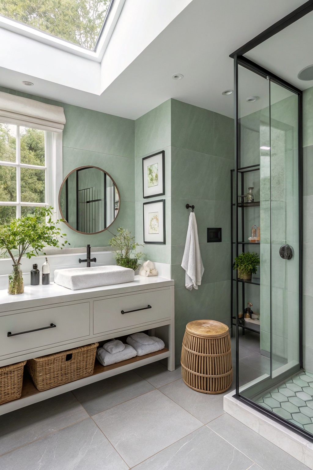
A soft sage green brings a calm, steady feel to bathrooms without making the space feel cold. This color sits right in the middle between gray and green, so it reads as fresh but still grounded next to white vanities and stone floors.
It works best with simple white trim and wood tones that have some warmth. In lower light it can lean a bit more gray, so test it on a large patch first if your bathroom does not get much natural light.
Soft Rose Beige Walls
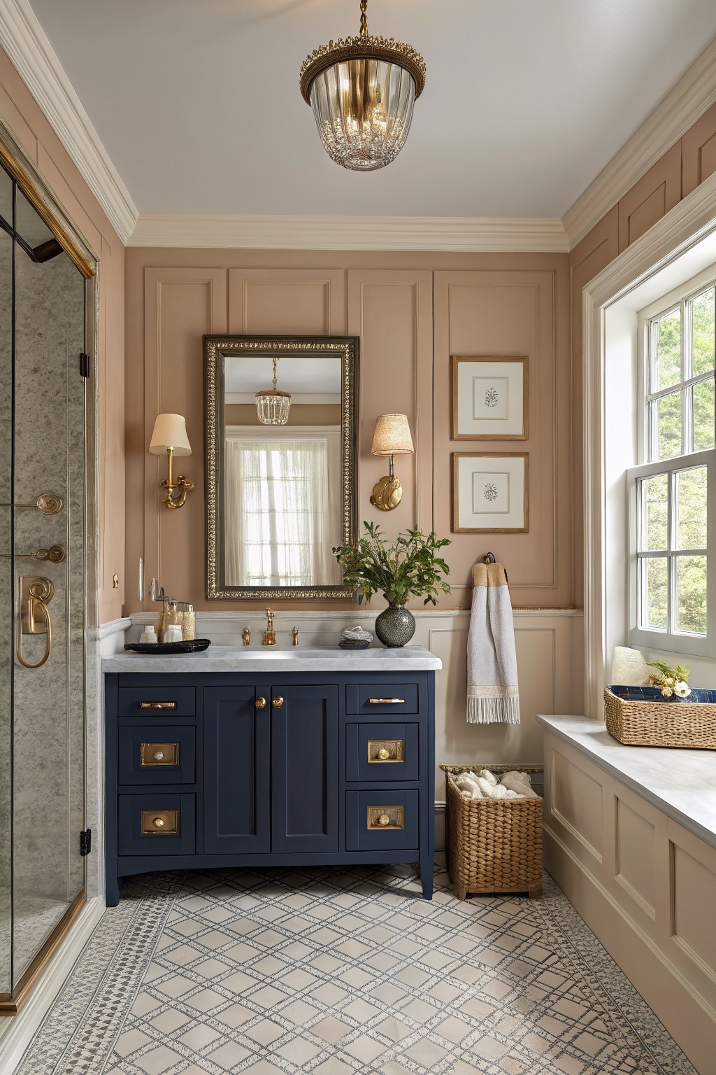
This soft rose beige brings a gentle warmth to bathrooms without feeling too sweet or too gray. It sits in that middle ground between beige and blush, which makes it easy to live with and gives the space a calm, slightly lifted look. The color works especially well when you want something quieter than a true pink but still a touch softer than a standard warm neutral.
It carries a light pink undertone that shows up more in natural light, so it pairs nicely with deeper tones like navy cabinetry or stone counters. Try it in rooms that get decent daylight, and test a larger sample first because the pink can shift depending on the time of day and what else is in the room. Good matches in this family include Farrow & Ball Setting Plaster, Benjamin Moore Pale Pink, Sherwin Williams Creamy, and Behr Soft Peach.
Muted Blue Green Sage Walls
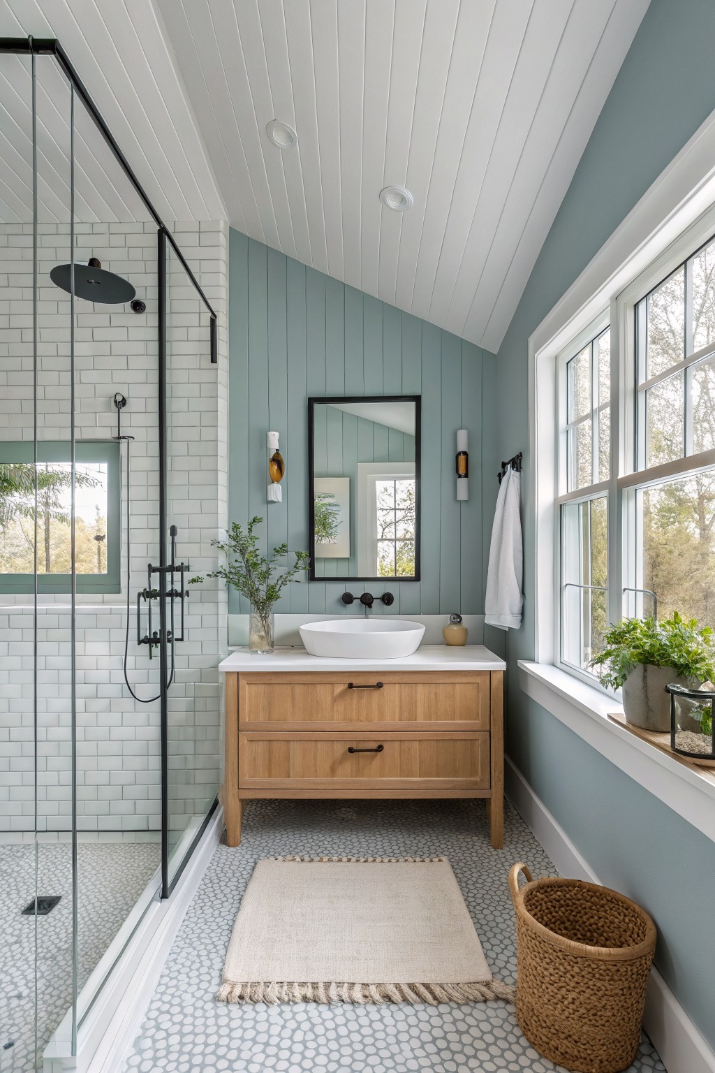
This bathroom uses a soft sage green on the walls. It is a muted blue-green with a hint of gray that feels calm and fresh at the same time.
The color pairs easily with white trim and light wood cabinetry. It can look a bit cooler under artificial light, so it works best in rooms with decent natural light and simple accents like black hardware or stone tile.
Classic Warm Greige Walls
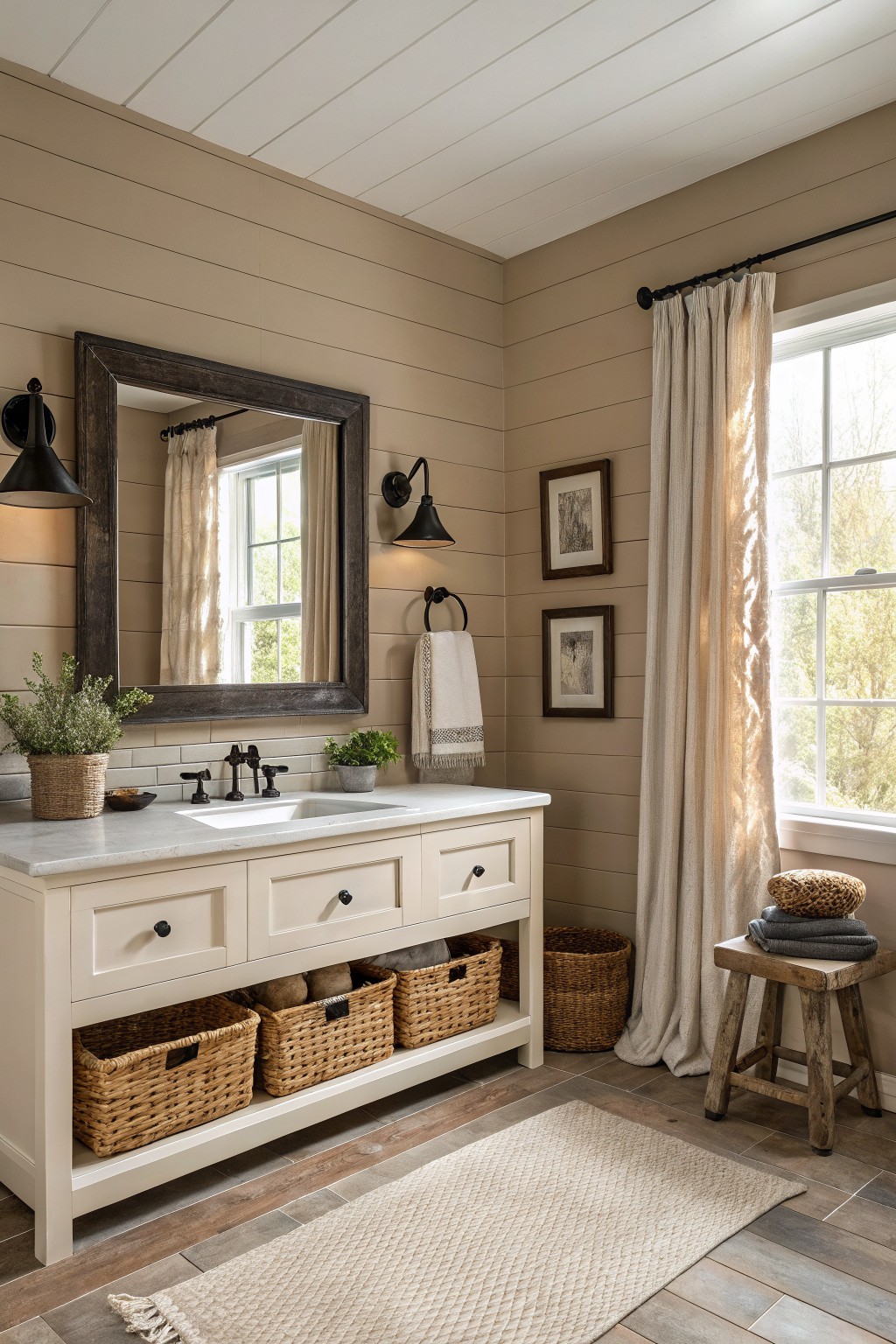
This bathroom uses a warm greige on the walls. It sits between beige and gray with a soft touch of warmth that keeps the space from feeling too stark or cold.
The color works nicely with white trim and wood tones on the floor. It can shift a little depending on the light, so it helps to test a sample on the actual wall before committing.
Airy Mint Green Bathroom Walls
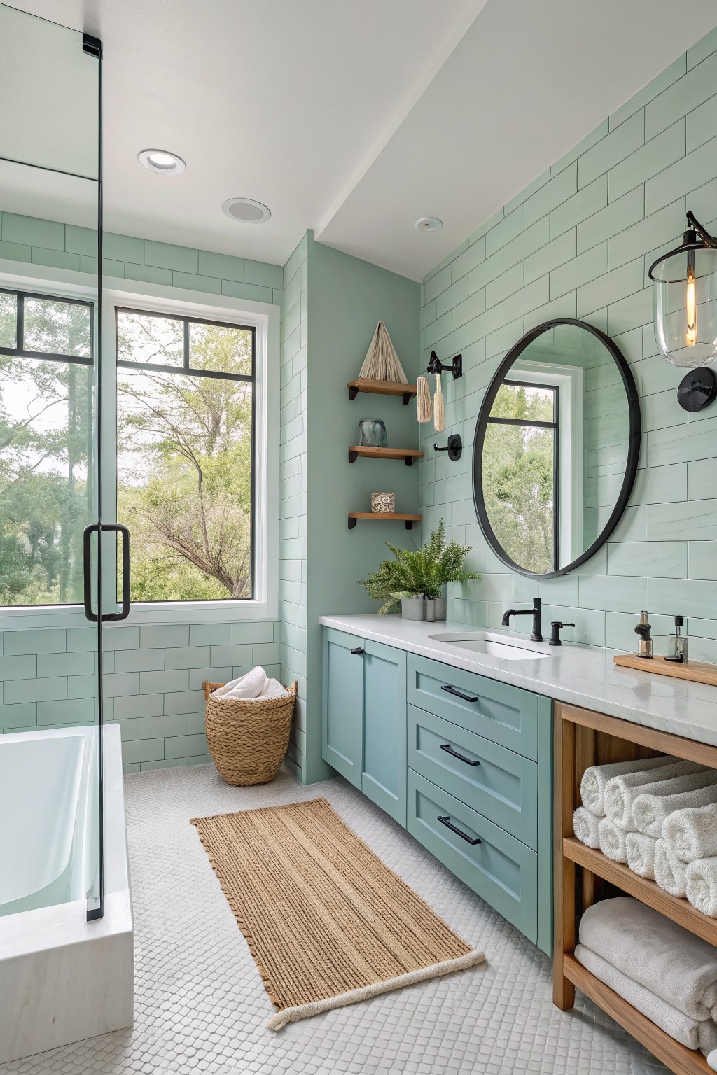
A soft mint green like this gives a bathroom a clean, airy look without feeling stark. The color family sits between green and blue, and it reads closest to Sherwin Williams Sea Salt, Benjamin Moore Palladian Blue, Behr Ocean Air, or Farrow & Ball Pale Powder.
The cool undertone helps it stay fresh next to white tile and wood cabinetry. It works best with plenty of natural light and pairs easily with black hardware or simple wood tones. Avoid using it in very dark rooms or with too many warm yellow accents, since the color can shift quickly.
Deep Green Bathroom Walls
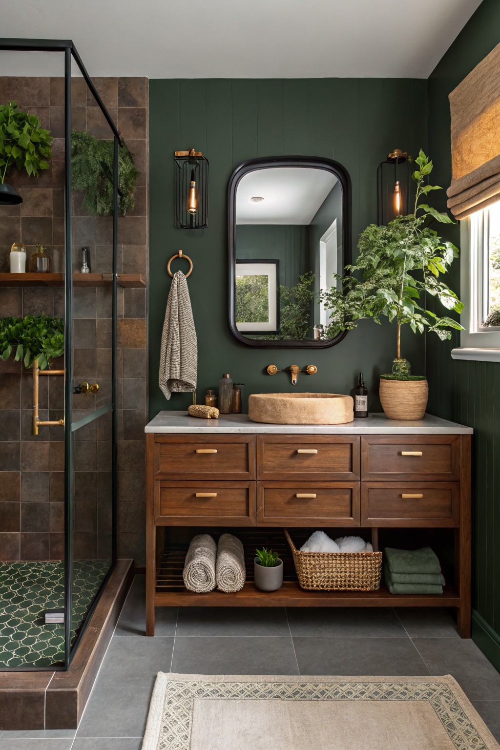
A deep green gives bathrooms a grounded feel that still feels fresh. This color sits somewhere between forest and olive, with enough depth to make the room feel intentional rather than plain.
It carries a soft blue undertone that shows up next to warm wood and gray tile. The shade works best in rooms with decent natural light and pairs easily with wood vanities, stone counters, or simple brass fixtures.
Soft Sage Green Cabinets
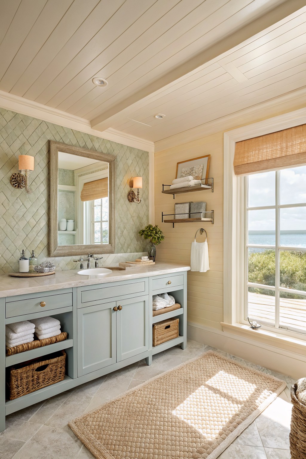
A soft sage green on the vanity cabinets brings a calm, slightly cool feel to the bathroom. It sits between gray and green without leaning too far either way. This color reads closest to Sherwin Williams Rainwashed, Benjamin Moore Wythe Blue, or Behr Soft Sage.
It works best with white trim and light stone surfaces, since the cool undertone keeps the room from feeling heavy. The color can look a bit flat if the lighting is very dim, so it suits bathrooms with decent natural light or simple white fixtures.
Warm Terracotta Walls
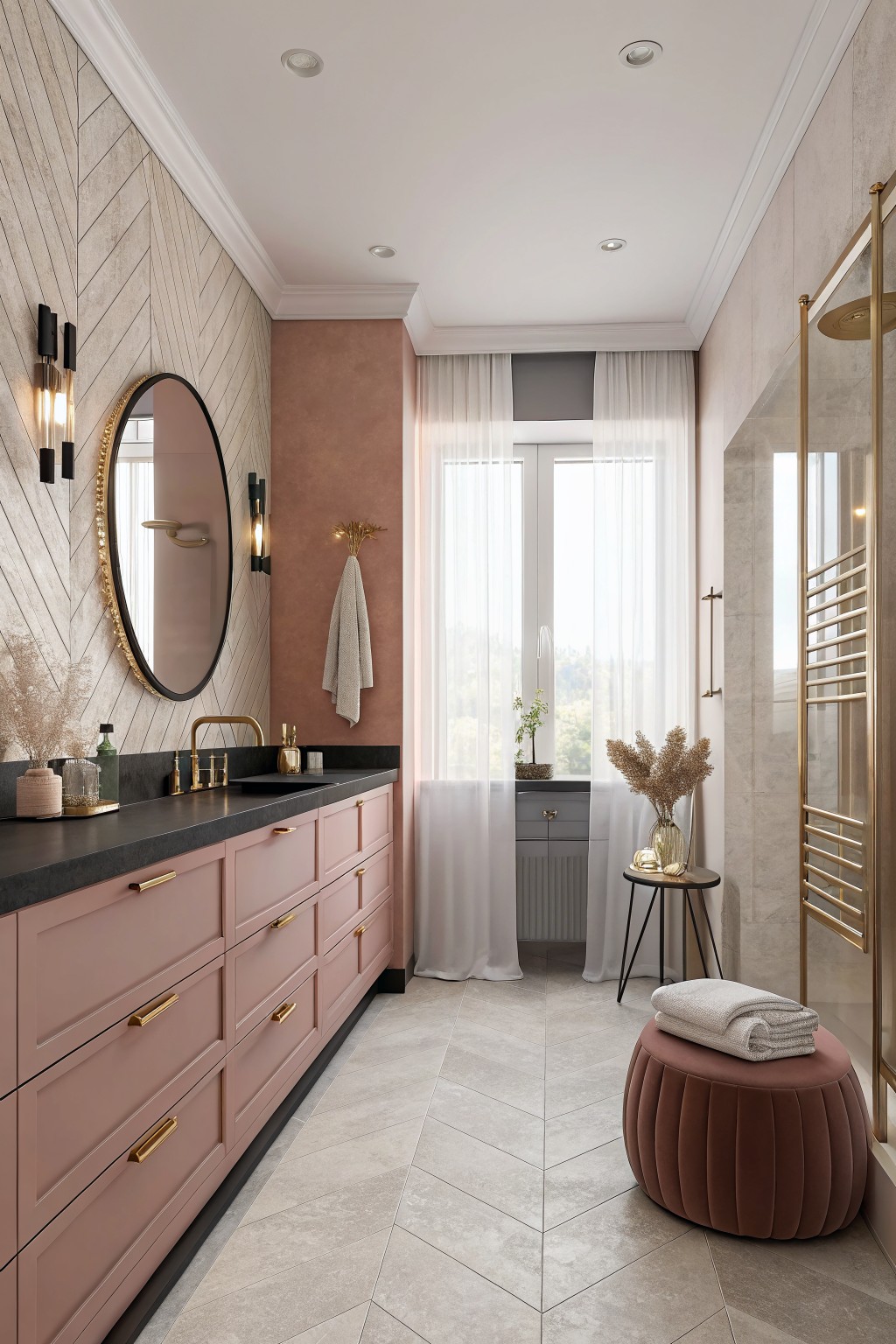
A soft terracotta paint covers the main wall in this bathroom. It is a warm, muted pink-brown that feels earthy and grounded while still keeping the space light enough for a smaller room. This kind of color works especially well with wood tones and brass hardware because it adds quiet depth without fighting the other finishes.
The undertone runs slightly orange, so it reads cozier in the morning light and stays balanced next to the gray floor tile. It suits bathrooms that already have some natural texture, like stone or wood cabinetry, but it can start to feel heavy if the room has very little daylight or too many dark surfaces.
Gray Leaning Sage Green Walls
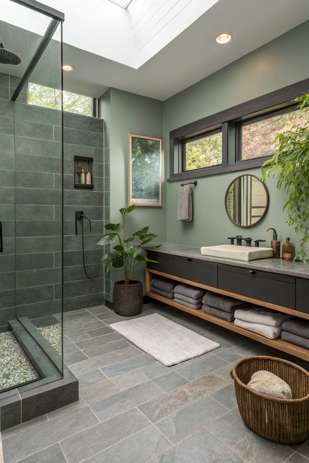
This bathroom uses a muted sage green on the walls that leans more gray than bright green. The color feels calm and steady, which helps the room feel balanced without needing a lot of extra pattern or color.
It has cool undertones that sit well next to dark cabinetry and gray tile. Try it with warm wood shelves or black fixtures to keep the space from turning too cold, and test it in both natural and artificial light first since the gray can shift depending on the time of day.
Soft Yellow Walls
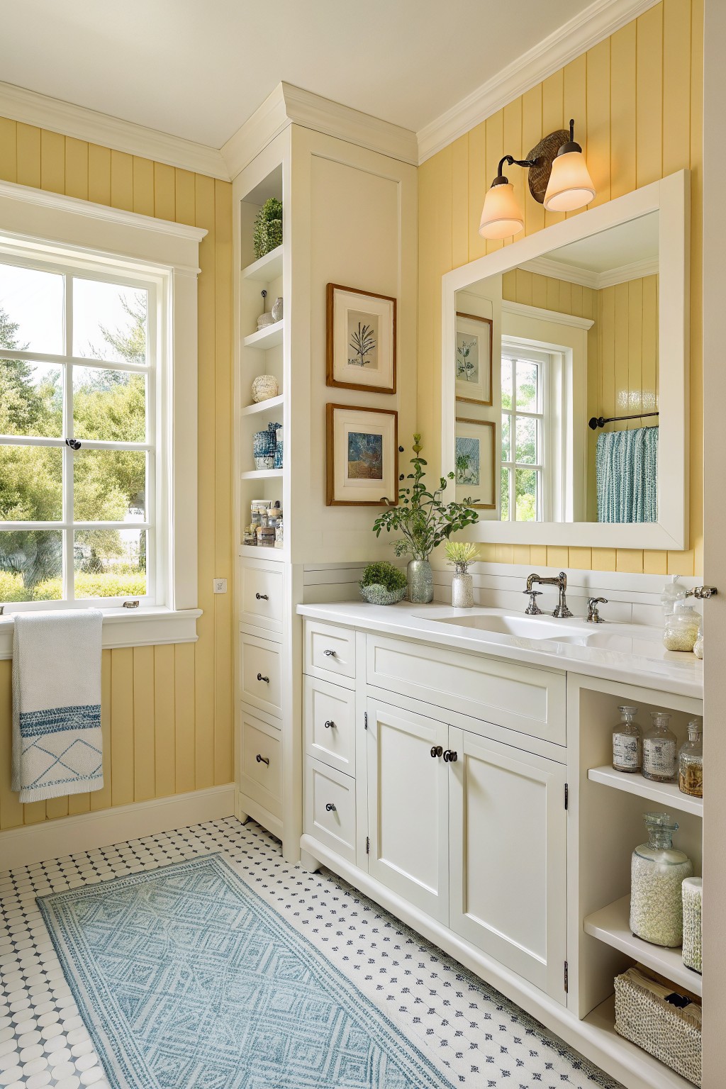
This bathroom shows a soft yellow on the walls. It is a light warm shade that feels bright without turning harsh, and it works well with the white trim and cabinetry.
The color has a gentle creamy undertone that stays friendly in both natural and artificial light. It pairs nicely with white fixtures and wood accents, though it can look a bit washed out if the room gets very little daylight.
Deep Teal Bathroom Walls
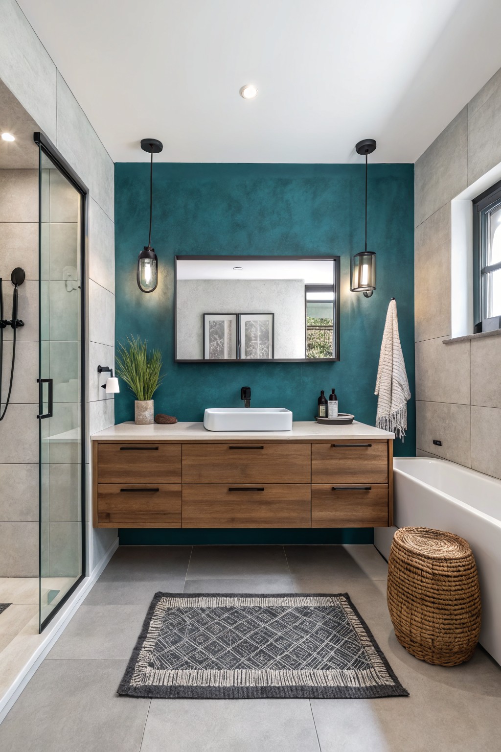
A deep teal gives bathrooms a fresh look that still feels grounded. This shade sits between blue and green with cool undertones that make the room feel a little more enclosed and calm.
It works best with warm wood tones and white fixtures to keep things from feeling cold. Try it in spaces with decent natural light and pair it with black hardware if you want a bit more contrast. Good matches include Sherwin Williams Jade Dragon, Benjamin Moore Deep Teal, Behr Peacock Blue, and Farrow & Ball Vardo.
Soft Lavender Bathroom Walls
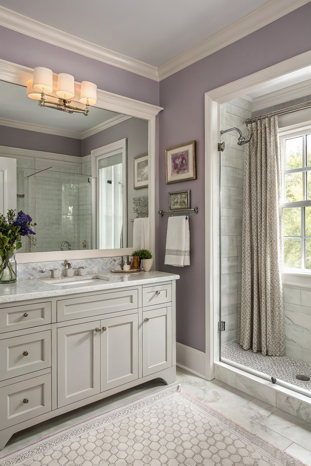
A soft lavender brings a gentle color to a bathroom without making it feel too bold. This muted purple-gray tone reads calm and fresh, especially when used across all the walls in a space with white trim and marble surfaces. It seems closest to Benjamin Moore’s Lavender Ice, Sherwin Williams’ Novelty, Behr’s Purple Rain, or Farrow & Ball’s Cromarty.
The cool undertone helps the color stay light even in lower light, and it works best paired with crisp white cabinetry or simple tile. Too much dark wood or heavy patterns can make it feel flat, so keep the rest of the room fairly neutral.
Soft Blue Gray Bathroom Walls
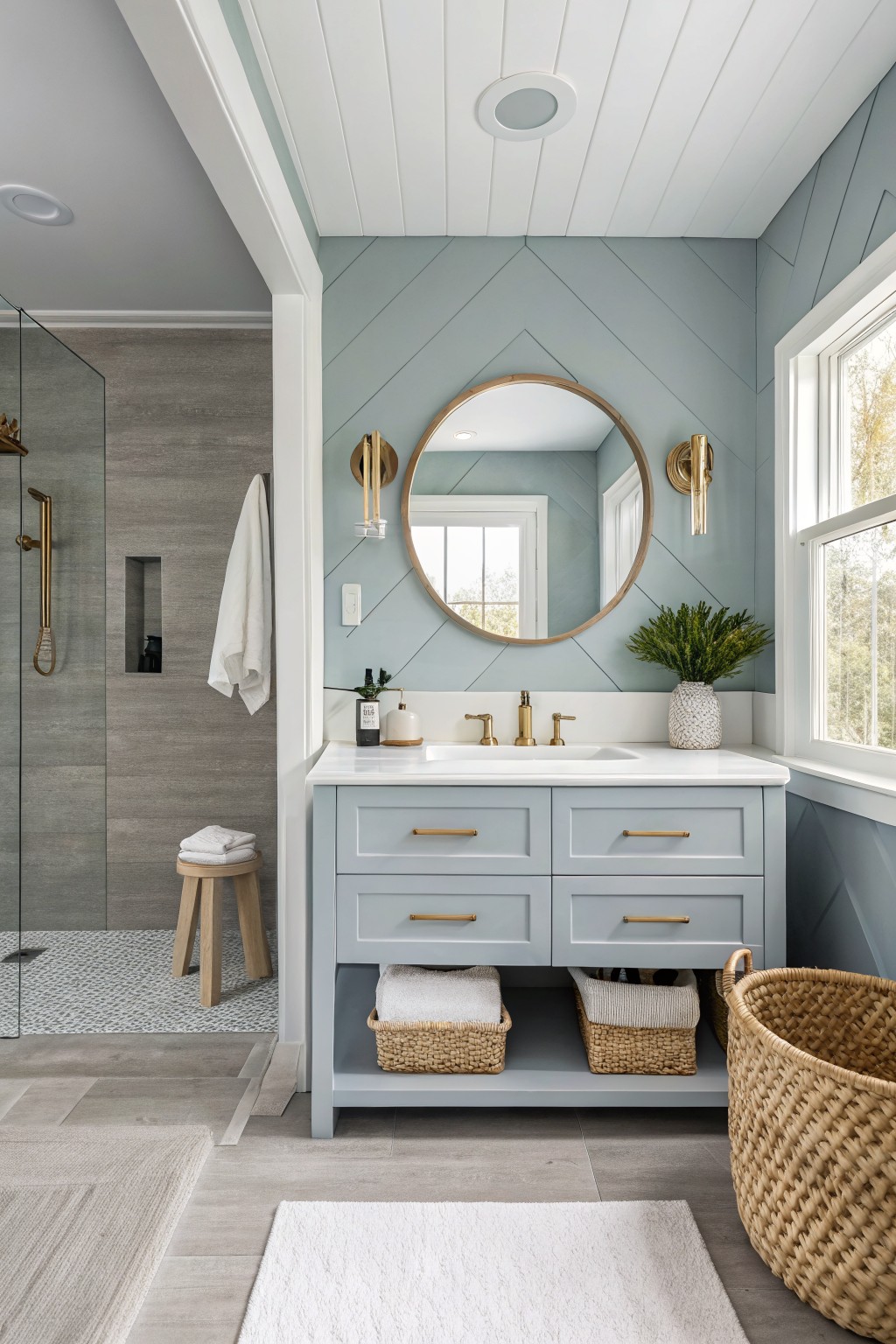
This soft blue gray paint brings a calm, clean feel to bathrooms without looking stark. It reads as a muted mix of blue and gray with just a hint of green, which keeps the space feeling fresh rather than cold. Colors like Benjamin Moore’s Palladian Blue, Sherwin Williams’ Rainwashed, or Behr’s Silver Drop sit in the same range.
The undertone helps it pair with white counters and brass fixtures without clashing. It works best in rooms with decent natural light, and it stays looking balanced next to wood tones or gray tile.
Frequently Asked Questions
Q: How do I pick a color that won’t feel too dark in my small bathroom?
A: Try samples on the wall first. Paint a big patch and check it at different times of day. Light colors bounce around more and keep things open.
Q: What if my bathroom has old tiles that clash with new paint?
A: Choose a shade that picks up one of the tile colors. This ties everything together without a full remodel.
Q: Do bathroom paints need special formulas for moisture?
A: Pick satin or eggshell finishes. They handle humidity well and wipe clean when steam builds up.









