I’ve learned through trial and error that paint colors shift dramatically once they cover your walls and catch the day’s light.
A shade might glow warmly in morning sun but turn flat or muddy by evening if its undertones don’t match your room’s conditions.
I still cringe thinking about the beige I tested that absorbed every shadow in my low-light living room and felt heavy.
Paints with subtle complexity often perform best because they adapt without losing their edge. Sample them in your space first.
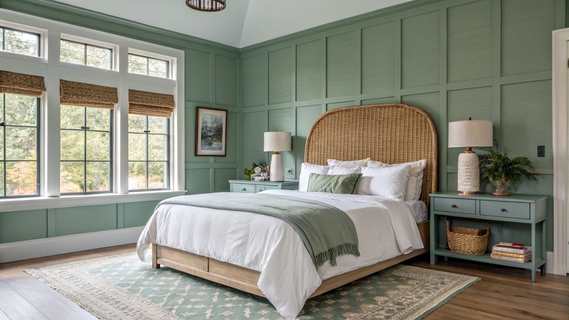
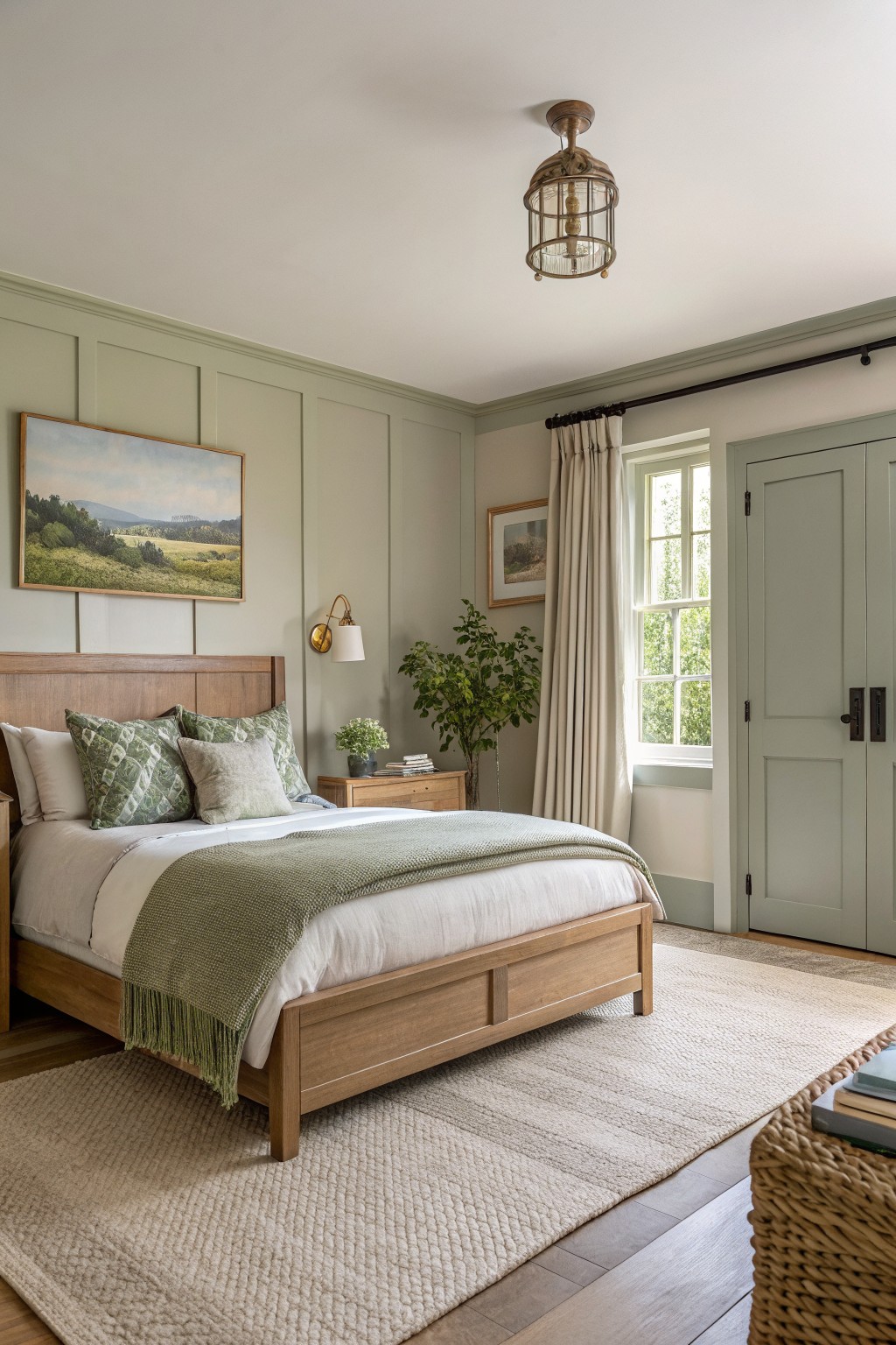
Pale Sage Green Walls
This pale sage green on the walls looks closest to Sherwin-Williams Clary Sage or Benjamin Moore October Mist. Behr’s Silver Sage comes pretty near too. It’s a gentle green in the sage family. Not too yellow. Not too blue. Just soft and easy on the eyes. Folks like it because it keeps a bedroom feeling calm without going flat.
That cool undertone shows up best in rooms with good natural light, like near big windows. It sits nice against warm wood floors and rattan pieces. Go for white bedding and green accents to keep things fresh. Skip heavy dark furniture though. It can make the green read muddier.
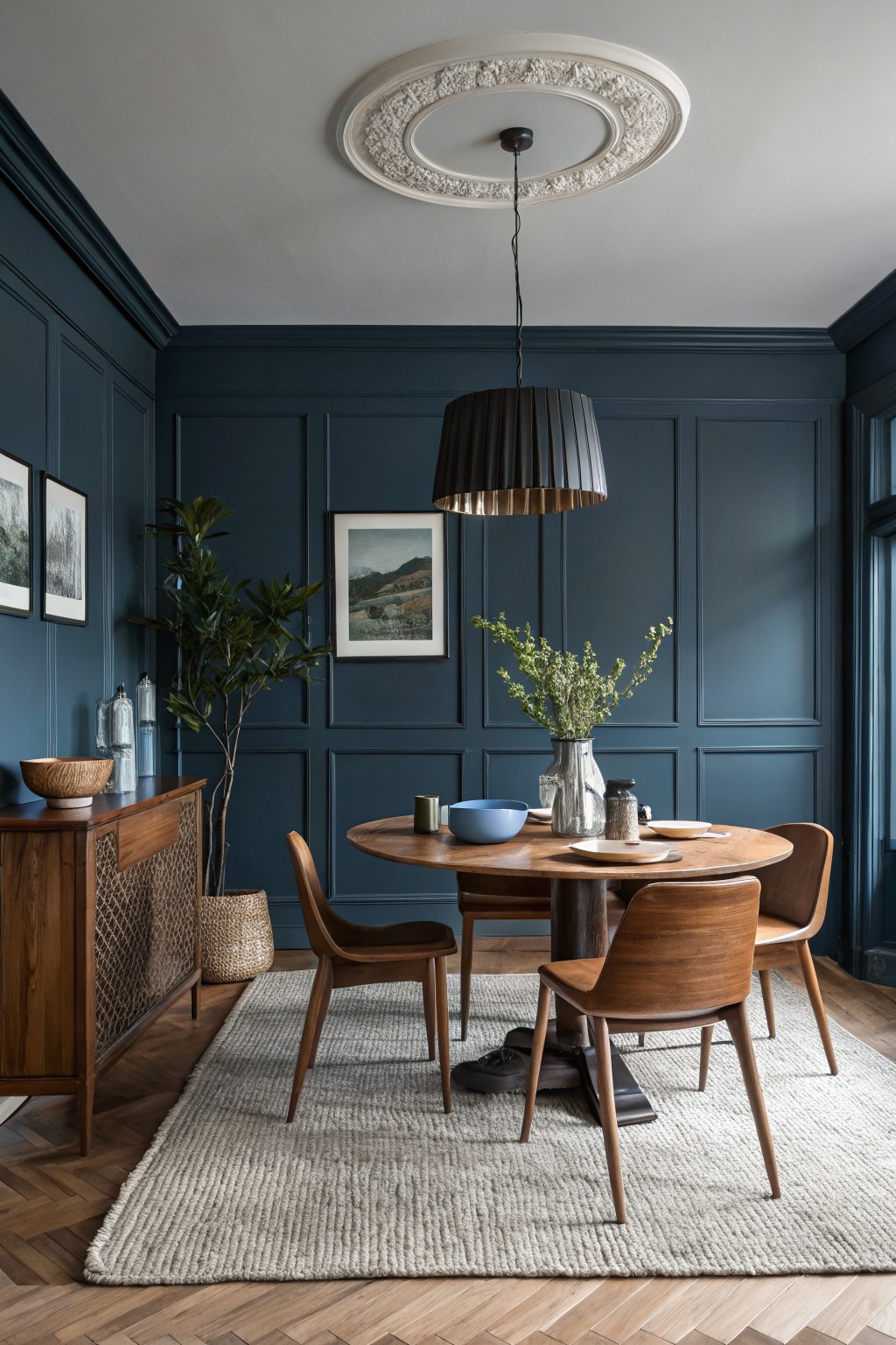
This dining room shows off a deep navy paint on paneled walls that feels rich and current. It’s that moody blue shade, probably closest to Sherwin-Williams Naval or Benjamin Moore’s Hale Navy. Or maybe Farrow & Ball Hague Blue. People go for it because it makes wood furniture pop without overwhelming the space.
The cool undertone keeps it from going too dark in normal light. Pair it with warm oak tables and chairs like here, plus some greenery. It suits dining areas or studies best. Just test samples, since it can shift a bit with your floors.
Blush Pink Walls
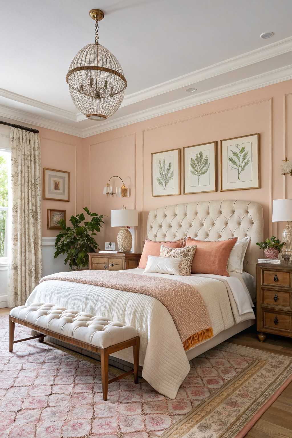
This blush pink on the walls gives a soft, warm feel that’s right in line with today’s trends. It looks closest to Farrow & Ball’s Setting Plaster or Benjamin Moore’s First Light 2102-70, with maybe a nod to Sherwin-Williams Peach Fuzz too. What I like about it is how it keeps things light and feminine without going full candy pink. It’s got that subtle peach undertone that makes a bedroom cozy.
The color picks up nicely in good light, warming up the cream bedding and wood furniture without clashing. Pair it with botanical prints or greenery like you see here on the nightstand. Just watch it next to cooler grays, though. It shines best in spaces with natural window light.
Deep Green Kitchen Cabinets
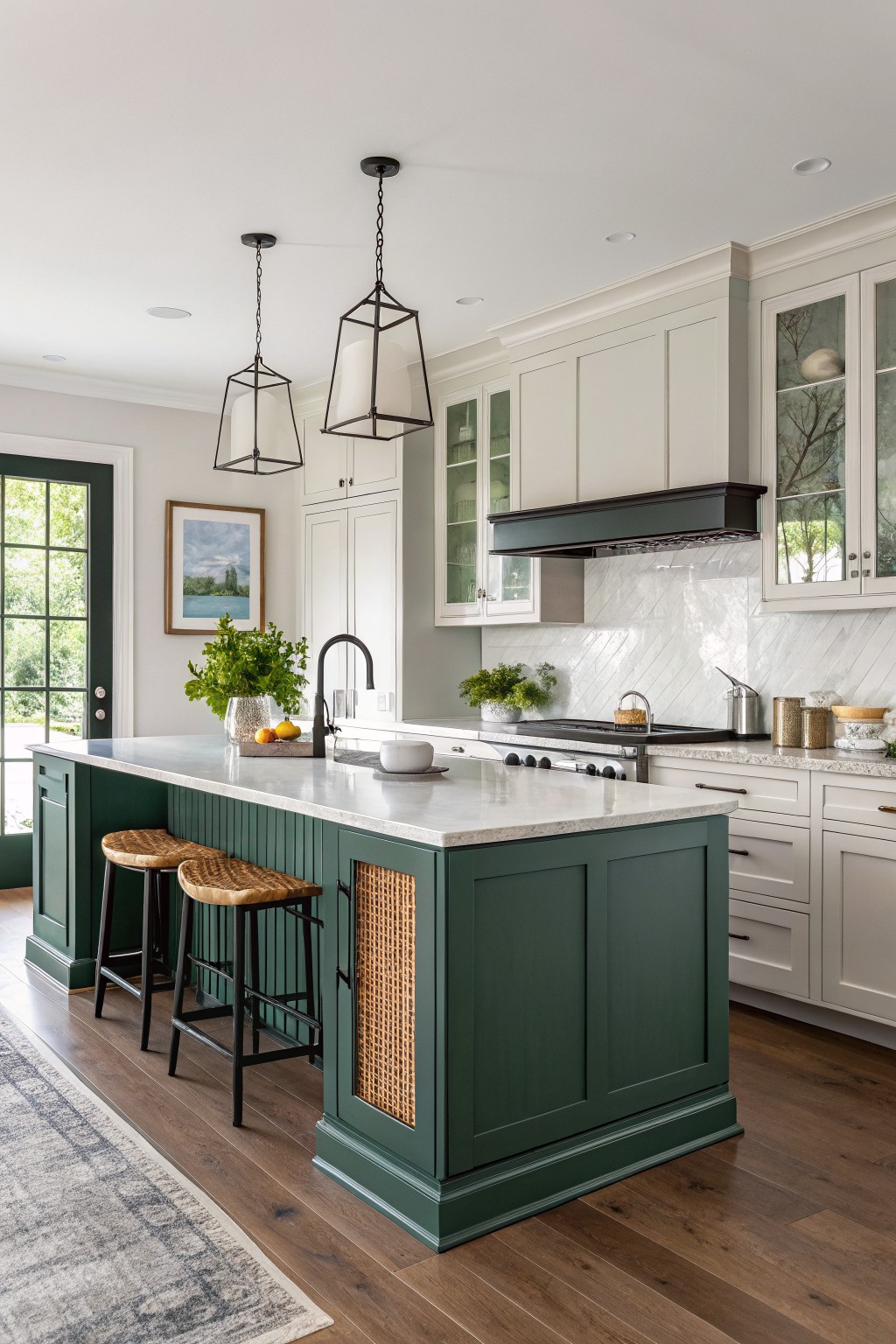
This deep green paint on the kitchen island reads very close to Benjamin Moore Essex Green HC-188 or Sherwin Williams Jasper SW 6216. Maybe even Farrow & Ball Calke Green. It’s a rich green in the hunter family, not too blue or yellow. Folks like it because it adds some weight down low without overwhelming the room. Makes white uppers pop more.
That green has a neutral undertone that plays nice in natural light. It works best on cabinets or islands paired with quartz counters and wood floors like you see here. Stick to brass hardware and rattan accents to keep it fresh. Just test it in your space first, since greens can shift a bit.
Warm Terracotta Walls
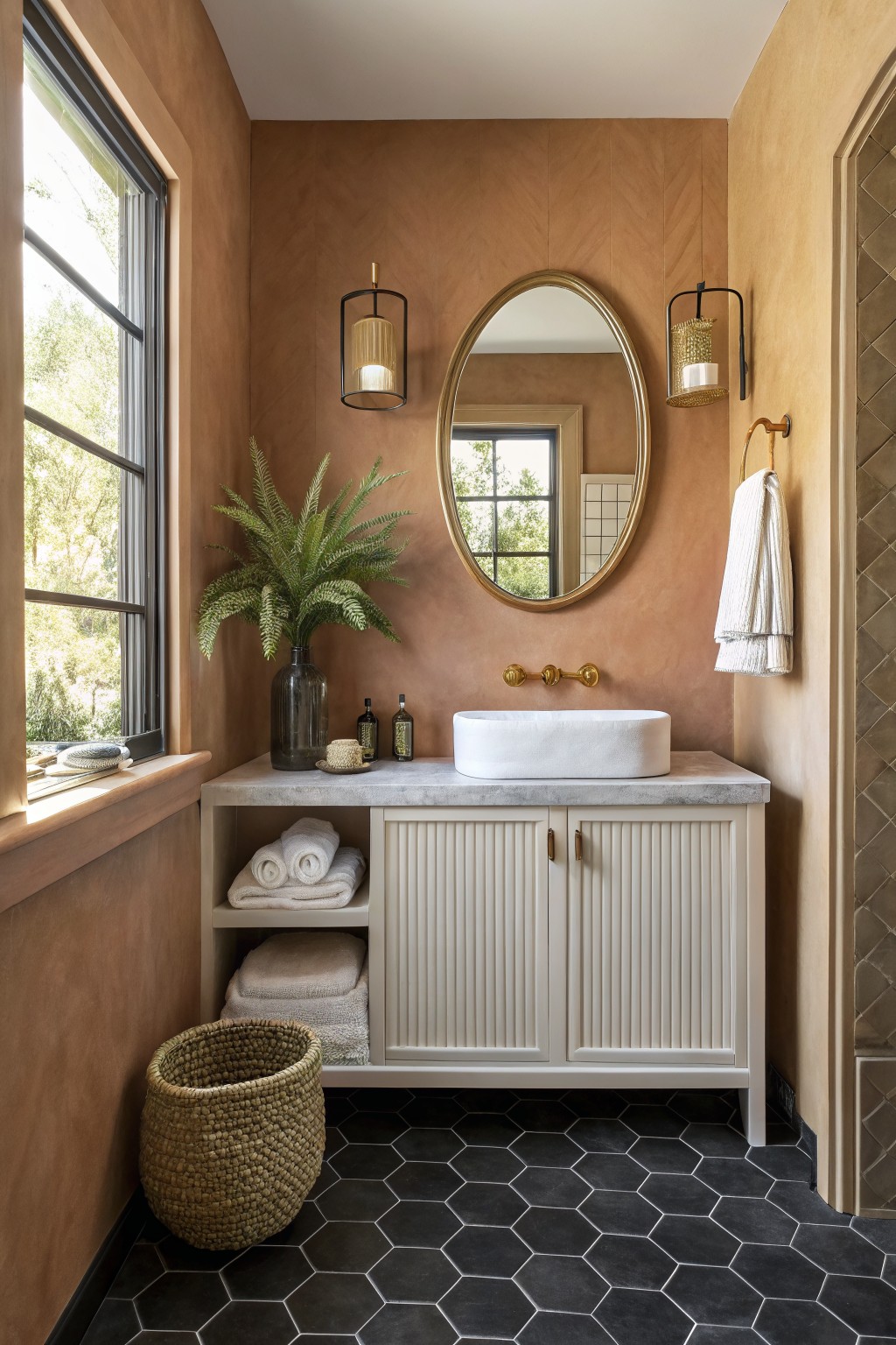
This bathroom pulls off a warm terracotta on the walls that seems closest to Sherwin-Williams Riding Hood or Benjamin Moore Terracotta Tile, with maybe a nod to Farrow & Ball Red Earth. It’s an earthy shade with just enough orange undertone to feel grounded but not too heavy. Folks like it because it brings in that Southwest vibe without overwhelming the space, especially when the texture shows through like plaster.
The color works best in good natural light, where the warmth really comes alive next to black tile floors or white cabinets. Pair it with brass fixtures and greenery for balance. Watch for cooler north-facing rooms though. It can read a bit flat there.
Soft Greige Walls
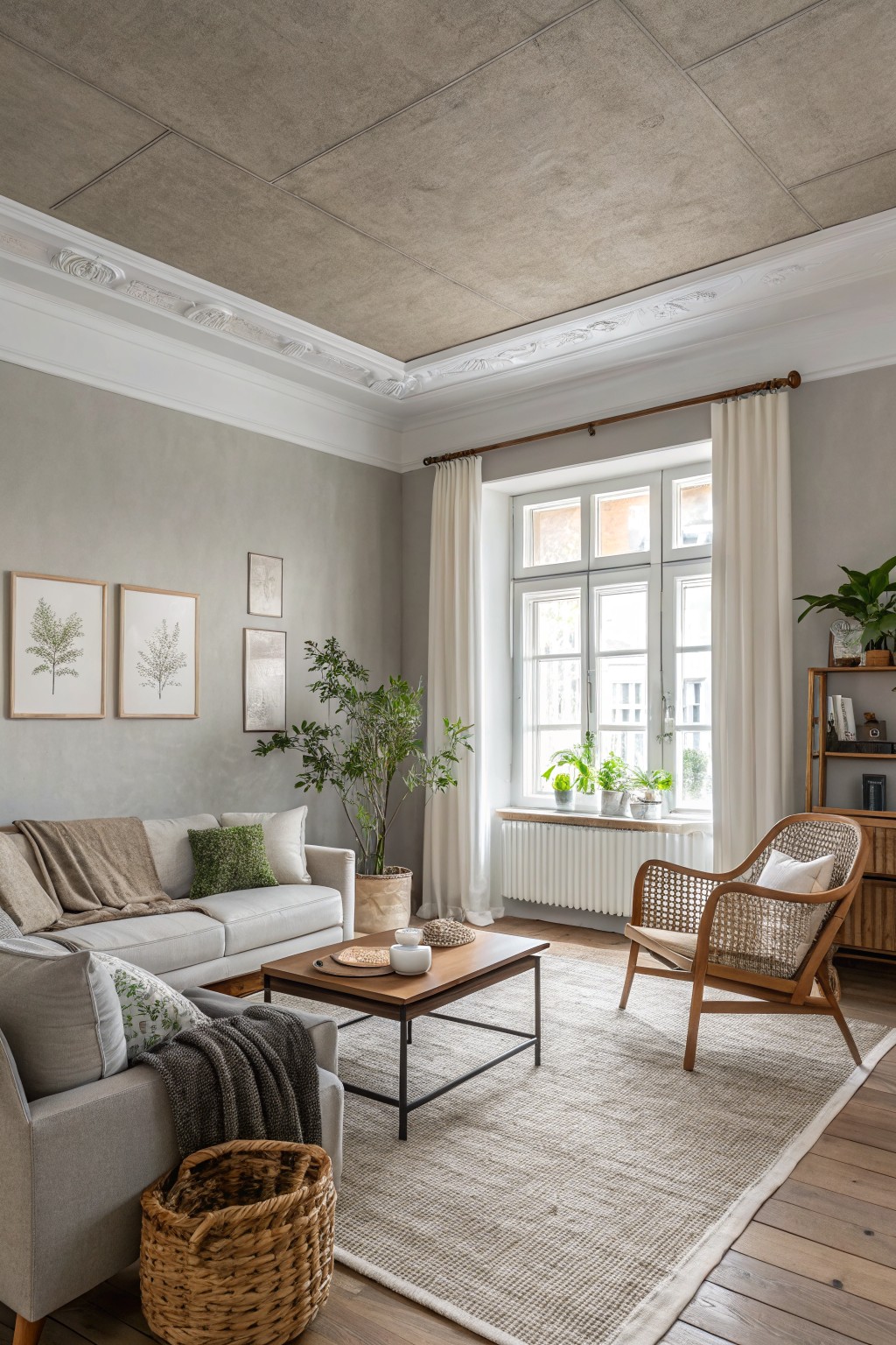
This soft greige on the walls pulls together gray and beige in a way that feels just right. It reads very close to Sherwin-Williams Agreeable Gray or Benjamin Moore Edgecomb Gray, maybe even Behr’s Silhouette. What I like about it is how neutral yet warm it stays, making a living room look fresh without going bold.
The warm undertone keeps it from feeling stark next to wood floors and trim. It works best in rooms with decent natural light, like this one by the big windows. Throw in some green plants or woven textures, and it all comes alive.
Pale Sage Cabinets
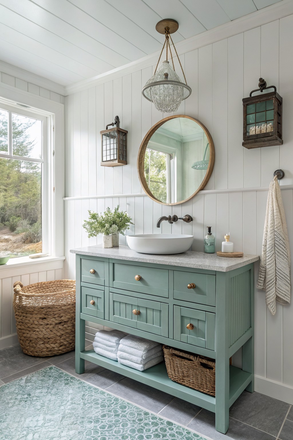
That pale sage on the vanity cabinet pulls from the cool green family, reading closest to Sherwin-Williams Sea Salt or Benjamin Moore Saybrook Sage. Behr’s Silver Sage Green feels right in there too. It’s a soft, muted shade that’s fresh without being too trendy, easy to live with day to day.
The cool blue undertone keeps it from going brassy, especially next to bright white shiplap walls like these. It works best in sunny spots with good natural light, paired with crisp whites or natural wood. Skip it in dim rooms though… it can read flat.
Muted Mauve Walls
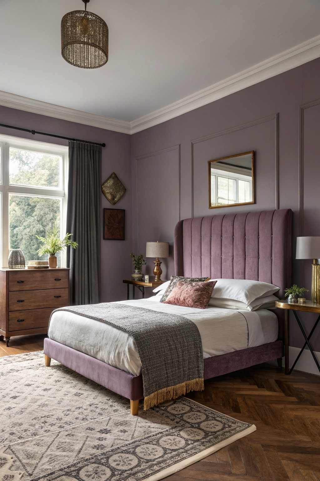
This muted mauve paint on the walls reads very close to Sherwin-Williams Mystifying Mauve or Benjamin Moore’s Mauvewood. It’s that soft purple-gray family that’s showing up everywhere lately. Folks like it because it feels modern without being too bold, and it makes wood furniture pop nicely.
The warm gray undertone keeps it from going too pink, especially in natural light from a window like this. Try it in a bedroom where you want calm vibes. Pair with beige bedding or brass lamps, but watch it next to super cool whites, might need warmer trim to balance.
Soft Pale Yellow Walls
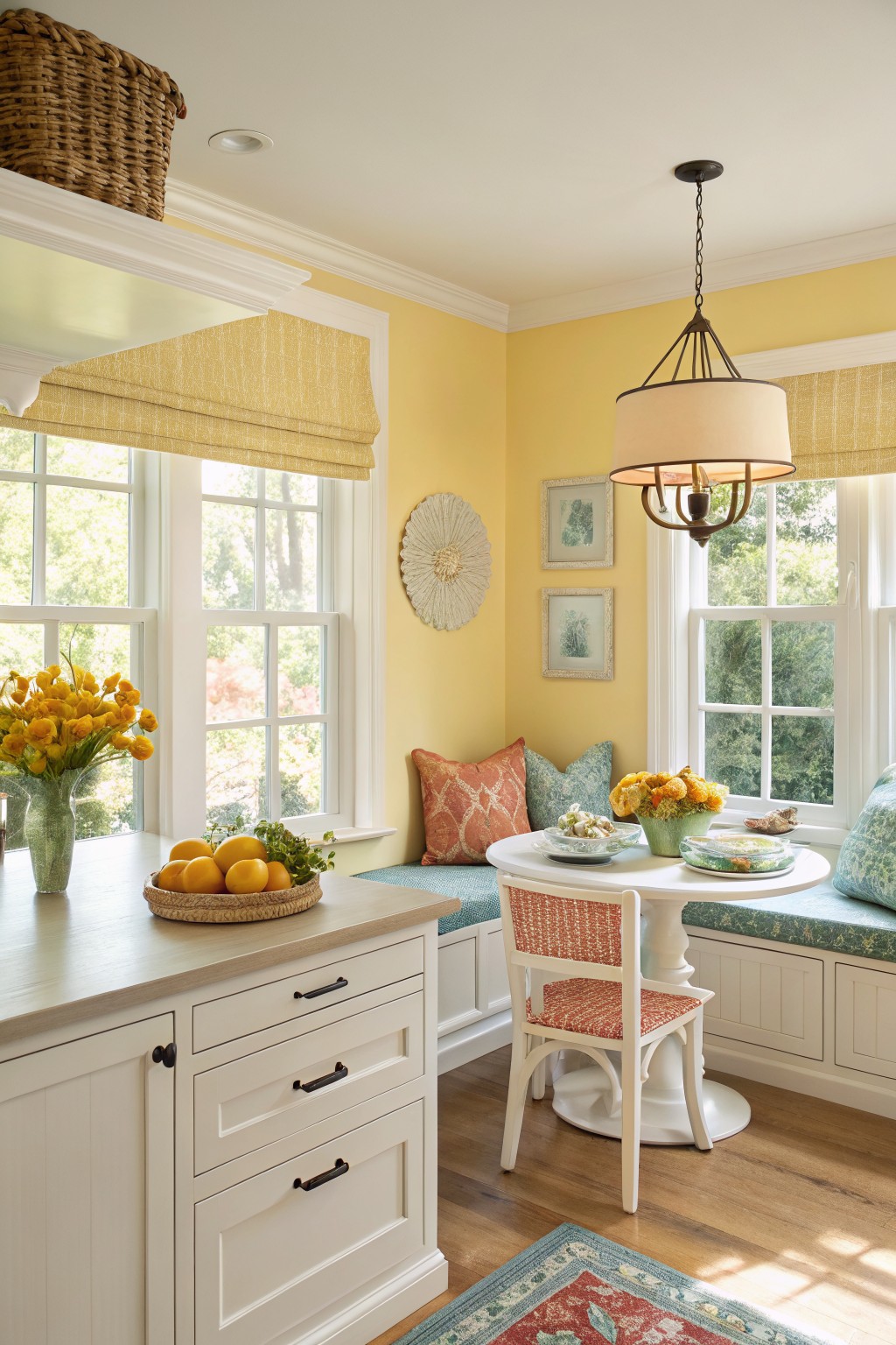
This pale yellow on the walls feels like a close match to Benjamin Moore Pale Yellow HC-3 or Sherwin-Williams June Day. It’s a warm, easy yellow that brightens a room without shouting. You see it here making a kitchen nook feel sunny and welcoming right away.
That golden undertone works best in spaces with lots of natural light, like near big windows. It plays nice with white cabinets and colorful pillows, too. Just watch it doesn’t look too flat under dim bulbs.
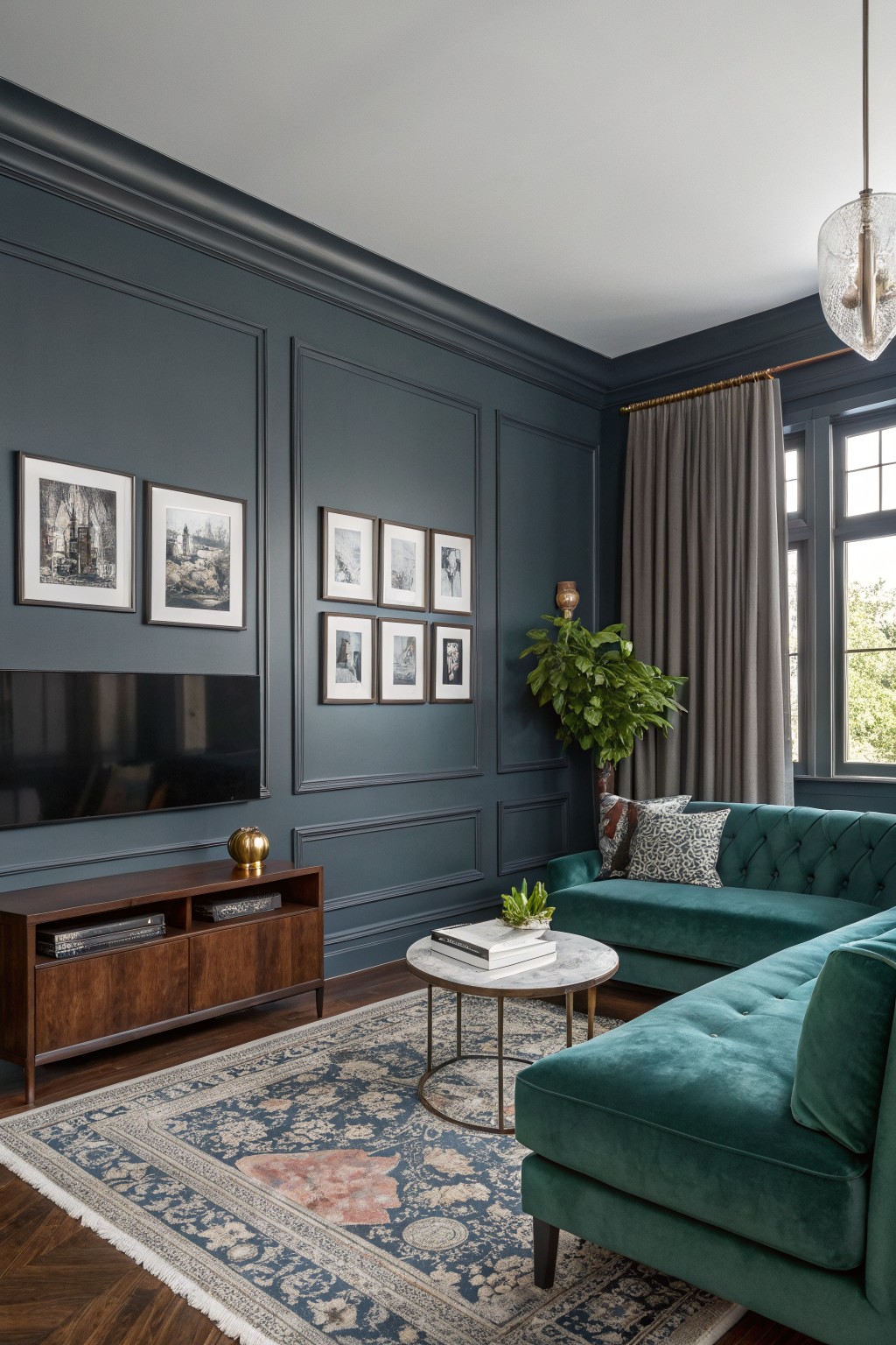
This setup highlights a moody navy wall color that seems closest to Sherwin-Williams Naval or Benjamin Moore Hale Navy, maybe even Farrow & Ball Hague Blue. It’s a deep, cool-toned blue with gray undertones that gives the room real presence. People go for it because it makes everything else pop, like that green sofa, without overwhelming the space.
The key is the subtle blue-gray lean, which keeps it from going too black in low light. It shines in living rooms with big windows and wood pieces nearby. Just balance it with brass or plants so it stays fresh.
Sage Green Cabinets
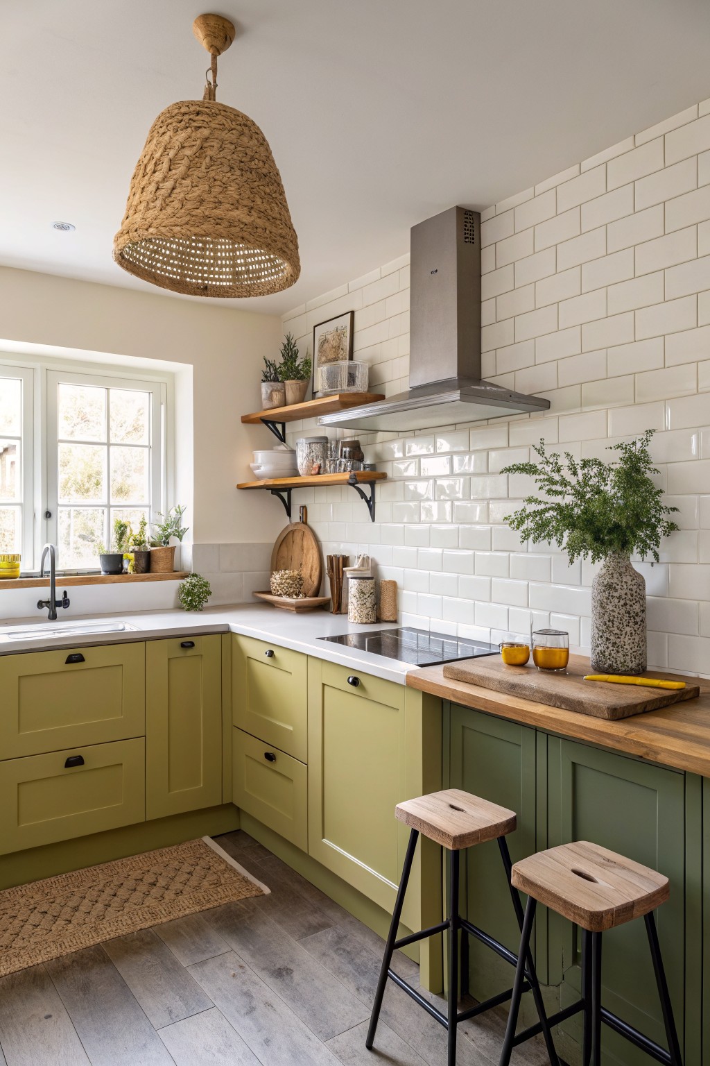
This muted sage green on the cabinets pulls off that fresh, relaxed look without trying too hard. It sits close to Sherwin-Williams Clary Sage or Benjamin Moore Saybrook Sage, maybe even Behr Back to Nature. Folks like it because it adds just enough color to wake up a kitchen, but stays easygoing next to wood tones and white tiles.
The warm yellow undertone keeps it cozy, not chilly. It works best in spots with decent natural light, like near a window. Pair it with oak counters or rattan accents to let that earthy side shine. In dimmer rooms, test a sample first… it can shift a touch greener.
Warm Greige Walls
This soft greige on the walls pulls off that cozy neutral look so well. It seems closest to Sherwin-Williams Accessible Beige or Benjamin Moore Edgecomb Gray, maybe even Behr’s Silky White. People go for it because it warms up a space without overwhelming the wood tones or white trim nearby.
Those warm undertones make it forgiving in hallways with changing light. Stick to natural wood furniture and a few plants, and it stays fresh. Just test samples first, since it can shift a bit in low light.
Pale Sage Kitchen Cabinets
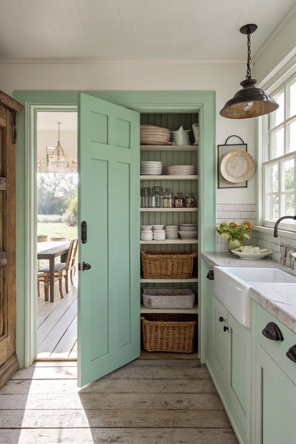
This pale sage green shows up on the lower cabinets and that open pantry door. It sits in the soft green family and looks closest to Sherwin-Williams Sea Salt or Benjamin Moore Saybrook Sage, maybe Behr’s Sage Whisper too. It’s muted, not screaming for attention, but fresh enough to keep a kitchen feeling light and lived-in.
The gray undertone keeps it from going too minty, especially next to white tile and wood floors like here. It works best in sunny spots where natural light warms it up. Pair it with brass pulls or wicker storage… just watch it doesn’t read flat in dim rooms.
Deep Teal Walls
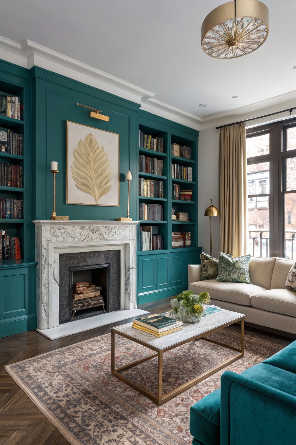
This deep teal paint covers the walls and built-in bookcases here. It has that rich, moody feel with blue undertones that isn’t quite navy but pulls a bit blue next to the white marble fireplace. Looks closest to Sherwin-Williams Black Lagoon or Farrow & Ball Inchyra Blue, maybe Benjamin Moore Night Whale too. Folks like it because it makes a room feel wrapped up cozy without going dark and cave-like.
Pair it with creamy sofas and wood floors like this setup. It reads richer in rooms with good window light. Skip it in super small spaces unless you want bold. Gold accents bring out the warmth in the green side.
Dusty Blue-Gray Walls
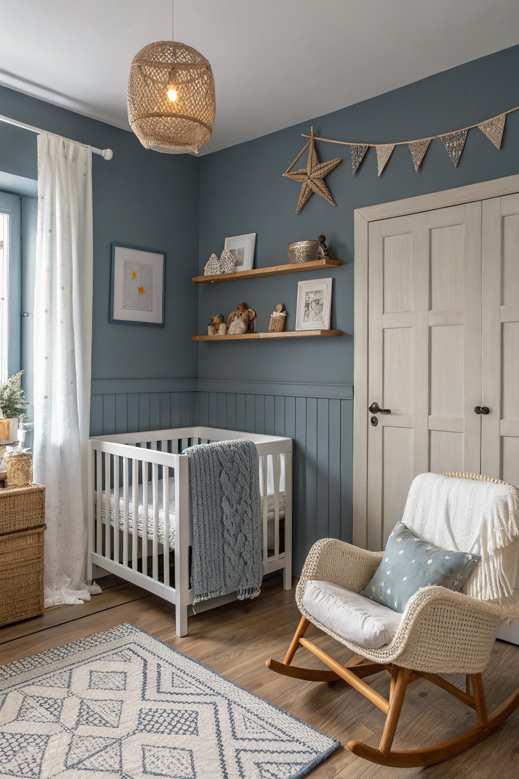
These walls show off a cool blue-gray that’s got that dusty navy feel. It reads pretty close to Farrow & Ball’s Inchyra Blue, or maybe Sherwin-Williams Naval dialed back a shade. What makes it nice is how calm it looks in a nursery setup, fresh but not overpowering next to the white crib and wood accents.
The gray undertone keeps things balanced, especially with warm rattan and sheer curtains letting light in. It works well in kid rooms or cozy corners where you want soothing vibes. Just pair it with soft creams or beiges so it doesn’t go too chilly in dimmer spots.
Warm Ochre Walls
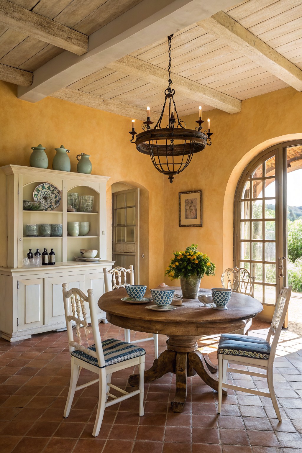
Those ochre walls give off a cozy, sunbaked feel. It’s a warm yellow-beige in the ochre family, reading pretty close to Farrow & Ball’s Babouche or Sherwin-Williams’ Kilim Beige, with Benjamin Moore’s Golden Straw not far off. Folks go for it because it warms up rustic spots without overwhelming them, especially next to wood and tile.
The golden undertones keep it from looking dingy. Pair it with natural wood furniture and terracotta floors like in this dining nook. It shines in rooms with good light, say a breakfast area… just test samples first if your space is dimmer.
Pale Lavender Walls
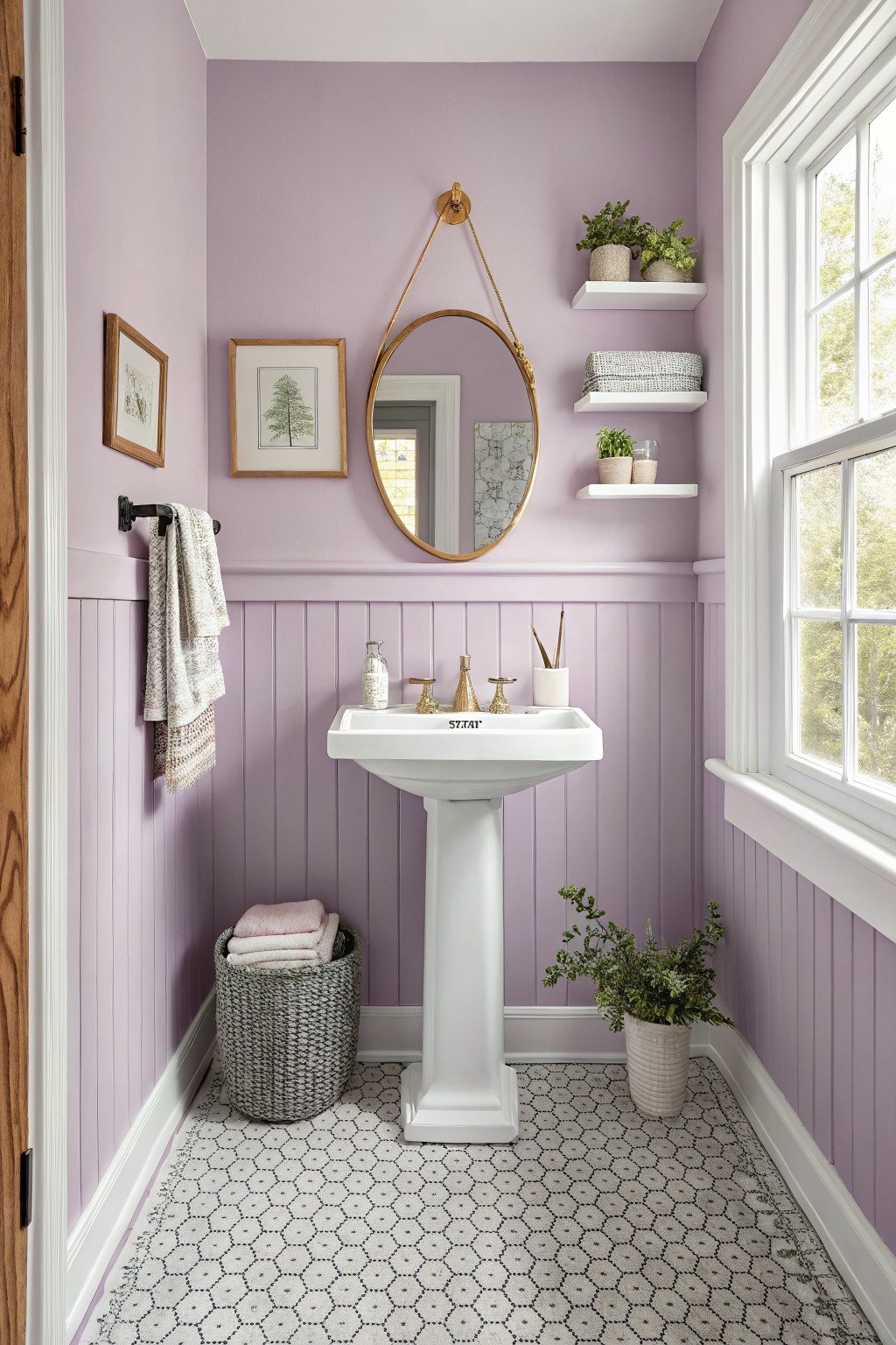
This pale lavender on the beadboard walls looks closest to Sherwin-Williams Lilac Hush or Benjamin Moore Pale Estate. It’s a gentle purple that’s fresh without being too intense. People go for it in small rooms because it opens things up and feels current.
Warm undertones keep it from going cold under window light. Try it in a powder room paired with white fixtures and wood tones. Just watch it next to bright metals… gold works better than silver.
Soft Blue-Gray Accent Walls
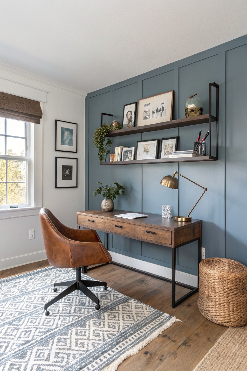
That blue-gray paint on the plank wall looks closest to Sherwin-Williams Sea Salt or Benjamin Moore Palladian Blue. Maybe Behr’s Silver Drop too. It’s a cool mid-tone with just enough blue to feel fresh but not chilly. Folks go for it in home offices because it makes the space look bigger and pairs easy with wood furniture.
The gray undertone keeps it from going too beachy. It shines in rooms with natural light from a window like this one. Stick to warm woods and metals on the desk or shelves. Dark trim helps it pop without overwhelming.
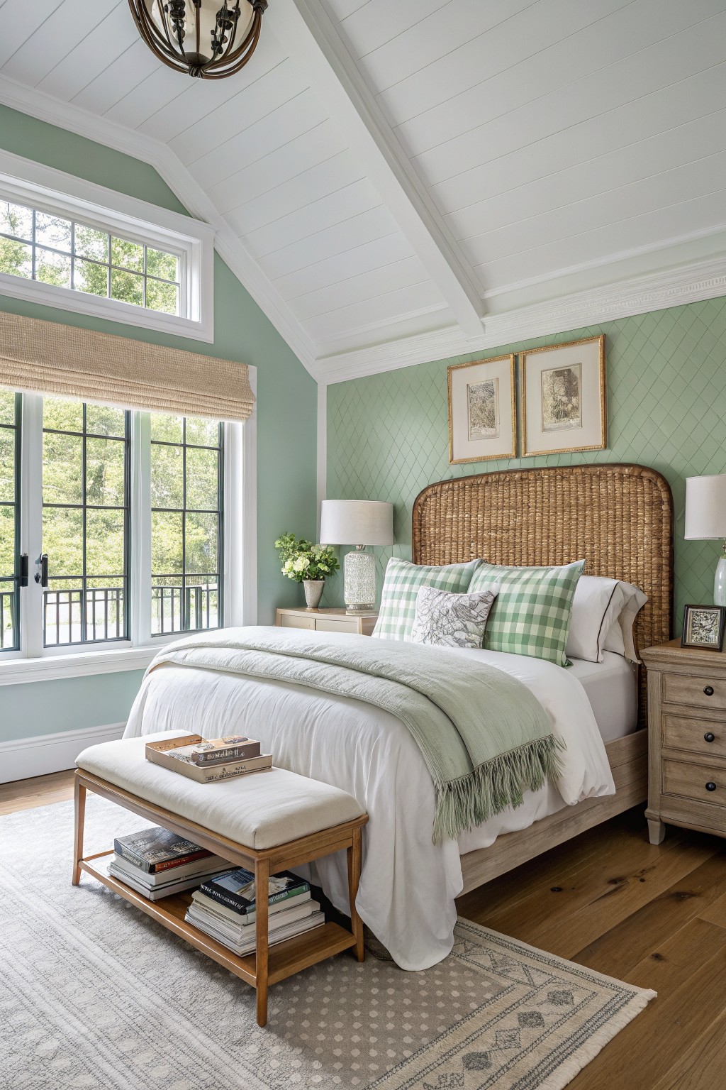
Pale Sage Nursery Walls
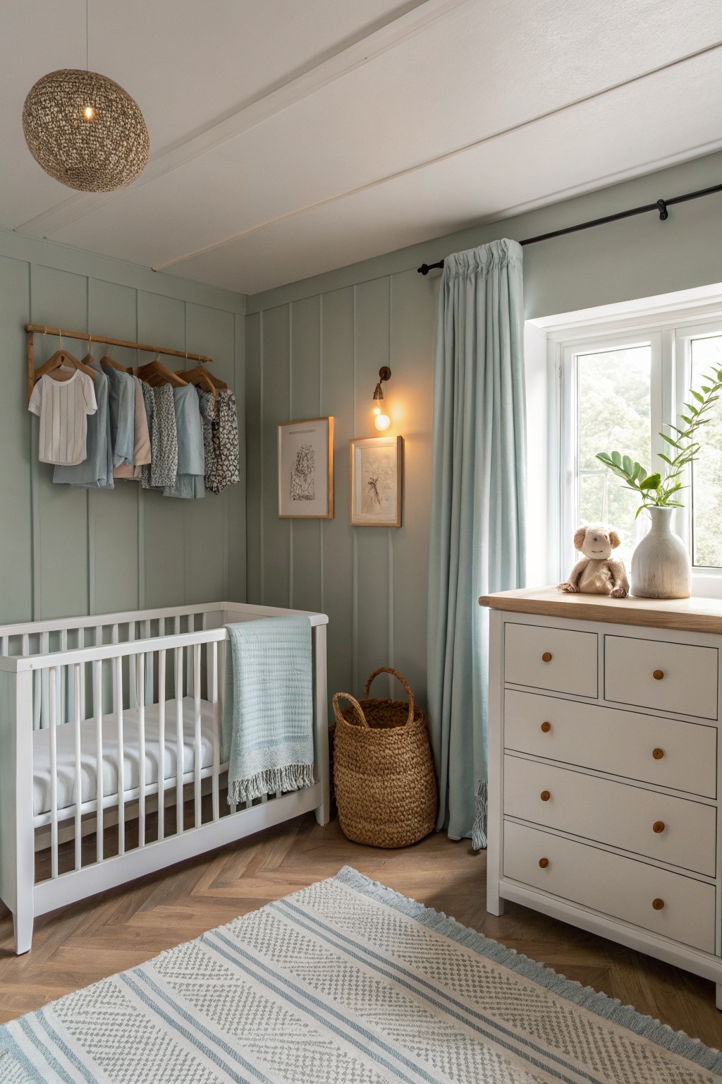
This pale sage green on the paneled walls looks closest to Sherwin-Williams Clary Sage or Benjamin Moore Saybrook Sage HC-114. Behr Silver Sage comes pretty near too. It’s that soft green family with a hint of gray, fresh but not overpowering. Makes a room feel calm and current, especially somewhere like a nursery.
The cool undertone plays nice against wood tones and crisp whites, without shifting yellow in warm light. I’d use it on textured walls like this shiplap. Stick to light neutrals and soft blues alongside… keeps everything breezy.
Deep Green Entry Door
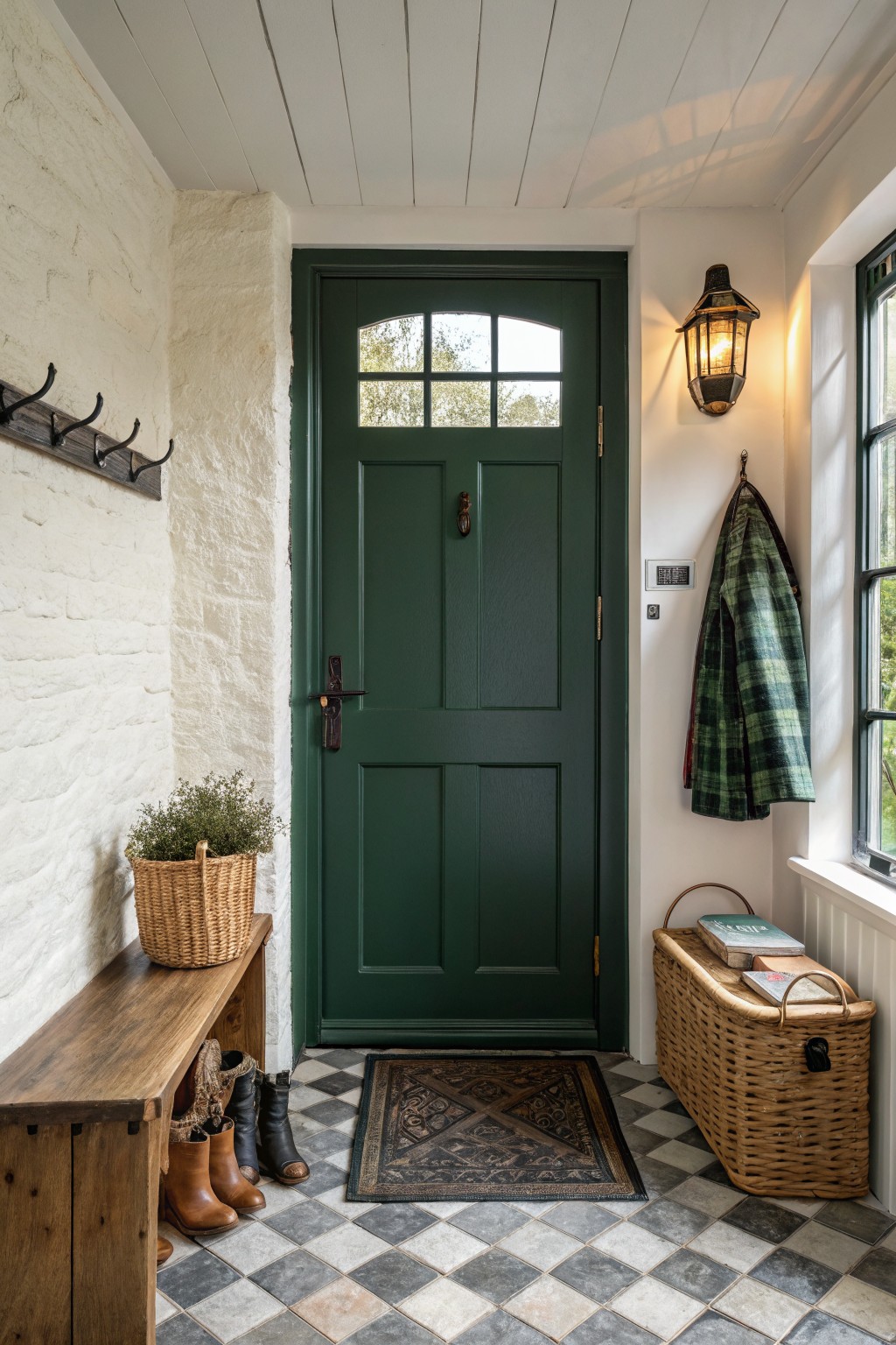
This deep green paint on the entry door sits in the hunter green family. It reads close to Farrow & Ball Studio Green, or Sherwin-Williams Pewter Green and Benjamin Moore Essex Green. People go for shades like these because they give a traditional door real presence without making the space feel closed in.
The color has a muted warm undertone that holds up next to white plaster walls and natural wood benches. It shines in entryways with some window light. Brass hardware brings out the green best. Just avoid dim corners where it might read too heavy.
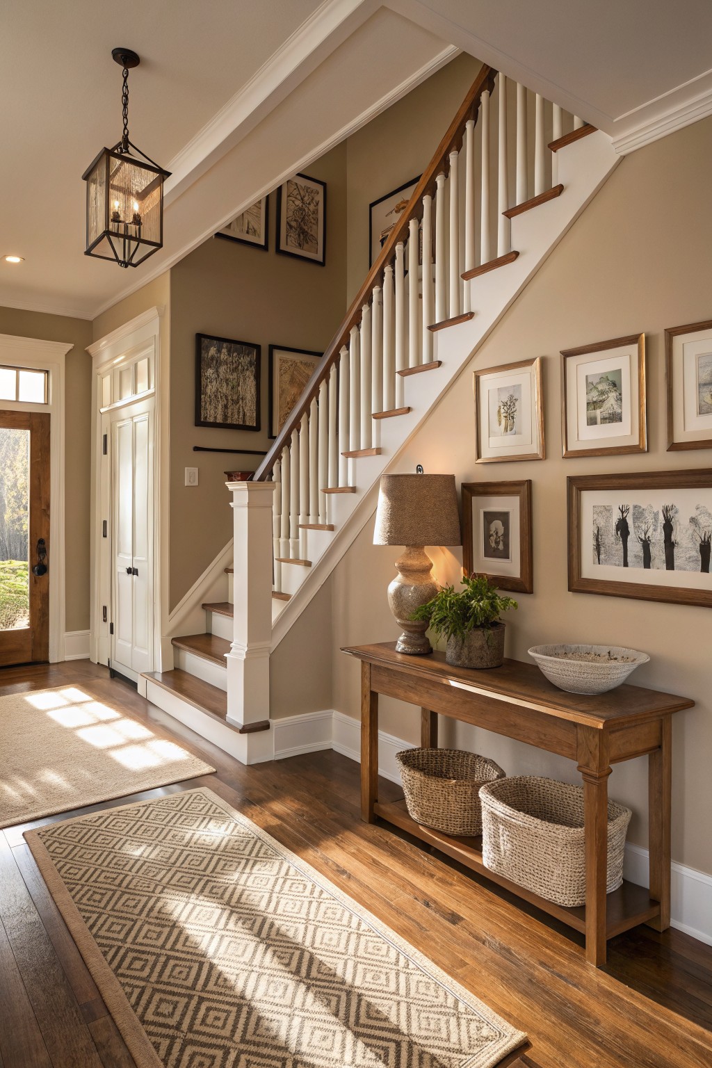
Light Greige Living Room Walls
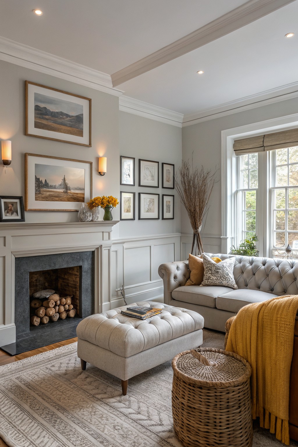
This pale greige on the walls reads very close to Sherwin Williams Agreeable Gray or Benjamin Moore Revere Pewter. It’s that easy warm neutral where gray meets beige, keeping things light without going too cool. Folks like it because it lets wood floors and cream trim stand out nice, like here next to the dark fireplace.
The warm beige undertone shows up best in rooms with good natural light from big windows. Pair it with soft yellows or taupes for a cozy feel, but watch it doesn’t look dingy under too many warm bulbs. Living rooms like this one suit it perfect.
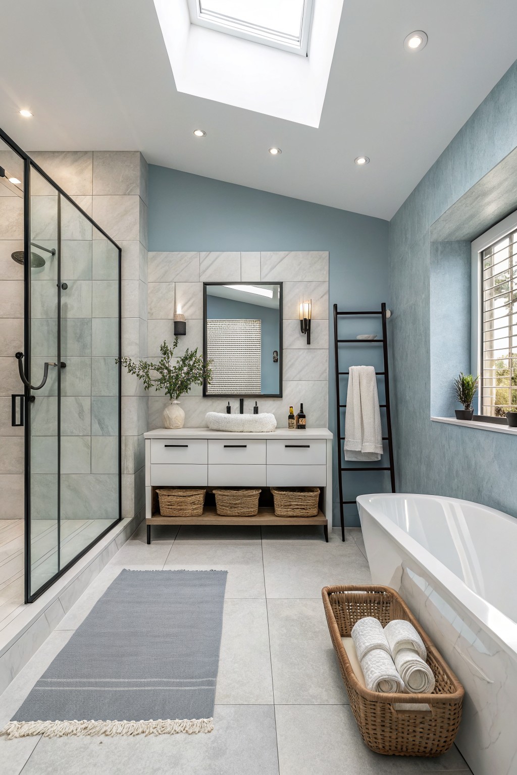
Pale Blue Kitchen Cabinets
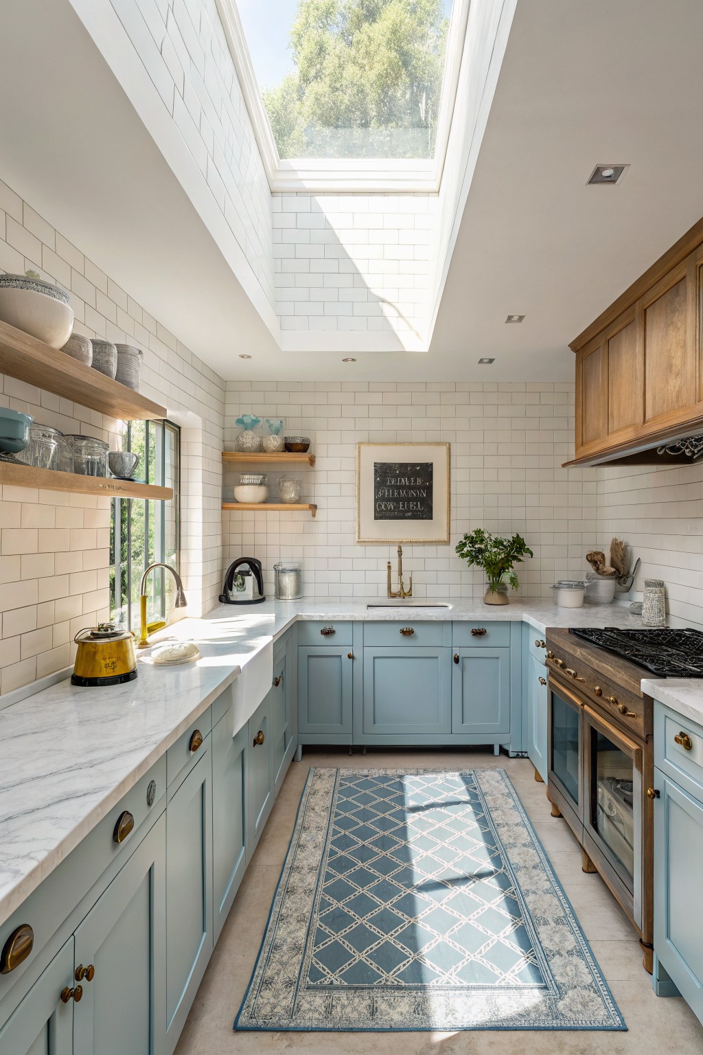
Those lower cabinets catch your eye right away in this kitchen. They’re painted a pale blue that seems closest to Benjamin Moore’s Palladian Blue or Sherwin-Williams Rain, maybe even Farrow & Ball’s Borrowed Light. It’s a gentle color from the blue family, cool but not stark, and it gives the whole space a fresh lift against the white tiles.
The grayish undertone helps it stay calm in bright light from the skylight. Kitchens like this do best with natural daylight to keep the blue from looking flat. Brass pulls and wood uppers warm it up nicely, just watch it doesn’t clash with overly yellow tones.
Deep Plum Walls
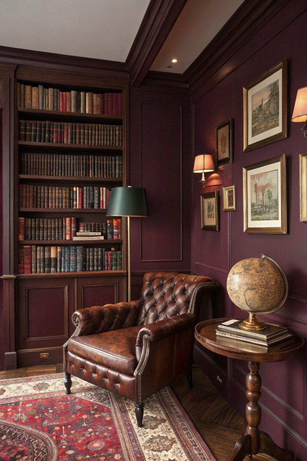
This deep plum on the walls looks closest to Farrow & Ball’s Brinjal. You could also try Benjamin Moore’s Black Plum 2111-10 or Sherwin-Williams Amulet for something very similar. It’s a warm purple with just enough red undertone to feel rich and current. Rooms like this show how it turns a study into something cozy and pulled together.
That warmth comes through best under lamps or natural light, playing nice off wood bookshelves and leather chairs. Skip it in super sunny spots though. It pairs easy with brass lamps and textured rugs.
Pale Sage Walls
This pale sage green on the walls looks closest to Sherwin-Williams Contented or Benjamin Moore’s Saybrook Sage. It’s a soft green in the sage family, not too bold but with just enough color to feel fresh. People like it because it keeps things calm and pairs easy with wood furniture, like that oak bed frame here.
The undertone leans a bit gray in some lights, which helps it stay neutral without going cold. It works best in bedrooms with good natural light, alongside cream linens and plants. Watch for pairing it with warmer woods to keep the green from looking flat.
Soft Blue-Gray Bathroom Walls
This pale blue-gray shows up nicely on the textured wall here. It reads close to Sherwin-Williams Sea Salt or Benjamin Moore Breath of Fresh Air, maybe even Farrow & Ball Borrowed Light. It’s a cool, easygoing color that keeps a bathroom feeling calm and open. Not too blue. Just right.
The gray undertone helps it stay neutral next to the white marble tiles and vanity. Bright skylight makes it pop without washing out. Pair it with wood tones or black fixtures. It suits spa-style spaces best, but test in your light first.
Frequently Asked Questions
Q: How do I test these trendy colors in my actual room lighting?
A: Paint big swatches right on the wall where you get morning sun and evening shade. Walk by them over a couple days and note how they warm up or cool down. That real-life shift beats any store sample.
Q: Will a bold color like terracotta make my small living room feel cramped?
A: Balance it with crisp whites on the other walls. It draws the eye out instead of boxing you in. Open up the space with sheer curtains too.
Q: Can I pull off these fresh hues with my old wood furniture?
A: Hunt for a shade that echoes the wood’s undertones, like a soft sage with honey oak. Layer in textured rugs to bridge any gaps. The combo feels lived-in and cool.
Q: What’s the smartest spot for an accent wall with one of these colors?
A: Go for the wall behind your bed or sofa. It spotlights the furniture without overwhelming the room.