I have noticed that creamy whites in farmhouse settings often pick up yellow or pink hints once they cover an entire wall.
Grays behave differently depending on the time of day and what they sit next to, which is something I check carefully before choosing one for a whole room.
Undertones matter more than the name on the can.
Muted greens tend to look softer indoors but can shift when sunlight hits them directly, so I test them on boards that move around the house.
This approach keeps the colors from feeling off once the project is finished.
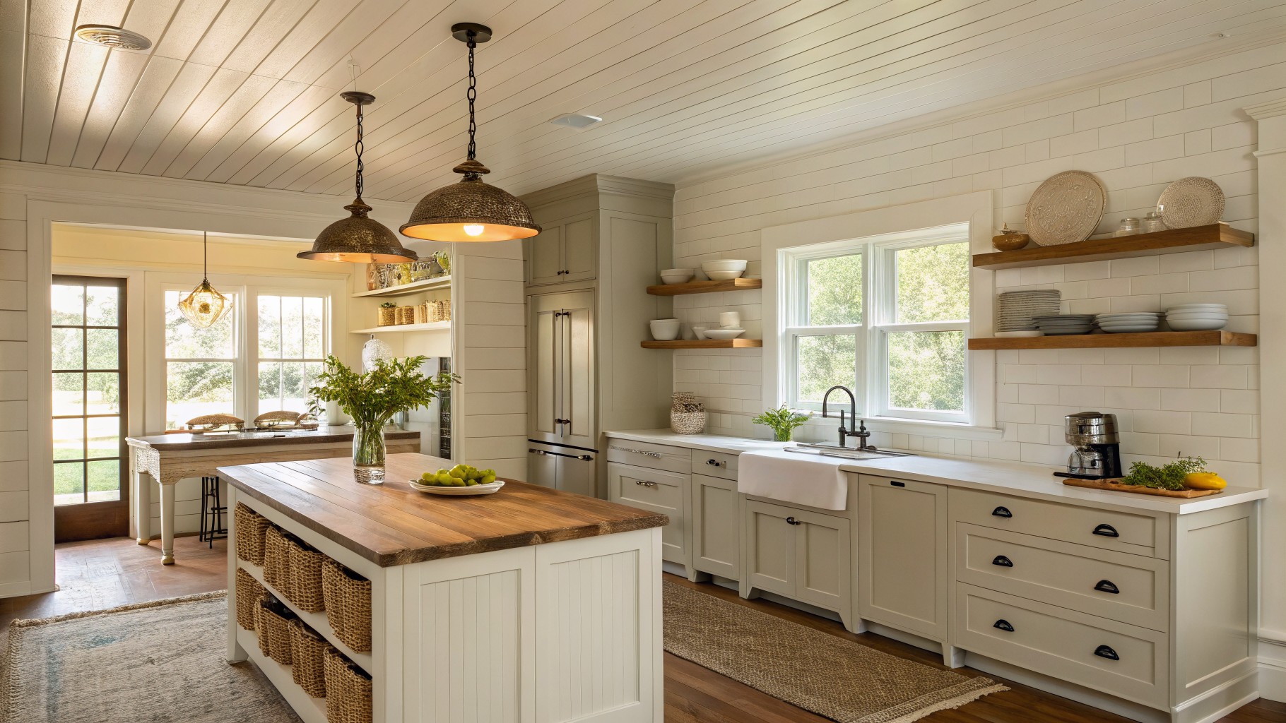
Soft sage green cabinets

This soft muted green on the cabinets brings a gentle warmth that feels right at home in a farmhouse kitchen. It has a creamy quality that keeps the color from turning too cool or gray, and it blends easily with wood tones and white surfaces.
The undertone leans slightly yellow, which helps it sit comfortably next to natural wood and stone. It works best in rooms with good natural light and pairs simply with black hardware or light-colored counters without needing much else to feel finished.
Muted Green Walls
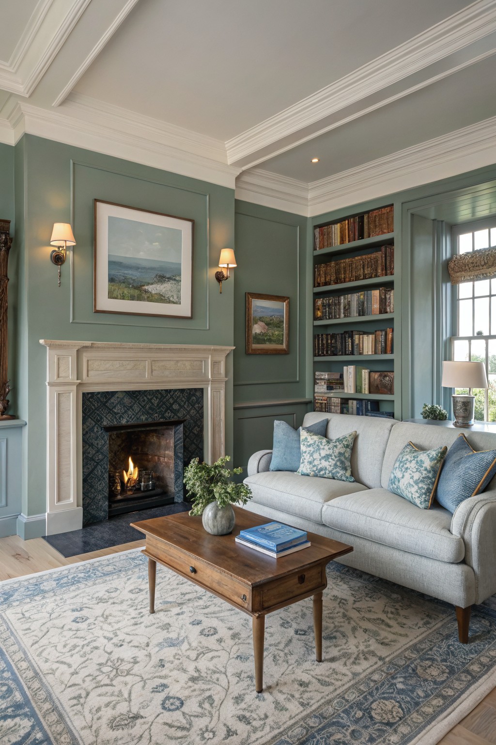
This muted green on the walls sits right in the middle of gray and green. It gives the room a calm, settled look without feeling heavy or dull.
The color has a soft gray undertone that keeps it from turning too cool or too warm. It works best with white trim and natural wood pieces, though it can look flat if the lighting is too dim.
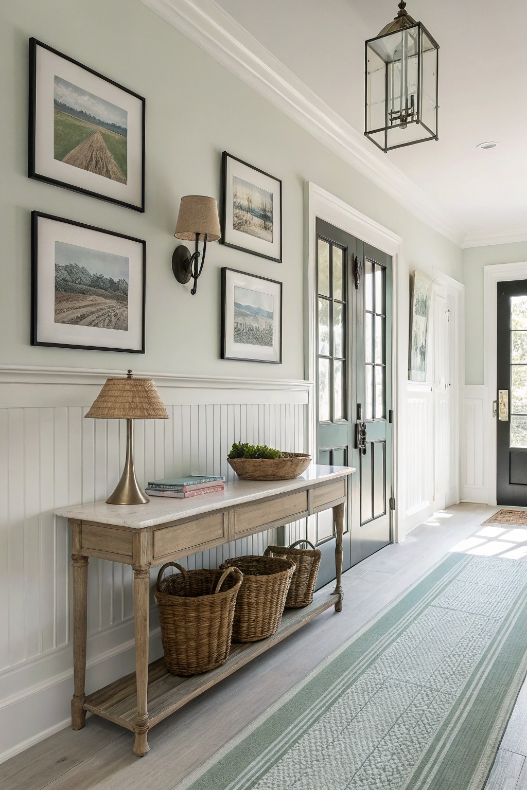
Creamy White Walls
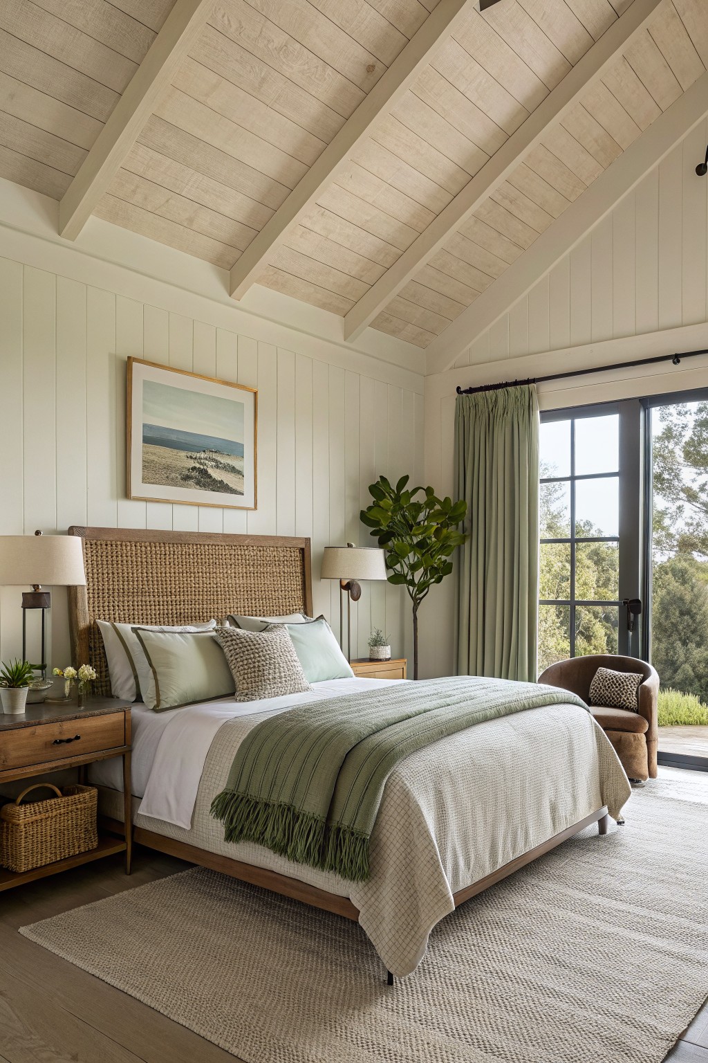
This bedroom uses a creamy white on the walls. It is a soft warm white that gives the room a quiet, settled feel without looking stark or flat.
The color sits nicely against the wood trim and flooring. It works best in spaces where you want light but still need some warmth to keep things comfortable. Try it with natural wood furniture or simple linen textiles. Good matches include Benjamin Moore White Dove, Sherwin Williams Creamy, Behr Almond White, or Farrow & Ball Pointing.
Muted Green Cabinetry
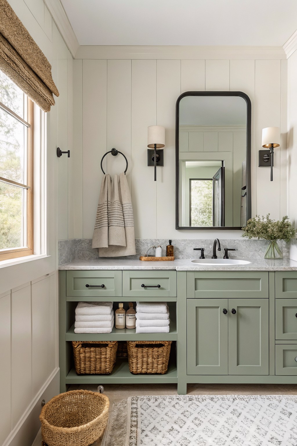
This soft muted green on the vanity has that gentle sage quality that feels calm without going too cool. It sits nicely between gray and green, which makes it easy to live with in a bathroom where you want something a little different from plain white. Many people reach for colors like Sherwin Williams Clary Sage, Benjamin Moore Saybrook Sage, or Behr Aged Olive when they want this same quiet tone.
The green has a slight gray undertone that keeps it from feeling too bright next to marble and black hardware. It works especially well with warm wood baskets and light walls, though it can look a bit flat if the lighting is very dim. Try it on built-ins or vanities where you want a soft farmhouse touch without making the room feel heavy.
Warm Gray Walls
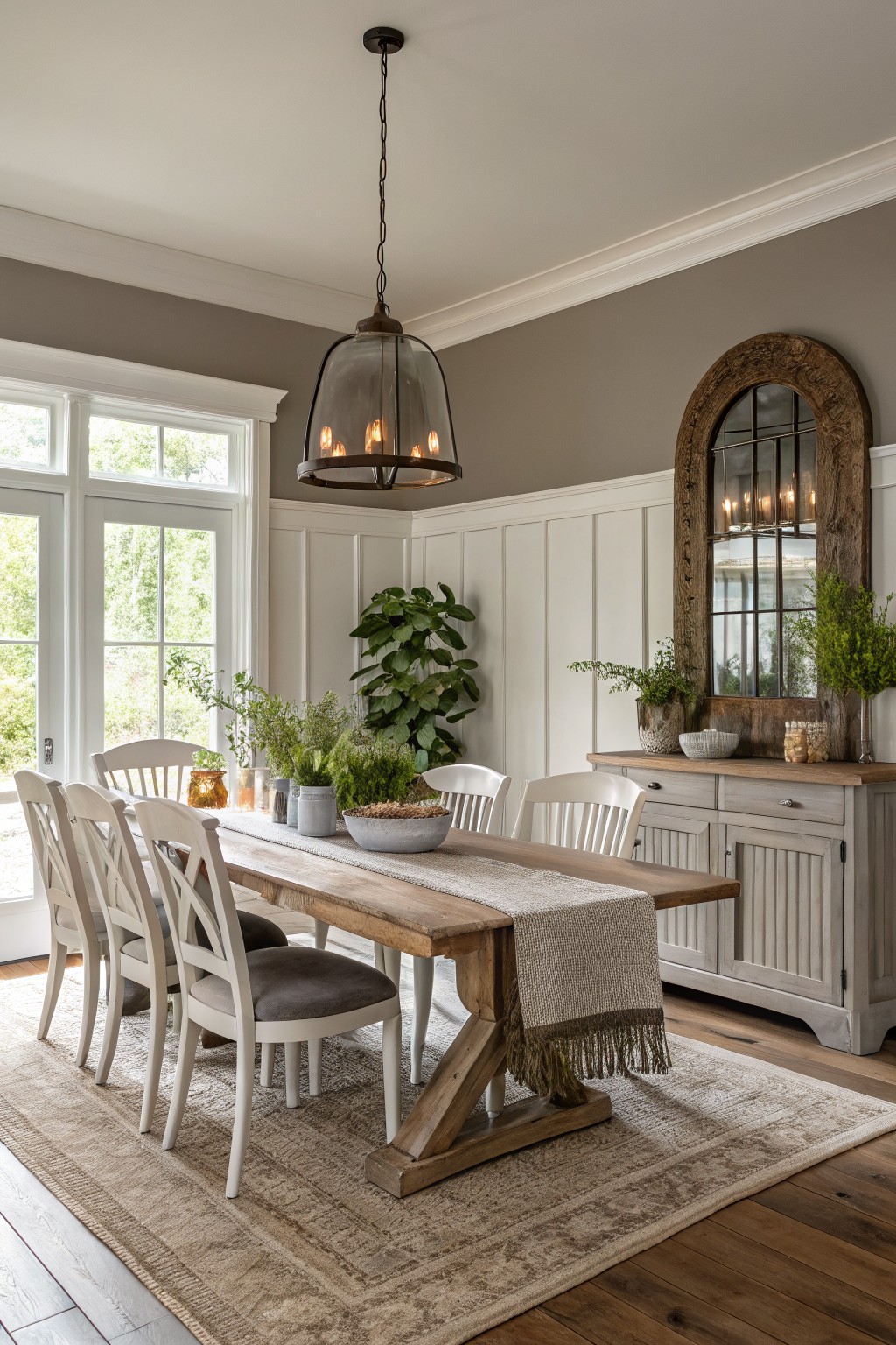
This warm gray on the walls sits right in the middle of the gray and greige range. It gives the room a quiet, settled look that works well with the white trim and wood furniture without feeling stark.
The color carries a light taupe undertone that keeps it from turning cool under daylight. It pairs best with natural wood, simple textiles, and painted cabinetry in similar soft tones.
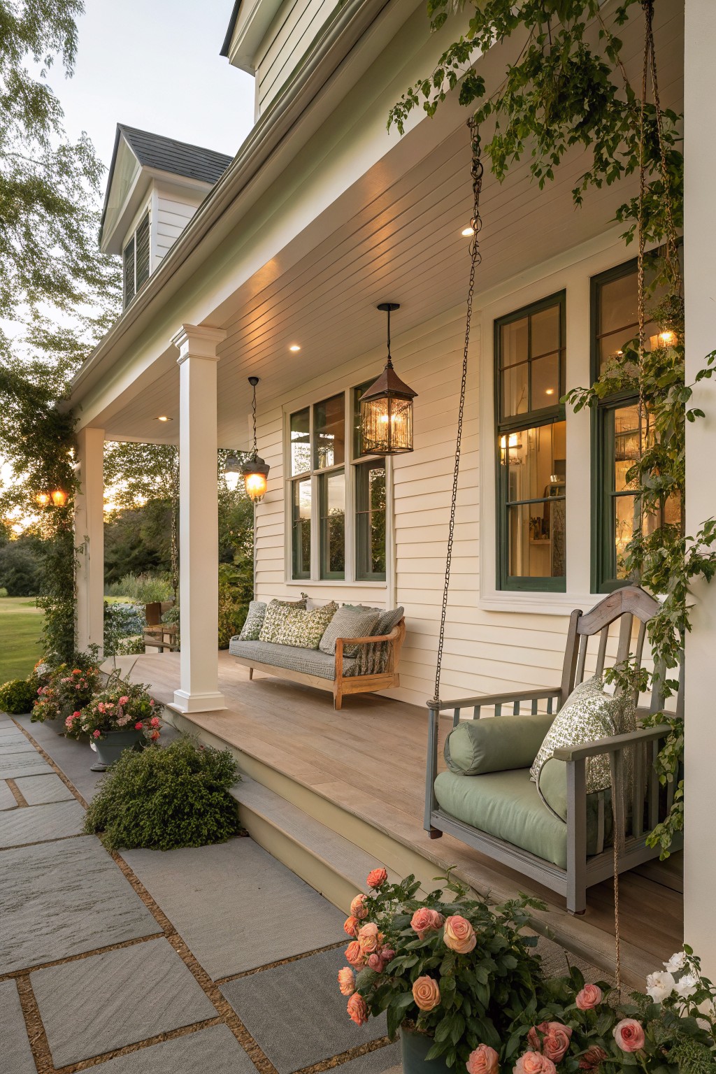
Soft Muted Green Walls
This muted green sits somewhere between gray and sage. It feels calm and a bit earthy, which makes it a good fit for farmhouse interiors that need a little color without going too strong.
The shade has cool undertones that show up more next to white trim and light wood floors. It works best in rooms with decent natural light, and it pairs easily with woven textures or simple wood pieces. Test it in your own space first since it can shift depending on the light.
Soft greige built-ins

This color is a soft greige with a hint of green in it. It sits nicely between gray and green without leaning too far either way, which makes it a good fit for farmhouse rooms that already have wood floors and brick. It feels calm next to the white trim and keeps the whole wall of cabinets from looking too heavy.
The undertone stays warm enough that it works well with natural wood and stone. It pairs easily with creamy whites on the trim and looks best in rooms that get steady daylight. Avoid pairing it with very cool grays or it can start to read flat.
Soft Sage Green Cabinets

This muted sage green on the cabinets has a quiet gray undertone that keeps it from feeling too bright or country cute. It sits nicely between gray and green, which makes it easy to live with in a kitchen that gets steady daylight.
It reads closest to Benjamin Moore Saybrook Sage or Sherwin Williams Evergreen Fog. The color holds up well against wood counters and white tile, though it can look a bit cooler if the room has mostly north light.
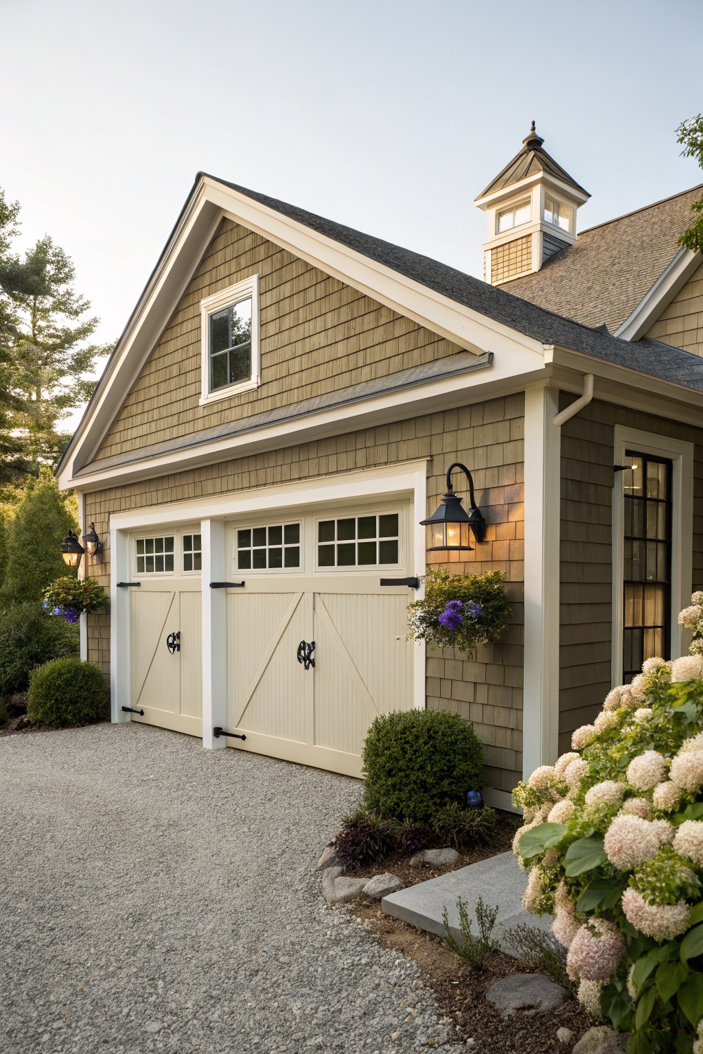
Muted Green Siding
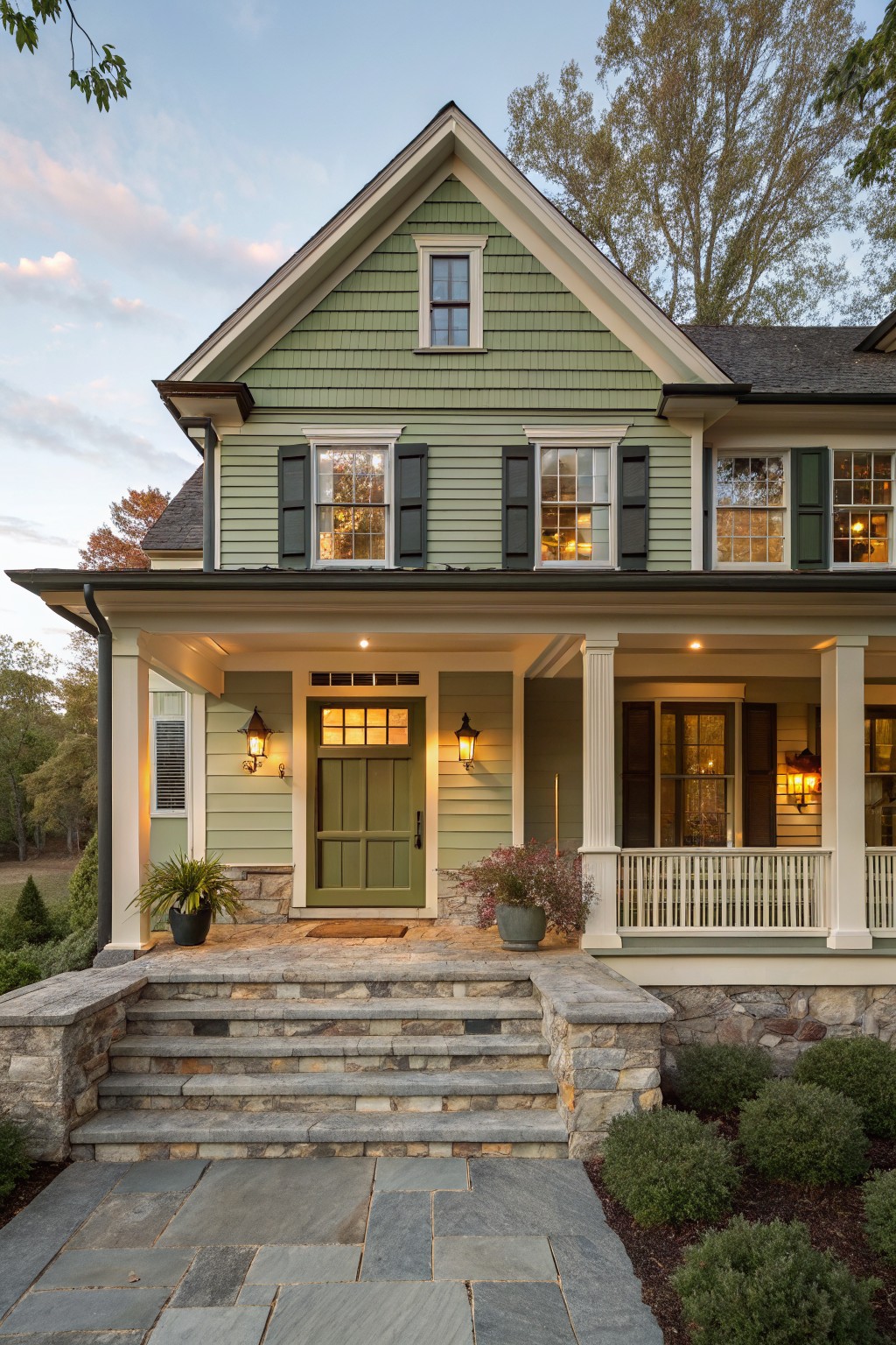
This muted green siding gives a farmhouse that soft, lived-in look without trying too hard. It sits in the sage family and feels calm next to stone and white trim.
The color has a slight gray undertone that keeps it from turning too yellow in afternoon light. It pairs well with warm white trim and dark roofing, and colors like Sherwin Williams Clary Sage, Benjamin Moore Saybrook Sage, or Behr Aged Olive come close.
Muted green siding

This muted green siding gives a farmhouse that soft, settled look without feeling too bold. It leans more gray than bright green, which helps it sit nicely with wood tones and stone details on the exterior.
The color has a gentle cool undertone that works best with warm wood doors and simple trim. It suits traditional homes with some greenery nearby, though it can look a bit flat if the light is very harsh or the roof is too dark.
Soft Sage Green Walls
This muted green reads as a soft sage with a hint of gray in it. It gives the room a calm, grounded feel without making the space feel dark or heavy. Many people like this kind of color because it works with both newer and older homes and pairs easily with wood tones.
It has a cool undertone that shows up more in bright light, so it can look a little bluer in some rooms. Try it on built-ins or walls where you want something gentle but still a bit different from plain white or gray. It looks good with white trim and natural wood, though it can feel flat if there is not enough light or warm wood nearby.
Soft Greige Cabinets

This soft greige works well on the cabinets because it sits between gray and warm beige without leaning too far in either direction. It has enough warmth to feel at home with wood tones and stone, yet it still reads clean next to the white sink and shelves. Colors like this tend to hold up nicely in a farmhouse kitchen where you want something a little softer than plain white.
It pairs best with natural wood counters and open shelving, though it can look flat if the room gets very little natural light. Try it with Benjamin Moore Edgecomb Gray, Sherwin Williams Agreeable Gray, or Behr Silverberry if you want a similar tone that feels lived-in rather than stark.
Creamy white siding
This creamy white on the house siding is a soft off-white that feels warm rather than bright. It gives the exterior a gentle, lived-in look that pairs easily with wood and greenery without standing out too much.
The color has a light warm undertone that stays steady in changing light. It works well with gray porch flooring and dark green window frames, and similar shades show up in Sherwin Williams Alabaster, Benjamin Moore Simply White, Behr Swiss Coffee, and Farrow & Ball Wimborne White.
Muted Green Siding
This muted green siding sits somewhere between gray and sage. It has a soft, slightly cool tone that feels settled rather than bold, which is why it works well on older homes that already have some age to them.
It tends to read a little grayer in low light and picks up more green when the sun hits it. Stone foundations and white trim help keep it from looking too flat, though it can feel heavy if the surrounding landscaping is all dark evergreens.
Soft Green Cabinets

A muted sage green like the one on these walls and cabinets brings a calm, grounded feel to a utility space. It sits somewhere between gray and green, which keeps it from feeling too bold while still adding a bit of color. This shade works especially well in farmhouse settings because it pairs naturally with wood tones and simple tile floors. Colors that read very close to it include Sherwin Williams Evergreen Fog, Benjamin Moore Saybrook Sage, Behr Aged Sage, and Farrow & Ball Mizzle.
It has a slight gray undertone that helps it stay soft even in rooms with mixed lighting. The color looks best with warm wood counters and white trim, though it can start to feel flat if the lighting is too cool or dim. It suits mudrooms, pantries, and laundry areas where you want something practical but still a little interesting.
Muted Green Walls
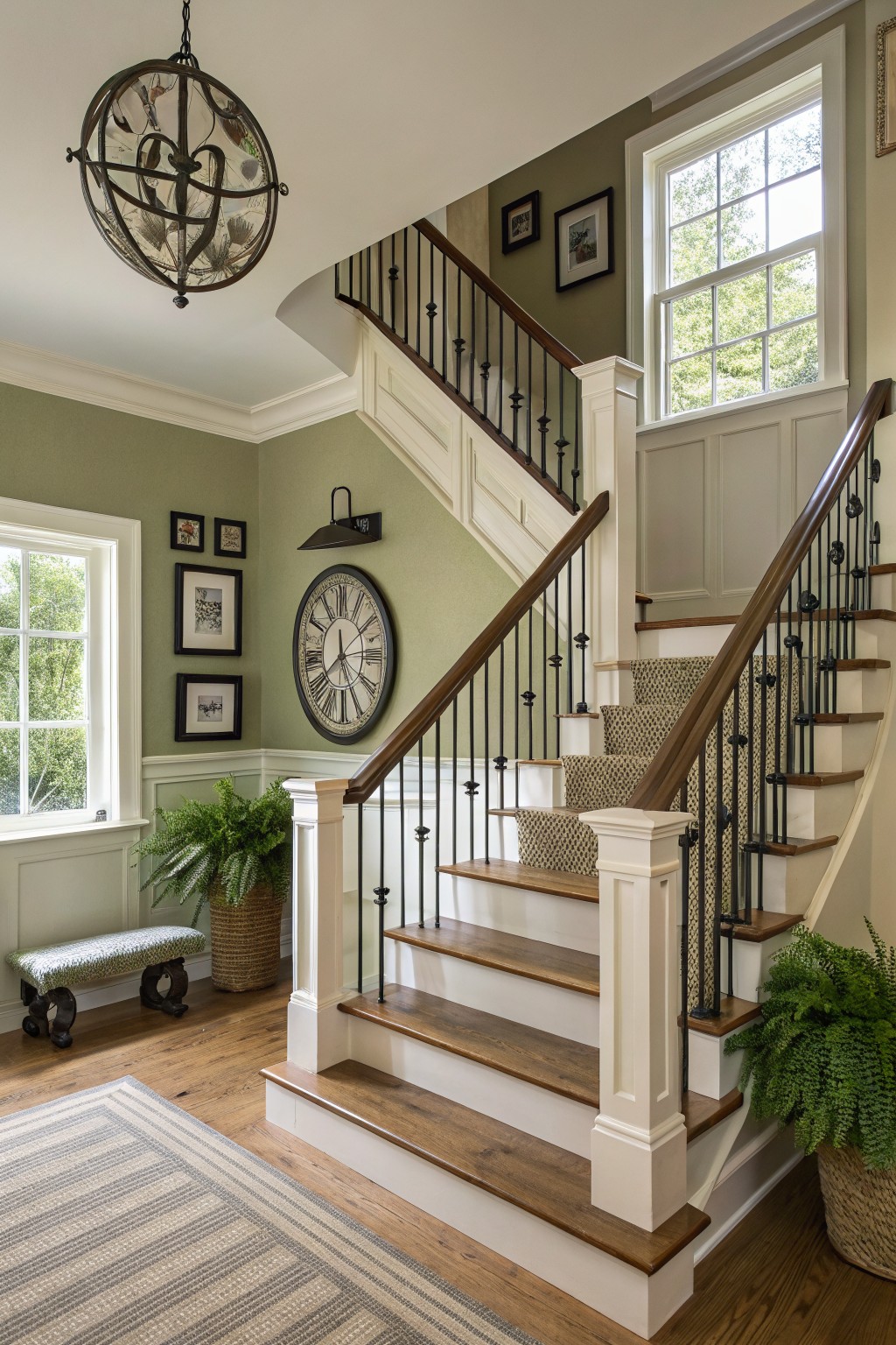
This muted green on the walls is a soft sage that feels calm and a little earthy. It sits somewhere between gray and green, which makes it work well in older homes that already have wood trim and floors. Colors like this read best in natural light and tend to shift a bit through the day.
It has a slight warm undertone that keeps the room from feeling cold next to white trim and medium wood tones. Benjamin Moore Saybrook Sage or Sherwin Williams Clary Sage both come close, as does Behr Aged Sage if you want something a touch deeper. It pairs nicely with black accents and woven textures without overpowering the space.
Muted Green Siding
This muted green on the siding gives a farmhouse exterior a soft, settled look. It sits between gray and green without leaning too hard either way, which helps it blend with roof tones and trim.
The color holds up well in changing light and pairs best with white trim and simple stone or gravel areas. It can start to feel flat if the trim is too bright or if there is no contrast around the windows and doors.
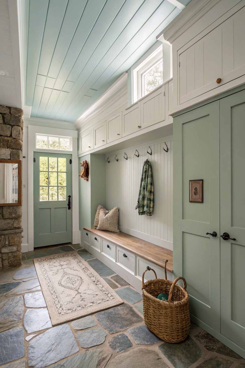
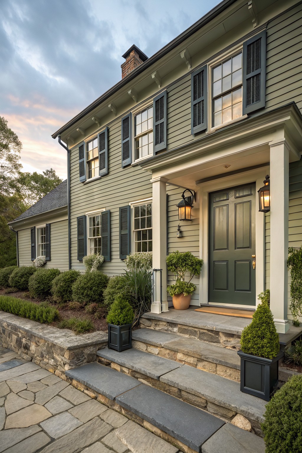
Soft Sage Green Doors

This muted green works well on doors and built-ins in a farmhouse kitchen or entry. It reads as a soft sage with gray undertones that keep it calm and versatile instead of too bright.
The color pairs easily with wood tones and white trim. It suits spaces where you want something gentle that still feels grounded, though it can look a bit flat in very low light.
Creamy White Siding

A creamy white makes a good choice for farmhouse siding because it feels bright without looking harsh. This one has a warm base that helps the whole house sit comfortably in its setting.
It works especially well with darker roofing and simple trim. The color holds up nicely outdoors and pairs easily with stone or wood accents without needing much else.
Muted Green Cabinetry

This muted green brings a calm, earthy tone to the kitchen without feeling heavy. It sits somewhere between gray and sage, which gives it a soft look that works with both older homes and newer farmhouse builds. People like it because it adds color but still feels neutral enough to last.
The color has a slight cool undertone that shows up more in bright light, so it pairs best with warm wood tones and creamy whites on the walls. It looks good next to stone counters and black hardware, though it can turn a bit flat if the room gets very little natural light.
Frequently Asked Questions
Q: How do I narrow down which creamy white works best for my trim? A: Hold the samples against your floor and cabinets in the actual room. The right one will blend without fighting the wood tones you already have. Walk away and check again later when the light shifts.
Q: Will a muted green make my small dining room feel closed in? A: It can if you pick one with too much depth but most of the shades here stay soft enough to reflect light. Paint just the lower half of the walls first and see how it sits with your furniture. That keeps the space feeling open.
Q: What gray should I try if I want it on kitchen cabinets? A: Go for the lighter options that still read warm rather than stark. They hide fingerprints better than you might expect while keeping the farmhouse feel. One test door will tell you if the tone matches your countertops.


