In older farmhouses the way light hits the walls can turn a supposedly neutral paint into something entirely different by afternoon.
I have learned to check how each shade sits next to trim and furniture before committing.
Samples on the wall reveal the truth.
Furniture and rugs often pull out hidden tones that the paint store lighting hides completely.
That is why I always suggest living with a test patch for several days in the actual space.
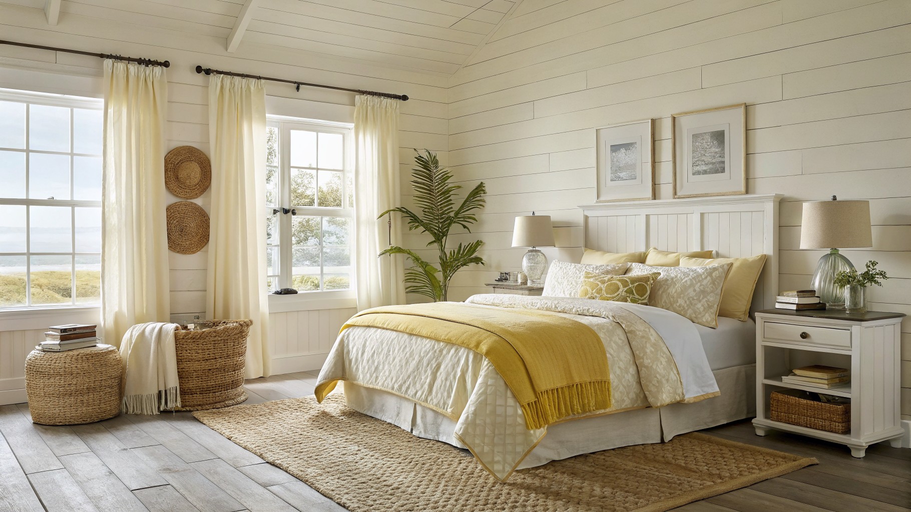
Soft Yellow Walls
This soft yellow has a gentle warmth that keeps the room feeling calm and open. It sits right between cream and a true yellow, so it adds a touch of light without ever feeling bold or overpowering. Colors in this range often read close to Benjamin Moore Pale Sun or Sherwin Williams Lemon Ice.
The slight creamy undertone helps it sit well with white trim and wood floors, though it can look a little washed out in low light. It suits bedrooms or living spaces where you want something cheerful but still relaxed, and it pairs easily with linen, natural textures, and soft neutrals.
Soft Greige Bedroom Walls
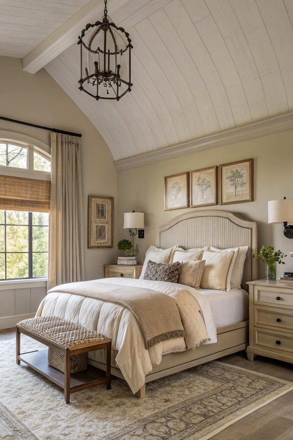
This wall color is a soft greige with a light warm base that leans slightly gray. It stays calm next to white trim and wood tones without feeling too cool or too yellow.
The undertone holds steady even when the light shifts during the day. It pairs easily with natural wood furniture and simple textiles, though it can look flat if the room gets very little natural light.
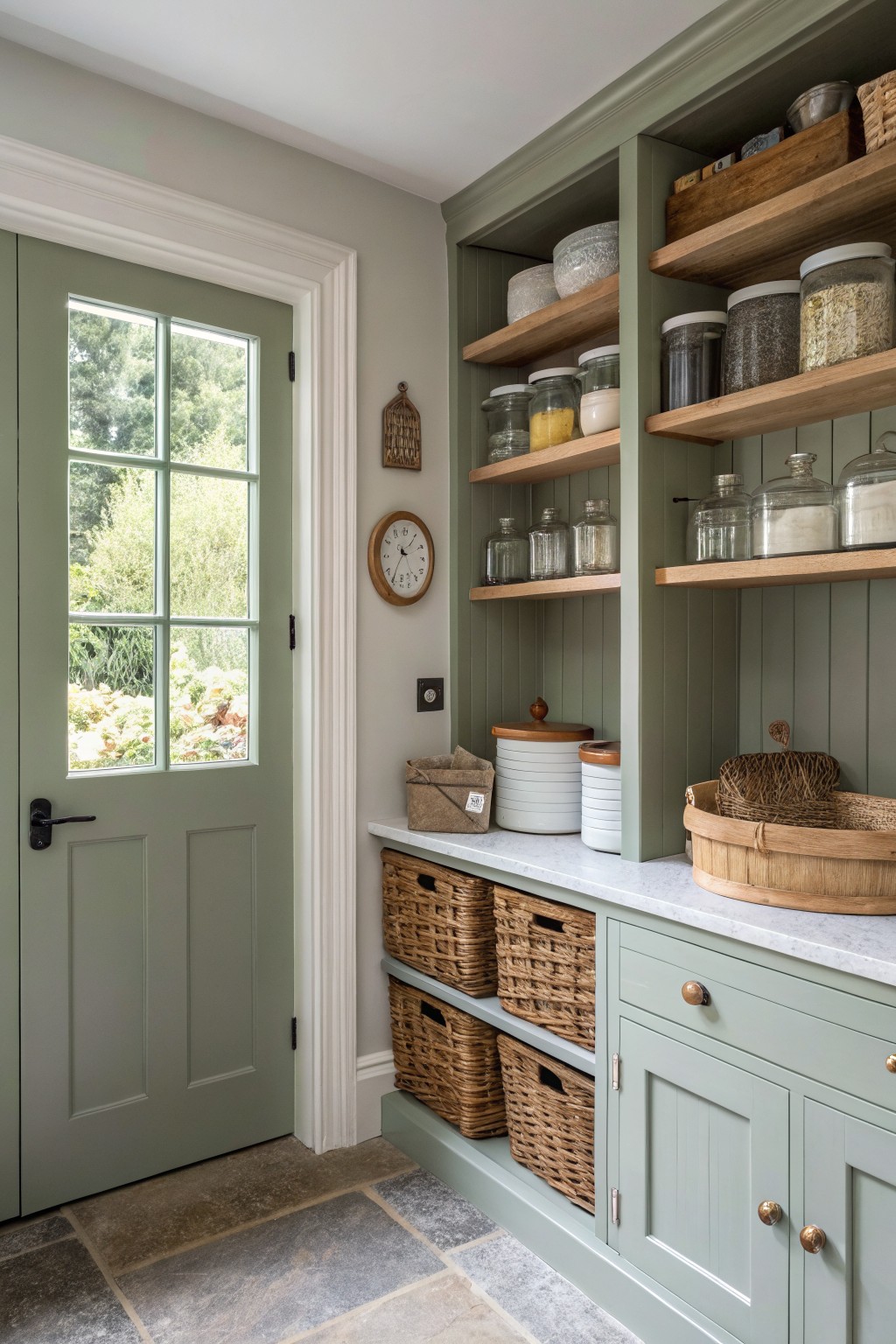
Soft Sage Green Cabinets
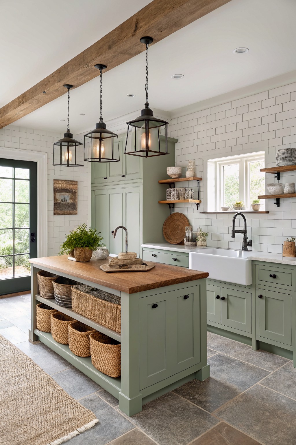
This soft sage green gives kitchen cabinetry a calm, relaxed look that fits right into farmhouse style. It is a muted green with subtle gray undertones that keeps the space feeling airy rather than heavy.
It works especially well against white tile and warm wood tones. The color stays steady in both natural light and evening lighting, though it can lean cooler if paired with too many stark grays. Good matches include Sherwin Williams Clary Sage, Benjamin Moore Saybrook Sage, and Behr Aged Eucalyptus.
Soft Blue Green Walls
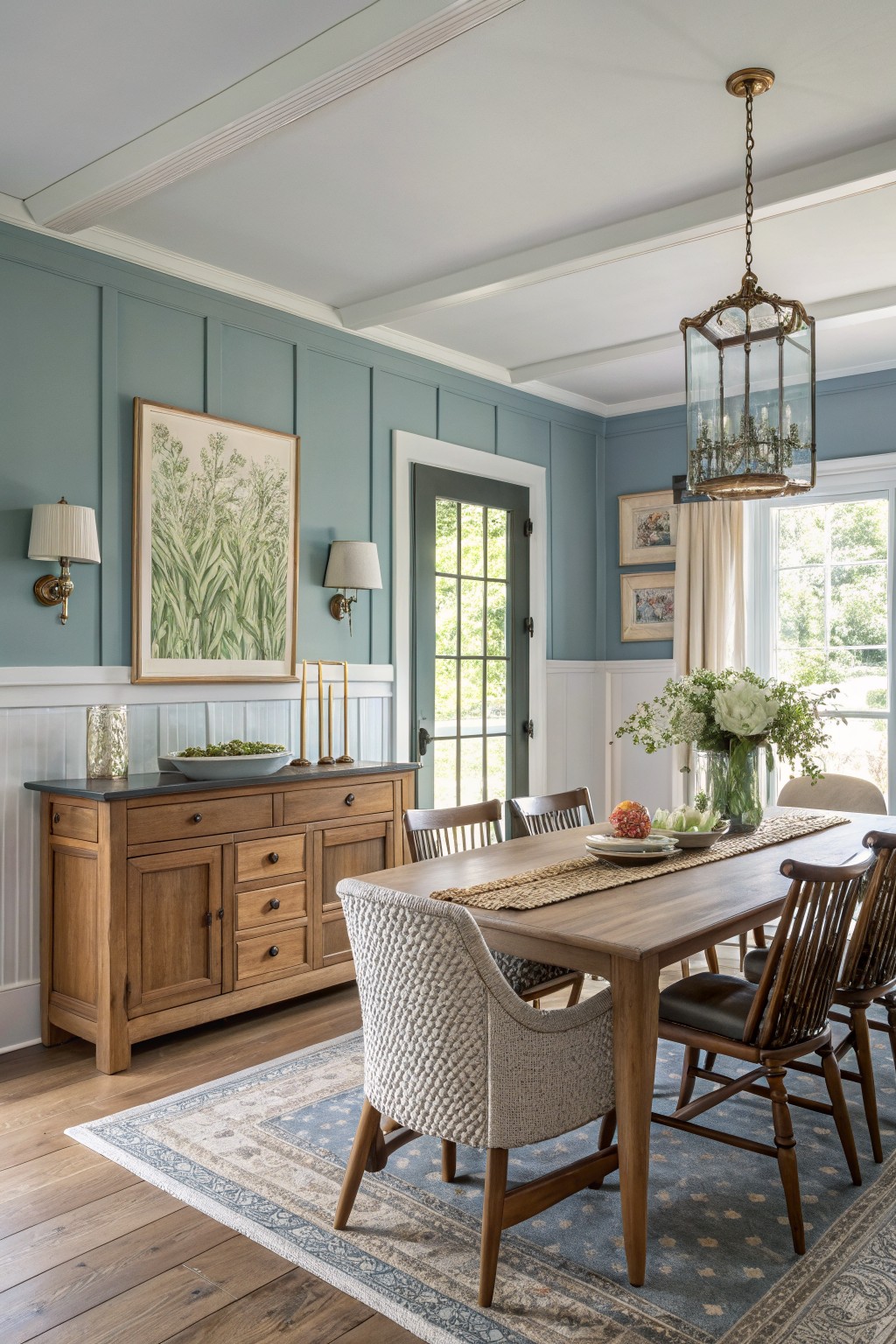
This soft blue green wall color gives a calm backdrop that suits farmhouse interiors well. It sits in that gentle middle ground between blue and green with a bit of gray mixed in, and it feels relaxed next to wood tones without competing with them. Colors like this read close to Sherwin Williams Rainwashed, Benjamin Moore Wythe Blue, or Behr Soft Chambray.
It works best in rooms that get decent daylight since the undertone can shift cooler in low light. Pair it with white trim and warm wood furniture or floors to keep the space feeling balanced and easy.
Soft Greige Built-Ins
A soft greige is a good choice for built-ins when you want the color to stay calm and blend into the background. This one sits right between gray and beige, giving it just enough warmth to feel relaxed rather than stark.
It works best with wood floors and simple trim, and it keeps the focus on whatever you put on the shelves. Light greige colors like this can shift a little depending on the room, so test a sample on the actual wall before committing.
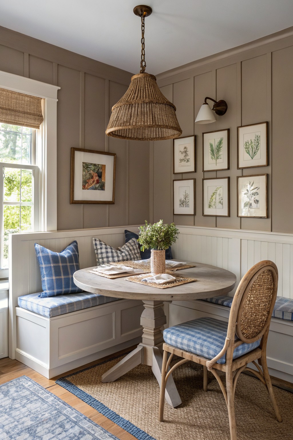
Soft Greige Walls
This soft greige has a warm, slightly gray tone that feels quiet and easy on the eyes. It sits nicely between beige and gray without leaning too far in either direction. Many people like it because it works with older homes and newer builds alike.
The color has a gentle warmth that keeps wood tones from looking stark. It pairs well with painted trim in a similar shade or a crisp white. Try it in hallways, entryways, or any space that needs a calm backdrop without feeling flat. It seems closest to Sherwin Williams Accessible Beige, Benjamin Moore Pale Oak, Behr Silver Satin, or Farrow & Ball Elephant’s Breath.
Soft Greige Walls
This soft greige sits right between gray and beige and gives the room a calm, steady feel without looking flat. It has enough warmth to keep the space from feeling cool while still reading light and clean next to white trim.
The color leans slightly green in its undertone, which helps it work well with natural wood, wicker, and stone floors. It suits rooms that get steady daylight and pairs easily with simple textiles or painted furniture in soft neutrals.
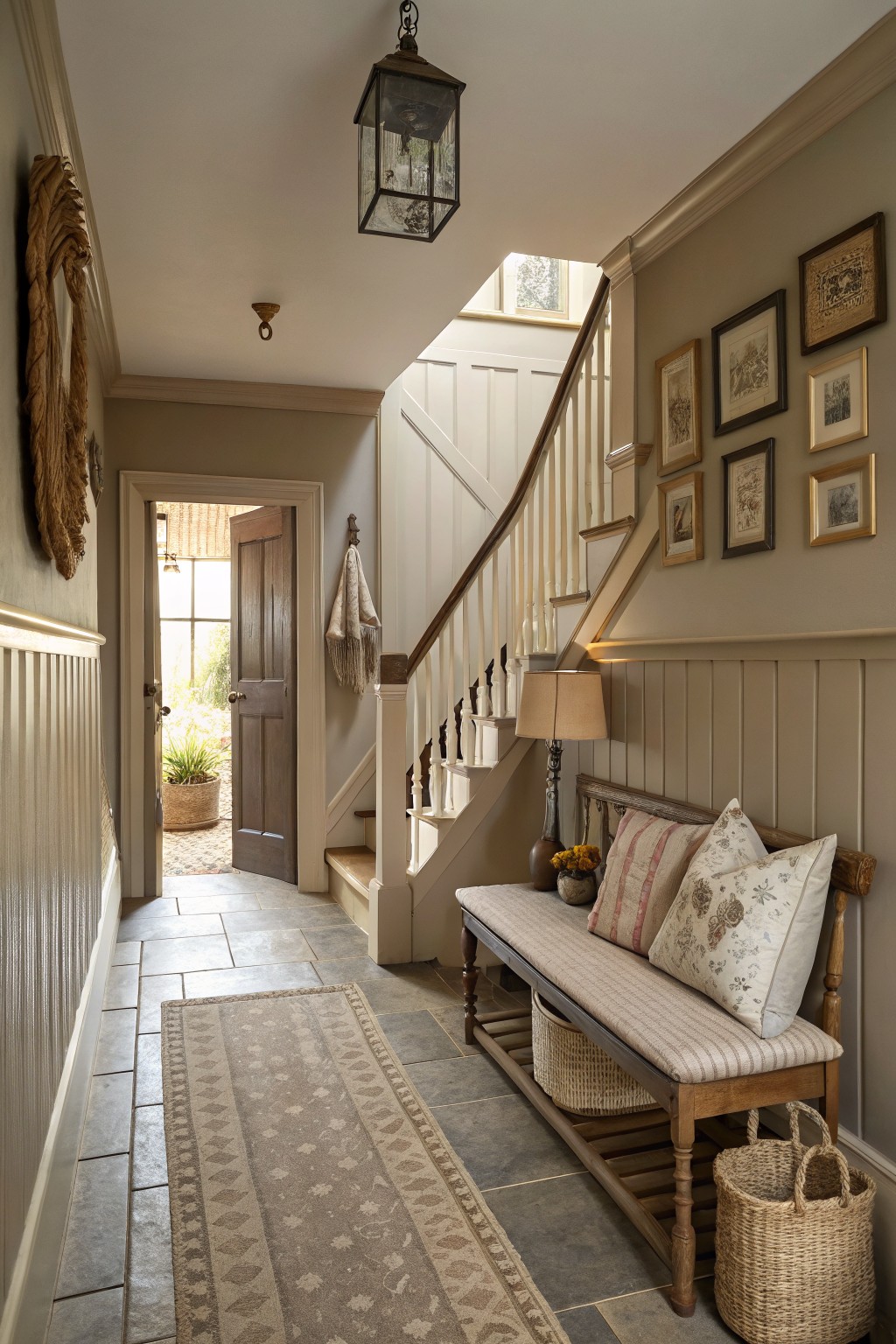
Soft Greige Built-Ins
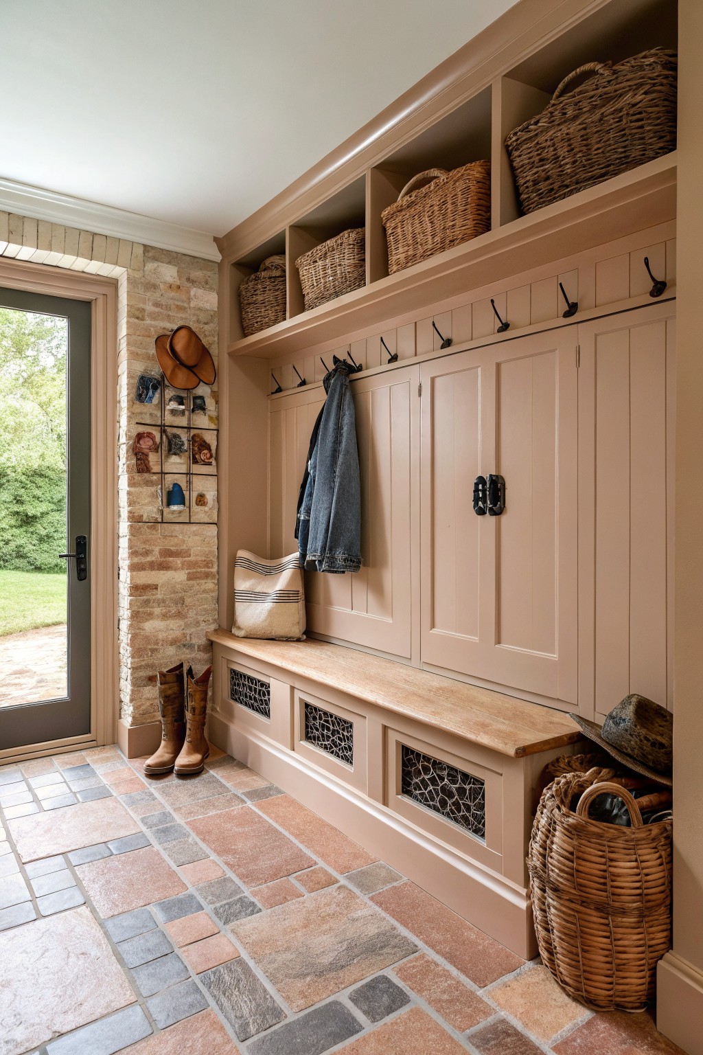
This soft warm greige on the cabinetry and bench keeps the entry area feeling calm and grounded. It has enough warmth to sit well with the wood tones and stone without turning yellow or feeling too cool.
It works best in spaces with mixed materials like tile floors and natural wood. Try it with black hooks or simple hardware if you want a bit of contrast, but watch how it shifts in low light since the gray undertone can read a little cooler there.
Soft Sage Green Walls
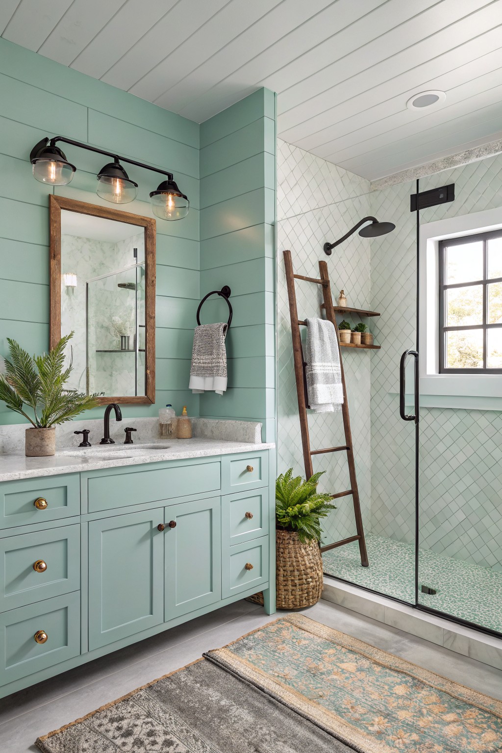
This soft sage green on the walls brings a gentle, relaxed feel to the bathroom without making it feel cold or stark. It leans slightly cool with a hint of blue in the undertone, which helps the color stay light even when the room gets less natural light.
It works especially well with white ceilings, warm wood vanities, and simple black fixtures. Colors like Sherwin Williams Rainwashed, Benjamin Moore Saybrook Sage, or Behr Soft Fern give a similar effect.
Soft Greige Walls
This soft greige has a gentle mix of gray and beige that keeps the room feeling calm and easy. It sits in that middle ground where it never leans too cool or too stark, which is why it works so well in a farmhouse setting.
The color carries a light warm undertone that plays nicely with white trim and wood tones. It suits spaces with steady daylight and pairs best with simple textiles or natural materials rather than anything too bold.
Soft Sage Green Walls
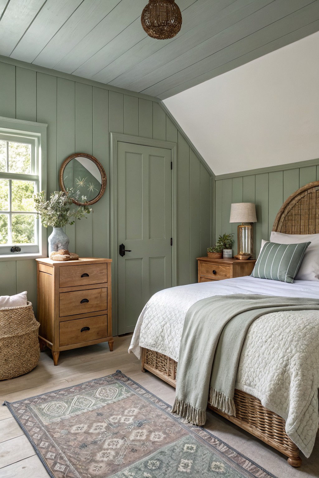
This soft sage green sits right in the middle of gray and green, giving walls a calm, lived-in look that fits the relaxed farmhouse style. It feels quiet and steady rather than bright, which is why it works well in bedrooms where you want the color to stay in the background. The shade has enough depth to show off paneling without making the room feel heavy.
It leans slightly cool, so it pairs best with warm wood tones and white trim. In rooms with decent natural light it stays soft and even, but it can read a touch grayer under cooler bulbs. Try it on walls with oak furniture or simple woven pieces if you want that easy, unfussy balance.
Muted blue gray cabinets
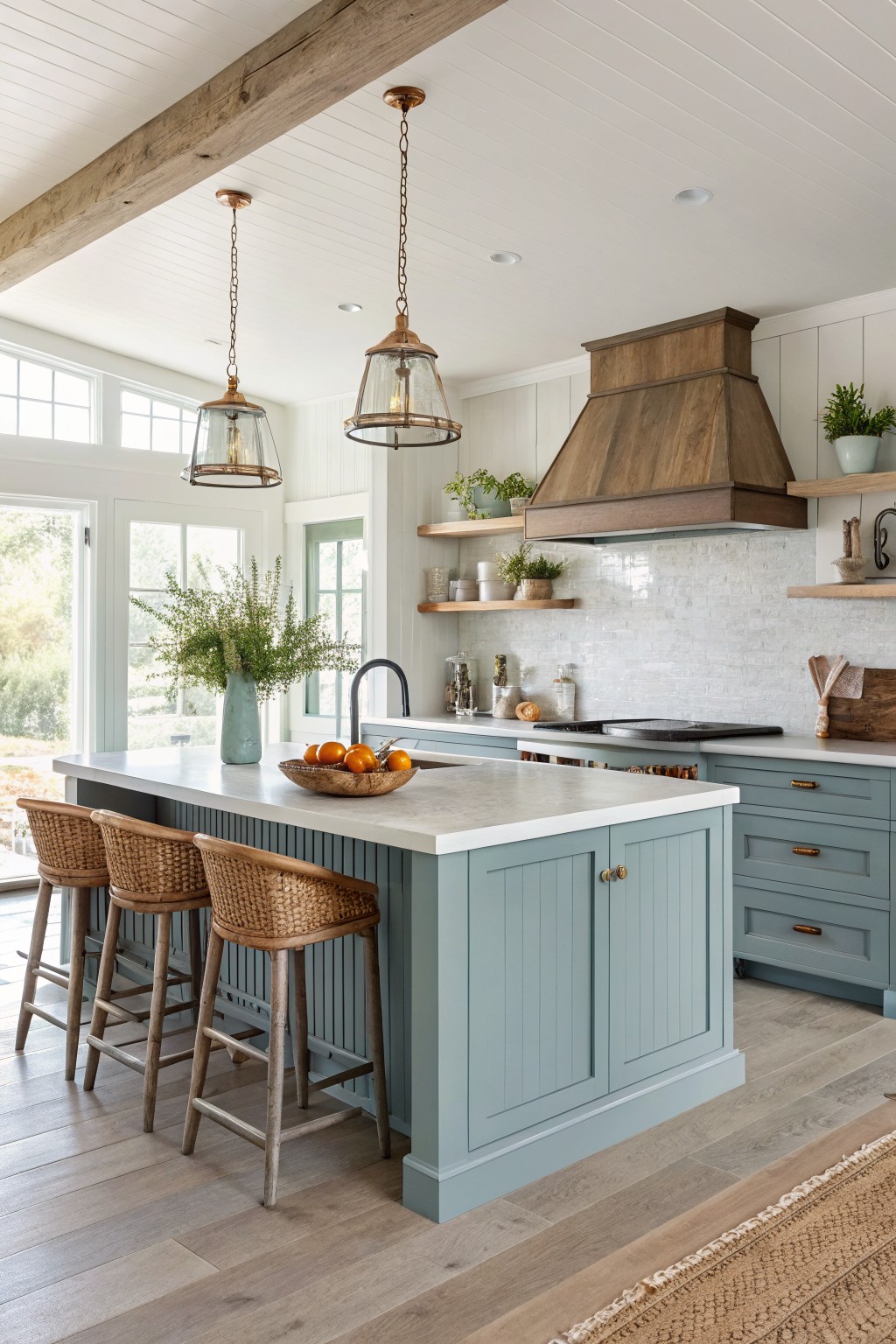
A soft blue gray like this one brings a quiet, steady feel to a kitchen without making the space feel cold. It sits right in that middle ground between gray and blue and works especially well when you want color that stays calm around wood tones and white counters.
The shade carries a light green undertone that helps it blend with warm flooring and natural textures. It looks good on both islands and perimeter cabinets and pairs easily with open shelving or simple hardware. Likely matches include Sherwin Williams Rainwashed, Benjamin Moore Wythe Blue, Behr Silver Drop, and Farrow & Ball Pigeon.
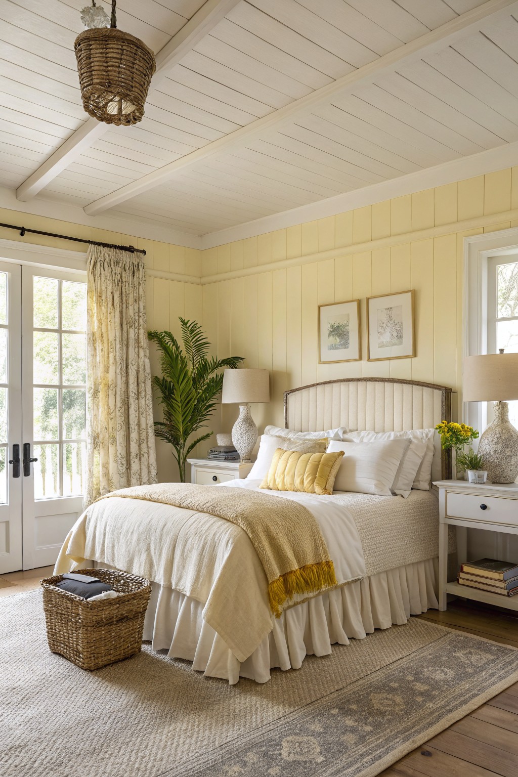
Soft Buttery Yellow Walls
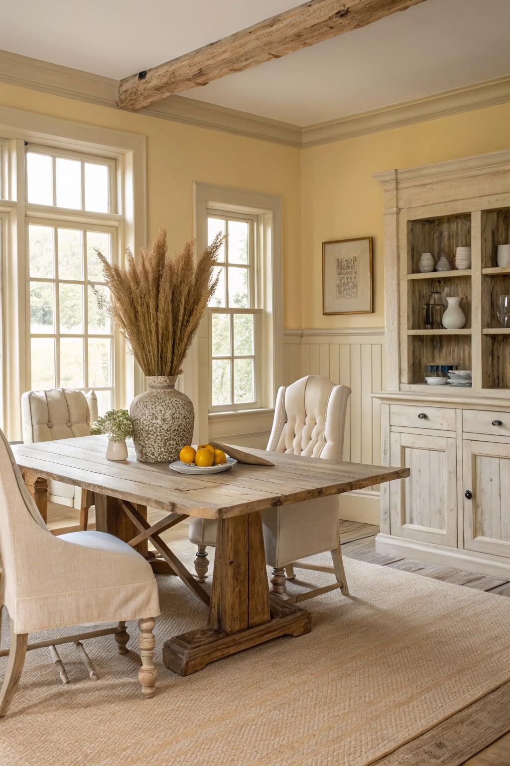
The walls are painted a soft buttery yellow that gives the room a gentle warmth without feeling heavy. This color family sits right between cream and pale yellow, and it reads closest to Benjamin Moore Lemon Ice, Sherwin Williams Butterfield, Behr Morning Sunlight, or Farrow & Ball Pale Hound.
It has a warm undertone that sits nicely next to the wood tones in the table and floor. It works best in rooms with plenty of natural light and pairs easily with white or cream trim, though it can look a little flat in very dark spaces.
Soft Sage Green Cabinetry
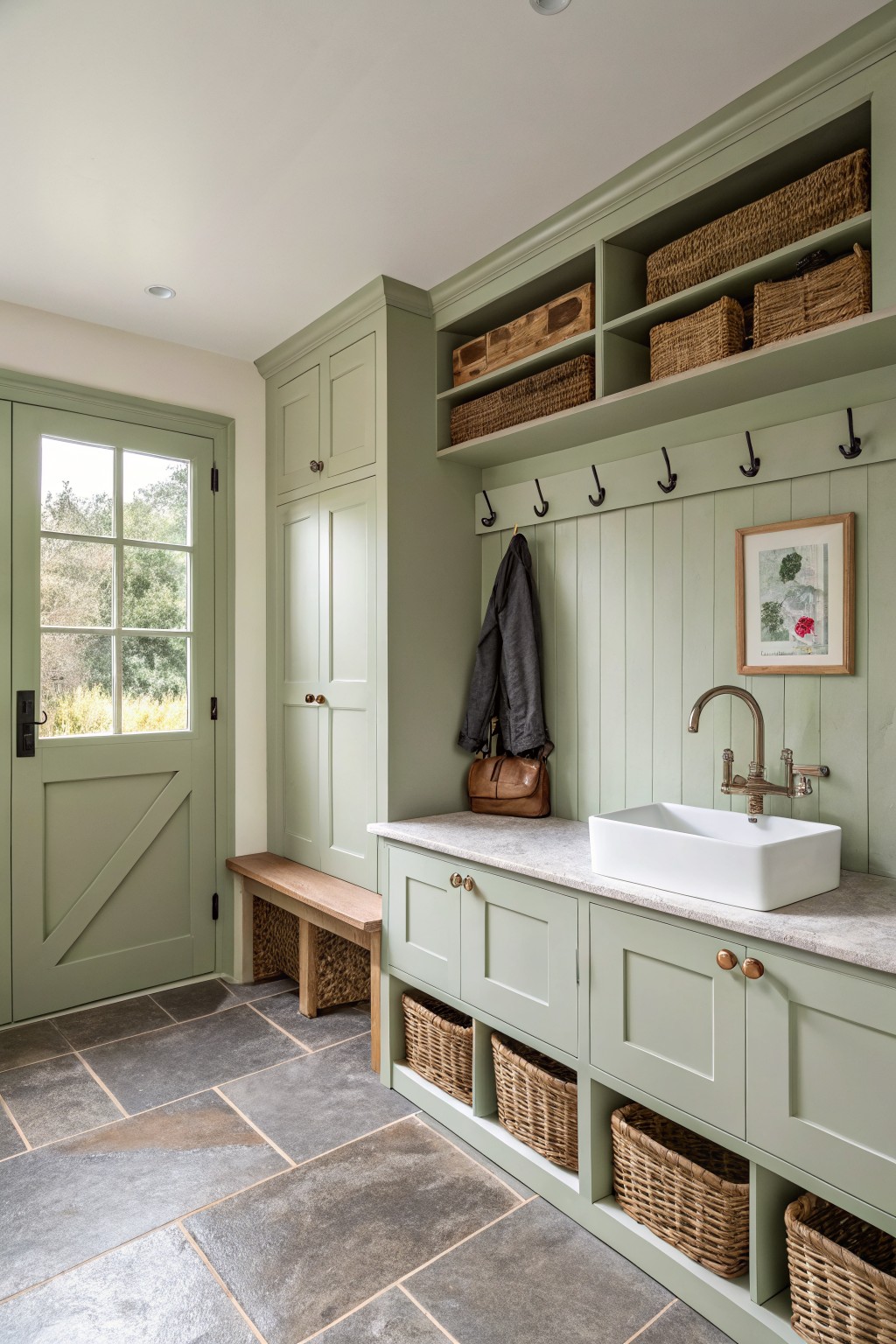
This soft sage green brings a calm, slightly grayed tone to cabinetry and built-in storage. It sits between green and gray without leaning too cool or too warm, which makes it easy to live with in spaces that get both natural light and indoor lighting. Colors like this often read closest to Sherwin Williams Clary Sage, Benjamin Moore Saybrook Sage, or Farrow & Ball French Gray.
It pairs well with wood tones on the floor and bench, and it keeps the white sink and stone countertop from feeling too stark. The color works best in rooms that already have some texture like tile or woven baskets, since the green itself stays fairly quiet. Watch the lighting though, because in very bright rooms it can shift a bit more toward gray.
Soft sage built-ins
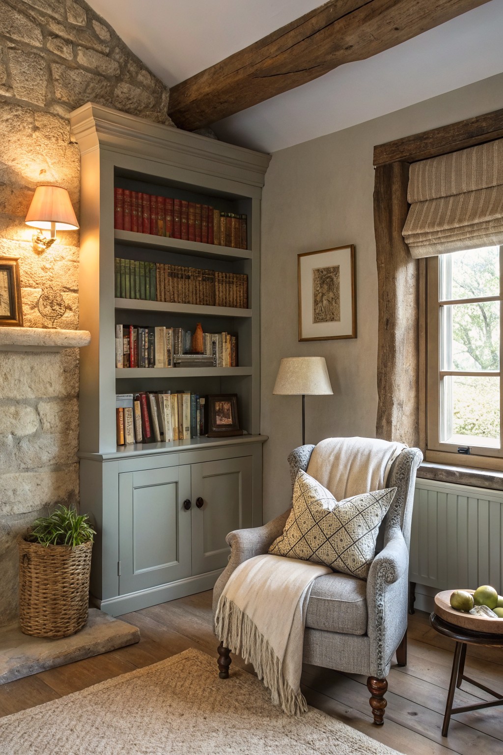
This soft sage gray on the built-in feels calm and a little earthy at the same time. It sits somewhere between gray and green, with just enough warmth to keep the room from looking cold next to the stone and wood.
It works especially well in older homes where you want the cabinetry to blend in rather than stand out. Try it with warm white trim or a light greige on the walls. Sherwin Williams Evergreen Fog, Benjamin Moore Saybrook Sage, or Farrow & Ball Pigeon all read very close to this tone.
Soft Blush Pink Walls
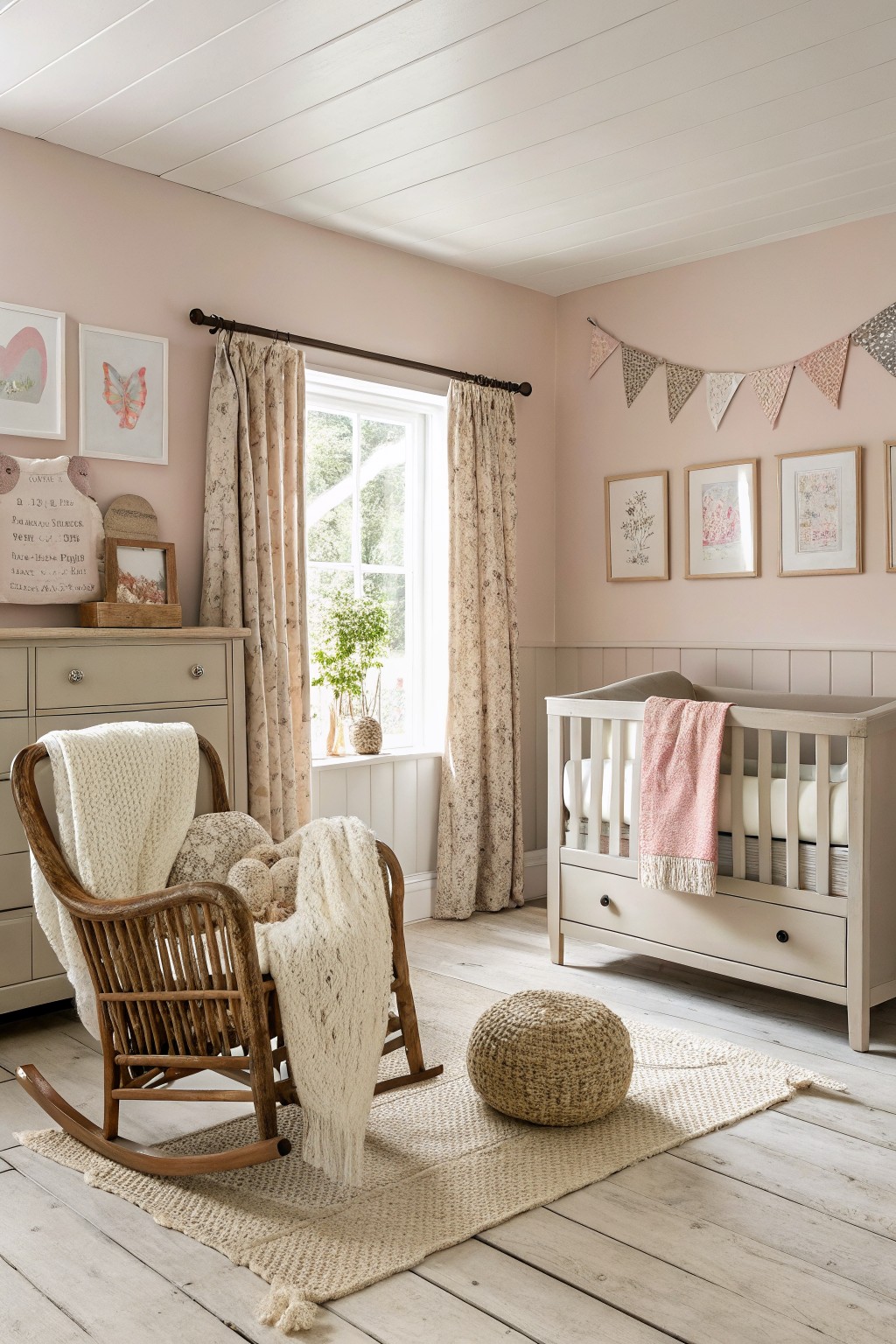
This room uses a soft blush pink on the walls. It is a warm, muted shade that feels gentle and calming without turning too sweet or childish.
The color carries a touch of beige underneath so it pairs easily with wood floors and white trim. It suits bedrooms or any spot where you want a quiet farmhouse backdrop. Try it with linen curtains or simple cotton bedding to keep the look relaxed.
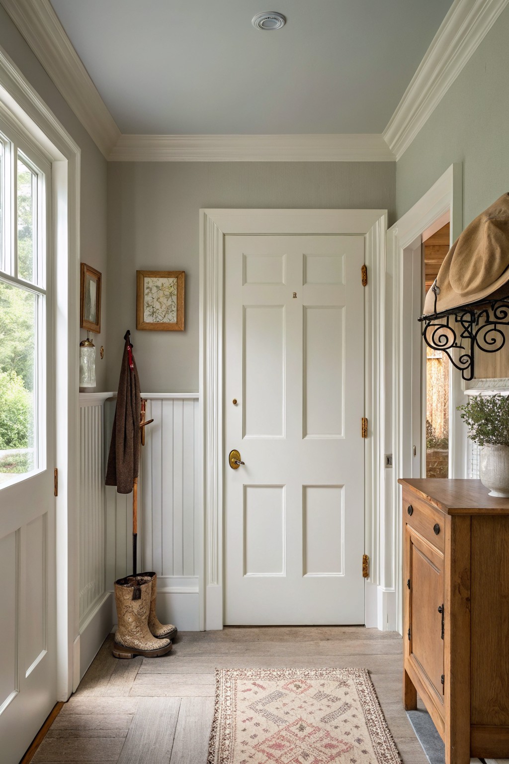
Soft Gray Walls
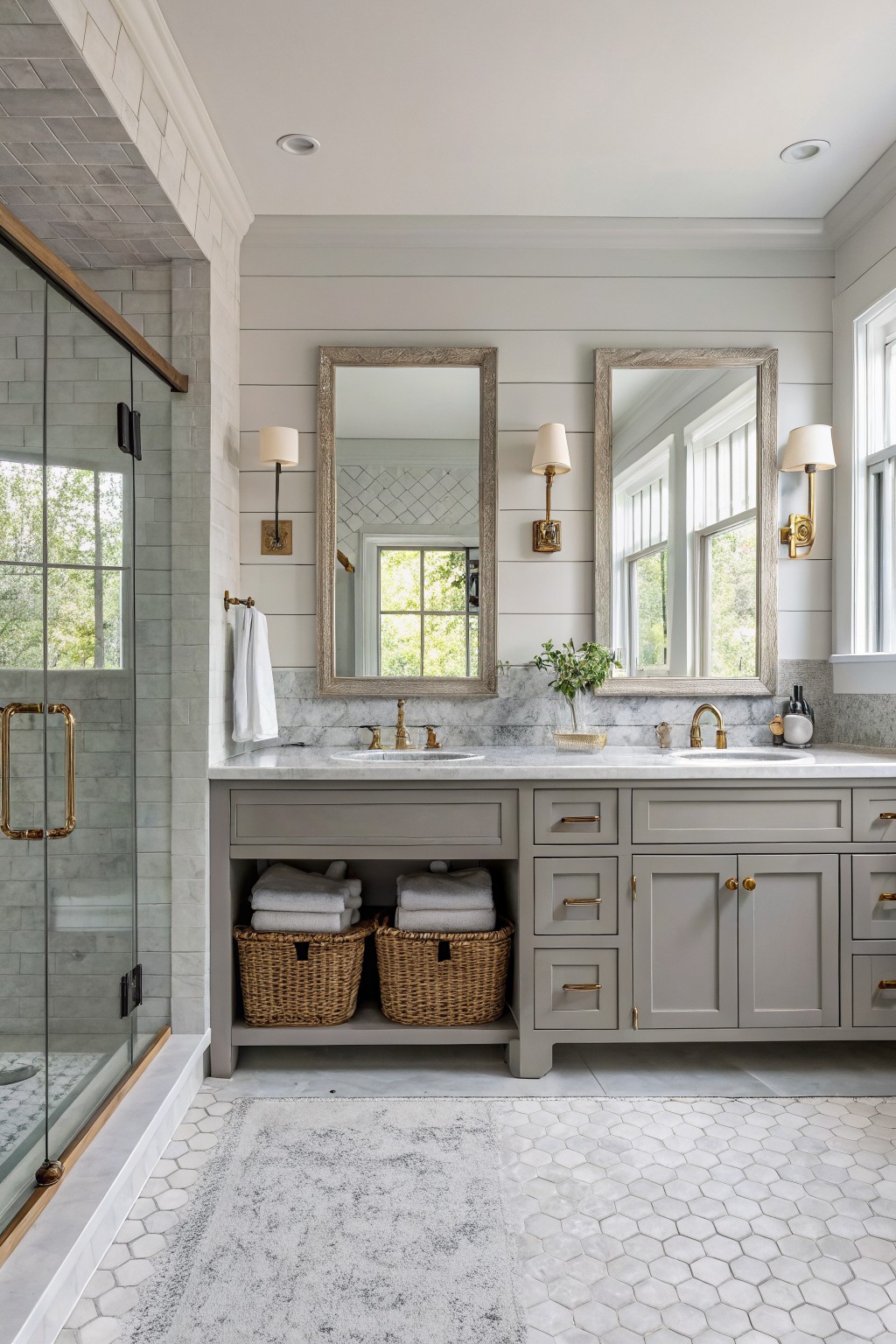
This soft warm gray brings a quiet calm to the room without feeling cold or flat. It leans slightly toward greige, which helps it blend easily with wood tones and stone.
The color has a light depth that works well on shiplap or smooth walls. It pairs best with white trim and marble, though it can read cooler in north-facing rooms, so a test patch is worth it.
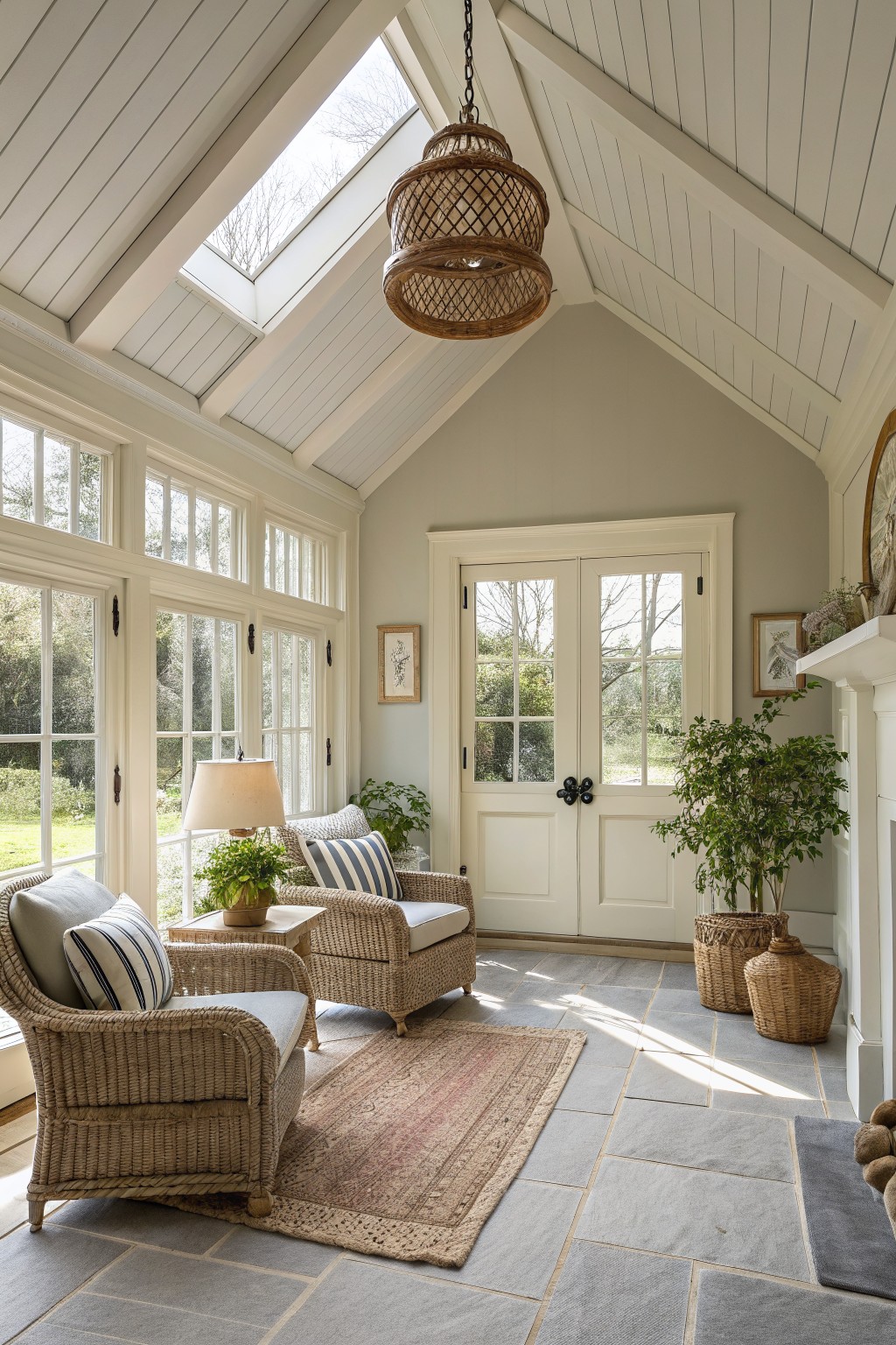
Soft blue ceilings
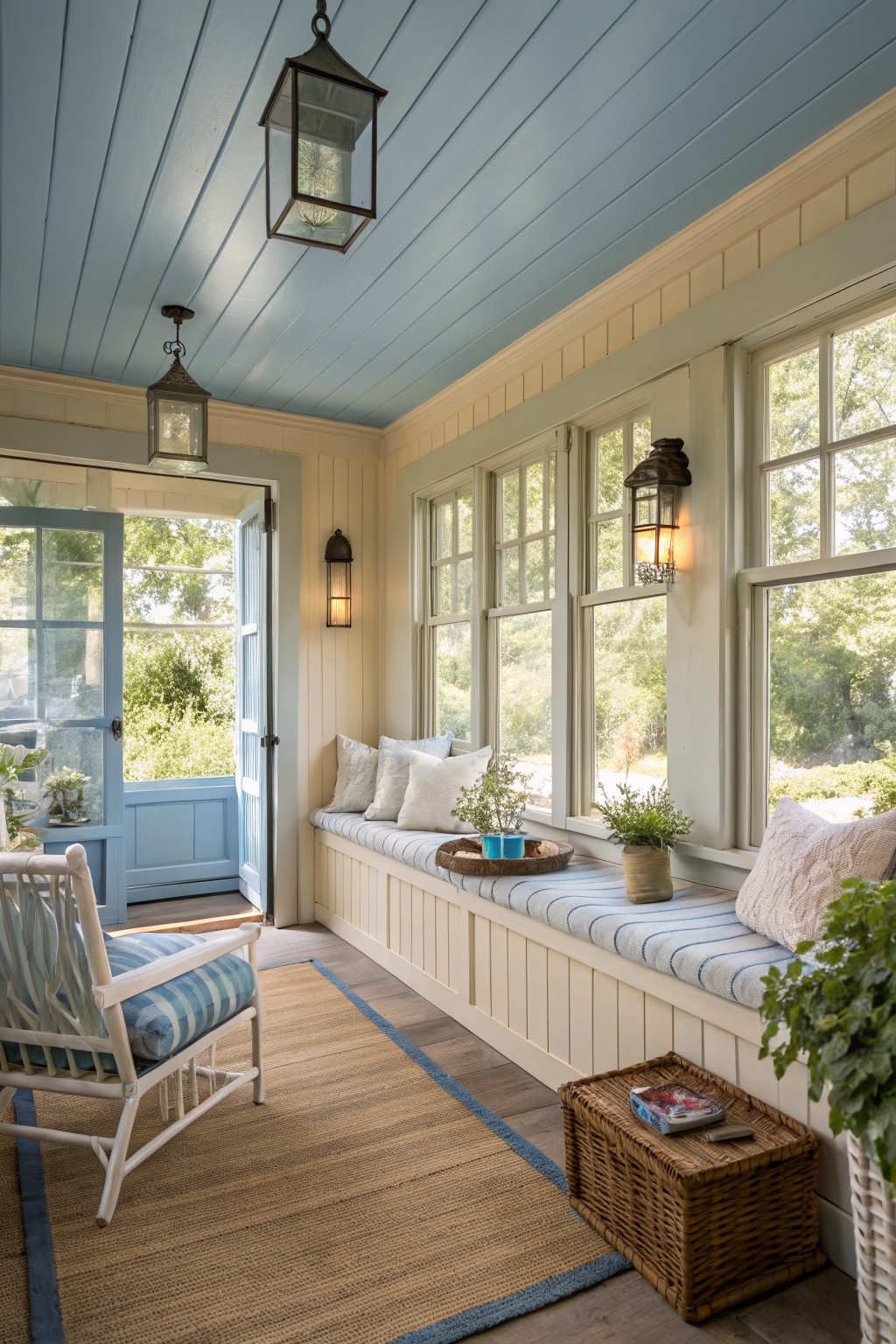
A soft blue ceiling gives this kind of enclosed porch a calm, open feel without making the space feel cold. The color sits somewhere between pale blue and light gray blue, which keeps it gentle next to the cream walls and wood floor. It works especially well in rooms with lots of windows since the light keeps it from looking flat.
This shade has a slight cool undertone that pairs nicely with warm whites and natural wood tones. It suits older homes or farmhouse style interiors where you want a bit of color overhead but still need the room to feel relaxed. Try it in sunrooms, back porches, or any space where the ceiling gets good natural light.
Warm Off-White Walls
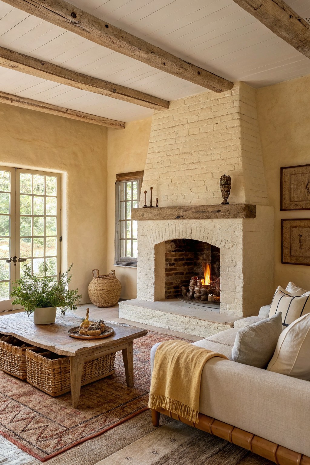
The walls and fireplace in this room are painted a warm off-white with soft cream undertones. It sits right between a bright white and a light beige, which helps the space feel calm without looking too stark next to the wood beams and natural textures.
This color works best in rooms that already have warm wood and stone details. It pairs well with linen, woven baskets, and simple upholstery, though it can start to feel dull if the lighting is very cool or if you add too many gray accents.
Soft Sage Green Built-Ins
This muted sage green sits right between gray and green. It gives the walls and cabinetry a calm, steady look that fits right into a farmhouse setting without pulling too much attention.
The color has a slight cool undertone that stays soft next to wood tones and stone. It works best in rooms with decent natural light and pairs easily with white trim or simple woven storage.
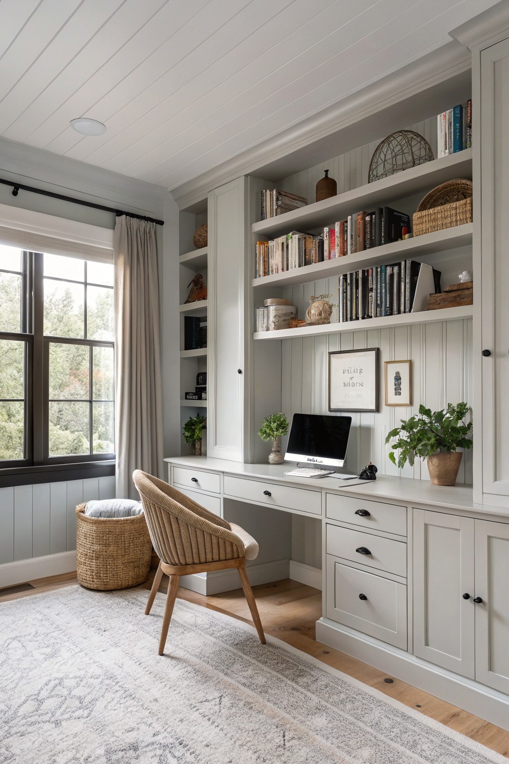
Soft Blue Gray Built-Ins
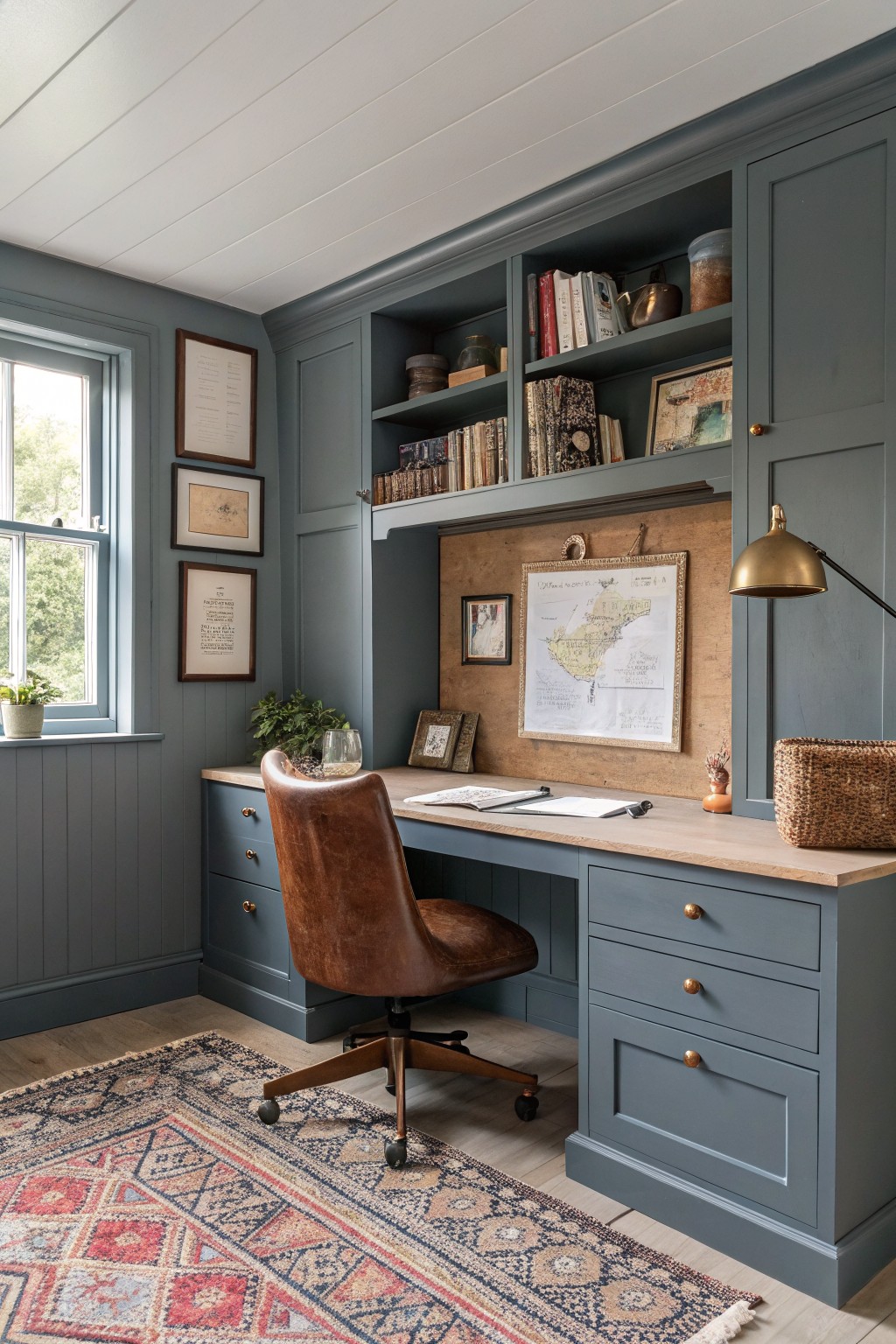
This soft blue gray paint creates a calm backdrop that fits right into a farmhouse setting. It is a muted color with cool blue undertones that still feels soft next to the wood desk and floor.
The shade works well in rooms with good natural light and pairs easily with leather, woven baskets, and simple wood tones. It can look a bit flat in very dark spaces so test it on a large board first.
Soft Sage Green Walls
This soft sage green sits in that useful middle ground between gray and green. It gives the walls a calm presence that feels natural in a farmhouse entry without making the space feel heavy or too themed.
The color has a light warm undertone that keeps it from turning chilly next to white trim. It works especially well with wood floors and simple painted millwork, though it can look a bit washed out if paired with too many cool grays or stark blacks.
Frequently Asked Questions
Q: Should I test these colors on my walls before committing? A: Grab a few samples and paint large patches in the actual room. Check how they look in morning light and again at night. This shows which shade keeps the space feeling open and calm.
Q: What trim color pairs well with these soft shades? A: Stick with a bright white or light greige on the trim. It gives the walls a clean edge while letting the relaxed color stay front and center.
Q: Can these paints handle high traffic areas like hallways? A: Choose a satin finish for those spots. The soft tones still read calm and wipe clean without much effort.
Q: How do I keep the whole house feeling consistent with just a few of these colors? A: Use two close shades from the list across connected rooms. They flow together without sharp changes.


