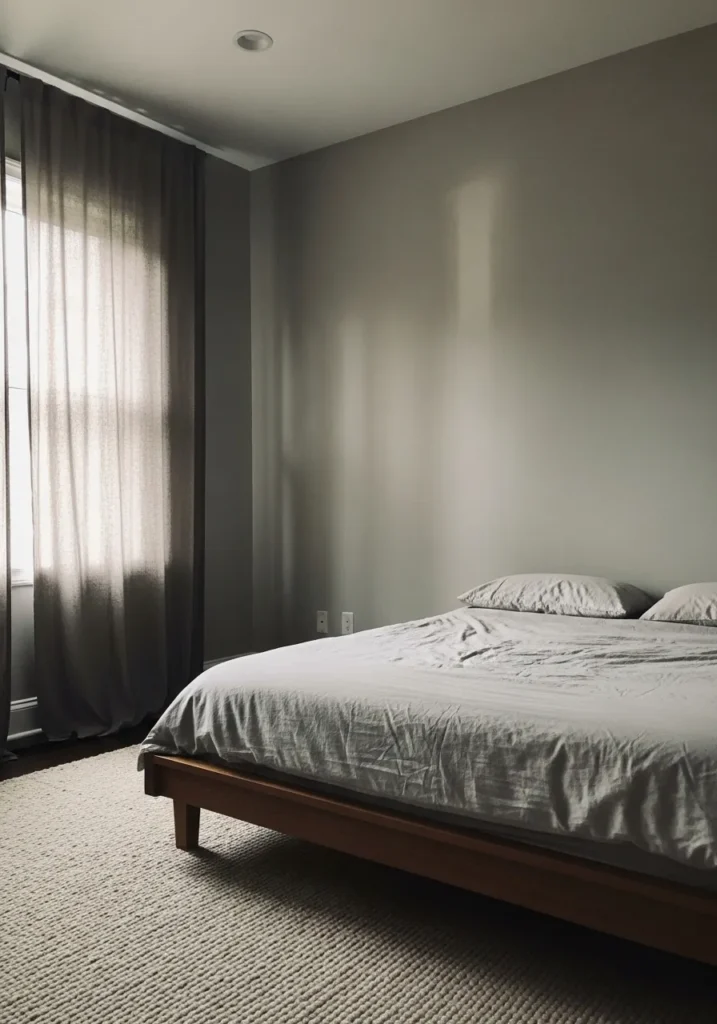
Neutral paint colors have always been my secret weapon for creating a calm and beautiful home.
I love how the right soft beige, warm gray, or creamy white can completely change the feeling of a room without overwhelming the space.
Benjamin Moore has some of my favorite timeless neutrals that make a home feel peaceful, elegant, and quietly stylish.
In this collection I am sharing 24 gorgeous neutral paint colors that always give a room that serene designer vibe I personally cannot get enough of.
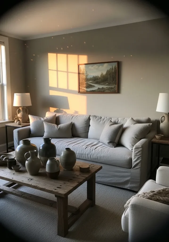
Soft Warm Beige Walls
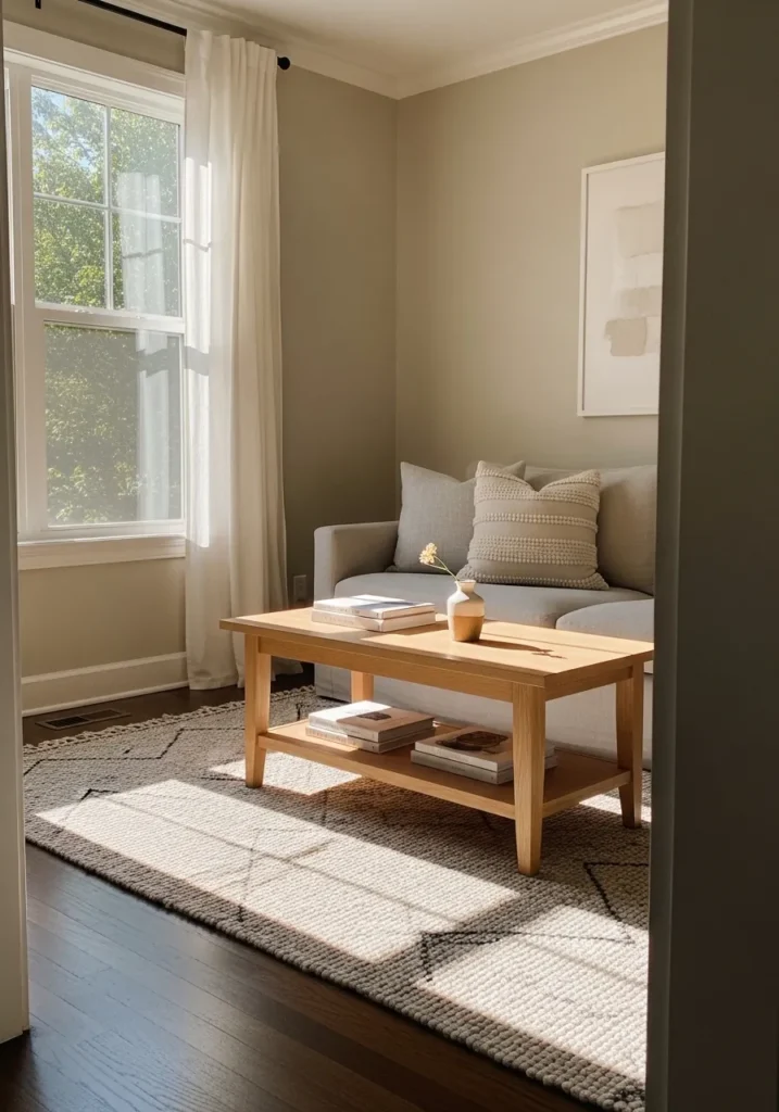
The wall color here reads very close to Benjamin Moore Edgecomb Gray. It sits in that soft warm beige range that feels calm without turning yellow. Edgecomb Gray is one of those neutrals that people return to again and again because it feels gentle and steady. You can see how it plays nicely beside the light wood coffee table and the simple neutral sofa.
This kind of beige carries a quiet greige undertone, which helps it stay balanced in different lighting. In bright rooms it looks a little lighter and creamier. In lower light it leans slightly taupe. It works well with pale woods, white trim, woven rugs, and relaxed fabrics like the ones in this space. If your room already has warm flooring or wood furniture, this shade tends to settle in very easily.
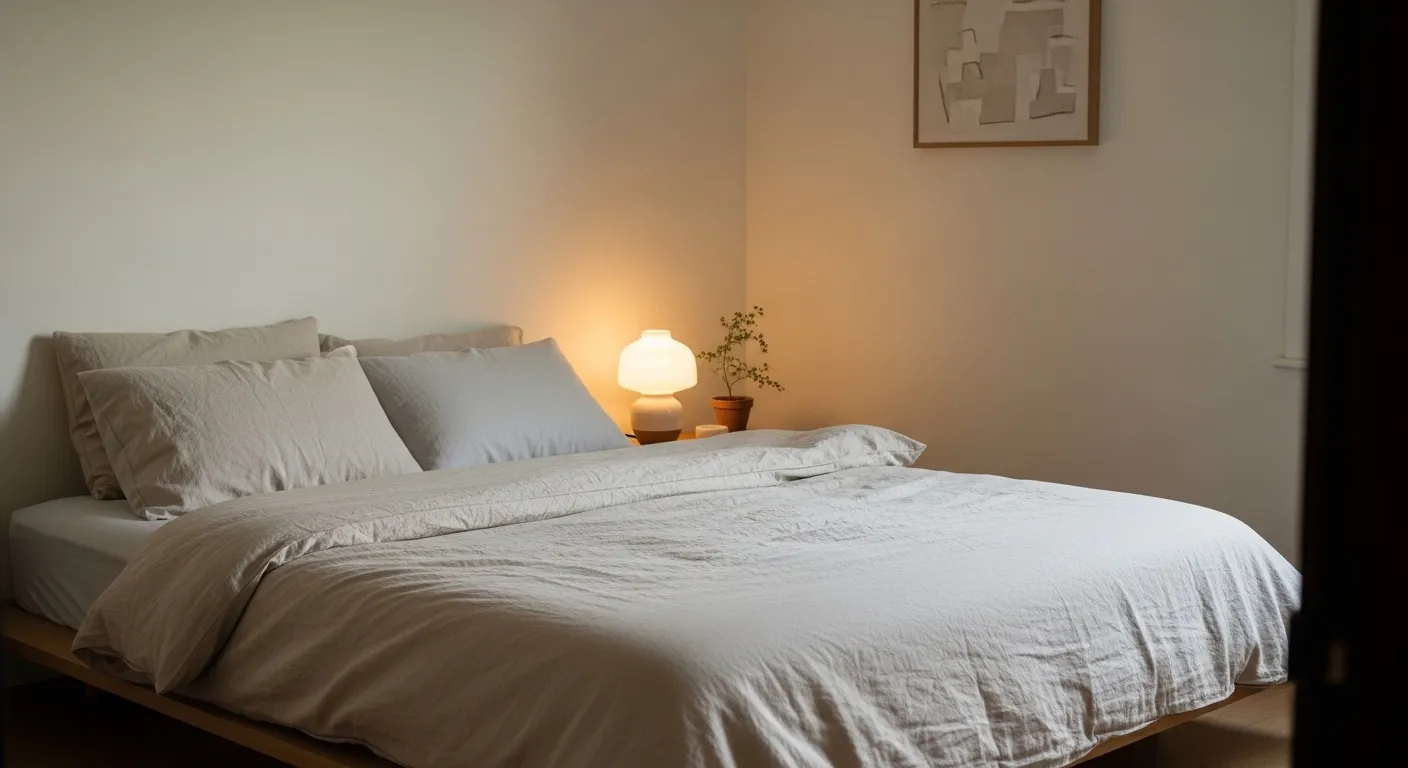
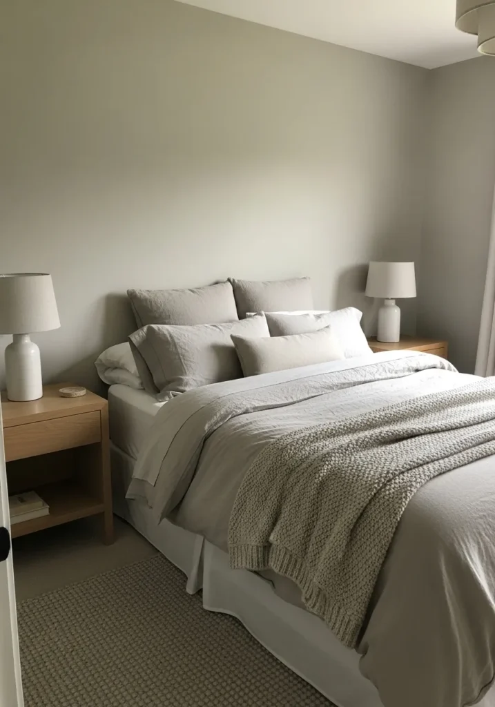
Light Greige Bedroom Walls
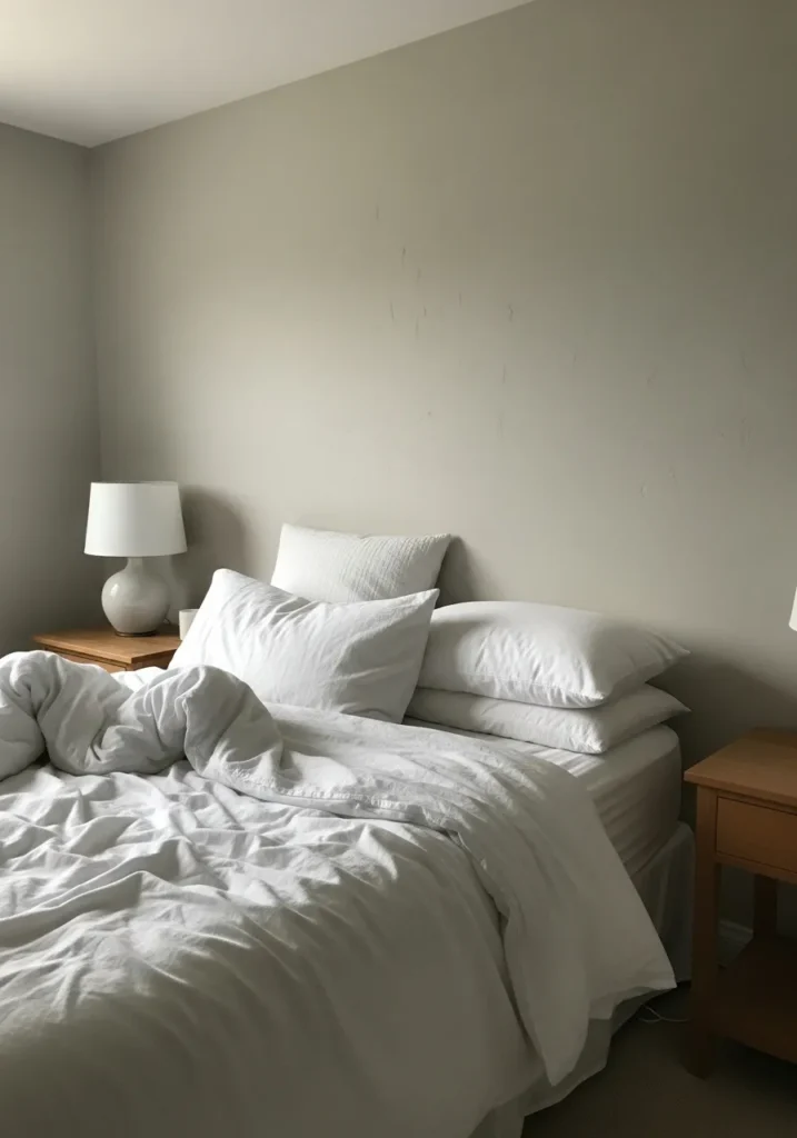
The wall color here looks very close to Benjamin Moore Classic Gray. It sits in that pale greige range that feels calm and easy to live with. Classic Gray is one of those light neutrals that almost reads like an off white, but it carries just enough gray to keep it from looking flat. Next to simple white bedding like this, the color feels quiet and relaxed.
Classic Gray leans slightly warm, though it still reads balanced in most rooms. In brighter spaces it can look very light, almost creamy. In softer light it shows a little more gray. It tends to work well in bedrooms, hallways, or smaller rooms where you want color but still want things to stay light and simple. White trim and medium wood furniture usually sit comfortably beside it.
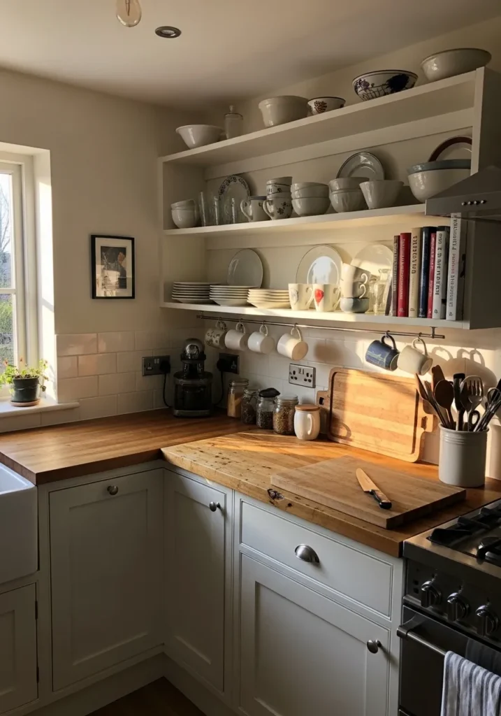
Creamy Off White Kitchen Cabinets
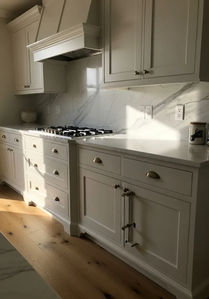
The cabinet color here looks very close to Benjamin Moore White Dove. It sits in that soft creamy white range that feels gentle instead of stark. White Dove has been a steady favorite for years because it gives kitchens a clean look without the cold tone that some bright whites bring. Next to the marble backsplash and warm wood flooring, it reads calm and natural.
White Dove carries a mild warm undertone, which helps it sit comfortably with brass hardware and natural materials. In brighter kitchens it appears light and airy. In dimmer spots it can lean a little creamier, which many people actually prefer for cabinets. It tends to work best when paired with warm counters, wood floors, or soft gray stone like the one behind the cooktop here.
Soft Taupe Neutral Walls
The wall color here reads very close to Benjamin Moore Pale Oak. It falls into that light taupe and greige range that feels easy to live with and not too cool. Pale Oak is often used when someone wants a neutral that is a little warmer than gray but still calm. Against the cream chair and the simple shelving, the color looks gentle and steady.
Pale Oak carries a soft warm undertone that can shift slightly depending on the light. In brighter rooms it can look like a pale beige gray. In dimmer corners it leans a bit more taupe. It tends to work well in quiet spaces like reading corners, bedrooms, or hallways. White trim, light fabrics, and wood floors usually sit comfortably next to it.
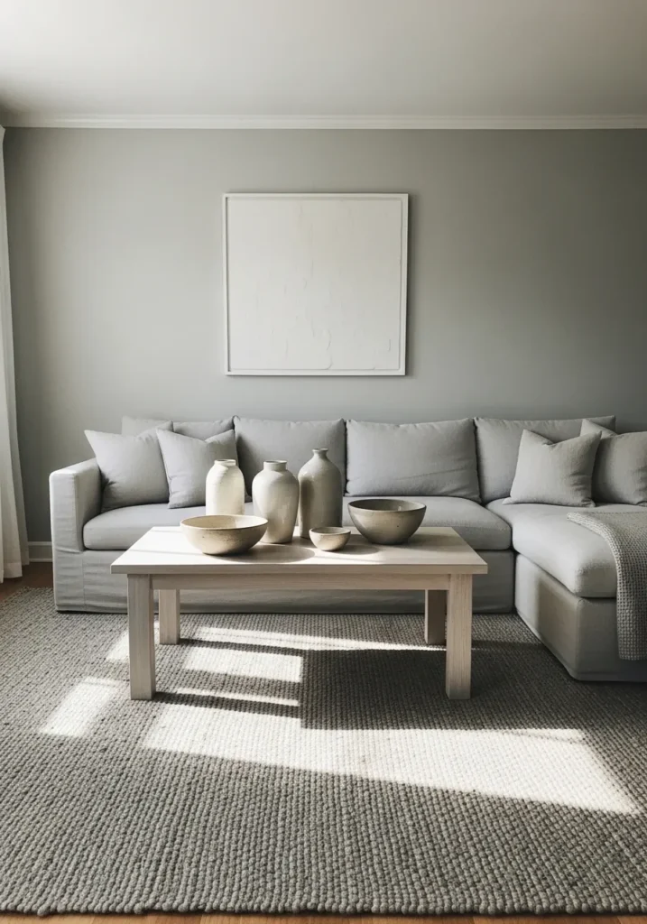
Calm Light Greige Living Room Walls
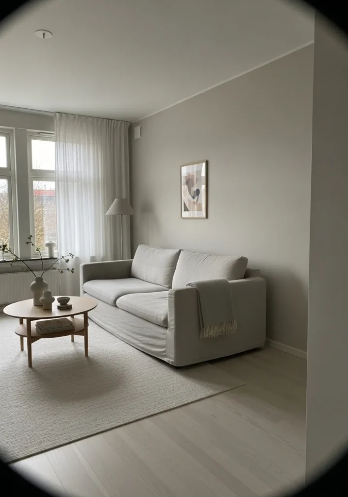
The wall color here reads very close to Benjamin Moore Balboa Mist. It falls into that soft light greige range that sits right between gray and beige. Balboa Mist is often chosen when someone wants a neutral that feels gentle but still has a little presence on the wall. Next to the light sofa and pale wood table, it looks quiet and easy to live with.
Balboa Mist carries a subtle warm undertone that shifts slightly through the day. In brighter rooms it can look pale and airy. When the light softens, it leans a bit more gray. It tends to work well in living rooms and open spaces where you want the walls to stay neutral but not plain. Light fabrics, soft rugs, and natural wood usually pair nicely with it.
Soft Gray Green Bathroom Walls
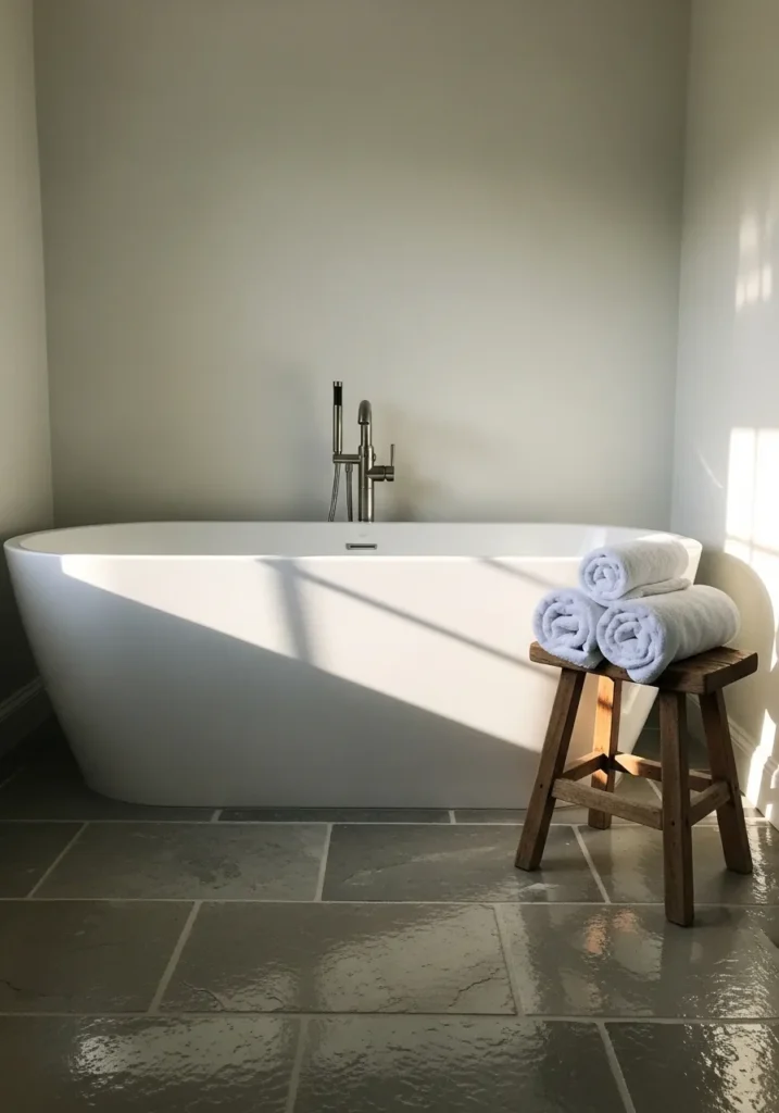
The wall color here reads very close to Benjamin Moore Healing Aloe. It sits in that quiet gray green family that feels gentle rather than obviously colorful. Healing Aloe often shows up when someone wants a neutral that still carries a little life. Next to the white tub and pale towels, the color looks calm and easy to settle into.
Healing Aloe leans slightly cool with a soft green undertone that can shift through the day. In brighter light it can appear almost like a pale misty gray. When the light softens, the green becomes a little easier to notice. It tends to work nicely in bathrooms and bedrooms where softer colors feel more comfortable. Stone floors and simple wood pieces usually pair well with it.
Warm Greige Dining Room Walls
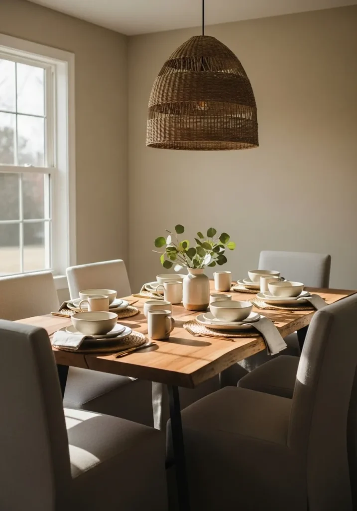
The wall color here looks closest to Benjamin Moore Revere Pewter. It sits in that well known greige family that blends gray and beige in a balanced way. Revere Pewter has been popular for years because it feels neutral but still noticeable on the wall. Next to the natural wood table and woven pendant light, the color reads calm and comfortable.
Revere Pewter leans slightly warm, which helps it work with wood tones and soft fabrics like the dining chairs here. In bright light it can appear lighter and a bit more gray. In lower light it shows more of its beige side. It tends to work well in dining rooms, living rooms, and open spaces where you want a steady neutral that still has a little depth.
Pale Gray Entryway Walls
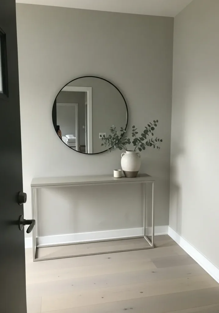
The wall color here reads very close to Benjamin Moore Gray Owl. It sits in the light gray family that feels clean but still soft on the wall. Gray Owl is often used in entry spaces because it gives a fresh neutral look without feeling too dark. Beside the simple console table and white trim, the color looks quiet and steady.
Gray Owl leans slightly cool, though it can shift depending on the light. In brighter areas it appears pale and airy. In softer light it can show a faint green gray undertone. It tends to work well in hallways, entryways, and smaller spaces where a light gray helps the room feel open and calm. Light floors and simple black accents usually sit comfortably with it.
Soft Cream Bedroom Walls
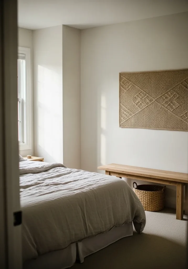
The wall color here reads very close to Benjamin Moore Swiss Coffee. It falls into that creamy off white family that feels warmer than a bright white but still very light. Swiss Coffee has been a long time favorite because it gives walls a soft look without feeling yellow. Next to the pale bedding and light wood bench, the color looks calm and easy to live with.
Swiss Coffee carries a gentle warm undertone that becomes a little more noticeable in softer light. In brighter rooms it often reads almost like a warm white. In rooms with less natural light it can lean slightly creamier. It tends to work well in bedrooms where a quiet neutral helps the room feel relaxed and simple.
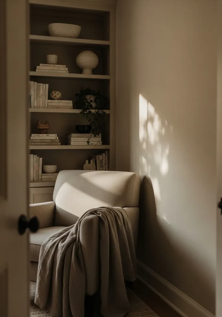
Warm Taupe Reading Nook Walls
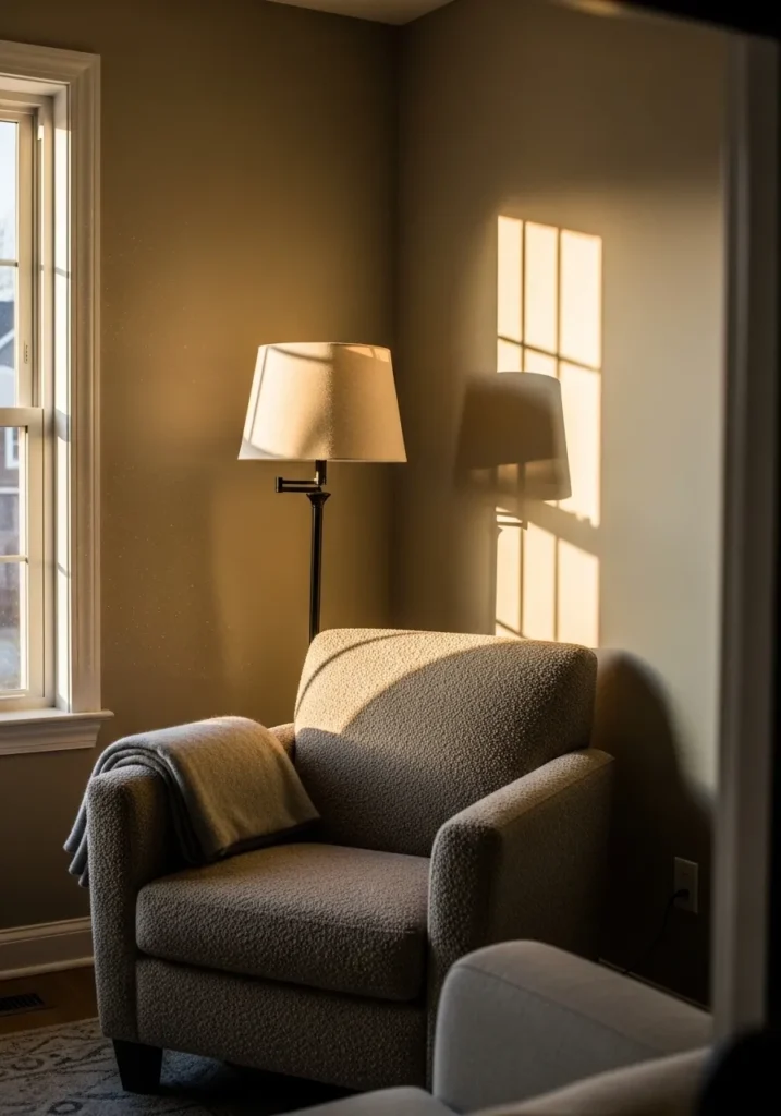
The wall color here reads very close to Benjamin Moore Smokey Taupe. It falls into that deeper taupe neutral family that sits somewhere between brown and gray. Smokey Taupe works well when you want a wall color that feels calm but still has noticeable warmth. Next to the textured chair and soft throw, the shade looks comfortable and settled.
Smokey Taupe carries a warm undertone that becomes richer in softer light. In brighter rooms it can look like a warm gray brown. In lower light it leans a bit deeper and cozier. It often works well in small sitting areas, bedrooms, or reading corners where a slightly darker neutral can make the space feel relaxed and quiet.
Soft Greige Home Office Walls
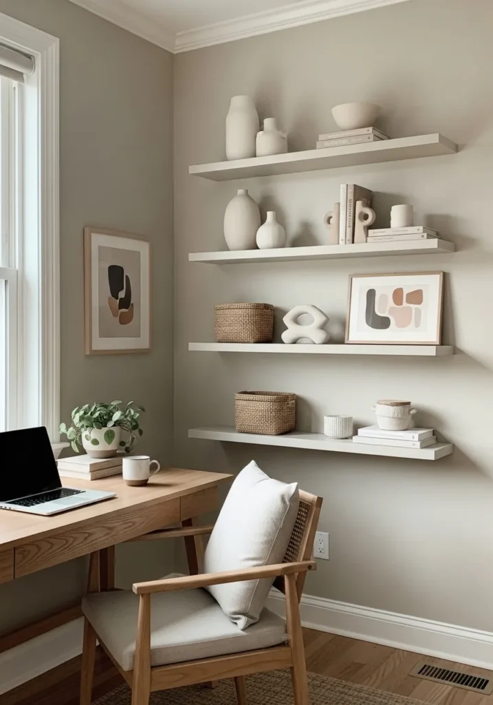
The wall color here reads very close to Benjamin Moore Edgecomb Gray. It sits in that light greige range that blends beige and gray in a very easygoing way. Edgecomb Gray is often used in work spaces because it keeps the room feeling light while still giving the walls a little color. Next to the pale wood desk and simple white shelving, the shade looks calm and steady.
Edgecomb Gray carries a gentle warm undertone that helps it sit comfortably with wood tones and natural textures. In brighter rooms it can look almost like a warm gray. In softer light it leans slightly beige. It tends to work well in home offices, bedrooms, and living spaces where you want a neutral wall color that feels quiet but not plain.
Light Greige Bedroom Walls
The wall color here looks very close to Benjamin Moore Balboa Mist. It falls into that soft light greige range that sits right between gray and beige. Balboa Mist is a common pick for bedrooms because it gives the walls a little color while still keeping the room bright. Against the pale bedding and simple wood nightstands, it reads calm and easy to live with.
Balboa Mist carries a mild warm undertone that can shift slightly depending on the light. In brighter rooms it appears lighter and more gray. In softer light it leans a bit warmer and slightly beige. It tends to work well in bedrooms and quiet spaces where a gentle neutral helps the room feel relaxed without looking plain.
Light Warm Greige Hallway Walls
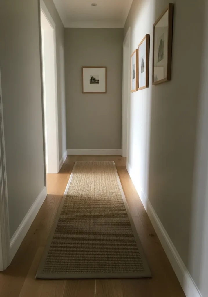
The wall color here reads very close to Benjamin Moore Pale Oak. It sits in that light greige range that blends gray with a gentle beige warmth. Pale Oak is often used in hallways because it brightens narrow spaces while still giving the walls some color. Next to the white trim and warm wood flooring, the shade feels quiet and natural.
Pale Oak carries a soft warm undertone that can shift a little as the light changes. In brighter areas it looks like a pale gray beige. In dimmer corners it leans slightly more taupe. It tends to work well in connecting spaces like hallways and stair landings where a calm neutral helps everything flow from room to room.
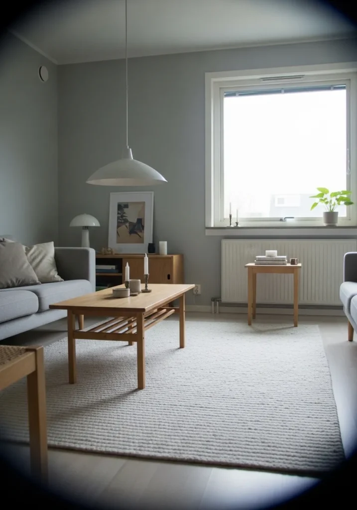
Soft Neutral Gray Living Room Walls
The wall color here reads very close to Benjamin Moore Stonington Gray. It sits in that light neutral gray range that feels clean but still gentle on the wall. Stonington Gray has been a steady favorite because it gives a room a soft gray backdrop without looking too dark. Next to the pale sofa and light wood table, the color looks quiet and balanced.
Stonington Gray leans slightly cool, though it usually stays fairly neutral. In bright rooms it can appear light and airy. In softer light it shows a bit more depth and looks like a calm medium gray. It tends to work well in living rooms and open areas where a simple gray wall color keeps everything looking relaxed and uncluttered.
Soft Beige Kitchen Walls
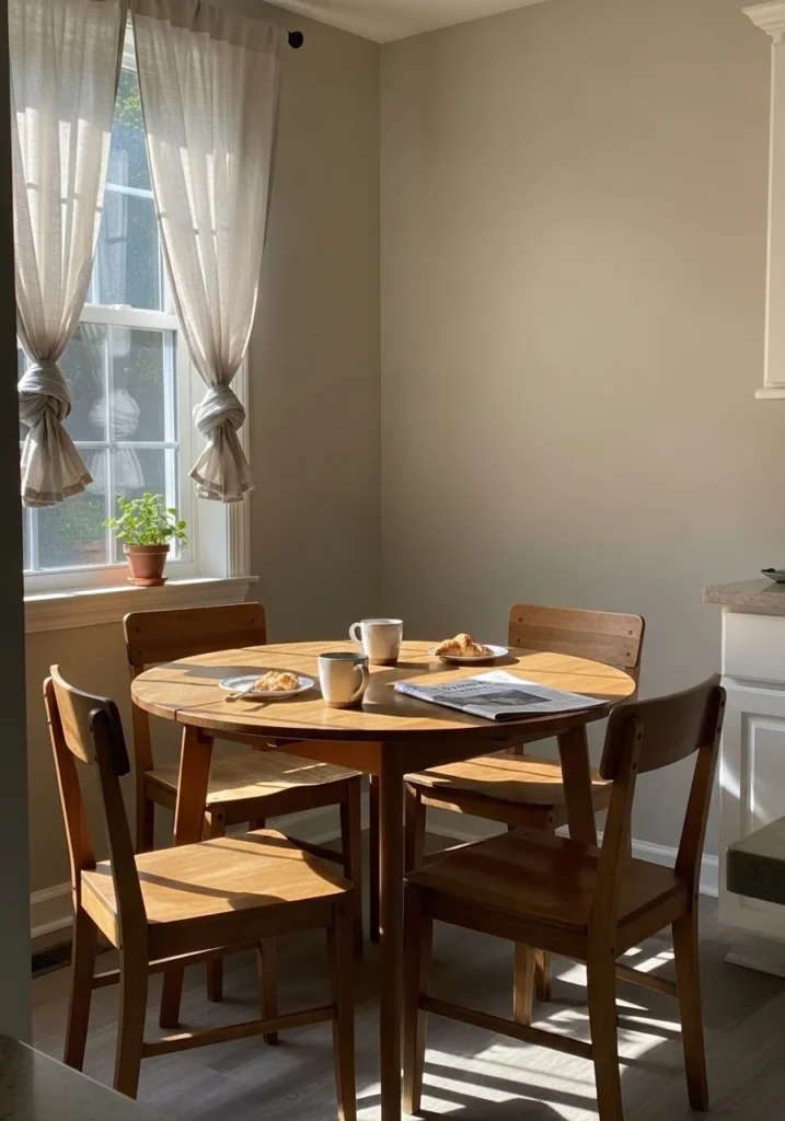
The wall color here looks very close to Benjamin Moore Natural Cream. It sits in that gentle beige family that feels warm without turning yellow. Natural Cream is often used in kitchens and breakfast areas because it keeps the space light but still gives the walls a little softness. Beside the warm wood table and simple white trim, the color reads calm and comfortable.
Natural Cream carries a warm undertone that works well with wood furniture and light fabrics like the curtains here. In bright daylight it can look almost like a pale creamy neutral. In softer light it leans a bit richer and more beige. It tends to work nicely in smaller eating areas where a warm neutral helps the room feel relaxed and lived in.
Warm Cream Kitchen Walls
The wall color here reads very close to Benjamin Moore Navajo White. It sits in that creamy beige family that feels warm but still soft on the wall. Navajo White has been used in kitchens for years because it gives the room a gentle glow without looking too yellow. Beside the wood counters and white shelving, the color feels comfortable and easygoing.
Navajo White carries a warm undertone that becomes more noticeable as the light changes. In bright daylight it can appear like a soft creamy neutral. In lower light it leans slightly richer and more beige. It tends to work nicely in kitchens with wood surfaces and simple white cabinetry where a warmer wall color keeps the room feeling relaxed.
Soft Greige Bathroom Walls
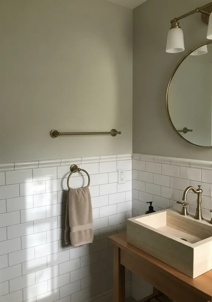
The wall color here reads very close to Benjamin Moore Classic Gray. It sits in that very light greige range that almost feels like a tinted white. Classic Gray is often used in bathrooms because it keeps the space bright but still gives the walls a little softness. Next to the white tile and brass fixtures, the color looks quiet and relaxed.
Classic Gray carries a subtle warm undertone that keeps it from looking too cool. In brighter bathrooms it can appear almost like a soft off white. In lower light it shows a bit more of its gray side. It tends to work nicely in small bathrooms where a gentle neutral keeps the room feeling light and simple.
Light Greige Entryway Walls
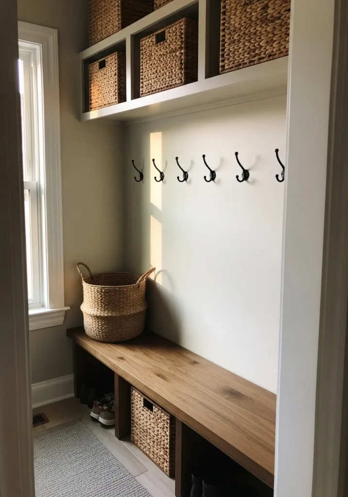
The wall color here looks closest to Benjamin Moore Edgecomb Gray. It sits right in that soft greige range that feels part gray and part beige. Edgecomb Gray has a reputation for being one of those easy neutrals that works in almost any space. Next to the white built in bench and the woven storage baskets, the color feels calm and natural.
Edgecomb Gray leans slightly warm, which helps it work nicely with wood surfaces like the bench here. In bright daylight it can appear lighter and almost creamy. In dimmer corners it reads a little more gray. It often works well in entryways and mudrooms where a quiet neutral keeps the space simple and easy to live with.
Calm Gray Bedroom Walls
The wall color here reads very close to Benjamin Moore Gray Owl. It sits in that light gray family that feels soft instead of cold. Gray Owl has been a popular bedroom color for a long time because it gives the walls a gentle gray tone without making the room feel heavy. Next to the simple wood bed and neutral bedding, the color looks quiet and easy to live with.
Gray Owl leans slightly cool, though it usually stays balanced. In brighter daylight it can look pale and almost silvery. In softer light it shows more depth and reads like a calm medium gray. It tends to work well in bedrooms where a simple gray wall keeps the room feeling uncluttered and restful.
Soft Greige Living Room Walls
The wall color here looks very close to Benjamin Moore Revere Pewter. It sits right in that classic greige range that mixes gray and beige in a very easy way. Revere Pewter has been a long time favorite for living rooms because it gives the walls a little depth without making the room feel dark. Next to the pale sofa and the natural wood coffee table, the color feels relaxed and familiar.
Revere Pewter carries a warm gray undertone that works nicely with wood furniture and soft neutral fabrics. In brighter light it can look lighter and a bit more beige. In dimmer corners it leans slightly deeper and more gray. It tends to work well in main living areas where a steady neutral wall color lets the rest of the room stay simple.
Light Warm Gray Kitchen Walls

The wall color here reads very close to Benjamin Moore Pale Oak. It falls into that light greige family that sits between gray and beige. Pale Oak is one of those quiet neutrals that works well in kitchens because it stays soft on the wall but still shows a little color. Next to the warm wood shelving and white counters, it feels calm and easy.
Pale Oak carries a gentle warm undertone that becomes more noticeable beside natural wood. In brighter light it can look almost creamy gray. In softer light it leans a bit more beige. It tends to work well in kitchens where you want a light neutral that still feels comfortable rather than stark.
Soft Beige Dining Room Walls
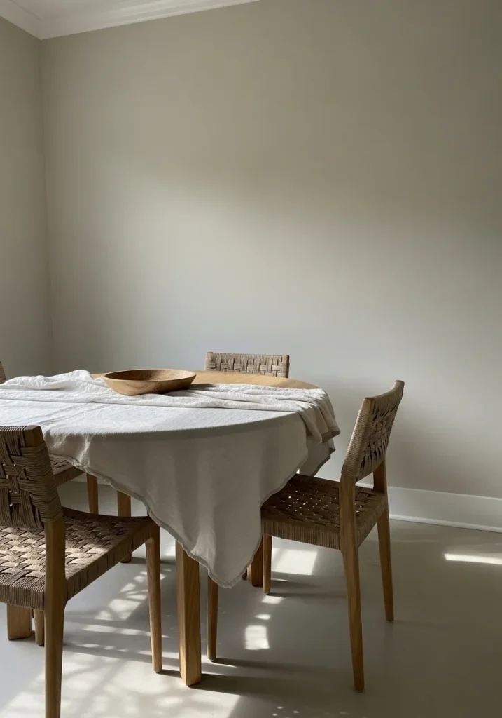
The wall color here reads very close to Benjamin Moore Muslin. It sits in that quiet beige family that feels warm but still fairly light on the wall. Muslin has a soft, slightly muted look that works nicely in dining areas where you want the room to feel calm without going fully gray. Beside the woven chairs and pale table linen, the color looks relaxed and natural.
Muslin carries a warm undertone that pairs easily with light and medium wood tones. In brighter daylight it can appear like a pale creamy beige. In softer light it deepens just a little and looks more traditional. It often works well in dining rooms where a gentle beige keeps the space feeling simple and comfortable.
Soft Cool Gray Living Room Walls
The wall color here looks very close to Benjamin Moore Wickham Gray. It falls into that light cool gray family that feels clean but still gentle on the wall. Wickham Gray is often used in living rooms where people want a simple gray that stays calm instead of dark. Next to the pale sofa and light wood tables, the color reads quiet and relaxed.
Wickham Gray leans slightly cool, which works well with soft whites and light wood tones. In brighter daylight it can look pale and airy. In lower light it shows more of its gray side and feels a little deeper. It tends to work nicely in open living spaces where a soft gray keeps the room looking uncluttered.
Warm Cream Reading Nook Walls
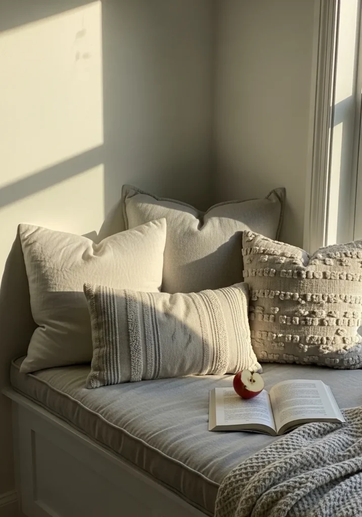
The wall color here reads very close to Benjamin Moore Swiss Coffee. It sits in that soft creamy white family that feels warm but still light. Swiss Coffee has been used for years in small spaces like reading corners because it keeps the walls bright while still looking gentle. Next to the pale cushions and woven blanket, the color feels calm and comfortable.
Swiss Coffee carries a mild warm undertone that shows more when sunlight hits the wall. In bright light it can look like a creamy off white. In softer corners it leans slightly more beige. It tends to work nicely in quiet spots like window benches where a warm light neutral keeps the space feeling relaxed.