I’ve noticed over time that paint colors often surprise us once they hit the walls in our actual homes. A neutral I thought would ground my bedroom ended up pulling too much green from the afternoon shadows.
What really sets good ones apart is how they adapt to shifting light without losing their quiet sophistication.
Benjamin Moore has several shades that hold steady through that, creating spaces that feel lifted but lived-in. Test them large in your room first.
Warm White Walls
This bedroom pulls off a warm white on the walls that looks closest to Benjamin Moore White Dove. It’s a soft, easy white with a touch of creaminess. Folks like it because it keeps things bright but cozy, especially against wood furniture like the nightstands and bed frame here.
That warmth comes through in natural light from the window. It plays well with beige bedding and rattan pieces. Best in bedrooms or living areas where you want calm without cool grays taking over. Just stick to warm woods and textiles to keep the feel right.
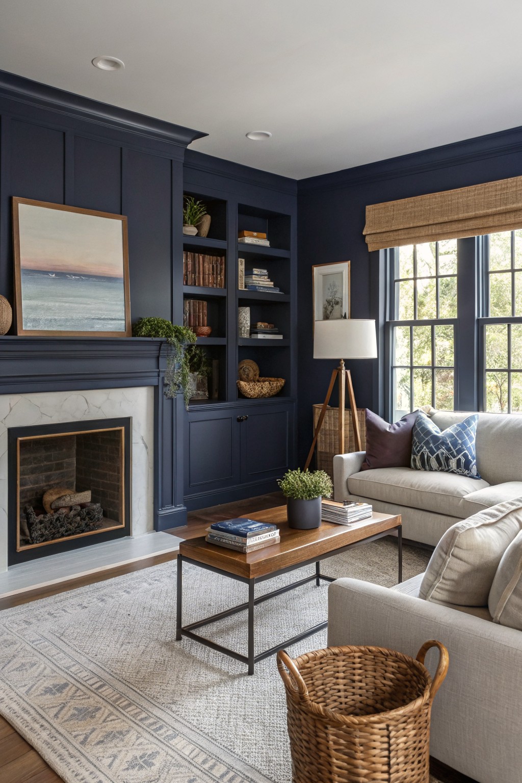
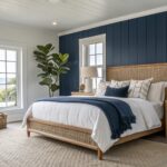
This setup pulls off a deep navy paint that looks closest to Benjamin Moore’s Hale Navy. It’s a rich blue with just enough depth to make paneled walls and built-ins feel substantial, without going full black.
That navy holds up well next to marble fireplace surrounds and wood floors. It picks up warmth from nearby creams and plants. Best in rooms with decent window light, like a home office or reading nook. Steer clear if your space stays dim all day.
Crisp White Kitchen Cabinets
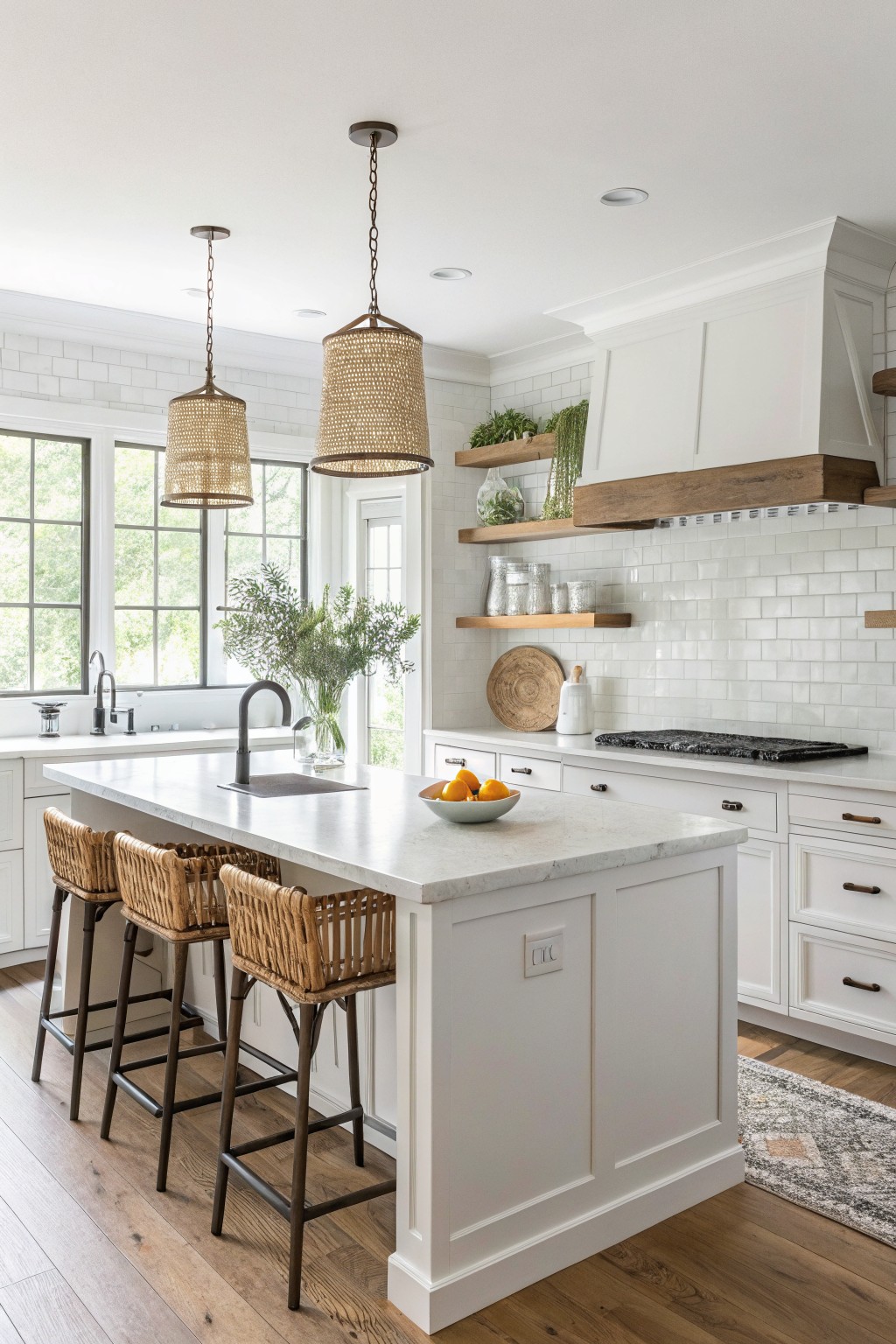
This kitchen uses a crisp white paint on the cabinets, walls, and trim that reads very close to Benjamin Moore Chantilly Lace (OC-65). It’s that clean, bright white people turn to for a fresh look without any yellowing. Makes the whole space feel bigger and ties in nicely with the subway tile backsplash.
The color has neutral undertones so it won’t fight the warm oak floors or rattan stools. It works best in rooms with good natural light, like this one with big windows. Pair it with wood accents or black fixtures, but watch for cooler north light where it might feel a touch stark.
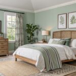
Pale Blue-Green Walls
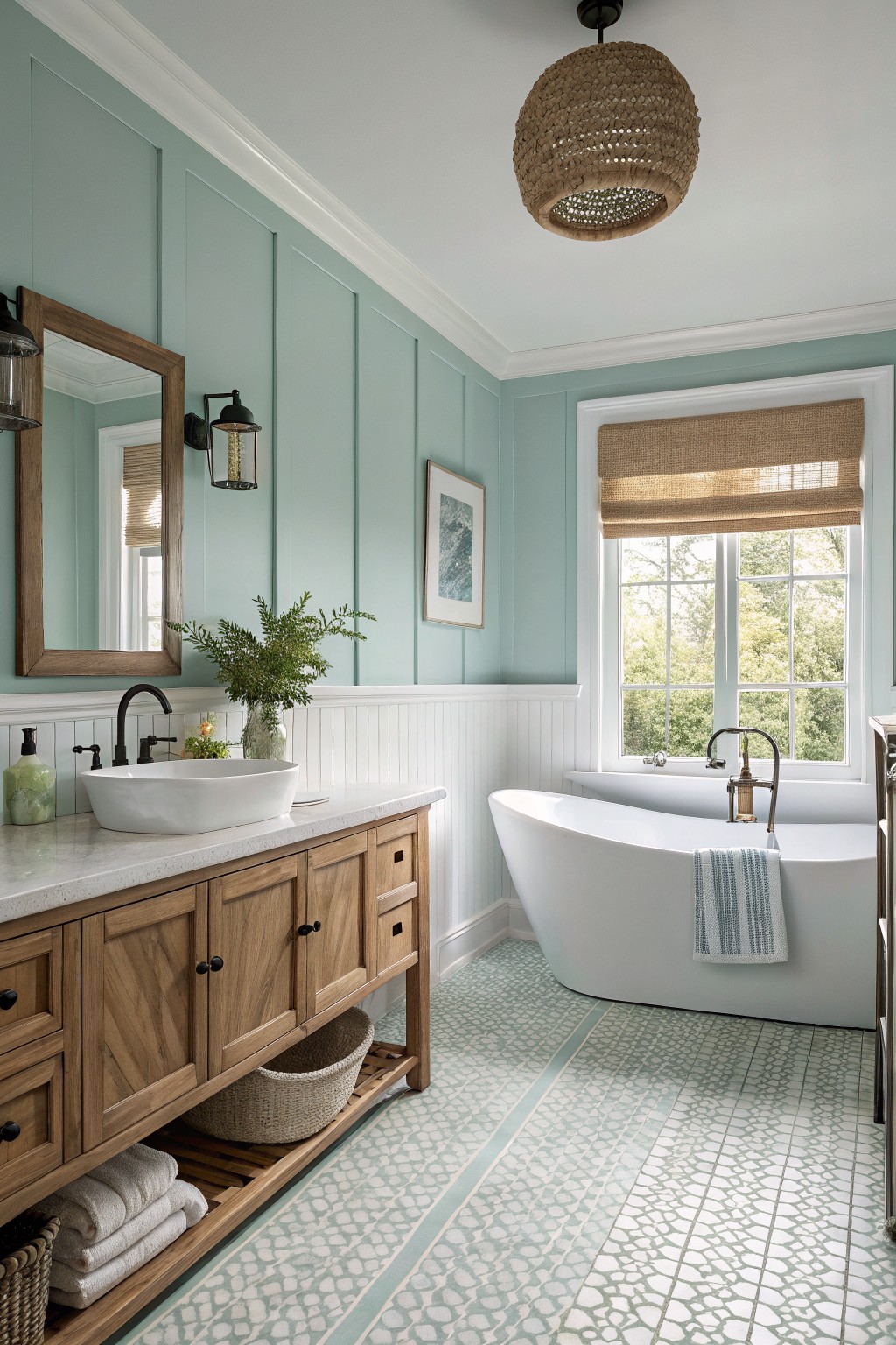
This bathroom pulls off a soft blue-green on the walls that looks closest to Benjamin Moore’s Palladian Blue. It’s the kind of light, airy shade with a subtle green undertone that keeps things calm and fresh. People go for colors like this because they open up the room without feeling stark, especially alongside wood cabinets.
That cool gray edge in the paint shows up nicely in daylight from the windows. It plays well with white trim and oak vanities, but watch it in dimmer spots, where it might lean greener. A simple woven basket under the sink keeps the look grounded.
Deep Charcoal Gray Walls
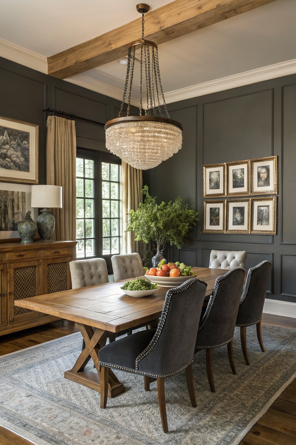
Those walls catch your eye right away with their deep charcoal gray shade. It looks closest to Benjamin Moore Kendall Charcoal HC-166. Not quite black, but moody enough to give a dining room real presence. Folks like it because it makes wood furniture pop without overpowering the space.
The color has a soft warm undertone that works well next to oak cabinets and beige chairs. It holds up in rooms with big windows letting in light. Pair it with gold frames or plants for balance. Just test samples first, since it can read cooler in low light.
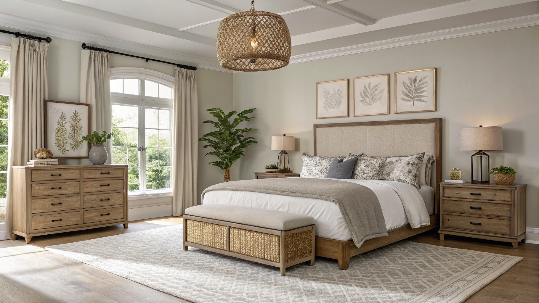
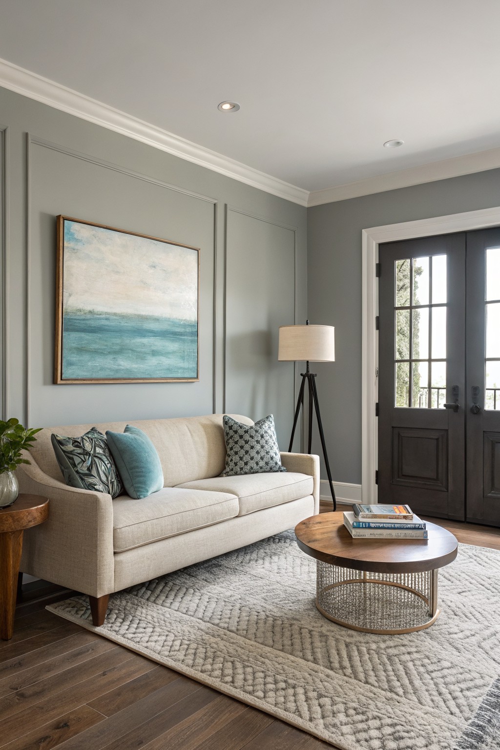
Soft Greige Walls

This foyer wall color seems closest to Benjamin Moore Revere Pewter HC-172. It’s a light greige with just enough warmth to feel cozy without turning beige. What stands out is how it lets wood floors and white trim pop, keeping the whole entry airy and welcoming.
That subtle warm undertone shines in natural light. It works best in open spaces like hallways or dining rooms. Go for it with brass lamps or greenery nearby, but test samples first in your own light.
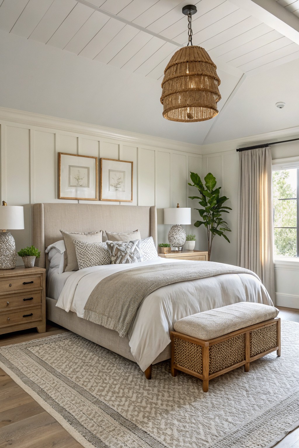
Crisp White Shiplap Walls
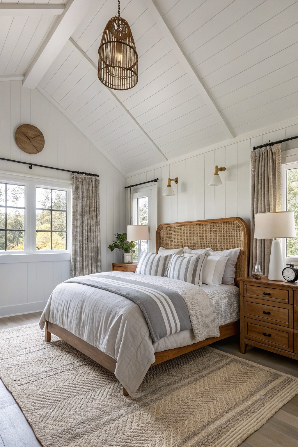
This bedroom setup shows off a crisp white that reads very close to Benjamin Moore White Dove OC-17. It’s the kind of clean white that feels fresh without going stark. What stands out is how it lets all the wood tones pop, from the rattan headboard to the nightstand.
White Dove has a soft warm undertone that plays nice in rooms with natural wood and light floors. It works best where you want sunlight to bounce around. Pair it with beige textiles or woven pieces, and skip anything too yellow if your light leans golden.
Soft Blue-Green Walls
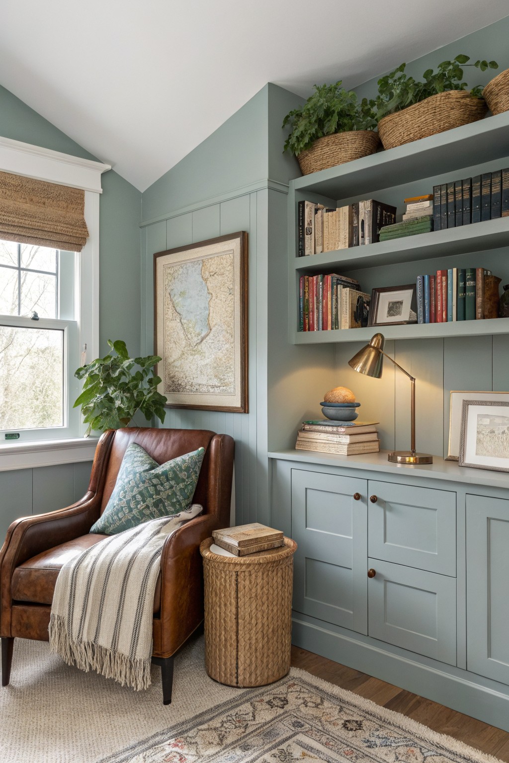
These walls read very close to Benjamin Moore Palladian Blue. It’s a light, easy blue-green that’s not too bold, just right for wrapping a room in quiet comfort. You see it here on the paneling and cabinets, making the space feel pulled together without trying too hard.
The cool gray undertone keeps it from going too beachy. It shines in north-facing rooms or spots with steady light, and it sits well next to leather chairs or wood shelves like these. Pair it with creamy whites on trim to let the wood tones pop.
Soft Sage Green Cabinets
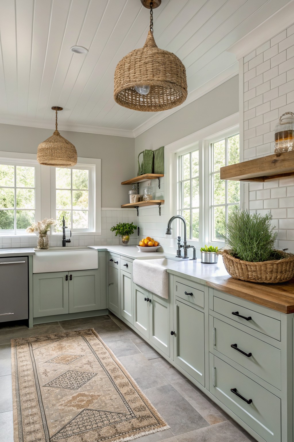
This pale sage on the kitchen cabinets comes across closest to Benjamin Moore Saybrook Sage HC-114. It’s a muted green with enough gray to feel calm and easygoing, not overpowering at all. Folks like it because it freshens up a space without clashing against white trim or wood details.
The subtle gray undertone keeps it from turning too yellow in warm light. It works best in kitchens with lots of windows, paired alongside oak shelves or brass faucets. Just test it in your room first… north light can make it read cooler.
Pale Blue Walls
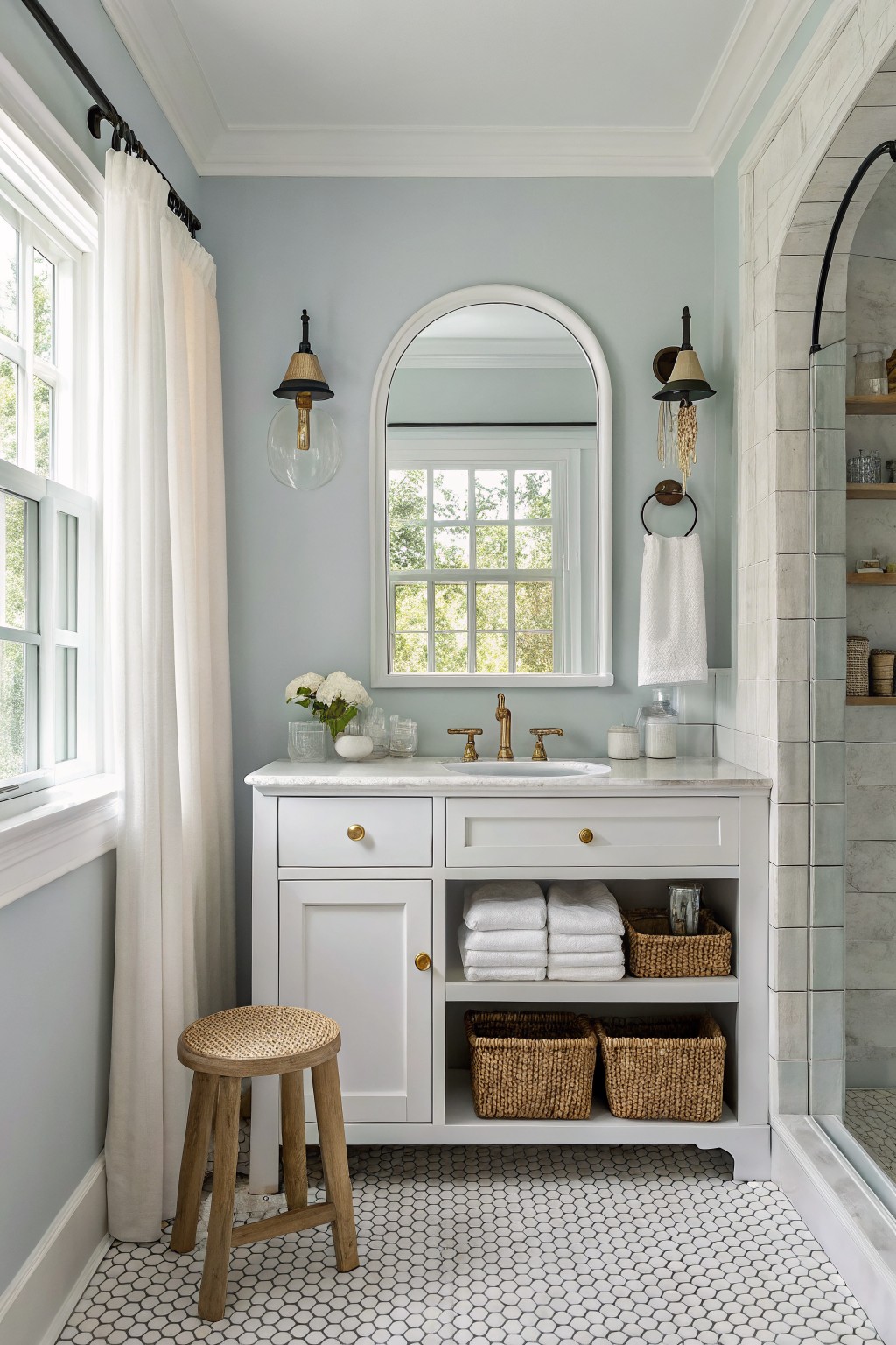
This pale blue on the walls reads very close to Benjamin Moore’s Palladian Blue. It’s a gentle cool shade, not too green or gray, that makes small spaces feel bigger and calmer. You see it here keeping the bathroom light next to that white vanity.
Cool undertones like this shine in rooms with good window light… keeps wood tones and brass hardware looking warm without clashing. Try it in baths or bedrooms, paired with white trim. Just test samples, since it can shift a bit cooler in low light.
Soft Greige Walls
This soft greige on the walls reads very close to Benjamin Moore’s Edgecomb Gray. It’s a light neutral that pulls a bit of warmth from the wood floors below. Folks like it because it keeps rooms feeling open without going too stark white.
The undertone leans warm, so it plays nice next to natural wood and those cream sofas. Try it in a living area with good natural light. Pair with muted blues from artwork, but watch it can look cooler under fluorescents.
Muted Green Walls
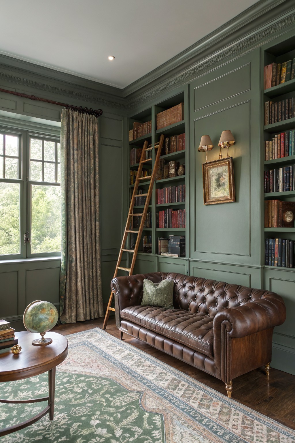
This sage green on the walls comes across closest to Benjamin Moore Essex Green HC-188. It’s got that soft, grayed-down tone that feels grounded without being too dark or bold. Folks like it for libraries and studies because it lets wood trim and leather pieces stand out just right, like you see with the sofa and ladder here.
The gray undertone keeps it from going too yellow in warm light. It works best in rooms with some natural window light, paired alongside brass lamps or oriental rugs. North light might make it read a touch cooler, so test a sample there first.
Warm Gray Kitchen Cabinets

The cabinets in this kitchen look closest to Benjamin Moore Revere Pewter. It’s a cozy warm gray, not too light or dark. What I like about it is how it feels grounded yet fresh, especially next to all that wood.
That beige undertone keeps it from looking cold. It works best in sunny spaces like this one, where windows bring in light. Pair it with crisp white walls or soapstone counters, and the wood pops even more.
Bold Red Front Door
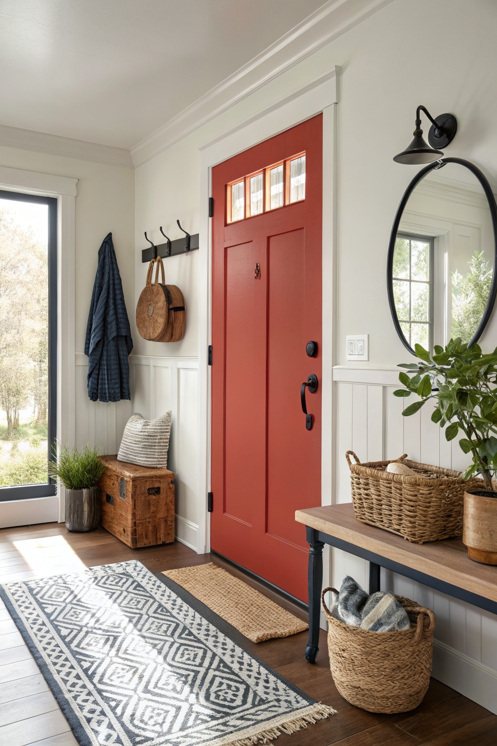
This entry pulls off a classic bold red door that reads very close to Benjamin Moore Caliente. It’s a warm true red. Not too orange. Not too burgundy. Just right for making a statement without overwhelming the space. Folks like it because it wakes up neutral walls and wood tones. Adds some life right at the threshold.
That warm undertone plays well in natural light. Keeps the red from going too harsh. Pair it with crisp white trim and soft woods like you see here. It works best in entryways or back doors. Watch for north-facing spots though. Might need a test swatch to see how it sits. Simple idea. Big impact.
Soft Greige Bedroom Walls
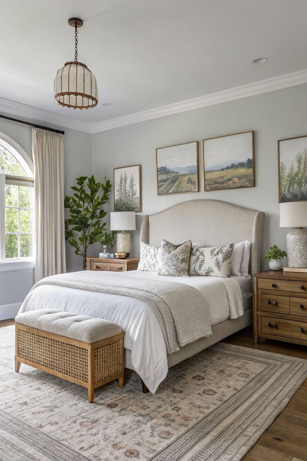
This bedroom pulls off a soft greige on the walls that looks closest to Benjamin Moore Edgecomb Gray (HC-173). It’s a light neutral with just enough warmth to feel cozy without going yellow. Folks like it because it plays nice with wood furniture and keeps things looking fresh.
That beige undertone shows up more in natural light from the window. It works best in sunny rooms where you want calm vibes. Pair it with off-whites on bedding and rattan accents… avoids feeling stark. Watch for north-facing spots though. It might read cooler there.
Soft Gray Wainscoting
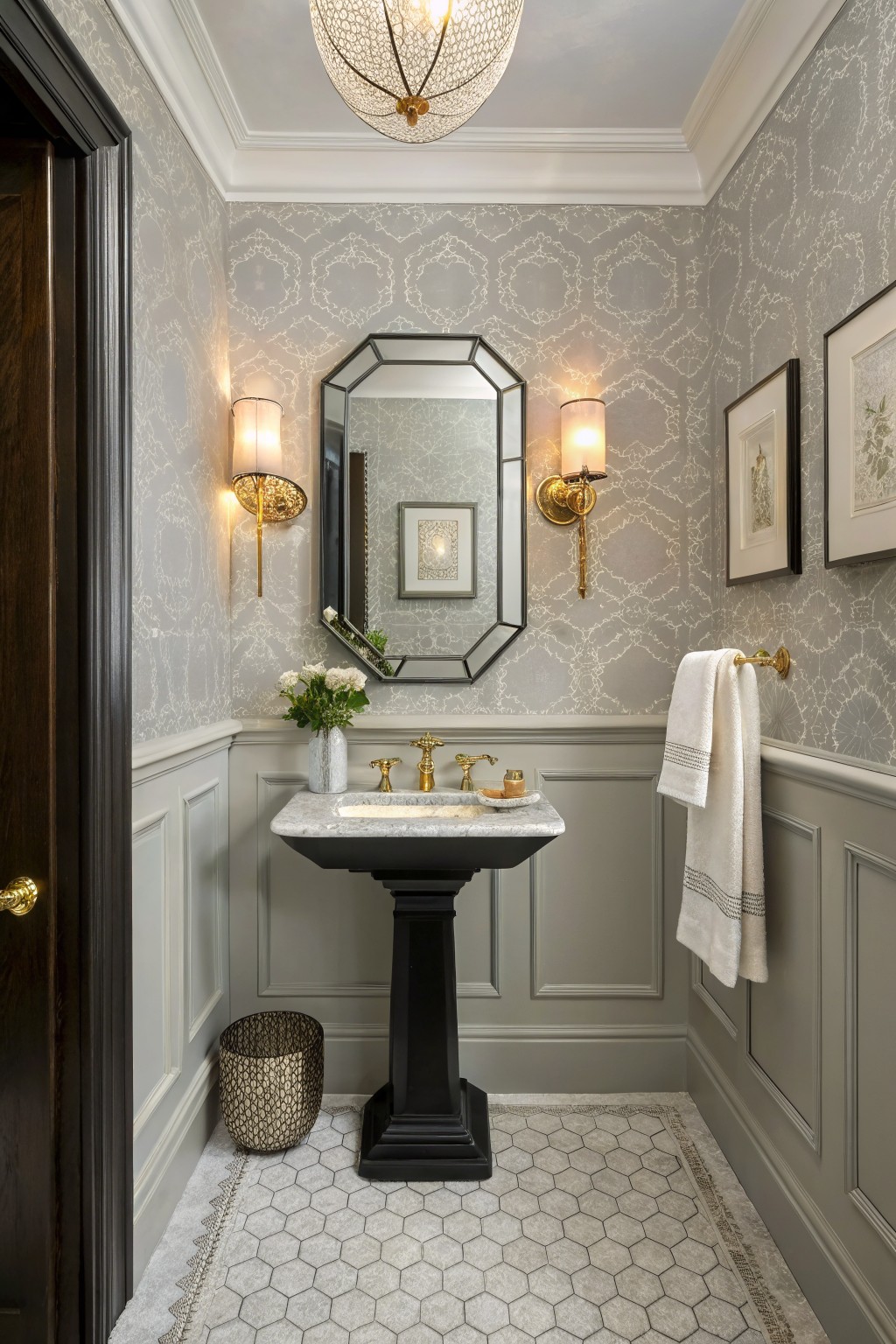
This powder room uses a soft gray on the lower walls and panels that seems closest to Benjamin Moore Balboa Mist 1563. It’s a light neutral gray, not too cool or stark. What I like is how it stays in the background. Makes the room feel put-together without competing with the wallpaper or hardware.
That gray has a subtle warm undertone. It reads best under natural light or warm bulbs. Good for small bathrooms or hallways. Pairs easy with black sinks and gold taps. Watch it in north-facing rooms though. Might pick up a cooler edge there.
Soft Sage Cabinetry
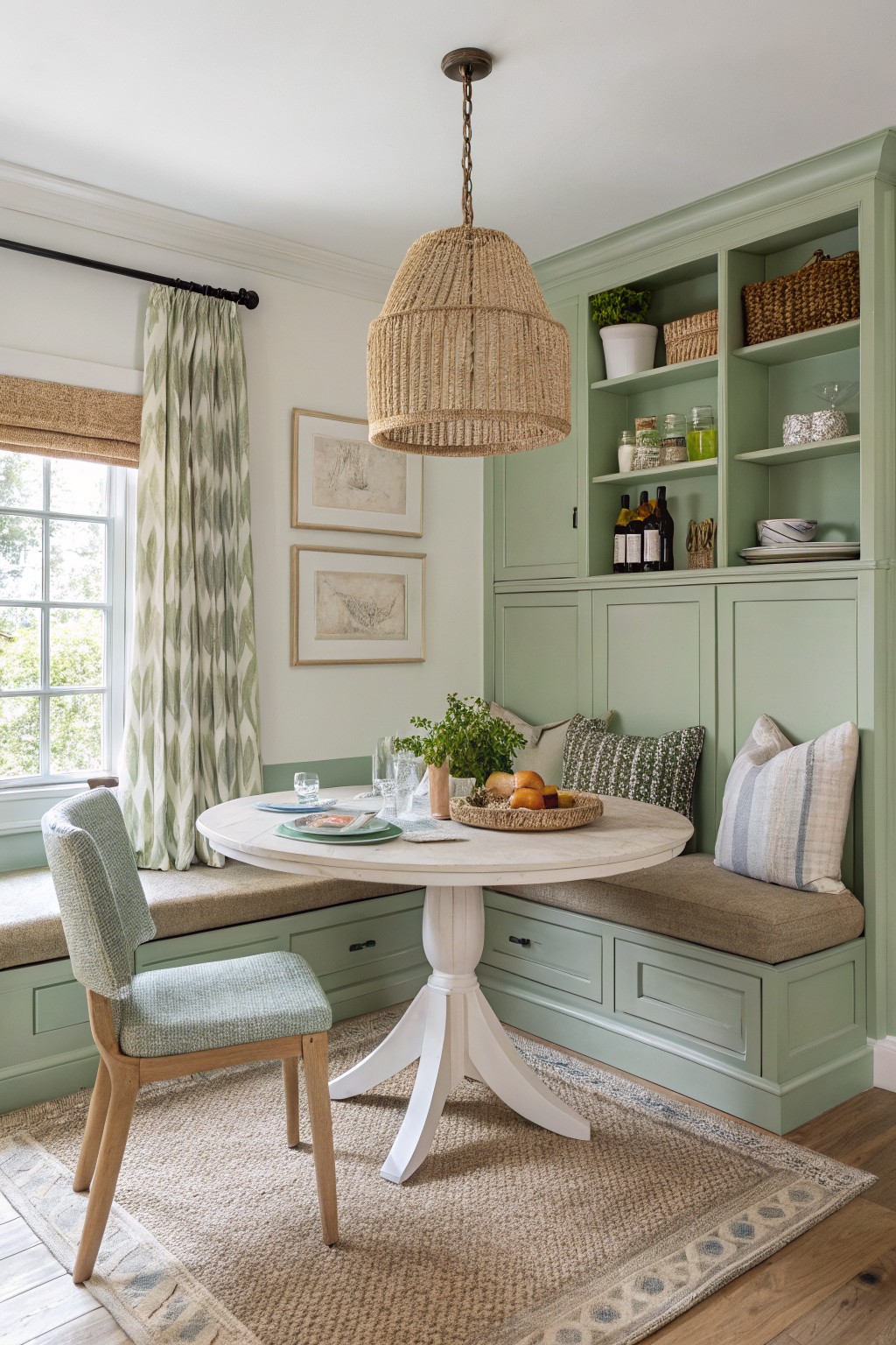
This pale green on the cabinets and walls reads very close to Benjamin Moore Saybrook Sage HC-116. It’s a muted sage in the green family, gentle enough for everyday spaces but with just enough color to feel alive. Folks like it because it keeps things calm around the eating area without overpowering the wood floors or white table.
The gray undertone helps it stay versatile in mixed light. It sits nicely next to natural wood and beige fabrics here, and I’d pair it with creamy whites or soft blues on trim. North light might cool it a bit… test a sample first.
Soft White Walls
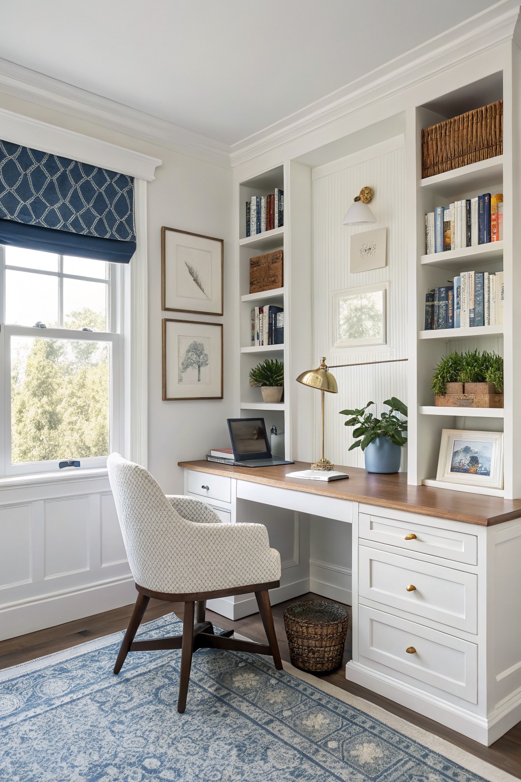
This setup uses a soft white on the walls and built-ins that reads closest to Benjamin Moore White Dove (OC-17). It’s got just enough warmth to feel cozy without going yellow. Folks like it because it opens up the space and lets wood tones pop, like that desk right there.
The subtle creamy undertone works best in rooms with good light. It plays nice with navy fabrics or green plants too. Skip it if your space is super dim, though. Might wash out.
Frequently Asked Questions
Q: How do I test these colors in my home before painting the whole room?
A: Snag sample sizes from Benjamin Moore and paint big swatches right on your walls. Prop up a few pieces of foam board with paint too, so you can shift them around. Watch how they play with your lights all day.
Q: Which of these hide everyday smudges in a busy living room?
A: Go for the warmer off-whites and soft taupes. They mask fingerprints way better than stark grays. Slap a sample on your most trafficked wall and rub it a bit to check.
Q: Do north-facing rooms change how these colors look?
A: Light from the north cools everything down a touch. Pick a shade with warm undertones to keep the space feeling inviting. Sample it there first.
Q: How do I pick trim that works with these wall colors?
A: Match the trim’s white to the color’s undertone, like a creamy white for beige walls. Paint a door edge to preview.