I’ve noticed grays shift in ways that can make or break a room’s feel, pulling warmth from sunset light or staying cool and composed all morning.
A few times, I’ve picked ones with hidden blue undertones that turned harsh in my north-facing kitchen, losing that refined edge I wanted.
The stronger choices balance depth without flattening out, holding elegance through changing conditions.
Real room light exposes what swatches miss, like subtle sheens that elevate the space.
Test them there.
Pale Greige Walls

The walls in this living room pull off a pale greige that’s soft and polished. It sits just right between gray and beige. I’d say it comes closest to Benjamin Moore Edgecomb Gray or Farrow & Ball Skimming Stone. Sherwin-Williams Agreeable Gray has that same easy feel too. What makes it nice is how it lets the wood floors and marble fireplace stand out without stealing the show.
Those warm undertones keep things from going too cool, especially with afternoon light coming in. It works best in spaces with some trim or stone details. Try it with cream sofas and a touch of blue, like that armchair. Just watch it doesn’t wash out in north-facing rooms.
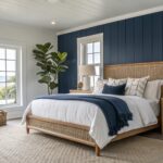
Soft Blue-Gray Walls

This soft blue-gray on the walls looks closest to Benjamin Moore’s Gray Owl or Sherwin Williams’ Sea Salt. Maybe Farrow & Ball Pavilion Gray too. It’s the kind of polished gray that feels refined without being stark. People like it because it keeps a bedroom looking pulled together and restful.
That subtle blue undertone shows up more in good light. It works great next to warm wood furniture and cream fabrics, like the nightstands and bedding here. Just watch it in north-facing rooms. It can read cooler there.
Deep Gray Cabinets

This kitchen uses a deep polished gray on the cabinets. It looks closest to Sherwin Williams Iron Ore or Benjamin Moore Kendall Charcoal. That kind of gray brings some weight to the lower cabinets. It keeps things feeling grounded and a bit formal.
The undertone leans neutral cool. It sits right next to white tile and wood shelves without clashing. Try it in kitchens with good window light. Pair with brass hardware and light counters to keep it from closing in.
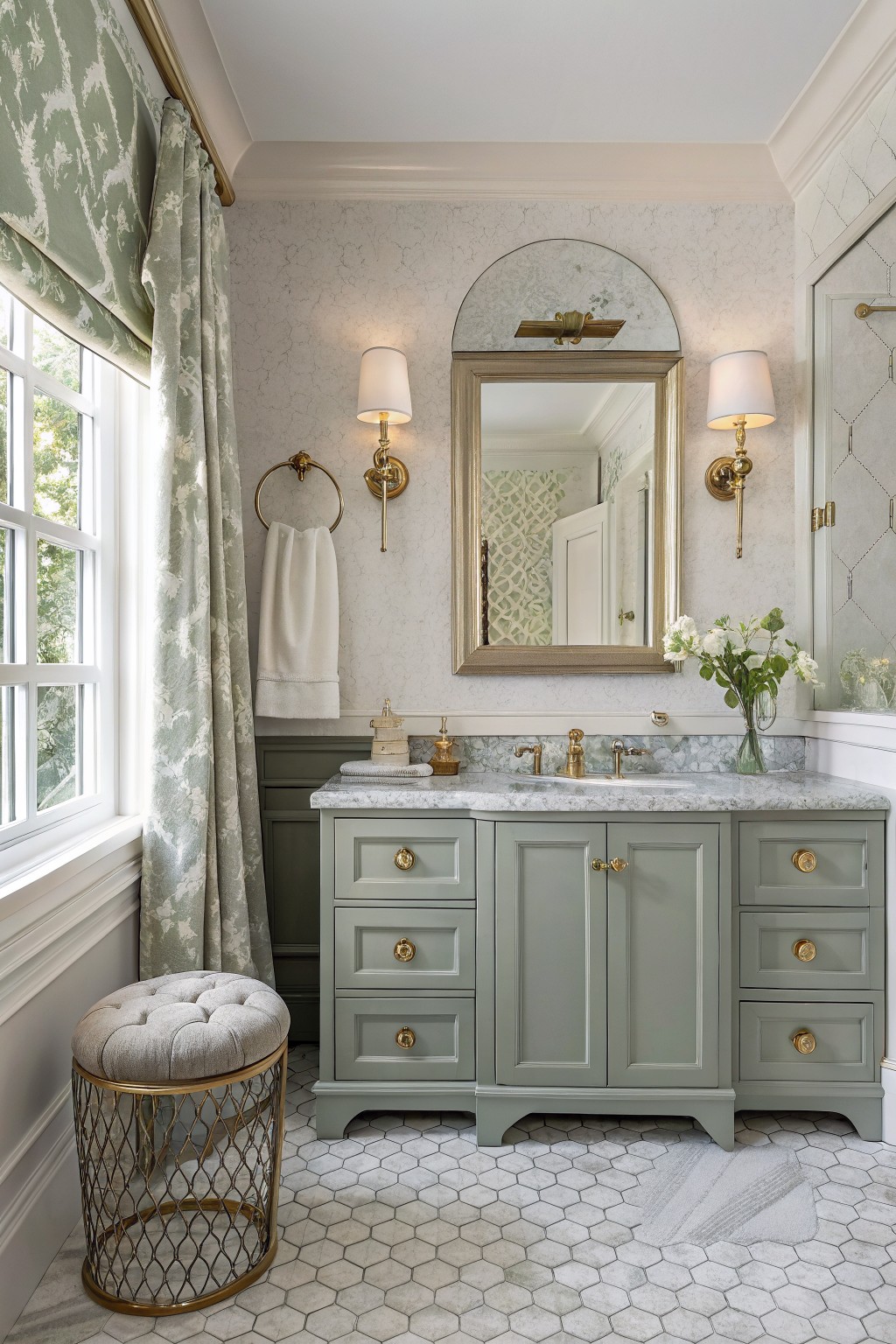
Warm Greige Bathroom Cabinets

This bathroom vanity shows off a warm greige paint that’s right in line with polished grays. It reads closest to Sherwin-Williams Agreeable Gray or Benjamin Moore Revere Pewter, maybe even Behr’s Polished Pebble. What stands out is how soft and balanced it feels, pulling in just enough warmth to keep things from looking cold next to all that white tile.
Those subtle taupe undertones make it forgiving in natural light, like what’s coming through the window here. Pair it with white subway tile and wood stools for that easy refined look. Watch for north-facing rooms though. It might pull cooler there.
Cool Blue-Gray Walls

This dining room pulls off a polished cool gray on the walls with just a touch of blue underneath. It seems closest to Benjamin Moore’s Stonington Gray or Sherwin-Williams’ Drift of Mist, and Farrow & Ball Pavilion Gray has that same quiet feel. What stands out is how steady it looks next to the white trim and wood floors, giving the space a put-together look without trying too hard.
The blue undertone shows up more in brighter light, like from those big windows. It suits formal rooms best, where you want something refined that lets wood furniture and creamy chairs shine. Just keep an eye on north-facing spots, it might read cooler there.
Soft Warm Gray Walls

This soft warm gray on the walls seems closest to Sherwin-Williams Repose Gray or Benjamin Moore Gray Owl. Maybe even Behr’s Wheat Bread for a budget match. It’s the kind of light polished gray that brightens a narrow space without washing out. People go for it in hallways because it makes trim pop and wood floors look richer.
Warm undertones give it a cozy edge over cooler grays. Natural light from windows helps it read even better. Stick to white wainscoting below and keep accessories simple, like a few baskets or a plant. Watch it doesn’t go too yellow in south-facing rooms.
Deep Gray Walls
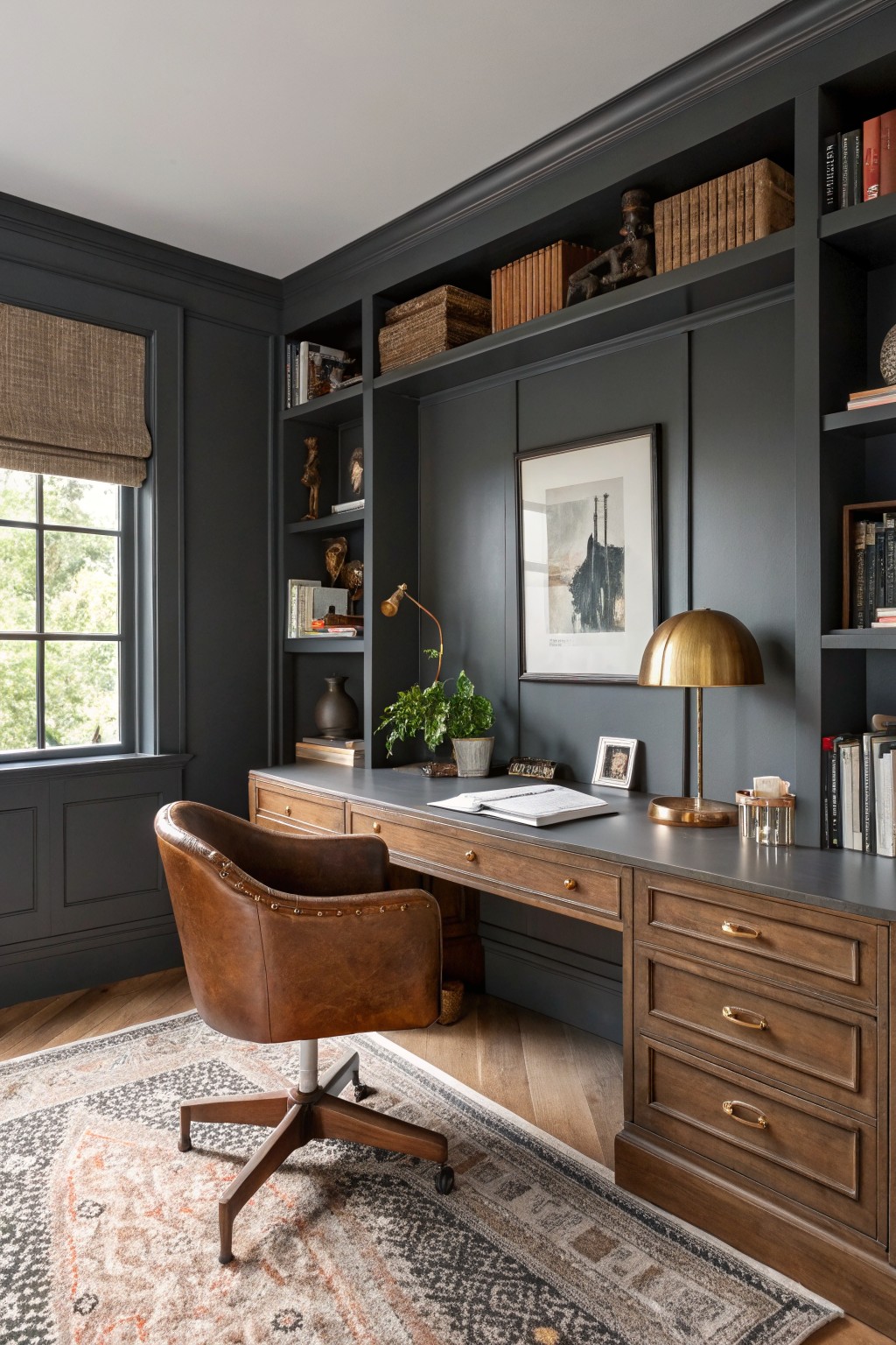
This deep gray paint reads very close to Sherwin-Williams Iron Ore or Farrow & Ball Down Pipe. It’s a polished, substantial gray that brings real elegance to a room without going full black. You notice how it frames the wood desk and shelves here, letting those warmer tones stand out.
The color picks up a bit of warmth from nearby oak and brass lamps, so it stays inviting even in a darker study like this. It works best where natural light comes in soft, and I’d pair it with leather furniture or woven rugs to avoid anything too stark. Watch the trim though, keep it matching or just a shade lighter.
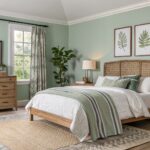
Soft Sage Gray Cabinets
This soft sage gray on the cabinets reads very close to Sherwin-Williams Evergreen Fog, or maybe Benjamin Moore’s October Mist. It’s a polished gray-green that’s subtle and refined, not too bold. Folks like it because it brings a bit of nature inside without overwhelming the room.
The green undertone shows up nicely next to marble counters and gold hardware. It works best in bathrooms with good natural light. Pair it with white towels or creamy tiles, and skip anything too bright orange. Just right for that elegant feel.
Blue-Gray Kitchen Cabinets

This kitchen island shows off a deep blue-gray paint that’s right in line with polished grays but leans cool. It looks closest to Sherwin-Williams Naval or Benjamin Moore Hale Navy, maybe Farrow & Ball Hague Blue too. Folks like it because it adds some weight down low while the white cabinets keep things airy.
The cool blue undertone reads softer next to marble and wood floors. It shines in sunny kitchens paired with brass hardware or rattan seats. Just watch it in dimmer spots, might feel heavier there.
Crisp Light Gray Walls

These walls catch the eye with a crisp light gray that’s polished but not cold. It reads very close to Sherwin-Williams Alabaster or Benjamin Moore White Dove, maybe even Behr’s Wheat Bread lightened a touch. Folks like it because it keeps things bright and clean, especially in a bedroom setup like this.
The subtle cool undertone plays nice with the wood bedposts and natural light pouring in. It suits sunny rooms best, where it won’t look dingy. Go for beige throws and rattan pieces to warm it up a bit.
Soft Gray Walls

This pale gray on the walls seems closest to Sherwin-Williams Repose Gray or Benjamin Moore Gray Owl, maybe Farrow & Ball Pavilion Gray too. It’s a light polished gray, not too cool or warm, just right for a refined look. What makes it nice is how it keeps things calm while showing off trim and furniture.
The undertone leans a touch green in daylight, especially by that emerald sofa. It works best in rooms with natural light and wood floors. Watch it with super dark pieces, though. They can pull too much.
Soft Gray Walls
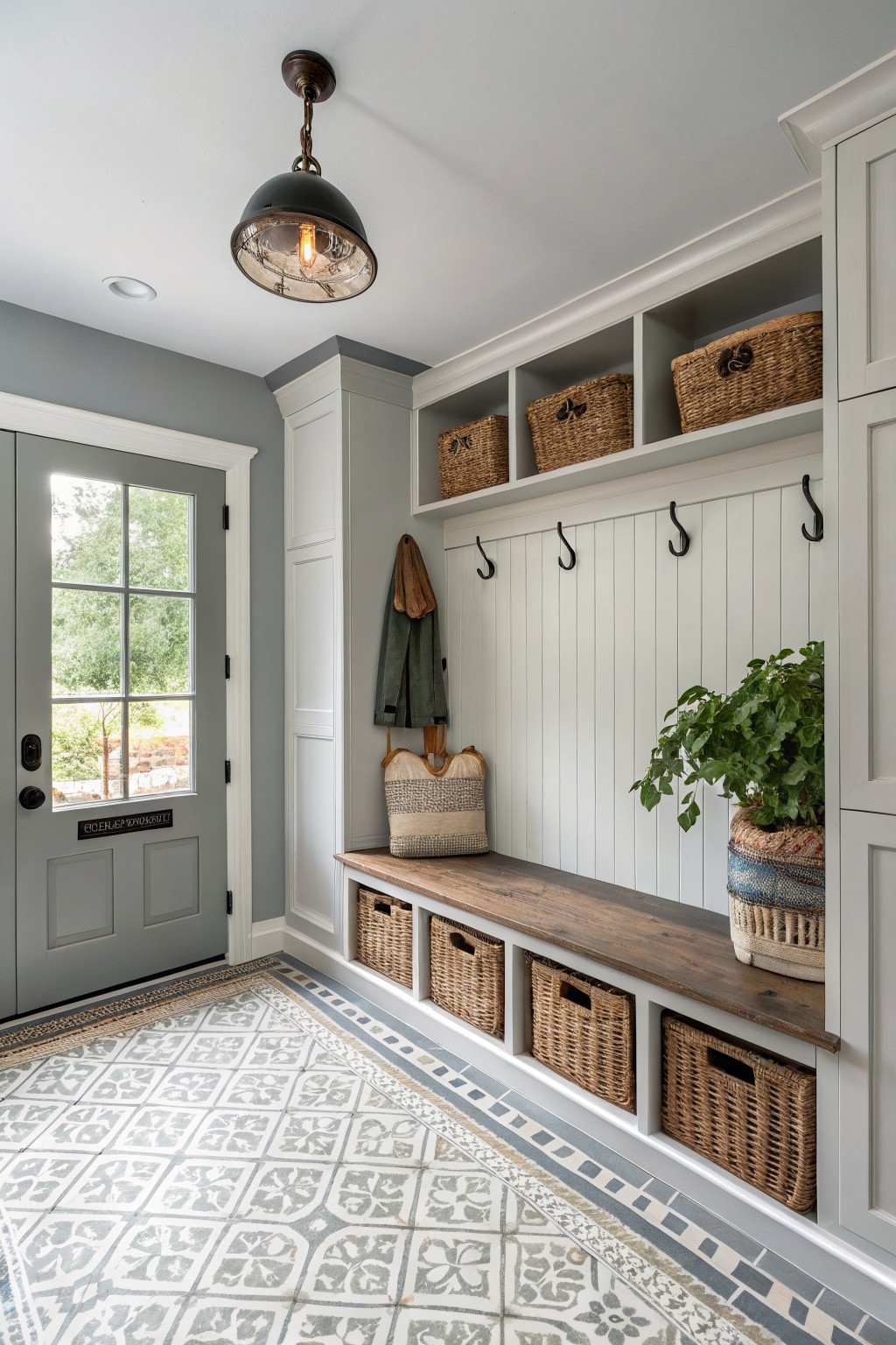
This soft gray on the walls comes across closest to Sherwin-Williams Repose Gray or Benjamin Moore Gray Owl. Maybe Behr’s Silver Drop too. It’s a light cool gray that stays crisp and airy. Folks like it because it opens up tight spots like mudrooms without washing out.
The cool undertone plays nice next to white shiplap and wood benches. It handles morning light well, keeping things calm. Pair it with those woven baskets or a green door for some life… just watch it doesn’t feel chilly in north-facing rooms.
Deep Gray Trim
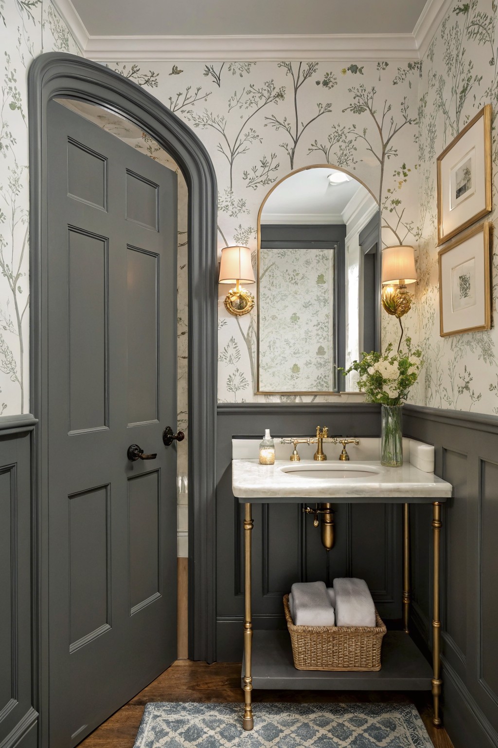
That deep gray on the doors and wainscoting here looks closest to Sherwin Williams Iron Ore or Benjamin Moore Kendall Charcoal, maybe even Farrow & Ball Railings. It’s a cool, polished charcoal with just enough depth to feel sophisticated. Folks like it because it adds structure without stealing the show from lighter walls or wallpaper.
The undertone leans blue-gray, so it pairs nicely with creamy backgrounds and brass like the fixtures and legs on this vanity. Best in well-lit spots. In dimmer rooms, it can read almost black… so test it out first.
Soft Light Gray Walls

This soft light gray on the walls seems closest to Sherwin-Williams Repose Gray or Benjamin Moore Gray Owl. It’s that polished neutral kind, not too cool or warm, just right for keeping a small nook feeling bigger. Folks like it because it highlights wood tones and fabrics without stealing the show.
The undertone stays pretty even in natural light from the window, making it great for breakfast spots or reading corners. Pair it with gray velvet seating like here, and add plants or a woven rug. In dimmer rooms it might read whiter, so test a sample first.
Pale Blue-Gray Walls
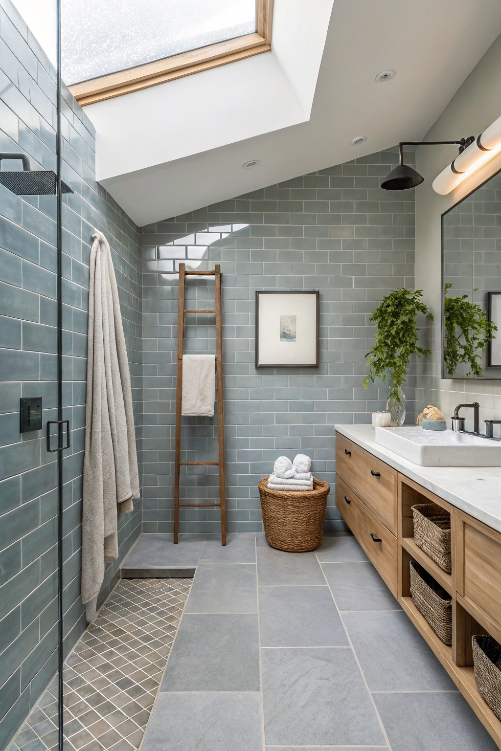
This setup uses a pale blue-gray on the shower walls and accents that seems closest to Sherwin-Williams Rainwashed or Benjamin Moore Breath of Fresh Air. Or even Behr’s Silver Drop. It’s a cool gray in the polished vein. soft and clean. without much fuss. People go for it in bathrooms because it keeps things fresh next to wood like that ladder and vanity.
That blue undertone shows up nicely under skylight. or any bright window. It suits wet spaces best. Pair with oak tones or white sinks. Just watch it might read cooler at night. so test a sample.
Soft Gray Walls

This soft gray on the walls looks closest to Benjamin Moore’s Gray Owl or Sherwin-Williams Repose Gray. Maybe Farrow & Ball’s Pavillon Gray too. It’s a light, easy gray with just enough coolness to feel fresh. What stands out is how it keeps everything looking clean next to the dark wood floors and stairs.
That blue-gray undertone shows up more in natural light. It works best in entryways like this, paired with brass lights or plants. Watch it doesn’t go flat in low light, though. A bit of white trim helps.
Charcoal Gray Bedroom Cabinets

Those dark cabinets built into the wall read closest to Sherwin-Williams Peppercorn or Benjamin Moore Kendall Charcoal. It’s a deep, polished gray with just enough warmth to feel grounded instead of stark. Folks like it because it makes a simple bedroom look put-together without trying too hard, especially next to natural wood pieces.
The undertone leans a bit taupe in this light, which keeps it from going cold against oak floors or trim. It works great in bedrooms or closets where you want storage that fades into the background but still adds some weight. Pair it with pale walls and textured linens… keeps everything calm and easy.
Sage Gray Kitchen Cabinets

This kitchen pulls off a soft sage gray on the cabinets. It reads closest to Sherwin Williams Evergreen Fog, or maybe Benjamin Moore October Mist and Behr Back to Nature. That muted green-gray mix keeps things calm and fresh without going too dark. Folks go for it in kitchens because it lets wood tones and white surfaces stand out nice.
The warm green undertone plays well next to oak cabinets and leather chairs here. It works best in sunny spots. Pair it with matte black pulls or simple white tile, but watch it doesn’t look flat under yellow lights.
Soft Warm Gray Walls
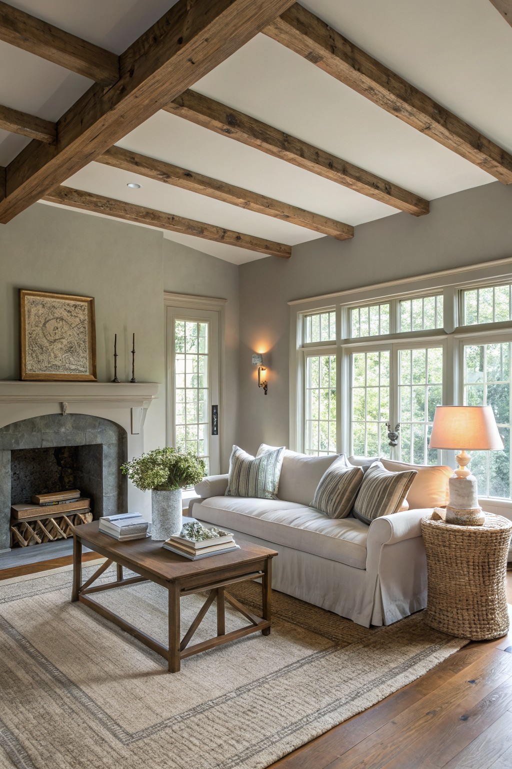
The walls in this living room show a soft warm gray that reads very close to Sherwin-Williams Repose Gray or Benjamin Moore Gray Owl. Or maybe Behr’s Wheat Bread if you want something with a touch more beige. It’s a light polished gray, easygoing and refined, the kind that lets wood beams and stone fireplaces stand out without competing.
That warm undertone keeps it from feeling cold, especially next to natural wood floors. It shines in sunny spaces like this one. Pair it with white trim and neutral fabrics. Just watch it doesn’t pull too green in low light.
Warm Gray Cabinets

The cabinets in this laundry room show off a warm polished gray that seems closest to Sherwin-Williams Repose Gray or Benjamin Moore Revere Pewter. Maybe Behr’s Wheat Bread too. It’s got that refined feel without being too cold, and the brass pulls make it pop just right.
Those subtle warm undertones keep it from looking flat next to the white shiplap walls and subway tile. It works best in rooms with good window light, like this one. Pair it with creamy whites or light wood, but skip harsh fluorescents… they’ll cool it down.
Frequently Asked Questions
Q: How do I test these gray shades before committing to a full can?
Paint big swatches right on your walls with sample sizes.
Move around pieces of painted poster board through the day to catch shifting light.
Q: Will a light gray open up my small bedroom?
Light grays reflect whatever light you give them and make tight spots breathe easy.
Skip heavy patterns on bedding to let the walls lead.
Q: Do these grays pair well with wood floors or furniture?
They hug warm woods like oak or walnut perfectly.
The subtle undertones in these picks pull out the grain without clashing.
Q: Can I use the same gray throughout my open-plan home?
Pick one versatile mid-tone gray as your anchor.
Accent with softer versions in bedrooms for flow that feels put-together.