
I often find myself standing in a half-painted room wondering why the color looked so different on the sample board once it covered an entire wall.
The shades that hold up over time usually carry a quiet depth that lets them shift with the light instead of clashing against trim or floors.
I test everything now.
A few colors I once thought were safe ended up feeling flat once the furniture returned and the afternoon sun hit them from another angle.
That experience makes me reach for the classics that still feel at home next to whatever else is already in the space.
Soft Greige Walls
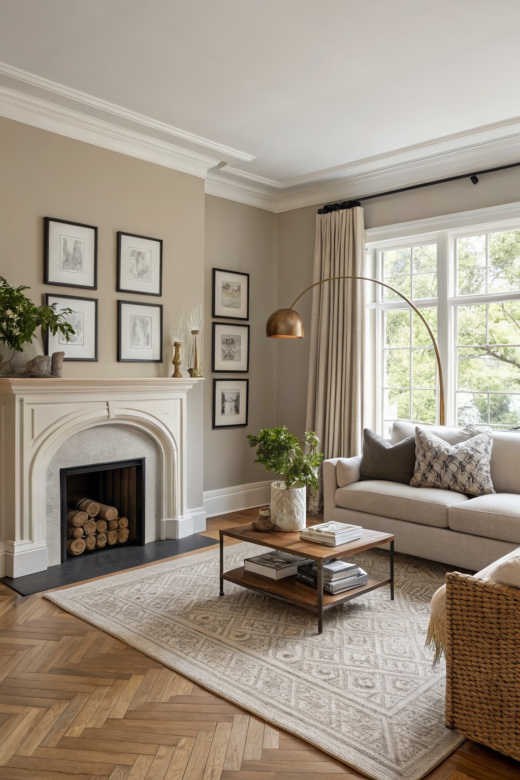
This soft greige sits right in the middle between beige and gray. It feels warm without turning yellow and keeps the room calm even with all the wood tones and white trim around. Many people reach for it because it works in older homes and newer ones without needing a big overhaul.
The undertone leans slightly brown, so it looks best with warm flooring and cream or white details. Pair it with natural wood, linen fabrics, or black accents if you want a bit more contrast. It can read a touch cooler in low light, so test it on a large sample first.
Soft Blue Walls
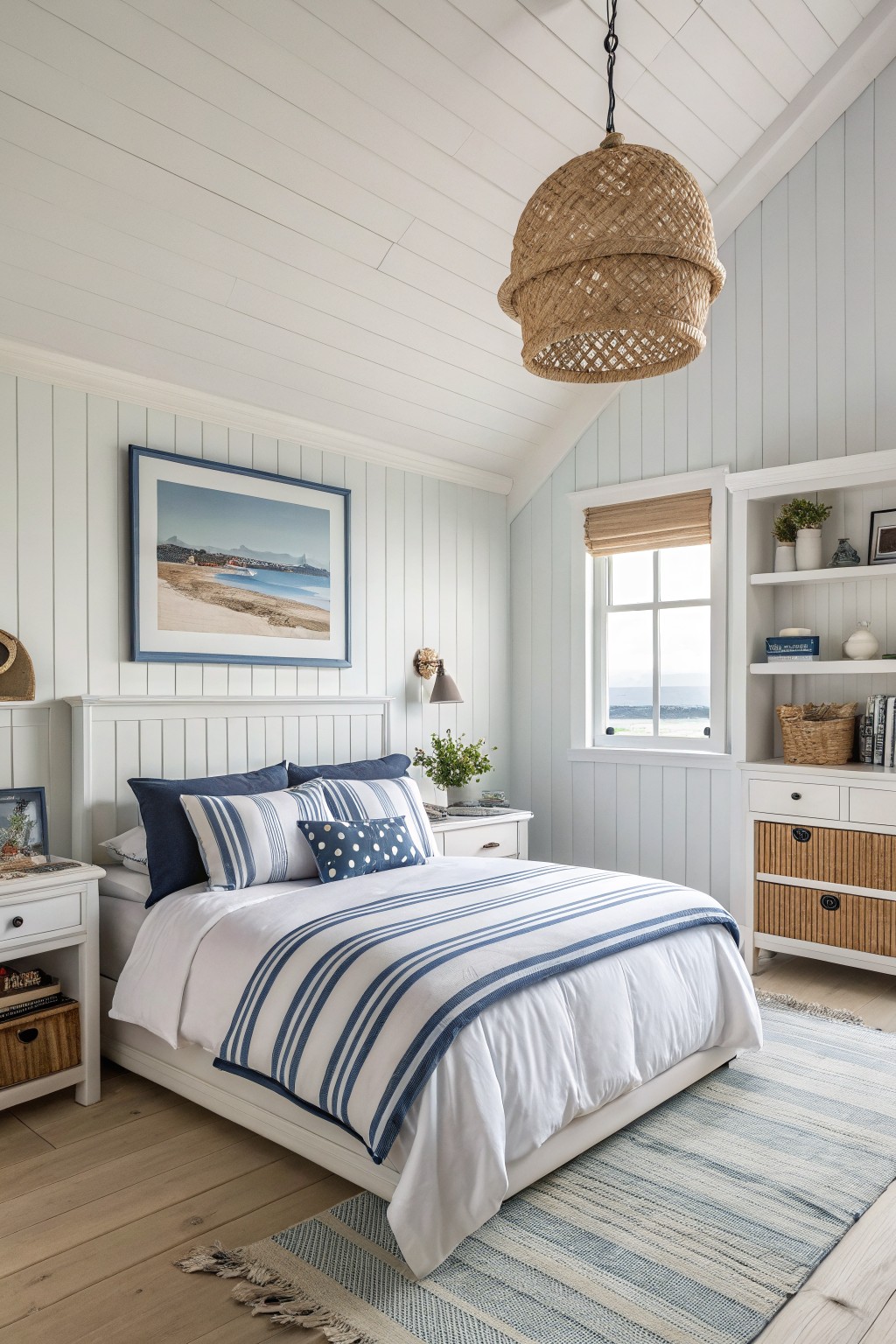
This soft blue on the walls is a light, cool shade that gives the room a calm and steady feel. It sits between blue and gray without leaning too far either way, which is why it has lasted as a classic choice for bedrooms and other quiet spaces. You can find similar tones in Benjamin Moore’s Palladian Blue, Sherwin Williams’ Rainwashed, or Behr’s Ocean Air.
The color works best with white trim and wood floors, since those keep it from feeling chilly. It also holds up well next to striped bedding or simple shelves. One thing to watch is strong afternoon light, which can make the blue look a touch grayer than you expect.
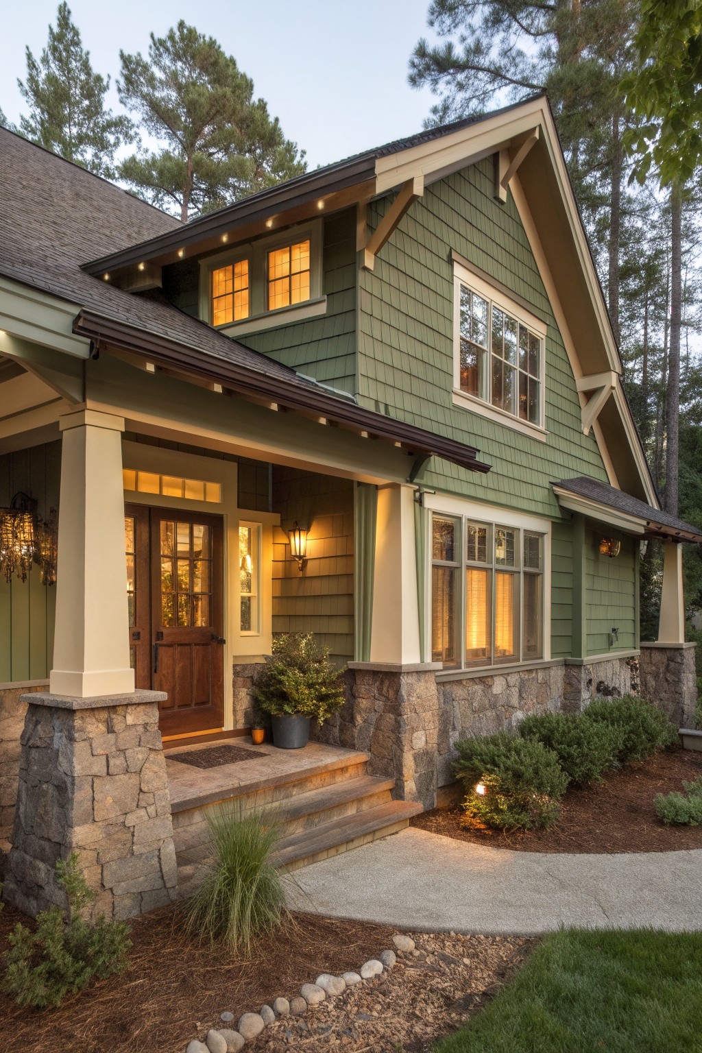
Soft Sage Green Walls
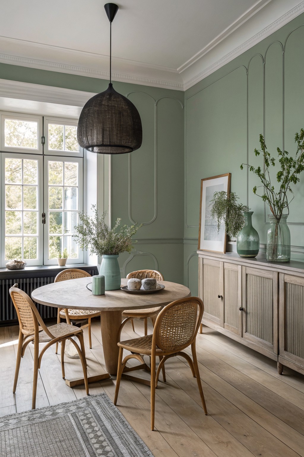
A soft sage green like this one on the walls gives a room a quiet, steady feel that holds up over time. It leans a little gray and sits nicely between green and neutral, so it feels calm without looking washed out or too bold.
The color pairs well with warm wood tones and natural light, which keeps the space from feeling chilly. It suits dining areas or living rooms where you want something gentle that still has a bit of depth, and it works especially well with lighter wood floors or simple trim.
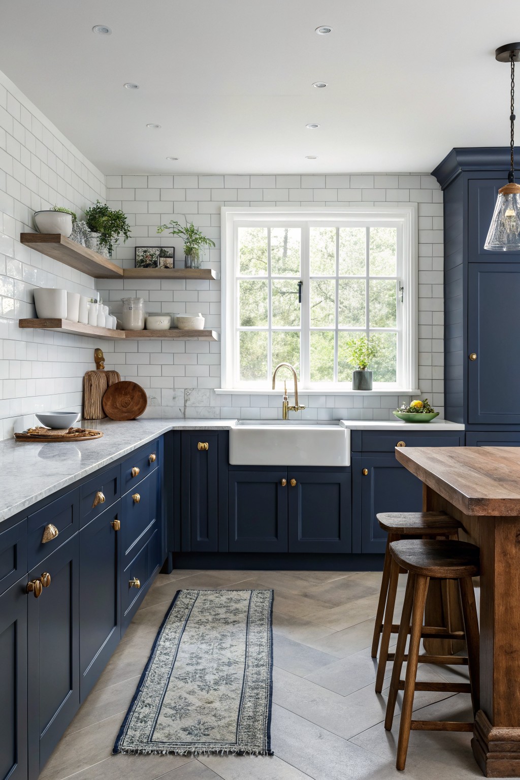
This deep navy blue on the cabinets is one of those colors that feels both fresh and familiar at the same time. It has enough depth to make the kitchen feel solid and put together, yet it still works with the white tile and counters without making the space feel closed in. Colors like this hold up because they sit right between a true blue and a soft black, so they do not date quickly.
It seems closest to Benjamin Moore Hale Navy or Sherwin Williams Naval, with Behr Midnight showing up similar in some lights. The cool undertone helps it look crisp next to brass hardware and warm wood, but it can read a bit heavy in rooms with less natural light. Try it on cabinetry first if you want something that feels classic without needing constant updates.
Deep Olive Green Walls
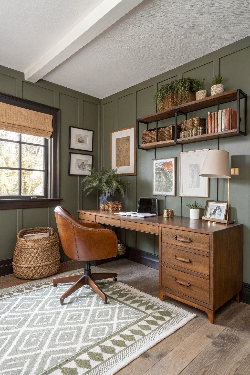
Deep olive green brings a steady, grounded feel to a room without making it feel heavy. This color sits right in that middle ground between gray and green, so it reads calm and a little earthy. It works especially well in spaces that already have wood tones and leather around, like the desk and chair here. Popular matches include Sherwin Williams Evergreen Fog, Benjamin Moore Saybrook Sage, and Farrow & Ball Studio Green.
The slight gray undertone keeps the green from turning too bright in natural light. It pairs easily with warm wood and brown leather, but it can look flat if the room has no other texture or natural material nearby. A few woven baskets or simple framed pieces are usually enough to let the color settle in nicely.
Soft Sage Green Walls
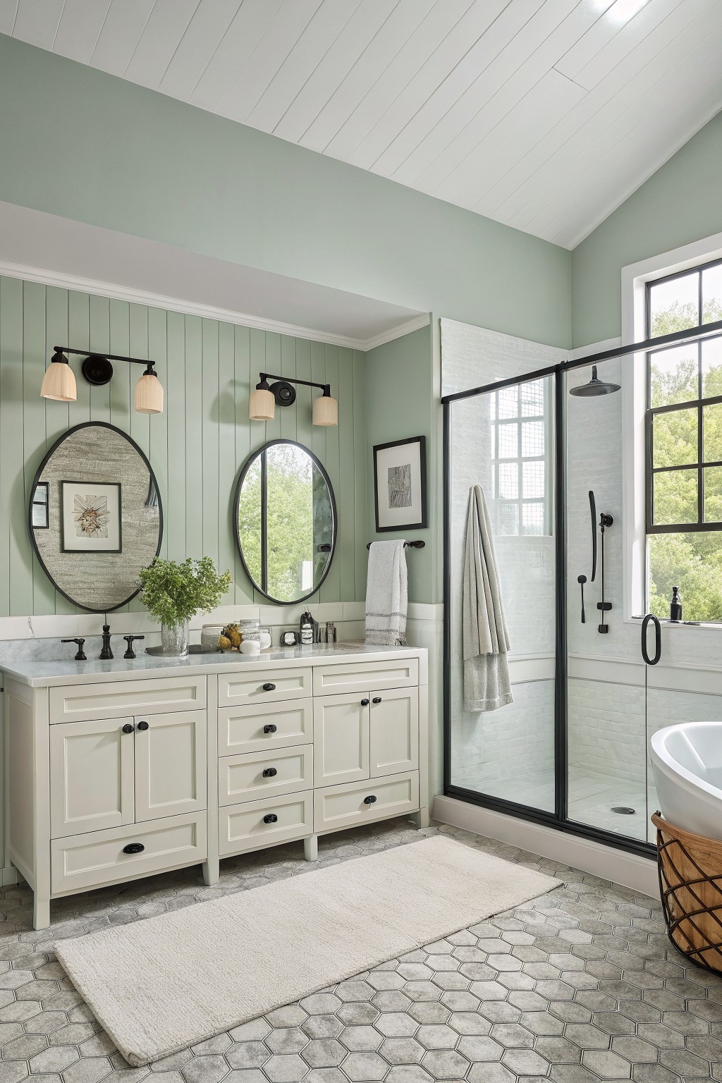
A soft sage green like this one brings a gentle, lived-in feel to a bathroom without making the space feel cold or flat. It sits somewhere between gray and green, which helps it work nicely with white trim, marble counters, and light wood tones. Colors in this range often read closest to Benjamin Moore’s Saybrook Sage, Sherwin Williams’ Rainwashed, Behr’s Quietude, or Farrow & Ball’s Green Ground.
The color stays easy on the eyes even when the light changes through the day. It pairs well with black fixtures or simple white tile, and it tends to make smaller rooms feel a little larger. Just watch that the undertone does not pull too blue in north-facing light, since that can shift the whole room cooler than planned.
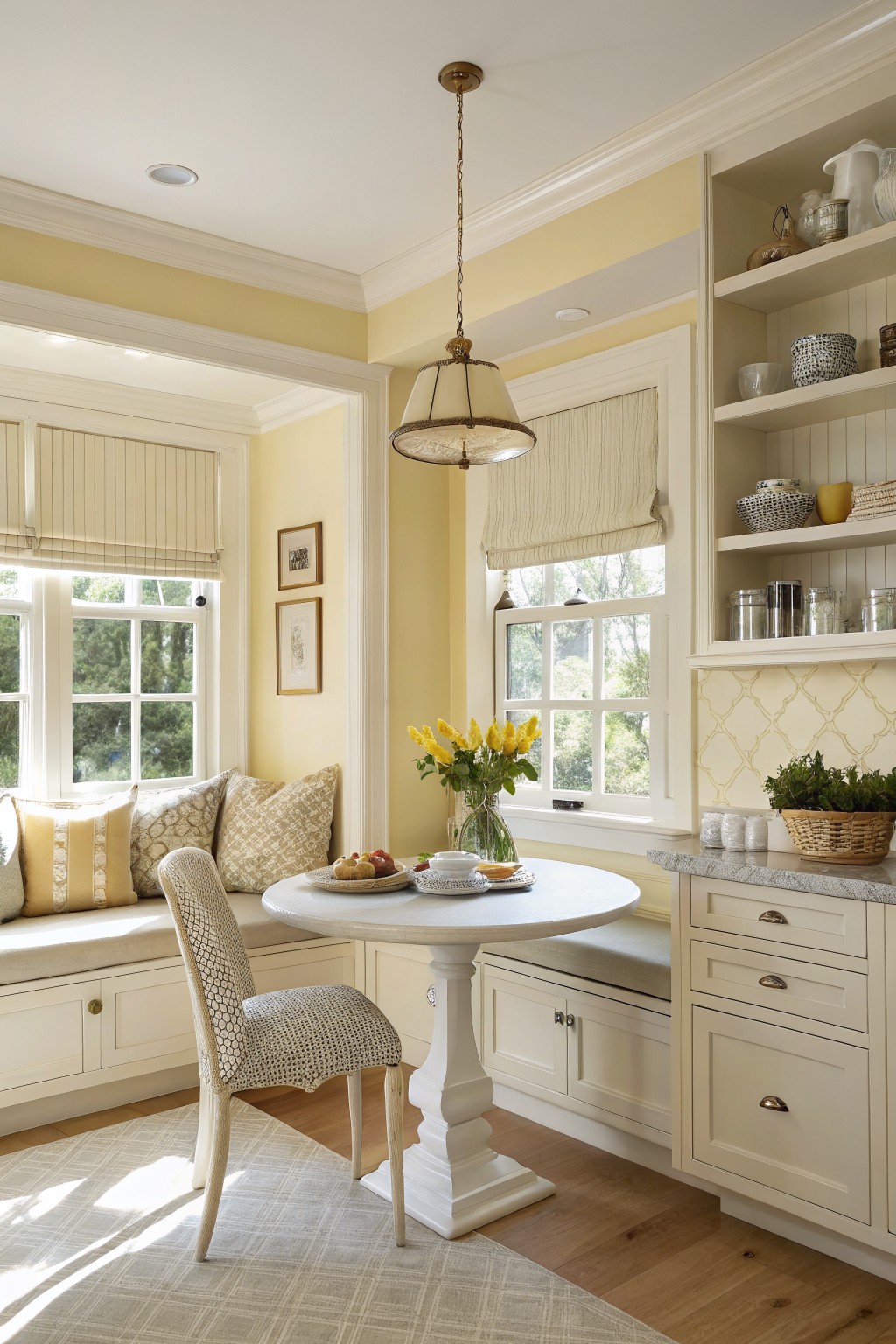
Soft Golden Yellow Walls
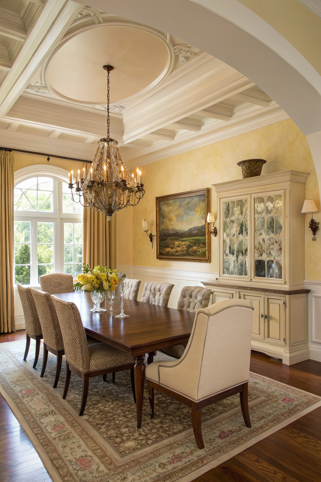
This soft golden yellow brings a warm and steady feel to a dining room without ever feeling too bright. It sits nicely between cream and true yellow, giving the space a classic look that works with both traditional furniture and older architectural details.
The color has gentle warm undertones that play well with dark wood tables and mixed neutral seating. It holds up nicely in rooms with both natural light from windows and the glow from overhead fixtures, though it can lean a touch deeper in lower light.
Soft Yellow Siding
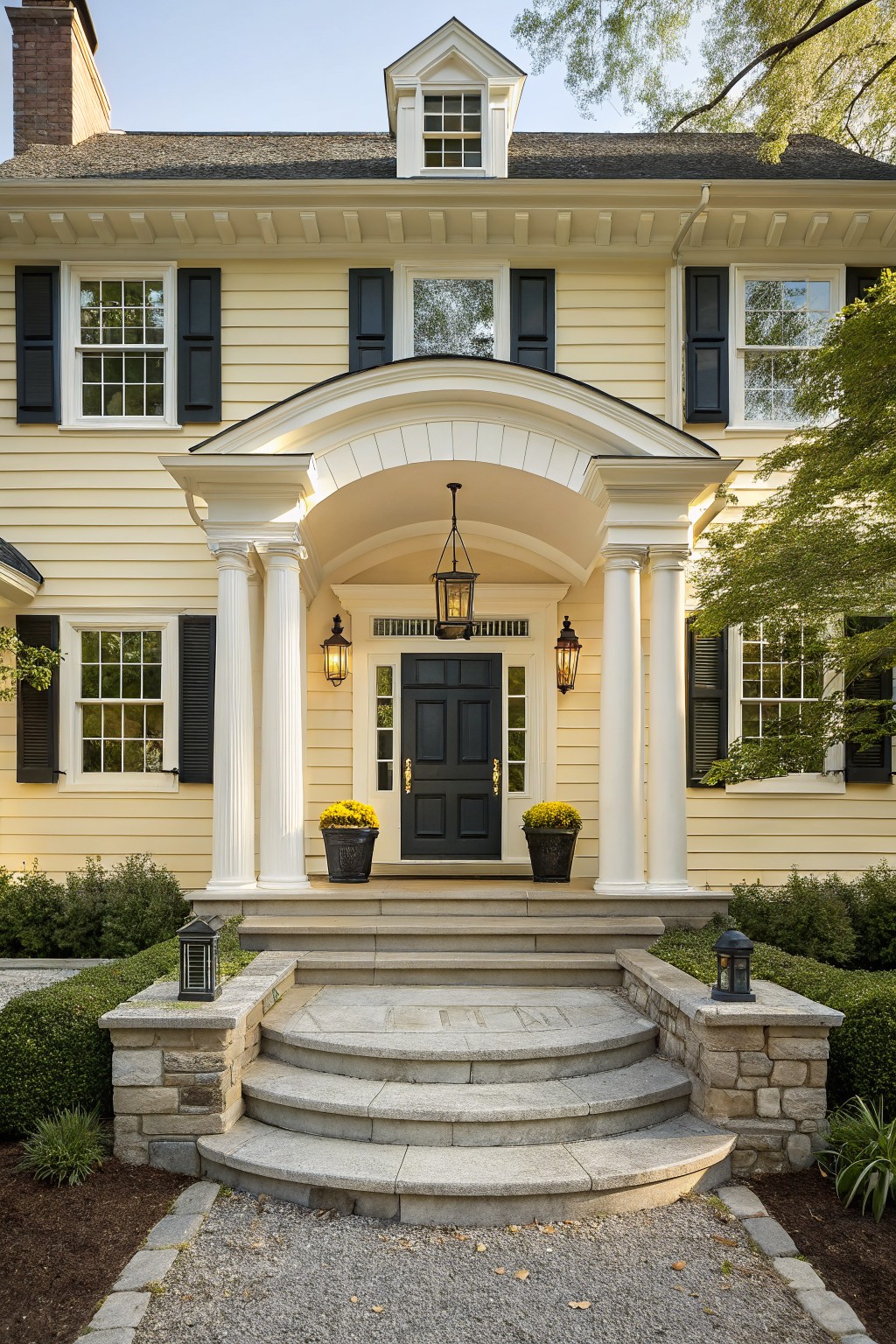
A soft yellow like this gives the house a warm, friendly feel that still reads classic. It sits somewhere between cream and butter, and the tone stays gentle rather than bright. Colors in this range often look closest to Benjamin Moore’s Hawthorne Yellow or Sherwin Williams’ Afternoon, with Behr’s Sunflower Seed and Farrow & Ball’s Pale Hound as other close options.
The yellow works best when it has white trim to keep it from feeling too sweet. It can pick up a slight green cast in heavy shade, so it helps to test a large sample on the actual wall first. This shade suits older homes or any place where you want a bit of color without making a big statement.
Soft Sage Green Siding
This soft sage green on the siding gives a house a steady, lived-in look that does not fight the surroundings. It carries just enough gray to stay calm while still reading as a true green, which is why it holds up over time on many styles of homes.
The color seems closest to Sherwin Williams Evergreen Fog or Benjamin Moore Soft Fern. It works best with warm white trim and natural stone bases, though the green can shift a touch cooler in strong afternoon light.
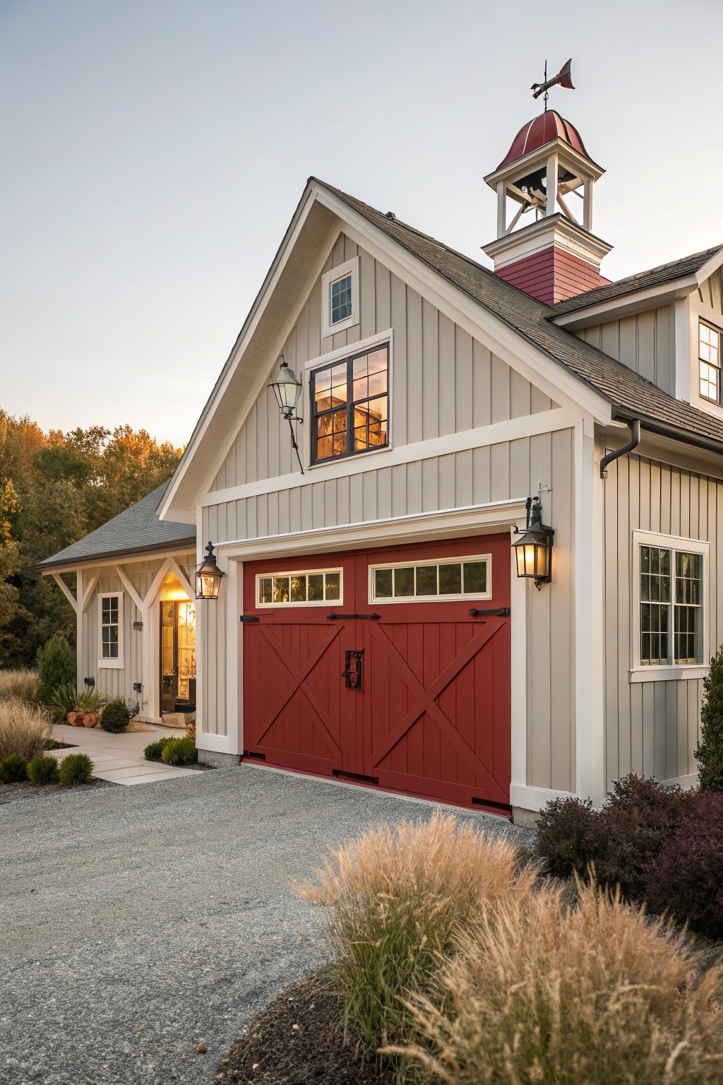
Barn Red Siding
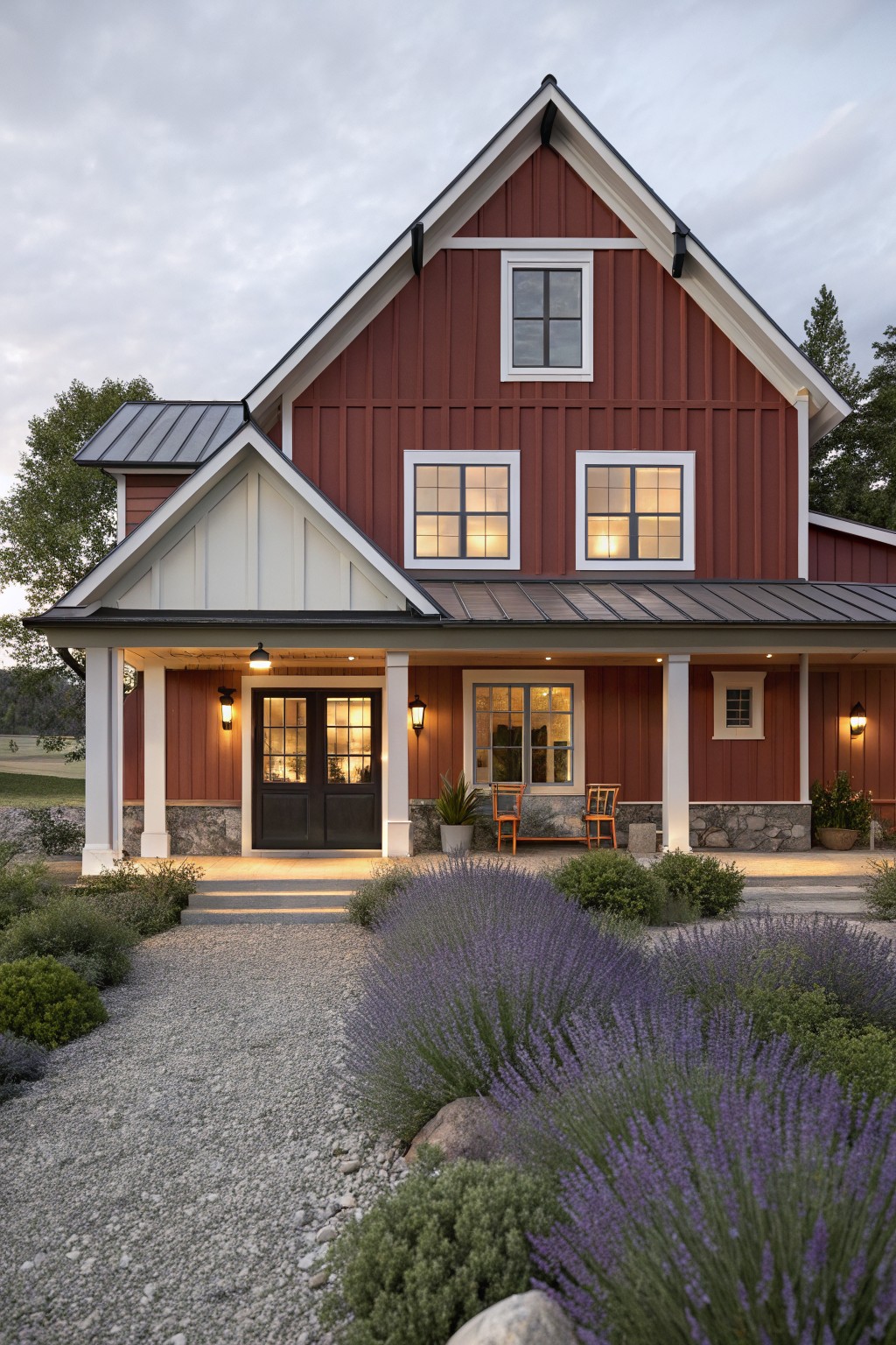
This warm barn red is one of those exterior colors that feels steady and familiar year after year. It has a deep earthy tone that sits well against stone foundations and natural wood accents without looking too bold or too faded.
It works best on farmhouses and traditional homes where you want something with a little weight. Pair it with crisp white trim and a dark roof to keep the whole look balanced. Watch the undertones though, since some reds can lean orange in strong sunlight while others stay more muted.
Muted Blue Gray Walls
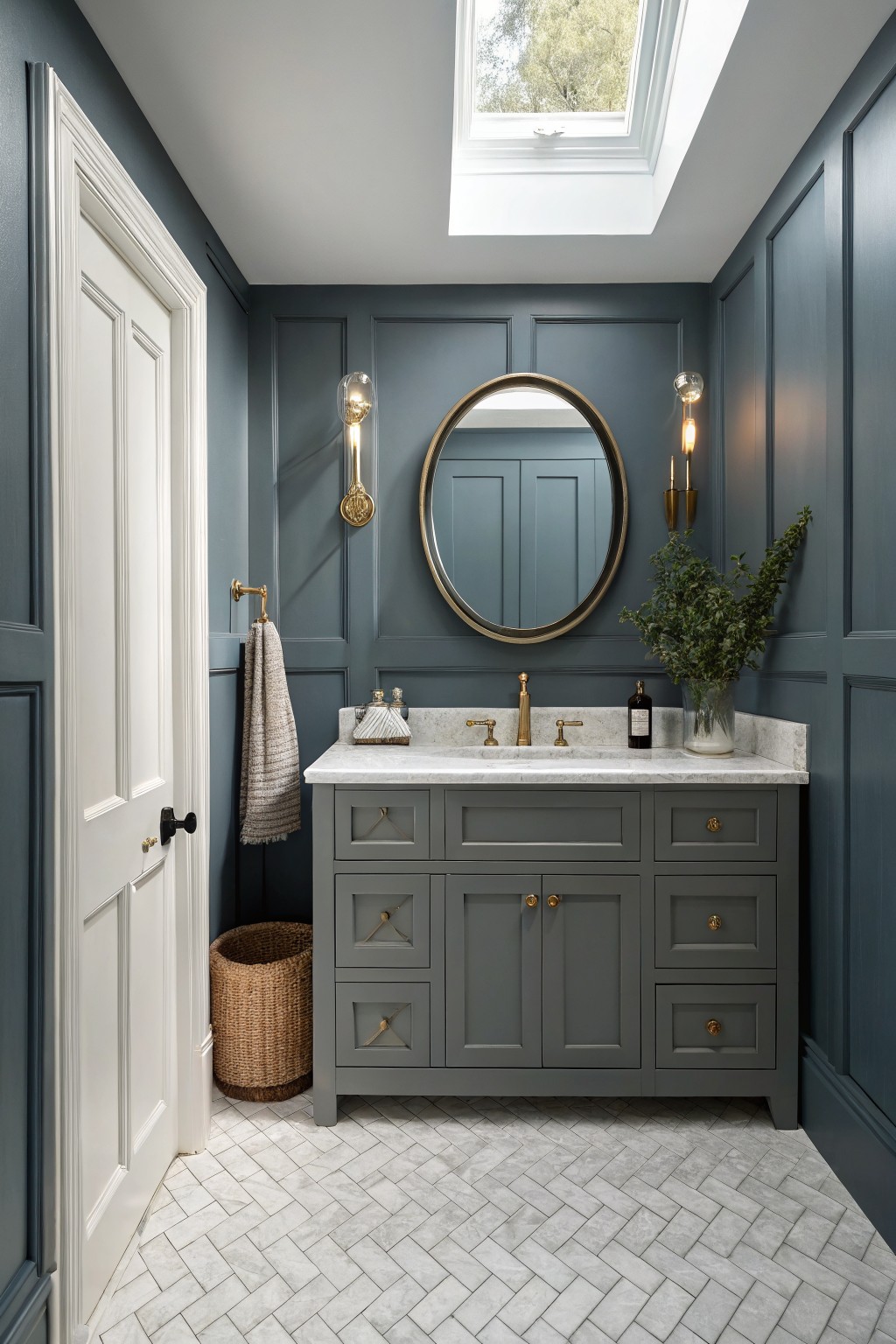
This blue gray brings a quiet depth to a bathroom without making the space feel heavy or dark. It sits in that useful middle ground between gray and blue, so it reads soft rather than stark and works in both older homes and newer ones that need a little character.
It shows a slight cool undertone that plays well with white trim and marble counters. Most people like it best in rooms that get decent daylight, where the blue side shows up more clearly. Pair it with warm wood or brass if you want to keep the whole room from feeling too chilly.
Soft Gray Walls
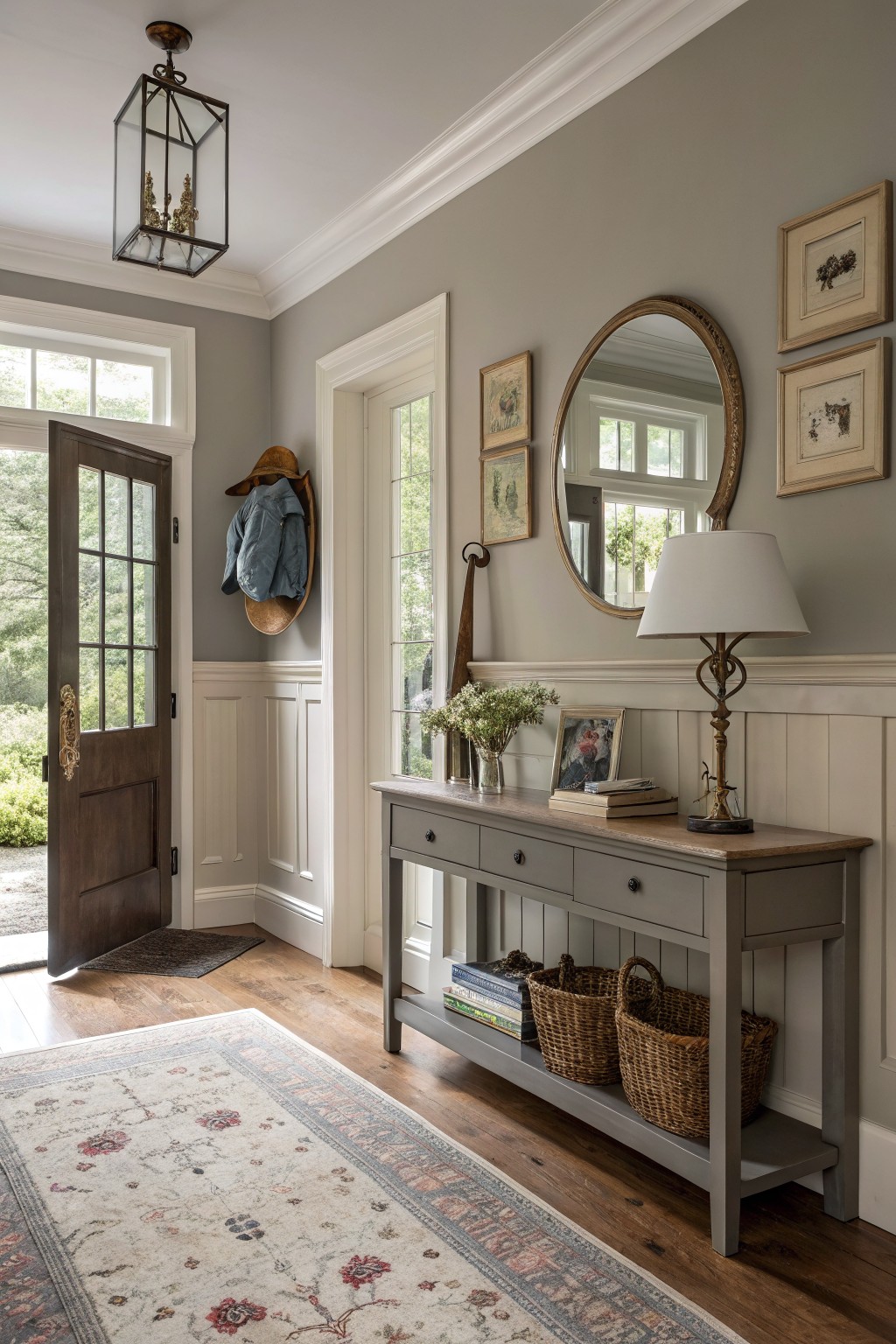
This soft warm gray keeps things simple and steady in an entryway. It has enough depth to feel grounded but stays light enough that the room never feels dark or heavy.
The color carries a gentle taupe undertone that works well with white trim and natural wood floors. It pairs easily with baskets, books, and everyday pieces without needing constant updates.
Soft Yellow Walls
A soft yellow like this one gives a room a gentle lift without feeling bold. It reads as a warm, creamy shade that stays easy on the eyes year after year. Colors such as Benjamin Moore Pale Yellow, Sherwin Williams Lemon Chiffon, and Farrow & Ball Yellow Ground sit close to this tone.
The warm undertone helps it blend well with white trim and natural wood. It works best in spots that get steady daylight, though it can turn a bit brighter in strong afternoon sun, so a test patch is worth it.
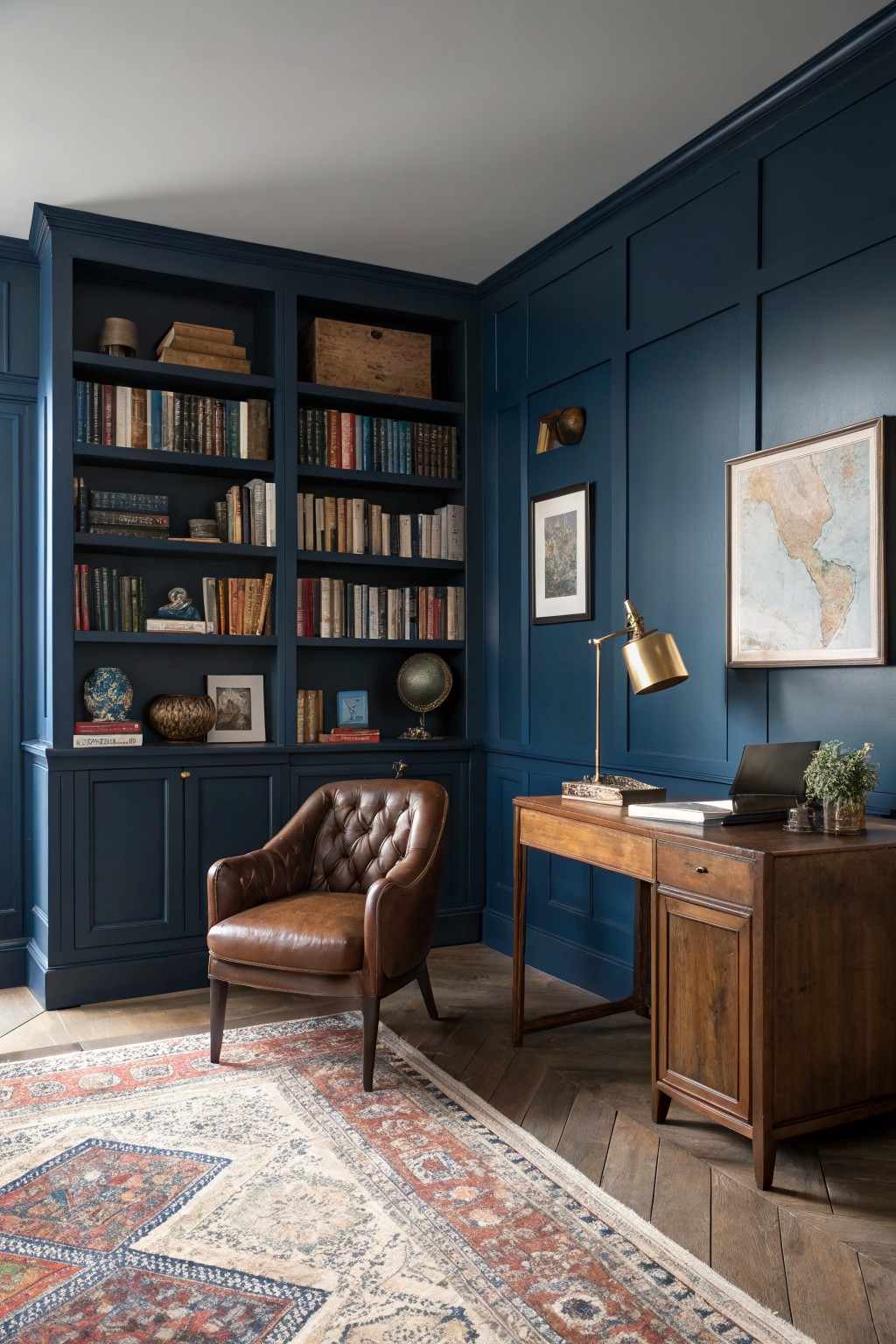
This deep navy blue brings a grounded, classic feel to the room without feeling heavy. It has enough depth to make the space feel intentional and a little formal, which is why the color has stayed popular for years in studies and libraries. Colors like this work well because they give the walls presence while still letting wood tones and leather stand out.
It leans slightly warm rather than cool, so it pairs nicely with brown furniture and natural wood floors. Try it in rooms that get decent daylight, and keep trim in a crisp white or warm off-white to avoid a closed-in look. A few good matches are Sherwin Williams Naval, Benjamin Moore Hale Navy, and Farrow & Ball Hague Blue.
Deep Charcoal Front Doors
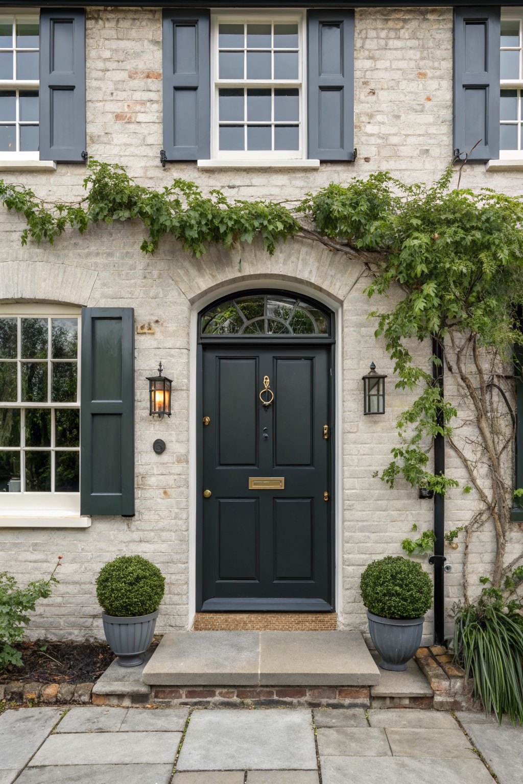
This deep charcoal color on the front door gives a solid, classic look that holds up year after year. It has enough depth to stand out without feeling too stark against the light brick.
It pairs nicely with simple stone steps and a bit of greenery nearby. Colors like Sherwin Williams Iron Ore, Benjamin Moore Kendall Charcoal, or Farrow & Ball Railings all give off a similar feel.
Soft Greige Siding

This house exterior uses a soft greige that sits between warm gray and light beige. It feels calm and steady without looking too cool or too yellow, which helps it stay looking clean next to black windows and wood doors. Colors like this often read close to Sherwin Williams Accessible Beige or Benjamin Moore Edgecomb Gray.
The slight warmth in the undertone keeps the house from feeling flat against the darker roof and trim. It works well on homes that want a neutral look that ages nicely without needing constant touch-ups.

Soft Blush Pink Walls
This soft blush pink works well because it stays gentle without turning sugary. The color has a warm tone that feels calm and easy to live with, especially in rooms that get steady daylight. It pairs nicely with natural wood and simple white trim, which keeps the whole space from feeling too sweet.
The undertone leans slightly peachy rather than cool, so it reads warmer next to oak floors or light wood furniture. It suits nurseries or quiet bedrooms best, but watch how it shifts in the evening since it can pick up more warmth under artificial light.
Deep Charcoal Walls
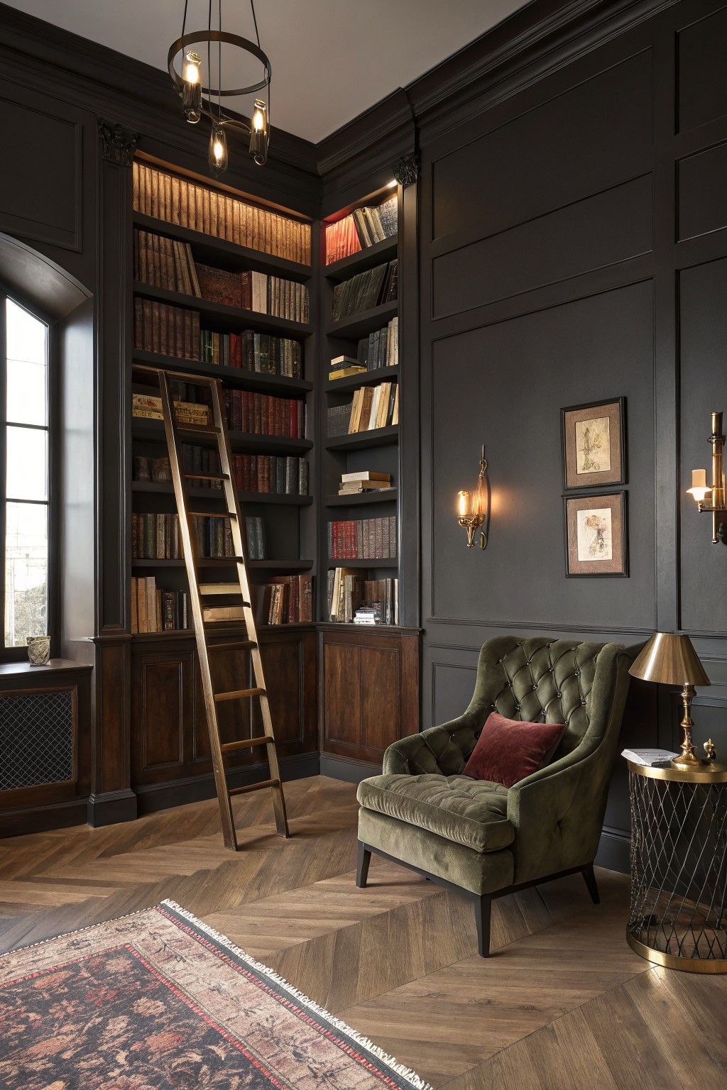
A deep charcoal gray works well in rooms like this one because it gives the space weight without feeling heavy. The color sits nicely against the wood tones in the built-ins and floor, and it makes the whole room feel grounded and calm. Colors like this hold up over time since they do not fight with changing furniture or lighting.
It has a soft gray undertone that keeps it from going flat black, which helps it read warmer in low light. This shade pairs best with natural wood, brass accents, and richer textiles. It suits older homes or any room where you want the walls to recede a bit while still adding presence.
Soft Greige Siding
A light greige like this makes a solid choice for house siding because it stays neutral without looking flat. It blends gray and beige in a way that feels warm but still clean, and it holds up as styles shift over the years.
This shade has subtle warm undertones that help it sit comfortably next to white trim and bolder accents like a red garage door. It works best on traditional homes with some wood or stone nearby, though it can look a little washed out if the light is very harsh.
Warm Beige Siding
A warm beige like the one on this house gives the exterior a simple, steady look that does not go out of style. It sits somewhere between tan and light greige, so it feels soft but still has enough depth to hold its own next to stone and wood.
The color has a gentle yellow undertone that keeps it from turning cool or flat in daylight. It pairs easily with natural wood doors and masonry bases, and it tends to look good on both older homes and newer builds as long as the trim stays light and clean.
Frequently Asked Questions
Q: Will these colors hold up if my living room gets tons of sunlight? A: Go for warmer versions of the classics like soft grays or warm whites. They shift less under bright light and keep a steady feel through the seasons. Test a sample on the wall at different times of day to see how it settles.
Q: How do I decide between two shades that both seem timeless? A: Start with the one that matches your existing floors and trim. This creates an easy flow without extra work. Walk away from the samples for a day and come back with fresh eyes to pick the winner.
Q: What if I want to update my space later without repainting everything? A: Layer in new pillows or art that play off the classic base color you chose. The neutral foundation stays fresh while the accents do the changing. Swap those pieces every couple of years to keep things interesting.


